LOFT中國感謝來自 木君建築-MDO 的商業項目案例分享:
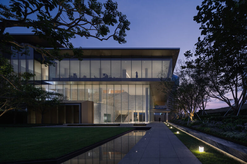
郡西雲台銷售中心處於位於杭州西北市郊美麗的良渚文化村中,MDO非常榮幸能夠獲得設計這座擁有獨特風格建築的室內空間。
作為設計師,我們對於空間中各元素的聯係和對比有很強的興趣 – 建築與室內,粗糙與平滑,深與淺,鮮明與細膩。每組對立概念之間都有一個過渡,在這個過渡中間也蘊藏著引發某種情感的機會。
MDO were honoured to be offered the chance to design the interior for a unique piece of architecture situated in the beautiful Liangzhu area, in the northwestern outskirts of Hangzhou.
As designers we are interested in relationships and contrasts; architecture and interior, the rough and the smooth, dark and light, strong and the delicate. Between each is a transition, and opportunity to create an emotion.
入口大廳
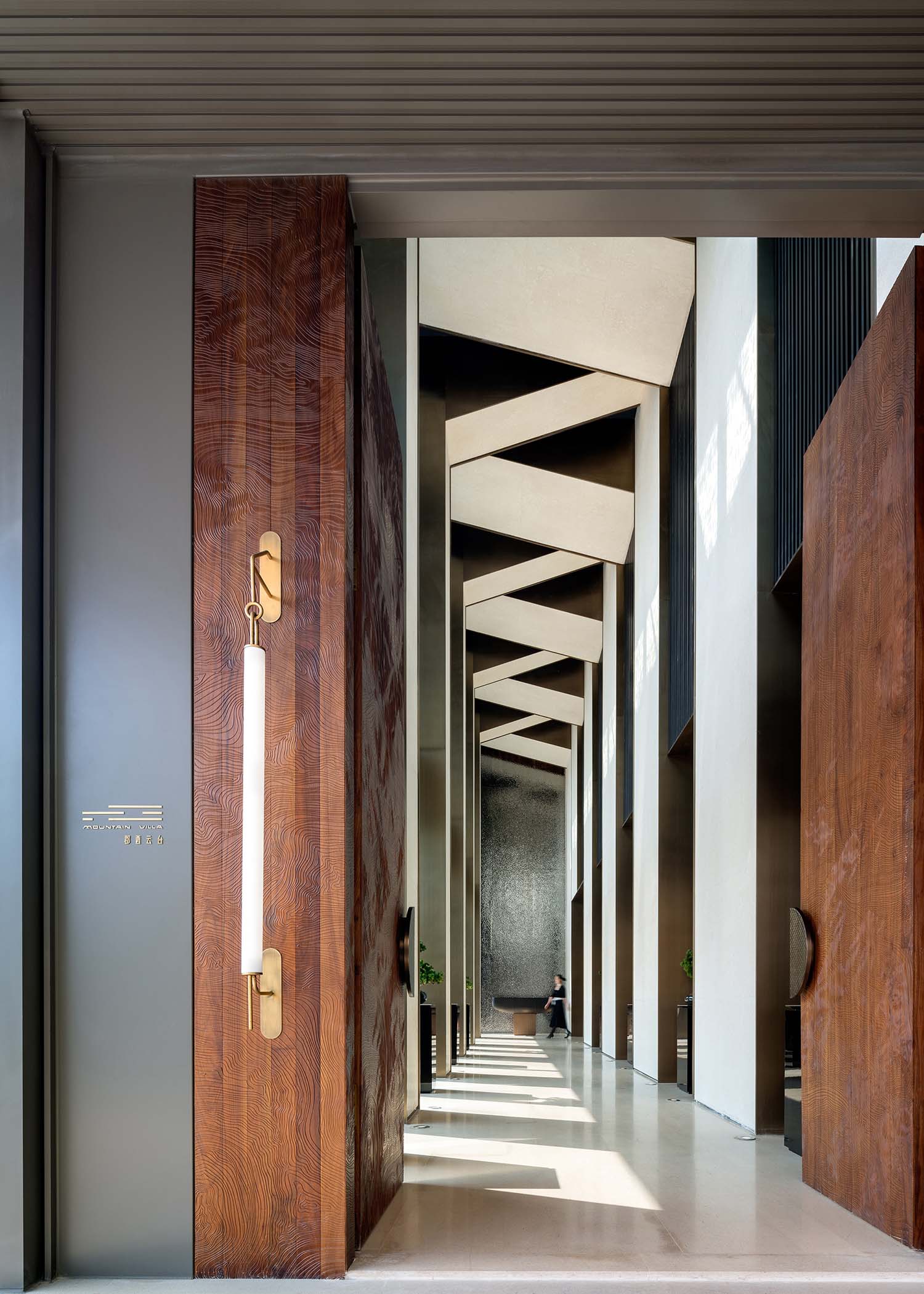
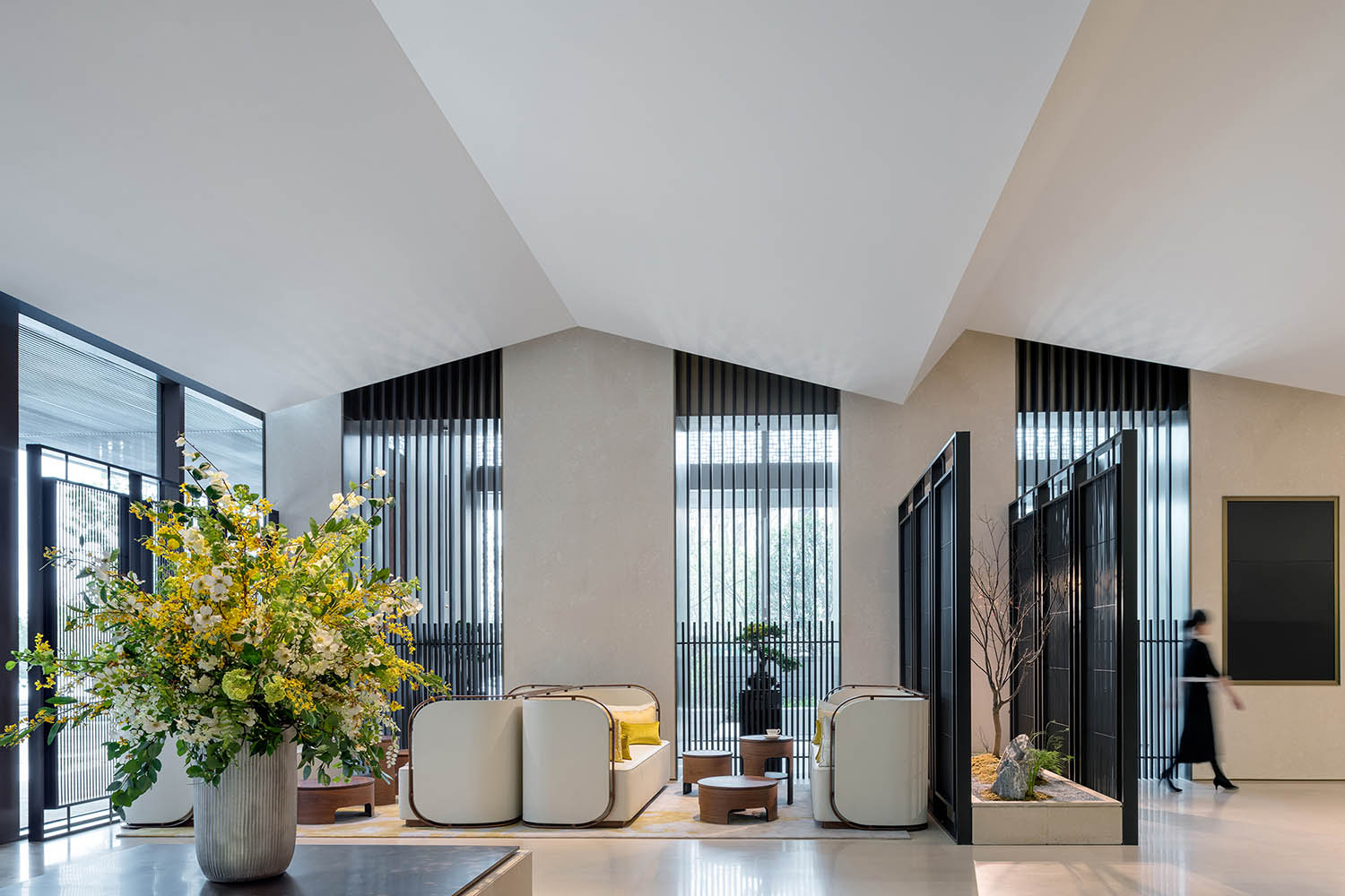
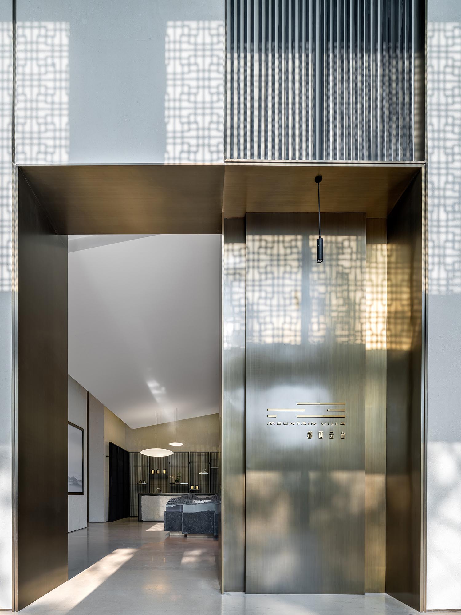
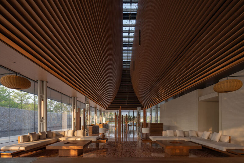
對於我們來說,這個售樓處展廳代表著這樣一種過渡。它是訪客們進入一段發現之旅的大門。到達目的地的儀式感成為了我們設計大廳的出發點。一個高而列隊般的空間讓訪客們感受到敬畏和期待感。在這個空間中我們奠定了整個項目的基調,並且展現了地產商對於精致和品質的追求和承諾。
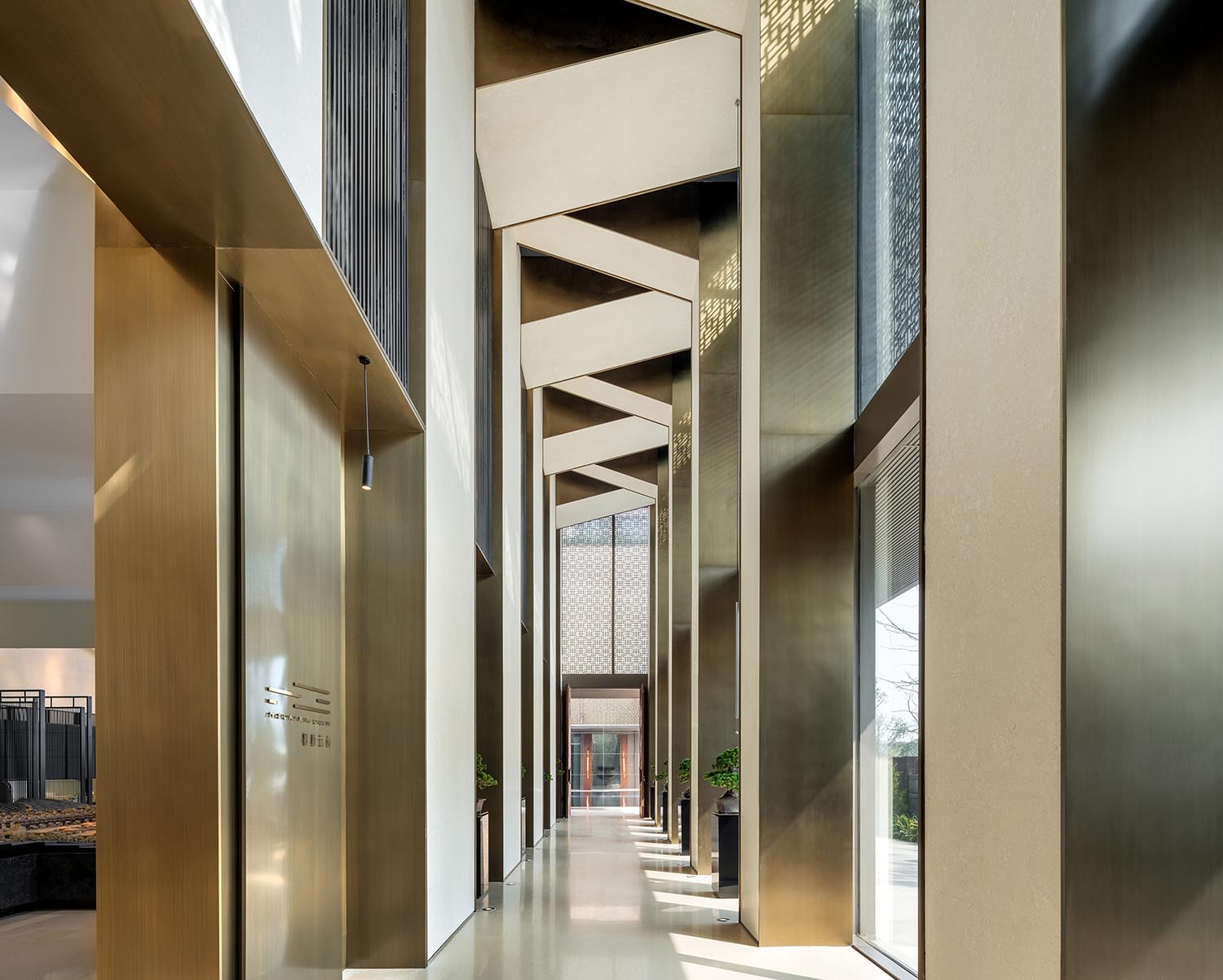
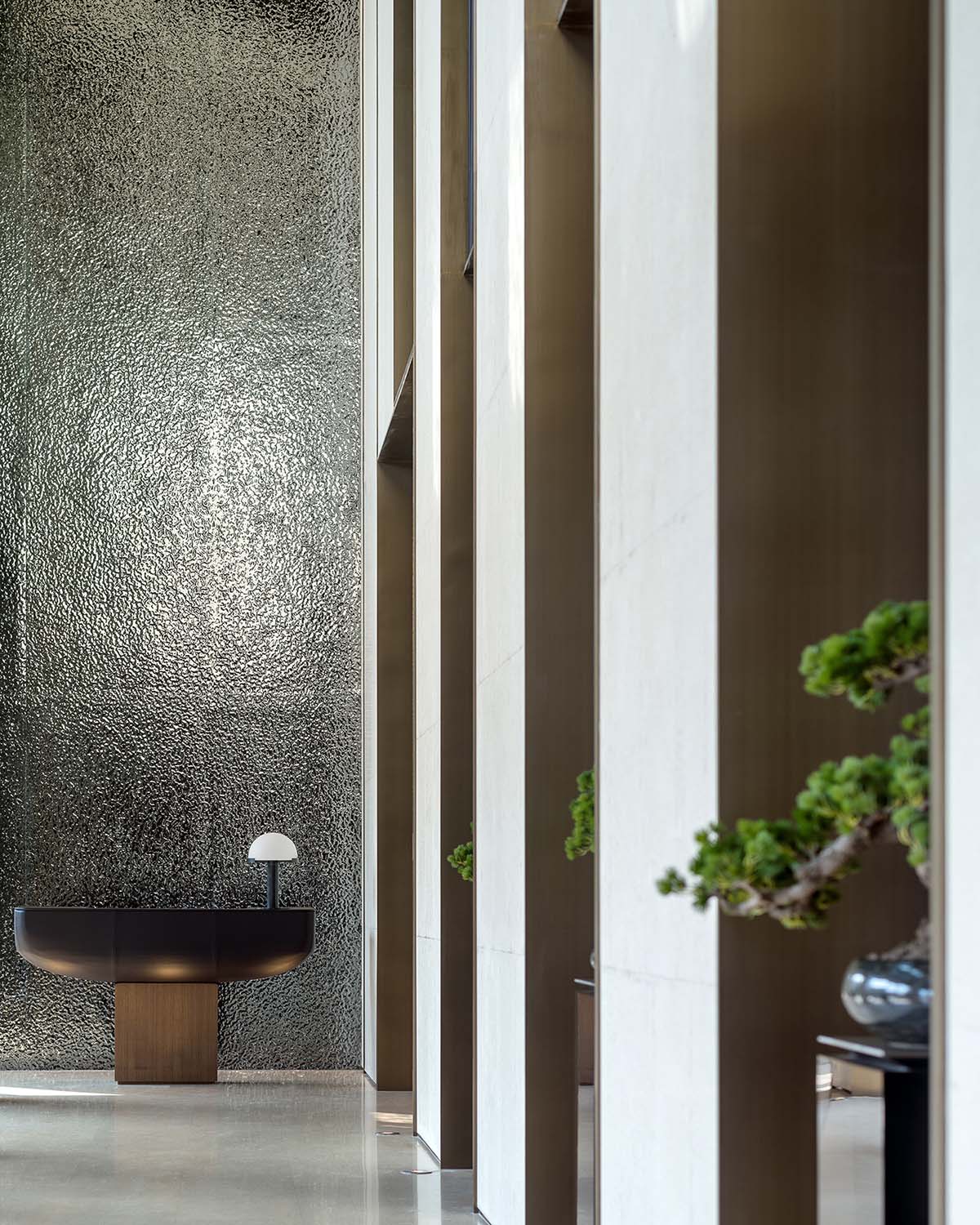
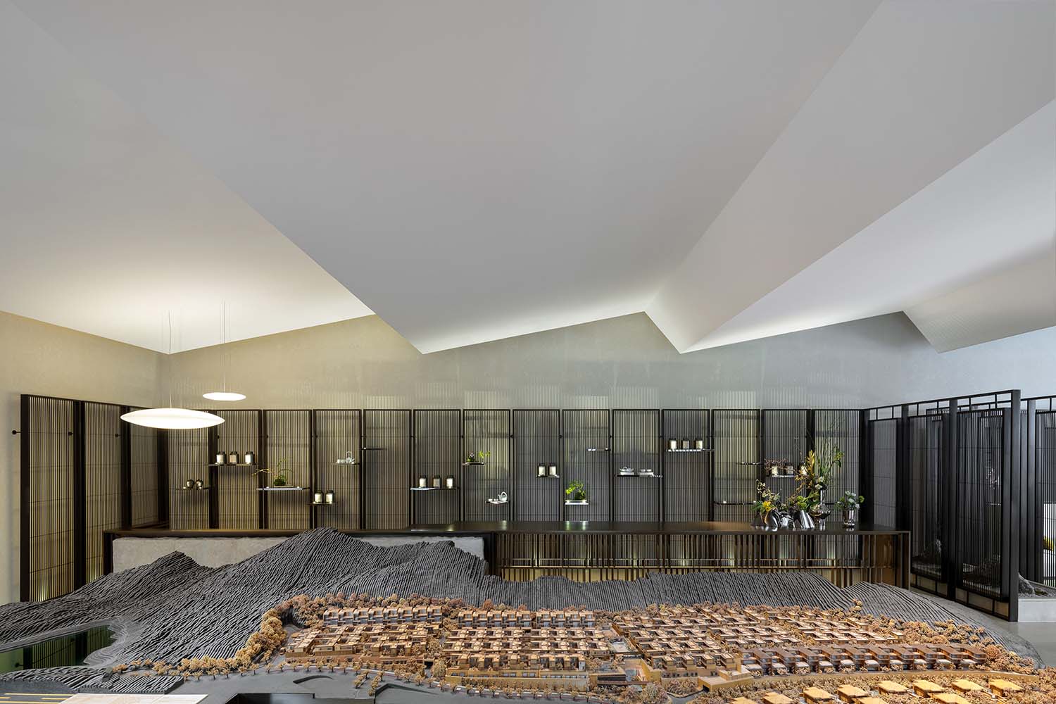
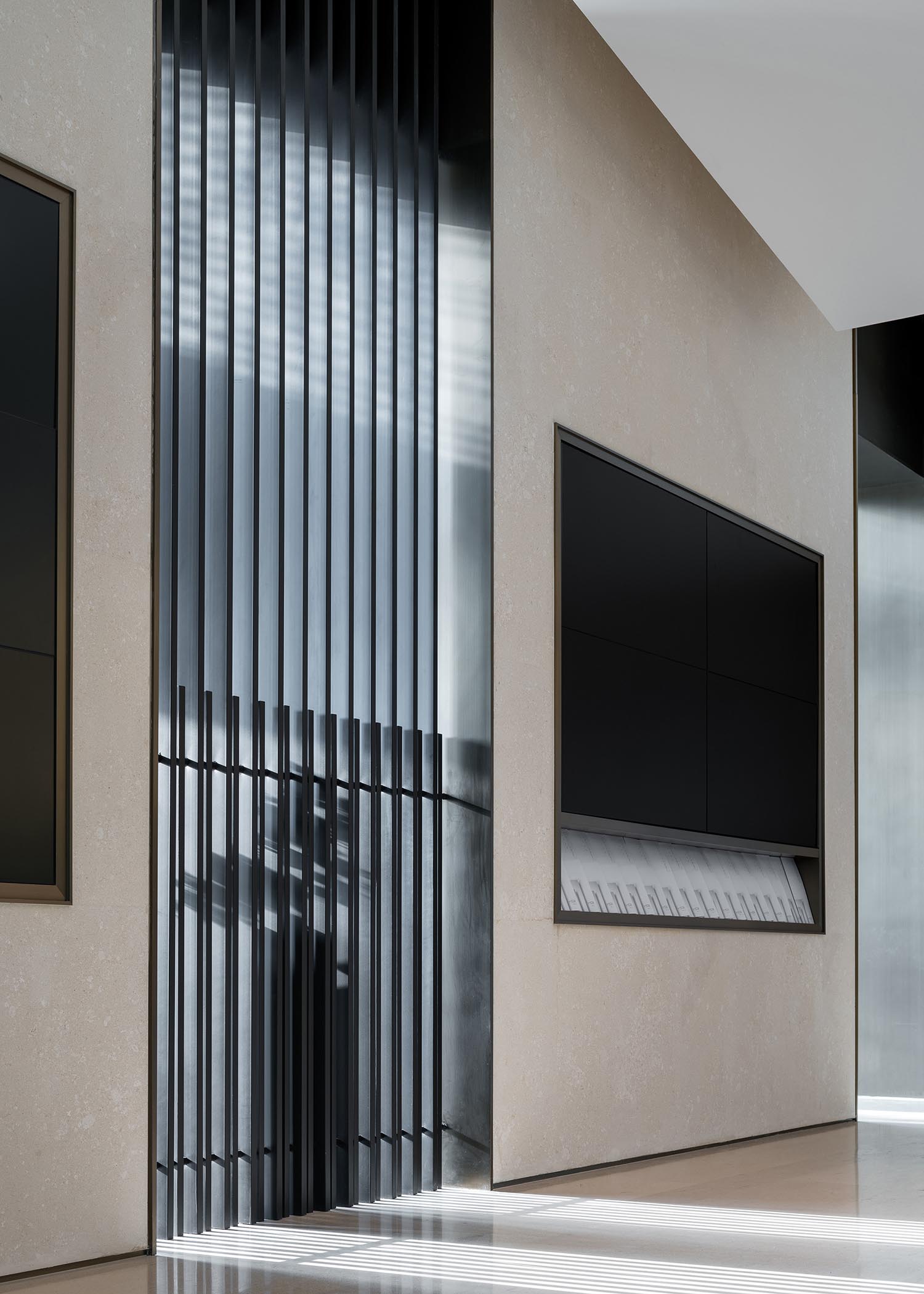
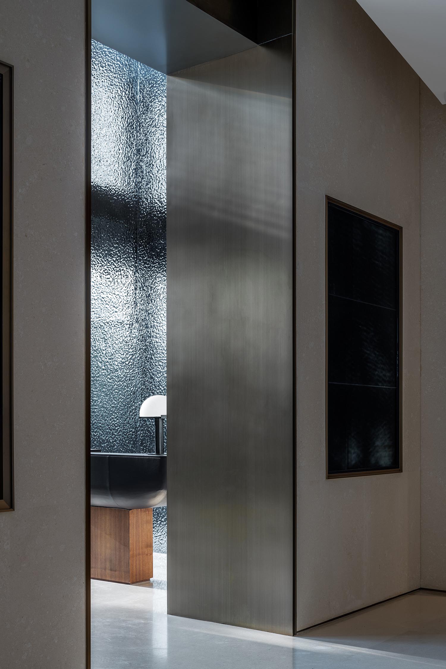
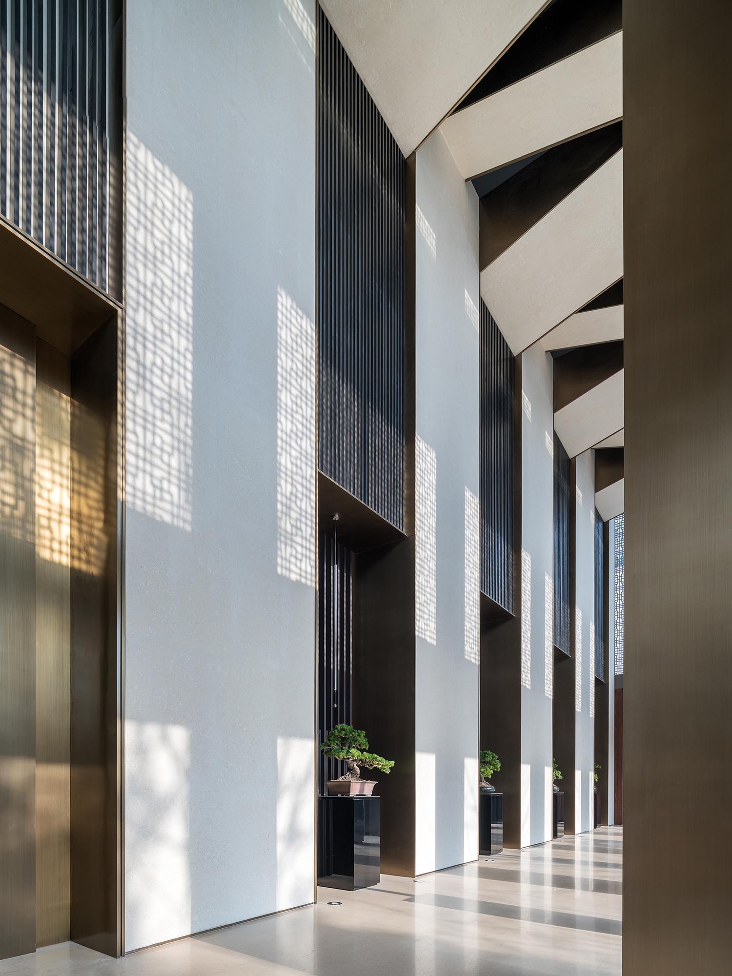
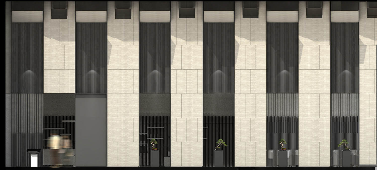
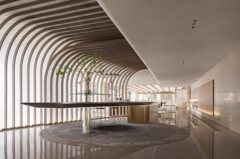
我們設計了一係列的折疊屋頂(靈感來源為中國藝術家吳冠中作品中展現的傳統中式屋頂),而這些屋頂形狀也呼應了建築的節奏。這個長廊從南邊單側采光,這種節奏被一係列的立柱上深色拉絲金屬與淺色砂岩之間的強烈對比凸顯得更加強烈。每兩個立柱之間都給予訪客一個通過層疊的屏風瞥見室內的機會。
THE ENTRANCE HALL
For us, the Sales Gallery represents one of these transitions. It is a gateway that visitors encounter on their journey to discover the development. This sense of arrival became our starting point for the entrance hall. A tall processional space which would fill the visitors with a sense of awe and anticipation. A place where we could set the tone and express the developments commitment to refinement and quality.
We designed a series of folding arches (inspired by painting of traditional Chinese roofs by Wu Guangzhong) which responds to the rhythm of the architectural façade. Side lit from the south, the rhythm is enhanced by a series of columns clad in contrasting dark hairline metal and light textured limestone. Each bay allows a glimpse view through a layered lacquer screen to the inside.
中央區域
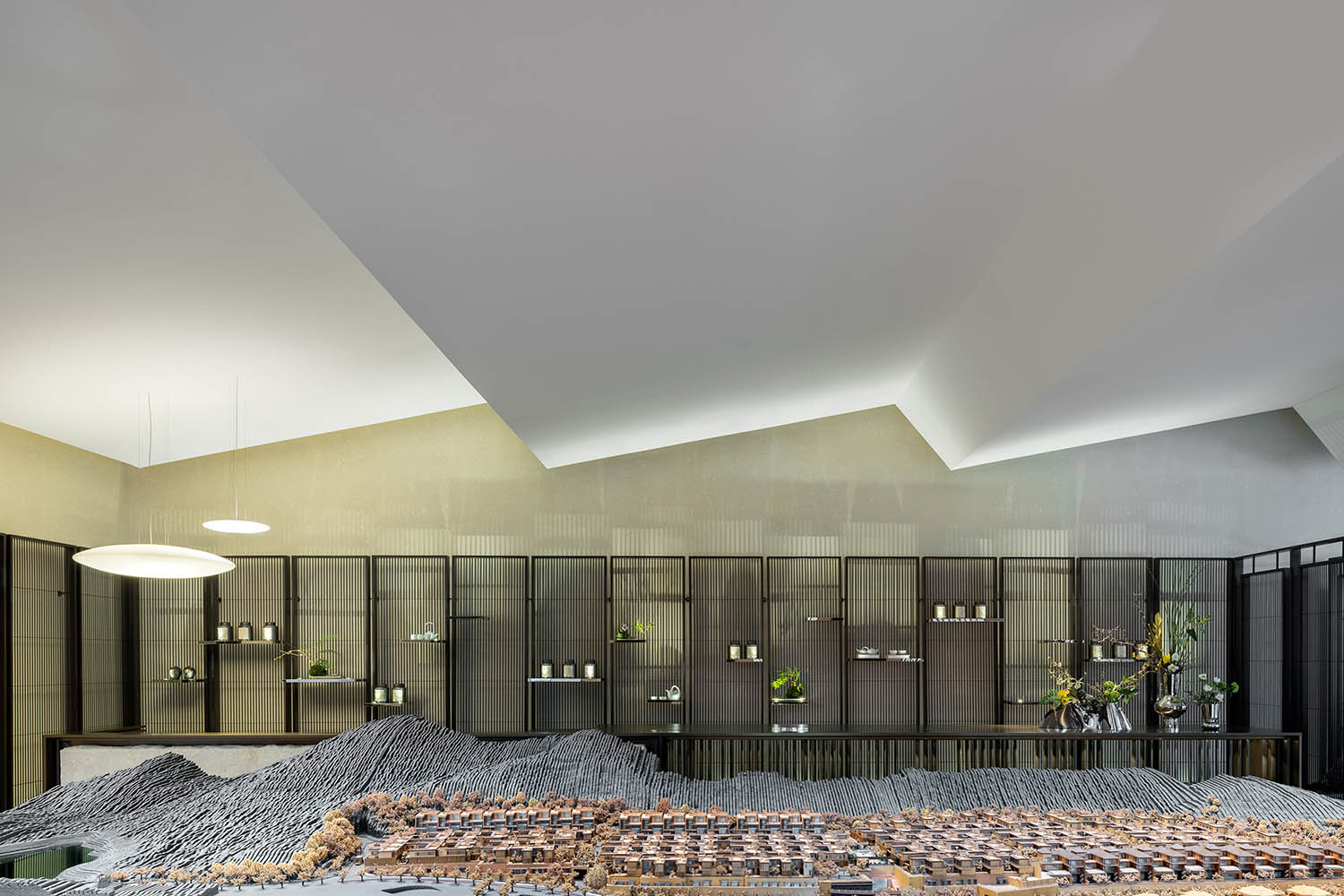
我們在設計中麵臨的一個挑戰是兩種建築高度之間的過渡:入口大廳是一個雙層挑高的空間,整體規模很大,而當你步入中央區域的模型區時,天花高度突然降低了一半。怎樣才能保持整個設計的精神呢?
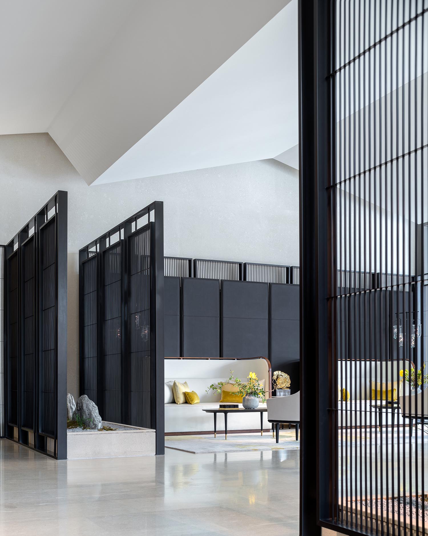
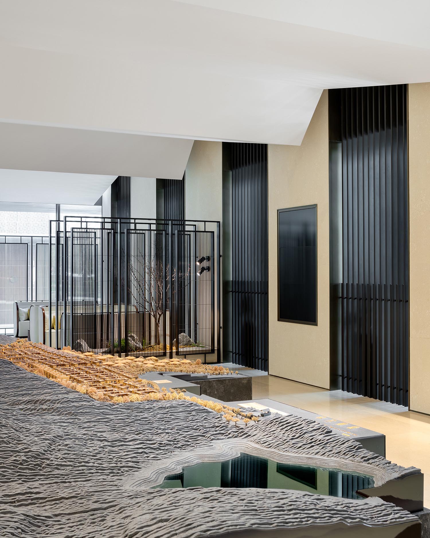
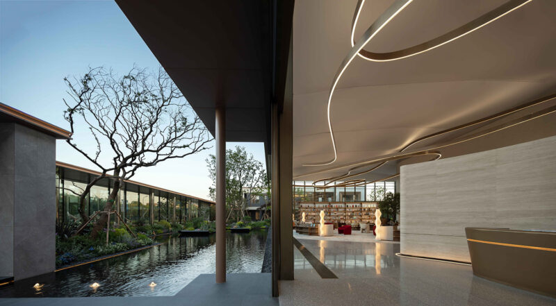
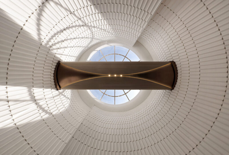
我們的解決方法是在中央區域中延續入口大廳中折疊天花的主題,但加大它的比例。我們創作了一個以水波為靈感的,向外流動的折疊形態。當這些折疊造型到達了洽談區時,它變成了軸對稱的形狀。從座位處向上看,它則是傳統尖屋頂的樣子。這樣,洽談區的上方的空間感就顯得更為舒適而親近。
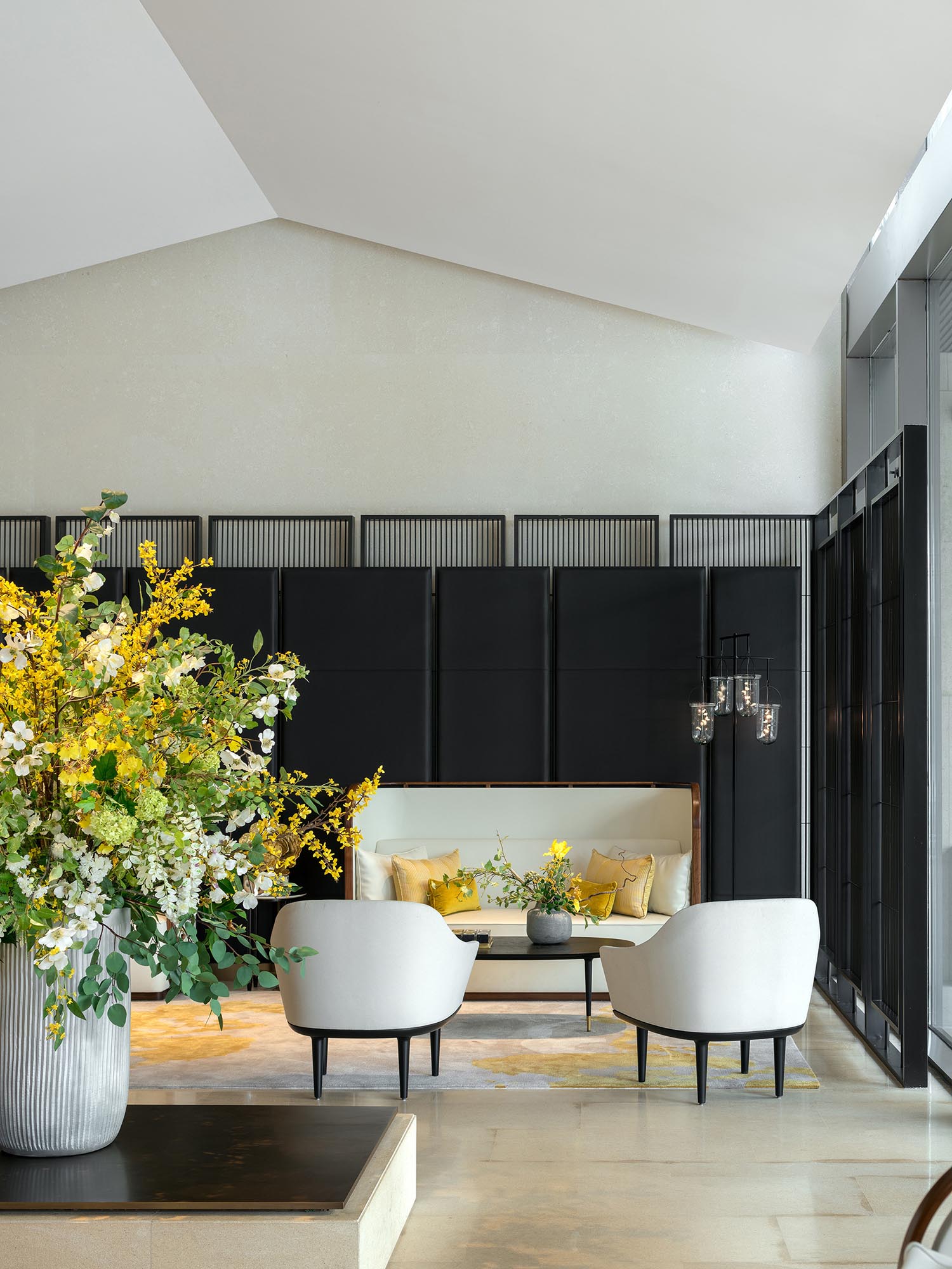
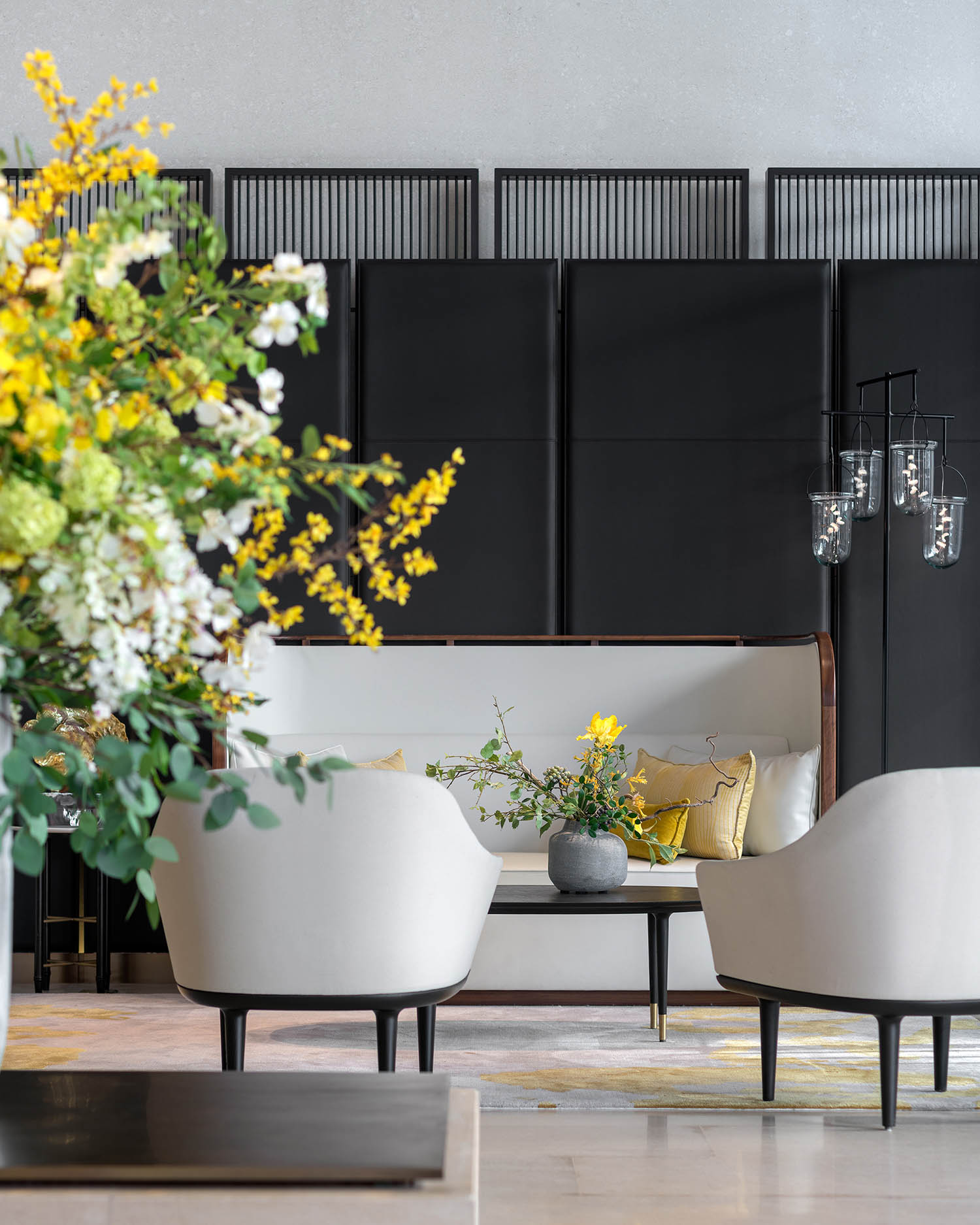
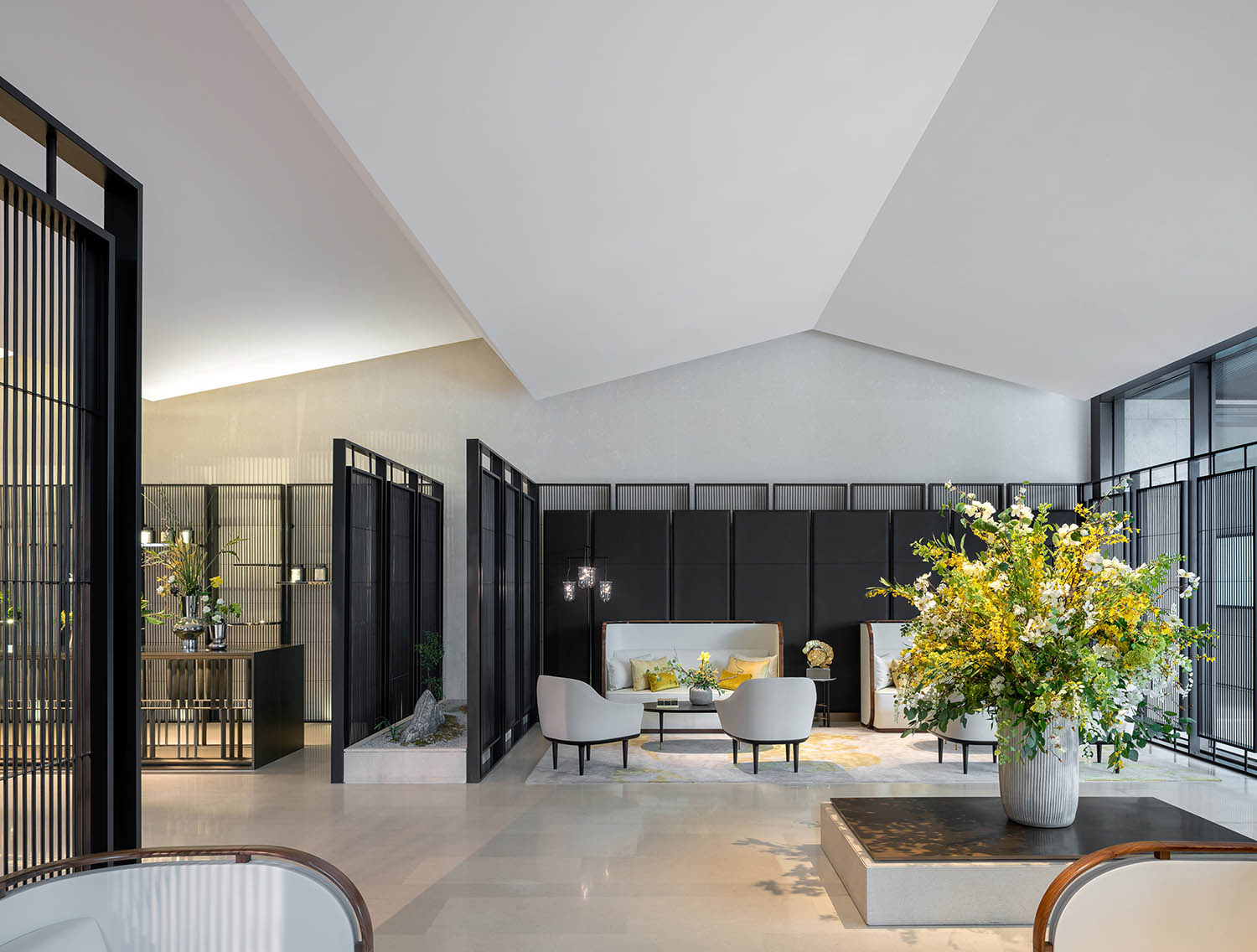
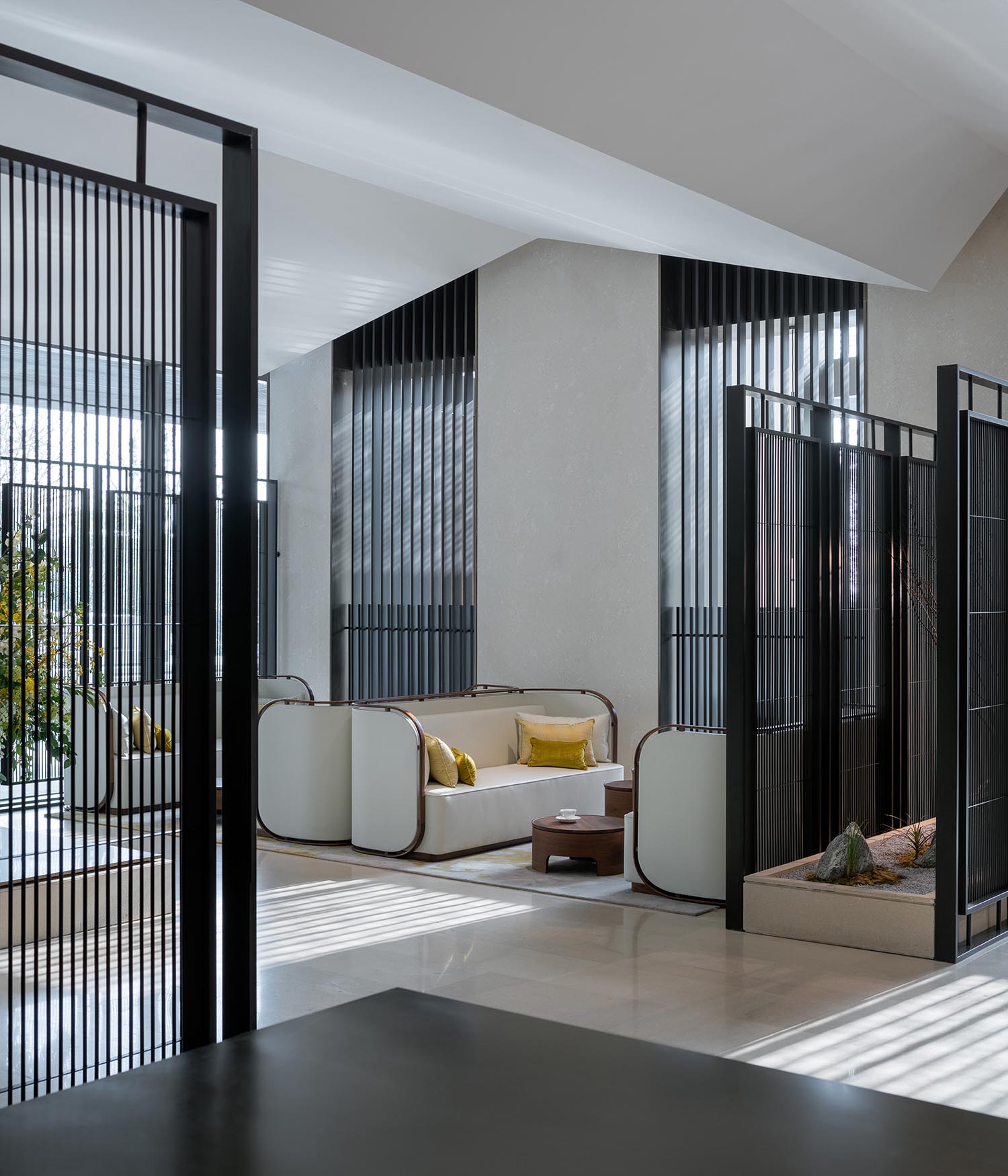
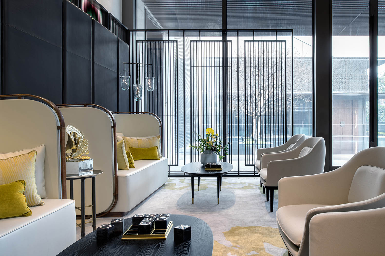
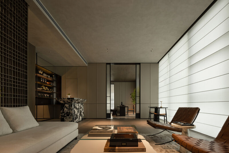
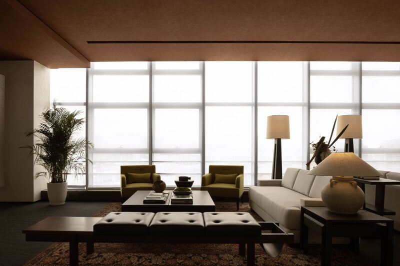
我們設計了洽談區處的定製沙發,這個沙發也呼應了觀看室外景觀的視角。背靠著牆的沙發有一個很高的後背,給你提供了必要的隱私。而麵朝景觀的沙發則比較矮,能給訪客提供朝向花園和景觀的極佳視角。
CENTRAL HALL
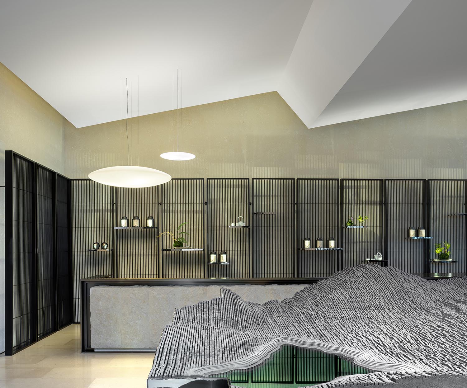
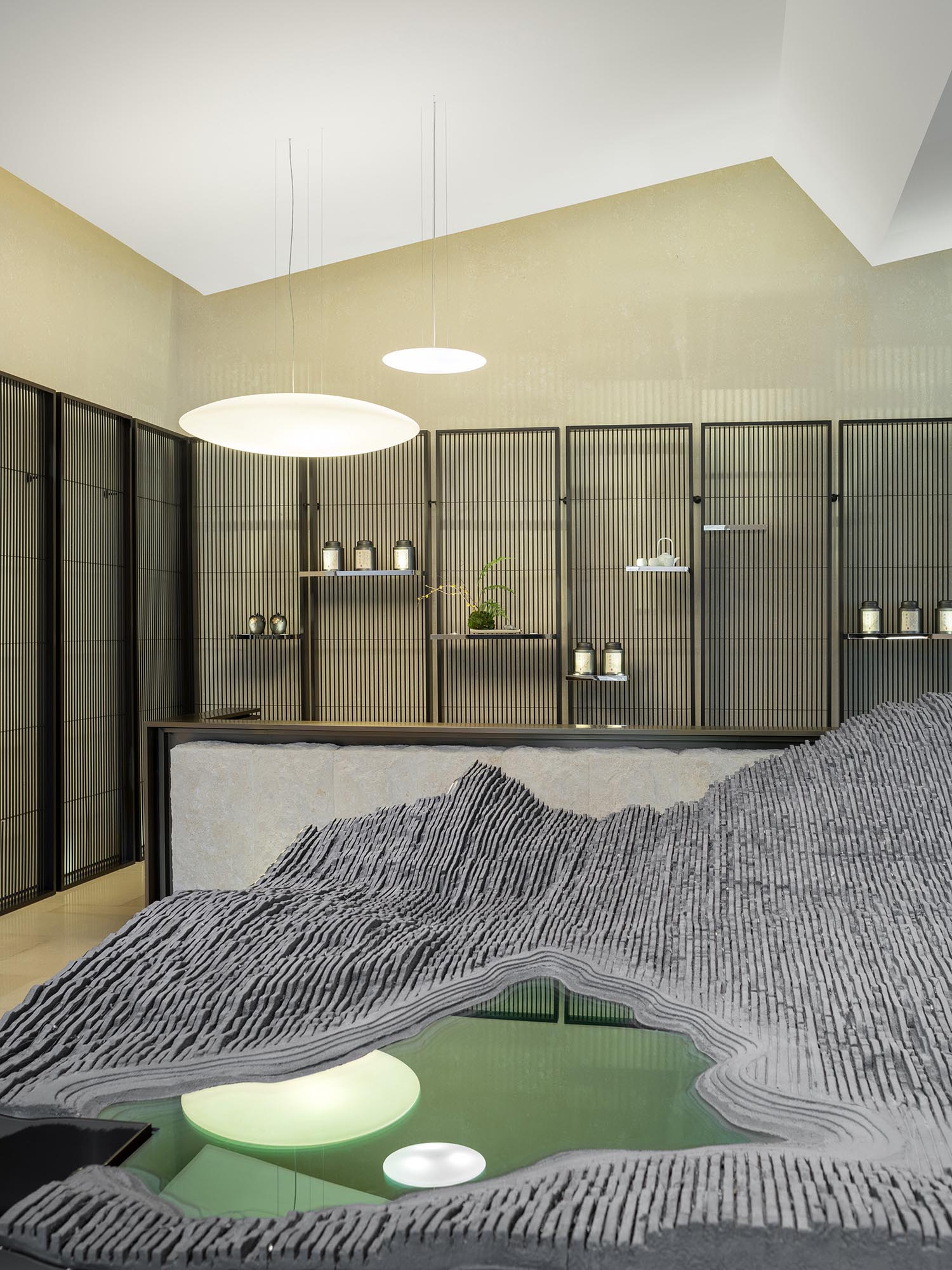
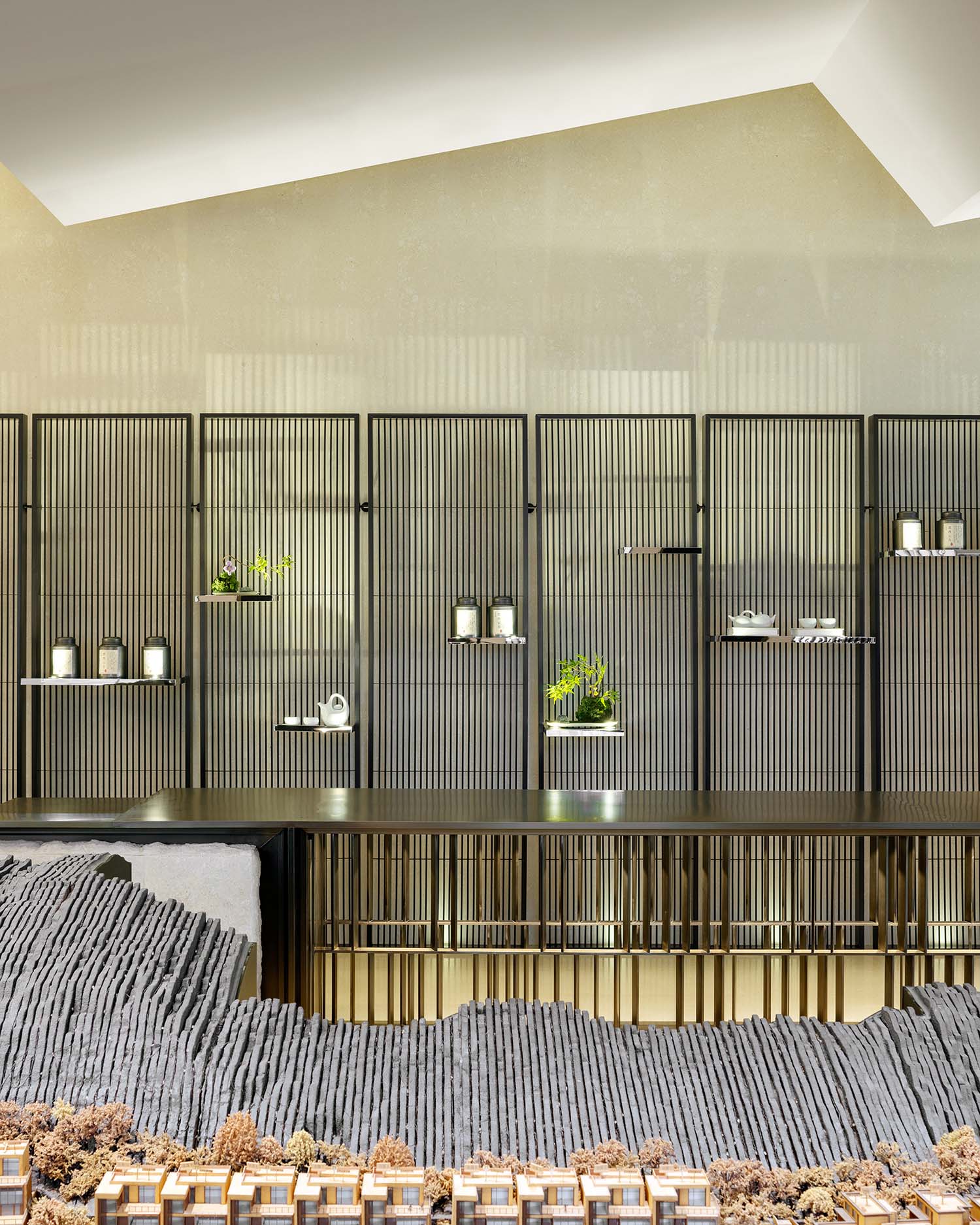
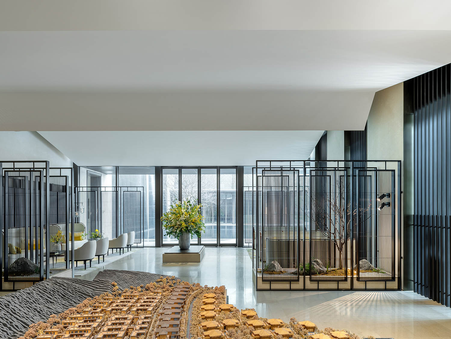
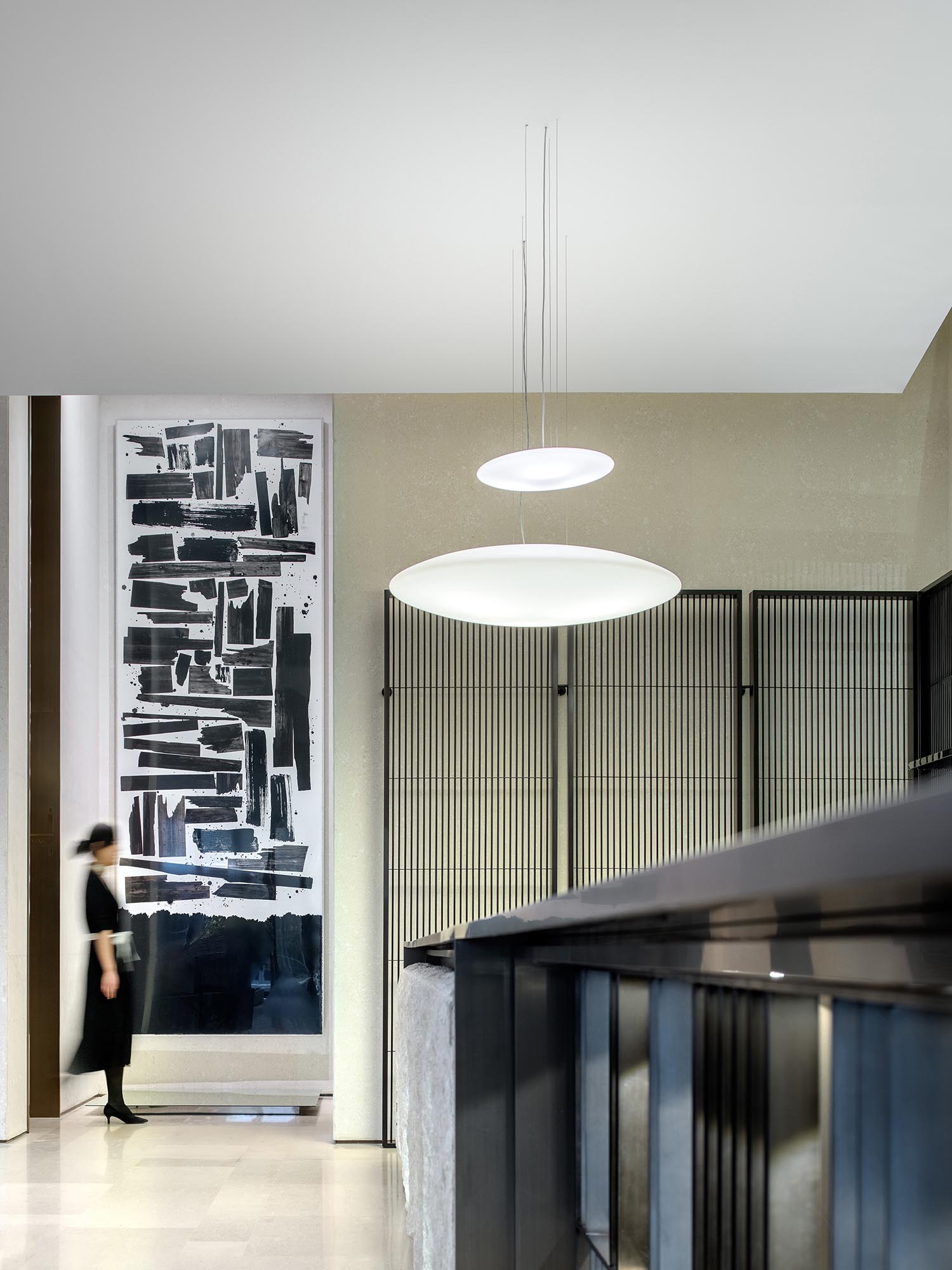
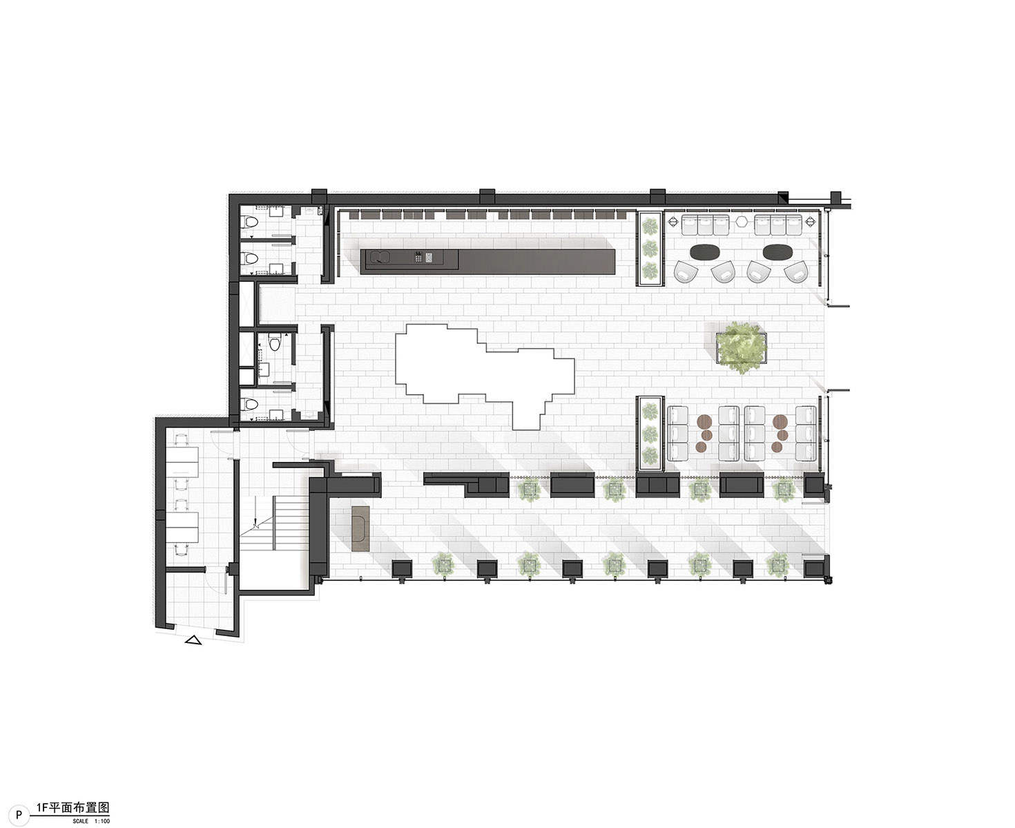
The central hall is divided into 2 parts. The first is the model area, which is flanked by a long bar clad in bush-hammered stone, and a delicate forest of dark metal rods. The composition of the space is formal, with a strong central axis which leads on to the 2nd consultation area, and the external water feature.
One challenged we faced was that the entrance hall is a double height space, with a very impressive scale. When you come into the model hall the ceiling drops to half the height. How to keep the energy of the design?
Our solution was to continue the theme of folding roofs, but on a much greater scale. We created a direction fold inspired by water ripples which flows to the outside. As it reaches the consultation area the fold becomes symmetrical so that it creates the form of a traditional roof above the seating. This establishes a more comfortable and intimate setting above the consultation area.
We designed custom built sofa and seating which responds to the views of the landscape. When you sit with your back to the wall, the seating is high backed and enclosing. Whereas where the seating faces the landscape the sofas are lower to allow all guests views of the garden and landscape.
捕捉風景
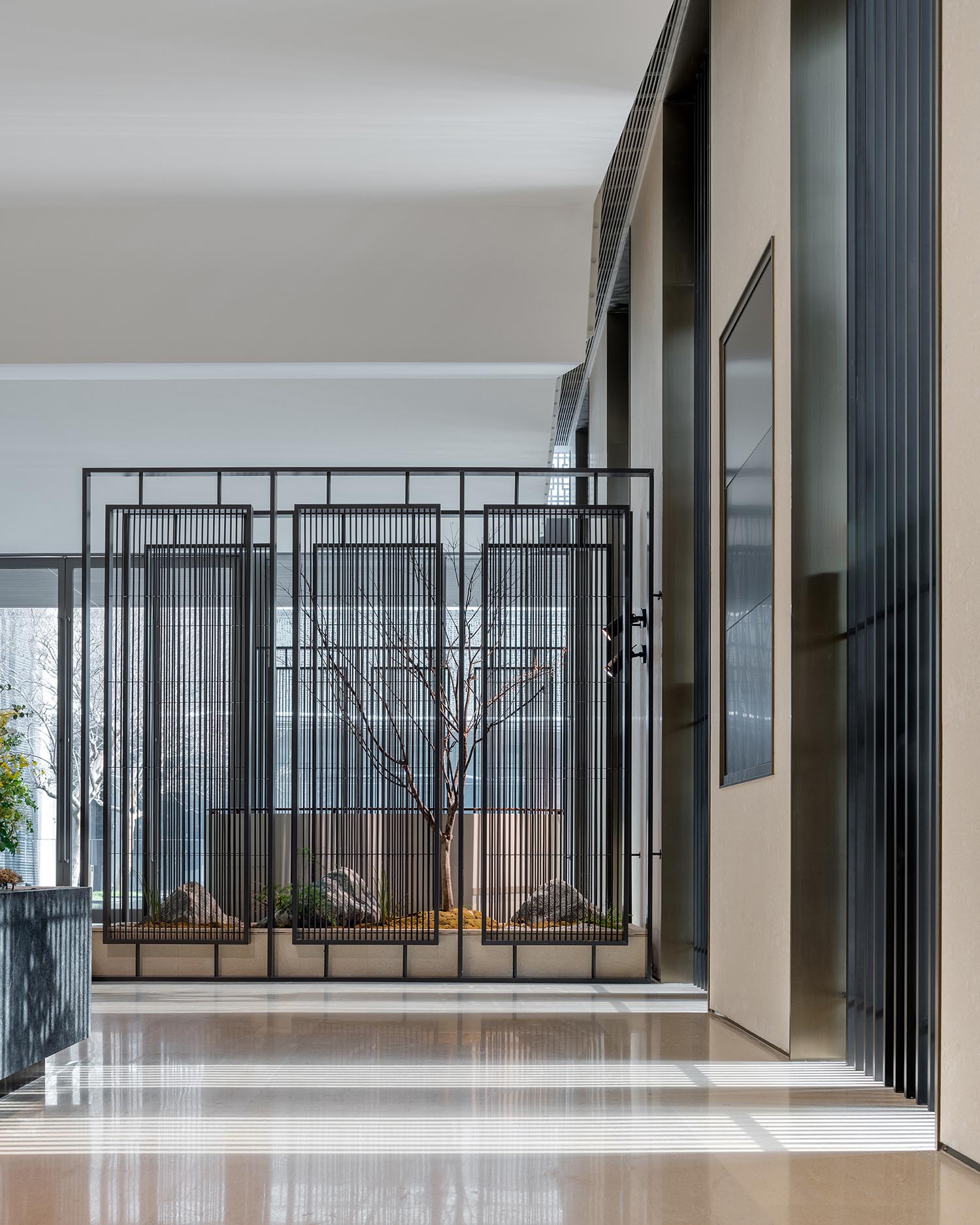
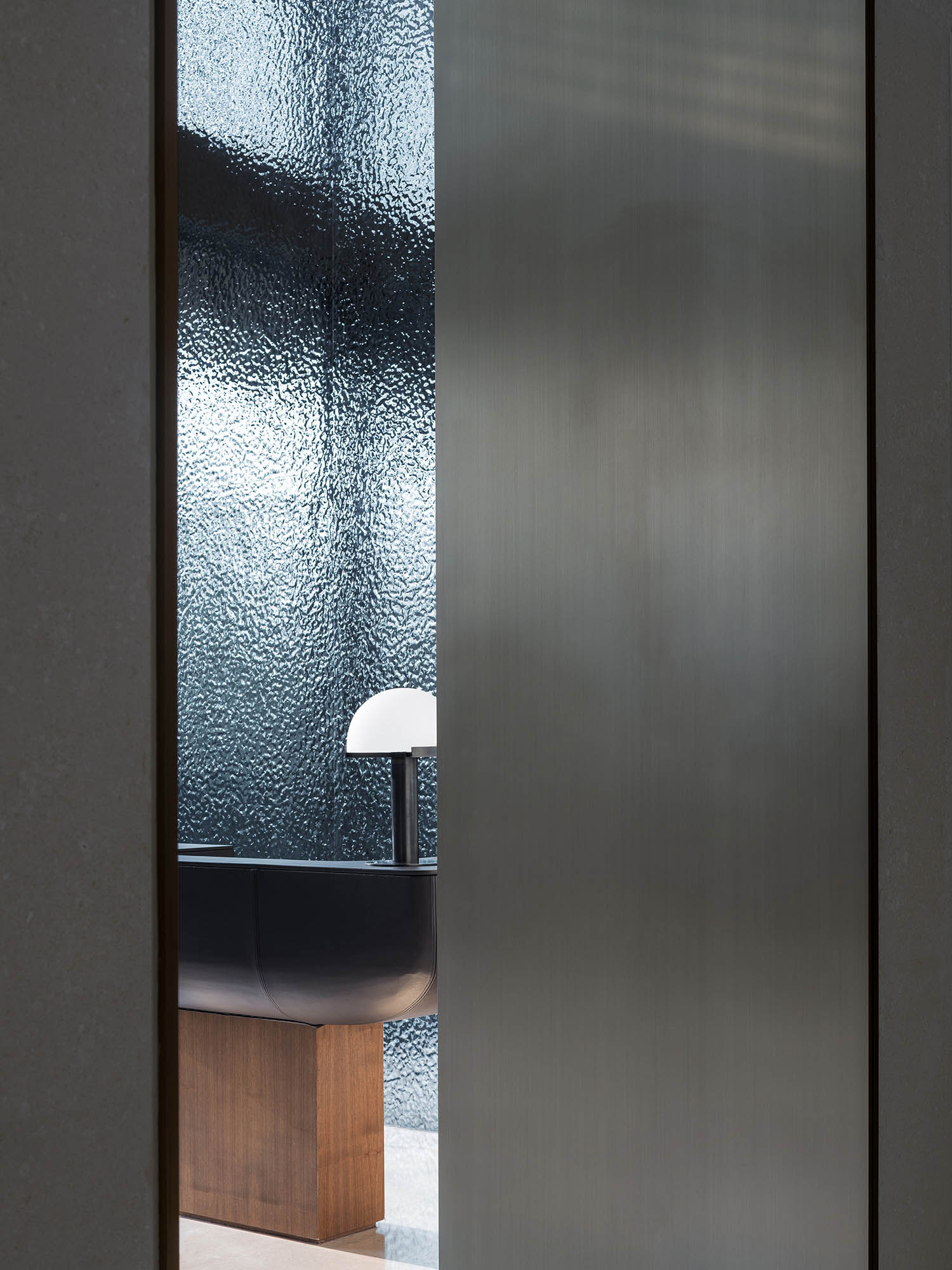
MDO對於捕捉風景這一概念非常感興趣。我們把每一個空間的過渡當作一個可以框出獨特景觀的機會,如創作一副畫一樣。每個捕捉景觀的地方同時安裝了定製的屏風,這些屏風使得觀景的體驗更佳豐富 — 訪客們可以通過屏風看到部分風景並感受到在此之外有更多景觀,因此想要更進一步地探索。從入口大廳處,這些烤漆屏風就創造了使人們往內部和外部看到風景的機會,也從而建立了內部和外部空間與空間之間的關係。
在中央區域的中心部位有一個用烤漆屏風圍繞起來的微景觀。這個微景觀把室外的風景延續到了室內,既成為了一個室內特征,又增加了室內的層次感。
CAPTURING VIEWS
This idea of capturing views is something MDO are very interested in. We see each transition as an opportunity to frame a view, as if to create a painting. This is enriched by the use of screens which allow partial views. The visitor gets a glimpse or a sense of what is beyond, encouraging them to explode further. From the entrance hall lacquered screens permit views in and out, established these relationships between spaces, between inside and out.
In the centre of the main hall a framed garden wrapped in lacquered screens brings the landscape into the building, and creates an element which is both a feature and means to organize and layer space.
建築與室內空間的聯係
MDO對於建築與室內空間的聯係非常重視。事務所的兩位創始人都是建築師出身,因此空間、形態和光影等元素對於我們來說非常重要。我們喜歡室內空間和建築之間的對話,並且探索它們如何可以影響並且改善彼此。這種模糊建築和室內之間界限的概念隻有在對建築和室內都有清晰認知的基礎上才可以達到。
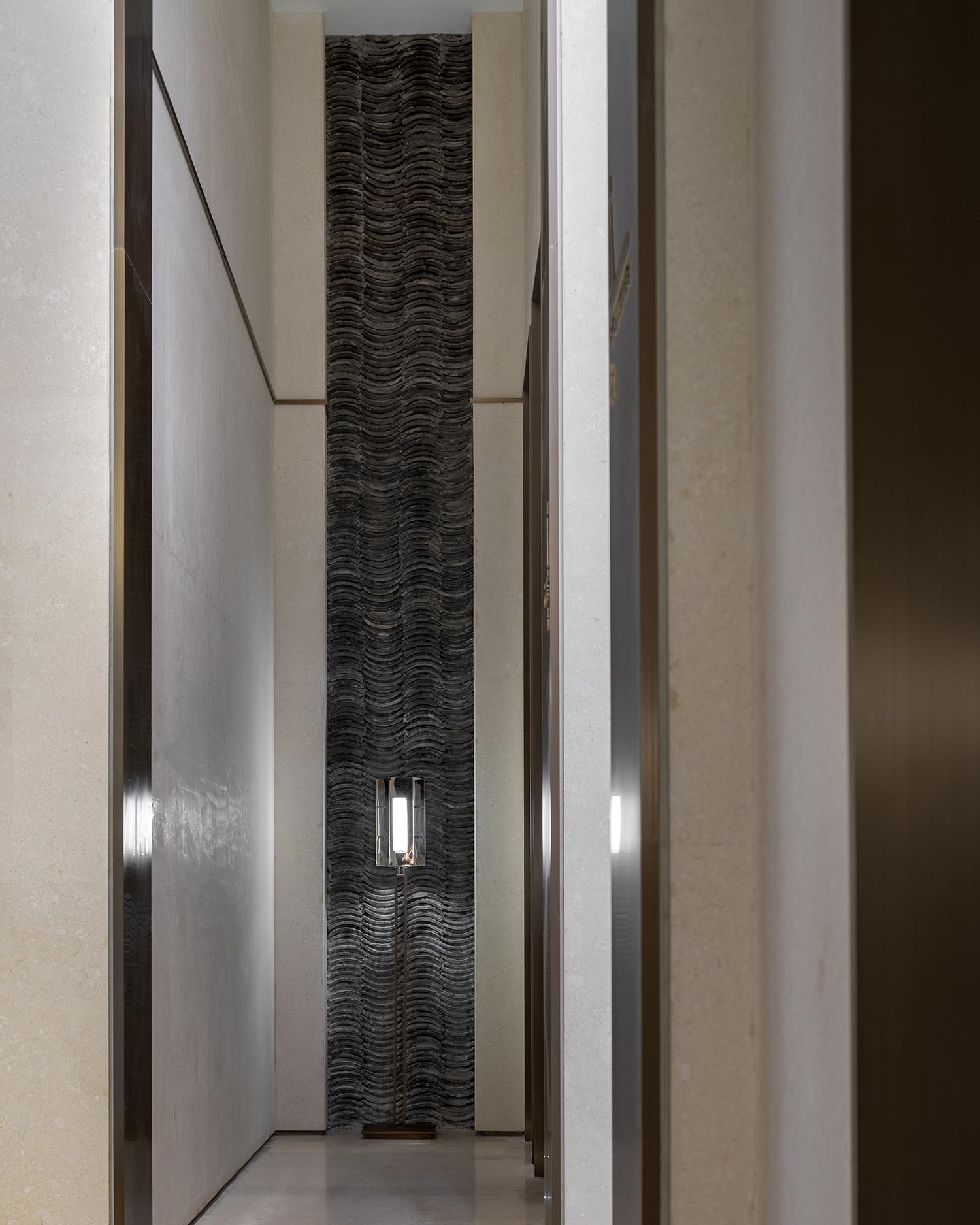
在我們的設計過程中,我們會不斷考慮任何的形態、材質和規模可以在銜接室內和室外空間的時候達到平衡。我們注重每個細節,包括石材的排列,建築立柱與窗框和完成麵的對齊,以及空間之間銜接材料的肌理和特性。每一種關係是否都可以加強訪客們在空間中移動時的感官體驗?
我們的興趣也延伸到了對於自然光與燈光的研究。在入口大廳處,我們想象這些連續的立柱可以被看作是日晷 — 它們的影子一直在動,一日之間可以大廳的地上畫出時刻。在室內,我們運用了隱藏的洗牆燈,從而賦予了沿著淺色石牆的屏風溫柔而有質感的陰影。
RELATIONSHIPS BETWEEN ARCHITECTURE AND INTERIOR
MDO are interested in these relationships because the two founders are both architects who come from a background where space, form and light are very important. We enjoy how interior and architecture interact, how one can inform and improve the other. The idea of a blur between inside and outside, where we can live in both can only be achieved with a clear understanding of architecture and interior.
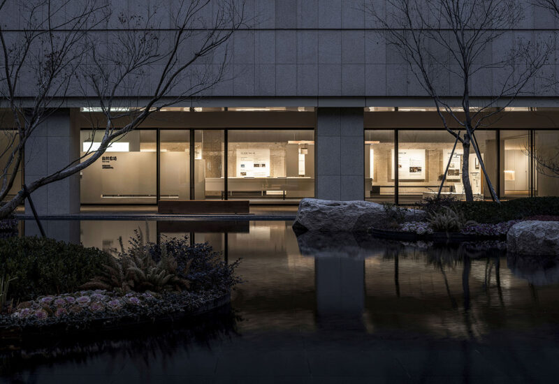
When we design we are always considering how the form, material and scale work inside to out to create a balance. We look every detail, the setting out of stone, the alignment with architectural columns, window frame and cladding, to the physical properties of connecting materials. Can each relationship strengthen the experience that the visitor feels as they move through the building?
This interest continues through to the study of lighting, natural and artificial. In the entrance hall we imagined the columns to behave as a sundial, the shadows constantly changing and drawing the hours of the day across the floor. Inside we used indirect light to wash the walls and create gentle textured shadows playing through the screens which line the light stone walls.
∇ 平麵布置圖 Floor plan
∇ 立麵圖 Elevation
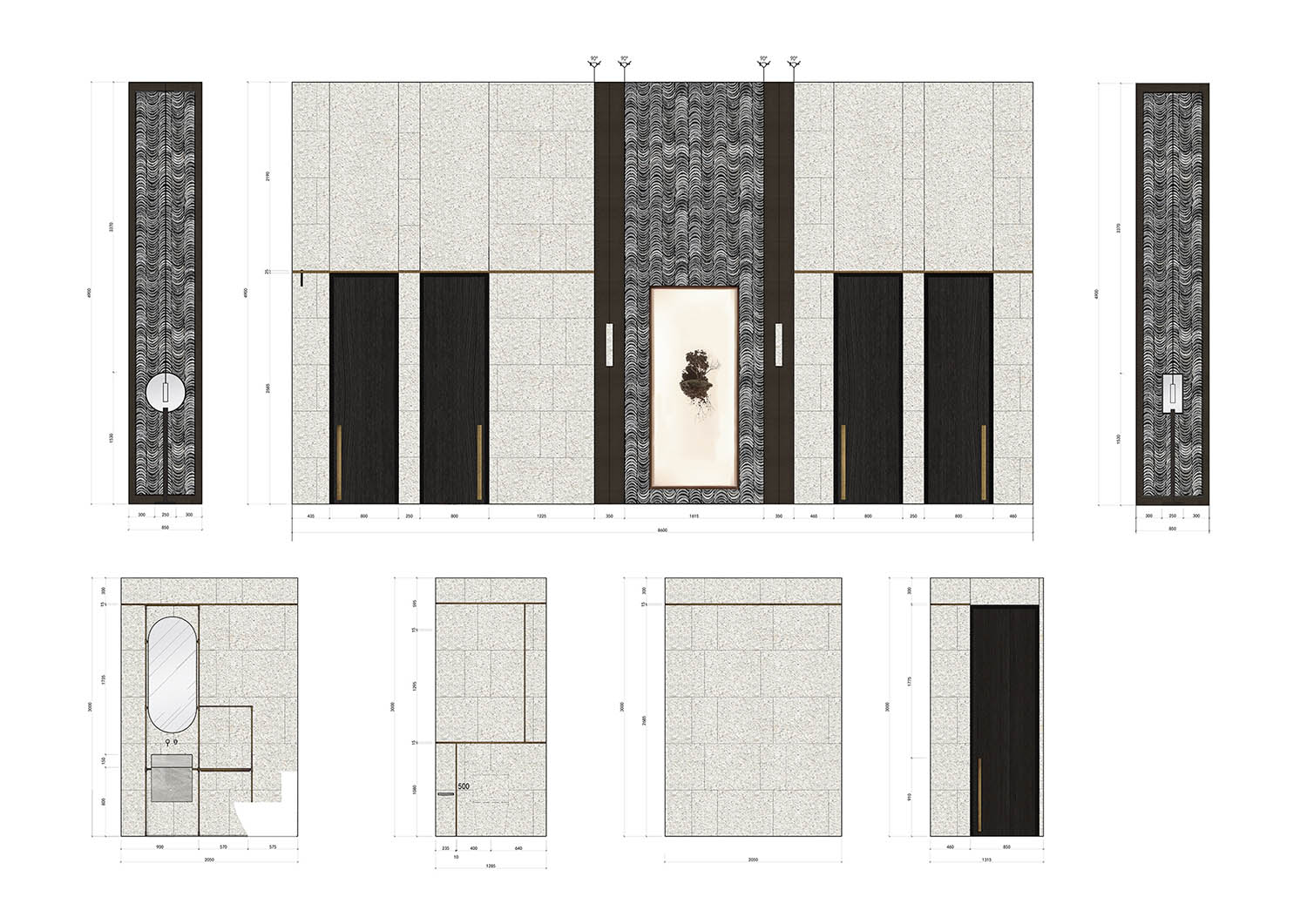
∇ 立麵圖 Elevation
∇ 立麵圖 Elevation
完整項目信息
項目名稱:郡西雲台銷售中心
事務所:More Design Office (MDO) / 木君建築設計谘詢(上海)有限公司
網站:http://moredesignoffice.com/
狀態:2017年11月完成
麵積:400平方米
地址:杭州市餘杭區萬科郡西瀾山郡西雲台售樓處
攝影:隋思聰, Dirk Weiblen
Project Name: Junxi Mountain Villa Sales Centre
Architecture Firm: More Design Office (MDO)
Website: http://moredesignoffice.com/
Status: Completed Nov 2017
Size: 400 sqm
Address: Mountain Villa Sales Centre, Vanke Junxi, Yuhang District, Hangzhou City, Zhejiang Province, China
Photographer: Sicong Sui, Dirk Weiblen


