Self+品牌實體店位於裏約熱內盧波西米亞的社區之一博塔福戈,我們使用了激發品牌靈感的人物角色來創造商店設計的概念。
For the physical store of the label Self+, in Botafogo, one of the most bohemian neighborhoods in Rio de Janeiro, we used the persona who inspires the brand to create the concept of the store design.
角色是一個尋求自我認識並反映她向世界展示自己方式的女性。為了在商店的概念中體現它,家具是模塊化和靈活的,可以根據可用的產品、品牌進行改造和翻新。
The persona is a woman in a search of self-knowledgeand that reflect the way she presents herself to the world. To reflect it in the concept of the store, the furniture is modular and flexible what allows transformations according to theproducts available, brand transformations and renovation.
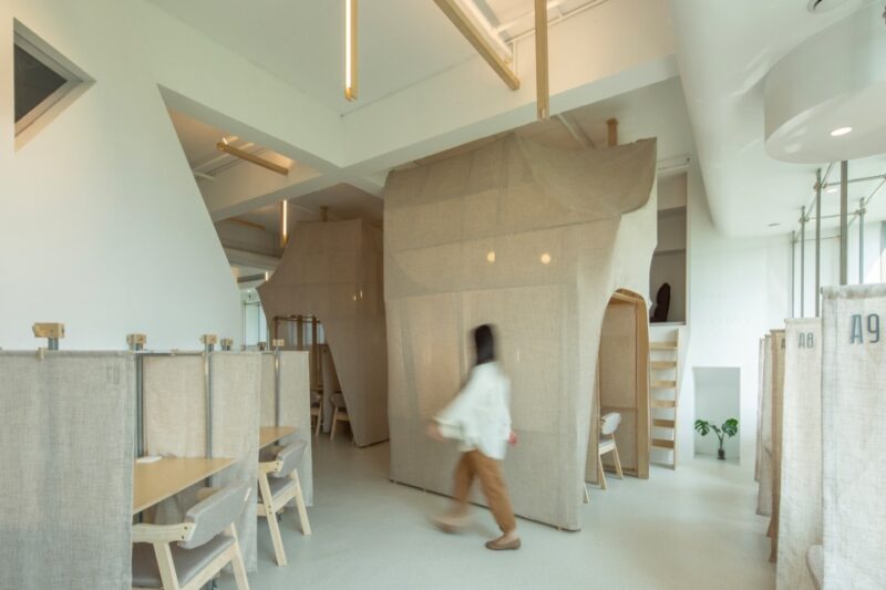
內部是由不同的碎片組成的,就像在不同的旅行中發現的那樣。牆壁上繪有不同顏色的幾何圖形,象征著一個不斷變化的女人。
The inside was build up from separate pieces like they were found in different trips.The walls are painted with geometric forms in different colors as a metaphor for the woman who is always changing.
材料的選擇喚起了回憶和情感,植物也帶來了一種自然的感覺。其中一個衣架呈三角形,體現了和諧與平衡。
The materials have been chosen to evoke memories and affection and the plants bring a touch of nature inside. One of the Clothes Rack has a triangle shape, thatrepresets harmony and balance.
立麵隻有一麵窗戶,可以根據季節、收藏和品牌定位進行改造。左邊是一個客廳,你可以坐在那裏,在書架上換書,或者隻是在等人。
The façade have window only on one side and it can transform conforming to the seasons, the collection and the brand position. On the left a living room was projected where you can seat, change books on the collaborative shelf or just wait for someone.
它是由金屬板製成的,能夠與植物和裝飾元素相結合,而且外觀從不相同,強化了根據新發現進行再創造的概念。
It is made by metal panels that are able to receive plants and decorative elements and never look the same reinforcing the concept of reinvent according to new discoveries.
∇ 立麵圖 elevation
∇ 剖麵圖 sections
完整項目信息
項目名稱:Self+
項目位置:巴西裏約熱內盧
項目類型:商業空間/品牌實體店
完成時間:2018
項目麵積:42平方米
設計公司:Kube Arquitetura
設計團隊:Bárbara Mingozzi, Carolina Magoga, Ivna Reis, Lucia Santoro, Raphaela Fogaça
攝影:João Magnus


