MisterDesign零售展廳作為標誌性城市修複項目的一部分,將消費者與工藝重新聯係起來。
Reconnecting consumers to craftsmanship as part of an iconic city restoration project.
對於MisterDesign furntiure展廳,我們有機會賦予Den Bosch這座獨特的曆史建築一個新的生命。該建築是荷蘭設計的標誌性建築,采用了新客觀性的風格,具有機器般的美感,適合建築物在20世紀30年代作為福特車庫的原始用途。
For the MisterDesign furntiure showroom, we had a chance to give new life to a unique historical building in Den Bosch. The site is a Dutch design icon built in the style of new objectivity, with a machine-like aesthetic suitable for the building’s original purpose as a Ford garage in the 1930s.
今天,作為消費者,我們幾乎失去了與我們購買的產品背後的工藝的聯係。我們的目標是將消費者與每種產品的價值及其在設計創新曆史中的背景重新聯係起來。 我們將MisterDesign定位為一個獨特的故事敘述過濾器,用於展示其產品組合中的標誌性品牌,在前福特車庫的功能主義建築中注入工藝理念。
Today, as consumers, we’ve almost lost the connection with the craftsmanship behind products we buy. Our goal was re-connect the consumer with the value of each product and its context in the history of design innovation. We positioned MisterDesign as a unique storytelling filter for showcasing the iconic brands in their portfolio, infusing the idea of craftsmanship in the functionalist architecture of the former Ford garage.
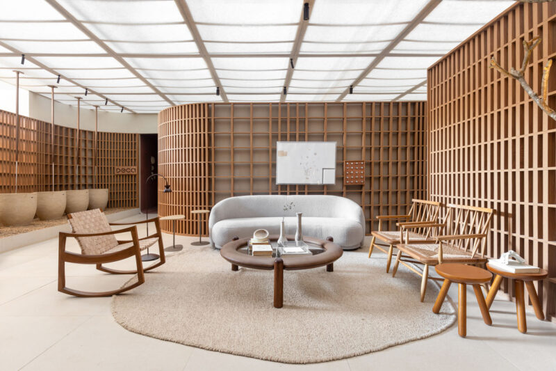
我們的方法是研究製造與工藝的主題。我們創建了一個“創新平台”,擱板展示了隨著時間的推移而改變設計形狀的標誌性作品。該平台采用彎曲的膠合板,這是那個時代手工家具的一種典型形式。一堵彎曲的橡木牆,飾以四分之一截的染色橡木,並包裹著平台和擱架,有意喚起一種傳統的感覺。
Our approach was to study the themes of manufacturing vs craftsmanship. We created an ‘innovation platform’; shelving that showcases iconic pieces that have changed the shape of design over time. The platform uses bent plywood, a characteristic form of crafted furniture pieces from the era. A curved oak wall, veneered in quarter-cut stained oak, wraps the platform to envelope the shelving displays, intentionally evoking a feeling of heritage.
完整項目信息
項目名稱:MisterDesign
項目位置:荷蘭Den Bosch
項目類型:商業空間/零售展示廳
項目麵積:2000平方米
使用材料:橡木
設計公司:Studio 34 South
攝影:Nina van Ewijk


