S / LAB10為Mantab集團位於馬來西亞吉隆坡的新辦事處創造了大膽的設計。包括對現有平房的全麵內部改造——團隊在為馬來西亞吉隆坡的這家當地房地產開發公司確定最終設計方案時,需要設計一個能夠應對東南亞氣候和本土化的辦公室/工作空間。該公司不僅需要為其不斷壯大的團隊提供一個工作空間,還需要一係列的空間來招待和招待他們的客戶。因此,現有的單體,多層住宅被改造成一個有魅力的企業中心,將商務與休閑無縫結合。
S/LAB10 created the bold design for the Mantab Group’s new offices located in Kuala Lumpur, Malaysia.Comprising a complete internal overhaul of an existing bungalow—the team was required to re-examine the office/workspace typology in a Southeast Asian climate and locality for a local property development company in Kuala Lumpur Malaysia in producing the final design scheme. The firm required not just a workspace for its growing team, but also a series of spaces for hosting and entertaining their clients. As such, the existing single unit, multi-story former residence was transformed into a gleaming corporate hub for a private entity that seamlessly integrates business and leisure.
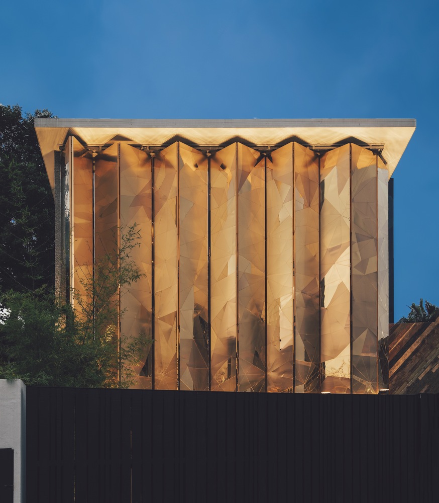
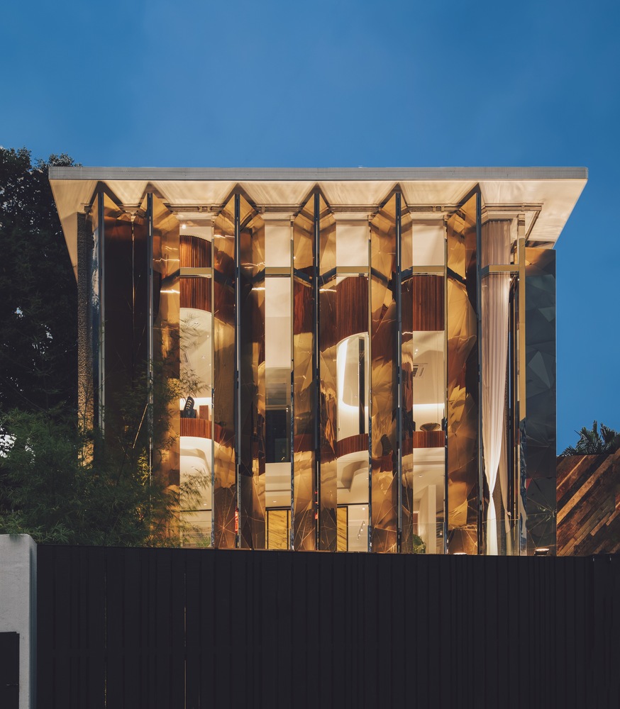
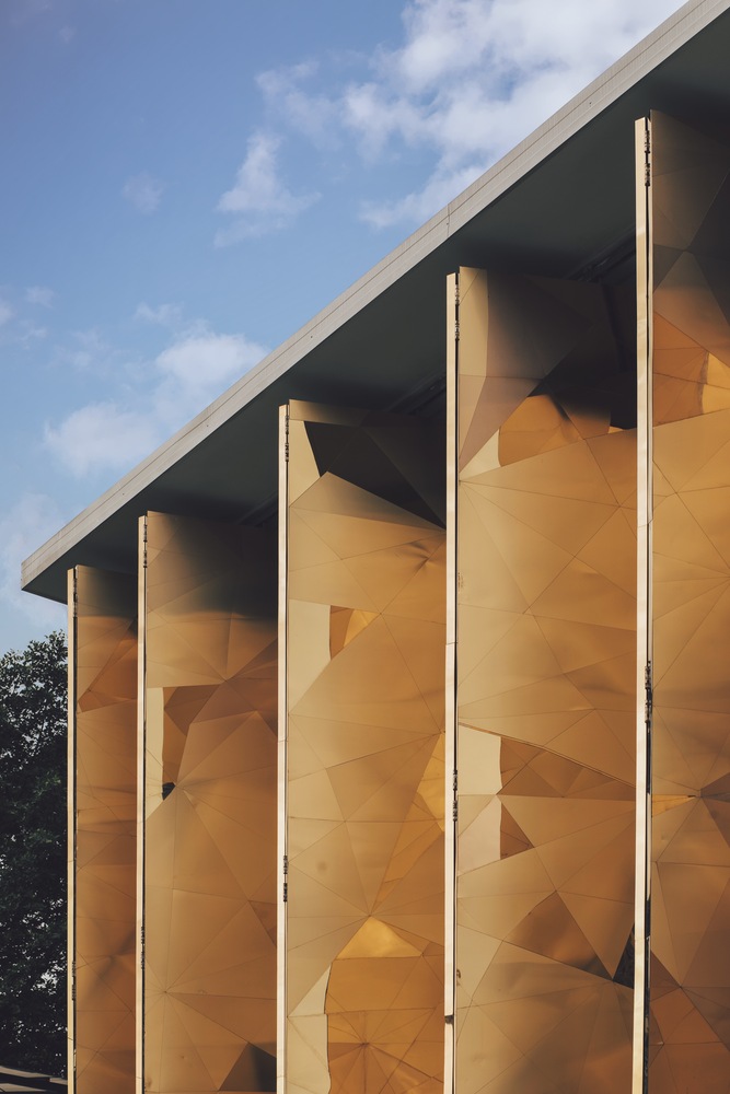
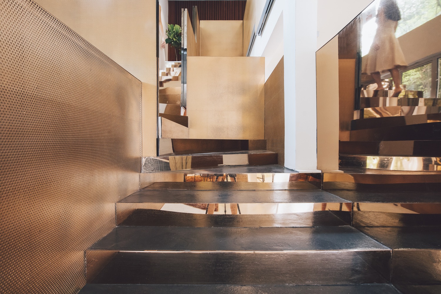
Mantab Workplace特別引人注目的是它閃閃發光的造型大膽的外觀。在安靜的郊區街道上若隱若現,金銅合金立麵從建築的一層升起,隱蔽地保護著內部。啞光和高拋光金銅合金的三角麵表麵看起來是隨意的,但其實是根據公司的名稱和品牌設計出來的。從馬來語翻譯過來,“mantab”意味著堅固; 不可動搖的誠信。設計師將企業名字的含義與鑽石的堅硬聯係起來,鑽石每一個切麵都不相同,卻有著無可挑剔的剛硬之美。同時受到本地折疊鐵百葉窗的啟發,其金銅合金包層折疊板是鉸接和可操作的。無論是半關閉的角度與內部向外窺視其郊區的範圍,還是完全關閉的隱私和遮擋熱帶光,外立麵是引人注目的和迷人的,它引發了好奇心,留下許多遊客在猜測什麼在裏麵。
What stands out in particular in Mantab Workplace is its gleaming bold façade. Looming over the quiet suburban street, the gold-copper alloy façade rises up from the building’s ground level in shielding its interior furtively. The triangulated facets of the matte- and highly polished finishing of gold-copper alloy are seemingly arbitrary–but in essence are conceptually extrapolated from the corporation’s name and brand. Translated from Malay language, “mantab” means solidity; an unshakeable integrity. The designers likened this to the hardiness of a diamond—with no single facet on the jewel alike, yet abound with impeccably hardy beauty. Inspired as well by the Malaysian shophouse vernacular of folding iron shutters, the gold-copper alloy clad folding panels are hinged and operable. Whether angled half-shut with its interiors peeking out to its suburban extents, or closed in entirety for privacy and to keep out the glare of tropical light out—the façade is eye-catching and captivating, with the allure of it leaving many a visitor guessing what lies within.
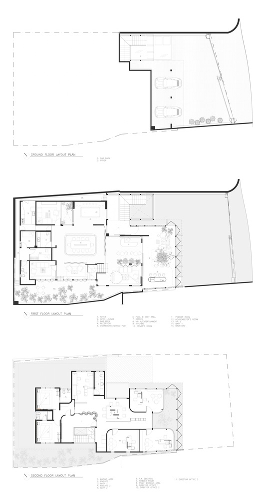
設計要求非常特殊:在建築內部設計一係列的空間,滿足從商業到社交的不同用途。因此,S/LAB10的任務是改變和挑戰辦公空間的標準。新設計的方案包括公司三位主管的辦公室、一個展覽空間和許多用來接待客戶的休閑區域。設計團隊試圖設計一個不僅能滿足上述要求,並且功能實用、具有視覺衝擊力的綜合性設計方案。項目保留了建築原有的基本結構(這個結構非常有助於處理場地自然陡峭的斜坡)。這是一個精巧整合了體量,對比性表麵、材料、肌理以及用途和複雜細節設計的空間。在現有結構框架中,表麵及體量元素的處理手法,在充滿力量及感官刺激的空間體驗和貫穿始終的設計語言中,達到了極致。自信、醒目的建築表現形式和對客戶而言充滿識別性的布置,被謹慎地容納到現有建築之中。
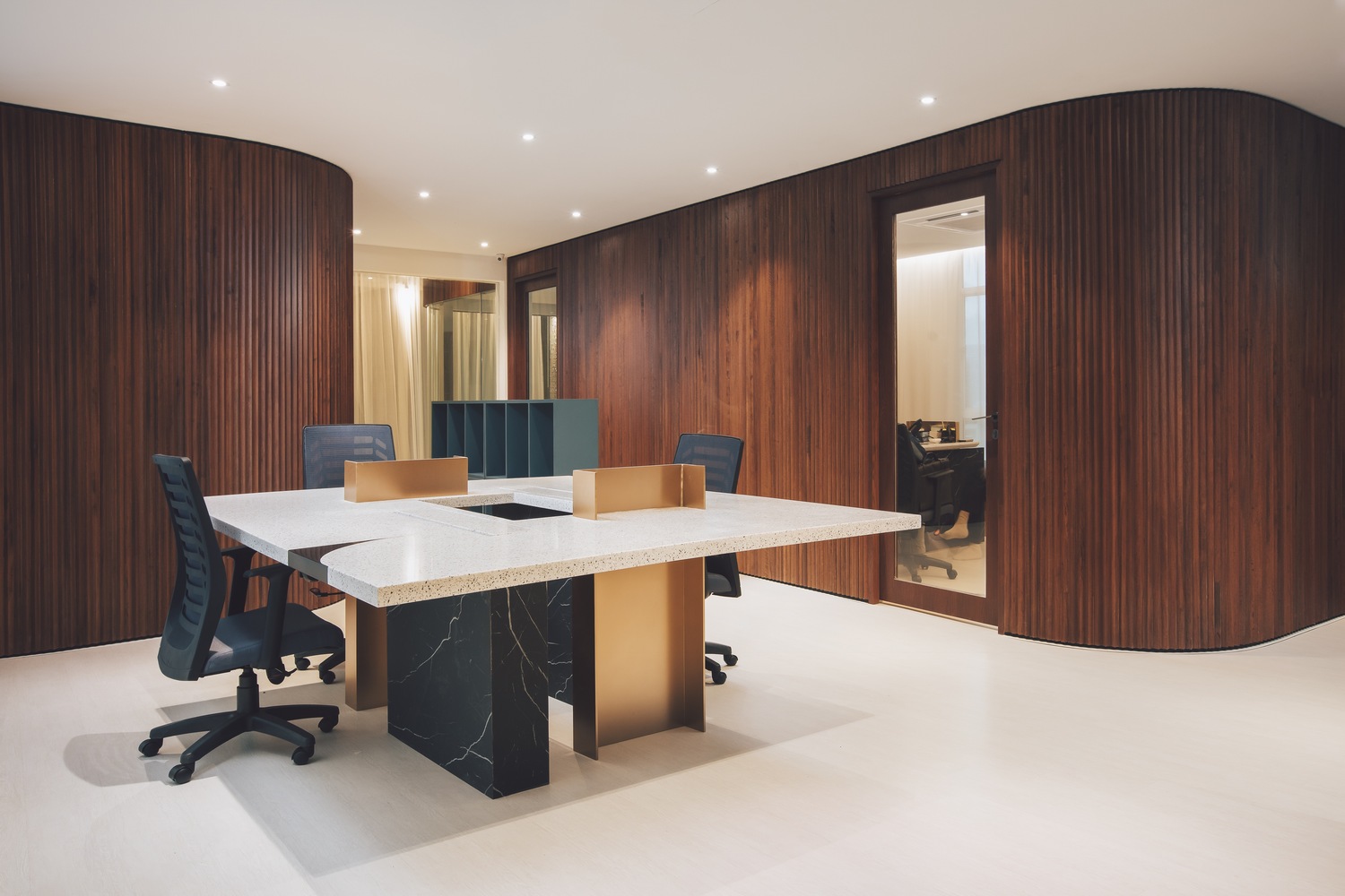
The design brief was unusual: to create a series of spaces within the building to suit a variety of purposes that ranged from business to social. Thus, S/LAB10 was tasked to revise and challenge the norms of an office typology. The new program was to include offices for the company’s three directors as well a display gallery and numerous leisure spaces for hosting clients. The team sought to fulfill the client’s requirements by delivering a design that not only re-worked the aforementioned, but also resulted in a comprehensive design scheme that was both visually striking and practical in its function. The project inherits the house’s basic structure (which proved advantageous in dealing with the site’s naturally steep incline). In place, is a dexterous play of cantilevering volumes, contrasting surfaces, materials and texture, as well as the considered use and design of intricate details throughout. The consolidation of the building’s existing structural framework with a bold play of surface and volumetric elements culminates in a strong, sensual spatial experience and language throughout. And subsequently, a confident, bold architectural presence and visual identity for the client prudently set within the existing building’s typology.
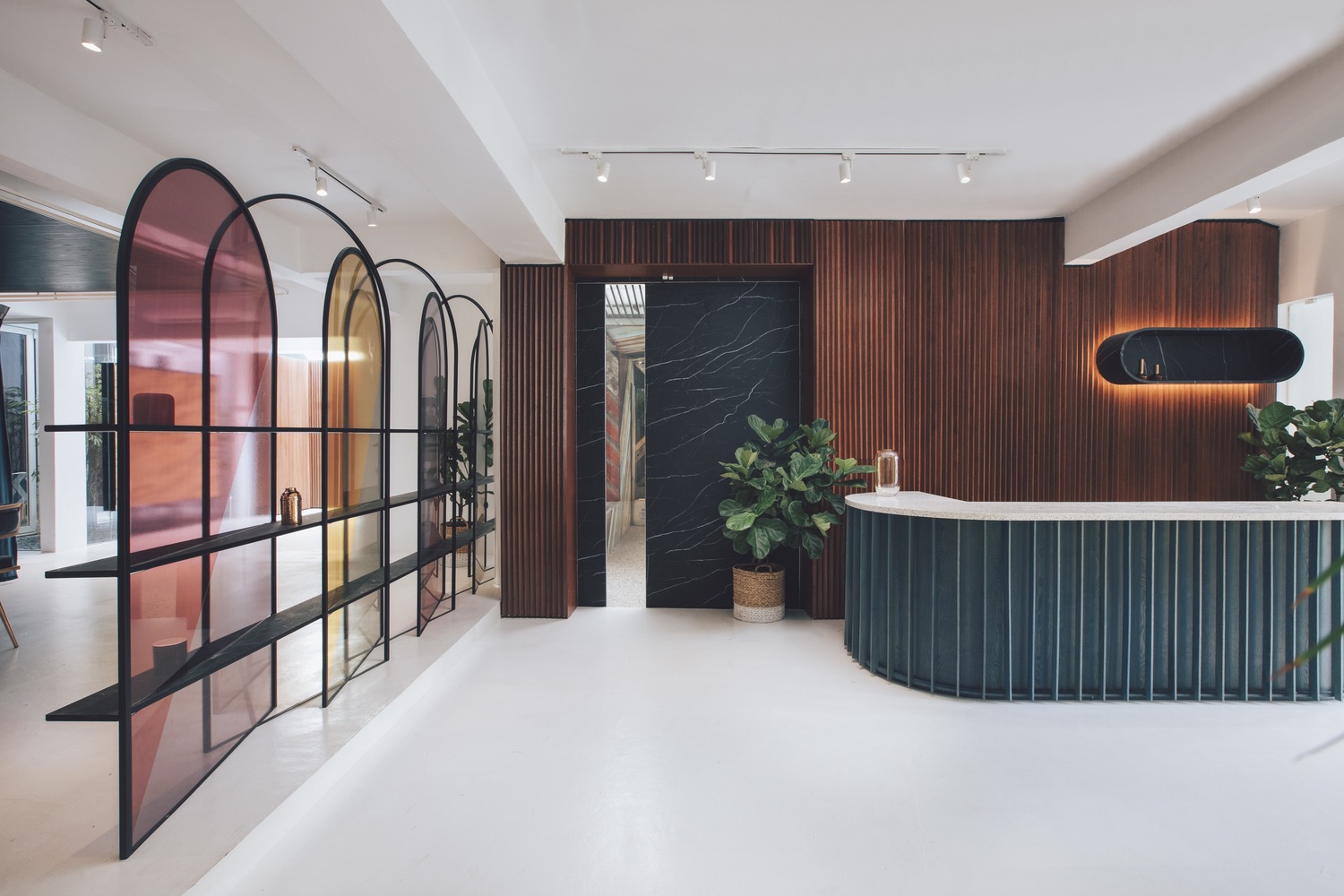
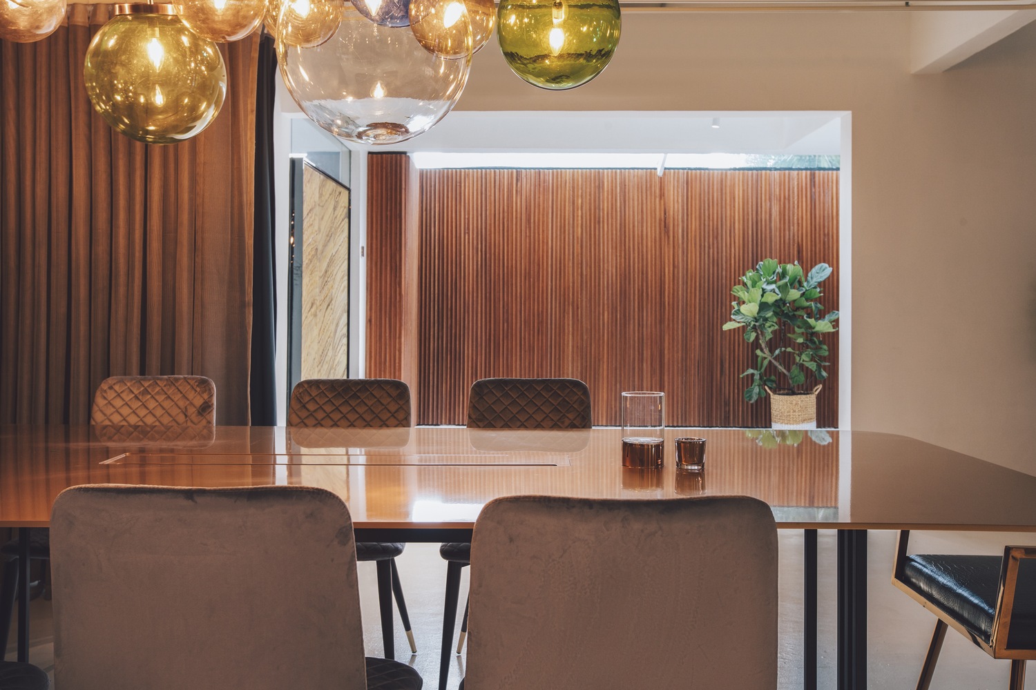
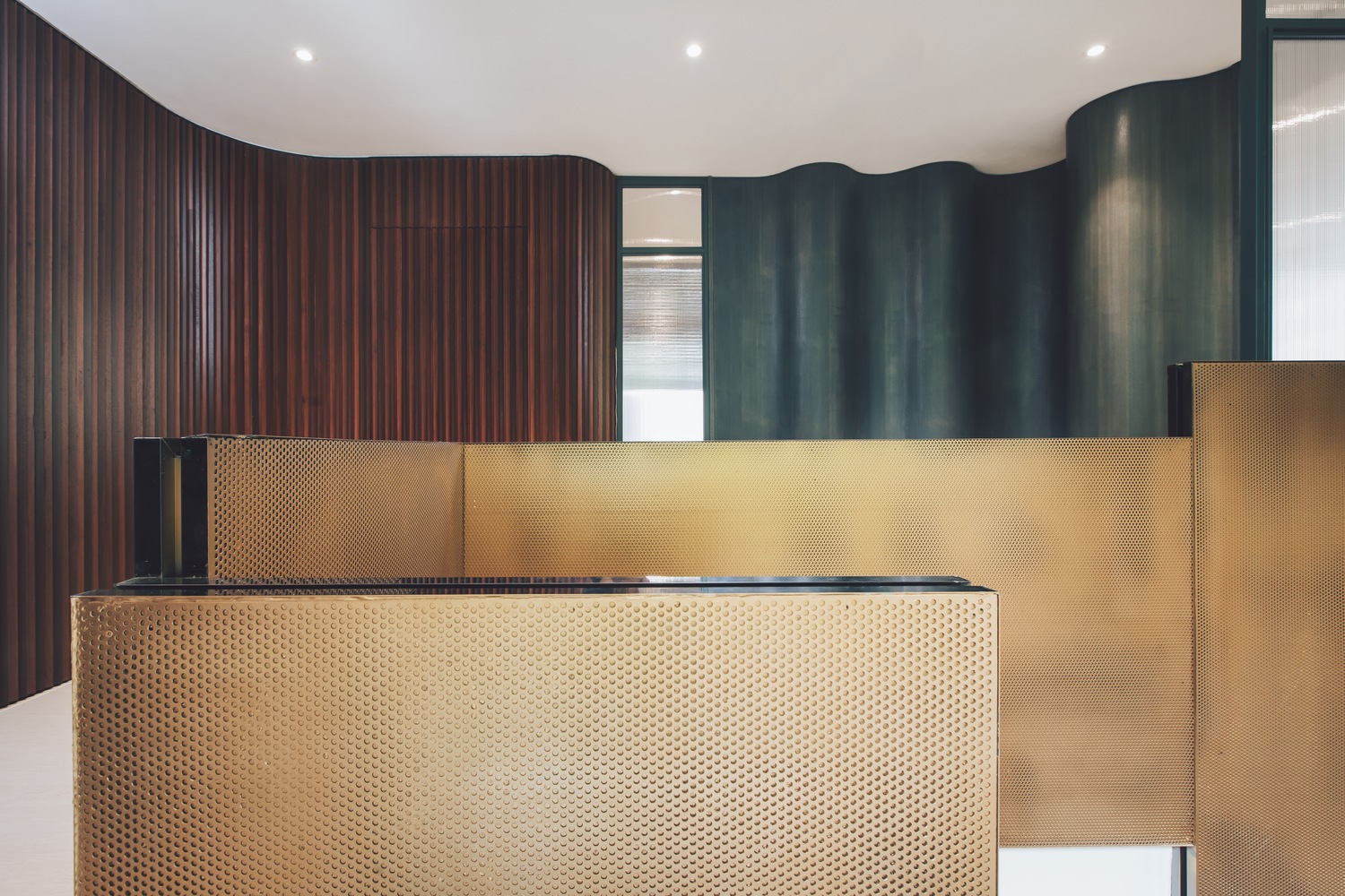
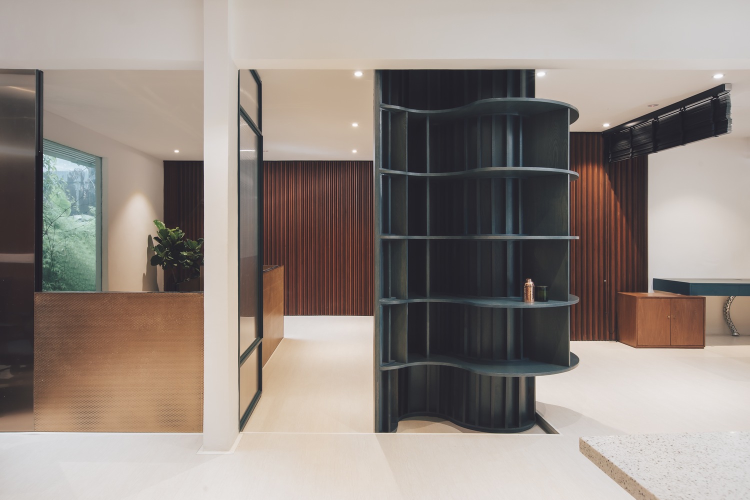
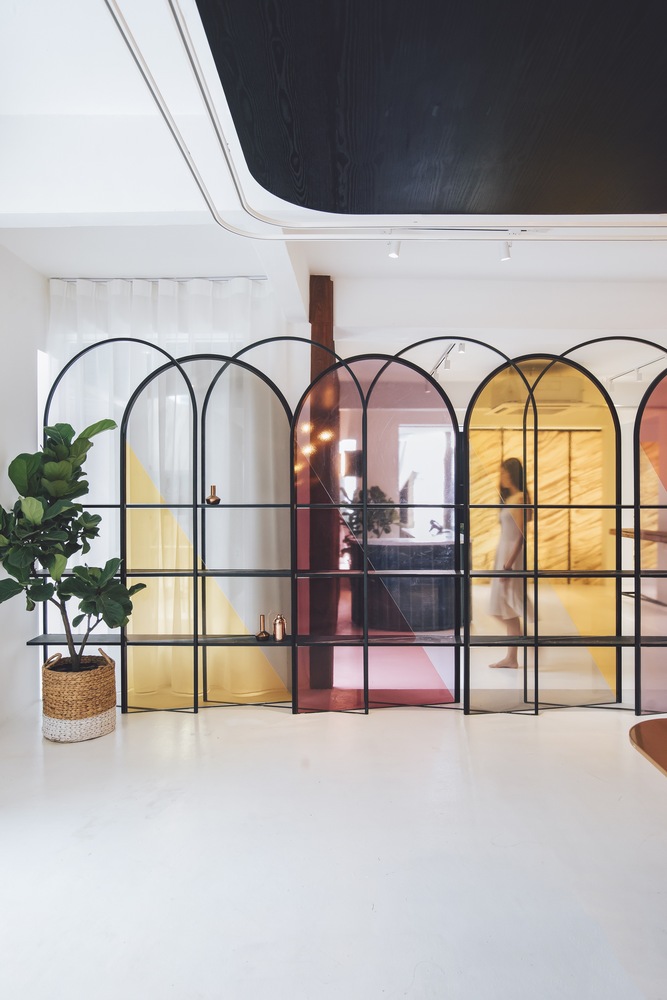
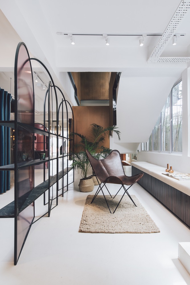
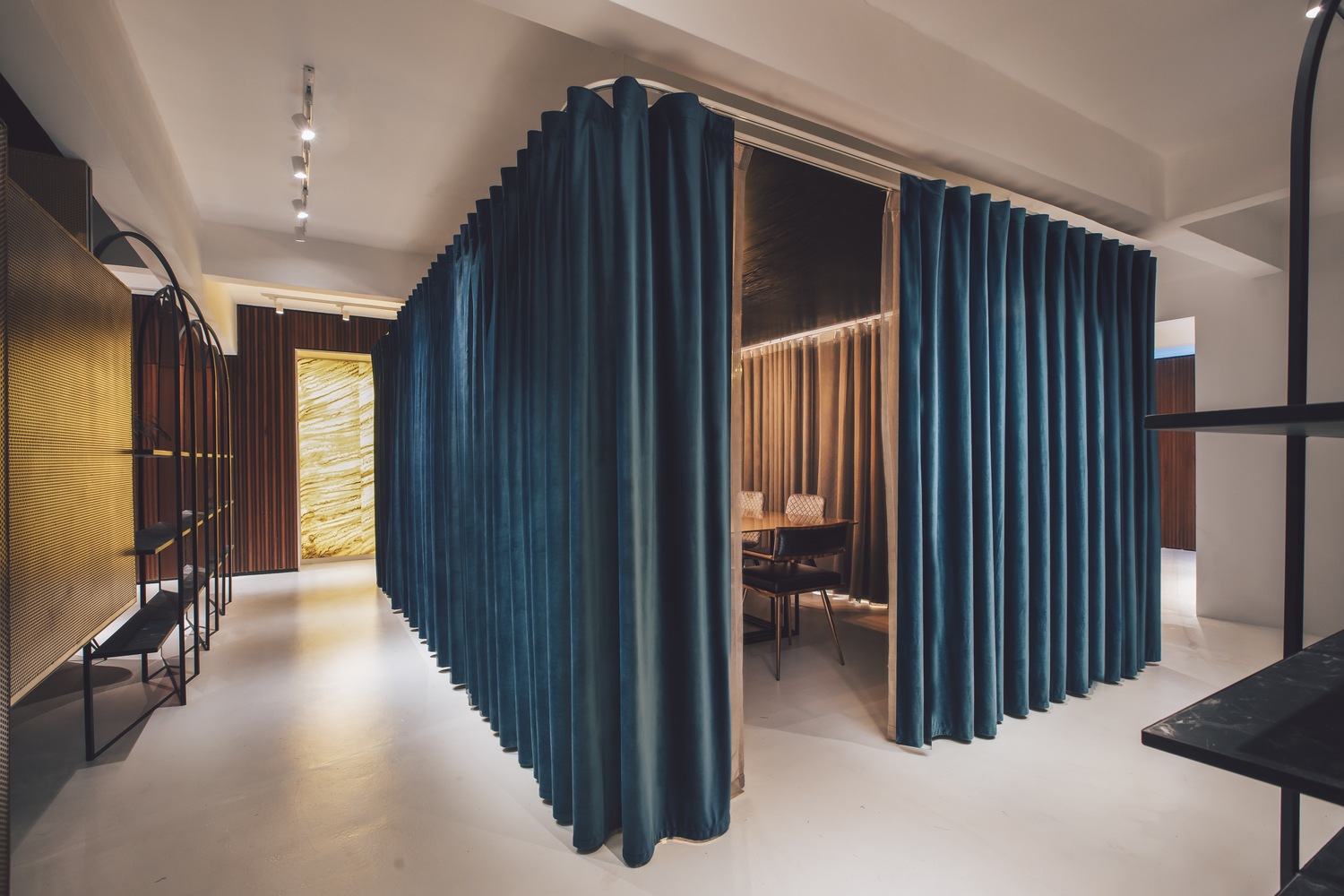
在滿足業主特殊而複雜要求的過程中,S/LAB10團隊意識到項目的關鍵性挑戰是設計一個簡單的空間方案,但能夠滿足複雜的要求。對比是設計師在達成設計要求時所采用的關鍵設計策略。這是一個大膽有序的對比主題,或者如設計師所說,是一種“有意識的非匹配性”,這一策略貫穿了整個空間設計,如在空間體量處理,顏色、紋理、材料的對比,特別是在定製的細部構造中。設計師在空間劃分、設計策略和元素方麵都進行了細致地思考。典型的例子是二層空間(使用了白色環氧樹脂地板)中央的會議室,會議室四周用厚重的翡翠綠色窗簾圍合,在不使用會議室時,窗簾完全打開,形成一個中心開放的靈活空間。空間邊界處一對細長框架的半透明拱形屏風,進一步開放了空間。這些半透明屏風設計獨特、細節精致,柔和霓虹色的麵板安裝在纖細的黑色鋼框中,可以作為展示架。從不同的方向看,屏風可以產生不同的效果,增加了空間趣味性和層次感,有時,半透明屏風層層重疊,色彩和輪廓與後部材料及裝飾融為一體,產生一種獨特的景象。
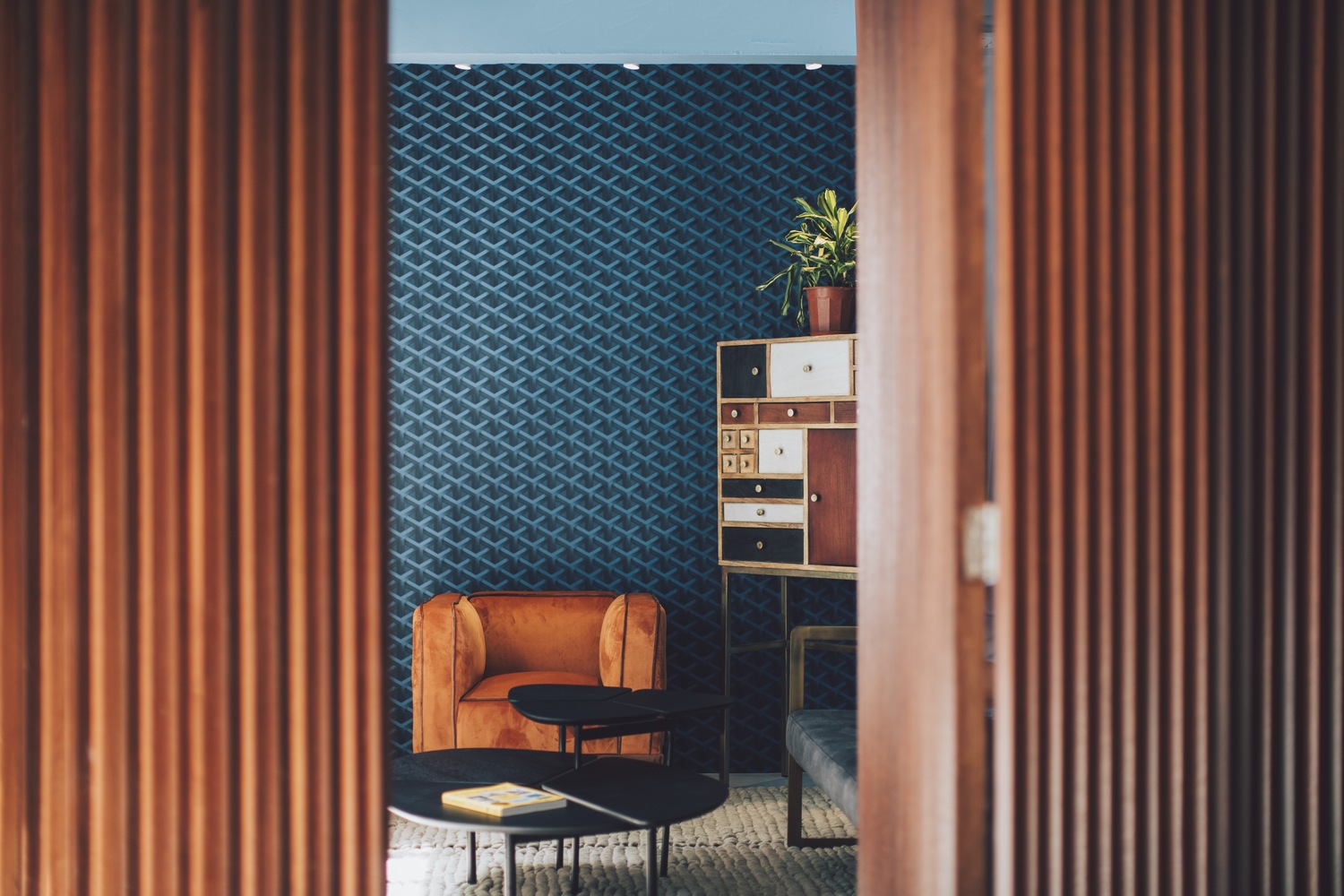
In fulfilling the client’s unique hybrid brief, the team at S/LAB10 recognized the brief’s key challenge: delivering a spatial scheme that was simple in nature, but suitably addressed the brief’s complex demands. Contrasts was a key design strategy employed by the designers in approaching this brief. A strong theme of bold yet methodical contrasts, or as the designers put it: “intentional mismatches”, is evident throughout, as articulated in the design’s volumetric handling of spaces as well as the contrasting play of colors, textures, materials and, in particular, its complementary custom detailing. The division of spaces are carefully considered, as were the design strategies and elements involved in this. One such example is the centrally positioned conference room on the white epoxy-floored first level. The room is surrounded by heavy but lush emerald-green privacy drapes. Left open when not in use, the curtains provide a flexible use of space that opens up the heart of the level rather than further segmenting it. On its borders are a pair of slender-framed, arched translucent screens that further aid in framing the open space. Uniquely designed and detailed for the scheme, these translucent panels of varying soft neon hues are encased in a thin black steel frame that double up as feature display shelves and add visual interest and depth to the space when viewed from different orientation derive different outcome, at times stacking of multi-layer colors or silhouette of translucent color foreground merged with the background surrounding materials and finishes.
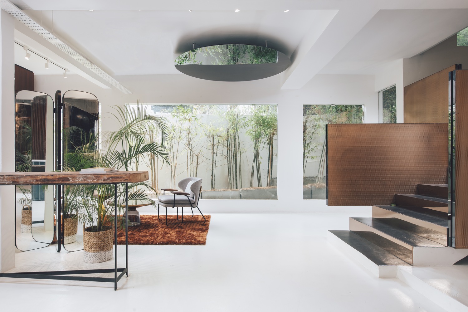
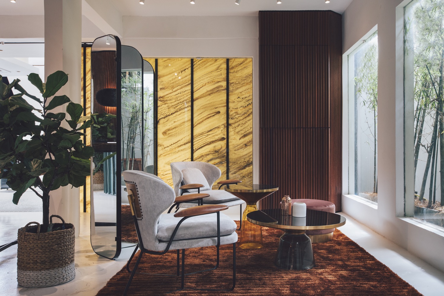
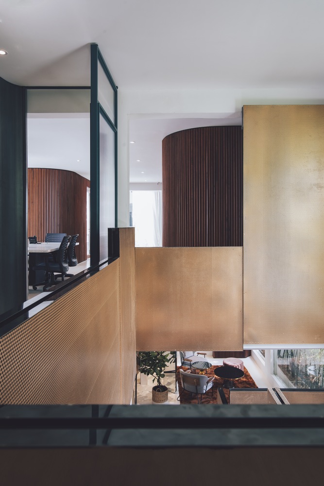
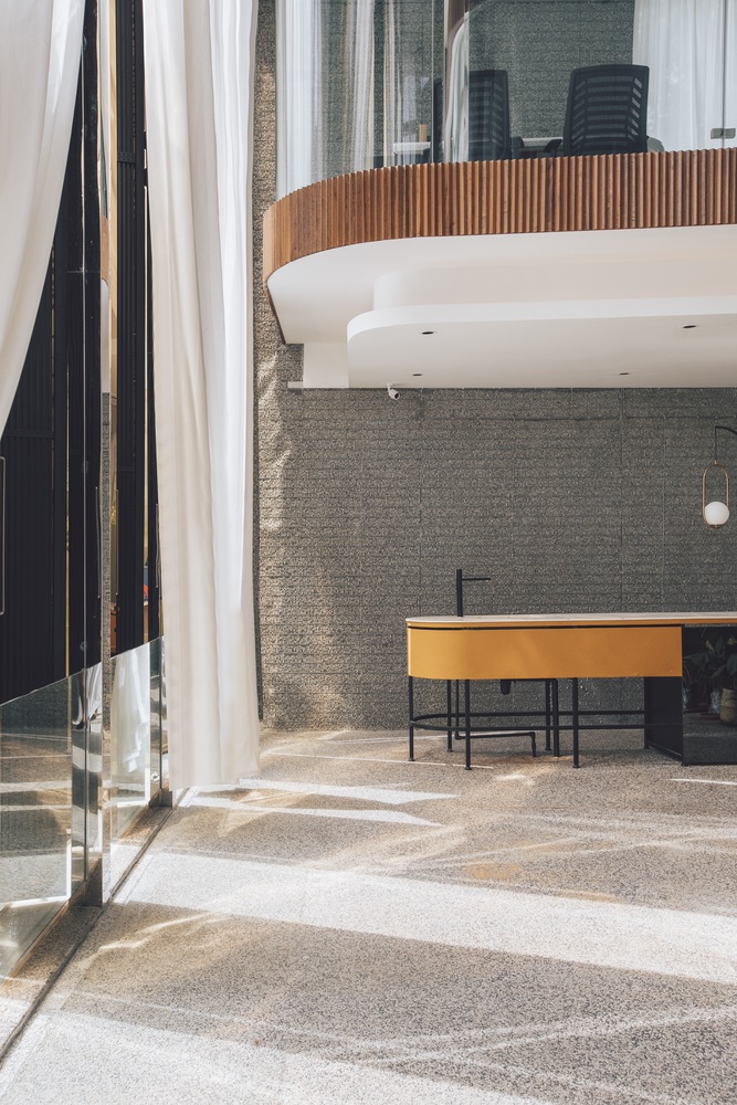
建築上部兩層空間使用了可移動的明亮金色銅窗框。關閉後,寬闊的金色銅窗框隱藏在高高的玻璃幕中,為後方的休息廳騰出空間。在這個空間的左側是一個輕盈的木製體量,作為主入口標誌並平衡整個立麵。這個突出結構采用當地再生木材製造,在尺度上與立麵形成對比並產生一種戲劇效果。設計師說:“我們想創造一個沉浸式的空間,提高人們進入空間的感知和體驗。”兩層高的舒適休息廳上方,是玻璃結構的主管辦公室。在自然光線的照射下,辦公室和休息廳都籠罩著一層柔和、溫暖的光芒。沿著建築的西南邊緣,設計師在二層設計了一個室外綠色露台,名為“竹露台”。借助這種設計,自然和戶外為精致的室內增添了微妙的特質。設計師通過創造性探索各種複雜的體塊、空間布局以及多種手工定製的細部,成功塑造了一係列既具有私密性又具有開放性的工作和休閑空間,人們可以自然輕鬆地從一個空間進入到另一個空間。
In another instance, the top two floors of the building are prominently cast in operable bright gold-copper alloy panes. Once shut, the broad gold-copper panes make way for a spaciously appointed lounge beyond, concealed behind tall curtain glass panels. To the left of this is a slighter single timber-clad volume—this marks the main entrance and balances the entirety of the façade’s composition. Contrasting in size and clad with locally sourced recycled timber, the protrusion was designed for dramatic effect. “We wanted to create an immersive volume in which to heighten one’s sense and experience of space to highlight their entry into the building,” the designers note. Hovering over the ensconced double-height lounge space are the glass-encased directors’ offices. Generously washed with natural light, the offices and lounge are cast in a soft, warm glow. Along the south-western edge of the building here, the designers have incorporated an outdoor green terrace—dubbed the “bamboo terrace”—on the first floor. In doing so, nature and the outdoors are a subtle feature that complements the scheme’s sleek corporate interior. By creatively exploring various complex configurations of volume and space with their respective custom crafted details, the designers have successfully composed a series of work and leisure spaces, both private and open, that flow effortlessly from one to the other.
完整項目信息
項目名稱:Mantab Group Offices
項目位置:馬來西亞吉隆坡
項目類型:辦公空間/商務休閑風
完成時間:2019
設計公司:S/LAB10
設計團隊:Jason Sim, Hao Wang, Fion Hsu & Liz Siew
攝影:Heartpatrick





![[4K] 2.1G 虛空之美-100個日式庭院](http://www.online4teile.com/wp-content/uploads/2023/09/1_202309111611111-8-414x550.jpg)
