LOFT中國感謝來自 萬社設計 的商業項目案例分享:
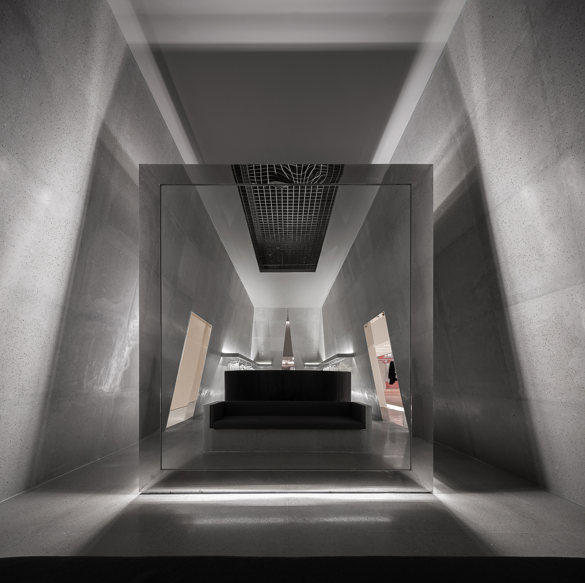
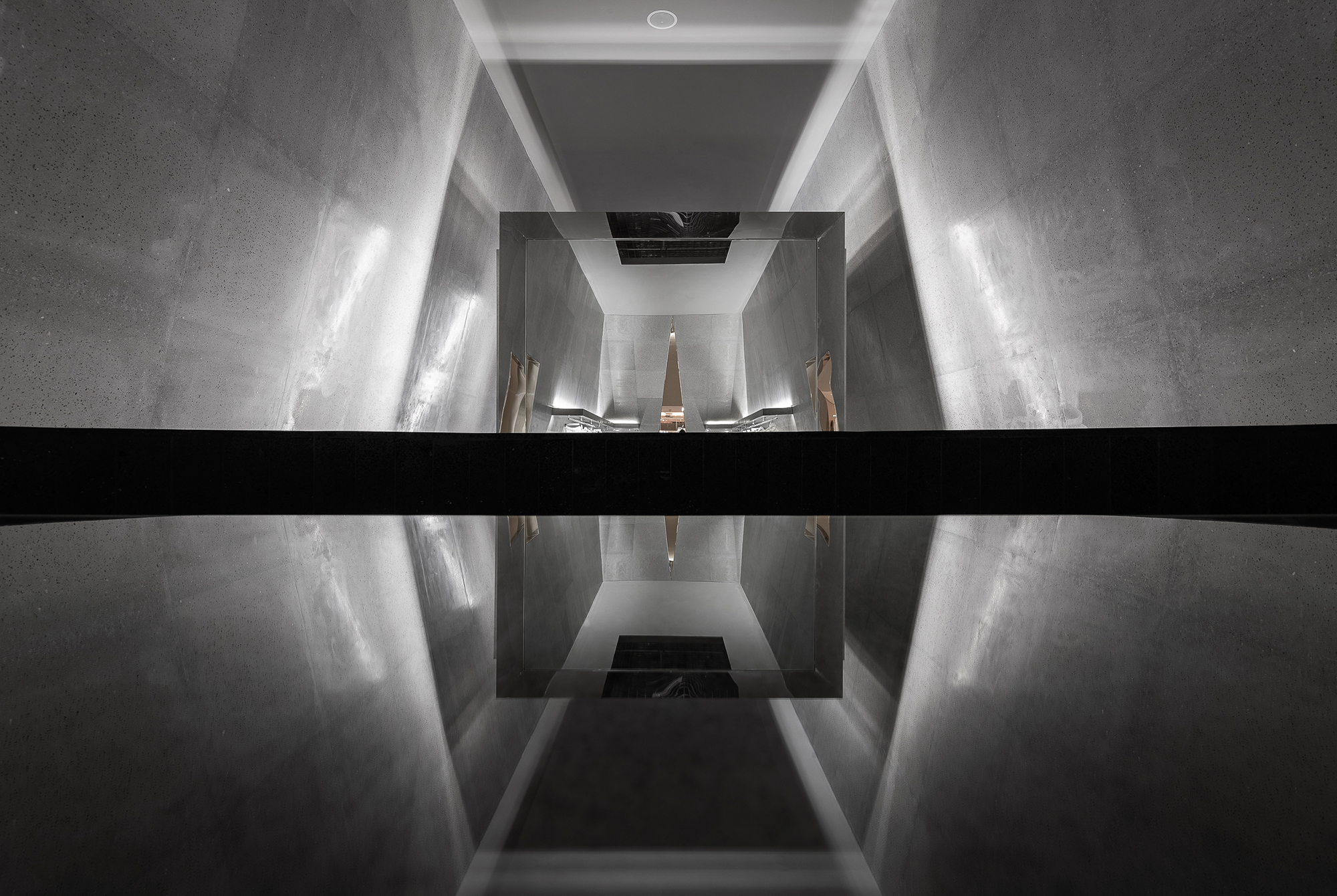
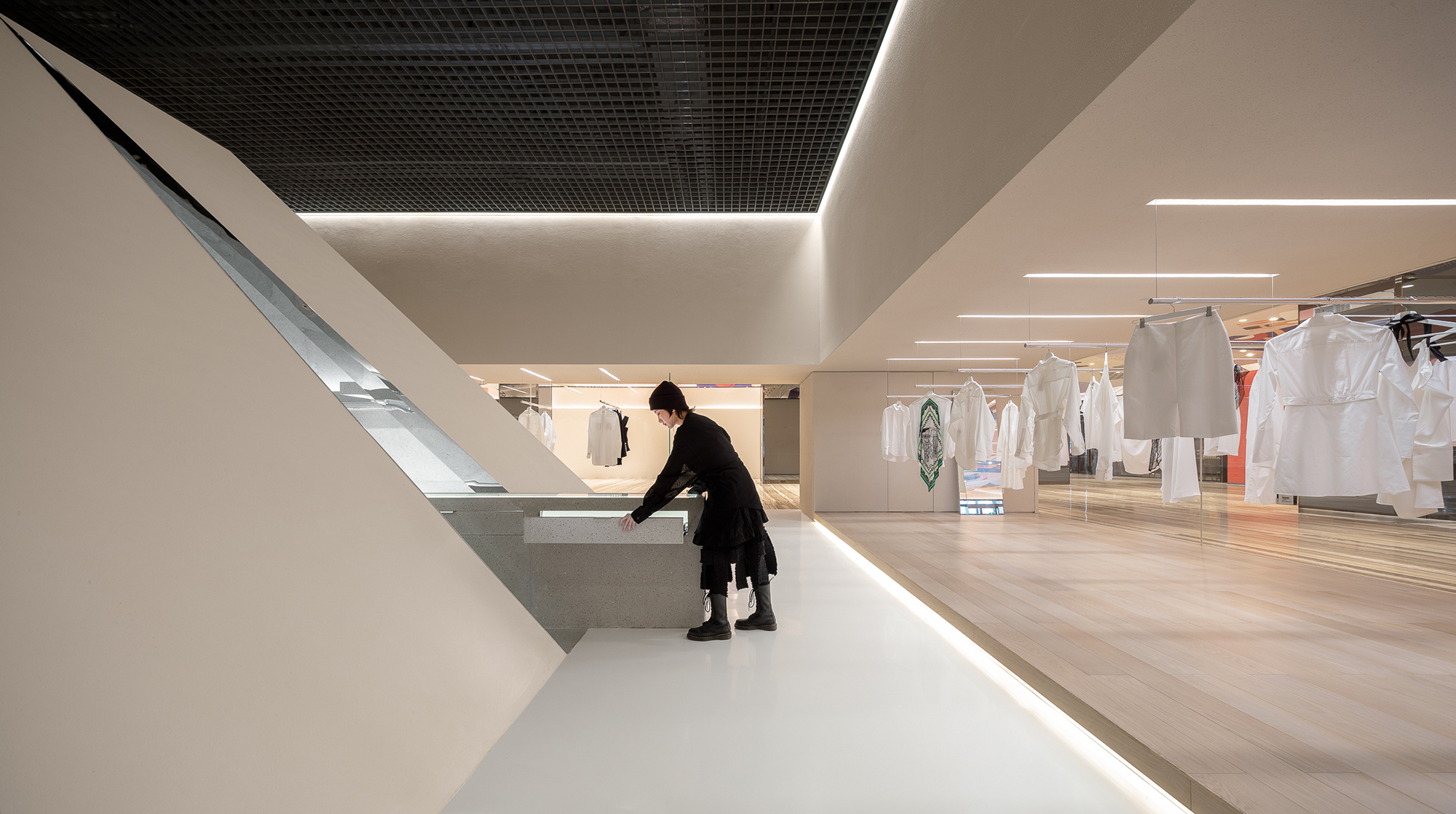
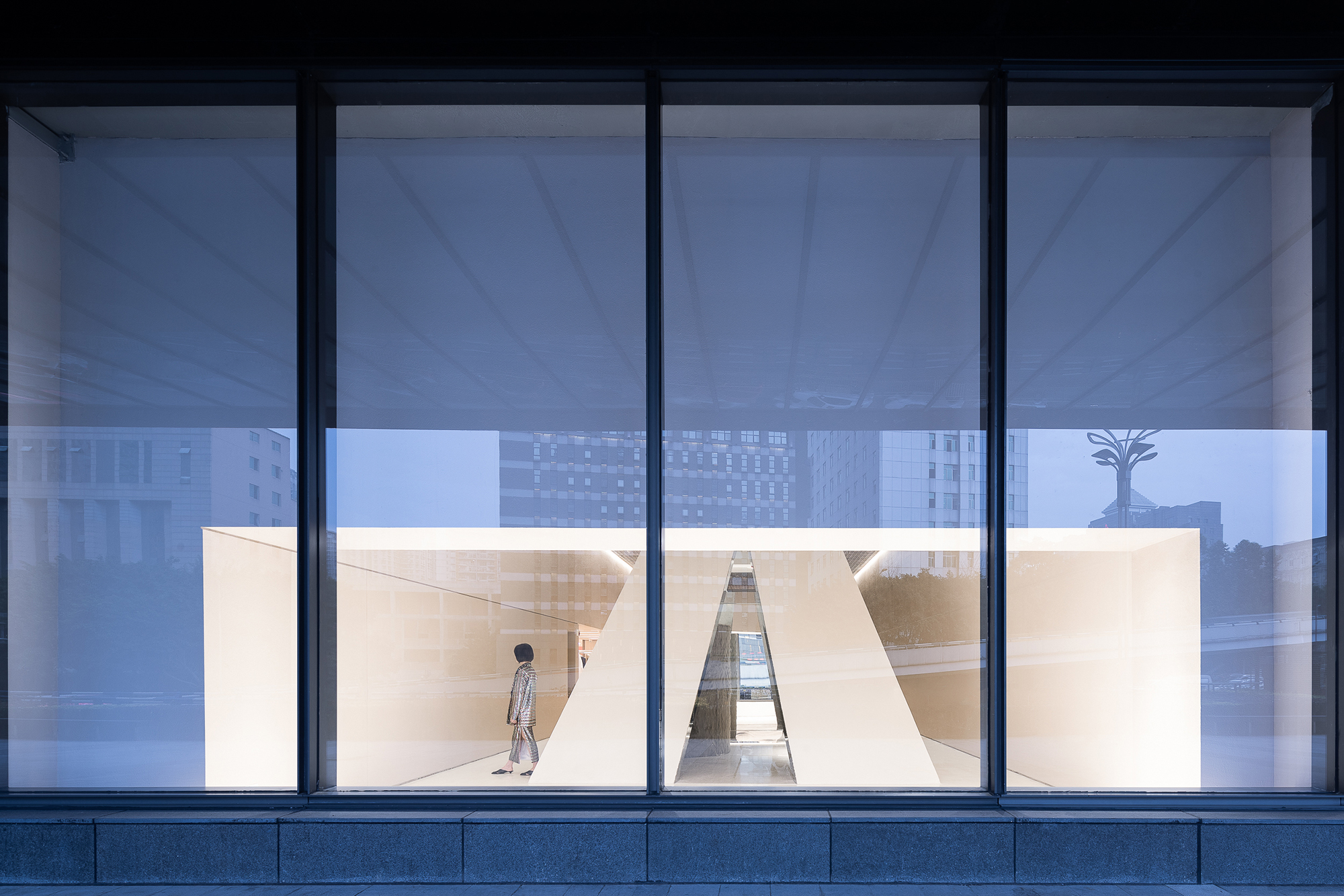
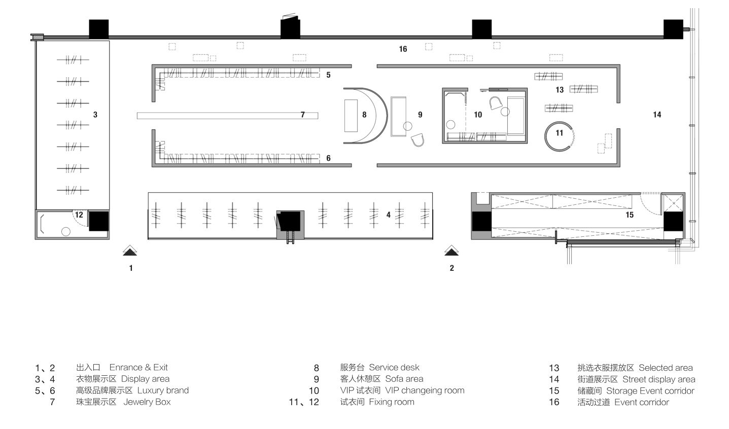
設計團隊從建築維度思考,使店鋪成為探索身體和空間之間關係的媒介。在簡約純粹的空間界麵,運用中軸線的布局,將具象征意義的“裏程碑”置於中心點上。同時,“裏程碑”的設計概念寓意SND邁向國際代表性買手店之列的新起點,教堂式的建築形製契合其“在個性與趨勢中找到平衡”的品牌信仰,兩邊的開放式陳列區形似廣場。通過獨特的布局方式使客戶具有清晰的行駛動線且在行走過程中能看到完整的商品陳列,方便顧客挑選及對比商品。設計方案則根據場地的自身狹長的特點並結合品牌對藝術、行為、展示多方麵的功能需求。無論從店鋪外的任意一個角度往裏看,空間的層次感與材質的碰撞都成為一道路過的風景。
From the architectural dimension, the store is designed to be a medium where customers can explore the relation between body and space. The layout is pure and simple, with a symbolic “milestone” placed at the center right on the central-axis. The “milestone” holds an obvious implication – a new starting point for SND to move towards an internationally representative buyer’s shop. In addition, the church-like architectural form serve as an embodiment of SND’s brand belief, which is to strike a balance between keeping the brand personality and catching on the fashion trends. The open display area on both sides resembles a square. Through its unique layout, customers can know clearly the routes and can view every product in display while walking, offering them a chance to select and compare goods easily. The design team had not only take into consideration the site’s own narrow and linear characteristics, but also the brand’s functional requirements for art, behavior, and display. Seen from any angle outside the shop, its hierarchical layout and the texture of materials have enabled the shop to be a memorable landscape for any passers-by.
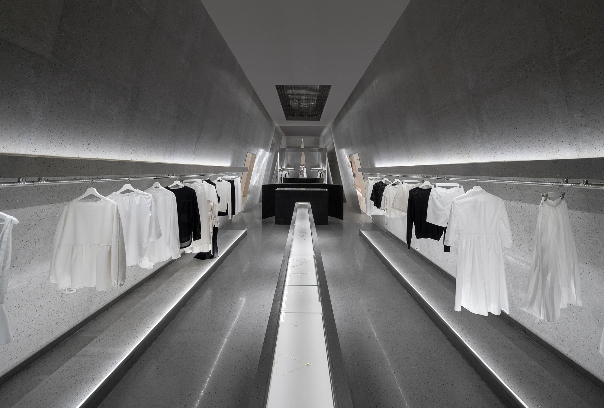
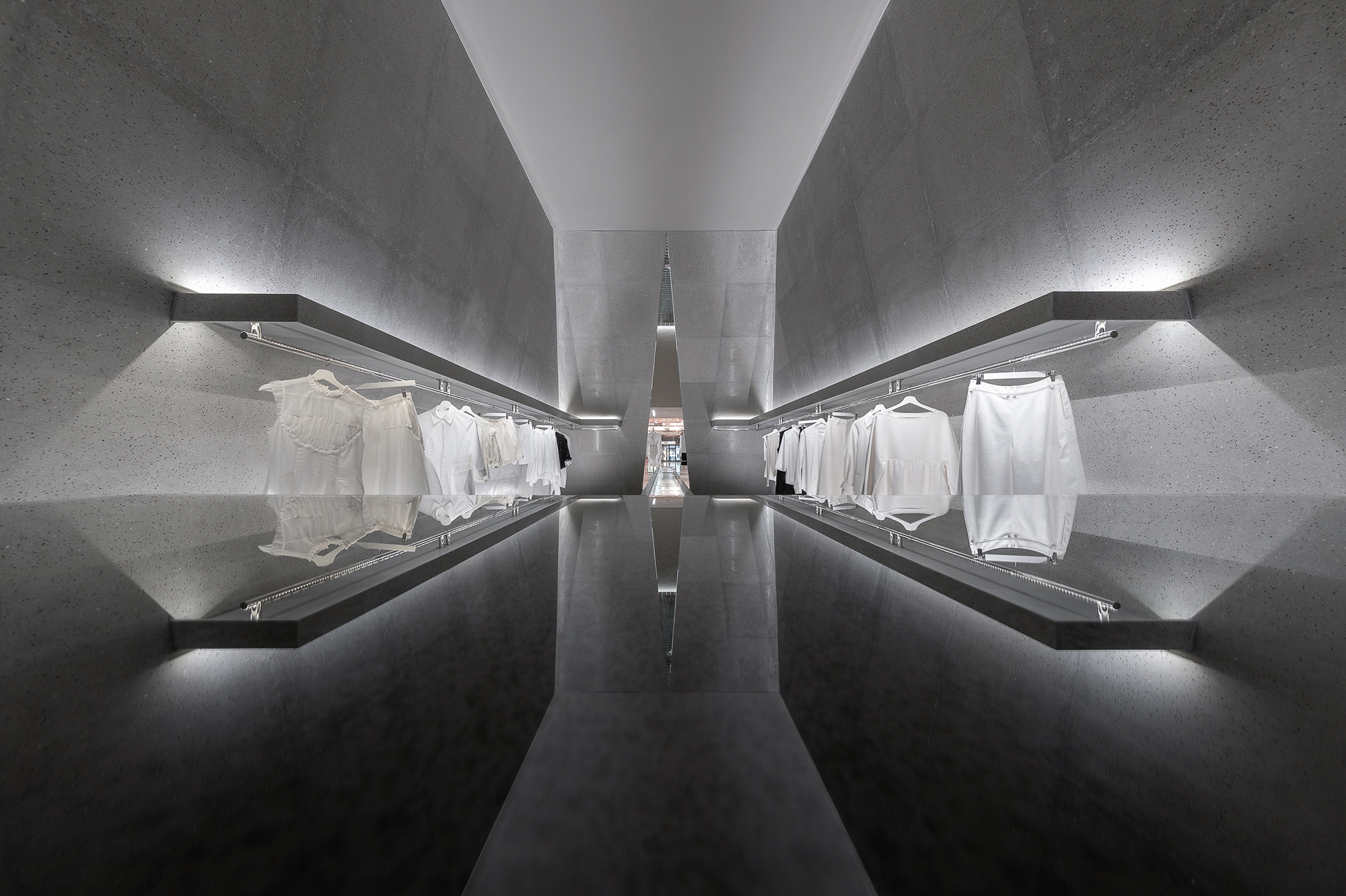
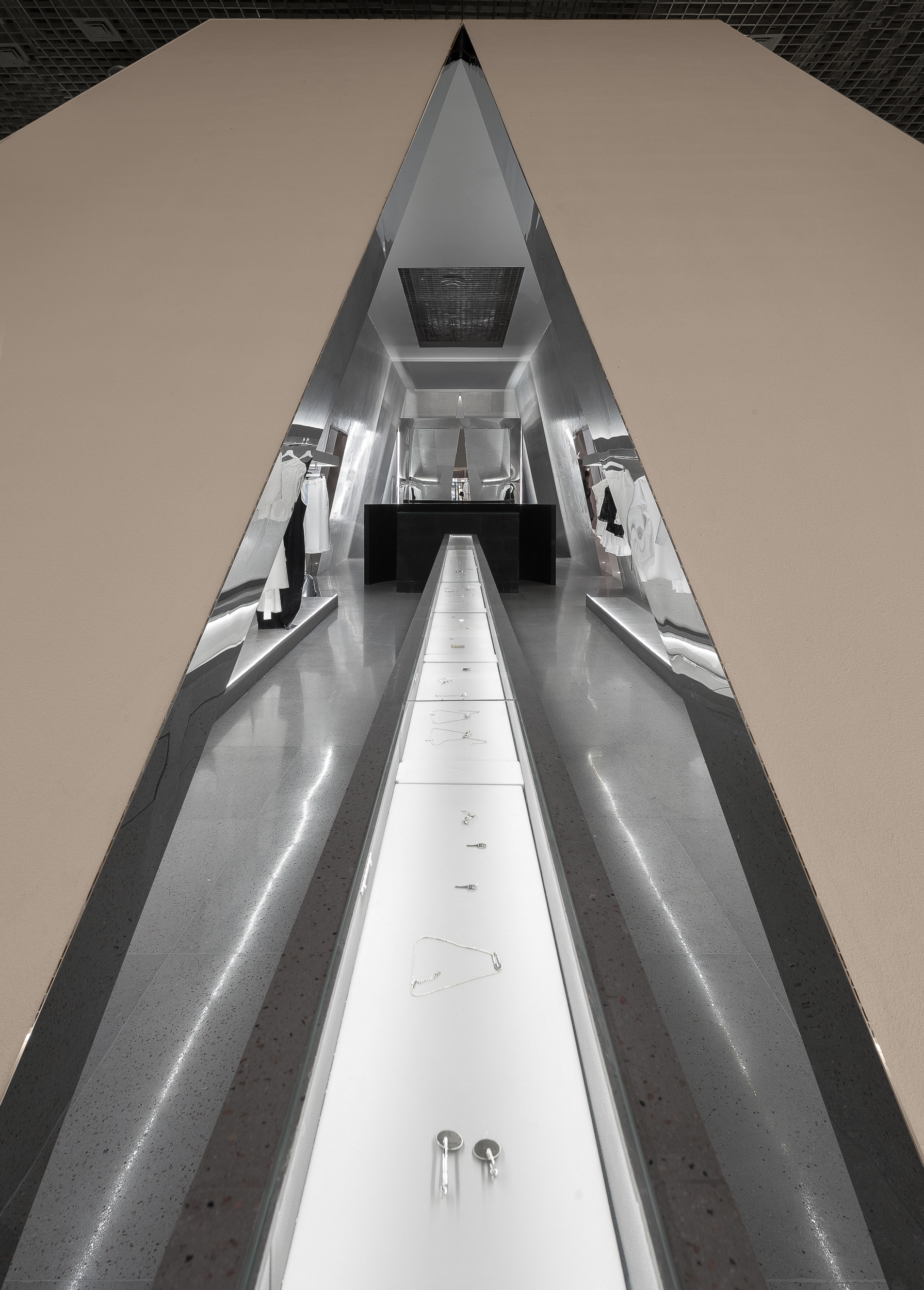
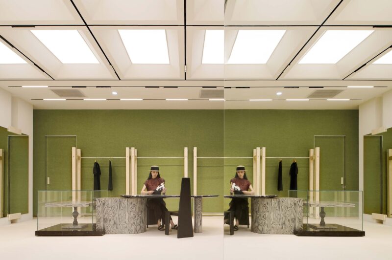
而在立方體內,萬社設計延續著中軸線的構圖及對稱式設計語言,賦予了室內空間神聖感跟儀式感。珠寶展示於中心的長直線展櫃,易於客戶細心挑選,高定衣服品牌則陳列於空間內兩側,均以專業柔和的燈光照射以展示衣物自身的質感。弧形的前台立於空間正中心,分割了展示空間與休息間的區域的同時也保證客人在需要時能及時得到服務。
Within the cube, Various Associates continues the idea of symmetric design, offering the interior space a scared and ceremonial sense. Jewelry is displayed in the long straight showcase right in the middle, which is easy for customers to choose carefully. Luxury brands of haute couture are displayed in both sides, and are illuminated with professional soft lightening so as to show the texture of the clothes. The reception desk is curved and stands at the heart of the space, dividing the display area and the rest area in the cube while offering timely services to customers in need.
在此項目中,萬社打破了傳統品牌店的貨架式思維,以新的陳列語言在保留買手店貨品充分展示的同時以自身獨有的設計語言凸顯snd的品牌個性。最大化保留櫥窗展示麵積並突出展示商品的美感跟質感,同時保留了商品陳列的靈活性及多樣性,為之後更多品牌活動跟展示方式提供更多的可能。萬社設計以功能品質與視覺表現的深度創作,實現了品牌空間與城市生活更大尺度的自由對接。
In this project, Various Associates have overcome the conventional thinking mode of traditional brand stores. Not only the products have been fully displayed, the brand personality of SND was also highlighted in its own unique design language. The size of window display area has been maximized to the largest extent, while at the same time, the flexibility and diversity of product display were retained, which offered more possibilities for brand activities and presentations follow up. This innovative design by Various Associates marks the achievement of quality and visual performance, and realized the association of brand space with urban life.
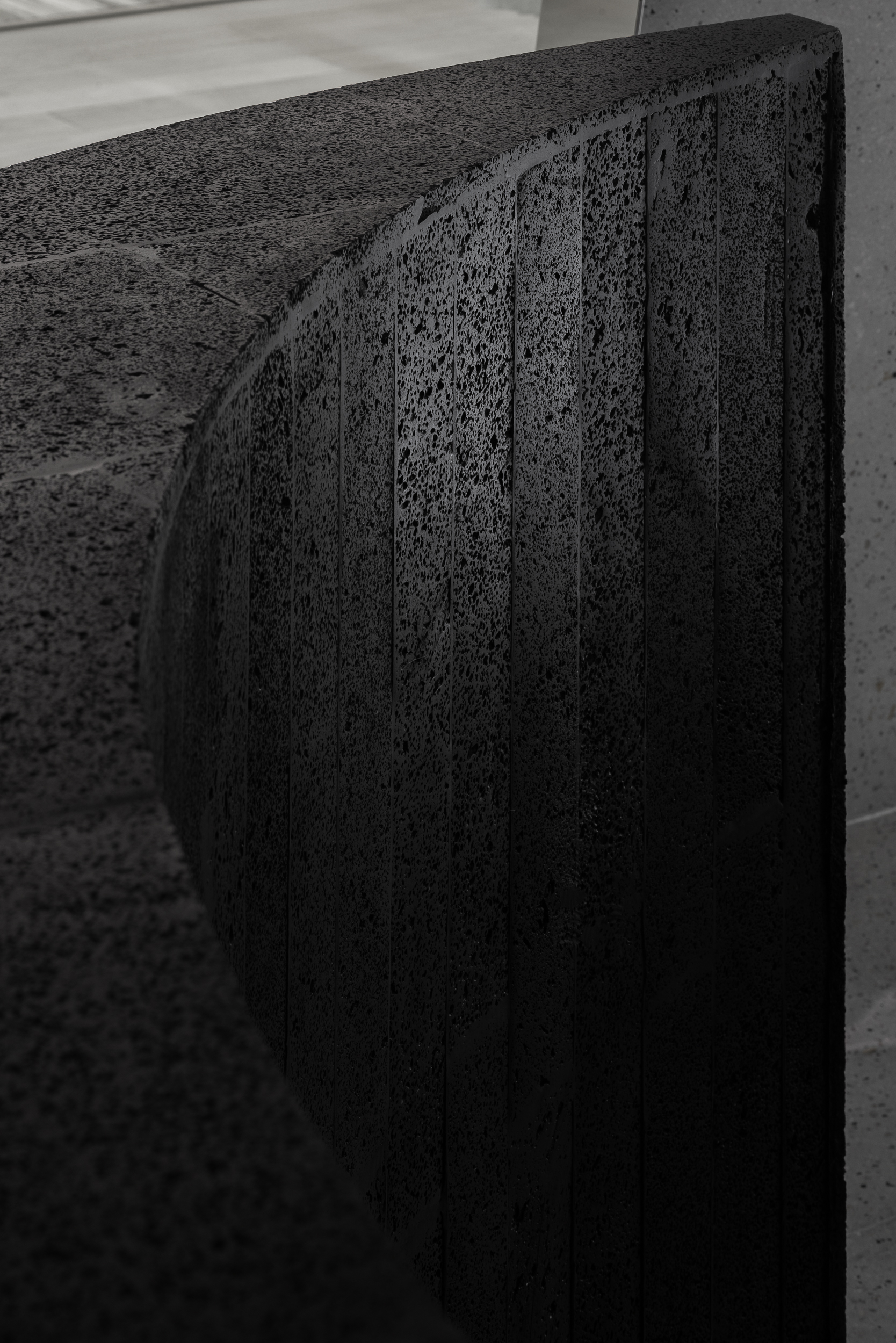
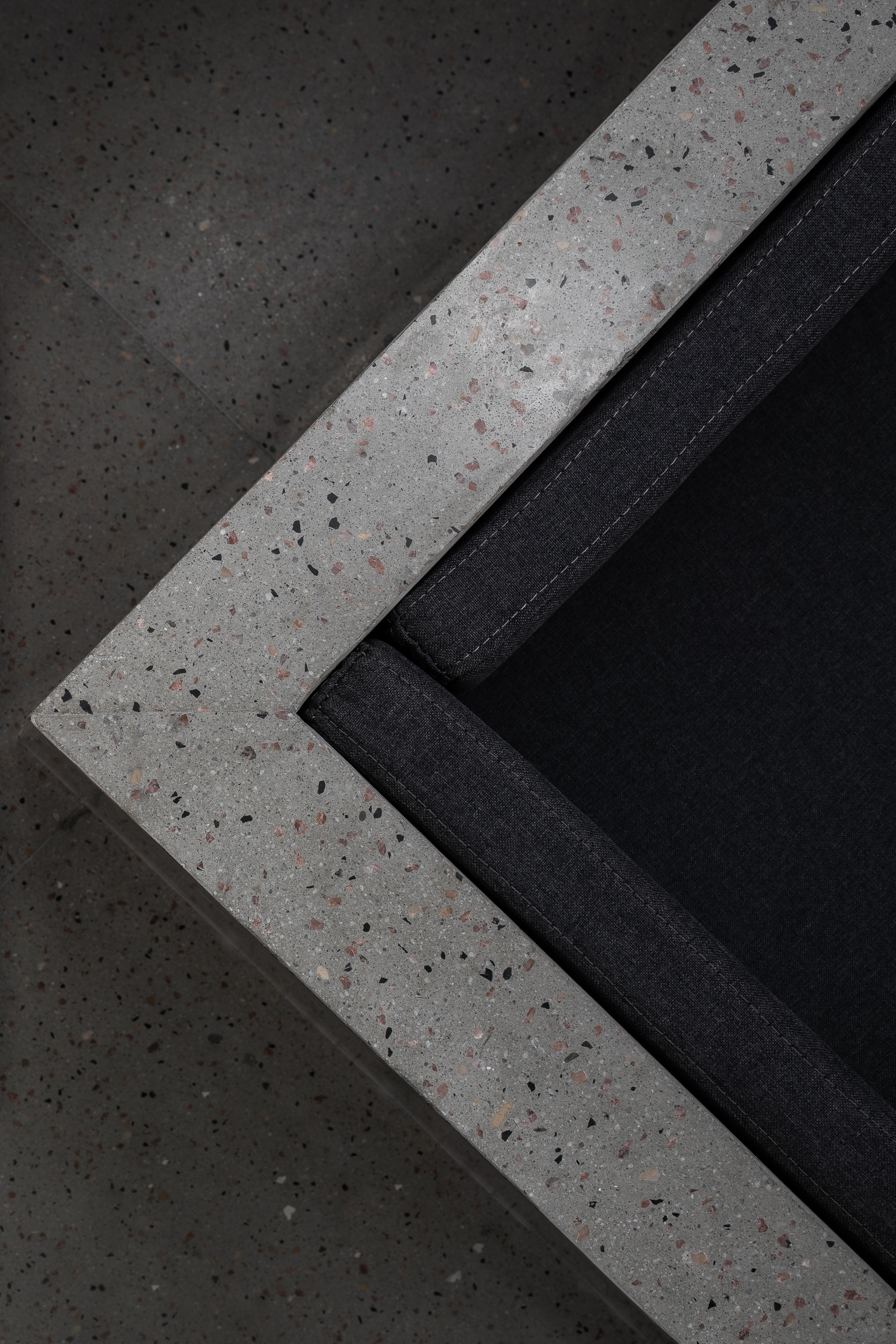
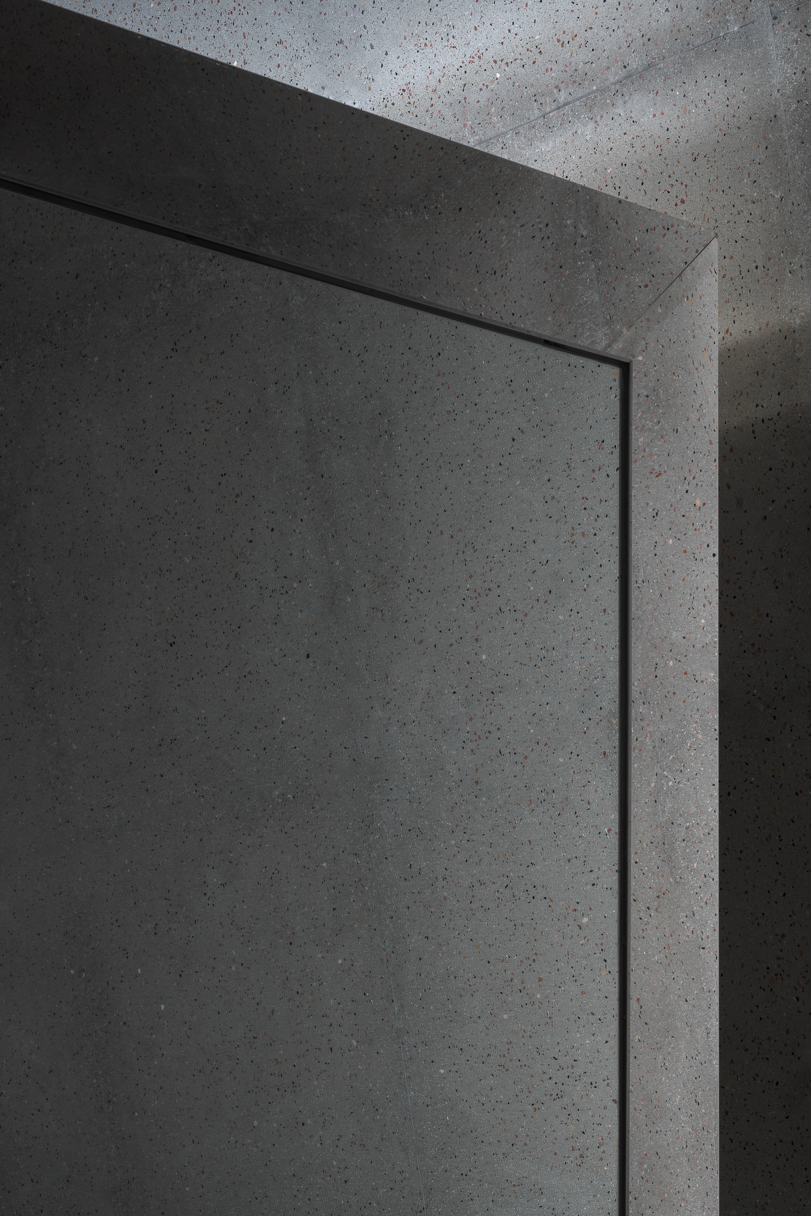
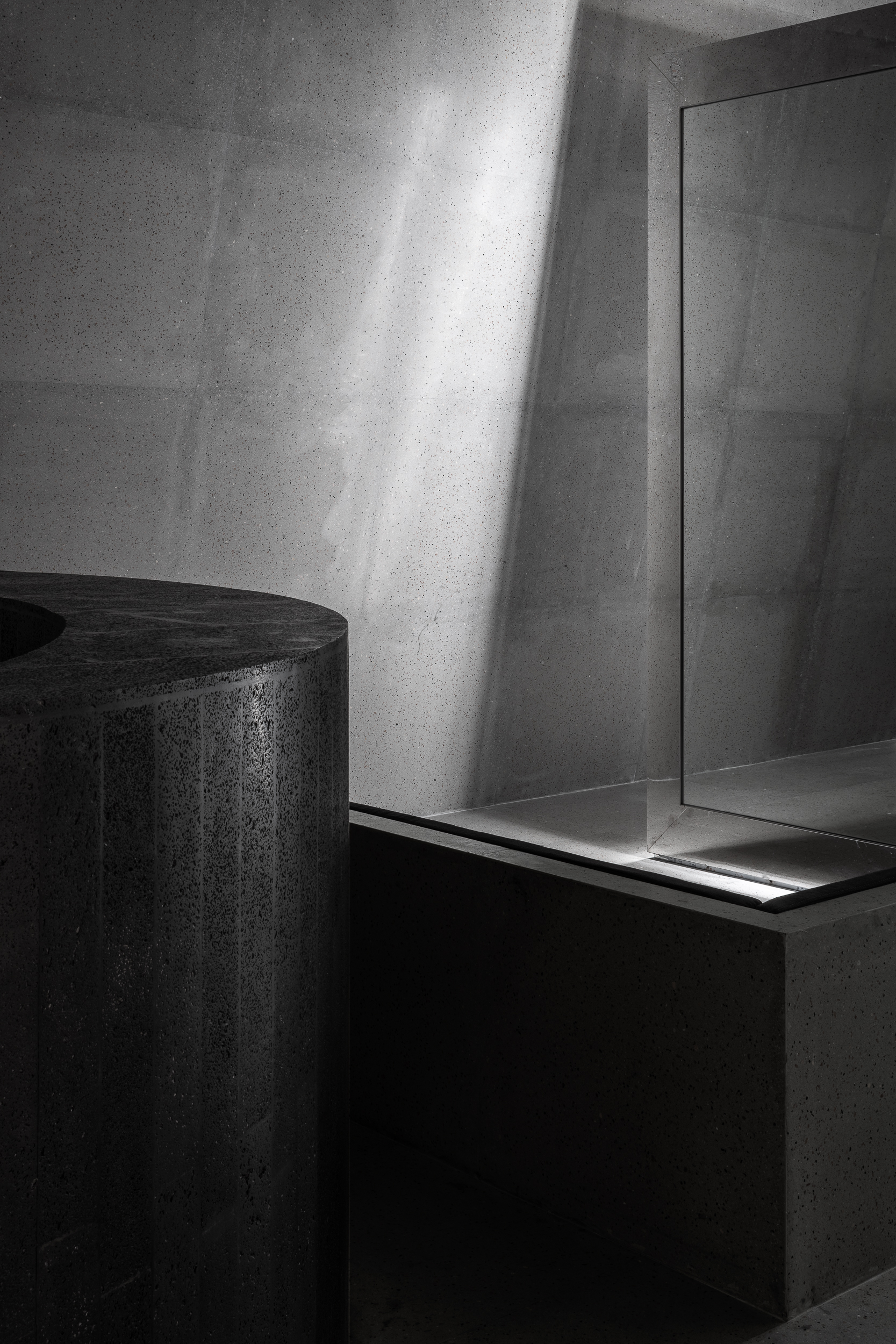
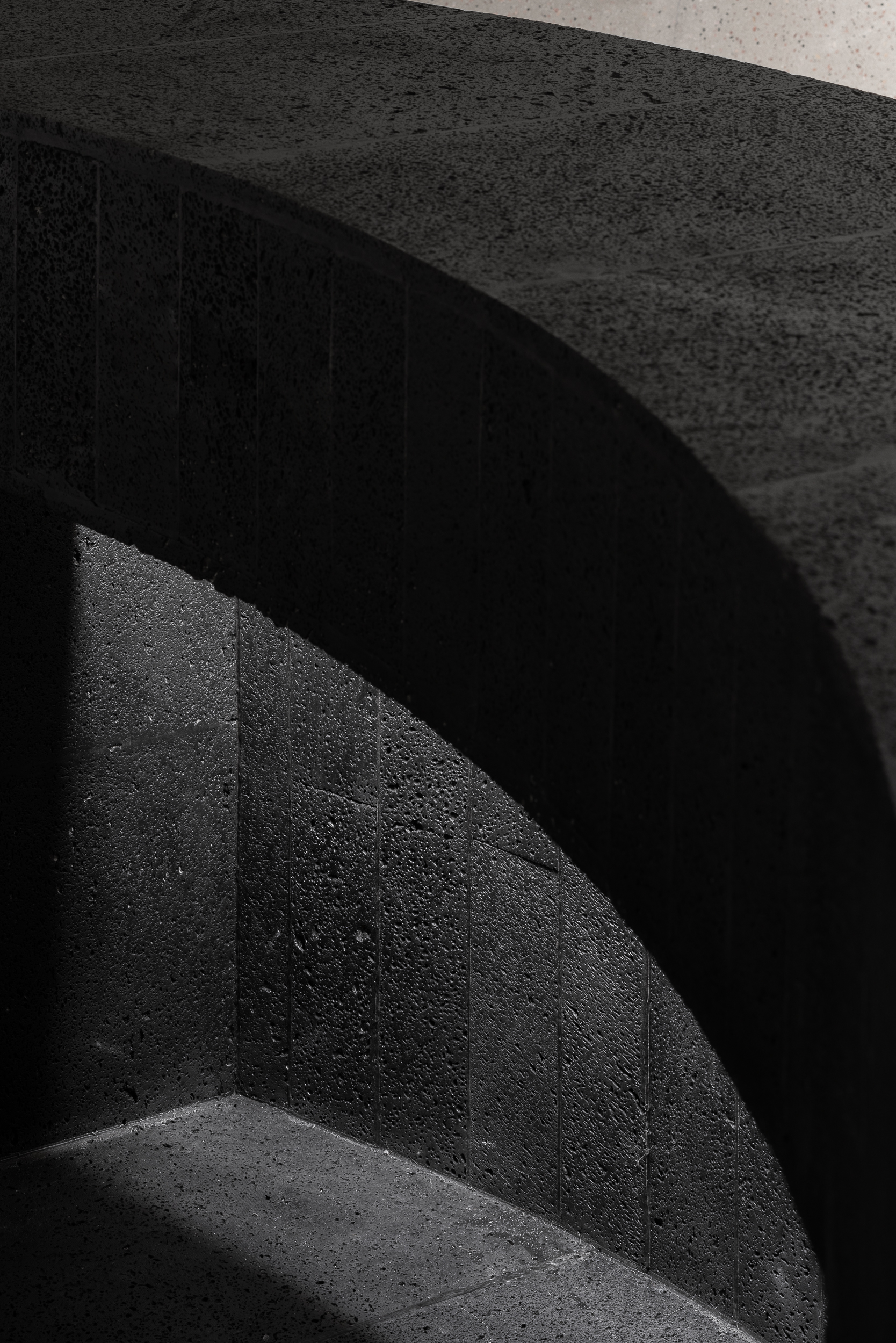
∇ 火山石的粗獷孔隙與水磨石的平滑光亮形成天然對照。The vesicular texture of the volcanic stone echoes with the smooth brilliance of the terrazzo.
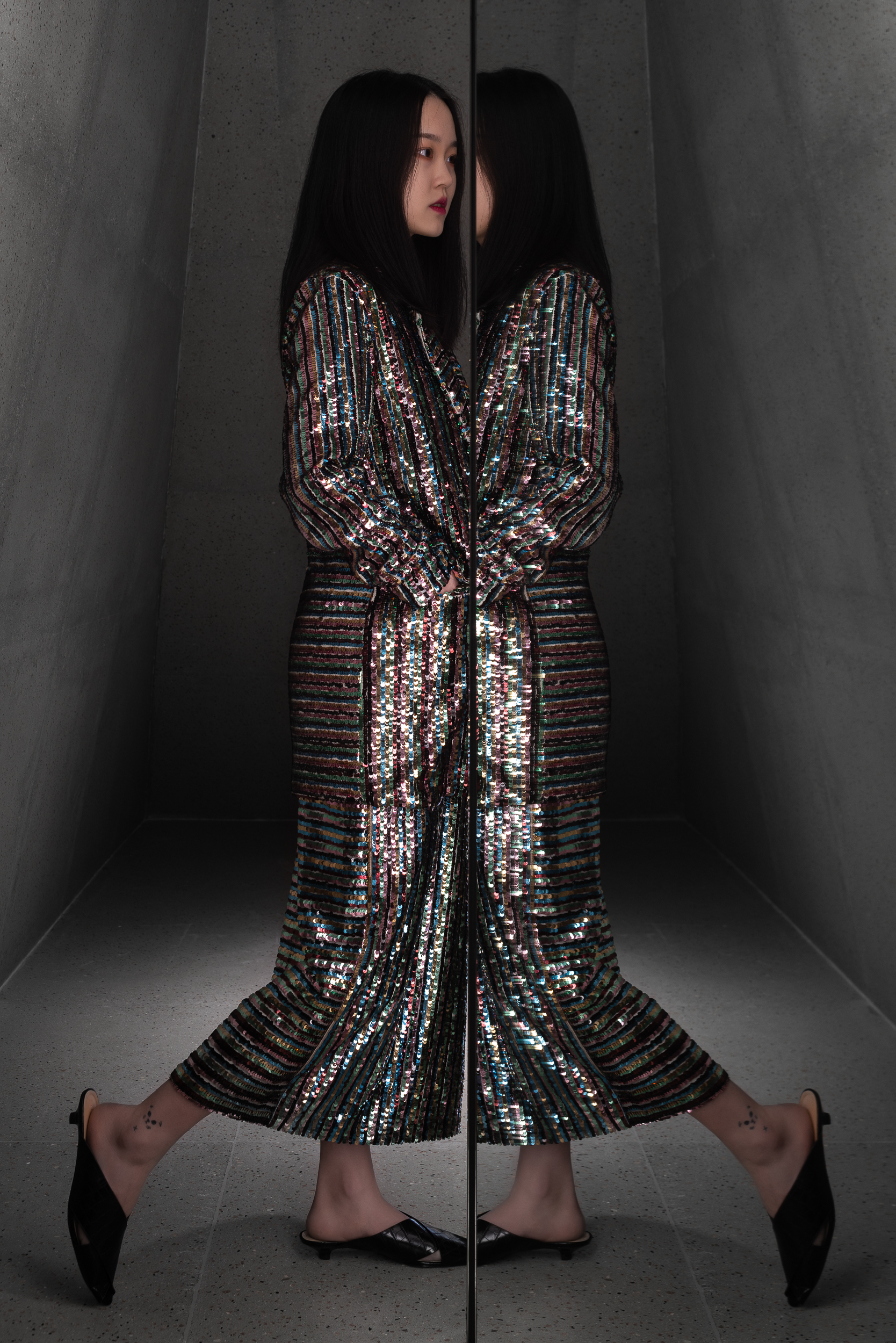
∇ 立方體內兩邊的通道材質折射出顧客的行走動態,將畫麵捕捉為奇幻有趣的影像序列。The channel on both sides of the cube reflects the walking style of customers, capturing the moments as fascinating image sequences.
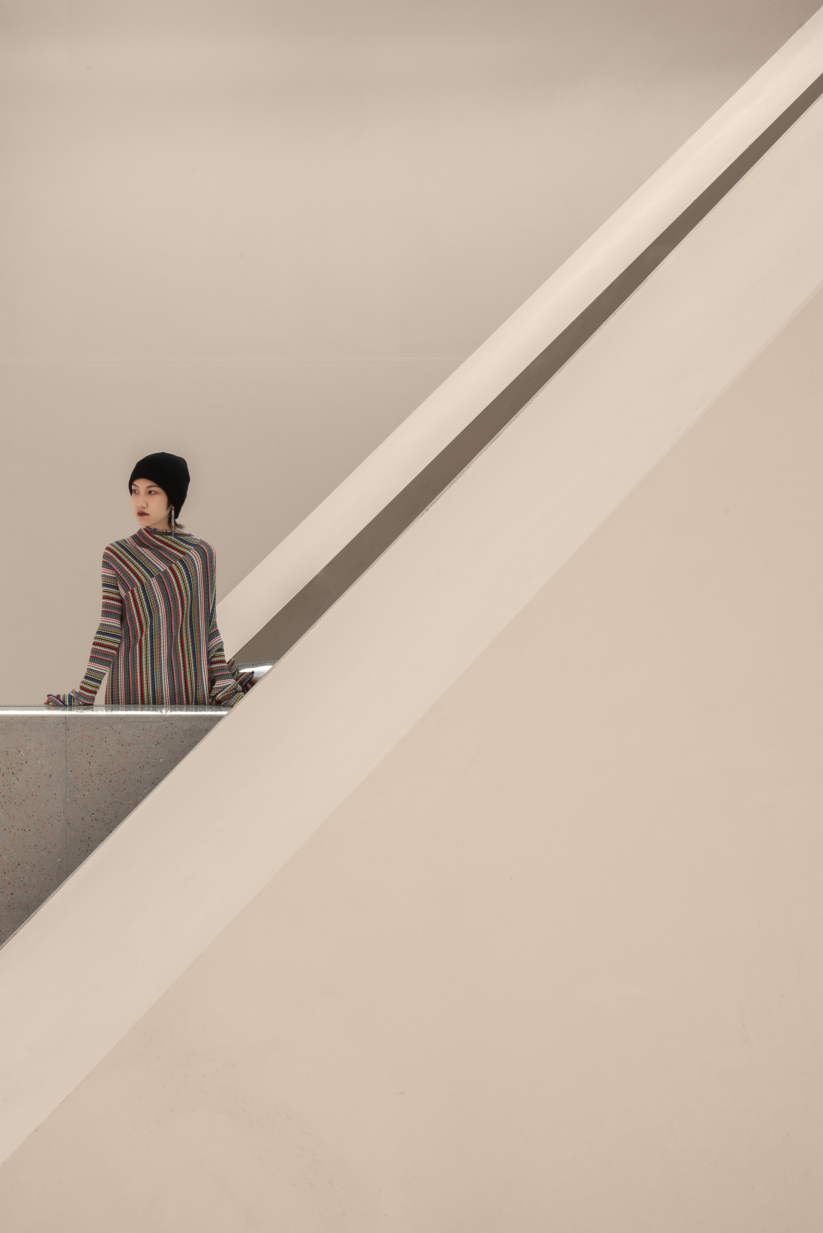
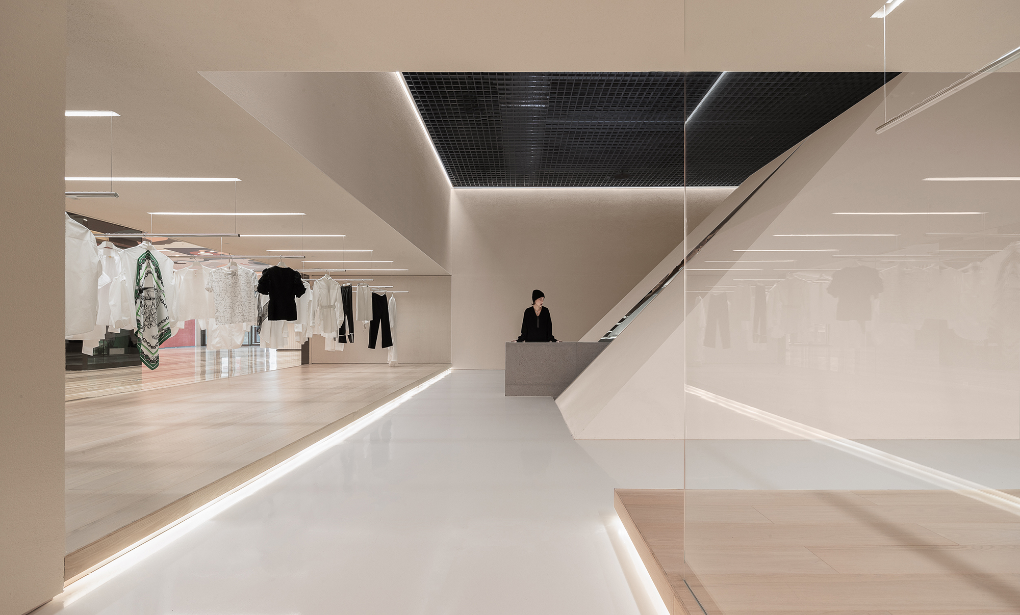
∇ 充滿儀式感的空間、人、展台、材料之間的幾何美感與畫麵感隨處可見。The geometrical beauty that lies within space, people, booths and materials can be preserved everywhere.
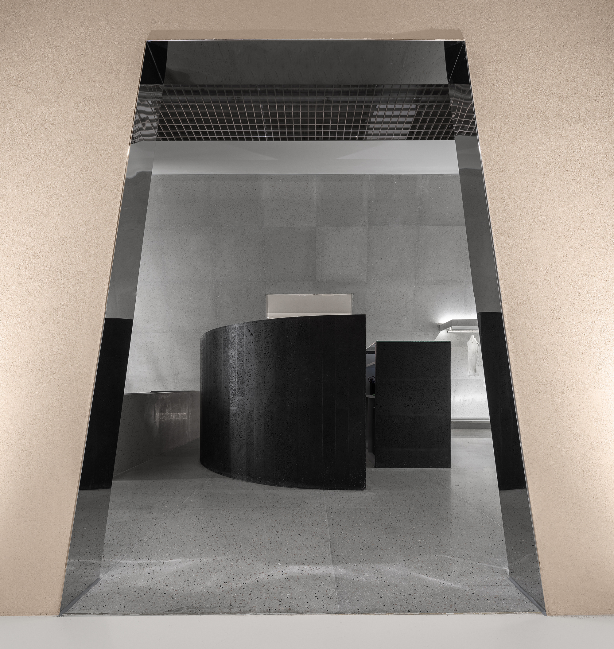
∇ 內部高級展示區的黑色弧形前台在米色與淺灰色中予人沉穩與神聖的感覺。Complimented with beige and light-grey, the curved black reception of the interior high-end display area offers people a sense of holiness and tranquility.
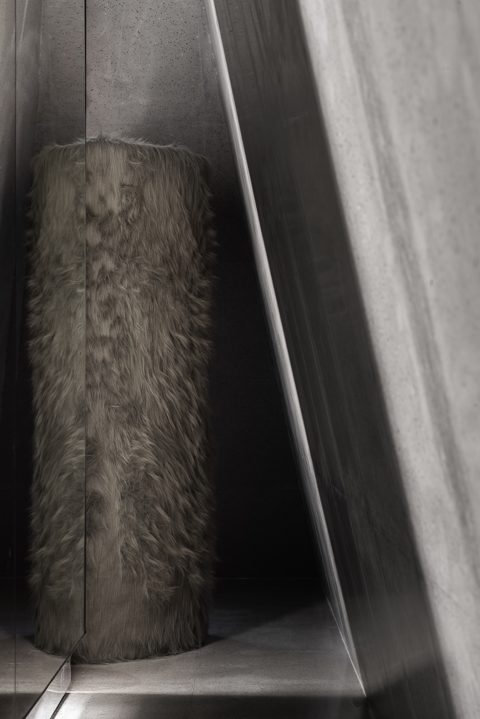
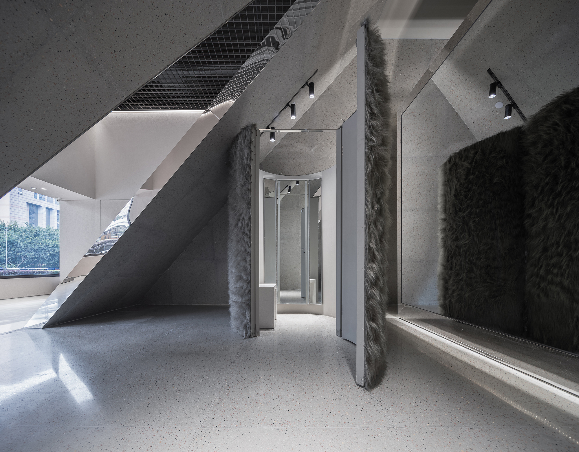
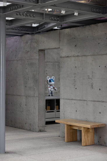
∇ “Fluffy”在空間中展示著自身的趣味與個性。 “Fluffy” reveals its own taste and personality in the space.
室內部分Interior design
空間概覽Interior overview
∇ 完全對稱的結構使空間具備典雅的莊嚴感與神聖感,藏著對美好衣物的敬畏。The completely symmetrical structure gives the space a sense of sacredness, showing the admiration of fine cloth-ing.
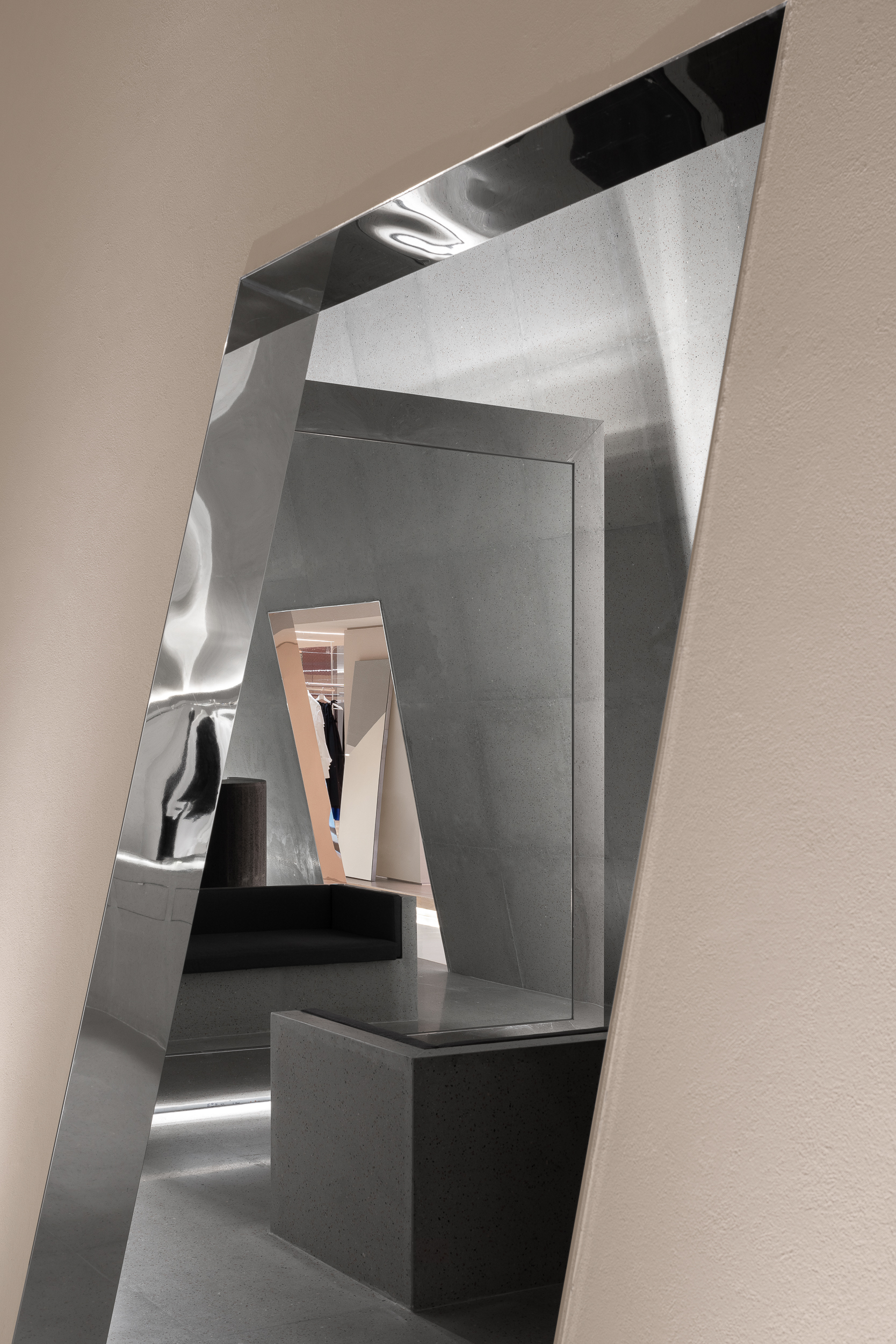
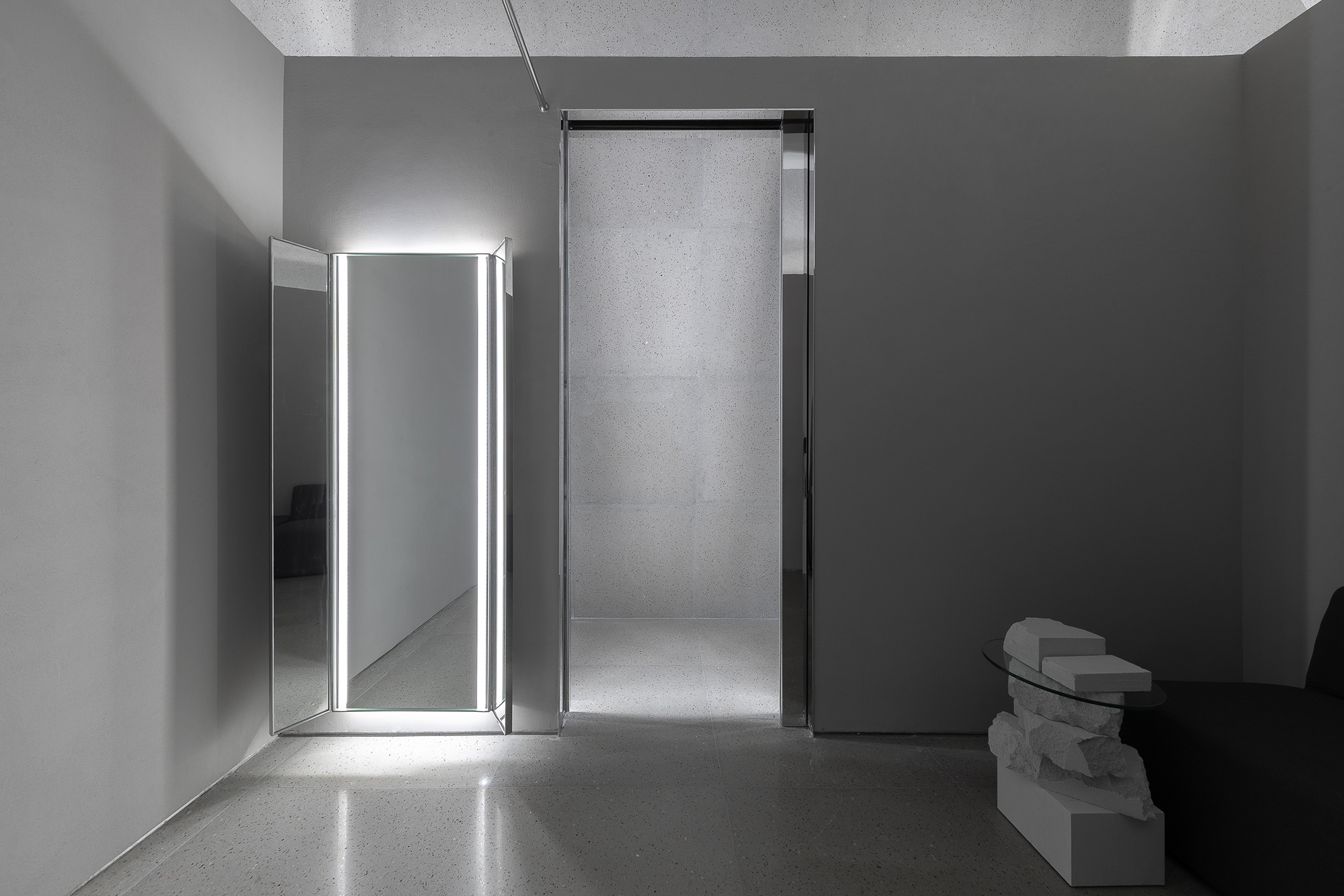
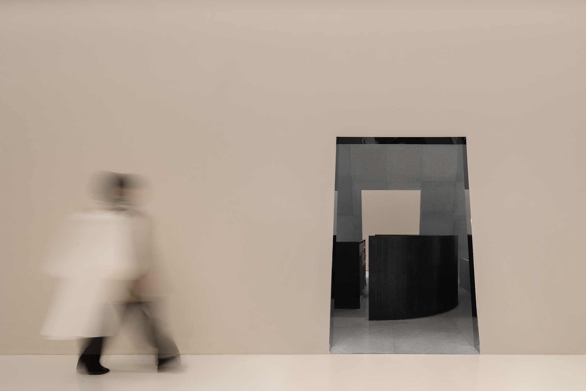
∇ 處於空間內中心點的“Mirror Room”鏡麵上的景象給予人們一種虛實結合的迷幻感與未來感。The scene on the mirror surface of the “Mirror Room” at the center of the space enables people to experience a combination of psychedelic and futuristic sense.
∇ 親近溫和的毛絨質感中和淺灰空間的理性與儀式,同時彰顯著品牌的獨有個性。The gentle silky tactile soften the rich rationality of the light gray space, while highlighting the brand’s unique personality at the same time.
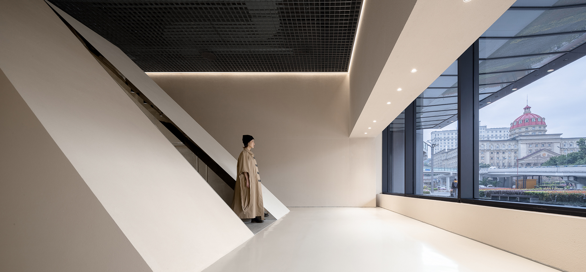
∇ 在外廊經過時可透過斜麵上的開口看到內部暗藏的另一個世界。A hidden world can be seen through the opening on the slope when one passes by the corridor.
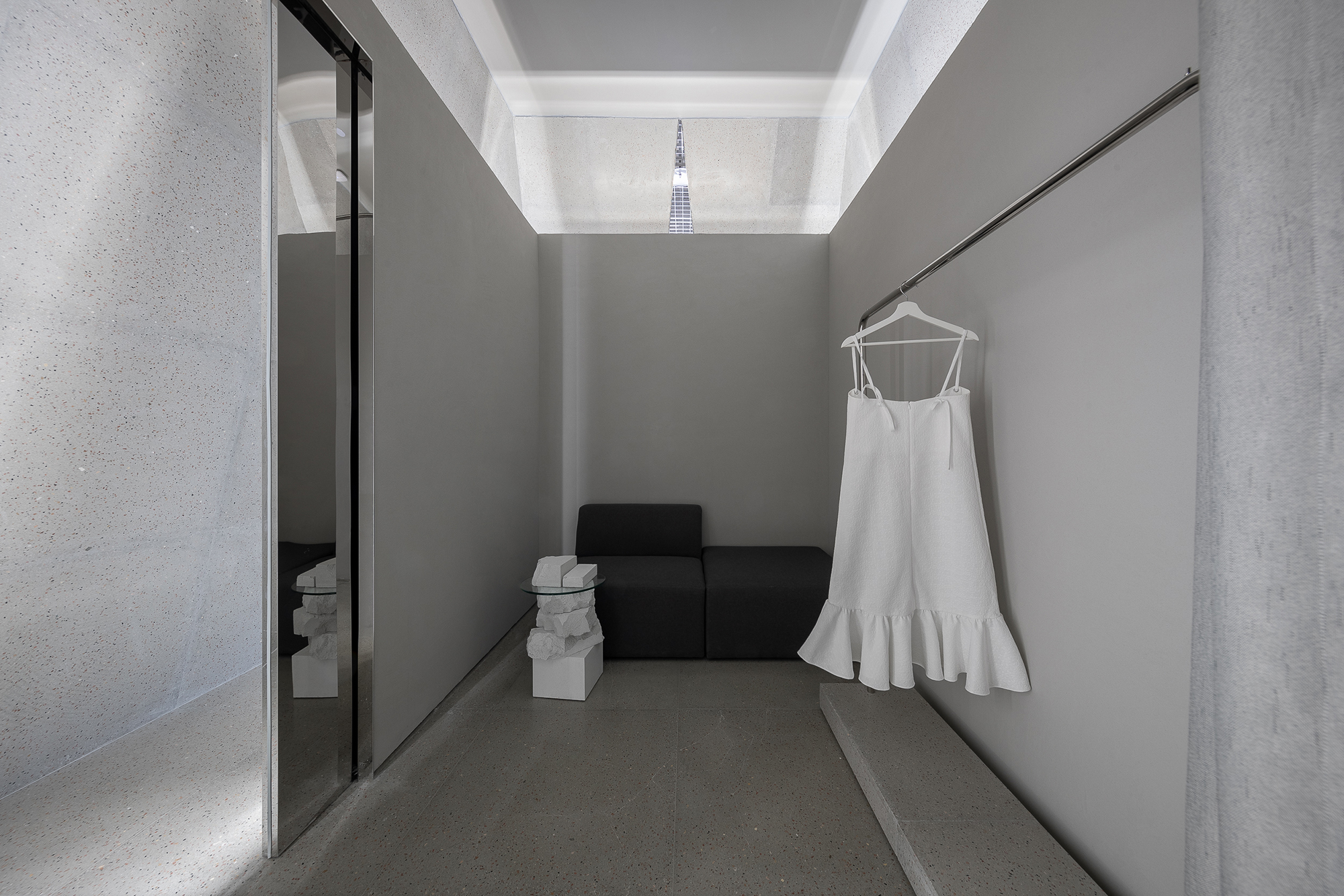
∇ 試衣間內部,輕鬆簡潔。Embrace purity and elegance in the fitting room.
∇ 米色調的立麵予人純粹及舒適感,而反射出裏程碑室內空間的開口則引人向往邁入隱藏在內獨立的神秘天地。The façade in beige are pure and comfortable, while the openings that reflect the interior space of the “milestone” lead customers to enter an independent mysterious world.
∇ 展示區域概覽Display area overview
∇ 懸掛構造的衣杆使衣服自然擺動,在燈帶的暈映下形成飄動的影子。The clothes swing naturally on the clothes rails, forming dangling shadows under the illuminating lamp belt.
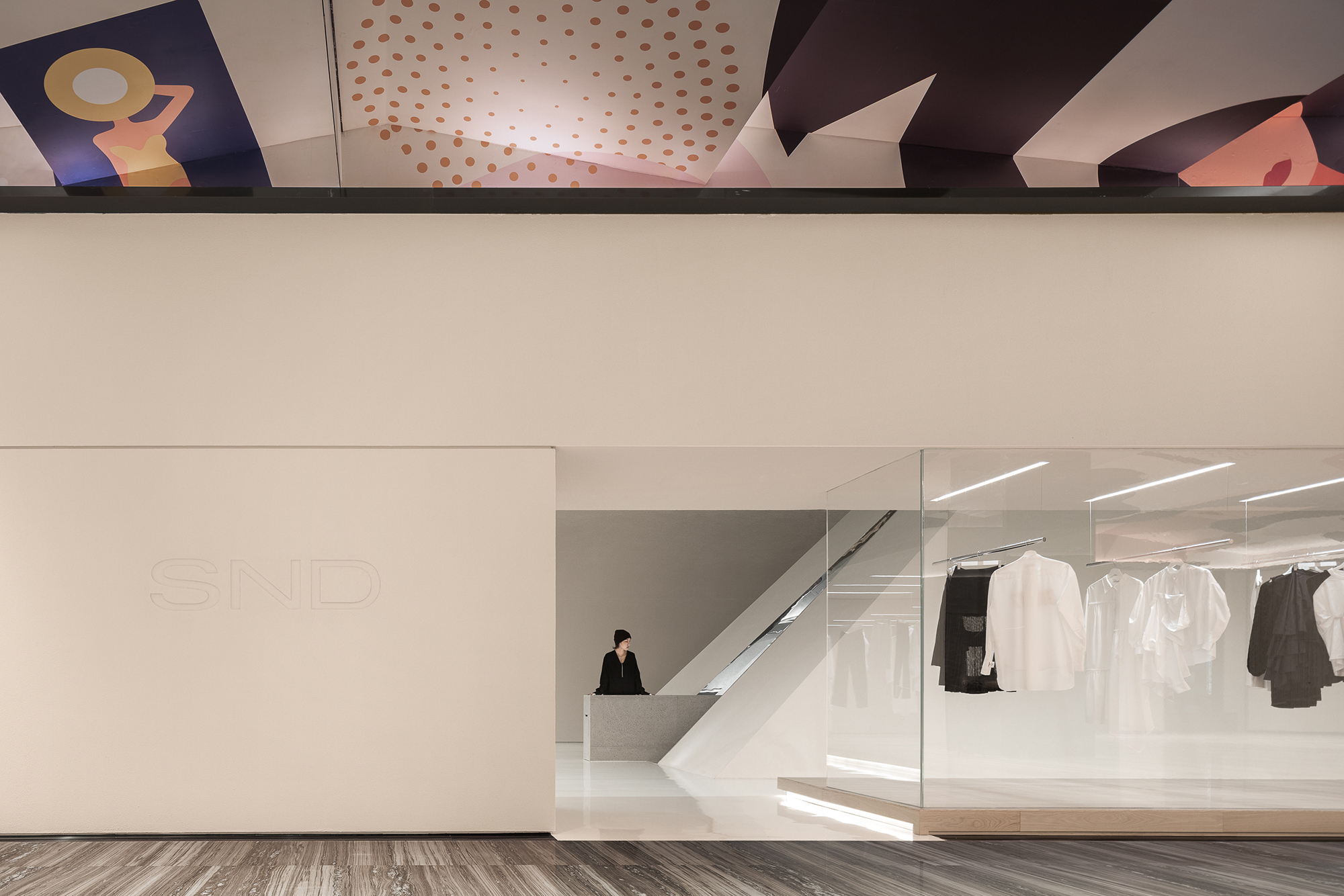
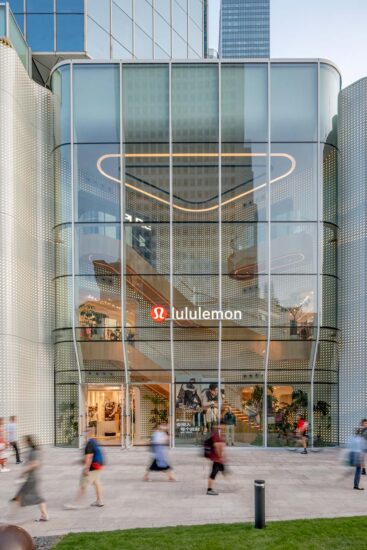
∇ 商場內的店鋪入口Shop entrance in the mall
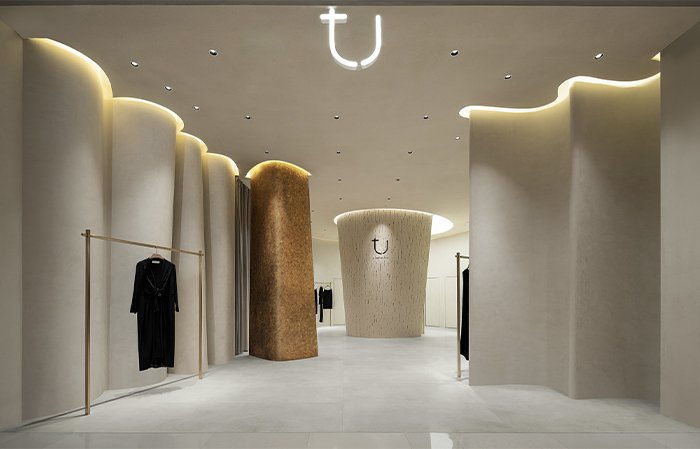
∇ 獨特的空間語言使人們路過時不禁停步矚目。The unique visual outlook encourages people to stop and enjoy.
∇ 儀式感、未來感與趣味性,使這個項目具備獨一無二的個性。The ceremonial sense, futuristic and intriguing characteristic makes this project one of a kind.
完整項目信息
項目名稱:SND
設計公司:Various Associates 萬社設計谘詢(深圳)有限公司
事務所網站:https://various-associates.com/
主創設計師:楊東子
項目負責人:林倩怡
設計團隊:楊東子、唐靜靜
項目地址:中國重慶新光天地
完工時間:2019.03
項目麵積:288 平方米
專業燈光供應商:Viabizzuno
攝影師:邵峰
Project name: SND
Design firm: Various Associates (https://various-associates.com/)
Main designer: Dongzi Yang
Project leader: Qianyi Lin
Designer team: Dongzi Yang, Jingjing Tang
Project location: Shin Kong Place, Chongqing, China
Completion time: 2019.03
Area: 288 sqm
Professional lighting supplier: Viabizzuno
Photographs: Shao Feng










評論(1)
6666