LOFT中國感謝來自 TOWOdesign堂晤設計 的商業空間案例分享:
由家具構成的創意自然——2018DDS展覽
DDS展覽是家具行業內引導設計風潮的集群展,2018參展商有23家。每屆展覽空間都希望通過設計能夠引發人們對整個行業的深度思考。同時展覽空間設計還要考慮到每個參展商家視覺展示的公平性,以及整個展覽主題形象與23家參展商不同個性形象之間的矛盾關係。主形象太強,就缺少了百花齊放的創意爆發氛圍;單體的商家形象呈現過強就會造成整個展覽視覺雜亂,缺乏主題性。
TOWOdesign created an exhibition space for 2018 Design Dream Show (DDS) in Shanghai. DDS is a cluster exhibition that leads the design trend in the furniture industry, with 23 exhibitors taking part in the event in 2018. Considering the common goal of general exhibition spaces, which is to provoke people’s deep thinking about the whole industry through designs, this project focused on fairness of visual display for each participating exhibitor, as well as the coordination between the overall thematic image of the exhibition and individuality of the 23 exhibitors. If the image of the whole exhibition was too strong, it would weaken the characteristics of exhibitors, while on the contrary, if the individuality of each exhibitor’s booth was too conspicuous, it would cause visual clutter and fail to convey the theme of the whole exhibition.
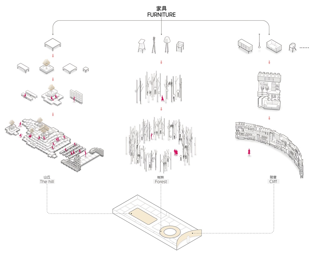
由於家具是人生活中最常用的工具,其生產使用與整個自然環境的物質循環密切相連。所以展覽就圍繞家具本身,通過對家具進行各種變形組合,延伸出由家具構築的人造自然——陡壁、迷林、山丘。警示人們關注家具產業鏈與整個環境之間的關係。
Furniture is the most commonly used tool in our daily life, and its production and utilization are connected closely with material circulation in natural environment. Accordingly, the exhibition space gave full play to furniture. The design team applied different combinations of furniture to create artificial natural formations such as “cliff”, “forest” and “hill”, hoping to urge people to pay attention to the relationship between furniture industry chain and the environment.
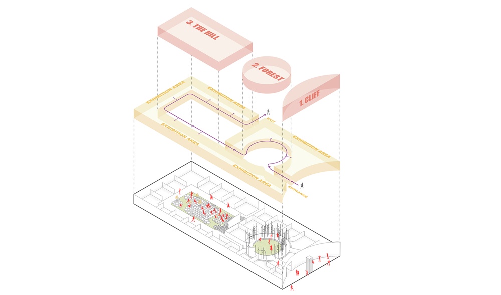
三個區域形態也根據主題選用不同視覺形態與空間形態,為參觀者提供了充滿變化的觀展體驗。
Different visual spatial forms were created based on the theme for the three spaces, which provided audience with a variety of viewing experiences.
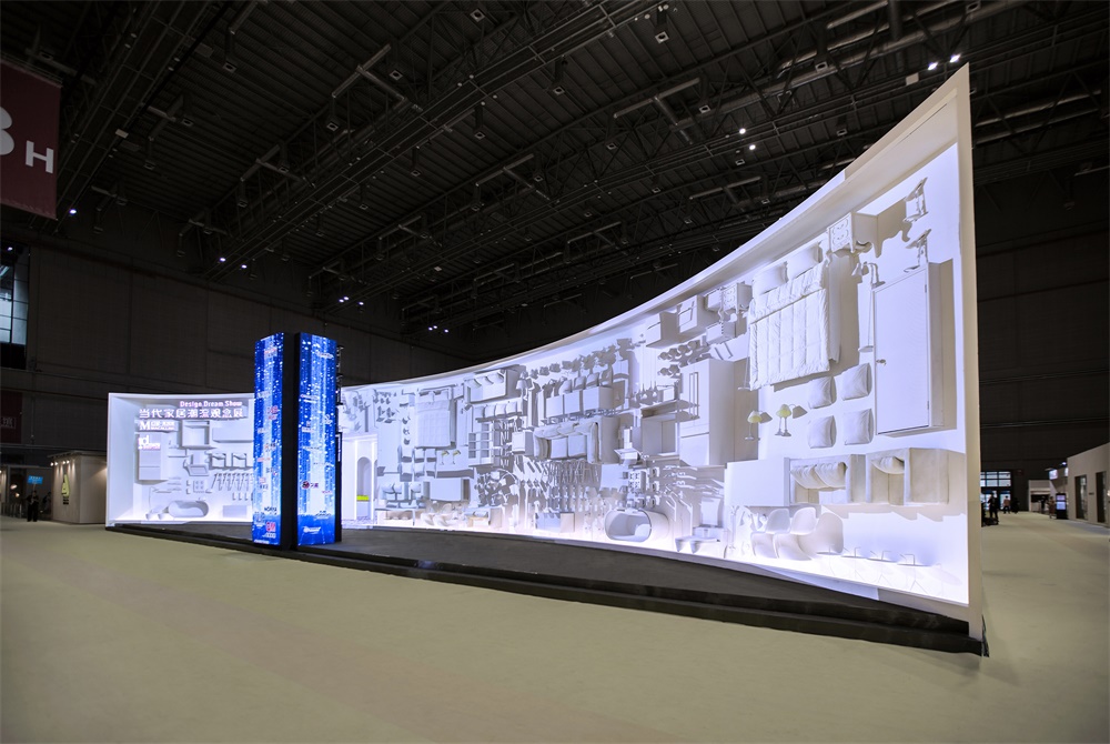
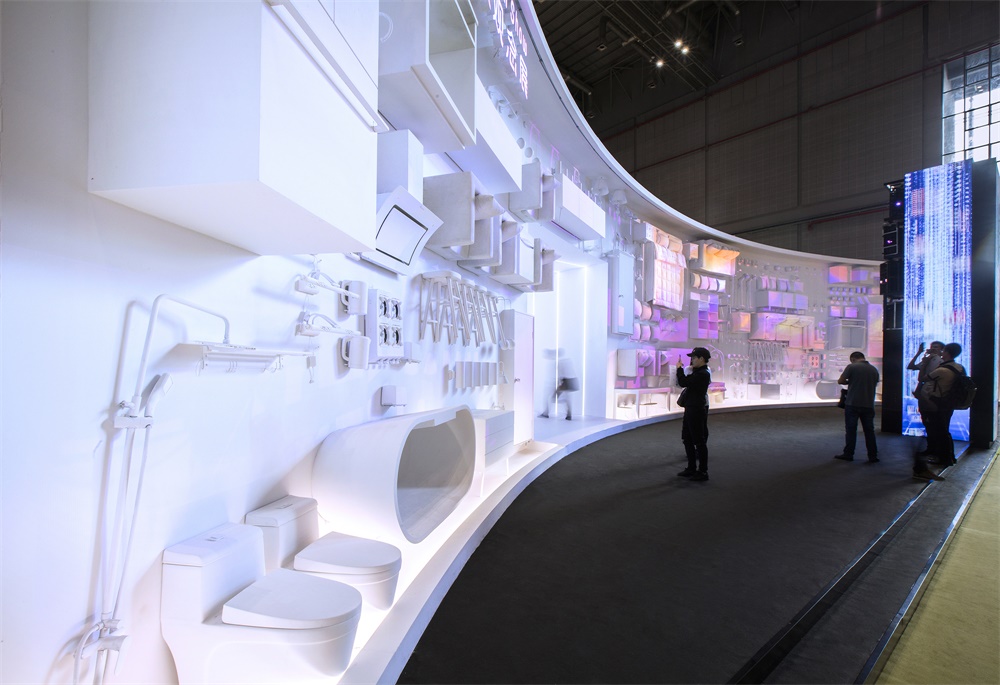
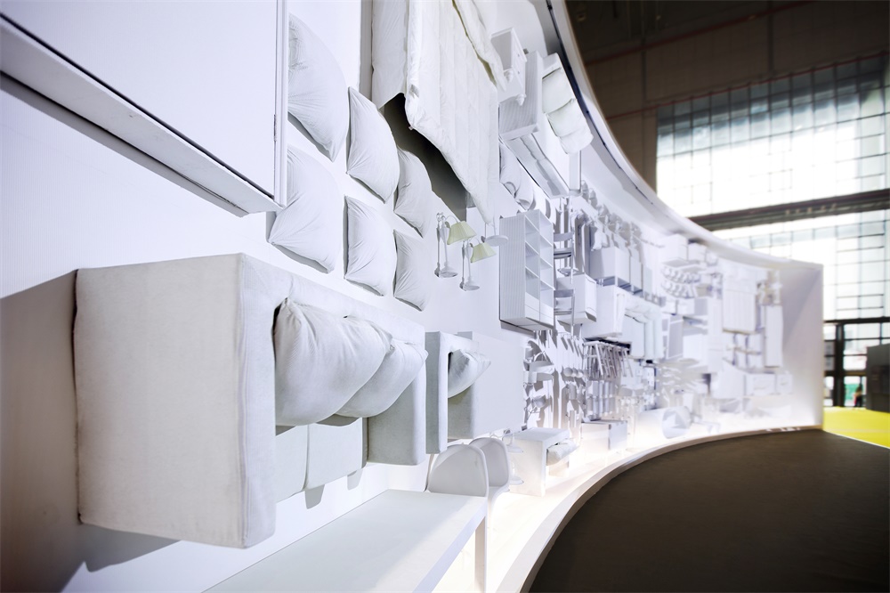
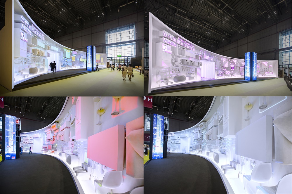
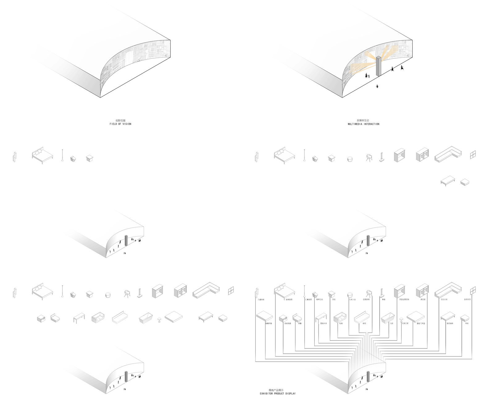
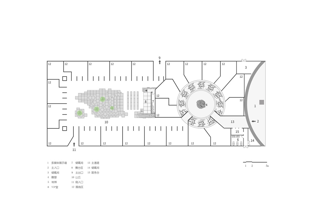
入口區域要公平的向觀眾呈現不同的參展商的產品,同時又能夠打造足夠吸引眼球的視覺效果,能夠在絢麗的展覽會場中把觀眾吸引過來。所以TOWOdesign利用所有參展廠商會涉及到的家具,打造出一個弧形的家具牆——陡壁,牆麵的家具都是收集的廢棄家具,經過修複噴成白色。結合投影3Dmapping技術,讓廢舊家具牆轉換成了炫酷的多媒體秀。承載投影機的中心立柱上也不停的呈現該展區的參展商LOGO。對參觀者起到很好的預告作用。
The entrance area needed to fairly present different exhibitors’ products to the visitors, and at the same time created enough eye-catching visual effects to attract them. Considering this, TOWOdesign used exhibitors’ discarded furniture to build a curved furniture wall — “cliff”. The furniture was repaired and painted in white. Combined with 3Dmapping technology, the furniture wall was turned into a cool show. Logos of exhibitors were constantly presented on the center pillar that supported the projector, which foreshowed the overall information of exhibitors to the visitors.
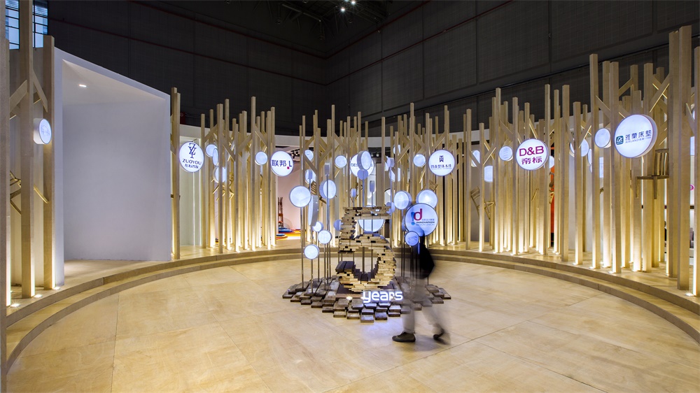
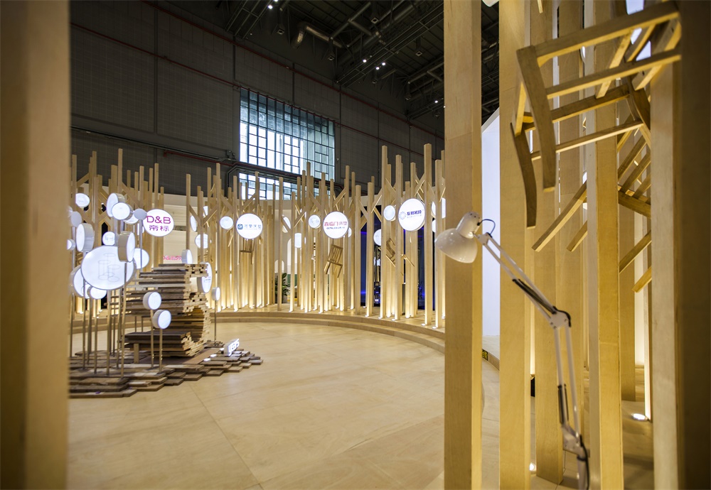
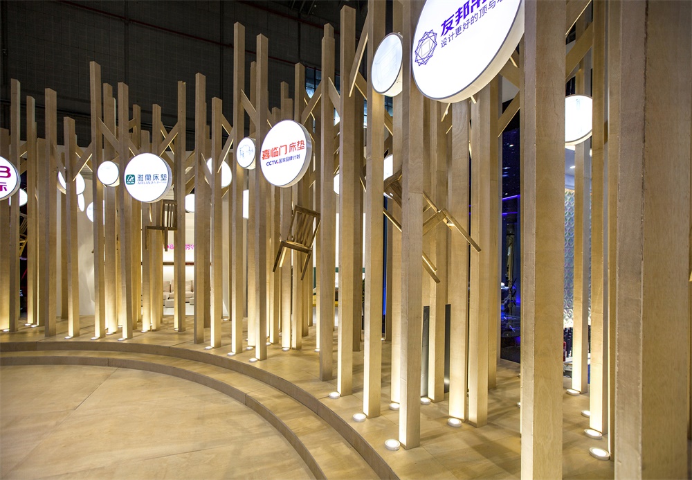
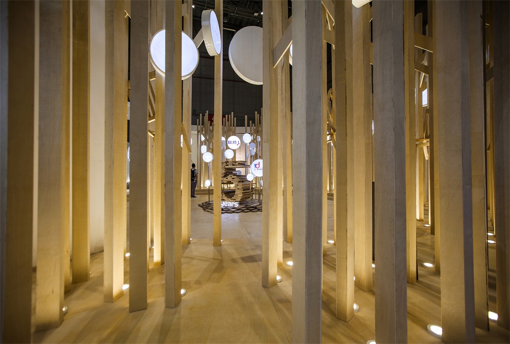
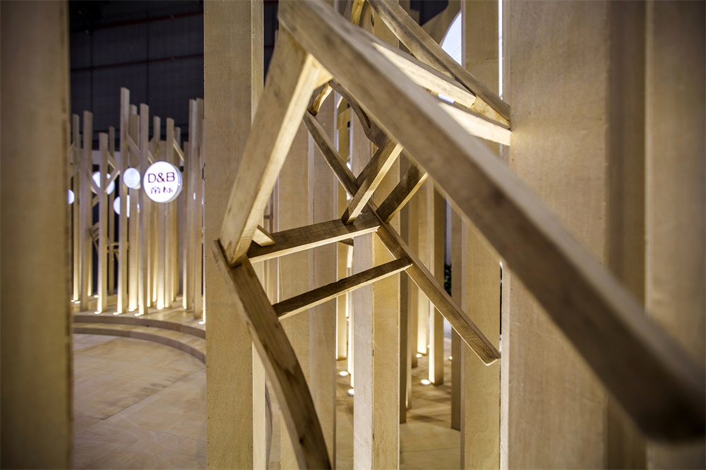
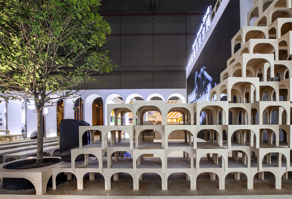
第二個區域——迷林,為一個圓形的廣場空間,整個區域解決的問題就是主題空間形象與展商個性形象之間的矛盾,TOWOdesign在廣場邊緣用各種家具框架,結合豎向木條構成一個半透明密林空間,人們透過密林縫隙可以探索性的發現後麵的展示空間。通過一個過渡的灰空間解決了整個矛盾。
The second area was a round-shaped “forest”, with the mission of coordinating exhibitors’ individuality and the thematic image of the overall exhibition. On the edge of the square, a semi-translucent dense forest-like space was formed by all kinds of furniture frames combined with vertical splints, attracting visitors to explore the exhibition booths hidden behind the “forest”. Such transitional area connected the square and exhibition booths harmoniously.
廣場中心的主題雕塑選用了生產家具廢棄的板材作為材料,通過設計作品本身向觀眾傳遞可持續的理念。
The theme sculpture in the center of the square was made of discarded furniture boards, conveying the sustainability concept to visitors.
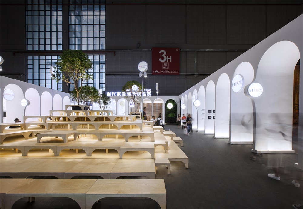
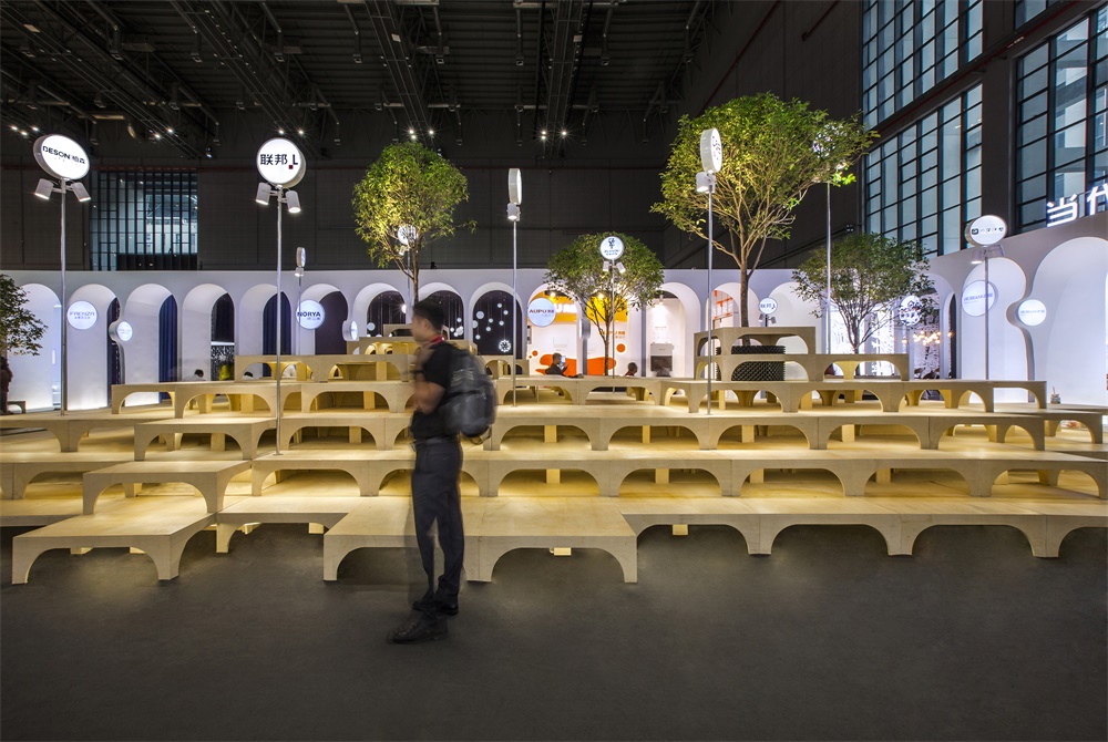
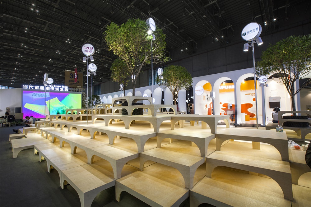
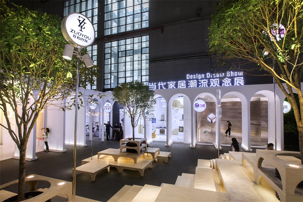
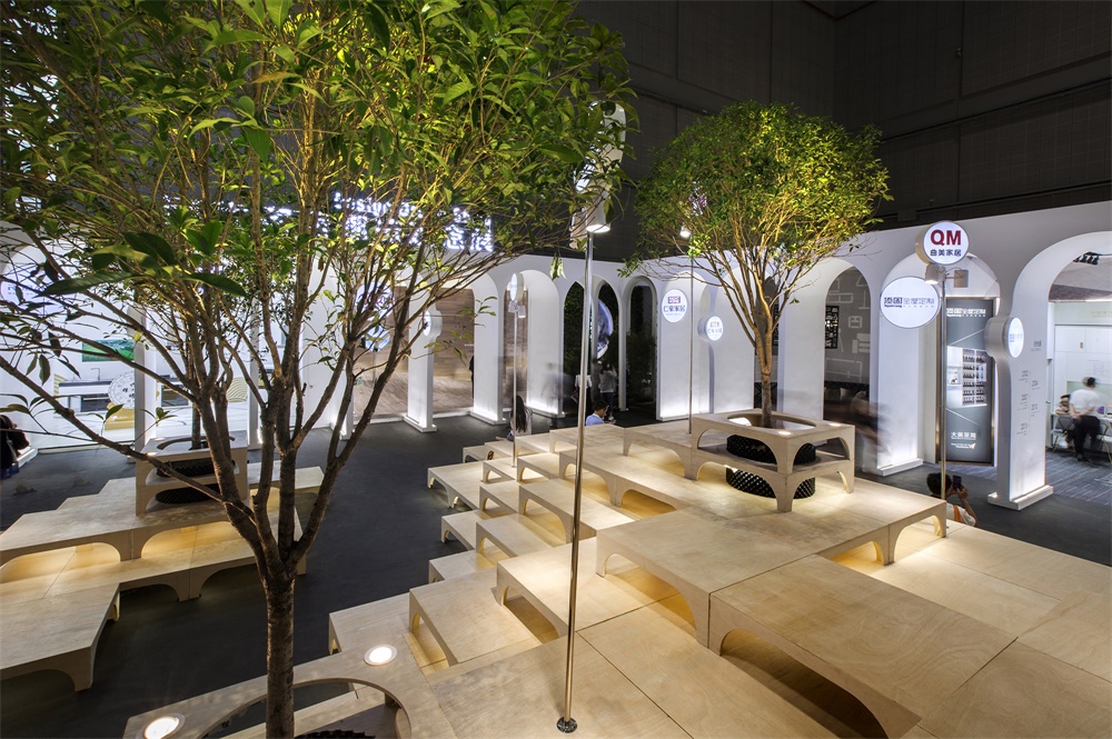
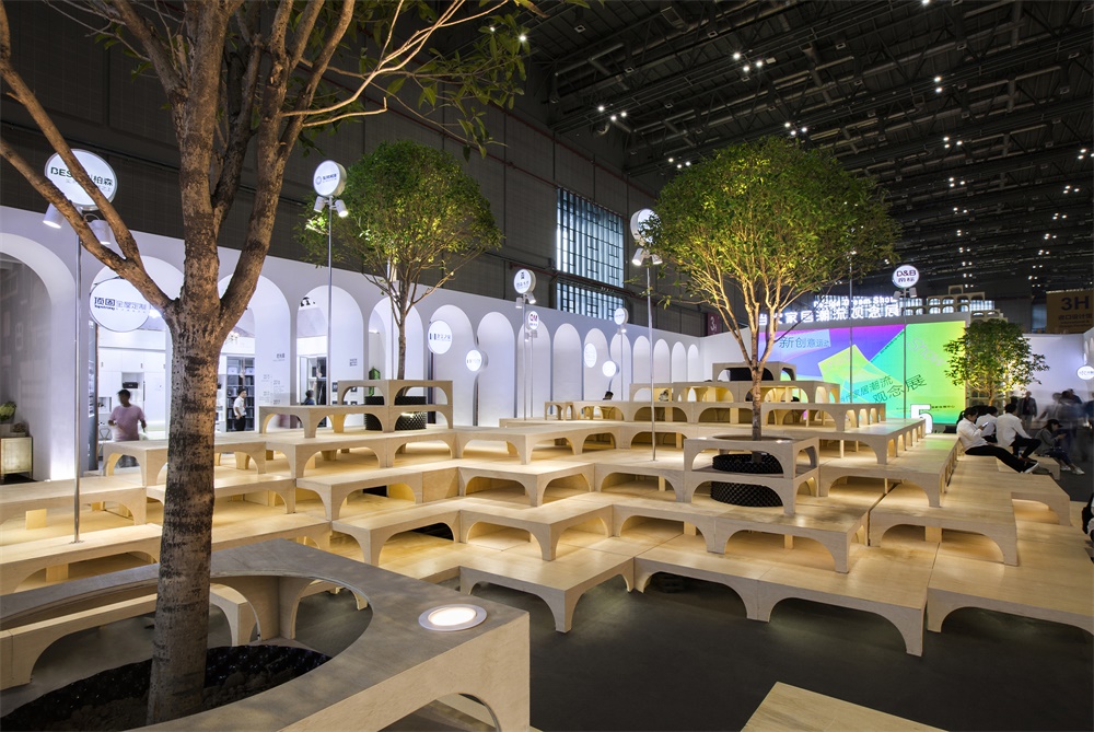
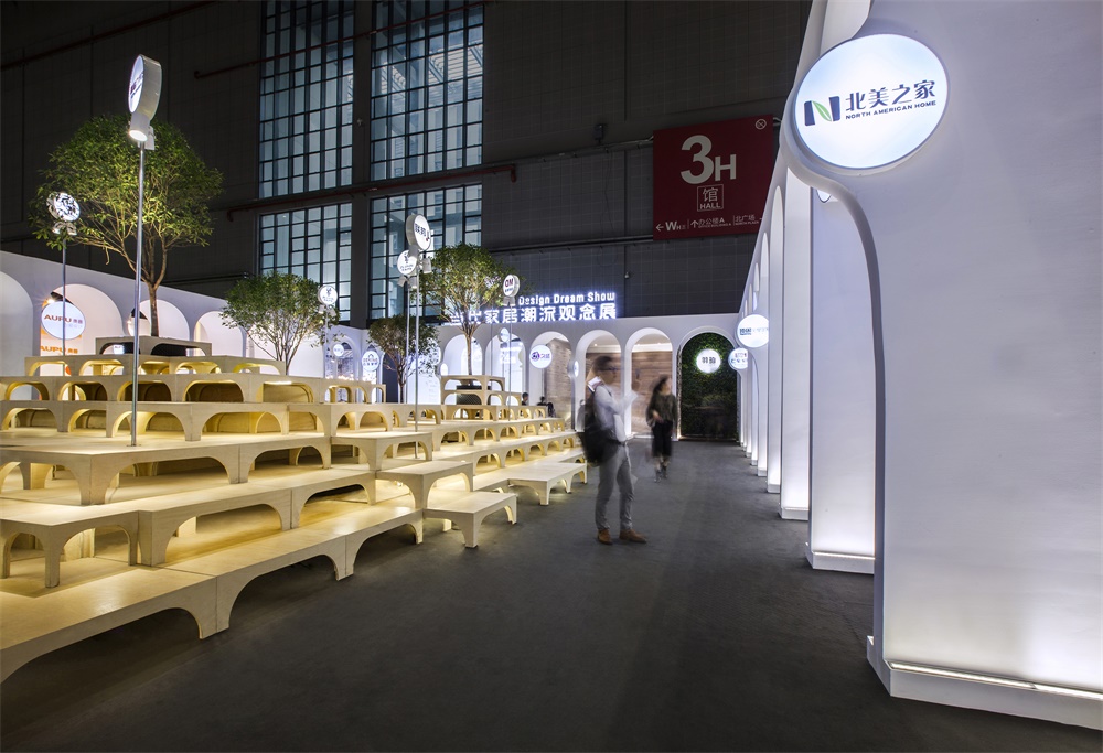
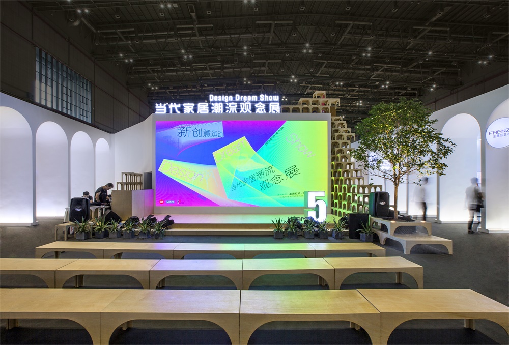
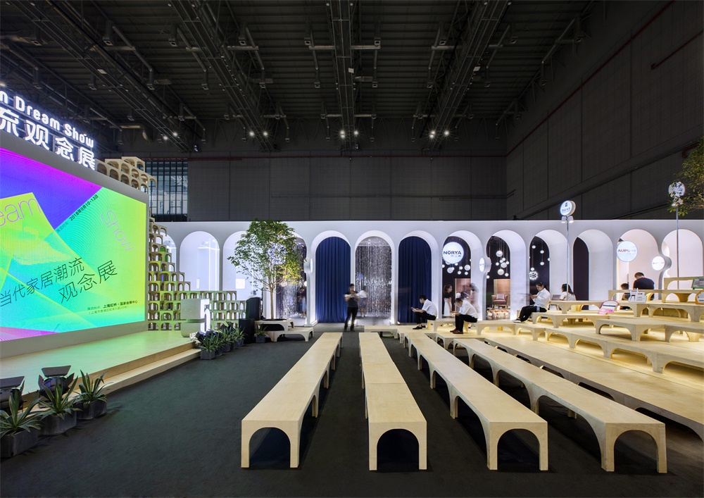
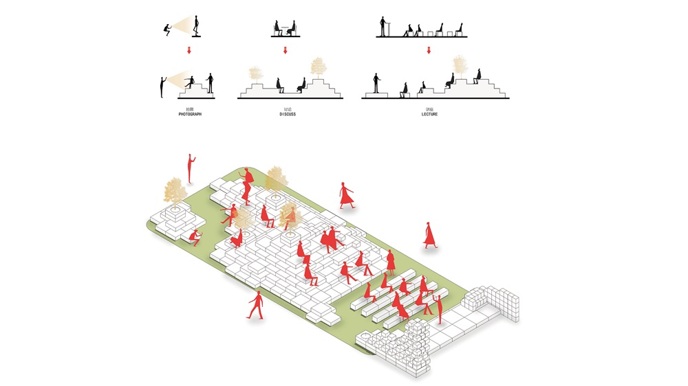
第三個區域為一個長方形的廣場區域,需要一個場所能為四周的展位提供交流洽談的空間,還能具舉辦整個展區的活動的場所。所以TOWOdesign運用最基本的凳子形態進行演變拓展,衍生出長凳、方凳、樹池、屏風;並用他們在廣場的中心構建了一個山丘,山丘的階梯高度與形狀很好的兼容了上麵所需要的功能,同時還打造了一個家具構成的人造景觀,為整個廣場帶來更多情感與樂趣。
The third space was a rectangle square, providing a space for facilitating communication between the surrounding exhibitors and visitors as well as holding activities for the whole show. The designers used the most basic stool form to create benches, square stools, tree pools and screens, and with which they built a “hill” in the center of the square. The step height and shape of the “hill” well satisfied the above-mentioned functions, and the “hill” itself at the same time created an artificial landscape consisting of furniture, which brought more fun for the square.
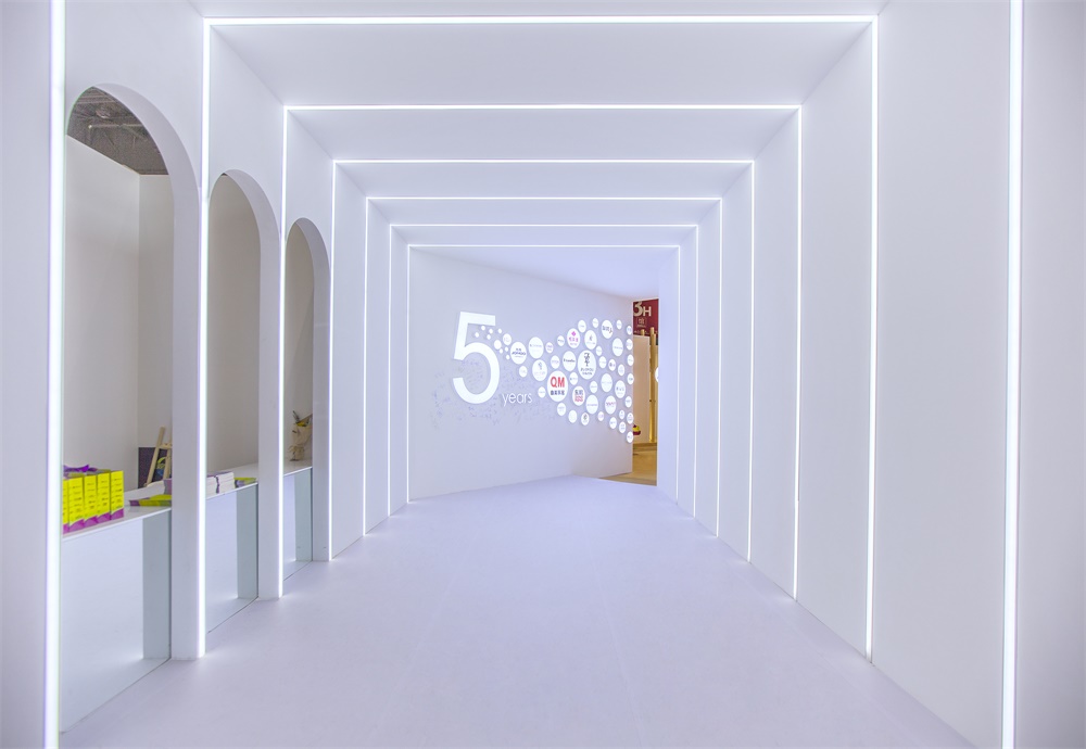
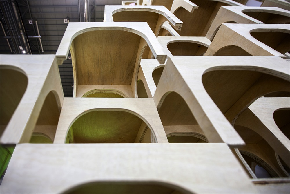
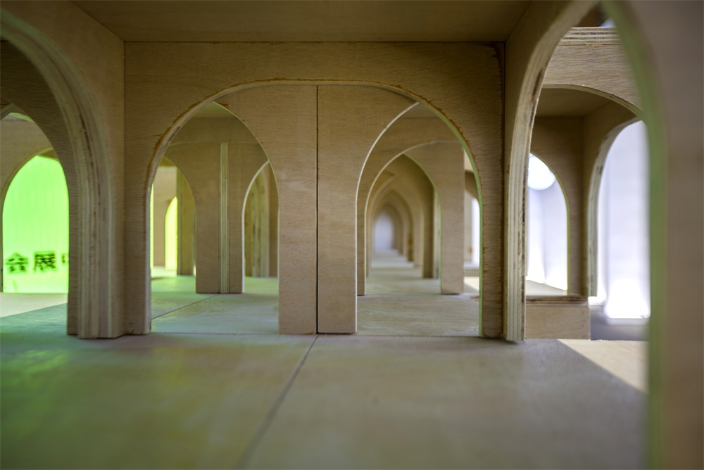
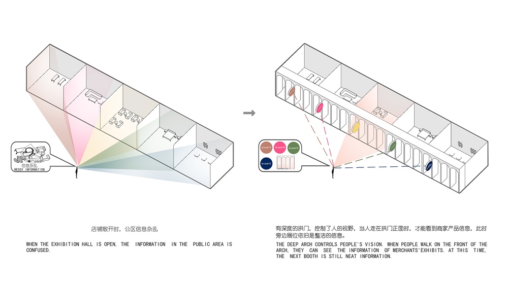
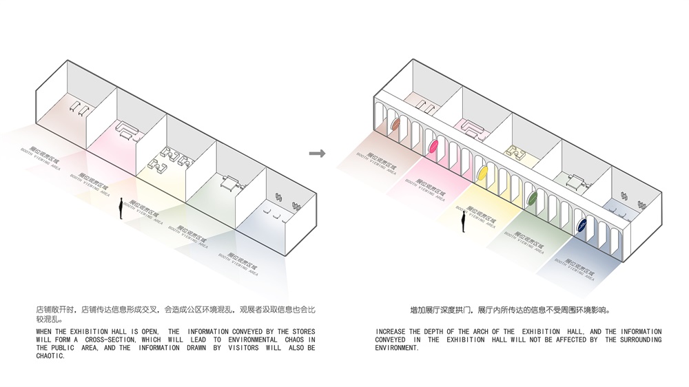
第三個廣場區域也會麵臨多個商家個性的形象與整個展示空間氛圍與格調之間的矛盾,所以在椅子山丘與展商之間TOWOdesign設置了深度為1.5米的拱門,一方麵它與中間山丘形成了規則排列與自由構成的對比效果,更重要的是拱門的深度控製觀眾同時看到展商的個數。隻有當觀眾站在每個展商拱門的正前方的時候,商家的空間形象才能完全的映入眼簾,而旁邊更遠的展位,被拱門遮擋掉大部分內容,更遠的展位就隻能看到整齊的拱門與外麵伸出的品牌logo,這樣就建立了個更有序的信息獲取邏輯,也解決了共性與個性之間的矛盾。
In order to balance the exhibitors’ individualities and the atmosphere and style of the entire exhibition space, arches with a depth of 1.5 meter were built between the wooden hill and exhibition booths. On the one hand, the orderly arrangement of arches contrasted with the free formation of the hill in the center. On the other hand, the depth of the arches limited the number of booths that visitors could see at a glance. Only when visitors stood directly in front of an arch, could the whole space of the booth come into view completely. Besides, the arch blocked out most of the space of the adjacent booths, and for other farther booths, only neat arches with brand logos stretched out could be seen. In this way, an orderly logic of information acquisition was established and the balance between commonness and individuality was also achieved.
完整項目信息
項目名稱:2018DDS當代家居潮流觀念展展覽空間設計
項目地點:上海國家會展中心H3館
項目類型:展廳
項目麵積:2000平方米
設計公司:towodesign堂晤設計(www.towodesign.com)
主持設計師:何牧
設計團隊:張倩、任偉、孫蒙
項目持續時間:2018年5月至2018年9月
主要材料:多層膠合板,白色乳膠漆,廢棄板材,舊家具
攝影:towodesign堂晤設計
Project name: 2018 DDS Exhibition Space
Location: H3 Exhibition Hall, National Exhibition and Convention Center, Shanghai, China
Category: exhibition hall
Area: 2000 m2
Design Company: TOWOdesign(www.towodesign.com)
Chief designer: He Mu
Project team: Zhang Qian, Ren Wei, Sun Meng
Project duration:May 2018 to September 2018
Main materials: plywood, white latex paint, abandoned wooden panels, discarded furniture
Photos:TOWOdesign


