LOFT中國感謝來自 立品設計Leaping Creative 的商業項目案例分享:
用旋轉舞台講故事的主題性體驗空間 A dramatic experiential space that tells stories with a rotating stage
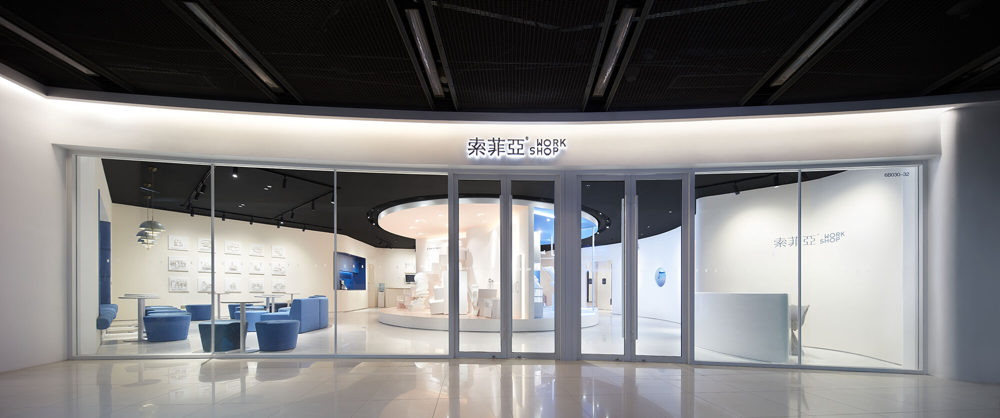
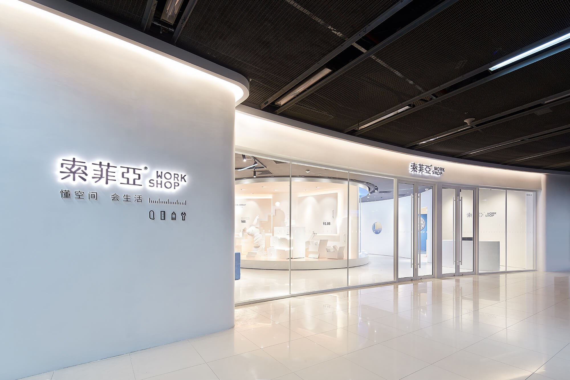
全屋定製品牌索菲亞(SUOFEIYA)的全新概念店選址於廣州天河核心商圈人流量最大的正佳廣場,立品設計受邀為品牌打造創新零售空間,希望能在已趨成熟的定製家居行業模式中做出突破。
The new concept store of the full-house furniture customization brand SUOFEIYA is situated at one of the most popular shopping-malls with largest number of visitors in Tianhe CBD, the commercial center of Guangzhou, China. Designed by LEAPING CREATIVE, the innovative retail space aims to explore a new mode of experience in the ever-maturing furniture customization industry.
目前市麵上的家居零售店普遍采用以樣板間展示產品的展廳模式,此店200平方米的麵積顯然無法容納大量樣板間;而基於設計團隊對定製行業的洞察,其核心優勢並不局限於單獨的家居產品,而是從定製設計到產品生產再到物流和安裝的完整服務體係。
Currently, most furniture retail stores in China display products in various sample rooms which normally requires a large scale of showroom space, which is infeasible for this project since the site only occupies an area of 200 square meters. However, with great insight, the design team think that the core competitive advantage of a furniture customization brand does not merely lie in individual products, but more importantly in a comprehensive service system that integrates products design, manufacturing, home delivery and installation.
因此,如何在有限的空間中,向消費者傳達服務優勢、提供有趣體驗並留下深刻印象是設計的首要思考點;設計團隊從概念、視覺、空間、互動裝置、營銷推廣等各方麵進行梳理及統籌,為品牌的終端店麵提出“WORKSHOP”主題概念。
So the key is to figure out how to innovatively convey the brand’s service advantages, and to create impressing customer experience in the limited space. Coordinating store concept, visual identity, floor planning, interactive installations, and marketing strategy, LEAPING CREATIVE came up with the theme of “WORKSHOP” to guide the project.
01. WORKSHOP:親身體驗、共同參與的工作坊 Workshop: first-hand experience and joint participation
“WORKSHOP”即“工作坊”,命名取其“多人共同參與、親身體驗、相互激發靈感”的核心理念,品牌將通過WORKSHOP店麵為消費者帶來優質生活方式提案。
The “WORKSHOP” concept is based on its core idea of “experiencing first-hand, participating together and inspiring mutually”, which is considered an innovative retail mode to provide customers with quality lifestyle proposals.
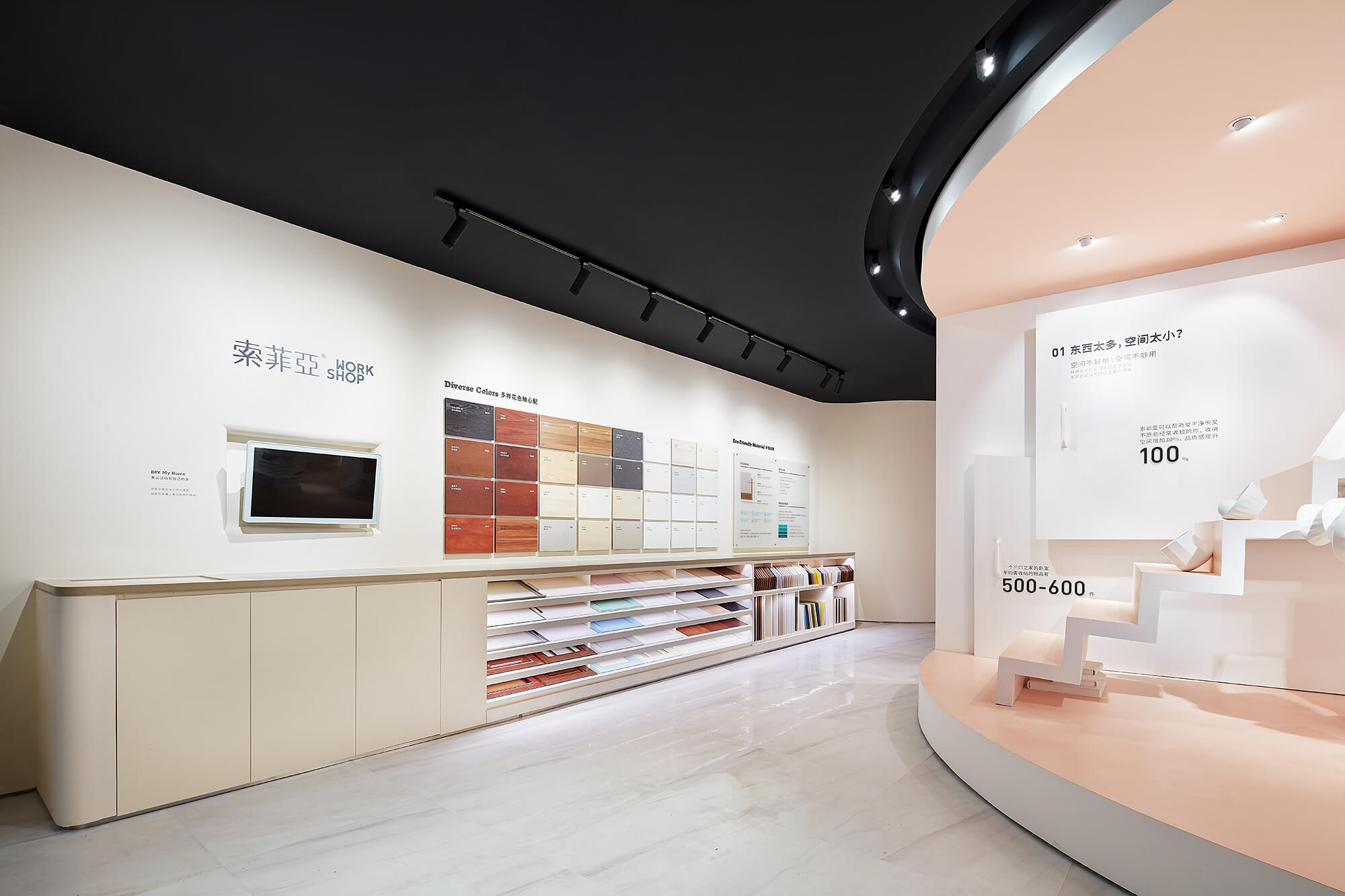
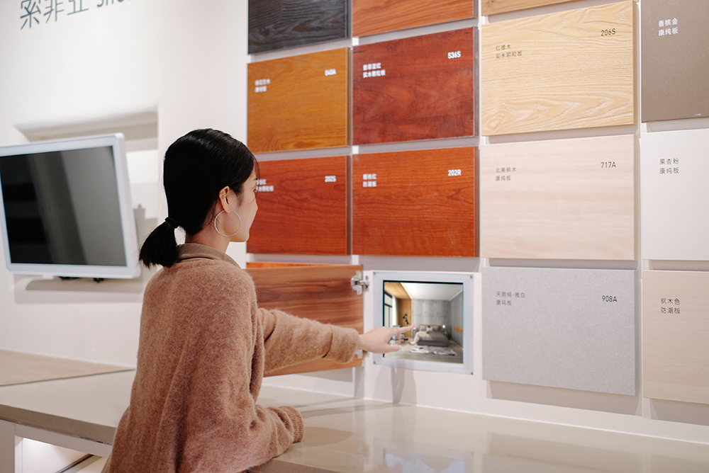
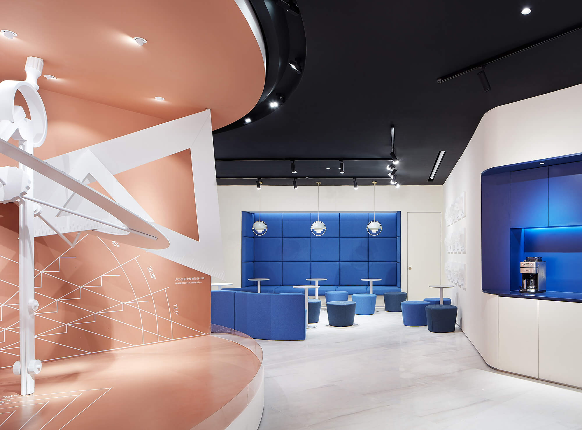
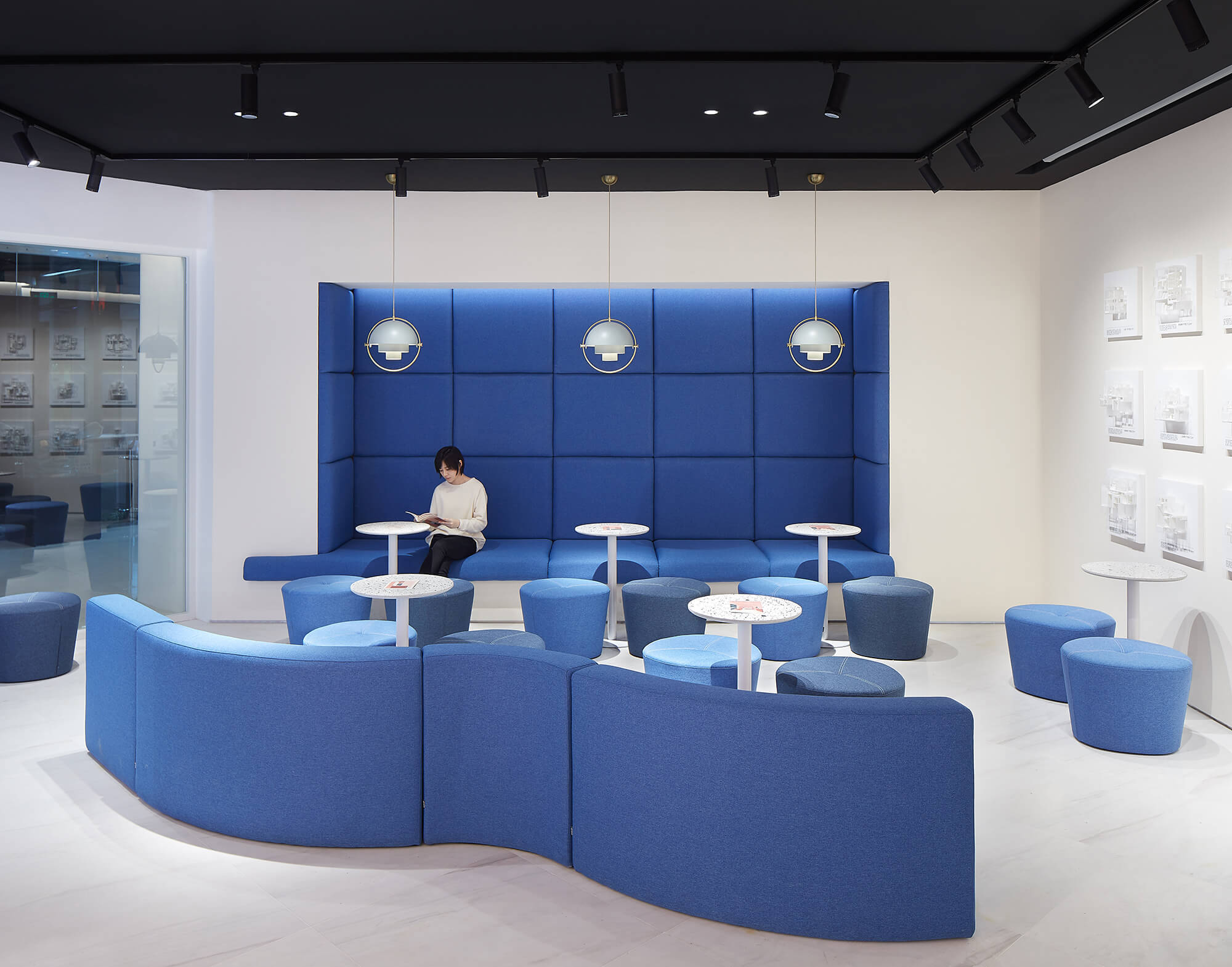
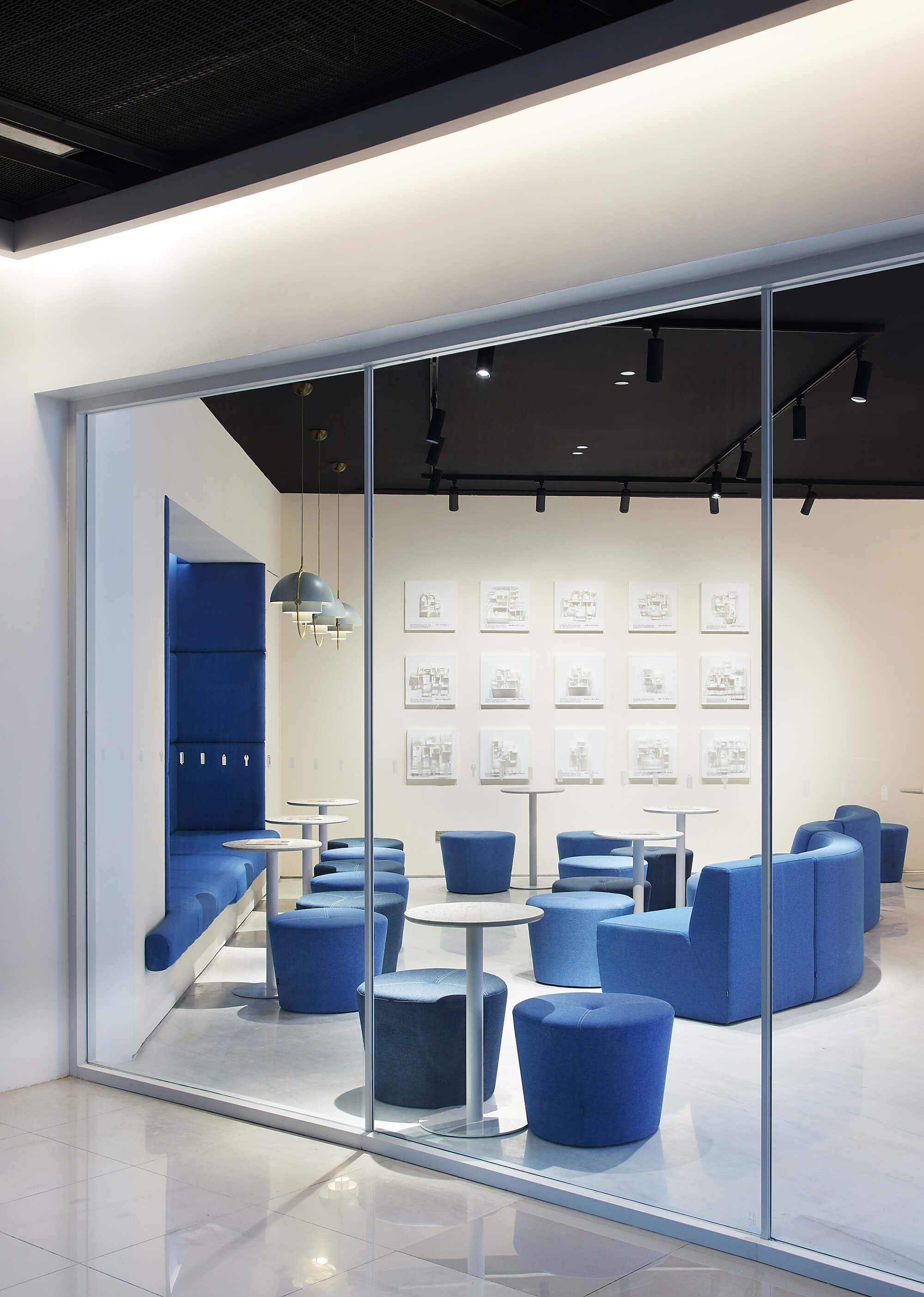
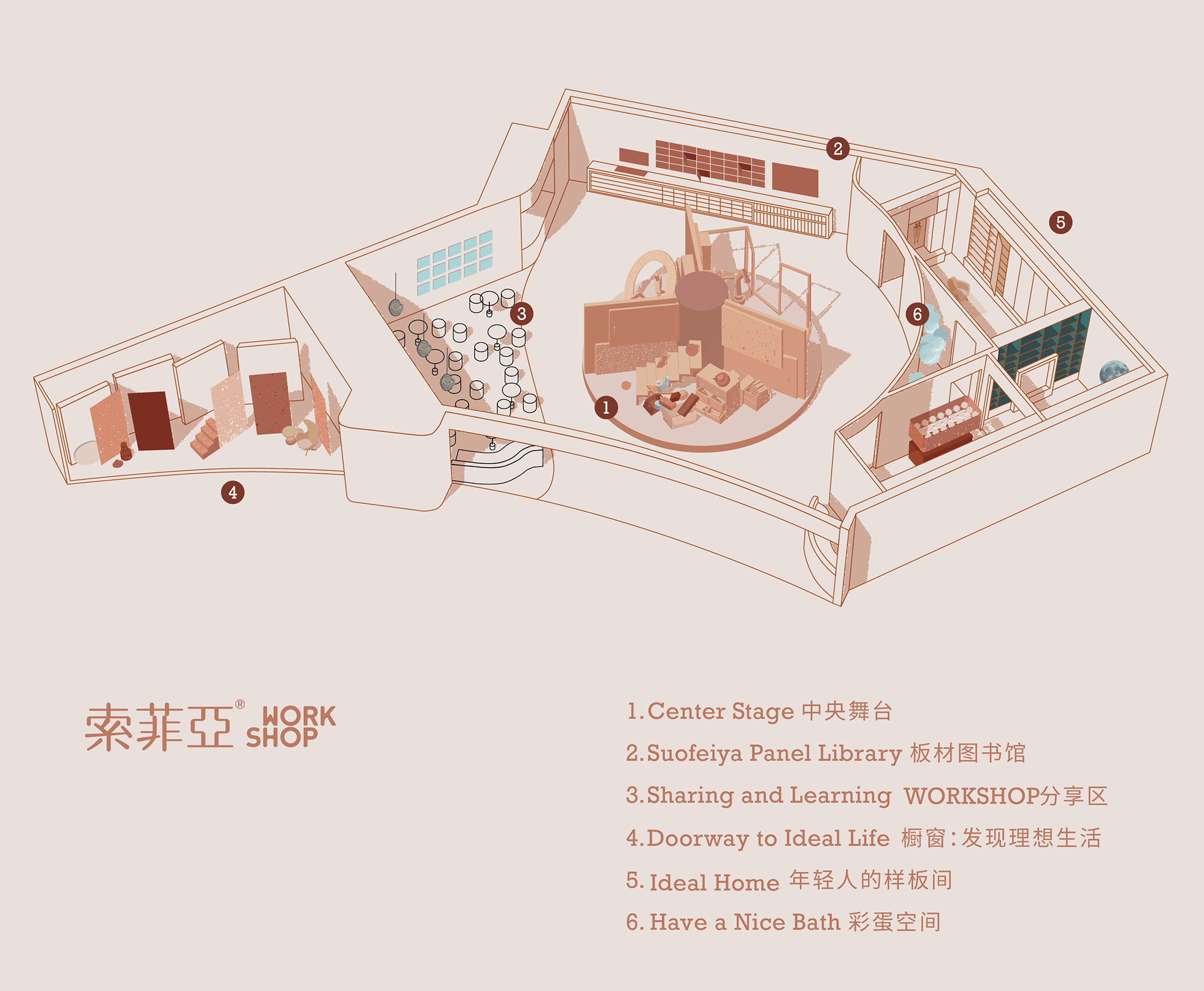
在為這家店做空間規劃時,除了展現服務優勢的部分,設計師還加入“板材圖書館”與“WORKSHOP分享區”板塊。前者運用多媒體展示幫助訪客親身眼見和觸摸材料樣板,從而更易想象它們用在家中的樣子;而後者為生活達人的日常分享會活動提供專屬空間,使得WORKSHOP真正成為共同參與、以交流啟發靈感的“靈感供給站”。
As planning the layout, the designers added a “Panel Library” area and a “Sharing and Learning” section in the space, in addition to the main area for displaying the brand’s advantages of services. The “Panel Library” uses multimedia to help visualizing how those materials can be utilized in their homes, and the “Sharing and Learning” area is a dedicated space for lifestyle advisers to share their experience, which makes the WORKSHOP an “inspiration station” that allows a group of people to participate in sharing activities together and thereby spark inspirations through communication and interaction.
02. 用裝置設計手法講述故事 Storytelling installations
WORKSHOP店的一個重要任務,是幫助麵對裝修無從下手的消費者了解家居裝修定製服務優勢;區別於行業傳統依靠店員口述的方式,設計師選擇讓空間中的裝置來講述故事。
One of the major goals of the WORKSHOP is to acquaint customers who have no idea of home decoration and furnishings with the brand’s advantages in terms of furniture customization. As opposed to the conventional practice of introducing services by salespersons, the designers tried to let installations in the space to tell the stories.
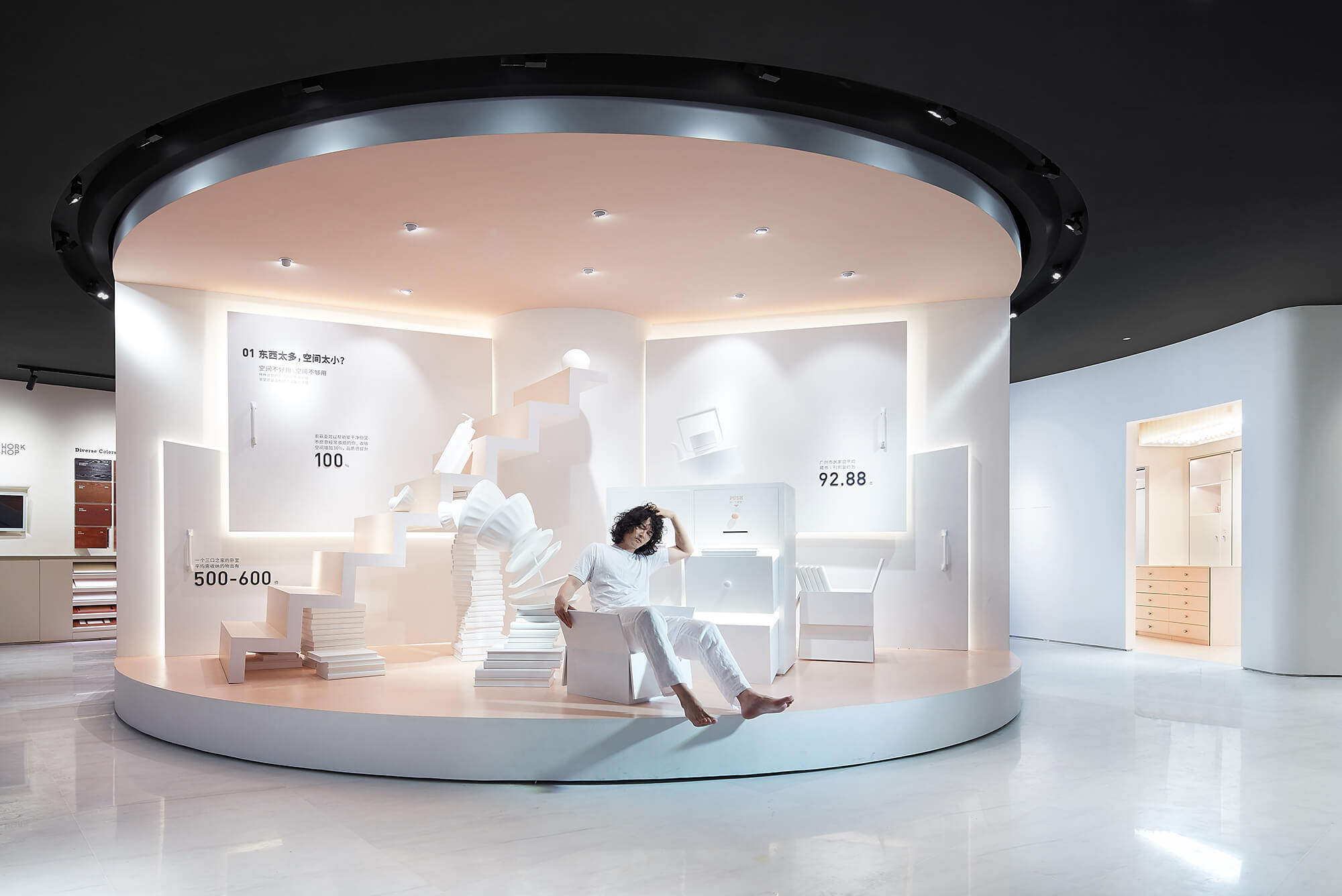
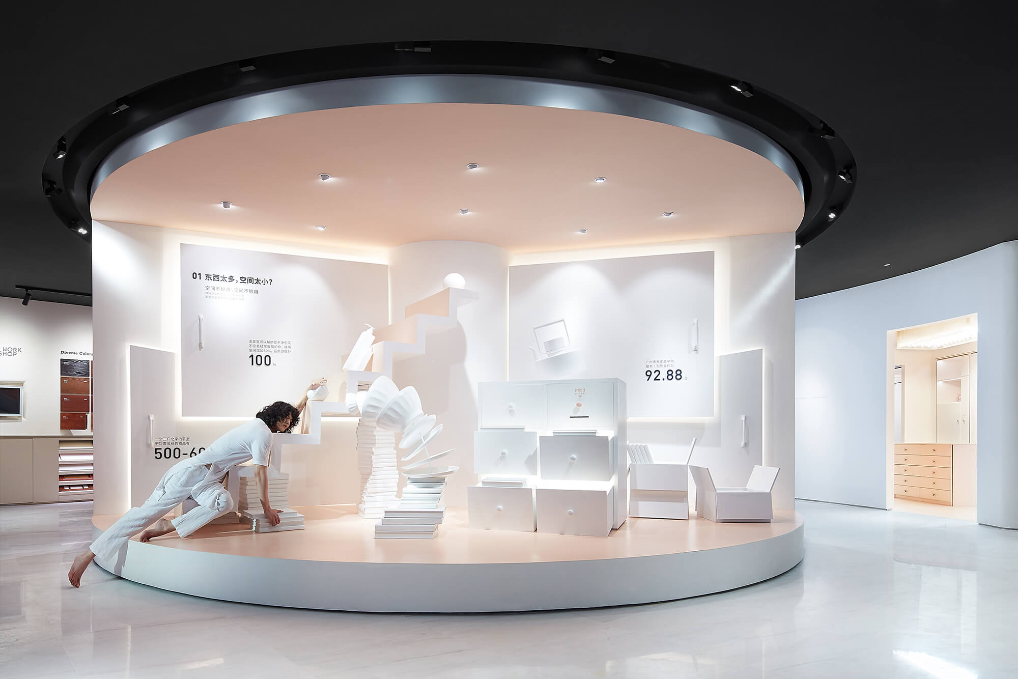
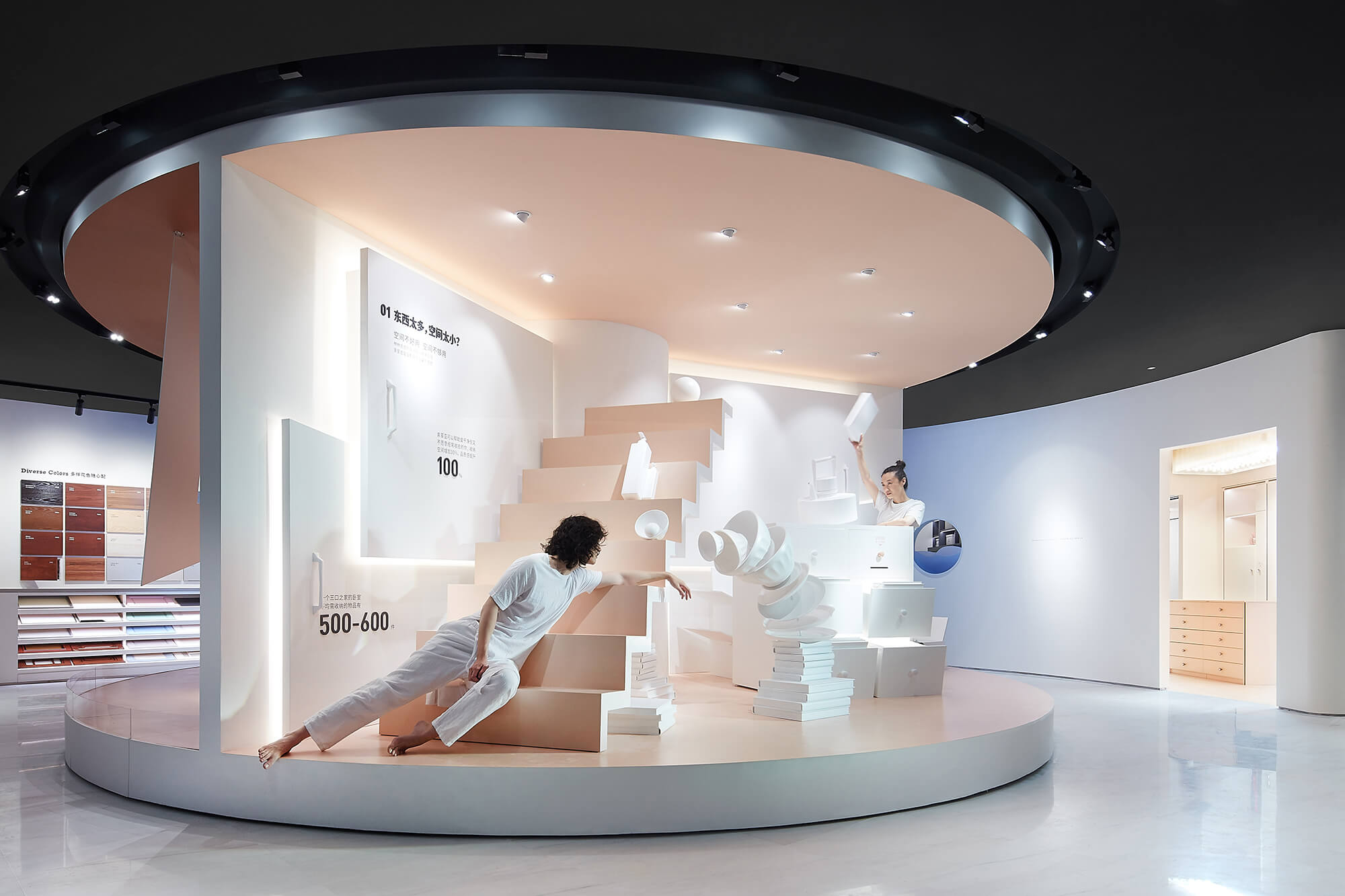
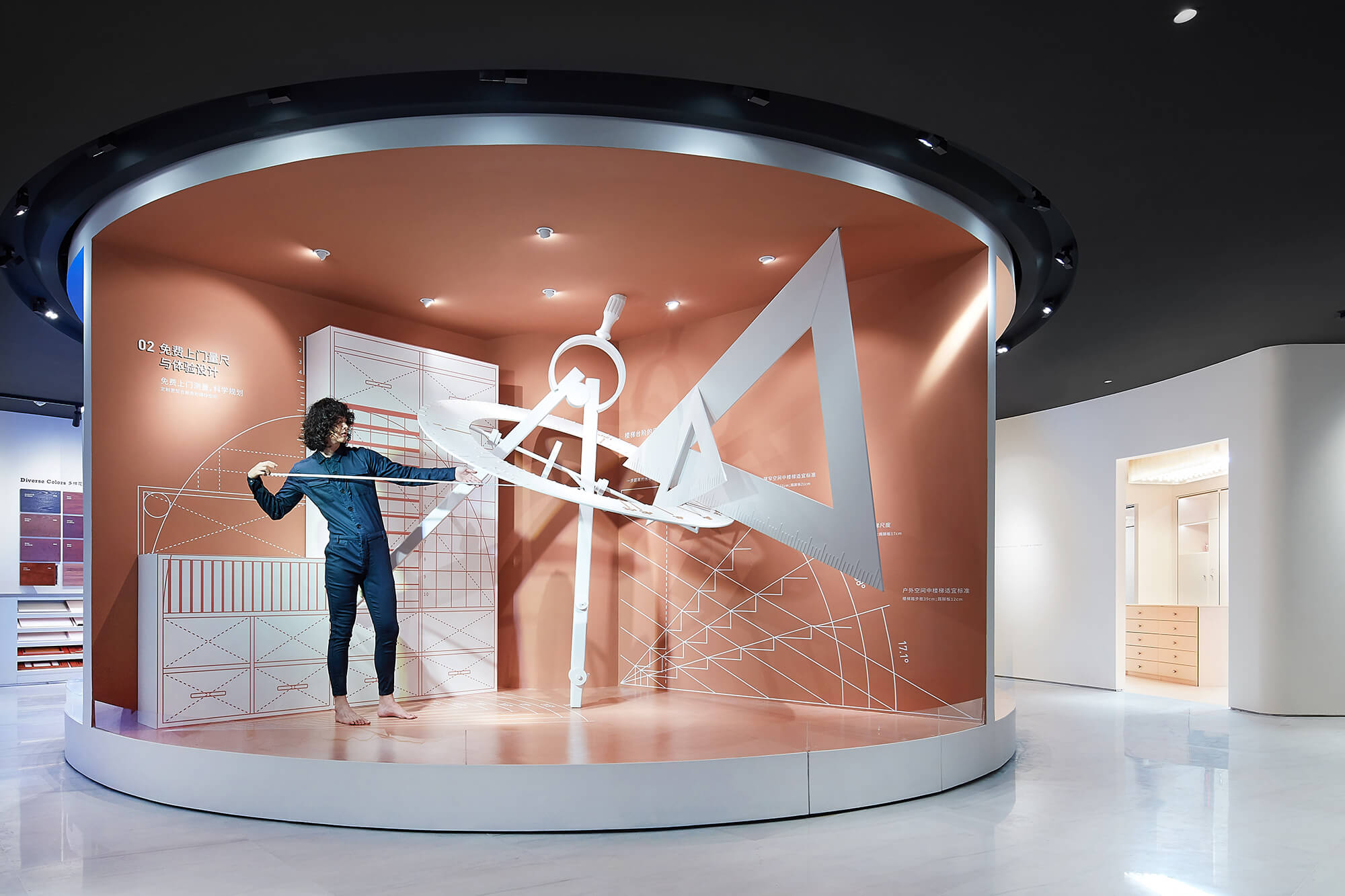
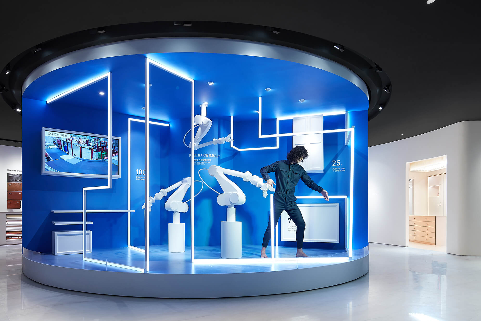
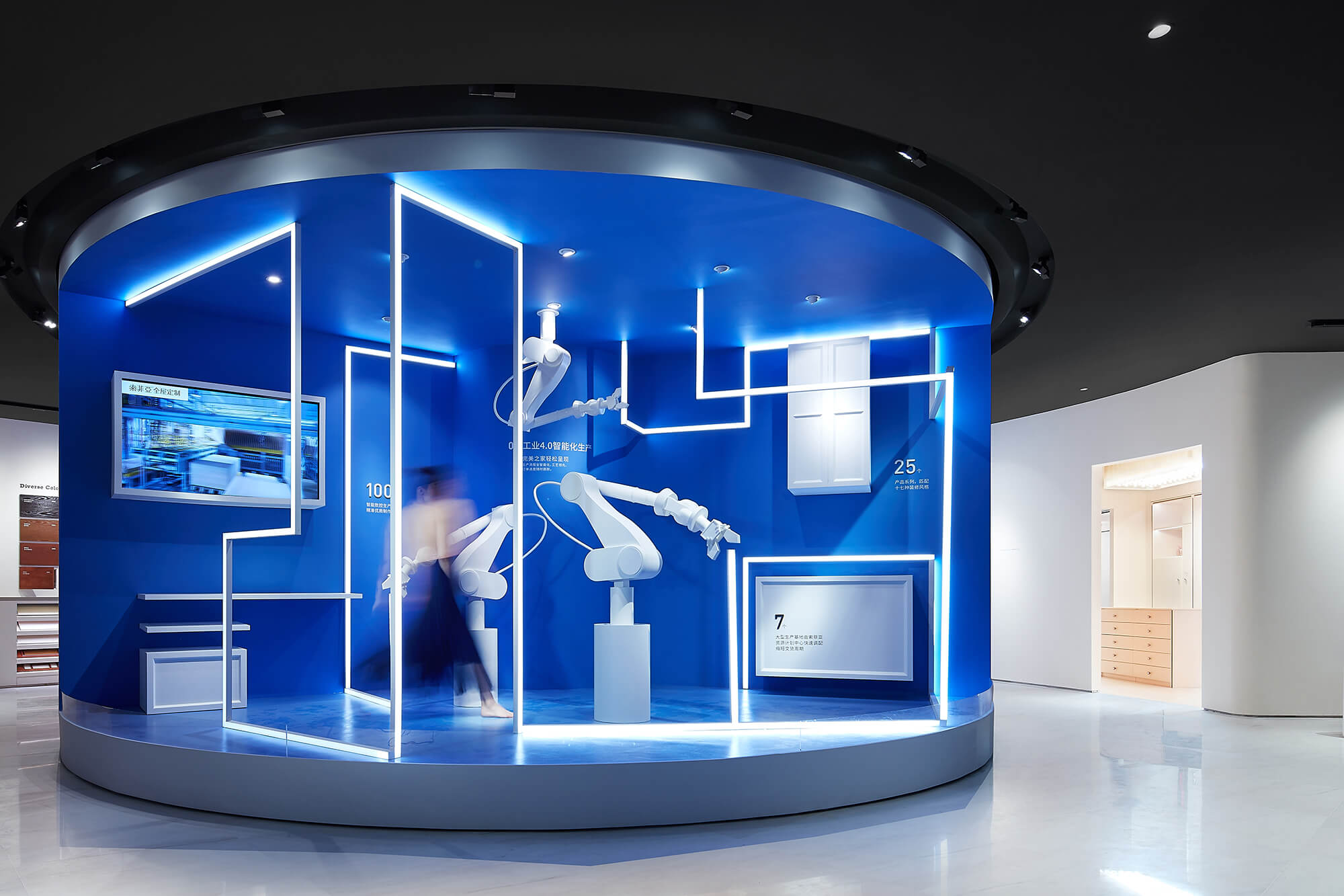
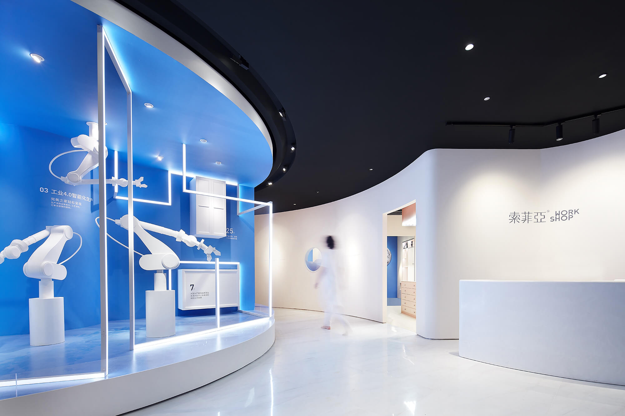
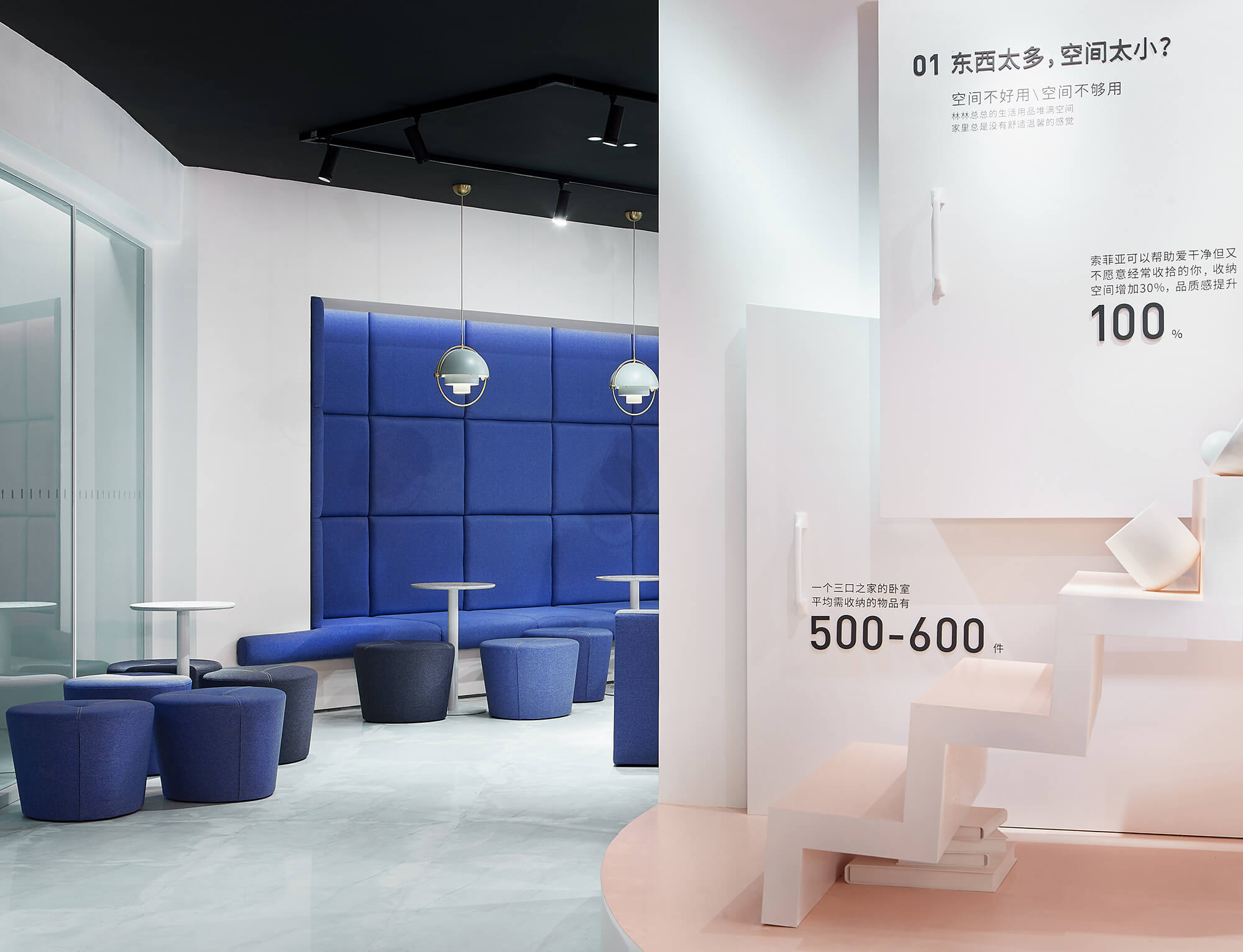
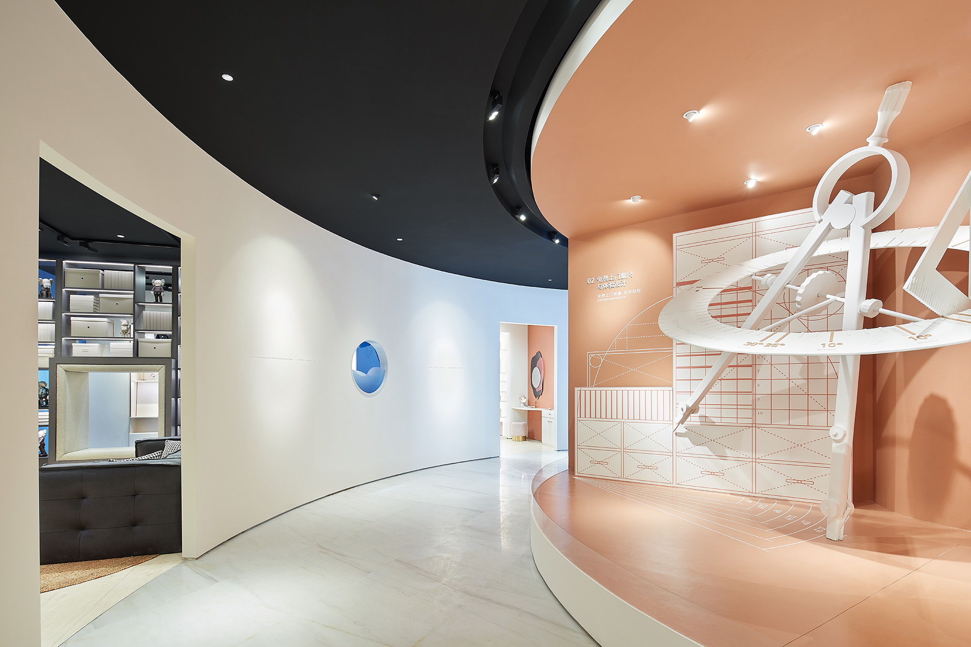
為此,設計師利用鋪位原有建築結構——立於店麵中心位置正對入口的大柱子,轉化空間布局難點,環繞柱子設置了一個不停緩慢轉動的圓形舞台;利用裝置設計手法,通過充滿戲劇張力的表達方式,用舞台上的三個部分分別展現服務過程中的三個體驗環節。其中的第一部分就從日用品雜亂堆疊的誇張場景開始,著力表現人們家中“東西太多、空間太少”而二次裝修無從下手的普遍生活困境,希望與剛剛步入店內的顧客產生共鳴。
To that end, they ingeniously made use of the large column at the center area of the original space that faces the entrance, and created a rotating circular stage around it. Featuring installation design approach and dramatic expressions, the stage consists of three sections that respectively present the three steps in the service process. The first section starts with an exaggerated scene where household items are stacked disorderly, which focuses on embodying a common dilemma in people’s daily life, especially in large cities — too many articles in the limited living space yet redesign and redecoration is far from easy, thereby aiming to strike a chord with customers as they stepping into the WORKSHOP.
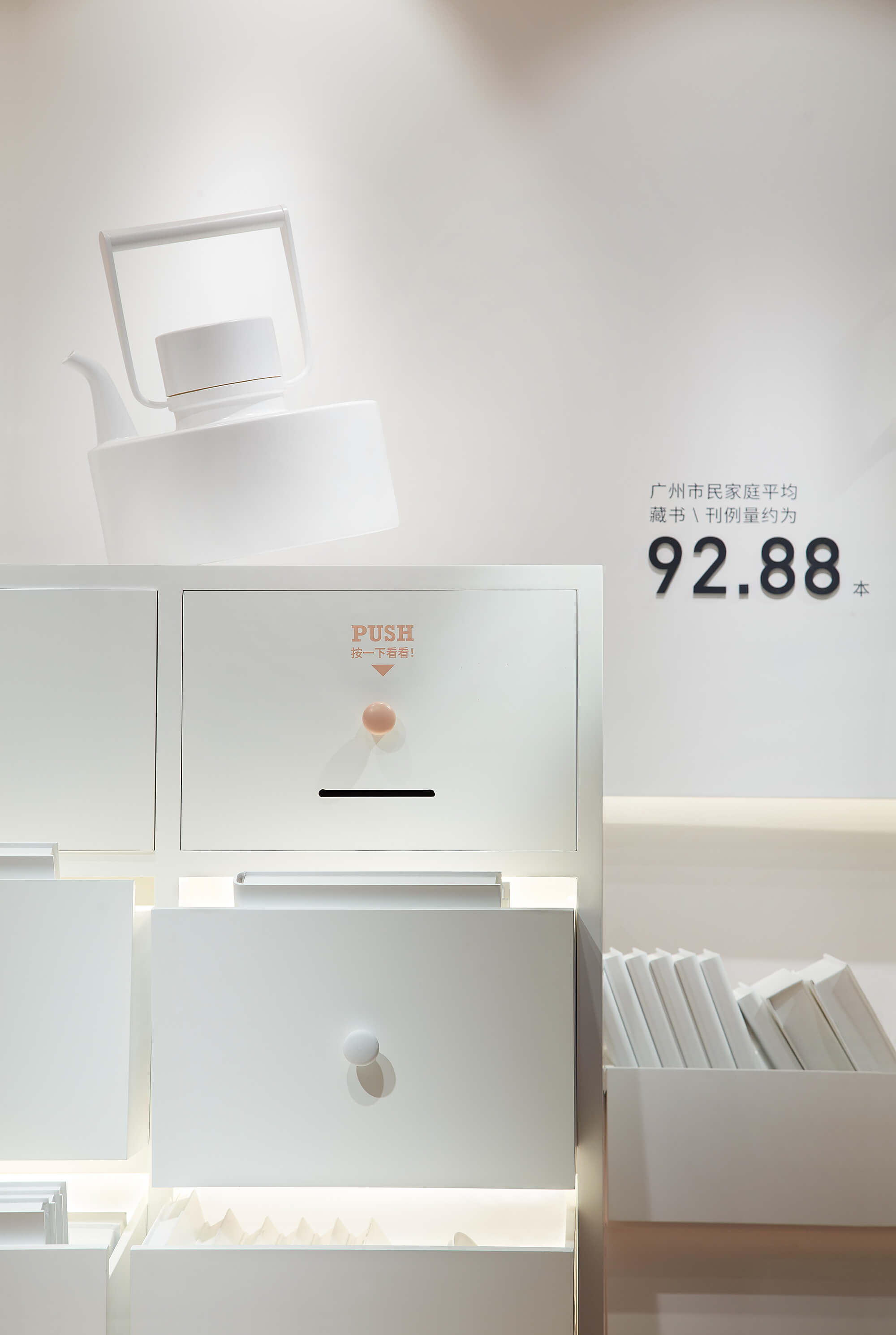
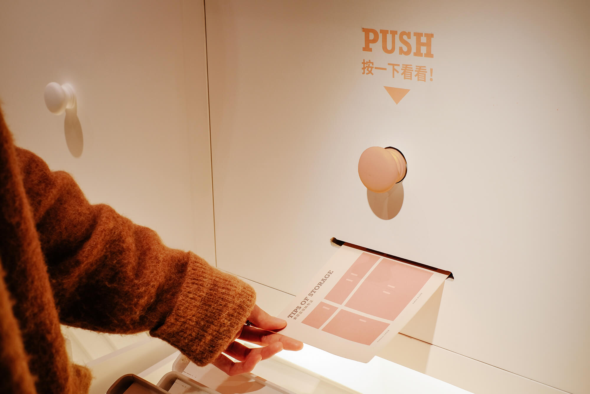
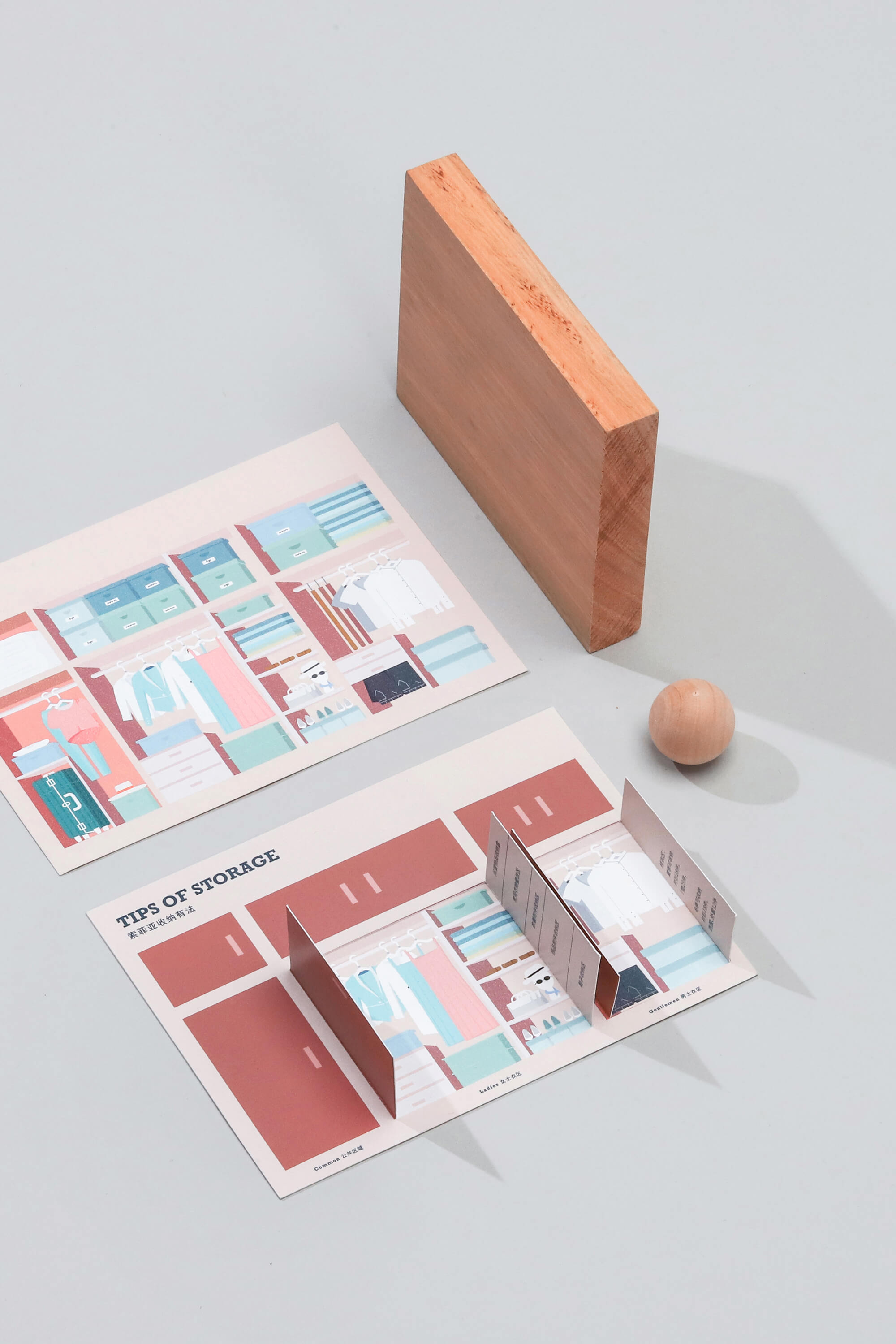
舞台上還藏有互動小驚喜,按下儲物櫃的抽屜把手便會吐出“收納tips”卡片,卡片設計模仿衣櫃櫃門的打開形式,顧客動手撕開上層即可翻看背麵的實用收納竅門。
There are some surprising interactive details on the stage. When pushing the handles of cabinet drawers, cards with storage tips would come out. The double-layer cards mimic the form of closet, so that the customers can get practical information by flipping the upper layer cards like opening a closet door.
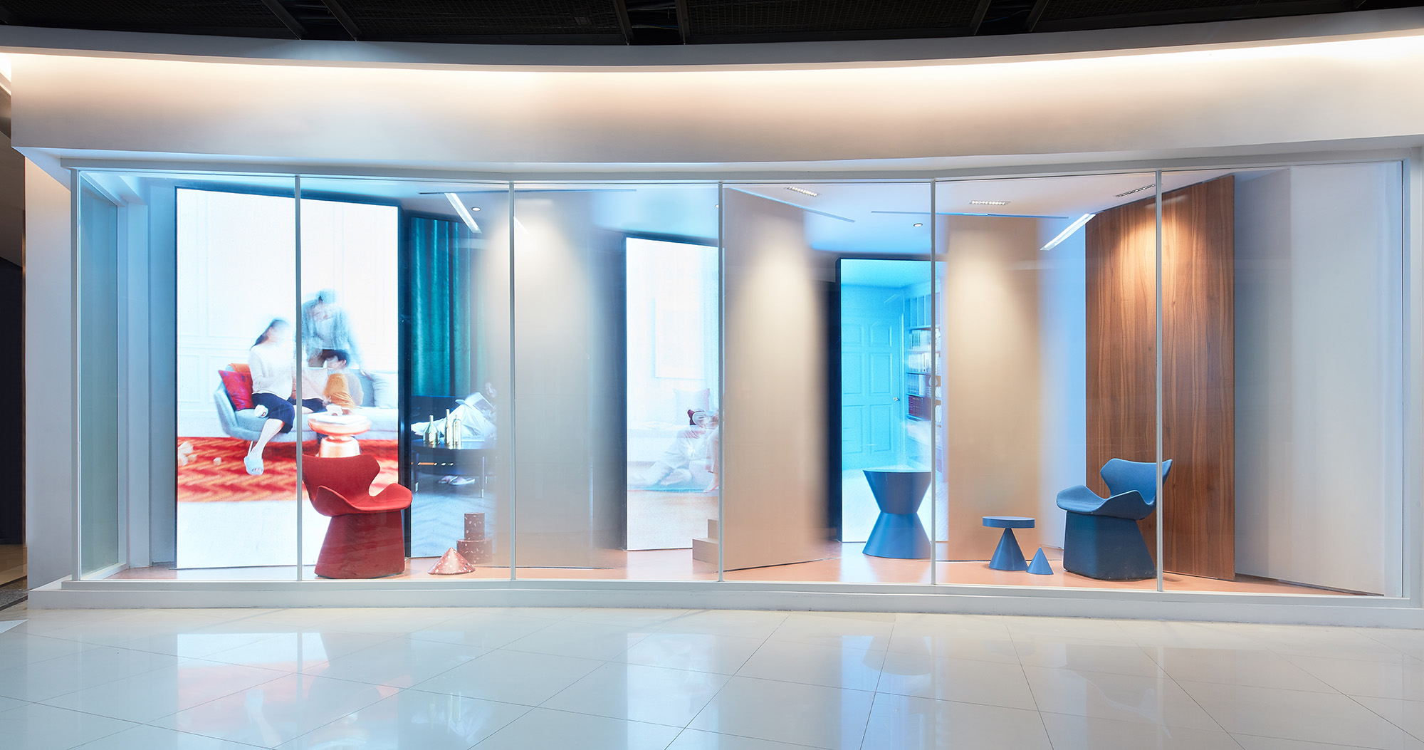
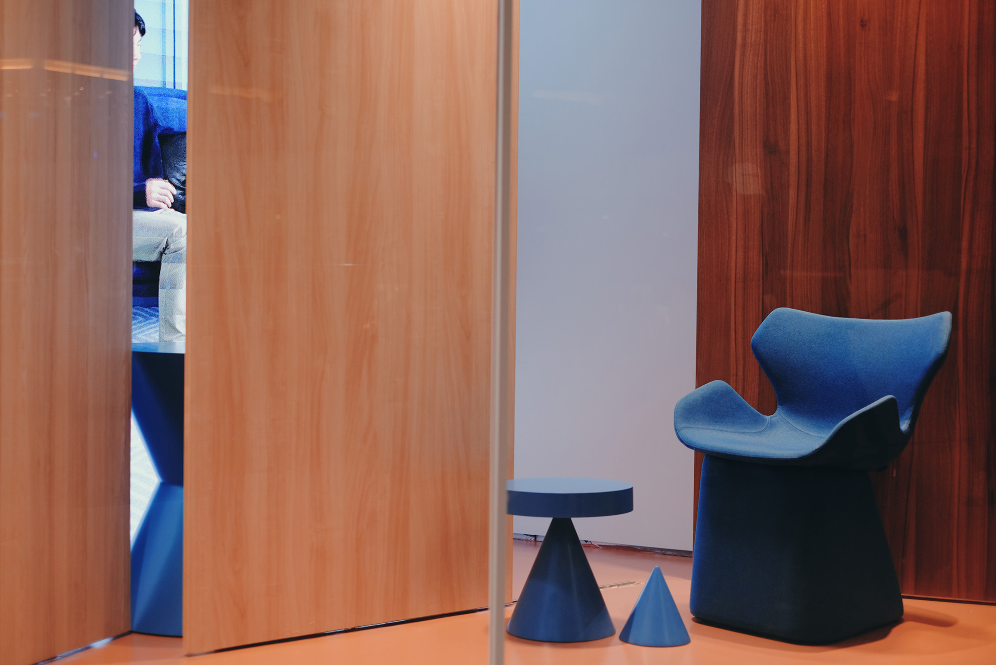
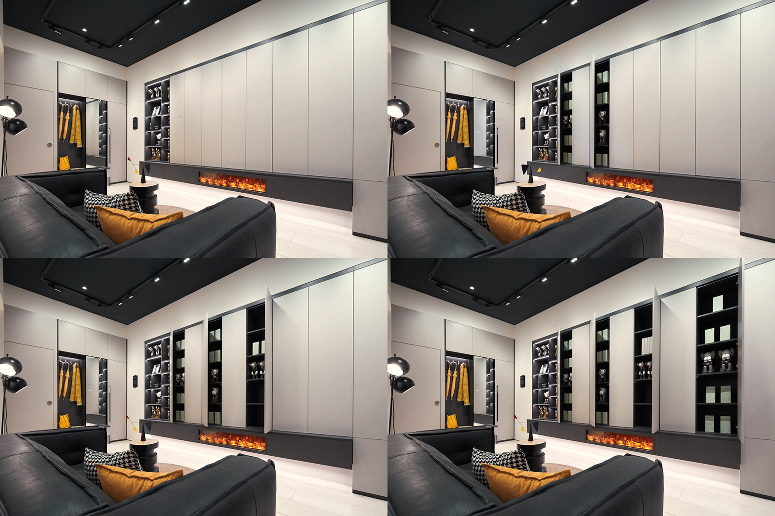
而外立麵的櫥窗裝置則采用動態機械與視頻畫麵結合的方式:豎立在前的櫃門板像舞台幕布一樣來回移動,隨機露出屏幕畫麵;而畫麵中分別輪播著單身、年輕伴侶、及三口之家等不同類型家庭的生活畫麵。設計師希望以此表達打開櫃門獲得更多優質生活的概念,對產品賣點進行趣味性表達。
On the other hand, the store window display installation also refers to the door-opening motion. The cabinet door panels in the front keep moving back and forth to reveal the video screens randomly. The videos keep playing the life scenes of singles, young couples, families of three and other family types in turn. Through such design, the designers hope to convey the connection between quality lifestyle and the products both provided by the brand.
03. 更貼合都市年輕人生活方式的故事樣板間 Showrooms that well fit into urban young people’s lifestyle
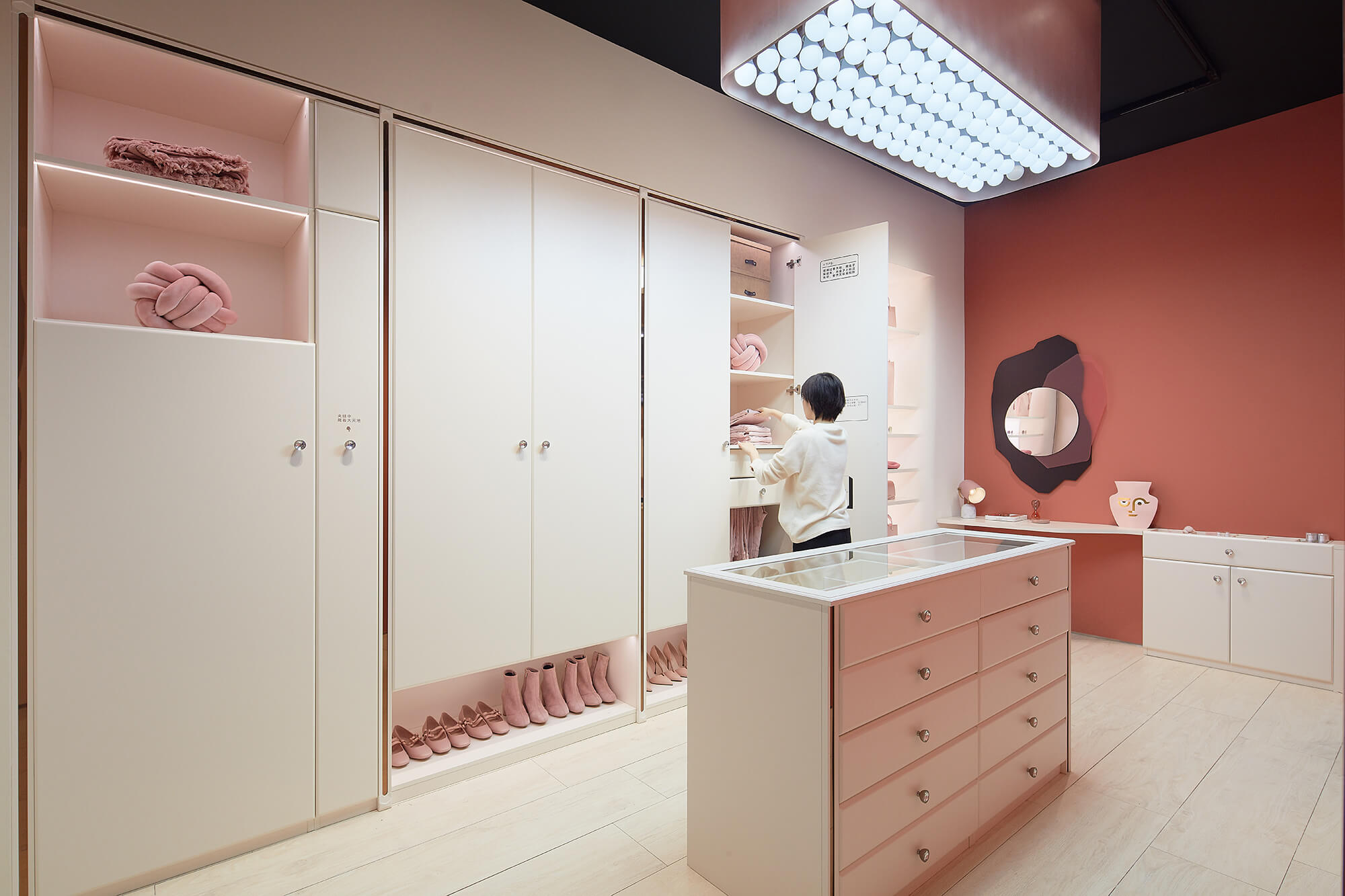
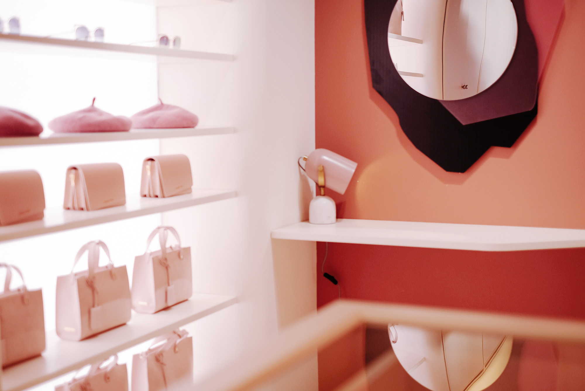
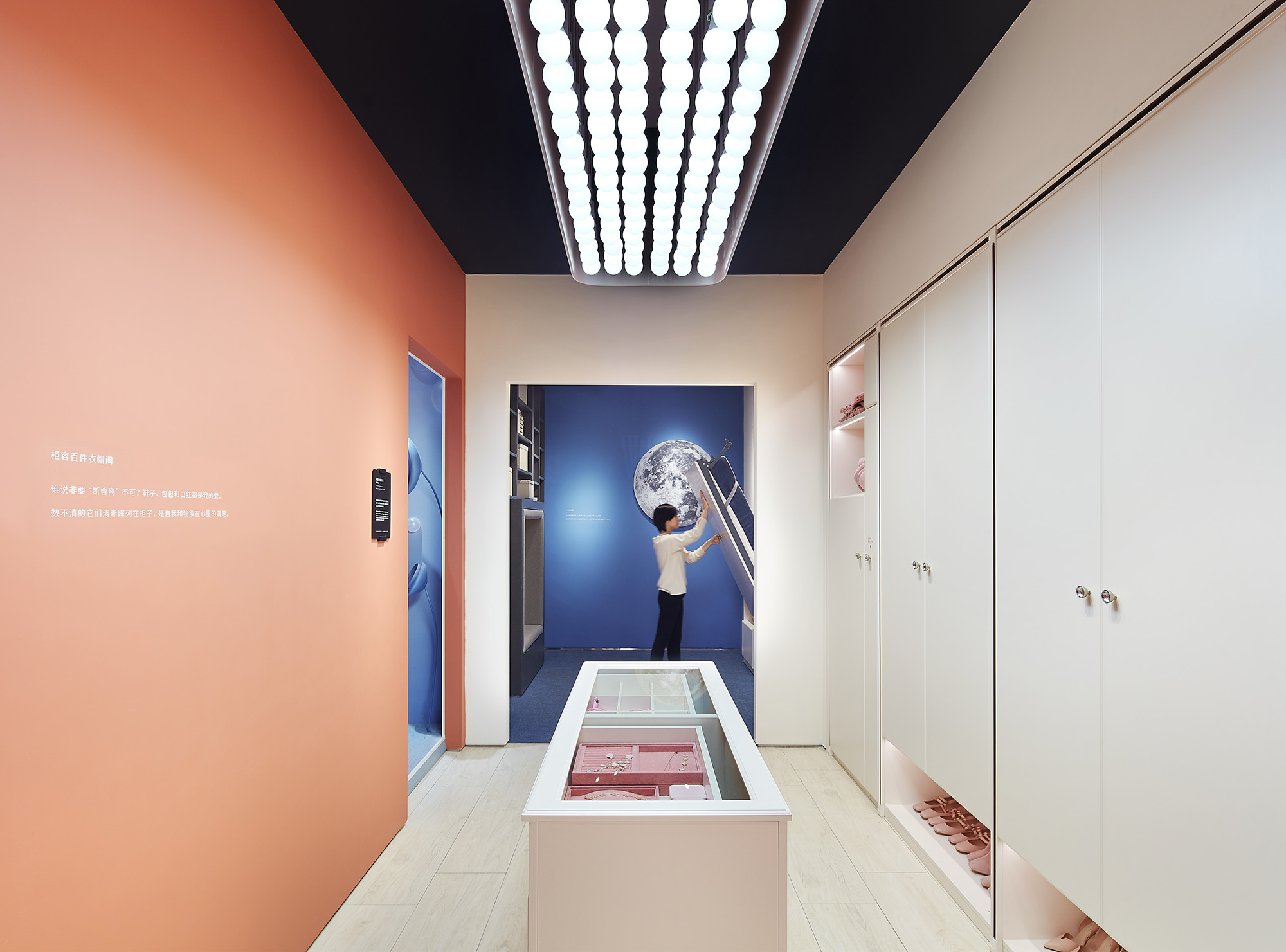
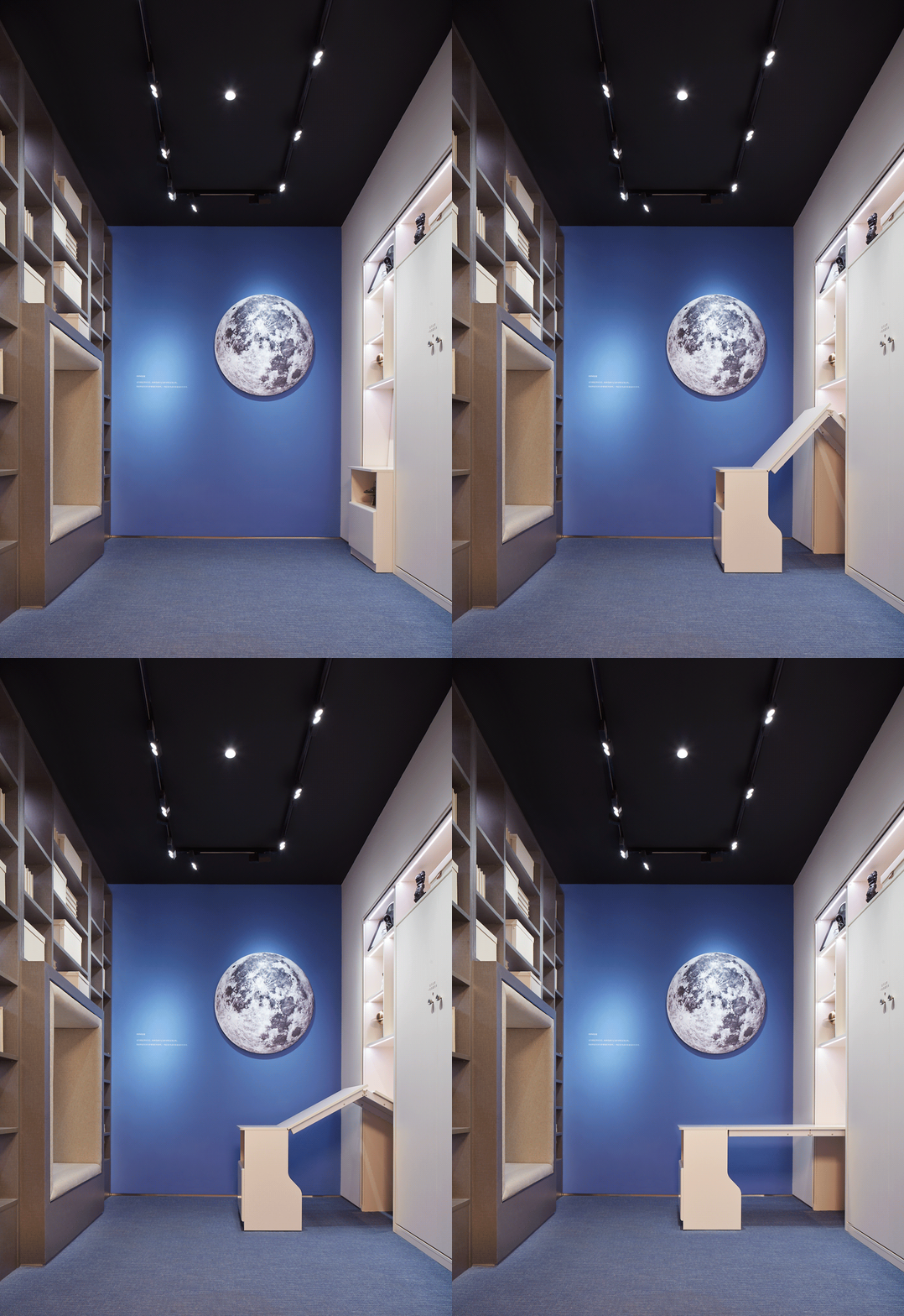
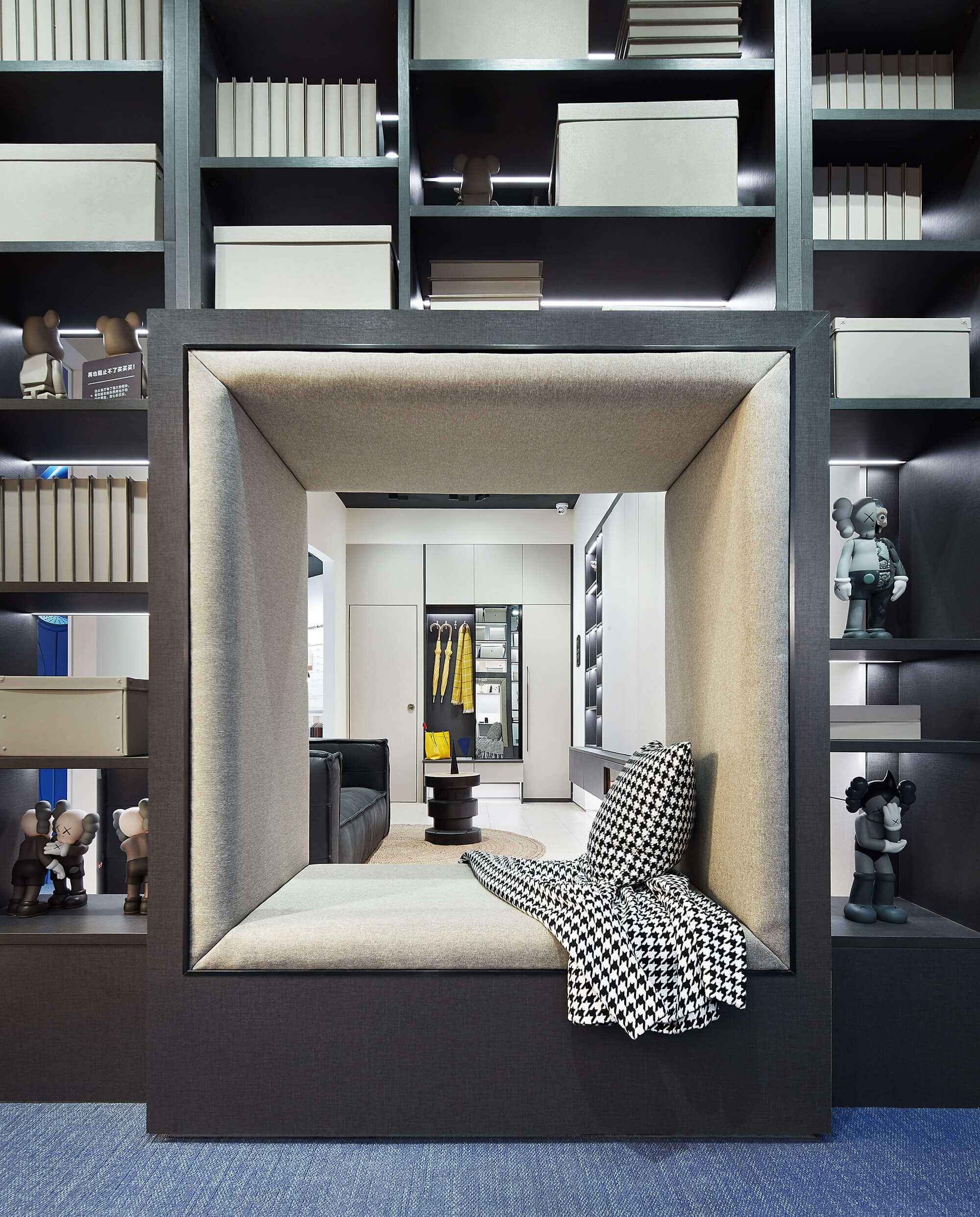
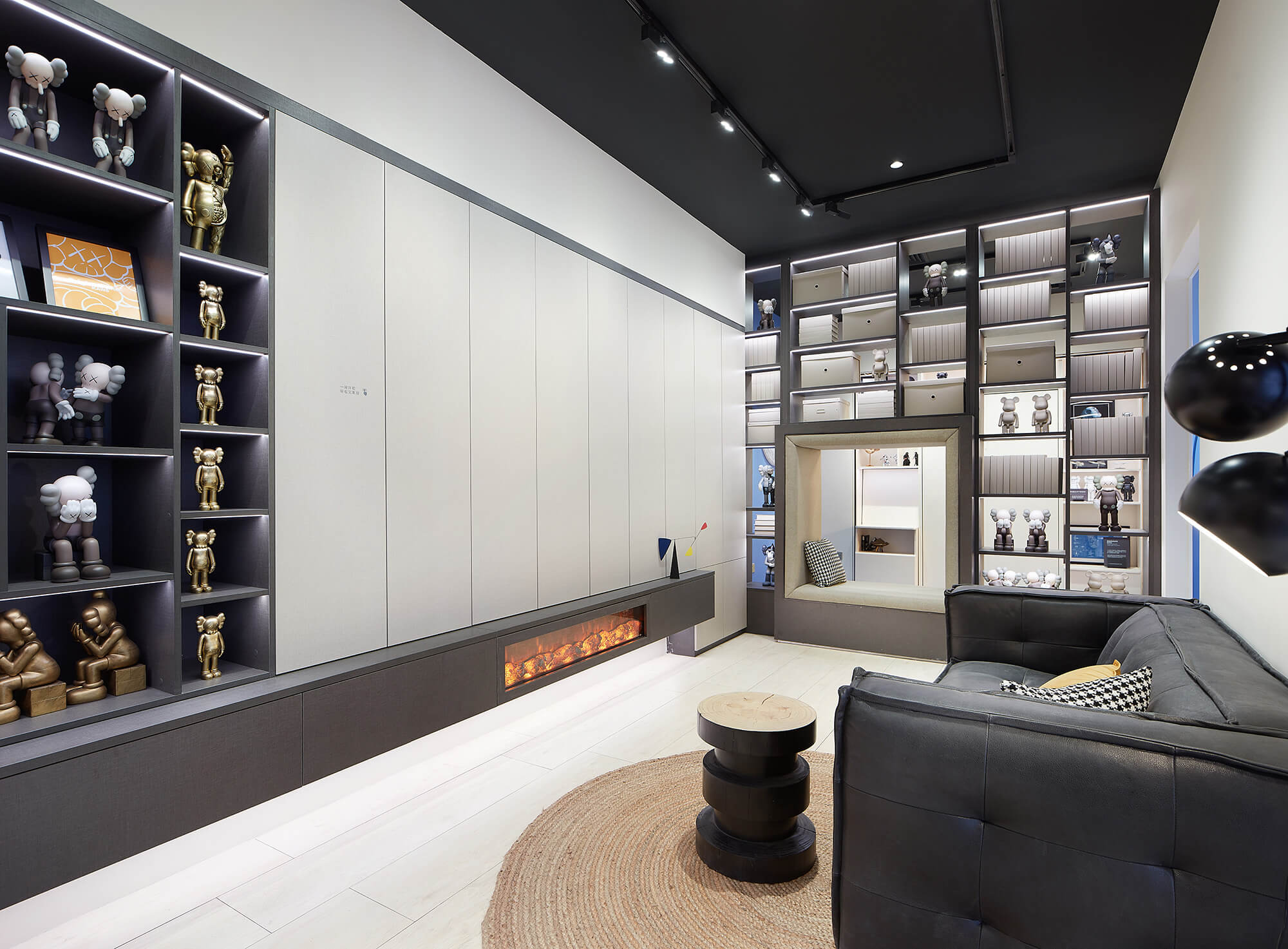
與傳統樣板間不同,WORKSHOP店內參照都市常見生活場景構建了三個故事樣板間,分別是喜歡買買買的女生的衣帽間、文化青年的書房兼臥室、以及熱衷收集潮品的家庭的客廳。
The WORKSHOP has three special storytelling sample rooms that were designed based on common scenes of urban life, including a walk-in closet for girls who are enthusiastic about shopping, a study & bedroom for literature-loving young males and a living room for families keen on stylish items collection.
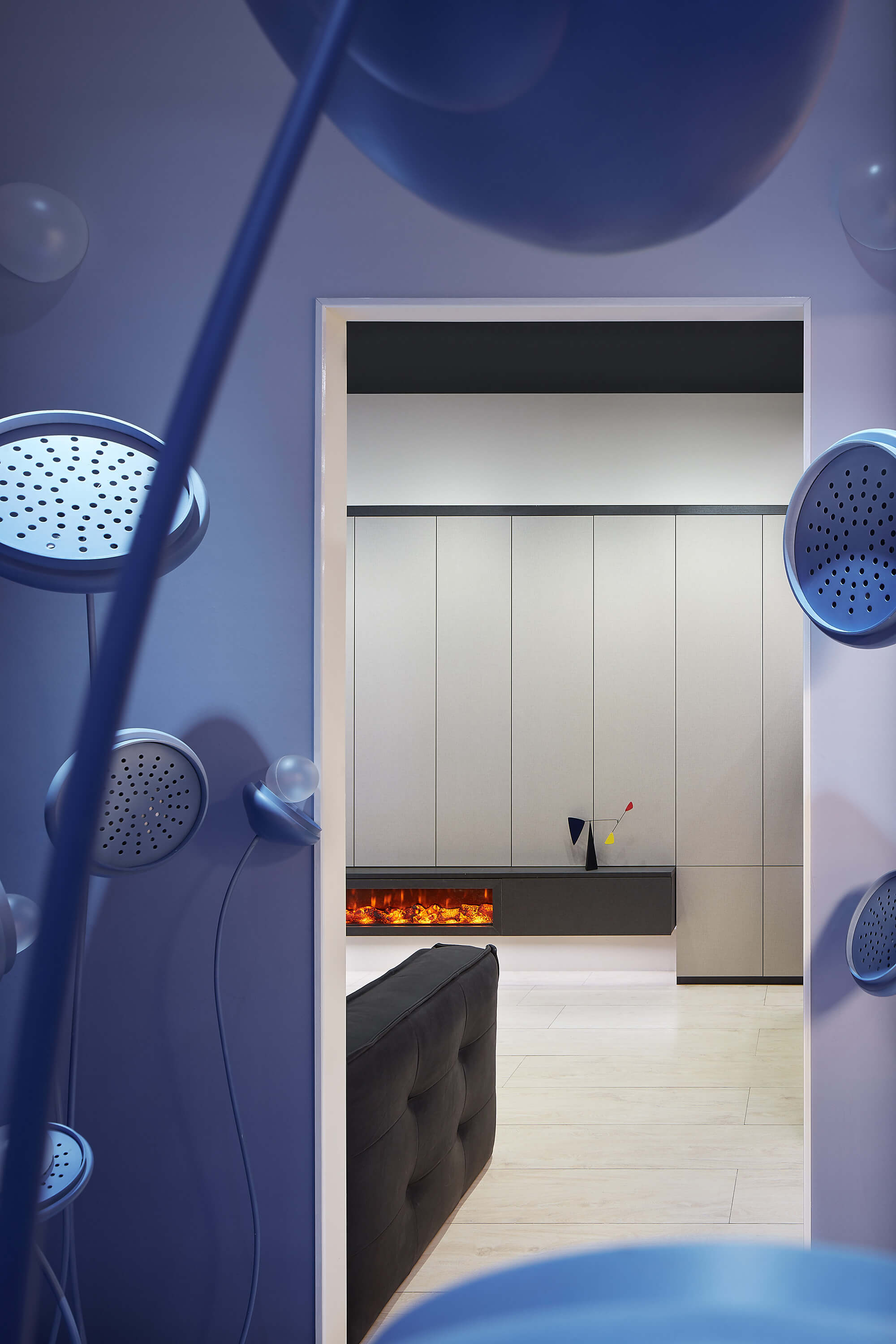
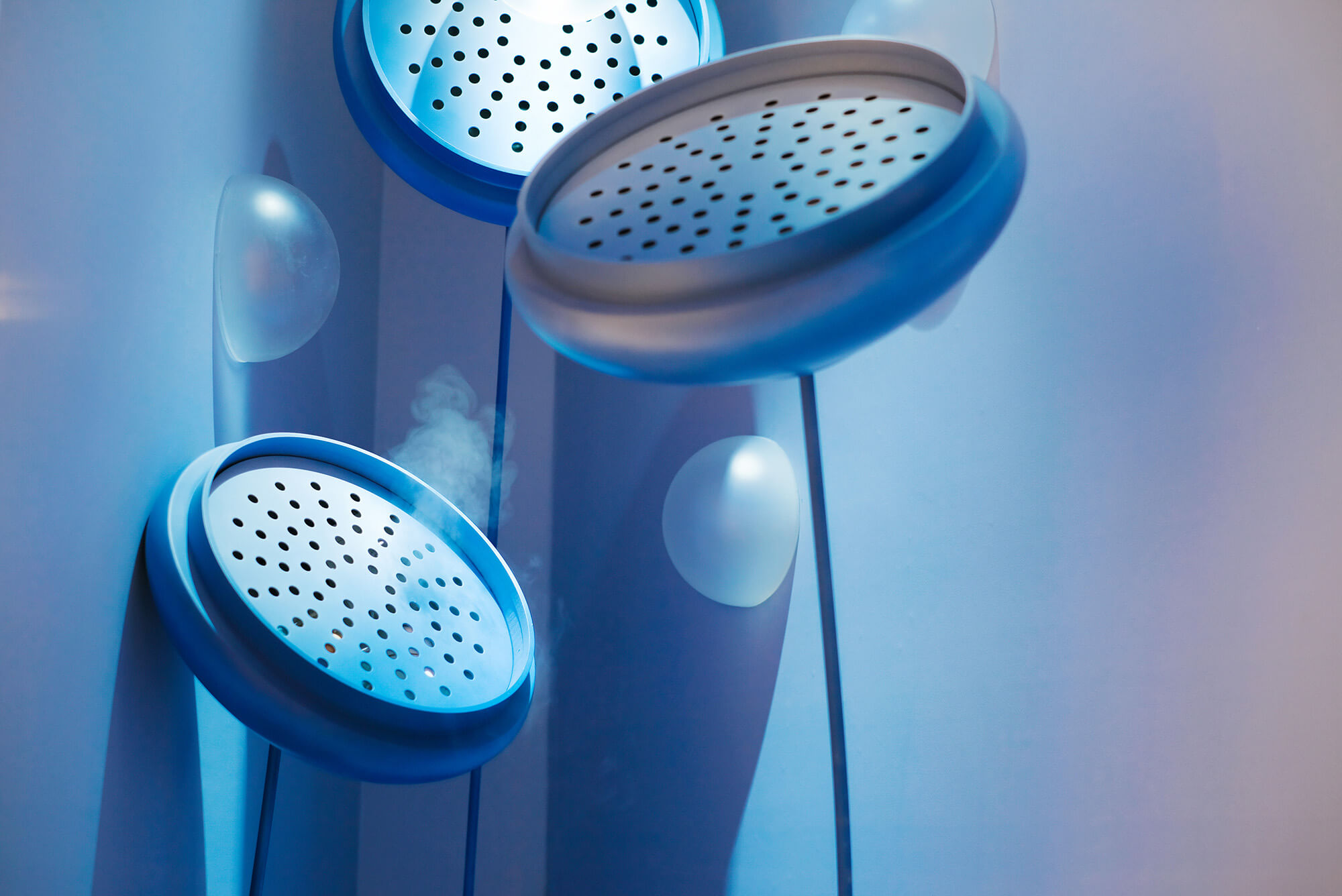
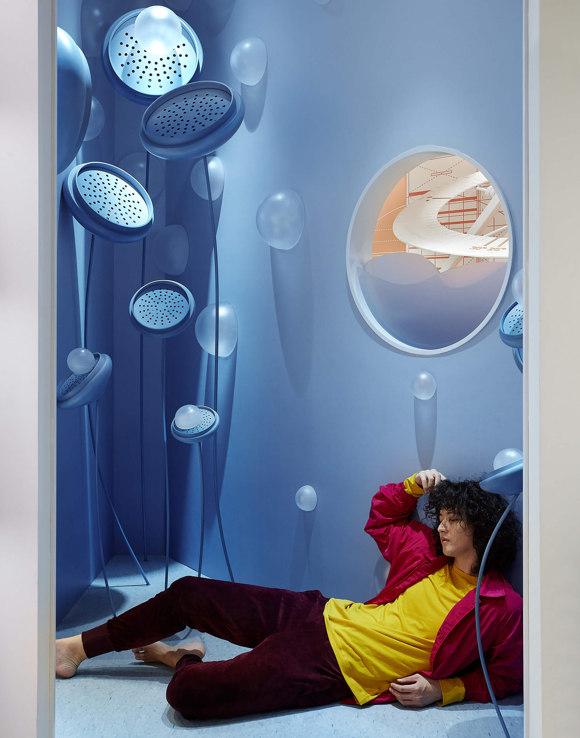
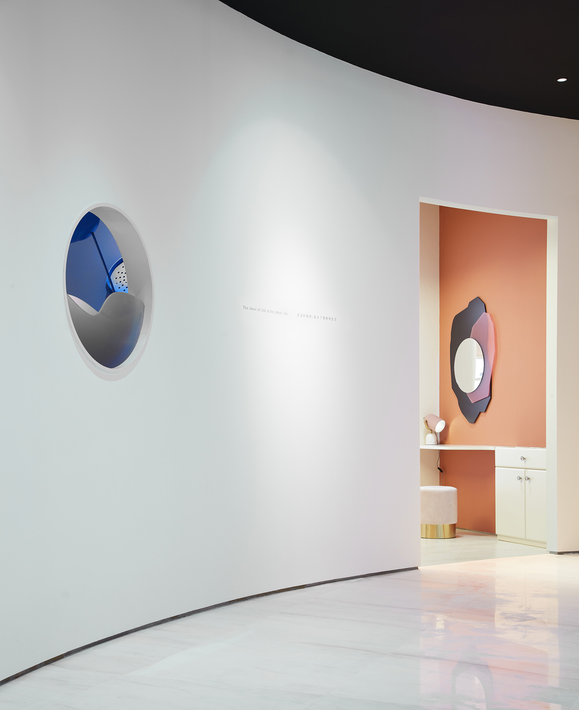
三個樣板間夾角之間的三角區域設置了充滿泡泡的藍色角落,結合香薰及音響效果,形成彩蛋空間;而正麵弧牆及圓形窗口,則與外窗外的圓形舞台形成呼應。
The intersection angle of the three showrooms forms a triangular area, which features a blue corner with bubbles, pleasant fragrance and audio effects, making it a bonus space. Its arc-shaped wall and the round window echo the circular center stage outside it.
04. 統一視覺調性塑造全方位的完整體驗 Full-range and unique experience created through unifying visual effects
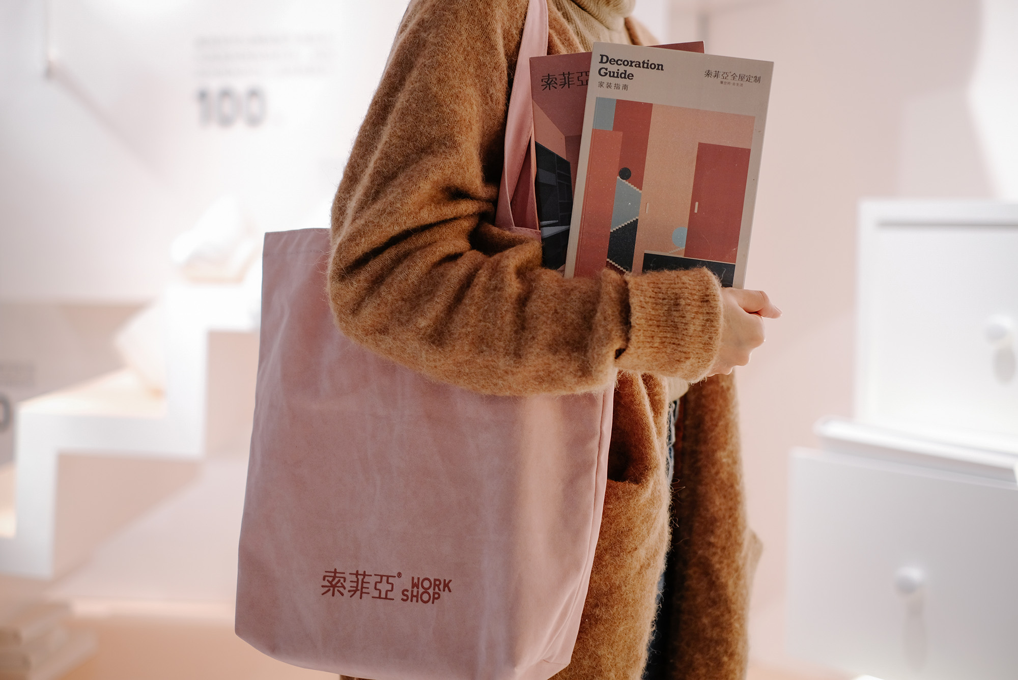
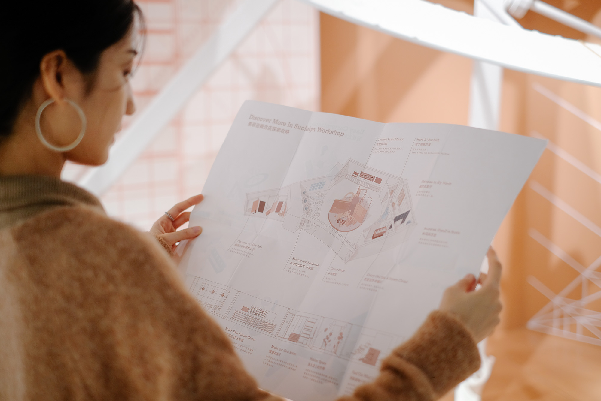
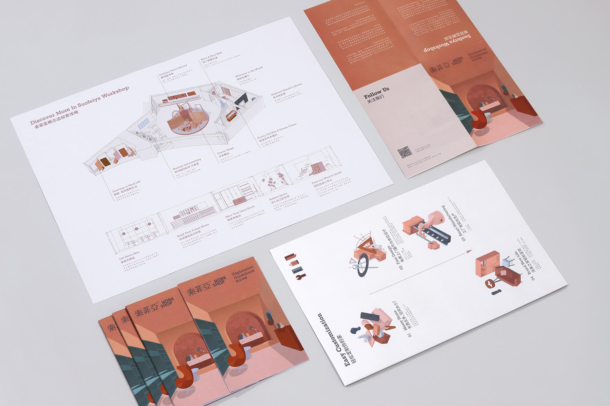
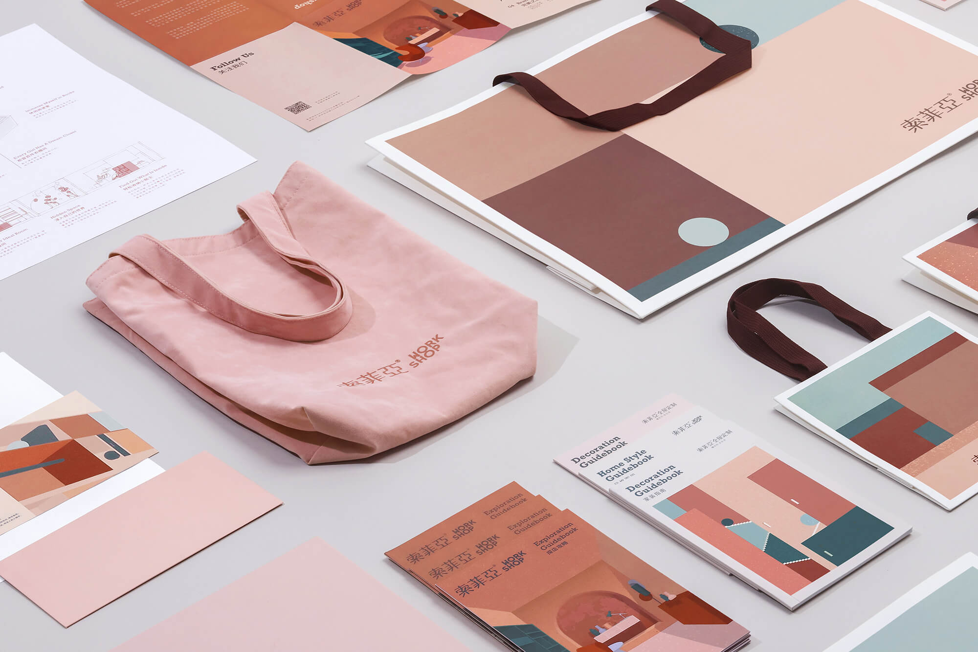
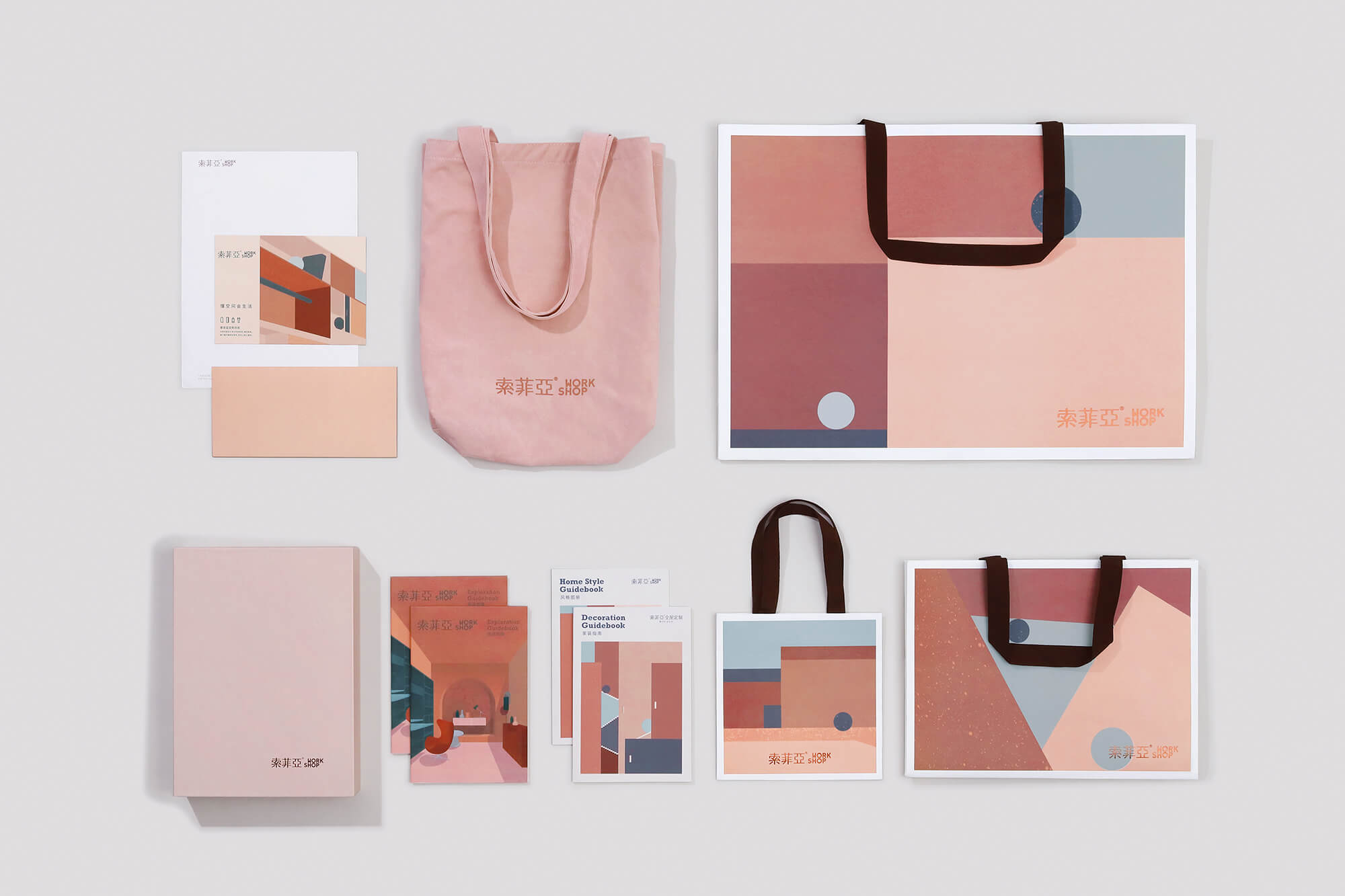
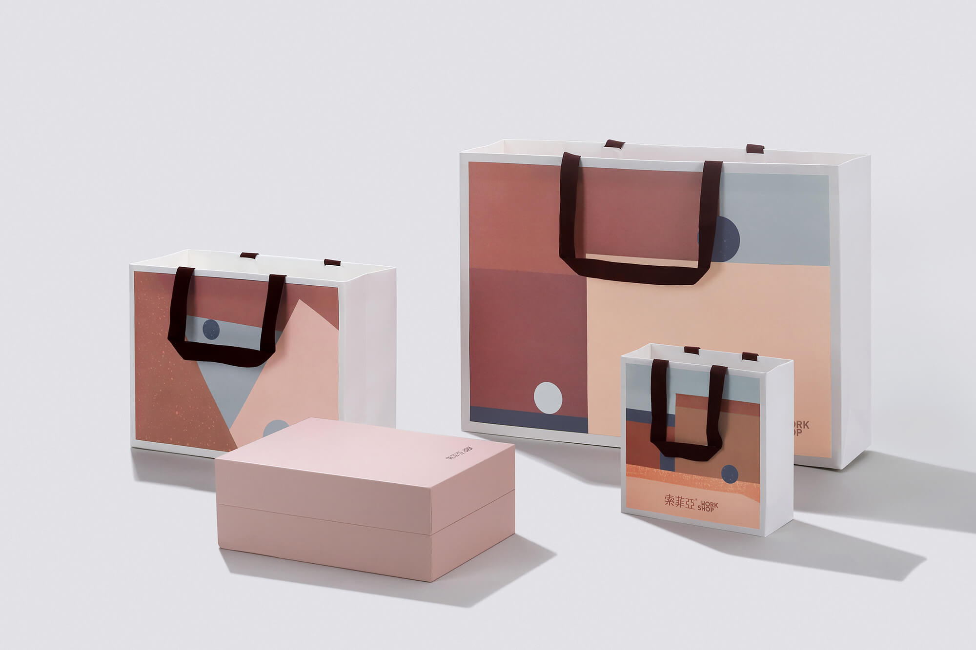
由WORKSHOP概念出發,從品牌LOGO及輔助圖標,到店內的物料也均由立品設計團隊操刀,以保證完整統一的品牌形象。通過在店內設置的可供取閱的《探店攻略》,顧客的整個逛店過程成為了更具儀式感的新奇體驗;而禮品紙袋和作為延伸品的絨布麵托特袋,則幫助這種獨特體驗走出空間,傳遞給更多的受眾。
In order to build a unified brand image, the brand logo and icons as well as the supportive materials in the WORKSHOP were all designed by LEAPING CREATIVE. Exploration Guidebook is accessible to customers, making the experience of exploring the space more novel and giving it a ceremonial sense. Besides, the paper gift bags and velvet tote bags are helpful to bring the unique experience out of the store and communicate to more target customers.
∇ 功能分區
完整項目信息
項目地點:廣州市
空間麵積:200 m2
設計公司:立品設計(www.leapingcreative.com)
設計總監:鄭錚
項目經理:陳常
品牌策劃及視覺:陳常、黃綺琳、肖文婷、陳策禦
店麵空間:梁紀穎、劉瑞學、姚丁淩、陳瑜
互動裝置:黃綺琳、蘭穎、黃敏聰
營銷設計:陳常、洪加路、黃綺琳
撰文:洪加路
視頻攝製:讚製作
空間攝影:黃早慧、20Animagis
平麵攝影:Anson
模特造型:Zoey
Location: Guangzhou, China
Area: 200 m2
Design firm: LEAPING CREATIVE (www.leapingcreative.com)
Design director: Zen ZHENG
Project manager: CC CHEN
Brand planning &visual identity: CC CHEN, Qilin HUANG, Wenting XIAO, Evan CHEN
Spatial design: Jiying LIANG, Ruixue LIU, Dingling YAO, Yu CHEN
Interactive installation design: Qilin HUANG, Ying LAN, Mincong HUANG
Marketing design: CC CHEN, Jialu HONG, Qilin HUANG
Text: Jialu HONG
Video production: Jank Production
Photos of interior spaces: Zaohui HUANG, 20Animagis
Photos of graphic designs: Anson
Model stylist: Zoey
Instagram: @leapingcreative


