LOFT中國感謝來自 知白設計研究室 的辦公項目案例分享:
知白設計研究室意在創造一個舒適的辦公空間,利用空間的調性來體現“知白”的設計主張,白為無,白為有,白又為空。正如理查德邁耶對白色的理解一樣,白色是純潔、透明和完美的象征,白色是豐富的,包含所有的顏色,能最好的欣賞光影的表演,更加清晰的表現空間結構出來,設計師在原8.5M*8.5M的建築標準柱跨單元模數空間裏麵,進行基礎幾何構成的體塊穿插和切割的手法劃分來形成不同功能區域布置,在小的空間體塊裏麵容納多重的功能,不同的空間體塊裏營造不同的空間感受,滿足使用空間的同時也融合品牌寓意。
Zhibai Design Research Office intends to create a comfortable office space, and use the tonality of space to reflect the design idea of “Knowledge White”. White is nothing, white is white, white is empty. Just as Richard Meyer understands white, white is a symbol of purity, transparency and perfection. White is rich, contains all colors, can best enjoy the performance of light and shadow, and express the spatial structure more clearly. In the original 8.5M*8.5M building standard column spanning unit modulus space, the basic geometry of the block insertion and cutting method is divided to form different functional areas, and accommodate multiple functions in a small space block. Different spatial styles create different spatial feelings, satisfying the use of space and also integrating brand meaning.
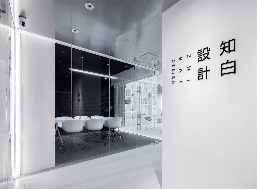
入口 Entrance
入口處的空間處理是3個盒子的穿插組合,LOGO位置將視線引向走廊。頂麵的不鏽鋼一直延伸到天花通向辦公區,界定了交通動線的流向,在空間上釋放空間的高度,使空間在視覺上得到延伸。
The space treatment at the entrance is a patchwork combination of 3 boxes, and the LOGO position directs the line of sight to the corridor. The top stainless steel extends all the way to the ceiling to the office area, defining the flow of traffic lines and releasing the height of the space in space, allowing the space to be visually extended.
辦公區 Workspace
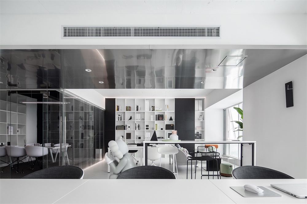
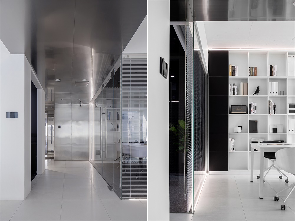
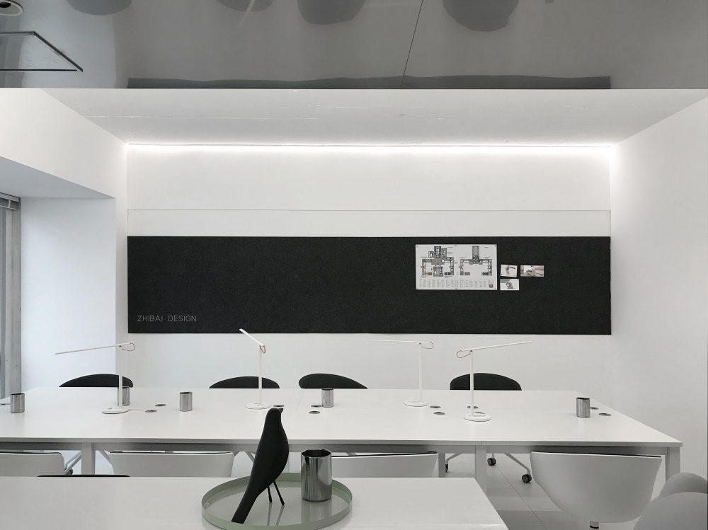
空間上大麵積采用了高純度的白色,動線空間裏麵運用的了灰度的不鏽鋼,功能空間裏麵用黑色作為輔助色,強調了空間的性質,空間裏麵自由開放,線性光的使用強調的了空間的結構。
A large area of space is made of high-purity white, grayscale stainless steel is used in the moving space, and black is used as the auxiliary color in the function space, which emphasizes the nature of space. The space is free and open, and the use of linear light emphasizes The structure of the space.
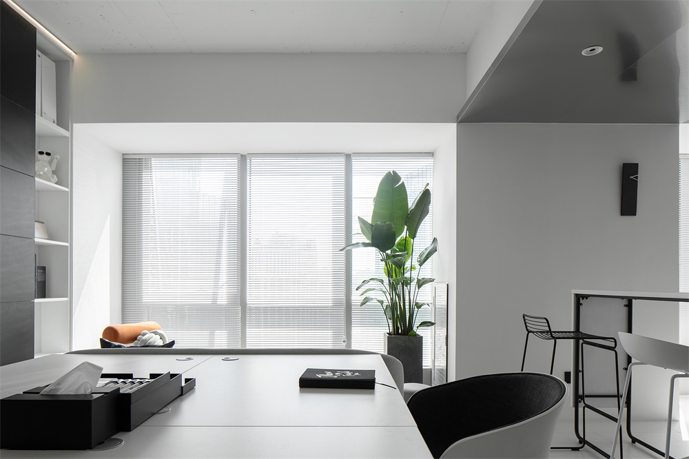
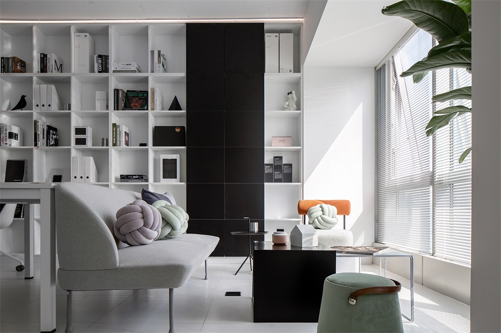
環境影響人的情緒,情緒帶動人的心情,空間裏大麵積的白色搭配灰色係顏色讓空間增加了情感的變化,白色既是無色,白色又是所有的顏色。自然光透過百葉在純淨的空間裏麵有了幾分節奏。陽光下的綠色讓空間多了一份對生命的詮釋。
The environment affects people’s emotions, and emotions drive people’s moods. The large white color in the space is matched with the gray color to make the space change the emotion. White is colorless, white and all colors. Natural light through the louvers has a bit of rhythm in the pure space. The green under the sun gives the space an interpretation of life.
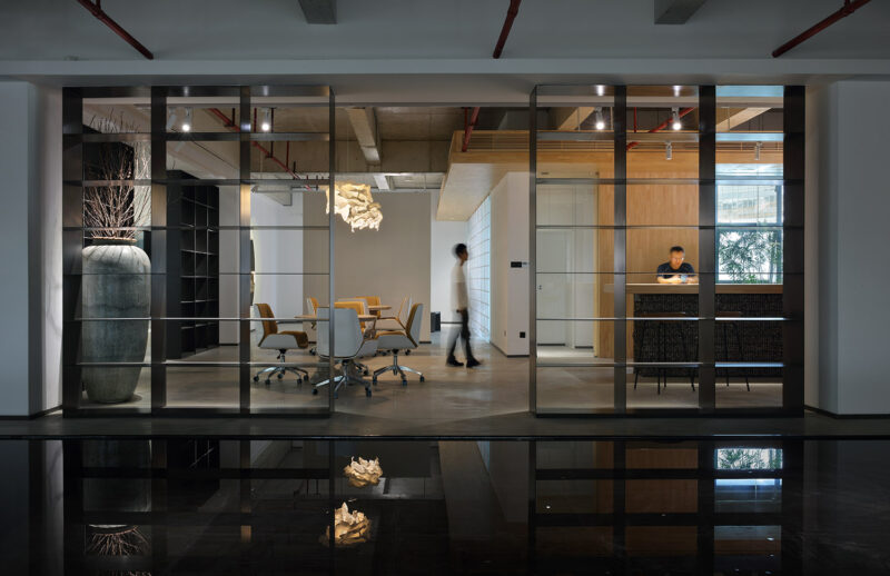
會議室 Meeting room
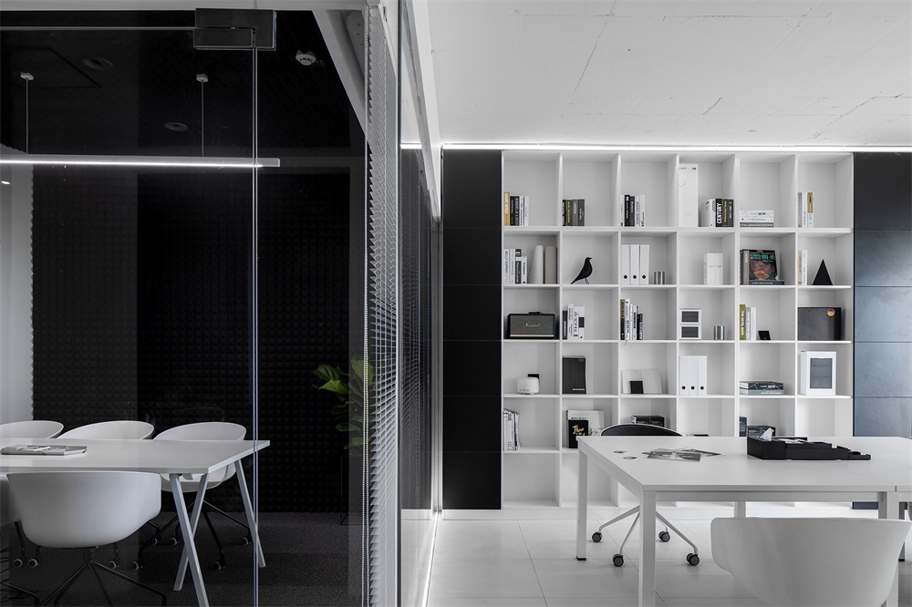
空間是凝固的符號。正如設計以多樣探索賦予空間更大的想象力,空間的創造具有無限的可能性,在探索功能和美學相結合的同時,讓置身當中的人猶如穿越一般體驗兩種不同的場景,吸音棉的空間包裹讓整個空間有很好的吸音效果,從而保證了私密性。
Space is the symbol of solidification. Just as design creates a larger imagination with multiple explorations, the creation of space has unlimited possibilities. While exploring the combination of function and aesthetics, let the people in the middle feel like two different scenes through the general experience, sound-absorbing cotton. The space package gives the entire space a good sound absorption, thus ensuring privacy.
衛生間&材料間 Toilet & Material Room
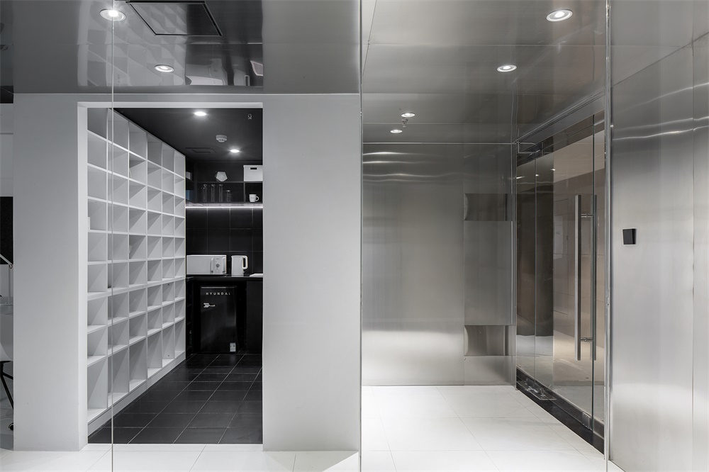
衛生間與材料間延續平麵布置的理念意在營造空間的的體塊穿插感,從材料間到洗手間形成兩種對立的色塊對比。
The concept of continuous layout between the bathroom and the material is intended to create a sense of interspersed space in the space, forming two opposite color block contrasts from the material to the bathroom.
∇ 平麵圖
∇ 軸測圖
完整項目信息
項目名稱:「白色盒子」
項目設計:知白設計
聯係郵箱:zhibai_design@yeah.net
項目設計時間:2018年12月
項目完成時間:2019年3月
設計團隊:周海飛、王子林
項目地址:湖南長沙德思勤城市廣場
建築麵積:101平方米
攝影版權:夏旭威
品牌:辦公家具(GRIGHT)、燈(小米)、展櫃(HIH)等


