LOFT中國感謝來自 北京人和明天品牌設計 的商業空間案例分享:
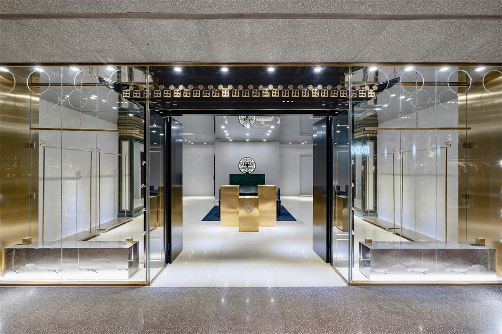
此次項目是為一家中國傳統手工刺繡品牌進行空間設計。項目選址於北京,位於年輕人的聚集區三裏屯太古裏,主理設計師希望借由一種新舊融合的東方設計語彙使得更多年輕人接受中國的傳統服裝並將其設計進行日常穿著。
The project is a space design for a traditional Chinese hand-embroidered brand. The location of the project was chosen in Taikoo Li, a gathering place for young people in Beijing. Through a combination of new and old oriental design vocabulary.The founding designer hopes that Chinese traditional clothing could be accept by new generation of Young people and be we wore in their daily lives.
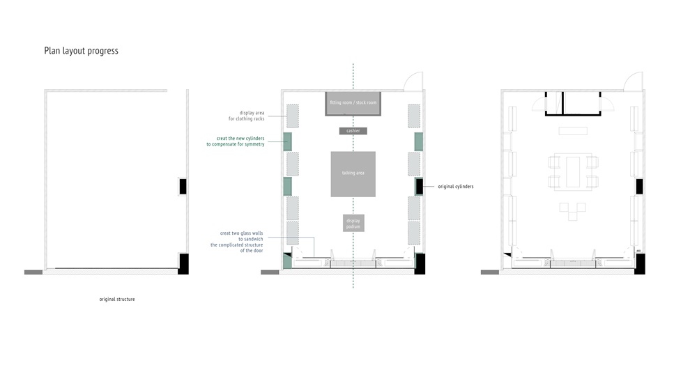
空間布局:參考了中式建築傳統的單軸對稱劇中的格局布置方式,增加立柱將原先的非對稱空間補足使得空間呈現高度對稱。
Spatial layout:Refer to the pattern arrangement in the uniaxial symmetry of the traditional Chinese architecture. Adding columns to complement the original asymmetric space makes the space highly symmetrical.
鑒於空間可用高度僅為2.6m,使用了鏡麵天花使得空間的視覺高度得以充分延伸。
Given the space available height of only 2.6m, the use of mirrored ceilings allows the visual height of the space to be fully extended vertically.
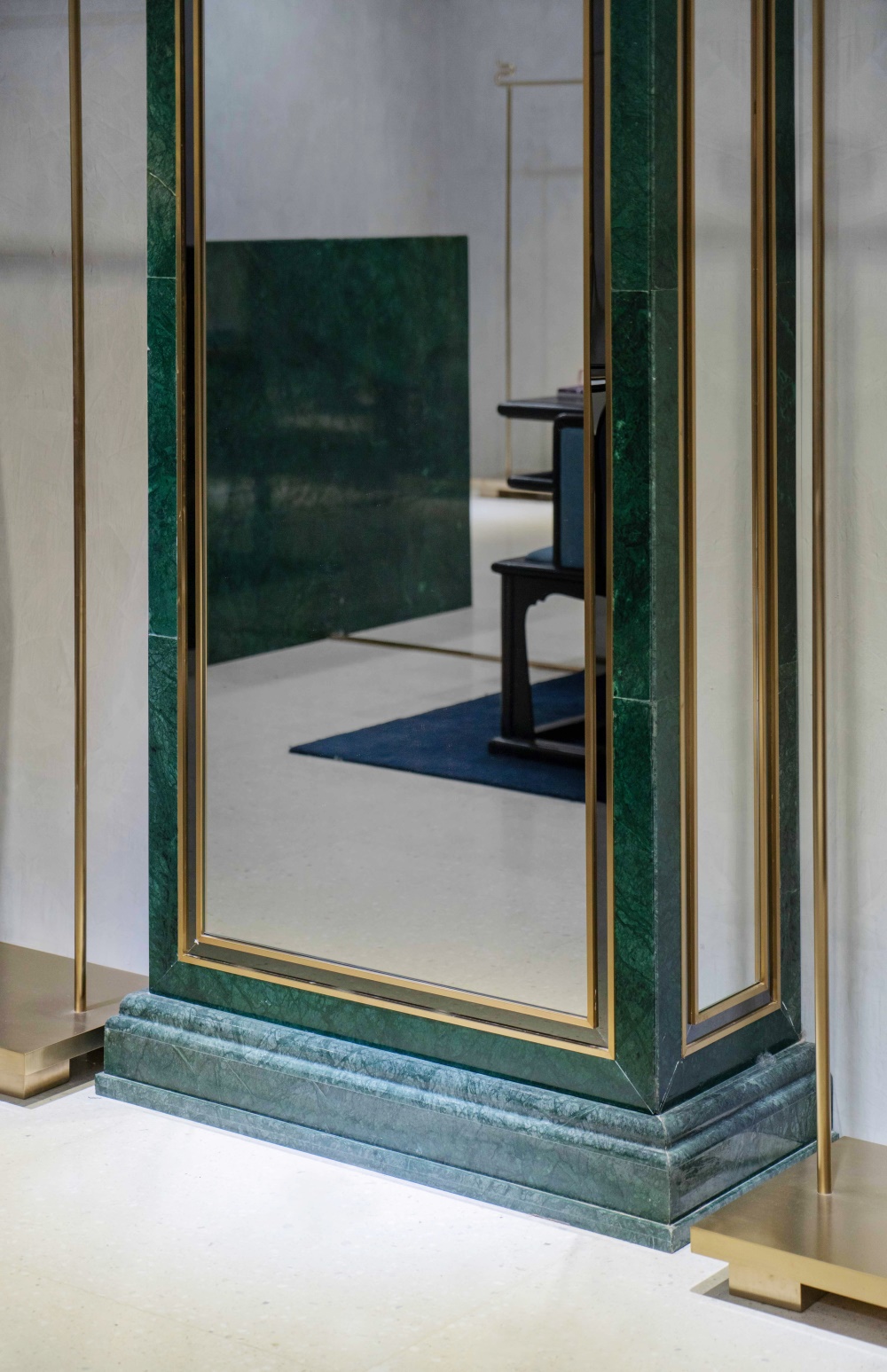
由於整體實際空間麵積僅七十平米,空間分割策略采用功能區域的軟性分割方式,除卻試衣間及小型儲物倉庫區,其他功能區域共享了同一空間,而放棄了用實體牆麵進行空間拆分。試衣間的設計僅有不足三平方米的麵積。而將四枚大尺寸穿衣鏡安置在店內的柱體牆麵上,以便引導顧客將試衣過程的後半部分在共享空間中完成,提升了顧客試穿時的舒適度,同時也引導顧客幫助店鋪成功吸引透明櫥窗外走過的客流。
Since the overall actual area is only 70 square meters, the space segmentation strategy adopts the virtual-blur–edged manner when making the division of functional areas. Except for the fitting room and the small storage warehouse area, other functional areas share the same space, and the physical wall surface is abandoned. The design of the fitting room is only less than 3 square meters. The 4 large-size mirrors are placed on the column facades to guide the customer to complete the second half of the fitting process in the shared space, which enhances the comfort of the customer during they try-on, and also guides the customer to help the store successfully attracted the flow of passengers passing through outside the glass windows.
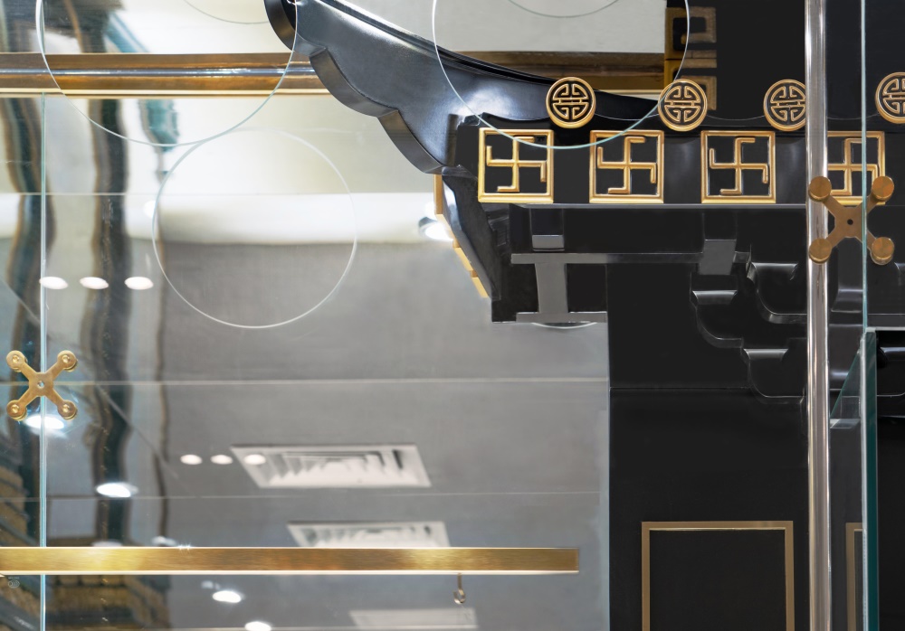
為融和玻璃櫥窗本身的現代性與門頭設計的純粹中式風格,將櫥窗的玻璃平麵延伸至門頭區域進行統一的一體化封裝。
Pure Chinese style designed to blend the modernity of the glass window itself with the door, extending the glass plane of the window to the door area for uniform integration.
道具設計
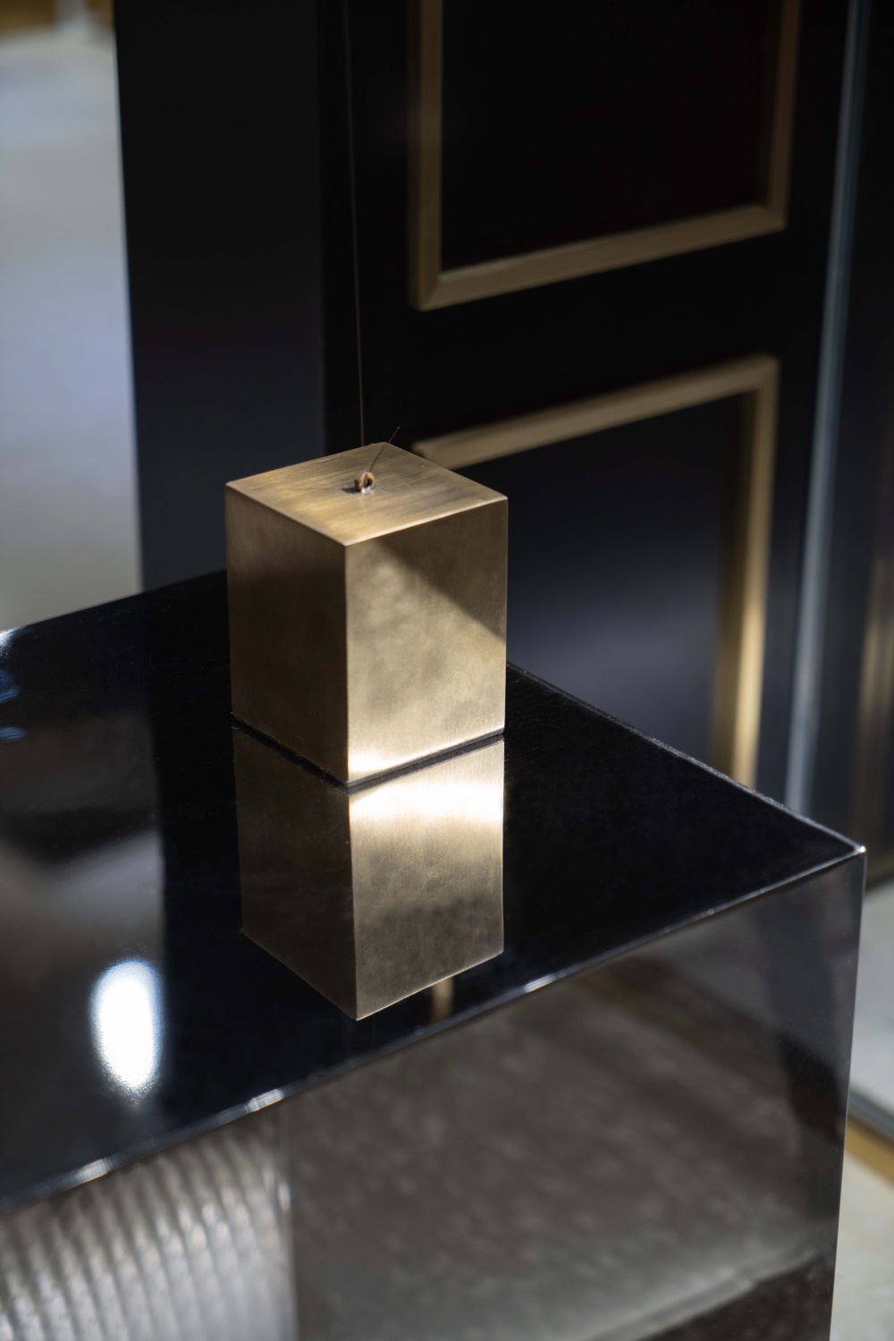
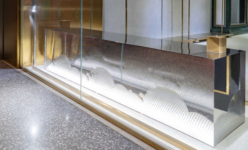
櫥窗道具:櫥窗中的方墩使用了非傳統中式風格的鏡麵不鏽鋼材質,以傳統的水紋圖案進行全手工的拉絲處理加以中和風格的現代感。方墩高度同時考慮到店內人員更換櫥窗展示服裝時更為方便。
Pier: The square piers in the windows chose non-traditional mirrored stainless steel, which is hand-brushed with Chinese traditional ocean pattern to create a modern and neutral style. The height of the fixture also creates more convenience when considering the replacement of exhibits by the staff in the store.
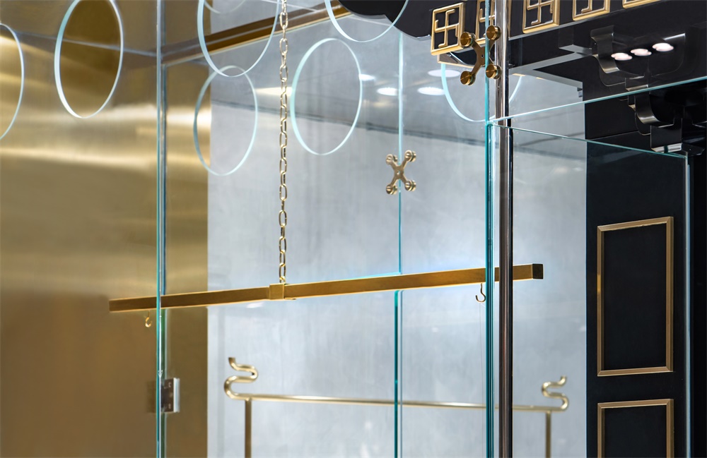
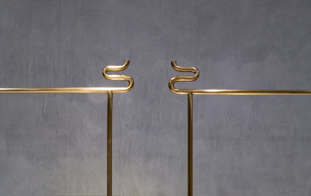
衣架:考慮到中式服裝兩片式的傳統剪裁,以及寬大廓形的特征,特別設計了專用的衣架,以便更好的展示服裝上刺繡手工藝的華彩。
Fixture design:Hangers: Taking into account the traditional cut of the two-piece Chinese clothing and the characteristics of the loose-fitting silhouette, customized hanger is specially designed to better display the brilliance of the handicraft on the garment.
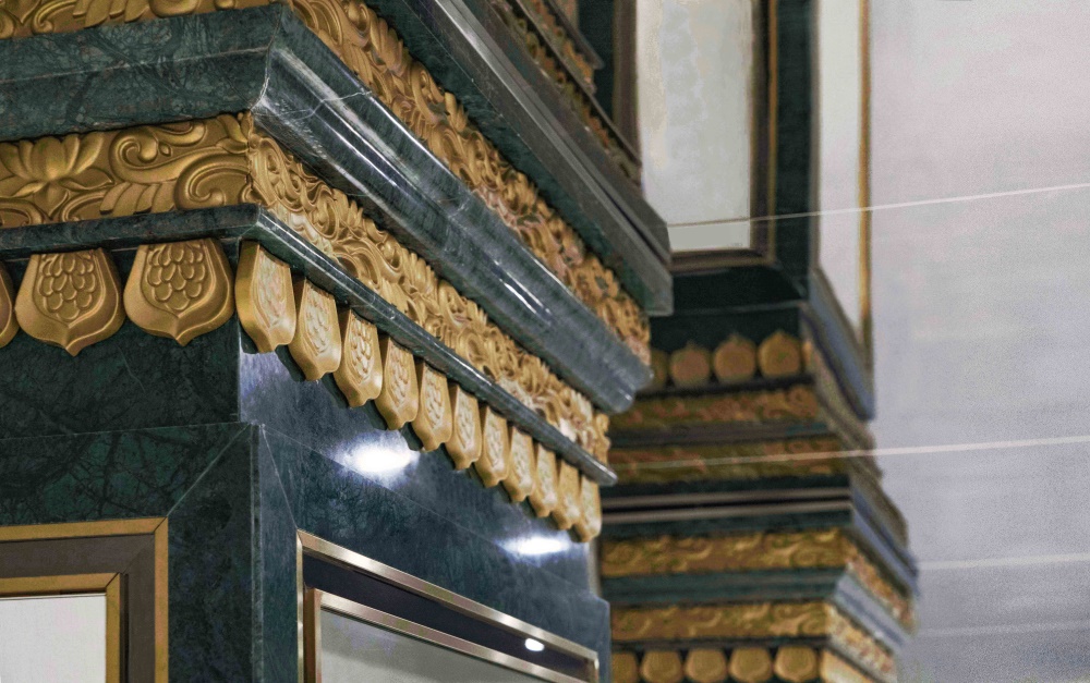
穿衣鏡:采用了大理石基礎的方柱,而又同時使用了傳統中式的蓮花紋樣柱頭。
Dressing mirror: The marble-based square column is used, while the traditional Chinese lotus pattern stigma is used at the same time.
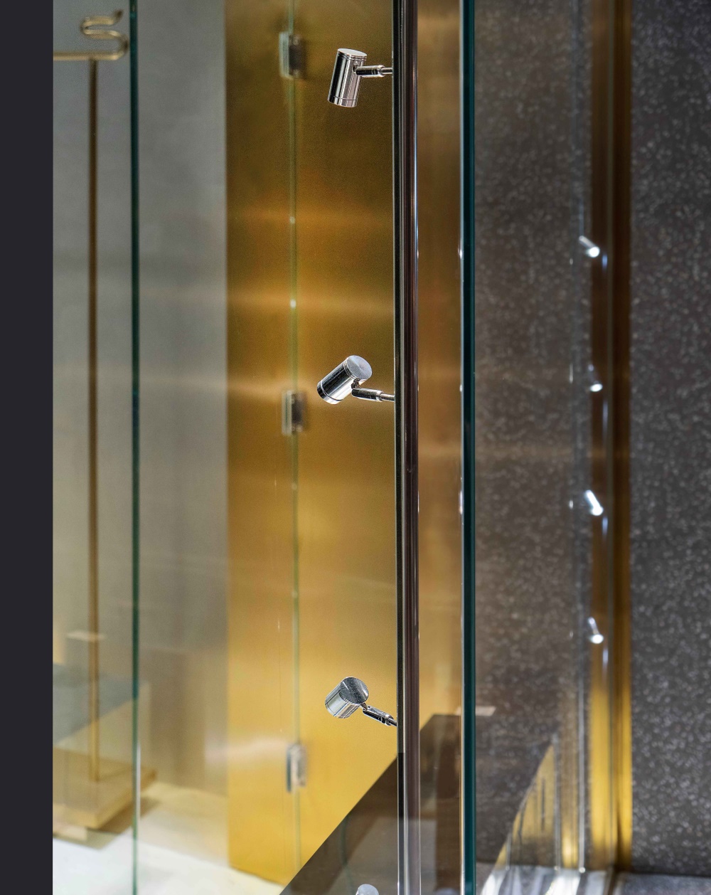
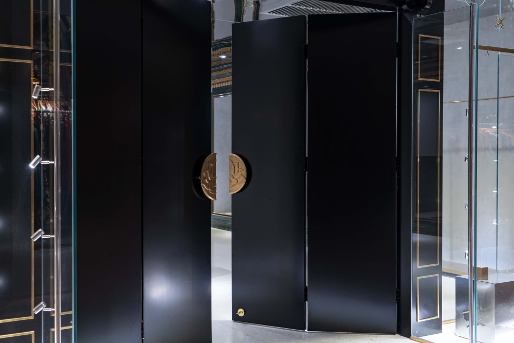
正門:門相對較寬,開門狀態下,為避免近門口處店內兩側的服裝在視線上被遮擋,因此把門拆分成四扇,以便降低開門時的整體長度。
Front door:When door opening In order to avoid the clothing on both sides near the doorway being blocked on the line of sight, the wide door is divided into four parts to reduce the overall length when front door stay opening.
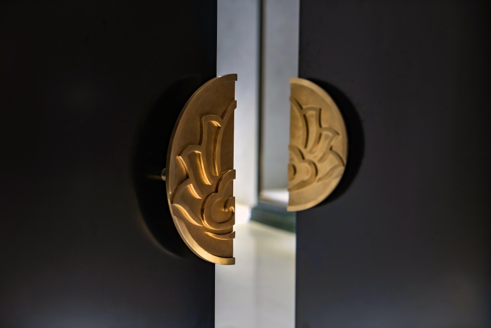
∇ 門把手細節 Door nob
完整項目信息
項目名稱:祥荷秀中式手工定製服裝店鋪空間設計
主創設計師:王末
協作及執行團隊:北京人和明天品牌設計顧問有限責任公司
完成年份:2019.5
建築麵積:70平方米
項目位置:北京市 朝陽區 三裏屯太古裏 南區
攝影師:和威
Project name:Xianghexiu Chinese
Lead designer:Wang Mo
Associated and executive team:Beijing Harmonious Future Brand Design Co.,Ltd
Completion year:2019.5
Floor area:70 sqm
Project location:Tai Koo li(Sanlitun),South Area, Chaoyang District, Beijing, China
Photographers :He Wei


