LOFT中國感謝來自 Towodesign堂晤設計 的餐飲項目案例分享:
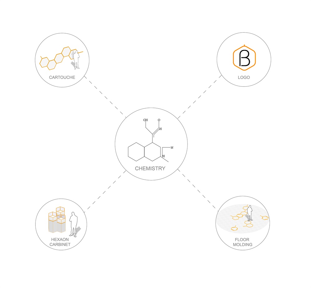
自然界中不乏以六邊形與曲線呈現的天工之作,其背後隱藏著物質分子排布的巧妙與柔美形態。Towodesign堂晤設計從“為健康而研發”的品牌立意出發,擇取了化學式中的基礎圖形——等邊六角形結構。
A variety of works of nature feature hexagons and curves, behind which is the subtle arrangement of molecules. The studio Towodesign recently completed a bird’s nest drink and dessert shop for Dr. Bravura.
∇ 概念來源1
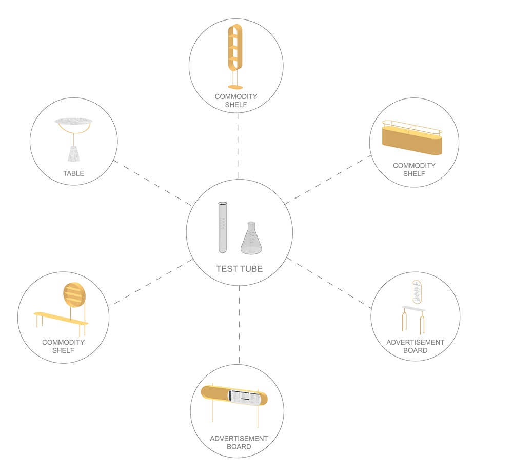
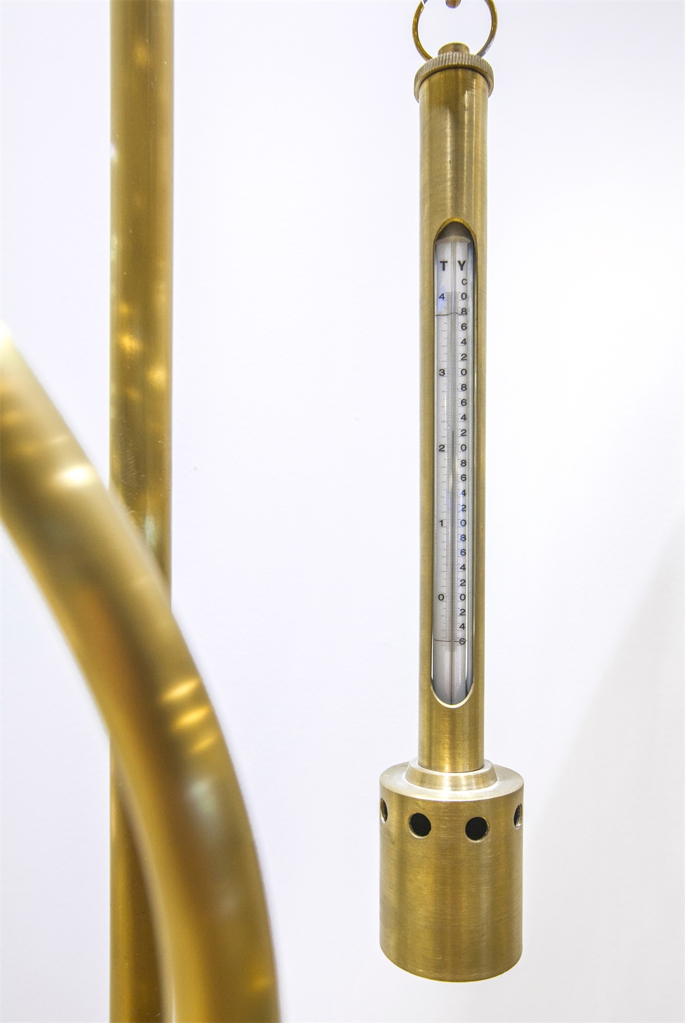
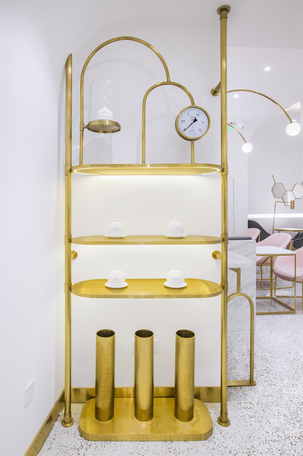
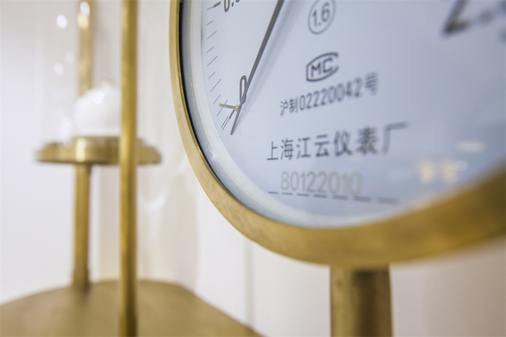
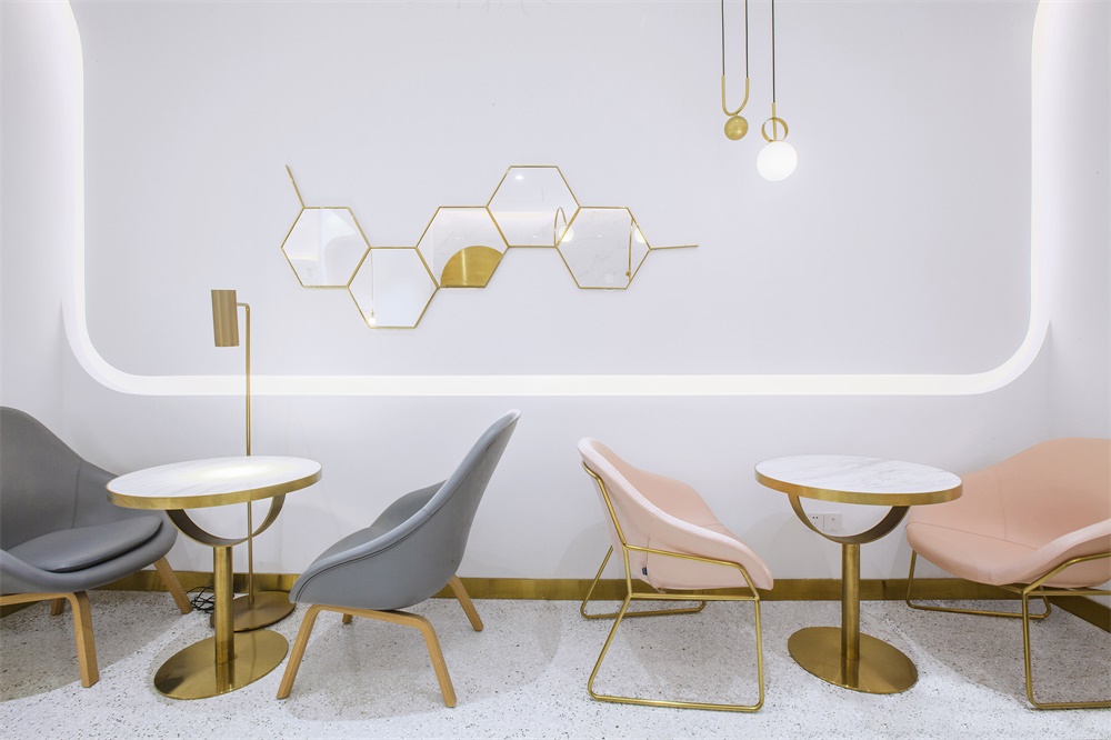
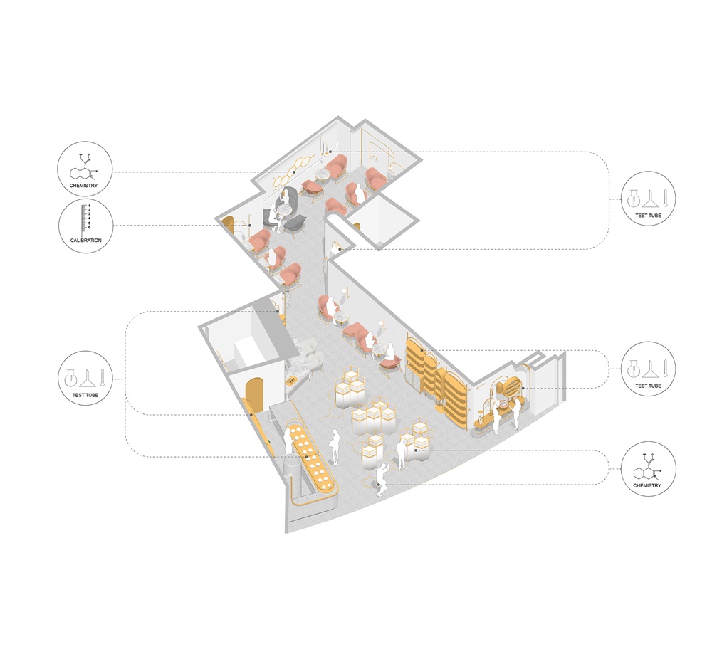
通過變化使其滲透到品牌Dr.Bravura貝瑞博士的店麵logo、地麵、牆麵和展示架中,再結合實驗室計量器皿的元素運用,建構了一個實用體驗與美學意象共存的複合功能空間。
Based on the brand’s concept of “Research and Development for Health”, Towodesign applied regular hexagons, commonly seen in chemical formulas, to the storefront logo, the floor, walls and display stands. These hexagons, are combined with elements derived from measuring vessels used in laboratories, together creating a unique space that integrates functionality and aesthetics.
∇ 概念來源2
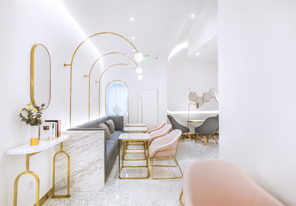
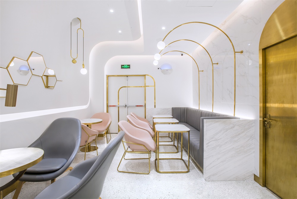
Dr.Bravura貝瑞博士本身是以營養科學為基礎,衍生出燕窩相關的甜品與輕飲,為當下年輕人提供了健康、新穎、高端的結合傳統食材的新型輕食體係。商鋪沿襲了品牌的主題顏色,主體空間以白色打底,金色勾勒,部分穿插低度的粉與灰,彰顯輕奢的氣質。
Grounded on nutrition science, Dr. Bravura serves bird’s nest drinks and desserts, and provides healthy, novel and high-end light food system that incorporates traditional ingredients. The space inherits the brand’s typical color palette, with white setting the overall tone, gold sketching the contours and light gray and pink dotted in it.
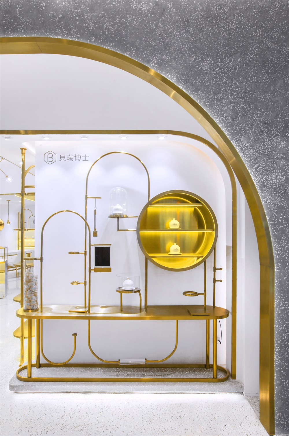
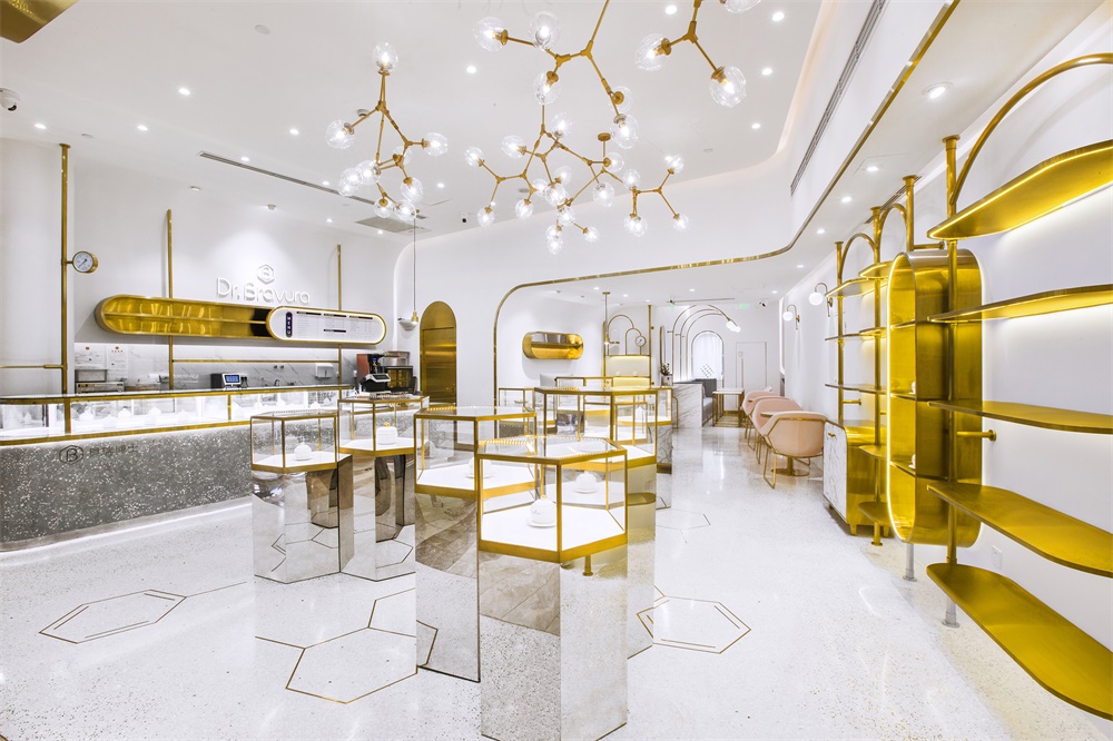
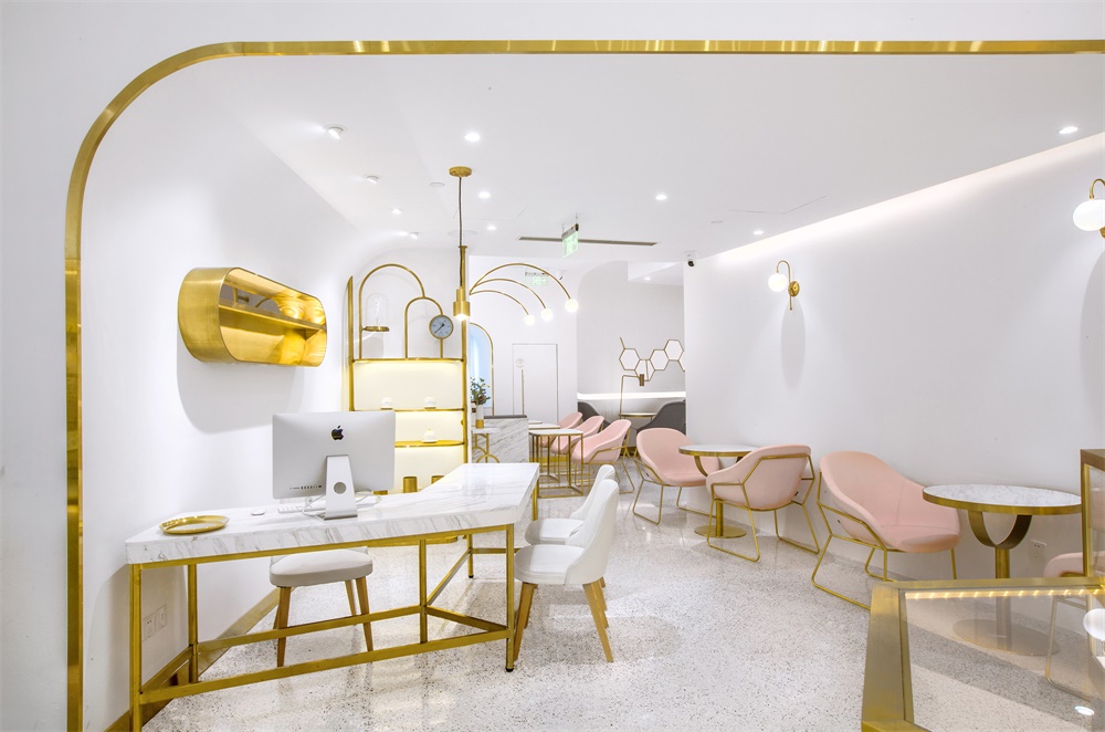
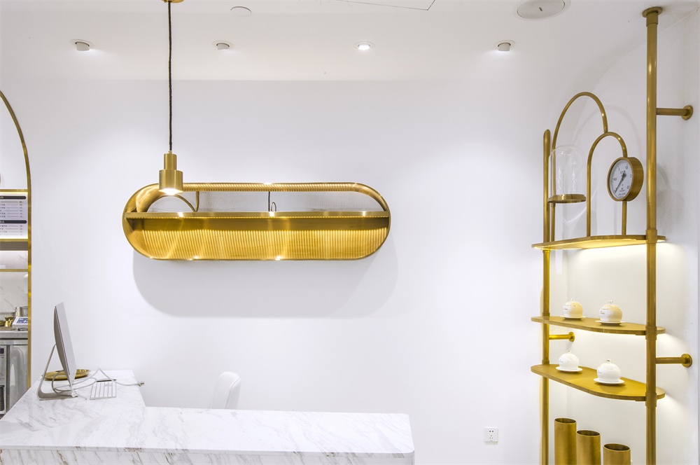
門頭水平描摹的金色線條,延伸至入口展示區的幾何造型貨架,進而貫穿於內部堂食區的桌椅及裝飾細節,以幾何美學的思維,對空間的輪廓進行勾勒。
Gold lines highlight the storefront, frame the display stands with geometric shapes, and blend into the chairs and decorative details in the seating & eating area. The space is outlined with the aesthetics of geometry.
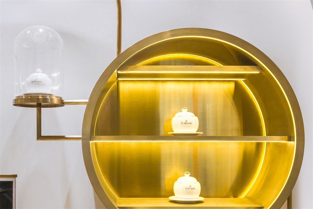
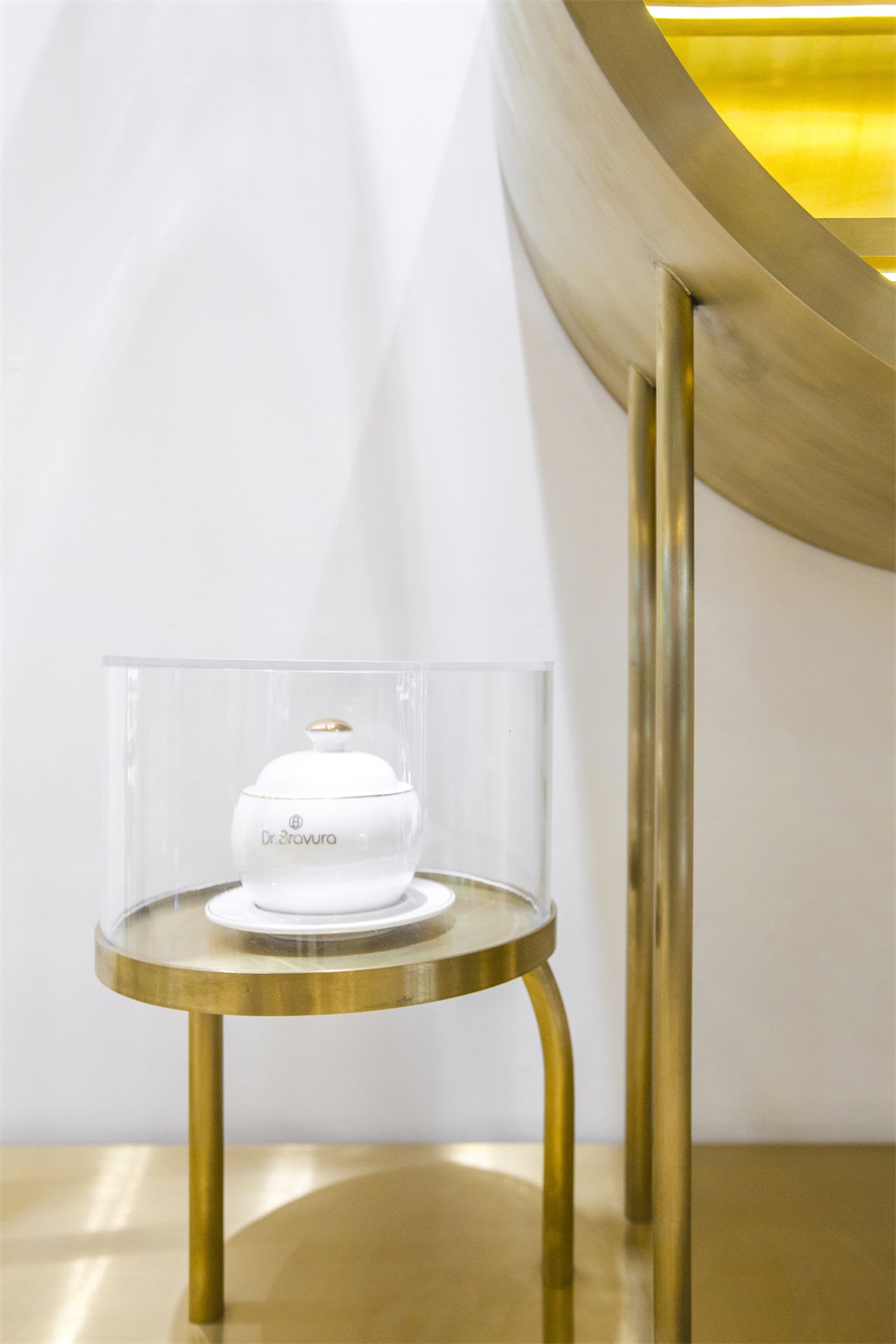
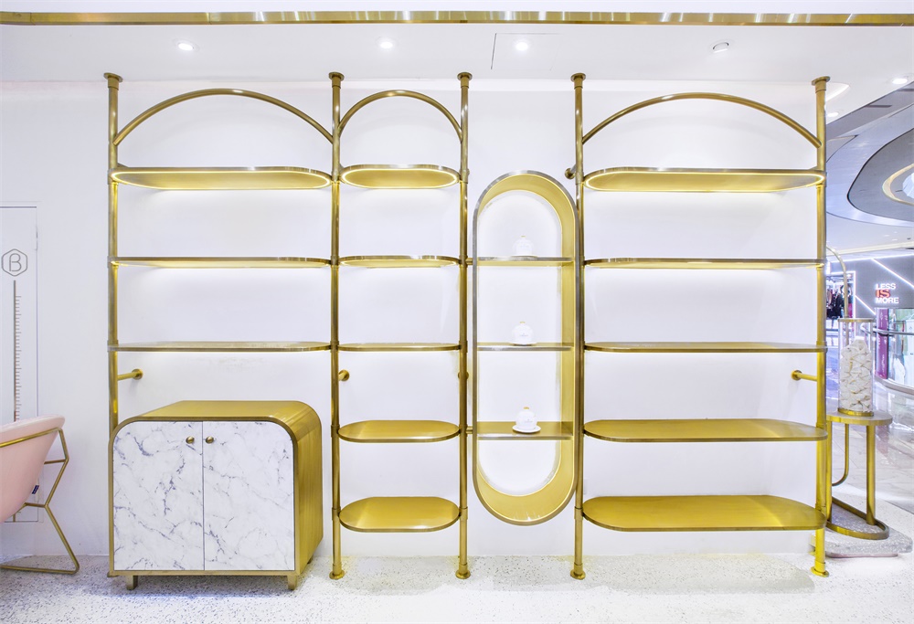
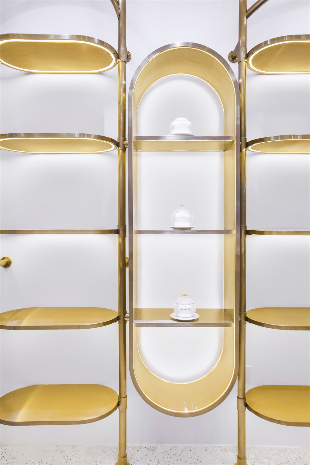
店內的靈魂當然要回歸於它所提供的產品和服務。開放式貨架上,燕窩產品像藝術品一樣陳列著,使顧客專注了解食材的原生細節,同時也感受到品牌對高品質生活的用心倡導。
The soul of the shop lies in the products and services it provides. On the open shelf, edible bird’s nest products are displayed like artworks, enabling the customers to know about the details of the natural ingredients and the concept of pursuing a high quality life that the brand advocates.
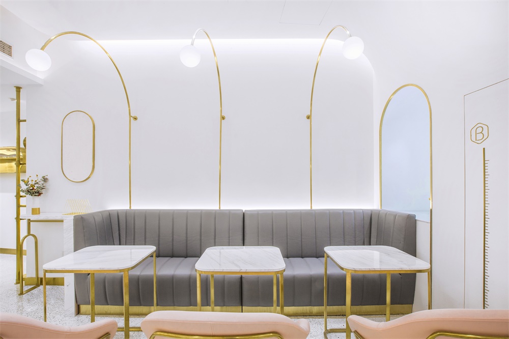
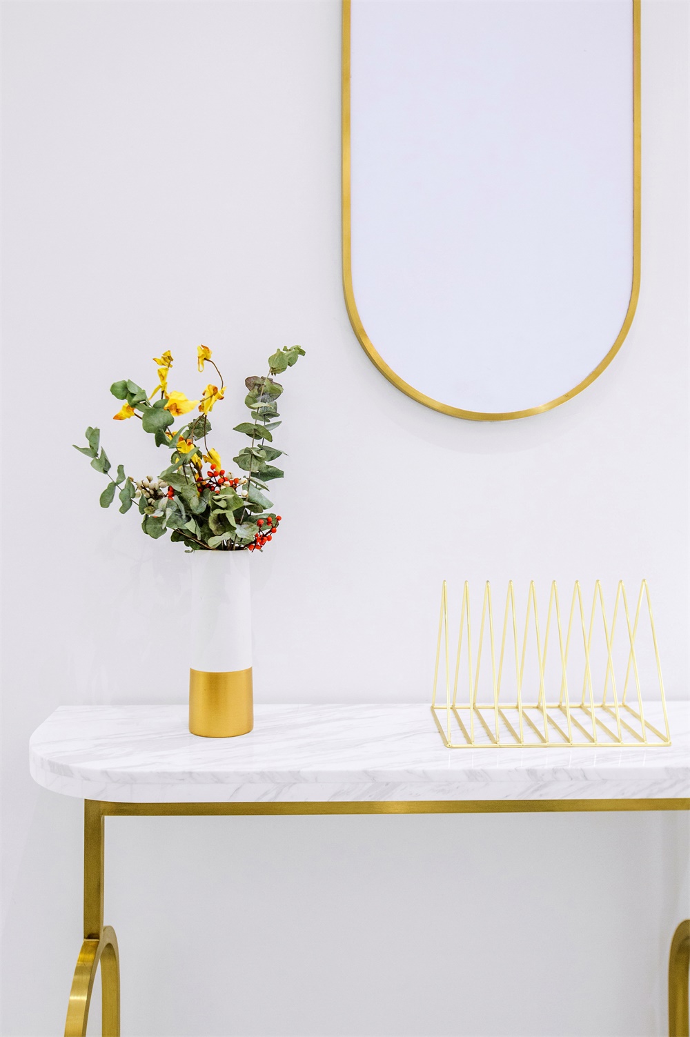
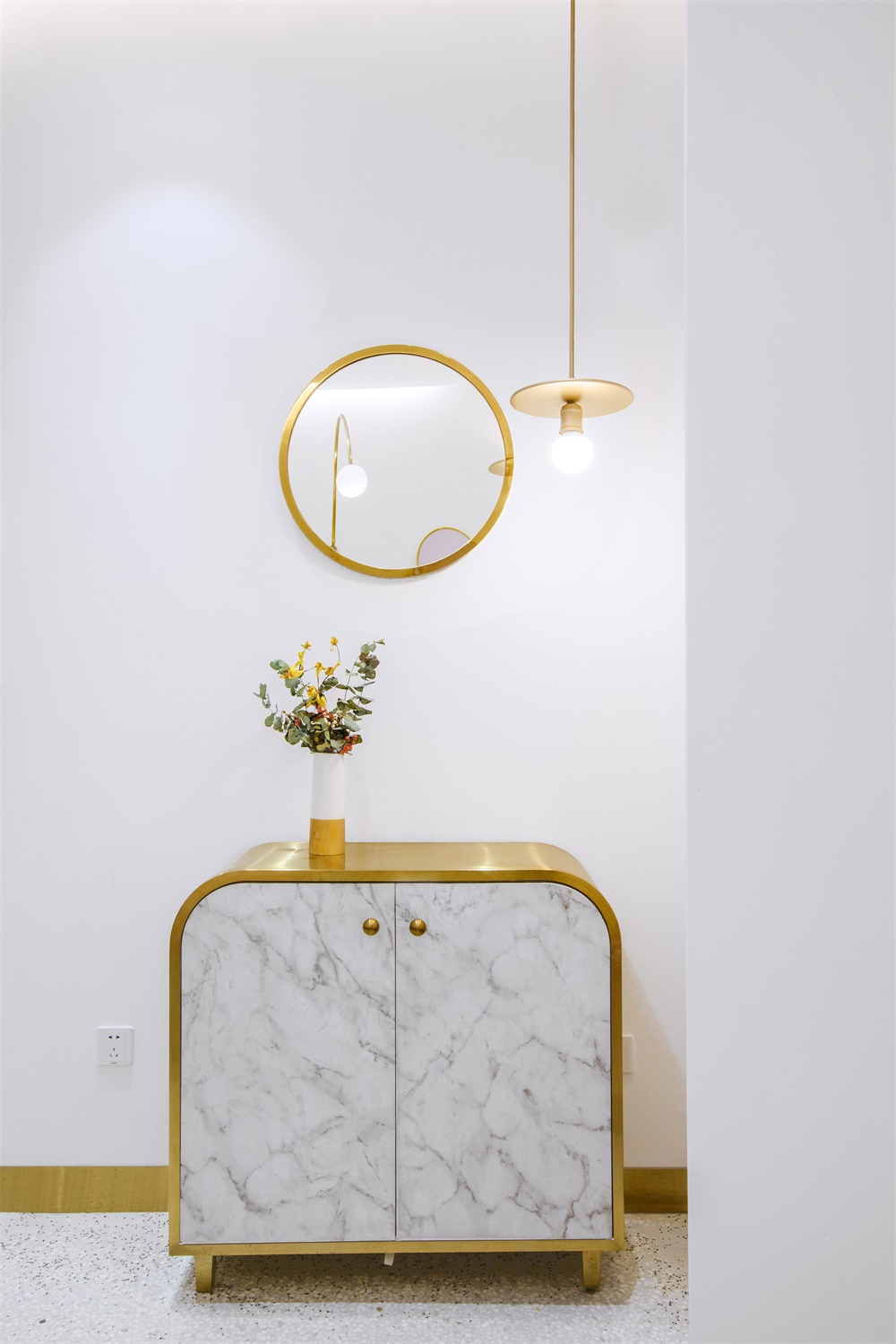
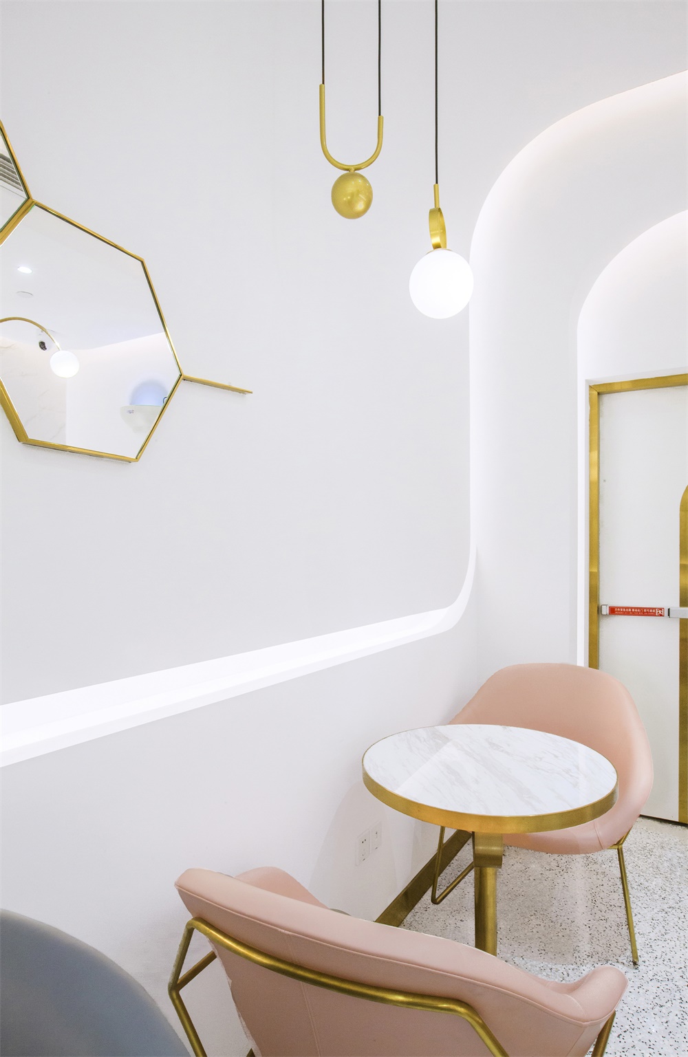
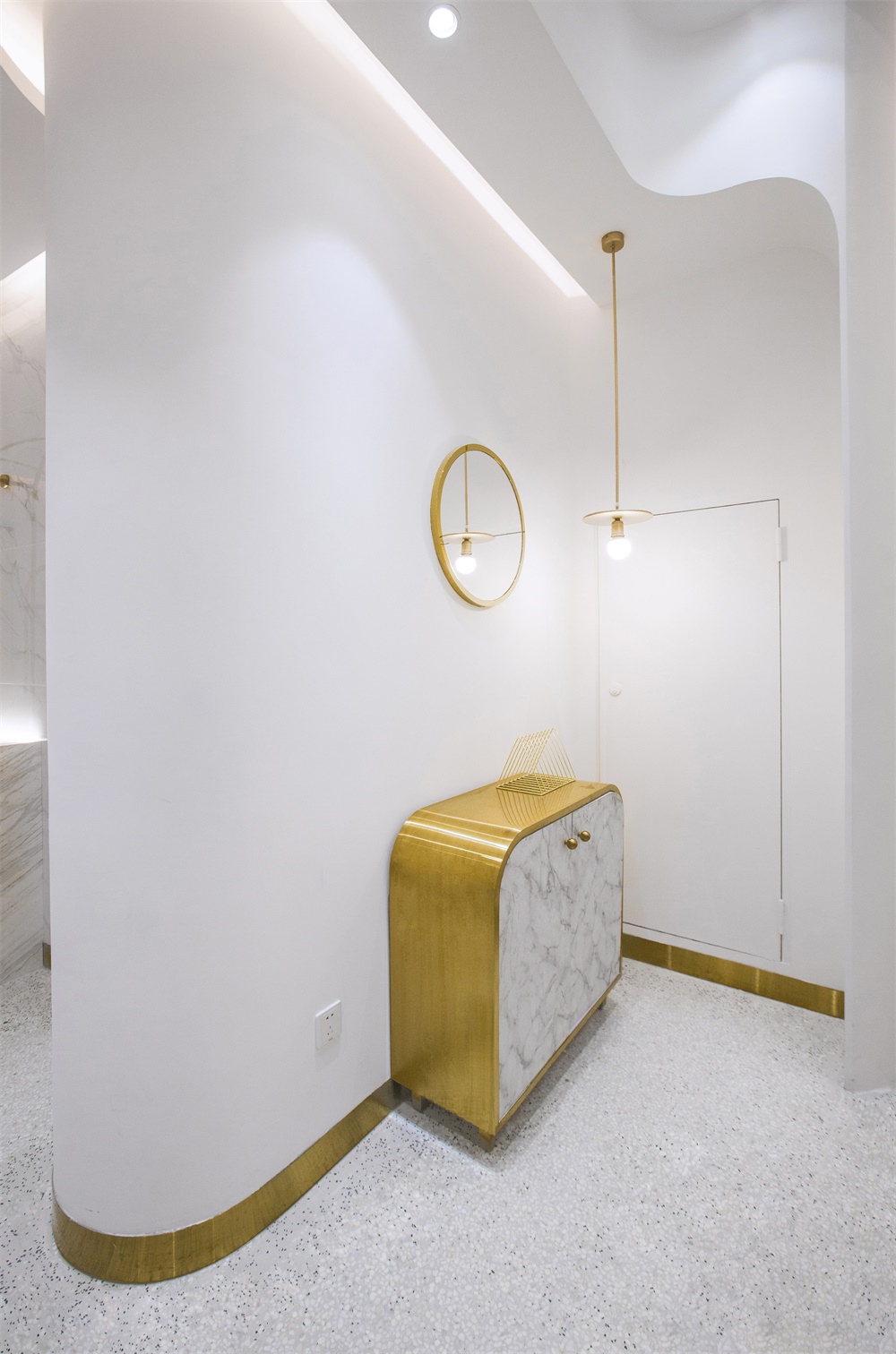
這種對於品質的關懷同樣體現在其他細節中:玻璃、金屬框架與大理石紋理完美搭配,傳遞出尊重材質天性的態度;獨具個性的家具,每一件都是品牌專屬氣質的定製物件。
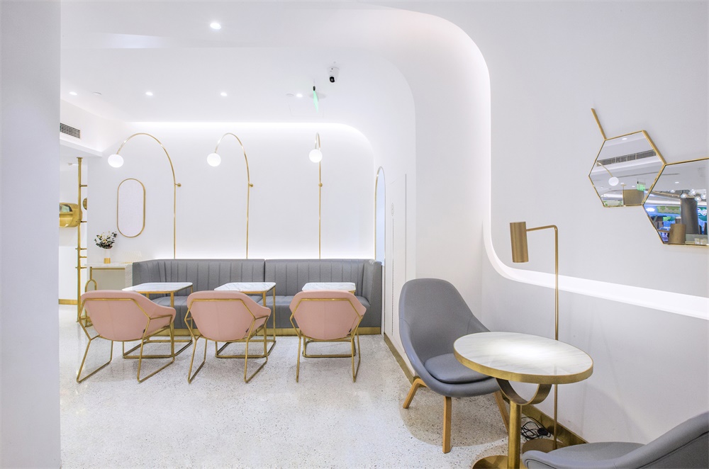
The details of the interiors show quality and exquisiteness. Glass, metal frames and marble grains complement each other, and each piece of furniture are customized, characteristic and unique. In the seating & eating area, seats are arranged in diverse densities.
堂食區疏密有致的座位排布,牆體與家具互相呼應的韻律曲線,與售賣區的精密科學感產生對比,更能引起顧客坐下來小憩一番的興趣。
And the walls and furniture echo each other and create a spatial rhythm, in contrast with the sales area featuring a sense of scientific precision, which is quite compelling to customers.
∇ 店鋪概念總覽圖
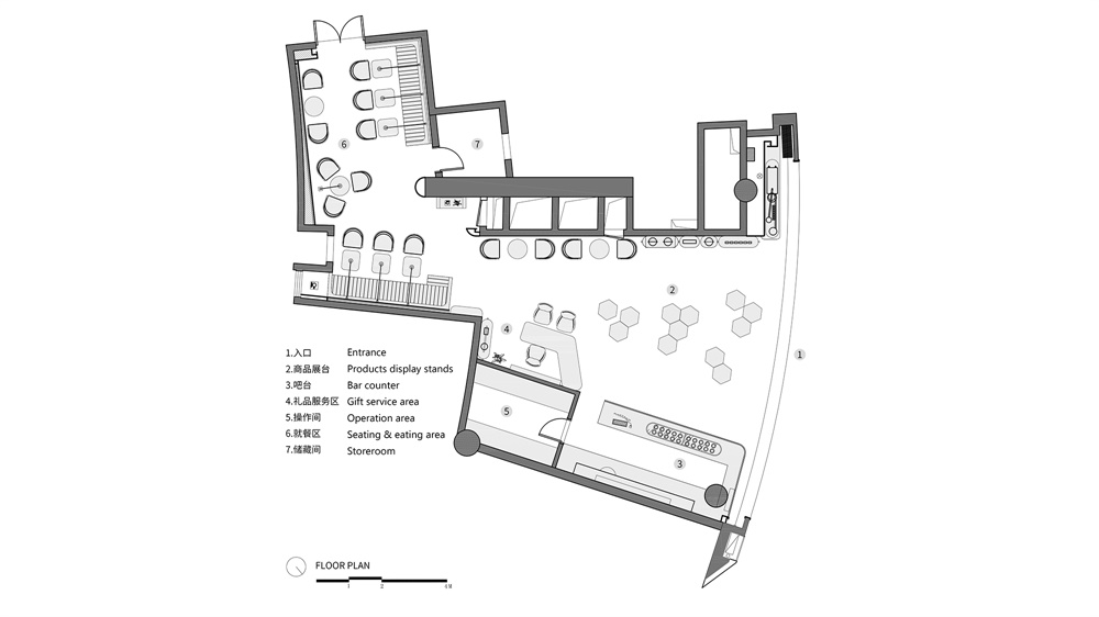
∇ 平麵圖
完整項目信息
項目名稱:Dr.Bravura貝瑞博士燕窩飲品綜合店
項目地點:上海
項目類型:休閑餐飲
項目麵積:119m2
設計公司:Towodesign堂晤設計(www.towodesign.com)
主持設計師:何牧 設計團隊:何牧、任偉、劉雄傑、鄭力源
完工時間:2019.03
主要材料:不鏽鋼、水磨石、石材、塗料
攝影:Towodesign堂晤設計
Project name: Dr. Bravura Bird’s Nest Drink & Dessert Store
Location: Shanghai, China
Type: casual catering space
Area:119 m2
Design firm: Towodesign (www.towodesign.com)
Chief designer: He Mu
Design team: He Mu, Ren Wei, Liu Xiongjie, Zheng Liyuan
Completion time: March 2019
Main materials: stainless steel, terrazzo, stone, paint
Photography: Towodesign


