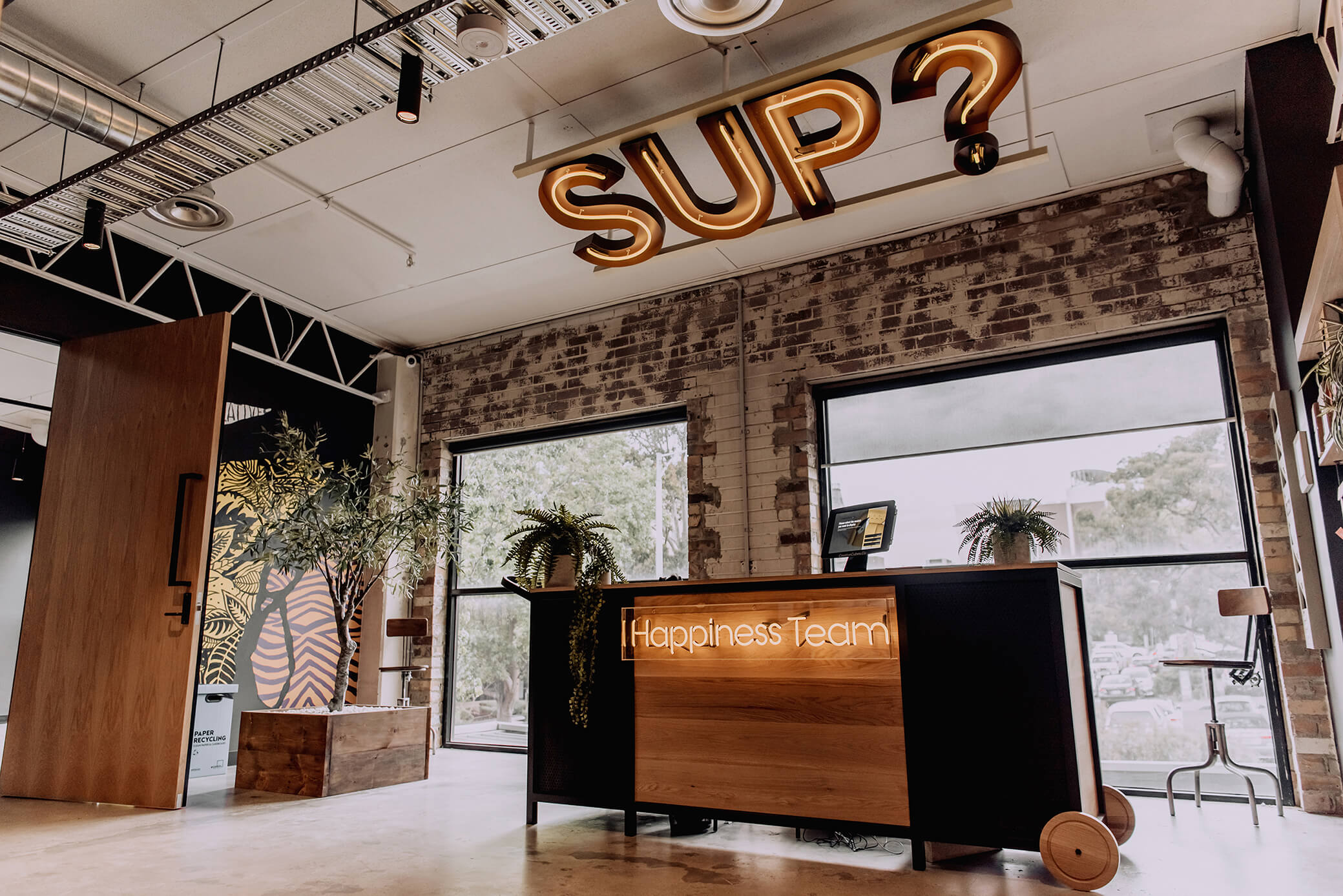
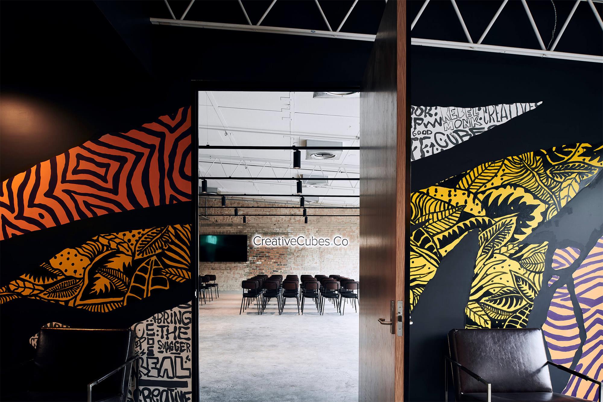
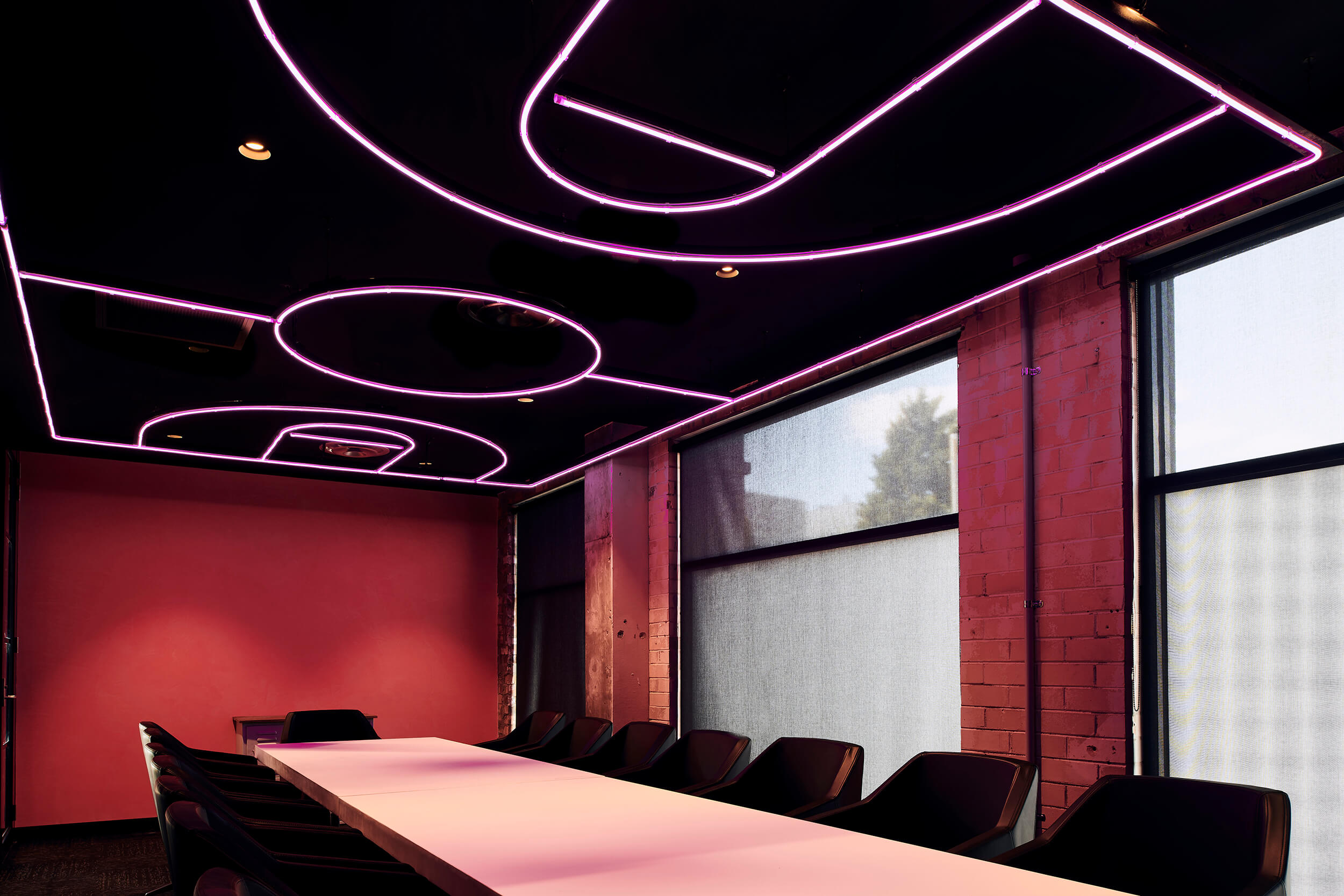
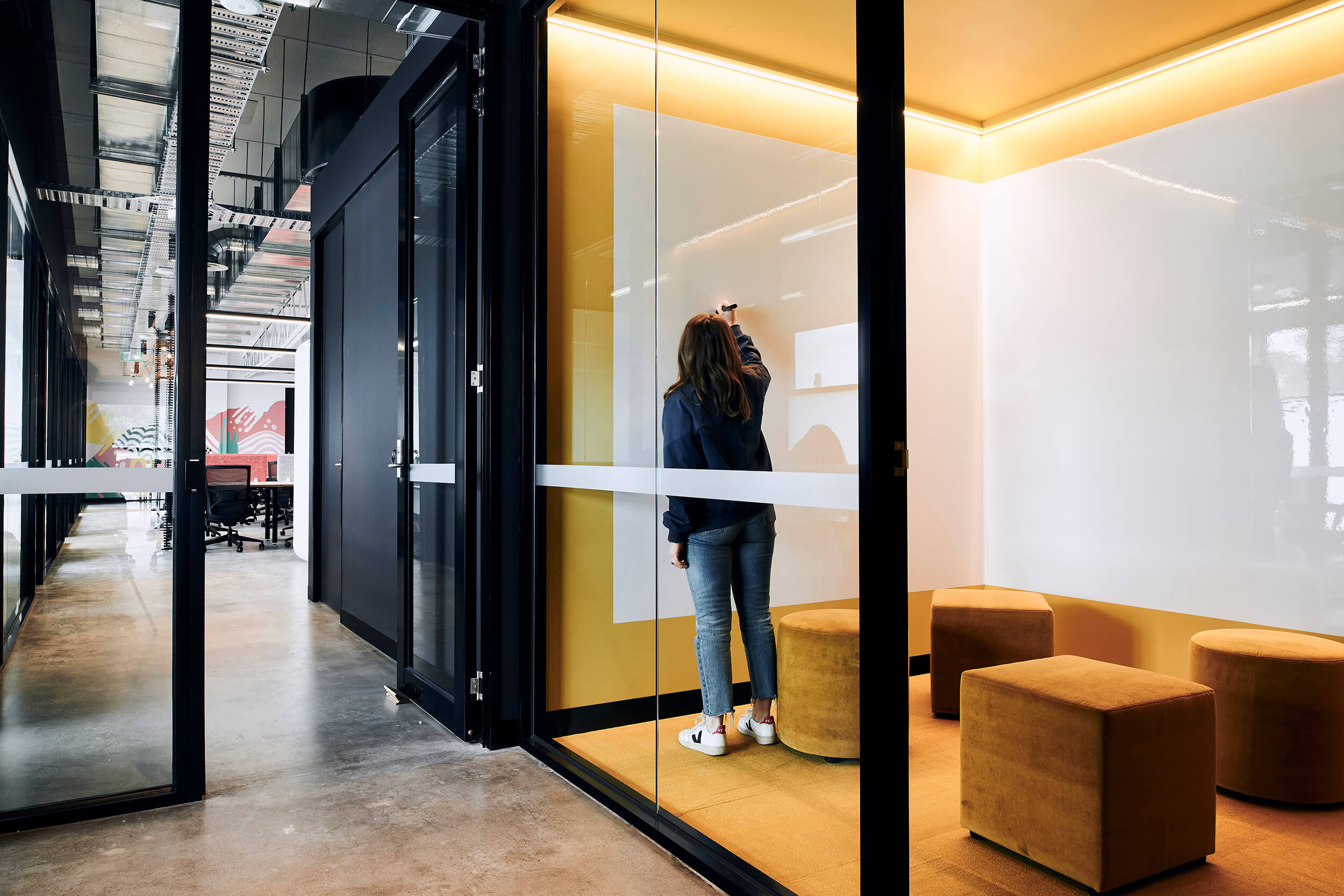
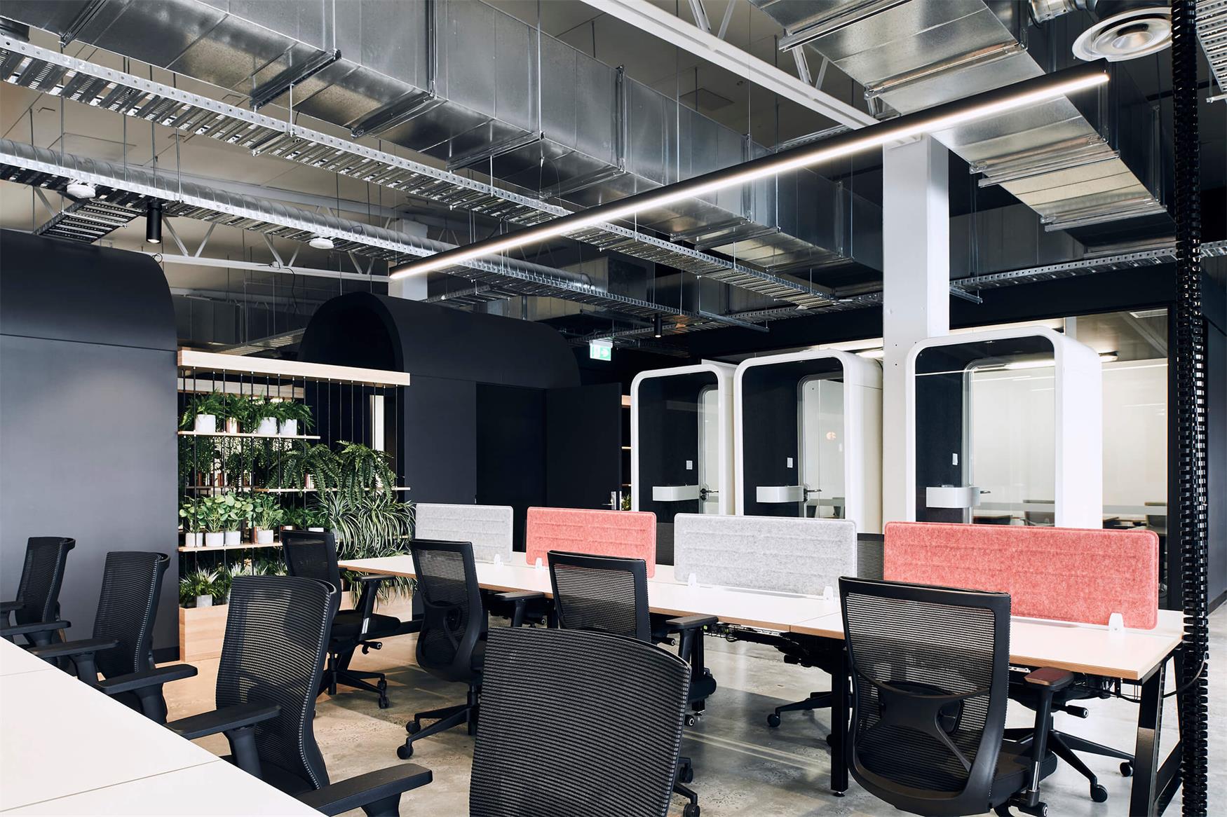
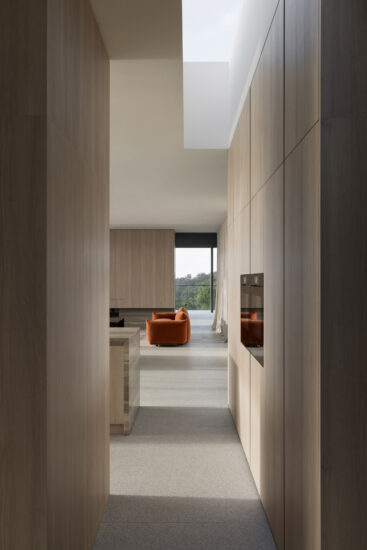
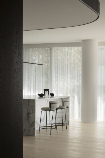
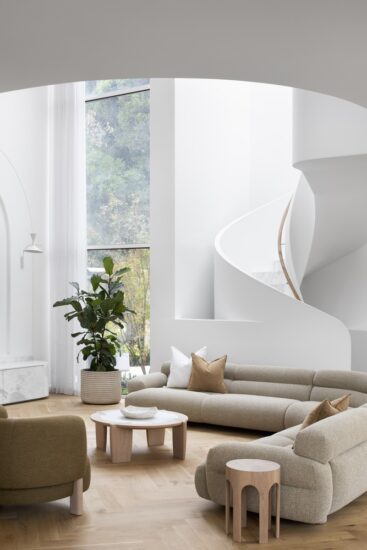
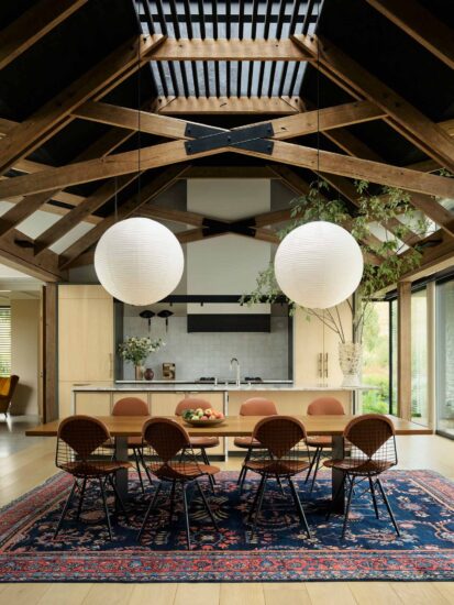
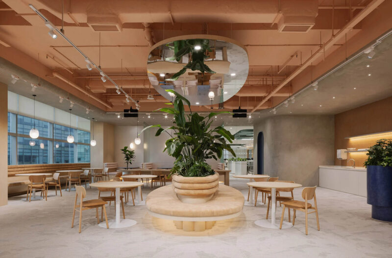
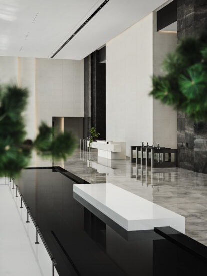
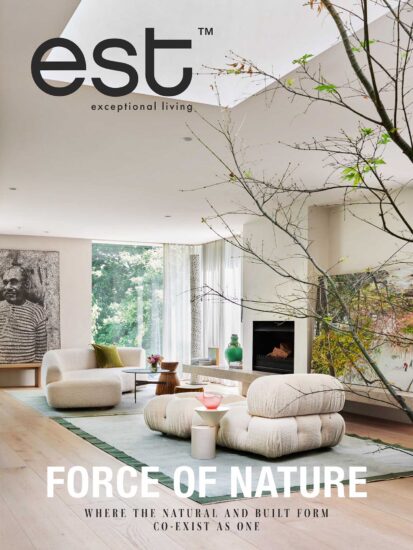
澳大利亞的CreativeCubes.Co 聯合辦公室被分成五個核心區域,是一個需要想象力和創造力的地方。它是一個與環境無縫融合的空間,符合功能的便利性與有著顛覆性的現代設計方法。經過聲學處理的中心樞紐提供了建築形式的視覺和功能平台,使企業能夠高效且不間斷地運營。
Split into five core areas, CreativeCubes.Co is a place with the need for imaginative creativity. It is a space that seamlessly folds into the environment, a conforming functional convenience with a disrupting modern approach. The acoustically treated central hub provides the visual and functional platform from which the building forms, allowing business to operate effectively and without interruption.
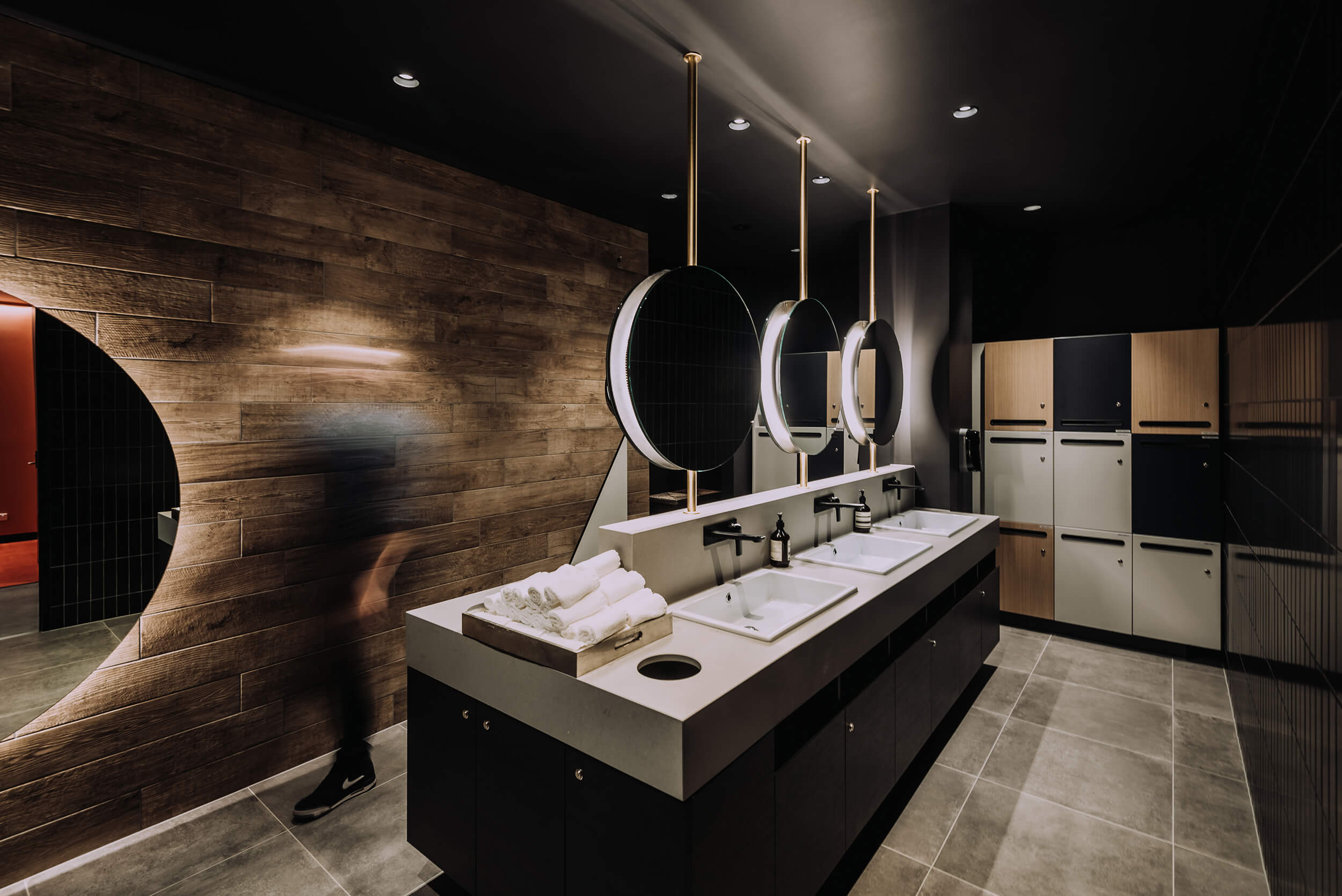
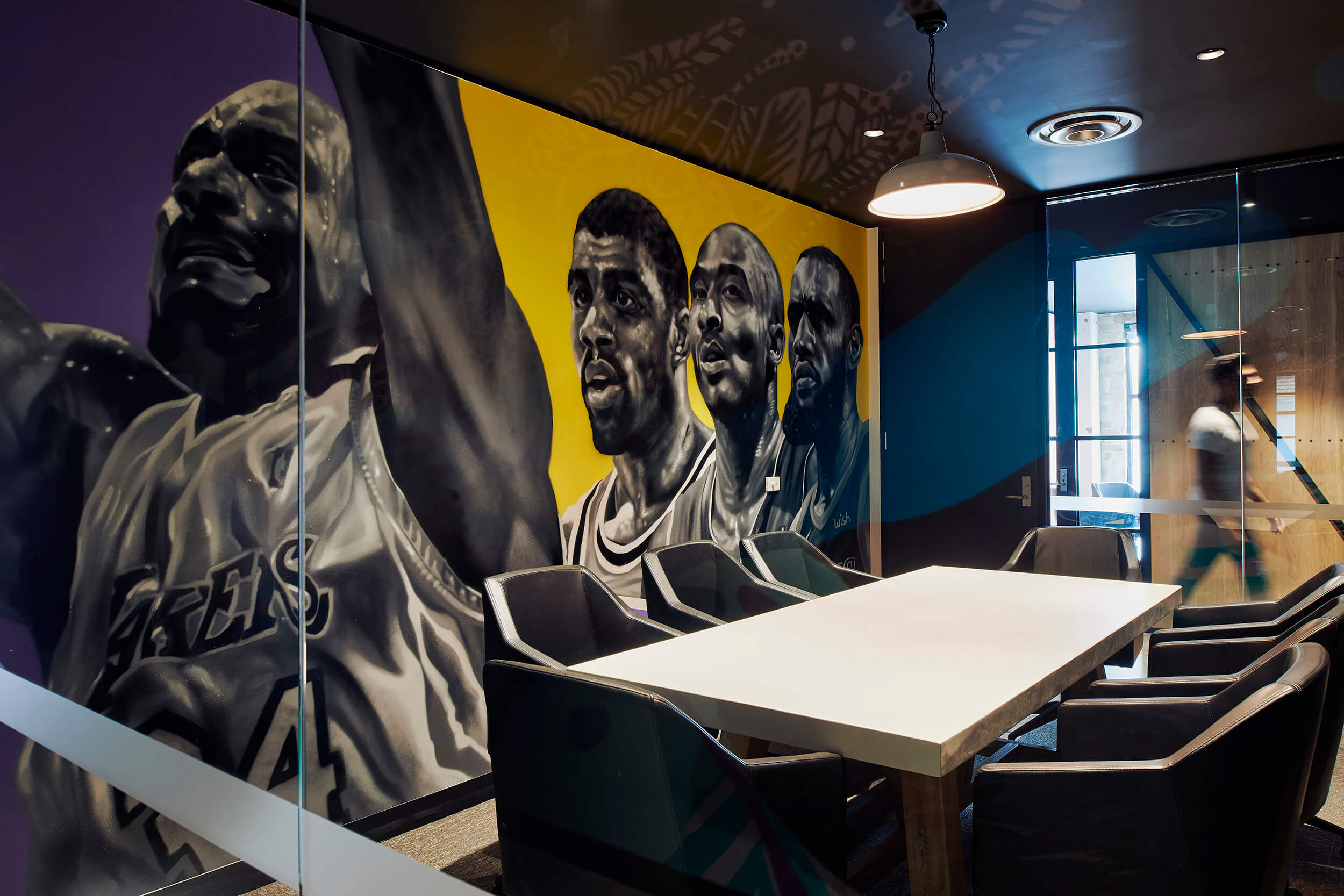
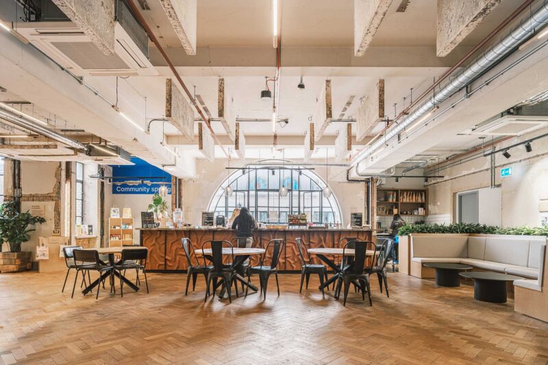
木材和磚砌形成了空間的背景,這些都具有功能性的好處,有助於聲音回響,同時在黑白牆壁之間提供紋理多樣性。五種原色形成了最初設計的基本構思,每個調色板都提供了一個視覺對比,允許在沒有牆壁或障礙的情況下劃分公共區域。藝術品,標牌和地毯上的顏色重複為空間增添了一種序列感和結構感,員工都沉浸在功能齊全的工作空間中,這些工作空間采用中性色調和簡單的線條設計,以確保最佳焦點。
Timber lining and the existing brickwork perimeter form the backdrop for the space, each with functional benefit to help reverberate sound while providing textural diversity among intentionally positioned black and white walls. Five primary colours form the foundational musings of the initial design, with each palette delivering a visual contrast that allows for common areas to be zoned without walls or barriers. This colour repetition across artwork, signage and carpets provides order and structure, with each guest immersed in highly functional workspaces that are designed with neutral tones and simple lines to ensure focus is optimal.
自然光流入每個工作空間,從光線充足的會議中心穿過拱形走廊,進入柔和的瑜伽和冥想空間,這起到過渡體驗。
Natural light flows into each workspace, with a transitioning experience gained when flowing from the well-lit meeting hub through the arched hallway and then into the softly lit yoga and meditative atmospheres.
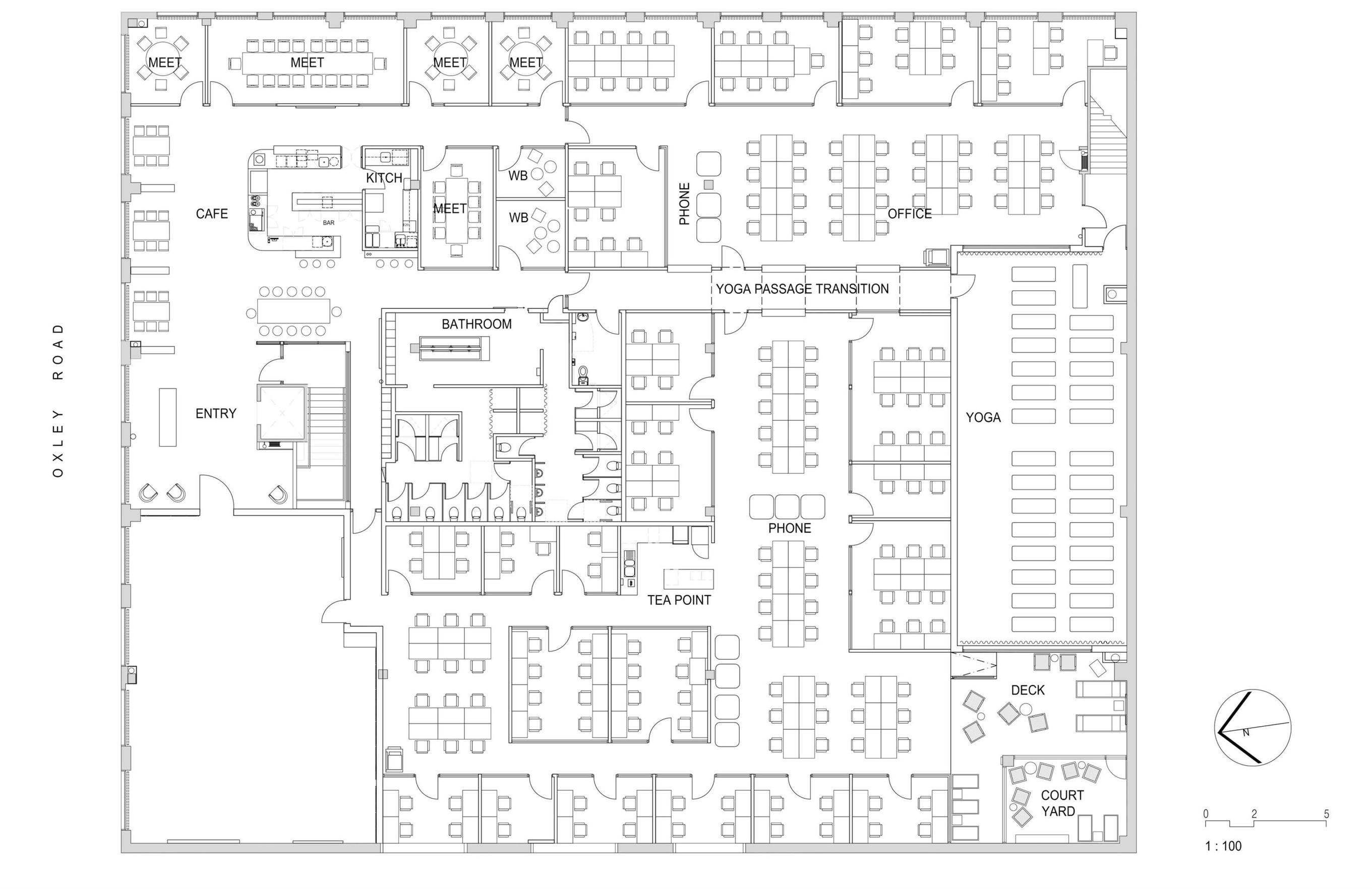
空間的主要挑戰是確保自然光可以分布在整個樓層區域,現有的窗戶隻能在基地的兩側使用,因此使角落會變暗。另一個挑戰是確保每一個工作站的感覺都和下一個一樣好,空間規劃是應對這一挑戰的關鍵,浴室、瑜伽空間和隧道大廳的位置是打破空間的關鍵,讓每個人都有一個很棒的視覺體驗。
The main challenge was to ensure that the natural light was spread across the entire floor area, existing windows were only available along two sides of the site, therefore making the opposite corner dark. Another challenge was to ensure that each and every workstation feels as good as the next, space planning was key to respond to this challenge, the bathrooms, yoga space and the position of the tunnel hall was vital in breaking up the space, allowing a great visual experience for everyone.
完整項目信息
項目名稱:CreativeCubesCo
項目位置:澳大利亞
項目類型:辦公空間/聯合辦公
完成時間:2019
項目麵積:1450平方米
設計公司:ARCHIEE
攝影:Ting En Wong & Simon Shiff


