LOFT中國感謝來自 平介設計 的餐飲空間案例分享:
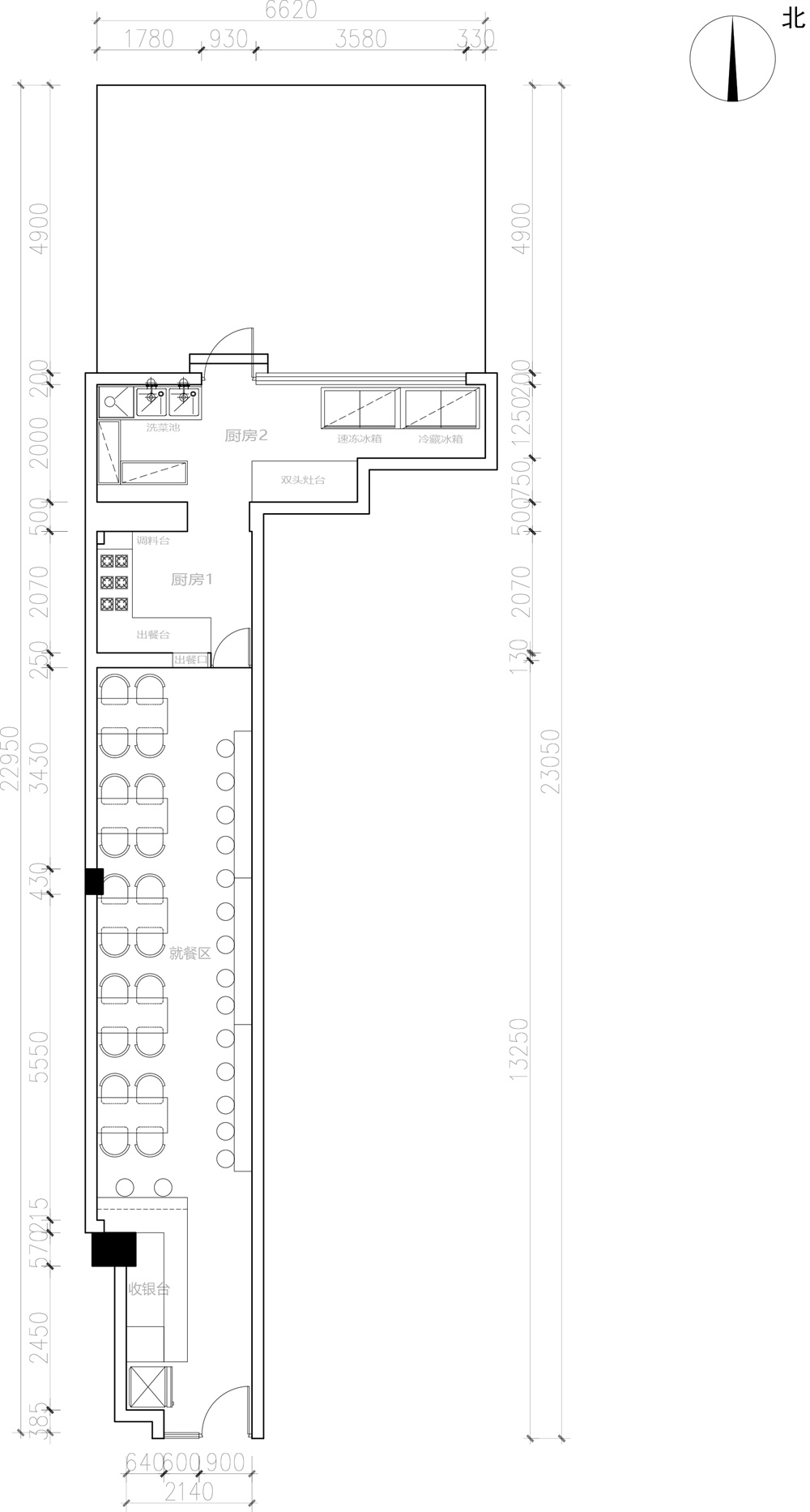
項目位於江蘇省蘇州市工業園區九華路,處於周邊多個住宅區的生活中心。原店是三杯雞米飯/東北燒烤,是小區臨街的一間商鋪,空間單一且狹小。店麵的立麵非常狹長,內部空間相應也是極其狹長的“過道式”空間,長約13米,寬2.3米,麵積大約30平方米。新的餐廳是一家新興的鮑汁撈飯店,業主希望通過室內外的改造,形成獨特的空間體驗,而吸引周邊住宅的人流量以及外賣流量,讓店麵成為大家都想來吃飯打卡的“網紅”快餐場所,並由此對後續外賣業務起到拓展作用。
The project is located at Jiuhua Road, Suzhou Industrial Park, Jiangsu Province, and is located in the living center of several residential areas. The original store is chicken rice / barbecue restaurant . The facing street shop is very small and narrow. The facade of the space is high but narrow, and the interior space is also an extremely narrow “alley” space, about 13 meters long and 2.3 meters wide, with an area of about 30 square meters. The new restaurant is an emerging abalone rice restaurant. The manager hopes to transform the interior and exterior to create a unique experience to attract the flow of people around the area, making the store a “pop-up restaurant” that everyone wants to eat and take photos, which also help with his follow-up take-away business.
因此,如何利用狹窄的過道式空間打造“設計爆款”的就餐空間就成為了本次設計的核心問題,同時極低的造價預算同樣也是需要克服的設計障礙。另外,結合環境現狀,有三個設計要點可以明確:第一,需要合理利用好這個空間窄長的形式特征,依次排布桌椅,體現出空間特質;第二,通過設計材質貼麵等盡可能使店內看起來寬敞不壓抑;第三,注重外立麵的設計,造成一定的視覺衝擊,吸引來往行人入內就餐。而狹小的空間必須考慮到人群流量的控製,因此需要通過空間創造出的“快速”的心理映射。
Therefore, how to use the narrow space to create a “pop-up restaurant” dining space has become the core issue of this design, and the extremely low budget is also a design obstacle that needs to be overcome. There are three key points that can be clarified: First, it is necessary to make reasonable use of the narrow and long form features of the space, and reasonably arrange the tables and chairs; secondly, the space should looks spacious and not depressed by using material and light; third, the facade and interior should attract people to come but also with certain visual impact to create a “fast” psychological effect to push people eat quickly in this space in order to control the crowd flow.
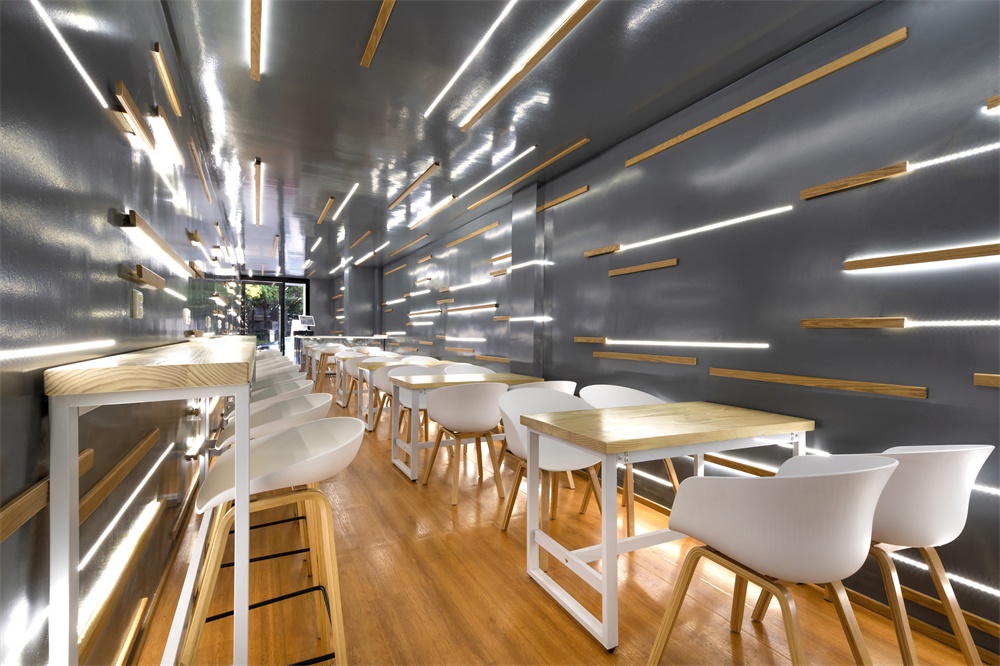
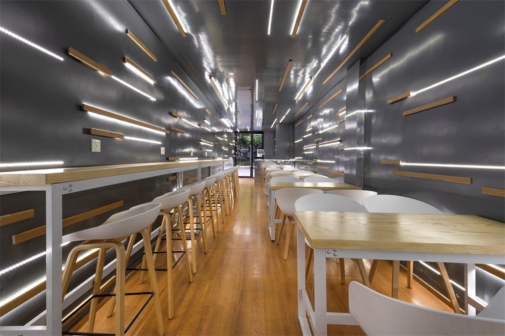
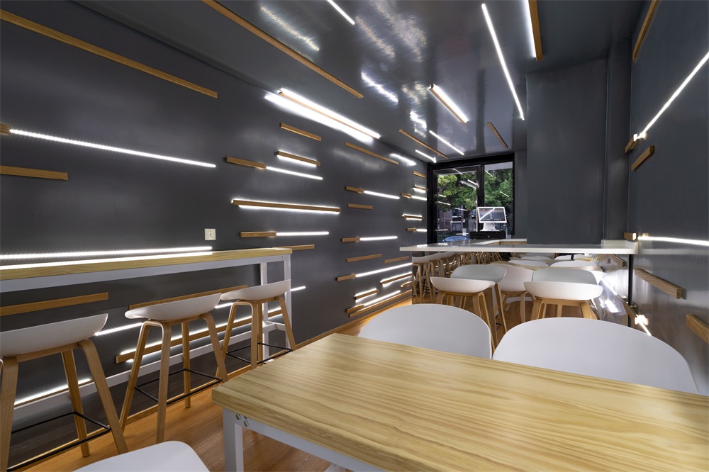
設計師在設計之前對菜品的品嚐以及與大廚的聊天中,逐漸形成了味覺時光隧道的設計概念:在圍合的牆麵和頂麵上均安裝水平的線條——為增加牆麵的多樣豐富性和飛逝的效果。采用了木條和LED燈帶兩種材料的三種組合,在強調速度,促進一波又一波用餐者的更迭的同時,又強調出“隧道”極佳的延伸與進深感,以及光線為空間帶來的流動感和活力。
Through taste of the dishes and chat with the chef, the designer gradually formed the design concept of taste/time tunnel: by installing horizontal stripes on the enclosed wall and top surface in order to increase the variety and richness of the wall to make the fleeting effect of interior space. Three combinations of two materials – wood strip and LED light, are used to emphasize the fleeting speed, while emphasizing the “tunnel” feeling with infinite extension to the food.
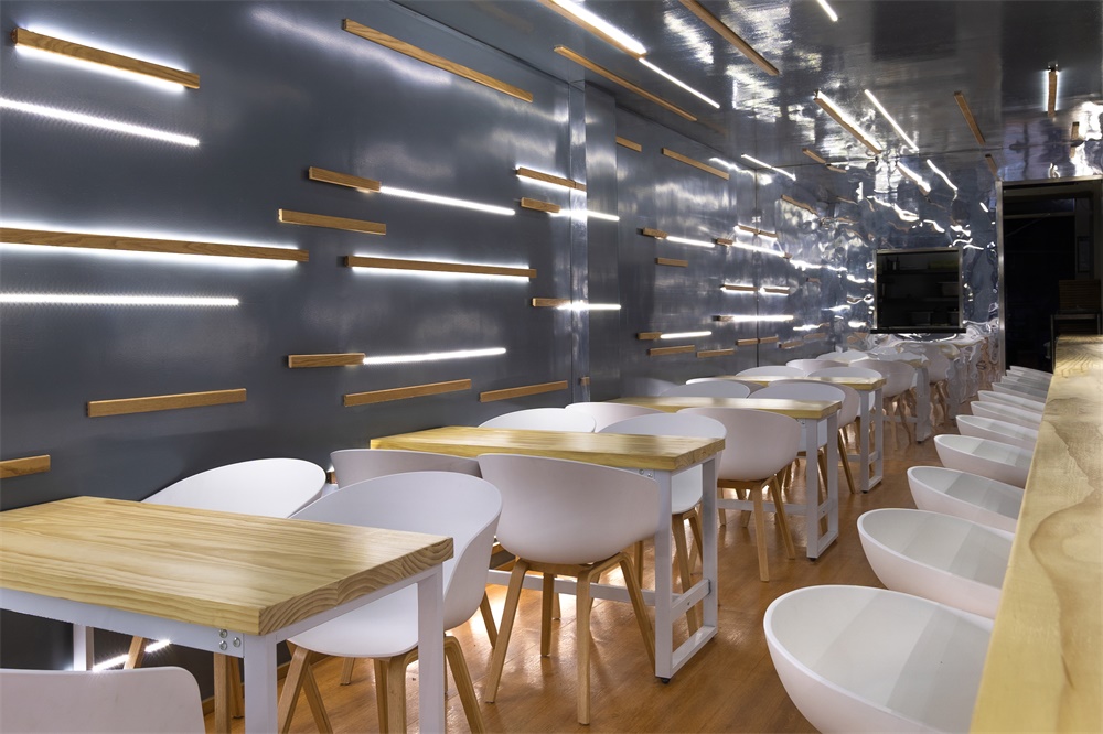
但為滿足較為良好的用餐體驗,並且增加空間的橫向寬度,使之又不至於太過深邃壓抑。在經費有限的條件下,設計師摒棄使用鏡麵材質而嚐試用在牆麵上塗刷價格較為低廉的環氧樹脂漆創造反射與發光感的空間界麵,漫反射帶來類似磨砂的質感又不至於使光線反射過於強烈而引起不適。同時在櫃台、廚房與就餐空間的分隔麵等非牆麵界麵則使用鏡麵亞克力使空間形成一個鏡麵反射的整體同時增強空間的縱深感。空間界麵之間的界限模糊,很好地增加了空間的開闊性。
In order to satisfy a better dining experience and increase the lateral width of the spatial feeling. Under the condition of limited costs, the designer abandoned the use of mirrored materials and tried to use the cheaper epoxy paint on the wall to create a spatial interface of reflection and illuminance. The diffuse reflection brought a texture similar to matte and did not make the light reflect too strongly which cause uncomfortable. At the same time, the functional surface such as counter, the window of kitchen uses mirrored acrylic to make the space form a mirror-reflective effect while enhancing the depth of the space.
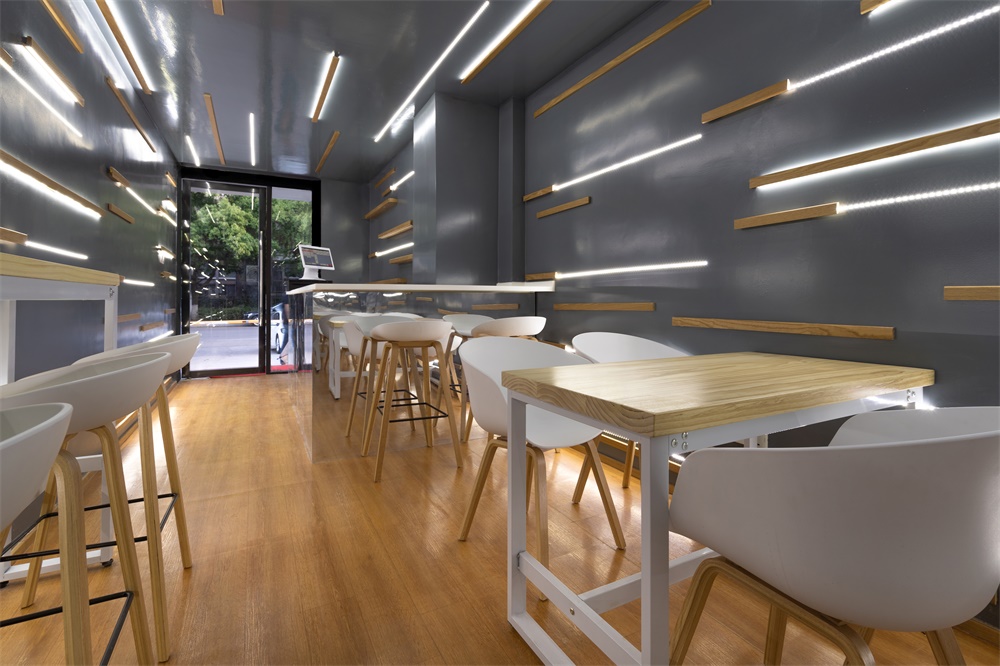
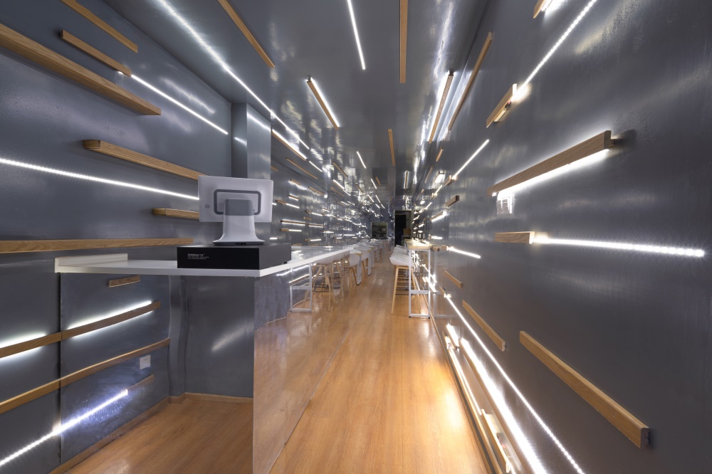
於是,一個完整的漫反射通道空間應運而生。整體設計空間分成兩個部分:入口櫃台空間、就餐區空間。首先是櫃台空間,櫃台僅以一台點單機作為與店員與顧客交涉的界麵,其下“隱藏”店員工作區,形成具有層次感的櫃台空間,十分簡約。並在操作手法上,使用懸浮的概念:木條與燈帶在鏡麵亞克力上的反射,使櫃台與整個空間融為一體,櫃台仿佛“漂浮”在空中。同時櫃台局部的可移動設計滿足店員進出的需求,以及在櫃台旁留有的局部等候空間給外賣員進行休憩。
Thus, a complete diffuse channel space came into being. The overall design space is divided into two parts: the reception space and the dining area space. The counter only uses a computer as the interface on the desk to negotiate with the clerk and the customer, other functions are hidden under the white table-board. At the same time, the movable design of the counter partially meets the needs of the clerk to enter and exit, and the partial waiting space left at the counter is for the take-away staff to rest.
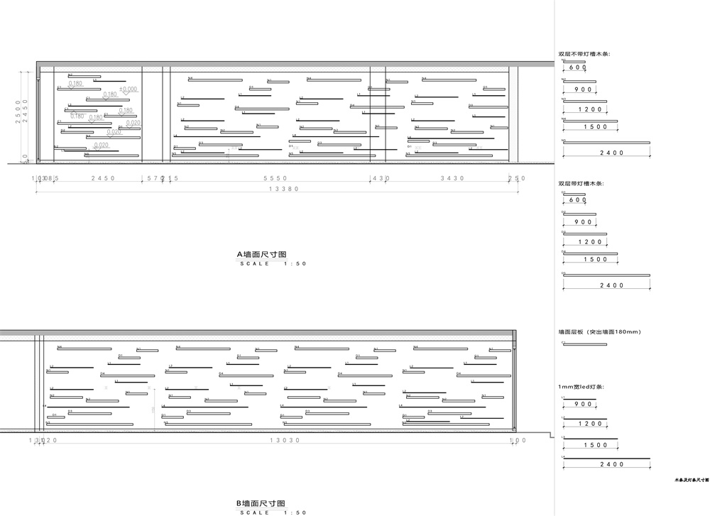
就餐空間按照不同的人員模式分成聚餐與單人兩種桌椅排布形式,木條以漸變的規律鑲嵌在左右牆麵、地麵、頂麵上,提升空間的狹長與進深感,同時漸變的規律參照空間照明需求自上而下燈帶減少。燈條強化空間的進深感,並且增加了時尚感與趣味性。木質地板與燈帶的搭配,延續了空間界麵的連續性,且增加空間的親切感和溫度。
The dining space is divided into two types of tables and chairs according to different eating modes. The wooden strips and LED light are inlaid on the left and right walls with gradually change form according to lighting requirements are reduced from top to bottom. The light bar enhances the depth of the space and adds a sense of fashion and fun. The combination of wooden floor and strips create the continuity of the spatial interface and increases the intimacy and warm-feeling of the space.
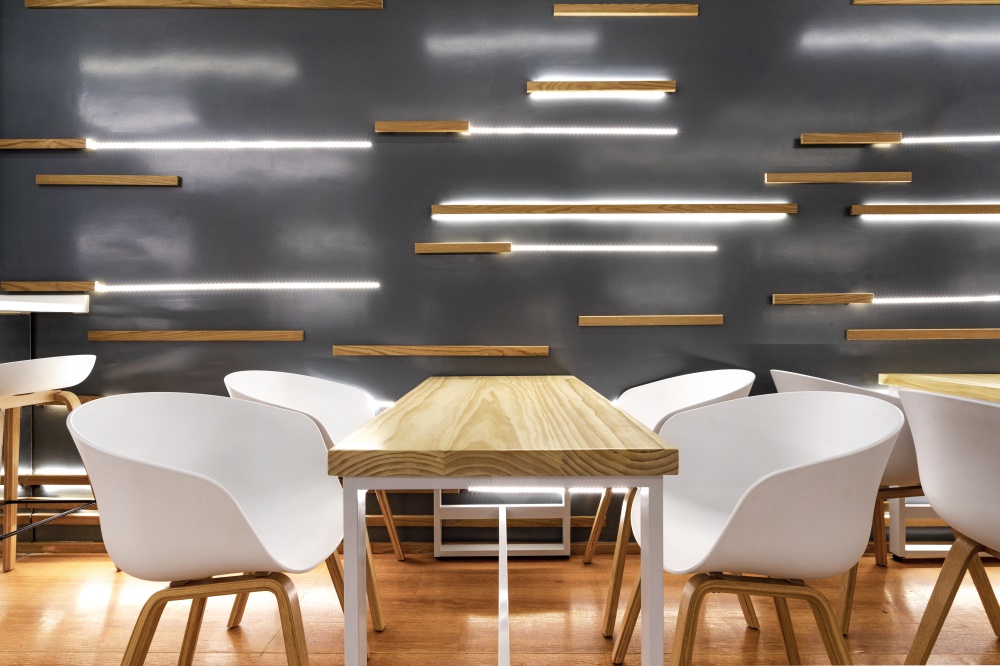
整個空間使用幾種材質“拚貼”而成,摒棄了傳統室內天花板、牆麵、地麵的邏輯而進行整體打造。室內空間主要采用四種材料:環氧樹脂漆,木條,燈帶,鏡麵亞克力。鏡麵亞克力安裝在狹長空間的盡頭,起到反射與延伸空間長度的作用。環氧樹脂漆具有漫反射的作用,作為左右牆以及頂麵的主要基底材質,給界麵以光澤的質感,且使空間視覺上不再封閉。木條和燈條進行三種不同的牆麵操作:純木條、純燈條、木條內嵌燈帶(一種懸浮於空中的效果)。整個空間盡端不僅以吸引眼球的延伸界麵進行終止,同時以菜品的出餐口(味覺與嗅覺)進行開始重新引導整個空間的餐飲基調。
The entire space is made up of several materials’ “collage”, which eliminates the logic of traditional design logic of ceilings, walls and floors. The interior space is mainly made of four materials: epoxy paint, wood strips, light strips, and mirror acrylic. The mirrored acrylic is mounted at the end of the narrow space and functions as extension of space. The epoxy resin paint has the function of diffuse reflection, and serves as the main base material for the walls and the top surface, giving the interface a glossy texture and making the space visually wider. Wood strips and light strips perform three different wall operations: pure wood strips, pure light strips, and wooden strips with built-in strips (an effect suspended in the air). The end of the space is not only terminated with an eye-catching extension interface, but also begins to re-direct the dining atmosphere of the entire space with the food outlet (taste and smell).
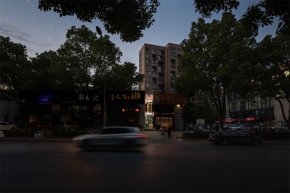
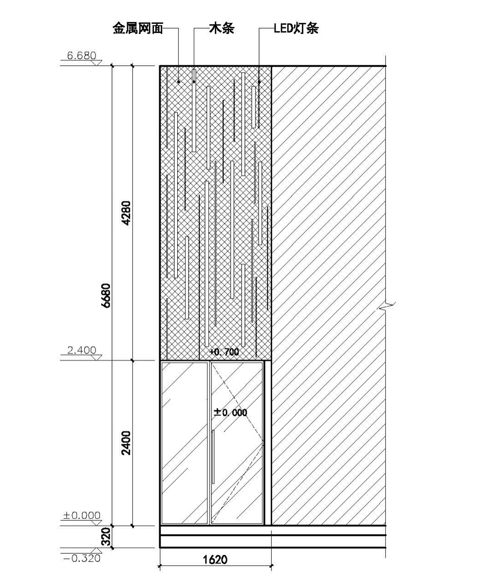
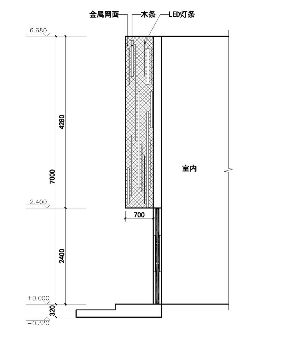
與室內空間相對應的,外立麵同樣延續相似的語彙,利用廉價的金屬網為店招基底,外掛燈條和木條。由於店麵的特殊性質,上下兩個店招在原先的使用中是完全分開的,中間的二層空間也是別的店家經營使用,因此立麵設計時就通過外掛燈條和木條將兩部分進行了串聯並克服了不能遮擋的問題。
Corresponding to the indoor space, the façade also continues a similar vocabulary, using cheap metal mesh for as base, install light strips and wooden strips on the surface with easy bolts. The upper and lower sign were completely separated in the previous use, and the middle two-storey space is also used by other stores. Therefore, the facade design has connected both parts and overcomes the obstructed issues of upper store.
身處住宅區,決定了它很難具備商業區那樣網紅餐飲店的特質;而特殊的狹長空間,用“網紅小吃店”來描述其定位十分恰當。設計師也希望這個空間能夠作為一種特殊店鋪、快餐文化疊加的新範式,設計在這個空間的作用並不是迎合商業,而是針對空間的重新表達和思考以及重釋。
Located at a residential area determines that it is difficult to have the characteristics of a pop-up restaurant compared with in a commercial district. But its unique narrow space, it work as a “neighborhood cafe” to describe its position. Designers also hope this space can serve as a new paradigm for the superposition of pop-up store and fast food culture in China. The role of design in this space is not to cater to business, but to re-express and reflect and reinterpret small dinning space.
∇ 桌椅排布的幾種可能性 Several possibilities for table and chair arrangement
∇ 平麵圖 Floor plan
∇ 牆麵設計 Design for the walls
∇ 室外正立麵施工圖 Outdoor façade construction drawing
∇ 室外側立麵施工圖 Outdoor side façade construction drawing
完整項目信息
項目名稱:夾縫中的撈飯餐廳
項目類型:室內改造
項目地點:江蘇省蘇州市工業園區九華路
設計單位:平介設計(蘇州平介建築科技有限公司)、上海衡泰建築設計谘詢有限公司
空間設計:楊楠,王乙童,吳怡,鄭軼鴻,黃迪
施工設計:上海衡泰建築設計谘詢有限公司
主要材料:鏡麵亞克力、防腐木、環氧樹脂
工程造價:5萬
建成狀態:建成
設計時間:2019年
建設時間:2019年
建築麵積:30平方米
攝影:姚傑奇
Complete project information:
Project Name:Lao fan restaurant in the alley
Project Type: Indoor Renovation
Project Location: Jiuhua Road, Suzhou Industrial Park, Jiangsu Province
Design team: Parallect Design、Shanghai hengtai architectural design consulting co., LTD
Architects: Nan.Yang, Yitong.Wang,Yi.Wu,Yihong.Zheng,Di.Huang
Main materials: mirror acrylic, anti-corrosion wood, epoxy resin
Engineering: Shanghai hengtai architectural design consulting co., LTD
Project cost: 50,000
Type: built
Design:2019
Construction: 2019
Area: 30 sqm
Photo: Jieqi.Yao


