LOFT中國感謝來自 壹席設計事務所 的餐飲項目案例分享:
“沒有人是一座孤島,可以自全”。對於全球日益信息化的今天尤其如此。但在資源共享與萬物互聯的外衣下,現實中人與人的距離感卻在加深。
“No man is an island, entire of itself.” This is especially true in the current information age. In fact, interpersonal relationships are being estranged under the trend of resource sharing and interconnection of all things.
無間是一個沉浸式場景的社交體驗空間,在充斥著戒備與疏離的都市背景中,試圖探索人類更純粹和自發的狀態。借由感知、直覺、行為意識的空間交錯界麵,去思考當代人與人、人與自身最大自由的共存關係。
The project is a social communication space featuring immersive scenes, which tries to explore a purer and more spontaneous state of human beings in the urban context full of vigilance and alienation. Via the interlaced interfaces of perception, intuition and behavior consciousness, it triggers people to think about the coexistence between people and themselves and others in a most free manner.
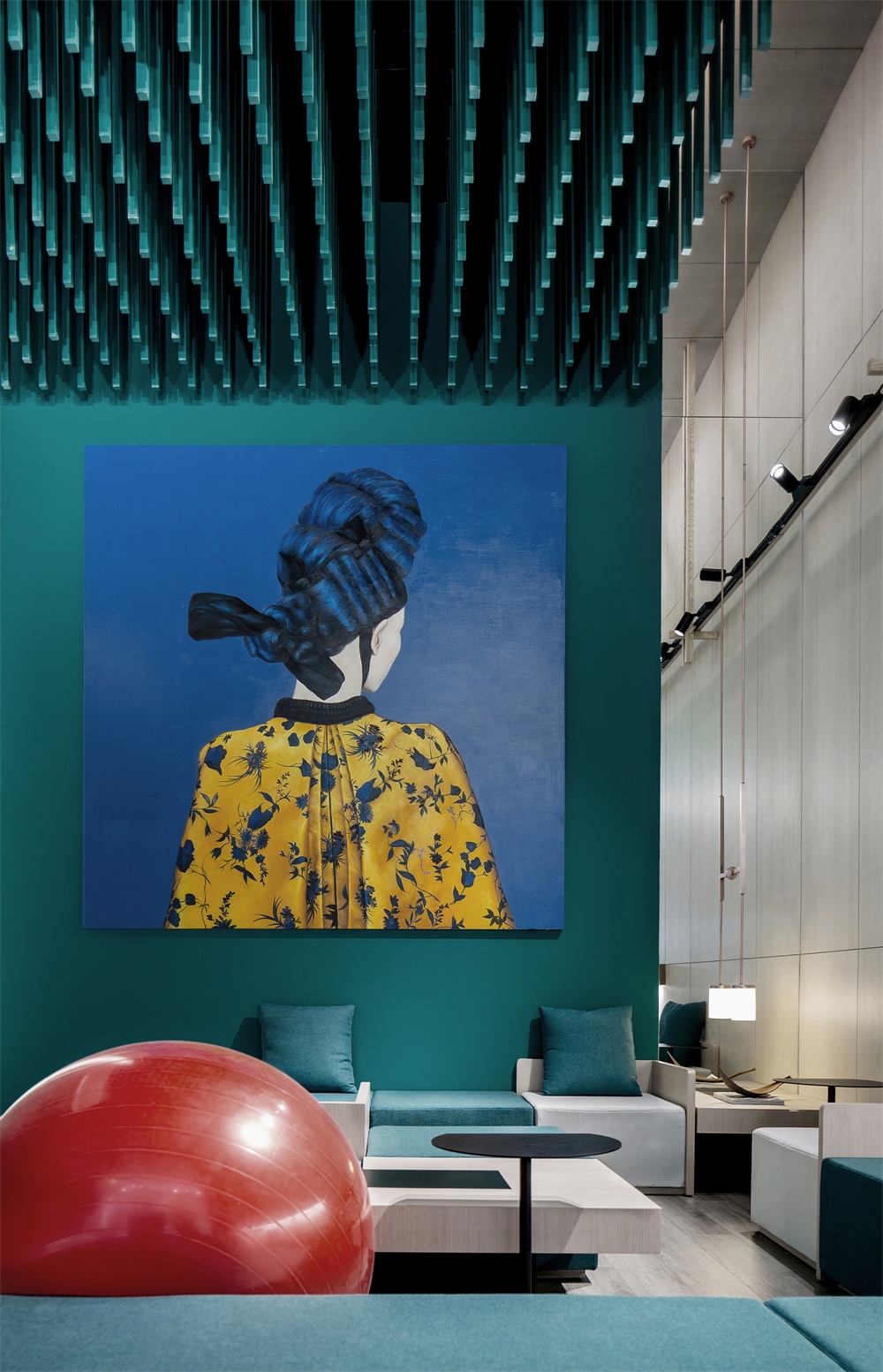
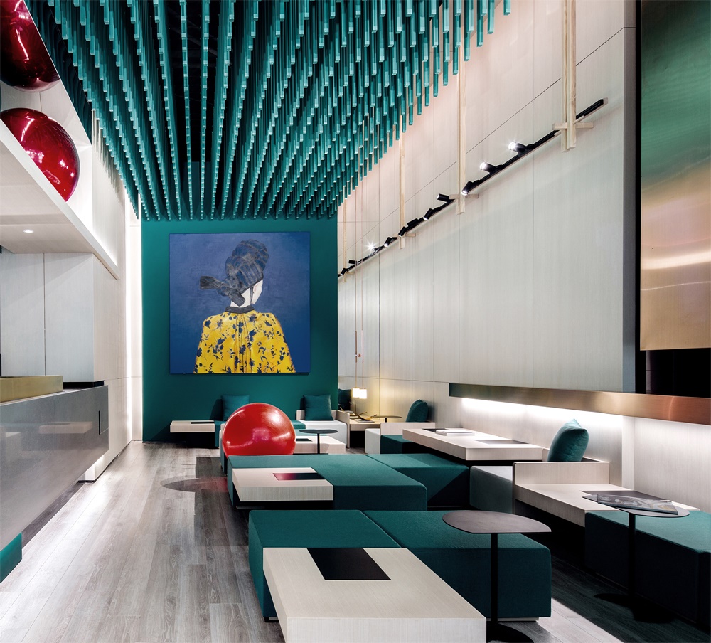
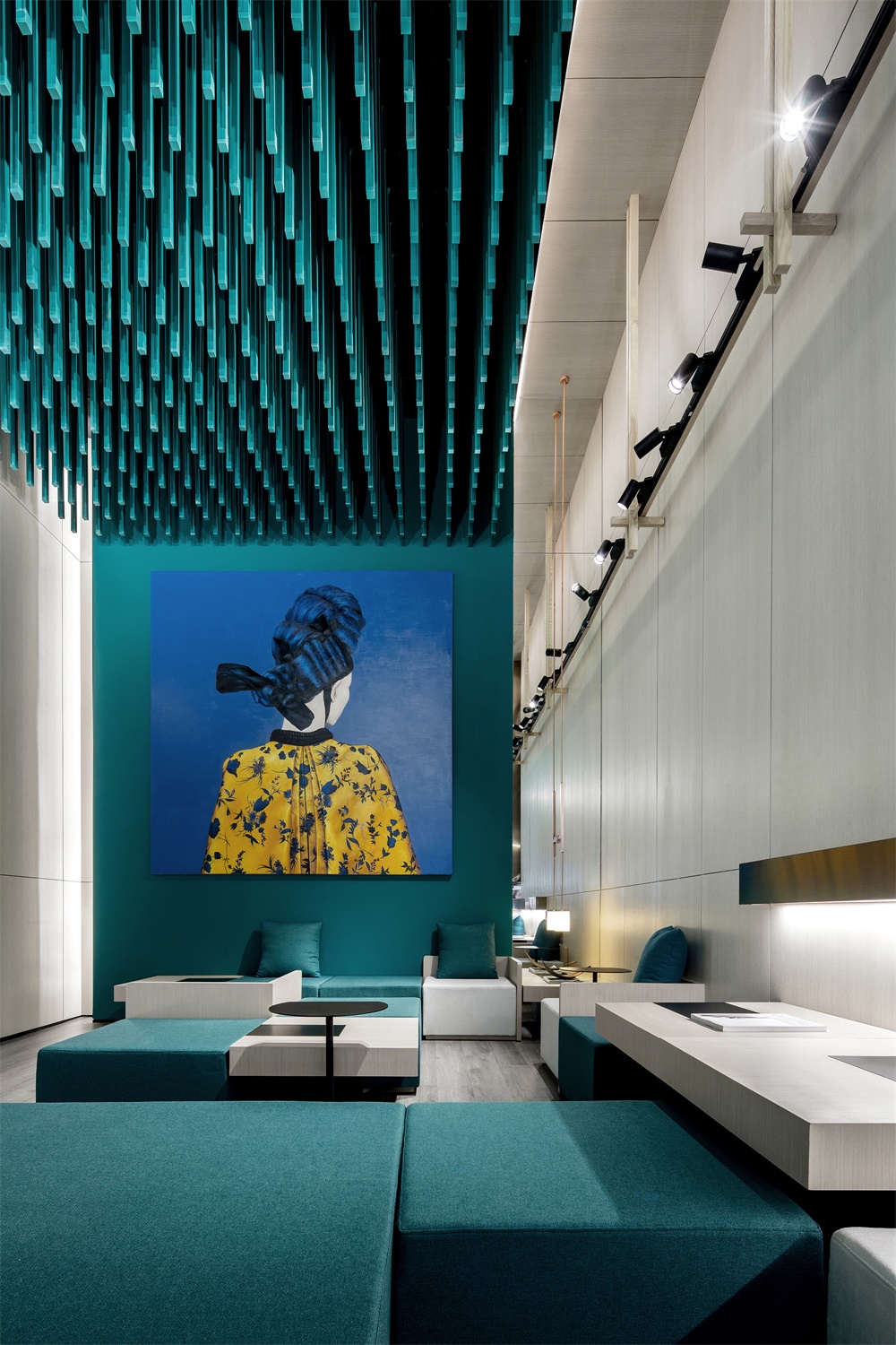
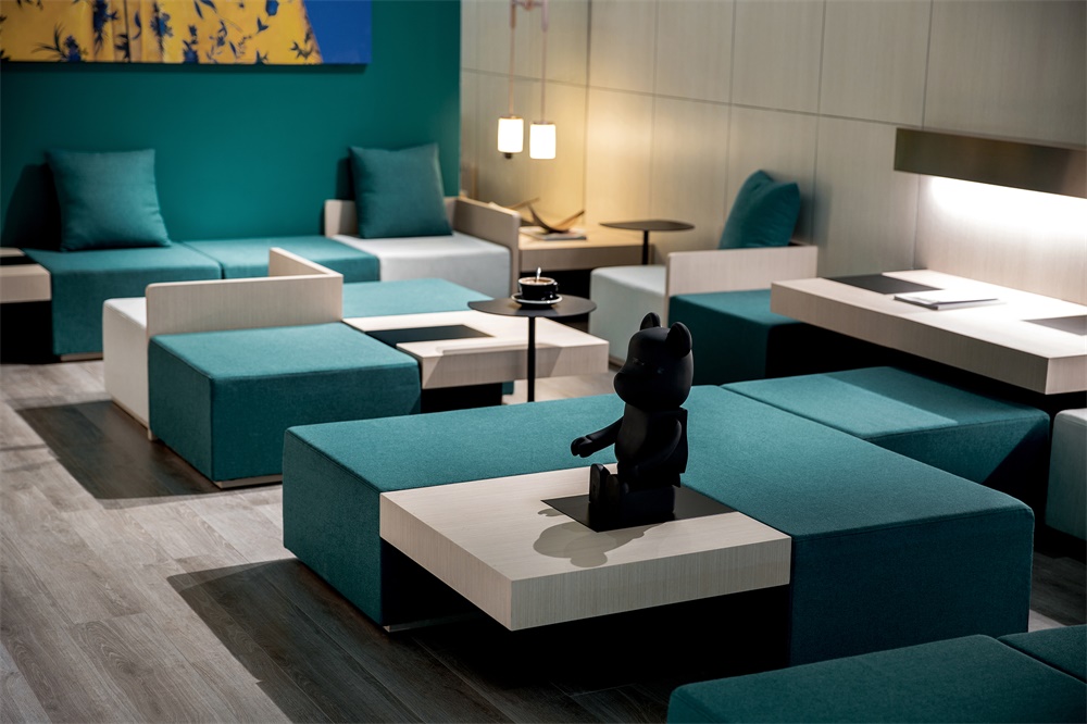
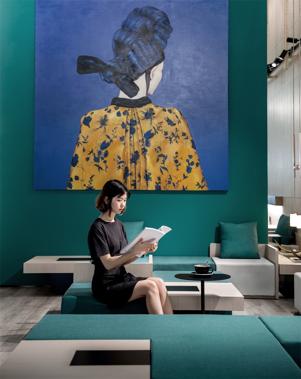
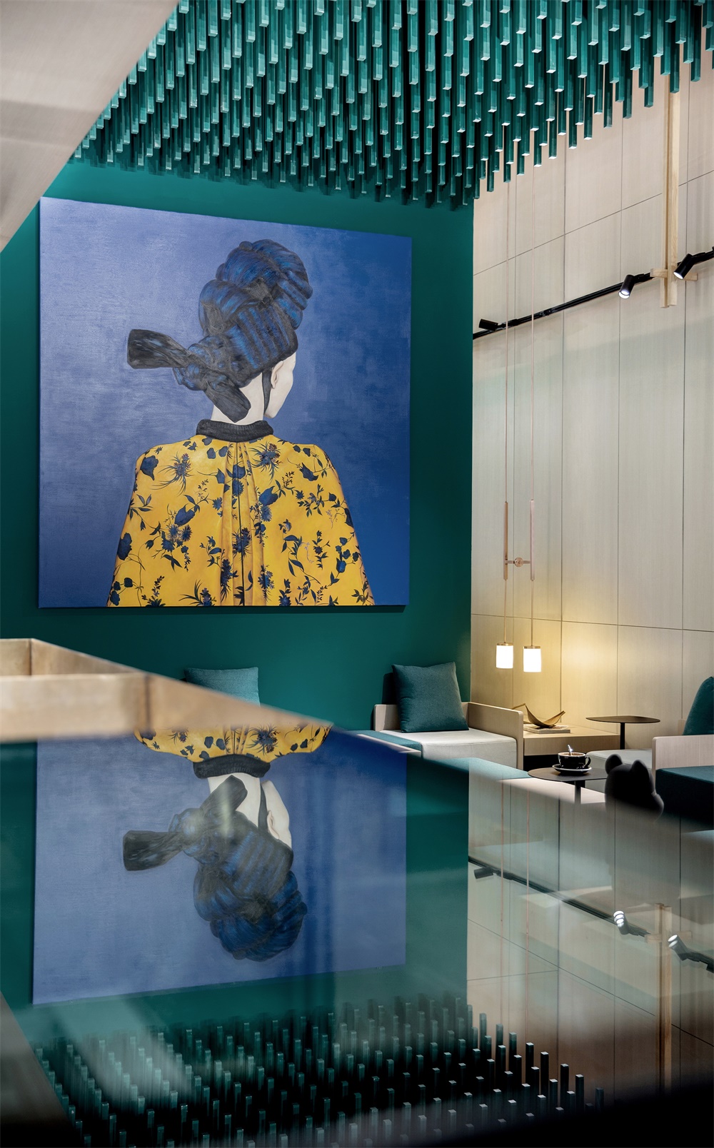
項目選址深圳核心腹地福田轄區,聚合周圍高效的商務人流能量,開辟出一個半公共的獨特社交領地。模塊化座椅係統由沿街麵延伸至室內,引領行人進店探索。淺色簡潔的地板與雕塑式的天花形成對比,藝術裝飾畫更為牆麵增添點睛之筆。
Located in Futian District, the heartland of Shenzhen which gathers lots of business elites, the tea drink store serves as a unique semi-public social territory. The modular sitting system extends from the street level to the interior, leading pedestrians to enter and explore the space. The simplistic light-colored floor is in contrast to the sculptural ceiling, and the artistic decorative painting adds a finishing touch to the wall.
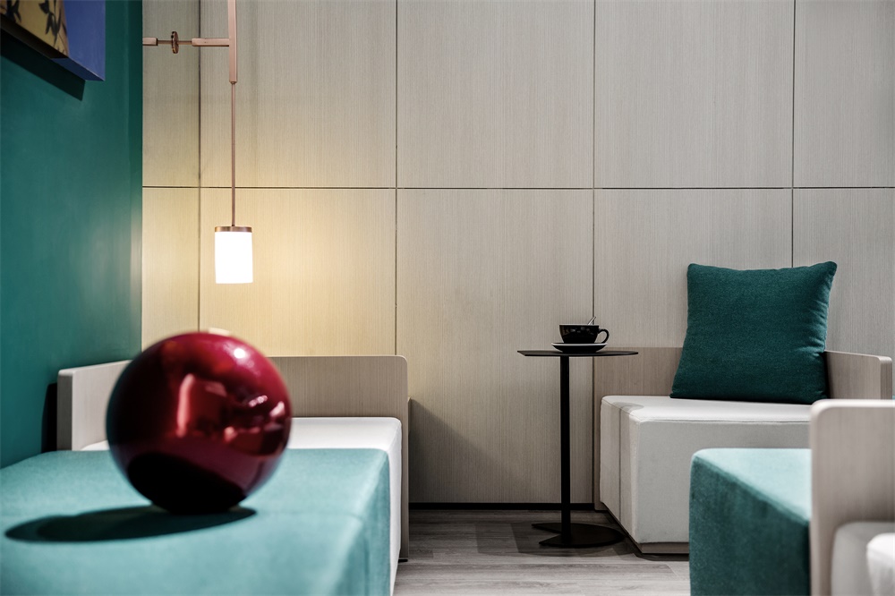
天然祖母綠成為空間主色調,這一藍色與綠色的混合體,蘊含明晰的純粹之感,於今日複雜世界來說,更具有視覺上的衝擊力。綠色亦契合本案茶飲的自然健康理念,傳遞出品牌的溫度和願景,以萬物複蘇的象征意義賦予場景空間新的生命力。
Natural emerald green sets the overall tone of the space. It’s a color mixing blue and green, which delivers a clear sense of purity and has a striking visual impact. Besides, the major hue also fits into the natural and healthy tea drinking concept, well conveys the warmth and vision of the brand, and injects vitality into the space with a symbolic meaning of revival.
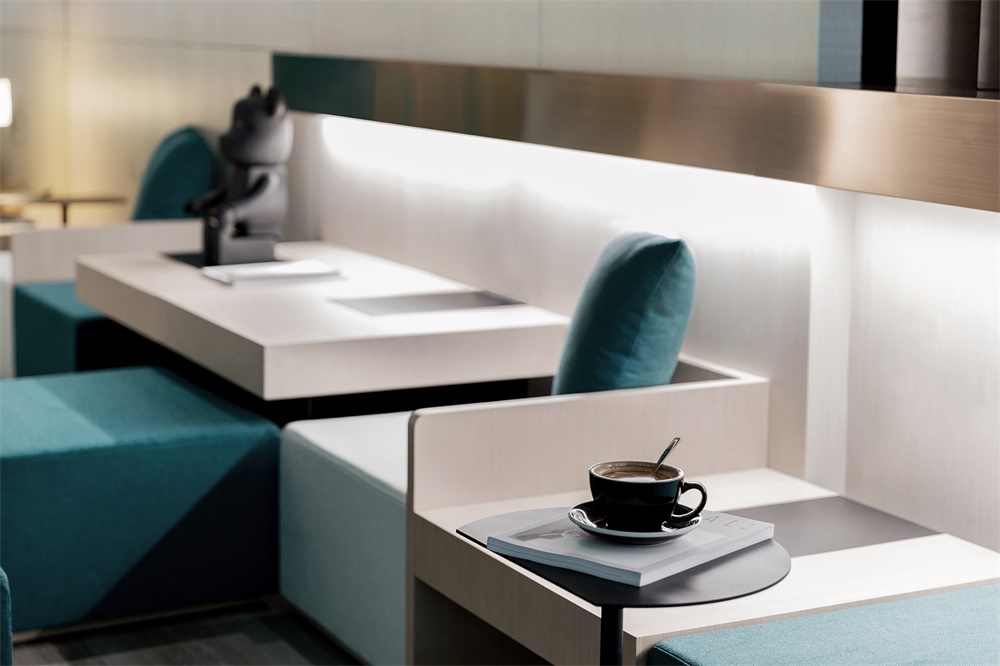
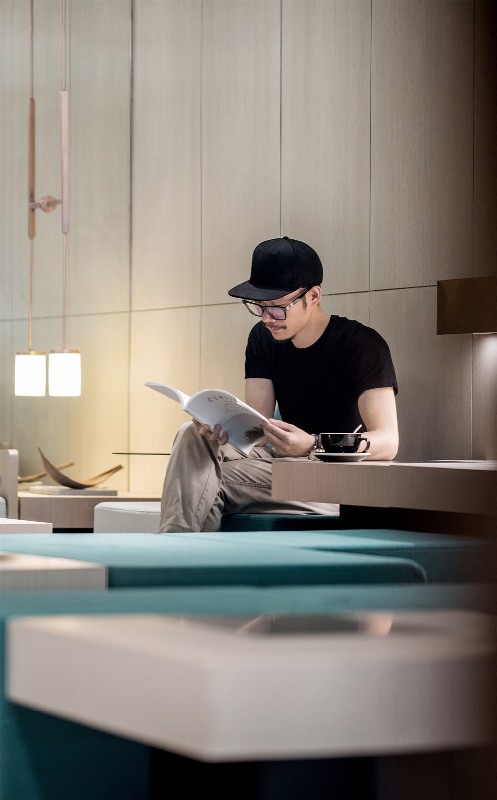
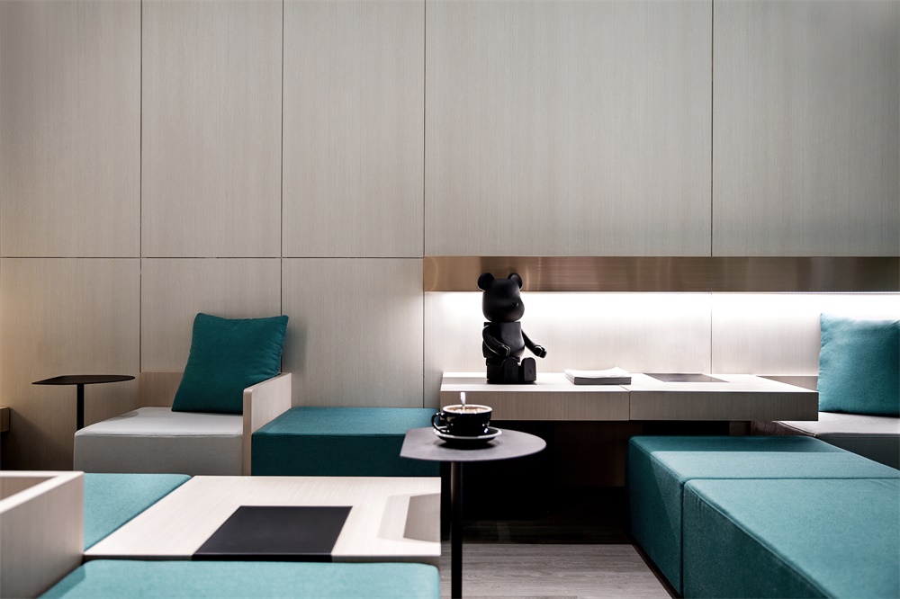
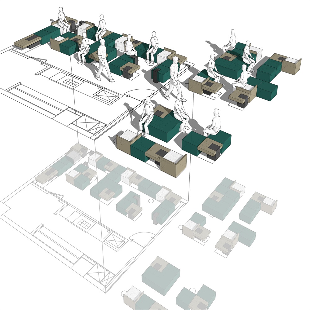
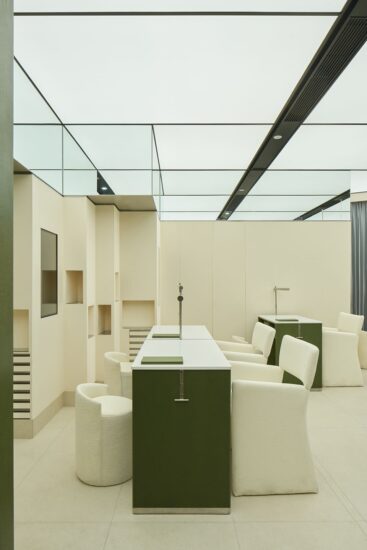
設計試圖打破目前空間語言和商業布局中的陳規,為此創造了一個動線豐富的空間序列。高密度、低坐麵的桌椅關係有利於拉近人與人之間的距離,模塊化的自由組合形式滿足對坐、反坐、圍坐等不同姿勢,兼顧私密性與開放性,為多維度的社交方式提供了條件。
The designers attempted to break conventional spatial languages and commercial space layout by creating a dynamic spatial sequence with diversified circulations. The densely arranged tables and chairs with low seating surfaces are helpful to shorten the distance between people. The free combination of sitting modules enables people to sit face to face, back to back or around, which also ensures privacy and openness and hence provides favorable conditions for multi-dimensional social communication.
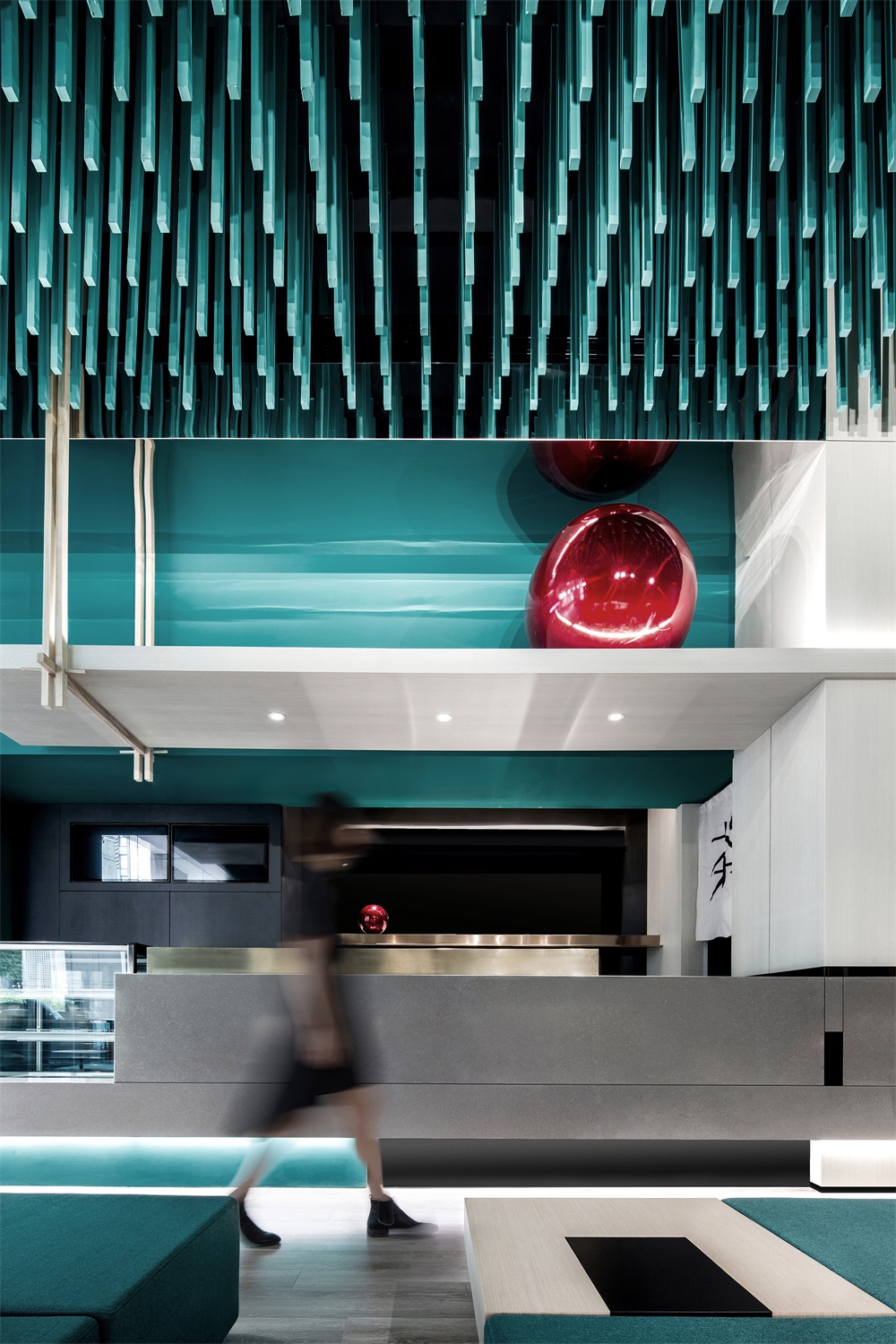
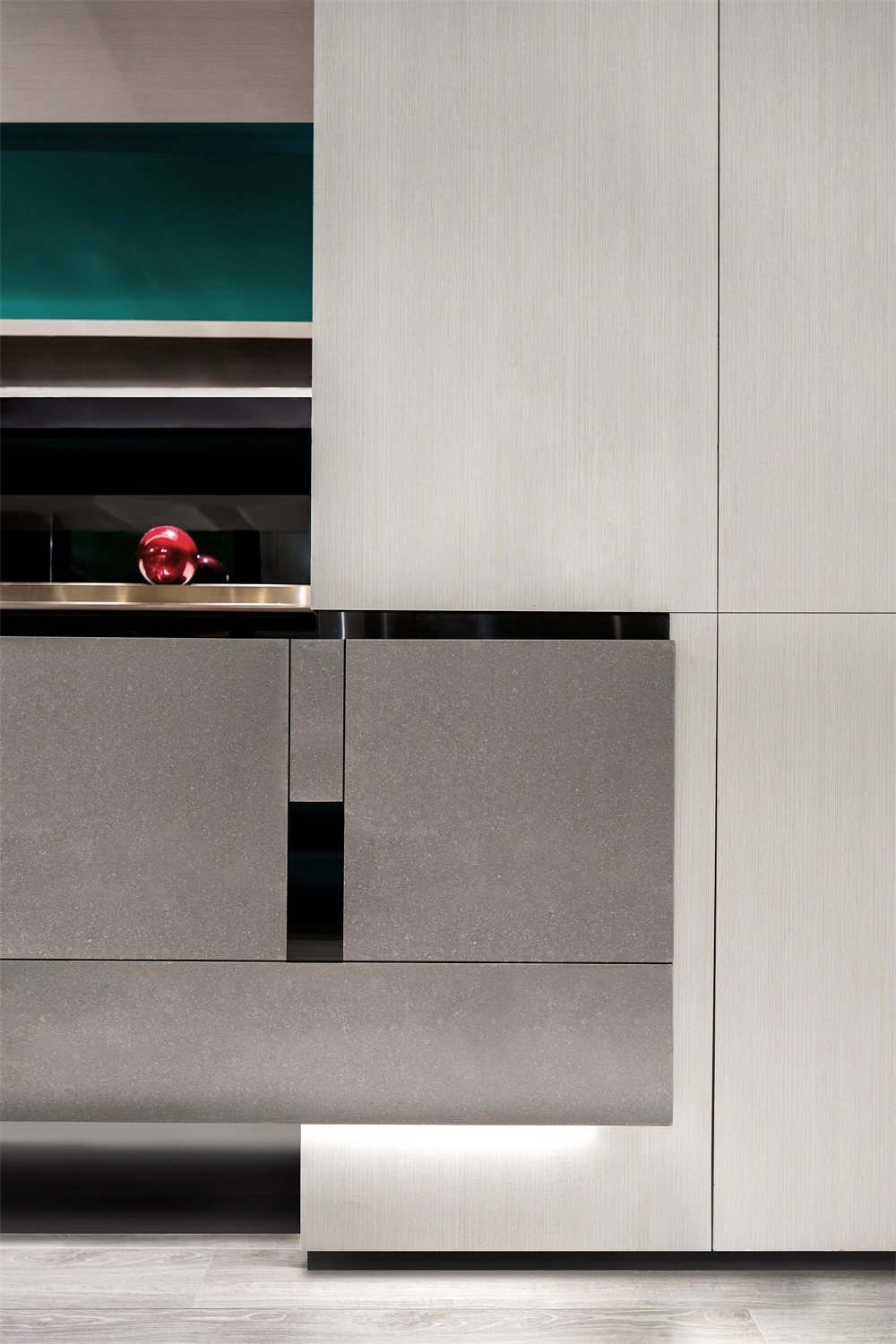
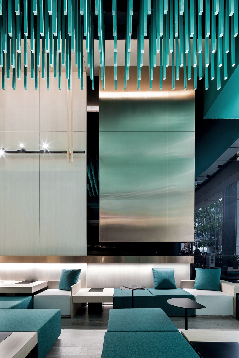
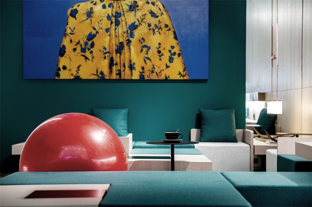
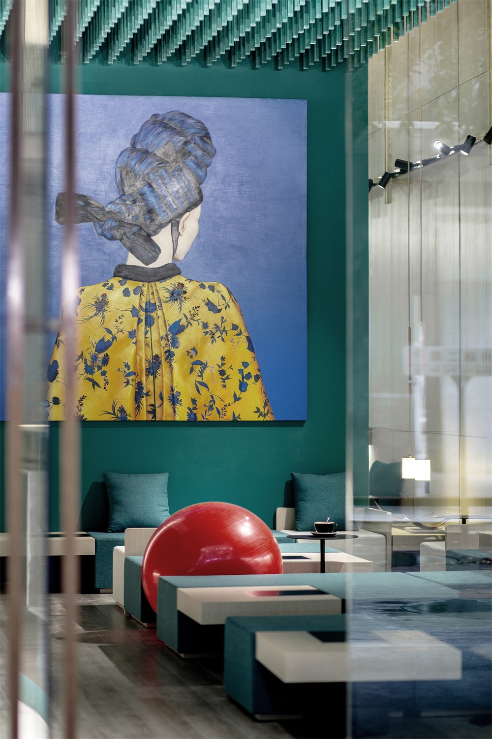
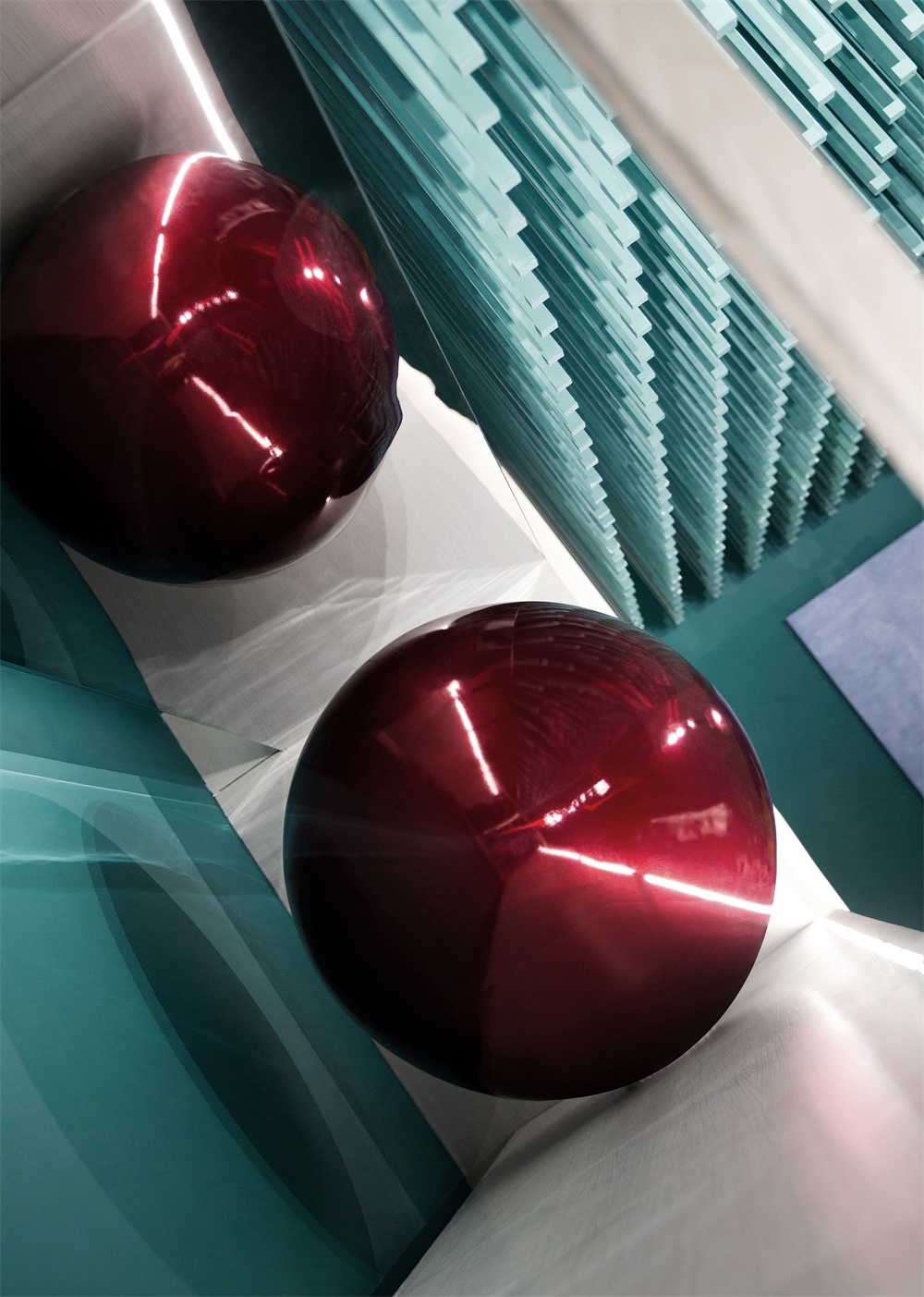
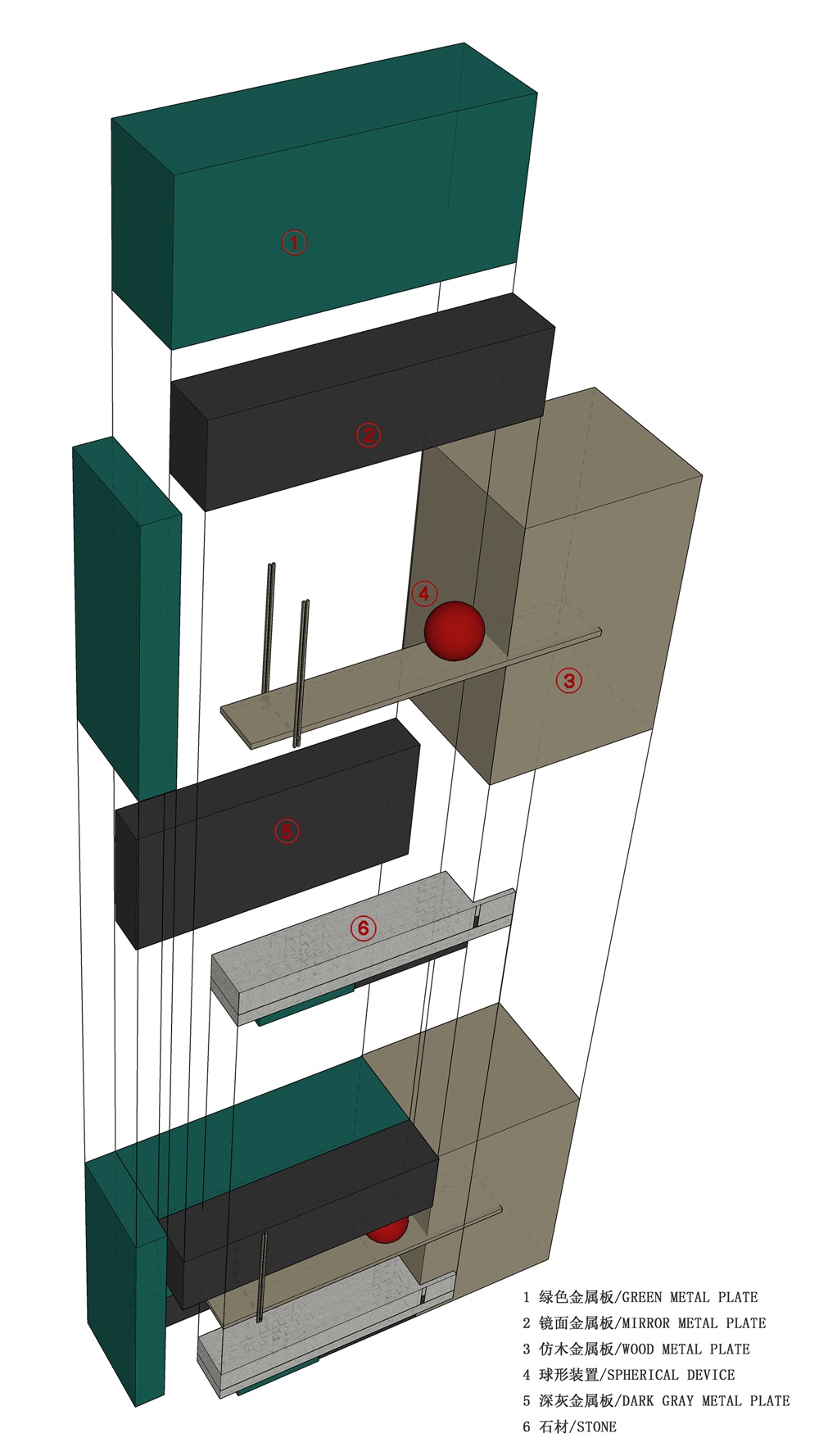
在木質、水磨石與不鏽鋼構築的幾何界麵中,軟性的紅色球體以一種無邊的形態,為方形為主的物理空間注入隨機的不確定性。這又何嚐不是人類關係哲學的藝術化寫照,因為人生便是疊加一次次轉身的成全或錯過的陌生。而此無間,恰似獨一無二的情感容器,承載著已知或未知的記憶來與現在的我們相見。
On the geometric interfaces covered with wood, terrazzo and stainless steel, the soft red spheres with infinite forms infuse random uncertainty and flexibility into the physical space dominated by squares. Such design artistically reflects the philosophy of human relations. We come across various people throughout life. When turning around, we may become friends, while we would be strangers if just brushing past each other. This space, like a unique emotional container, carries known or unknown memories to meet us.
∇ 分析圖
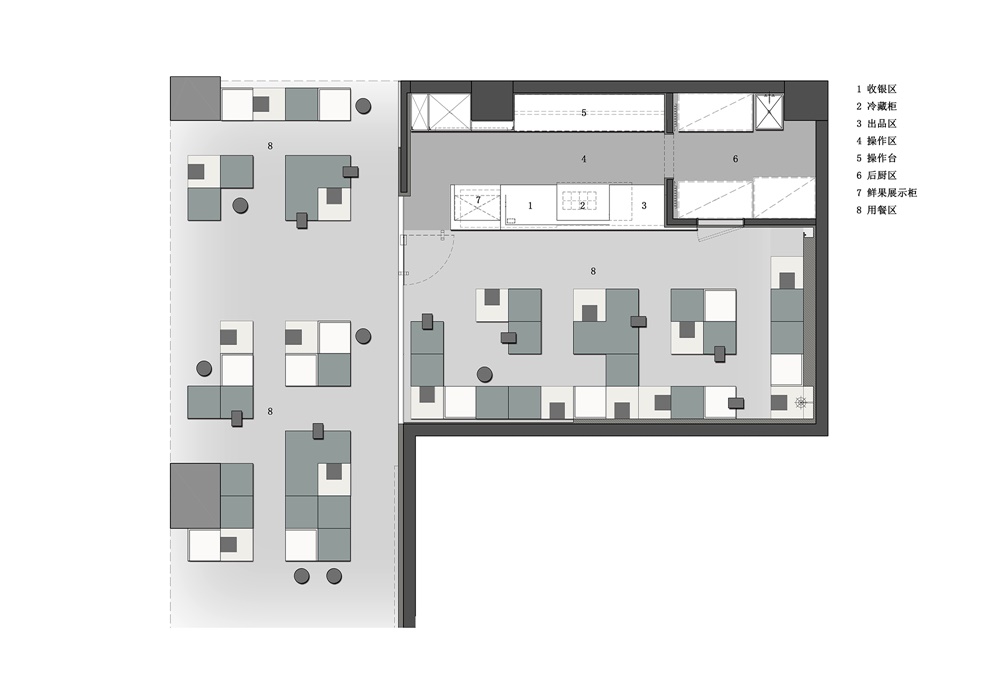
∇ 平麵圖
完整項目信息
項目名稱:本色E茶旗艦店
項目地點:深圳福田
項目類型:商業
項目麵積:60㎡
設計公司:壹席設計事務所
主持設計師:胡濤
室內設計團隊:羅偉偉、羅文良、劉啟宏、尹詠嫻、林武源
軟裝設計團隊:李曉聰、黃秋萍
工程顧問:曾玉軍
完工時間:2019/04
主要材料:品擇科技仿木金屬板、禦豐創展不鏽鋼、鋁方通噴漆、藍色建材水磨石、金意陶瓷磚、本傑明摩爾塗料、極成光電
視頻:客氣藝術/李海峰
攝影:裏外視覺/馮建
Project name: BENSE E TEA
Location: Futian District, Shenzhen, China
Category: commercial space
Area: 60㎡
Design firm: ONE DESIGN
Chief designer: Huson Tao
Interior design: Luo Weiwei, Luo Wenliang, Liu Qihong, Yin Yongxian, Lin Wuyuan
Decoration design: Li Xiaocong, Huang Qiuping
Engineering consultant: Zeng Yujun
Completion time: April 2019
Main materials: faux-wood metal panels (PANACHE), stainless steel (YUFENG), lacquer spray (used on aluminum tubes), terrazzo (supplied by Blue Building Materials Co., Ltd.), ceramic tiles (KITO), paint (Benjamin Moore), lighting fixtures (Geosheen)
Video: Li Haifeng
Photos: Feng Jian
Video link: https://v.qq.com/x/page/g0873w70hxm.html


