LOFT中國感謝來自 Towodesign堂晤設計 的餐飲項目案例分享:
一場關於奶酪的食色空間洗禮 A “Cheesy” Feast Appealing to all Senses
Tim Burton鏡頭裏的《查理與巧克力工廠》,曾帶給我們味蕾刺激下的想象力旅行。色澤淡黃、充滿孔洞的奶酪,有著不遜於巧克力的溫潤醇香。當Towodesign堂晤設計將它作為甜品工房的概念主打時,食物、視覺與情感混糅產生的化學作用,醞釀成個性化空間設計的奇幻體驗。
In the movie Charlie and the Chocolate Factory directed by Tim Burton, we witnessed a journey of imagination full of tasty stimulations. Cheese, with its tiny holes and color of yellow, is comparable to the rich and mellow flavor of chocolate. By choosing this delicacy as the main concept to design “The Dessert KITCHEN”, Towodesign produced chemical reactions among food, visual impression and emotion, and created a unique space that provides fantasy experiences.
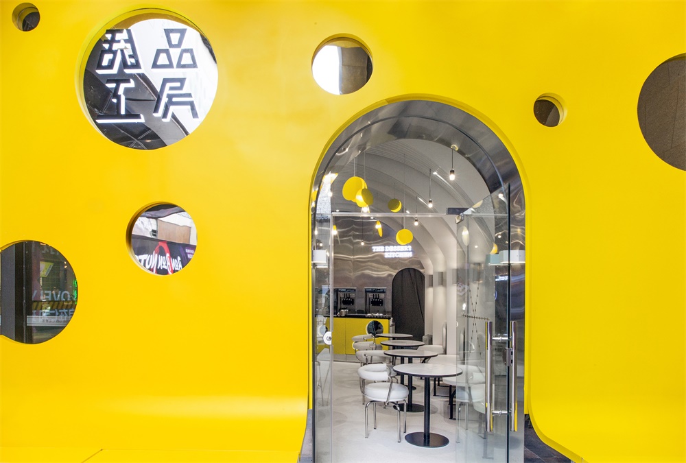
∇ 奶酪之門
店麵隻能是招牌、外立麵或櫥窗? Shopfront: Signboard? Façade? or Show Window?
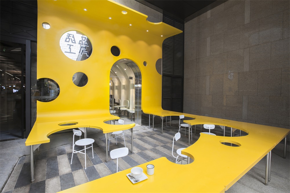
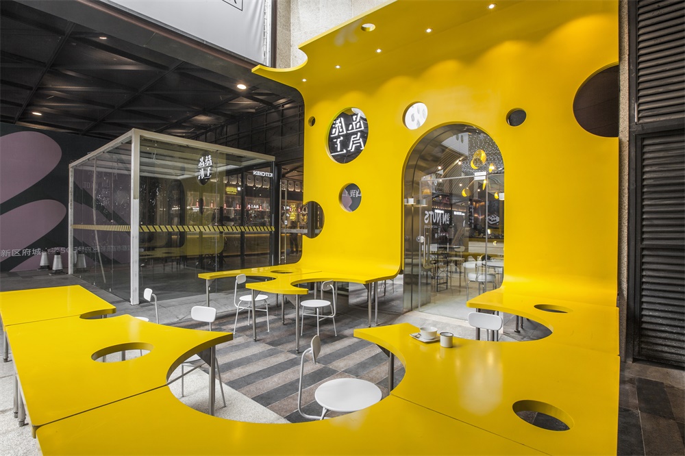
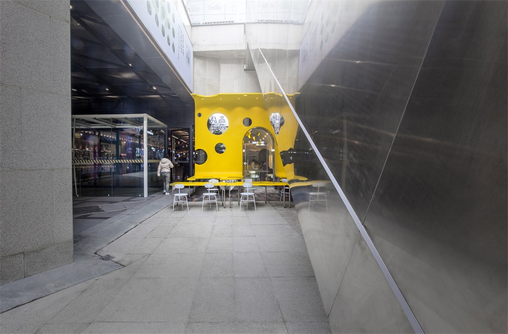
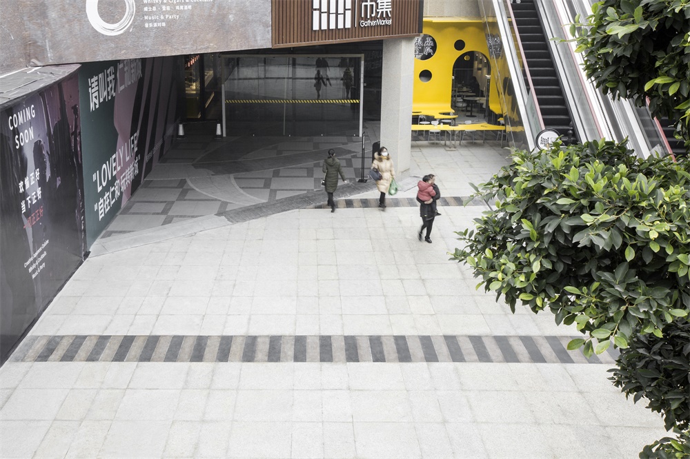
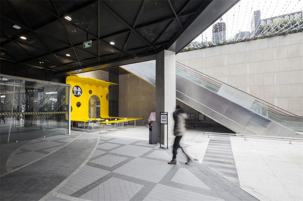
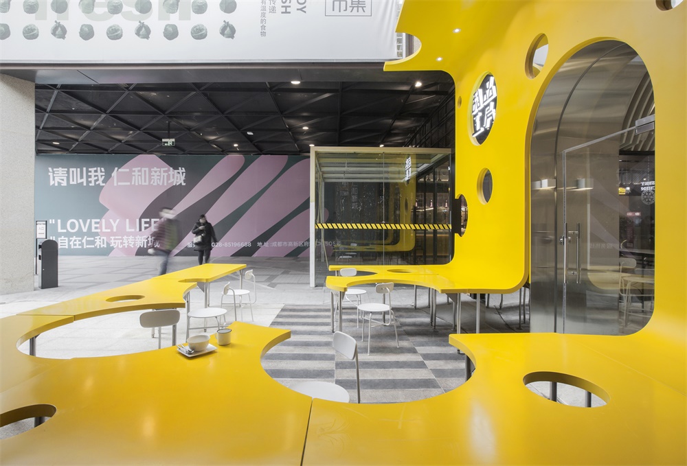
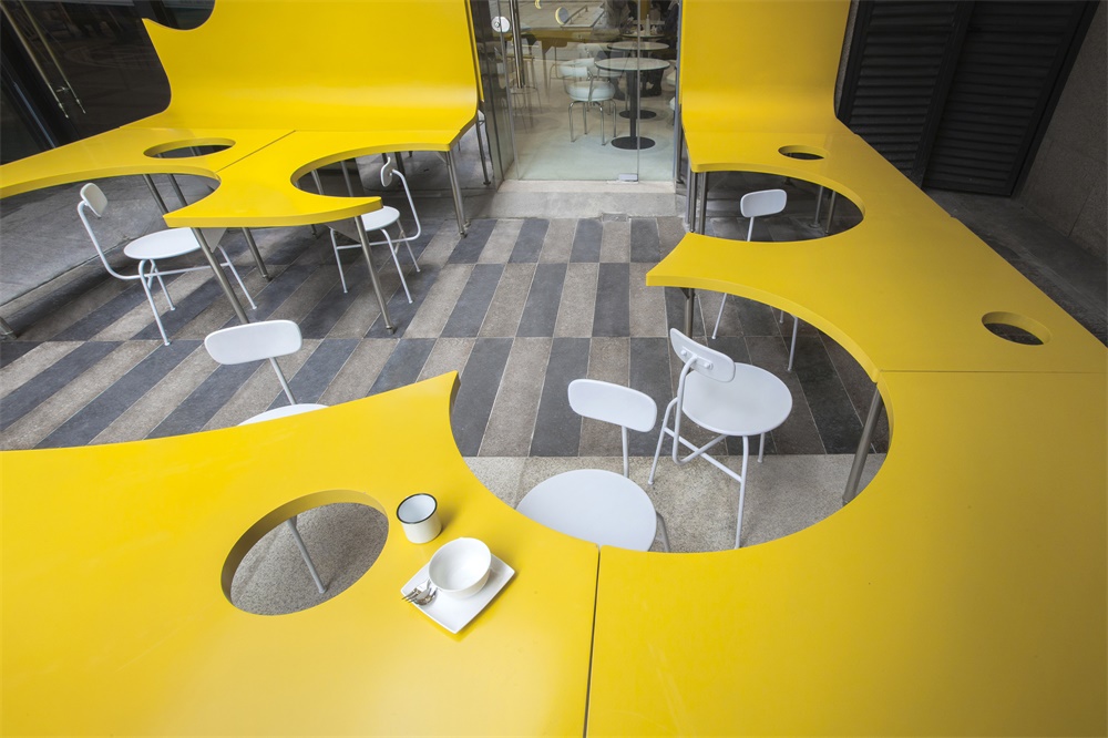
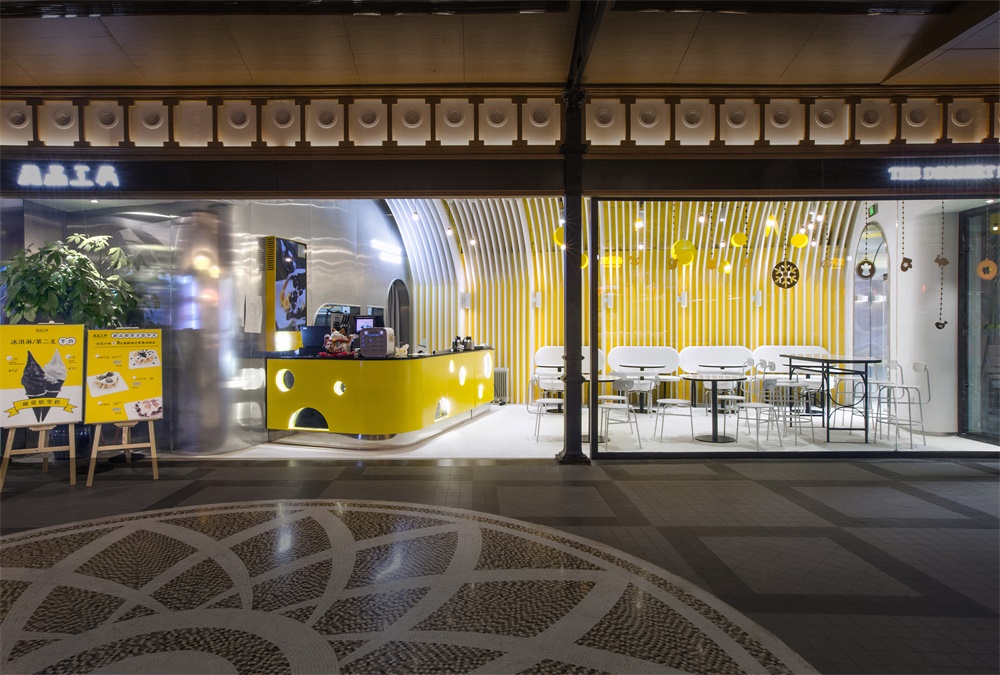
這家甜品工房位於商場的下沉廣場,靠近主入口。從商業引流的角度考量,需要一個具有充分聚合力的視覺點。一張足夠大的桌子成為了Towodesign的創意起點,從外擺區一直向店麵蔓延,甚至爬升到店鋪的門以及logo所在位置。
The dessert shop is located in the sunken square of a mall, close to its main entrance. From a commercial perspective, it’s necessary to give the store a striking visual impression to attract customers. A large yellow table extends from the outside eating area to the interior, and even up to the shopfront where the logo is set.
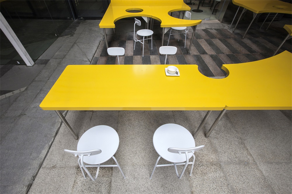
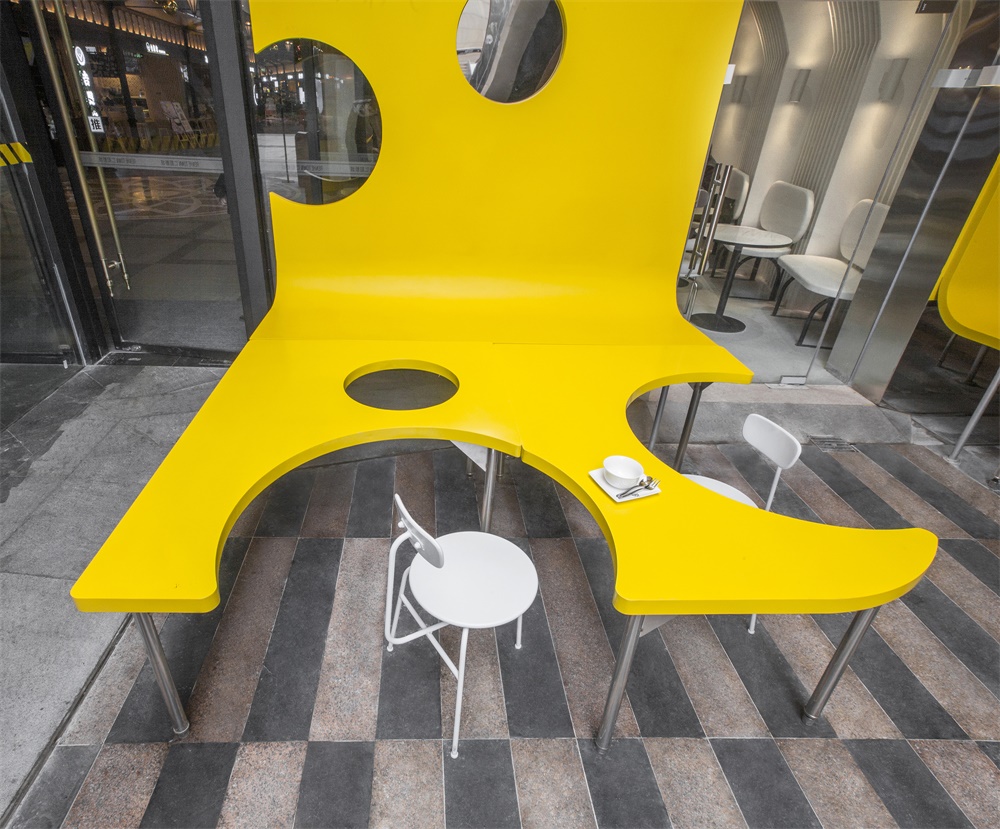
桌子表麵開出了奶酪般的圓形洞窟,食客們化身為流動的空間元素,讓一個個圓洞呈現時滿時缺的趣味模樣。仿佛海綿寶寶變成了大奶酪,這個外擺區以雕塑式的存在感,為商場地下廣場製造出最大的驚喜。而基於功能考量的設計動作,也鼓勵著相鄰而坐的人們進行更多的交流與互動。
The surface of the table is characterized by holes, similar to those of cheese. Customers are flowing elements in this area, making the holes variable, sometimes full, sometimes empty. It’s as if SpongeBob was turned into a huge cheese. The outside eating area, like a sculpture, has a strong sense of existence, becoming a visual highlight on the underground square of the mall. The openings of the table were designed based on functionality, which also encourage people sitting next to each other to interact and chat.
不僅填補胃的空虛,還能是生活的洗禮 Satisfaction not only for the Stomach, but also for Life
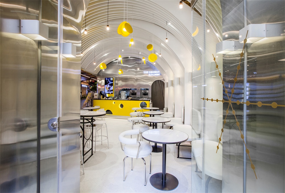
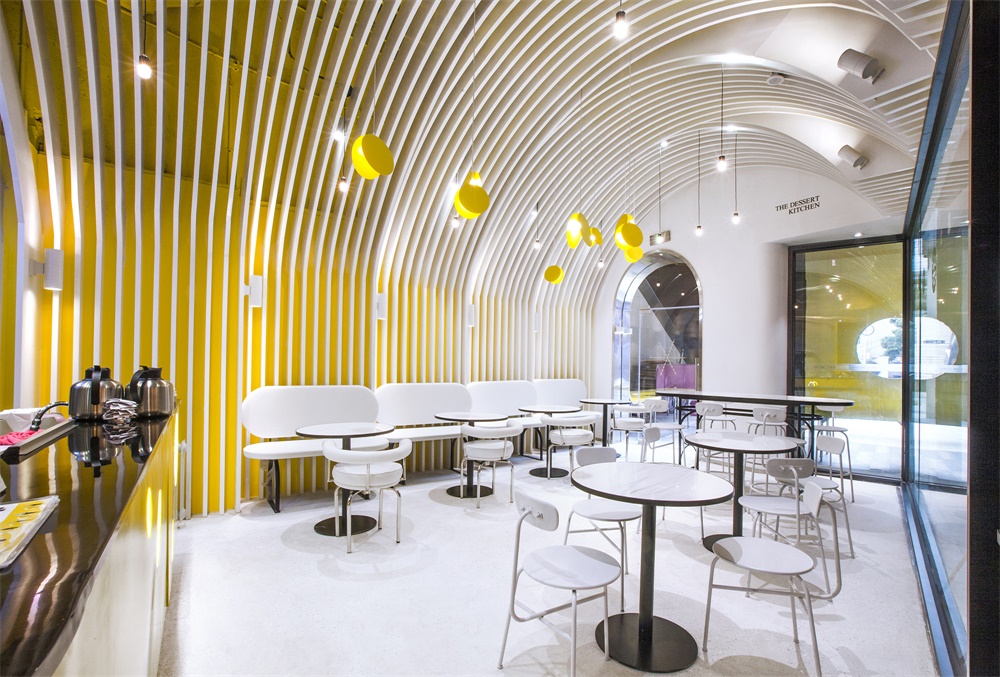
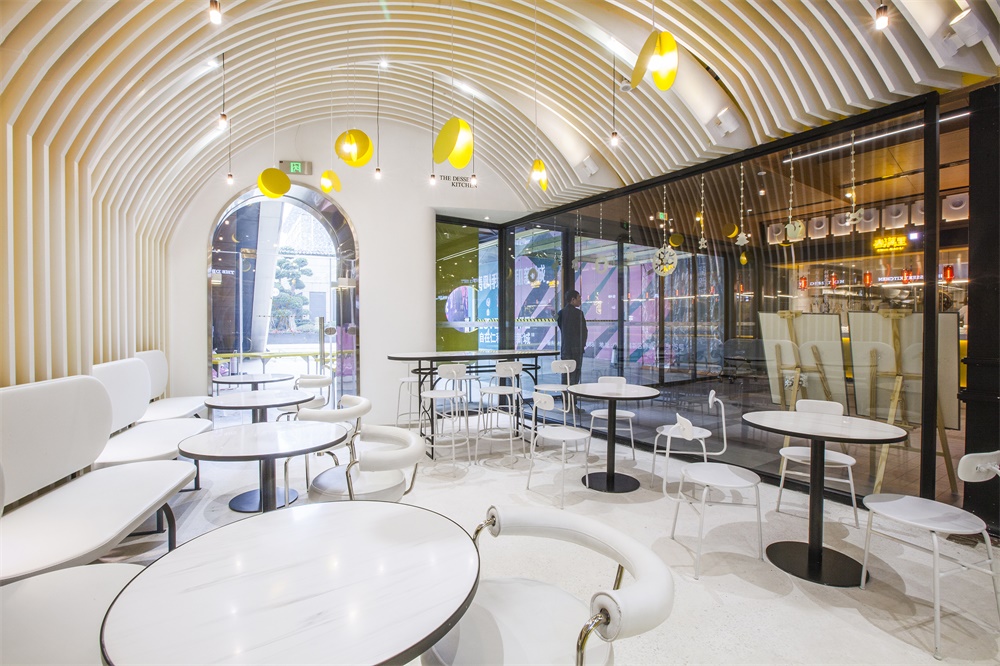
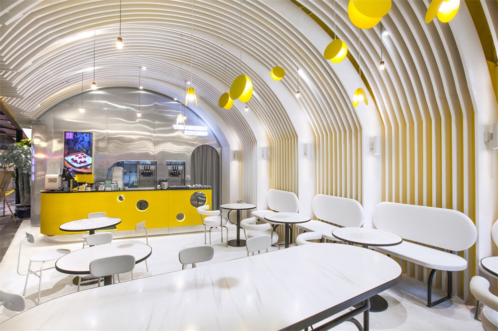
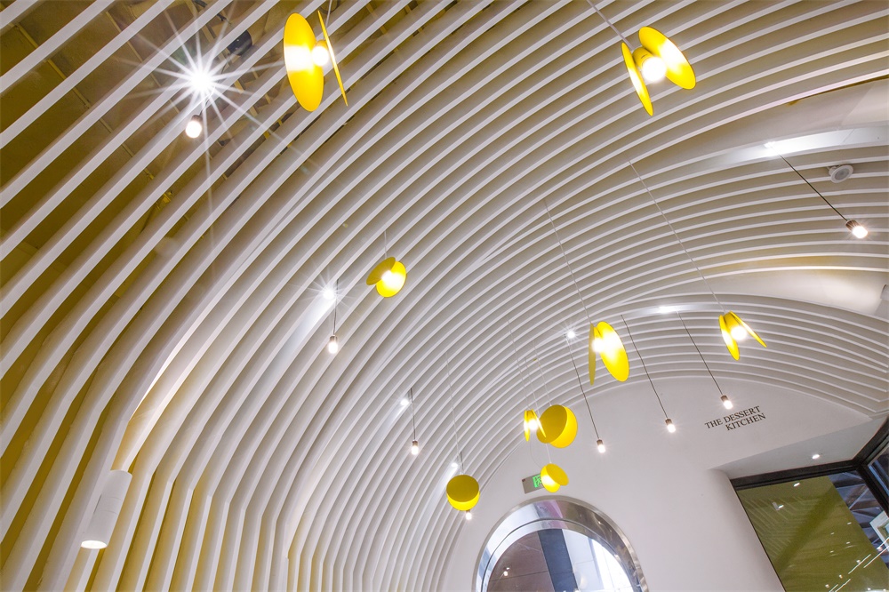
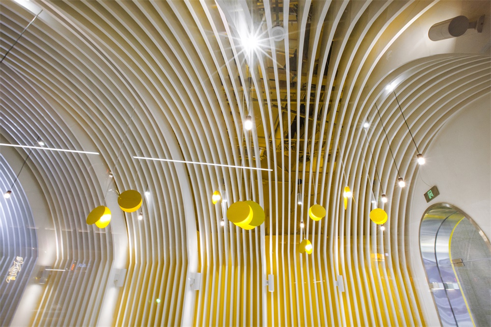
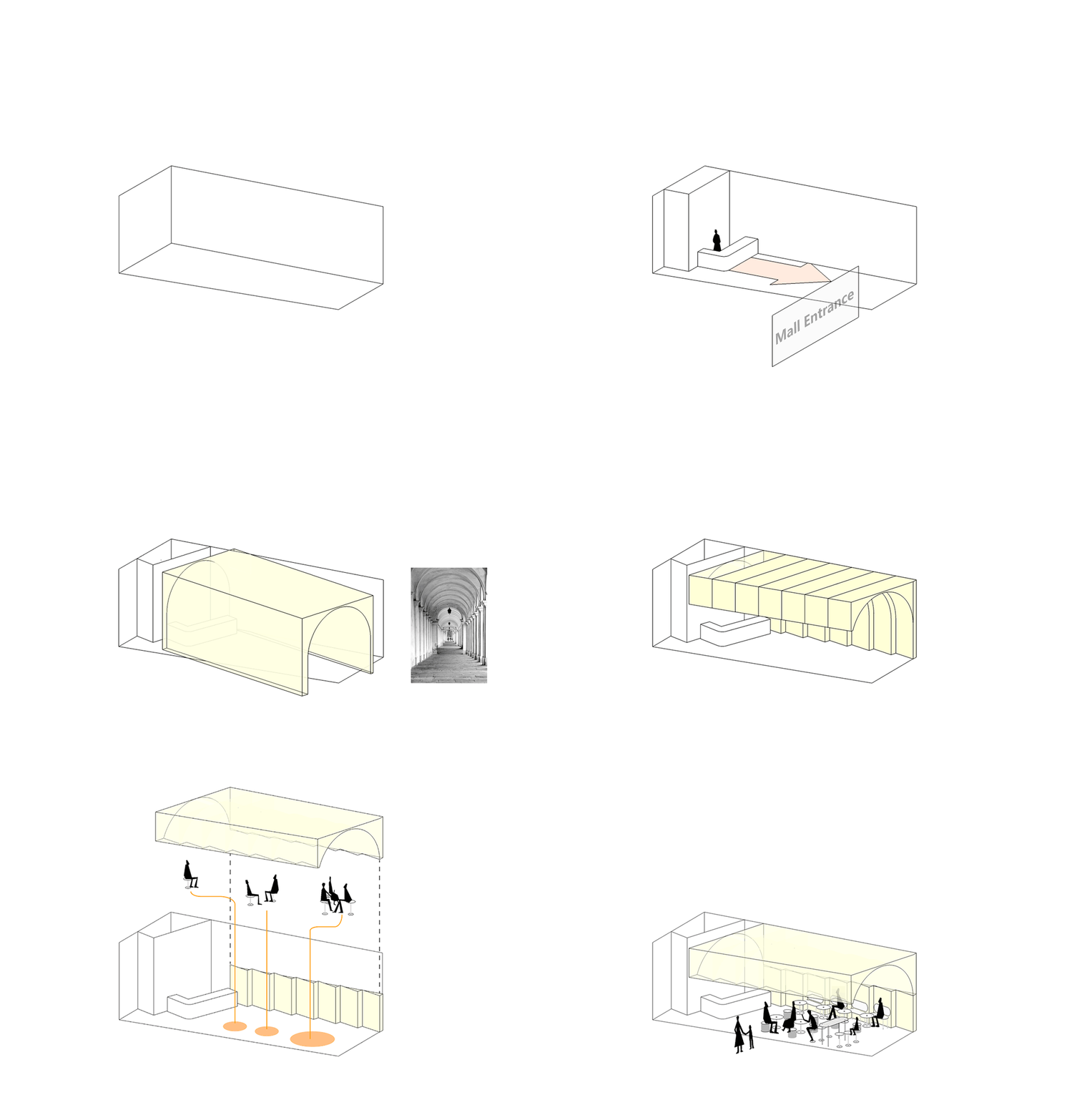
對於店鋪的室內部分,Towodesign從食物賦予人們生命能量這一原點出發,圍繞甜品教堂的概念進行空間儀式感的營造。於是,教堂裏高聳的穹頂元素被應用其中,並遵循場地的梯形平麵而呈現出分段漸變的拱頂。考慮到空調出風口隱蔽與視覺層次,穹頂使用了柵格來強化曲線節奏。
Starting from the fact that people gain life energy from food, Towodesign intended to create a dessert heaven with a church-like interior structure, full of a sense of “ritualism”. Elements of towering domes of churches were applied to the ceiling, which consists of several vaults in line with the trapezoidal plane of the site. Considering the concealment of the air conditioning vent and creation of a visual hierarchy, the ceiling presents a grid-like appearance, which also strengths the rhythm of curves.
∇ 甜品教堂
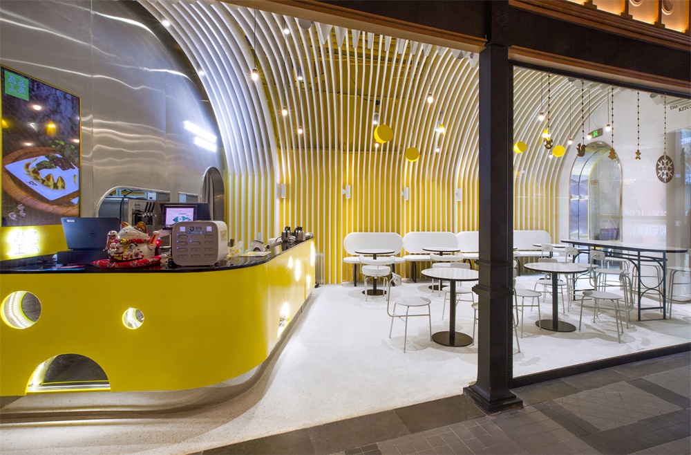
白色柵格搭配牆麵的黃色塗料背景,讓向食物致敬的這場空間洗禮,在秩序與親和之間達成恰到好處的平衡。下午茶時間的一場生活儀式,便在這靜謐與甜蜜交融的教堂意象空間中展開。吧台延續了店麵大奶酪雕塑的元素,形成內外呼應,配以圓弧形元素的餐飲家具,使得食客們的奇思遐想在眼睛和味蕾的互動中盡興到底。
The white grid well matches with the yellow backdrop wall, showing a proper balance between order and affinity. Teatime is like a ritual in life, which can be enjoyed in this imaginative church-like space of peace and sweetness. The bar counter also features the elements of cheese, echoing the structural eating area outside. The interior furniture presents round or curved shapes, adding flexibility to the space and enabling the customers to enjoy the feast of visual and gustatory entertainment.
∇ 平麵圖
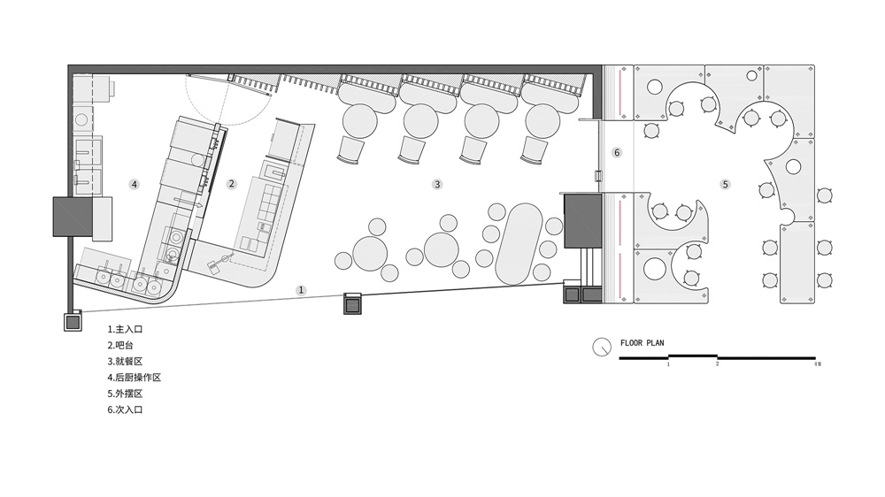
∇ 平麵縱覽圖
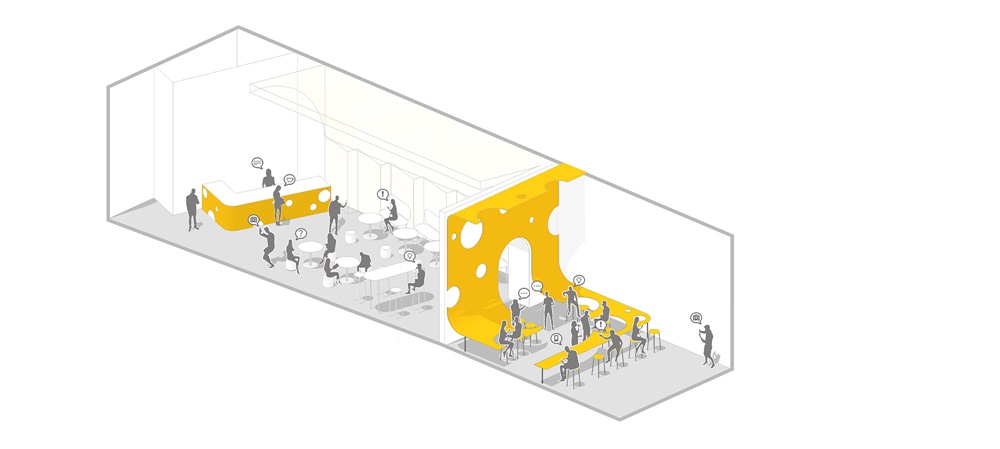
∇ 奶酪之門概念圖GIF
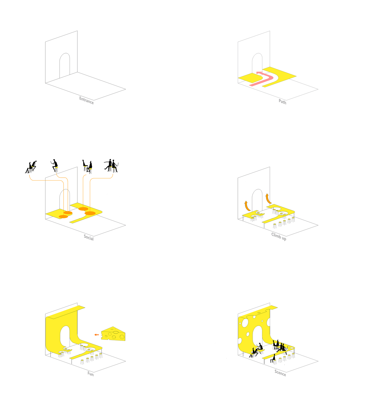
∇ 室內甜品教堂概念圖GIF
完整項目信息
項目名稱:成都仁和新城甜品工房
項目地點:成都仁和新城-1F
項目類型:甜品店
項目麵積:69平方米
設計公司:Towodesign堂晤設計(www.towodesign.com)
主持設計師:何牧
設計團隊:任偉,鄭力源
完工時間:2018年11月
主要材料:金屬,水磨石,拉絲不鏽鋼
攝影:Towodesign堂晤設計
Project name: THE DESSERT KITCHEN
Location: B1, REN HE TOWN MALL, Chengdu, China
Category: dessert store
Area: 69 m2
Design firm: Towodesign (www.towodesign.com)
Chief designer: He Mu
Design team: Ren Wei, Zheng Liyuan
Completion time: November 2018
Main materials: metal, terrazzo, brushed stainless steel
Photography: Towodesign


