Snøhetta為位於奧斯陸的時尚品牌Holzweiler設計了實體和線上零售空間,整個空間具有柔和的色調和網格元素。
Snøhetta has designed both physical and digital retail spaces for Oslo-based fashion label Holzweiler, featuring a muted colour palette and gridded elements.
Holzweiler熱衷於為其客戶提供在線和商店零售體驗,因此要求Snøhetta設計一個展廳和旗艦店,同時也要創建一個與之相匹配的網站。
Holzweiler was keen to offer its customers a similar retail experience both online and in store, so asked Snøhetta to design a showroom and flagship store, but also to create a website to match.
團隊為Holzweiler設計的展廳、旗艦店和在線銷售渠道的目標是創造一個完美的客戶體驗,使品牌和人們更緊密地聯係在一起。一切都采用了簡約美學。
The aim with the showroom, the flagship store and the online sales channel that we have designed for Holzweiler has been to create a seamless and holistic customer experience that brings the brand and people closer together.A pared-back aesthetic was adopted for everything.
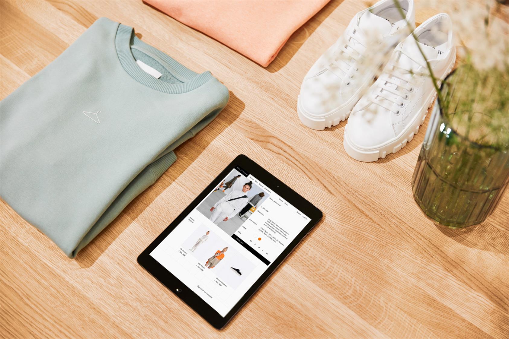
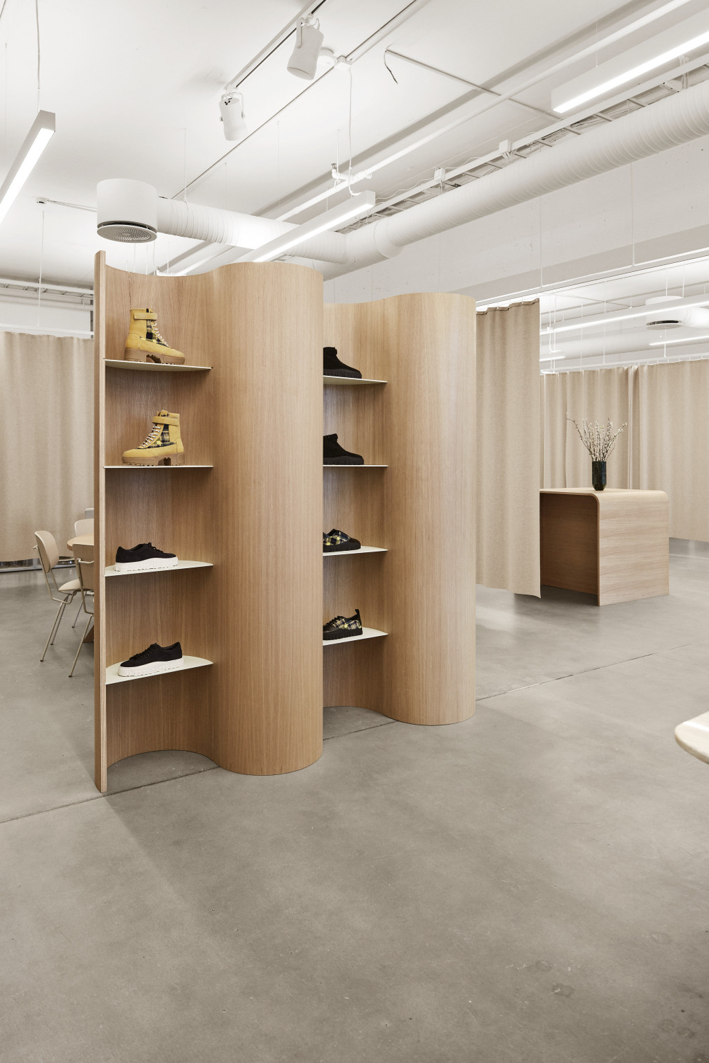
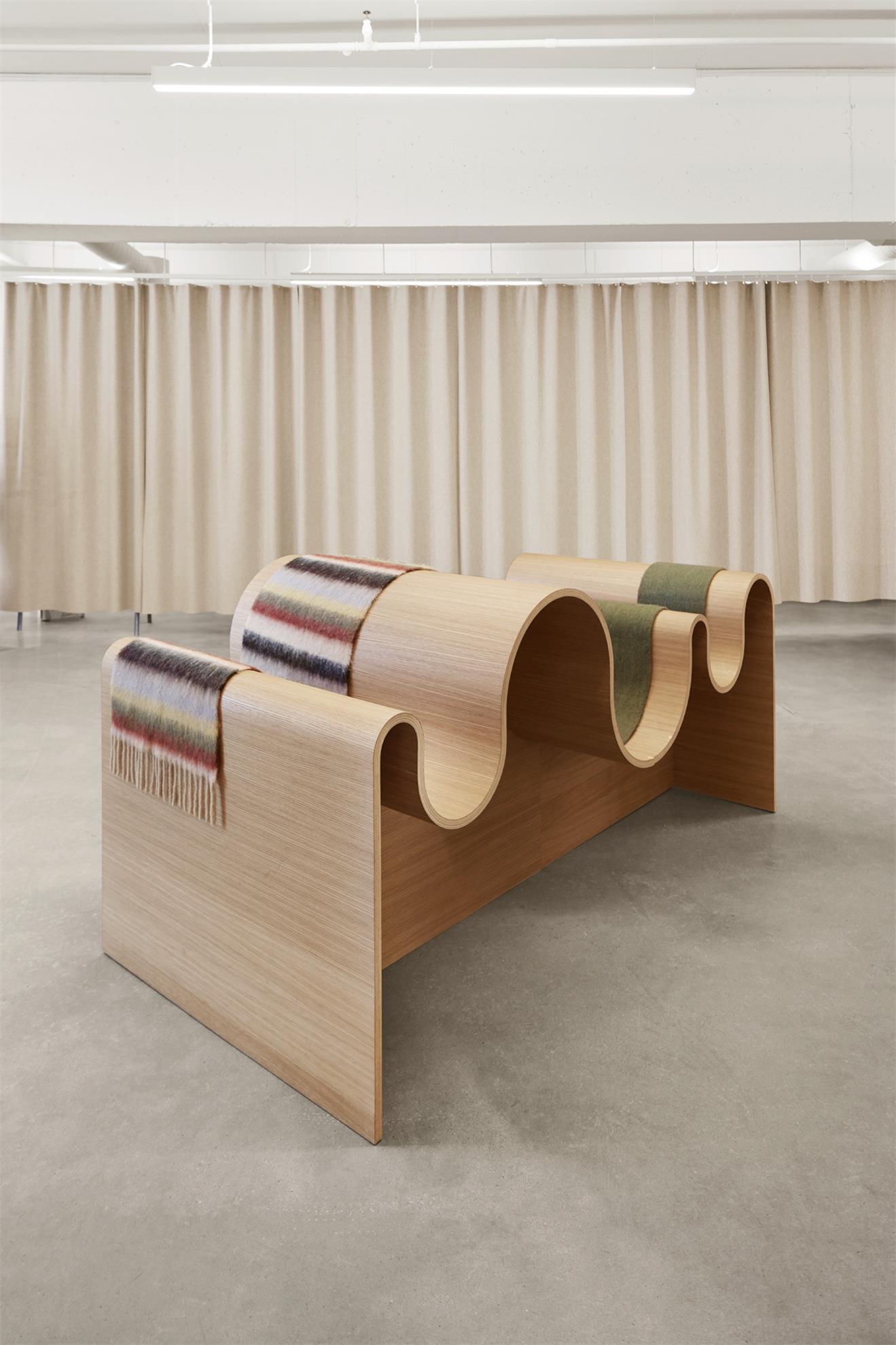
在網站上,它采用了網格顯示的形式,參考了該品牌的標誌性方格圍巾。在陳列室和商店裏,這被轉化為網格化的貨架元素,與彎曲的服裝展示相搭配,旨在喚起品牌的手工藝做法。其他細節包括混凝土地板和橡木桌子。
On the website, this takes the form of a grid display, which references the brand’s signature chequered scarves.In the showroom and store, this is translate into gridded shelving elements, which are paired with curvy garment displays, designed to evoke the brand’s handicraft approach. Other details include concrete floors and oak tables.
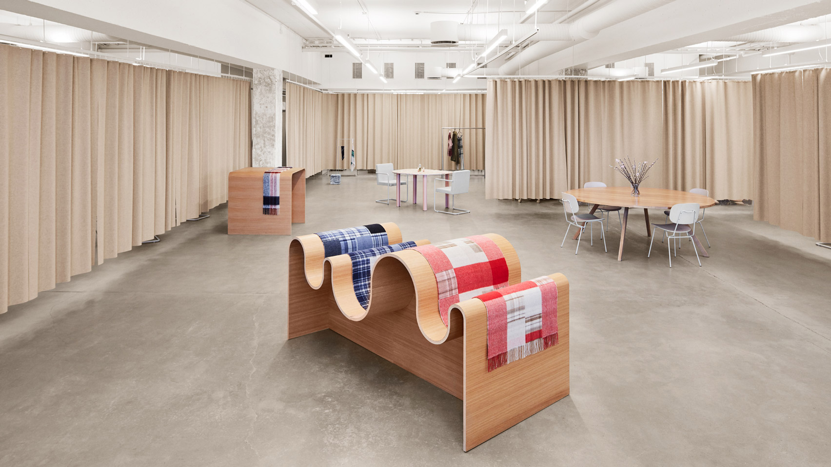
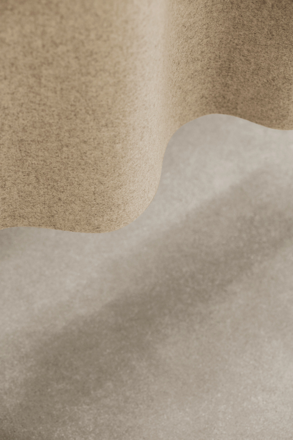
空間以米色羊毛窗簾為特色,窗簾與安裝在天花板上的網格狀係統相連。在向該品牌標誌性的圍巾致敬的同時,也打開了空間,或者變成一係列更私密的房間。展廳的其餘部分由Snohetta設計,旨在喚起“現代工廠”的感覺,溫暖但同時又有工業感。
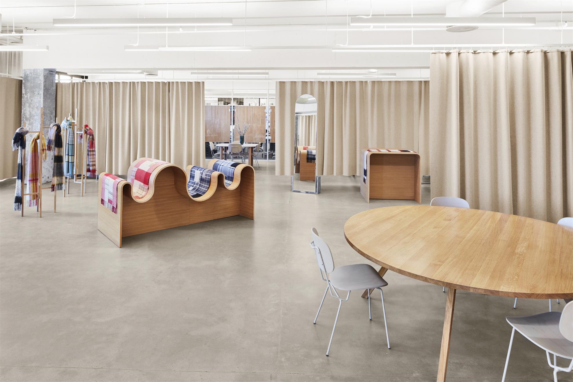
The space features beige wool curtains, which are attached to a grid-like system mounted on the ceiling. While nodding to the brand’s trademark scarves, this also allows the space be opened out or made into a series of more intimate rooms.The rest of the showroom was designed by Snohetta to evoke “a modern-day factory” with a “warm yet at the same time industrial feel”.
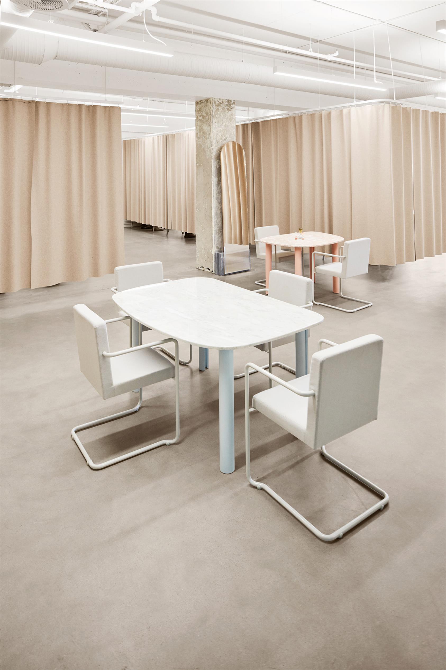
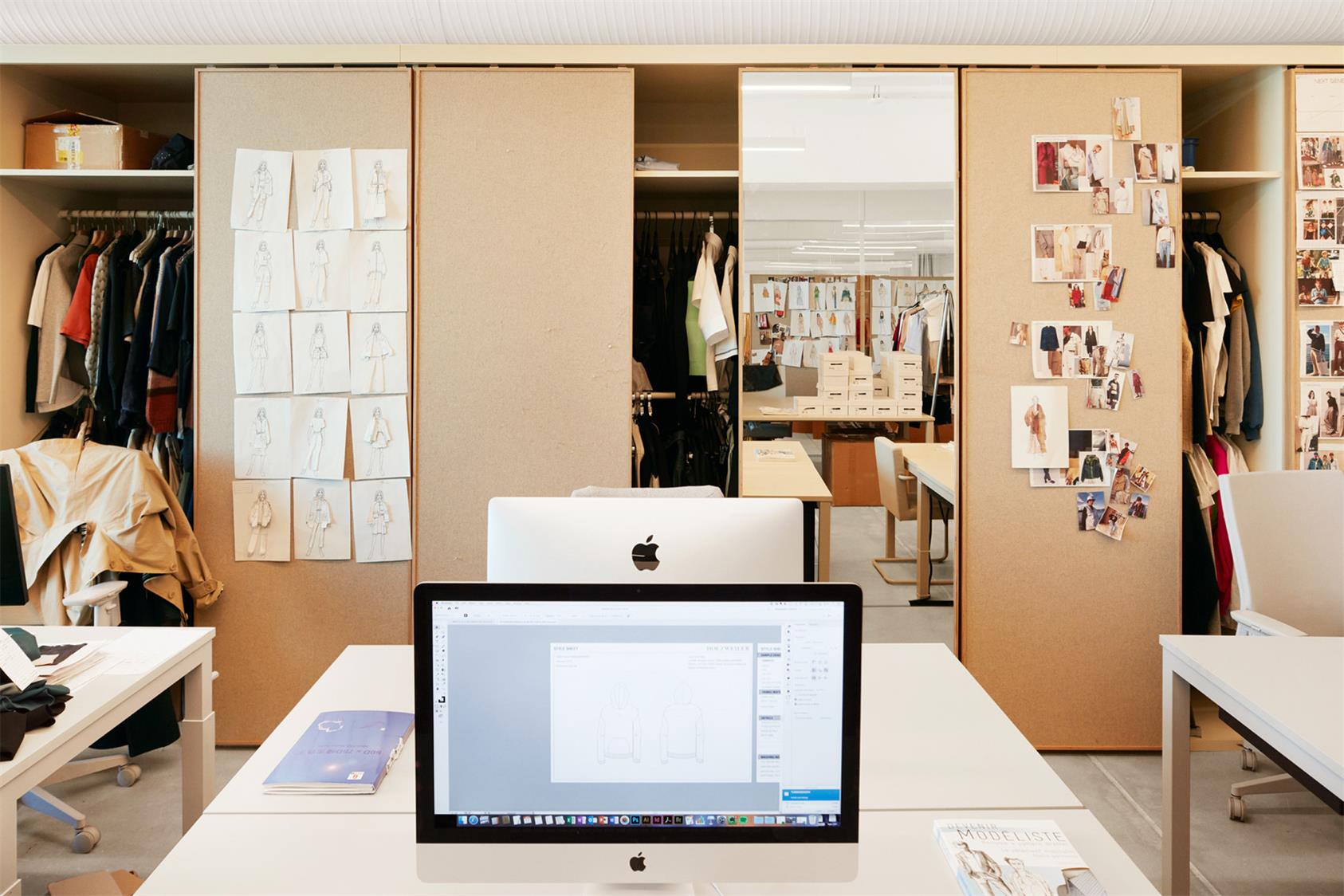
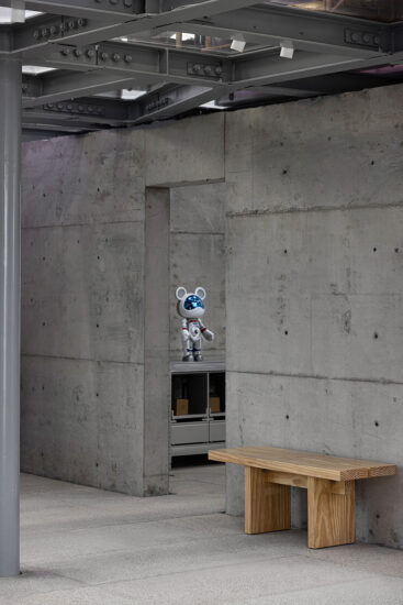
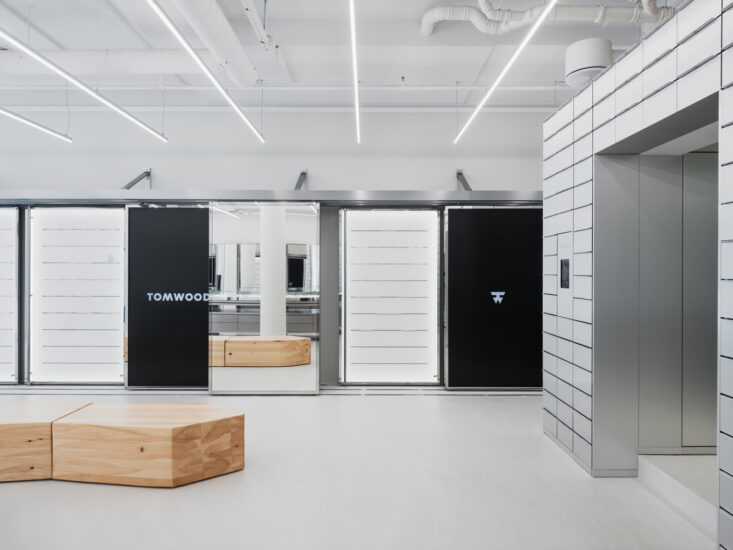
混凝土柱和地板構成一係列起伏的橡木服裝展示櫃背景,旁邊是橡木家具和大理石桌子,以及點綴其間的拱形鏡子。展廳還包括該品牌的設計工作室,它通過大玻璃窗與主房間在視覺上相連,並具有由鏡子和創意板組成靈活存儲空間。
Concrete columns and floors form the backdrop to an array of undulating oak garment displays,alongside oak and marble tables, and arch-like mirrors that are dotted throughout.The showroom also includes a design studio for the brand. It is visually connected to the main room through large glass windows, and features a flexible storage system made from mirrors and idea boards.
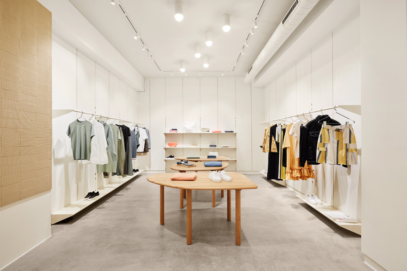
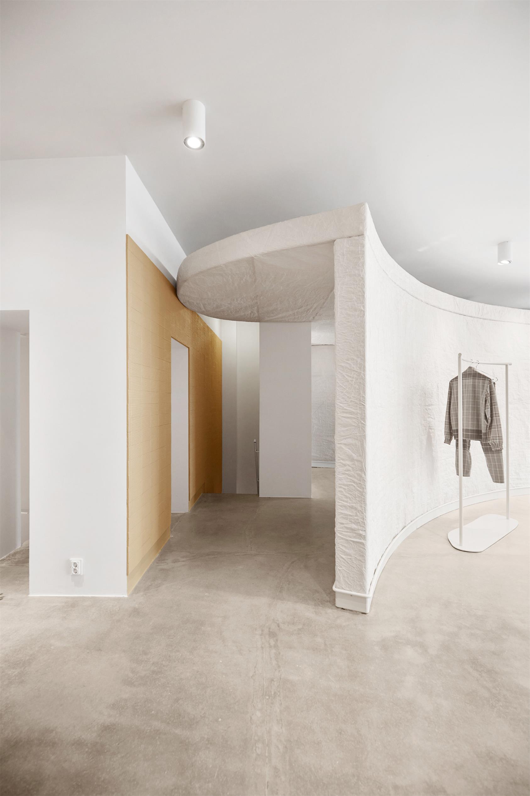
在Prinsens門那邊,Snøhetta設想的旗艦店是一個更“明確的零售空間”。客人可以通過白色紙牆圍繞的彎曲通道歡迎客人,該通道通向商店。
Over at Prinsens Gate, the flagship store was envisioned by Snøhetta as a more “clear-cut retail space”.Guests are welcomed by a curving passage enclosed by white paper walls, which opens out to the shop.
完整項目信息
項目名稱:Holzweiler
項目位置:挪威奧斯陸
項目類型:商業空間/服裝品牌店
完成時間:2018
設計公司:Snøhetta


