LOFT中國感謝來自 月介空間 的辦公項目案例分享:
設計的魅力是常常試圖打破邊界與固有局限性,讓空間出現更多的可能性與趣味性,使置身於空間的人嚐試不同的體驗。人與空間產生對話,營造出不同的空間感受,這也許就是設計師的價值所在。
The charm of design is an attempt to break the boundaries and inherent limitations, create more possibilities and interesting space, and people involves in space having different experiences.What’s the value designers is to have a dialogue between people and space, further to construct the different spatial feelings.
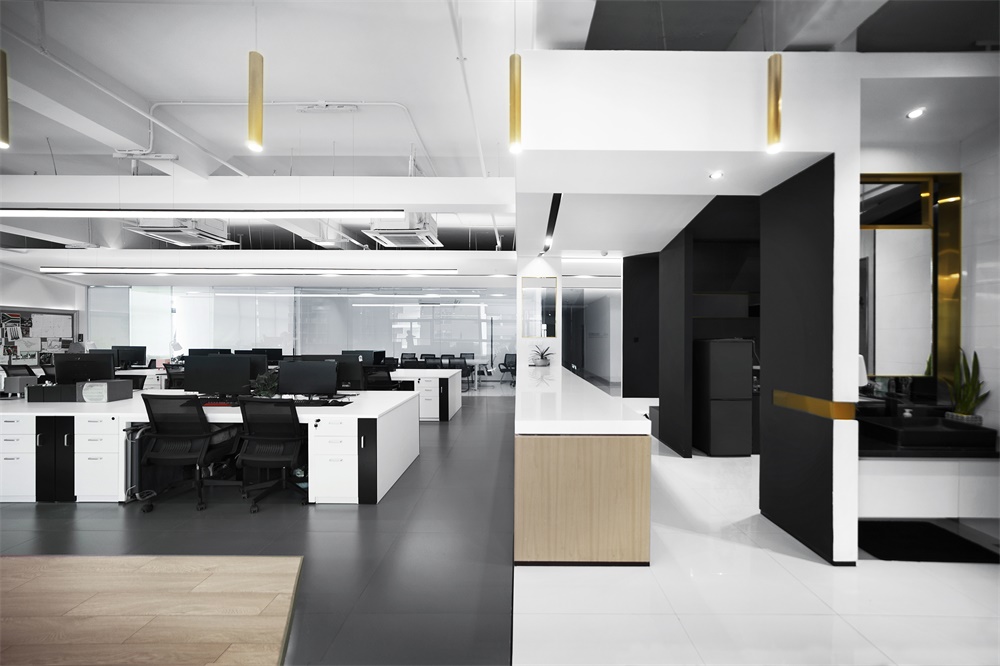
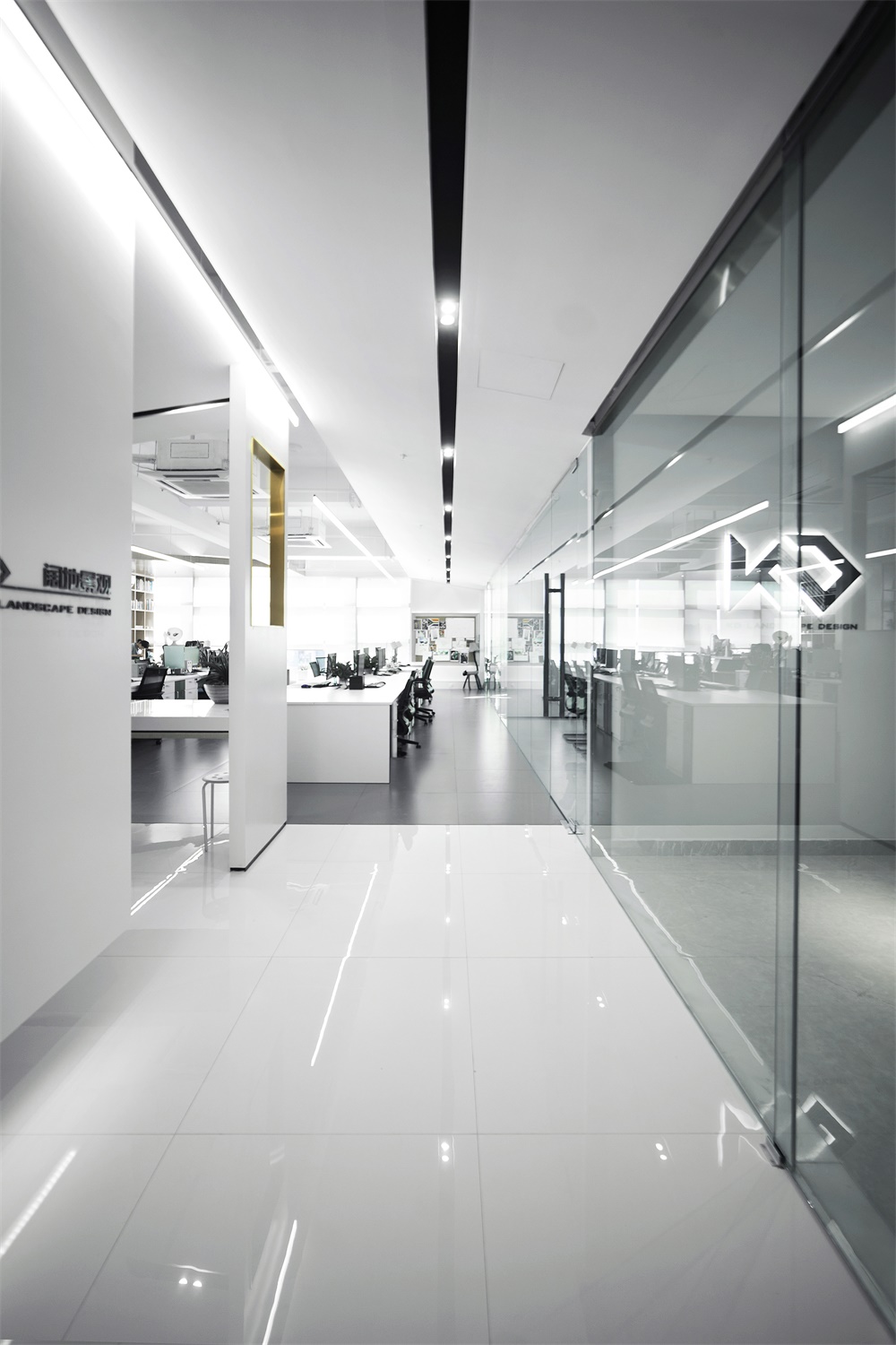
本案為一家景觀設計公司的辦公室,它需要一個開放、靈活,能激發更多創造力的空間。如何在有限的的空間裏滿足工作生活的不同需要是本案的難點。因此,我們希望整個空間是流動通透的,可以相互滲透延伸的趣味辦公環境。
This case is the office of a landscape design company, which requires an open, flexible space that inspires more creativity. The difficulty of this case is how to balance the different requirements between work and life in limited space. Hence, we prospect it is mobile and transparent, which could be a mutual penetration, extension, and interesting official environment.
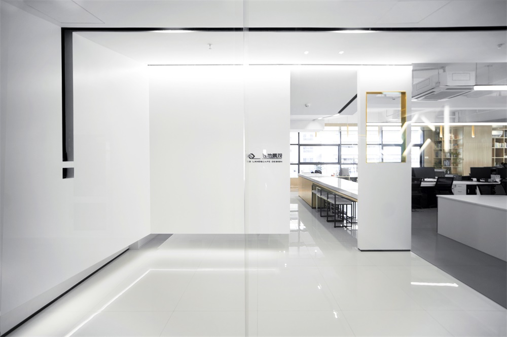
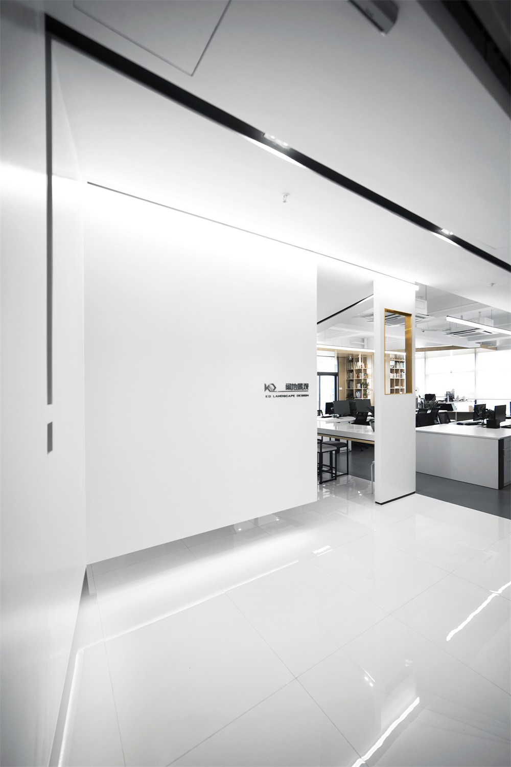
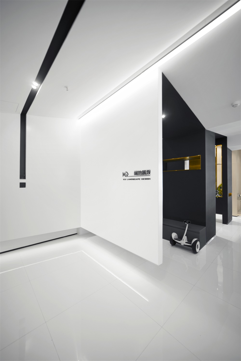
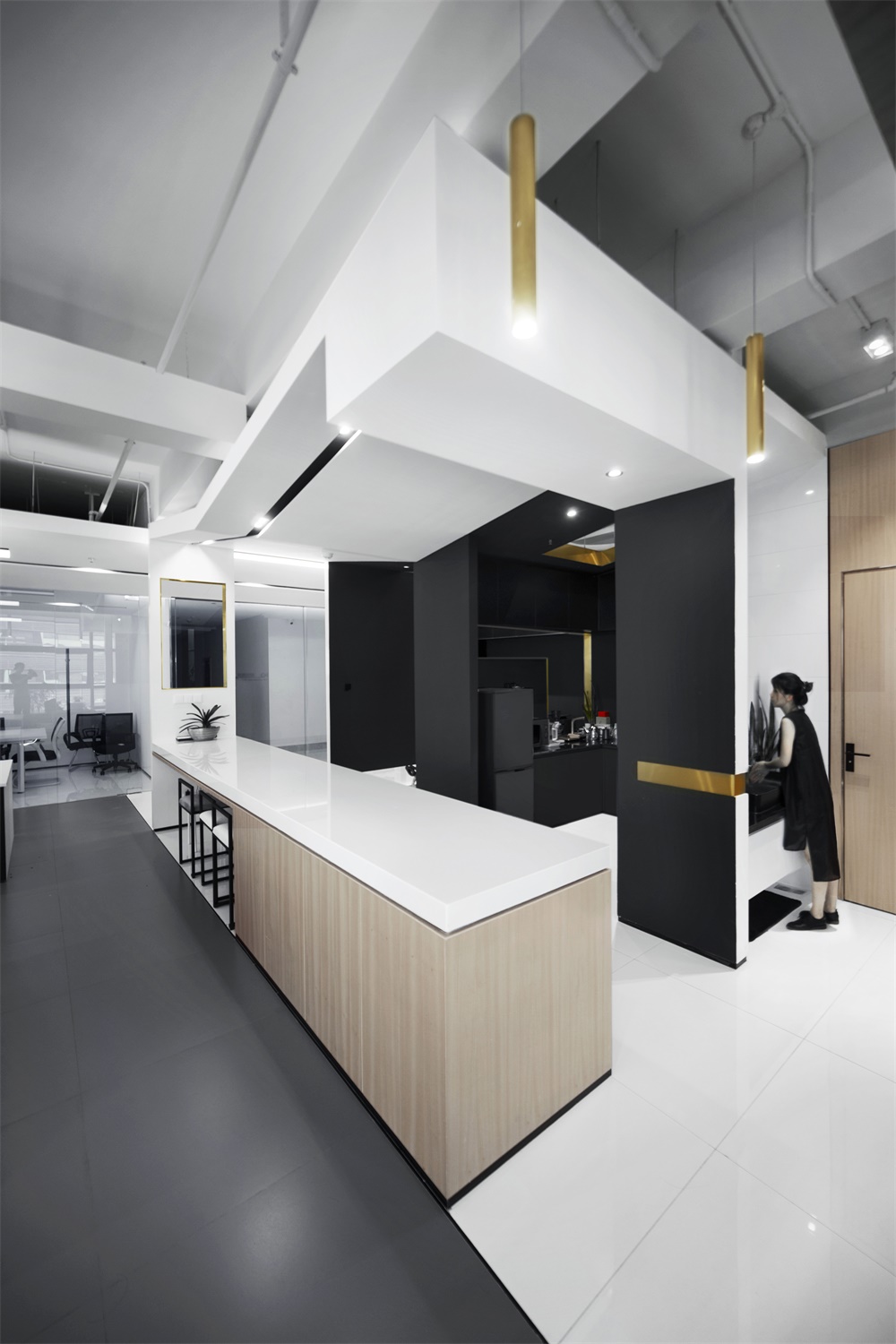
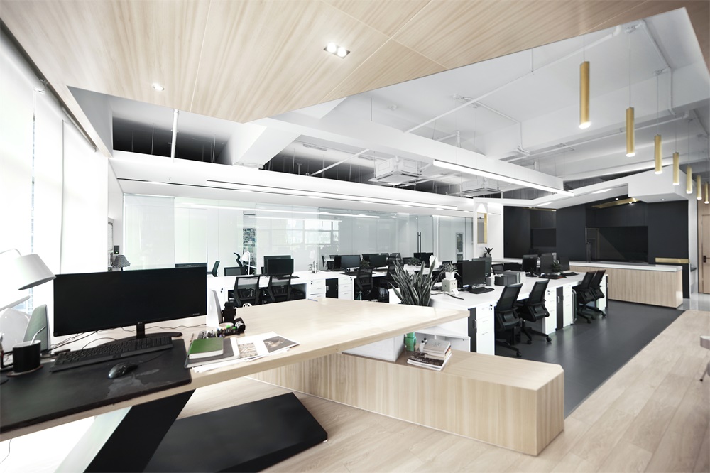
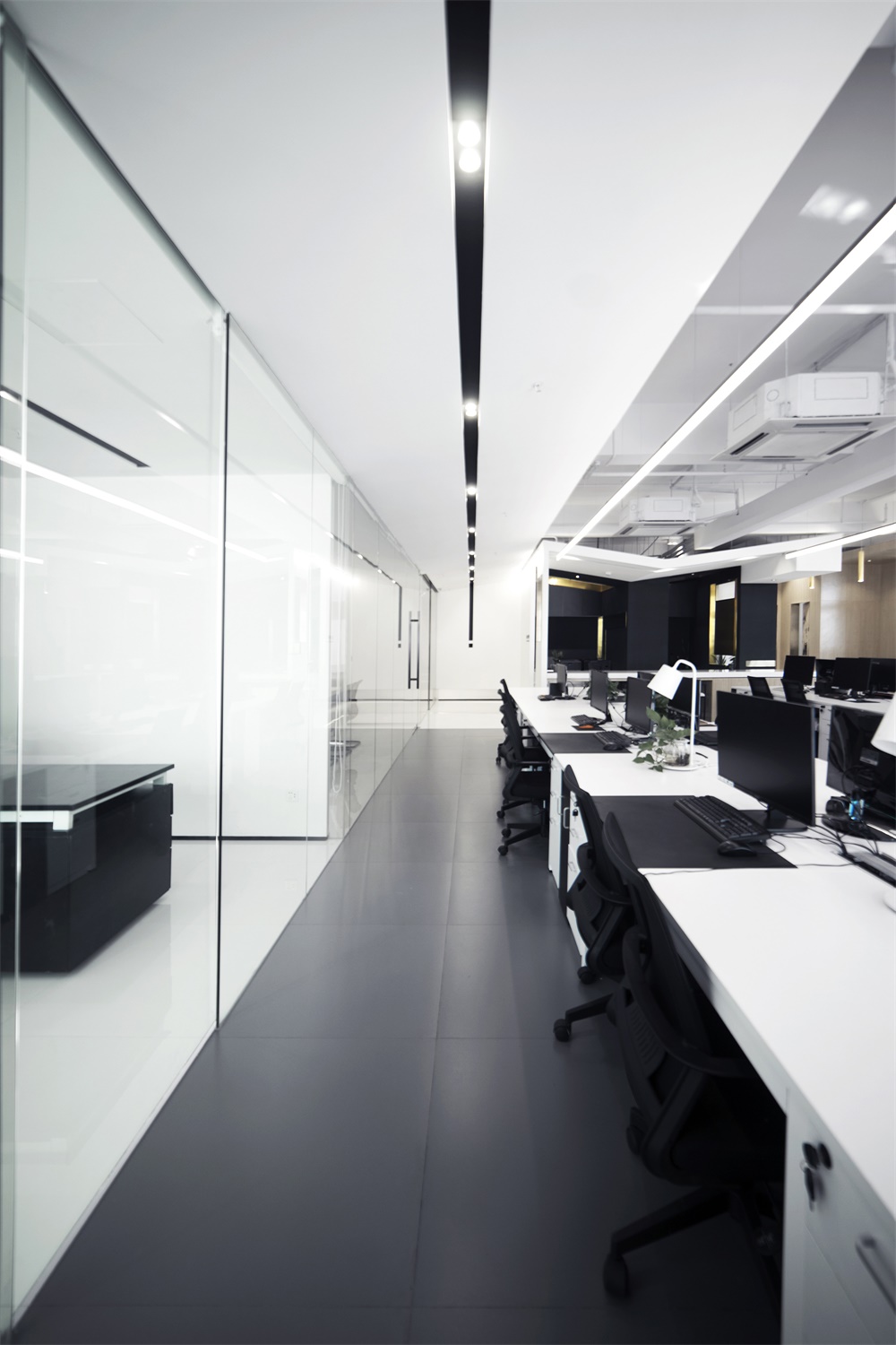
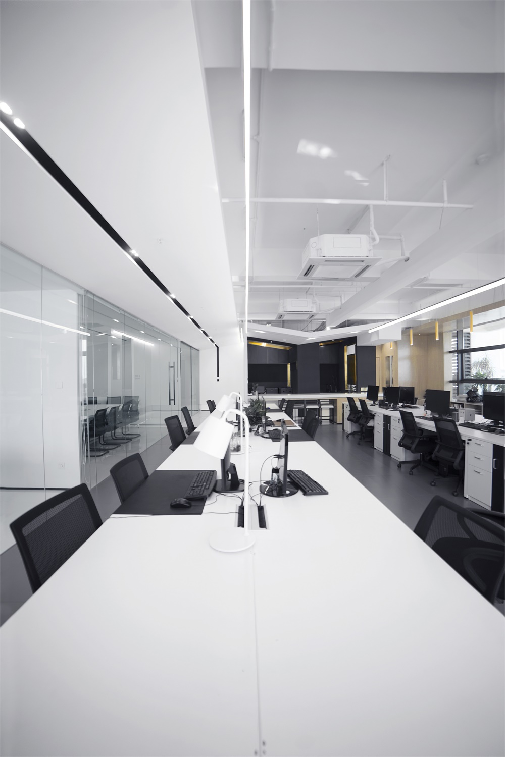
設計運用簡單的材料和語言強調極簡概念。空間上摒棄了繁冗、聒噪的裝飾鋪陳,白色牆麵與天花、灰色或白色地磚、淺木色閱讀區的色彩搭配與材質選擇,讓空間靜默而內斂,空間變得清爽大方。線性光的使用強調的了空間的結構,同時帶來一種穿越的未來感,給空間以蓄勢待發的張力和延伸感。
The design conception applies simple materials and language to emphasize minimalism. The project abandones all complex and noisy elaborate decorations,the color matching and material selection of white walls and ceilings, gray or white floor tiles and light wood reading areas make the space quiet and restrained. The space becomes refreshing and generous. A linear-light protrudes spatial structure, comes into a sense of the future crossing, attaches the space with potential tension and extension.
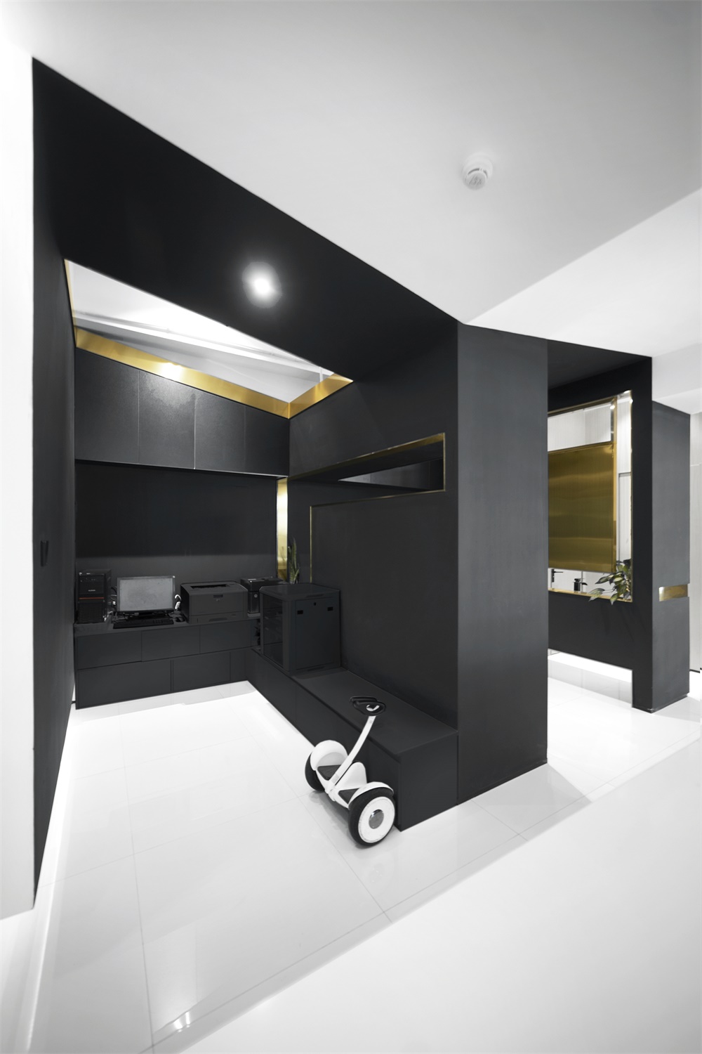
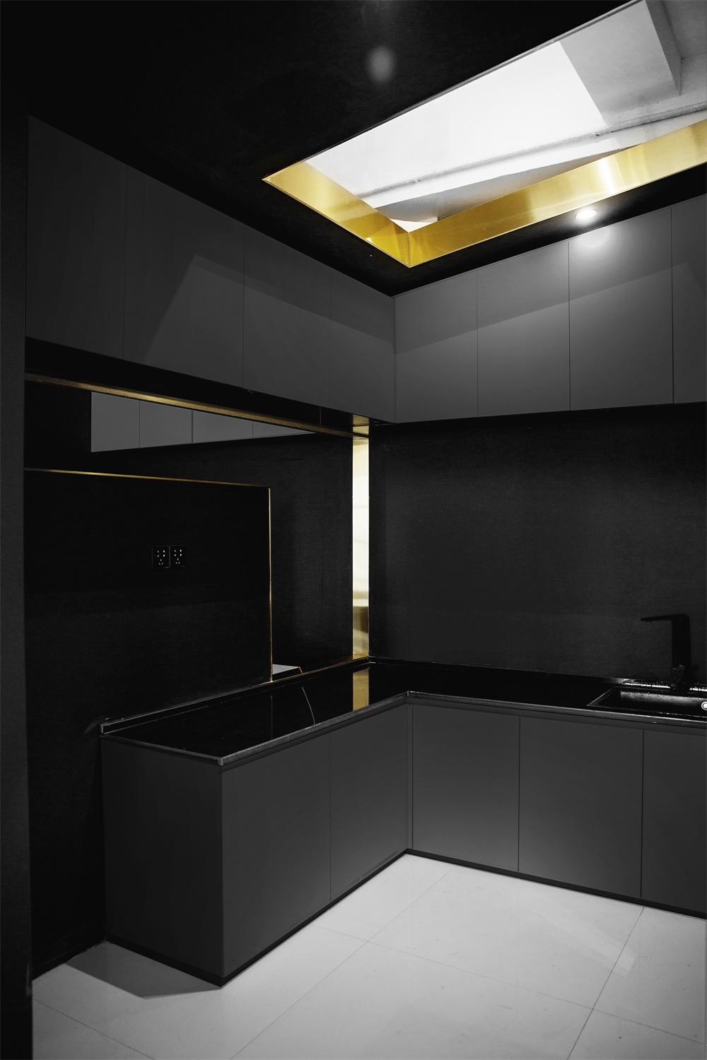
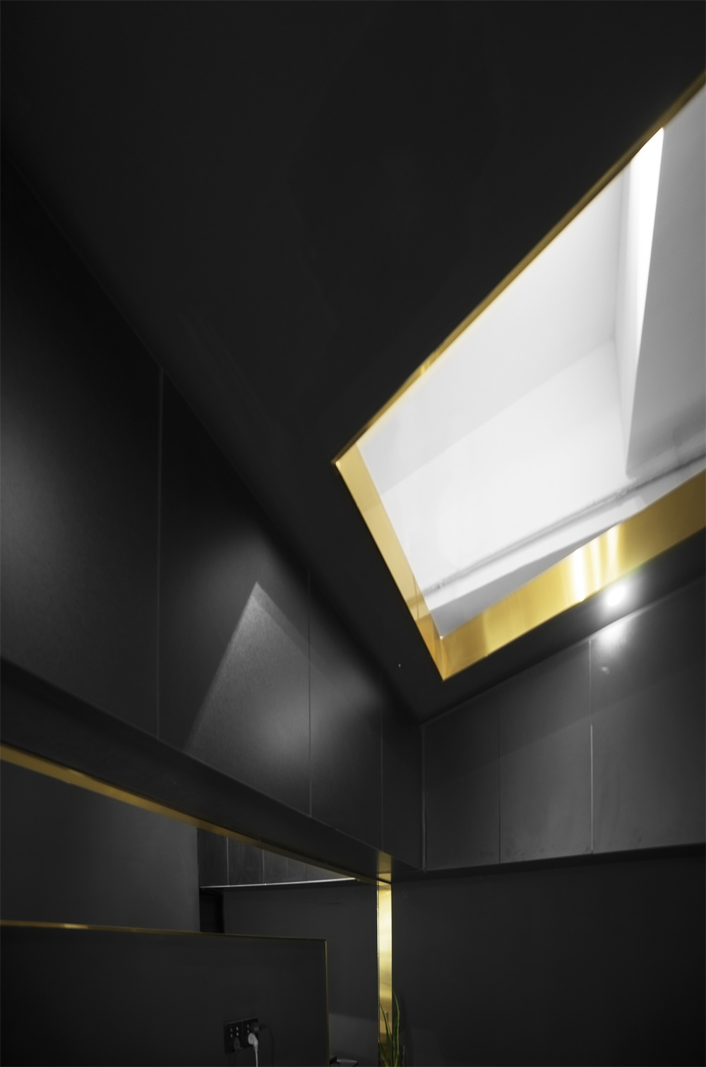
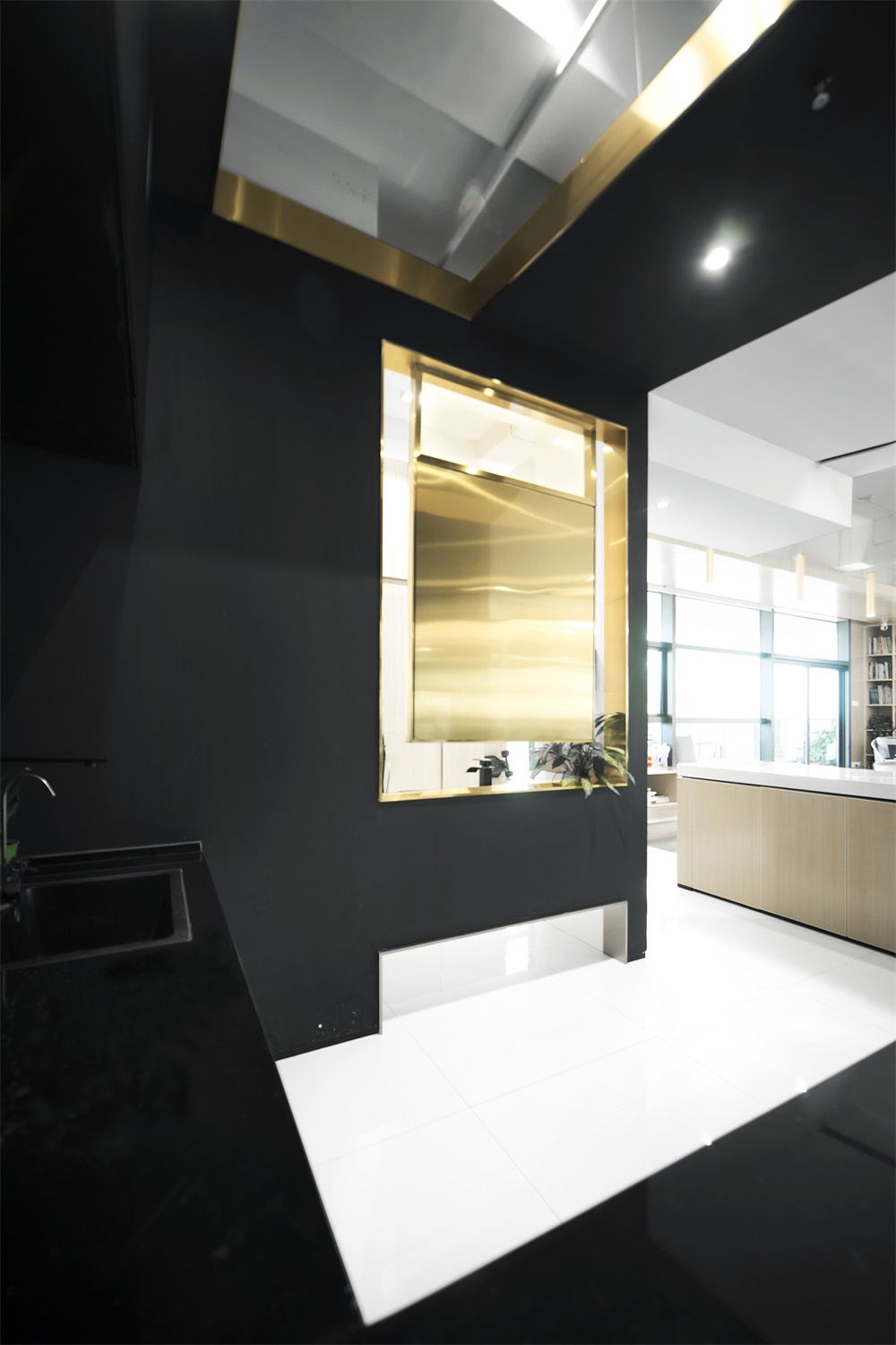
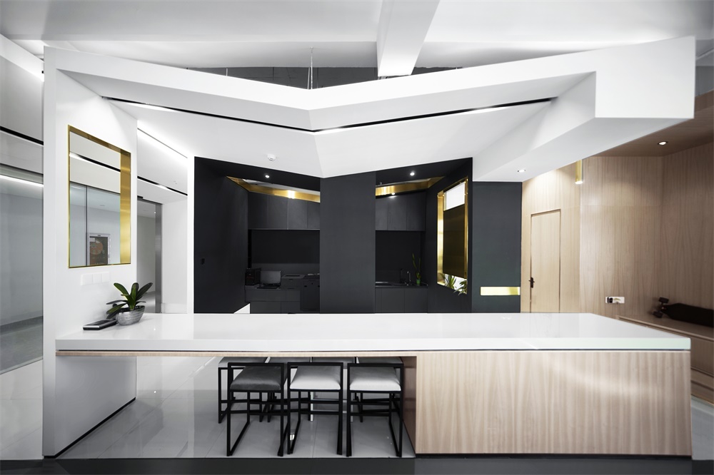
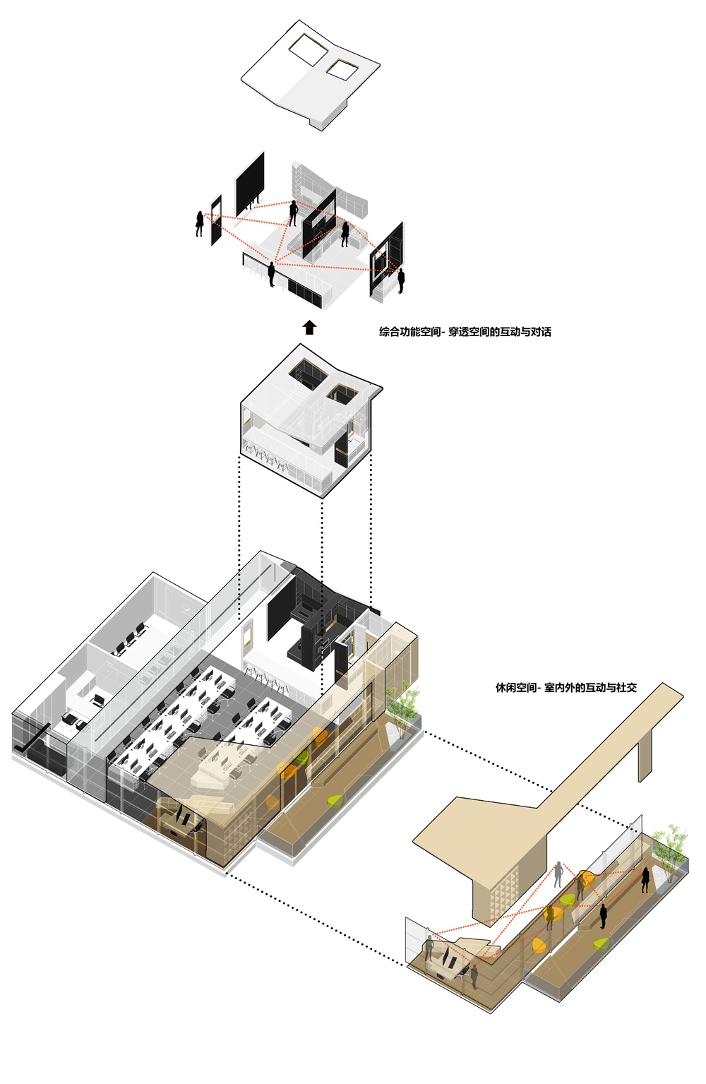
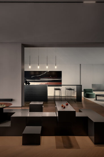
作為半私密空間的綜合功能區為半打開界麵,且選用了黑色作為主色,使其區別於其他空間。在界定不同空間功能的同時,讓空間可以相互滲透,緩和空間邊界,且保證溝通方式的多元。金色的取景框讓人的活動在黑色環境中更能凸顯出來,強調了空間的性質,空間變得自由且開放。人置身不同的空間狀態,鏡框下呈現不同的場景,在不同功能空間都可以相互交流、攀談,穿越空間的交互與對話。
The integrated function area as a semi-private space is a semi-open interface, and black is selected as the main color to distinguish it from other spaces. While defining different spatial functions, the space can penetrate into each other, alleviate the space boundary, and ensure the diversity of communication methods. The golden frame makes people’s activities more prominent under the black background, emphasizes the nature of space, and the space becomes free and opened. People can communicate in different spatial states and different scenes presented through the frame, which is the interaction and dialogue across space.
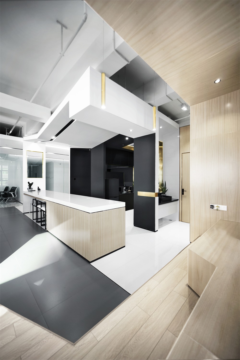
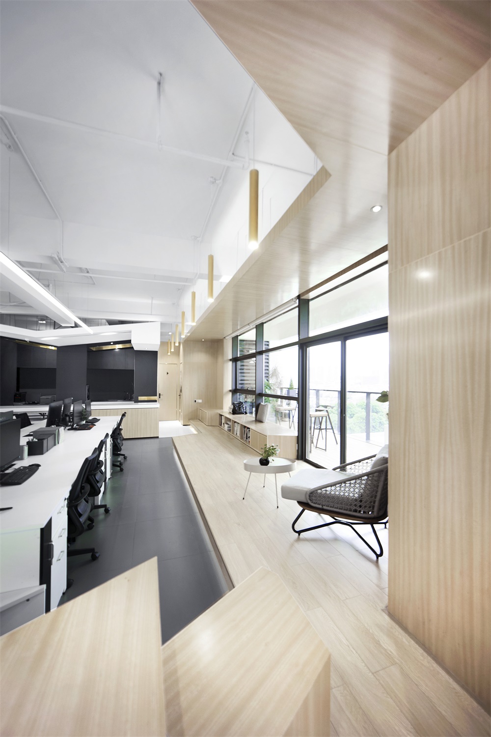
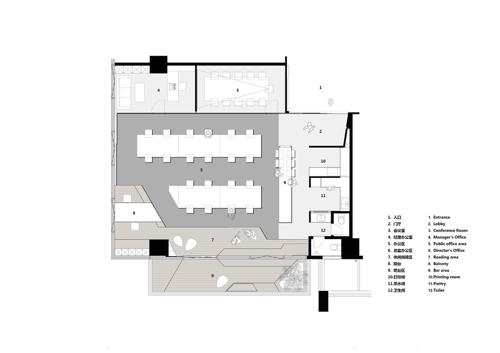
吧台和休閑書吧及開放陽台空間不僅解決了工作共享問題,同時塑造了人際關係與社交網絡,讓人與空間的關係變得富有彈性和延展性。以吧台為界,通過地麵鋪裝的差異,將公共辦公區與半私密綜合功能區區分,而空間卻是互滲相通,並沒有強硬的空間劃分。
The bar, the leisure reading area, and the open balcony space not only solve the problem of work sharing, but also create interpersonal relationships and social networks, make the relationship between folks and space more flexible and malleable. Taking the bar as the boundary, the public office area is distinguished from the semi-private integrated function area by the difference of the ground pavement, while the office area and the semi-private integrated function area are interpenetrated and there is no tough space division.
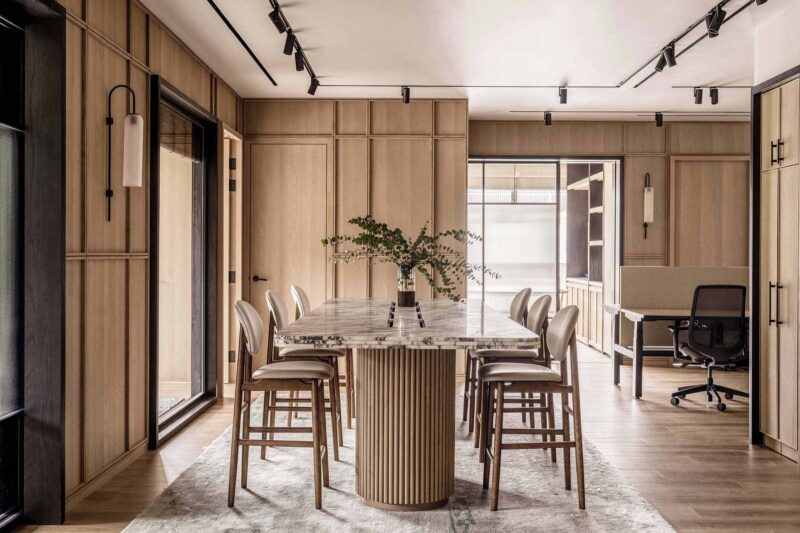
而休閑書吧和總監辦公區則形成一個修長的異型木盒空間,從顏色、材料、高度界定空間。木色相對溫暖的色調拉近了人與人的距離感,創造更舒適的溝通環境。空間的交融讓辦公不再冰冷,它或私密或開放,可靜止可流動,功能更加複合,能激發創造力與想象力。
The leisure reading area and the director’s office area converge into a a slender form, special-shaped wooden box space,which defines space from color, material and height. The relatively warm color of wood color makes people more closer and creates a more comfortable communication environment.The blending of space makes the office no longer cold. It is either private or open, static or flowable , and more complex functions. It can stimulate creativity and imagination .
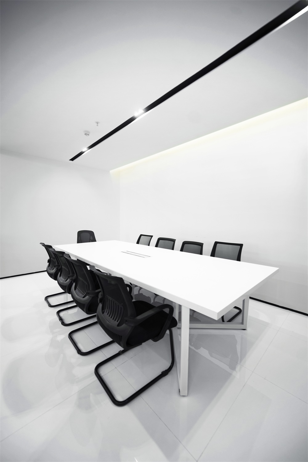
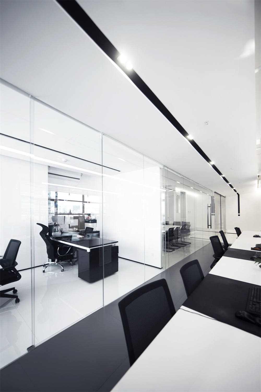
作為相對私密的會議室和總理辦公室,我們更傾向於更簡練的手法,長條簡潔的辦公桌對應頂上長條燈線讓空間更加舒張。
As a relatively private meeting room and manager’s office, we prefer a more concise approach. The long and simple desks correspond to the long strips on the top to make the space more relaxing.
設計旨在營造更多元有趣的辦公場所,使用者置身其中產生各種行為和靈感的碰撞,辦公不再單調乏味,變為生動趣味的場景和片段。
The design aims to create more interesting and diverse office space, in which users will have a variety of behaviors and inspirational collisions. the office is no longer monotonous, but becomes a vivid and interesting scenes and fragments.
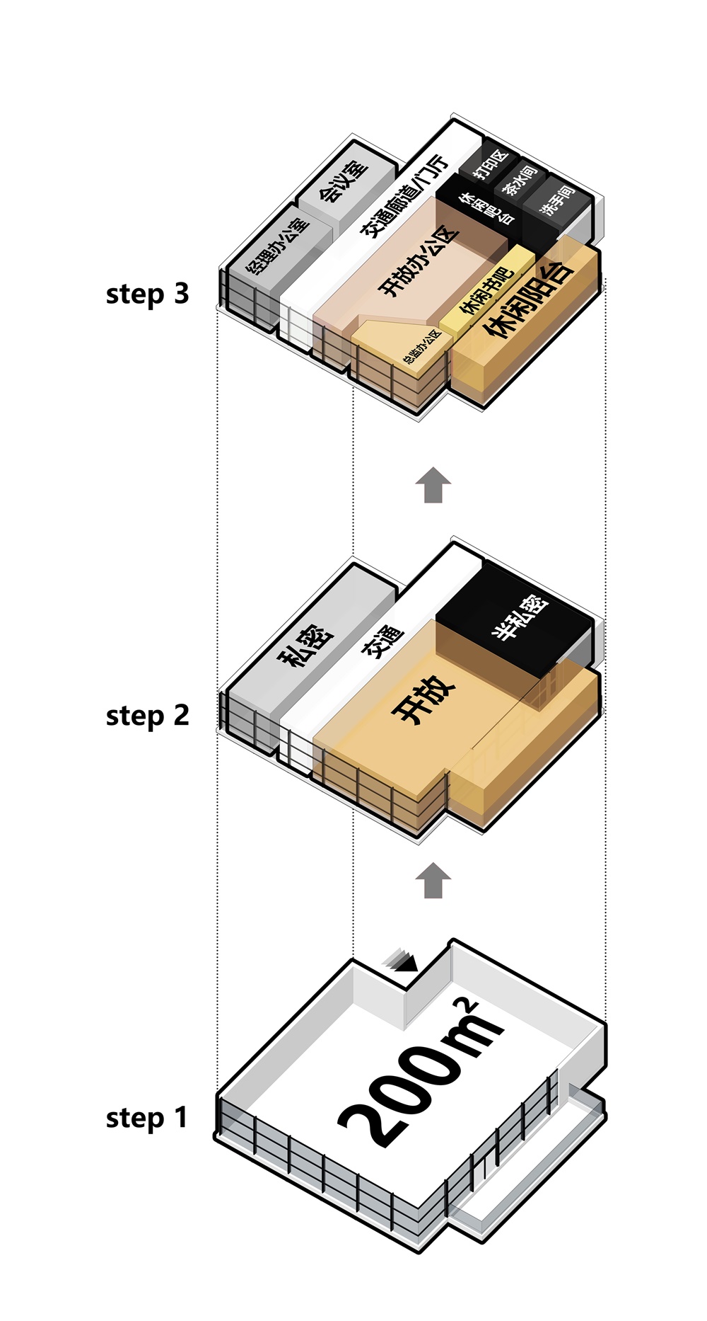
∇ 功能分區 functional division
∇ 空間原理 Space principle
∇ 平麵圖 plan
完整項目信息
項目名稱:闊地景觀辦公室
設計公司:月介空間
聯係郵箱:mpluslab@126.com
完成年份:16/2019-05/2019
建築麵積:200平方米
項目地址:東莞市南城區天安數碼城
攝影師:黃衛健
主創設計:黃衛健 陳秀瑤
客戶:東莞闊地景觀設計工作室
主要材料:不鏽鋼 木材 瓷磚 玻璃
project name: KD Landscape Studio
design: M+LAB
contact e-mail:mpluslab@126.com
completion Year:16/2019-05/2019
floor area: 200m²
project location: Tianan Cyber Park,Nancheng District,Dongguang,Guangdong, China
photographers: Weijian Huang
design:Weijian Huang/Xiuyao Chen
customers:KD Landscape Studio
materials:stainless steel wood ceramic tile glass


