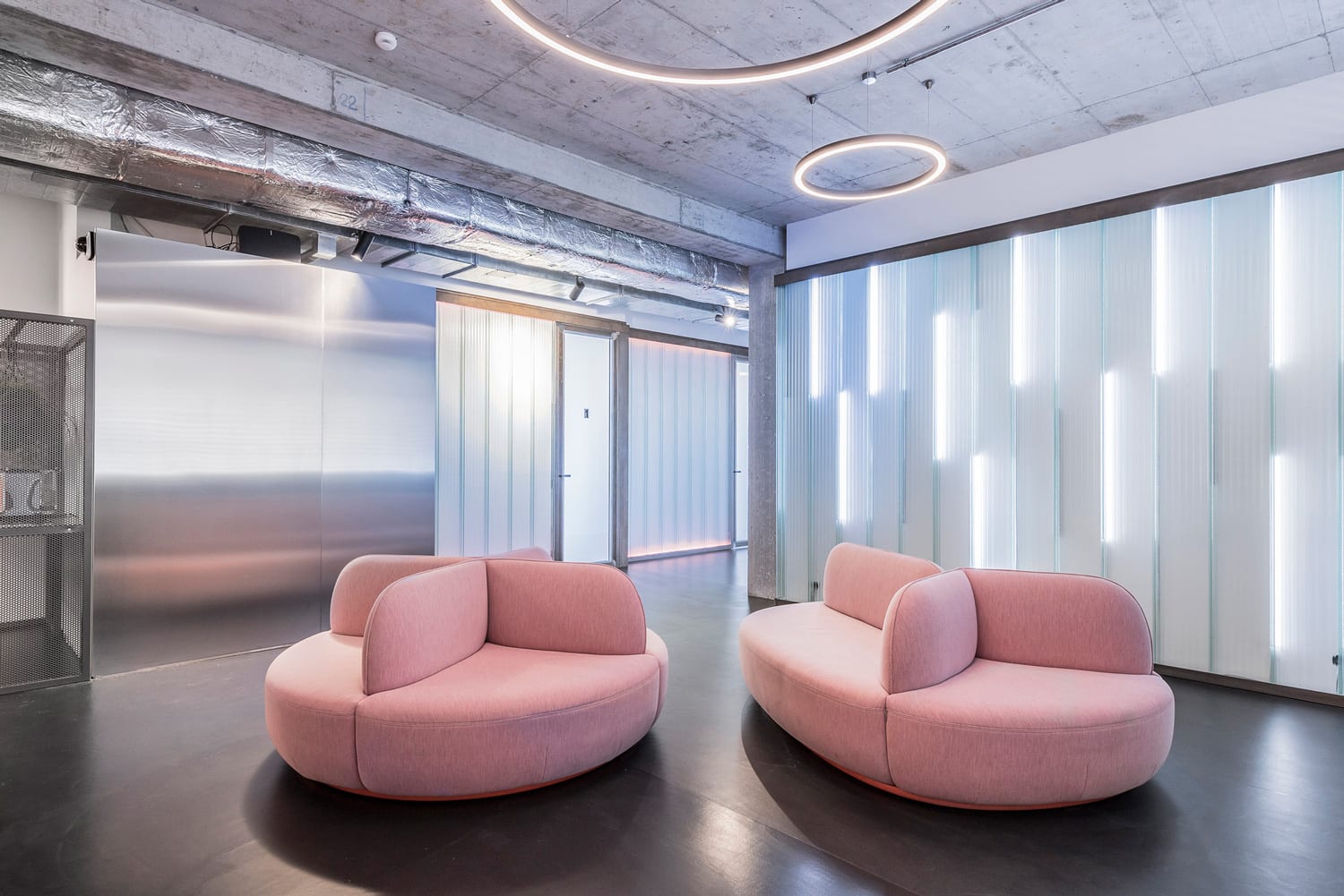
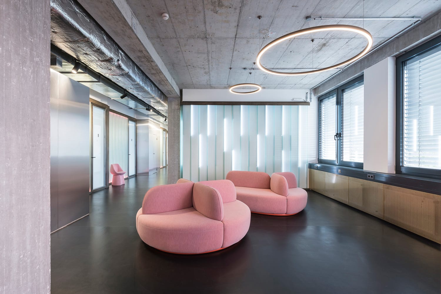
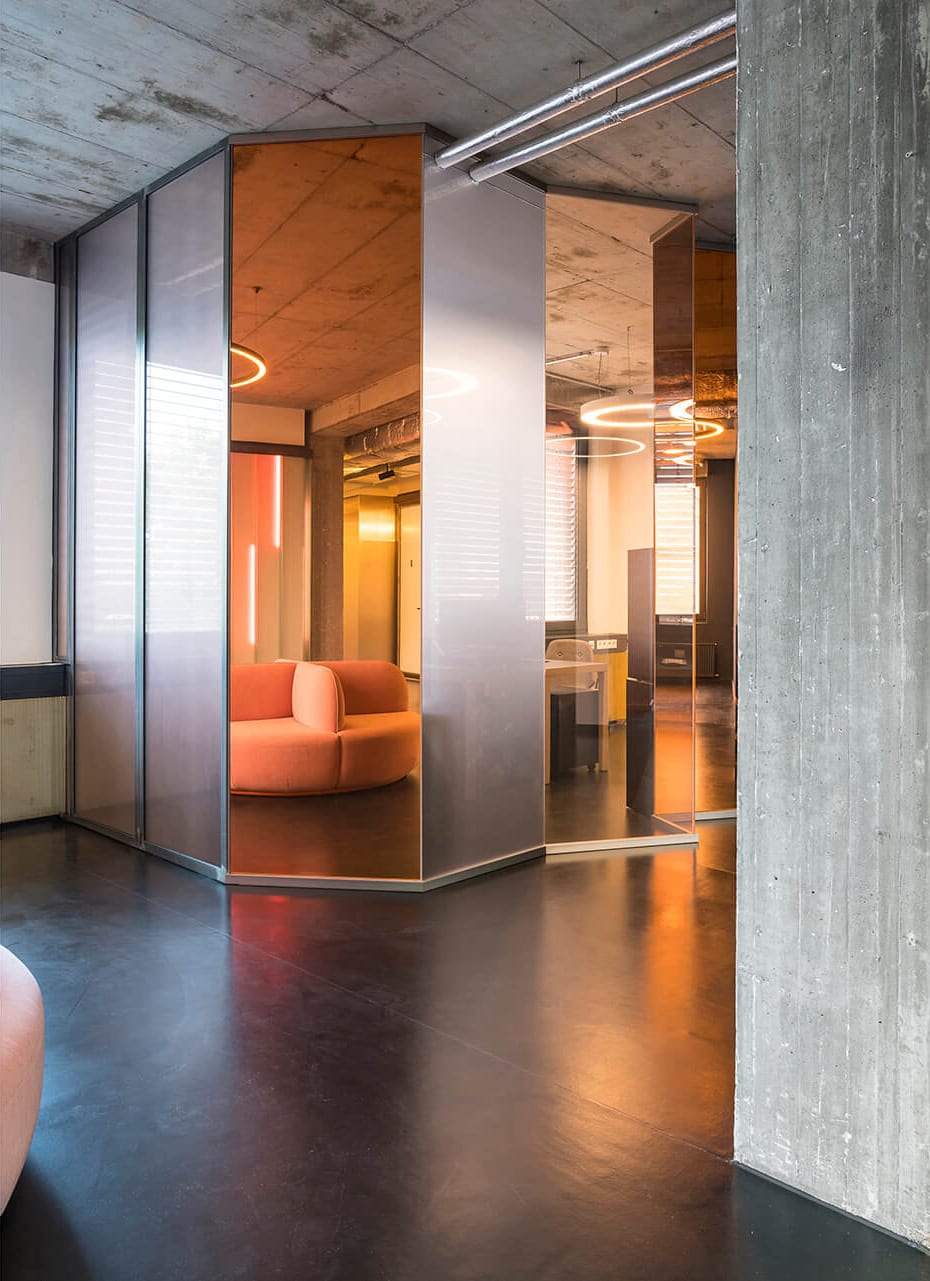
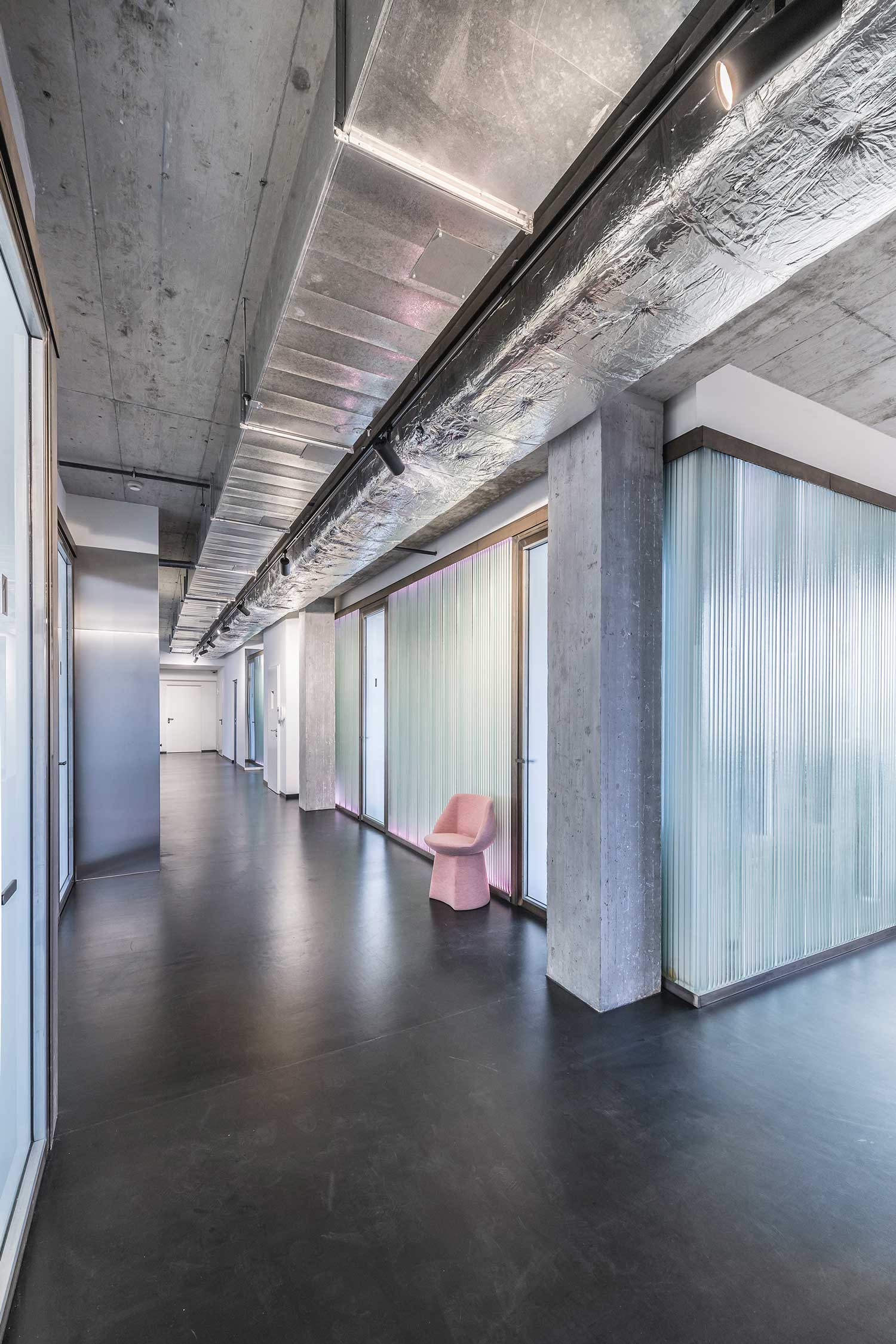
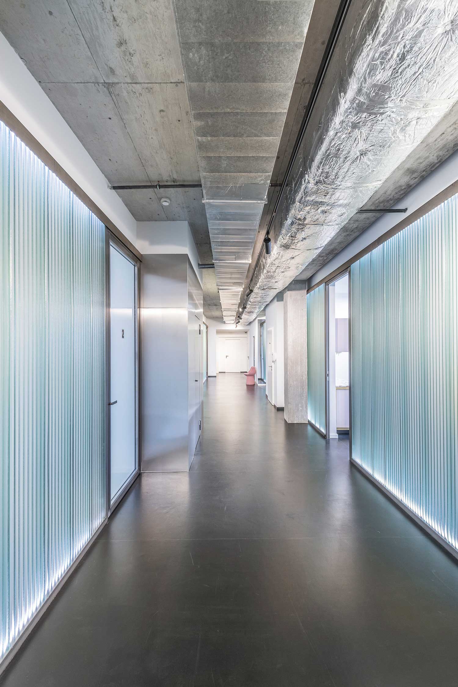
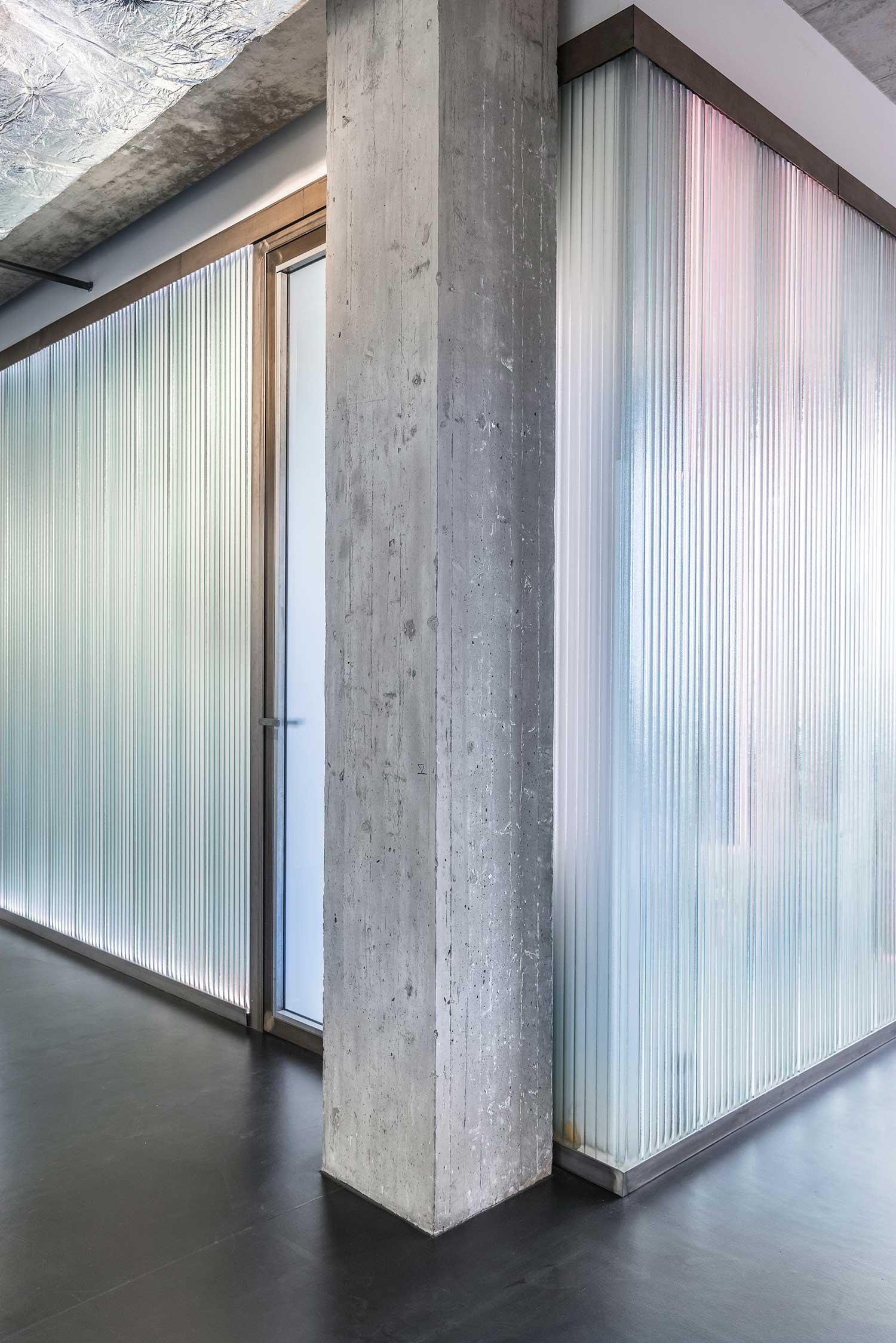
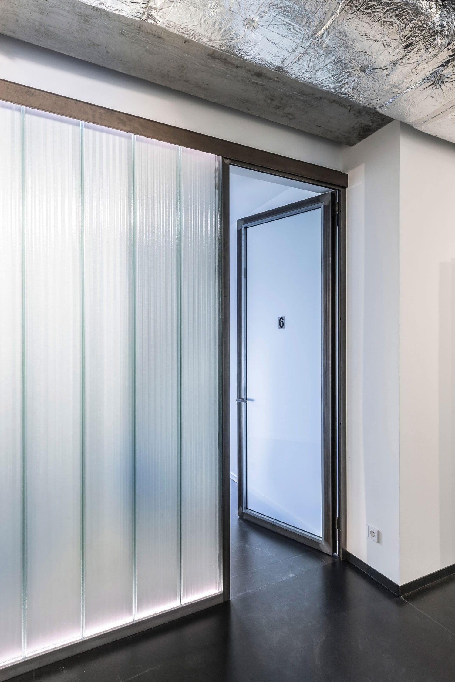
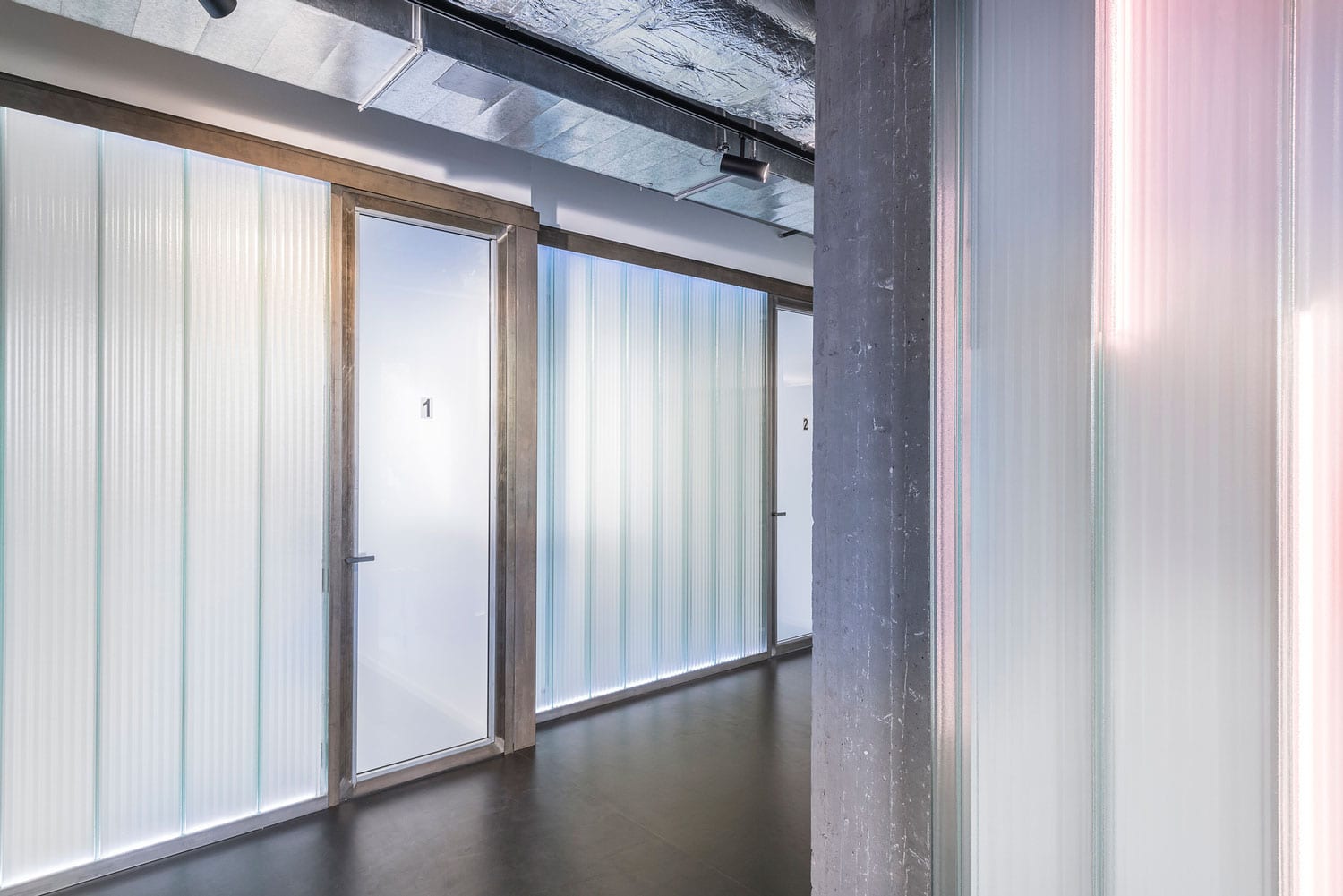
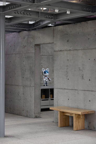
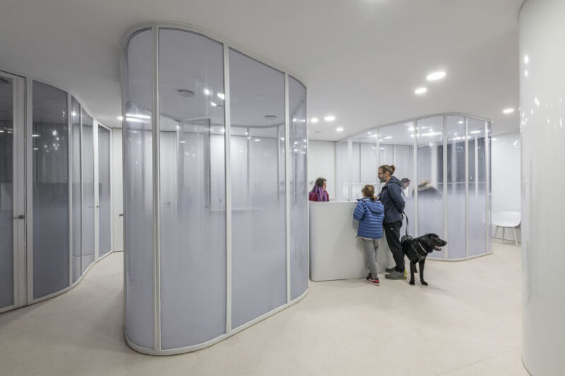
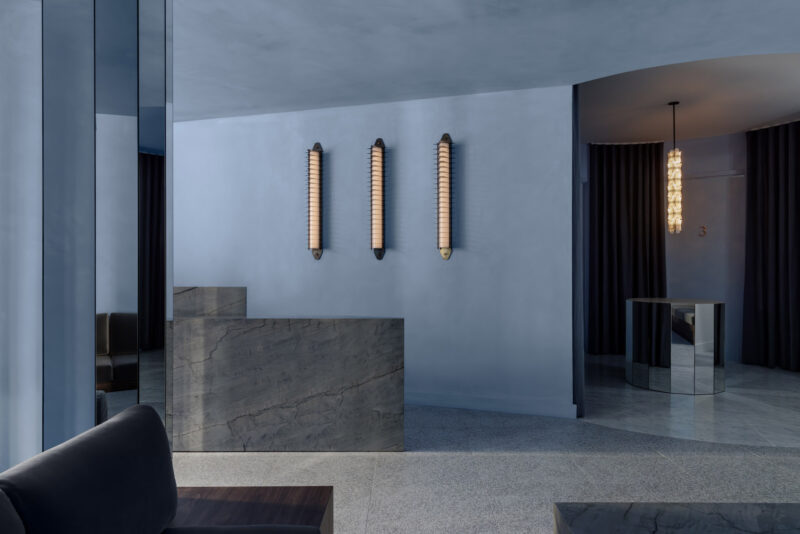
設計師沒有采用外科手術或醫療實踐的模式來設計這個360平方米的室內空間,而是采用了酒吧或概念商店的布局。顏色和紋理取代了通常與牙科焦慮相關的無菌白色表麵。外露的混凝土,鏡麵,玻璃麵板和有趣的粉色沙發代替它們。背光源的環境係統不斷改變顏色,這是一種動態元素,有助於營造出平靜的氛圍。
Rather than approach the design of the 360sqm interior through the paradigm of a surgery or medical practice, the designers applied the layout of a bar or concept store. Colour and texture replaced the sterile white surfaces often associated with dental anxiety. Exposed concrete, mirrored surfaces, glass panels and fun pink sofas stand in their place. An ambient system of backlighting changes colour constantly, a dynamic element that helps create a calming mood and atmosphere.
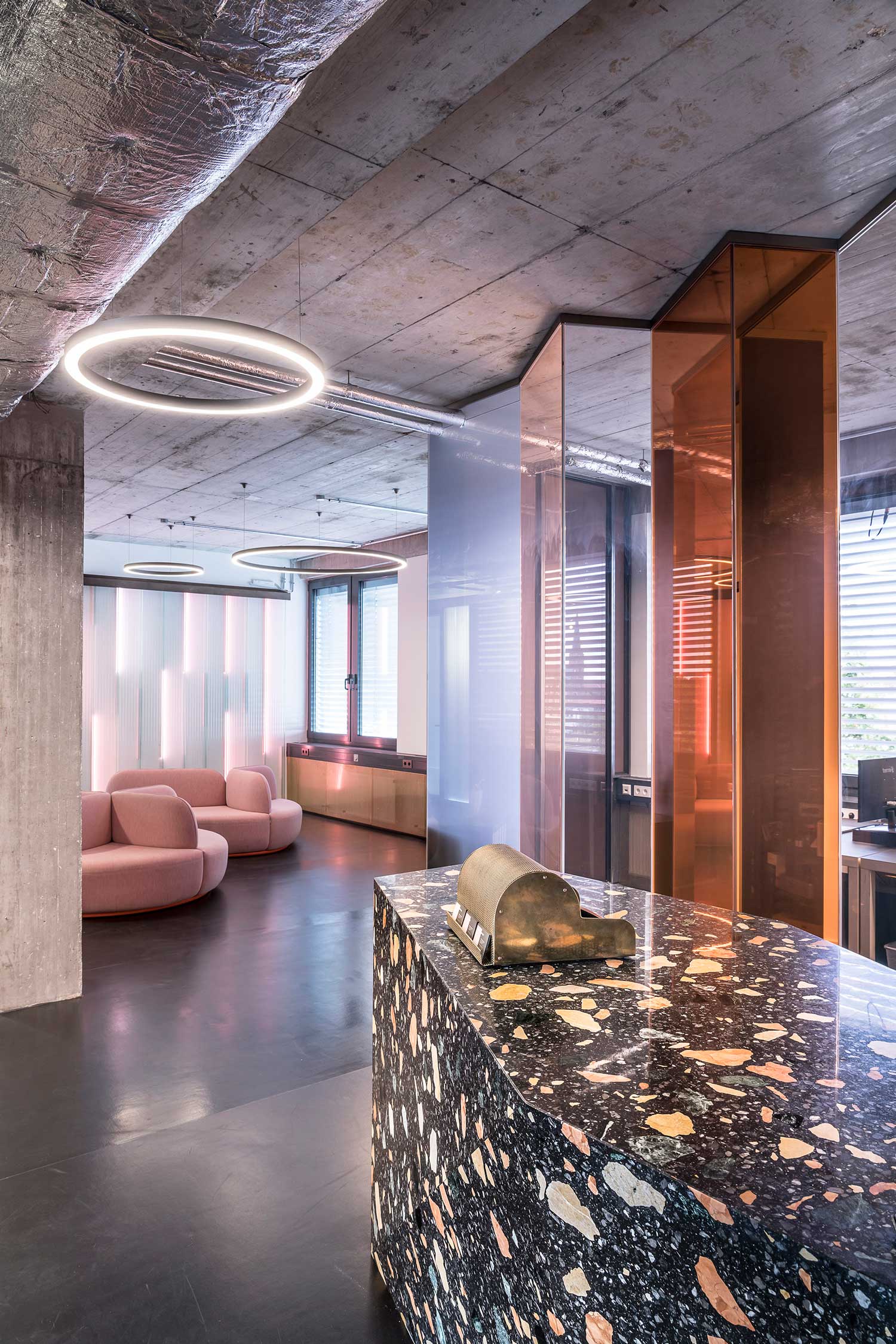
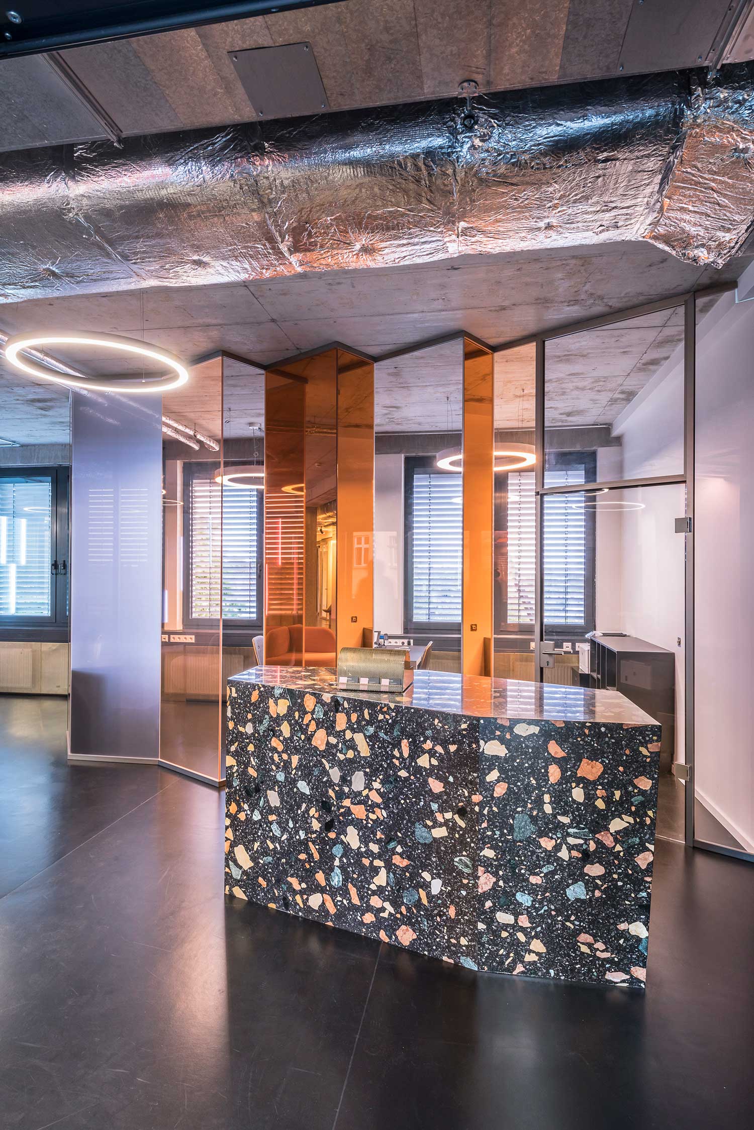
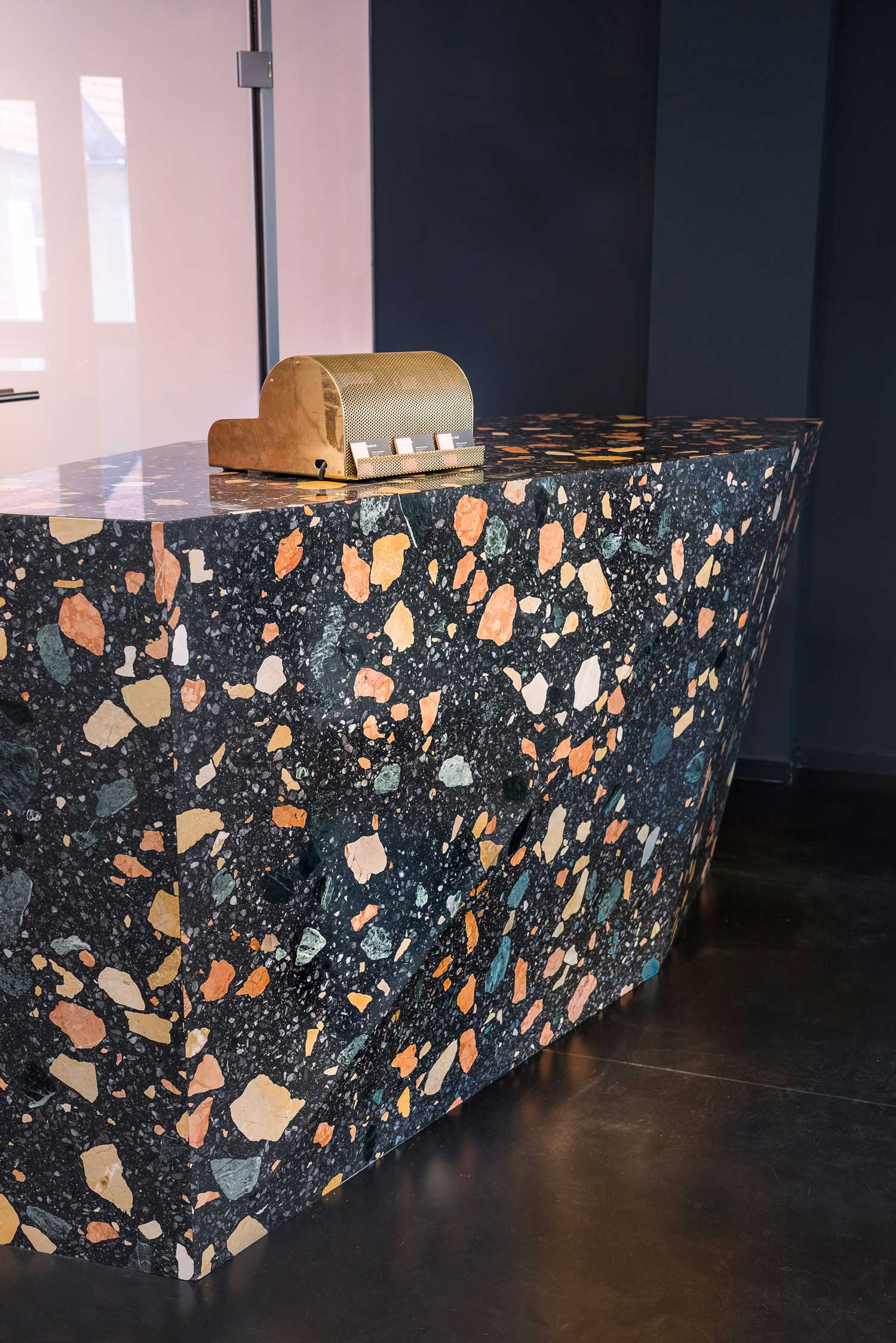
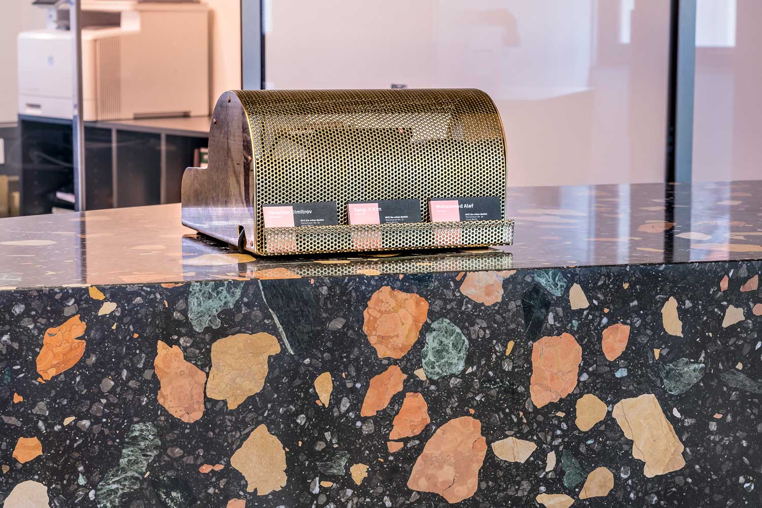
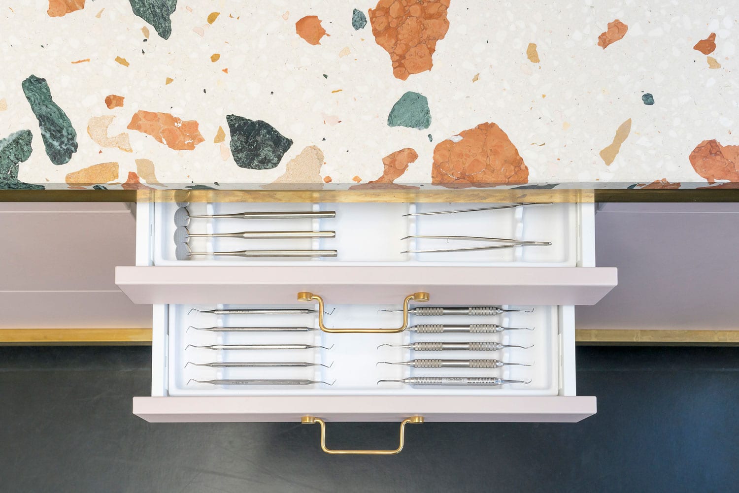
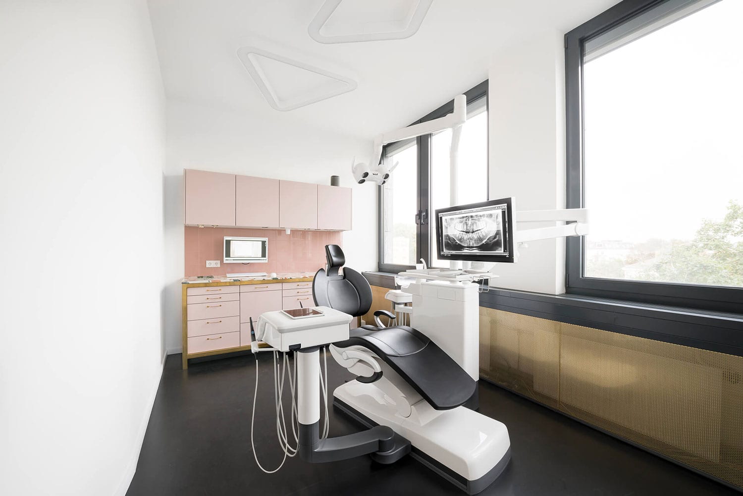
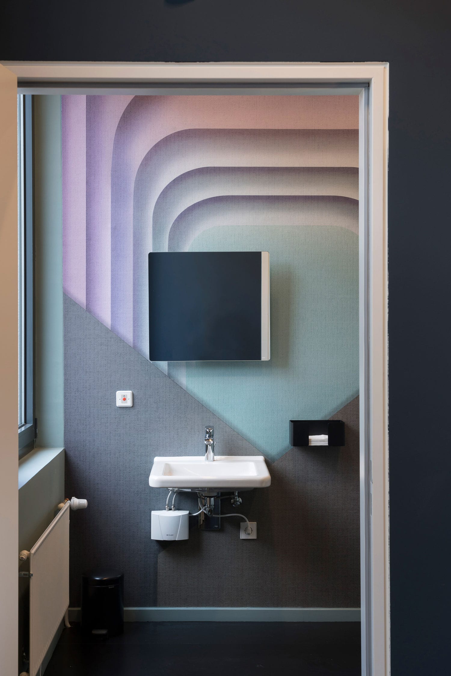
治療室配有傳統和必要的工具和牙科椅,由定製的粉紅色亞麻油地氈家具和黃銅框架調和而成。前台是一塊色彩斑斕的水磨石,黑色的石頭上點綴著綠色和金色的大理石。在治療室裏使用的是白色的。浴室有一種俱樂部的風格,牆壁內襯閃亮的黑色鑲嵌瓷磚。幾乎所有東西都是由當地設計師使用可持續材料定製的。
Treatment rooms feature your traditional and necessary tools and dental chairs, tempered by custom powder pink linoleum furniture and brass framing. The reception desk is a hunk of colourful terrazzo, black stone studded with green and golden marble. A white version is used in the treatment rooms. The bathrooms have a definite club-y feel, with walls lined with shiny black tessellating tiles. Almost everything was custom-built by local designers using sustainable materials.
完整項目信息
項目名稱:The Urban Dentist
項目位置:德國柏林
項目類型:商業空間/診所設計
完成時間:2018
項目麵積:360sqm
設計公司:Studio Karhard
攝影:Stefan Wolf Lucks


