隨著電子商務市場的快速成長,在各地拓展開發著以各種各樣行業為目標的大型借貸型物流設施,比如以網絡通販公司及貨運公司為主的廠家等等。迄今為止,拓展開發出了不計其數的物流房地產的業主,從重視效率,以物為中心的設施配備的思路轉舵,發起“以人為本”的理念。新型開發的大型設施“KLÜBB ELIA”便是打造了以人為先,向著舒適愉悅的工作環境整備邁進的專業品牌。我們此次經手了第5棟設施“ESR久喜DC”的托兒所、商店、休息室以及大廳的設計工作。
Large-scale rental distribution facilities are being developed all around Japan to meet growing demand caused by the exploding e-commerce market from a variety of businesses, including e-commerce and shipping companies. Our client, who has developed distribution facilities for many different clients, operates under the philosphy of Human Centric Design, shifting away from creating facilities centered on efficiency and goods. Their newly developed large-scale facilities offer advanced comfortable working environments, designed for people, branded as “KLÜBB Area.” We designed the nursery, shop, break lounge, and entrance hall of ESR Kuki DC, the fifth building.
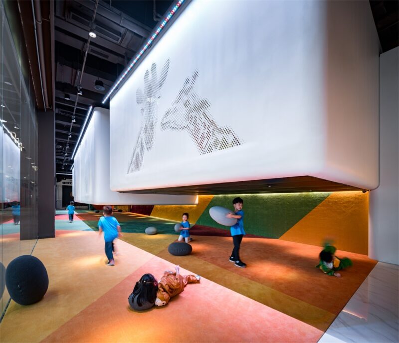
兒童時代將所見的雲的形狀想象成動物或者其它各種各樣有趣的東西。休息室撥動使用者心弦的,形狀多變的鏤空形牆壁,宛如圖書館的書架一般的排列開來,我們將它們取名為“cut out wall”。人們懂得觀察對象的遠近移動而產生的視覺差,透過cut out wall的複數連續的漏孔所見的事物產生變換時,即發生視覺差時,使用者便可感知自己在移動。相比之下,行走穿梭時身邊景物一成不變的碩大場所且相對封閉的物流設施,這種靈活多變回歸以人為本的建造,更多考量的是人們感受到舒心與舒適。這種視覺差的建造,也以連續鏤空的矩形的形式運用到了大廳的設計當中。
When we were children, we saw animals and many other things in the clouds. The break lounge is partitioned by “cut out walls,” arranged like bookshelves in a library, with irregular holes reminiscent of those childhood memories. People perceive distance by judging the disparity of what they are observing when it moves. When the figure seen through the series of holes in the cut out walls moves, in other words, when disparity occurs, the viewers feel as if they themselves are moving. In the context of a spacious yet closed-off distribution center, where the view never changes no matter how long one walks, these kind of mechanisms bring us back to human scale, prompting feelings of relief and comfort. We included this disparity mechanism in the design of the entrance hall by repeating a series of small holes as well.
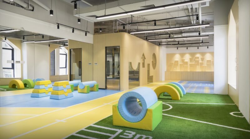
因托兒所位於日照不算好的東北側一樓,故將庭院裏最大限度吸收自然光照的傾斜壁麵的反射光倒入室內。早晨短暫照進來直射光打在傾斜壁麵的光影,隨著時間推移而產生視覺變換。庭院的地麵以及鋪滿人工草坪的傾斜壁麵勾起想人們要攀登的衝動。室內起伏的設計也會促使人多運動。這些既可以激發孩子們的好奇心,也可以培養加強冒險精神與身體素質。
Because the nursery is located on the first floor of the north building, where sunlight is not readily available, we attempted to let in as much natural light as possible by making a slanted wall on the terrace to reflect light into the interior. During the few hours of light in the morning, the direct light creates shadows on the wall, depicting the passage of time. The continuance of the floor of the terrace to the astroturf slanted wall invites us to run up it. Similarly, the rolling shapes of the interior design also function as a physical mechanism to invite movement and appeal to their sense of curiosity and foster their sense of adventure and physical ability.
完整項目信息
項目名稱:ESR Kuki DC KLÜBB area
項目位置:日本崎玉縣
項目類型:商業空間/托兒所
完成時間:2018.11
建築麵積:145,990㎡/托兒所122.65㎡ 社交室353.34㎡
設計公司:熊穀組(設計本體) TAKATO TAMAGAMI ARCHITECTURAL DESIGN(托兒所、休息室、商店、入口處) Architectural Design Office 【hyphen】(協作設計)
攝影:吉村昌也


