LOFT中國感謝來自 巨彙設計有限公司 的商業項目案例分享:
西安地處中國中心,千年建都史累積成久遠深邃的文化體係,如今作為教育重地更承載著中華文明的複興與文化自信。這樣的地域背景賦予西安天然的文創項目孵化力,開創文商結合趨勢之先河。
Located at the center of China, Xi’an has been the capital of multiple dynasties for over 1,000 years and formed a profound cultural system. And it is now bearing the mission for the renaissance of the Chinese civilization and cultural confidence as an important place for education. Such background endows the city with the capability to incubate cultural and creative projects and pioneer in the culture and commerce integration.
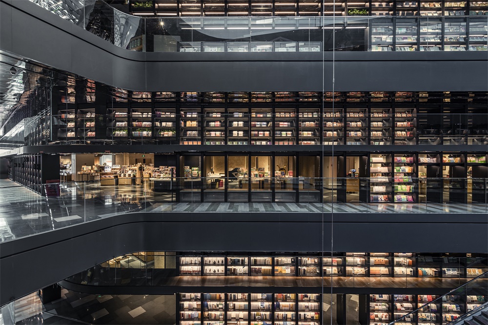
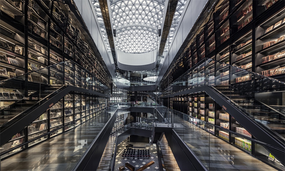
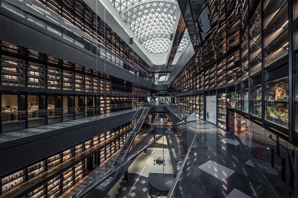
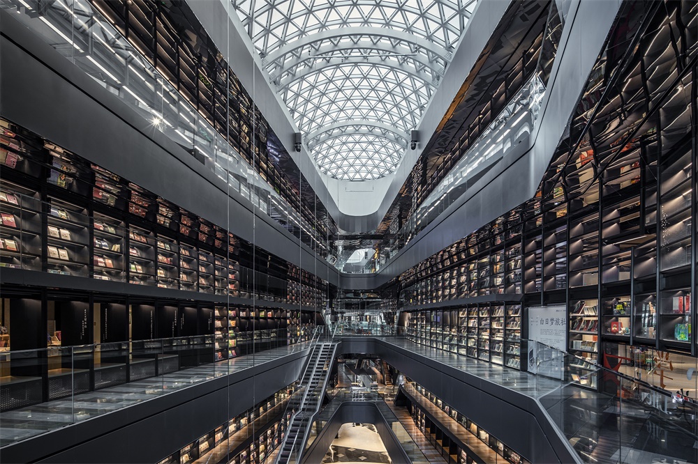
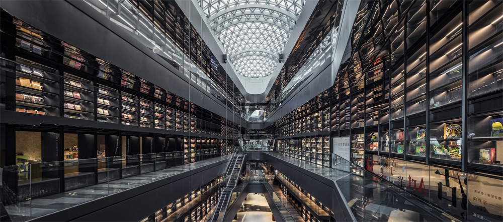
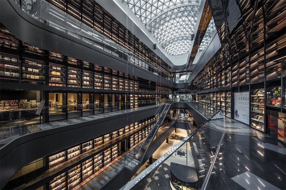
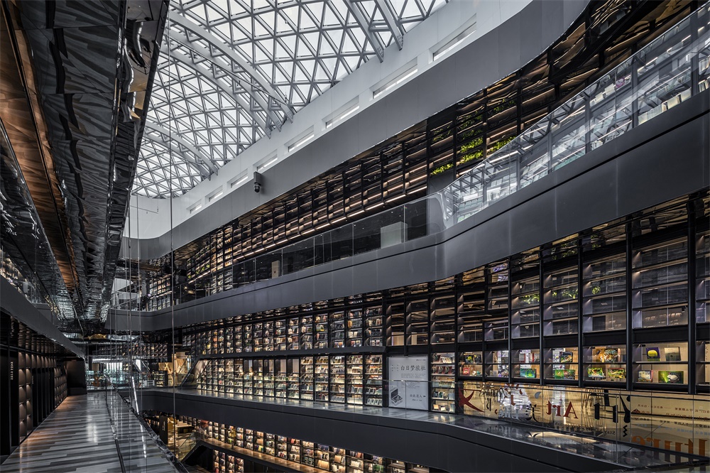
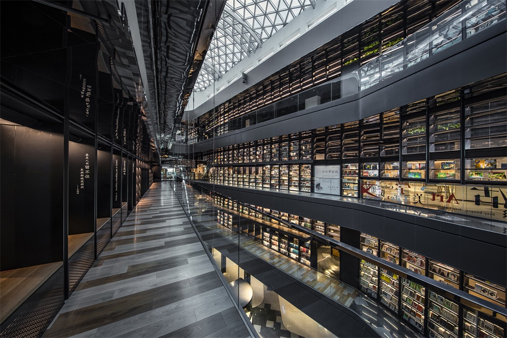
本案即是一座書店主題的商業綜合體,以文化+商業的策略性設計,構建多元業態的生活美學體驗。其中高18米、長240米的藝術書牆概念堪稱創舉,為西安乃至中國帶來城市商業空間的全新提案。
The project is a bookstore-themed commercial complex, which offers lifestyle aesthetic experience with multiple business forms via a “culture + commerce” design strategy. The 18m-high and 240m-long artistic book walls in it are striking and pioneering, bringing a brand-new image of urban commercial space to Xi’an and even China.
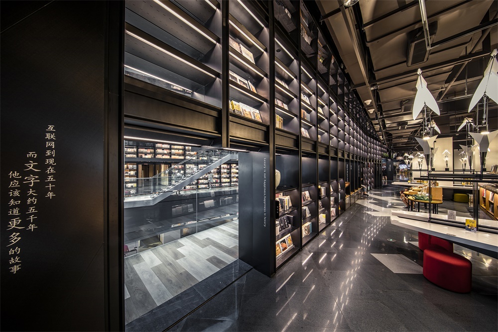
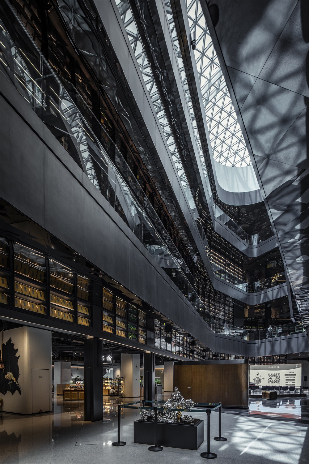
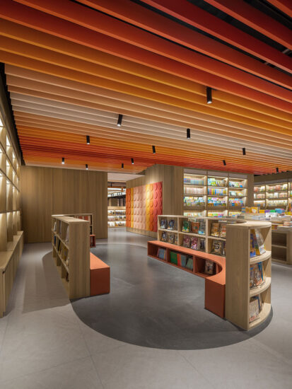
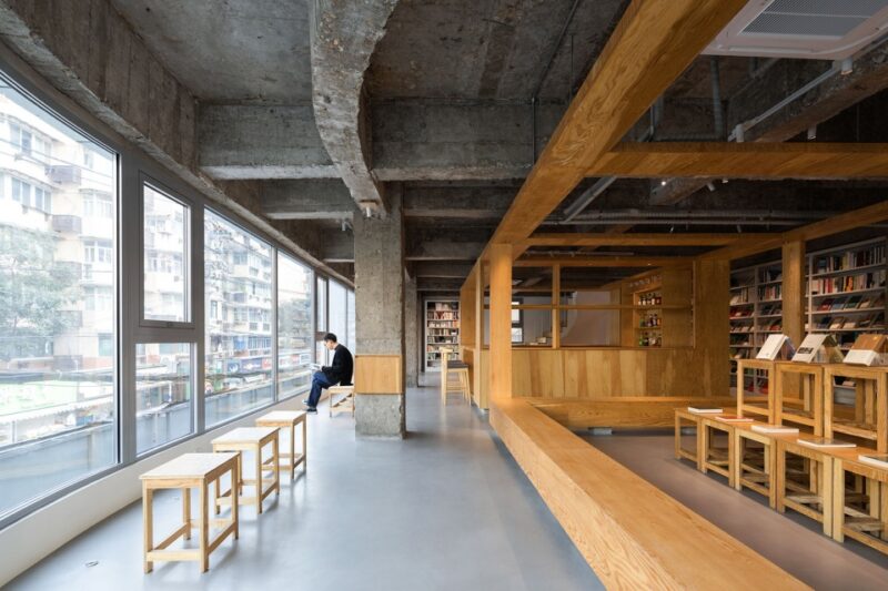
∇ 二樓書店閱讀區視角 Reading area of the bookstore on 2F
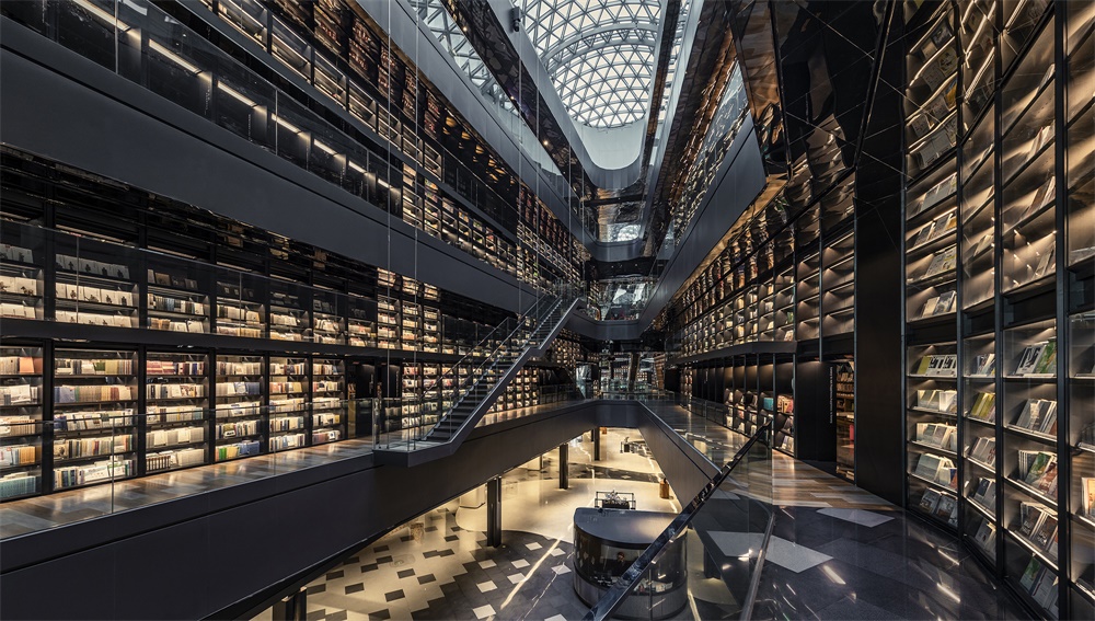
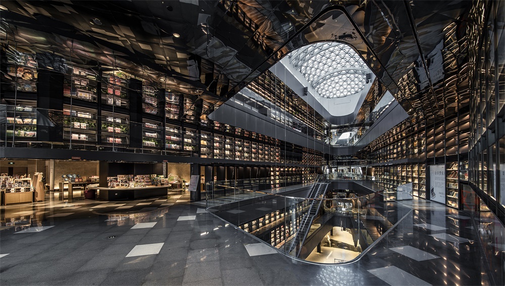
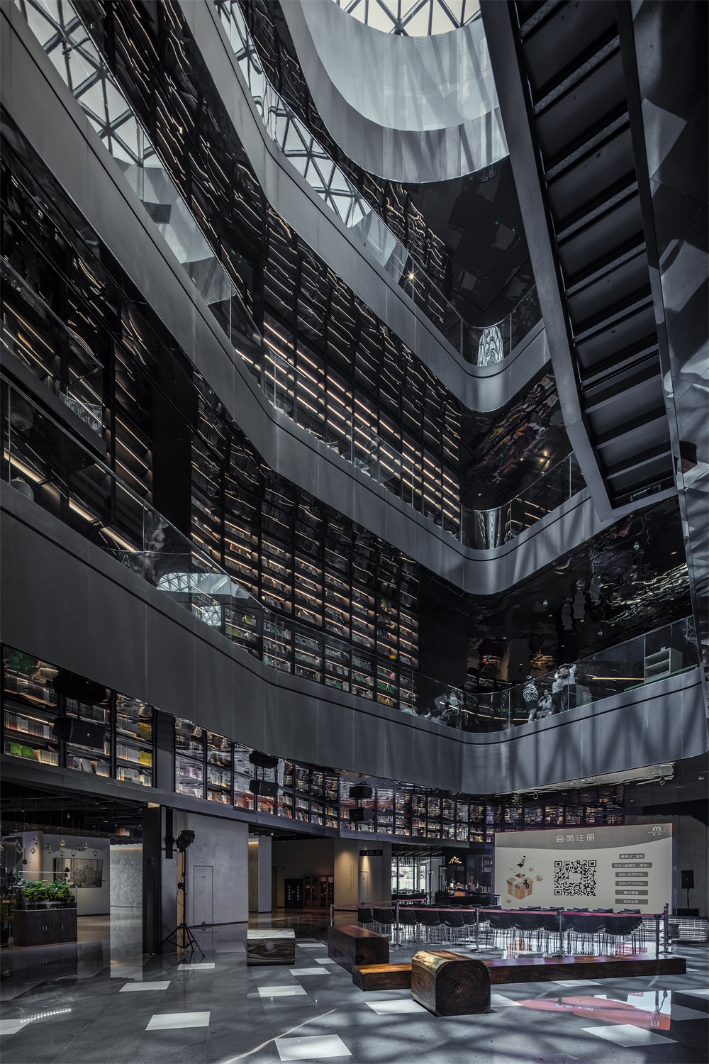
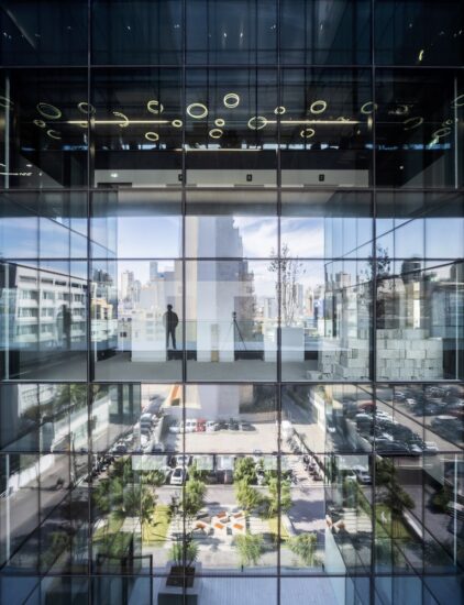
∇ 二樓挑空區南麵視角 South view of 2F’s void area
因應場地特質,化平庸為優勢 Turning commonness into advantage by making use of site characteristics
項目坐落在西安北郊的工業區,並非人潮商圈的核心地,常規的複合式經營顯然不足以吸引客流。來自寶島台灣的巨彙設計接手這座已閑置三年的毛坯建築體,並發掘出未經修飾的原始建築結構在天光之下展現的力與美。
The project is situated at an industrial area in the northern suburbs of Xi’an, which doesn’t enjoy large human flow volume and prosperous commerce. Therefore, the conventional compound operation mode is clearly inadequate to attract customers. As Gonverge Interior Design took over the project, the roughcast architecture had been idle for 3 years. By making use of site conditions, the designers strove to present the strength and beauty of the original undecorated architectural structure, with natural light brought in.
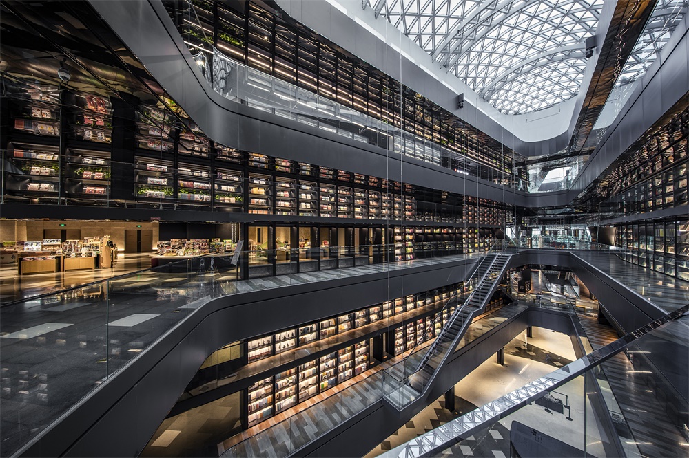
基於南北坐向的狹長場地和四層采光挑空區域,巨彙以五感設計為主軸,展開項目定位策劃、商業設計及空間設計。挑空區原本的建築空間優勢得以保留,塑造出強烈的空間體驗感。狹長的格局特質被強化,並順勢轉化為儀式感的動線體驗。
Based on the long and narrow site in south-north direction and the four-storey-high daylighting void area, Gonverge Interior Design carried out project orientation planning as well as commercial and spatial design with five-sensory experience as the main axis. The designers kept the advantage of the original void area, with a view to producing a strong experiential sense of space. Besides, they strengthened and highlighted the features of the slender and long site, and created a smooth circulation with a sense of formality.
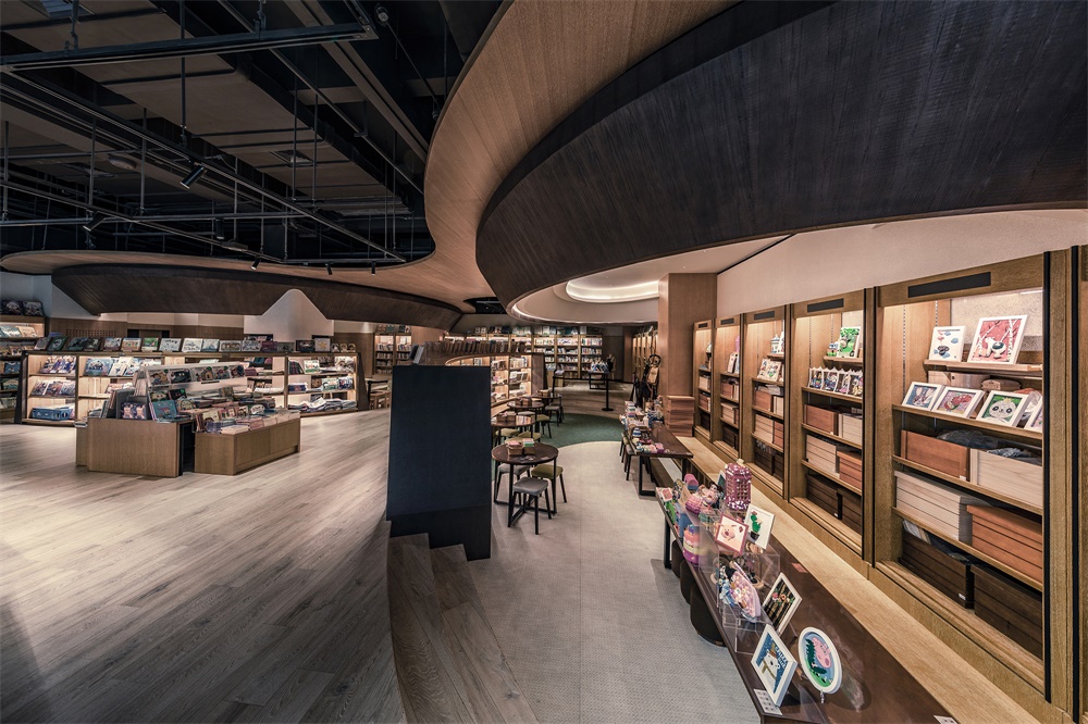
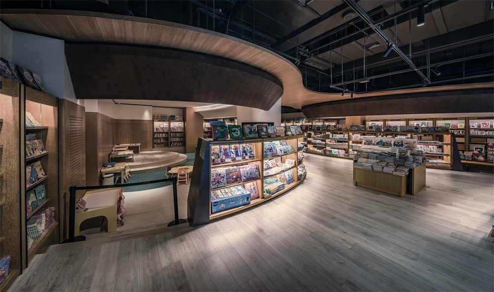
∇ 三樓兒童區視角 Kids’ book area on 3F
百米書牆構築商場標識唯一性 Long book walls: unique identifier of the mall
在主持設計師程瀚陞看來,要超越地域地段的限製,必須靠文化來使人彙集,因為文化本身沒有距離,能夠容納全民參與進而實現最大引流。商場因此化身為以藝術與文學為核心的知識殿堂,將書的主題貫穿於整個空間。
According to Han-Sheng Cheng, the chief designer, it’s imperative to depend on culture to go beyond geographical restrictions and gather people, because culture itself does not have geographical distance and can attract the participation of all people, thus maximizing the flow of customers. Based on such idea, the mall was designed to be a hall of knowledge, with art and literature as the core and the theme of “book” running through the entire space.
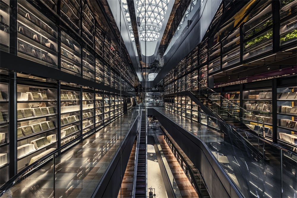
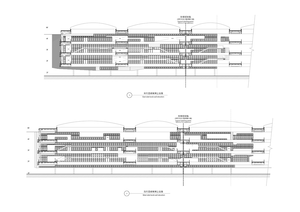
一樓到四樓,南麵延伸至北麵,在漫灑的天光映襯下,巨彙設計置入了兩道量體書牆,層高18米、全長240米的尺度為全中國之最,使喧鬧的商業空間卻有著殿堂般儀式性的感動與震撼。
Gonverge Interior Design embedded two book walls under the diffused natural light, which are erected from 1F to 4F and stretch from south to north. With a height of 18m and total length of 240m ranking top in China, the book walls give the busy commercial space a sense of rituality, which is striking and magnificent, just like a hall.
∇ 三樓挑空東麵視角 East view of 3F’s void area
∇ 三樓挑空區北麵視角 North view of 3F’s void area
以人為本,借由五感傳遞價值 People-oriented and delivering value through five senses
承載數十萬冊圖書的書牆,以鋼結構和透明玻璃為材質,除了視覺穿越,也讓光線自由漫射在挑空區域,與空間實體交迭出各種形式的語彙。閱讀者穿梭在書牆與挑空之間,成為這殿堂景象的一部分。
With hundreds of thousands of books placed in, the two large walls are constructed with steel structures and transparent glass, which enables people to see through and also allows the light randomly diffuse to the void area to interact with the spatial entities in various forms. Readers can walk between the book walls and void area, which becomes a unique scene in this hall.
近4萬平方米的空間內涵蓋藝術、人文、生活三大元素,將場景化閱讀與商業空間完美融合,營造出一個沉浸式閱讀情境。以美感為立基的情懷分享,也使這裏成為文創和設計師品牌進駐展示創意和理念的最佳平台。
The nearly 40,000m2 space combines the elements of art, culture and lifestyle, perfectly integrates scene-based reading and commercial functions, and creates an immersive reading environment. It’s a place enables sharing of feelings based on aesthetic, making it the best platform for cultural, creative and designer brands to display their creativity and ideas.
∇ 三樓挑空區南麵視角 South view of 3F’s void area
∇ 三樓挑空區西麵視角 West view of 3F’s void area
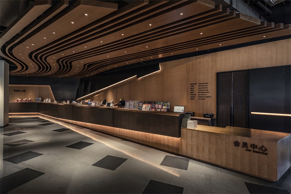
∇ 書店主收銀服務台 The bookstore’s main cashier counter
∇ 一樓挑空區北麵視角 North view of 1F’s void area
∇ 一層平麵分區圖 1F plan
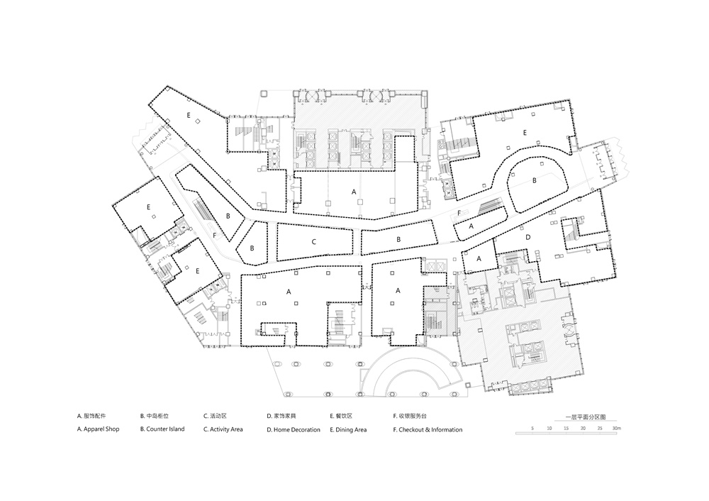
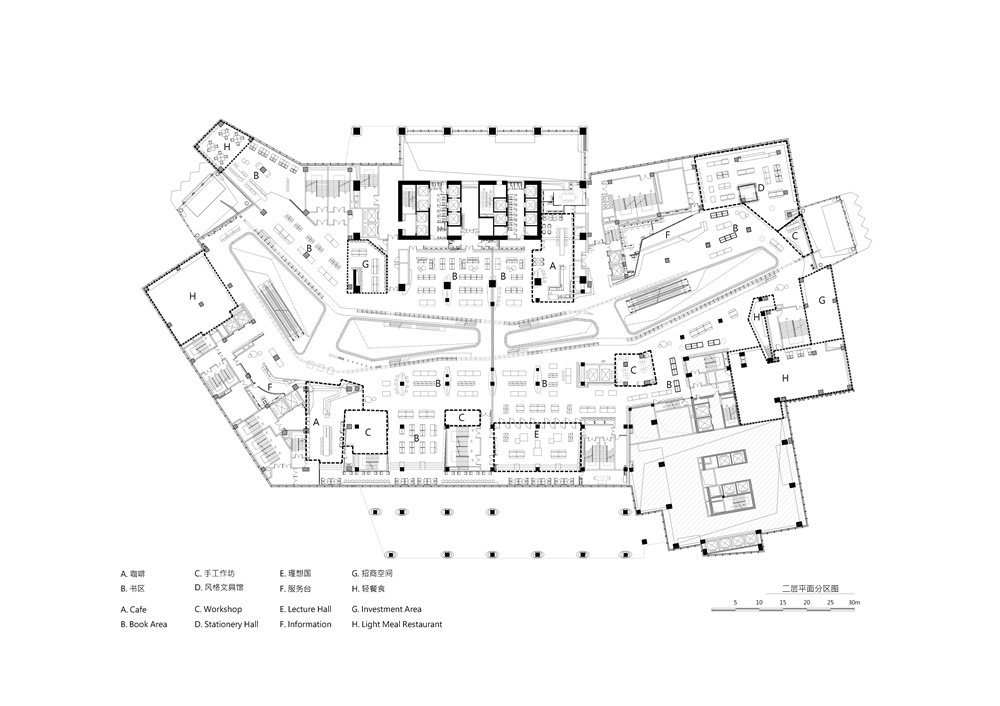
∇ 二層平麵分區圖 2F plan
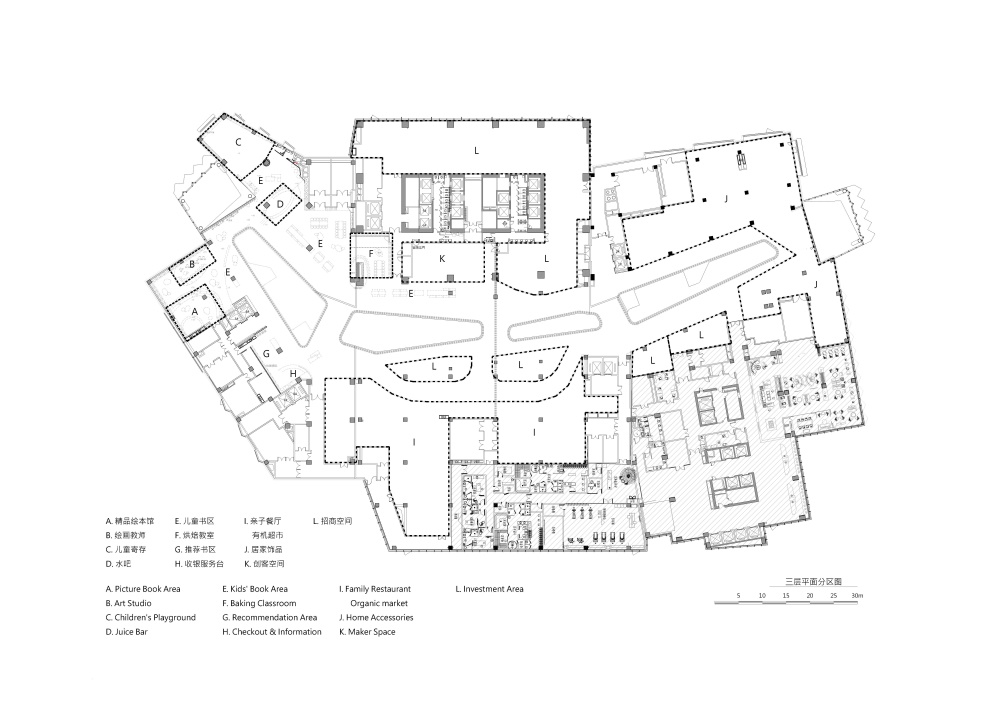
∇ 三層平麵分區圖 3F plan
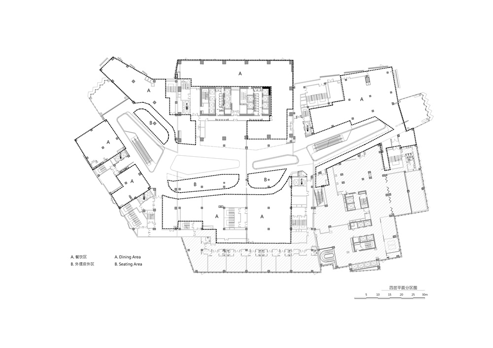
∇ 四層平麵分區圖 4F plan
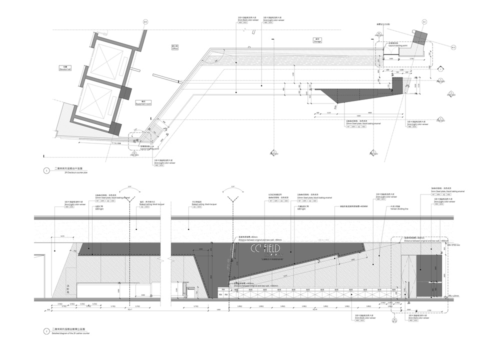
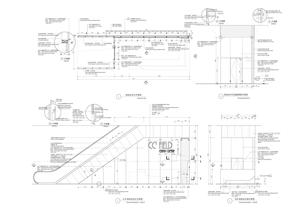
∇ 二層東南區服務台單元詳圖 Detailed diagram of the 2F cashier counter
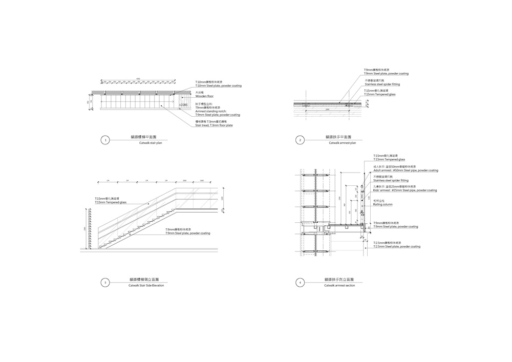
∇ 貓道樓梯詳圖 Detailed diagram of catwalk stairs
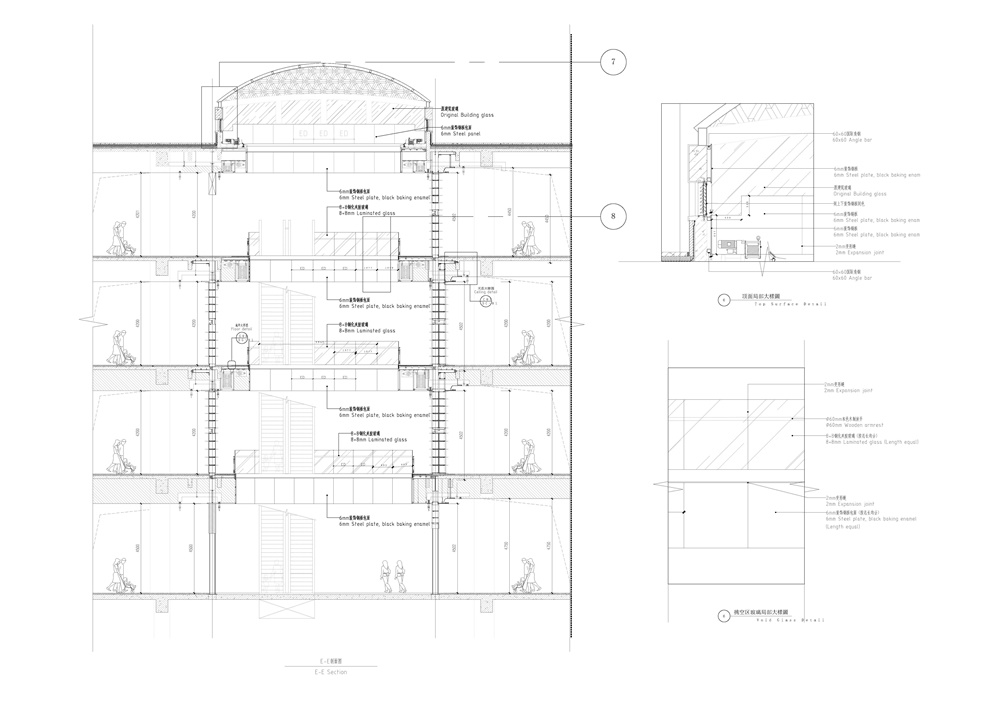
∇ 書牆立麵圖 Elevation of book walls
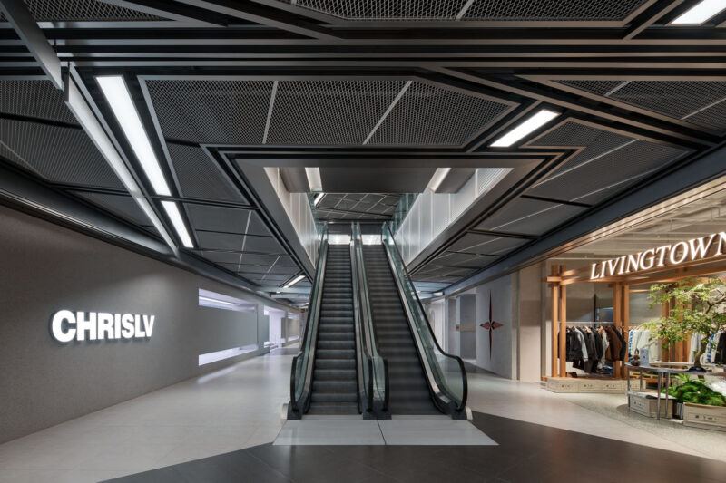
∇ 一層南北扶梯下服務台區 Diagram of 1F service counter area under the south-north escalator
完整項目信息
項目名稱:藍海風・漫巷
室內設計公司:巨彙設計有限公司(https://www.gonvergedesign.com/)
空間創作與商業企劃總導演:程瀚陞
設計師:呂欣璿、陳新強
項目地點:中國・西安
項目類型:文化商業綜合體(購物中心+書店)
項目麵積:36,000 m2
完工時間:2018.12
攝影師:金偉琦
Project name: LAFONCE・MAXONE
Interior design: Gonverge Interior Design (https://www.gonvergedesign.com/)
Spatial Design & Commercial Planning Director: Han-Sheng Cheng
Designers: Hsin-Hsuan Lu, Xin-Qiang Chen
Location: Xi’an, China
Project category: cultural & commercial complex (shopping mall + bookstore)
Area: 36,000 m2
Completion time: December 2018
Photographer: Weiqi Jin


