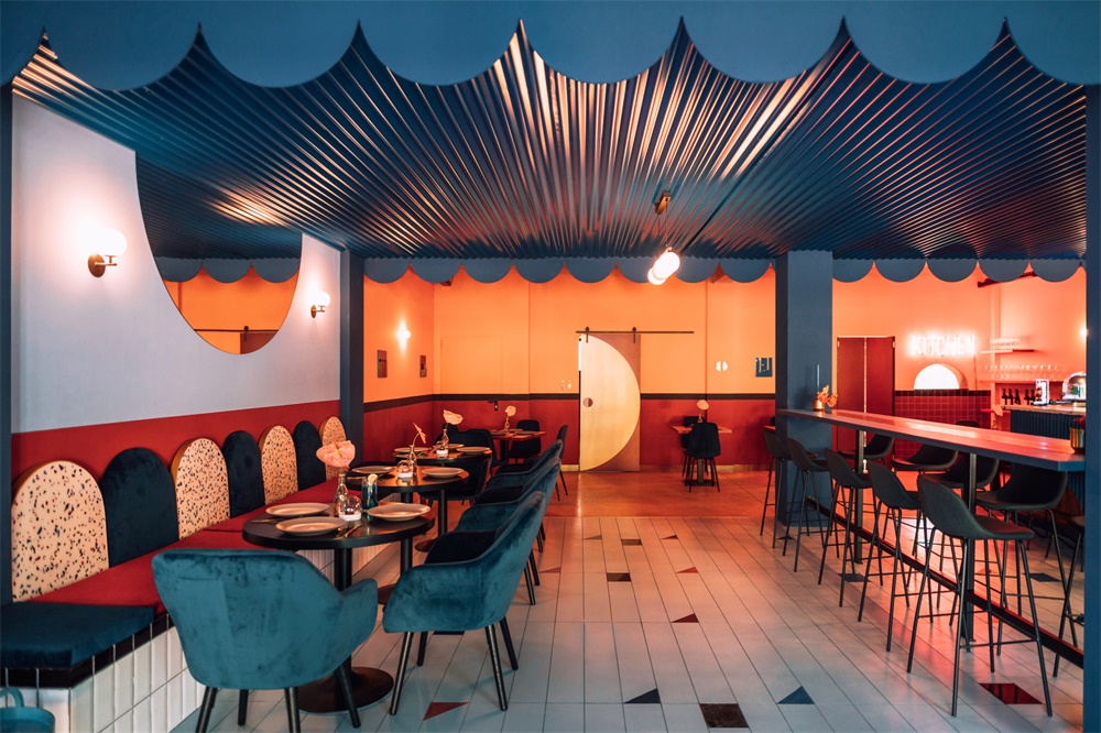
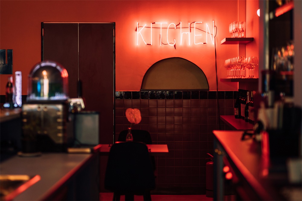
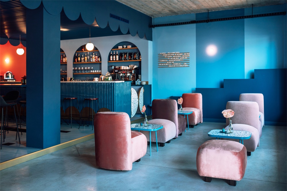
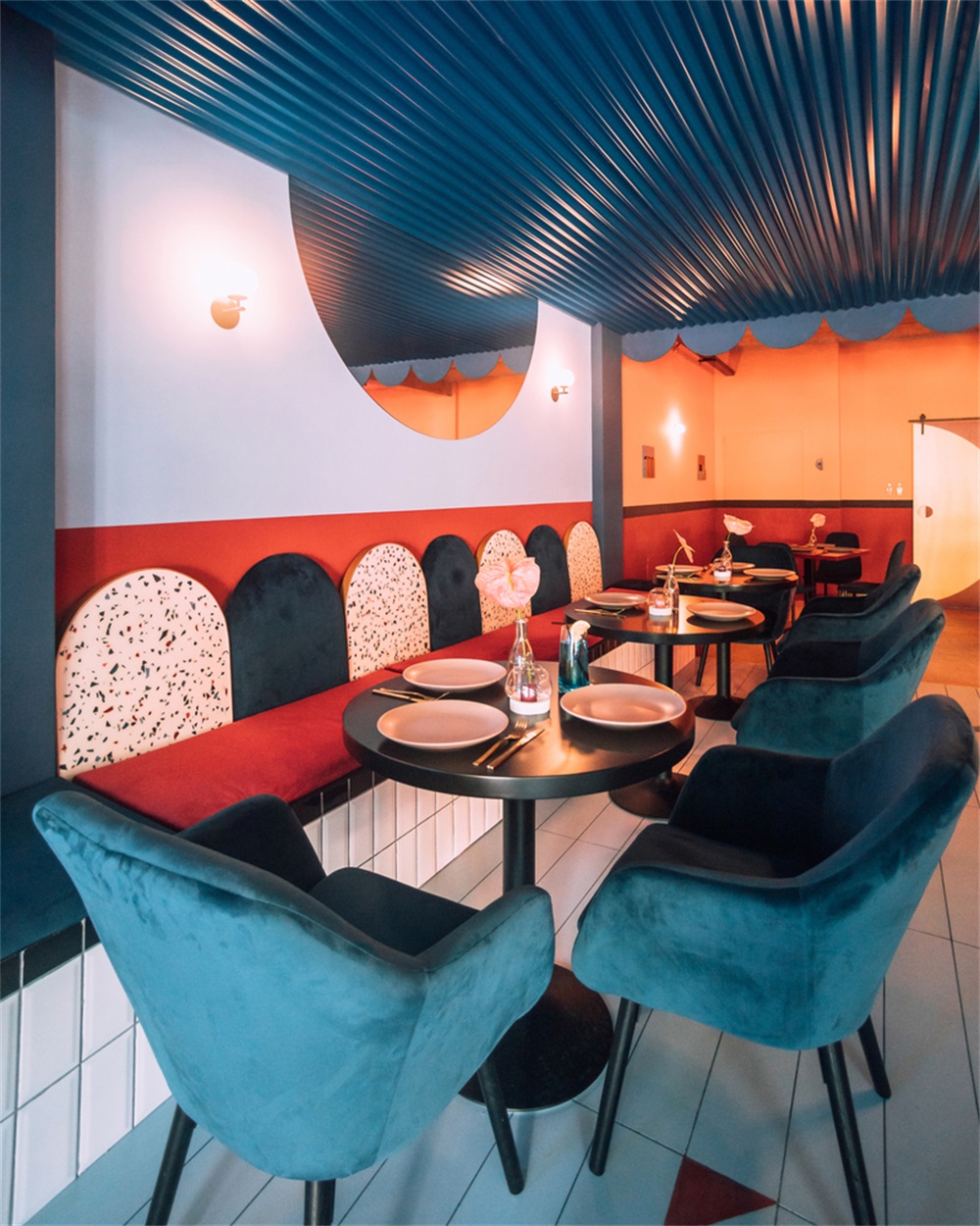
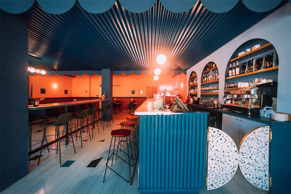
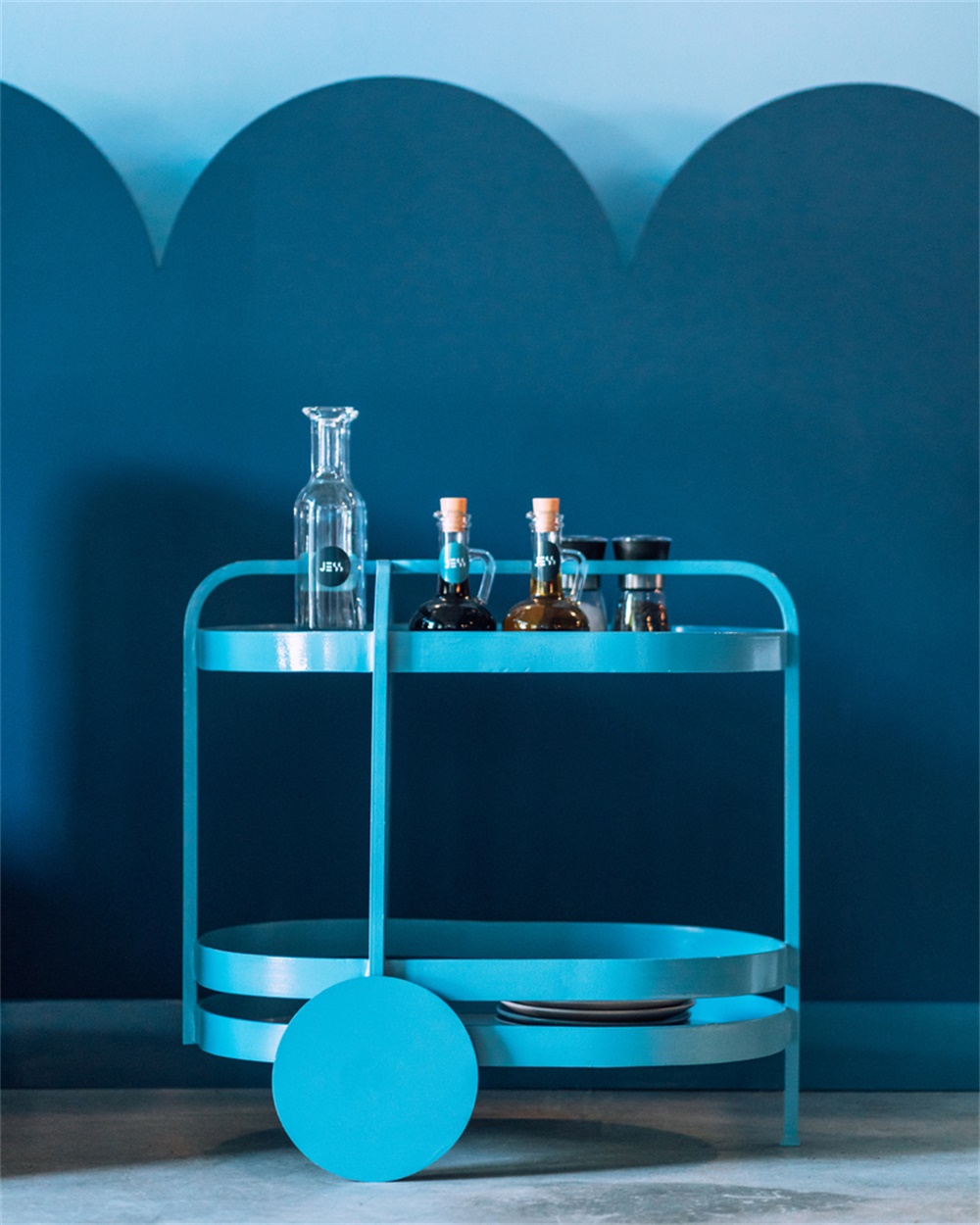
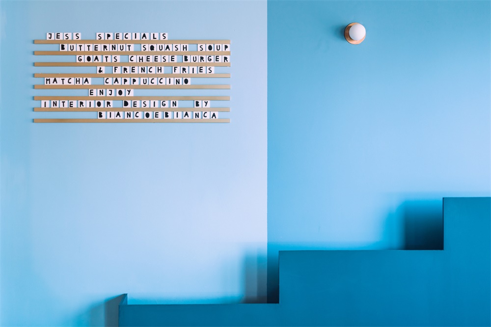
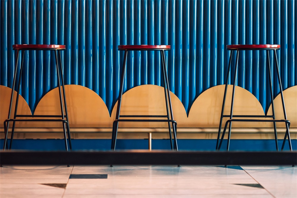
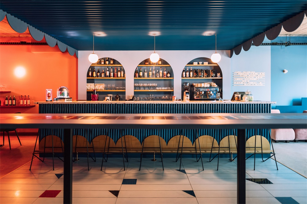
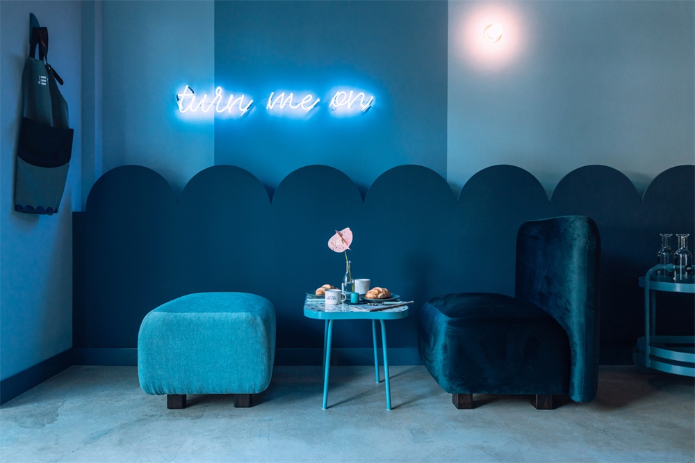
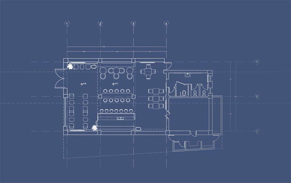
我們項目的概念遵循明亮和戲劇性的色彩對比,並具有強烈的幾何符號,不斷重複在空間中拋出不同的材料、形狀、顏色和物體。半圓形呈現在餐廳和室內空間的標誌中,這是Biancoebianca工作室的象征。盒子裏的盒子,打破了空間的規則,通過簡單的幾何圖形創建更多圖案,並使用更多顏色。設計風格開始變得更加戲劇化,而不是清新活潑。設計師使用了Wes Anderson調色板。
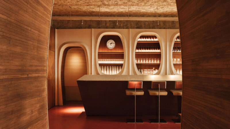
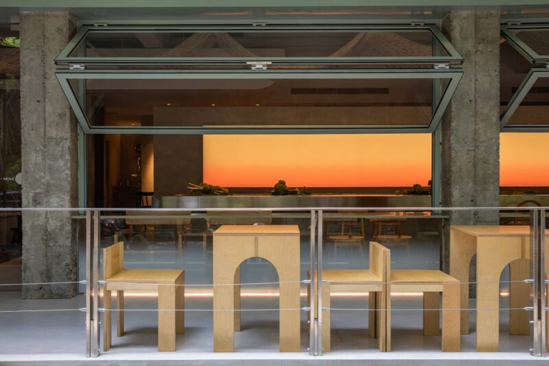
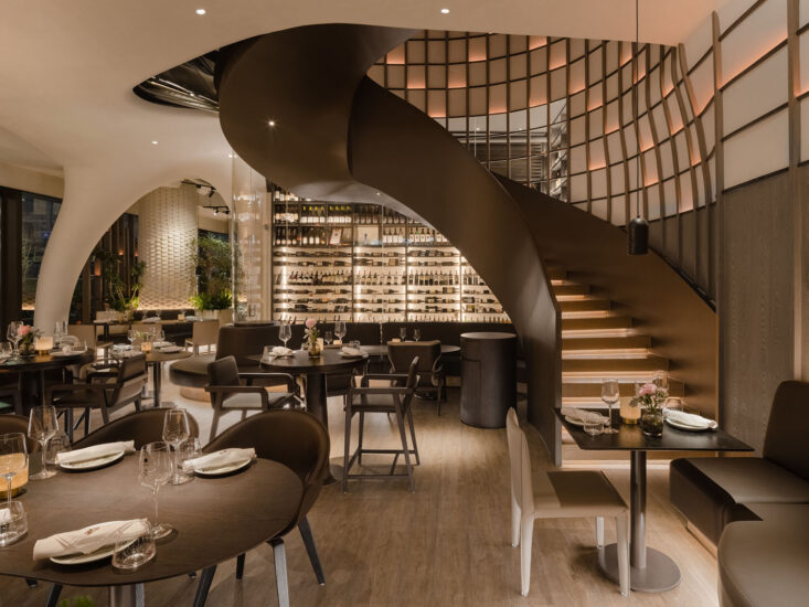
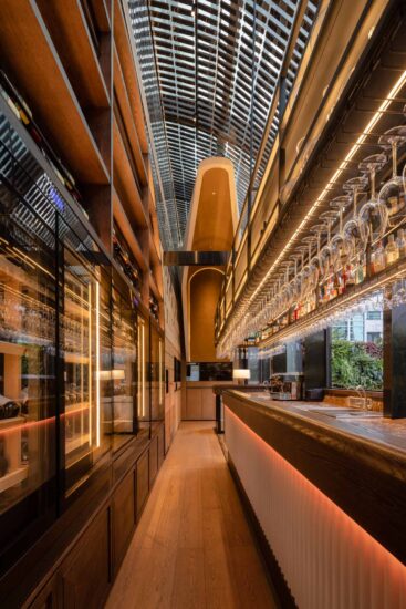
The concept of our project follows a contrast of bright and dramatic colors and has a strong geometrical symbol that keeps on repeating in the space to throw different materials, shapes, colors, and objects. The half-circle, present in the logo of the restaurant and the interior space, a symbol for Biancoebianca studio. Simple patterns and materials are combined to create a minimal but pop up the interior. The box in box effect, the wow factor of the restaurant breaks the rules of the space. There are more patterns created by simple geometry, more colors usage. The design style is starting to look more dramatic rather than fresh and bubbly. The designers used a Wes Anderson color palette.
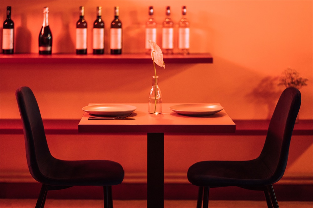
此外,還有一些神奇數字的重複,比如3個拱門,7把椅子,這些符號被設計工作室用作開發他們想象力的概念。Biancoebianca工作室在設計市場上以其幼稚而成熟的方式而引人注目。泡泡形狀、曲線、“美味”的材料混合在一起,創造出空間的氛圍。設計工作室表示,他們喜歡在室內創建快閃式,戲劇性的場景,因為他們可以隻使用一種顏色來玩不同的材質,但是有很多色調、圖案和紋理……然後是光和影的研究,它們更能改變空間。
Also, there are some repetitions of magical numbers like 3 arches, 7 chairs, symbols that the design studio used as a concept to develop their imagination. Biancoebianca studio is remarkable on the design market for their childish approach, yet sophisticated. Bubbly shapes, curves, “yummy” materials are mix to create the mood of the space. The design studio says that they like creating pop-up, theatrical scenes in an interior because they can play with different material using one color only, but many shades, patterns, and textures …And then comes the study of lights and shadows that changes the space even more.
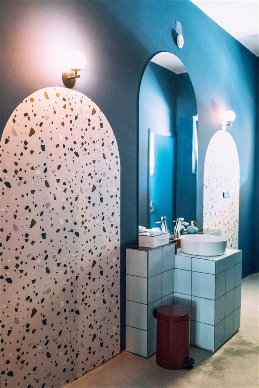
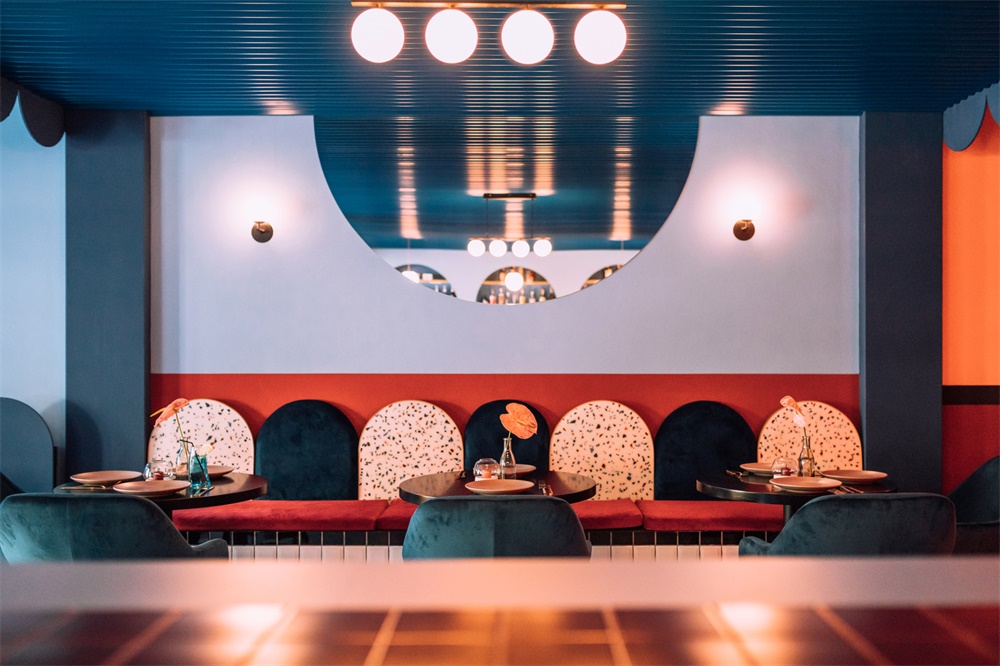
定製的樹脂–水磨石圖案是Jess設計的關鍵,它是由設計師將丙烯酸樹脂等材料混合在一起,一塊一塊地設計製作而成。Biancoebianca在餐廳的中心區域定製和設計了地板,在粗糙的混凝土地板和幾何色彩豐富的新圖案之間創造了180度的變化,給人一種中性的感覺。
The customized resin – terrazzo pattern is the key in the design of Jess, which was designed and made piece by piece by the designers mixing some materials, like acrylic resin. The same color shades are overused and used as tabletops, backrests, bar door details, and bar counter. Biancoebianca customized and designed the flooring in the center area of the restaurant, creating a 180 c change between the rough concrete flooring that gives it a neutral feeling and the geometrical, colorful new pattern.
主要項目信息
項目名稱:Jess Restaurant
項目地點:羅馬尼亞
項目類型:餐飲空間/餐廳
項目麵積:145平方米
完成時間:2019
設計公司:Biancoebianca
攝影:Raul Jichici


