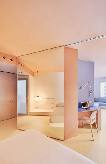
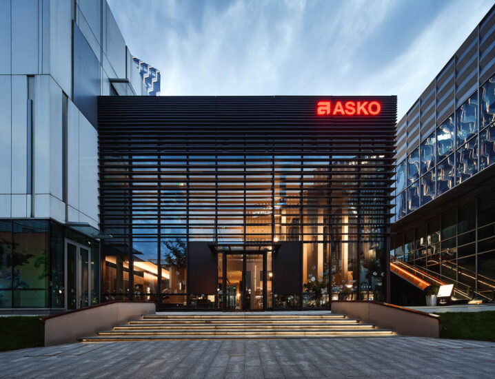
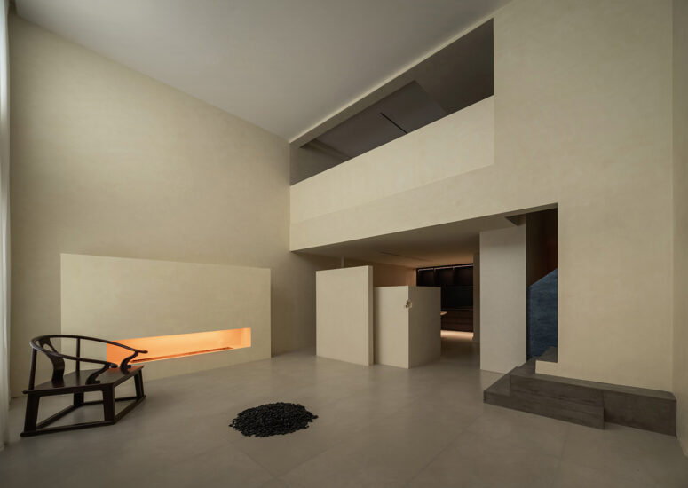
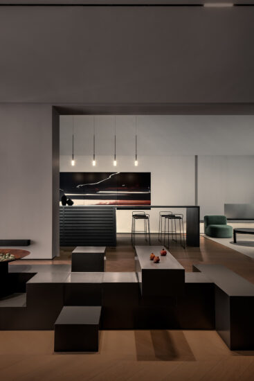
Vibia展廳位於巴塞羅那Gavà的新總部內,其展廳的設計以一係列的理念為特色,這些理念是我們與該公司幾次合作後發展而來的。其目的是創造一個地方,一方麵讓人回想起它在上一屆交易會上的企業形象,另一方麵與不同部門詩意而平衡的對話。
The design of the Vibia’s showroom inside its new headquarters in Gavà, Barcelona, features a series of ideas which we have evolved after several collaborations with the company.The aim was to create a place that, on the one hand, recalls its corporate image in the last trade fairs, and on the other hand, dialogues in a poetic and balanced way with different departments.
通過鋼結構和橡木的美學語言,主入口被粉紅色的格子包圍,通向一個開放空間,作為遊客的歡迎區。在接待處旁邊,樓梯旁邊有一根天然鋼製的扶手,扶手上布滿了led燈,標誌著穿過地板的路徑。
Through an aesthetic language of steel structure and oak wood, the main entrance enveloped in a pink-colored lattice leads to an open space that is used as a welcome area for visitors. Next to the reception, a handrail made in natural steel runs alongside the stair, enriched with LED-lighting to mark the pathway through the floors.
展廳從“照亮你的路”開始,位於空間的中心,遊客可以通過切片、品牌調色板等與產品進行互動。它的內部采用橡木材料覆蓋,旨在喚起品牌燈光的溫暖和親密感。
The showroom is set up from the volume “Light your way”, located in the heart of the space, where visitors can interact with the product through sectioned pieces, the brand’s color palette, etc. Its interior has been covered in oak wood evoking the warmth and intimacy of the brand’s light.
對於這個項目來說,我們使用了與短暫項目相同的建設性方法,例如格子圖案,用半透明織物製成的牆壁,窗簾作為裝飾元素。這樣,照明方案就有了足夠的獨立性,同時也創造出了個性十足的環境。展覽區與廚房和餐廳相連,在這裏,遊客可以體驗到更多的感官體驗。
For them, we used the same constructive methods as in the ephemeral projects such as the latticework, the walls made with translucent fabric, the curtains as decorative elements. In this way, lighting proposals have enough independence while environments with a great personality are created. The exhibition area is linked to the kitchen and dining room where to extend the sensorial experience of the visitors.
在沒有意識到它是工業建築的情況下,屋頂傾斜已被縱向主梁軟化。 圍繞著這個元素,金屬網格板被戰略性地分布在天花板上,方便地放置電氣裝置和懸掛燈具。
Without ever losing awareness that it is an industrial building, the roof inclinations have been softened by a longitudinal main beam. Around this element, metallic mesh panels are strategically distributed to order the ceiling and place the electrical installations and suspended luminaires easily.
樹木分布在整個展廳中,給空間和混凝土塊賦予了一定的戲劇性,它們的顏色與收藏品的調色板是相同的。
Distributed throughout the showroom, trees give a certain theatricality to the space and concrete blocks, painted in the same palette of colors that the collections, host a selection of ceramic pieces —by Gloria Carrillo from Pols Ceramic— inviting the visitors to adopt a slow perspective of the space.
完整項目信息
項目名稱:Vibia展廳
項目類型:商業空間/展廳
項目地址:西班牙巴塞羅那
項目麵積:1170平方米
完成時間:2019
室內設計:Francesc Rifé Studio
首席建築師:Francesc Rife, Sonia Pellicer
設計團隊:Sergio Alfonso, Bruno Benedito, Carlos Fernandez Saracibar, Patricia Guridi, Paola Noguera, Nuria Pedros, Stefanos Sideroglou, Jaume Abril, Mauro Federico Egea
攝影:Fernando Alda


