LOFT中國感謝來自 共向設計 的商業項目案例分享:
房子
那是一座四層高的廠房,毫無建築性可言,通常而言我們稱之為房子,而非建築,因後者總在某程度上帶點去功能化後攝人的特質,當然這些特質可以被稱之為藝術,文化,哲學……,或者那些還未被開拓的概念。總而言之,展廳就坐落在這平平無奇的房子的一層。然而我卻被這些所啟發和感動,因為如果這是由建築師設計出來的建築,便低調不起來了,因為他總會在上麵留下自己美麗的痕跡,當然我不評價“美麗”這詞的褒貶。
The project is a furniture showroom, situated on the first floor of a factory building in Shenzhen, China. The building, not designed by architects, is very ordinary and has a low profile, without any special features other than functionality. In general, architects usually tend to incorporate various non-architectural elements into the buildings they designed, such as artistic and cultural elements, which can bring out either positive or negative effects.
也許就是因為它隻是個房子,所有事情都變得簡單而清晰,有時在設計的過程中你需要這些特質,而不是總要把事情弄出個龍與鳳。這些簡單而清晰的特質指的是建築語彙中最基本的要素,開間,進深,梁柱,窗洞,門洞,秩序等等。就是這些要素,塑造出改造後的模樣,當麵向空間中那一排柱子的時候,一條有趣的廊道便知道它日後的誕生;當麵向那一排千篇一律的窗洞時,那一排富有秩序的“光盒子”才在日後成為獨特的室內外的媒介;當麵向柱廊兩側的開放空間時,那種感情才由目前的互不相幹變成日後的水乳交融。
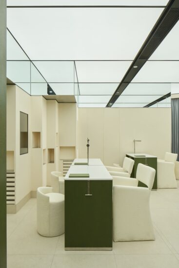
However, the ordinariness of this factory building greatly touched and inspired us as approaching the interior design. We respected and made the best of basic elements in the original architectural space, including beams, columns, window and door openings, etc., to reshape it. For instance, the row of columns was tactfully utilized to form an interesting corridor, and the orderly window openings were transformed into “light boxes” that connect the inside and outside space.
容器
在探尋基地的情況後,空間告訴我它想要成為的樣子,對,就是容器。它無意刻意為誰服務,也不想成為主角,它隻想安靜地處在一個平穩祥和的狀態,隻有這樣,它才能發揮它最大的能量來供給互相爭寵的家具們和來往的心靈無處安放的客人。
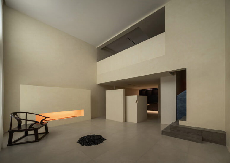
After visiting the site, we decided to make it be what it’s supposed to be: a container. With a tranquil and peaceful ambience, the space is not the “protagonist” but plays a supporting role of serving for the displayed furniture and visitors.
我問它為何想如此低調,它的回答讓我心碎卻同時又充滿慈愛,我想這也是這個時代我們最缺失的部分,它說,隻有觀眾才是主角,其他都是配角。配角所要做的就是調動一切手段來刺激觀眾的情緒,當然這些手段像風,看不見卻能感受。
It needs to be capable of stimulating visitors’ emotions in an invisible but perceptible manner.
轉換
也許隻有中國古代的文人雅士才從真正意義上看懂古典園林,隻因他們對造園的審美趣味和營造標準,試想在當今時代,又有誰能夠對待一草一木,一石一水有如此動人的描述和審美的要求,隻要翻開那些典籍,在庭院裏的魚林草石,都像人一般有著詳細的美醜標準。一塊石頭在具體的場景中適合以何種形態和何種質地呈現,都有著深刻的標準。
In Chinese classical gardens, forms and arrangement of details, such as a tree, a stone and water, all follow strict aesthetic standards.
我所關注的並非這些,而是潛藏在這些背後的時間與空間的線條。你可以在漫步在古巷當中,而不經意發現園林的入口,步入其中,方知其奧妙,隻有在空間非常狹小的地方,才能發現其背後的真諦,那是時間與空間的路徑。起承轉合,開合圍敞,一條停泊在湖邊的廊子,挑撥著湖麵與另一側的亭子的情感;廊子的盡頭,開始著另一個空間維度,在同一時空中,觀察到兩個不同的空間維度,像是在跨越時空的奧妙,抽離靈肉的覺悟。
Besides, another important feature of Chinese gardens is the skillful utilization of lines and transitions of space. If people step into a traditional garden, all the scenes cannot be seen at a glance. Nevertheless, twisting circulation routes and unexpected transitions of space help lead them to explore it, and present a series of perfectly composed and framed glimpses of scenery, such as a view of a pond, of a tree, of a rock, of a corridor, or of a pavilion, etc. Though seemingly disorderly, Chinese gardens are awash with order.
線條如同容器,一條無形之道,卻指引著來往客人的心靈。園林和展廳是一體的,他們有著同樣的想法,始與終歸於一點,過程則是潛藏在背後的線條所貫穿,其中包含多種的複雜性和矛盾性。
We think gardens and showrooms are very similar, both focusing on guiding people to explore the space and discover unexpected surprises. For this reason, we drew on the design of Chinese classical gardens, and worked to add subtle circulation routes to the interior, which link different areas in a unique way.
物質是有限的,也是客觀的。感知是無限的,也是主觀的。旨在秩序的置入和組織的重組,呈現一個短暫的時段,在主體的參與中,一係列的轉換泛起情緒的波瀾,無法平靜當中,不斷探尋和開拓,最終疲乏,情緒波動平息,隨意停歇,觀望,然而真正的探尋才開始,是在意識中的回放和定格,在迷惑中的突破與同步。一切歸功於秩序的偉大和時間的滲透。
Through incorporation of order into the space and reorganization of interior structures, we intended to create immersive and varying experiences for visitors. A series of transitions of space present different scenes, provide an interesting journey of exploration, and evoke change of emotions. It’s a pure space, and what make it unique are the subtle order and lines.
∇ 平麵圖
完整項目信息
項目名稱:華意空間展廳
項目地點:深圳市龍崗區浪背第六工業區18號
設計麵積:1178㎡
竣工時間:2019年4月
硬裝設計:共向設計
軟裝設計:共向美學
主要材料:灰色石材、肌理塗料、木飾麵、木地板、黑鋼
企業網址:www.cdd-china.com
項目攝影:張超


