親子餐廳作為近年來新興起的餐飲空間類型,更多地局限於兒童遊樂場附帶用餐這樣的功能 。旨在為兒童建造另一個與父母互動的場所。古魯奇與維塔蘭德合作的親子餐廳,卻將聚焦放在為了照顧孩子無暇顧及自己生活,更遑論與青春年少時的朋友安安靜靜約餐飯的“父母們”身上。然而當約局變成約“孩子局”似乎一切問題就迎刃而解。
In recent years, Parent-child restaurant has become a new type of dining in Beijing, with more restaurants serving the purpose of including children’s playgrounds, creating an environment for children to connect with their parents. Golucci’s Parent-child restaurant , cooperated with the Beijing local brand Vitaland, focuses on parents who would like to have a quiet meal with their friends, but at the same time, take care of their children. However, when your dates with friend become a “children’s date”, it seems like all the problems are easily solved.
“樹屋”的概念貫穿了整個餐廳的空間設計,一個個錯落在空間裏的小房子構成了不同的兒童體驗空間,與就餐的大堂形成半圍繞的結構,空間疏密相互呼應。
The “treehouse” concept runs through the entire space of the restaurant. The small houses that are scattered around the space compose different experience spaces for children, forming a semi-circular structure with the dining area, while the spaces are connected to each other.
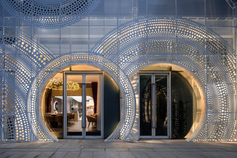
蔬菜與水果是餐廳的vi形象主體。一棵巨大的西蘭花在入口處以歡迎的姿態迎接到訪的客人,原本是大多數小朋友最“畏懼”的蔬菜,一下子活潑可愛起來。穿過白色的的鞋櫃與展示架組成的玄關,跨過拱形的門洞就算是正式進入到這個“兒童與父母的樂園了”。
Vegetables and fruits are the main form of the restaurants VI image. A large broccoli greets the visiting guests at the entrance with a welcoming gesture. It was chosen as broccoli are often interpreted as the vegetable that “scares” children. Through the white shoe cabinet and display stand, the arched door greets you into this amusement park.
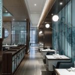
進入餐區,左手邊便是主要的就餐大堂,白色的空間基調配上天花漂浮的圓形光圈燈具,有一種天空中的夢幻。大廳的中段設計了折疊門,需要辦派對的時候還可以一分為二兩個空間。
而餐區的右邊,以框架構築的小屋為界限,分隔了餐區與兒童體驗的區域,各種不同場景的體驗活動,令成年人也羨慕不已。
On the left hand side of the dining area, it is the main dining lobby. The white space is matched with the circular lights floating in the ceiling, giving an impression of a dream. The middle section of the hall is designed with folding doors, which could be used when you need to divide the large room into two.
On the right side of the dining area, there is a hut built with frames, which separates the children’s play area and the dining area. The various arenas of the play area, is also envied by adults.
也許是在某個周五的下午,已為人父母的你我約上一杯下午茶,陽光透過窗邊梧桐樹落在桌麵。目光的盡頭是玩鬧的孩子,一切在現實與青春年少的回憶間穿梭,時間的軸線就這樣被打亂。
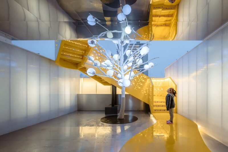
大廳的盡頭便是整個空間最最有趣的樹屋聚落。層錯的小屋彩色的玻璃窗,玻璃的顏色不僅來區分空間又與視覺係統相呼應。下層的小屋是包廂、兒童的休息室。而樓上層高不足1.5米的空間被設計成為又一不同主題的兒童體驗空間,這個層高對於成年人而言需要彎腰才能進入,但是對於孩子而言卻是恰恰合適而又充滿安全感。
Maybe on a Friday afternoon, You and I could have a cup of tea together, while the sun shines through the window and onto the phoenix tree. At the end of our gaze is a playful child, everything transporting back and forth between reality and youthful memories, while the axis of time gets disrupted.
At the end of the hall is the most interesting part of the entire space. The huts are covered in stained glass windows. The color of the glass not only distinguishes the space but also reflects the Brand vision system. The lower level cabin is a private dining room for children. The space up to 1.5 meters is designed to give a different experiences for children. The height of this space requires adults to bend over in order to enter, which creates a sense of security for children.
兩層的樹屋之間也充滿著空間上的互動。從右手邊的樓梯向上走,樓梯的內側邊是孩子們最喜歡球池。更多的小朋友會“半途而廢”還沒有爬上樹屋便順著設計在樓梯中斷的滑梯入口滑進球池裏。如此反複上上下下樂此不疲。也有些孩子首先就被樹屋吸引,一鼓作氣爬上樹屋,發現裏麵是一個充滿驚奇的新世界,剛從公主主題小屋穿過有來到了全是超級英雄的空間,再往前跑去,竟然又有旋轉的樓梯可以向下。
順著旋轉樓梯向下,剛剛落地,竟然看見才分開的爸爸媽媽正在熱火朝天的聊天吃飯。恍然間,一場新的探險旅程就又要開始了。
The two-story treehouse is filled with spacial interaction. As you go up the stairs, on the right hand side you can see a ball pit. Most children will not even climb up into the treehouse and instead go down the slide at the entrance. This constant up and down does not make them tired. On the other hand, some children will first be attracted to the treehouse, and they would climb into the treehouse and find out that it is a new world full of surprises. It goes from a princess-themed hut, to a space full of superheroes, and when you run forward, there is even a spiral staircase that leads you down.
When you go down the spiral staircase, you can see your mom and dad eating and chatting. Suddenly, a new adventure will begin again.
古魯奇所設計的維塔蘭德親子餐廳,並不走當下流行的誇張設計的網紅路線,清新如天堂的風格考慮更多的是小朋友的使用,而不是為了讓父母拍照。在空間上設計師將目光投放在了孩子本身對高高低低的可以攀爬的空間比對五顏六色的地方更感興趣的天性上,將空間生動有趣高低錯落起來,試圖營造出能讓孩子們自娛自樂“野蠻生長”的空間,也好讓父母們偷得浮生半日閑。
Golucci’s design of Vitaland kid restaurant does not follow the popular route of exaggerated fancy designs. The fresh style is more about the friendly children’s entertainment than to take pictures. In this space, the designer puts his perspective on the nature of the child’s own space that can be climbed more than the colorful place. It makes the space more interesting, and trying to create a way for children to use the space for entertainment is also good for parents to steal a half-day leisure.
∇ 平麵圖,the floor plan
完整項目信息
項目名稱 : 維塔蘭德親子餐廳
設計師(公司) : 古魯奇公司
設計總監 : 利旭恒
項目設計 : 許嬌嬌
設計團隊 : 利旭恒 ,許嬌嬌,張曉環,趙爽
客 戶 : 維塔蘭德親子餐廳
項目位置 : 北京
項目麵積 : 500平方米
完成時間 : 2019年06月
攝 影 : 魯魯西
文字: 朱圓欣
Project Name: Vitaland kid restaurant
Design company: Golucci Interior Architects
Director: Lee Hsuheng
Design team: Lee Hsuheng, Xu Jiaojiao, Zhang Xiaohuan, Zhao Shuang
Client: Vitaland kid restaurant
Location: Beijing, China
Built area: 500m2
Completion (date): 2019.6
Photographer: Lulu Xi
Text : Zhu Yuanxin


