LOFT中國感謝來自 一持工作室 的建築改造項目案例分享:
始源 ORIGIN
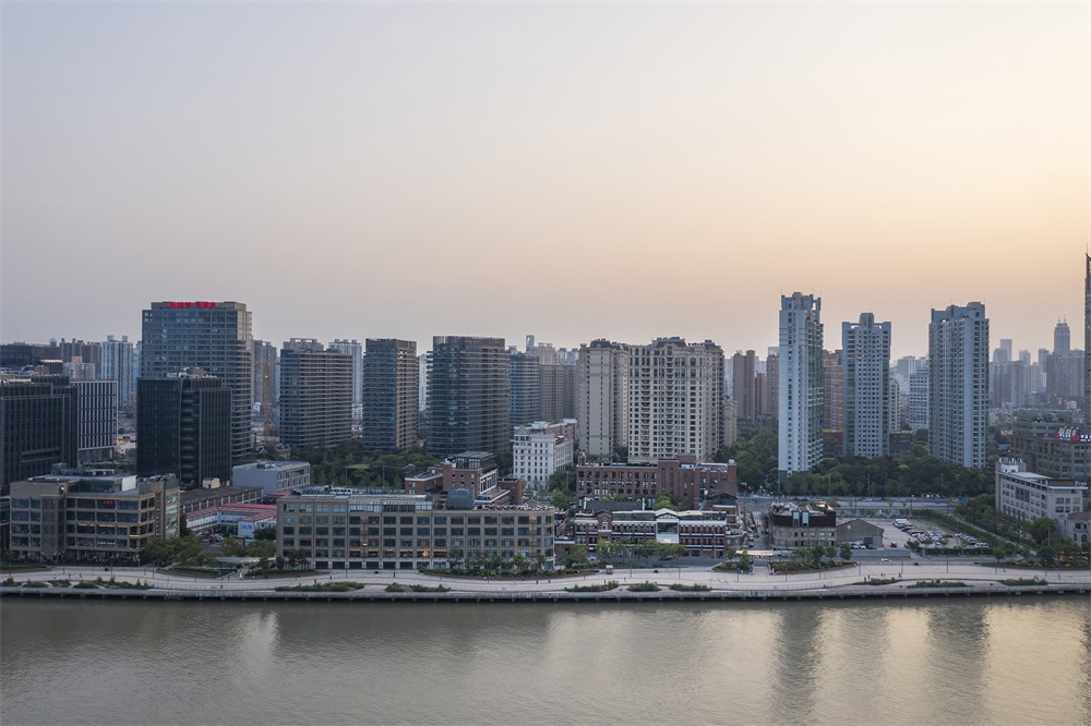
許多老上海的記憶裏,都曾有這樣一句話流傳:“先有十六鋪,後有上海灘。”臨江弄堂,老式石庫門建築,黃金榮杜月笙的糧食倉庫……上個世紀流傳在上海灘的傳奇故事,總能在這裏尋覓到蹤跡。時至今日,黃浦江水仍奔流不息。舊時的繁盛浮華已隨著時代更替而落幕。早年名為十六鋪的老碼頭,還靜靜地守在那裏。
The Shiliupu Dock of Shanghai was a place enriched fully with the Shanghai Bund history. It features numbers of longtangs and traditional Shanghainese Shikumen buildings where one can track down all the historical stories happened in this once prosperous era.
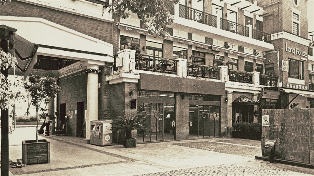
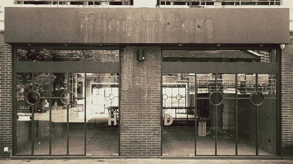
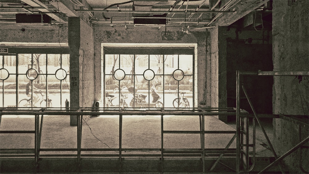
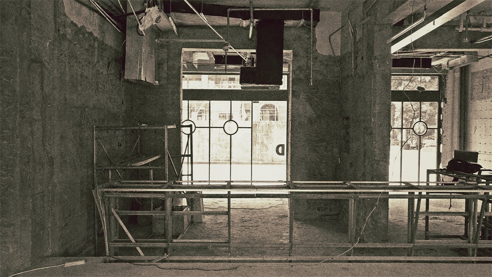
∇ 傾月翻新前的外立麵(前身是Haggen-Dazs) Front facade of the MOONCRAFT site before renovation (formerly Haggen-Dazs) © o&o studio
2018年,曆經過一輪翻新工程後,各種餐飲、酒吧、咖啡店紛紛落戶於此。老碼頭,以一種全新的姿態重歸大眾視野,但承載了無數記憶的舊時光,也理應被留下來。
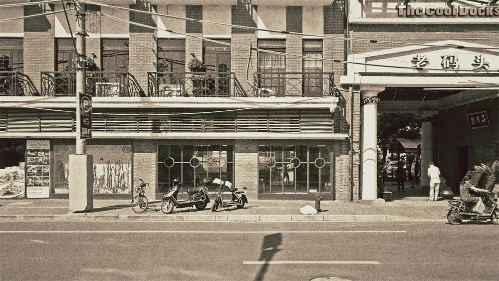
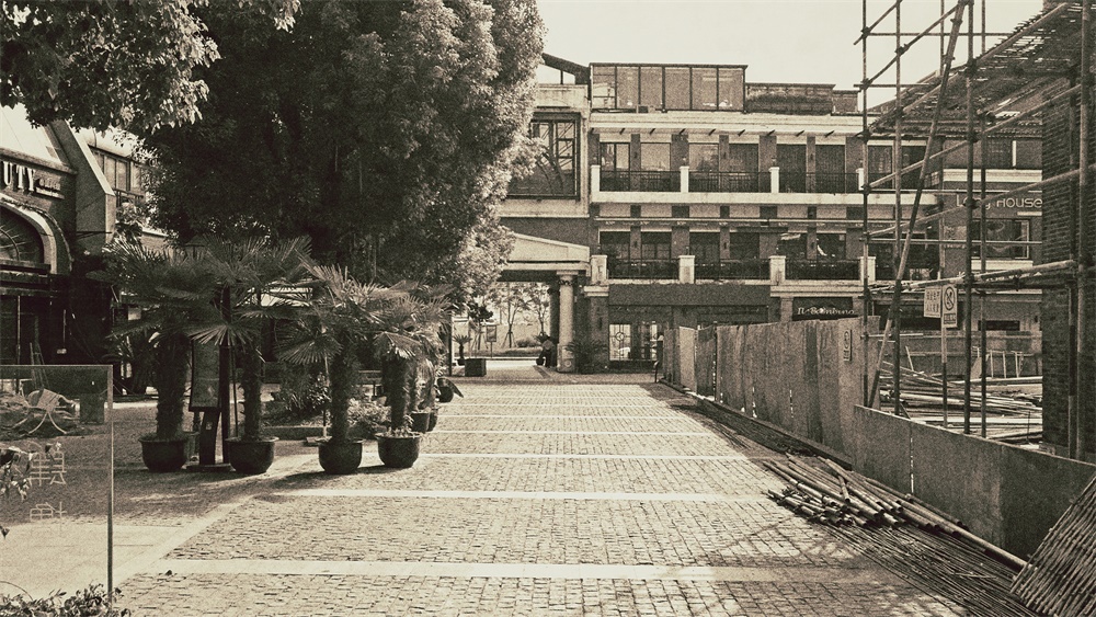
Located on No.505 Zhongshan South Road, the Cool Docks was originally a grease factory in the old days. Once a top ten creative hubs in Shanghai, it was renovated in 2018 and is now attracting new restaurants, coffee shops and bars to settle in. MOONCRAFT, among one of them, is launched at this celebrated spot on the South Bund.
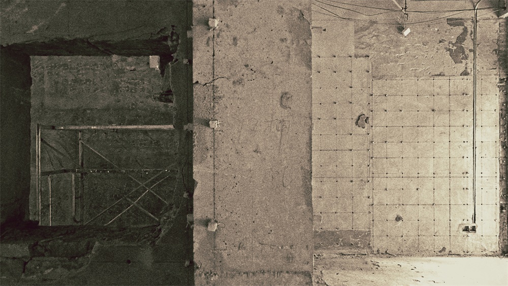
∇ 傾月翻新前的外立麵 Rear facade of the MOONCRAFT site before renovation © o&o studio
項目落址中山南路505弄——前身是上海油脂廠,曾經的十佳創意產業園。選擇這裏作為第一家酒吧的據點,業主本身寄予了很高的期望和要求。在這個麵積僅有130平米的空間裏,業主希望盡可能將手工啤酒酒吧、威士忌酒吧、餐飲區和調酒機器人等多元的業態納入其中。對此,一持工作室準備從兩個層麵來進行創作。
Choosing the Cool Docks as the first boutique bar’s location, clearly the Client has high expectation and requirement. From the design perspective, o&o studio set out two key directions in creating MOONCRAFT.
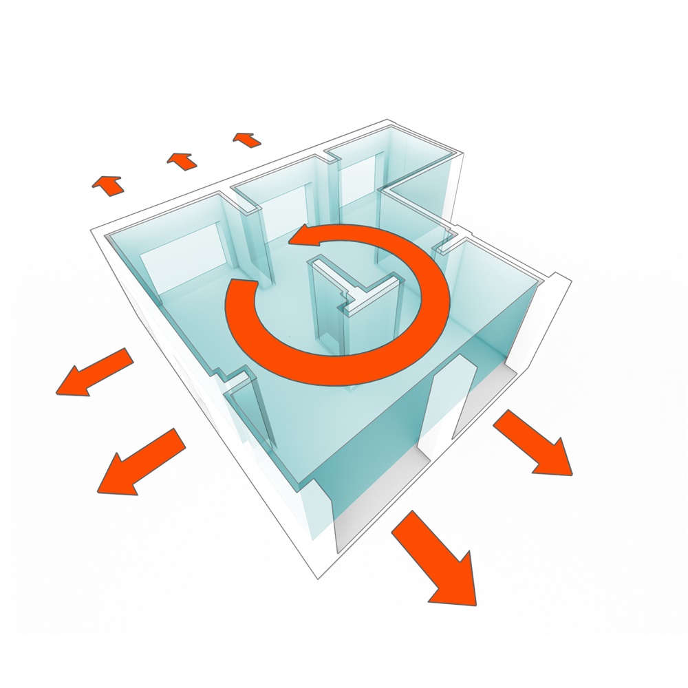
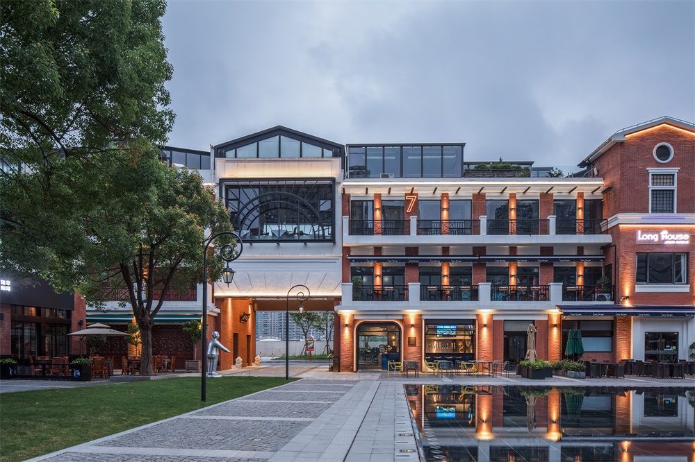
原店鋪空間位於園區外馬路出入口側,占據了三個連通的地麵單元,兩個主要外立麵分別麵向園區的廣場噴泉和外馬路/南外灘。在空間布局上,一持進行了深入研究,思索如何將眼前這個無法回避的不利結構,化解為有利於空間表達的規劃。
First of all, MOONCRAFT occupies three connecting ground level units right next to the Cool Docks Wai Ma Lu entrance, with dual aspects facing the Cool Docks central plaza and water feature, and the South Bund on the opposite side. Although the total area is a merely 130sqm, the Client requested a variety of functions to take place within it. This includes hand-crafted beer bar, whiskey bar, restaurant, and a rarely seen robotic bartender. In regards to the spatial arrangement, this is something important for o&o studio to look at, especially on how to absorb and make good use of the existing structure and give the units a new lease of life.
除此之外,運船、碼頭、江水這些來自上海灘的豐富元素,也讓一持為這間酒吧賦予了最初的想象:夏日夜晚,踱步到江邊小坐片刻,眼前是霓虹掩映下的粼粼江水,剛好可以飲下一杯月光。
Secondly, the site is packed with references such as the river, the docks and the warehouses which also became the first “ingredients” of the project’s design, while the Shiliupu era should also be remembered. With these inspirations, o&o studio is determined to craft a booze place that is filled with “moments”.
∇ 今天的南外灘,三層高的紅磚頭老碼頭坐落在黃浦江旁 Aerial Photo of Today’s South Bund, with the 3 storeys high red brick Cool Docks sitting adjacent to the Huangpu River © Tian Fang Fang
品牌 BRANDING
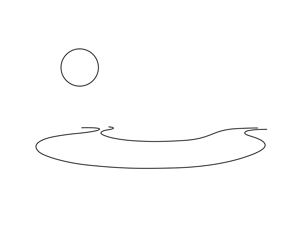
一輪圓月高懸於空中,波濤湧動的黃浦江順勢彎成了一個U型。寥寥數筆勾勒而成的極具時光隱喻的畫麵,正是一持工作室結合了酒吧所有設計元素,完成從店名、標識、品牌到建築、室內設計的起點。
The branding of MOONCRAFT integrates all the design elements as one identity. From the bar’s name to its logo, as well as the architectural and interior design, they share the same concept throughout, all by o&o studio.
何為“傾月”?
以黃浦江輪廓做杯,明月不經意掉落在酒裏,輕晃酒杯喝到微醺,人和月一起傾倒。在這樣一個令人傾情訴月的場所,也可以將上海灘的傳奇故事融入杯中同嚐。
Imagine the full moon hanging above the Huangpu River, together with the river’s geometry that forms a glass that hold some of the richest history of the city with the yellow lunar gradually dipping into the glass, form the logo of MOONCRAFT. The name “MOONCRAFT” stands for a place that holds moment of dialogue, enjoying the best craft beet in town under the moon and starry sky adjacent to the Souths Bund.
∇ 傾月品牌的概念 – 高掛黃浦江外灘上的圓月 Concept of MOONCRAFT’s branding – Moon hanging above the Huangpu River at The Bund © o&o studio
∇ 傾月標誌的設計概念 Design Concept of MOONCRAFT’s Logo © o&o studio
塑造 CRAFTING
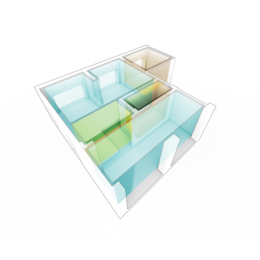
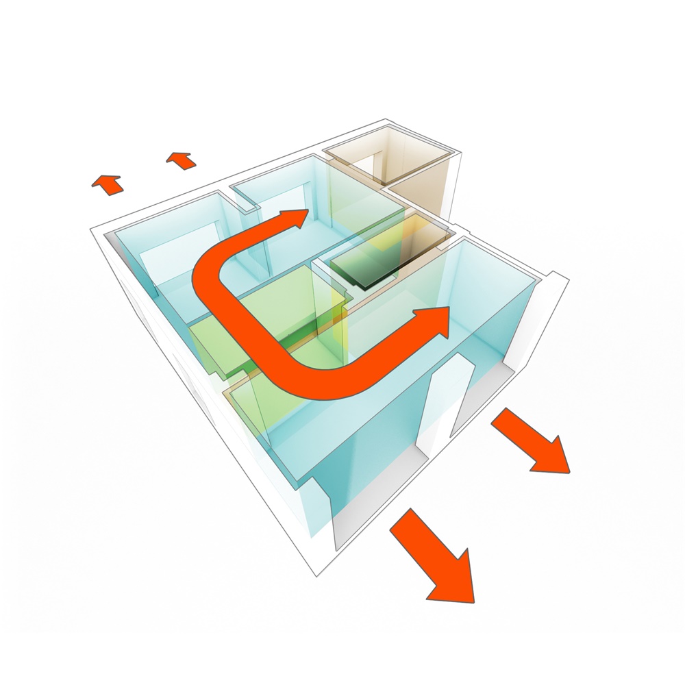
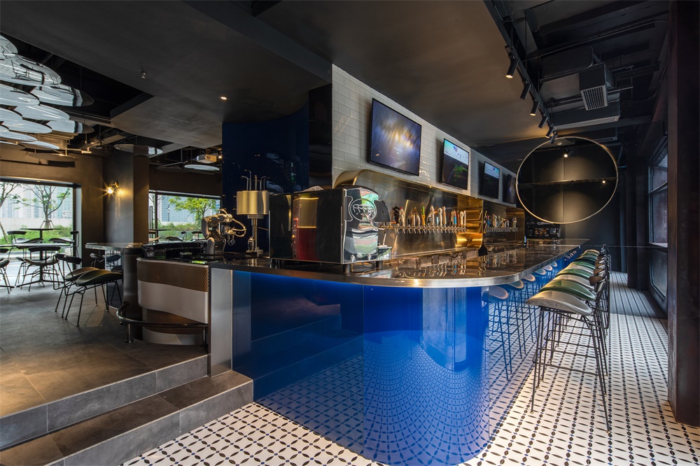
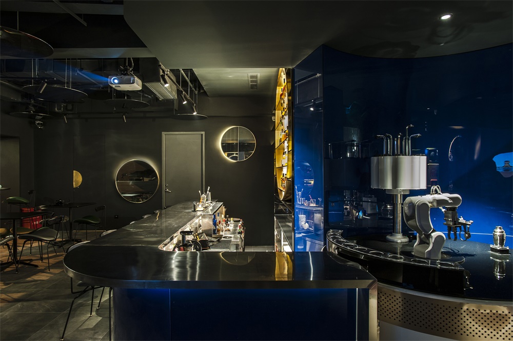
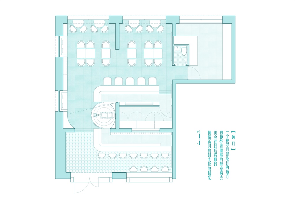
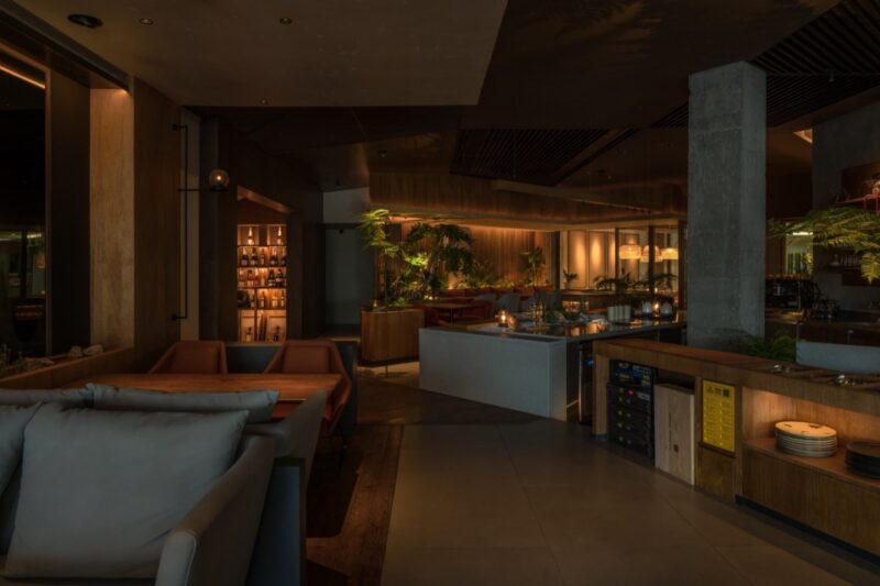
傾月內部主要分為三個區域——手工啤酒吧,威士忌酒吧,機器人調酒區。一持利用了一個U形空間巧妙地連通起店鋪兩端的啤酒和威士忌酒吧,啤酒的冷庫室和現有結構正好也可以隱匿其間。作為傾月的重要賣點,調酒機器人被安置在U形空間的轉彎處,能兼顧到坐在不同區域的酒客。
MOONCRAFT is zoned according to three key functions and features – hand-crafted beer bar, whiskey bar, and the robotic bartender. Considering the existing structural columns and sheer walls, o&o studio designed a U-shaped bar counter to associate the spatial relationship between the two bars. The U-shaped counter also “absorb” the existing sheer wall and by the making use of it, a hidden air-conditioned beer storage is formed. In-between the two bar counters found the robotic bartender which falls under most eye sights of the customers from both bar areas.
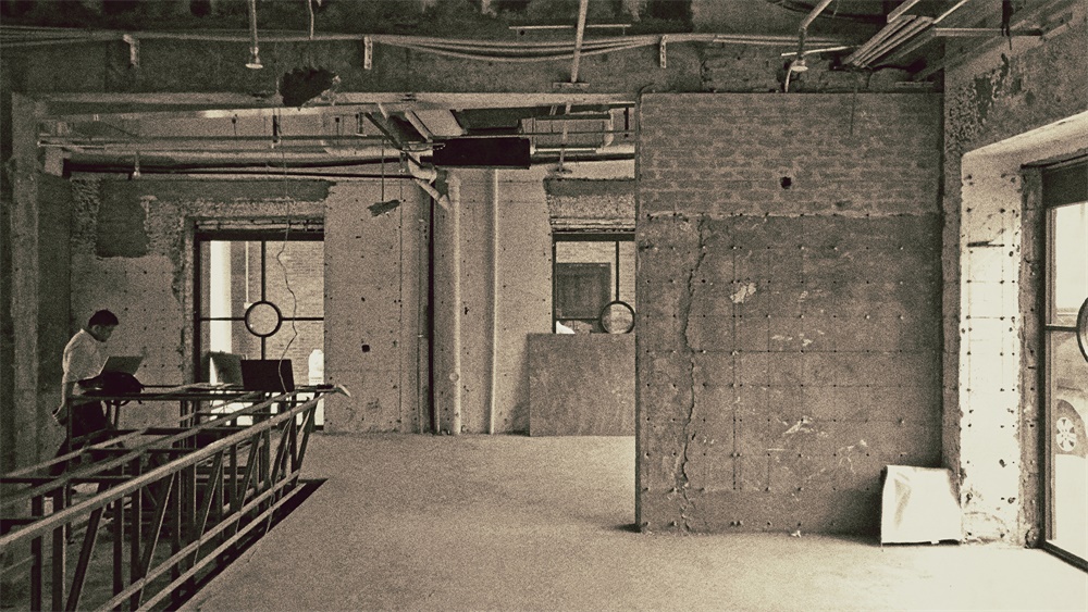
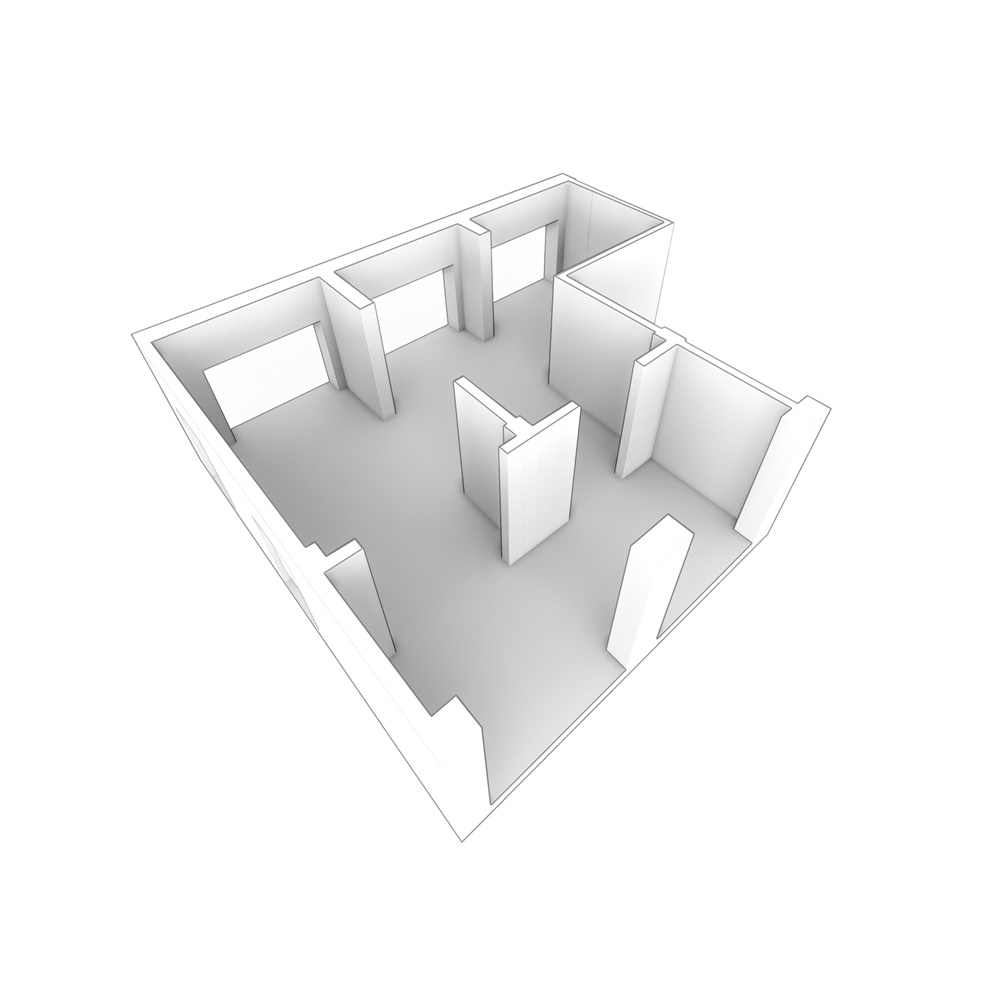
∇ 現有結構 Existing Structure© o&o studio
∇ 三個相連單元形成一個空間個體 Connecting three units as one single space© o&o studio
∇ 欠缺空間感,三個店麵也是過多 Lack of sense of space and overloaded with three shop fronts© o&o studio
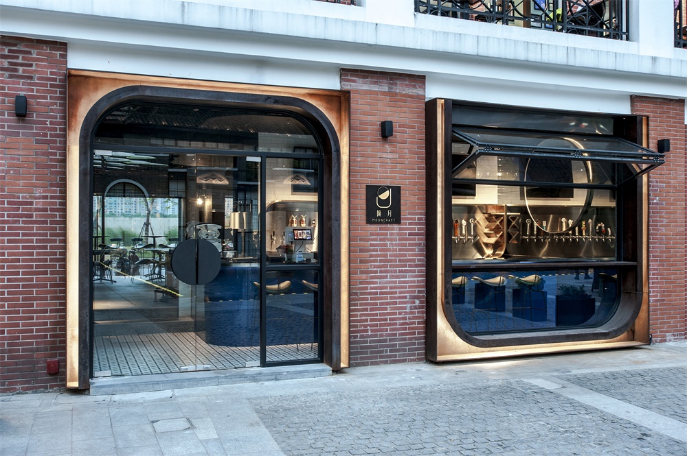
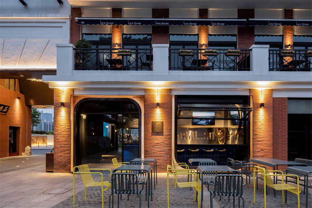
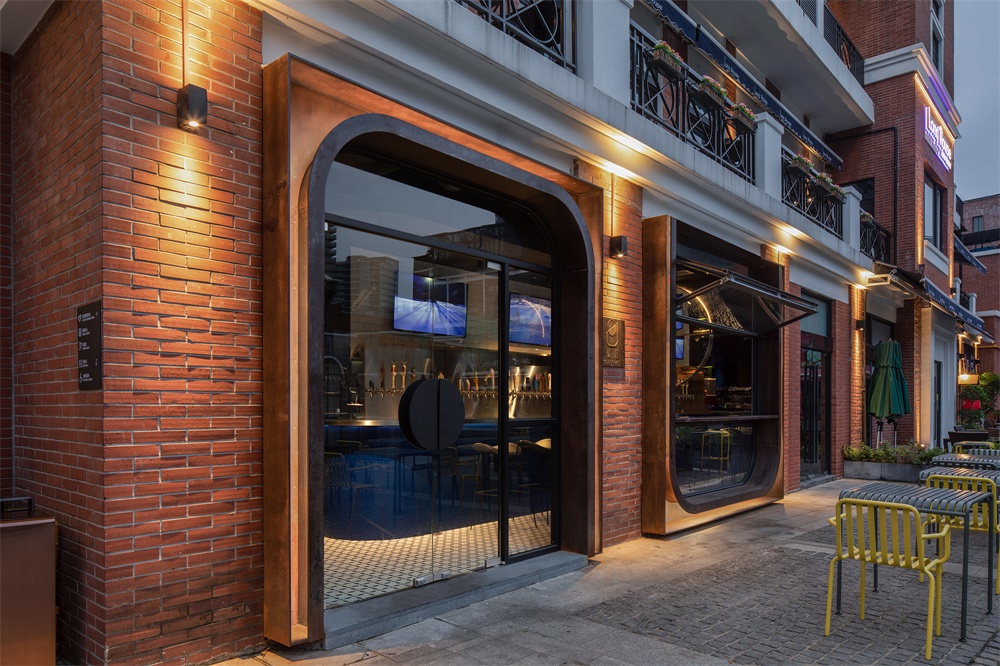
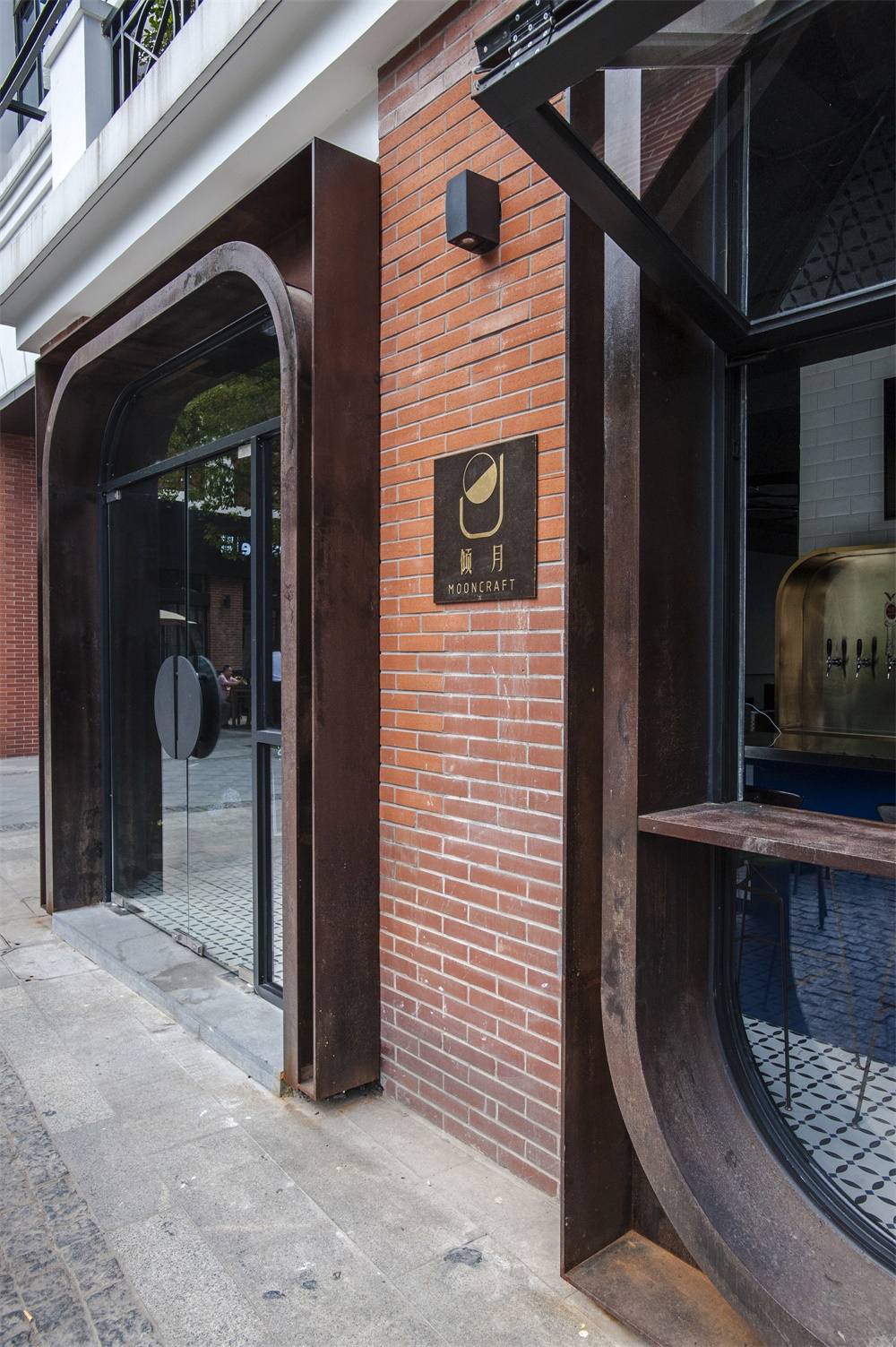
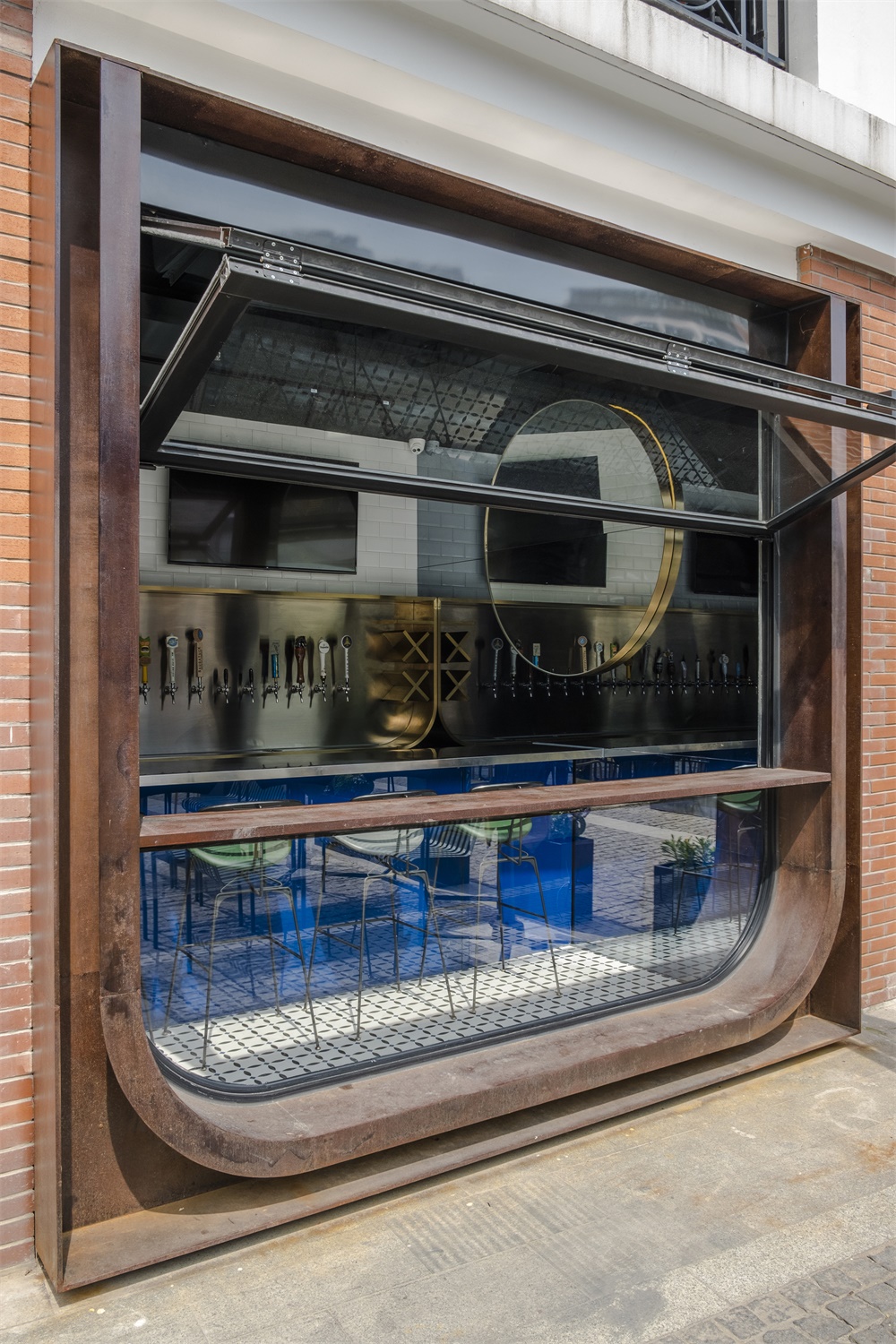
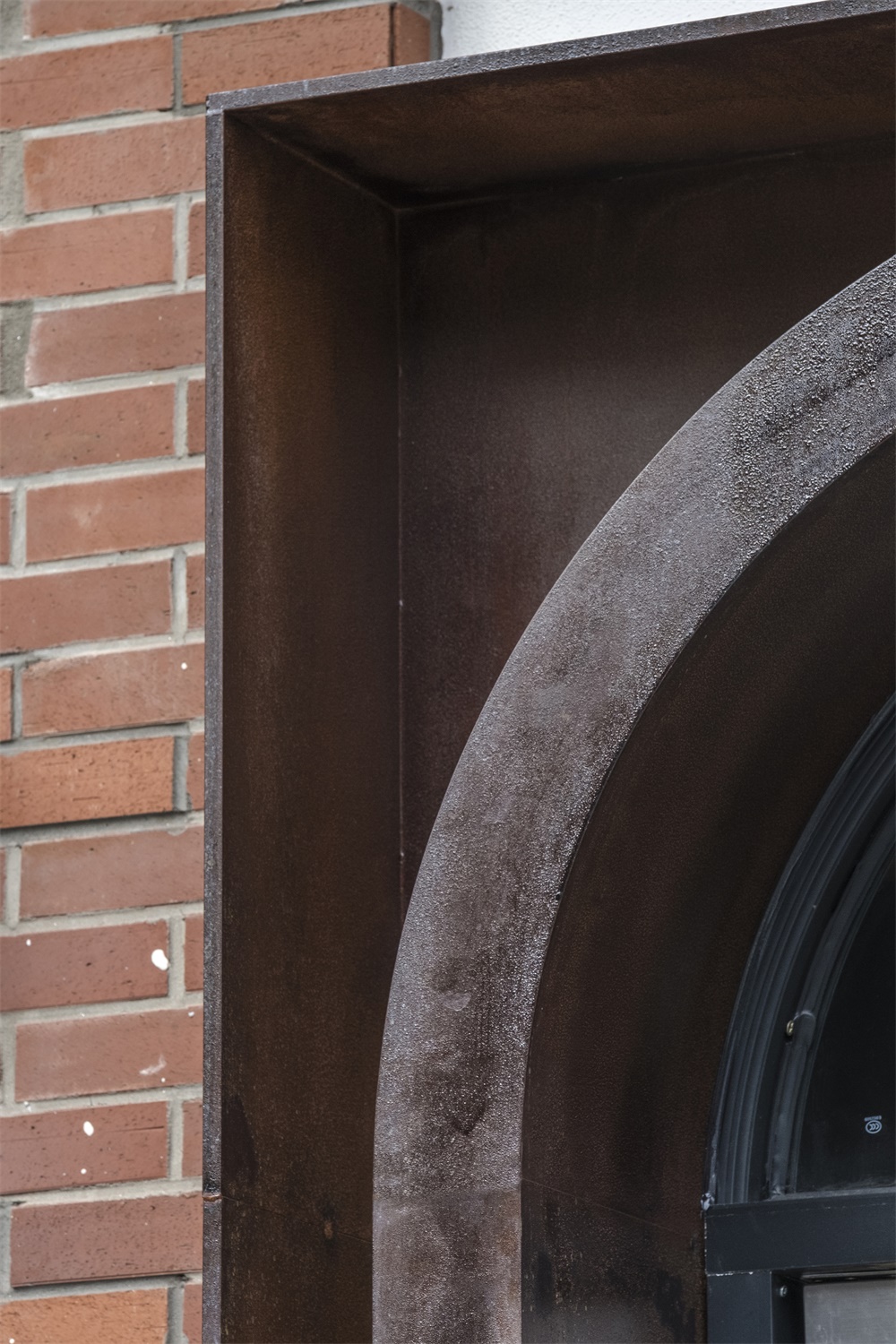
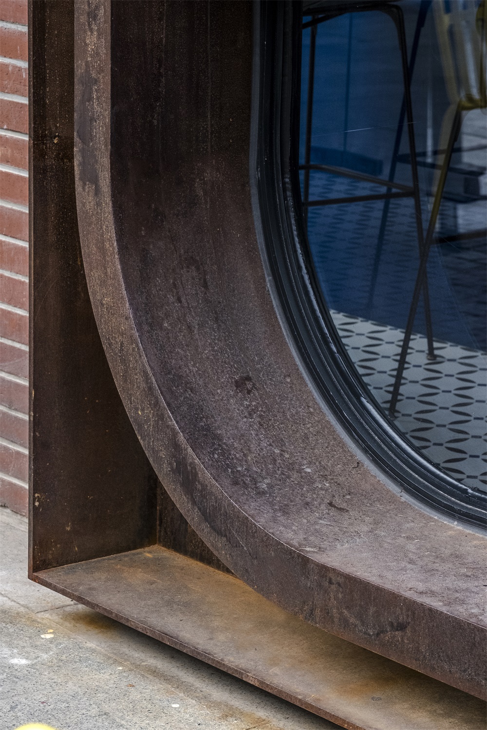
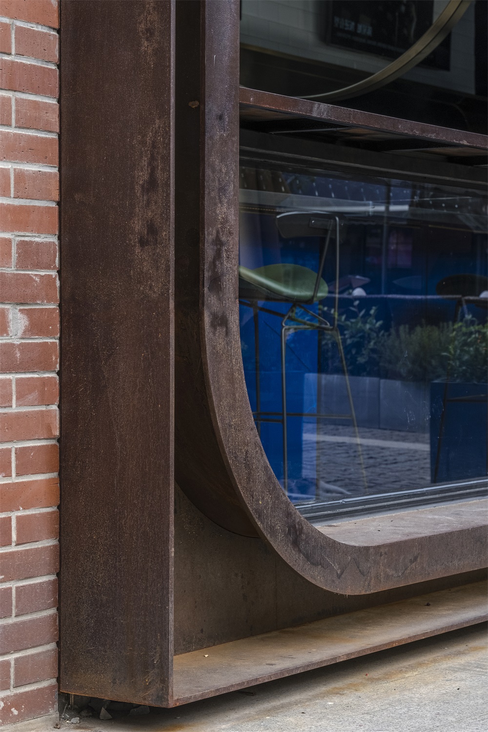
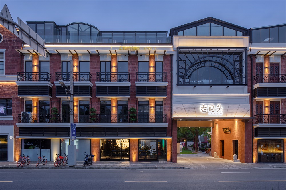
啤酒和威士忌酒吧分別麵對老碼頭廣場噴泉和後方的南外灘。因為南外灘的外立麵經過老碼頭物業翻新後有改裝上的限製,於是一持主要針對老碼頭廣場那一麵完成了酒吧主入口的設計。斑駁的鏽鋼板,從視覺上實現了與老碼頭厚重曆史積澱的呼應,也為現有外牆增加了深度。一邊為倒置的U形鏽板造型主入口,另一邊是連接室內外空間的直立U形鏽鋼板窗台,這讓傾月立刻從老碼頭上的眾多餐廳酒吧裏脫穎而出。
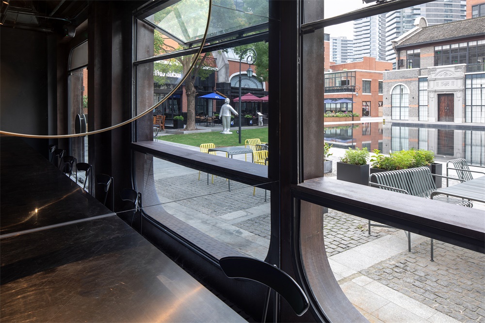
The beer and whiskey bars face the Cool Docks central plaza and the South Bund respectively. With restrictions on customizing the façade that faces the South Bund, o&o studio focuses on the side facing the central plaza, which is also MOONCRAFT’s main entrance. The concept of the façade is a dockside warehouse inspired weathering steel portals that plugged into the two façade openings which offer much needed depth to the slim brick wall. This gives MOONCRAFT a unique outfit among the other F&B units, and at the same time creating better use of space at the beer bar. The portals come as an inverted U-shape that form the main entrance, and an upstand U-shape with operable window and balcony that connects the inside and outside space.
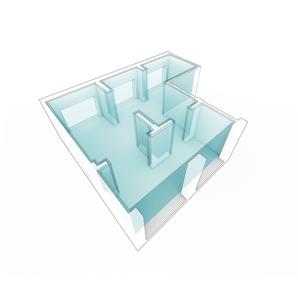
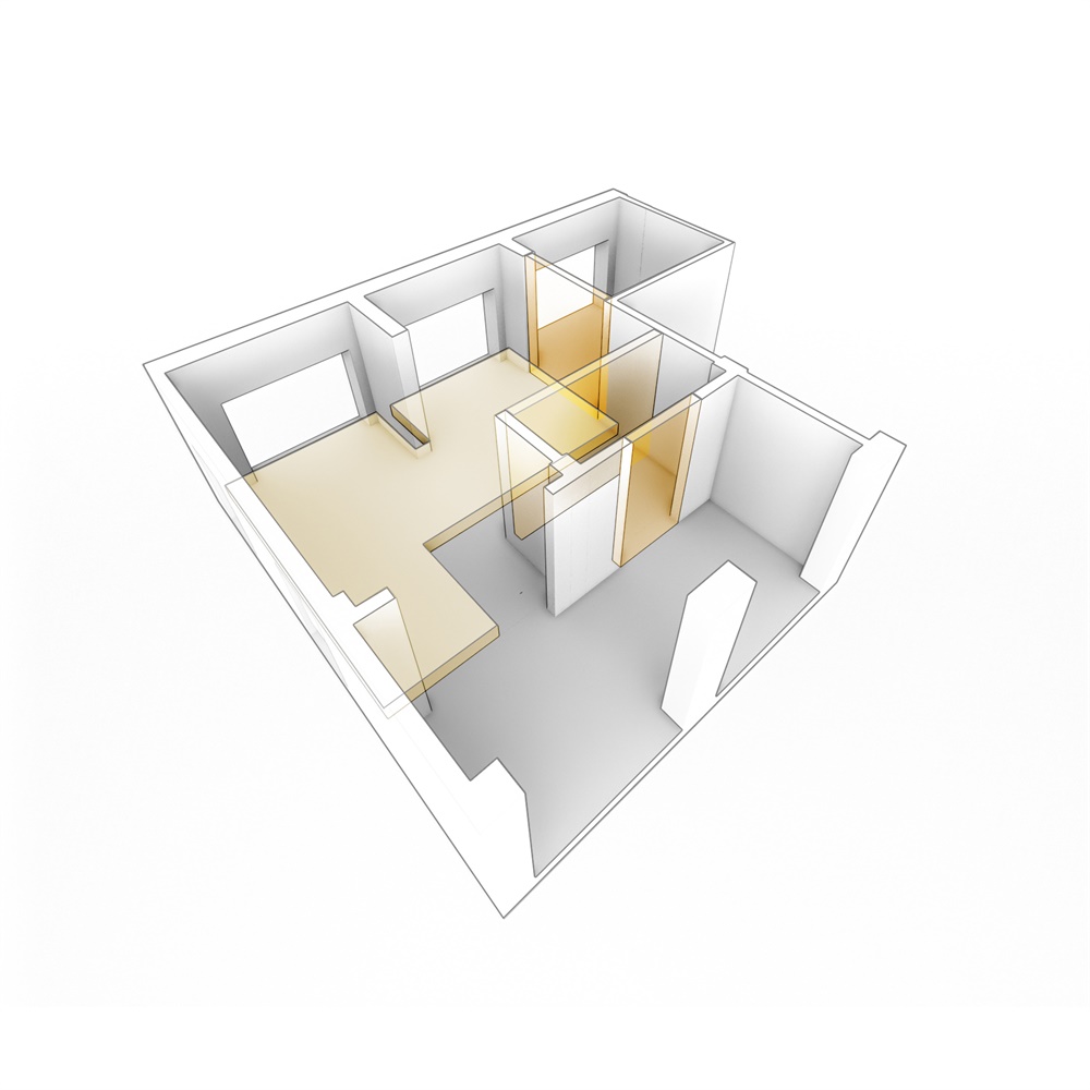
∇ 增加內牆及利用平台 Addition of partitions and making use of platform© o&o studio
∇ 利用內牆細分公共,交接和後勤區域 Making use of partitions to break down the spaces into private, interface and BOH© o&o studio
∇ 帶來清晰的空間感,還有優化了店麵的數量 Create a sense of space with advantage of reduced number of frontages© o&o studio
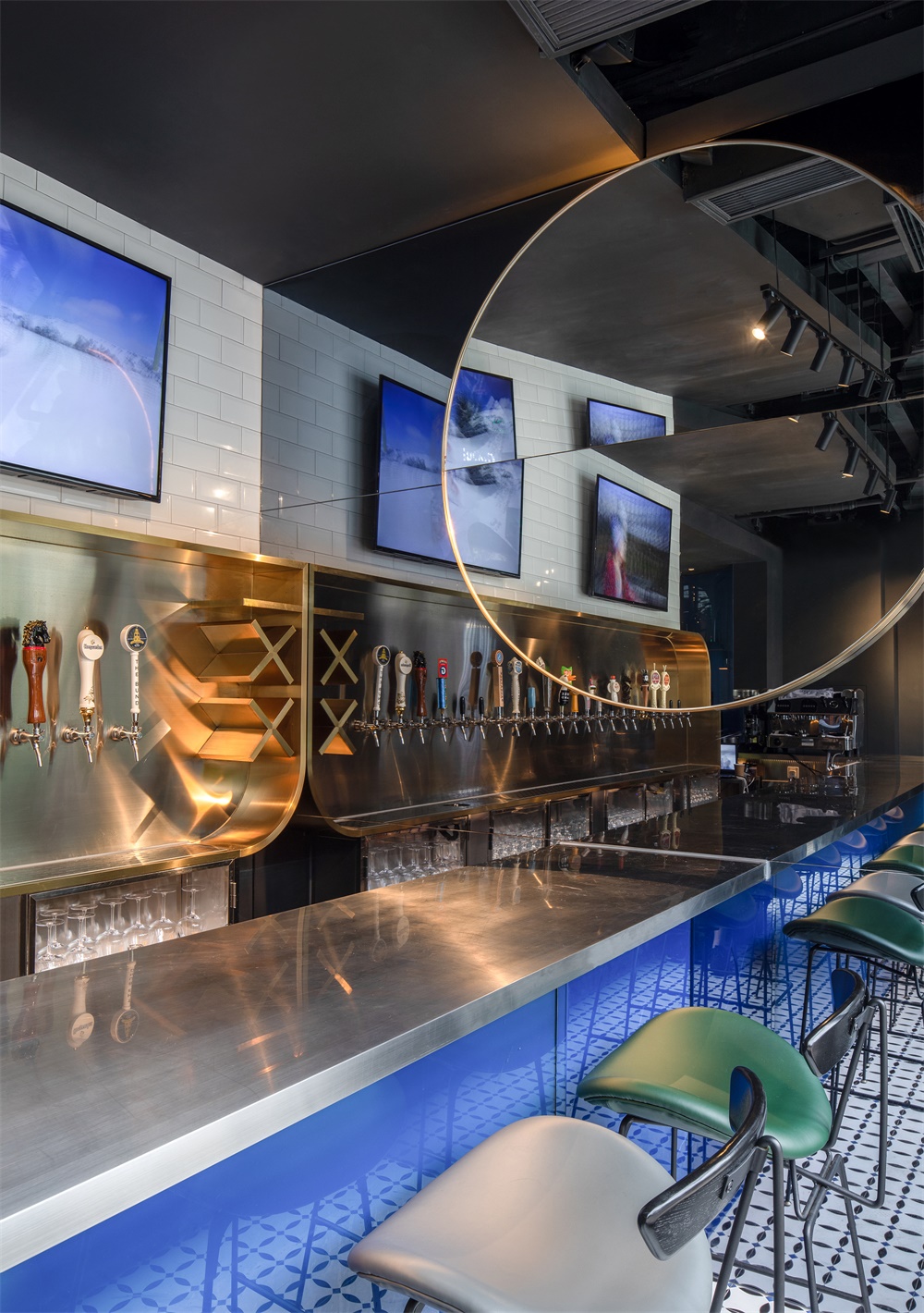
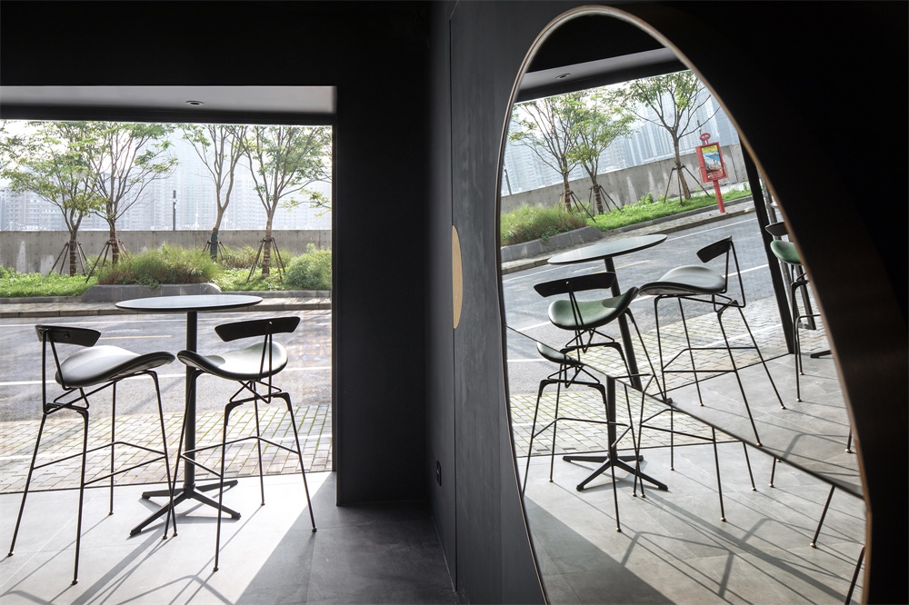
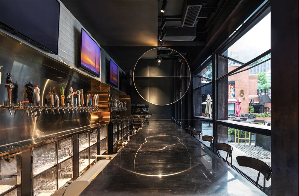
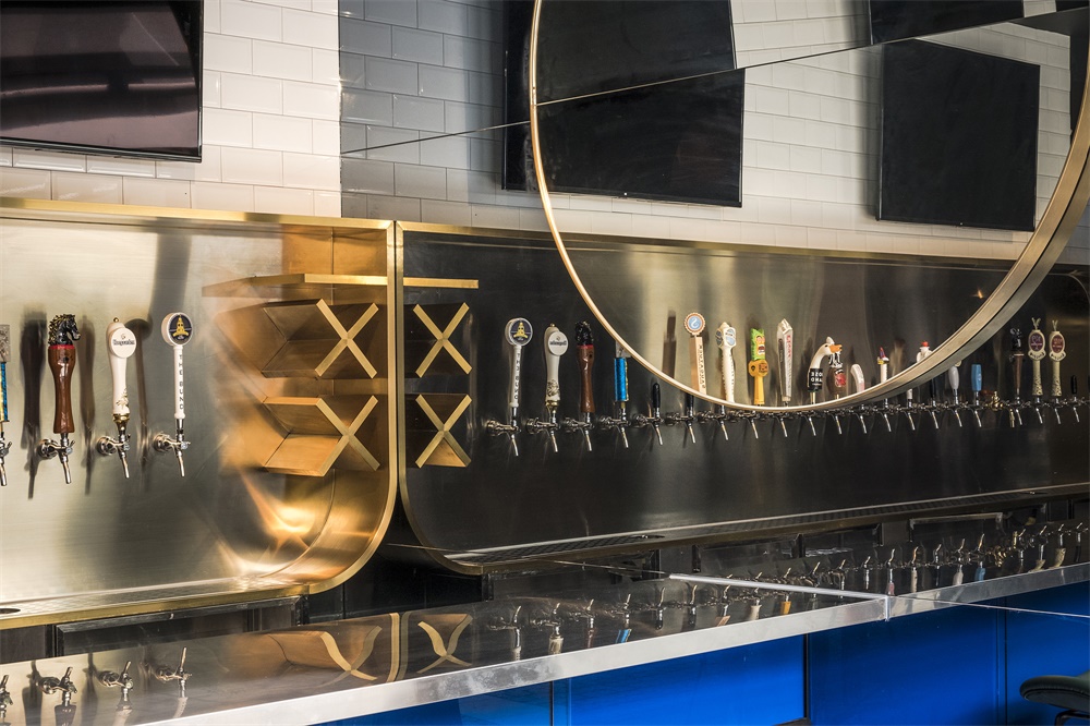
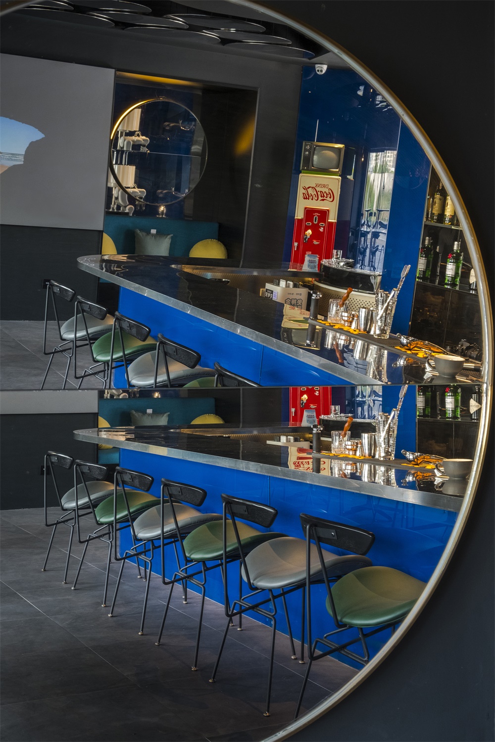
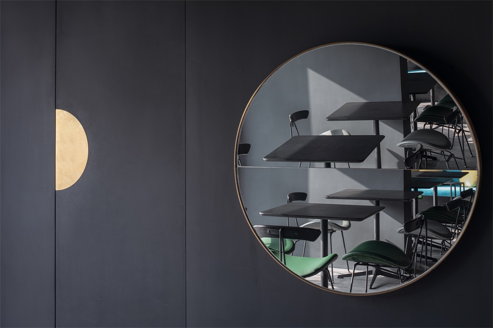
走進主入口來到手工啤酒吧,這裏的空間相對於威士忌酒吧麵積更小。一持首先利用一麵黑鏡增強了啤酒酒吧的空間感,同時為了融合“傾月”的概念,將一麵圓形折鏡懸在黑鏡之上,鏡中有鏡,宛若皓月當空;折鏡又進一步和周遭的人物、環境對話,變幻無窮的光影經過折射後,交疊出一幅難以言喻的奇妙景象。
Through the main entrance is the hand-crafted beer bar, with a smaller floor area than the whiskey bar. o&o studio makes use of a black mirror wall to enlarge the space. As the name MOONCRAFT suggests, whereas the design concept is “Moments”, a circular mirror with a slender valley fold hangs on the mirror wall that creates a “mirror within mirror” effect imitating the floating moon on the Shanghai Bund’s sky. The circular mirror certainly talks to everyone and every little context, generating ever-changing and unexpected reflections.
∇ 老碼頭廣場及傾月主門口 The Cool Docks Central Square and MOONCRAFT’S Main Entrance© Tian Fang Fang
∇ 主門口 Main Entrance© Eric Chan
在吧台後方的金色框架上,整齊排列著各類手工啤酒龍頭。如果足夠仔細,就能發現一持在這裏埋下的一顆小小“彩蛋”:緊貼鏡麵牆的框邊構造特殊,通過鏡像構成了一個“爽”字。工作之餘,和三兩知交走進傾月,敞開心扉交談,品嚐各種口味醇正的手工啤酒,別有一番舒爽的滋味。
At the backside of the bar counter, a champagne gold s.s. steel portal framed an orderly line of beer taps. Towards the end at the mirror wall, o&o studio also incorporated a half of the Chinese word “Cool”, making use of the mirror to complete its entirety, escalating the joy at MOONCRAFT.
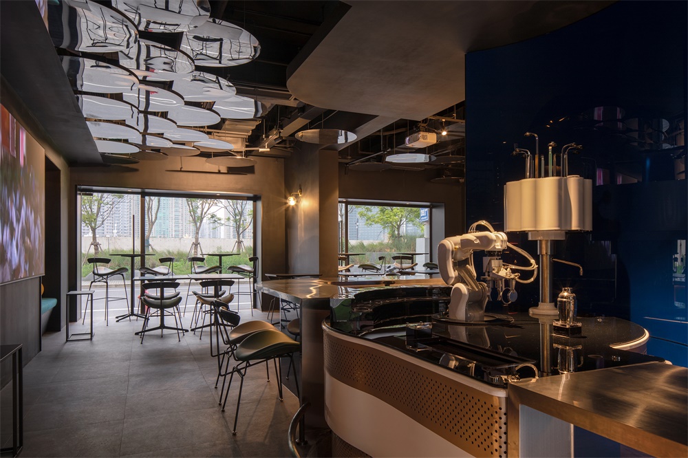
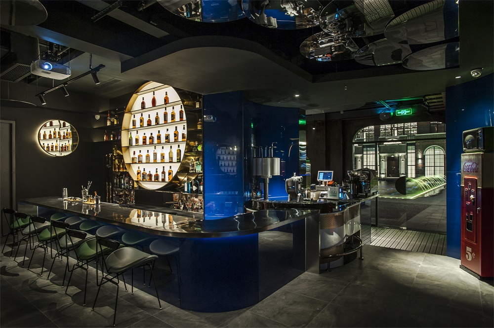
踏兩級台階而上,來到酒吧的中心點,就能遇到在上海難得一見的調酒機器人。無論是身處啤酒酒吧還是威士忌酒吧的客人,都可以與機器人互動,或是直接走到兩個酒吧的交彙處與機器人進行一次“親密接觸”。
The rarely seen robotic bartender sits at the centre that allows interaction with customers from both bars as well as more directly at this interchanging point.
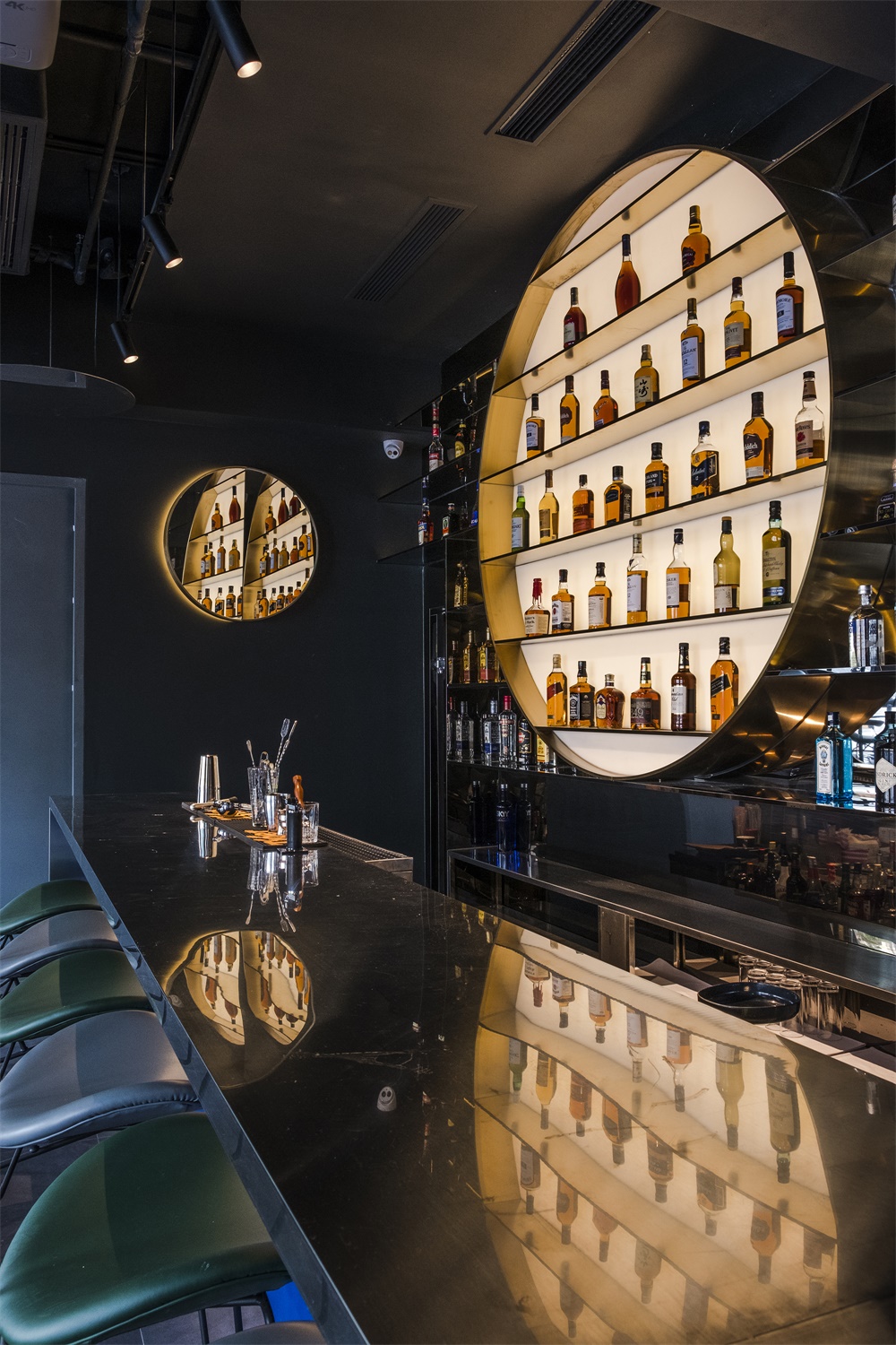
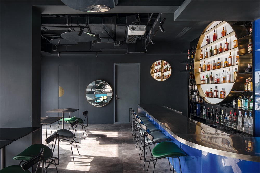
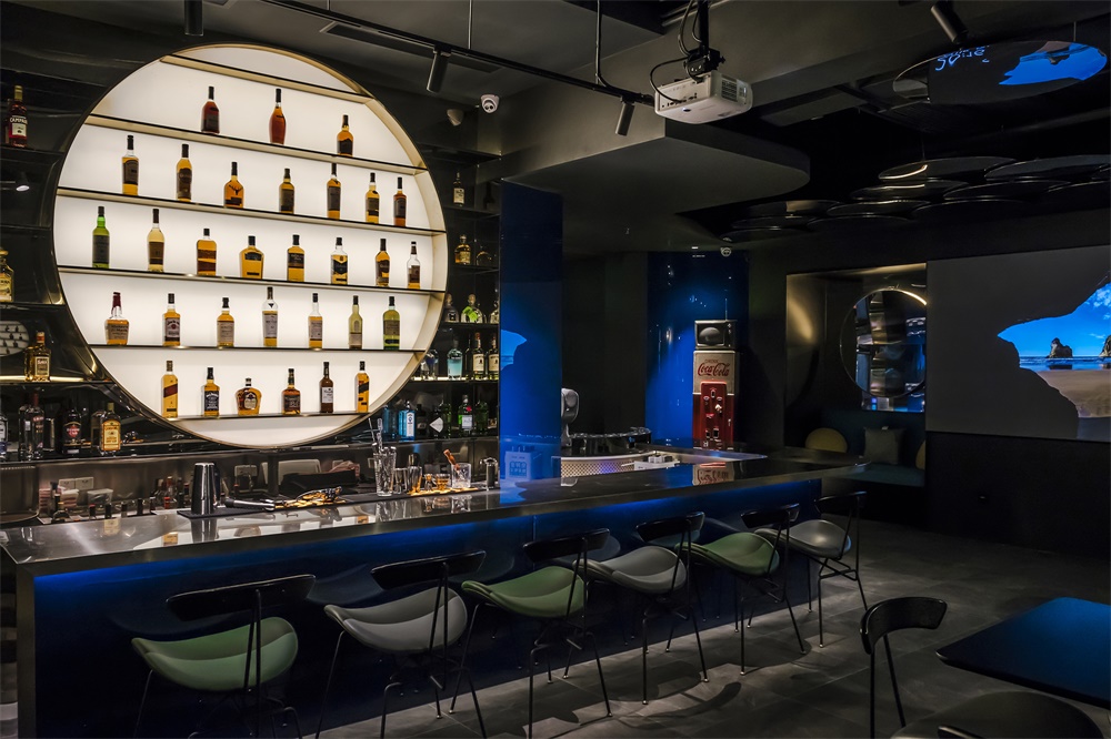
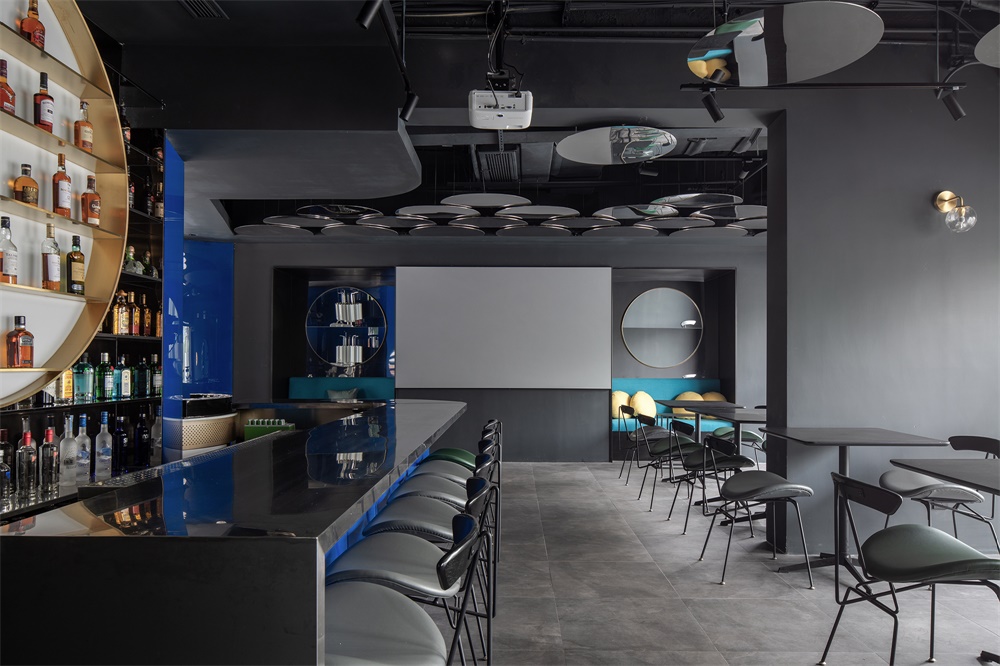
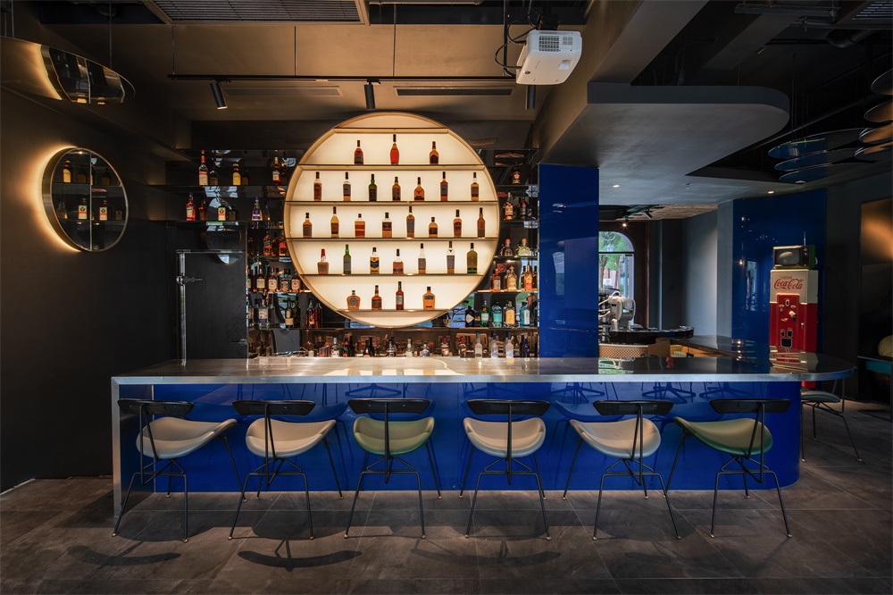
從啤酒酒吧延伸過來的就是威士忌酒吧,幾乎占據了整個平台的麵積,也因為高差,威士忌酒吧的吧台回落到了正常的座位高度。無論是從空間布局還是功能使用的層麵看,這個平台都扮演了不容小覷的角色。 吧台後方的酒架同樣延續了對於“傾月”的造型解讀,如一輪徐徐升起的明月。
Extending from the beer bar, the whiskey bar occupies the entire raised platform area. The level change perfectly allows a typical sitting height for this bar and restaurant area. The whiskey bar endures the “Moments of Moon” concept, where o&o designed a circular bar shelf that acts as a rising moon.
吧台前方是餐廳座位區,而在靠近外馬路的窗口位置,一持特意為情侶們設置了四對卡座,在遠眺南外灘夜景的時刻,也能親密地依偎在一起呢喃耳語。
Around the restaurant area in front of the whiskey bar, there are a couple of feature seats for couples that face the windows overlooking the South Bund.
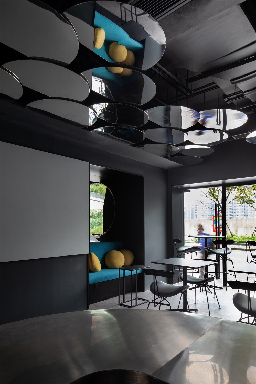
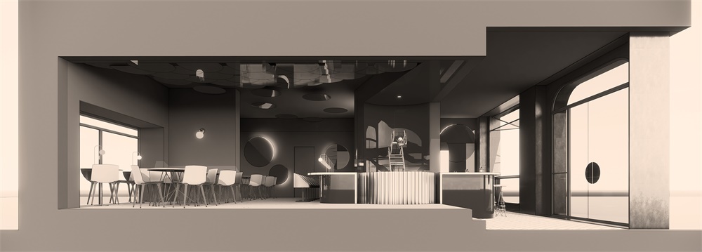
餐廳一側是包含了廚房和衛生間的後勤區,另一側則是酒吧與老碼頭入口間的一道實體牆。在去年老碼頭翻新之前,此麵的兩個門口已經確定要被封上,一持就順勢將原來的兩個門洞改成了沙發卡座。仰起頭看,一片一片半月形的天花高高低低地在半空蔓延,就像層層堆積到頂上的雲朵,又仿若是一場大雨過後的水中倒影。
On the other two sides of the restaurant are the kitchen and wc, and a solid wall on the opposite side. Originally this wall has two door openings that lead to the Cool Dock entrance. After the renovation, the landlord decided to fill up the openings. o&o take this as an advantage to provide sofa seats for casual drinking. Up above them is a feature ceiling with mirror finish s.s. plates to amplify the “Moments of Moon” idea, almost forging an inverted reflection of a rainy day.
第一次走進傾月,或許會有人覺得這裏的色彩有些單調,其實不然。一持對空間裏的部分平麵和曲麵使用了藍色烤漆玻璃,當深灰色的牆體經過玻璃折射,整個“傾月”都會籠罩在淡淡的幽光裏。
One might feel that MOONCRAFT is a little monochromatic. It is indeed not the case. o&o has made use of blue back painted glass at several designated planes which generate unexpected reflections, thus absorbed by the collective internal surfaces diffusing an essence of blue in MOONCRAFT.
∇ 最“爽”的手工啤酒酒吧 “Coolest” Crafted Beer Bar © Eric Chan
∇ 威士忌酒吧與調酒機器人 Whiskey Bar and Robotic Bartender © Eric Chan
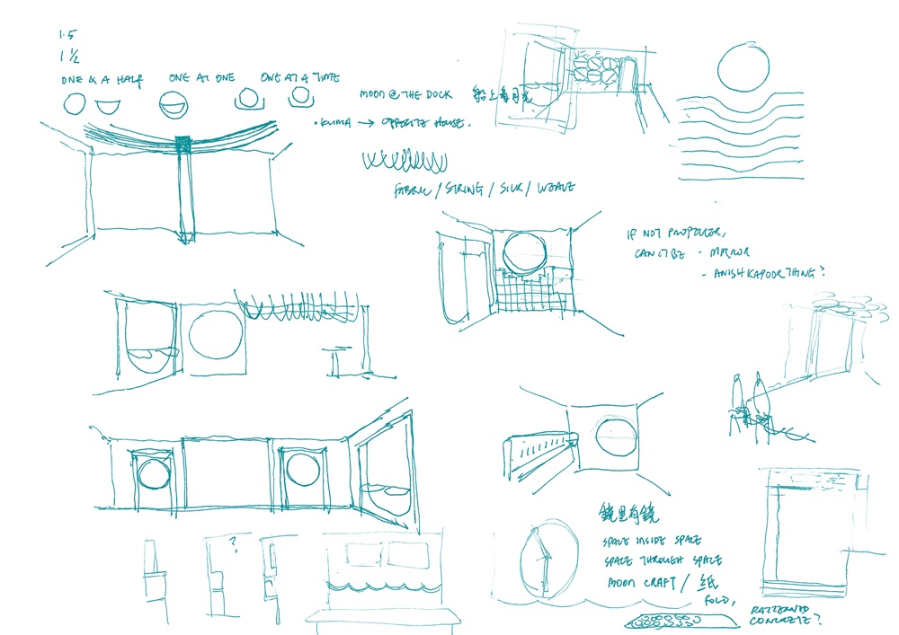
∇ 傾月手稿 Concept Sketches of MOONCRAFT© o&o studio
∇ 平麵圖 Floor plan© o&o studio
∇ 剖麵透視圖 Sectional Perspective © o&o studio
完整項目信息
項目名稱:傾月
項目地址:中國上海
建築師:一持工作室(https://www.oandostudio.com)
項目類別:餐飲建築、室內建築、酒吧設計、幕牆設計、裝修
主持建築師:陳思安、李雪雯
建築麵積:130平方米
項目年份:2019
攝影師:陳思安、田方方
文字:陳思安、李雪雯、鍾雪
Project: MOONCRAFT
Address: Unit 101/102/103, Cool Docks, Shanghai, PRC
Architect: o&o studio (https://www.oandostudio.com)
Typology: F&B, Bar Design, Interior Design, Shopfront, Renovation
Chief Designers: Eric Chan, Suzanne Li Private
Client: Private
GFA: 130 sqm
Completion: 2019
Photographers: Eric Chan, Tian Fang Fang
Text: Eric Chan, Suzanne Li, Zhong Xue


