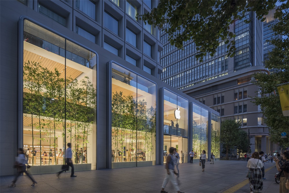
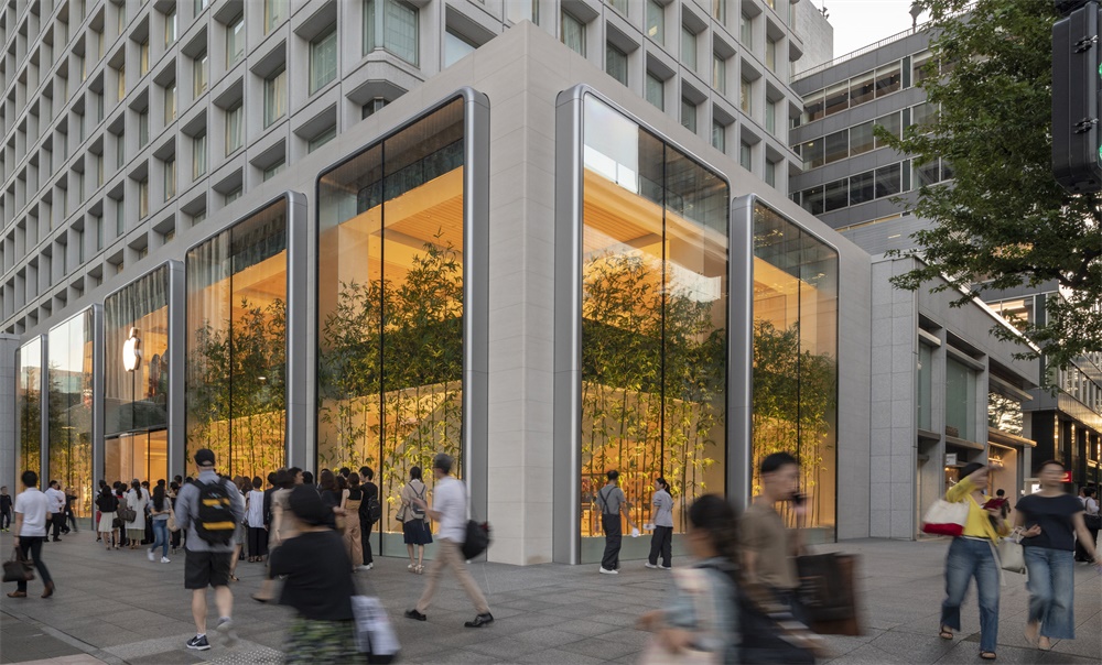
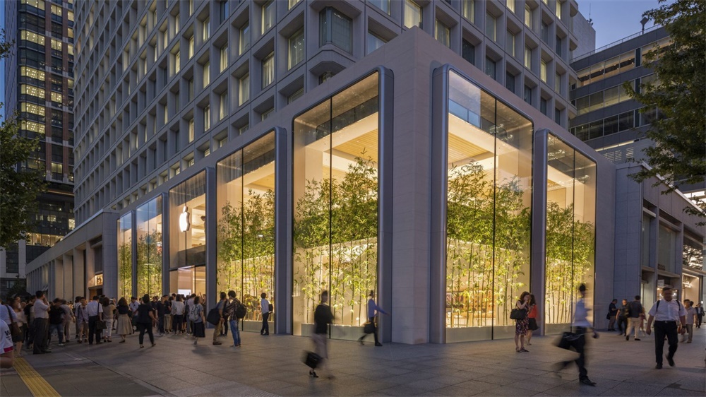
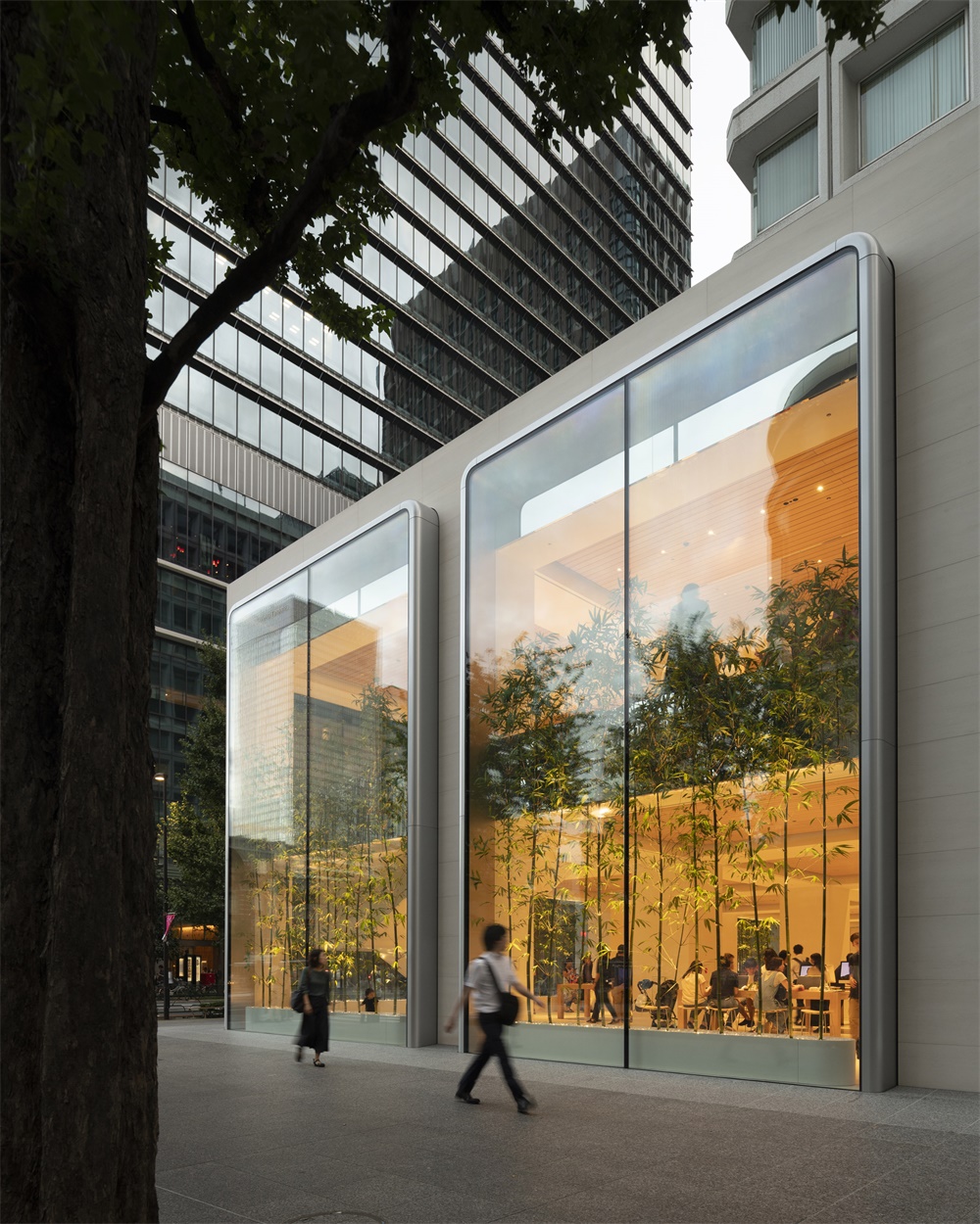
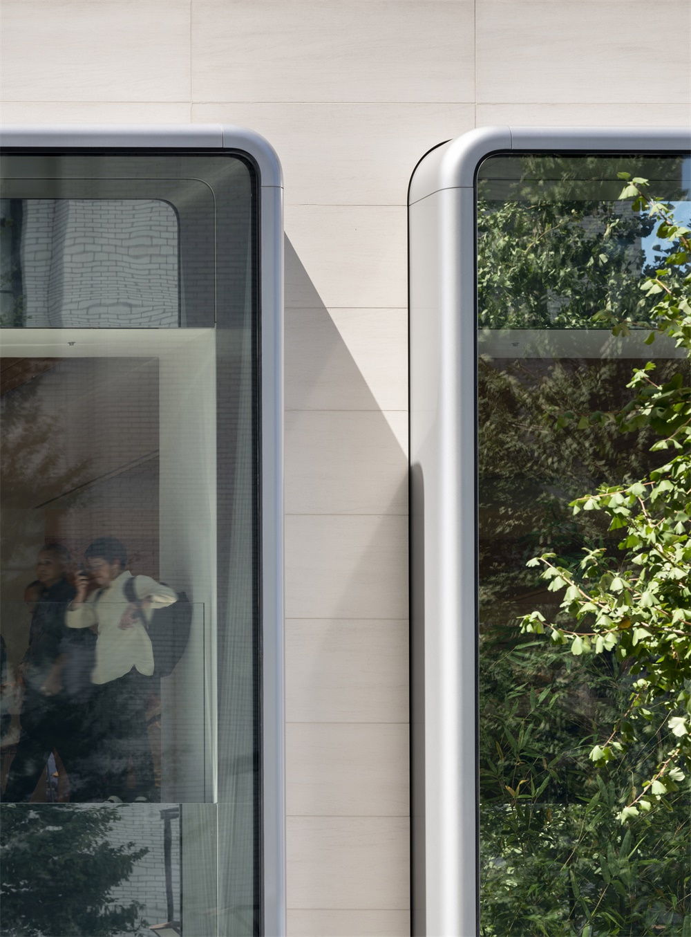
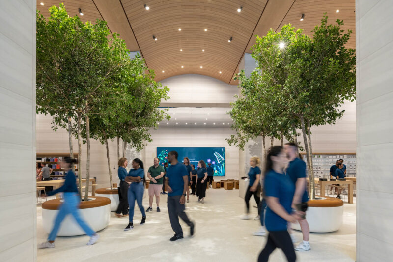
apple marunouchi專賣店位於1973年建的三菱大樓底層,由Foster + Partners與蘋果設計團隊合作設計。設計的靈感來自建築物的結構網格,鑄鋁內部和外部融合了鑄鋁玻璃。三菱建築的結構為Foster + Partners提供了安裝一係列兩層“玻璃”的機會,為蘋果提供獨特的展示。旨在增強包圍商店的現有一排周邊柱,玻璃體由鋁製成,經過特殊鑄造以創造圓角。
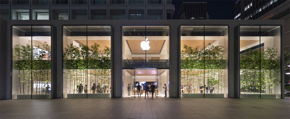
Built on a corner site at the base of a modernist 1970s tower block, the Apple Marunouchi store is fronted by seven large windows with cast aluminium frames that the studio refers to as vitrines – a type of glass display cabinet.Foster + Partners created the two-storey windows to be a continuation of the expressed structure of the tower above and create an identifiable facade for the store.
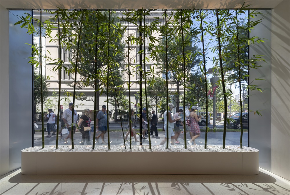
落地窗位置加入了竹子,營造都市中的淡淡竹意,增加自然的活力。射燈從下往上,竹葉的光影映在天花上,呈現出奇妙的藝術效果。工作室在澳門蘋果專賣店的設計中也使用了竹子。
Bamboo has been planted inside each of the producing windows – a plant that the studio also included in its design of the Apple Store in Macau.
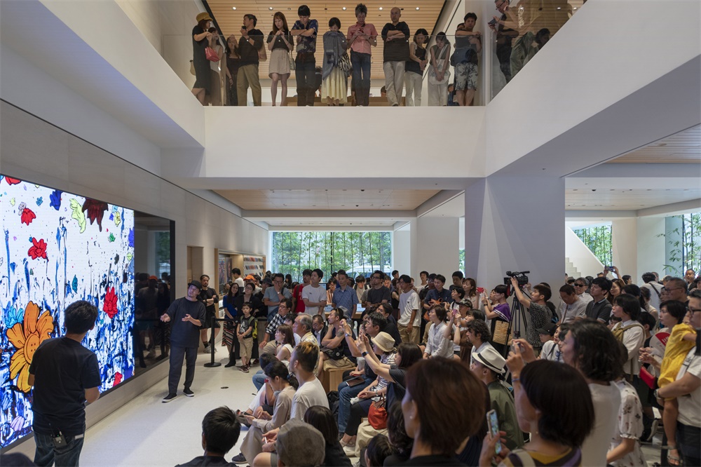
兩層的商店圍繞著與主入口對齊的兩層高的空間布置。由白漆鋁製成的雕塑樓梯提供了通往上層的通道。室內設計延續了之前極簡的設計手法,極簡白的空間,融入了樸質溫潤的木色,契合東京整體的建築與藝術氛圍。
The two-storey store is arranged around a double-height void aligned with the main entrance. A sculptural staircase made from white-painted aluminium provides access to the upper floor.Interiors are rendered with white plaster to match the facades of the tower block, and the ceilings are clad with white ash.
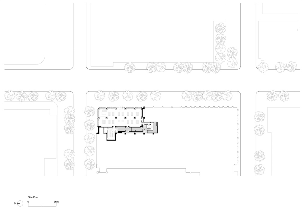
∇ 總平
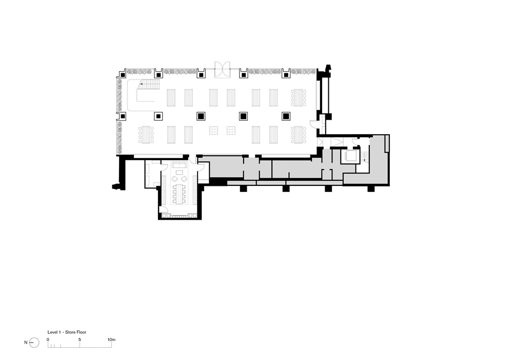
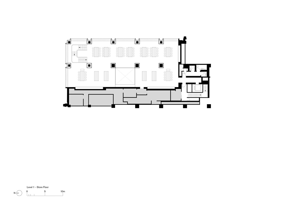
∇ 平麵
主要項目信息
項目名稱:apple marunouchi
項目地點:日本東京
項目類型:商業空間/手機體驗店
完成時間:2019
設計公司:Foster + Partners
攝影:Nigel Young


