LOFT中國感謝來自 艾克建築 的辦公項目案例分享:
叛逆在這不是一種否定,而是對周圍環境的一種回應。
AD ARCHITECTURE designed an office for a Chinese clothing brand called JYC, which is located in Dalang Town, Dongguan, China. The design team defined the space as a “Rebel”, which doesn’t mean the negation of something but is a response to the surrounding environment.
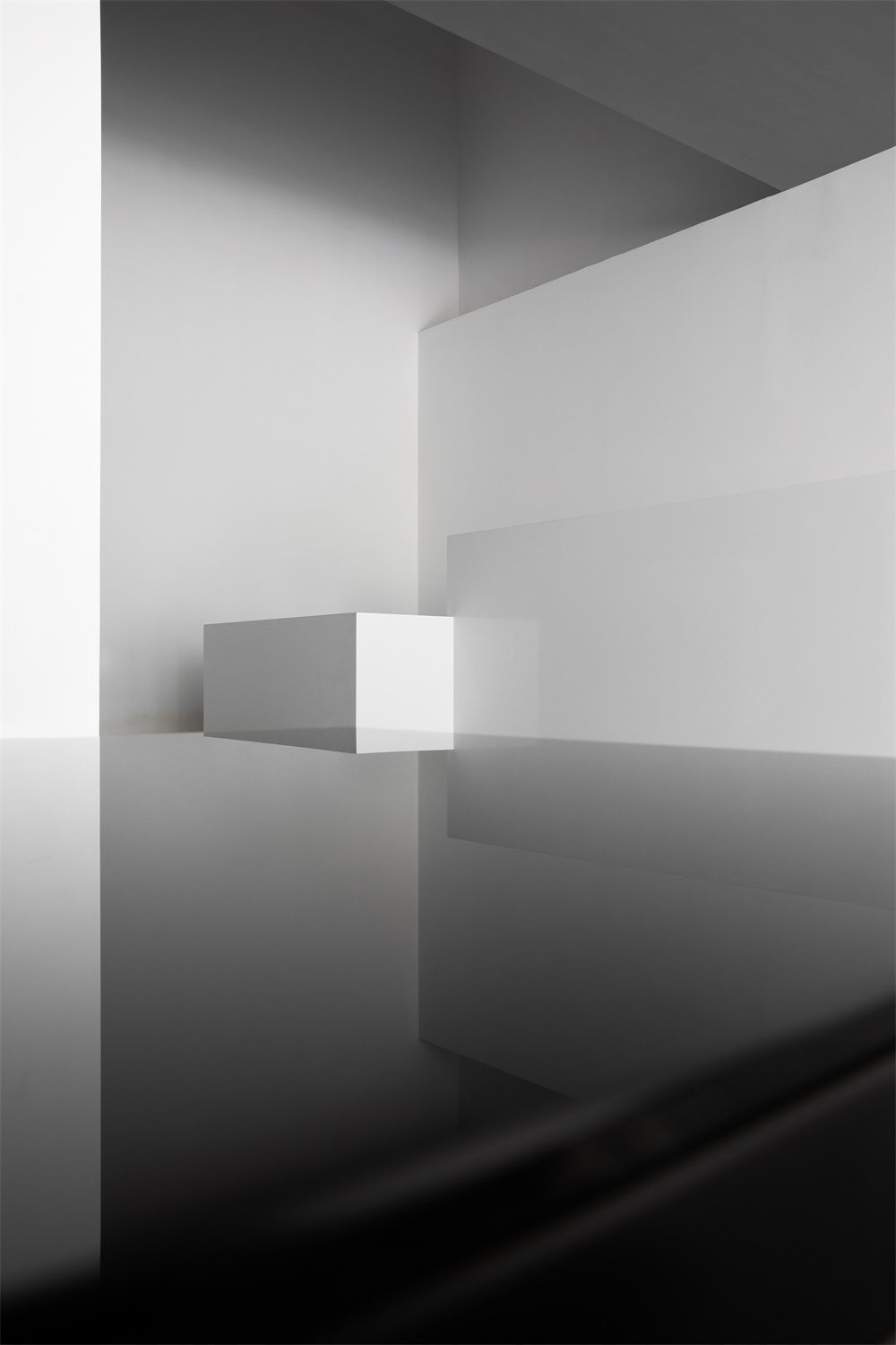
空間是物質的光與影反推出來的虛幻結構,它不追隨,而更在意自身的創造性與精神性, 我們將其定義為「叛逆者」。設計的開始,我們從空間自身的角度思考,借以形而上學在空間層麵上,營造有意錯亂的深景透視幾何圖式空間,由此衍伸辦公空間的創造性與精神性。
The space is an “illusory structure” deduced from physical light and shadows. Rather than following conventions, the project emphasizes creative and spiritual attributes of the space. At the beginning of design phase, the designers tried to think from the perspective of the space itself and apply metaphysics to the interior design. In this way, they created a geometric space which seems to be disorderly and features a deep and perspective view, aiming to inject creativity and spirit into it.
∇ 周邊環境
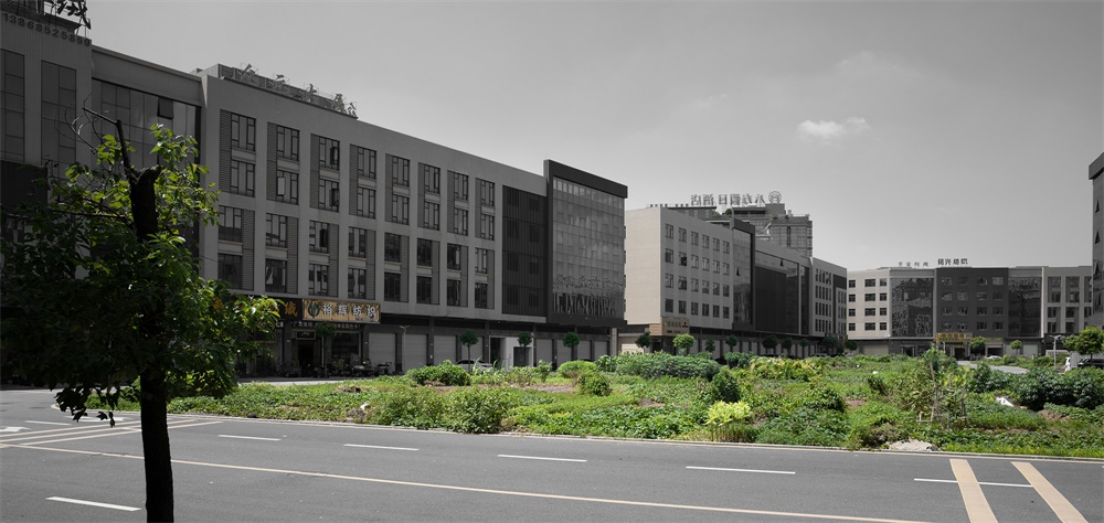
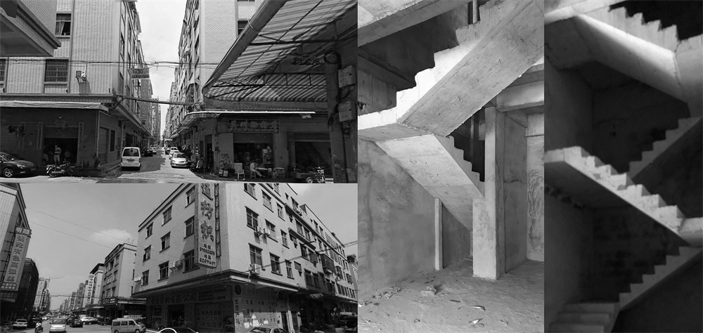
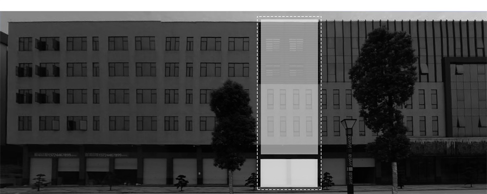
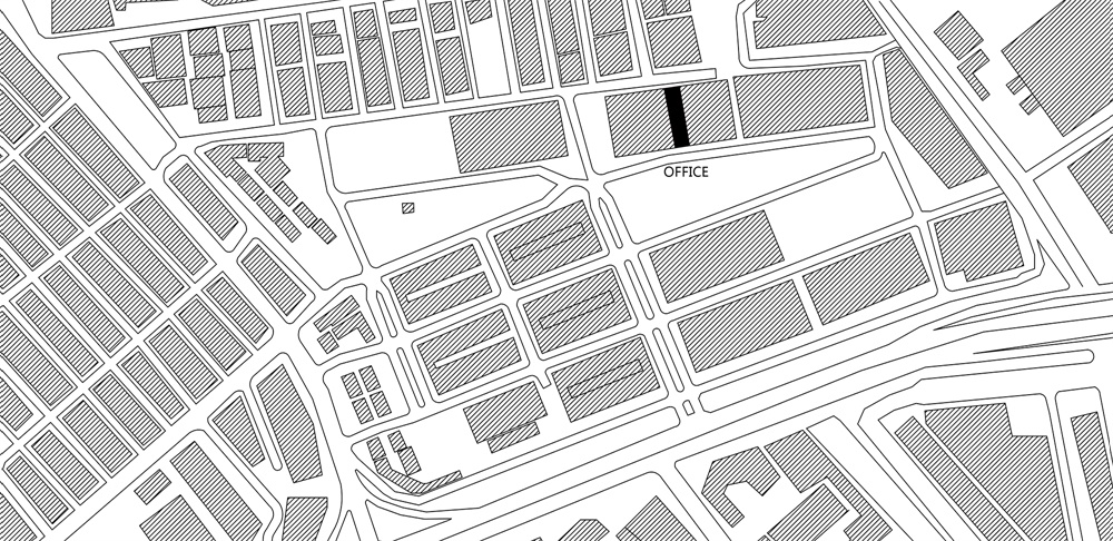
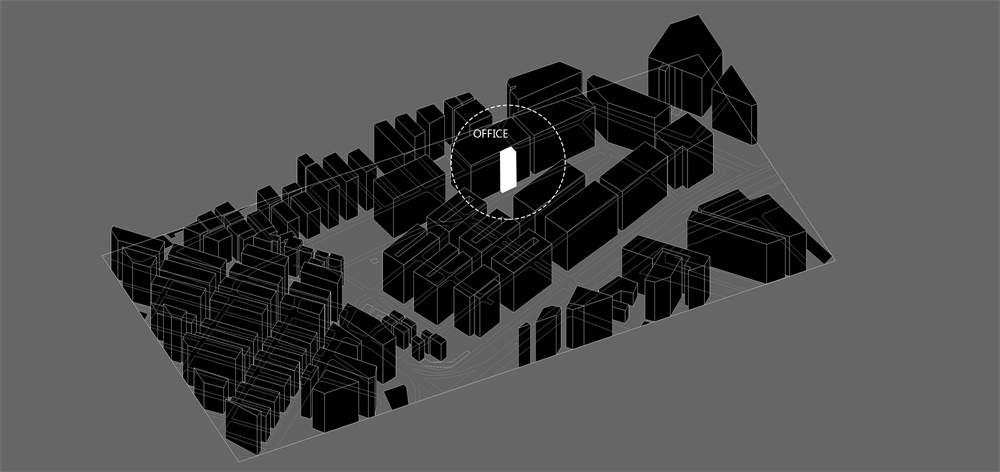
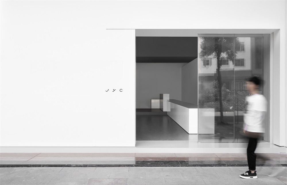
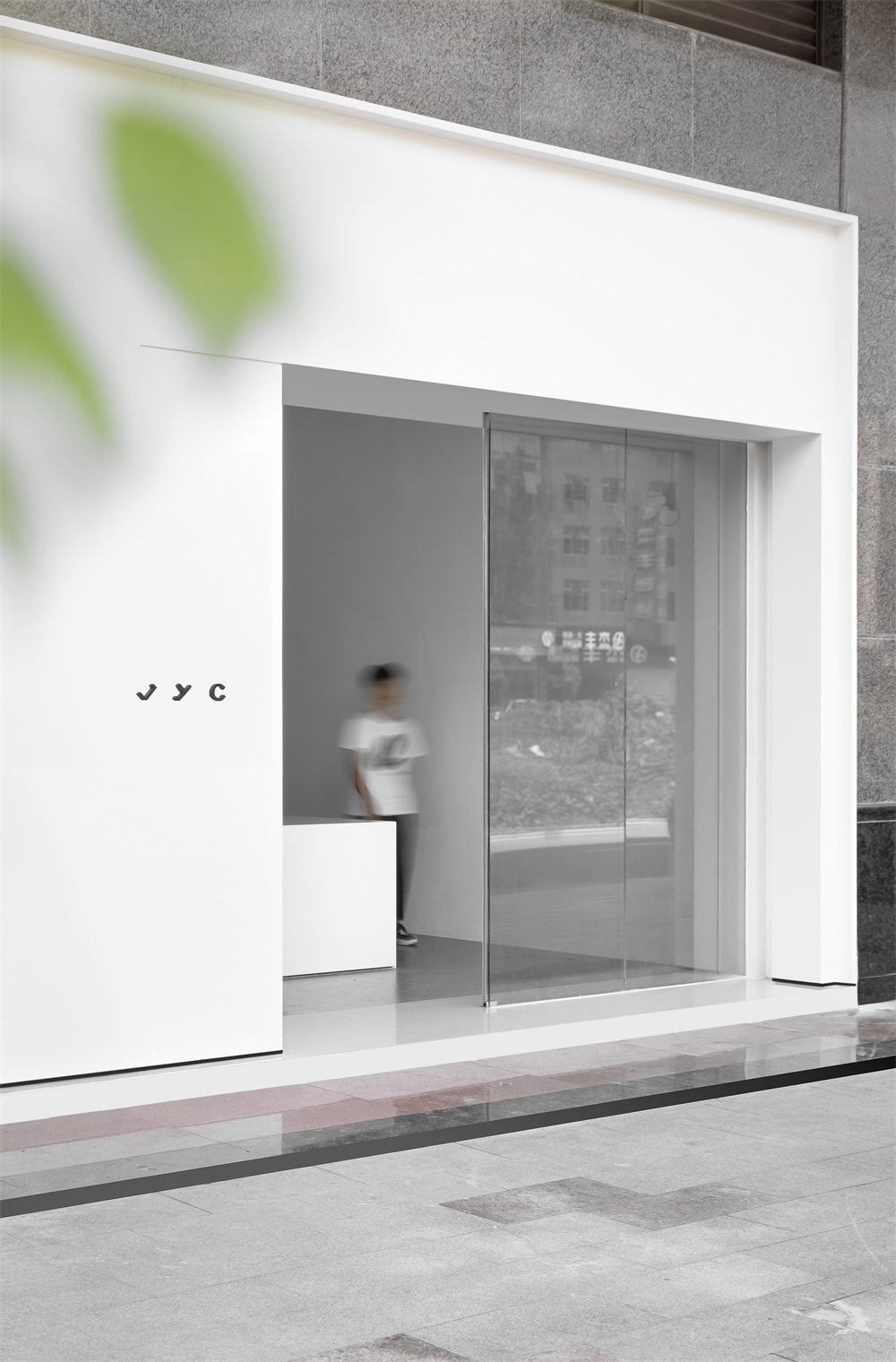
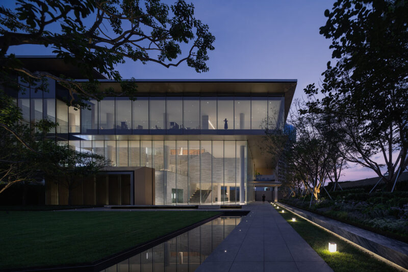
基地周邊為喧鬧雜亂的城市商業街區,位於東莞大朗鎮的羊毛服裝批發集散地。項目空間主要做為服裝設計和銷售辦公使用。入口處白色立方體嵌入一個雜亂無序的建築環境中,我們試圖去重新建立秩序,引導出一種商業街區新形象。
The project is situated at a woolen clothes wholesale center, surrounded by a noisy and chaotic commercial block. The space serves for garments design, working and sales activities. At the entrance, a white cube was inserted into the disorderly architectural space, through which AD ARCHITECTURE hoped to rebuild spatial order and bring a new image to the commercial block.
∇ 總圖區位
∇ 區位凸顯
∇ 外立麵
將功能空間以幾何的形式組合在一起,一層為接待區,二層和三層為辦公與會議及發布的功能性空間,通過虛實的樓梯將其串聯。
Functional spaces are combined in a geometric manner and connected by the staircase. 1F is used for reception, while 2F and 3F serve for working, meetings and new products release.
∇ 形體分析
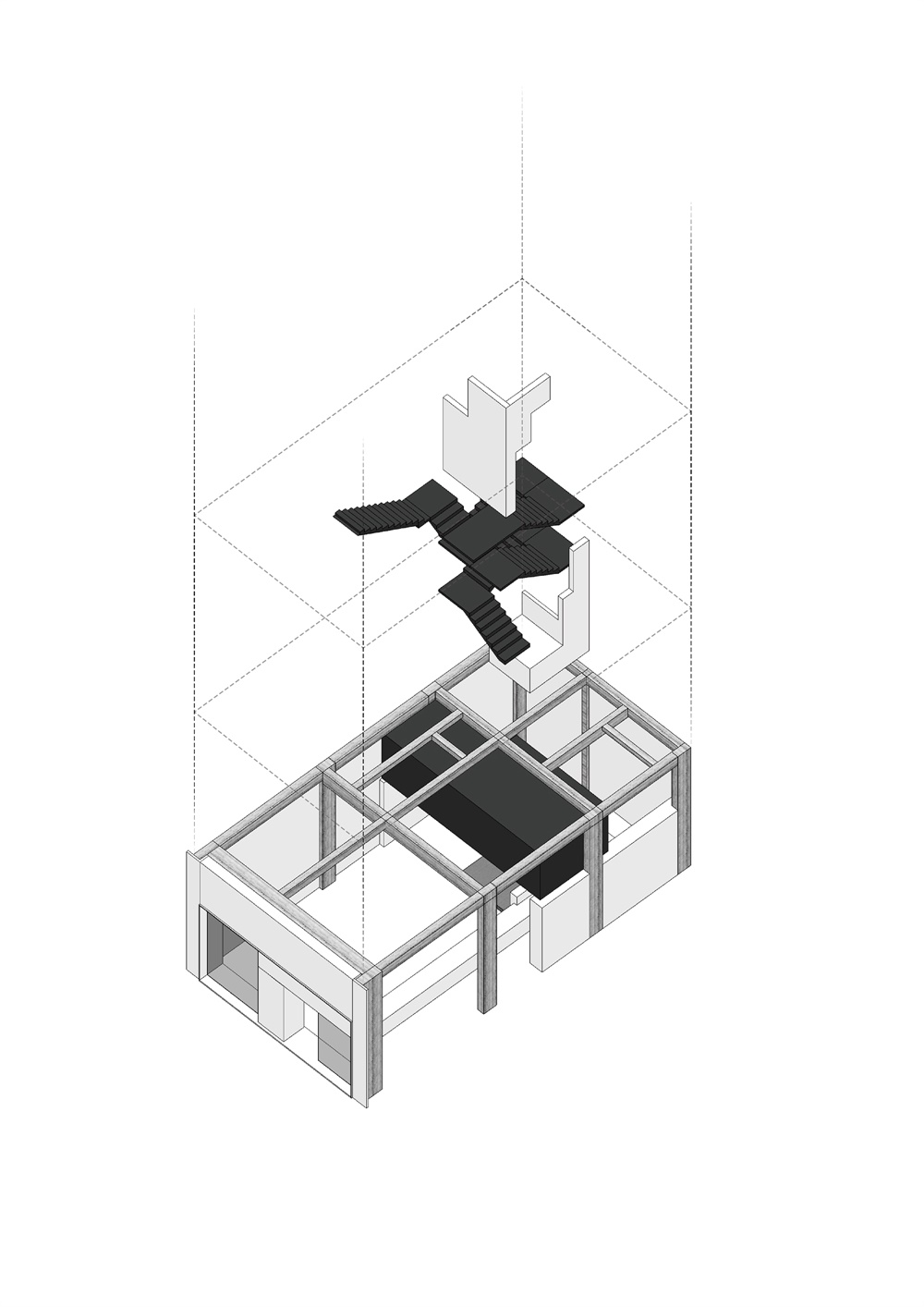
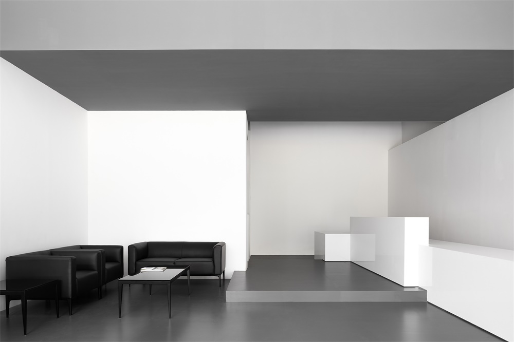
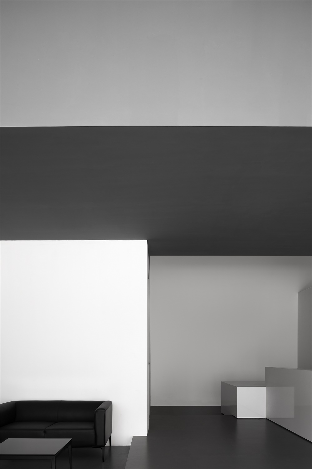
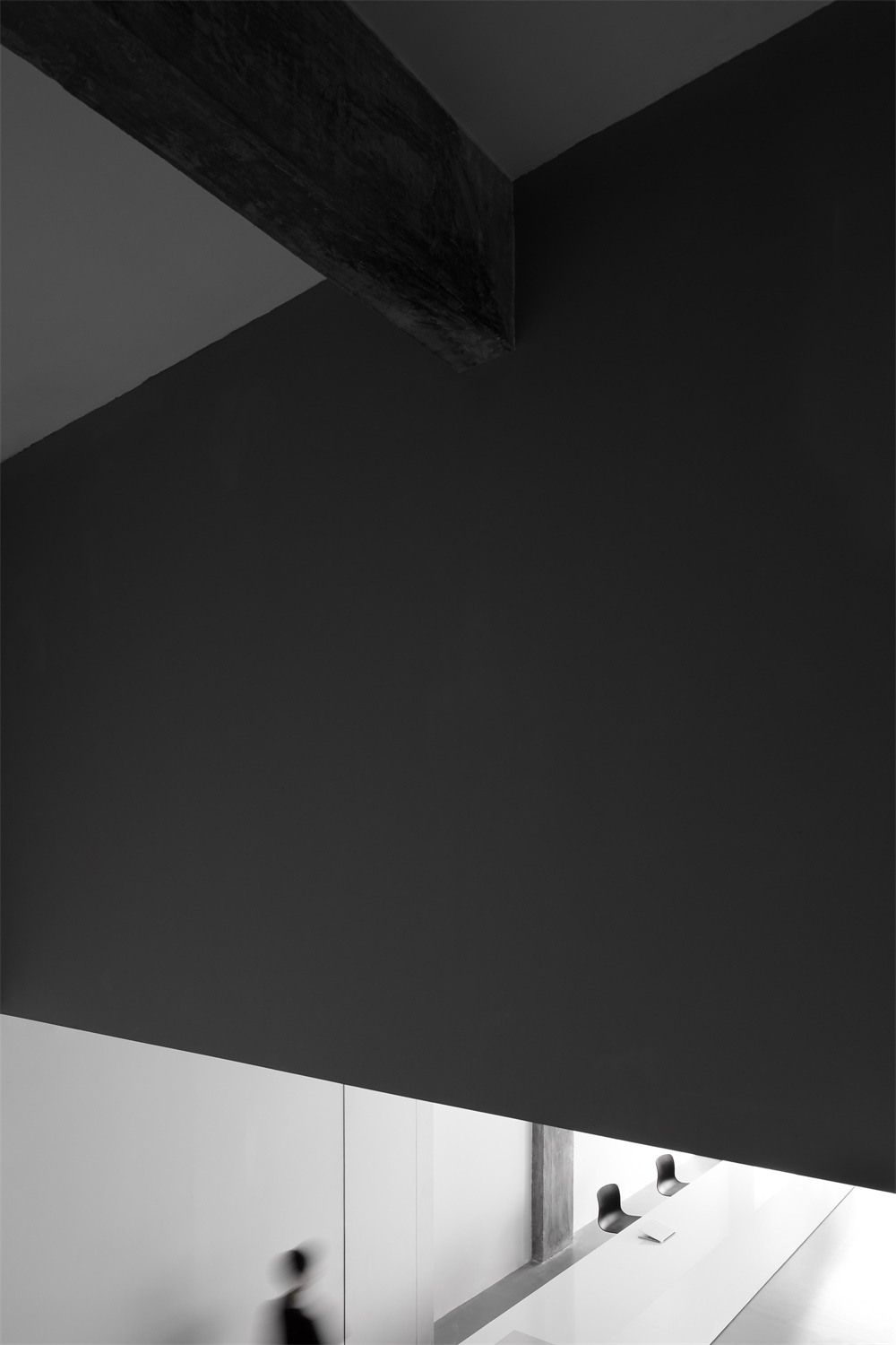
麵對矩形狹長的平麵,單跨結構的多層空間,我們將一個毫無裝飾的巨大幾何體量嵌入單一通高的門廳空間中,使空間張力得到重構。
The original space has a long and narrow rectangular plan as well as a single-span framework. AD ARCHITECTURE embedded a large unadorned geometric volume into the full-height foyer, which adds a sense of tension to the interior.
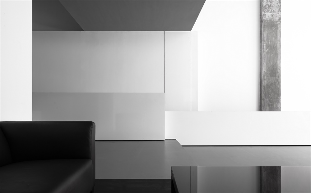
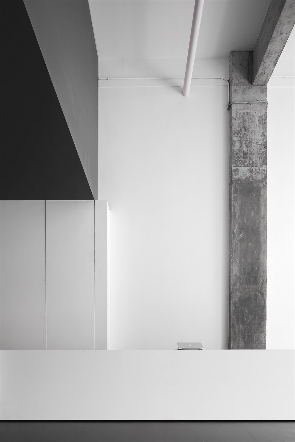
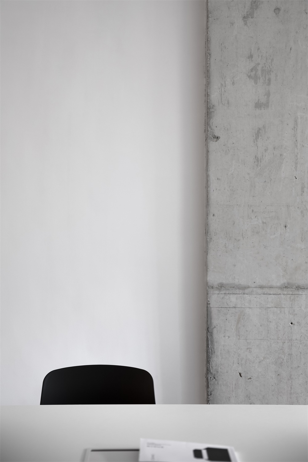
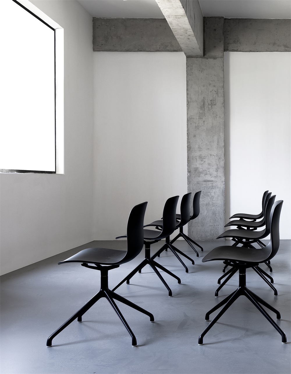
頂部灰色體塊實則為辦公室提供了額外的儲藏空間,門廳與接待空間被無形劃分,接待台後麵灰色混凝土柱子得以保留,強調了空間的結構的同時豐富了空間的質感。
The gray block on the top provides additional storage space. The foyer and reception area are separated in a subtle way, and the gray concrete column that already existed is retained, which highlights the interior structure whilst enriching spatial textures.
∇ 一層空間
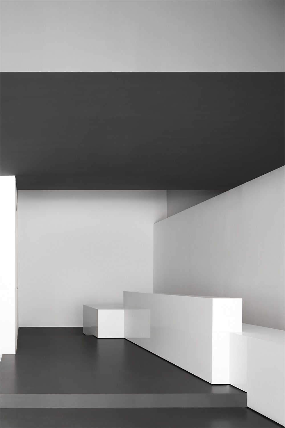
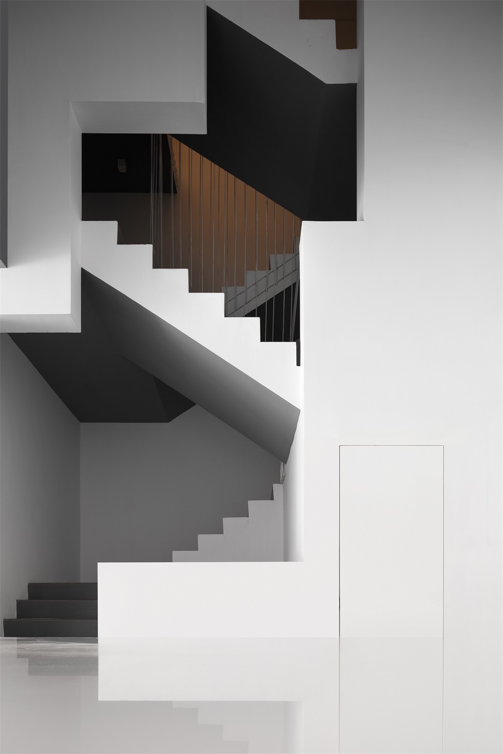
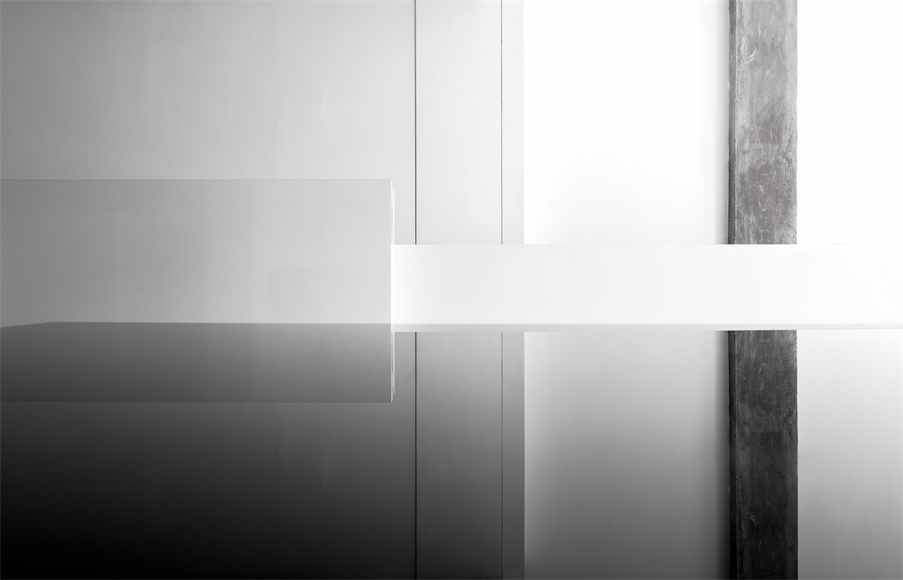
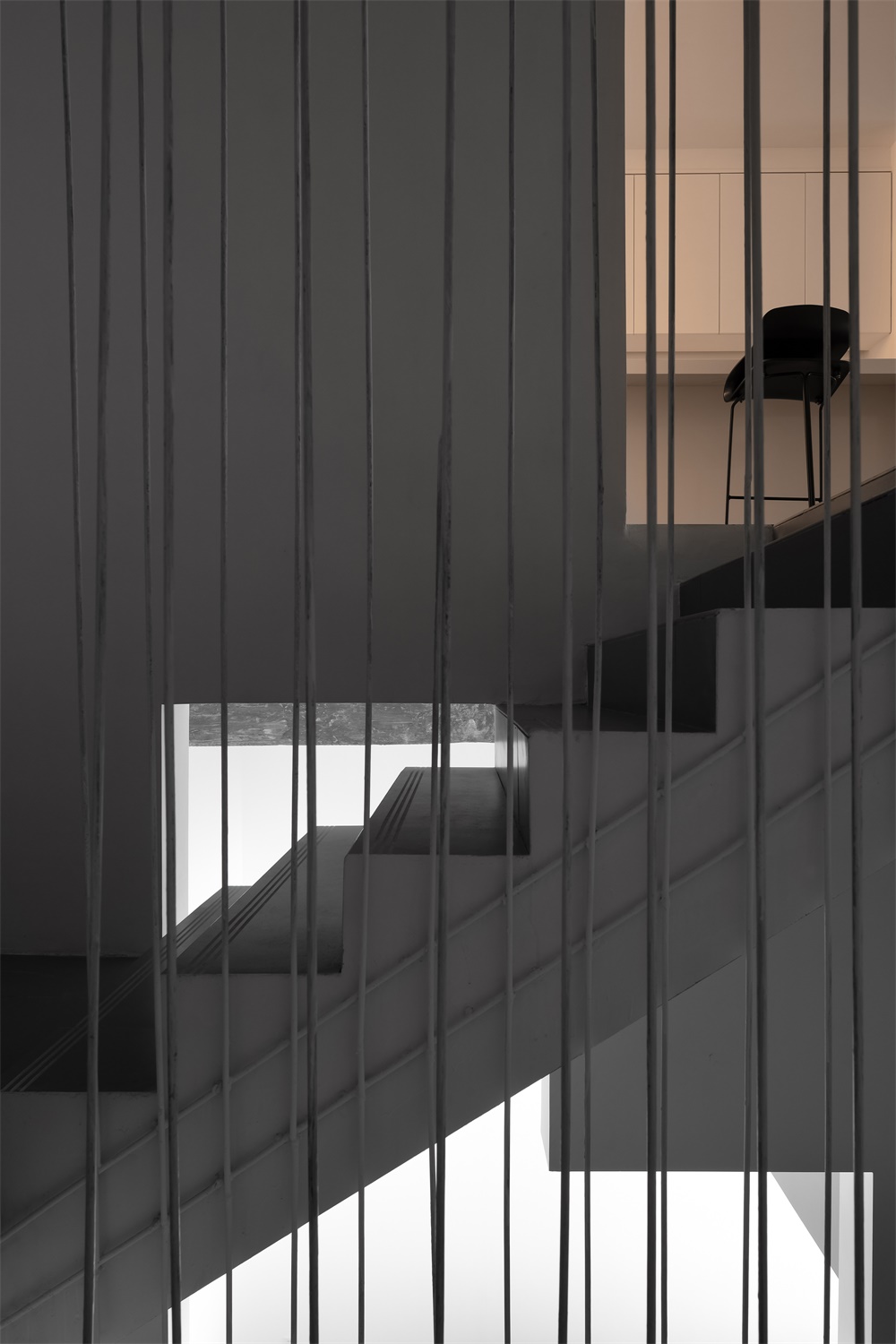
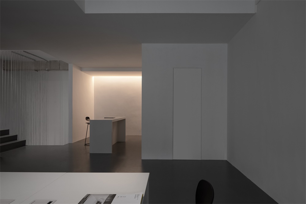
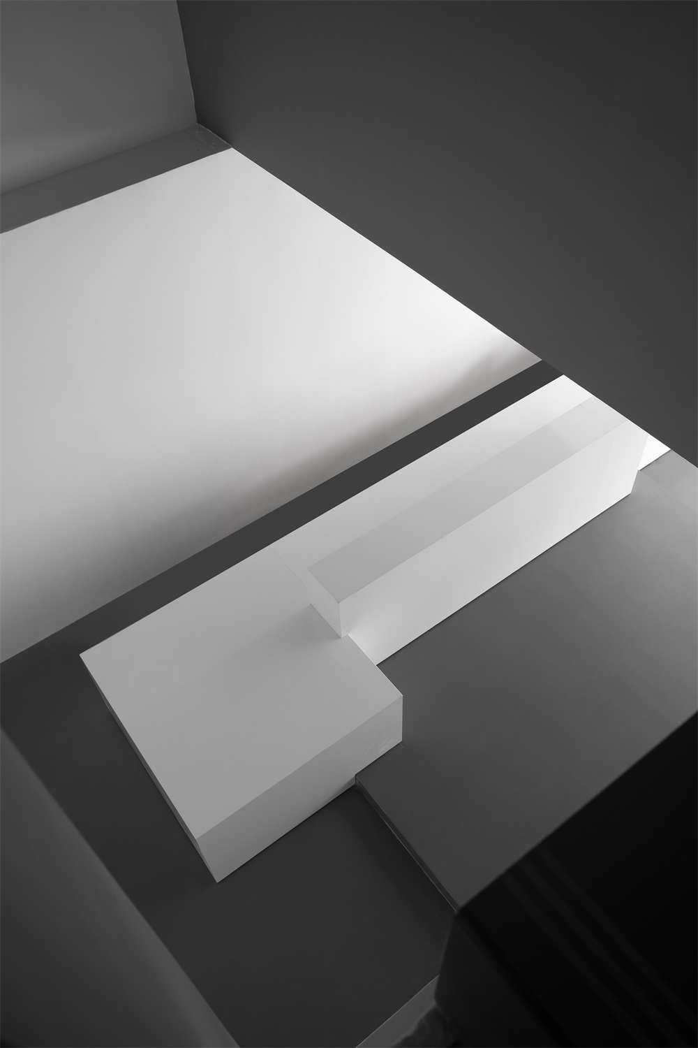
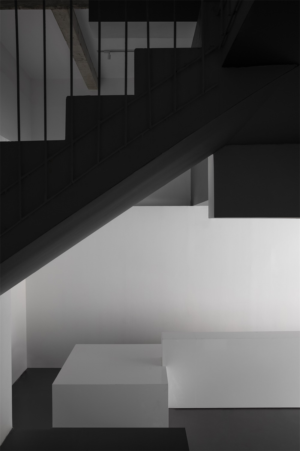
橫向的白色體塊兼顧前台接待台及水吧台,將門廳視線指向空間盡端的樓梯位置,相互交錯,樓梯空間不再是單一的垂直交通,而變成空間中的焦點舞台,結構解放及齒形洞口讓使用者與空間產生了有趣的對話。
The white block functions as a reception desk and a bar counter, and leads the sight line to move from the foyer to the rear staircase area. The staircase area provides a twisting circulation route and becomes a visual highlight in the space, with its flexible structures and openings allowing playful interaction between people and the space.
∇ 樓梯空間
∇ 空間細節
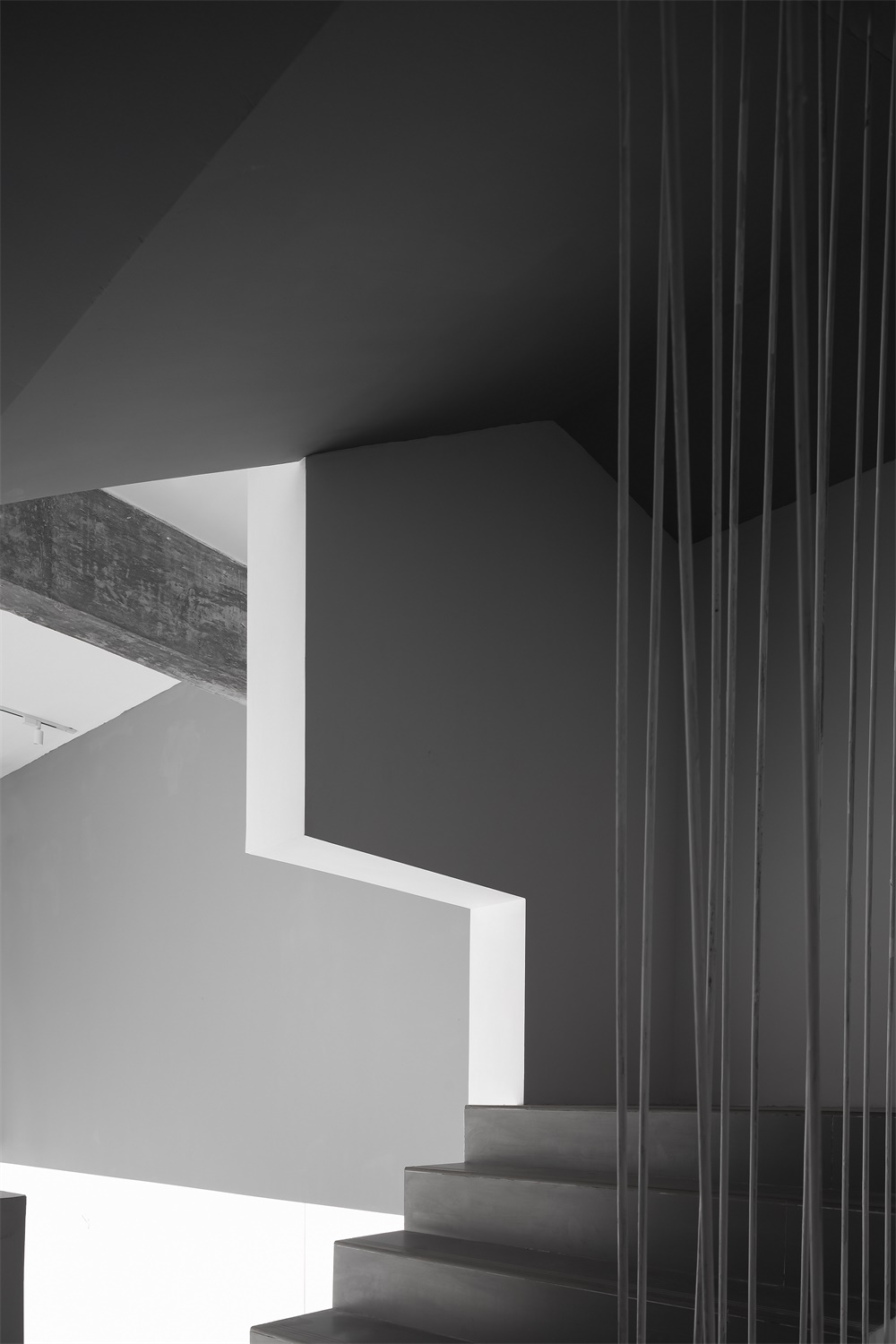
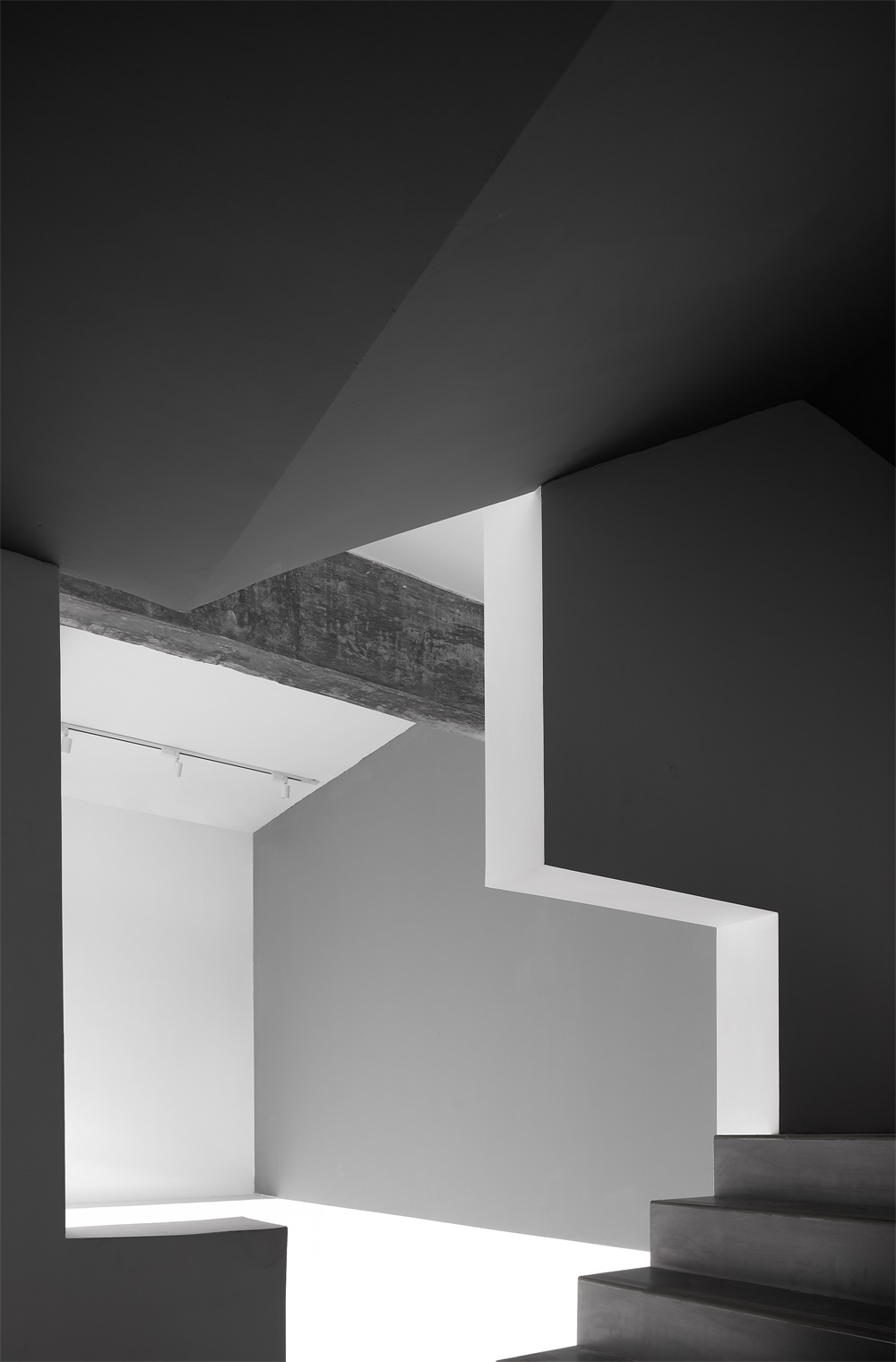
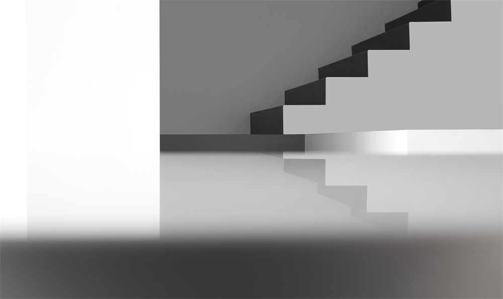
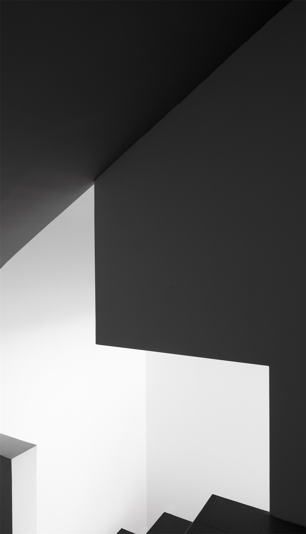
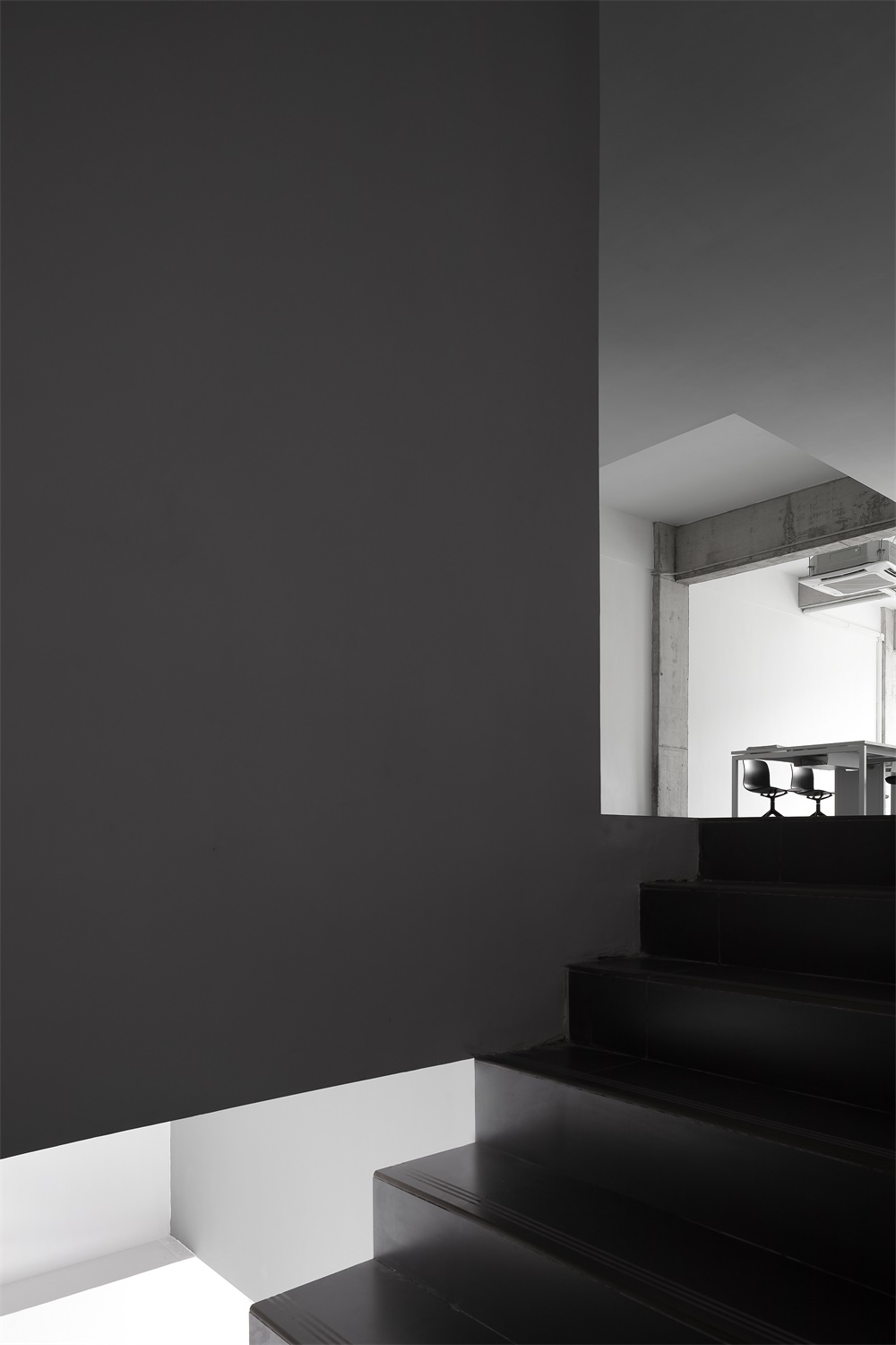
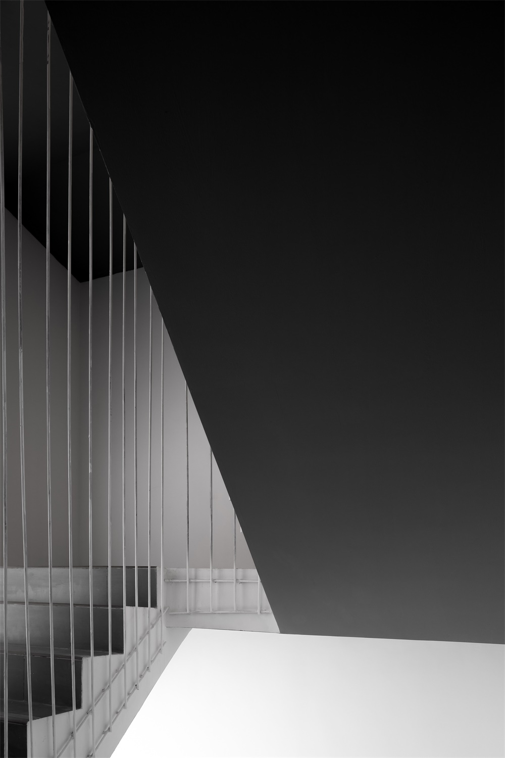
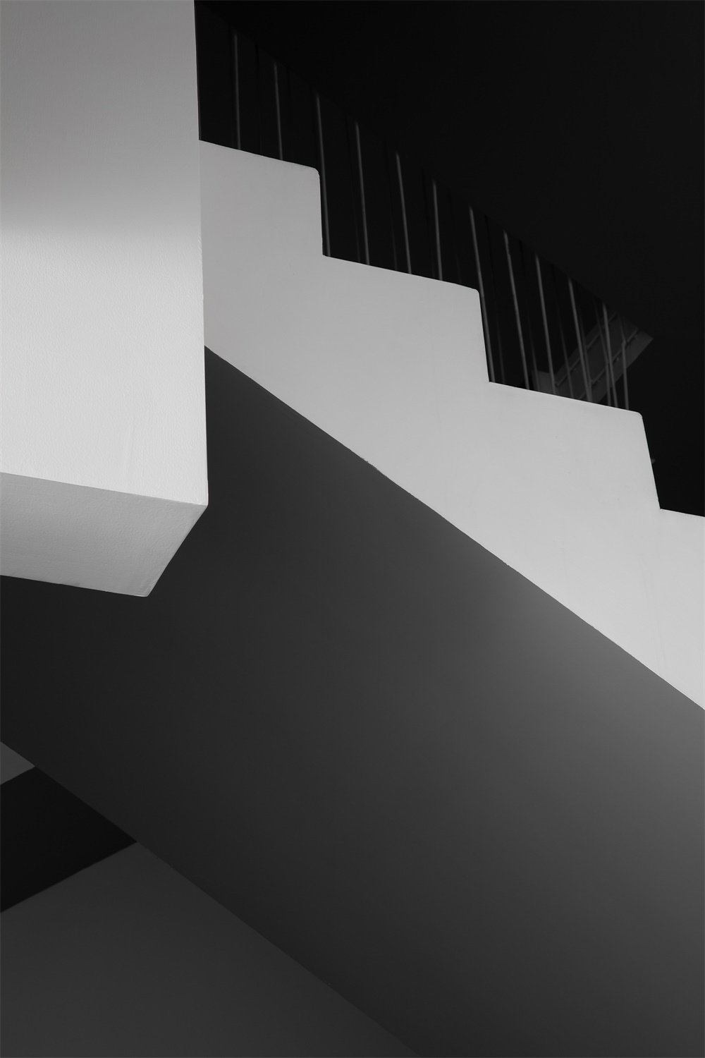
空間整體強調體量與尺度,在樓梯的處理上我們反推常理,黑白相間,讓原本厚重的樓梯輕量化,有如一張折紙。
The overall spatial design emphasizes volume and scale. And the staircase alternates between black and white, which appears more lightweight, just like a piece of paper.
∇ 樓梯空間
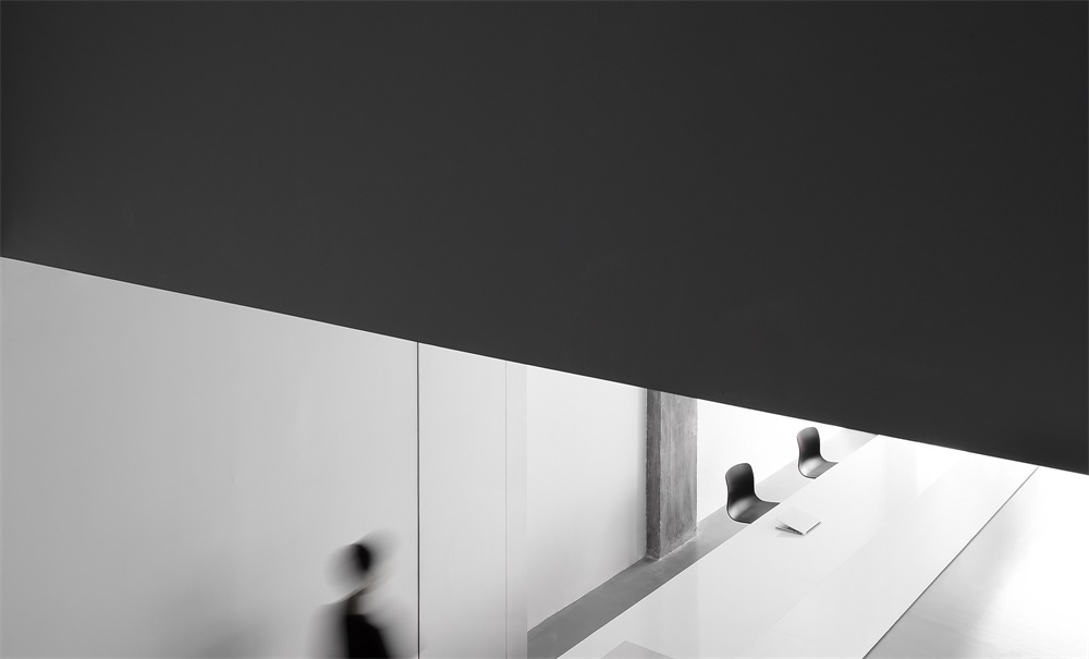
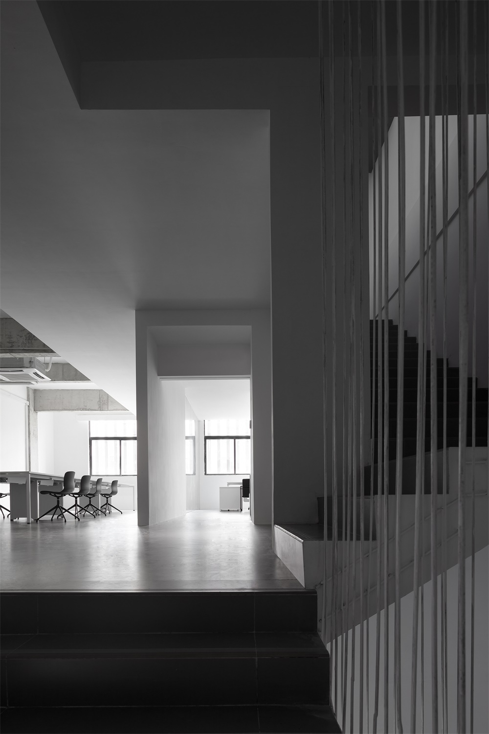
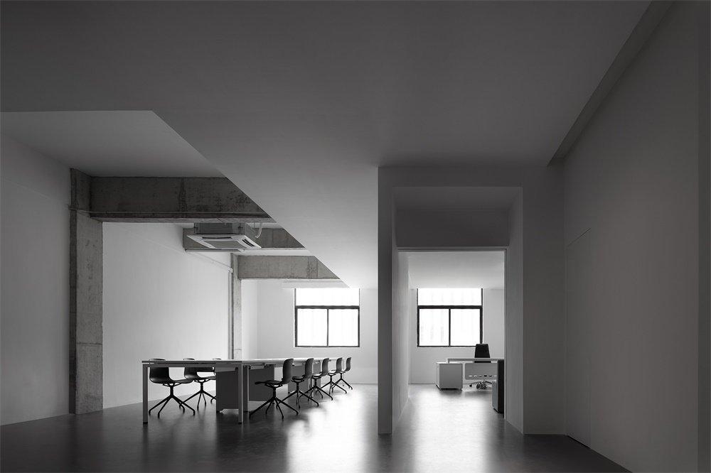
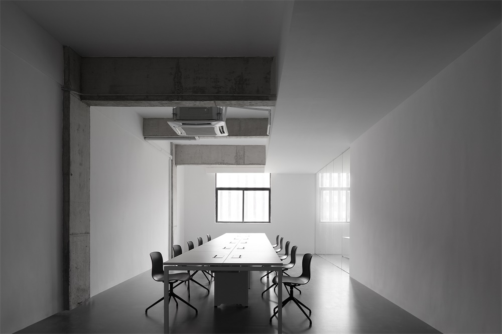
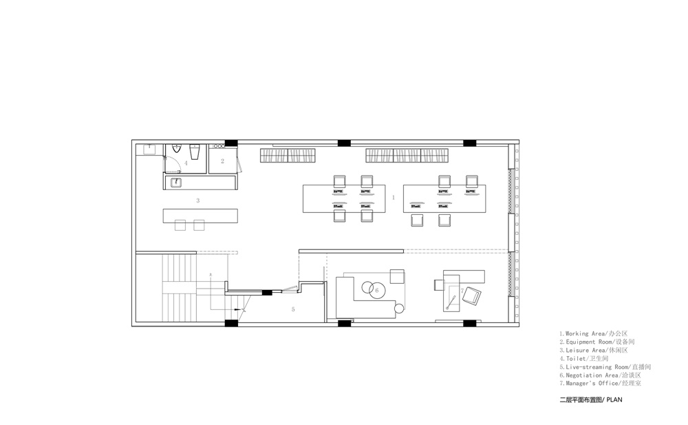
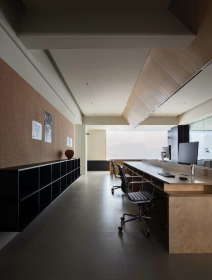
在辦公區頂部通過天花形體虛實變化界定出休息區域,員工可以在此溝通交流及休息。原始空間混凝土結構被有意解放,在緊湊的辦公區域裏營造一個舒適幹淨的環境。
In the working area, the ceiling presents varying shapes, either void or solid, which demarcates the resting space where the staff can communicate and have a break. The original concrete interior structure was “liberated”, so that a clean and comfortable environment was created in the compact workplace.
∇ 樓梯空間
∇ 二層辦公空間
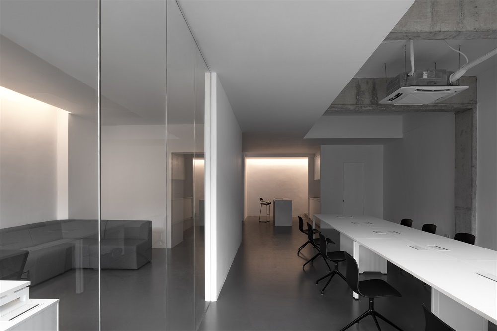
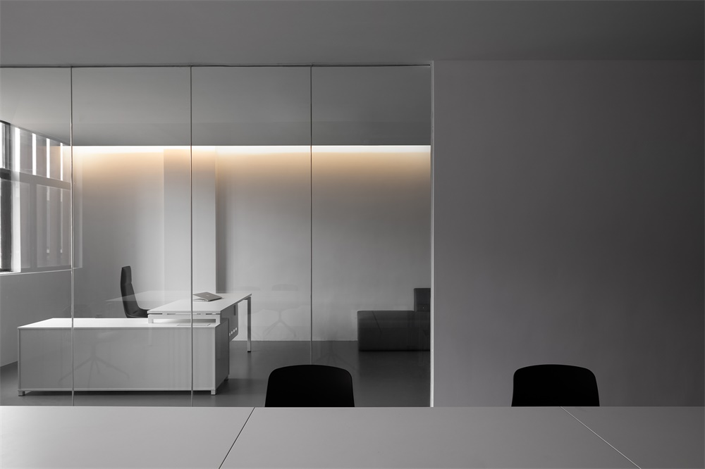
經理辦公室隻是透明玻璃隔斷,空間中並不介入實體劃分,意在營造開放、輕鬆的空間體驗。
Apart from the manager’s office which is partitioned by transparent glass, there is no massive physical partitions within the space, which ensures an open and relaxing spatial atmosphere.
∇ 二層辦公空間
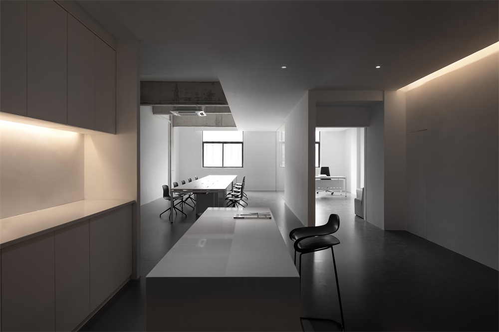
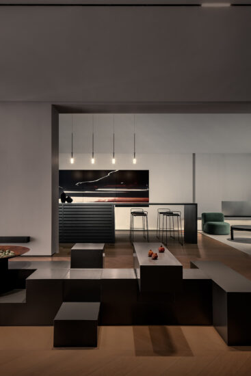
水吧區是連接一二樓空間的重要角色,也是起到了引導人的行為的一個物體,整體氛圍輕鬆舒適,軟化了整體辦公室的冰冷空氣。
The bar area plays an important role in connecting 1F and 2F and is capable of guiding physical behaviors. With a cozy ambience, it softens and balances with the cool tone of the overall space.
∇ 空間細節
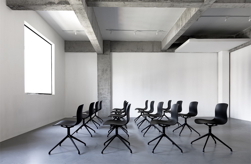
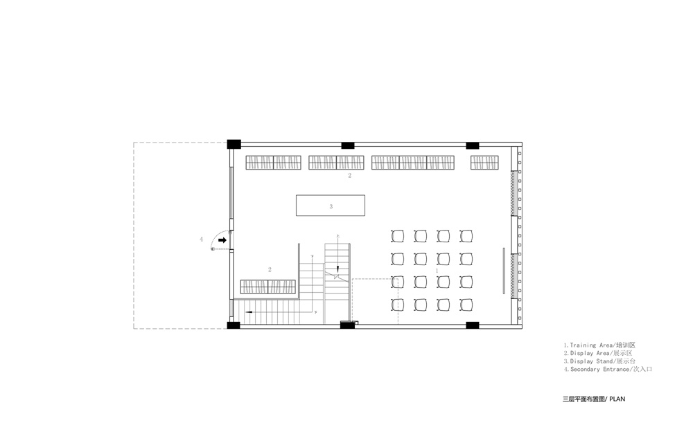
三層作為辦公空間的發布主題展廳,留空讓空間形式與可能產生最大的可能性,兼顧會議、產品發布、產品展示三大功能。設計輕量化,強調功能與產品。
3F functions as a place for meetings as well as product release and display. The interior structure is open and lightweight, so as to provide more possibilities and highlight functionality and products.
∇ 三層多功能空間
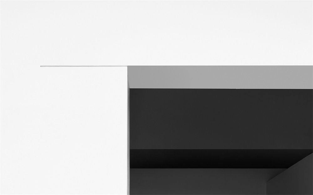
實質上,空間功能與形體視覺呈現為交錯的,混亂的。通過對空間形體、設施和結構的重新整合,讓空間實現自我演化,進而呈現有趣且富有張力的幾何空間美學。
In fact, functions and visual impressions of the space are intermingled. Through recombining spatial forms, facilities and structures, AD ARCHITECTURE realized self-transformation of the space and further endowed it with a playful geometric aesthetic, which is full of tension.
∇ 空間細節
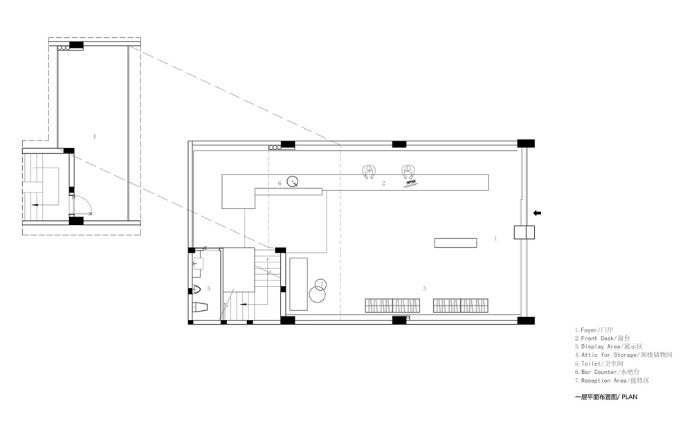
∇ 一層平麵圖
∇ 二層平麵圖
∇ 三層平麵圖
完整項目信息
項目名稱:叛逆者∣JYC服飾辦公空間
設計機構:AD ARCHITECTURE∣艾克建築設計(WWW.ARCH-AD.COM)
總設計師:謝培河
設計團隊:艾克建築
項目地點:廣東東莞
建築麵積:400㎡
主要材料:灰色磚、灰色地漆、白色乳膠漆、灰色乳膠漆、白色人造石
設計時間:2019年1月
竣工時間:2019年08月
攝影師:歐陽雲
Project name: JYC Office
Design firm: AD ARCHITECTURE (WWW.ARCH-AD.COM)
Chief designer: Xie Peihe
Design team: AD ARCHITECTURE
Project location: Dongguan, Guangdong, China
Project area: 400 m2
Main materials: gray brick, gray floor paint, white/gray latex paint, white artificial stone
Start time: January 2019
Completion time: August 2019
Photography: Ouyang Yun


