LOFT中國感謝來自 予舍予築 的辦公室項目案例分享:
設計概念:知識的倉庫
Design Concept: books: the vastest source of knowledge
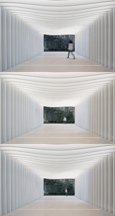
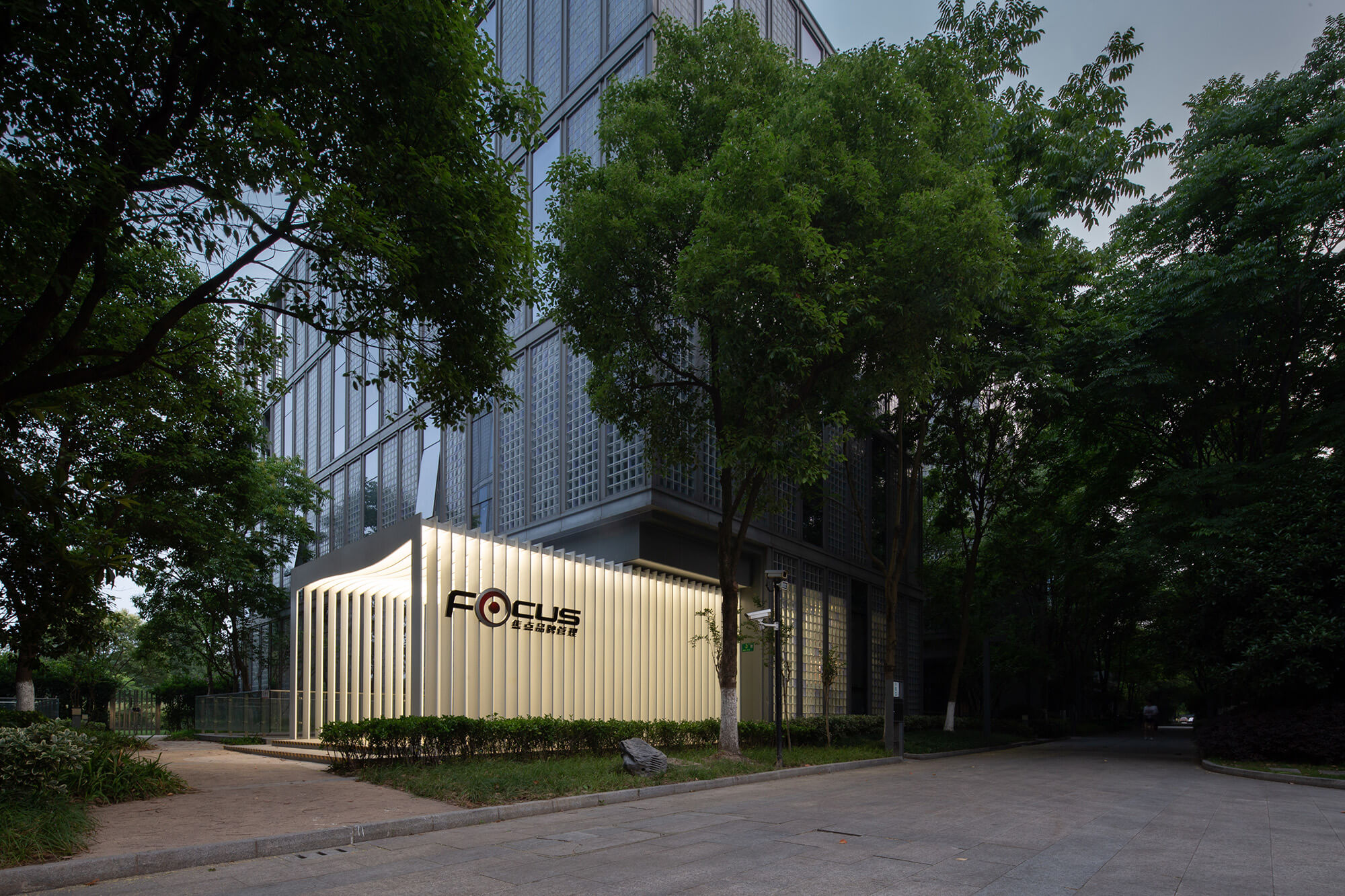
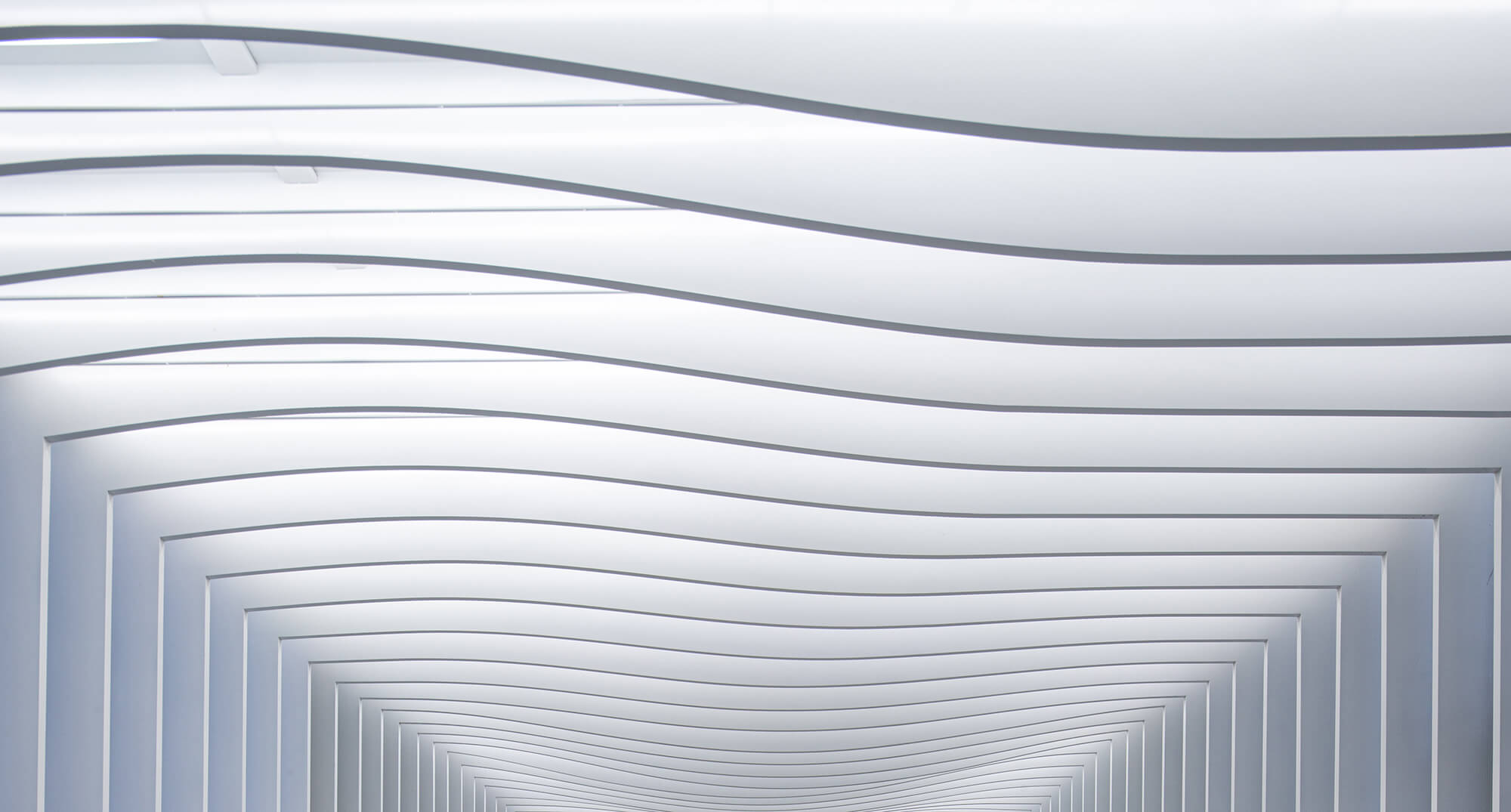
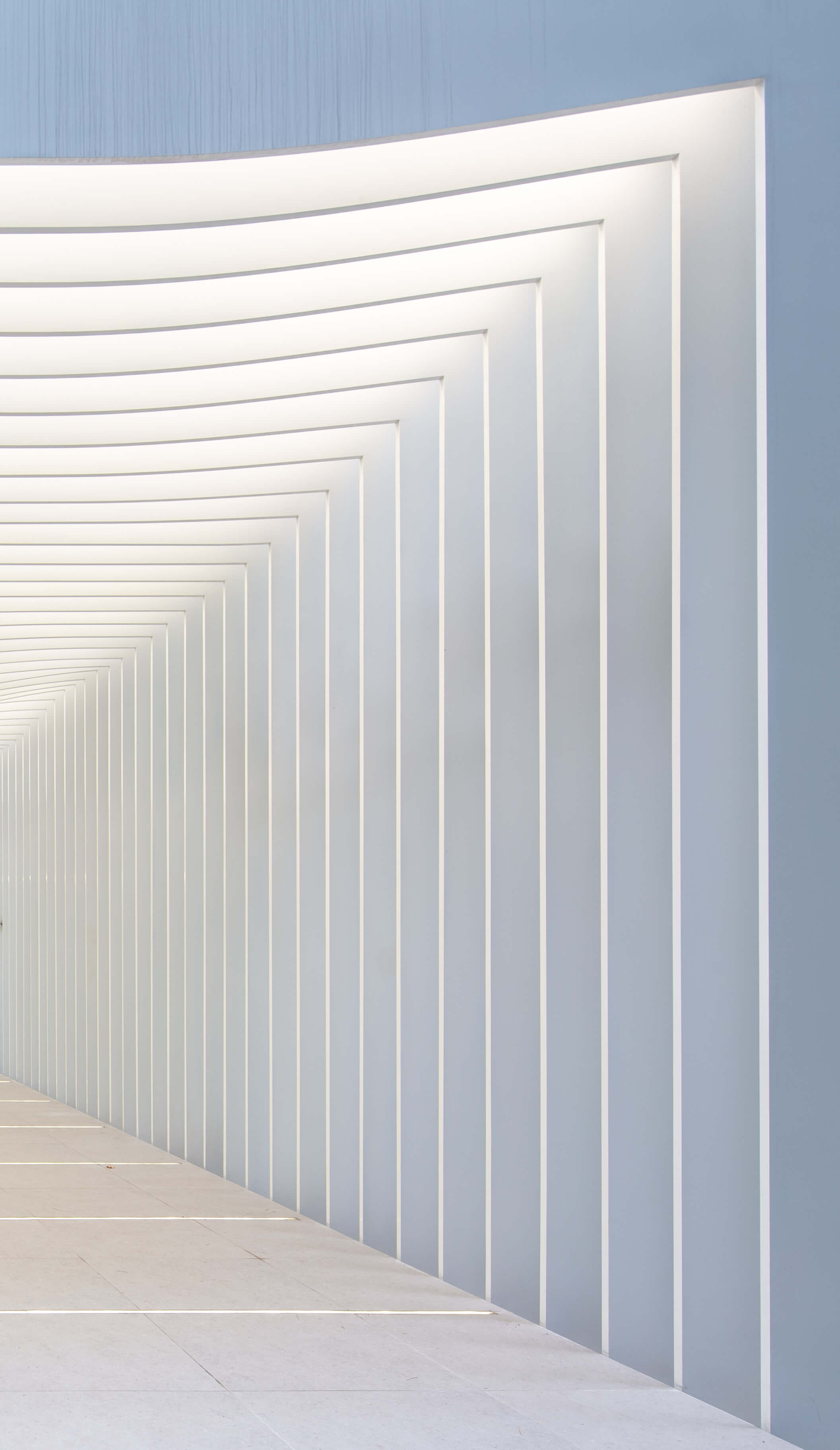
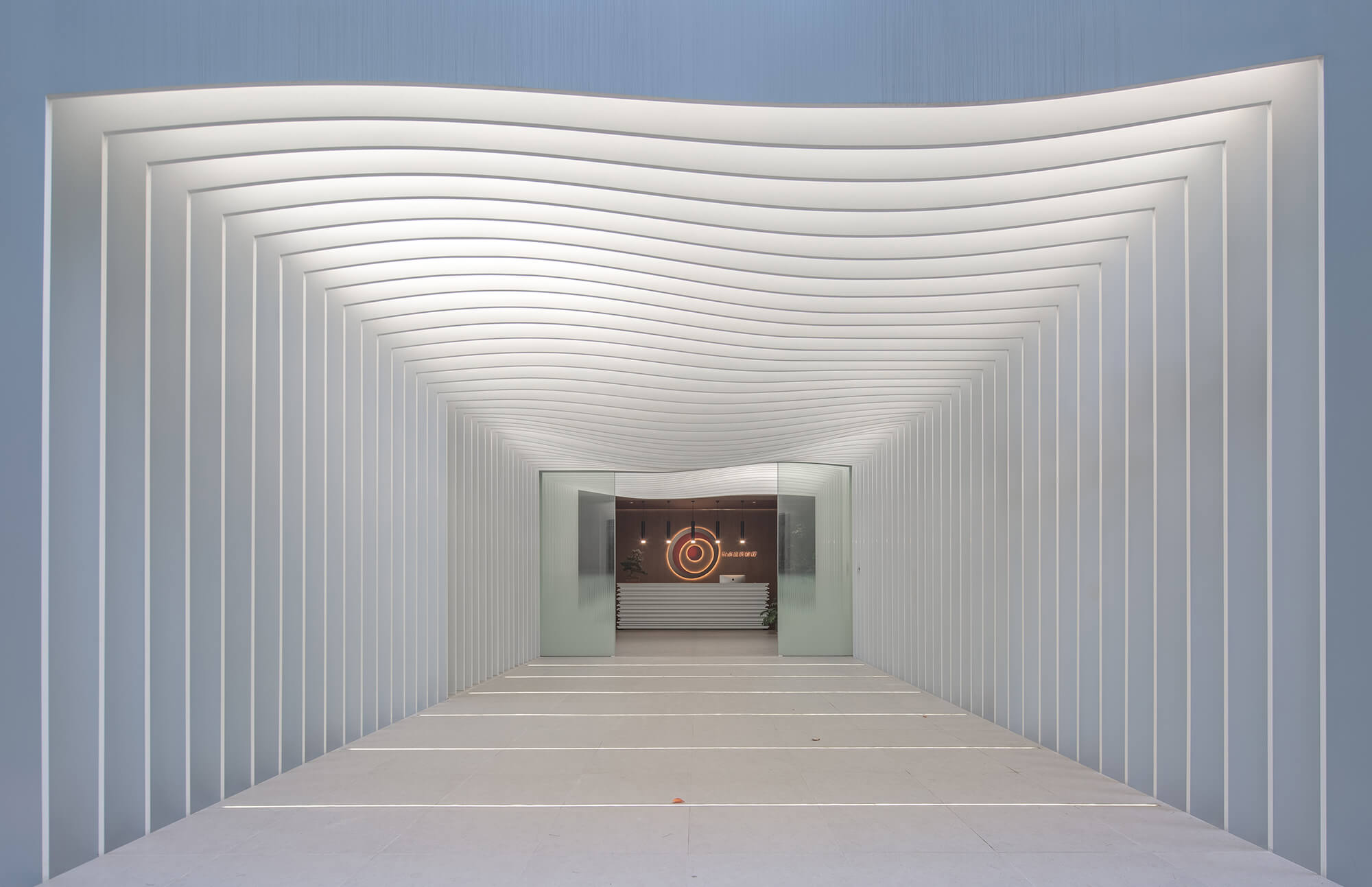
江南梅雨時節難得的晴天裏,這個“風琴”式的入口隻需要一點光和影就足夠風姿綽約。
伶俐的曲線和純白的色彩柔化了鋼結構傳統意義上給人的堅硬感覺。漸變的曲線有節奏地跳動,像是大海起伏的胸膛,吸引經過的人側耳傾聽它的呼吸;又如同一段通往內心深處的序曲,撩撥起聽眾探索的欲望。每個觀者、使用者對它都有不同的解讀,就如同一部好的文學作品,交到讀者手中,便和創作者無關了。
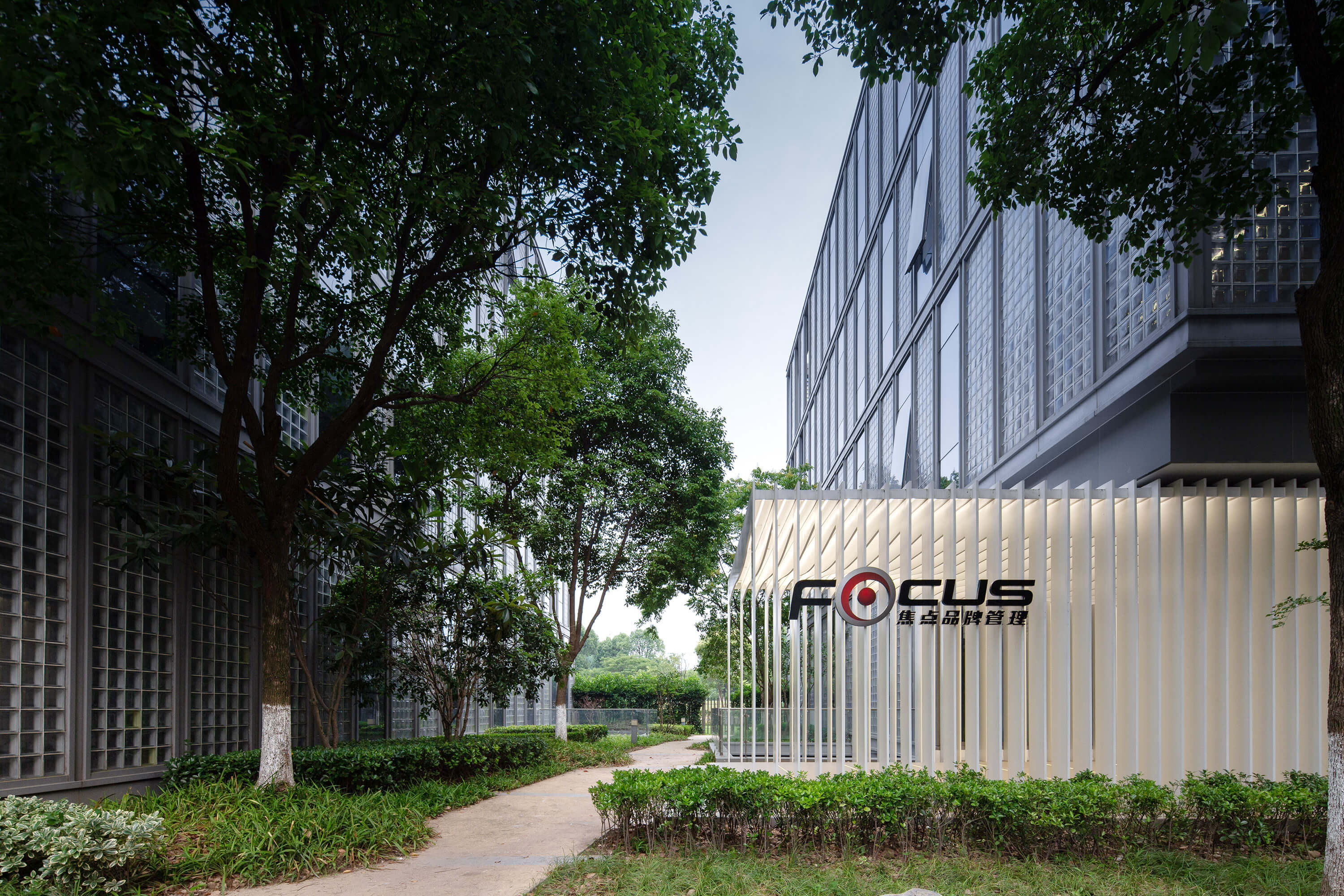
項目位於蘆恒路上的萬科VOM辦公園區,初見時周圍長滿了蘆葦,頗有野趣。戶外露台連接著室內外,感覺與大自然是融合的。建築包括地上四層及地下一層,由馬達思班設計,幕牆是通透的玻璃磚。
Located at VOM Office Park in Shanghai, among the same ordinary modernistic “cubes”, the office of Focus Advertising Agency can be recognized at first sight due to its graceful installation expanding from the entrance.
客戶第一次到訪焦點品牌管理總部,幾乎毫不費力就能一眼辨認出它來。掩映在一片綠意盎然的樹蔭之中,一個純白色的長方形鋼結構裝置從這棟辦公樓裏延伸而出,成為園區的視覺“焦點”。入口處起伏的波浪鋼板間隙抖落的光影讓經過的人浮想聯翩,不由想探究通道內部究竟是番什麼景象。
The page-like structure made by pure white waved steel plates creates rhythmically changing curves in the sunlight. Just like the prelude in a piece of music, it invites the audience to hear more about its mysterious story.
焦點希望辦公空間能夠傳遞“智庫”的概念,設計團隊摒棄了計算機CPU,雲,數據庫等這類更加現代科技的抽象概念,選擇了更具文化色彩的符號——書頁。
As a native Chinese advertising agency who wants a more distinctive office for its new business development based on its enterprise culture—always armed with a vast number of information. To achieve this, the designers choose a classical symbol of knowledge—book as design concept instead of CPU, Data Cloud, database which seems more suitable for advertising agency after long discussion.
愛書之人都有這樣的體驗:手握一本喜愛的書籍,連翻頁都是一個充滿儀式性的時刻。正襟危坐,做出一個長長的深呼吸,用指尖磨砂著扉頁硫酸紙那細膩清脆的質感,陶醉在翻頁時發出的“刷刷”聲中。我們希望這個“通道”創造出類似的儀式性時刻——當你經過它時,你甚至會刻意整理一下儀容,放緩步調,調整臉上的表情,緩緩開啟一場未知的探索。
The concept derives from the experience of reading and the definition of knowledge. People who love books may have this specific experience: holding a favorite book, even turning pages can be a ceremonial moment. Sitting solemnly as show of respect, make a long deep breath, use the fingertips to scrub the delicate and crisp texture of the vegetable parchment paper, and revel in the “brushing” sound when turning the page. Therefore, the design team creates a ceremonial tunnel functions as a spiritual reset. When people enter the office via this elegant walkway, they will even deliberately slow down and adjust their expression on the face, and slowly to open start an unknown exploration.
另一方麵,作為設計師,我們比誰都能感同身受知識的力量以及普遍的“信息焦慮”。今天,我們獲取信息,或者說所謂的“知識”的渠道比任何時代都要多,可以說是輕而易舉地,我們生活的方方麵麵都被信息填滿了。信息時代固然節省了我們選擇的時間和經曆,但是,我們因此失去的是發掘和探索。“正如最絕對的噪音與寧靜之間隻是一線之隔,信息的過於充實可能引起絕對的無知”。在信息高速發展的今天,我們倔強地要以滿懷深情、富有詩意地方式回歸到更原始的標準中去。
On the other hand, as designers, we can feel the power of knowledge and the common “information anxiety” than anyone else. Today, we have access to information, or the so-called “knowledge” more than any era before. It can be said that all aspects of our lives are filled with information. The information explosion age has certainly saved a lot of time and widened our choice, but also deprived the happiness of discovery and exploration. As the absolute noise and quiet are just a line apart, too much information can cause absolute ignorance. Today, with the rapid development of information, we obstinately return to more primitive standards of knowledge in such a deep and poetic way, because we still believe that books are a permanent form of knowledge.
空間:翻開智慧的書頁
Open the book of Focus Advertising Agency
我隻想言簡意賅
我祈求的不過是那高雅慧德
…
這是我們的發聲時刻,
不須誇誇而談,
我們的心靈明日將重新起航
——喬治塞·弗裏斯All I want is to speak simply;
for this grace I pray.
And it is now time for us to say
the few words we have to say.
Because tomorrow our soul sets sail
——George Seferis
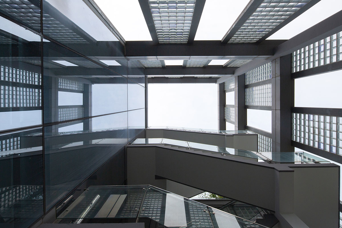
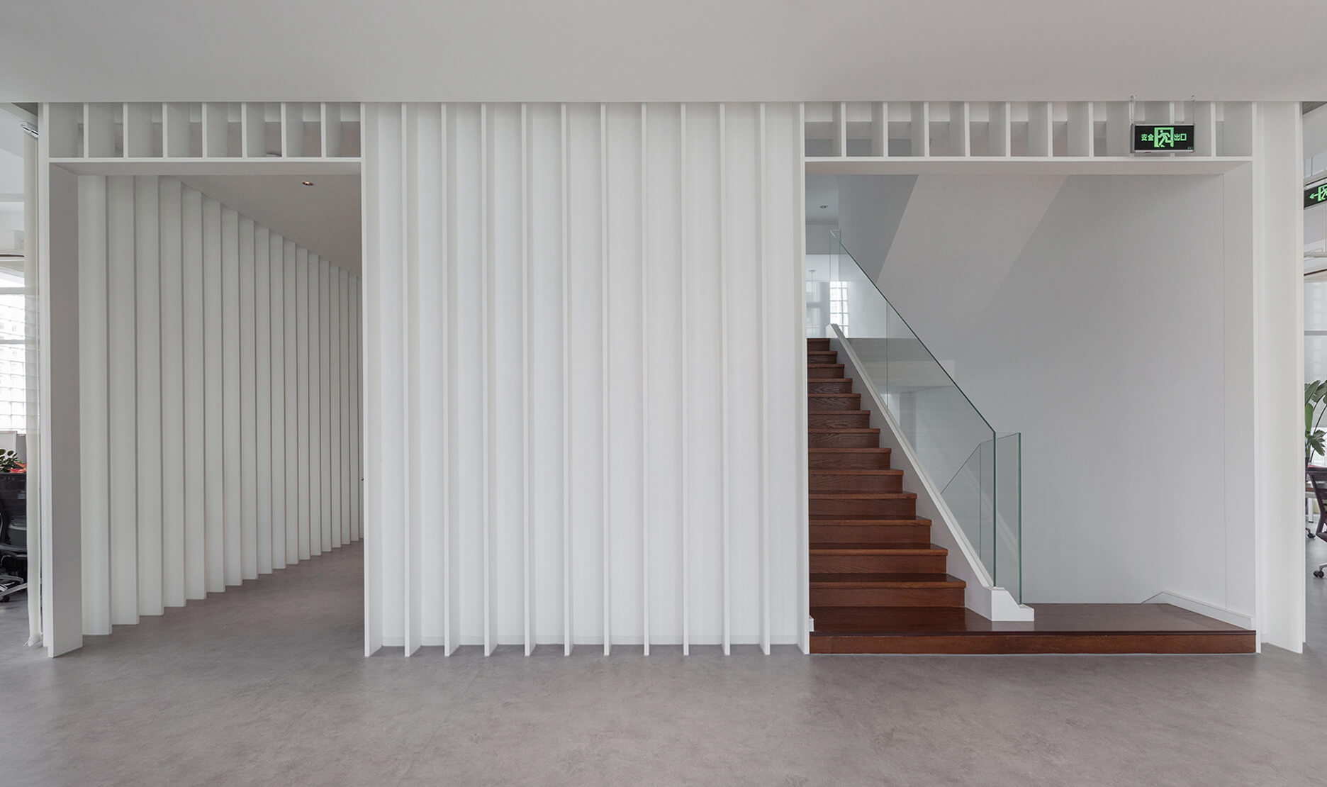
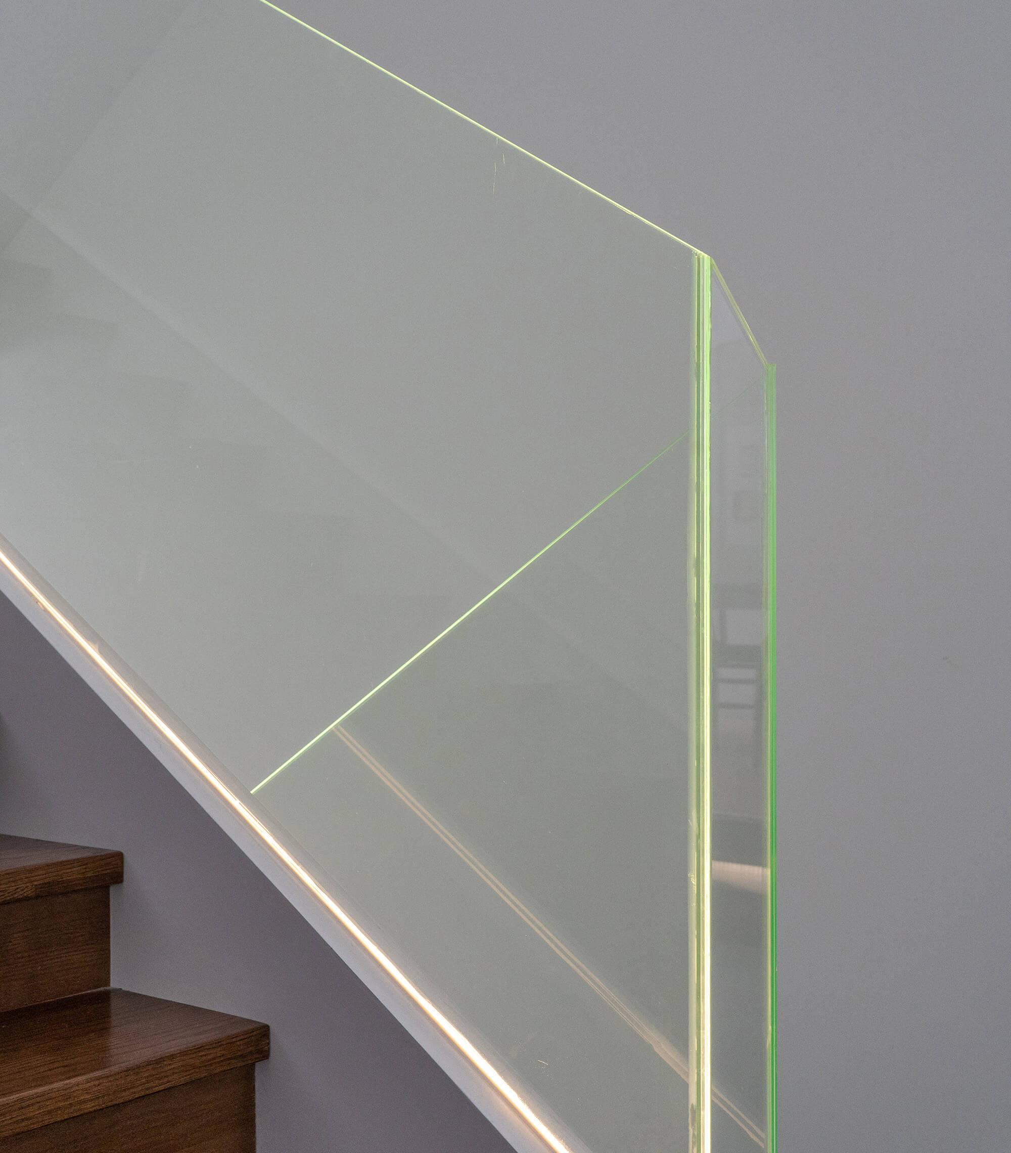
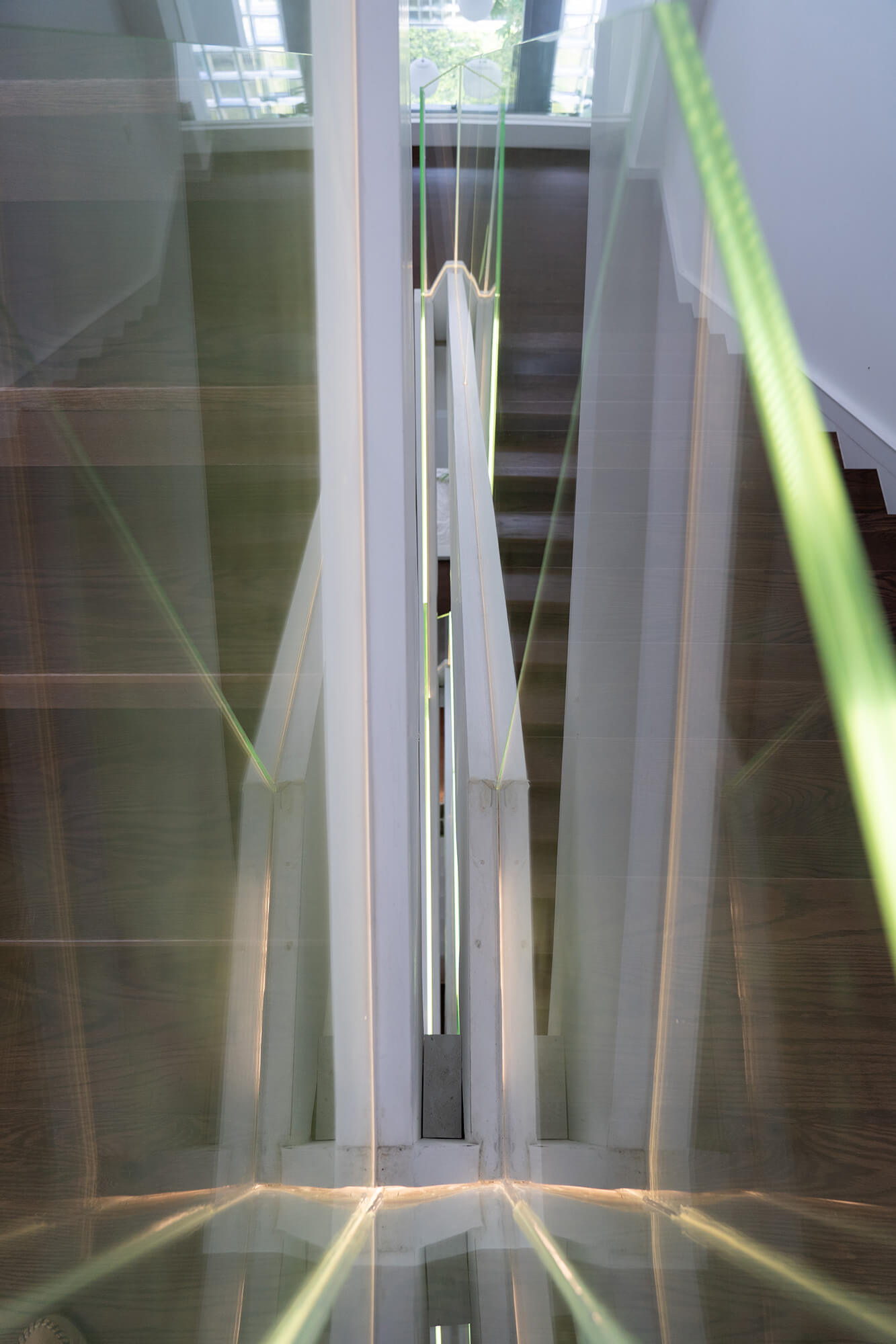
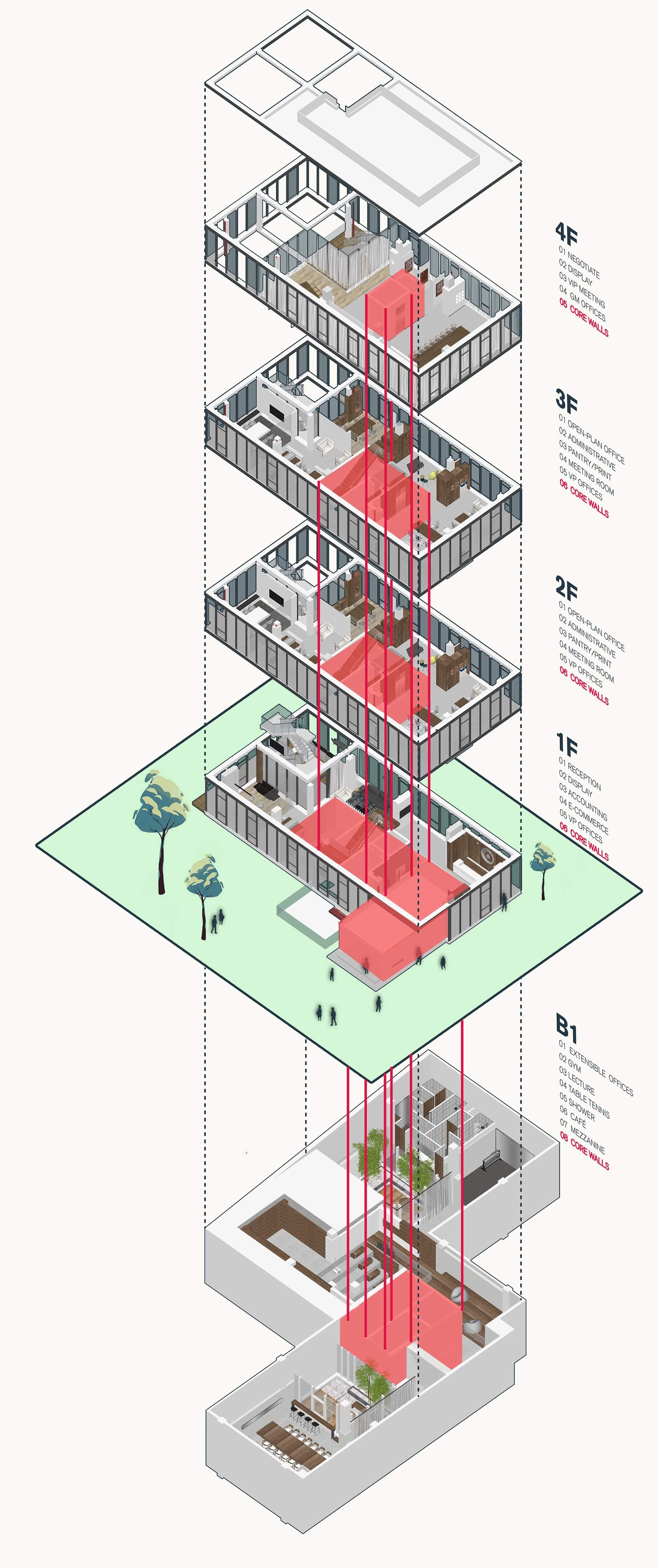
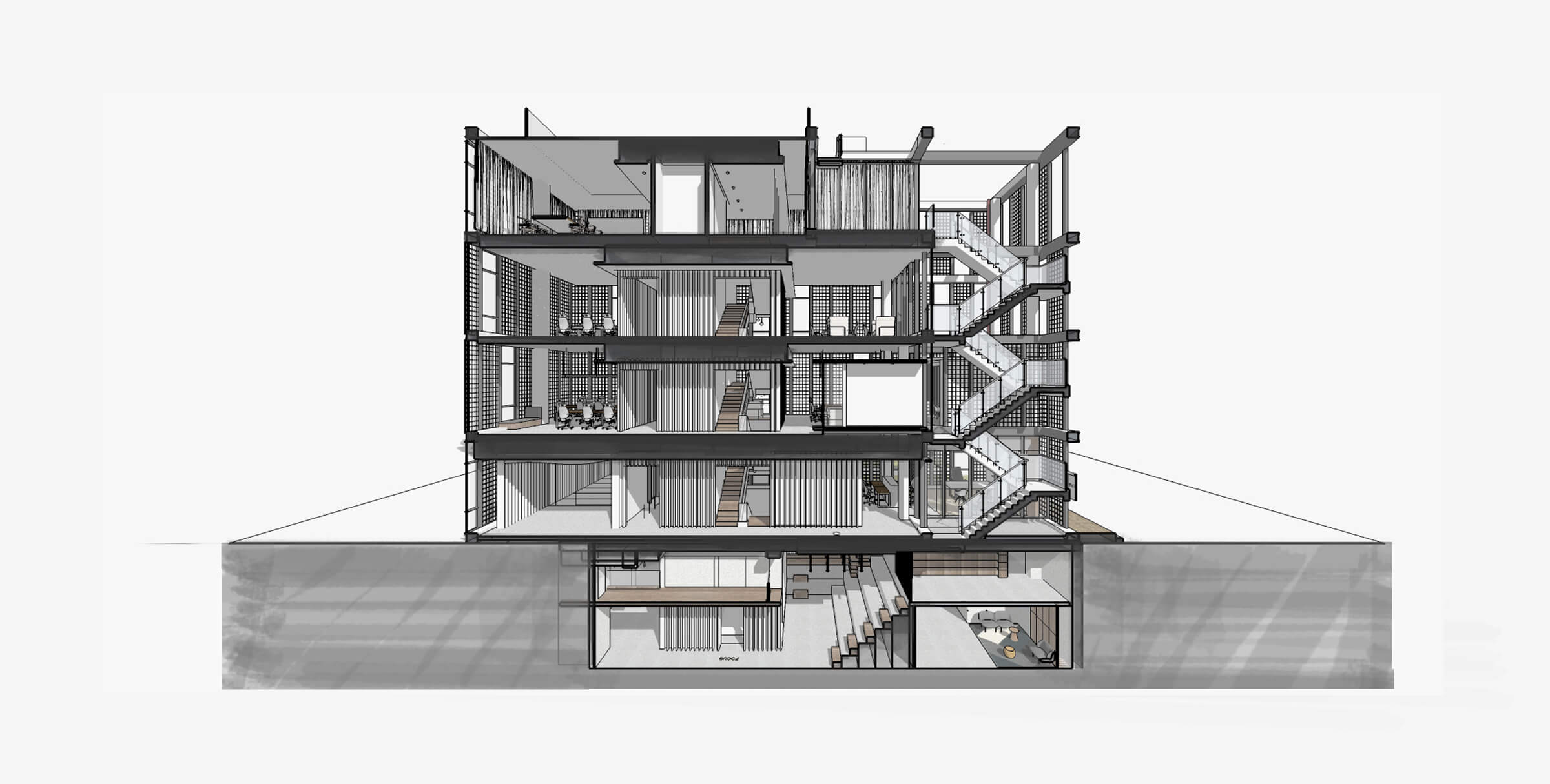
形式引發功能。“書籍”的核心概念以片狀格柵的具象方式,從負一層到三層,連續包裹整棟樓的核心筒,猶如緩緩打開的書頁。沿著樓梯拾級而上,目及之處是精致的小景觀設計,玻璃扶手在自然光下折射出頗有趣味的幾何線條。
The core concept of “book” is the figurative way of the sheet grid, from the basement to the third floor, continuously wrapping the core-tube of the whole building, like a slowly opened book page.
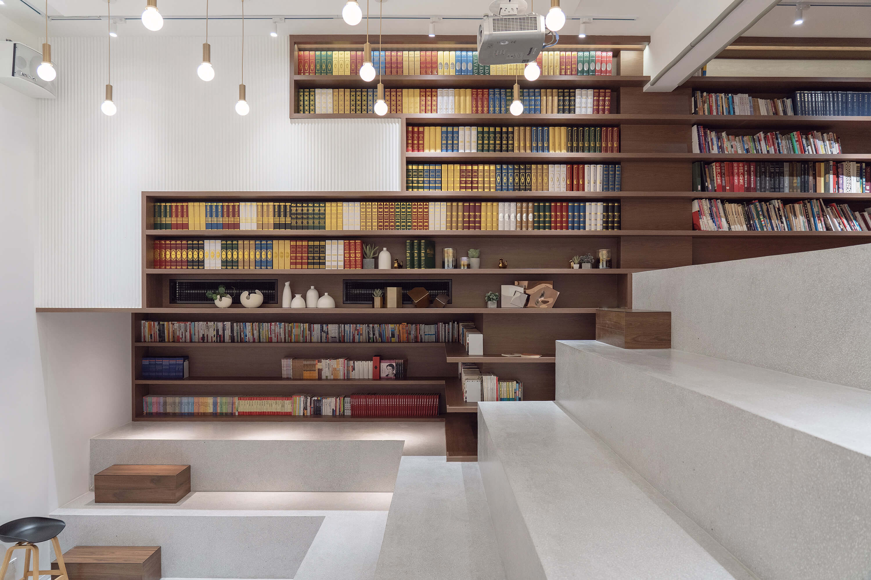
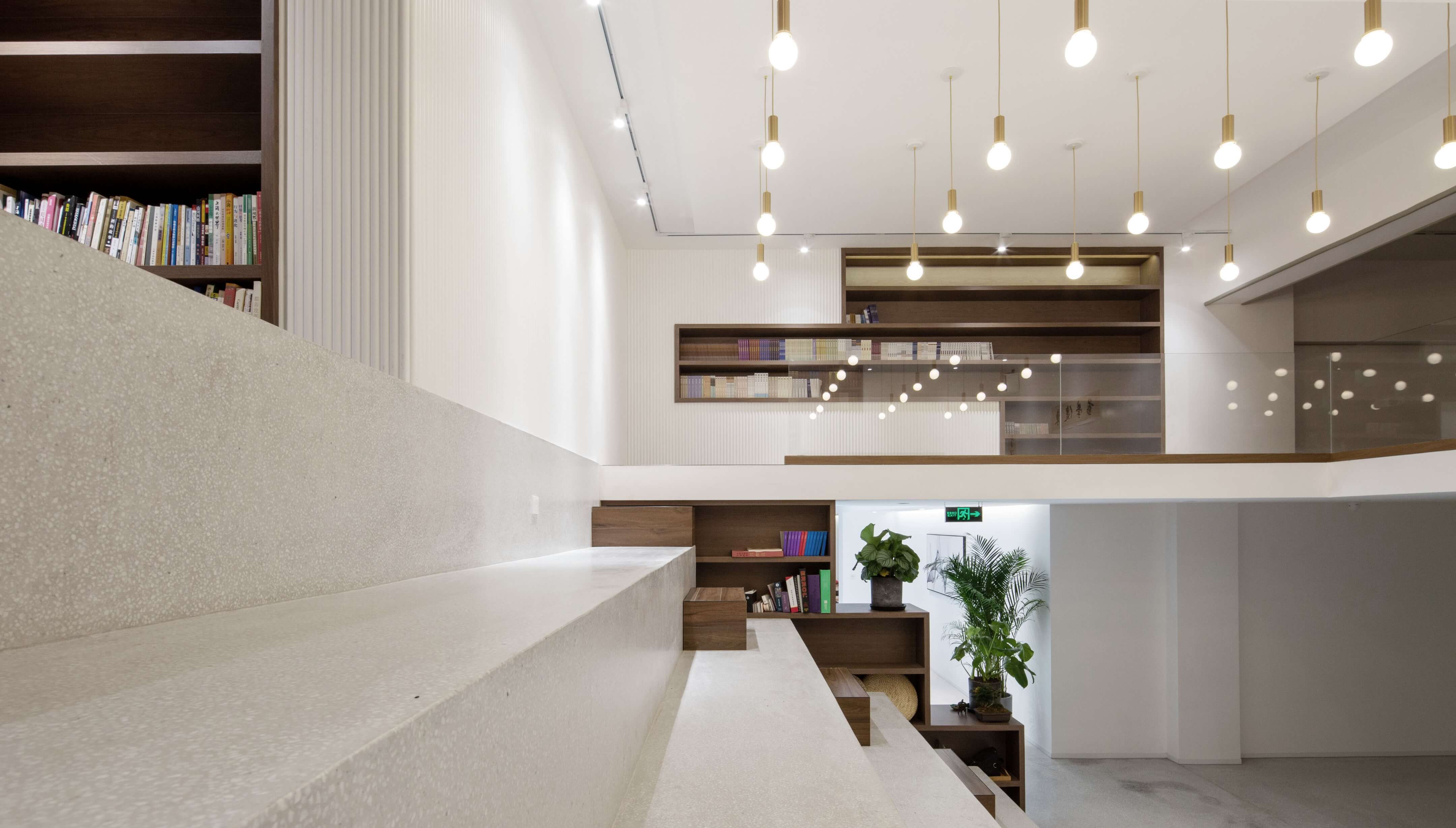
B1層有著高挑空的空間優勢,我們本著因地製宜的設計原則搭建了空間夾層、安裝了階梯休憩踏步,這樣,不但擴大了B1層的使用空間,也為多樣的辦公、休閑空間提供了可能,而階梯休憩踏步的融入使B1層成為焦點辦公召開員工會議的集會區域。
Due to the advantage of floor height, a mezzanine was built on B1 floor to maximize the space to accommodate different use such as informal meetings, staff activities and leisure.
細節:內心深處的返璞歸真
Sparkling Details
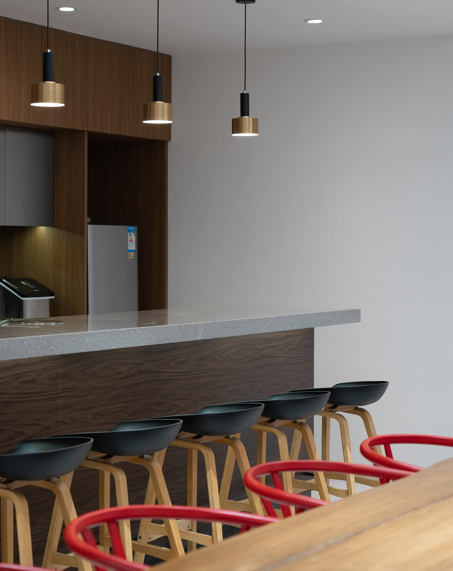
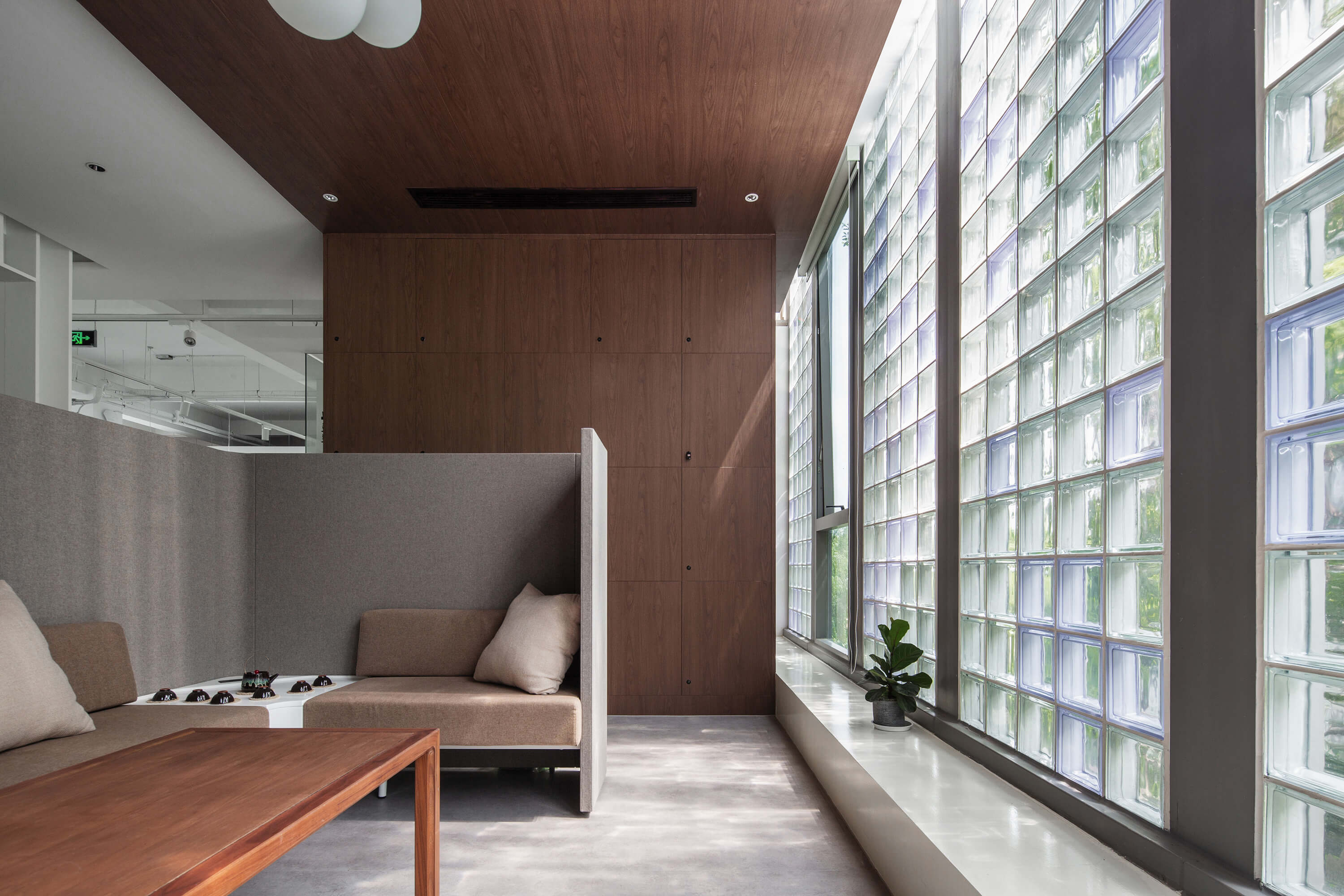
焦點十分重視企業文化和人文關懷,因此,四層的辦公環境預留了足夠的空間給餐飲區,員工休息區,甚至還配備了一間淋浴房。散布在不同角落的休息區選用活潑而不失穩重的色彩為員工營造舒適的自洽或者交流空間。
The four-story office provides enough space for dining area, rest area and even a shower room. Lounge areas scattered in different corners use steady colors to create a comfortable and quiet space for employees.
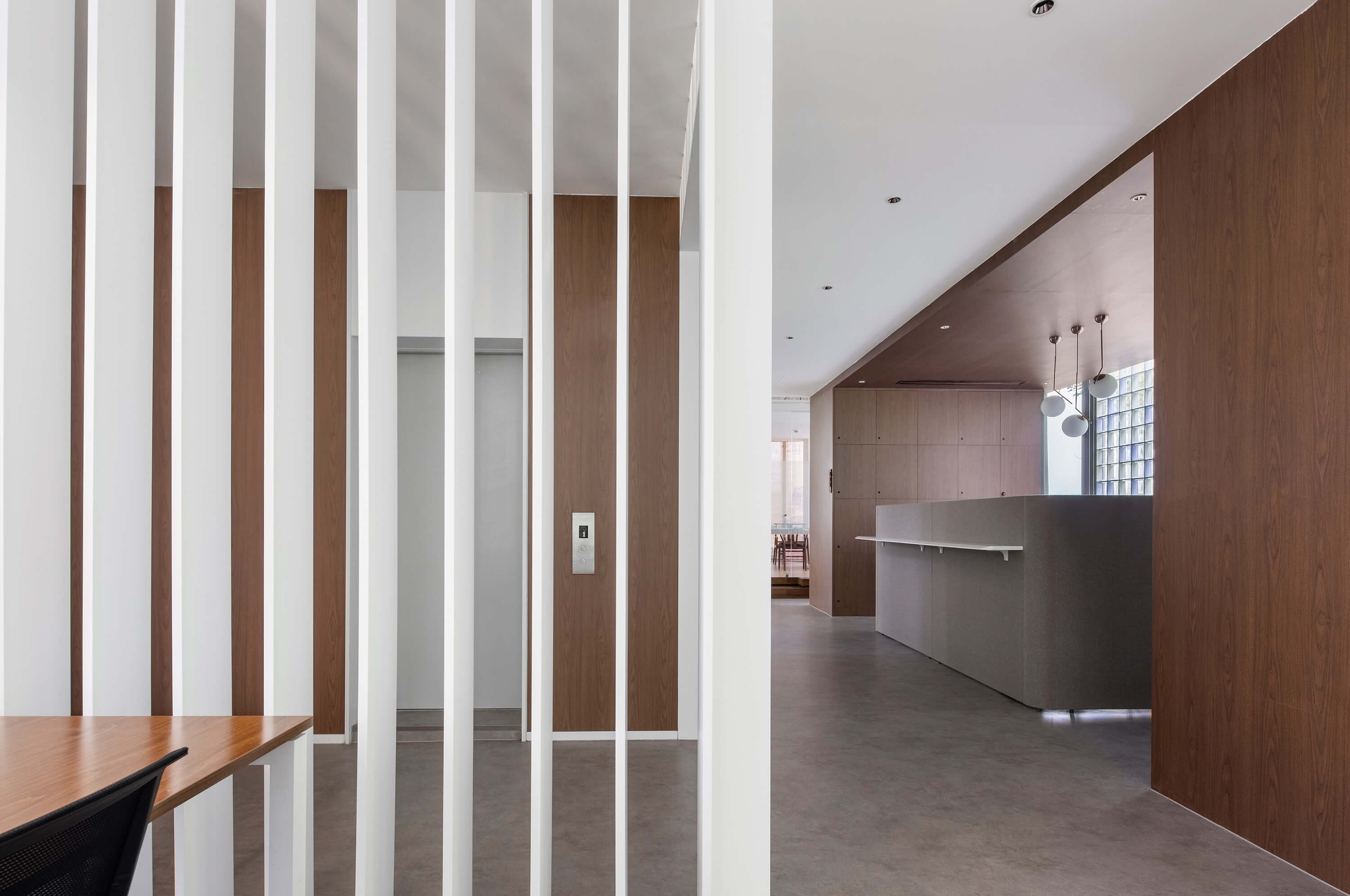
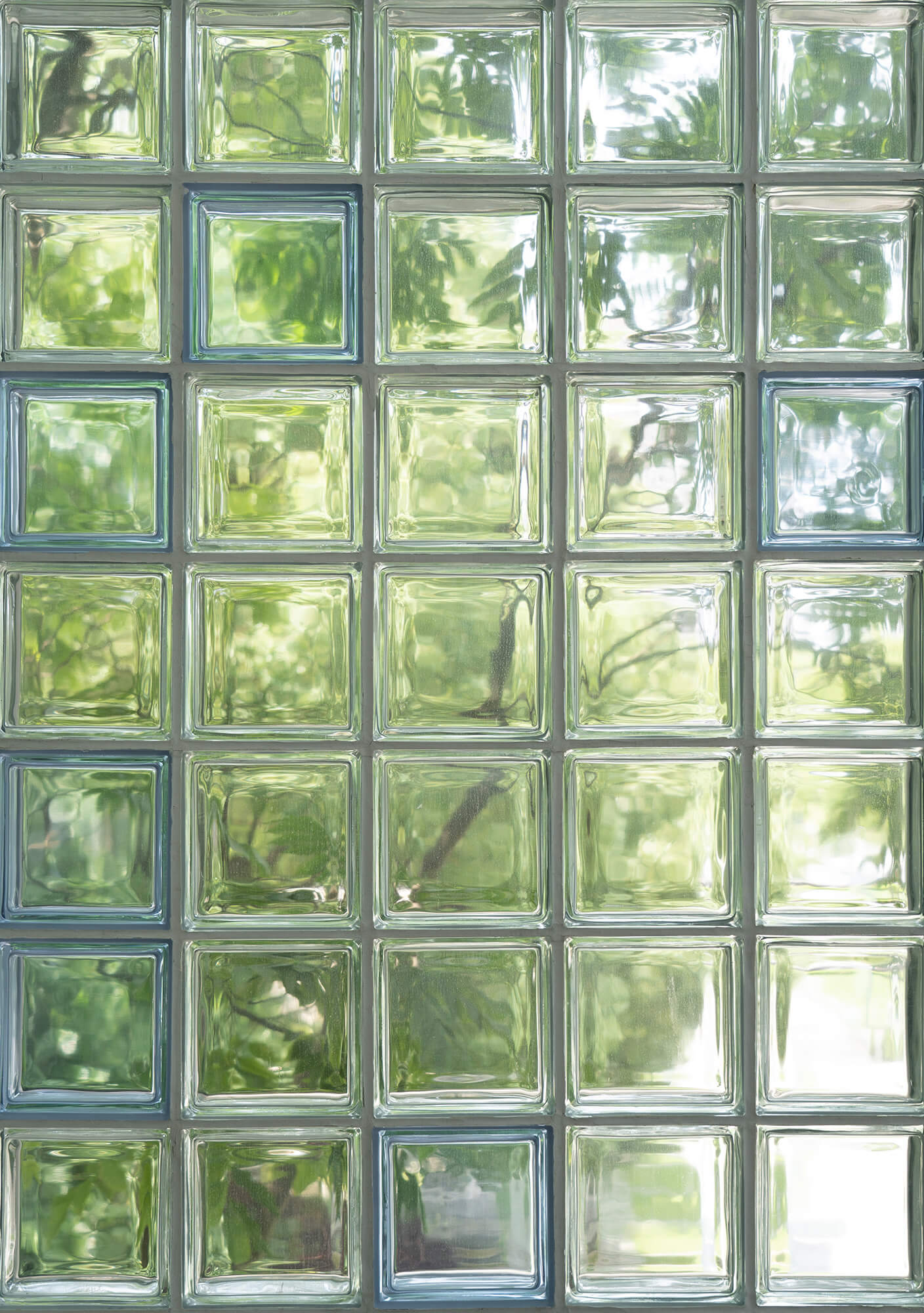
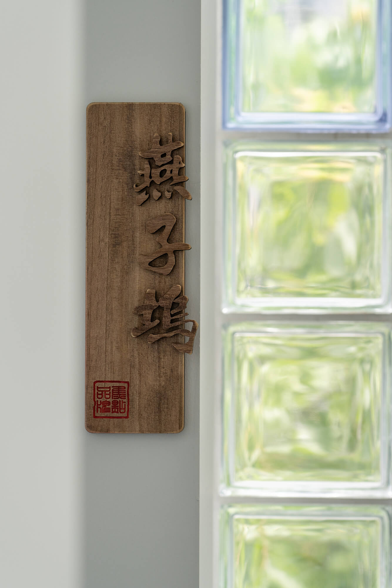
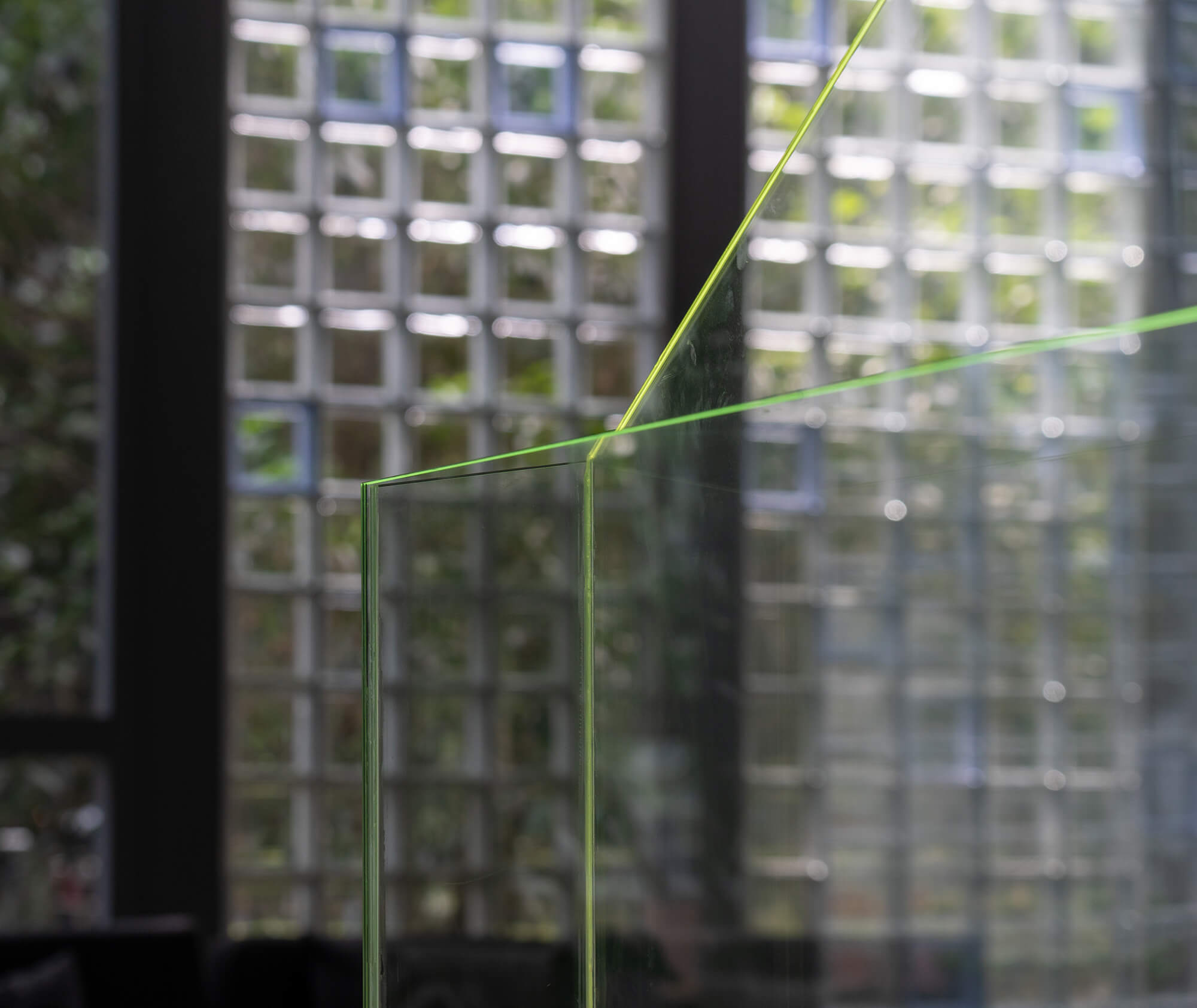
As a modern design language, glass bricks are flexible in the whole space, with dynamic reactions under natural light, artificial light and customized logo used to divide space.
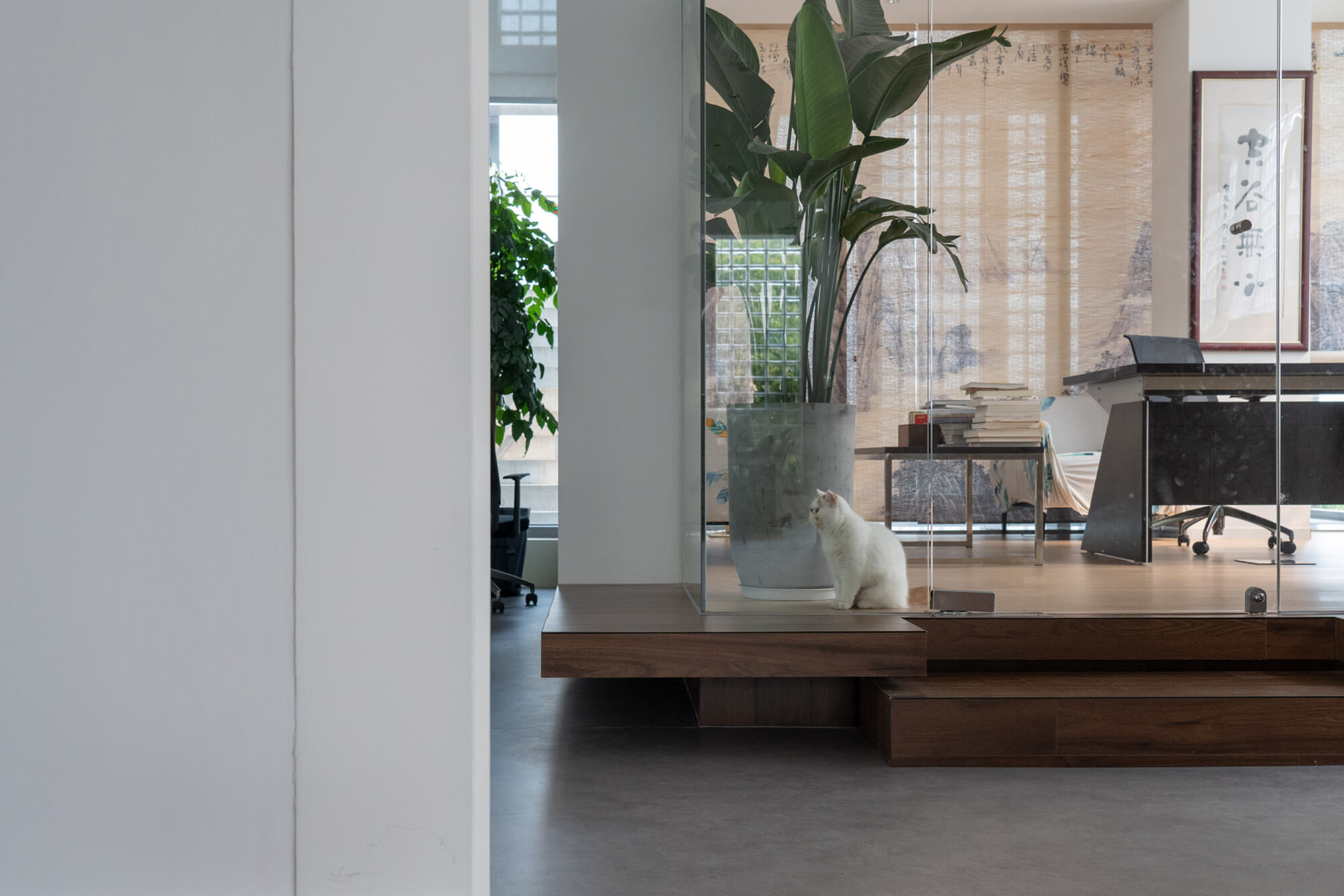
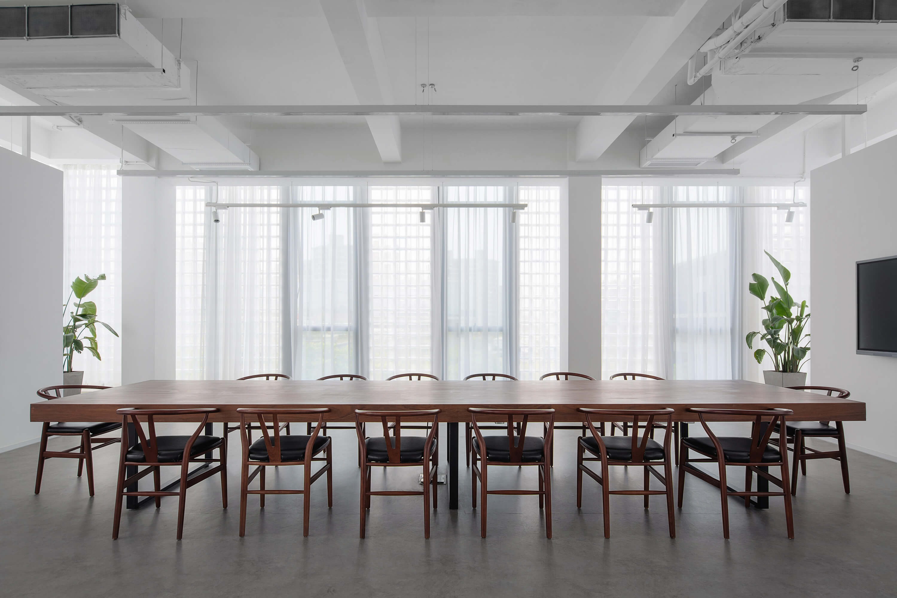
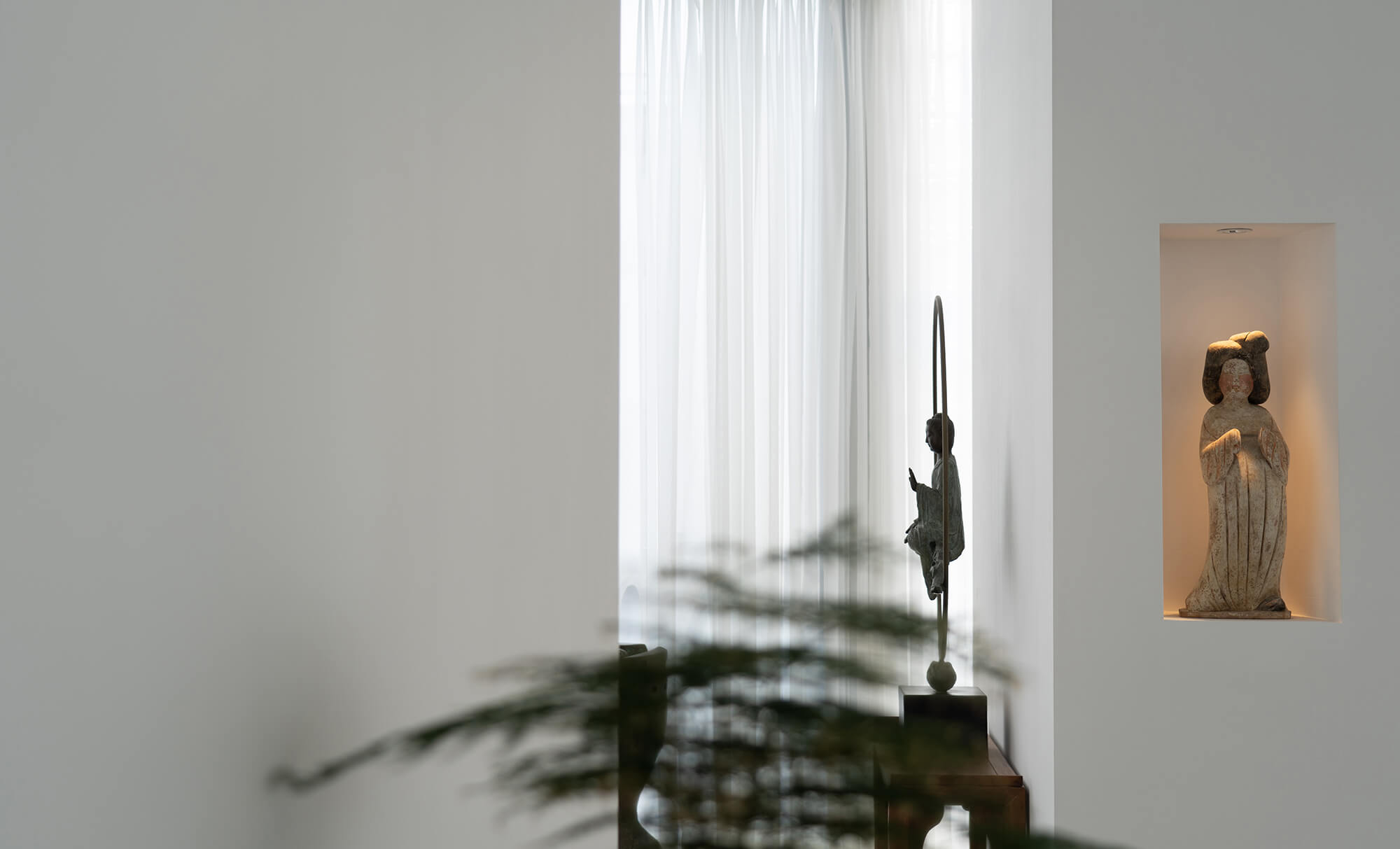
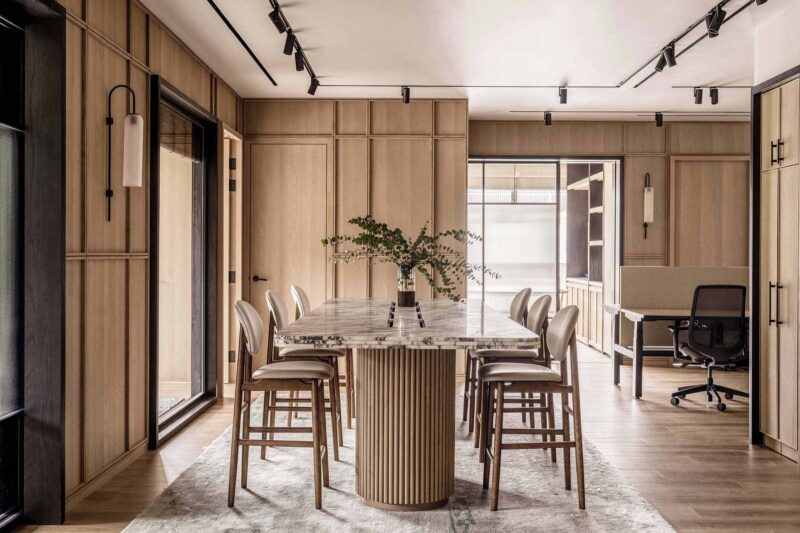
家具的陳設根據業主的收藏和獨特品味,采用現代簡約明式風格,創造一種頗有禪意的空間氛圍。因為越是高壓的現代城市生活,越能激發人們內心深處返璞歸真的願望。這就如同所有好書給我們帶來的那意味悠長的寧靜,越往上走,就越通往內心深處的寧靜和自由。
The furniture is furnished according to the owner’s collection and unique taste, using a modern minimalist style to create a Zen atmosphere. The more high-pressure modern city life is, the more simulative people’s desire to return to their hearts and souls. This is like the tranquility that all good books bring to us. The higher we go up, the deeper we walk into the inner peace and freedom.
某些驚豔的瞬間進一步強化了空間的精神性,我們把它稱之為“高遠中的一點火花”。正是這些“火花”體現空間的氛圍與品質,以及設計師對材料的把控能力。玻璃磚作為現代的設計語言在空間中靈活多變,在自然光、人造光和定製的標識作用下發生有趣的化學反應。
Some amazing moments further strengthen the spirituality of the space, and we call it “a sparkling moments”. It is these details that reflect the atmosphere and quality of the space, as well as the designer’s ability to control the materials.
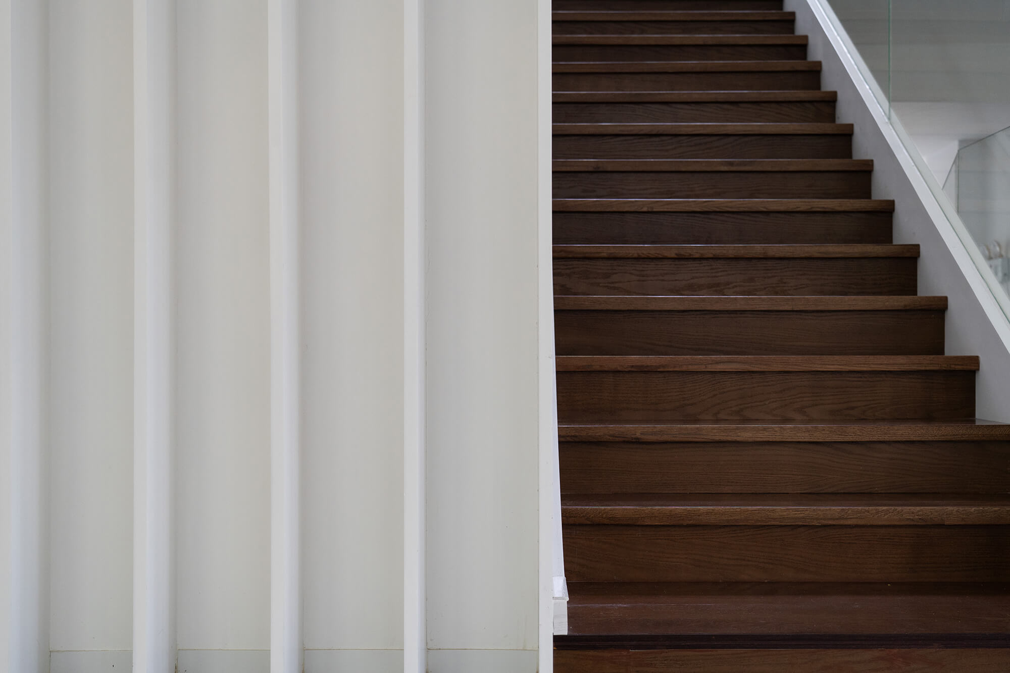
木質樓梯的沉穩對應玻璃扶手的輕薄和通透。透明無色的玻璃扶手有了底部光的投射折疊出動人的幾何麵。
The calmness of the wooden staircase corresponds to the lightness and transparency of the glass handrail.
對於予舍予築來說,辦公空間設計最重要的附加值在於幫助客戶提升價值,傳達企業形象,而非創造主主觀的審美範式。好看的皮囊千千萬,有靈魂的空間萬裏挑一。我們希望能為每個辦公空間都賦予企業獨一無二的理念和靈魂,傳遞出自己的企業文化。
For Yushe Design, the most important additional value of office design is to help clients enhance their value and convey their corporate image rather than create a subjective aesthetic paradigm. We hope to give each office space a unique concept and soul, and to convey its own corporate culture.
壁銘文,是刻在礦石上的人類記憶;篝火故事,是關於肉身的記憶,而這個四四方方的“玻璃磚中的寧靜”是關於焦點的記憶。
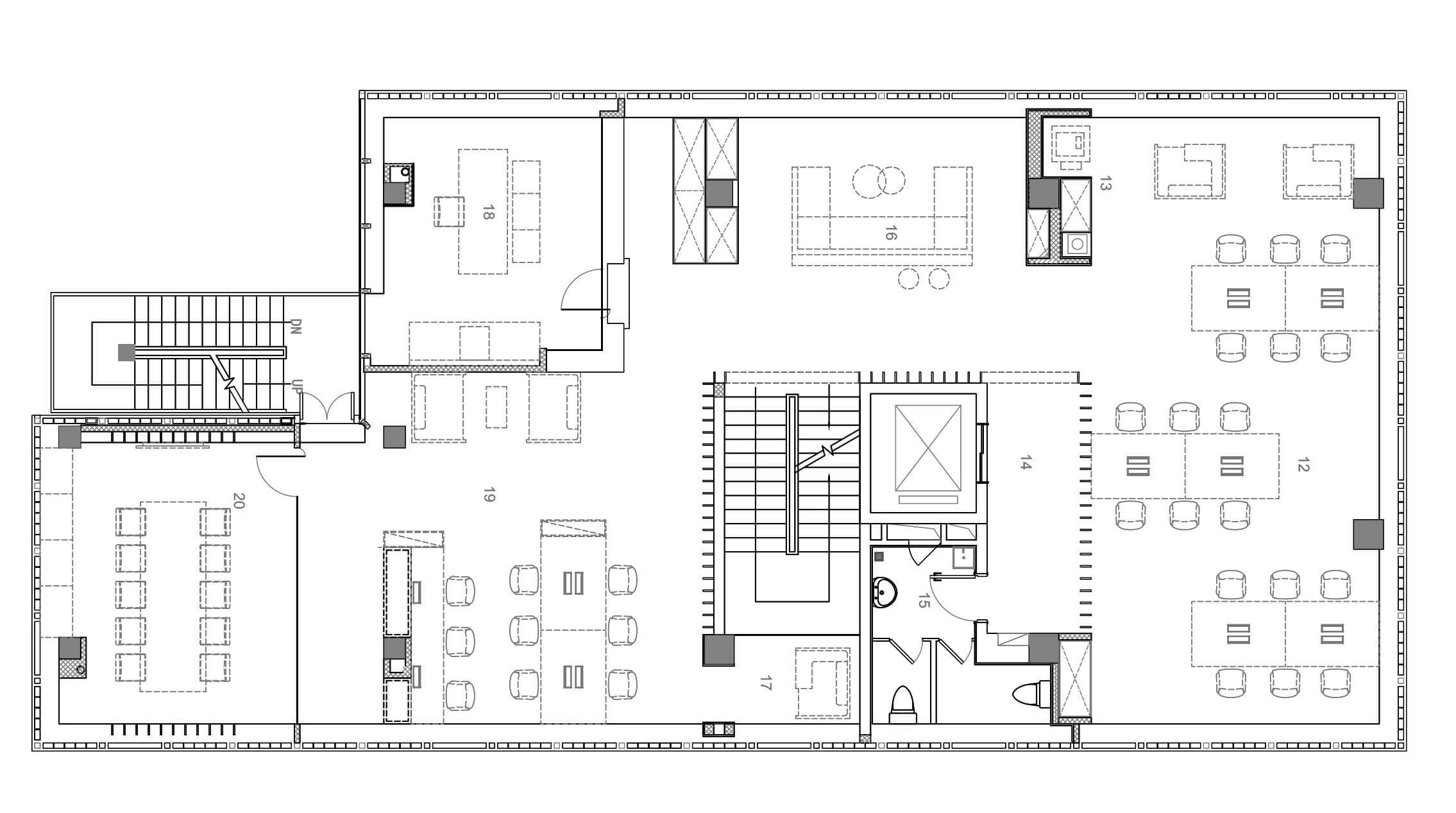
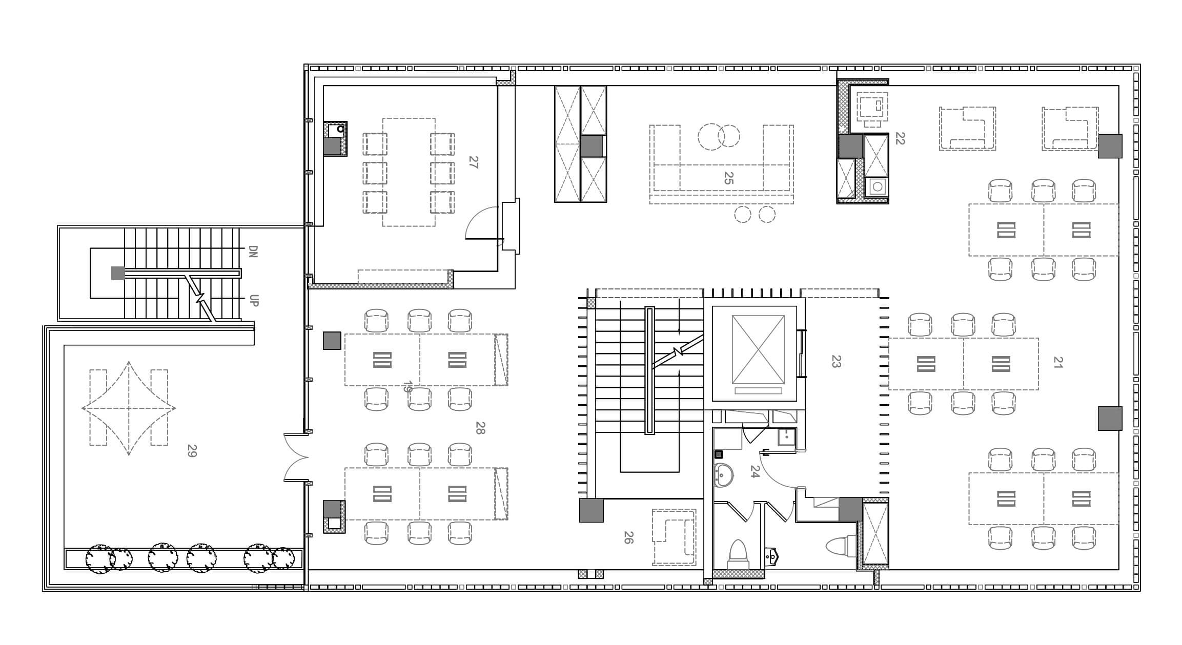
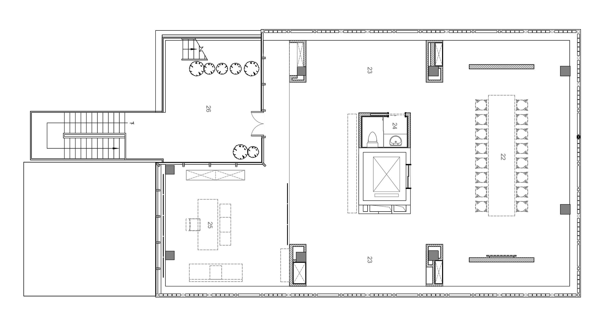
技術圖紙
Drawings
∇ 分析圖
∇ 核心筒分析圖
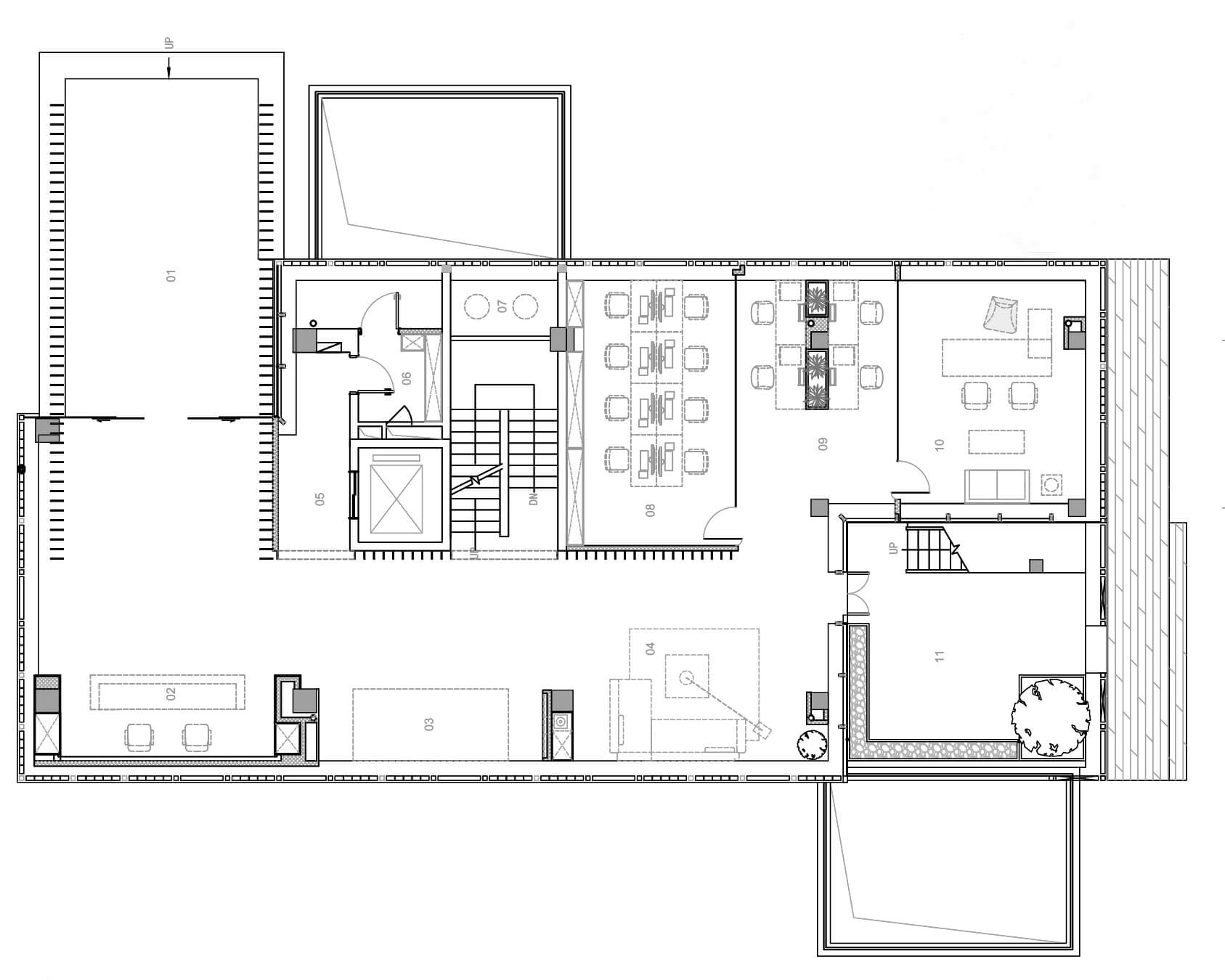
∇ 一層平麵圖
∇ 二層平麵圖
∇ 三層平麵圖
∇ 四層平麵圖
∇ 剖麵圖
完整項目信息
項目名稱:焦點品牌管理辦公室設計
項目地址: 萬科VMO 3號樓 上海市浦錦路2049弄
建築麵積:1403㎡
主持設計師:許異、陳瀟
設計團隊:毛莉麗、宗千翔、陳鵬、徐建國
設計周期:11.2018-12.2018
施工周期:01.2019-03.2019
主要材料:木飾麵, 白色木格柵, 白色烤漆不鏽鋼,乳膠漆, 水磨石, PVC
攝影師:劉安琪
Project Name: Focus Brand Management Headquarter Interior Design
Location: Vanke VMO No.3 Building, Lane 2049, Shanghai, China
Area: 1403㎡
Design firm: Yushe Design
Director: Xu Yi, Chen Xiao, Li Zhiqiang, Gao Shantong
Project Team: Mao Lili, Zong Qianxiang, Chen Peng, Xu Jianguo
Design Phase: 2018.11-2018.12
Contraction Period: 2019.1-2019.3
Main Material: Wood veneer, white wooden grilling, white lacquered stainless steel,
Emulsion painting, terrazzo, PVC
Photography: Liu Anqi


