全球設計風向感謝來自 Towodesign堂晤設計 的商業空間項目案例分享:
國民消費升級驅動商業場景迭代,擅以平衡手法重構空間的Towodesign堂晤設計,為上海中心地段新添了一處兼具複古氛圍與當代元素的跨時空體驗店。
With consumption upgrade in China driving iteration of commercial scenes, Towodesign, a Chinese design studio which excels at reorganizing spaces in a balanced and coordinated manner, created a unique experiential store that fuses retro atmosphere and contemporary elements in downtown Shanghai.
店鋪位於魔都腹地南京西路,毗鄰千年古刹靜安寺。場地以原有的混凝土構造為基底,設計師加入定製化的金屬道具,達到粗獷與精致的平衡。
The project is situated on Nanjing West Road, Shanghai, adjacent to Jing’an Temple which boasts a history of more than a thousand years. The designers retained a large area of concrete floor in the original space, and added bespoke metal elements to the interior, with a view to striking a balance between roughness and exquisiteness.
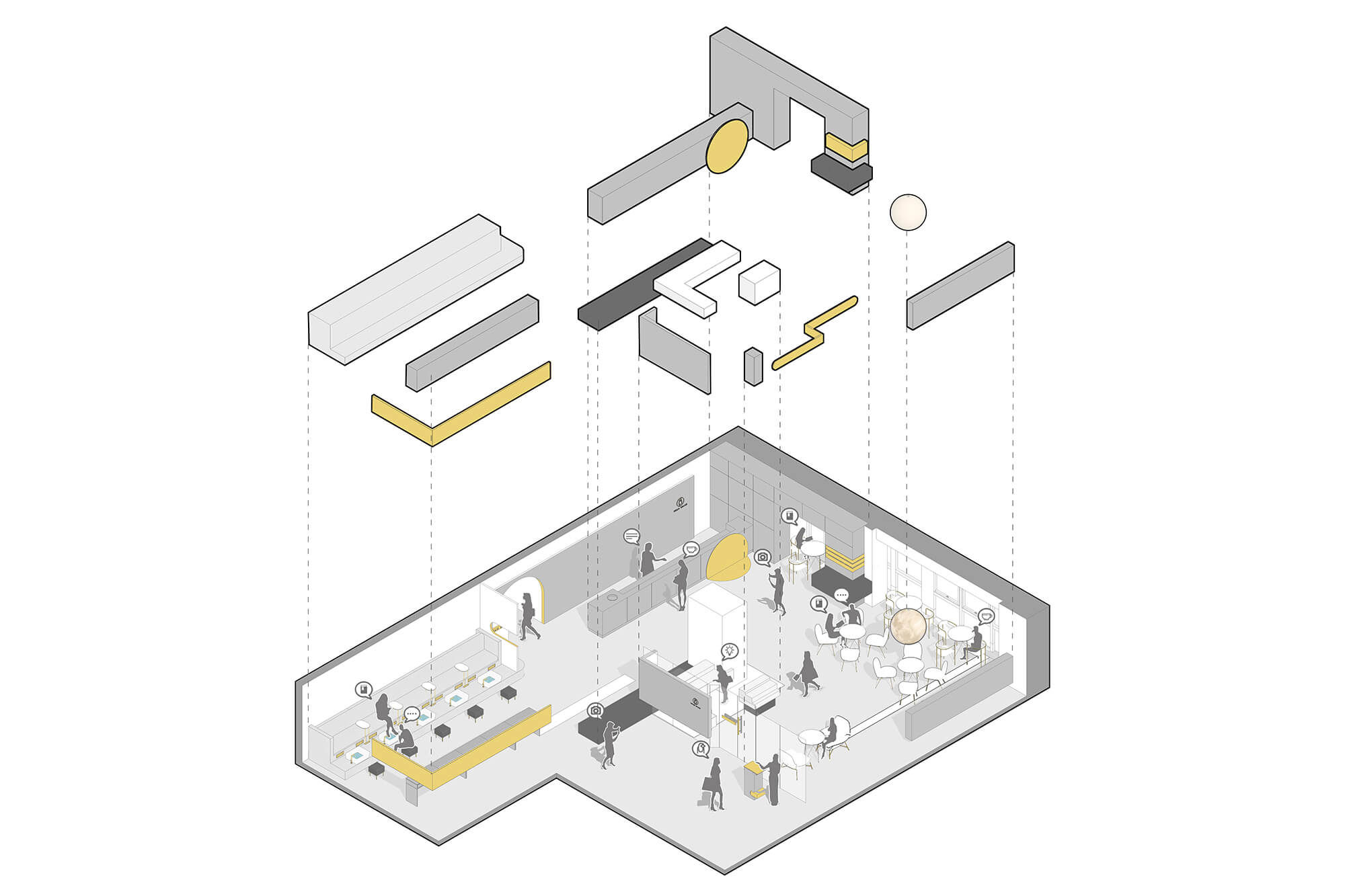
∇ 體塊節奏分析
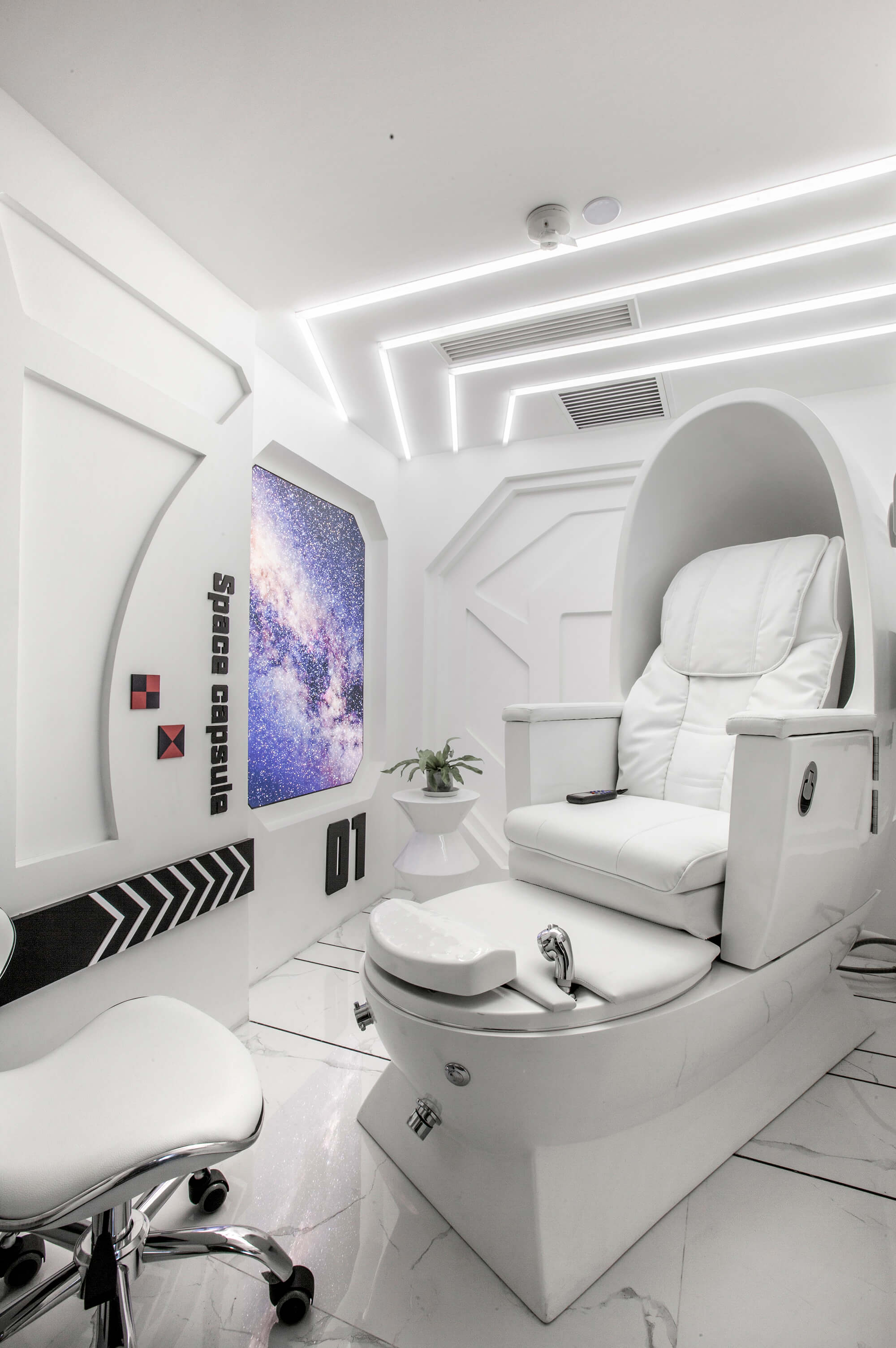
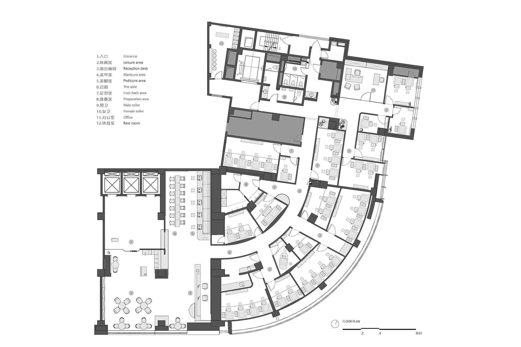
800平方米的麵積容納美甲、足浴、SPA在內的多種美業品類,並集結社交、休閑、娛樂等複合功能。不同主題和韻味的空間自由組合、相互穿插,人們穿梭其間猶如進入了時空隧道。
With an area nearly 800 square meters, the overall space contains various beauty service areas for manicure, foot bath and spa, etc., and integrates functions for socializing, recreation and entertainment. Interior spaces with different themes and charm extend and interweave with each other flexibly, seeming to bring consumers into a “space-time tunnel”.
起:去雕飾的裸妝精神
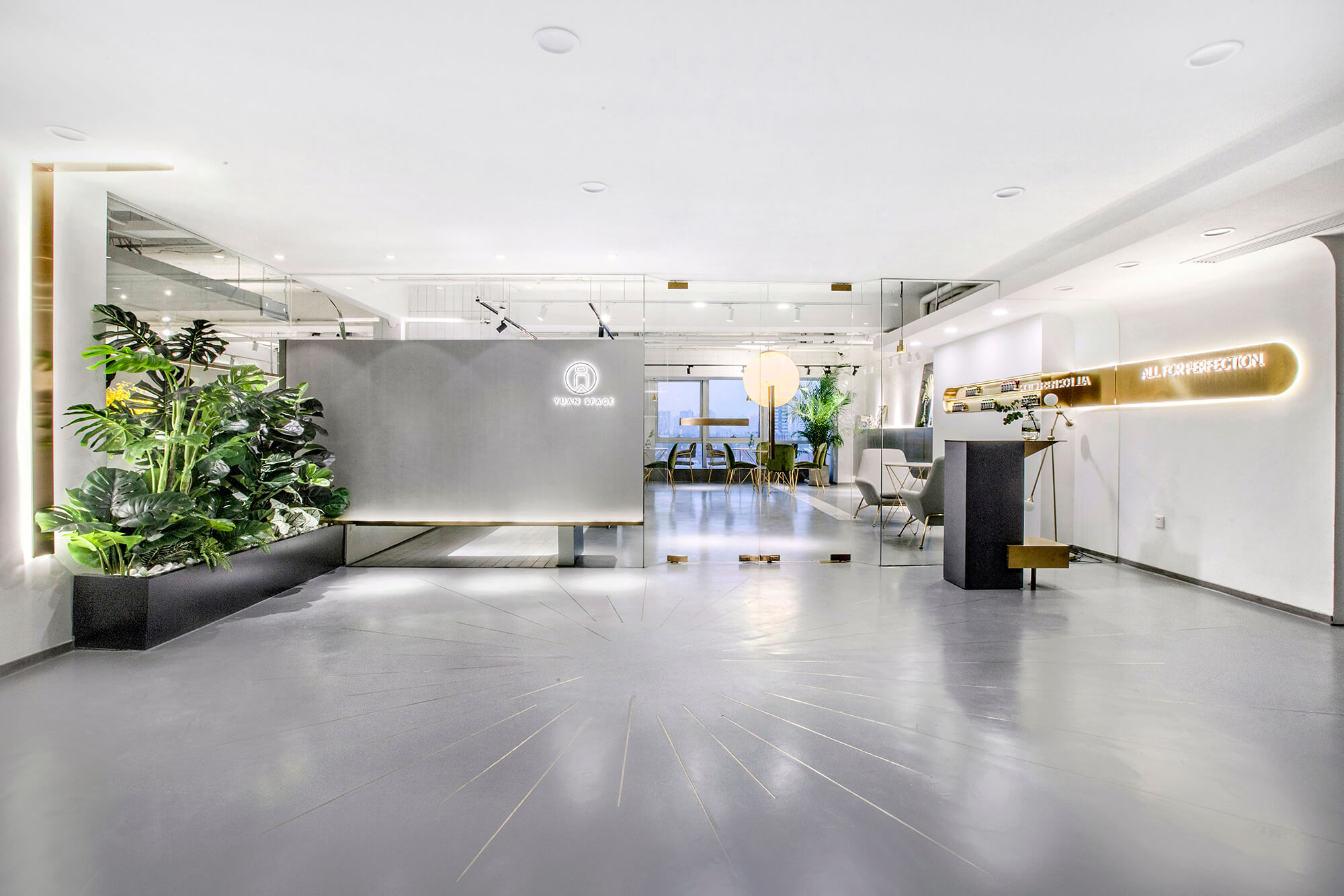
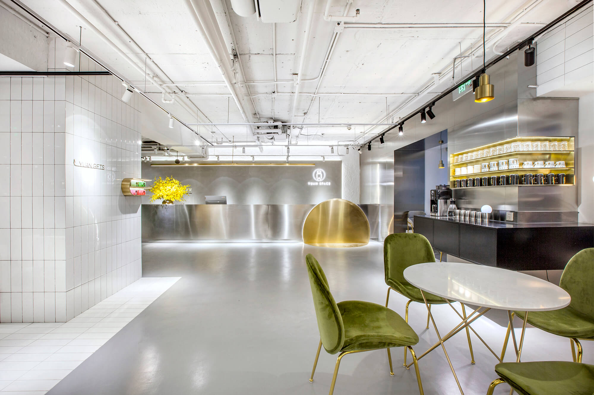
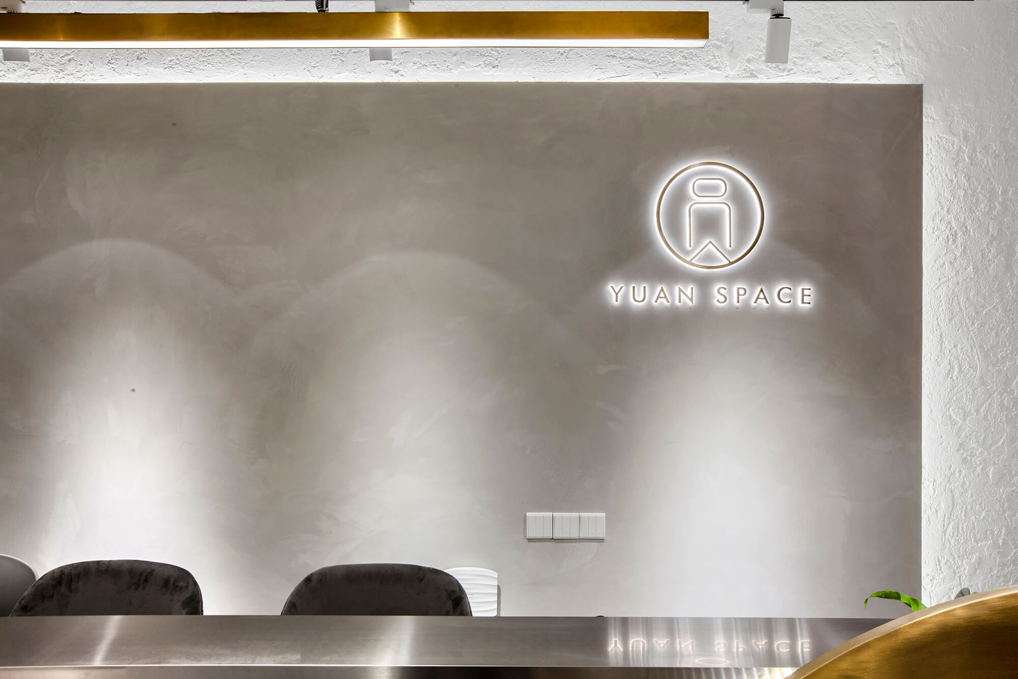
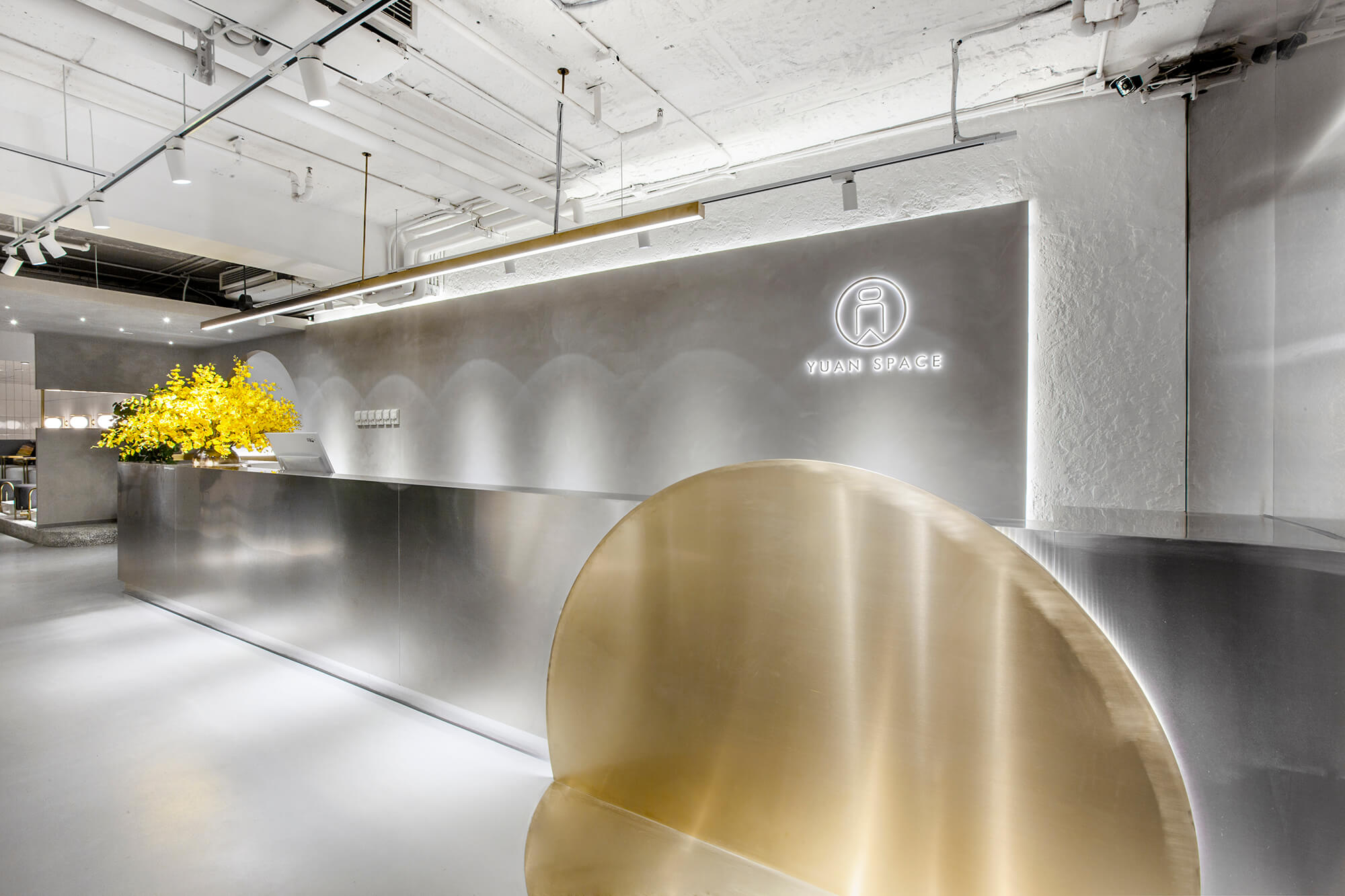
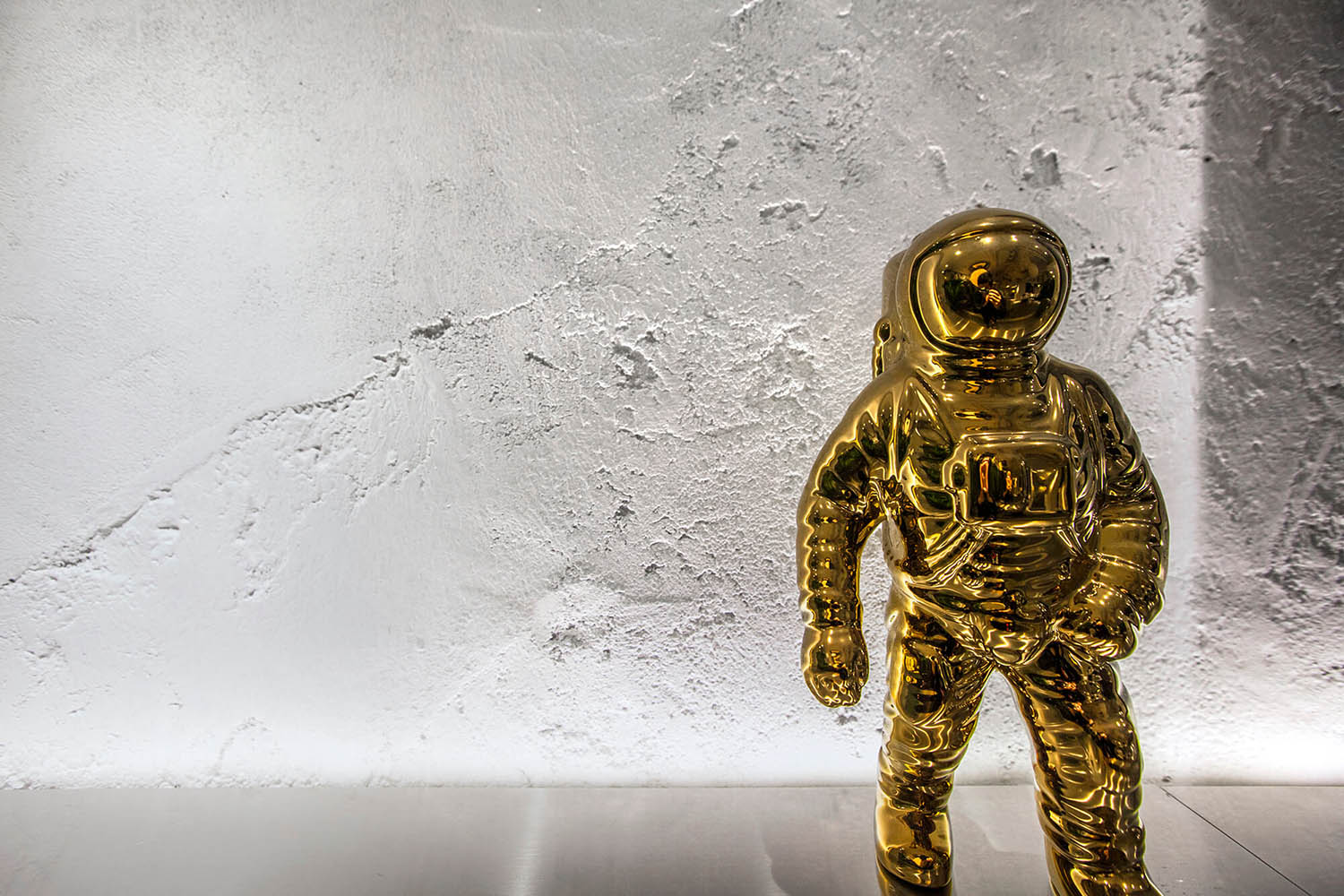
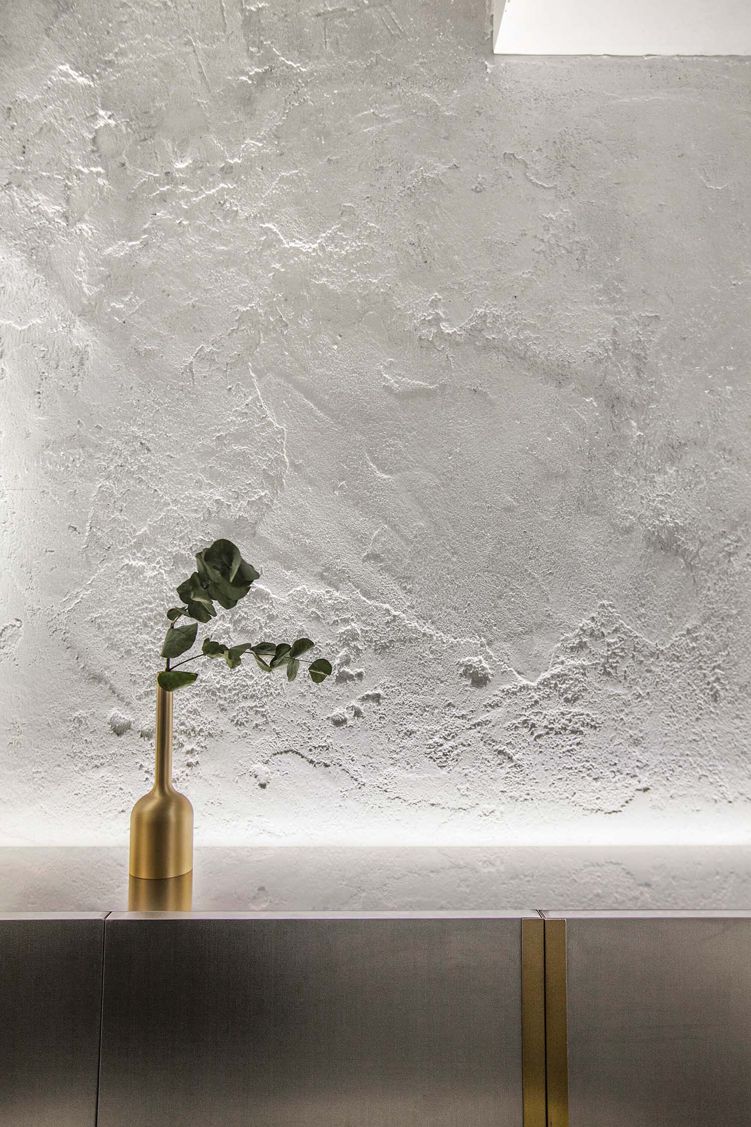
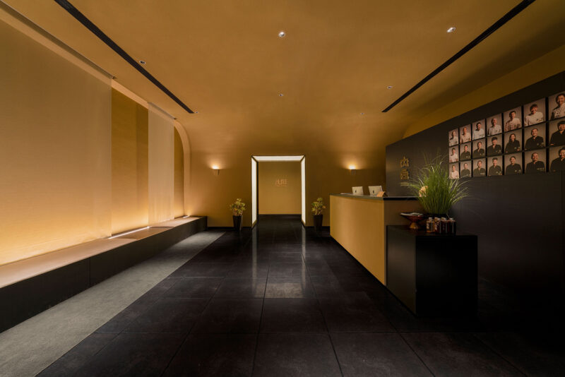
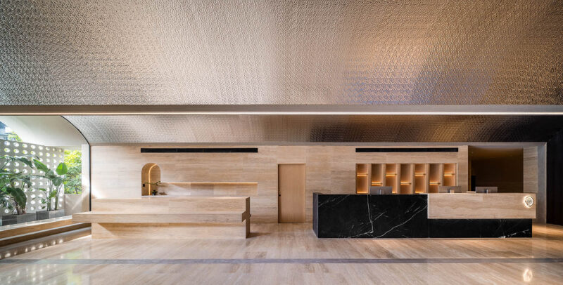
入口區以混凝土背景牆、水泥地麵和金屬質接待台鋪墊工業風的基調。接待台的圓形裝置和空間內分布的各種圓形元素呼應了品牌主題。因建築層高僅2.7m,前廳天花未做吊頂,用裸露的水泥與管線作為樸實的頂部背景。
I. Austere tone
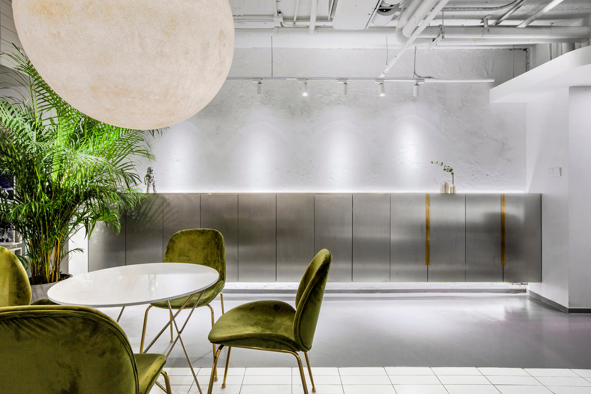
At the entrance area, the concrete backdrop wall, cement floor and metal reception desk together set an industrial tone. The round installation at the reception desk area and other round elements throughout the space echo the theme of the brand — “YUAN”, which means “round” in Chinese. Since the floor height is merely 2.7 meters, no decorations are added to the foyer’s ceiling, with exposed cement, pipes and wires producing austere visual impressions.
承:共享空間串聯內與外
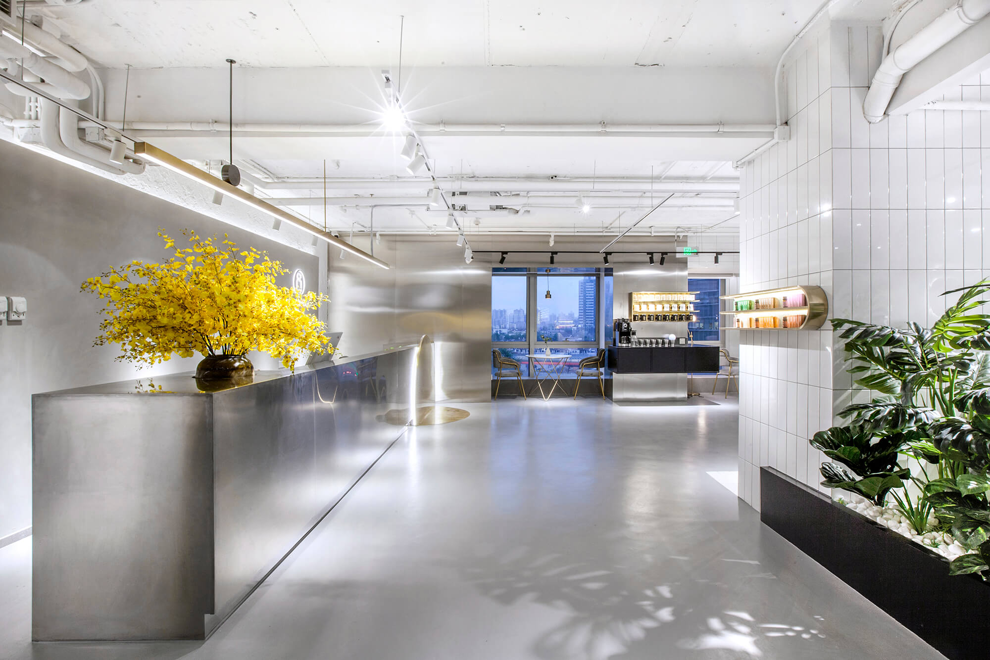
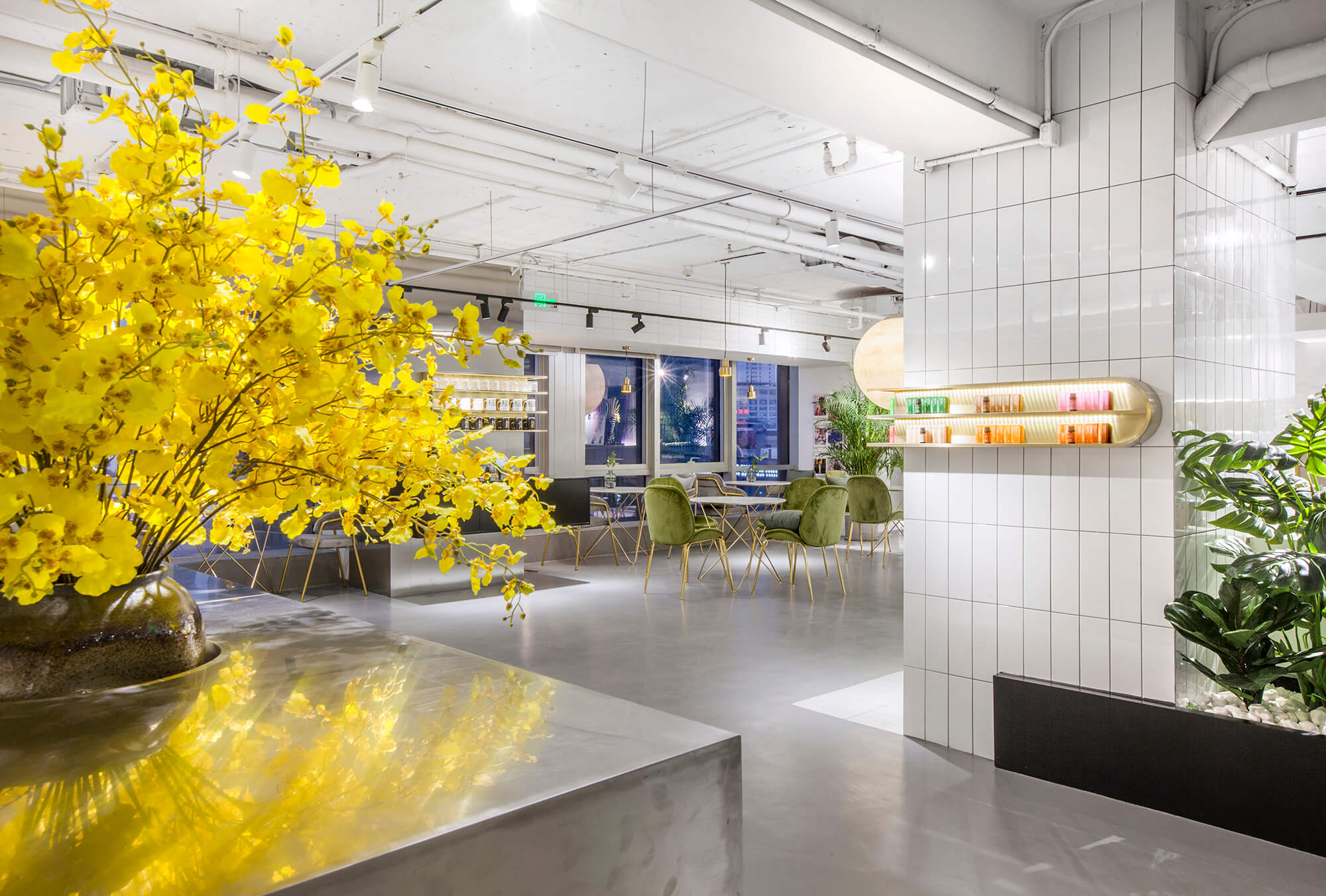
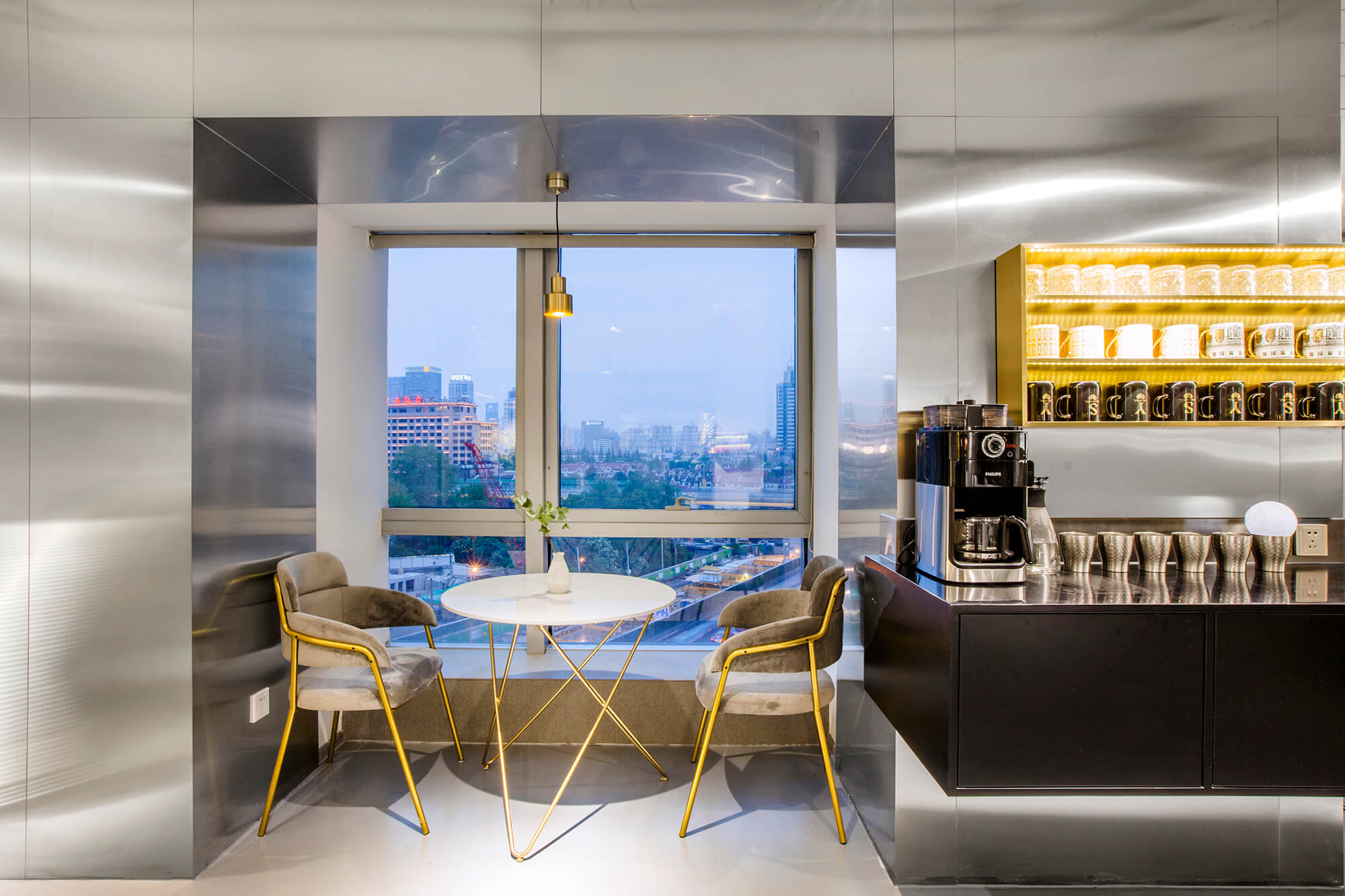
入口與收銀區之間設置了開放式的休閑水吧區,作為顧客進入主體消費空間之前的過渡地帶。大麵積的玻璃窗將城市景觀納入視野,同時借景引光拉近人與自然的距離。
II.Integration of inside and outside
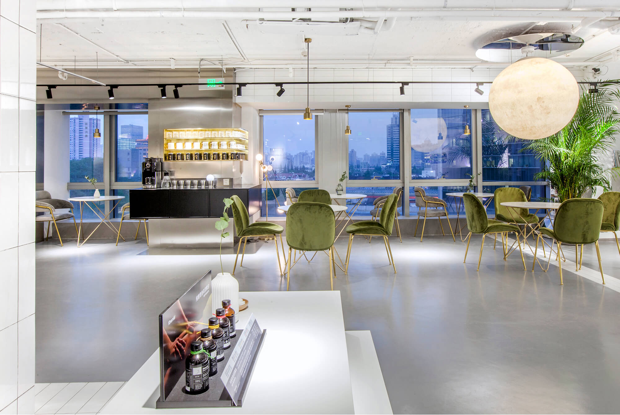
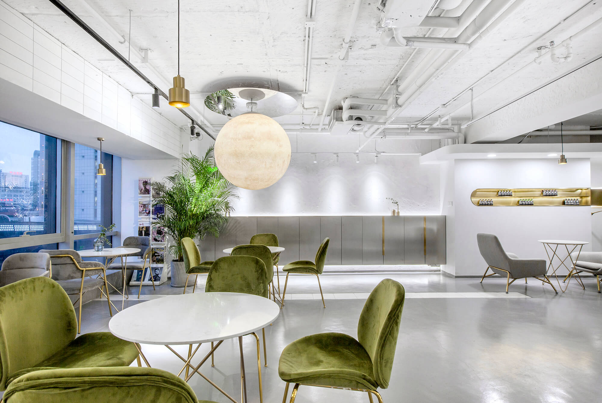
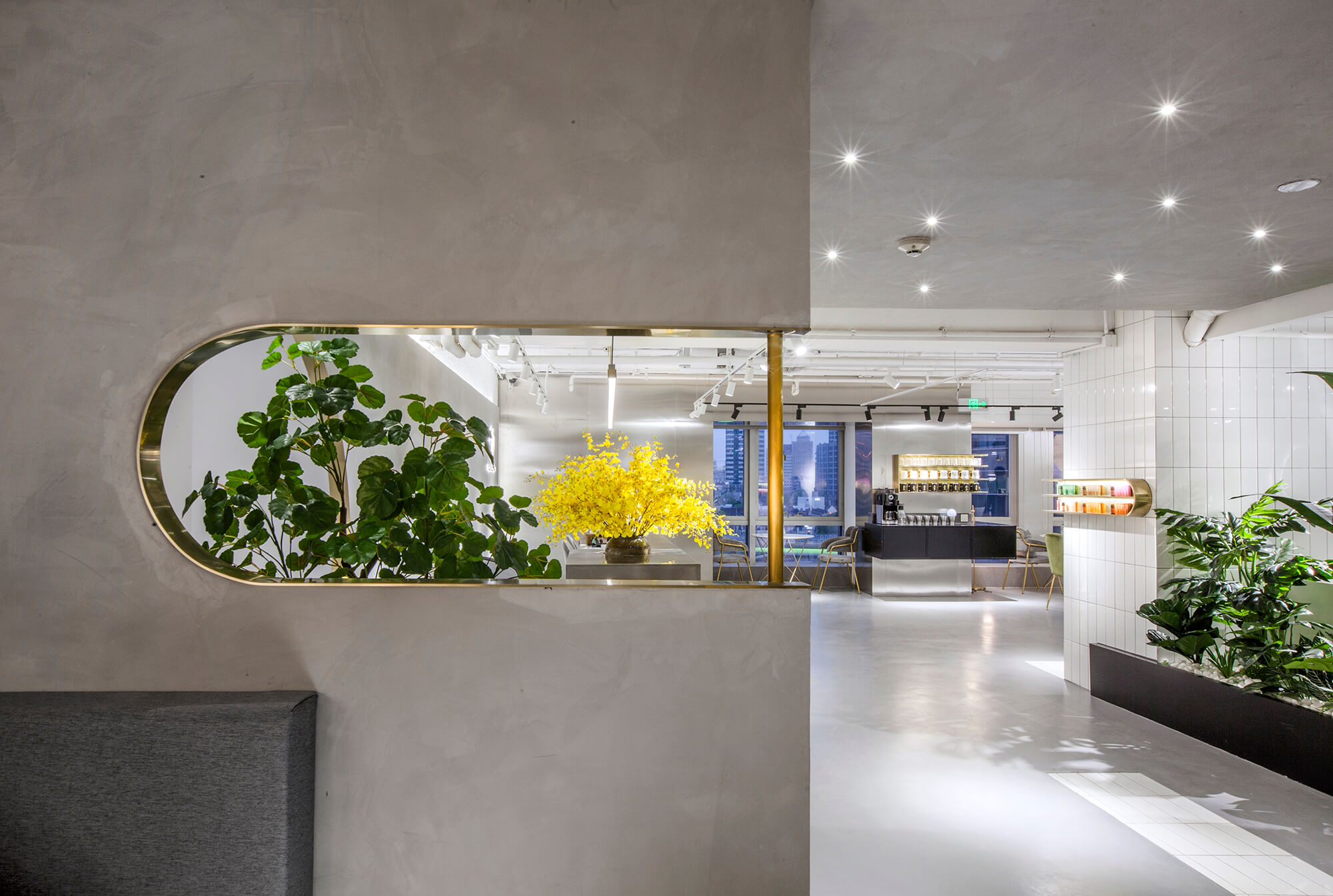
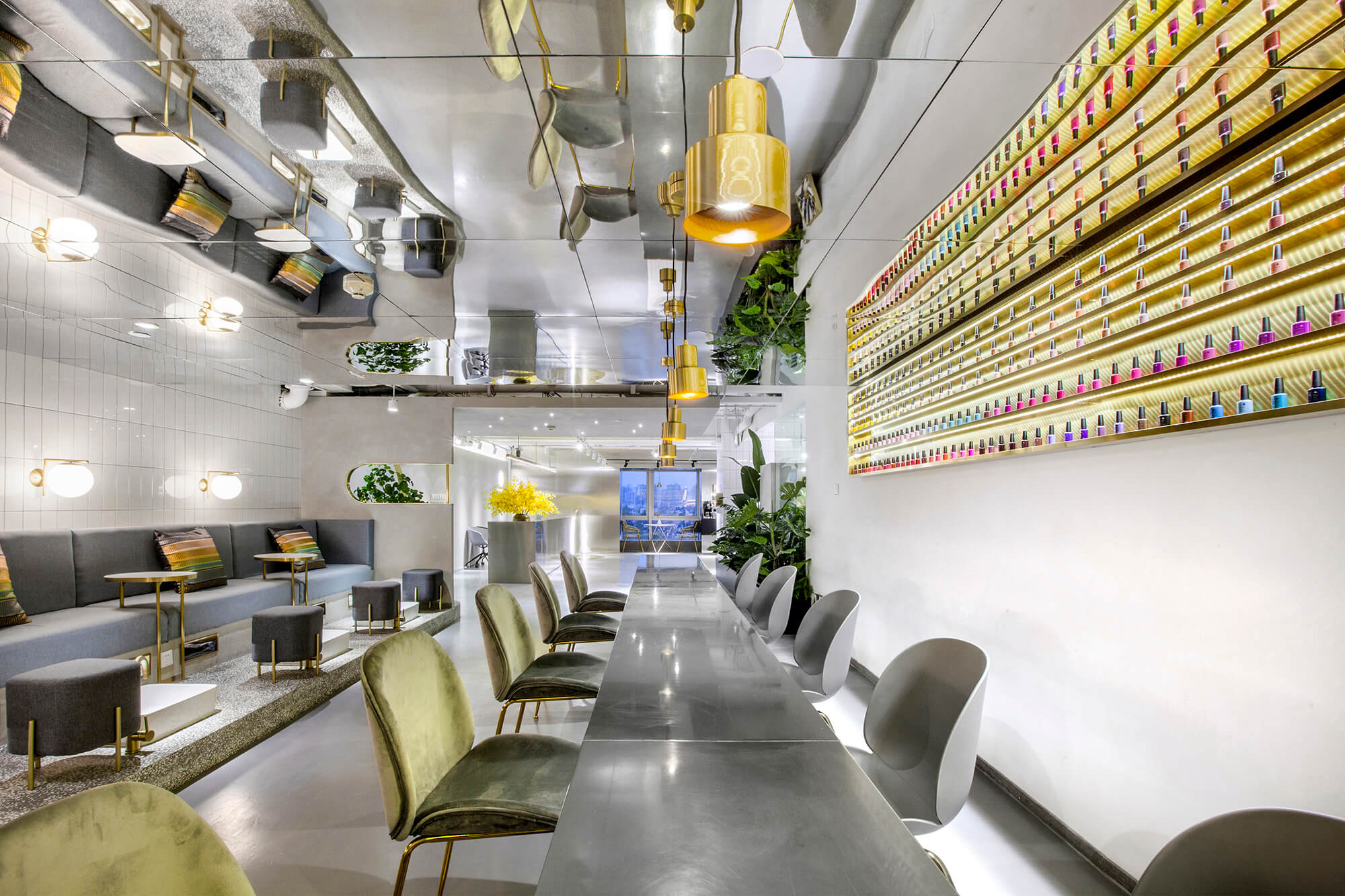
A leisure & bar area is set between the entrance and the cashier’s area, which functions as a transitional space for customers to enter major consumption spaces. Large French window brings urban landscape and daylight in, thereby narrowing the distance between people and nature.
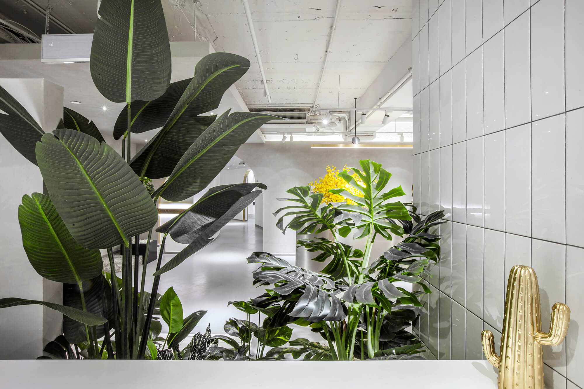
精簡的形式和共享的功能有效消弭了心理上的陌生感,借以綠植的穿插更增強了空間親和度。
This area’s simplistic design style and attribute of sharing effectively weakens the feeling of strangeness, and dotted green plants also makes the space more intimate.
轉:圍而不合的轉角優化
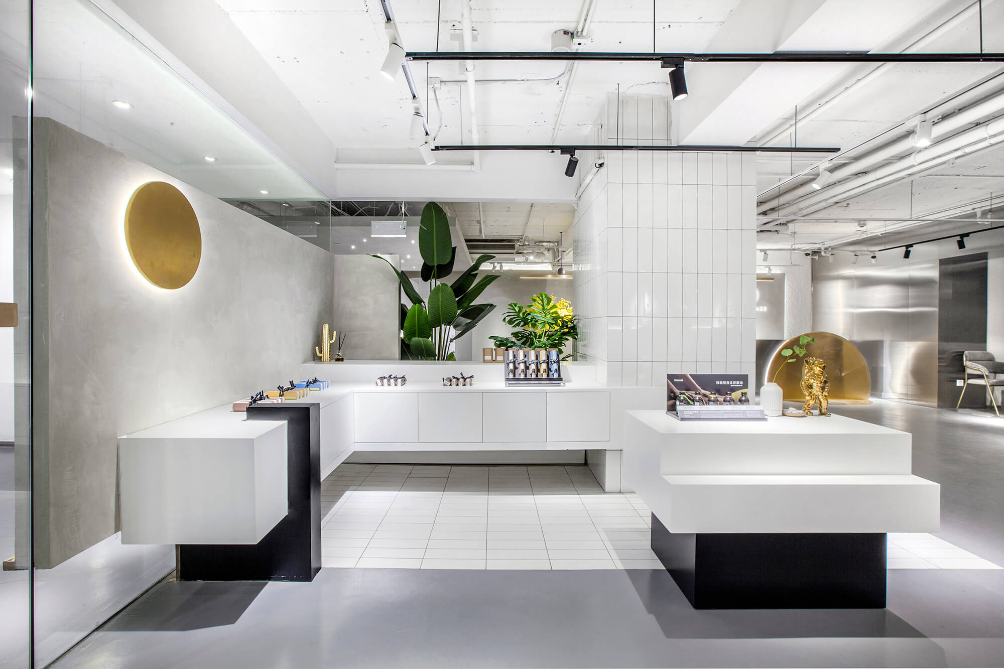
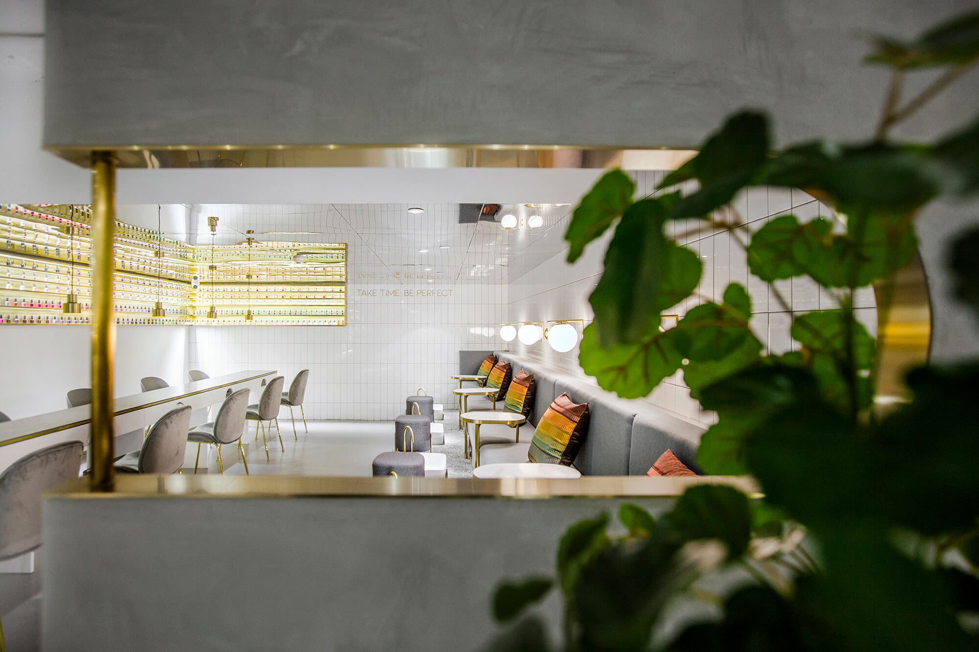
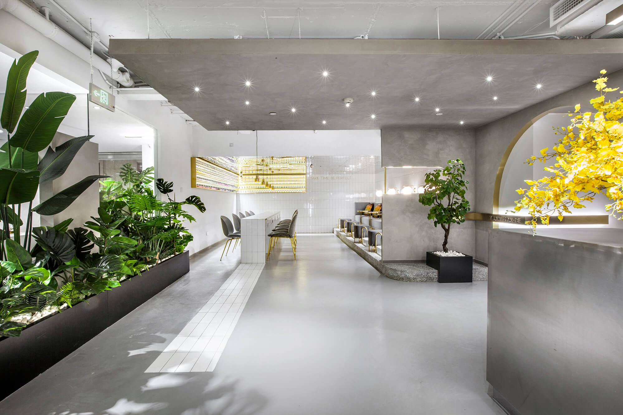
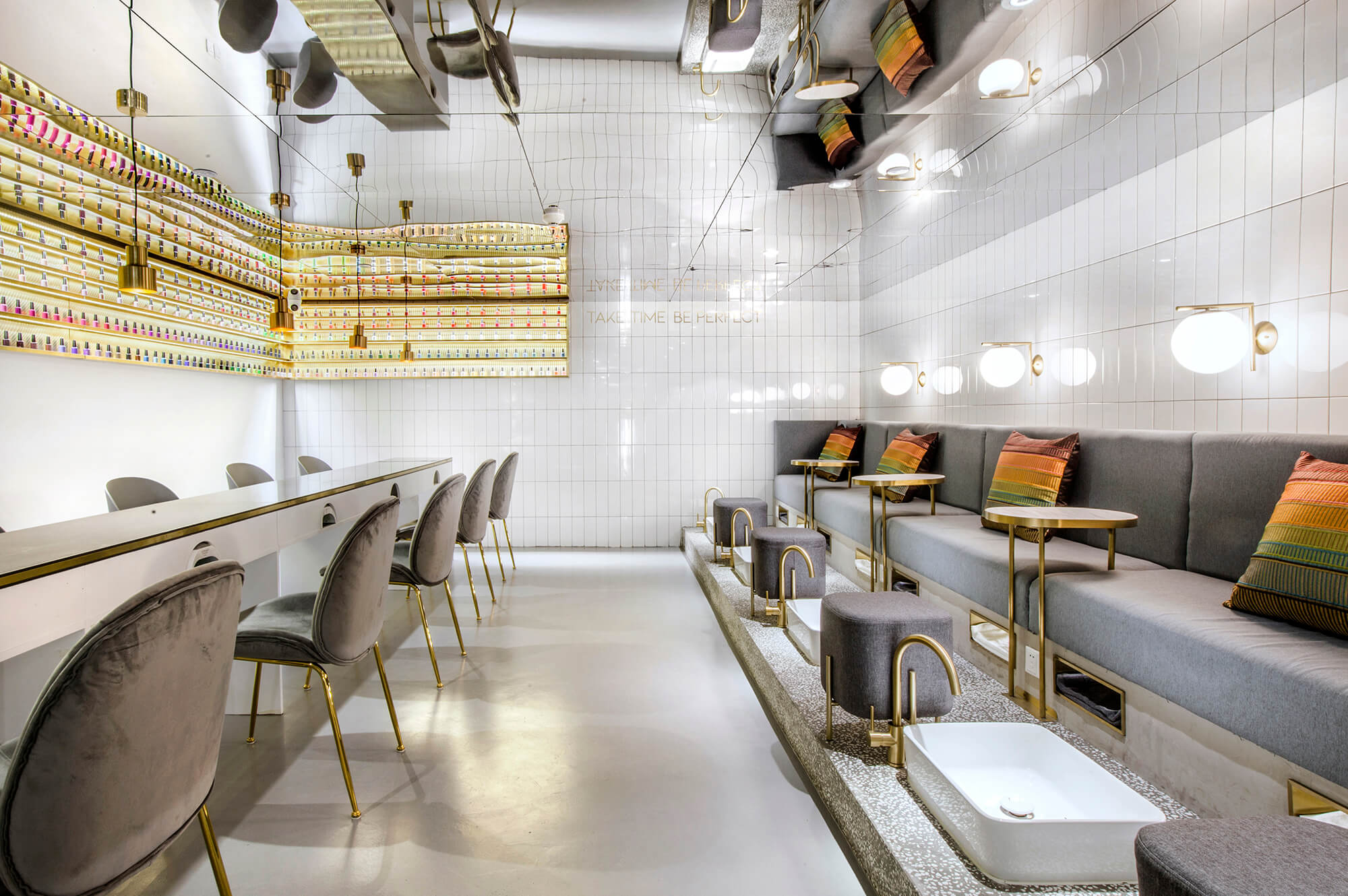
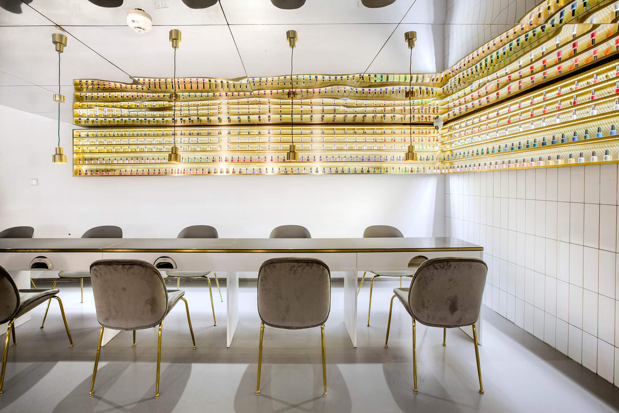
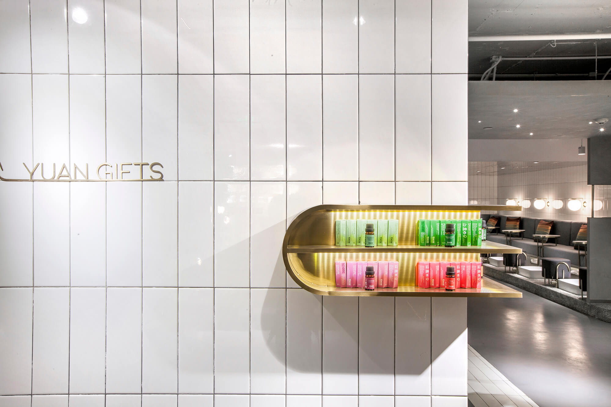
沿著行走動線的兩翼,與水吧區相對而設的是公共美甲及美腳區。小片的白瓷磚由地麵延伸至美甲台,充當隱性的導視功能,牆麵的白瓷磚則自成一麵簡潔明亮的背景。
III. Smooth transition
On the opposite side of the bar area are manicure area and pedicure area. Small pieces of white tiles extend from the floor to manicure desks, which guides customers’ sight line and route implicitly.The wall clad in white tiles constitute a bright and clean backdrop.
抬高的水磨石平台劃分出美腳區,功能分區明晰且留有通暢感。小白磚和水磨石作為經典複古元素也為時空穿越埋下了伏筆。
Besides, the elevated terrazzo platform demarcates pedicure area and manicure area clearly, whilst ensuring visual interaction. White tiles and terrazzo, as classic retro elements, set the stage for a time travel in the space.
合:古今交錯的圓融之境
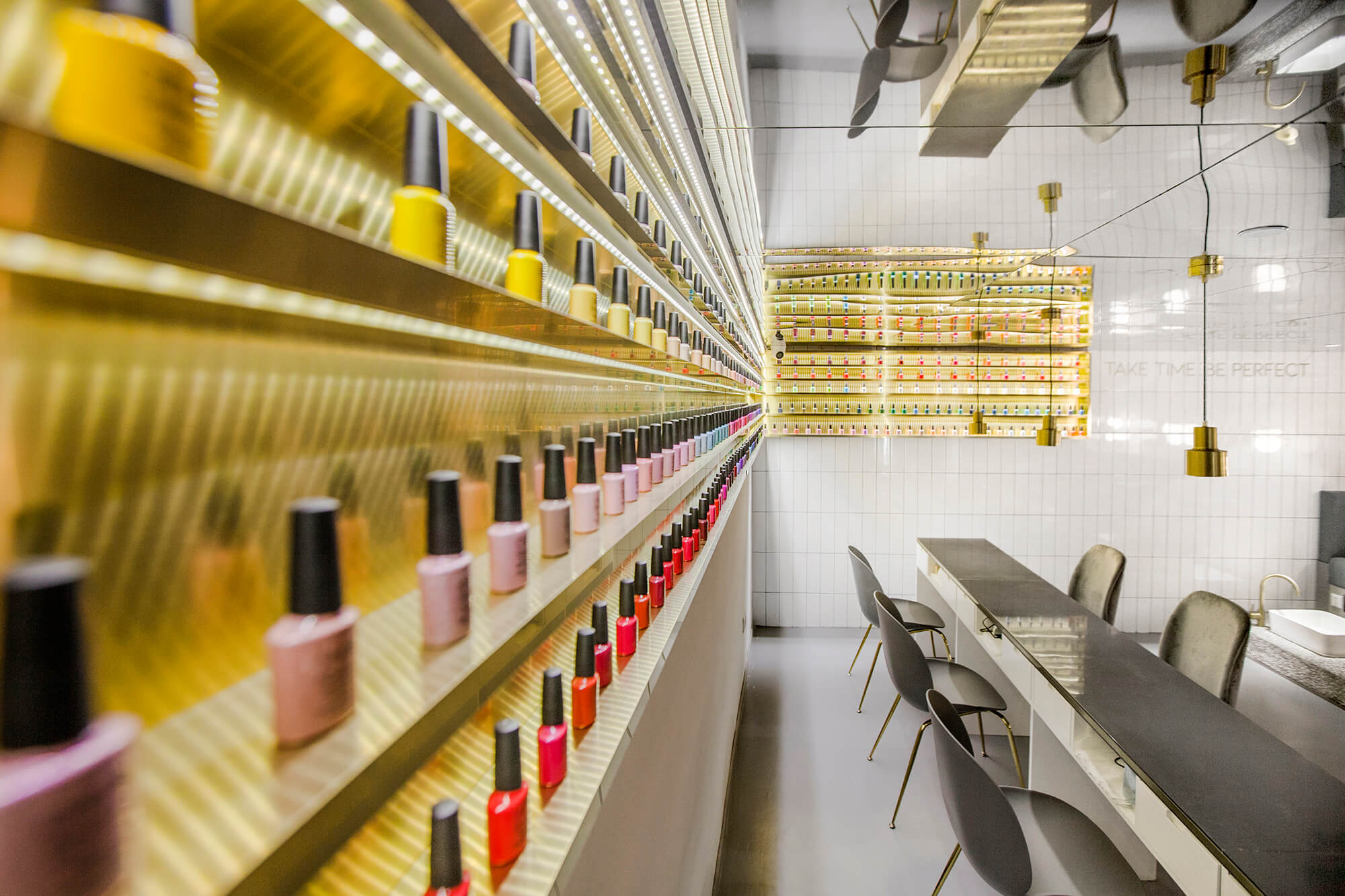
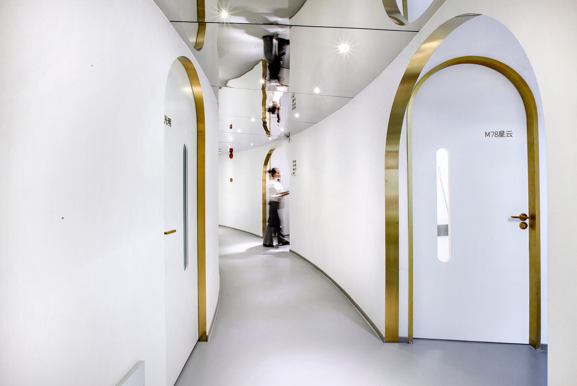
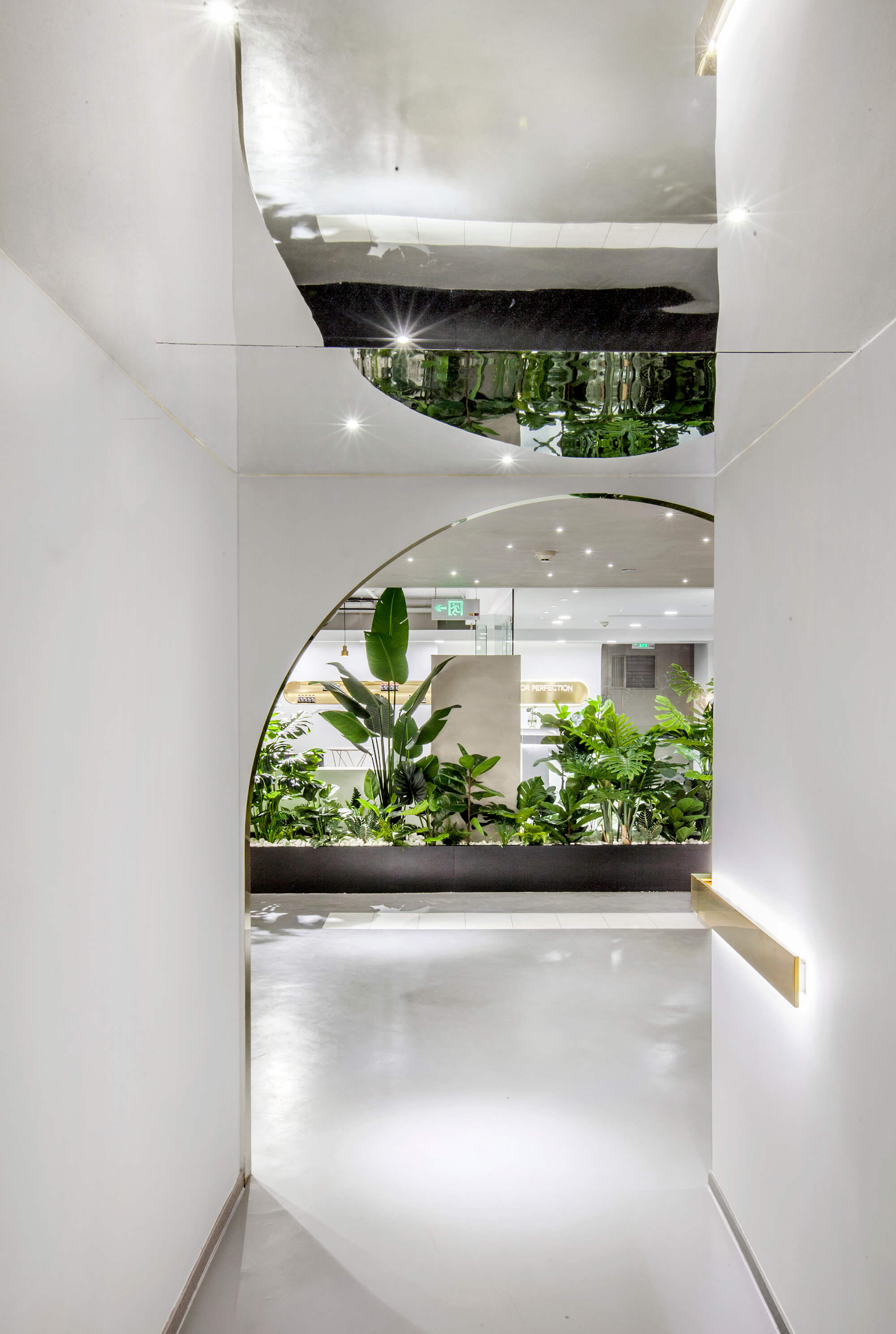
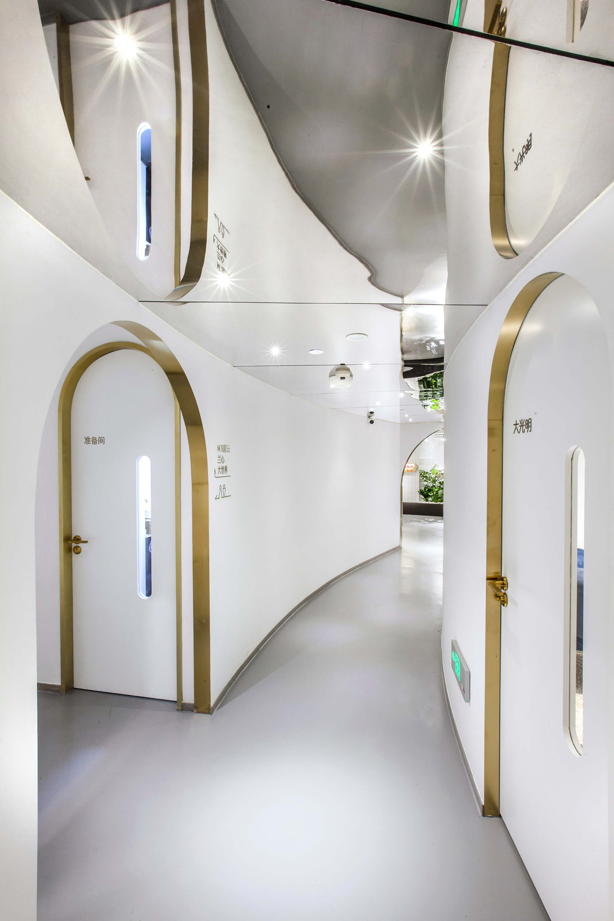
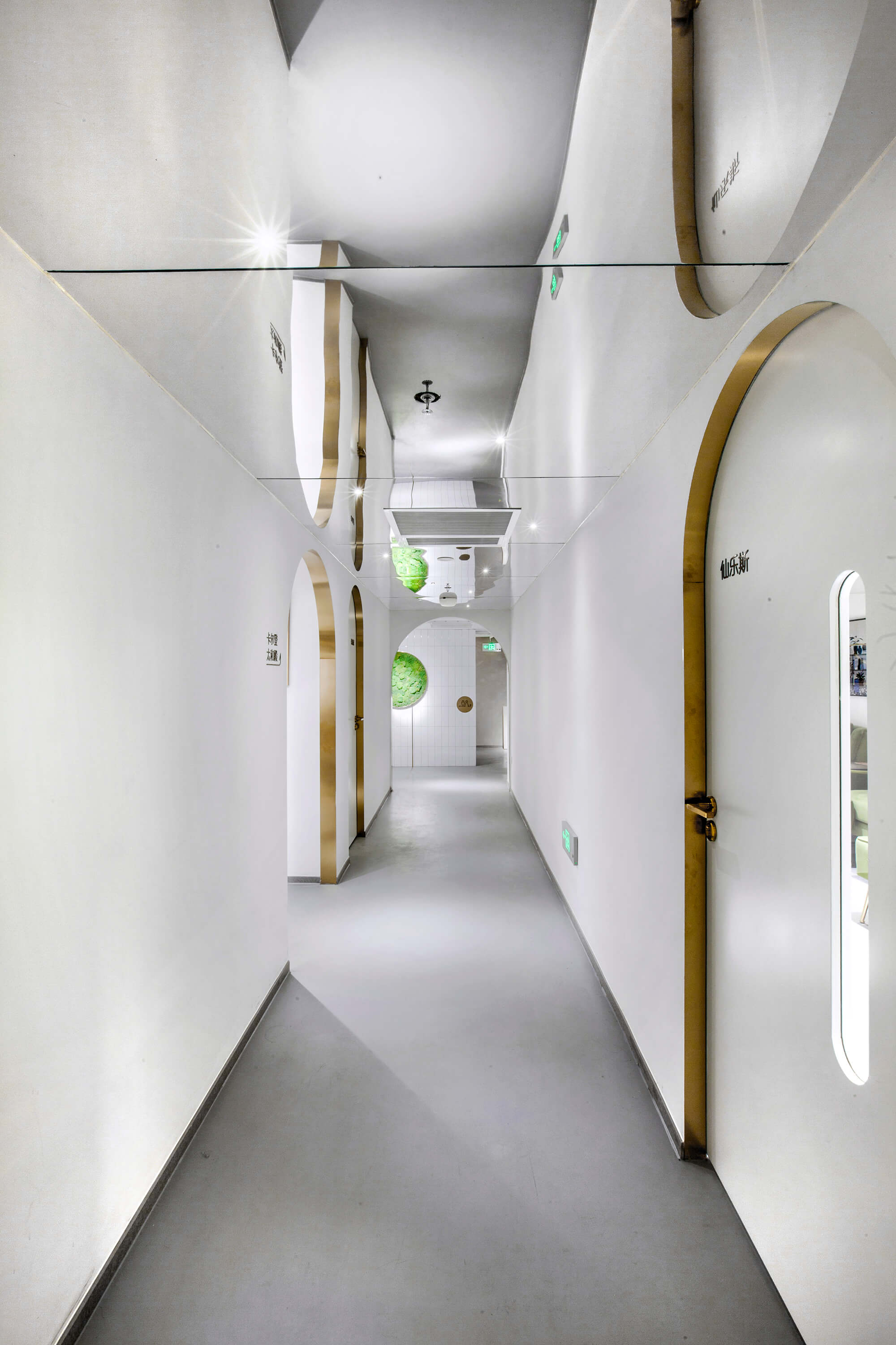
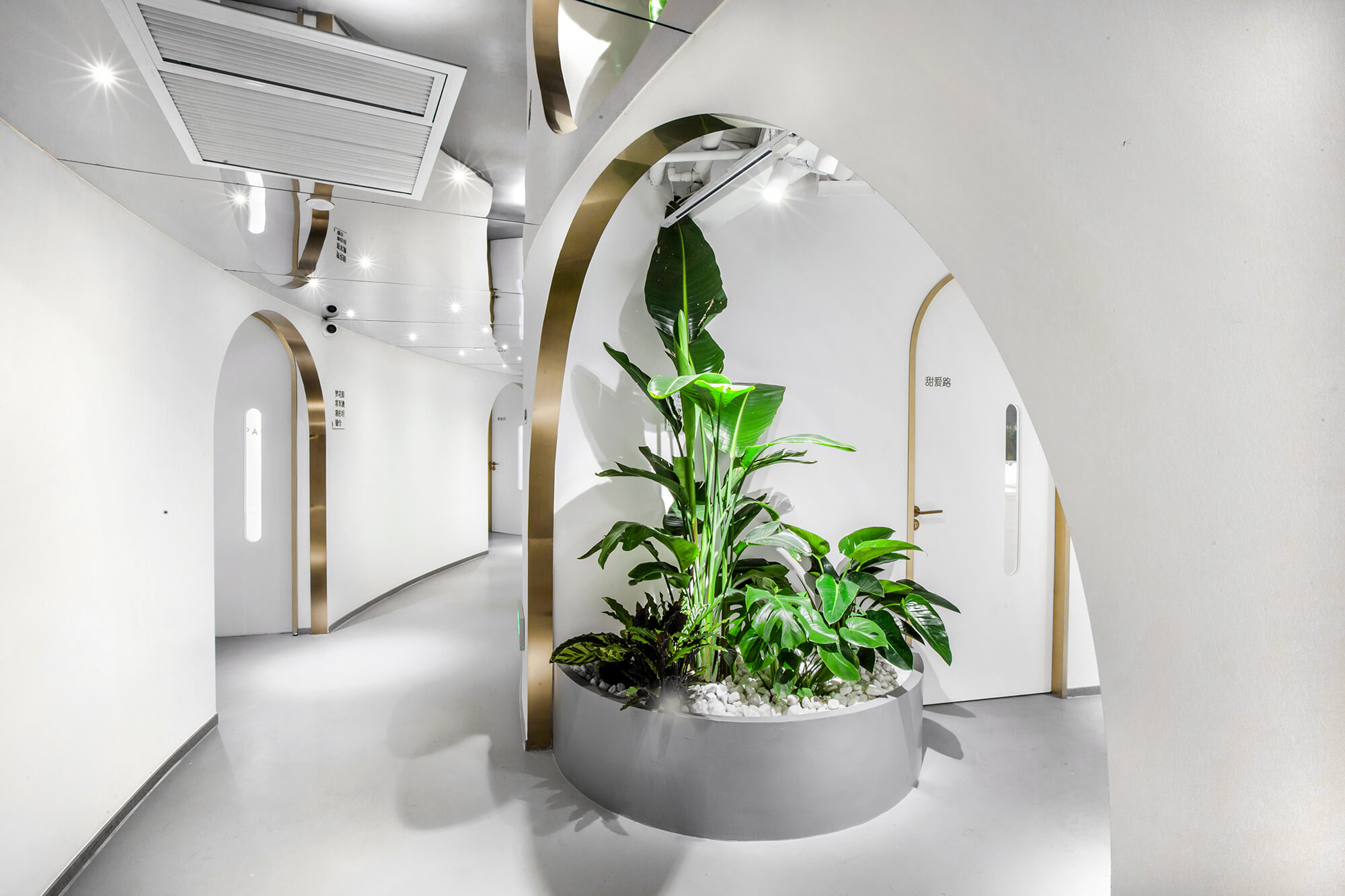
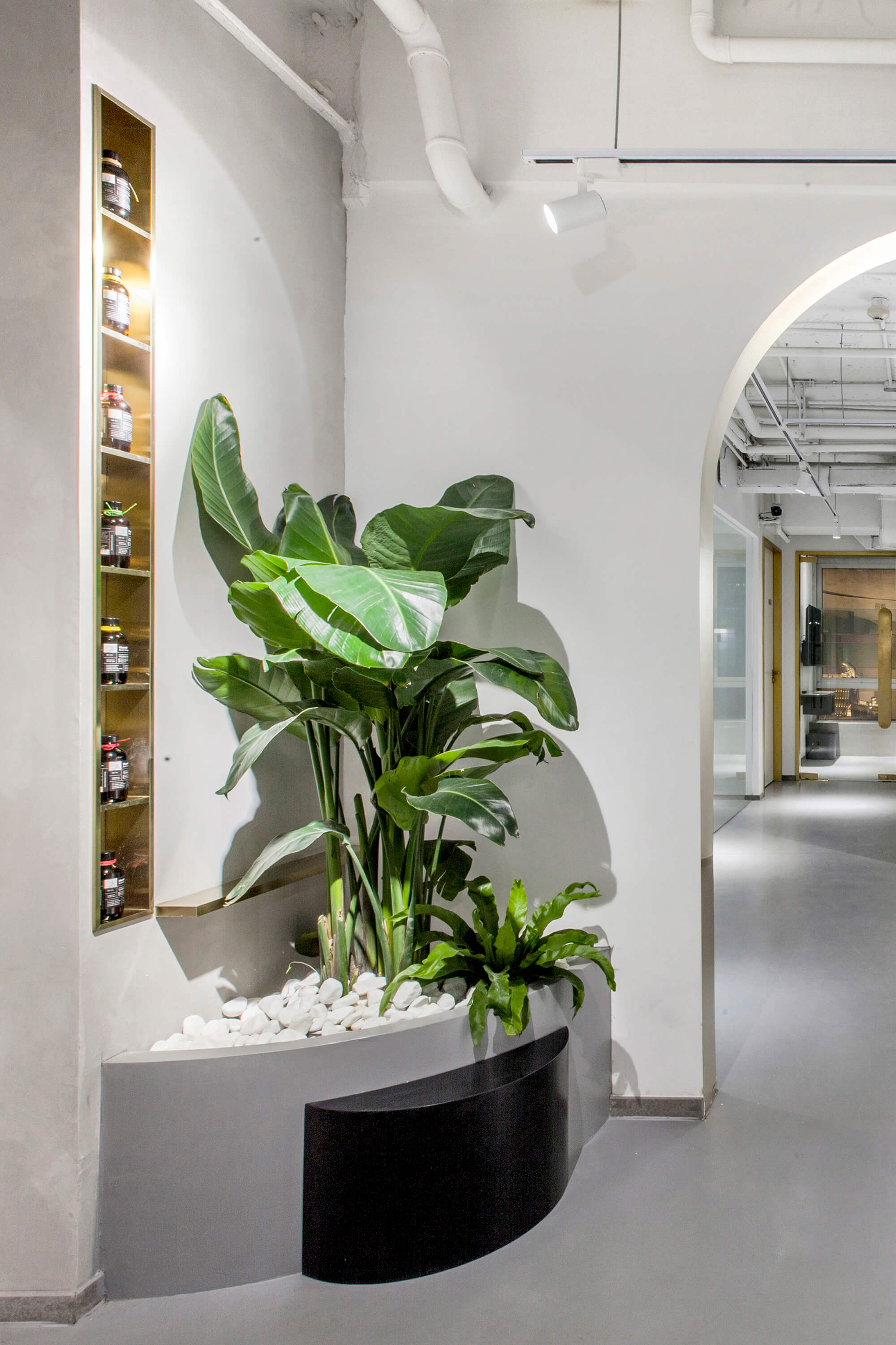
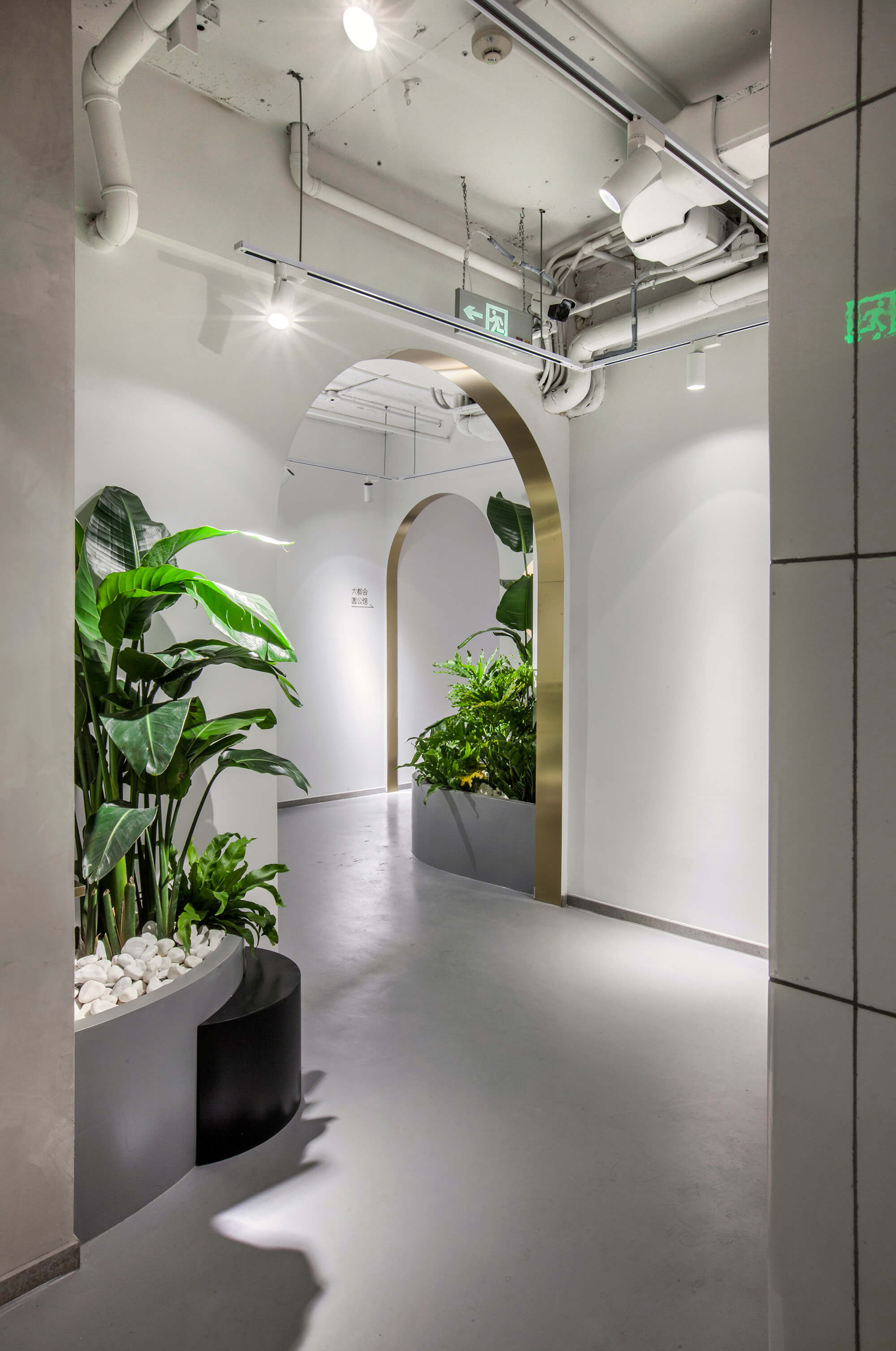
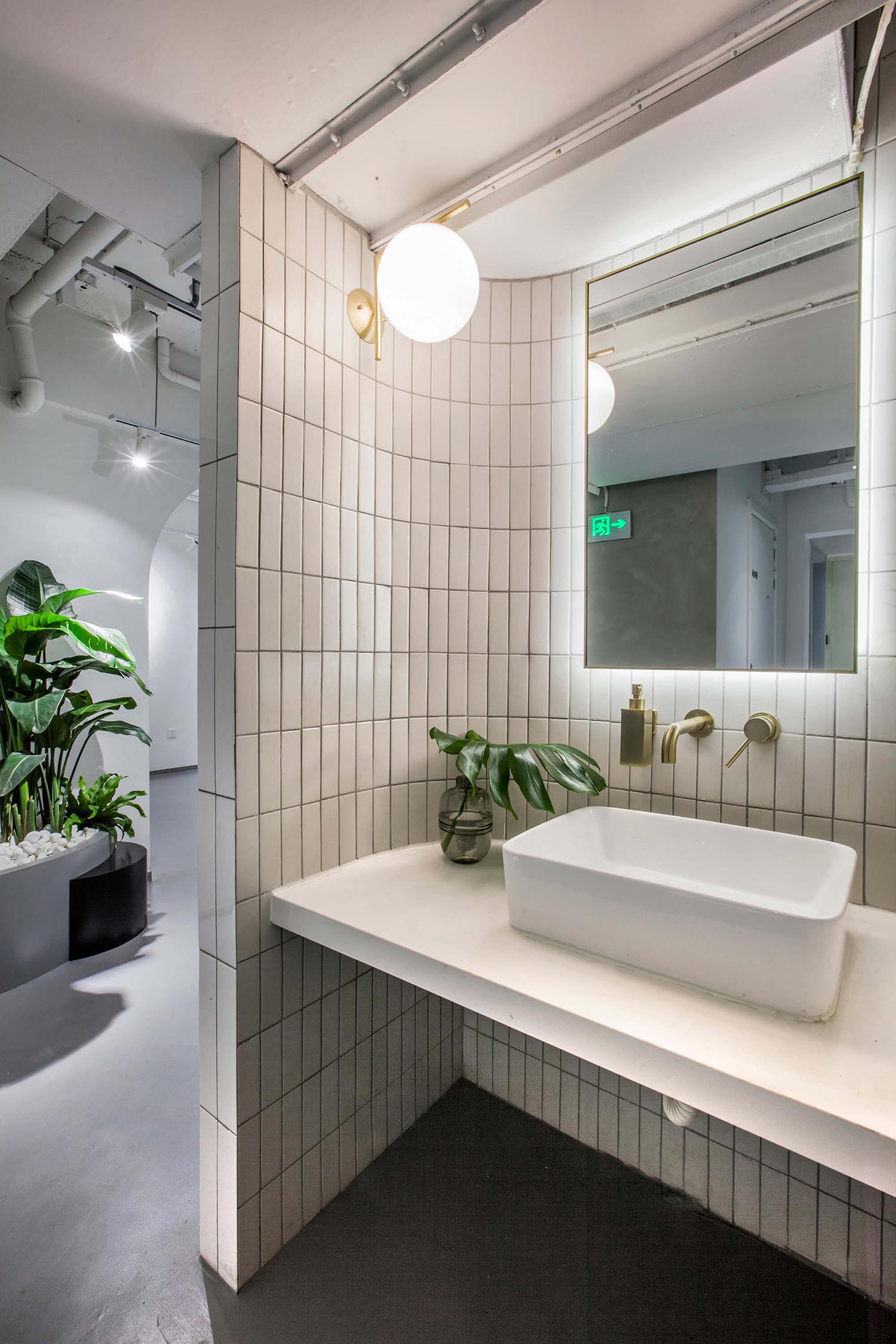
黃銅鑲邊的幾何線條成為空間的主視覺,由嵌入式的產品展示櫃放大至半弧形的門洞,疊加分布於弧線型的廊道動線上,鏡麵反射效果消匿了低矮天花的壓抑感並延伸空間視覺。
IV. Fusion of the new and old
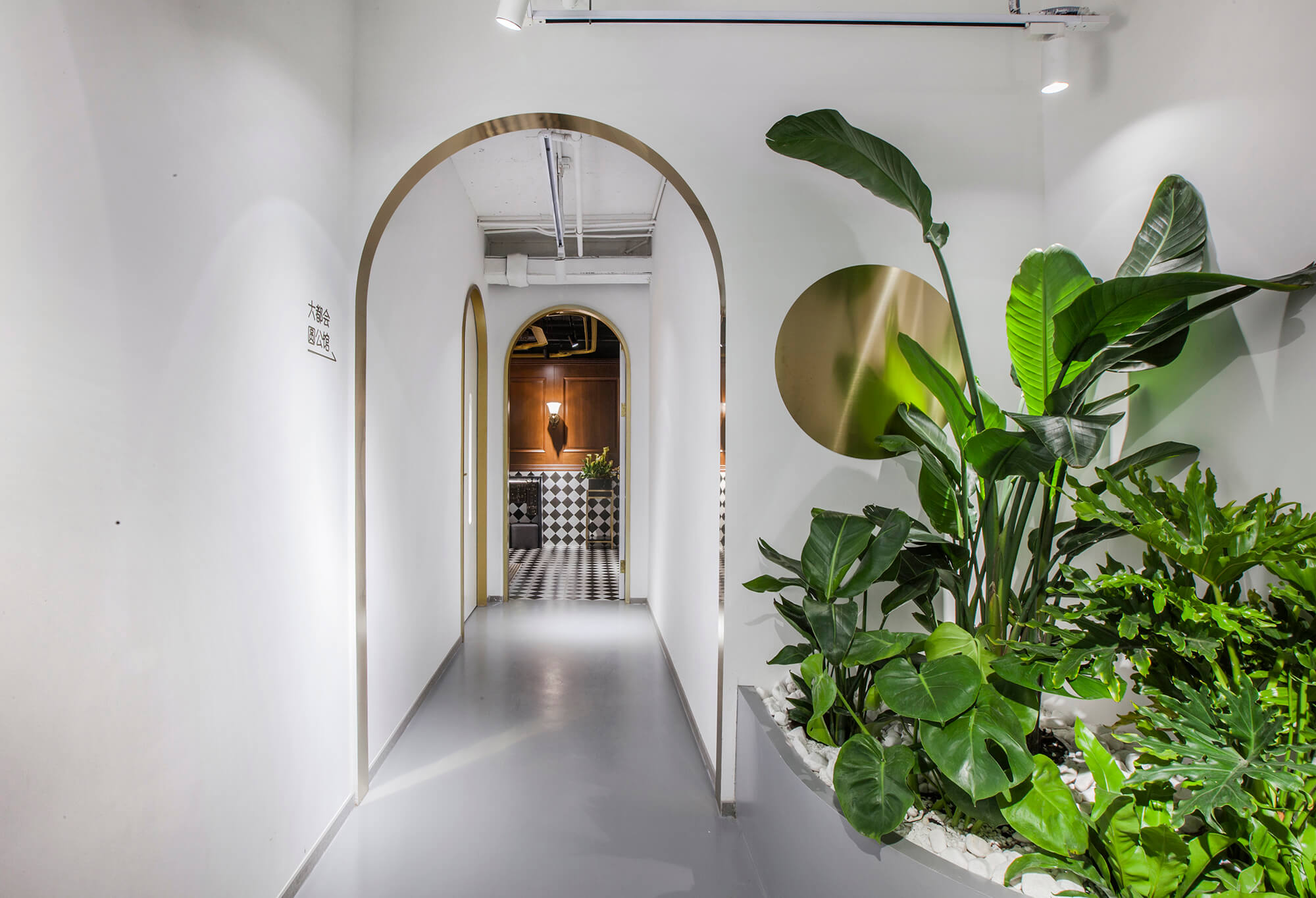
Brass lines can be frequently seen within the space, from embedded product display shelves to the arched door openings along the corridor. The corridor features a curved circulation route and reflections by mirrors, which alleviates the oppressive feeling caused by the low ceiling and extends the space visually.
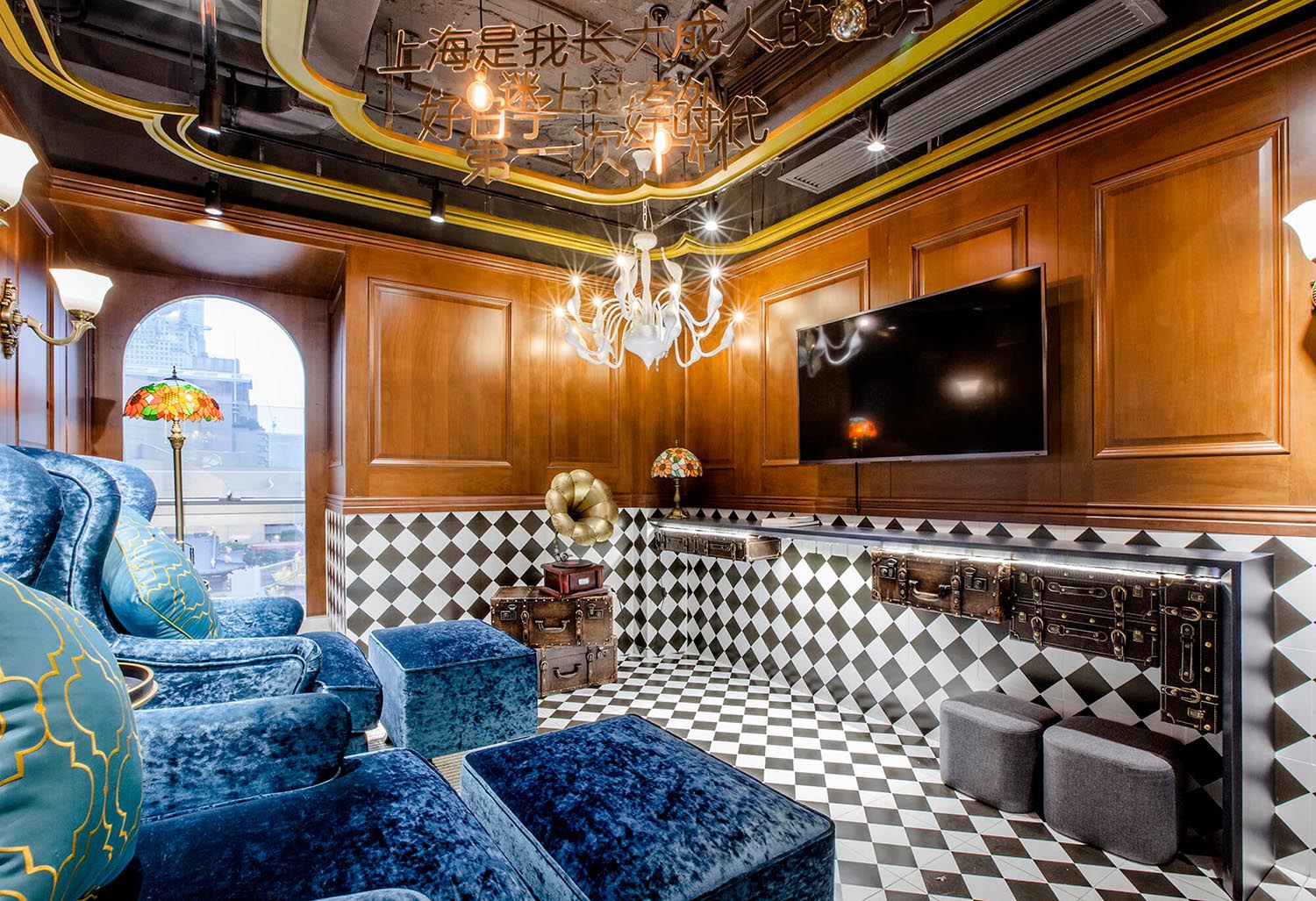
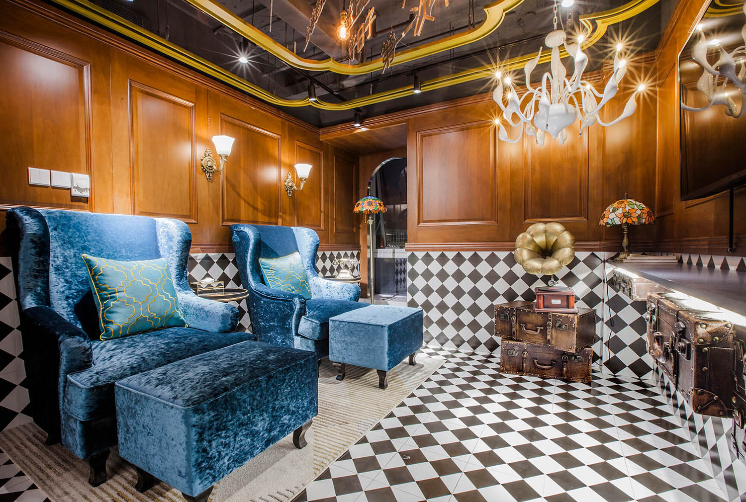
而在黑白方磚與深色實木圍合的海派房間,克萊因藍絲絨沙發、手搖電話和留聲機訴說著十裏洋場的往昔綺夢。
The room of old Shanghai style is finished with deep-colored wood and square black & white tiles, with Klein blue velvet sofas, hand-cranked telephone and gramophone producing an immersive and nostalgic scene.
∇ 平麵布置圖
完整項目信息
項目名稱:YUAN·Space
項目地點:上海市、南京西路1728號7樓
項目類型:美甲、SPA、足浴
項目麵積:約800平方米
設計公司:Towodesign堂晤設計(www.towodesign.com)
主持設計師:何牧
設計團隊:孫蒙、惠中旗、許曉瑜
完工時間:2019年3月
主要材料:金色拉絲不鏽鋼、水泥漆、白色條形磚、水磨石
攝影:Towodesign堂晤設計
Project information
Project name: YUAN · Space
Location: 7F, No.1728, Nanjing West Road, Shanghai, China
Category: manicure/foot bath/spa space
Area: about 800 sqm
Design firm: Towodesign (www.towodesign.com)
Chief designer: He Mu
Design team: Sun Meng, Hui Zhongqi, Xu Xiaoyu
Completion time: March 2019
Main materials: gold brushed stainless steel, cement paint, white brick, terrazzo
Photography: Towodesign


