LOFT中國感謝來自 班得建築 的商業空間項目案例分享:
GreenMonster Lab位於北京市朝陽區望京地區昆泰嘉瑞文化中心B1層,建築麵積4957.3m2。設計定位為集展覽、娛樂、休閑為一體的多功能文化空間。分別設置美食文化展示中心、傳統文化館、書店、品牌展示廳等空間。
The GreenMonster Lab is located on the B1 floor of Kuntai Jiarui Cultural Center in Wangjing area, Chaoyang District, Beijing, with a building area of 4957.3 m2. The design is positioned as a multi-functional cultural space integrating exhibition, entertainment and leisure. The complex includes culture exhibition center, traditional culture hall, bookstore, brand exhibition room, and other functional spaces.
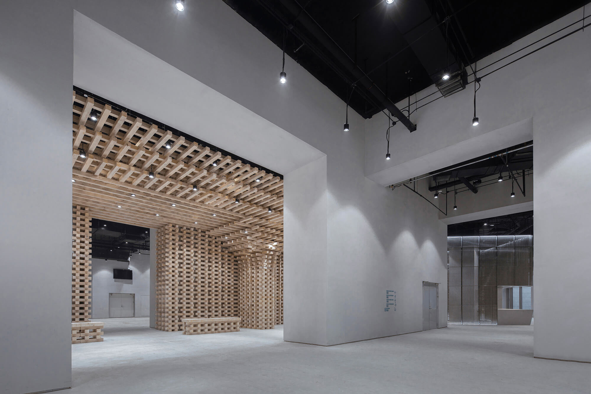
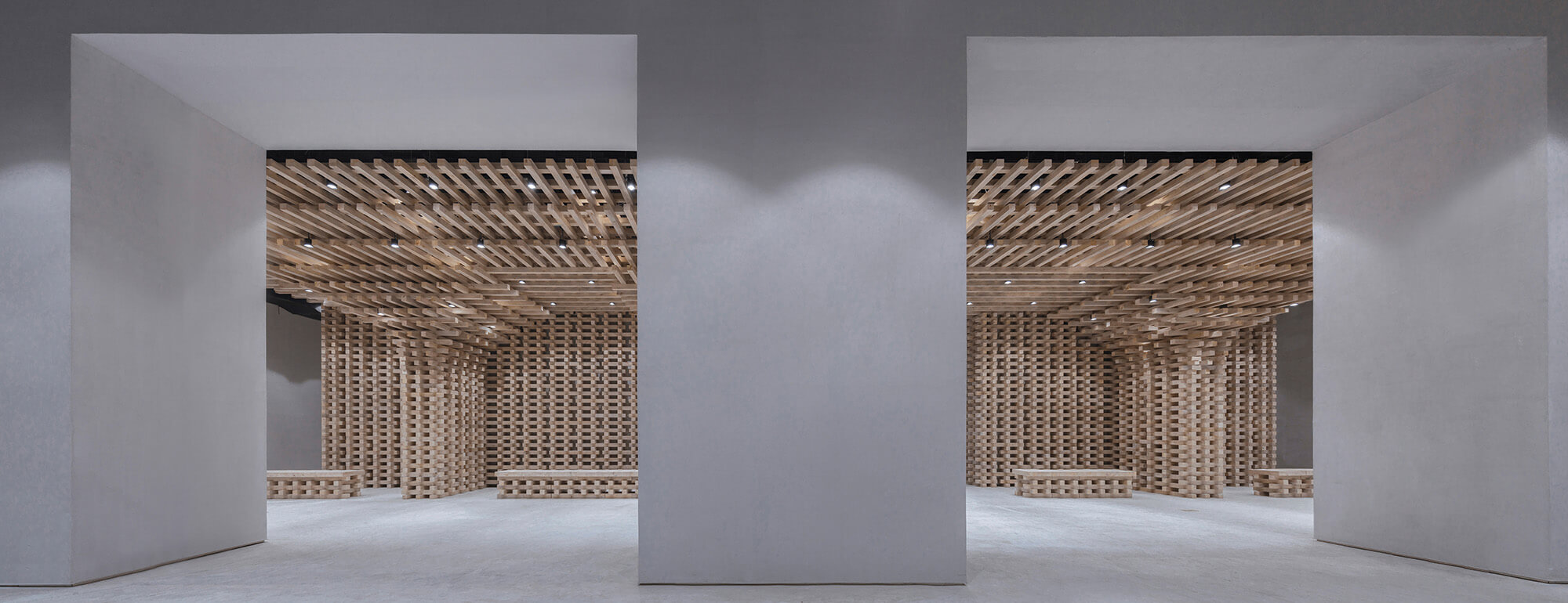
∇ 盛延入口 Entrace of The Feast
第一部分:盛筵
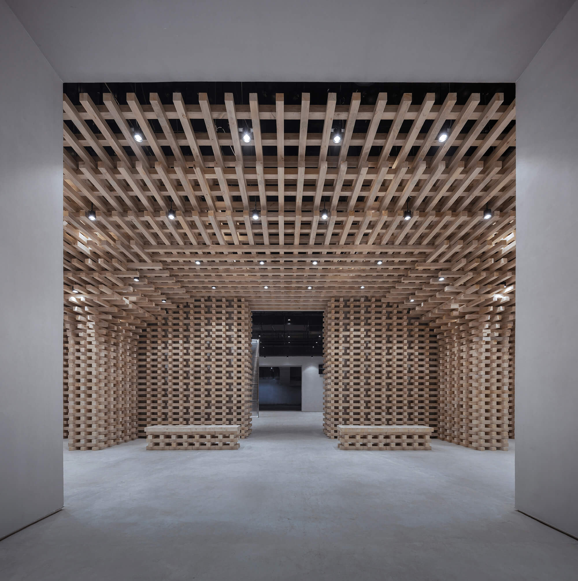
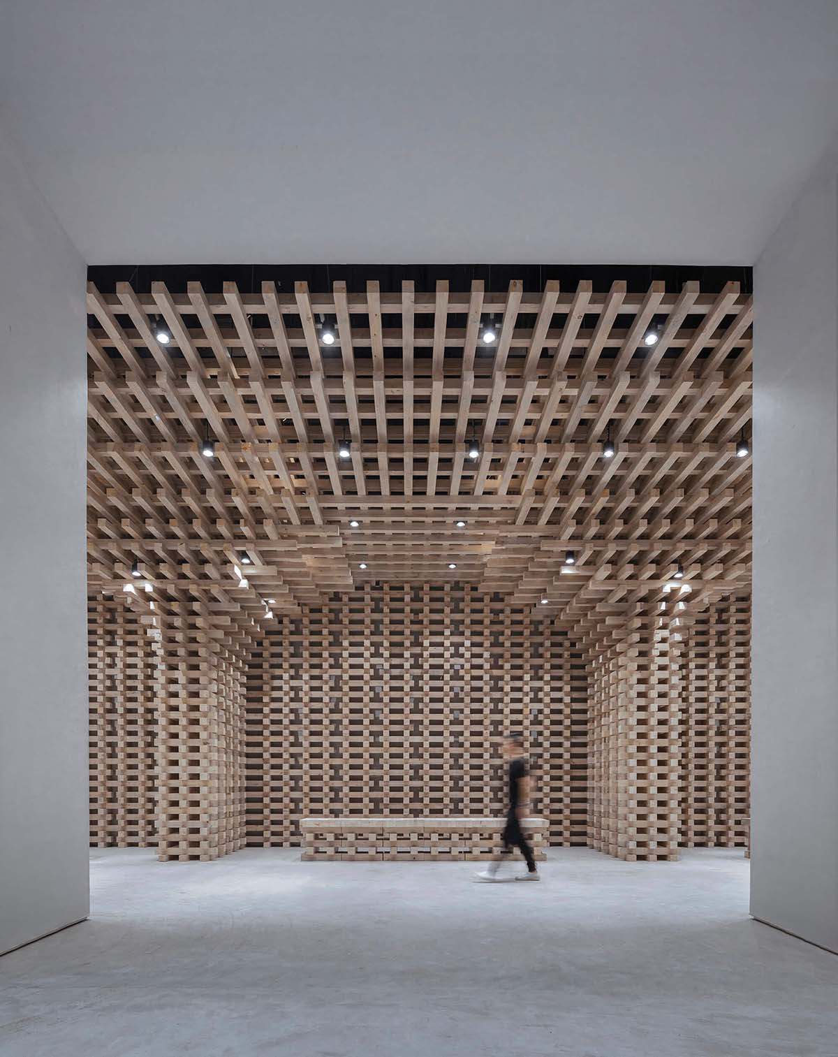
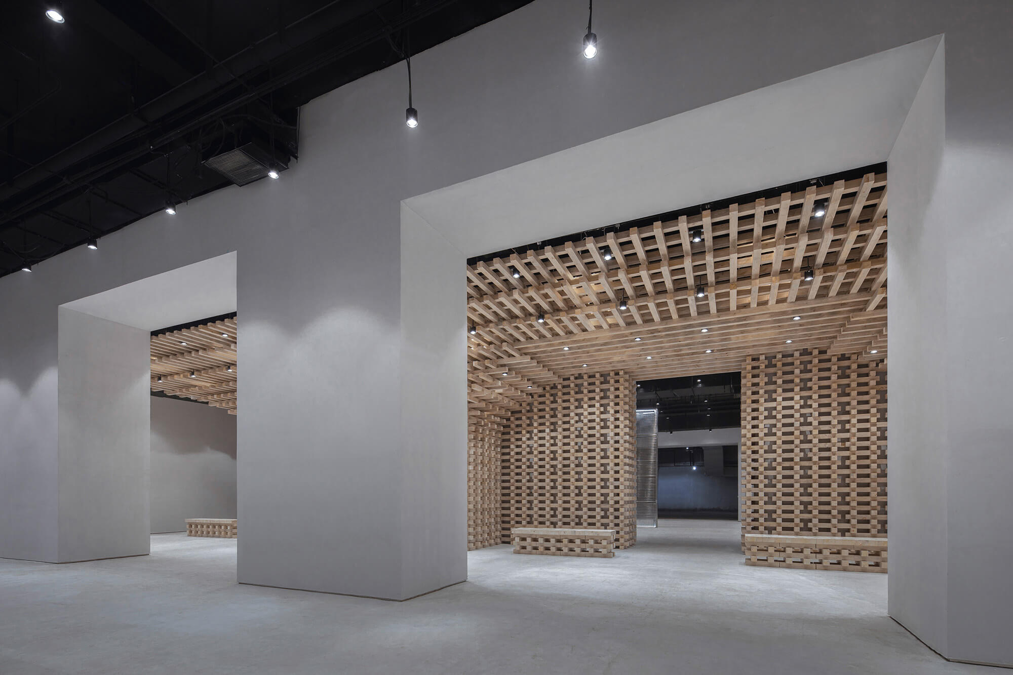
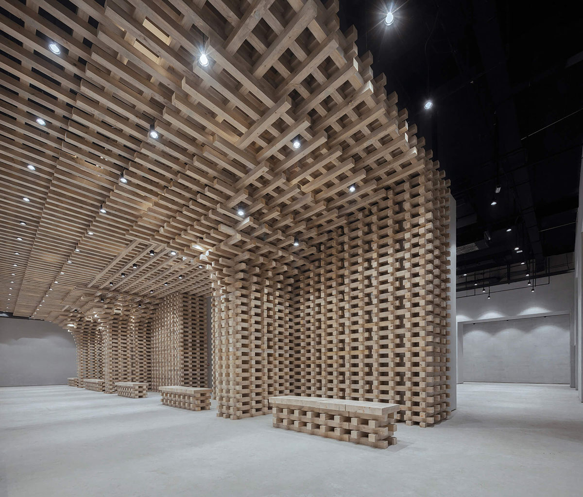
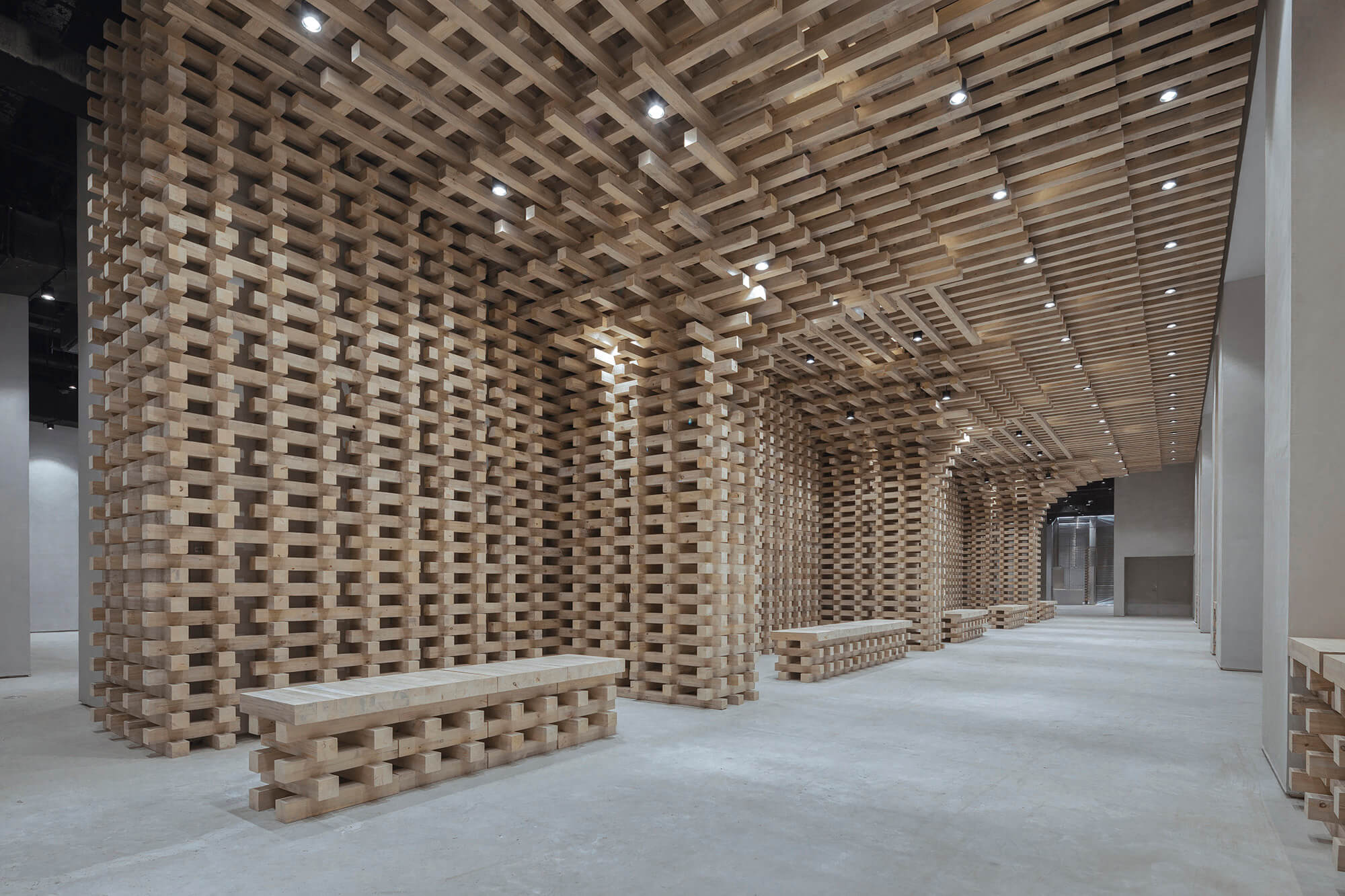
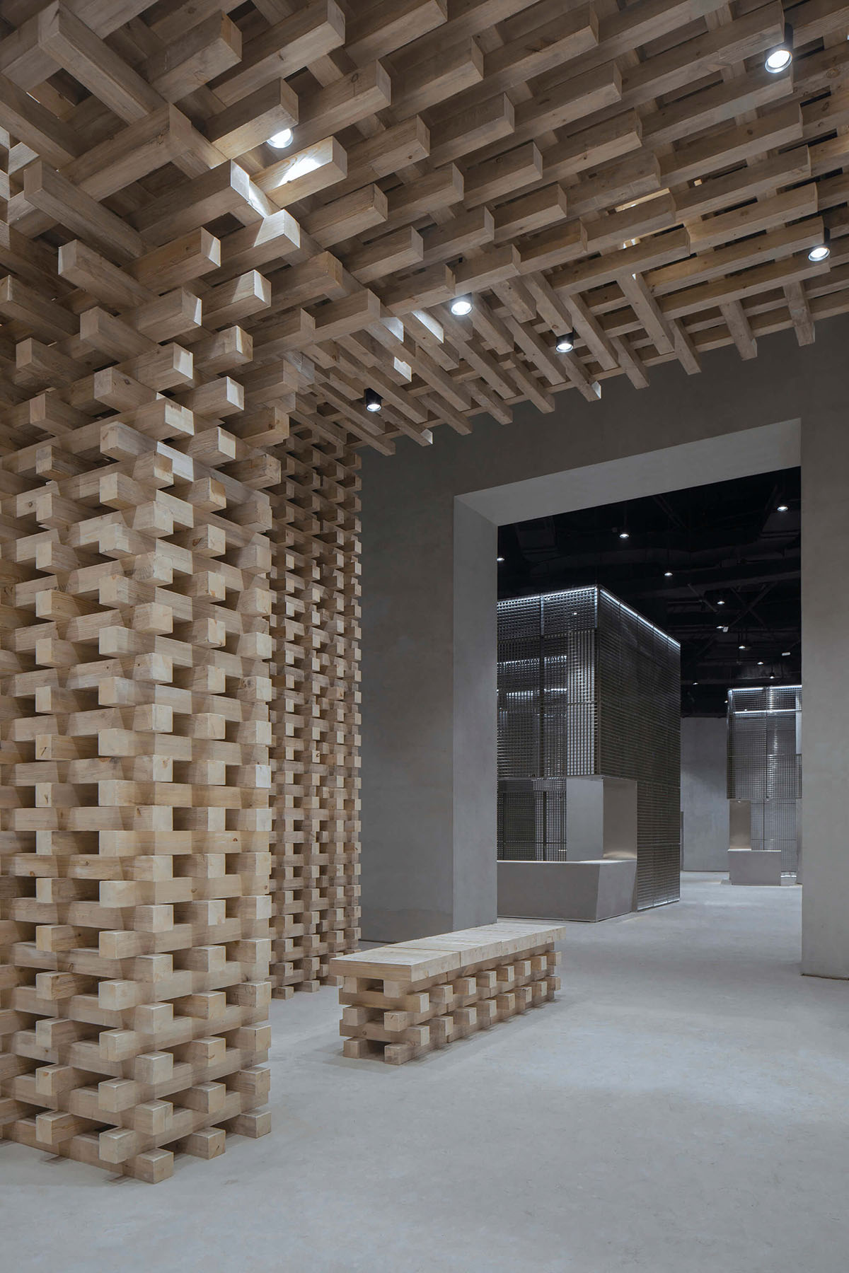
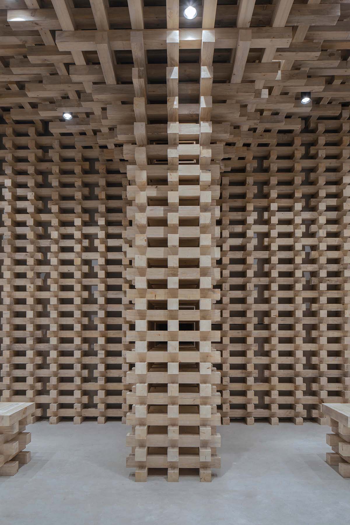
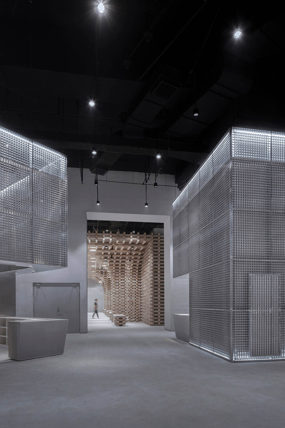
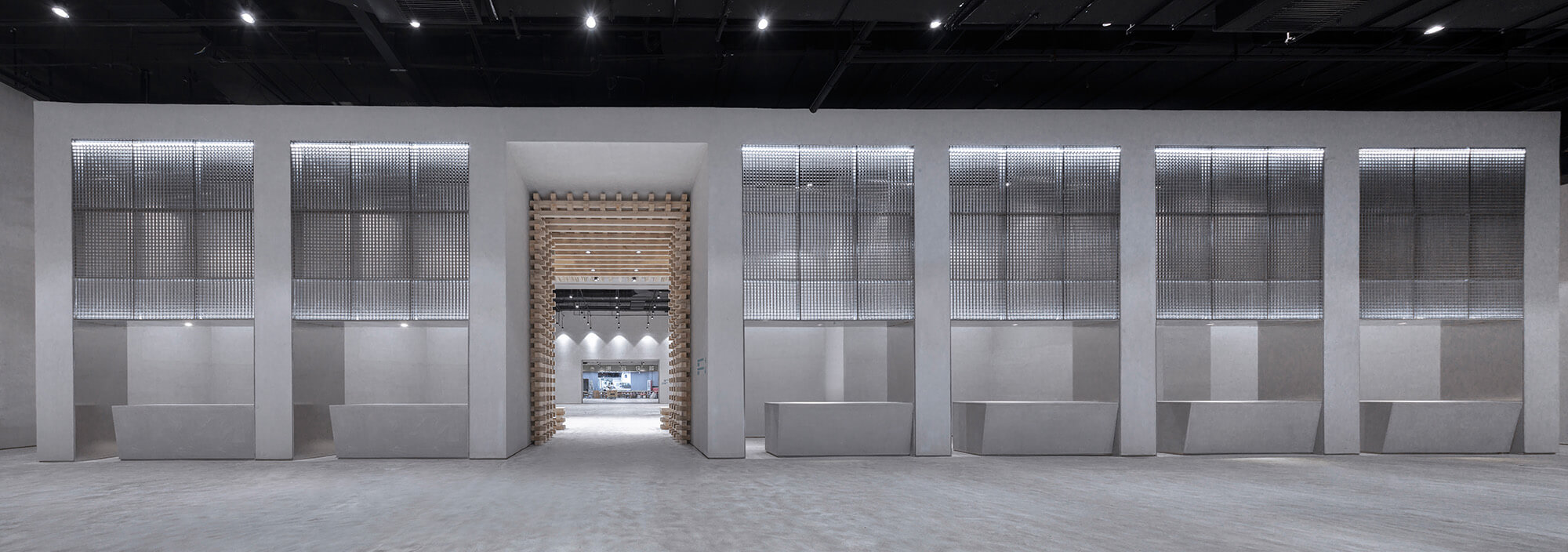
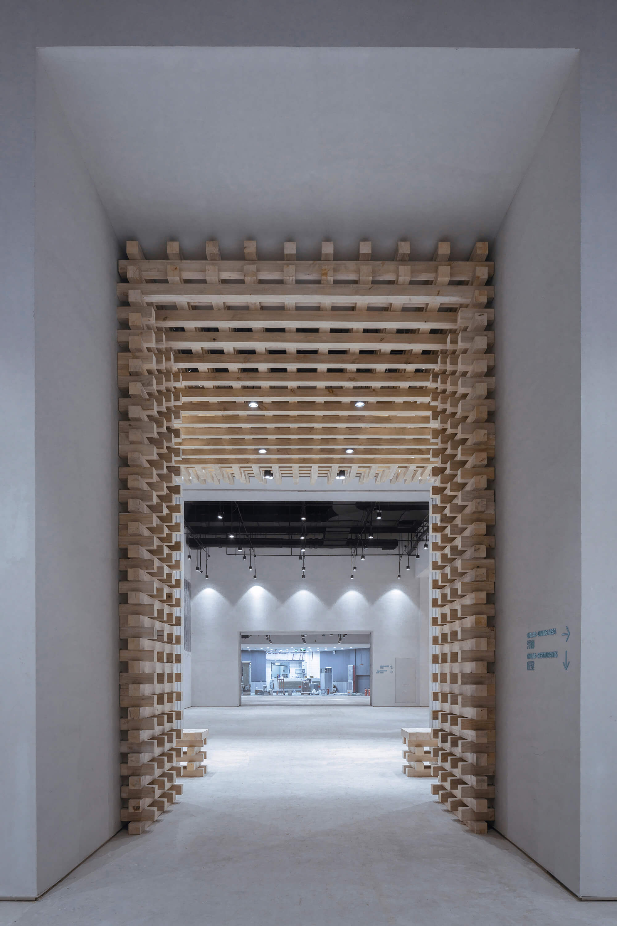
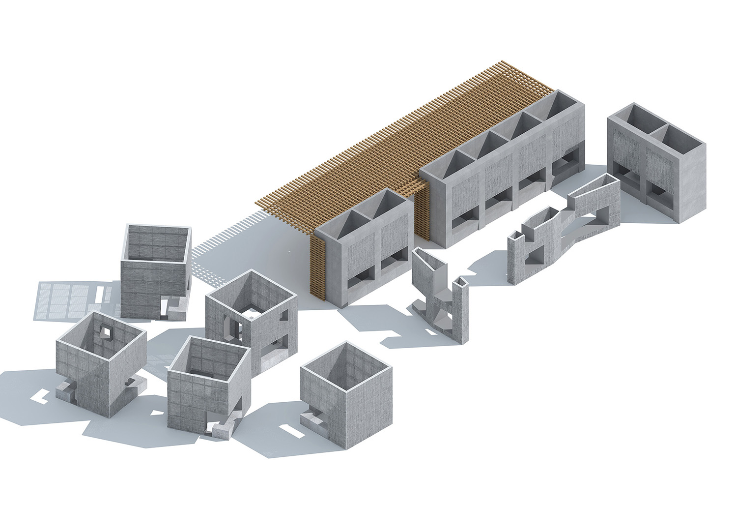
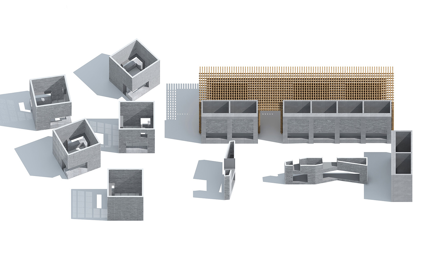
此區域為整體空間的開始,扶梯下到現場後第一個呈現的視覺空間。它是由一組木結構裝置組成的展示空間,定義為傳統文化館,用來展示世界各地的傳統文化物品。我們用最能代表中國建築文化的“木結構”來展示世界的傳統文化,是對此空間最好的詮釋。同時木結構建築帶來的大氣沉穩使整體空間序列的開始形成一組有氣勢的篇章,引人入勝,為整體空間的展開渲染一幅華麗的盛筵。建築展示形式集展牆、展台和地麵於一體,既有“展館”之隆重、又有“市集”之落地。
The first part: The feast
This area is the beginning of the overall space, the first scene the customer will encounter when coming down with the escalator. It consists of a set of wooden structures, defined as a traditional cultural pavilion, used to display traditional cultural relics from around the world. We use “wood structure” that best represents Chinese architecture to showcase the world’s traditional culture. The classiness brought by the wooden structure makes the area an astounding starting chapter for the spatial sequence that follows, presenting a gorgeous feast for the expansion of the overall space. The form of the exhibition includes the exhibition wall, the exhibition stand, and the ground. It features both the grandeur of an “exhibition hall” and the liveliness of a “market”.
∇ 盛延 The Feast
第二部分:匠堂
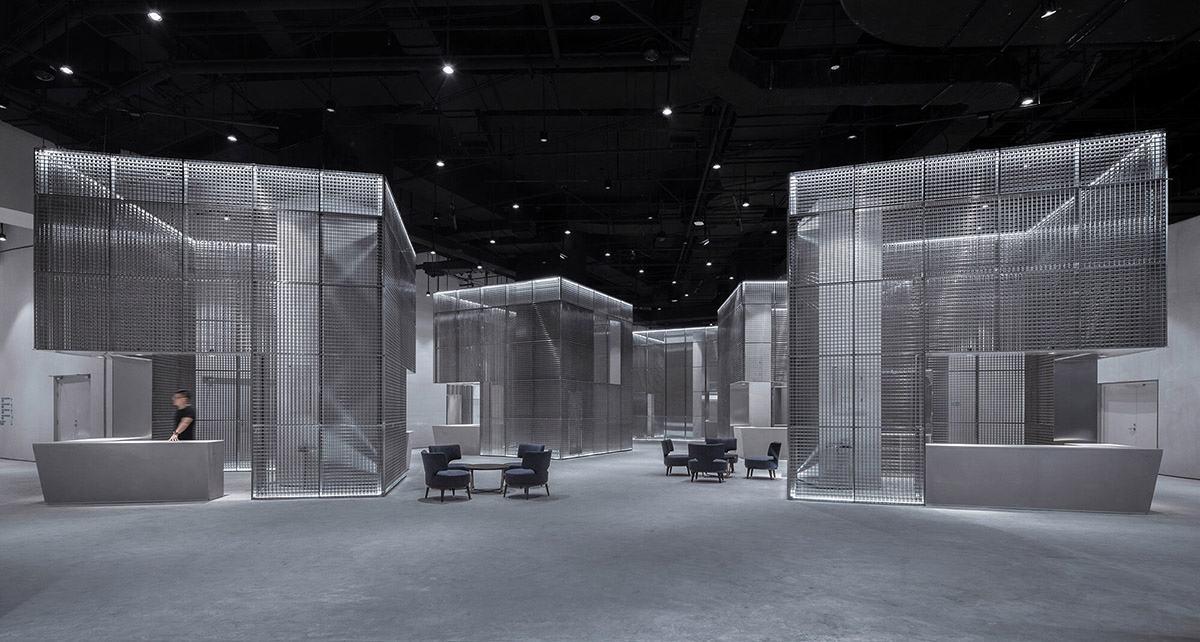
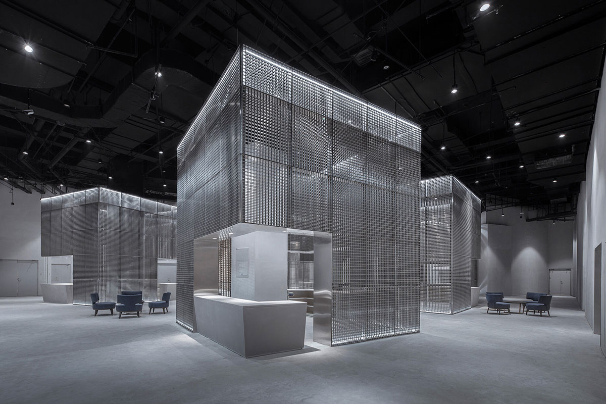
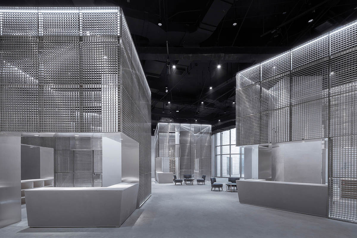
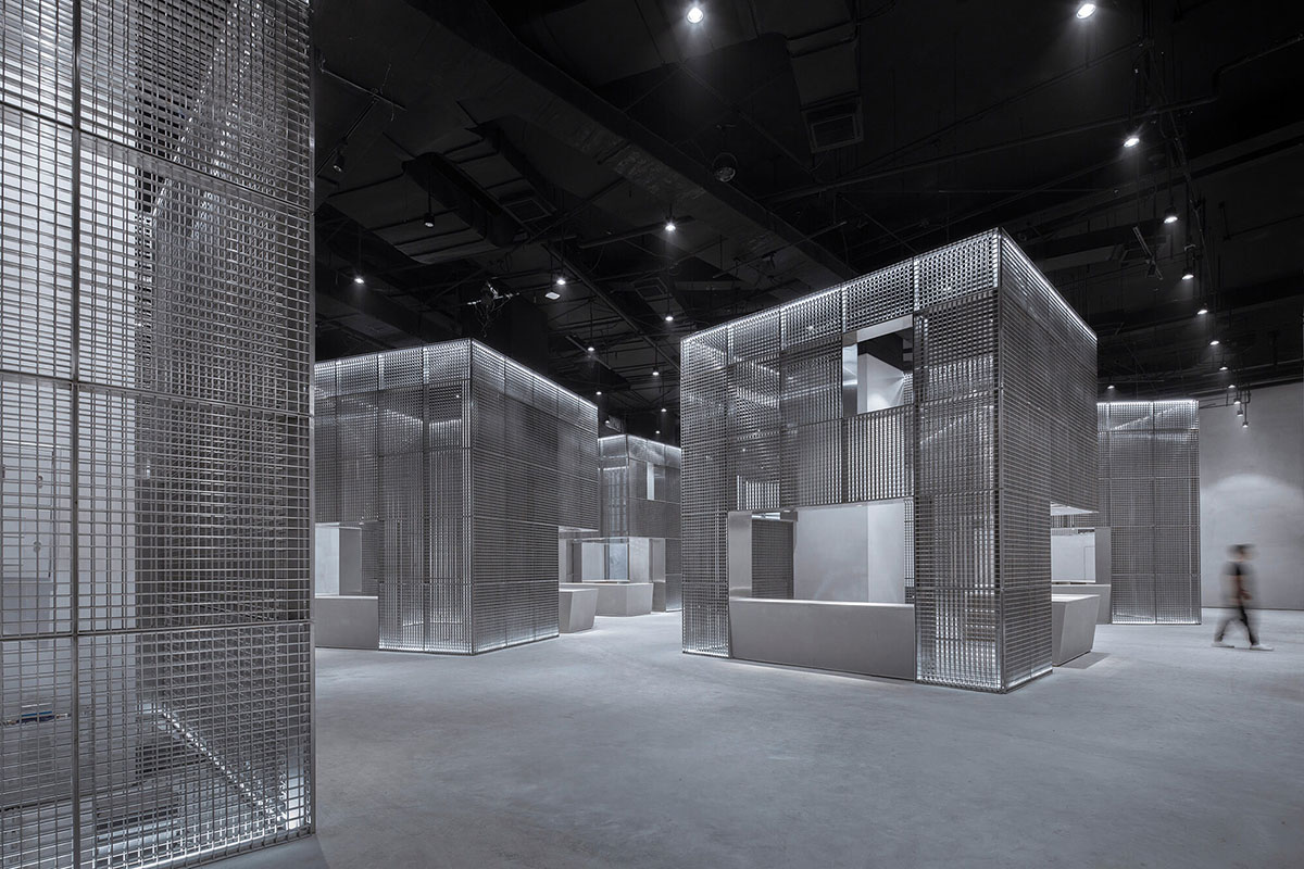
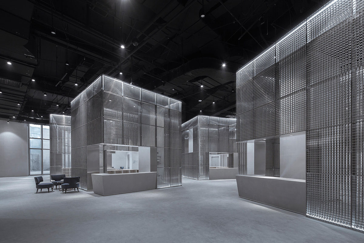
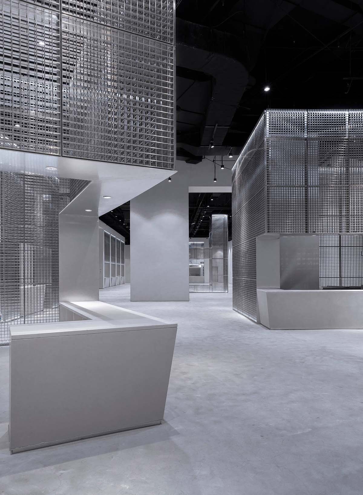
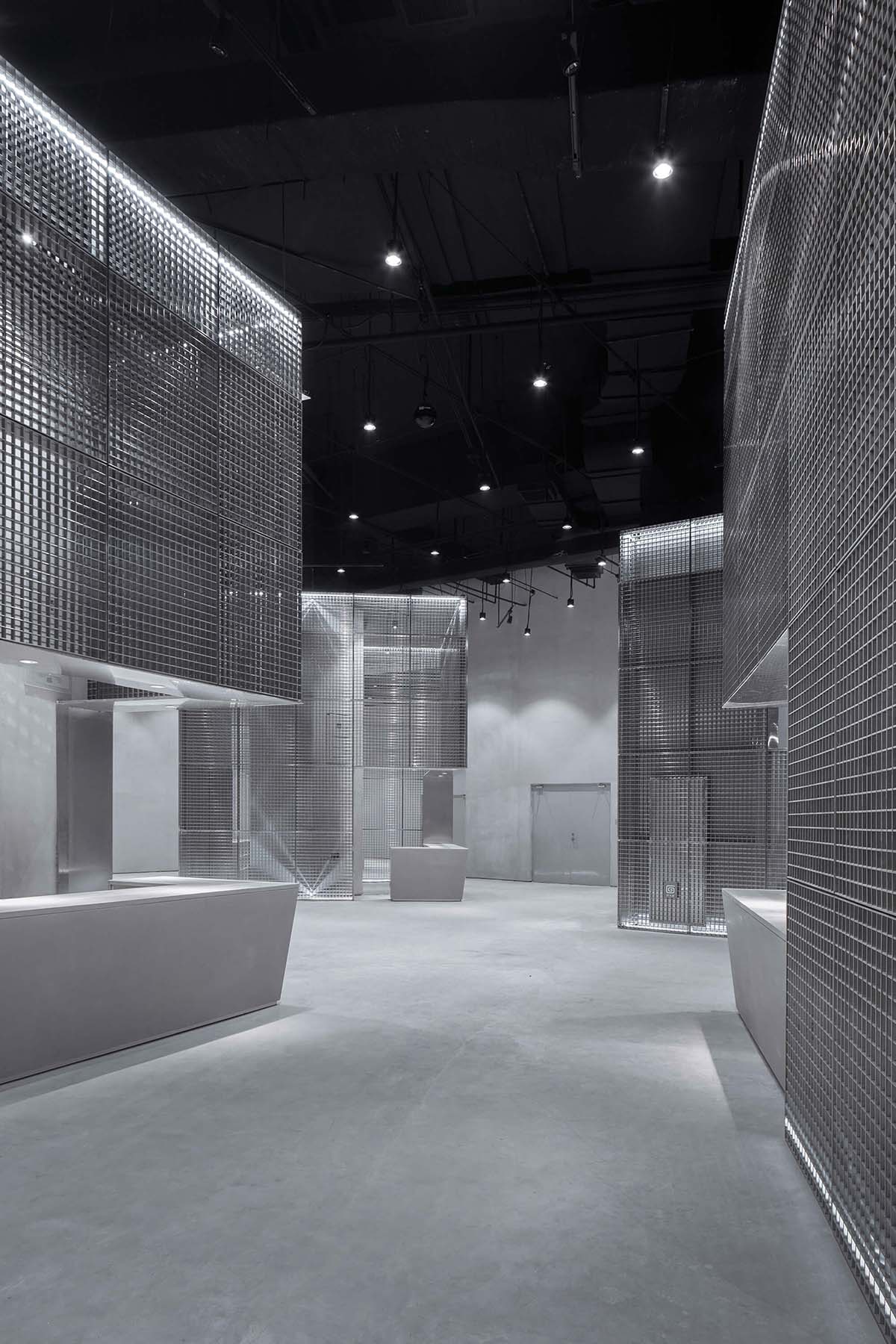
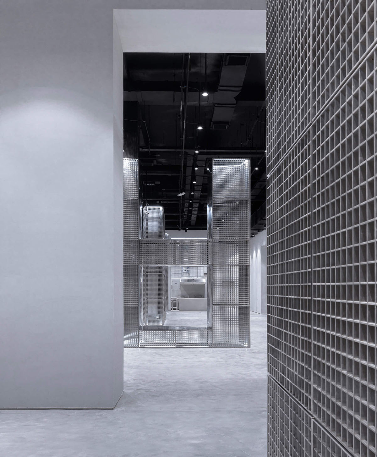
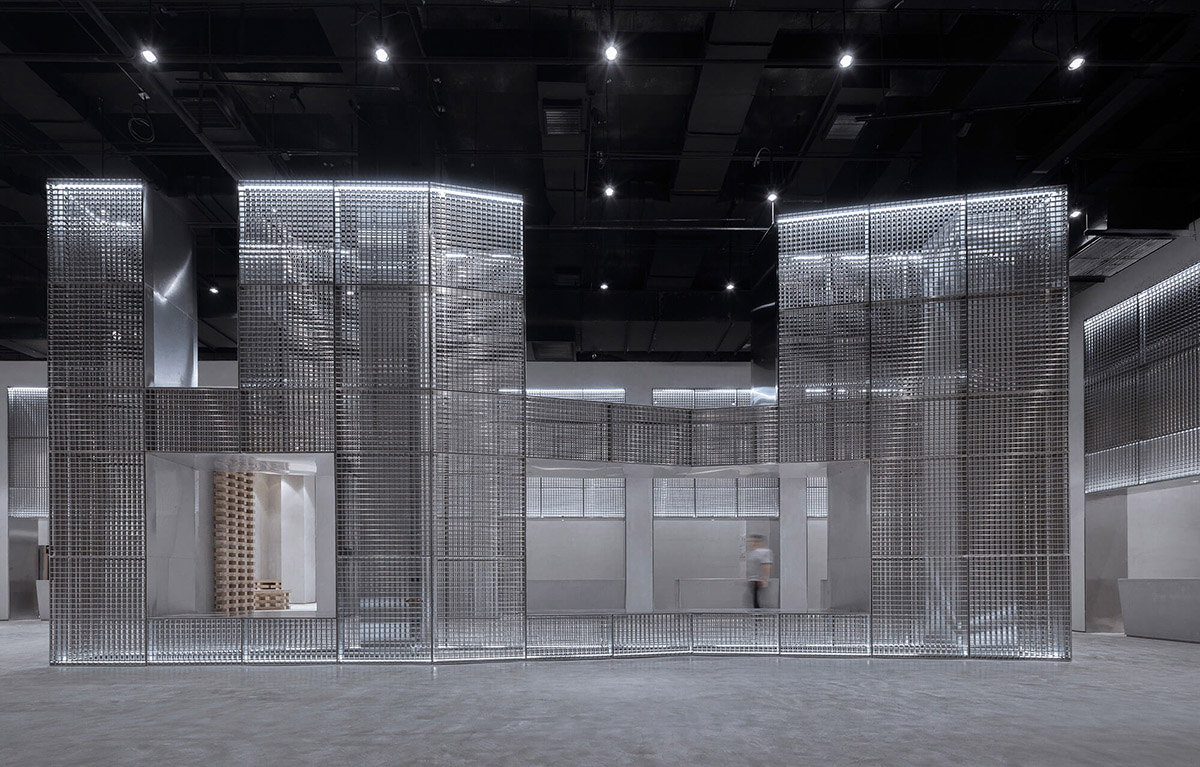
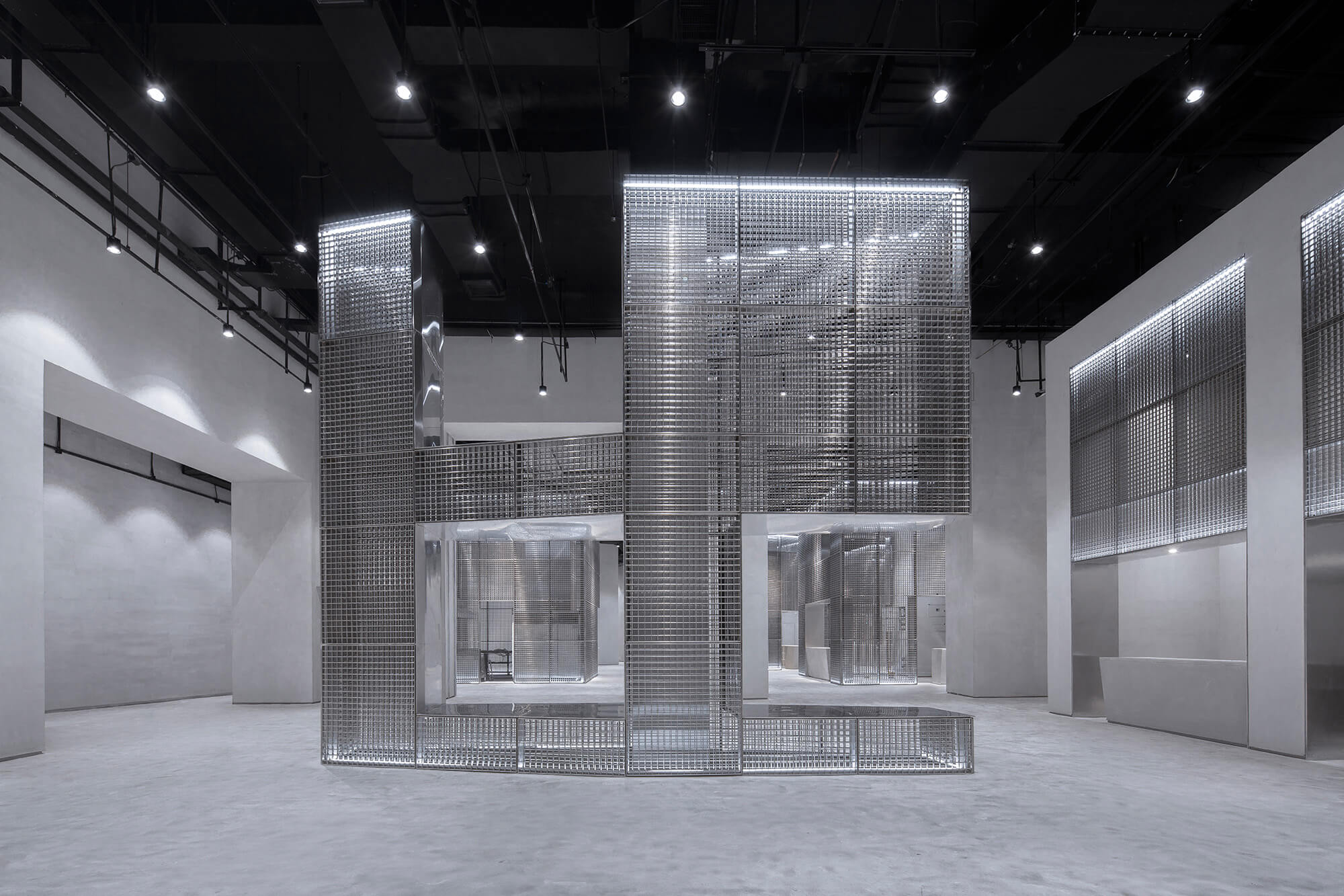
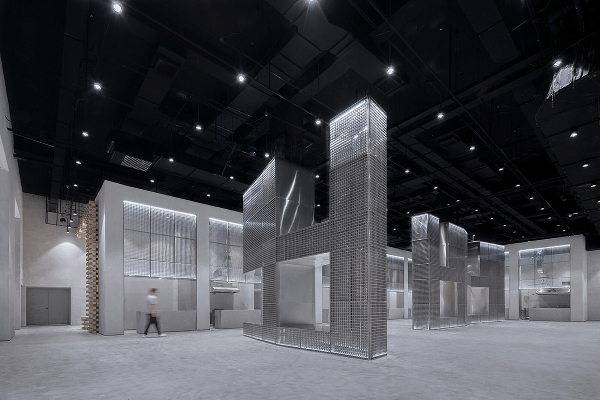
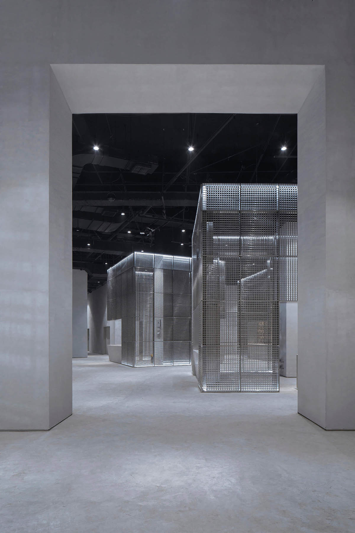
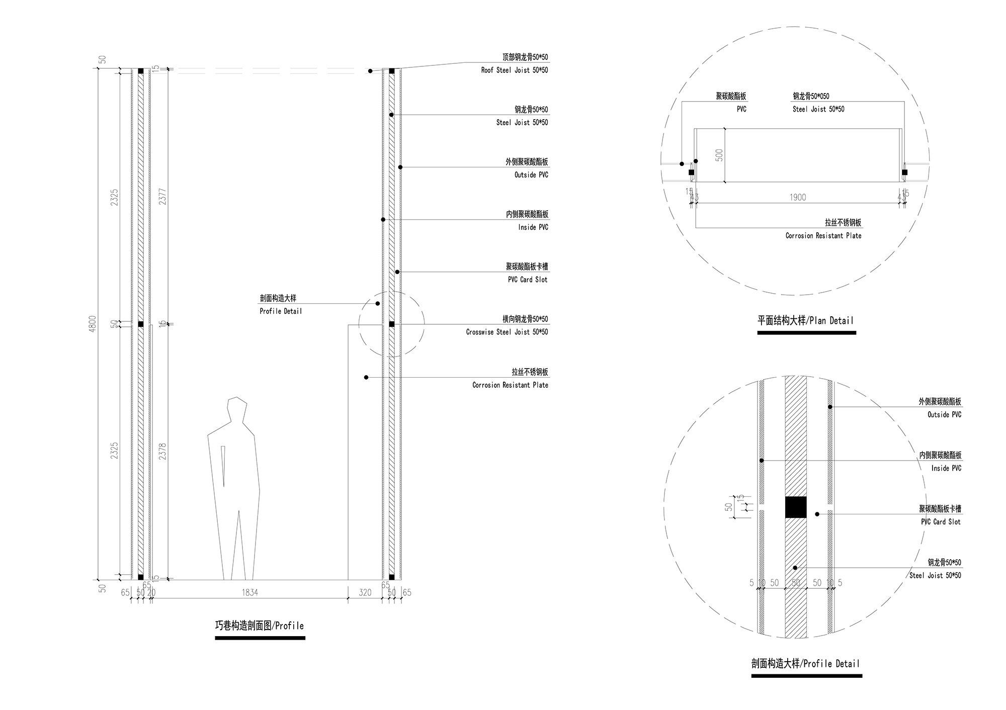
此區域為整體空間的第二個序列,它是由五組鋼網裝置組成的建築空間,每個鋼網裝置內是兩組商家和一個現場結構柱子。我們把商家的功能性展示和不好處理的柱子全集中在每一組鋼網內。呈現視覺的是幹淨的建築空間和若隱若現的商家工作人員。每個鋼網裝置內都是“匠人”精神的製造地。五個鋼網裝置在平麵關係中錯落旋轉的擺放形成了街巷空間效果,使參觀者與商家有更好的溝通、交流、學習場所。此空間除了美食展示交流功能之外,還是一個畫廊,五個鋼網裝置牆身為畫廊展示牆麵,大小各異的畫作與鋼網裝置相互呼應、渾然一體。
The second part: Craftsmen shop
This area is the second sequence of the overall space, which consists of five sets of stencil-covered units, each of which has an on-site structural column and can be dedicated to two dealers. We put the functional display of merchant and the tricky columns in each stencil-covered unit. The visuals are neat building spaces and looming merchant staff inside the unit. Each stencil installation is a ground for the “artisan” spirit. The placement of the five stencil unit in the relative to each other in the area creates an effect of street and ally, which enables visitors and dealers to have a better place for communicating, exchanging, and learnings. In addition to the function of culinary display and communication, this space is also a gallery. The wall of the five stencils unit is used to display art. Different sizes paintings and the stencils echo each other, forming a spectacular view.
∇ 匠堂 Craftsmen Shop
第三部分:浮廊
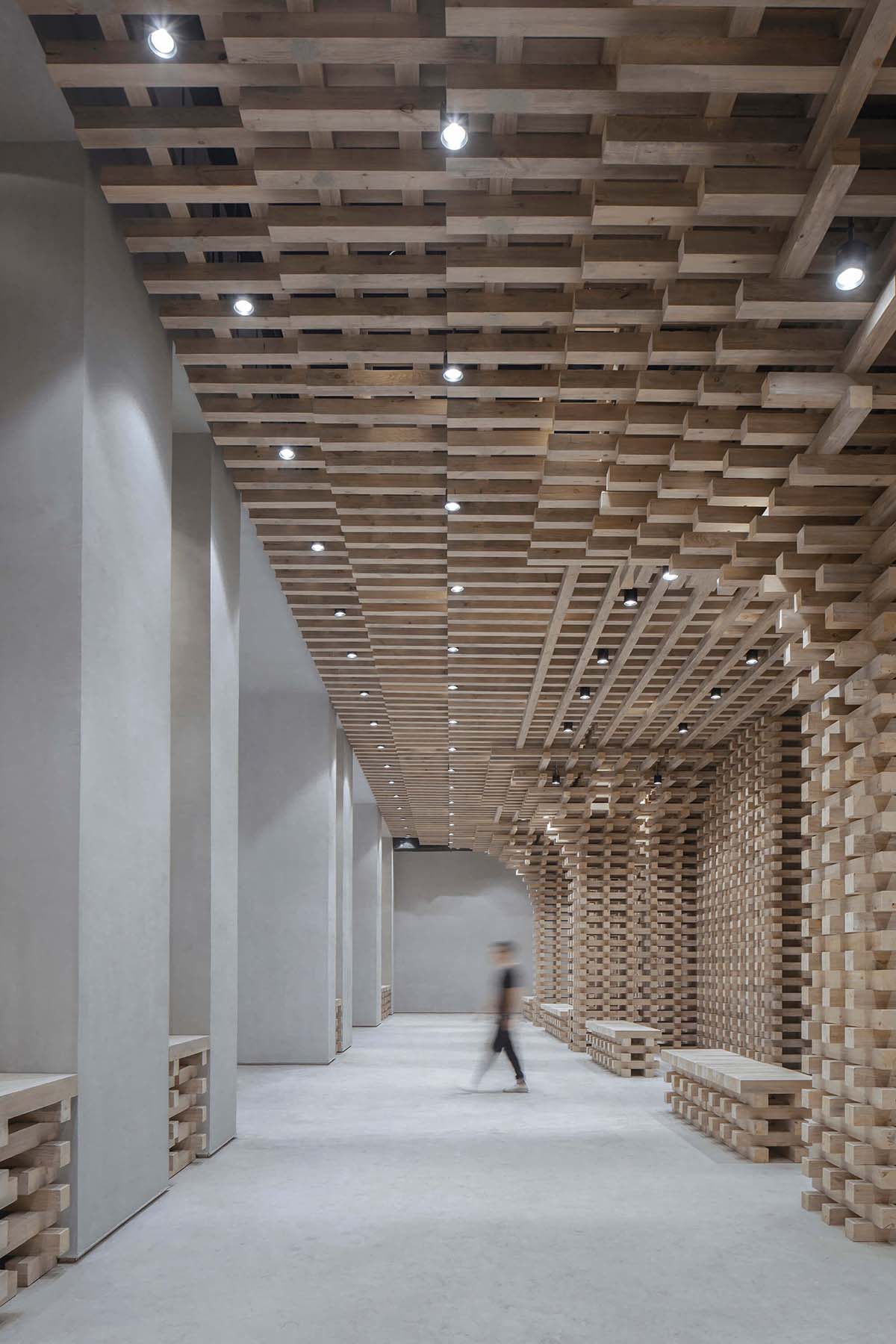
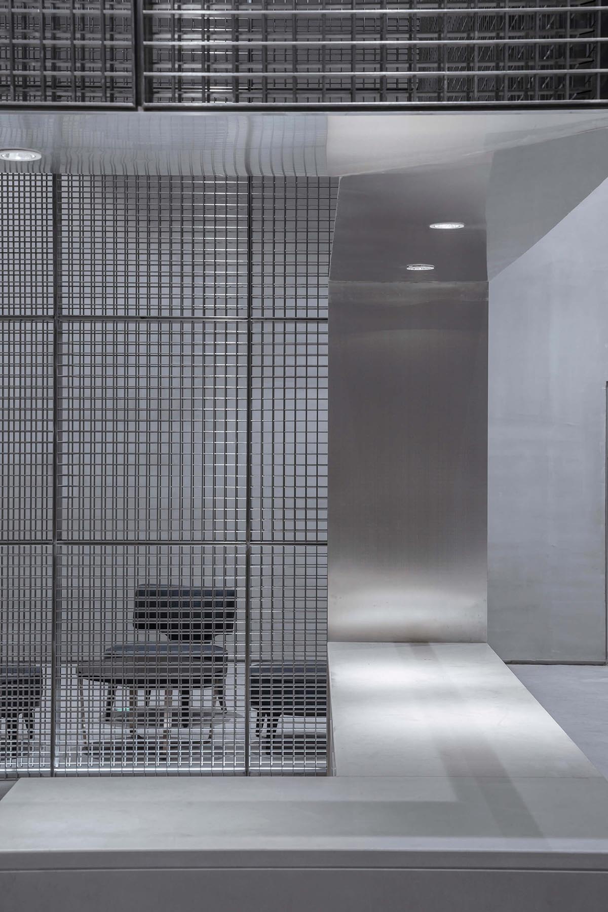
人若沉浮落地為息。此區域為整體空間的最後一個部分。它是由八組手工作坊和兩組休閑裝置組成。在這個空間裏,我們希望參觀者會安然的感受手工作坊帶來的食物、文化以及愜意。希望這個空間會是一個都市生活的休息站,也是所有情緒的終點站。八組手工作坊兩組裝置分別包含了現場的各個結構柱。呈現的建築空間是一排有氣勢的手工作坊和幹淨的休閑浮廊。此空間同時又是一個人與人溝通交流的場所,以浮廊為驛站放鬆心靈、溝通心得。感受喧鬧都市中的一點靜謐。
The third part: Le flottant
This area is the last part of the overall space. It consists of eight sets of manual workshops and two sets of leisure units. In this space, we hope that visitors will feel the food, culture, and coziness brought by the workshop. We hope this space will be a rest stop for urban life and a terminal of emotions. The eight sets of manual workshops and two sets of leisure units contain every structural column on site. The architectural space presented is a row of imposing manual workshops and a neat casual Le flottant. This is also a place to chat and relax, centered by Le flottant, where people can earn a bit of tranquility in the chaotic city.
∇ 浮廊 Le Flottant
第四部分:空間整理
這部分是我們設計過程中的思路,整體設計就是一個空間整合梳理的過程。
The fourth part: Space organizing
This part is the idea in our design process. The overall design is a process of spatial integration and organization.
我們剛接觸到這個項目的時候,發現現場條件非常複雜:一是現場柱網很亂幾乎沒有規律可找。二是現場空間處於地下一層並有五個防火分區,現場大部分空間的分割都是以防火卷簾防火牆防火門分割的。三是現場空間比較高,但是空間上部管線非常複雜,消防排煙、排油煙、新風空調、噴淋等等,這些管線實際就占據了空間高度的三分之一,使得實際空間感受與原始高度不符。整體感受可以歸納為一個字,就是“亂”。
所以我們在設計之前第一件要做的事情就是“歸納整理”。我們試圖找尋一種規律,把空間有序化。這個過程時間很長,慢慢地我們發現這個空間的“亂”也是它的特點之一,我們可以在歸納整理空間的基礎上利用這個特點,打造出因地製宜的空間秩序,這裏包括空間關係、形體關係、材料組合等等。
When we first came into contact with this project, we found that the site conditions were very complicated: First, the site was very messy and there were almost no patterns on the distribution of the column. Second, the site space is on the basement and there are five fire zones. The division of most of the space on the site is divided by fire shutters, firewall, and fire doors. Third, the on-site space is relatively high, but the upper pipelines in the space are very complicated, involving fire and smoke exhaust, fumes exhaust, fresh air conditioners, sprays, etc. These pipelines occupy one-third of the space height, making the actual feeling of the space does not match the original height. The overall feeling can be summarized into one word, “messy”.
So the first thing we had to do before designing is “inductive sorting.” We were trying to find a pattern that governs the space. This process took us a while. Slowly, we find that the “messy” of this space is also one of its characteristics. We were able to harness this feature on the basis of space organizing to create a spatial order suitable for the local conditions, including spatial relationships, geometry relationships, material combinations, etc.
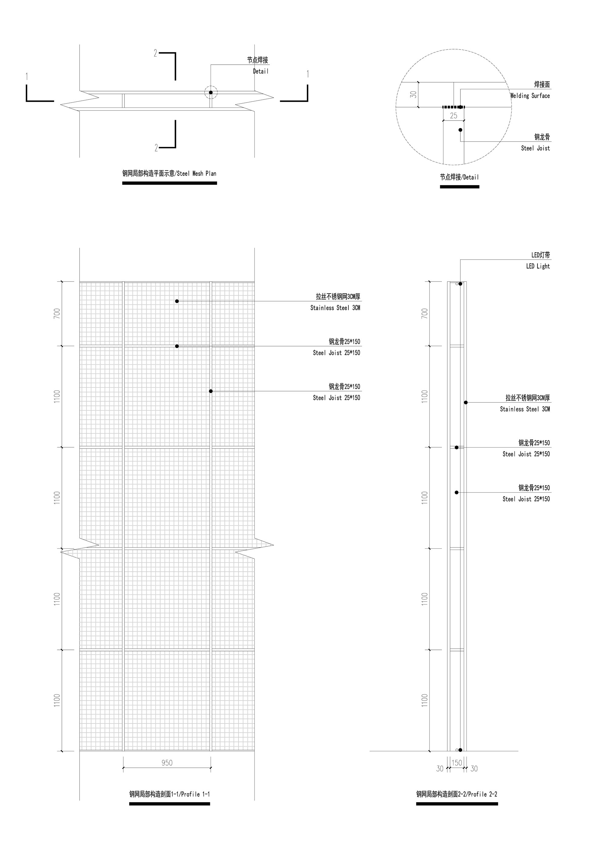
隨後我們又重新審視這個空間:第一就是雜亂的柱子,我們把一些柱子與功能進行合並隱藏,其餘的柱子我們選擇直麵它們,給它們“加粗”,形成功能性柱子,把商家放到“柱子”裏,加粗的柱子我們用鋼網這個材質進行圍合,鋼網是半透的材料,既有造型感又適當虛化加粗的柱子,同時又若隱若現的呈現了柱子裏的商家。在這樣處理空間的同時我們發現了一個有趣的空間體驗,加粗的大柱子之間的負型,形成了一個街區化的感覺,原有的雜亂的柱子變成了若幹功能性大形體和他們之間的街區化感受,這一點是我們覺得比較理想的一種處理方式。
Then we re-examined this space: the first is the messy pillar. We merged some of the columns into decorations and thereby hide them. For the rest of the pillars, we choose to face them, make them even thicker, forming a functional column. We use steel mesh to enclose several thick columns and put the dealers inside. The steel mesh is a semi-transparent material, give both style and some extent of blurring of the thick column, while shrouding the staff inside the unit. In this way of processing the space, we found an interesting experience of space. The void between the thick pillars, forming a sense of blocks. The original messy columns became a number of functional large bodies and give a feeling of neighborhood, which is an ideal way for us to handle them.
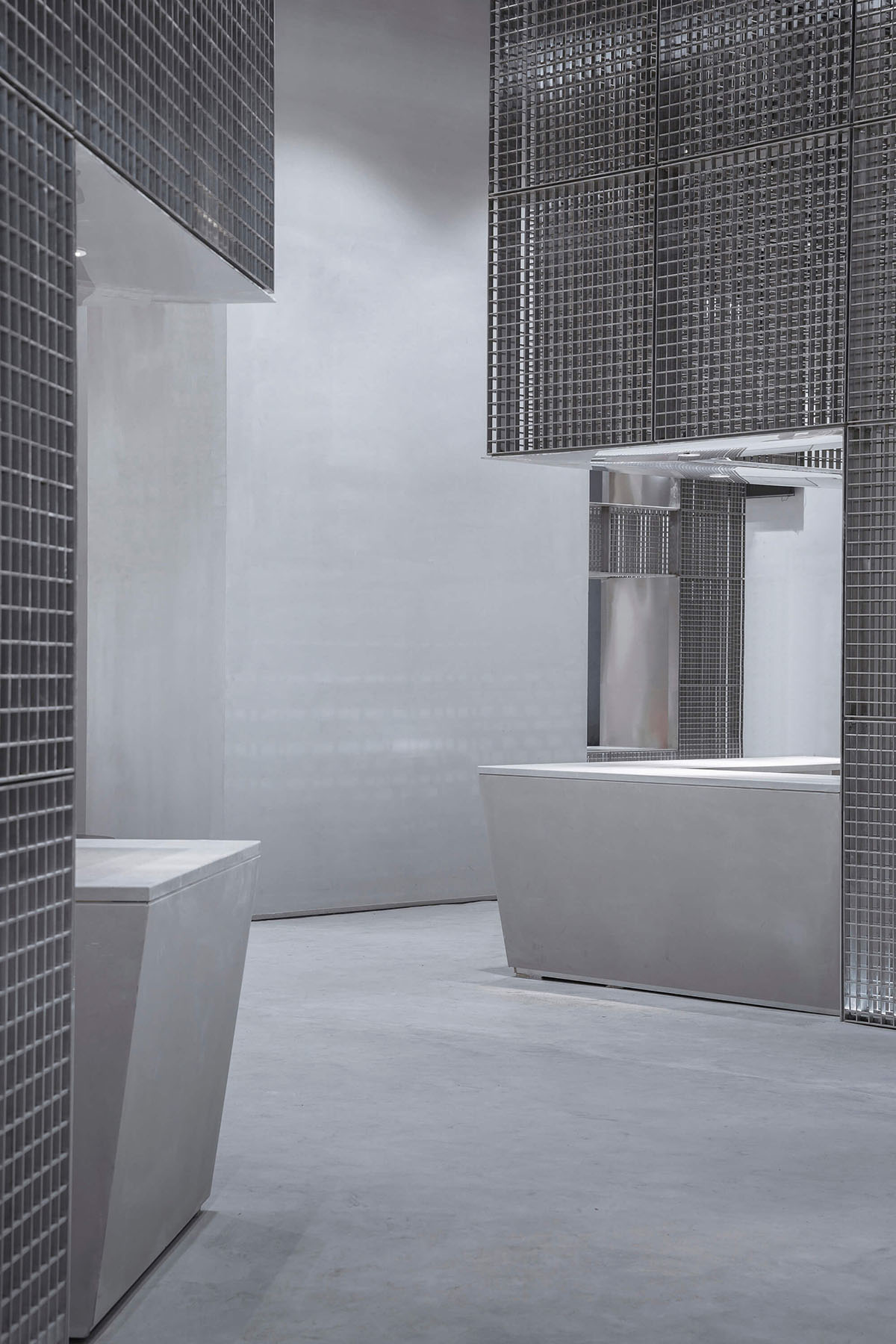
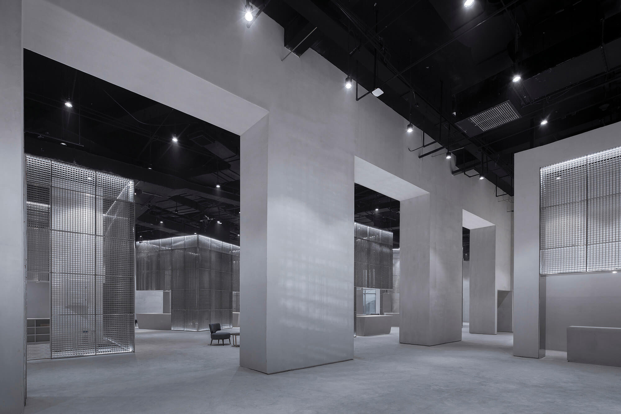
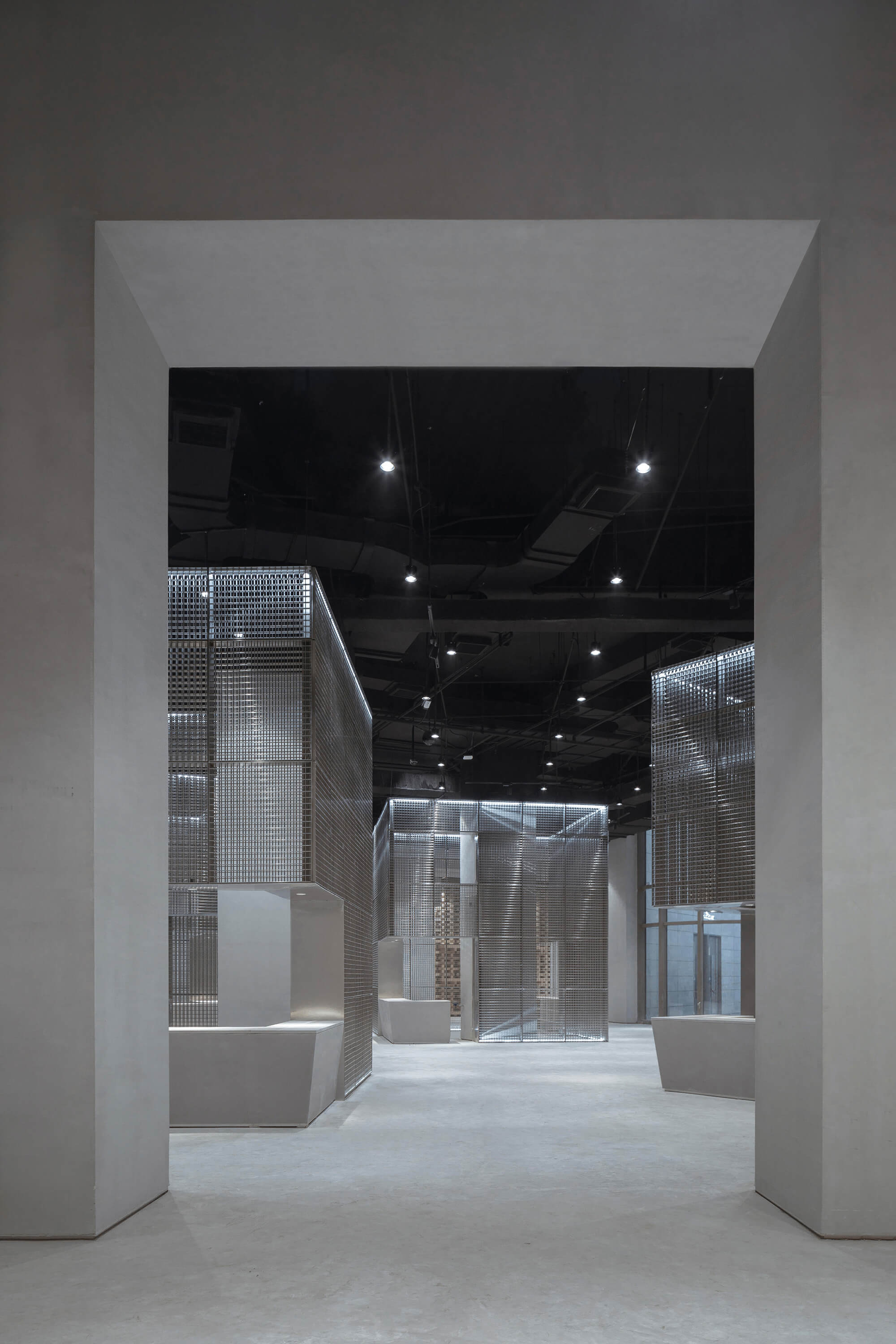
第二就是若幹的防火分區分割,這個部分我們既要滿足消防規範又要讓這些分割對空間的感受有積極的意義,所以我們嚐試加高所有消防卷簾、加厚防火牆。原本我們想弱化的這個部分我們更加強調它,加高的防火卷簾和加厚的防火牆形成的門洞呈現了一種意外的效果,空間之間的分割變得若隱若現又有一種莊重的儀式感,把“阻擋”變成了“交流”。
The second is the division of several fire zones. In this part, we have to meet the fire codes and make the divisions have a positive sense of space. So we tried to increase the height of all the fire shutters and thicken al the firewall. Originally we wish to weaken this part, but we ended up emphasizing it more. The heightened fire shutters and the thickened firewall form a door opening that presents an unexpected effect. The division between spaces becomes looming and has a solemn sensation, which changes the characteristic from “blocking” into “communicating”.
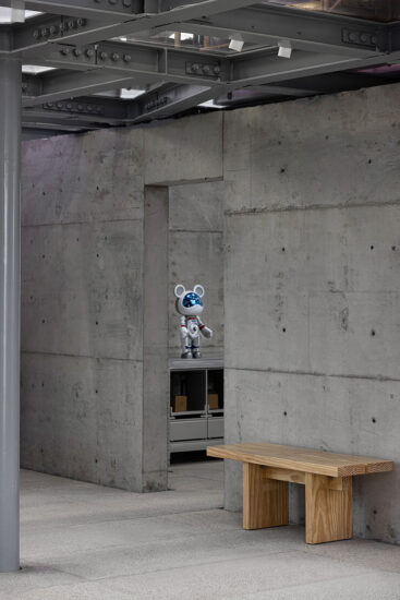
第三就是現場上空的管網,由於它的複雜使我們一直想處理它,但“較量”了一段時間以後我們發現它的複雜其實從另一個角度來說也是一種豐富和層次感,所以我們決定暴露它們,並用管線去設定形體的統一高度,我們設定的形體高度為5.4米,在此以上的所有管線暴露出來統一噴黑處理,讓它呈現自己獨有的層次感而且不與形體相衝突,讓高度關係裏的頂和形體沒有一個固定的分界線,而是相融又分離。
The third is the pipeline network in the upper area. Due to its complexity, we were going to deal with it initially. But after a period of “back and forth”, we found that its complexity is actually a rich layered sense from another perspective, so we decided to expose them. We use the pipeline to set a uniform height of the shape, which is 5.4 meters. All the pipelines above this height are painted black so that it presents its own unique layering and does not conflict with the shape. This renders the top and the shape do not have a fixed dividing line, but are both blended and separated at the same time.
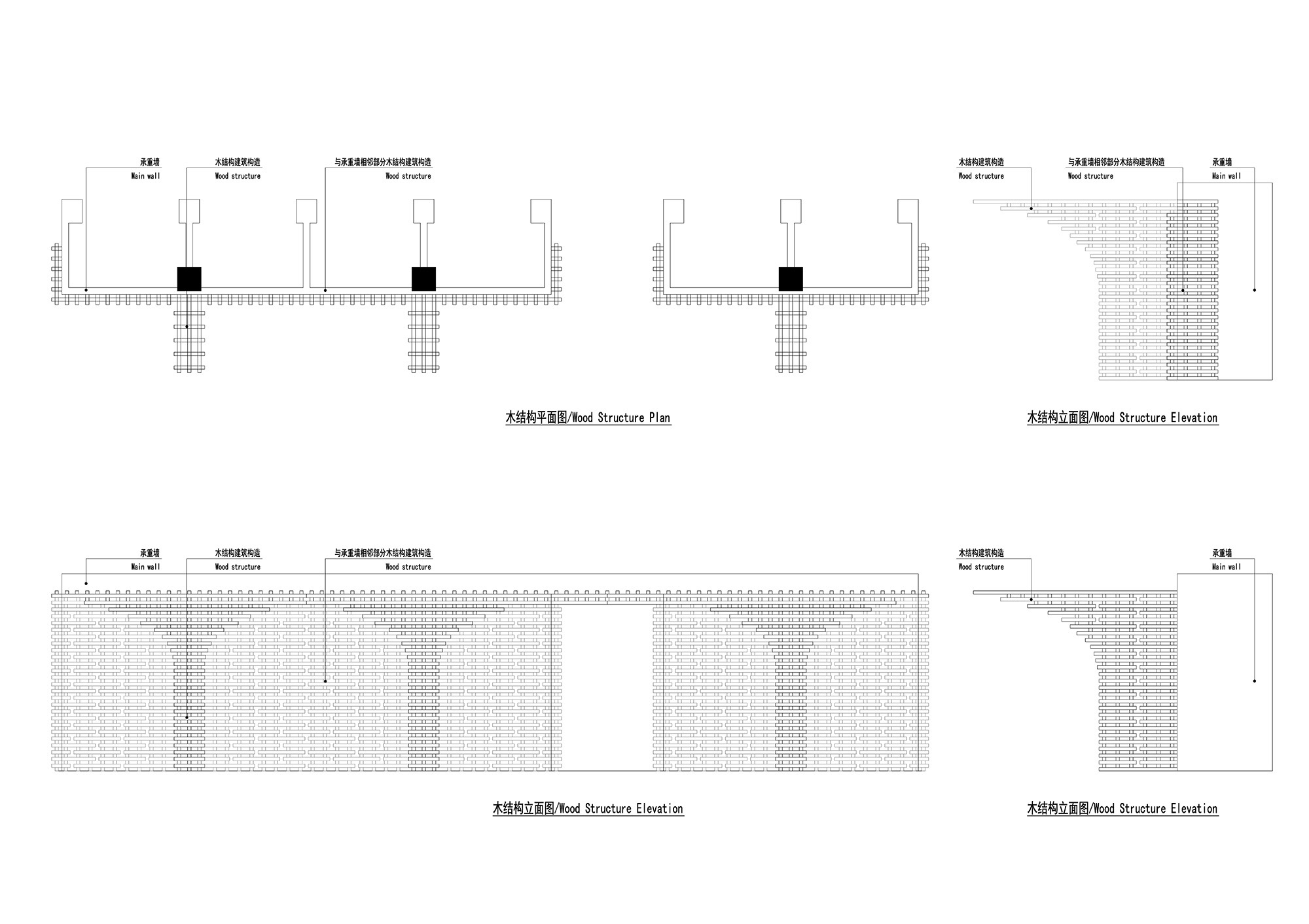
第四就是木結構的作用,除了它的功能性以外,這個區域的設計在整體空間中是一個起始點,也是一個中心點。我們選擇木結構這個中國元素符號感很強的設計手法,表達一種敬仰和傳承的態度,同時也在整體色調中加入一抹暖意,使整體空間冷暖相疊。
The fourth is the role of the wood structure. In addition to its functionality, the design of this area is a starting point and a central point in the overall space. We chose the wood structure, a symbol of Chinese design, which expresses a strong sense of admiration and inheritance. At the same time, we added a warmth to the overall color to make the whole space mixed with warm and cold.
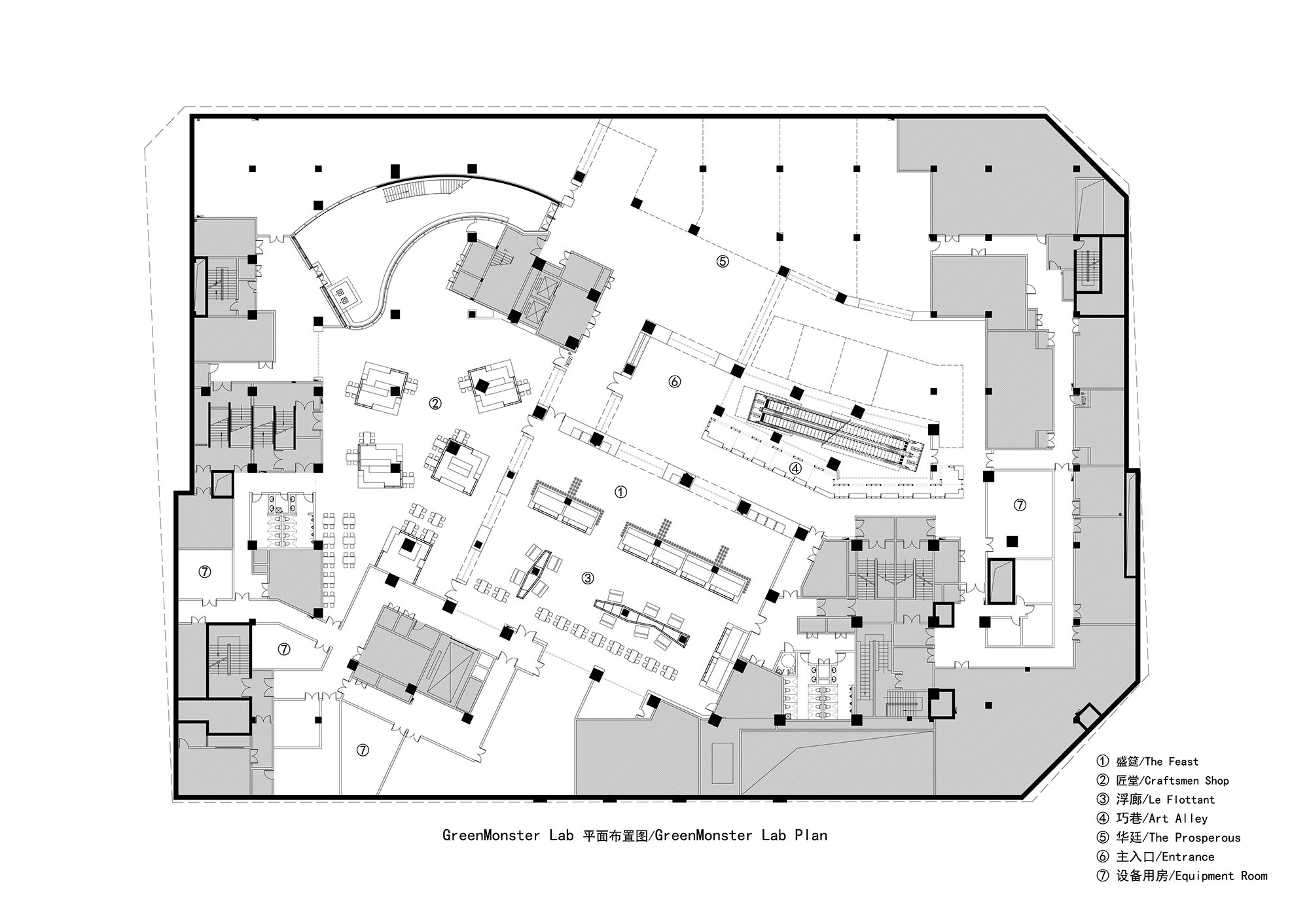
∇ 平麵圖
∇ 木結構示意圖
∇ 鋼網構造圖
∇ 細節構造圖
∇ 空間示意圖
∇ 空間示意圖
完整項目信息
項目名稱:GreenMonster Lab
設計方: 北京班得建築設計有限公司(簡稱:班得建築)
公司網站:www.bande.vip
設計年份:2018
完成年份:2019
主創:周堃、徐琳
團隊:楊承岡(顧問)、馮偉、李何鎖
項目地址:北京市朝陽區望京地區昆泰嘉瑞文化中心B1層
建築麵積:4957.3 m2
攝影版權:金偉琦
合作方:北京都市霍普建築設計有限公司
客戶:浙江至初無限文化傳媒有限公司
施工方:長沙廣大建築裝飾有限公司
施工團隊:伍廣進(項目經理)、李相、陳木木、謝曉亮、周明、唐偉祥、武玉厚、張樂宇
材料及品牌:
1、水泥自流平 品牌:秀珀
2、混凝土漆 品牌:秀珀
3、木材:樟子鬆木
Project name: GreenMonster Lab
Design: Beijing Bande Architectural Design Co., LTD (BANDe Architects)
Website: www.bande.vip
Design year: 2018
Completion year: 2019
Leader designer: Kun Zhou, Lin Xu
Team: Chenggang Yang, Wei Feng, Hesuo Li
Project location: B1 floor of Kuntai Jiarui Cultural Center in Wangjing area, Chaoyang District, Beijing, China
Gross Built Area: 4957.3 m2
Photo credits: Weiqi Jin
Partner: Beijing HYP-ARCH Architectural Design Co. LTD
Client: Zhejiang Zhichu Wuxian Culture Media Co. LTD
Contractor: Changsha Guangda Building Decoration Co. LTD
Construction team: Gaungjin Wu, Xiang Li, Mumu Chen, Xiaoliang Xie, Ming Zhou, Weixiang Tang, Yuhou Wu, Leyu Zhang
Brands / Products used in the project:
1. Self leveling cement Brands: SUPE
2. Concrete paint Brand: SUPE
3. Wood: Camphor pine


