LOFT中國感謝來自 瑞坤國際—正方良行設計公司 的建築改造項目案例分享:
設計如何影響經濟 How does design affect the economy?
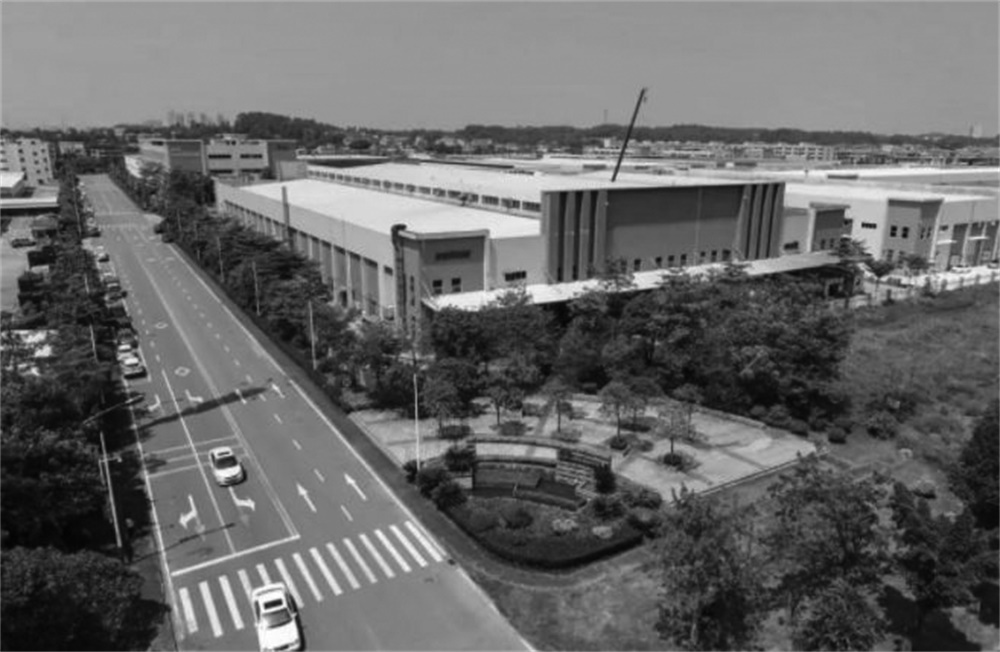
作為中華文明的重要孕育地之一,珠江流域以兩千年的百越文化和近代民族工業為基礎,被劃為改革開放的排頭兵。珠江三角洲憑借勞動力和土地的價格優勢,成就了“世界工廠”稱號。
As one of the important birthplaces of Chinese civilization, the Zhujiang River Basin was planned as the vanguard spearheading the reform and opening-up policy due to its profound culture heritage and great foundation of industry. Because of cost advantages in labor and land, the Zhujiang River Delta has become the “World’s Factory”.
2000年前後,隨著經濟的發展,珠三角地區的勞動力價格優勢缺失,用地趨緊,大部分勞動密集型的工業開始往周圍邊遠山區及東南亞轉移,“代工”製造市場也在往後幾年日漸回落。
Around 2000, with the development of the economy, this region gradually lost its labor cost advantage and faced the shortage of usable land. For this reason, most labor-intensive industries began to move to the surrounding remote mountainous areas or Southeast Asia, and its original equipment manufacturing (OEM) market gradually declined in the next few years.
如今珠三角跨進粵港澳大灣區的時代,以製造業為基礎構建現代產業體係,也被納入規劃之中。由普通“代工”升級為“代工品牌”,成為必然的選擇。
Nowadays, the Zhujiang River Delta has been included into the development blueprint of the Guangdong-Hong Kong-Macau Greater Bay Area, and is embarking on the road of establishing a modern industrial system based on manufacturing. In such context, it’s necessary for local OEM manufacturers to upgrade and build themselves into OEM brands.
∇ 廣東工廠區截影
代加工企業作為 To B 的製造業,處於市場的幕後,相較於 To C 企業,其品牌意識較弱。其次,因依賴於產業集群的基礎設施,這類企業的生產辦公建築,多以當初最基礎的剛需建築在一個地方聚集成群,每家企業都別無二致。
OEM manufacturers are B2B companies, which are not in the frontier of the market and are mostly lack of brand awareness comparing to B2C enterprises. Besides, due to high dependence on the infrastructure of industrial clusters, the production and office buildings of every OEM companies are mostly situated together.
在當下注重品牌和顏值的時代,無論是個體還是企業,提升品牌形象、對外傳遞品牌信息,已成為商業競爭的重要籌碼。正方良行認為建築空間是最好的傳遞載體,能夠通過立體的感官感受 ,更直接而深刻地向受眾傳遞企業品牌。
In the era that emphsizes brand and appearance, enhancing brand image and communicating brand information have become important strategies in business competition for both individuals and companies. Masanori Designs, an exceptional Chinese design practice, believes that the architectural space is the best media to directly and profoundly communicate corporate brands to the audience through providing multisensory experiences.
這幾年,正方良行一直致力於為製造業企業升級品牌,塑造品牌張力,用設計、藝術、美學為企業品牌注入能量,進而發揮商業設計的最優價值,推動企業發展。有競爭就有品牌的意義,代加工領域也必須有“代工品牌”意識。
In recent years, Masanori Designs has been committed to upgrading brand for manufacturing companies. Through shaping brand power, as well as injecting energy into the brand with design, art and aesthetics, it strives to maximize the value of commercial design and facilitate the development of clients. Brand matters in competition, and there is no exception for OEM industry. Hence, it’s important for OEM enterprises to establish brand awareness and improve their brand image.
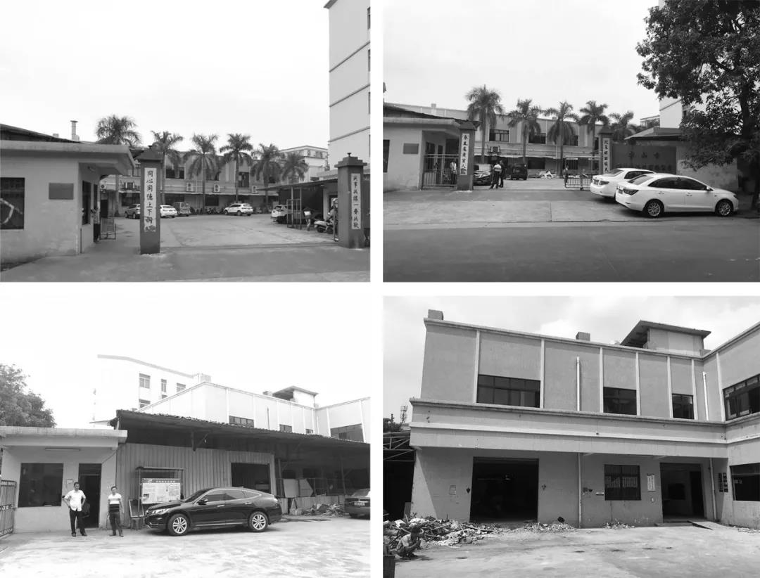
∇ 改造前
誠遠製衣,一家為國內年輕時尚服飾代工的製造型企業,位於廣東紡織之都中山的服裝加工生產基地沙溪鎮。
Chengyuan Garment is a Chinese OEM company specializing in manufacturing young people’s fashionable apparel, which is located in Shaxi Town owthe garment processing and production base of Zhongshan, Guangdong.
該項目是誠遠製衣總部一幢辦公樓的改造。企業主是青年創業者,她希望廠區舊建築在升級改造後,首先能滿足更多功能需求,其次貼合時代潮流,帶動廠區重新煥發活力,傳達企業與時俱進、追求品質、國際化的品牌經營理念。
This project is the renovation of an office building in the headquarters of Chengyuan Garment, approached by Masanori Designs. The business owner is a young entrepreneur. She hoped the renovated building to satisfy more functional demands, fit the trend of the times, rejuvenate the factory, and convey the company’s brand management philosophy of advancing with the times and pursuing quality and internationalization.
改造難點 Difficulties in renovation
·環境再造:工廠麵積偏小,缺少景觀環境,首先考慮的重點是自然環境的營造。
·Environmental creation:The factory area is small and lacks landscape, so the first consideration should be the creation of natural environment.
·建築更新:二十年前的工廠建築,外觀傳統,已遠遠不能滿足當下的功能需求及審美趨勢。
·Architectural renovation:The old look of the 20-year-old factory building was far away from meeting the current functional demands and aesthetic trends.
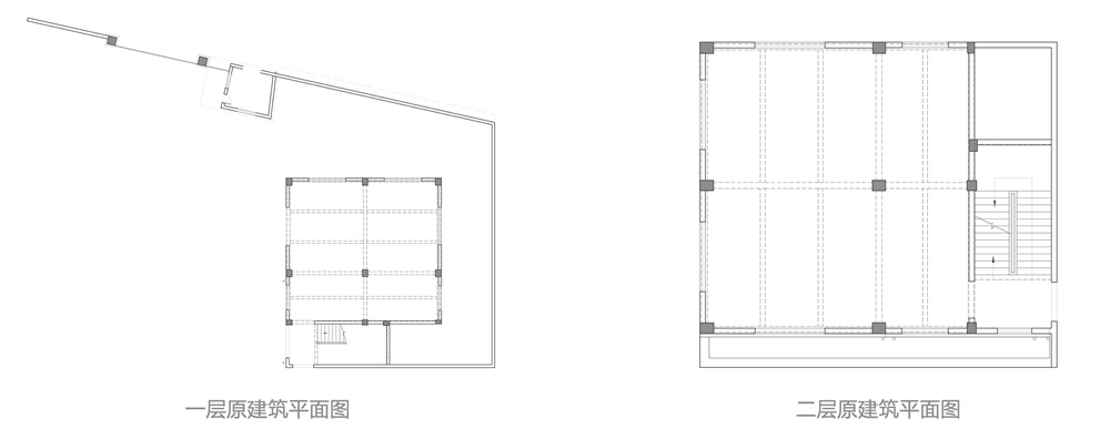
·空間重構:室內層級間關係斷層,缺乏整體性,無法滿足辦公使用要求下的空間關係。
· Spatial reconstruction:There was a lack of integrity among interior spaces and levels, which couldn’t meet the requirements of office use.
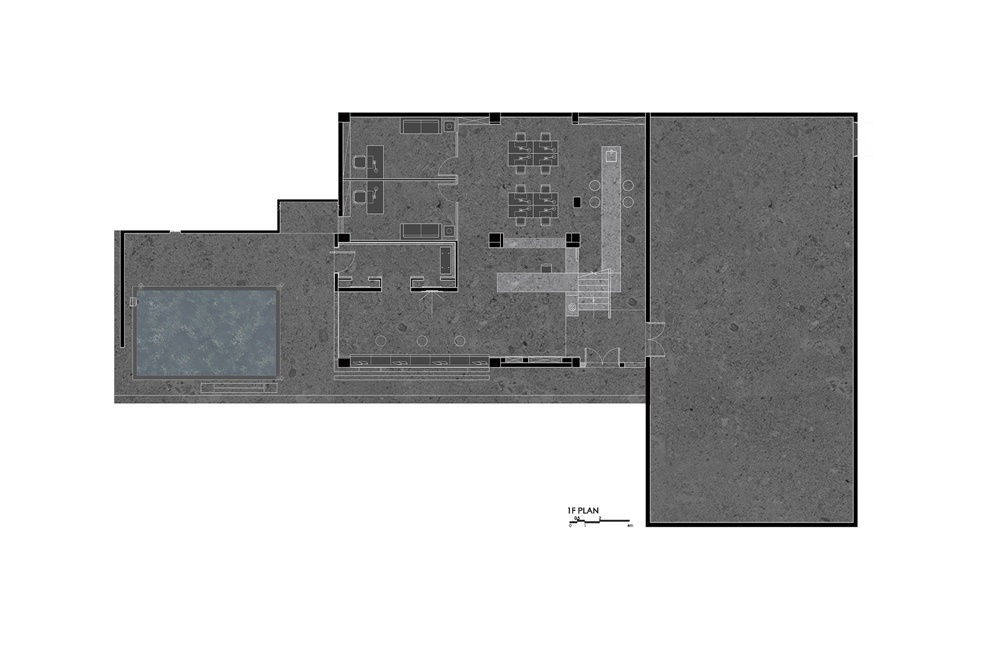
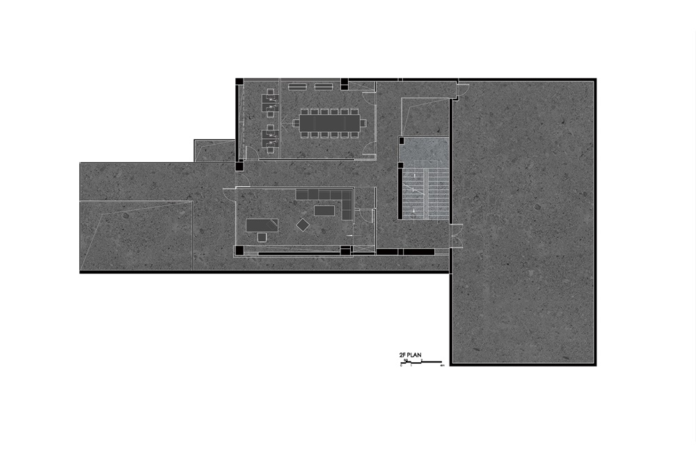
01 平麵規劃
02 景觀改造 Landscape creation
建築所在的廠區麵積較小,原廠區內也無綠化區域。在這次改造中,由水池、噴泉、綠植和石凳組成微景觀。通過以小見大的方式,重新塑造場域生態環境,與自然產生連接,賦予廠區新的生機與活力。
The factory area where the office building is located is small, and there was originally no greenery. During the renovation, Masanori Designs created a micro landscape formed by a pool, a fountain, green plants and a stone bench. By recreating the ecological environment of the site, the designers built a connection between the factory and nature and injected new vitality into it.
辦公樓的側邊,原是早年停放車輛的鐵棚,拆除後植入了自然景觀和藝術美學,自成盎然的一隅。工廠環境的喧囂得以消除,人們從周邊嘈雜的日常狀態中脫離,靜享園區內一處親近自然、放鬆精神的小天地。
They demolished the iron parking shed on one side of the office building, and then brought natural landscape and artistic aesthetic in, forming a visually pleasing view. It adds tranquility to the factory environment, and provides a place for people to escape from the daily noise, relax and get close to nature.
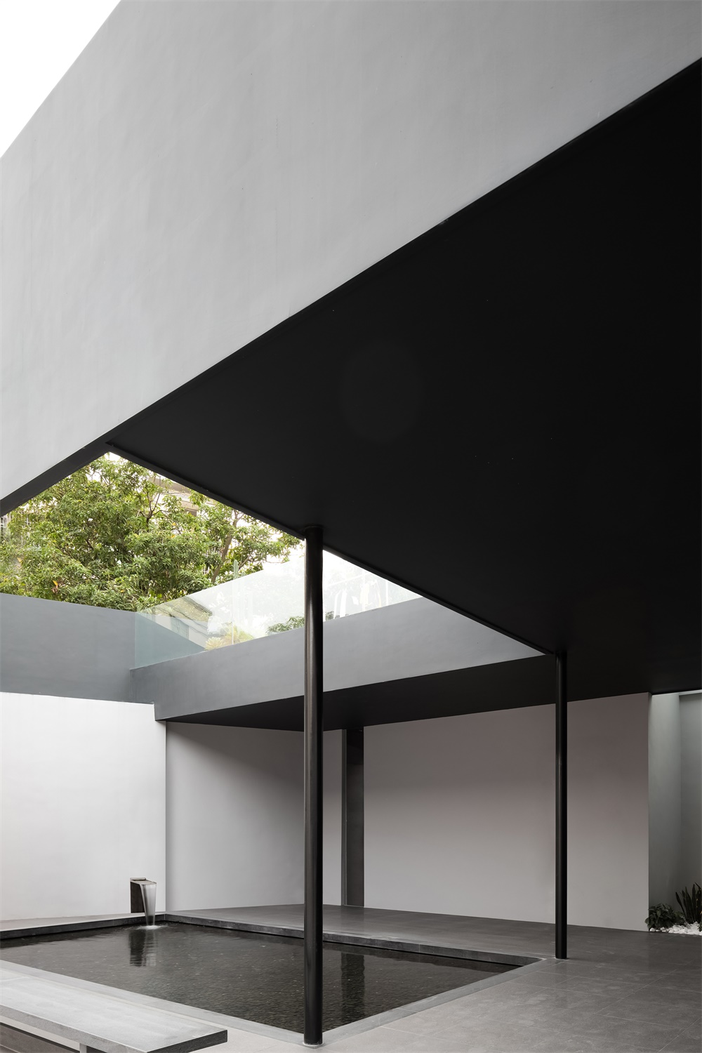
方形的水池之上,從牆外引流的流水噴泉汩汩湧入,動靜有序。零星綠植點綴其間,矩形灰石凳呼應水池的直線條,一石一木皆成風景。適度留白的簡潔色調,線條利落的建築,整個畫麵盈缺妥恰,給人以舒緩和治愈。
A fountain flows through the wall and rushes into the square pool, full of rhythm. Green plants are interspersed within this area, and the rectangular gray stone stool echoes the straight lines of the pool, together producing an enchanting scene. The simple color palette harmoniously integrates with the neat lines of the architecture, which generates a soothing and calming ambience.
為了讓這出景觀在無形中融入日常,傳統廠區的入口路徑也被打破,將入口設計在建築左側,經由水池景觀再進入企業,讓每個人都能潛移默化地浸入這處靜謐的景象中,沉澱平和心境。
In order to subtly integrate the landscape into daily life, the designers didn’t adopt a traditional entrance path to the office building. They set the entrance on the left side of the building. Before entering into it, people must pass through the entrance and then traverse the pool landscape, so that they can immerse themselves into the tranquil natural view and obtain inner peace.
03 建築改造 Architectural renovation
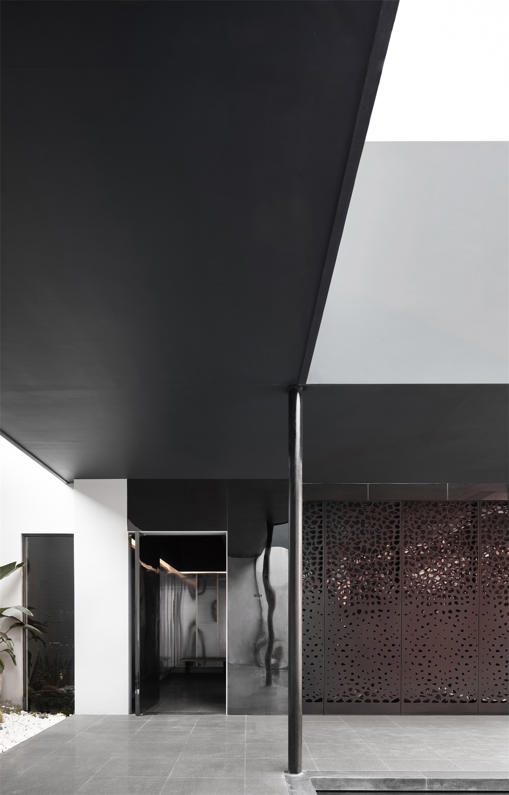
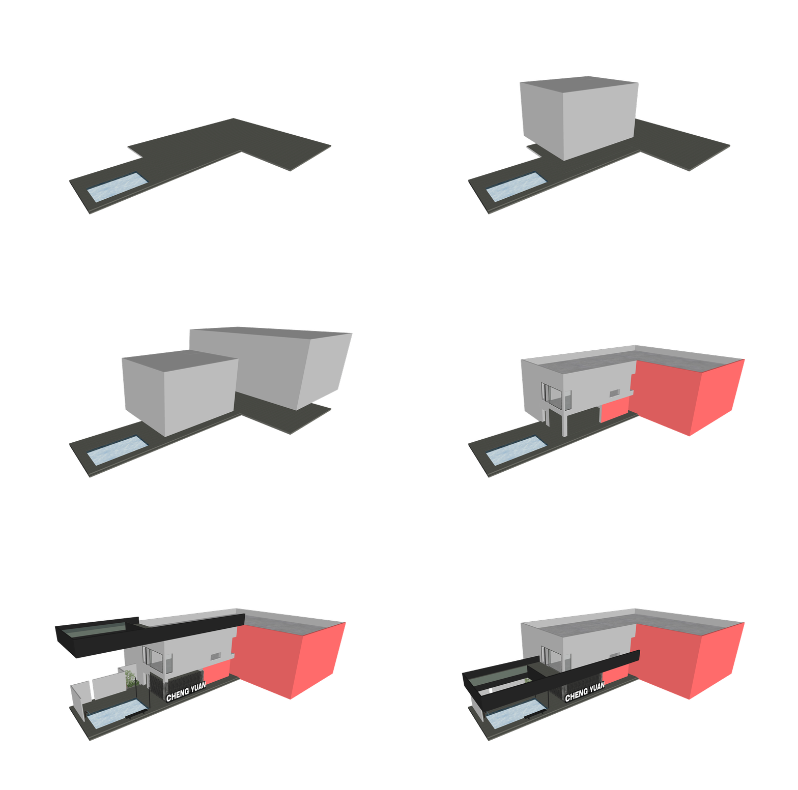
一層的入口與水池之間隔著 L 型走道,在此上方加建成二層的 L 型露台,也把一層的走道變成了景觀廊道。露台的圍欄和底板與入口室內的天花顏色一致,同時形成有體量感的建築體塊, 拉長了視覺縱深感。
The entrance of 1F is connected to the pool by an L-shaped walkway, above which a same-shaped terrace was added. In this way, the walkway on 1F was turned into a landscape veranda. The floor slabs and the fence of the 2F terrace utilized the same color as the ceiling of the entrance space on 1F, which forms a building block with a sense of volume and lends a visual depth.
L 型露台與圍欄圍合出天井,使得一層的自然景觀也能與二層共享,空間格局因此更加通透。露台的存在也讓更多的自然氣息滲透入二層的室內。
The L-shaped terrace and the fence enclose an open-air atrium, so that the natural landscape on the first floor can be shared with the second floor, and the spatial structure therefore becomes more transparent. The terrace also allows more natural air to filter into the interior space on 2F.
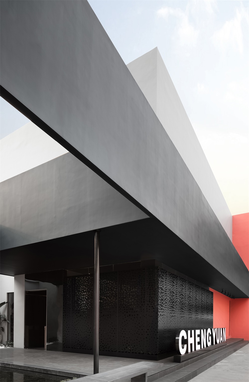
L 型露台外側,黑色鋼板從建築主體一直延伸到水池盡頭,與 L 型露台閉合,拚成一個“回”字。原建築、新建的露台和水池構成一個整體,顯現一氣嗬成的建築美感,外觀與氣質也契合國際美學時尚。
On the outside of the L-shaped terrace, a black steel plate extends from the main body of the building to the end of the pool and meet with the L-shaped terrace to form a hollow square. The original building, the newly built terrace and the pool are combined into a whole, presenting the architectural beauty of integrity. The appearance and temperament of overall architecture are in line with international aesthetic fashion.
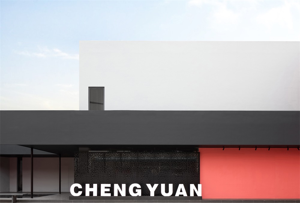
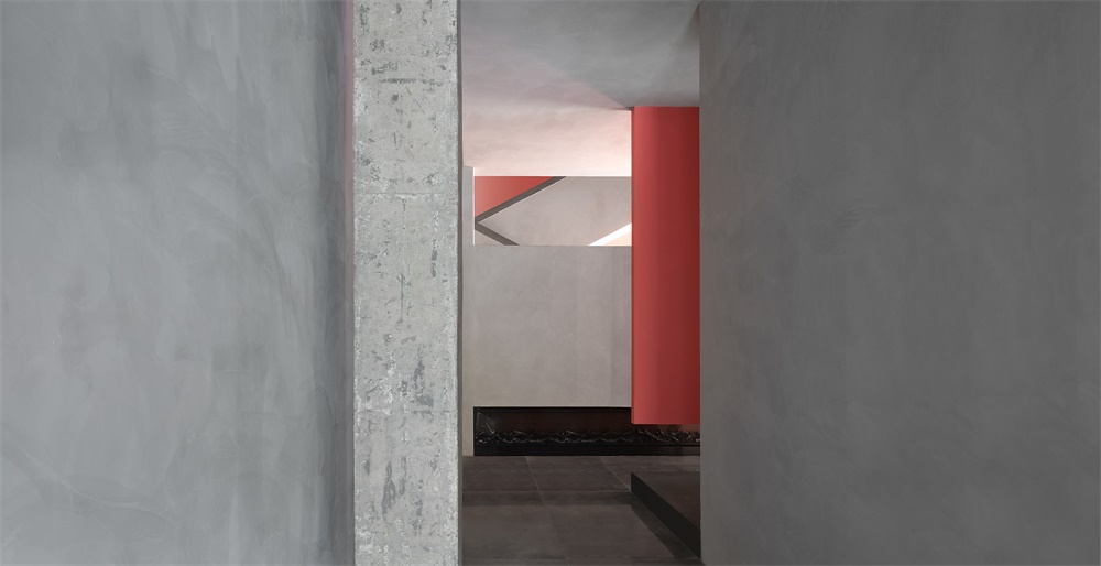
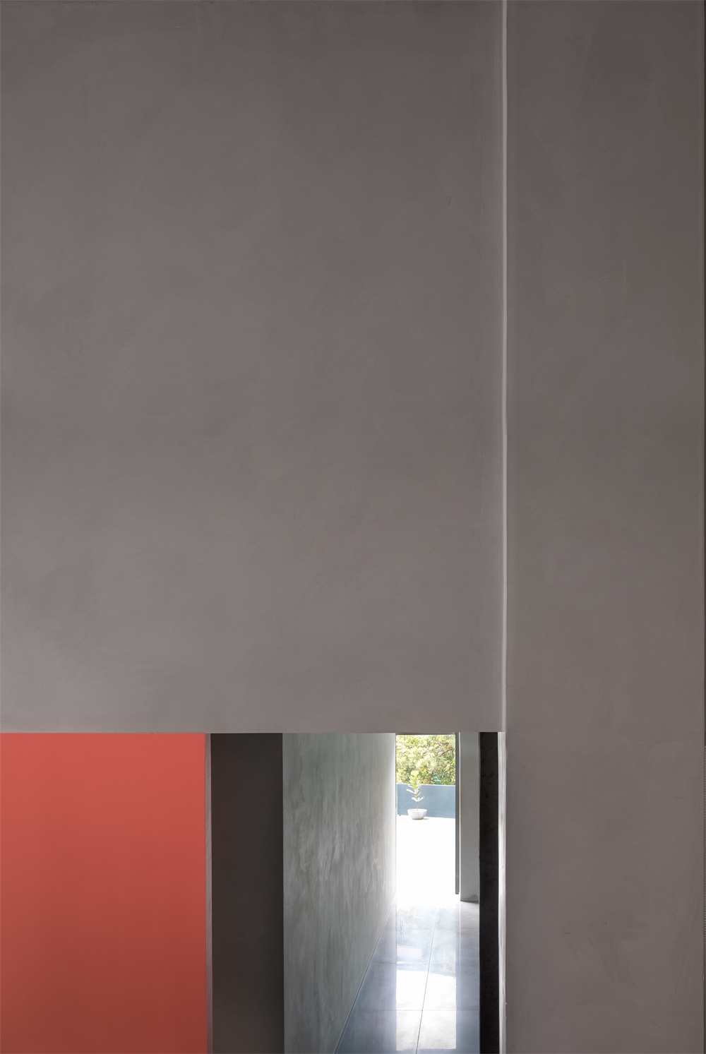
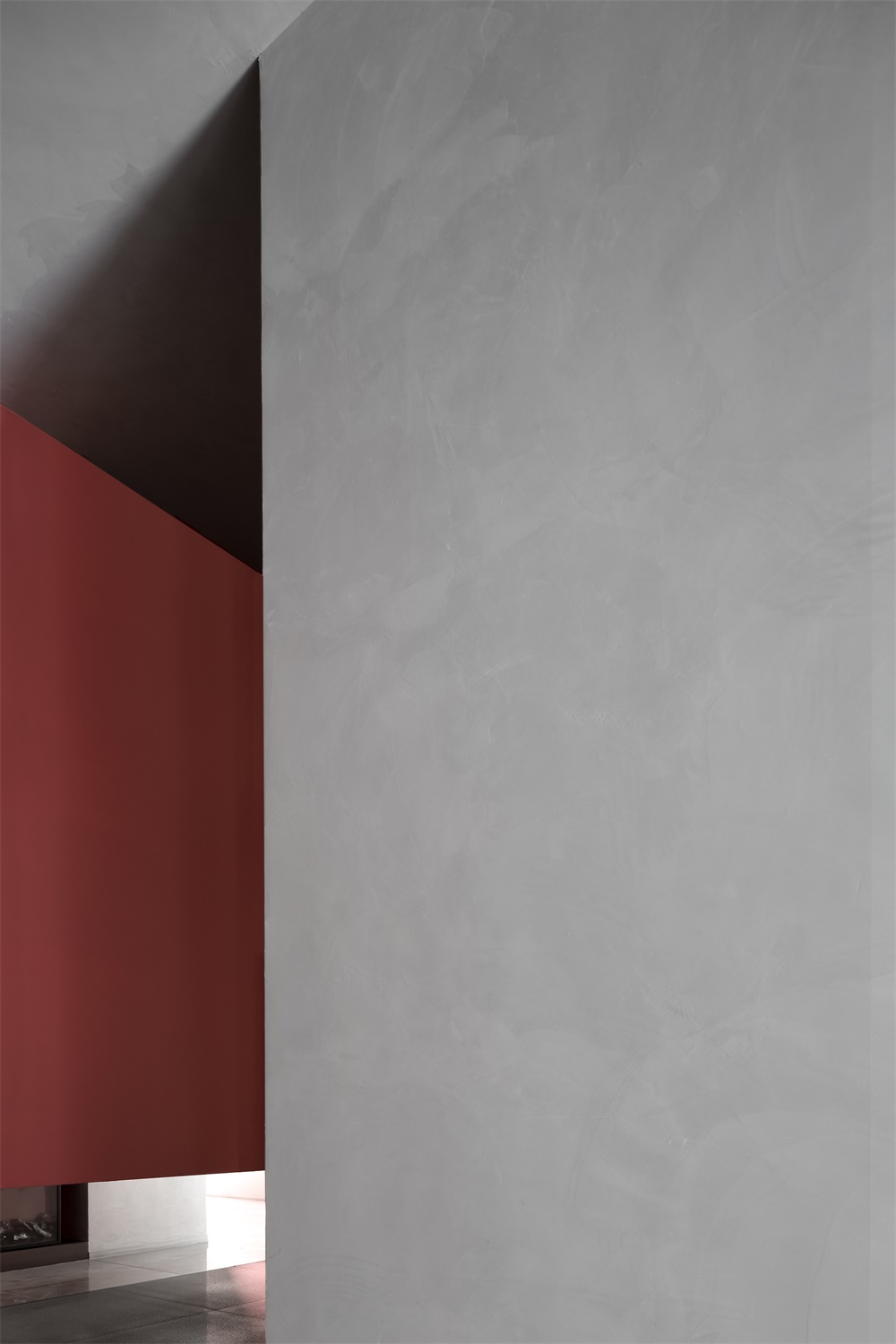
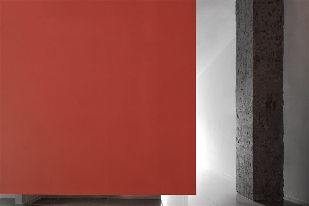
用黑灰與珊瑚紅的撞色塗料裝飾外牆,形成潮流且活力的視覺衝擊。不同色塊對應不同的功能區域,大麵積色塊的運用,凸顯建築的體塊感。一改以往傳統的製造企業形象,現代時尚的外觀,更似“藝術工廠”。在周圍的環境中脫穎而出,傳達著企業的與時俱進精神和時尚品味。
The exterior walls are finished with dark gray and coral red paint, which generates a contrasting, dynamic and stylish visual effect. Different color blocks correspond to different functional zones, and the large colored surfaces highlight the architecture’s sense of volume. The architectural appearance shakes off the traditional image of manufacturing companies, which is stylish, more like an “art factory”. It stands out in the surrounding built environment, and conveys the company’s spirit of advancing with the times and fashion taste.
04 室內改造 Spatial reconstruction
空間 Space
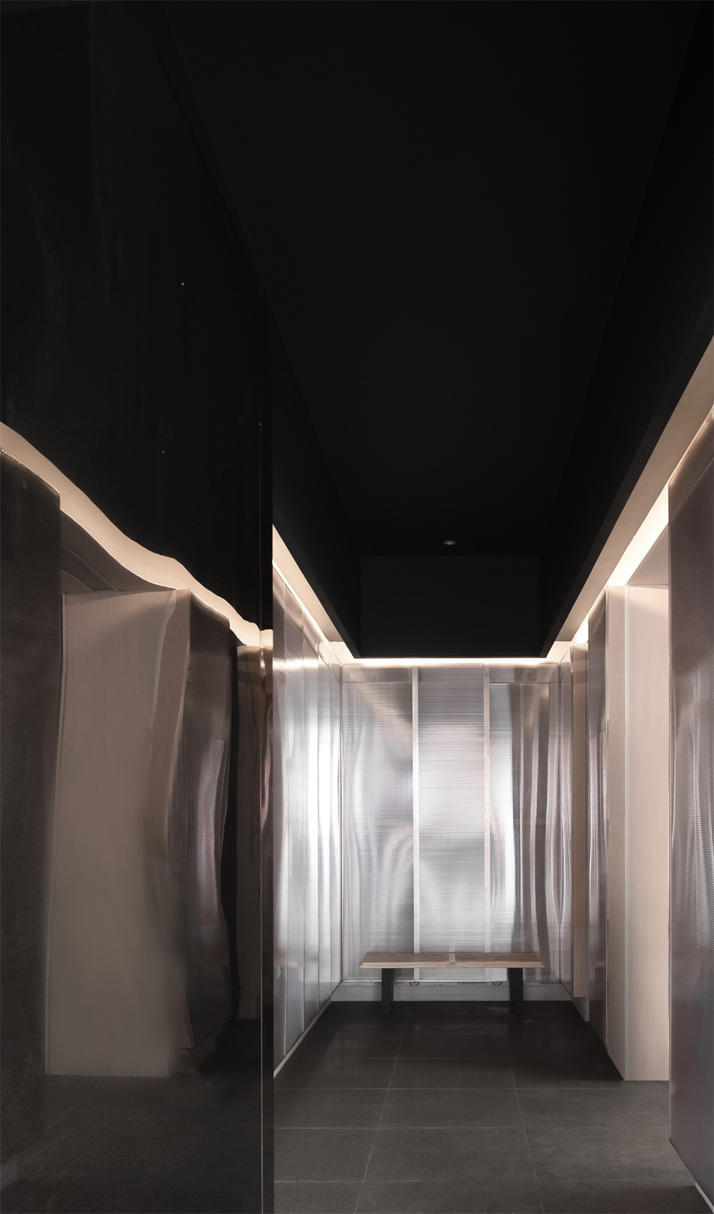
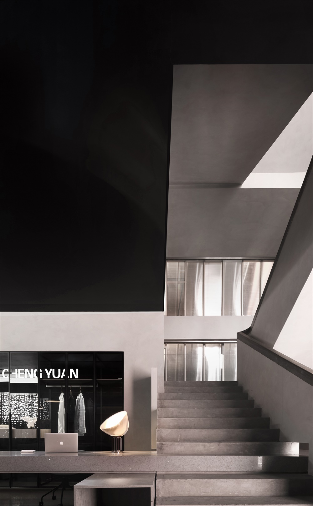
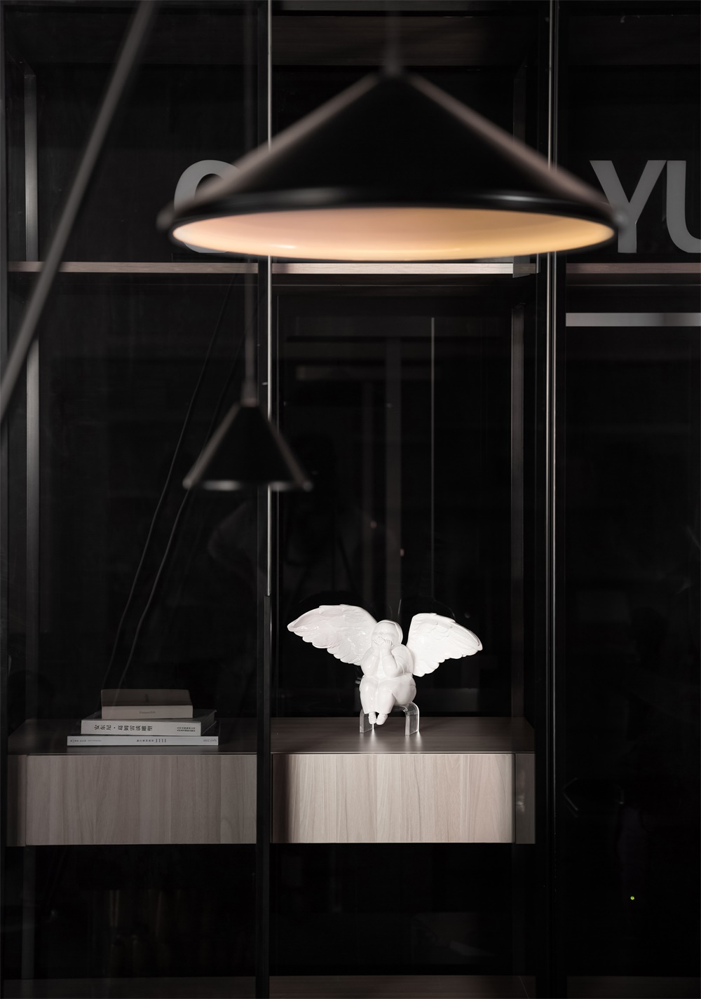
從室外到室內,以一個過渡空間起到緩衝作用,讓外部景觀帶來的短暫寧靜延續至該空間中。在設計上采用“更衣間”的概念打造,既帶有潮流服飾的空間屬性,又給人以趣味性的感官體驗。
There is a transitional space from the outside to the interior, which lets the brief serenity brought by the outside landscape continue into the space. Designed with the concept of “dressing room”, it has the features of a trendy clothing space and also provides fun sensory experiences.
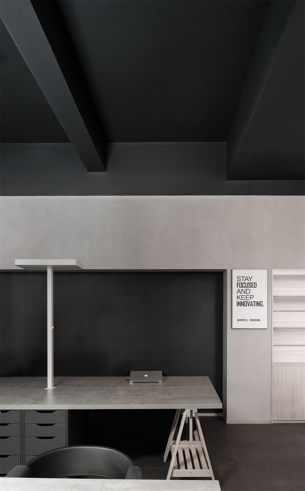
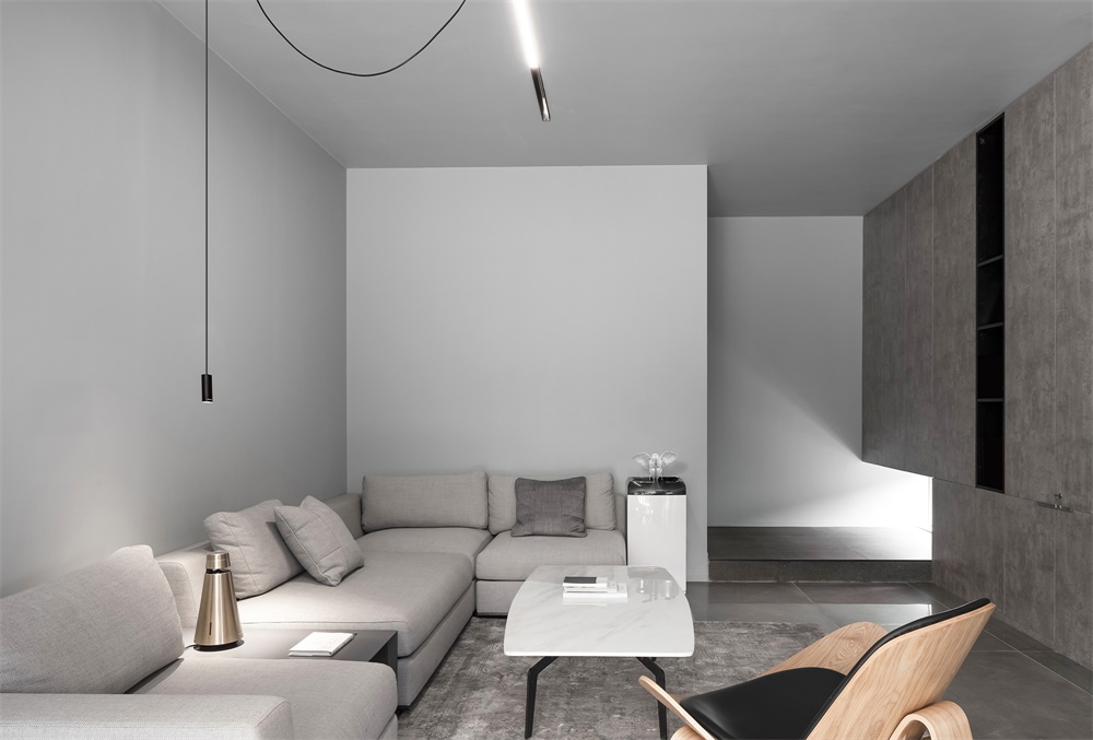
進入辦公室,以開放式的布局容納辦公和展示等複合功能,形成動線清晰的空間整合關係。簡潔而具質感的辦公家具貼合人體尺度,也讓企業與國際審美品位相對接。
The office area accommodates multiple functions such as working and display in an open layout, and has a clear circulation route that links all functional divisions. The simplistic and tasteful office furniture fits into human scale, and enables the company to keep up with international aesthetics.
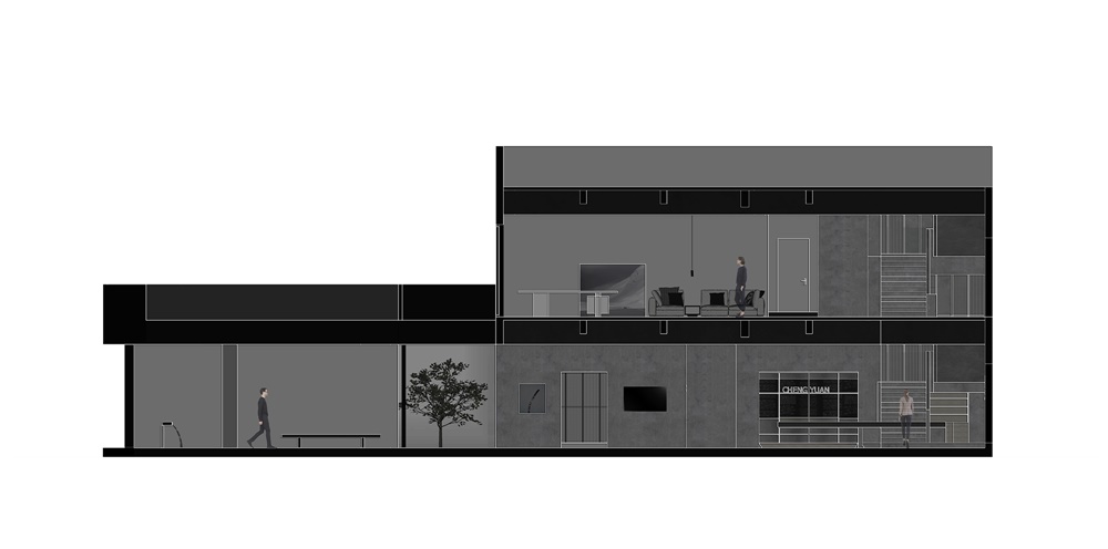
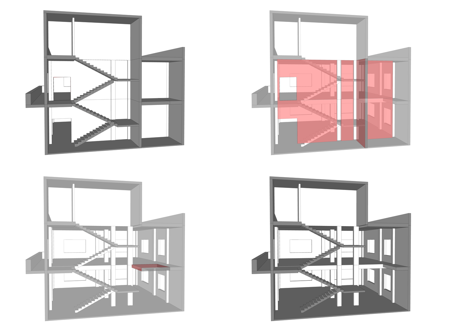
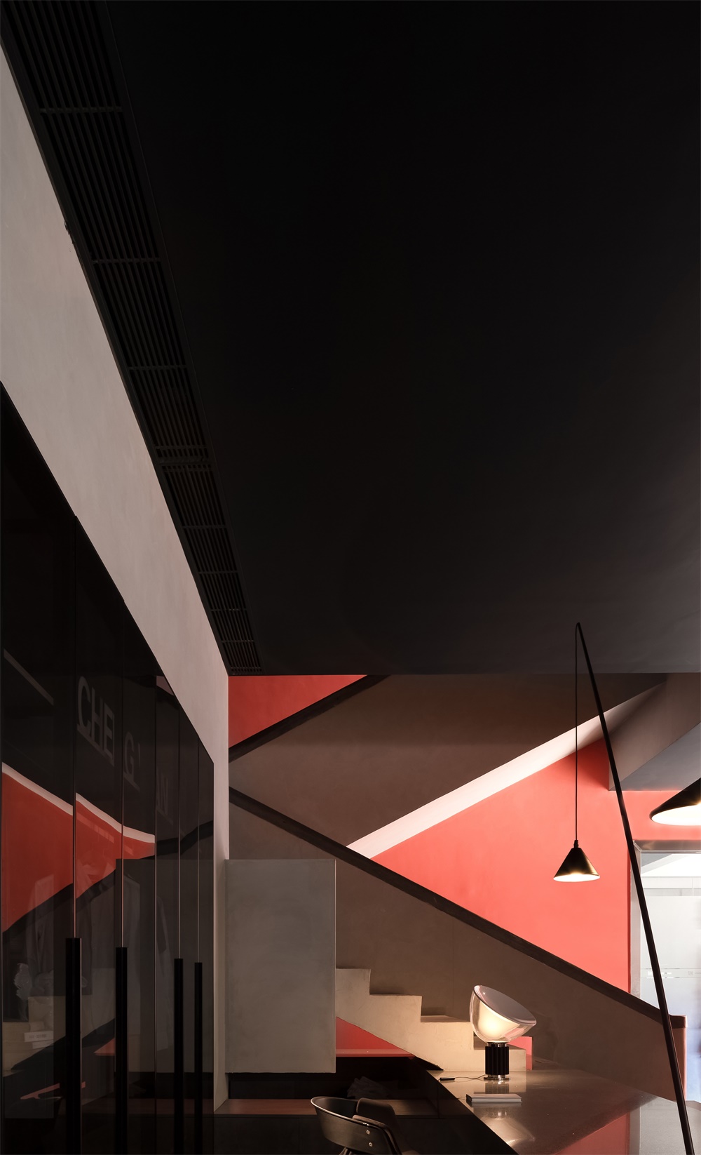
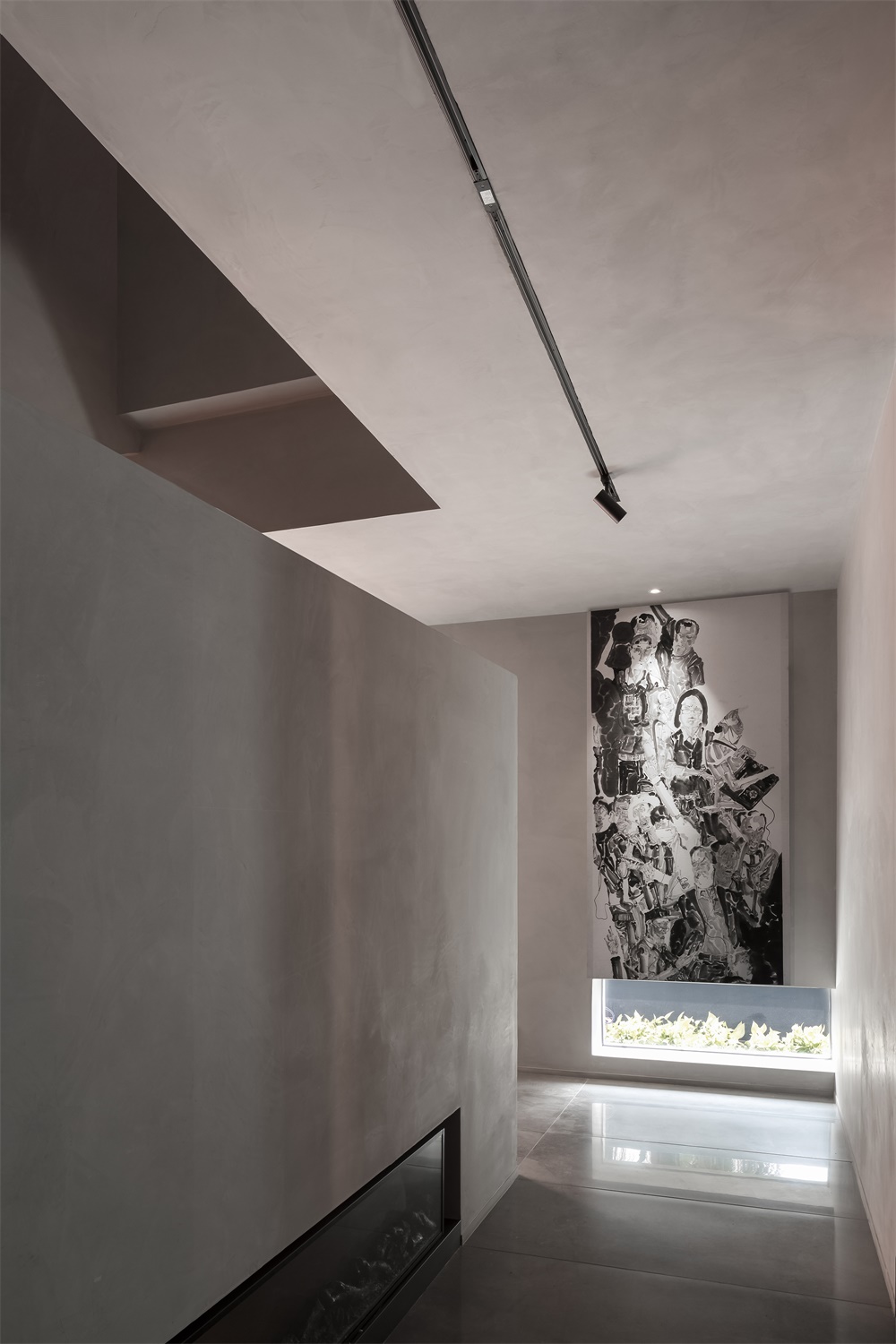
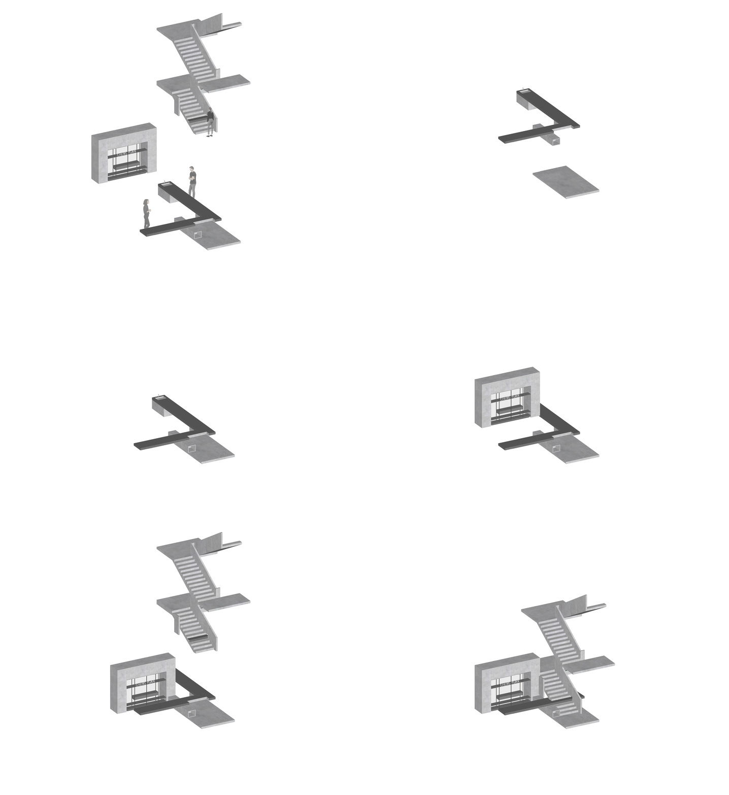
樓層關係上,原有的樓梯以獨立的樓梯間存在,這使得一、二樓之間相對割裂。為打破這種現狀,首先打通一、二樓之間的牆體,讓樓梯以開放狀態融入整個空間,使其變成整個空間重要的一角。
The vertical spatial relationship was also rearranged. The stairs were originally enclosed by a staircase hall, which made the space of 1F and 2F relatively separated. In order to change this, the designers demolished the walls enclosing the staircase, so that it was blended into the space in an open manner, becoming an important corner of the entire space.
同時將樓梯後麵的空間樓板打通,形成一個有氣勢的中空空間,使得兩層樓的室內空間融為一體,以豐富的節奏感,給人一種煥然一新的體驗。
Meanwhile, the floor behind the stairs was opened to form an imposing hollow space and thereby to make the interior spaces of the two floors blend into one, which creates a refreshing spatial experience with a rich sense of rhythm.
室內高低有致的立麵,與明暗變幻的光線,構成獨特的空間感受。
In addition, the staggered interior surfaces and varying light also make experiences in the space unique.
光 Light
光是自然的氣息。原建築室內的封閉式構造被打開,將自然光最大化引進室內,並把光巧妙地變成了室內的天然裝飾;在光照與建築一天明暗交替的互動中,給人帶來更舒適的自然體驗,賦予空間更自由的呼吸感。
Light is the breath of nature. The enclosed structure of the original building was opened to maximize the introduction of natural light into the interior, which subtly turns the daylight into a natural interior decoration as well. The light changes throughout the day and interacts with the architectural space, generating a more comfortable, free and natural ambience.
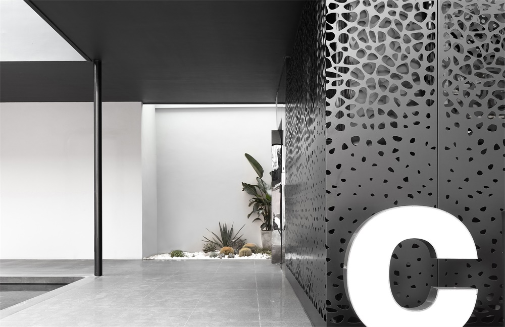
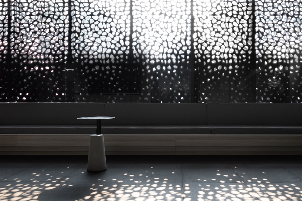
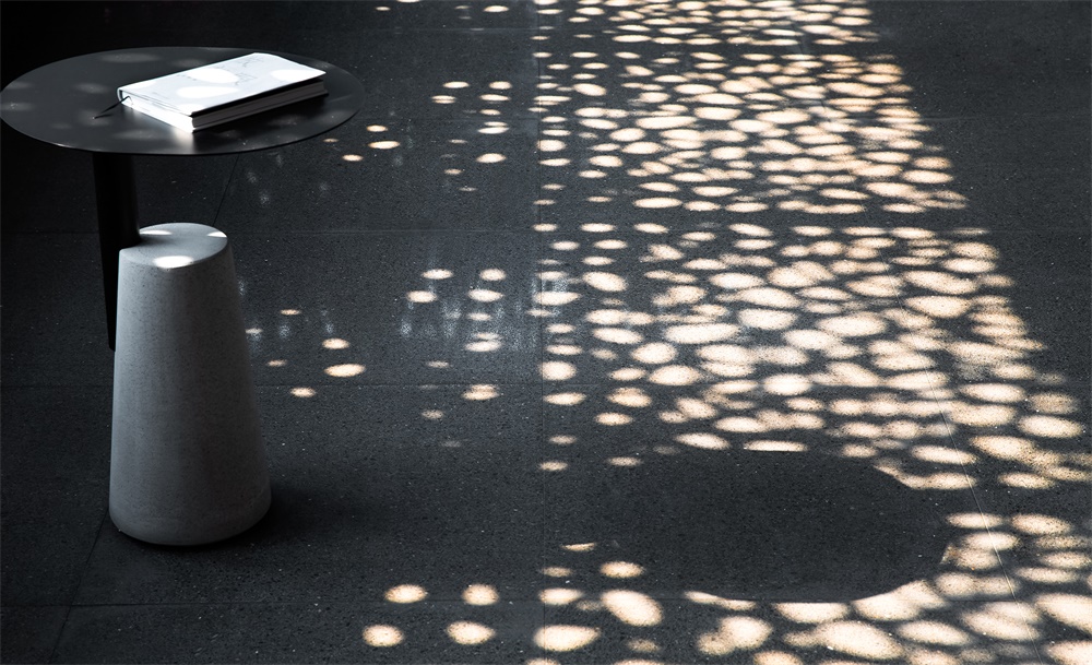
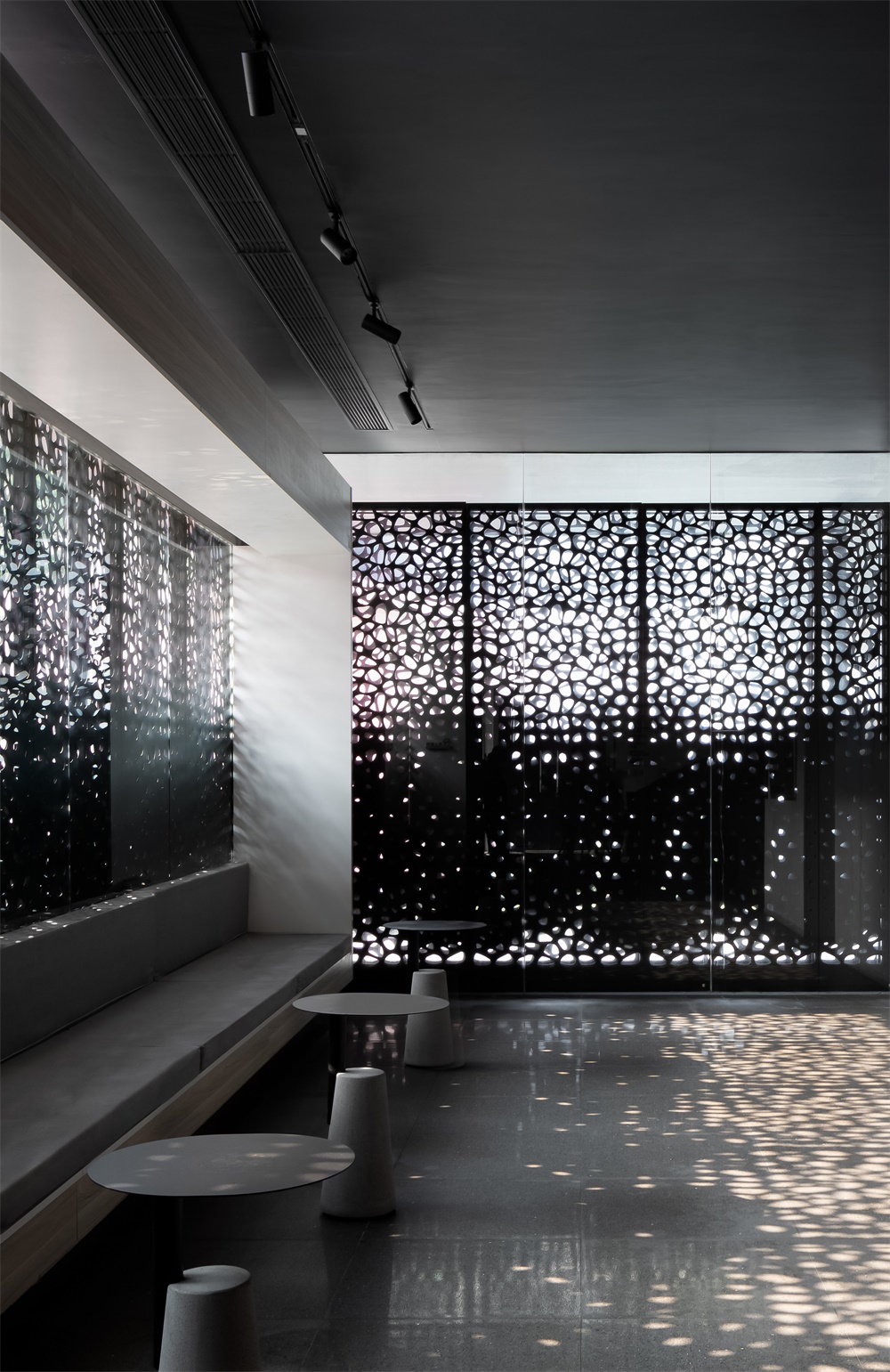
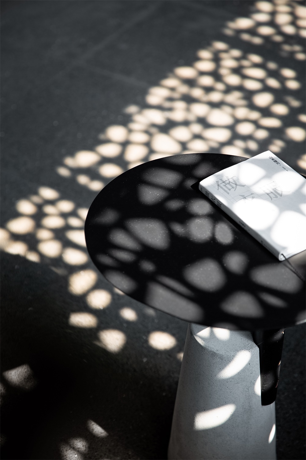
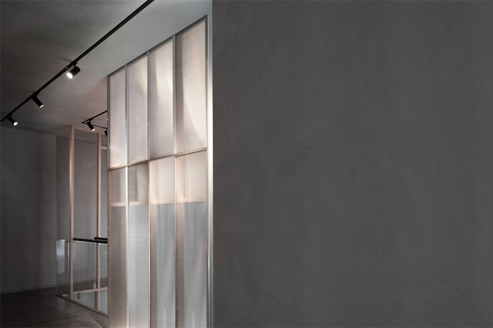
靠近前台的公共洽談區,將原本的外牆拆除,用鏤空鋁板替代。由下至上,鏤空眼由小到大,自然漸變。陽光透過鏤空鑽進室內,在白牆和地麵投下斑駁光影,猶如盛開的繁花。冬季,室內太陽光斑的位置轉移變換更加明顯,讓室內滿溢著暖意與溫度。
The public negotiation area is close to the front desk. Its original exterior walls were removed and replaced with perforated aluminum sheets. From bottom to top, the size of holes on the sheets increases gradually. The sun shines through the holes, and casts mottled light and shadows on the interior floor and white walls, looking like blooming flowers. In winter, the light spots move more actively within the space, which makes the interior awash with warmth.
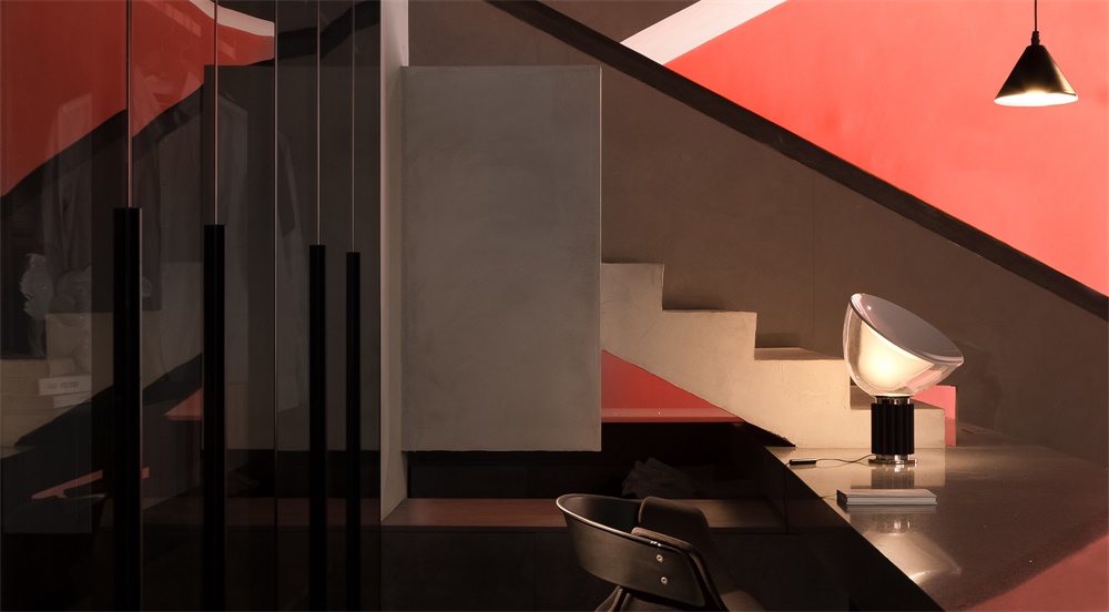
為了讓光與室內有更多的聯係,根據室內位置的具體情況,創造入光口,並在缺口的地方輔以綠植。樓梯邊的牆體改成牆體+玻璃,一方麵讓各處的光線更好地在室內穿透,另一方麵也讓樓梯牆麵那珊瑚紅在空間內蔓延。
In order to enable more interaction between light and the interior, daylight openings are positioned strategically in the space and are supplemented with greenery. The solid wall next to the staircase was changed into a “wall + glass” structure, which allows natural light to better flow into the space and also visually extends the striking coral red color of another wall beside the stairs by reflection of the glass.
建築感的延續 Continuation of the sense of architecture
對於室內的處理,在注重引入自然和優化空間舒適度之外,也通過建築思維下的空間建築感營造,增強內部的流動與穿插關係。
As approaching the interior, the design team not only focused on binging in nature and optimizing the comfort of space, but also worked to enhance flexibility and interweaving in the interior by adopting architectural thinking.
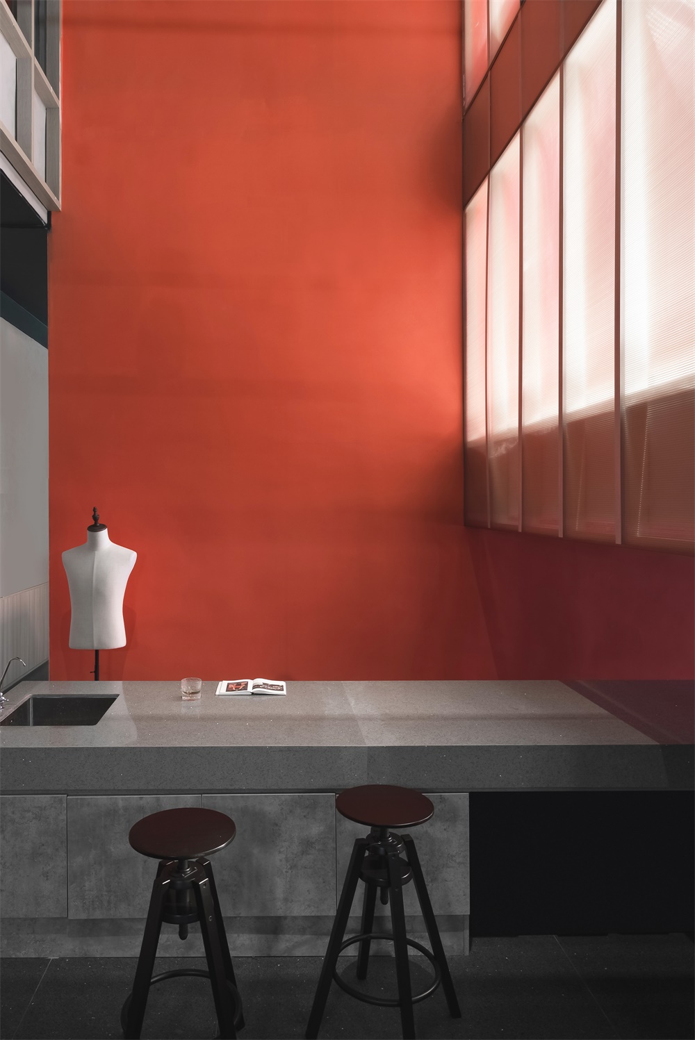
將二十年前的灰白樓梯稍加翻新,用簡潔的大理石板穿過樓梯。樓梯側前方的前台與側後方的休閑水吧區串聯成 L型,一直延伸到樓梯後的中空。前台、茶水間、操作台、洽談區被串聯起來,形成趣味的流動體,同時又拉近人與人之間溝通交流的距離。
The old gray and white staircase was renovated, with a simplistic marble slab penetrating it horizontally. The reception desk and the water bar area respectively at the front and rear of the staircase are connected, together forming an L shape that extends all the way to the void space behind the stairs. The front desk, the pantry, the operation desk and the negotiation area are linked in a smooth and playful way, which brings people closer to each other.
樓梯和中空區域的牆立麵采用與建築外立麵顏色相同的珊瑚紅塗料,使得室外建築感延伸至室內,模糊了室內外的界限。
The stairway and the wall surface in the hollow space are clad in the same coral red paint as the building facade, which extends the sense of architecture from exterior into indoor space whilst blurring the boundaries between interior and exterior.
此次升級改造,通過營造廠區景觀、調整建築與周圍環境的關係、室內空間協調性及與自然的聯係,多維度地為客戶重塑品牌的張力與活力。讓每個到訪企業的 To C 企業主都能在這個空間體驗到與自身企業同頻率的品牌格調。
Through creating landscape, adjusting the relationship between the architecture and its surroundings, coordinating interior spaces as well as establishing dialogue with nature, Masanori Designs reshaped the client’s brand image and enhanced its brand power, which enables every B2C company owner who comes to visit to feel a familiar sense of brand.
完整項目信息
項目名稱:CY-誠遠製衣
項目麵積:285㎡
項目地點:中國中山
設計單位:瑞坤國際—正方良行設計公司
主創設計:徐慶良
設計團隊:黃纘全、黃偉奇
施工圖深化團隊:CHL 施工圖深化
軟裝設計團隊:瑞坤軟裝
主要材料:TOA塗料、費羅娜水泥磚、卡布隆、衝孔鋁板
材料供應商:歸樸選材
原創品牌家具:良行文化
設計時間:2019年4月
攝影師:歐陽雲
Project name: Chengyuan Garment Office Building
Project area: 285 m2
Project location: Zhongshan, China
Design firm: Lucien Organization – Masanori Designs
Chief designer: Terry Xu
Design team: Huang Zuanquan, Huang Weiqi, Dai Jiahuan
Construction drawing detailing: CHL
Decoration design: Lucien Soft Decoration
Main materials: paint (TOA), cement tile (Florina), polycarbonate sheet, perforated aluminum sheet
Material supplier: Grepoo Material Trade
Original furniture brand: Masanori Art
Design time: April 2019
Photography: Ouyang Yun


