Casper Mueller Kneer建築事務所為倫敦梅菲爾的Self Portrait設計了第一家獨立商店,這是該時尚品牌首次在當地單獨開業。這一概念也為未來的商店設定了設計方向。
Casper Mueller Kneer Architects have designed the first standalone store for Self Portrait in London’s Mayfair, giving the fashion brand it’s first on-ground solo presence. The concept also sets the design direction for further stores to come.
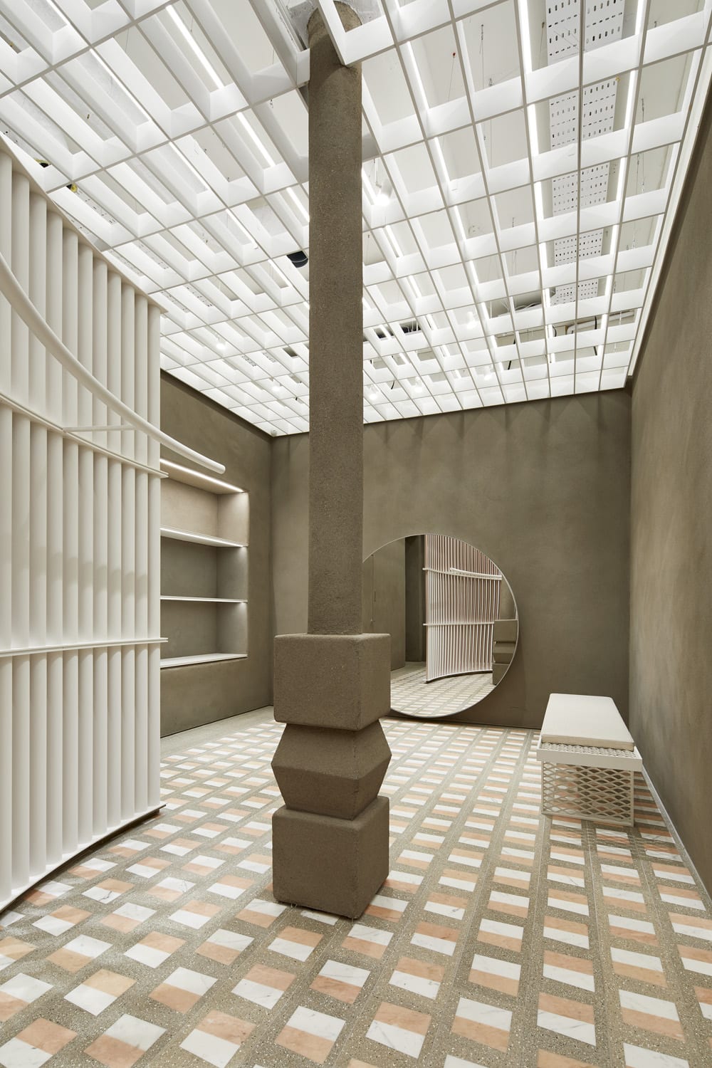
商店內部的地麵和底層地麵占地223平方米,並用不同的空間和材質定義不同的區域。設計團隊使用了三個主要的設計元素來定義空間。
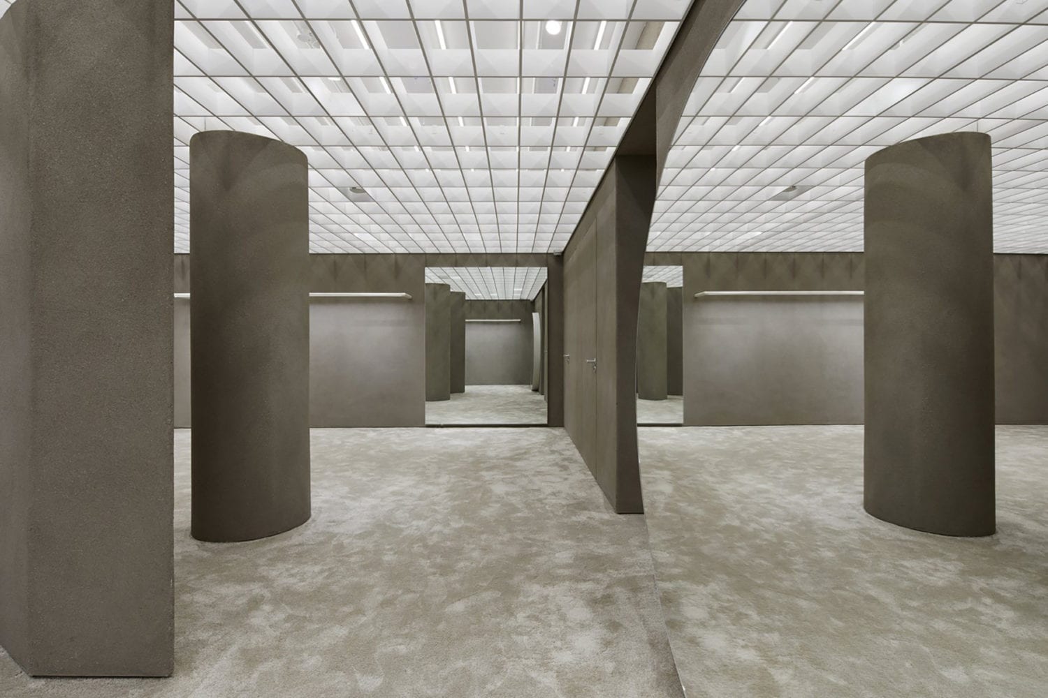
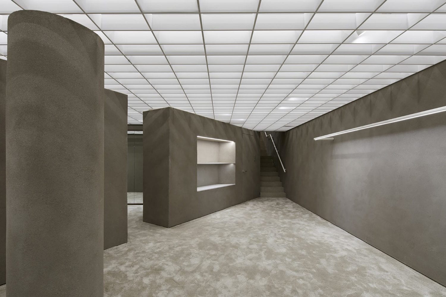
The Self Portrait store interior is set over 223sqm of ground and lower-ground floors, defining different zones with distinct spatial and material qualities. The architects employed three primary design elements that define the space.
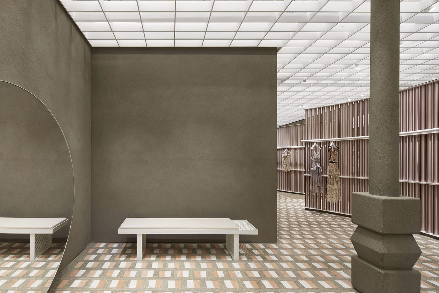
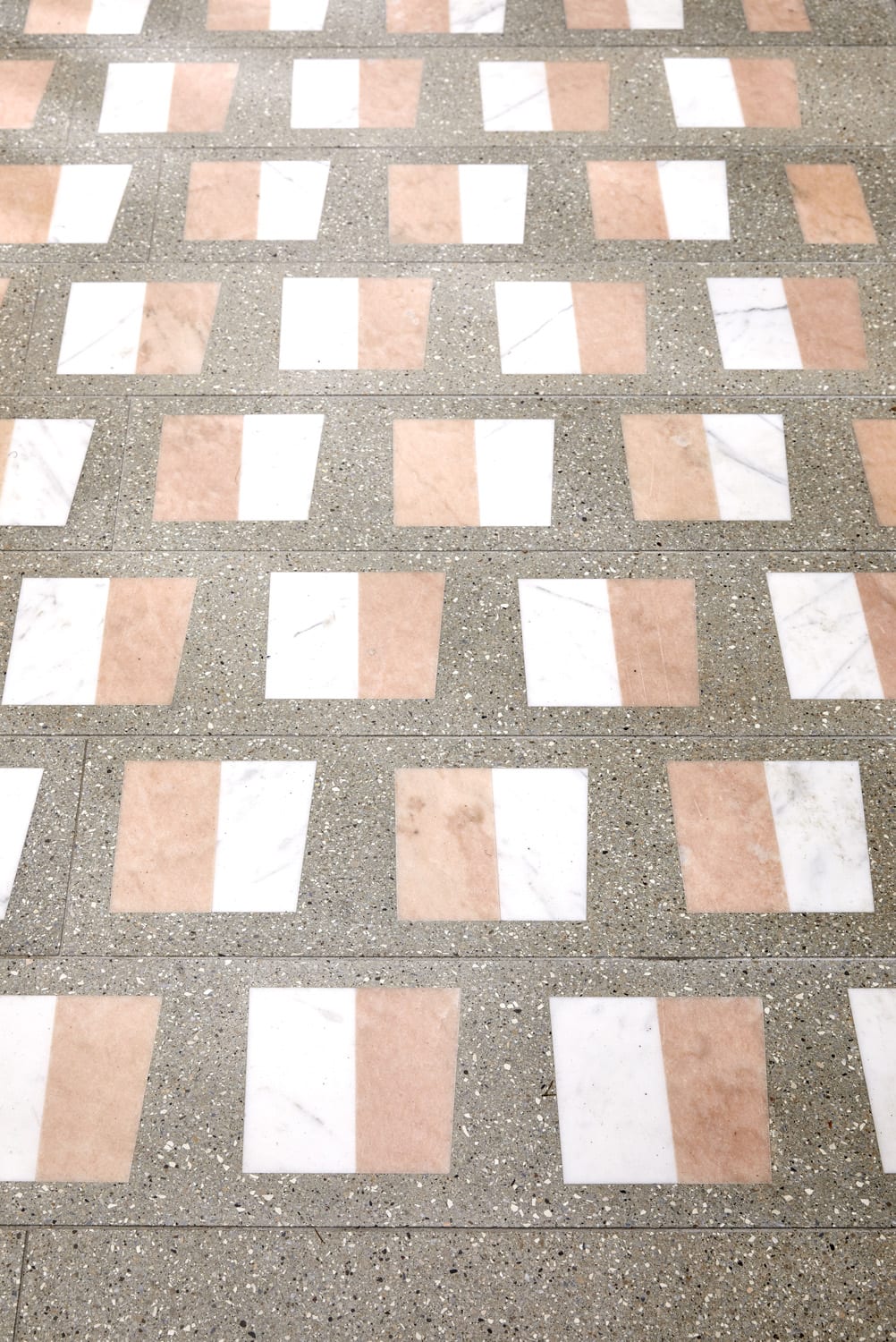
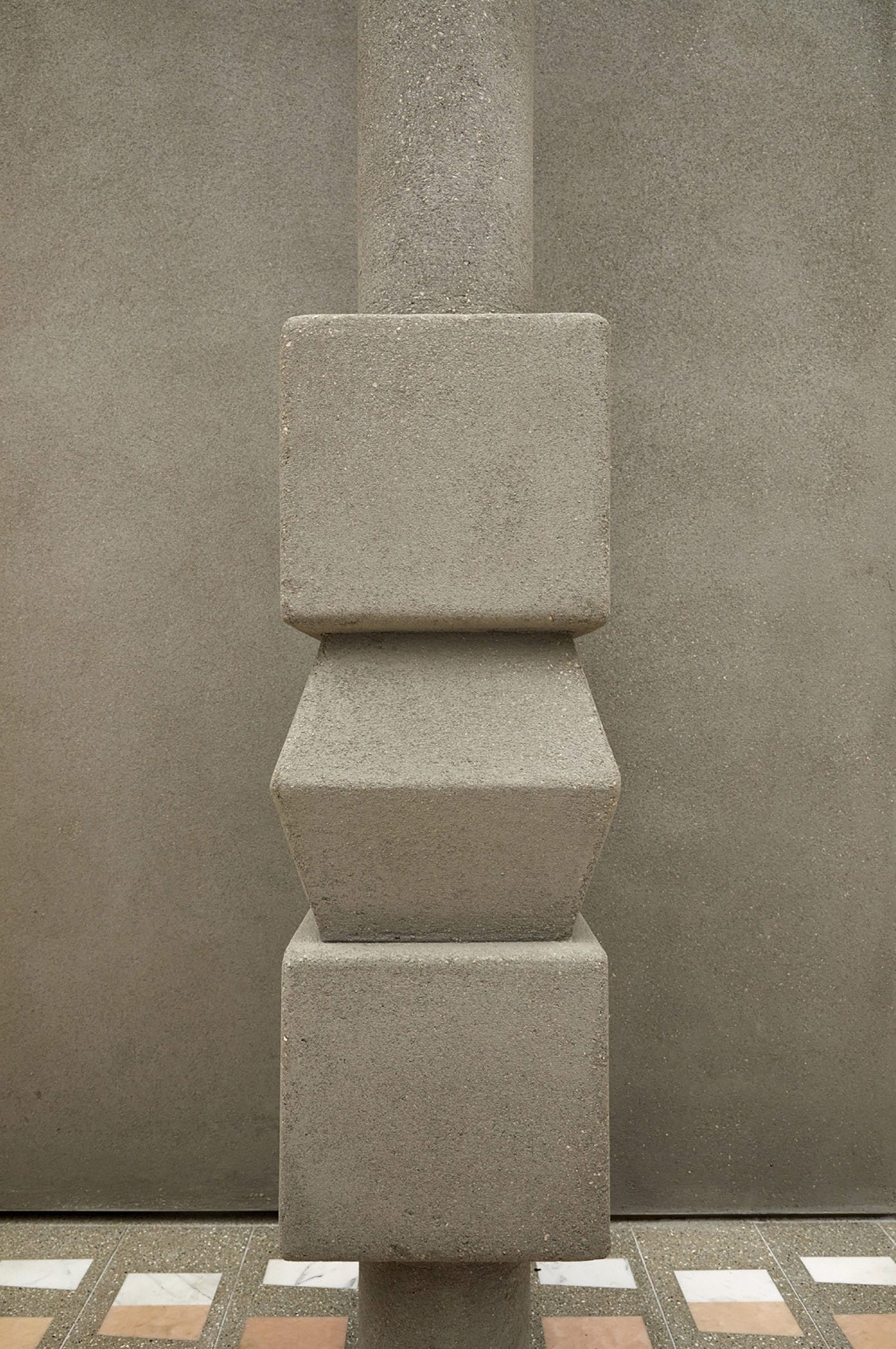
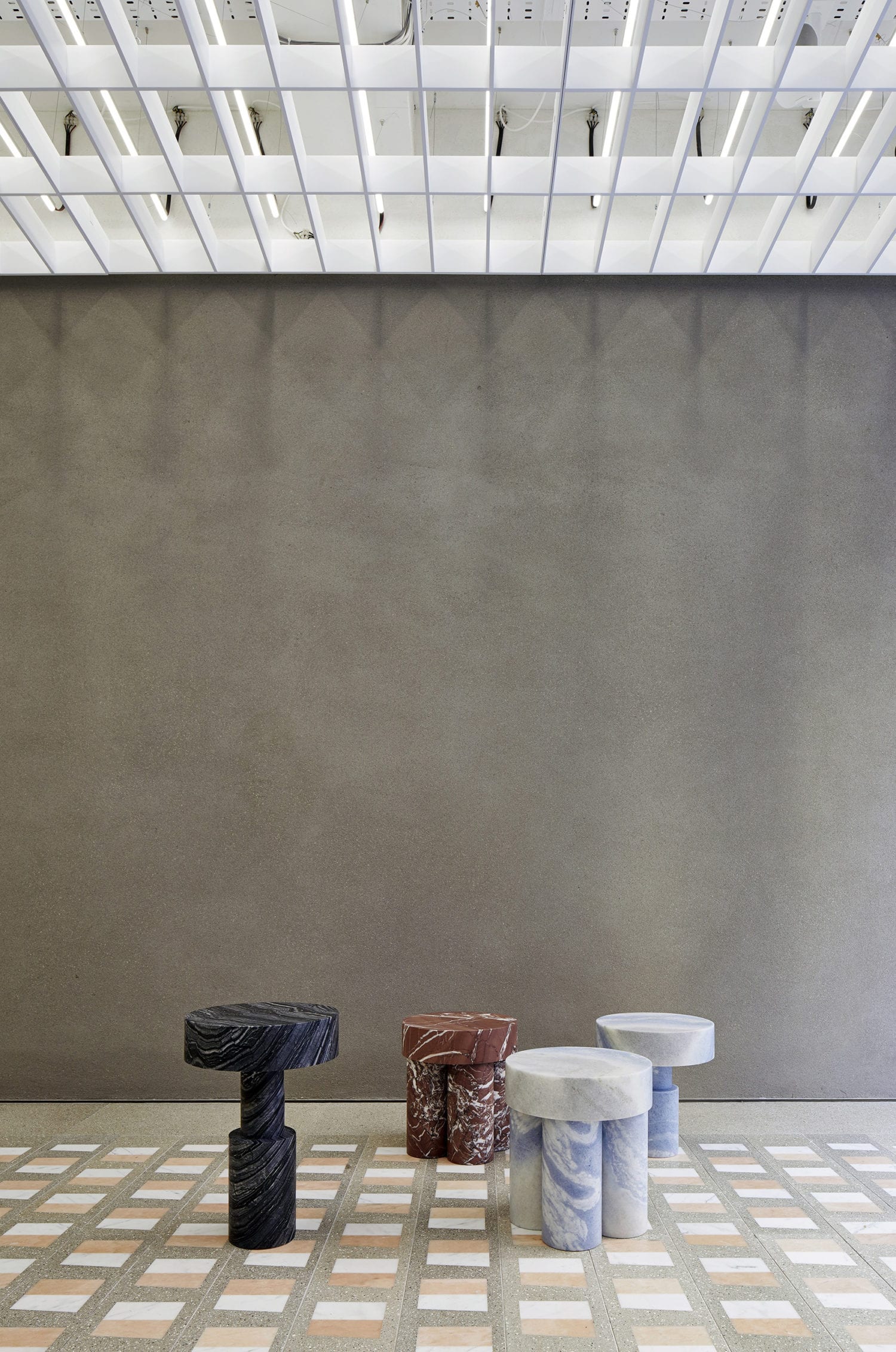
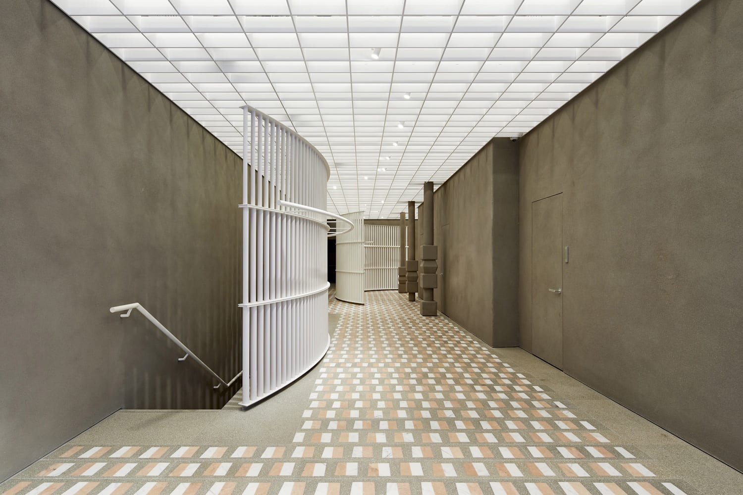
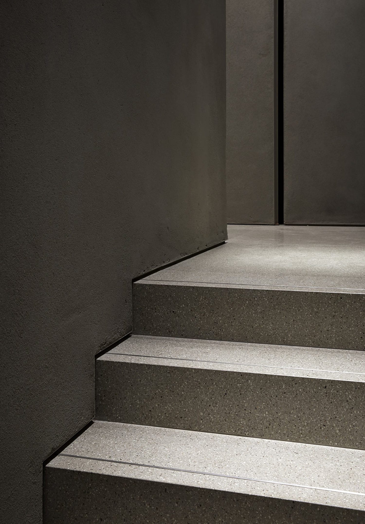
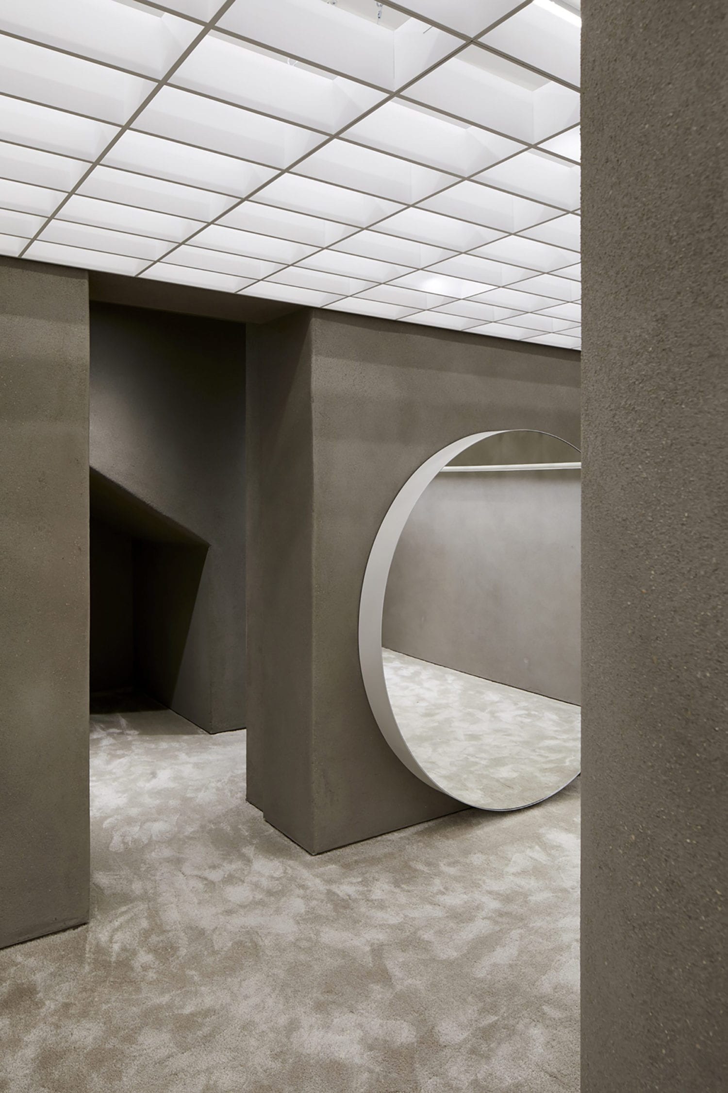
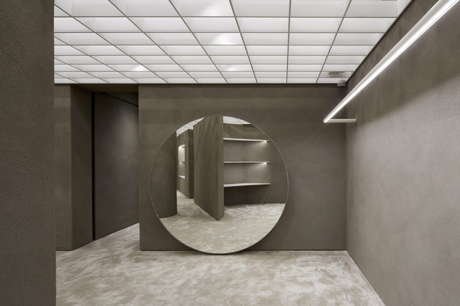
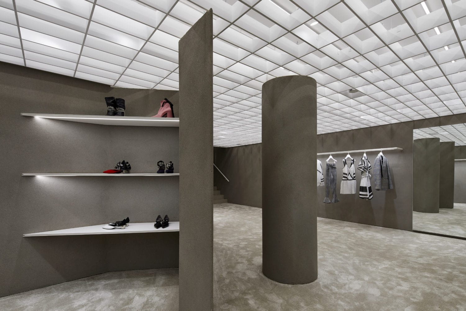
帶有粉紅色和白色大理石鑲嵌的定製水磨石地板為空間增添了質感,圖案和微妙的女性氣質。由Lichtvision設計的帶有照明的開放式網格天花板在車間上方創造了一個連續的、明亮的邊界。最後,深色和沉重的康沃爾礦物粘土渲染應用於所有的牆壁和天花板表麵。
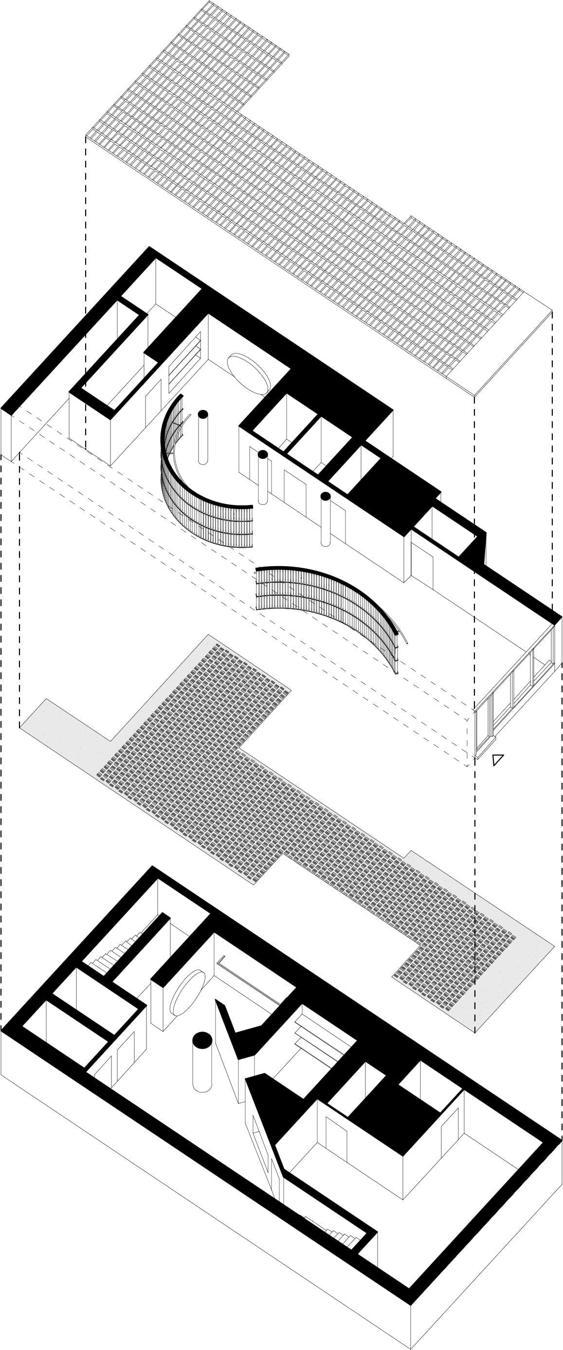
Custom terrazzo flooring with pink and white marble insets adds texture, pattern and subtle femininity. An open grid ceiling with lighting design by Lichtvision creates a continuous, luminous horizon above the shop floor. Finally, dark and heavy Cornish mineral clay render is applied to all wall and ceiling surfaces.
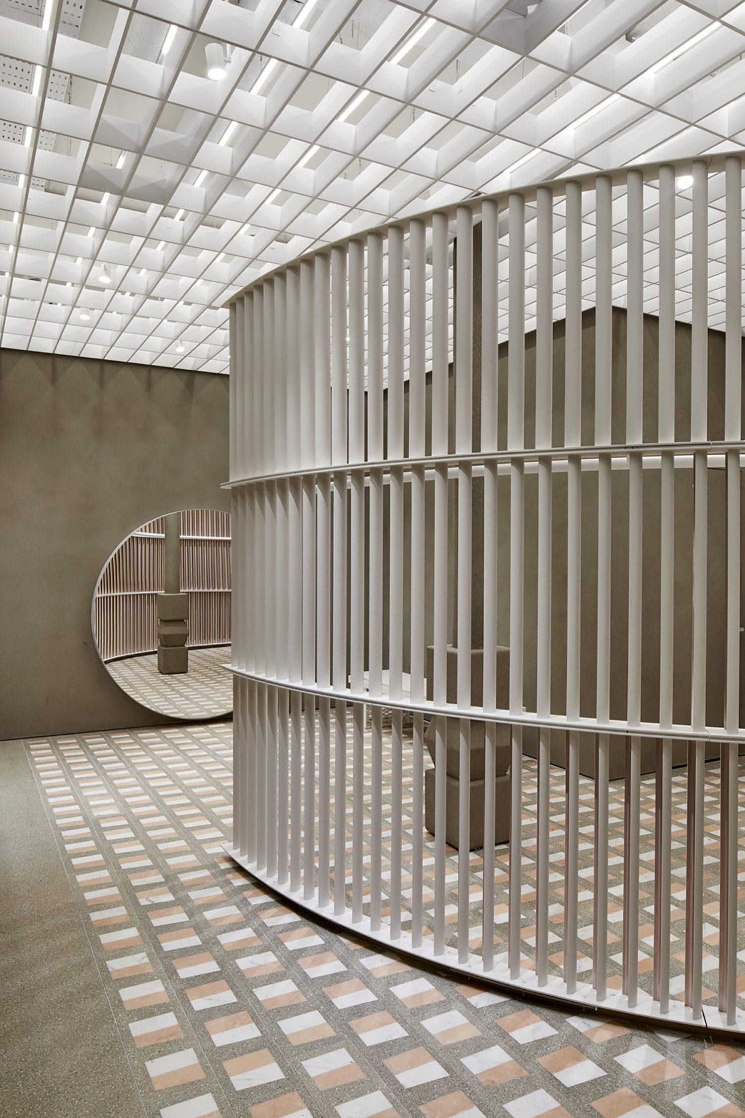
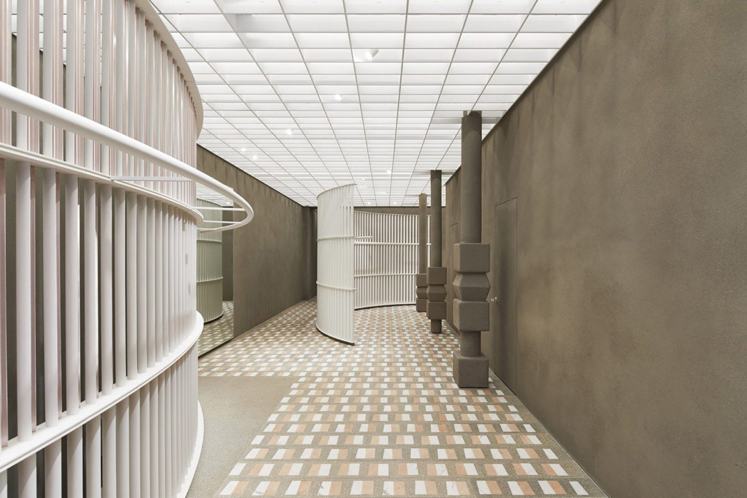
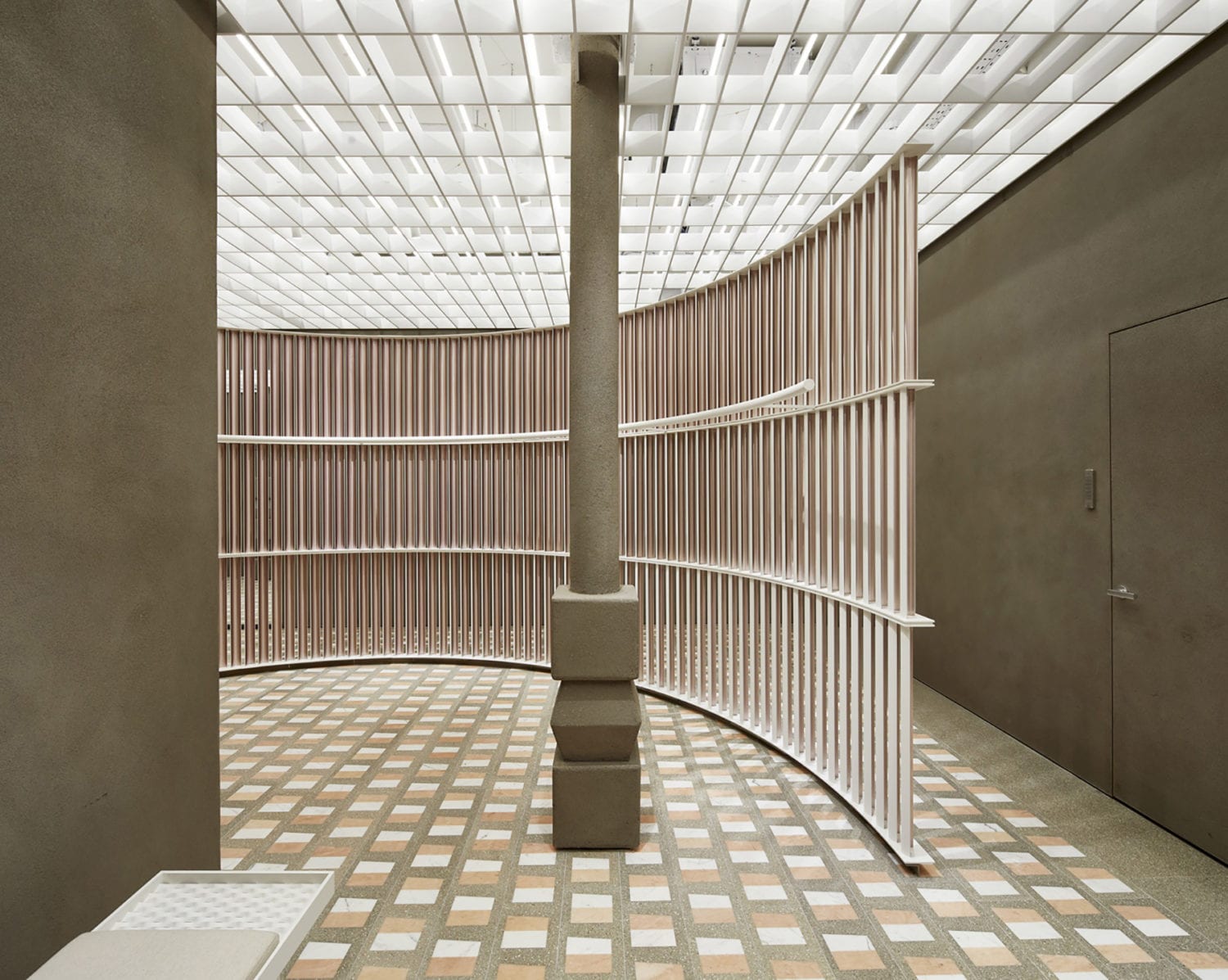
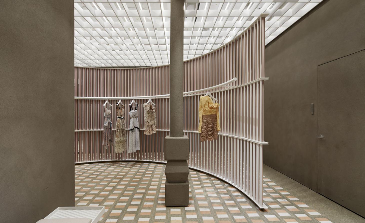
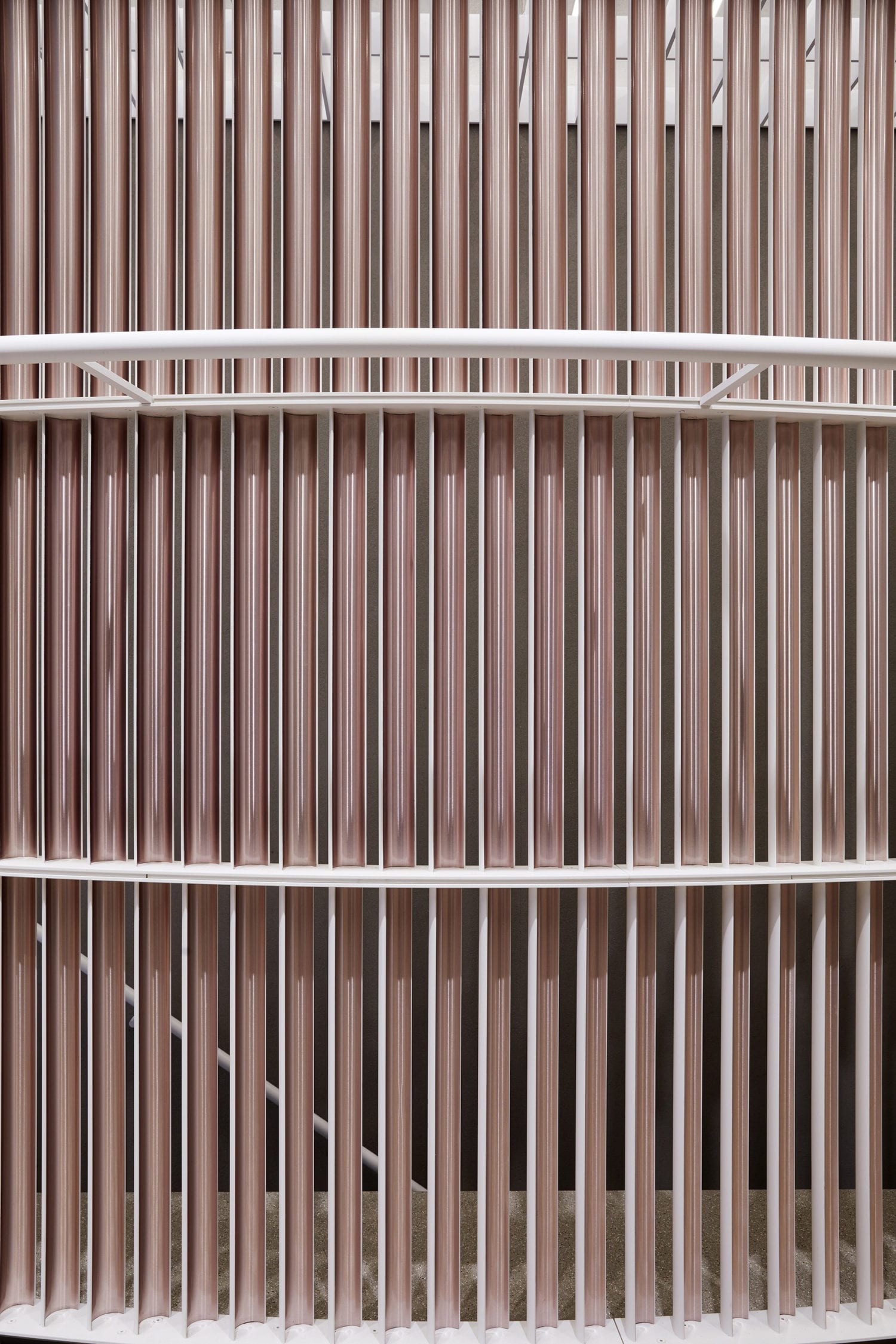
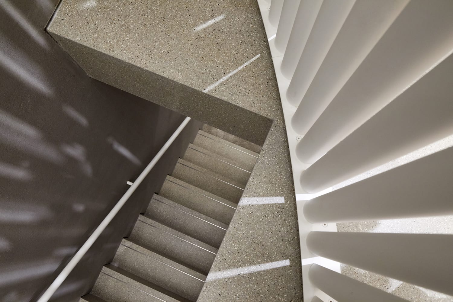
簡單的幾何形式被用來創建結構在兩個樓層。在地麵上,兩個帶有彩色鋁鑲嵌物的半圓形金屬篩網在開放的線性空間中為衣服提供了懸掛導軌。在較低的地麵上,建築師使用傾斜的牆壁和柱子來形成一個三角形的地板空間,周圍是較小的角落和凹室,比如一個有彩色大理石座椅和鞋架的區域。兩個樓梯在整個室內創造了一個有趣的環形通道。
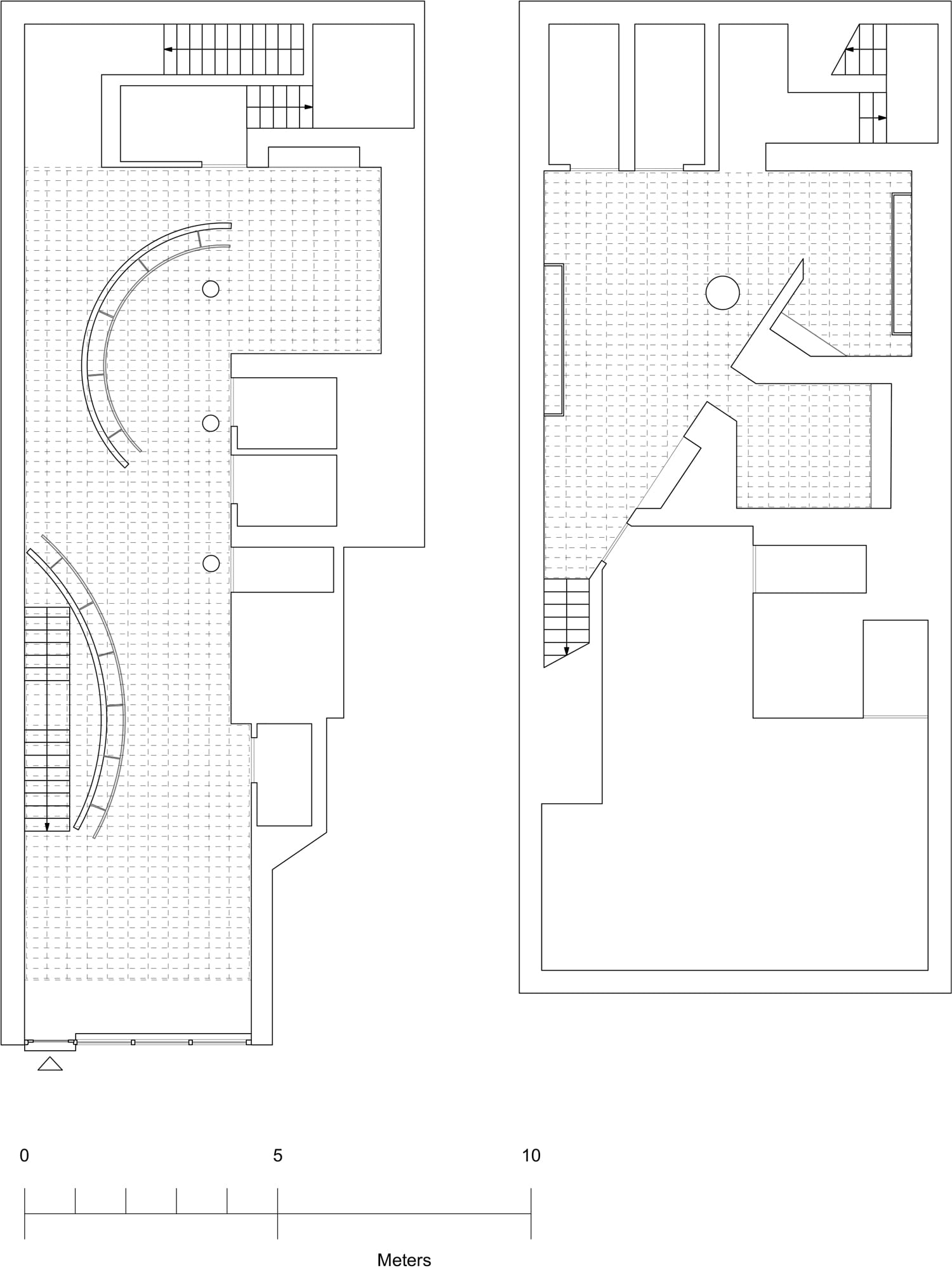
Simple geometric forms are used to create structure on both floors. At ground level, two semi-circular metal screens with coloured aluminium inlays provide hanging rails for clothes amongst the open, linear space. On the lower-ground, the architects use angled walls and columns to shape a triangular floor space surrounded by smaller nooks and alcoves, such as an area with colourful marble seating options and a shoe stand. Two staircases create a playful looped pathway throughout the interior.
∇ 平麵圖
∇ 爆炸分析圖
主要項目信息
項目名稱:Self Portrait
項目位置:英國倫敦
項目類型:商業空間/時尚空間
完成時間:2019
設計公司:Casper Mueller Kneer Architects
攝影:Paul Riddle





![[4K] 2.1G 虛空之美-100個日式庭院](http://www.online4teile.com/wp-content/uploads/2023/09/1_202309111611111-8-414x550.jpg)
