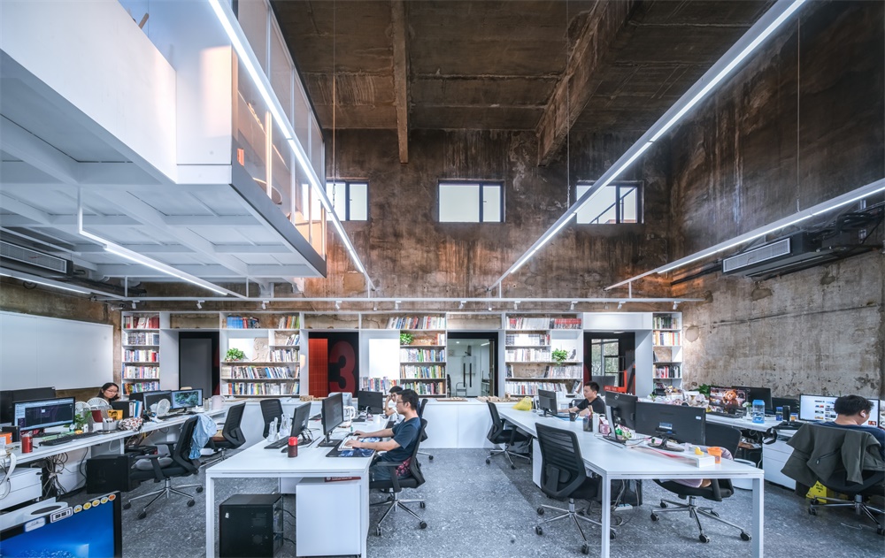
LOFT中國感謝來自 UAO瑞拓設計 的建築改造項目案例分享:
UAO瑞拓設計 將自己的辦公地從江邊搬到了一個武漢良友紅坊藝術社區內的獨棟小樓裏;良友紅坊藝術社區的前身是上世紀60年代,武漢肉聯廠的配套廠區——豬鬃廠,羽毛廠,廠區內建築均是具有生產性質的老工業建築。UAO負責廠區的景觀設計,以及最核心建築:ADC藝術設計中心的建築和室內設計。
UAO moved its office from the riverside to a single small building in the Liangyou Hongfang art community in Wuhan; the predecessor of the Liangyou Hongfang art community of was the supporting factory of Wuhan meat joint factory in 1960s – bristle factory and feather factory., and the buildings in the factory are old industrial buildings with production properties. UAO is responsible for the landscape design of the plant area, as well as the core architecture: the architecture and interior design of ADC art design center.
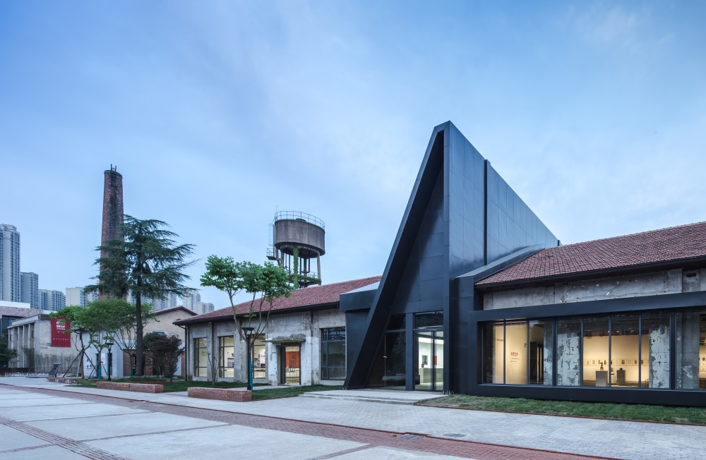
∇ ADC藝術中心(UAO負責改造設計的紅坊核心建築) ADC Art Center (the core building of Hongfang that UAO is responsible for renovation design)
延續:從規劃和景觀著眼的設計 Continuation: design from the perspective of planning and landscape
良友紅坊藝術社區前身是武漢豬鬃廠、羽毛廠;90年代被作為建材市場使用,隨著城市的發展,建材市場也日漸沒落;由於使用功能的變遷,廠區內的建築由不同年代建設,有60年代的紅磚單層木桁架瓦屋麵廠房,也有80年代,多層磚混結構,外表麵水磨石的廠房;也有90年代外表瓷磚或小馬賽克的樓;上海水石的總體規劃保持了原有小樓的基本結構,外表麵材質,讓曆史的痕跡從建築形態的不同就能得到表現和延續;
Liangyou Hongfang art community, formerly known as Wuhan bristle factory and feather factory, was used as a building material market in the 1990s. With the development of the city, the building material market is also declining. Due to the change of the use function, the buildings in the factory are built in different years, including the red brick single-storey wood truss tile roof factory in the 1960s, and the multi-storey brick concrete structure factory in the 1980s with terrazzo on the outer surface. There are also buildings with exterior tiles or small mosaics in the 1990s; the overall planning of Shanghai Shuishi keeps the basic structure of the original small building, with exterior materials, so that historical traces can be expressed and continued from different architectural forms;
∇ 紅坊全區鳥瞰圖(紅色為UAO新辦公室)Aerial view of the whole area of Hongfang (UAO new office in red)
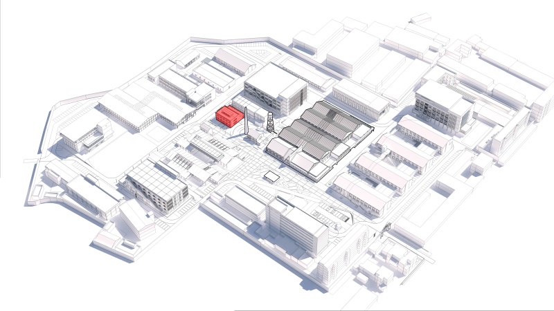
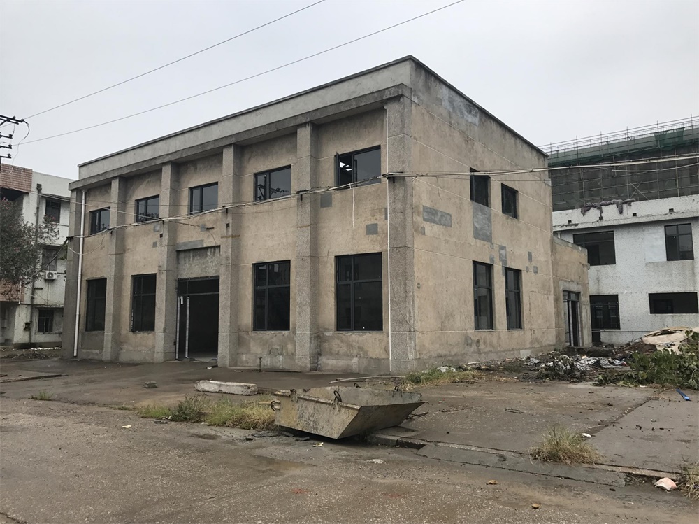
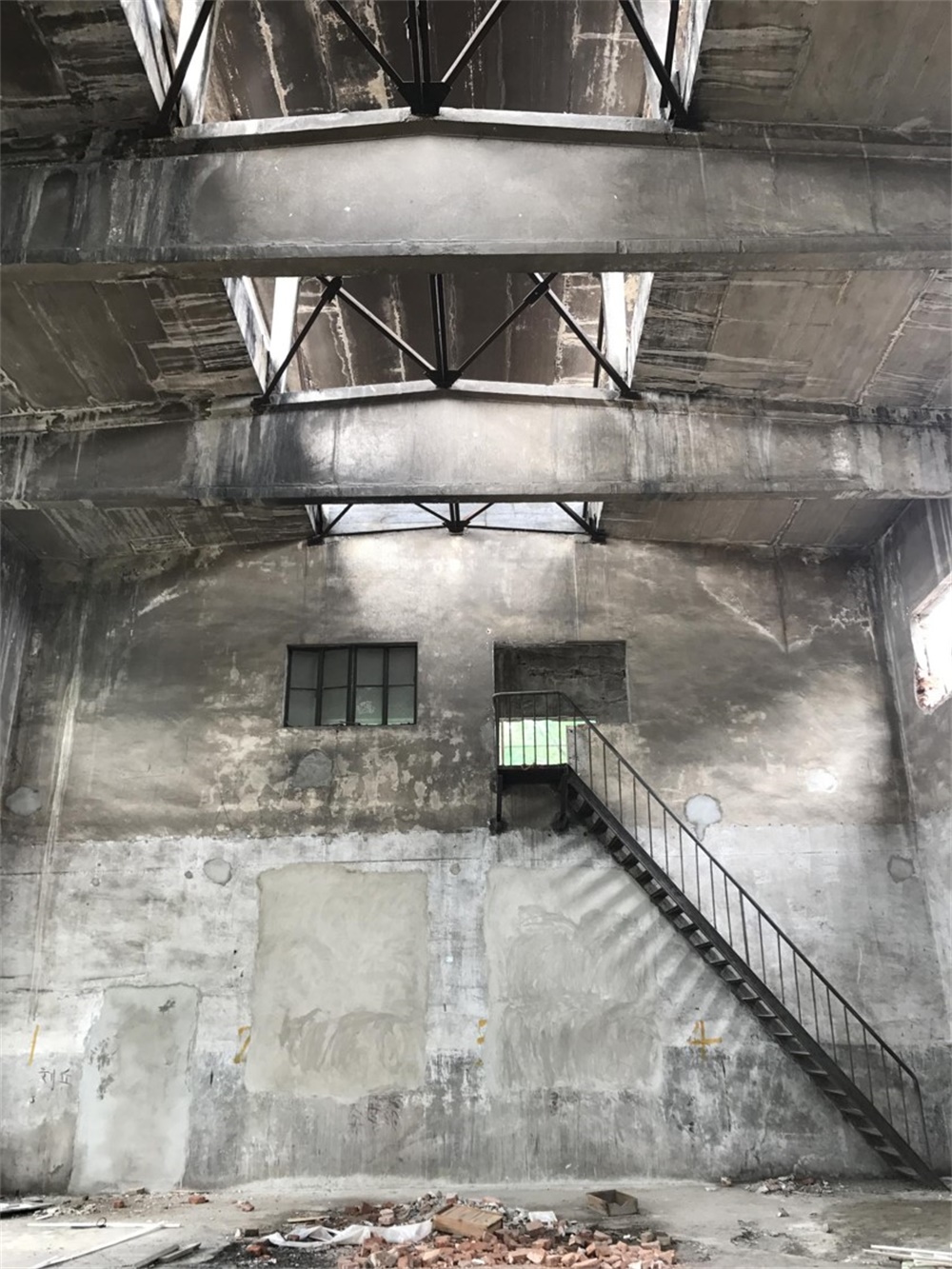
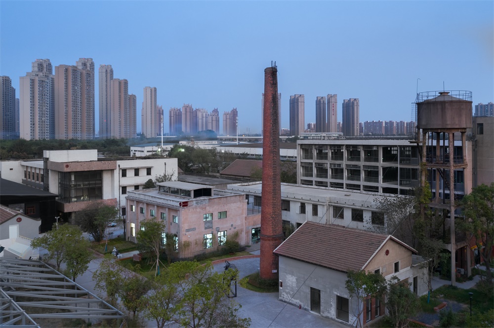
在設計梳理過程中,在廠區的核心區內發現有一棟內空較高的獨棟小樓,位於高大的紅磚煙囪和水塔旁,前身是工業廠區的發配電機房。高聳的內部空間,陽光從頂上的天窗和夾層的窗戶傾泄下來,照耀著煙熏火燎過的,布滿曆史痕跡的老牆麵,極具衝擊力的空間感;UAO的創始人兼主持建築師李濤決定將其租用下來作為自己的辦公空間。
In the process of design, it is found that there is a single small building with a high void in the core area of the plant, which is located next to the tall red brick chimney and water tower. The former is the distribution motor room of the industrial plant. The towering interior space, the sun pouring down from the skylight on the top and the window on the mezzanine, is shining on the smoky and burning old wall, which is full of historical traces, with a strong sense of space; the founder and chief architect of UAO, Li Tao, decides to rent it as his own office space.
∇ 發電機房改造前外觀 攝影:李濤 Appearance of generator room before reconstruction , photography: Li Tao
∇ 發電機房改造前內部空間 攝影:李濤 Internal space before reconstruction of generator room , photography: Li Tao
高聳:發揚原有空間的特質/ Towering: carry forward the characteristics of the original space
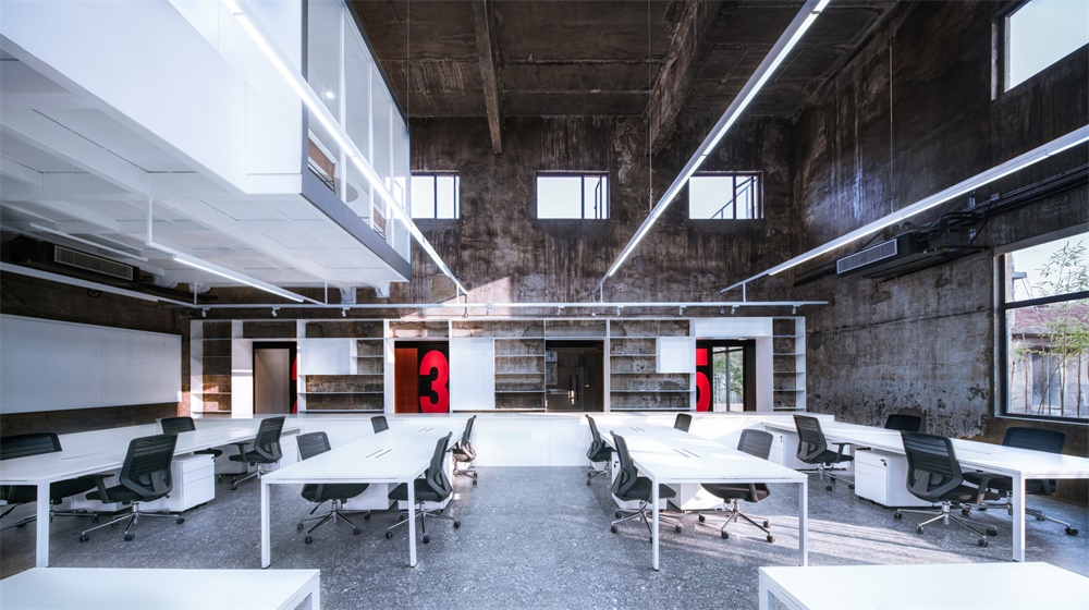
原有發電機房總高度8米,如教堂般高聳的空間很是震撼;設計的最初出發點就是保留並發揚這個高聳空間感特質,所以新設計很克製,隻以較少的空間體量植入到大空間裏去,最後的決策是隻靠原來二層一側新建設計一個柱跨寬度的夾層,以保留大廳大部分的豎向空間格局,讓這個新的植入不僅沒有改變空間原有的特征,繼續讓陽光傾泄下並布滿整個空間;而且它的形態強化了高聳空間的特征,並給與一個觀者直觀的尺度衡量。
The original generator room has a total height of 8 meters, The towering space like a church is very shocking. The original starting point of the design is to retain and carry forward the high-rise space sense, so the new design is very restrained, only a small space volume is implanted into the large space, and the final decision is to rely on the original two-story side to design a new column span width mezzanine to retain most of the vertical of the hall. The spatial pattern makes this new implant not only not change the original characteristics of the space, but also let the sunlight pour out and fill the whole space; moreover, its shape strengthens the characteristics of the towering Space and gives an intuitive scale to the viewer.
∇ 保留陽光傾泄的豎向空間特質 Keeping the vertical space characteristic of sunlight
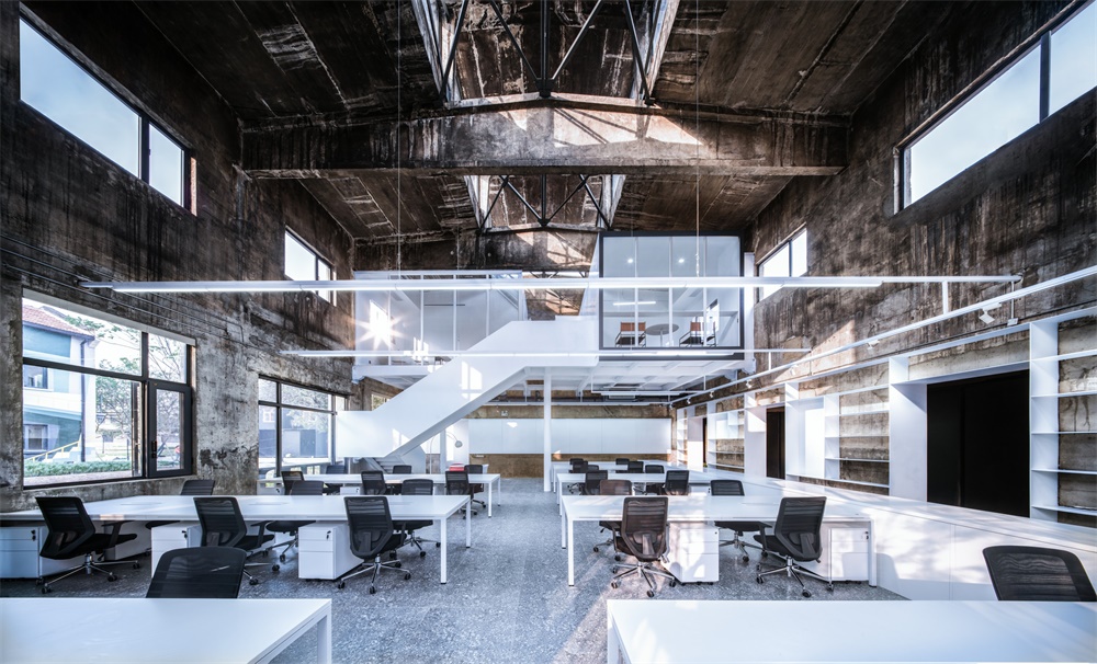
∇ 增加很少的夾層空間 Add few mezzanine space
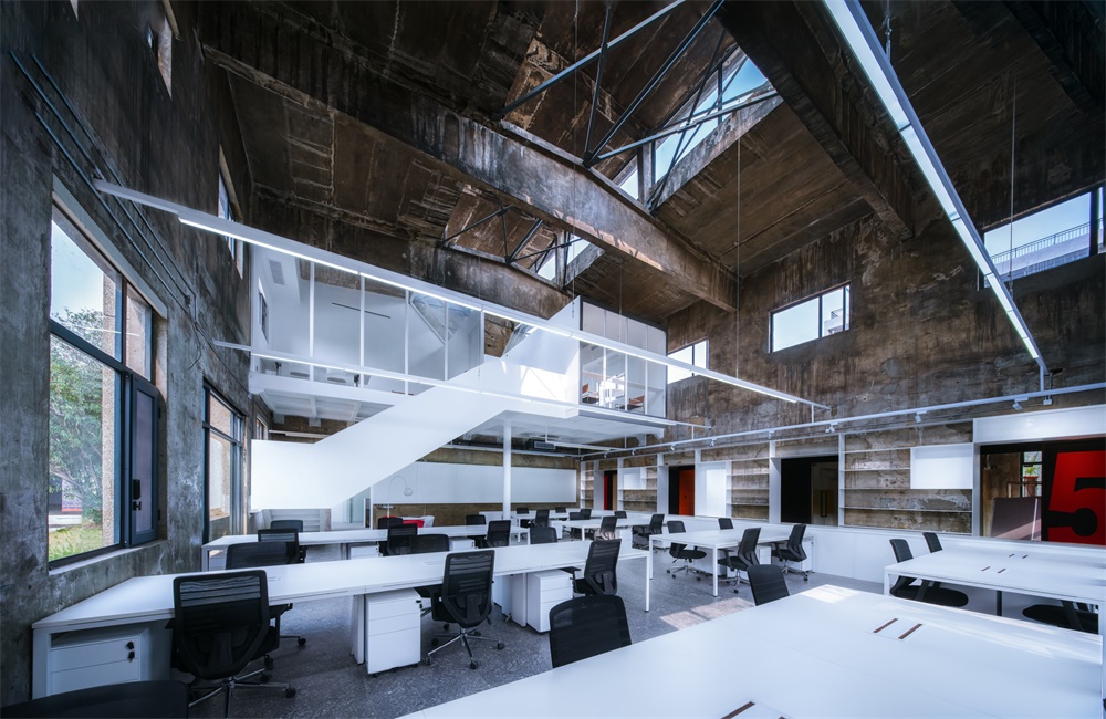
靠一側設計夾層的目的,也使得建築因為天窗獲得的長軸方向的序列感得以保留。
The purpose of designing the mezzanine on one side also makes the sense of sequence of the long axis obtained by the skylight retained.
∇ 長軸方向的序列感得以保留 The sense of sequence in the long axis is preserved.
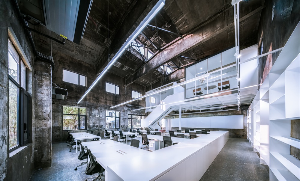
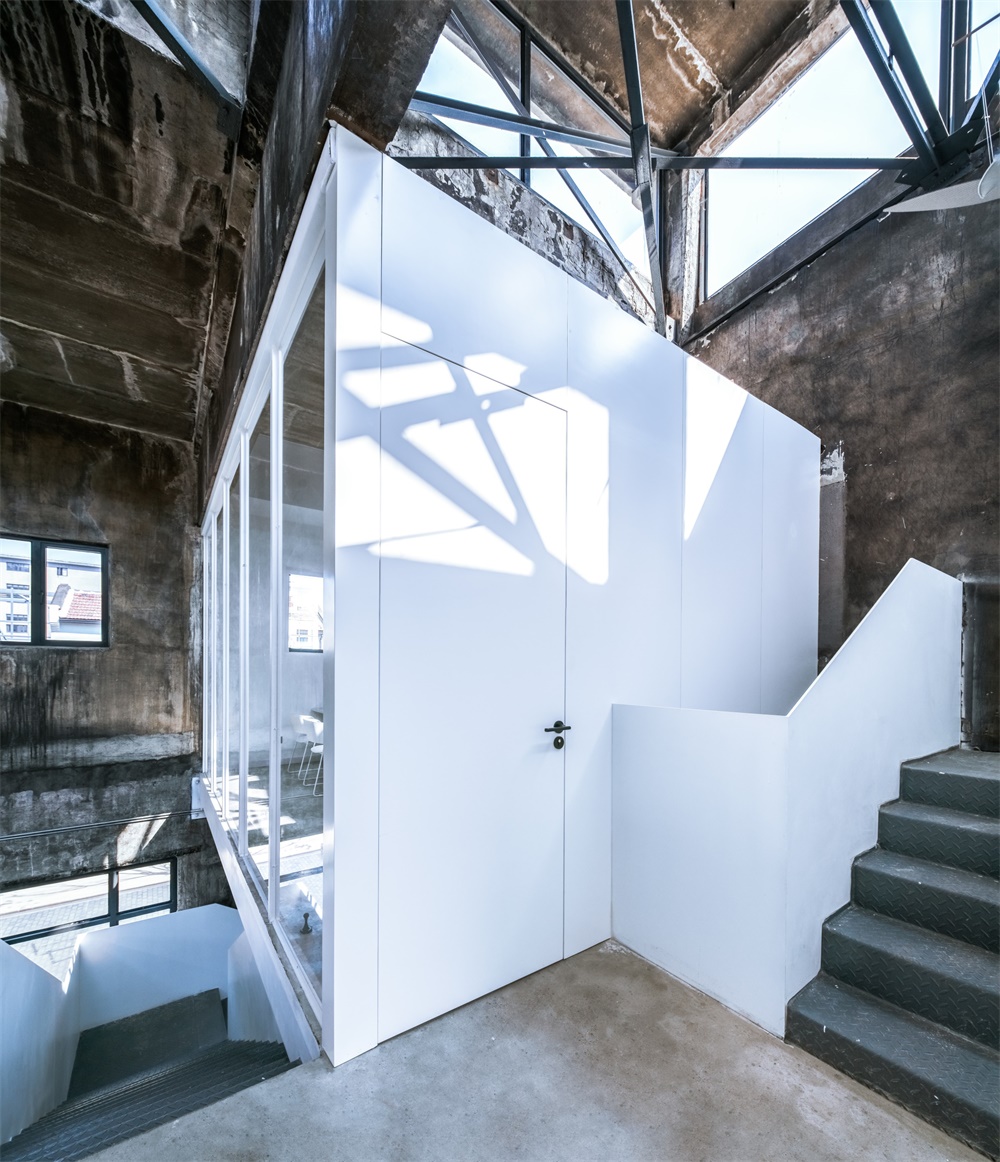
夾層僅通過中間的一根200mm直徑的柱子來支撐,加上折線樓梯,更加強化了夾層的重量和漂浮感,它通過建築的表達去強化結構的獨立支撐作用,類似於筱原一男的白之家中心的柱子;中心柱的輕巧反襯著周遭厚重而有曆史痕跡的牆體——新的體量以純淨的白來體現,老的牆麵僅清掃後刷牆麵固化劑,保留了原有的煙熏火燎、甚至是髒的痕跡,從而產生一種新與舊的對話和反差。這種“髒”也是原有空間的特質和曆史。
The mezzanine is only supported by a 200mm diameter column in the middle, and the folding staircase strengthens the weight and floating sense of the mezzanine. It strengthens the independent supporting function of the structure through the expression of the building, similar to the column in the center of Xiaoyuan’s White House. The light and ingenious central column contrasts with the thick and historic wall around – the new volume is reflected by pure white. , the old wall is only painted with curing agent after cleaning, which keeps the original trace of smoke, fire and even dirt, thus creating a new dialogue and contrast with the old. This kind of “dirty” is also the characteristics and history of the original space.
∇ 一根柱子支撐其夾層的結構 A structure in which a column supports its interlayer.
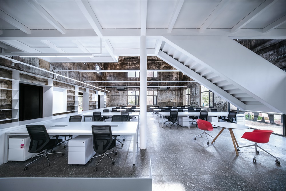
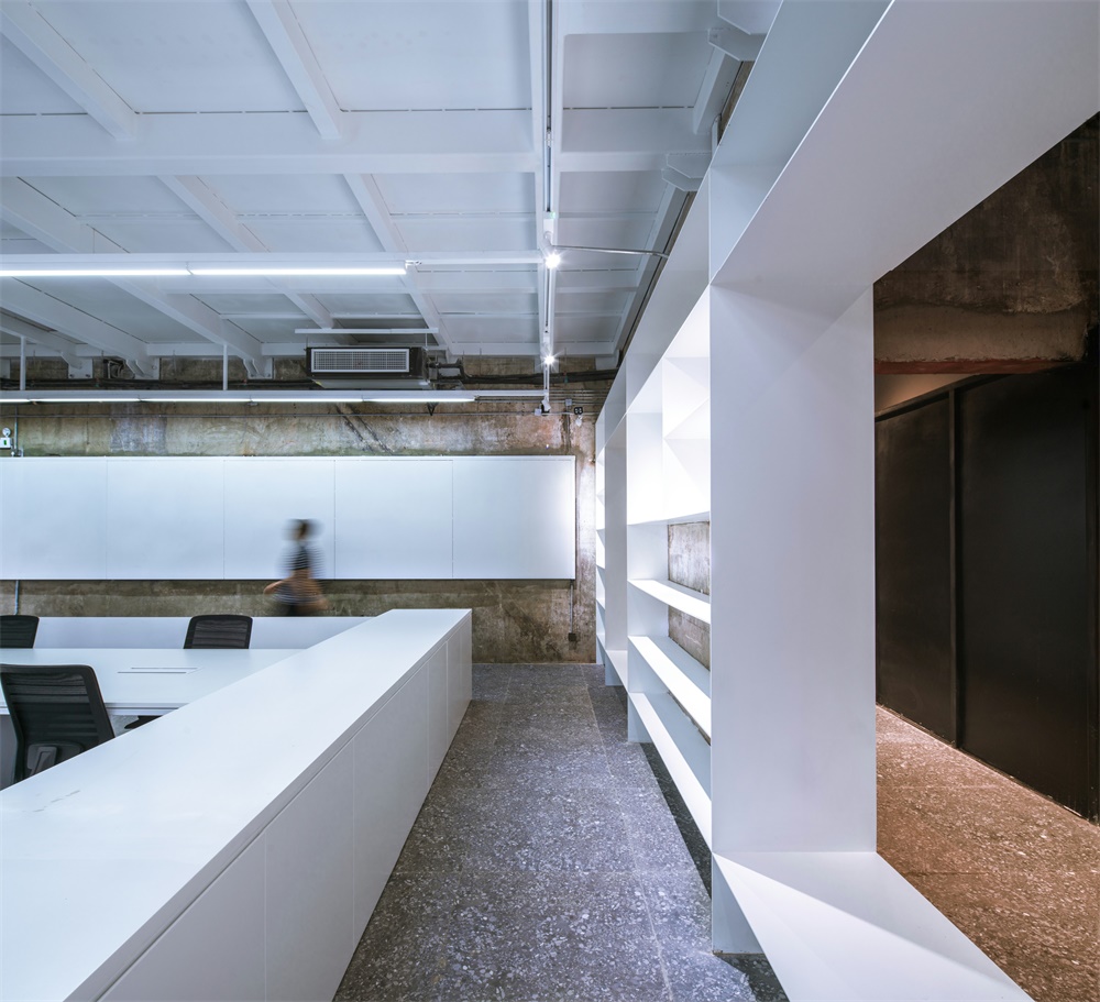
白色的體量延申至鋼板書架、櫃子和桌子,大廳內再通過家具輔以少量的紅色來點綴;
The white volume extends to steel bookshelves, cabinets and tables, and the hall is decorated with a small amount of red furniture.
功能:服務與被服務空間 Function: service and served space
在決定了夾層的形式和位置,同時對UAO的使用功能進行了梳理。
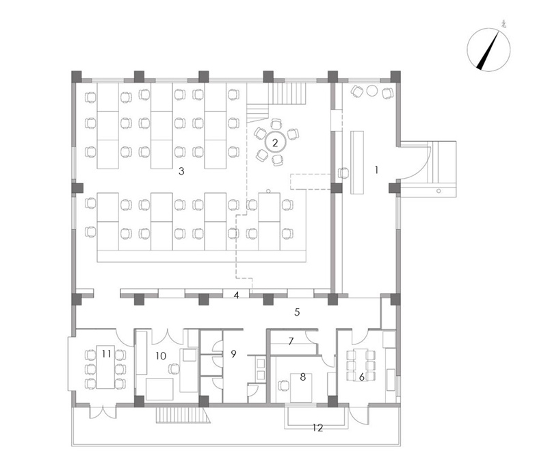
結合UAO多年來的工作流程和模式,我們對辦公室的功能分為三大部分:辦公+配套服務+展覽論壇。辦公包含兩位合夥人的辦公室和辦公大廳;配套服務包括:模型室、打印室、會議室和財務室,以及茶水間和衛生間,而展覽論壇需要的是一個幹淨整潔的大空間;
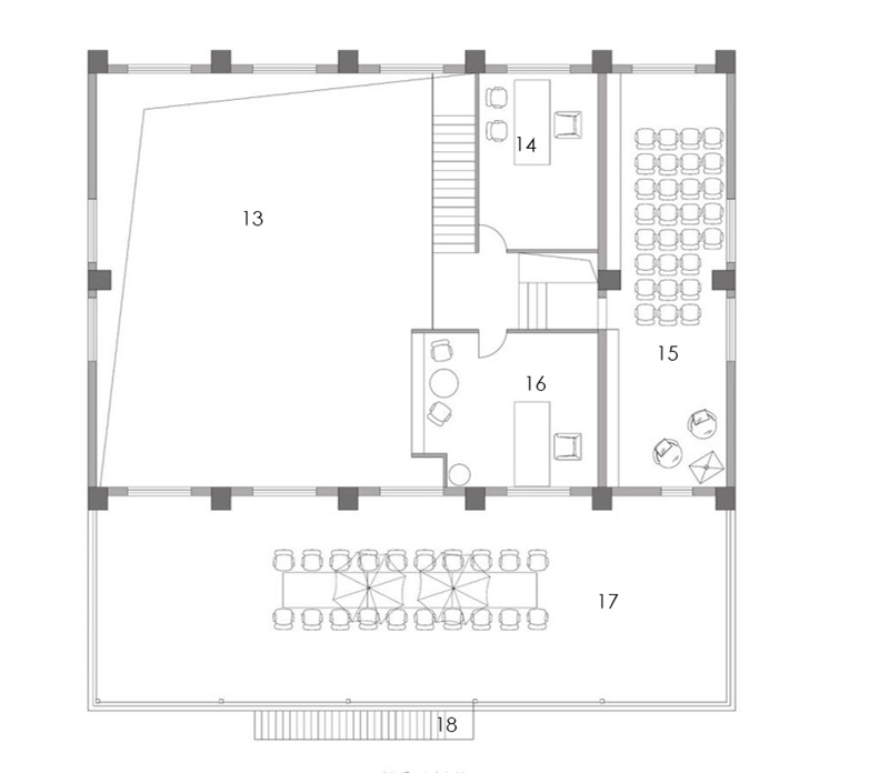
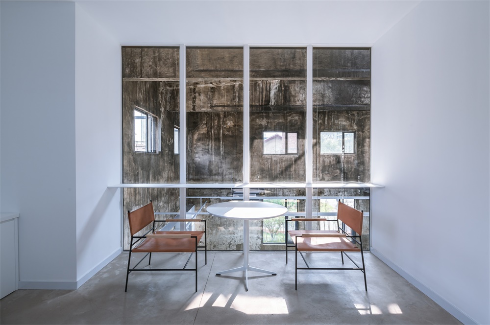
根據這個功能要求和目前建築的現狀,將高區高聳空間作為辦公區域,將南邊較低的低區作為配套服務空間,將高聳空間東側本來就是兩層的空間,一層給前廳和展覽,二層給會議和論壇,二層的會議室外,就是配套服務空間的屋頂,它形成了一個天台空間,也成為做室外論壇交流的絕佳位置。
In determining the form and location of the mezzanine, at the same time, the use function of UAO is combed.
Combined with UAO’s working process and mode over the years, our office functions are divided into three parts: Office + supporting services + exhibition forum. The office includes two partners’ offices and office halls; supporting services include: model room, printing room, meeting room and finance room, as well as tearoom and restroom, while exhibition forum needs a clean and tidy large space;
According to the functional requirements and the current situation of the building, the high-rise area is taken as the office area, the lower area in the south is taken as the supporting service space, and the east side of the high-rise space is originally a two-story space, the first floor is for the front hall and exhibition, the second floor is for the conference and forum, and the second floor is the roof of the supporting service space, which forms a rooftop space. It’s a great place for outdoor forum communication.
∇ 平麵圖 Plan
平麵圖序號索引:Plan No. index:
1 前廳/展廳 2 討論 3 辦公大廳 4 框景窗 5 走廊 6 茶水間 7 儲藏 8 財務室 9 衛生間
10 模型切割/打印 11 模型製作/討論 12 花園 13 上空 14 辦公室 15 會議室 16 辦公室 17 天台
18 消防樓梯
1 front hall / exhibition hall 2 discussion area 3 office hall 4 frame view windows 5 corridor 6 tea room 7 storage 8 finance room 9 restroom
10 model cutting / printing 11 model making / discussion 12 garden 13 Over the hall 14 office 15 meeting room 16 office 17 terrace 18 fire stairs
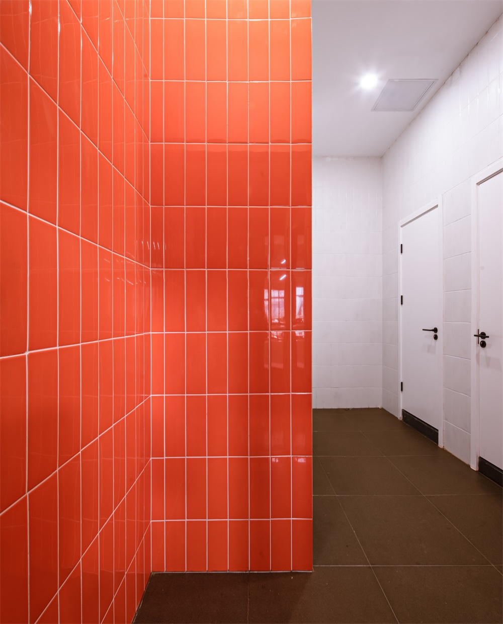
功能關係上,高空間的辦公大廳和低高度的配套空間,構成了路易斯康所說的被服務與服務空間;設計在材質和色調上刻意做了區分,服務空間(包含茶水間、衛生間、模型室、打印室、會議室等)采用了黑色調,配以紅色的數字和房間的局部彩色,如衛生間隔間內的橙黃色、墨綠色;茶水間裏的花磚;模型室內的黃色洞洞板掛板;而被服務空間(即辦公大廳和前廳會議室等,則是以純白為主色調的理性控製的空間調性);服務空間采用色溫3000K的暖白光,而被服務空間則采用色溫4000K的白光;
In terms of functional relationship, the office hall with high space and the supporting space with low height constitute the service space and service space described by Louis Kahn. The design deliberately distinguishes between the materials and colors. The service space (including tea room, rest room, model room, printing room, meeting room, etc.) adopts black tone, with red numbers and local color of the room, such as rest room cubicle Orange and dark green inside; tiles in the tea room; yellow hole board hanging board in the model room; and the space to be served (i.e. the office hall and the meeting room in the front hall, etc., are the space tonality rationally controlled with pure white as the main color); the service space adopts warm white light with color temperature of 3000K, while the space to be served adopts white light with color temperature of 4000K;
∇ 服務空間與被服務空間 service and served space
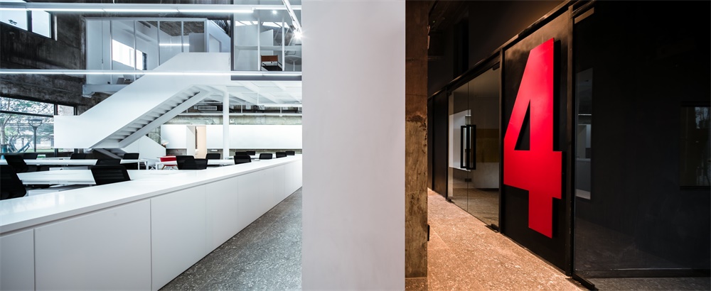
服務空間偏向感性,被服務空間偏向理性;服務空間飽滿的色彩和較暗的空間,更加烘托出被服務空間純白,高聳和向上的神性。
The service space is inclined to sensibility, and the service space is inclined to rationality; the full color and dark space of the service space more foil the pure white, towering and upward divinity of the service space.
隱喻:平麵和剖麵完美結合的設計 Metaphor: the perfect combination of plane and section design
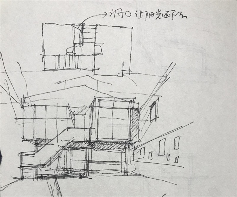
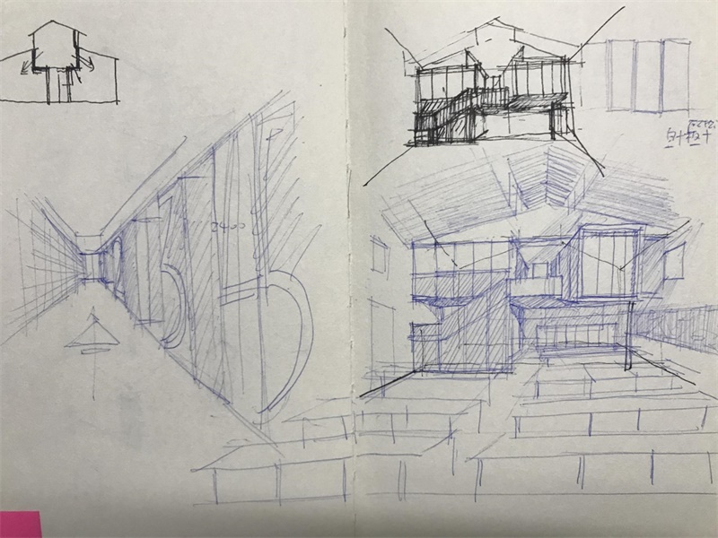
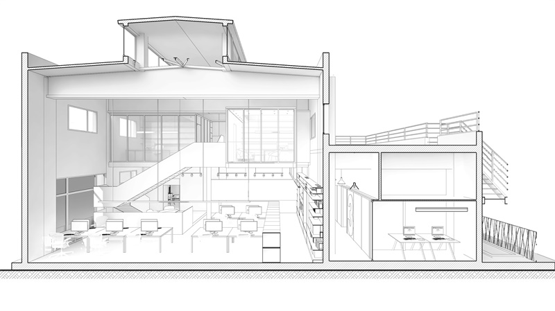
建築設計,經常首先從平麵布局入手,但這個項目的高聳空間特質,使得我們的設計在第一時間就考慮從剖麵入手:在高聳空間內設置夾層,夾層的高度比原有二層要低900MM,其目的是在高聳空間內形成完美的比例關係;在底層配套服務區域,將茶水間和模型室樓上設置夾層休息室和模型材料間,但是放棄了衛生間、會議室樓上的夾層設置,目的是保留空間的高低節奏,為不同空間滿足不同的觀感和感受,比如會議討論空間較高的設置,也方便各種討論和碰撞。
In architectural design, we usually start with the plane layout first, but the high-rise space characteristic of this project makes our design consider starting from the section at the first time: set the mezzanine in the high-rise space, the height of the mezzanine is 900mm lower than the original two floors, its purpose is to form a perfect proportion relationship in the high-rise space; in the supporting service area of the ground floor, the tea room and the model room building The mezzanine rest room and model material room are set on the upper floor, but the mezzanine setting on the rest room and meeting room is abandoned, so as to keep the high and low rhythm of the space and meet different views and feelings for different spaces, such as the higher setting of meeting discussion space, which is also convenient for various discussions and collisions.
∇ 剖透視圖 Section&Perspective view
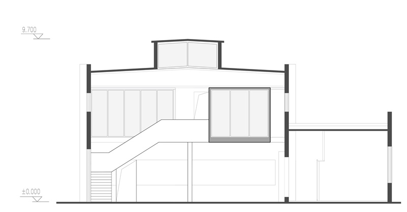
建築師在畫剖麵圖的時候,會將剖到的牆體等建築主體部分塗成灰色淡顯的填充;因而在夾層右側突出來的盒子的四周,也將其四周圍合的方框截麵,刷成了灰色油漆,它的目的其實隱喻了這裏像圖紙中一樣被剖切了一刀,如同建築師在藍圖剖麵圖中要表達的那樣。
When the architect draws the sectional drawing, he will paint the main part of the building such as the cut-out wall into gray light filling; therefore, around the box protruding from the right side of the mezzanine, he will also paint the surrounding box section into gray paint. Its purpose actually metaphors that here, like in the drawing, is cut, as the architect wants to express in the blueprint sectional drawing.
∇ 切開的剖麵隱喻 Sectional metaphor of incision
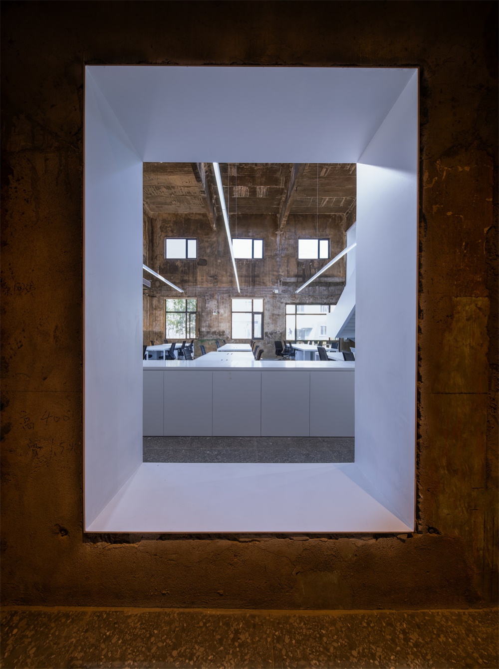
流動:空間蒙太奇 Flow: space Montage
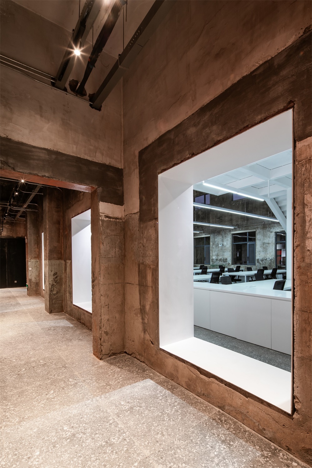
原建築的低區和高區之間的牆體本來隻有兩個門,高區厚重的南牆將高區和低區分割成兩個視線並不相通的部分;設計對應二層平台窗戶的位置,在高區一層打開了三個窗洞,它形成了服務空間與被服務空間之間的互動;同時因為鋼板書架的設置,使得牆體從視覺假象上變得很厚,它讓兩側的空間雖然視覺上是連續的,但是從一個空間過度到另一個空間,猶如在電影切換鏡頭時的加黑遮擋的處理,加上兩側空間色溫和黑白色彩的對比,更加強化了“剪輯”式的鏡頭處理。
There were only two doors in the wall between the low area and the high area of the original building. The thick south wall in the high area divided the high area and the low area into two parts which are not connected by the line of sight. The design corresponds to the position of the platform window on the second floor, and three window holes are opened on the first floor of the high area, which forms the interaction between the service space and the served space. At the same time, because of the setting of the steel bookshelf, the wall can be seen from the vision. The illusion becomes very thick, which makes the space on both sides continuous visually, but the transition from one space to another is like the processing of adding black cover when the film switches the lens, and the contrast of color temperature and black-and-white color on both sides, which further strengthens the “clip” lens processing.
同時所開的三個新的窗洞,成為空間的取景框;也形成了服務空間與被服務空間的聯動,整個空間因此而流動起來。
The three new window openings become the view frame of the space, and also form the linkage between the service space and the served space, so the whole space flows.
並置:新與舊的物理間隙 Juxtaposition: new and old physical gap
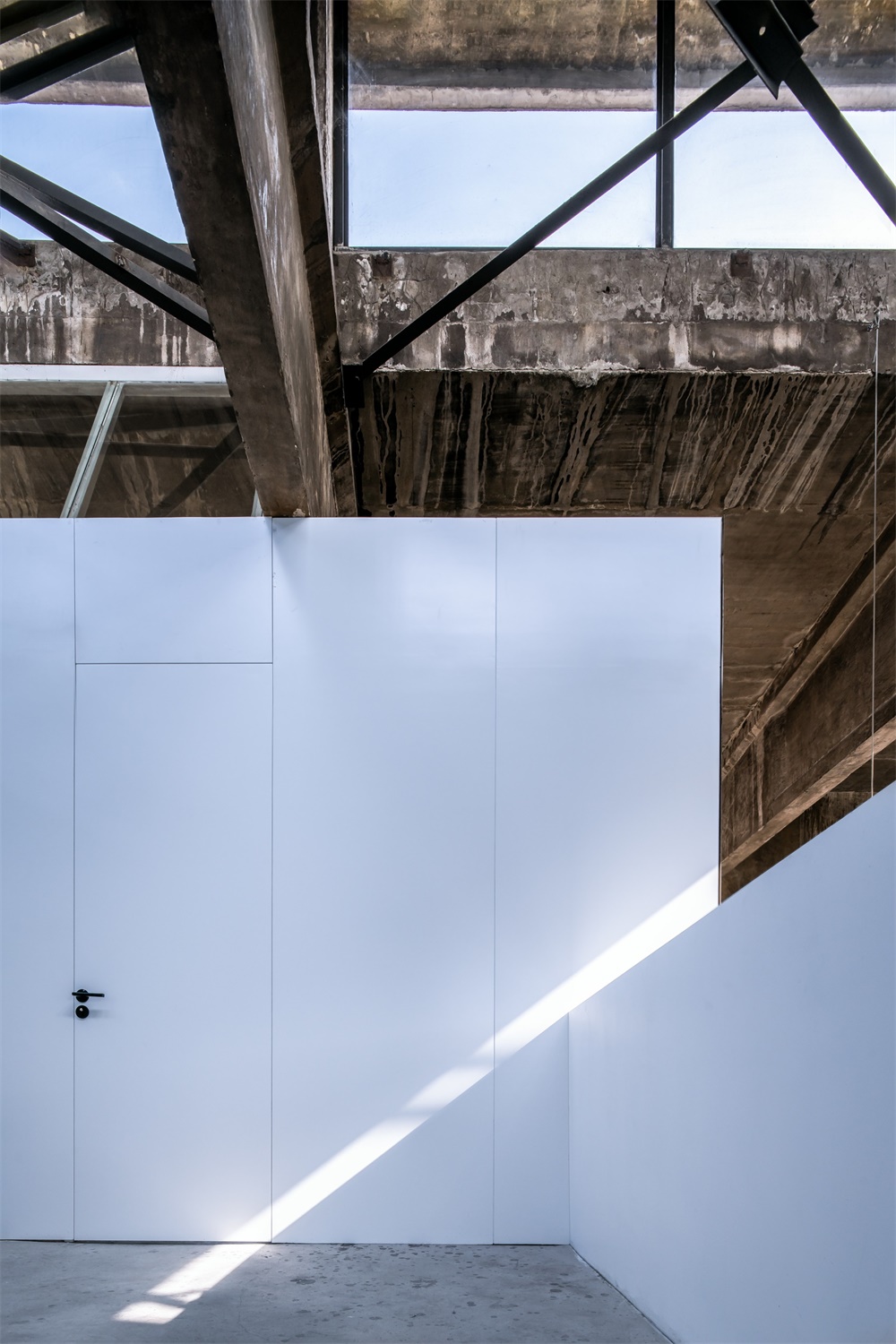
新的植入和舊的保留,自然形成了新老元素的並置,以期達到把建築的三維空間加上時間這一維度的目的,這也是並置手法的最終目的。在新的鋼板和舊的牆體之間,其刻意保留的物理間隙(沒有填縫砂漿,沒有收口收邊),將鋼板材料的挺括和牆體材料的自然剝落形成對比,這個間隙提醒著新與舊之間的物理距離和時間距離。
New implantation and old reservation naturally form the juxtaposition of new and old elements, so as to achieve the purpose of adding the three-dimensional space of the building with the dimension of time, which is also the ultimate purpose of juxtaposition. Between the new steel plate and the old wall, the intentionally reserved physical gap (no caulking mortar, no closing edge) contrasts the straightness of the steel plate material with the natural peeling of the wall material, which reminds the physical distance and time distance between the new and the old.
∇ 新舊之間的物理間隙 new and old physical gap
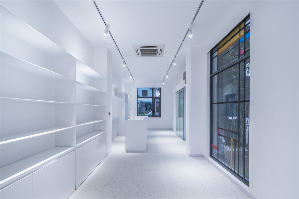
新的夾層,二層辦公室的盒子的故意凸出,使得它與老牆之間也離開了一定距離。
書架全部使用8MM厚鋼板,它的薄,也與原有牆麵的厚重感形成了對比。
The new mezzanine and the intentionally protruding box of the second floor office make it away from the old wall. All bookshelves are made of 8mm thick steel plate. Its thickness is also in contrast with the original wall thickness.
∇ 前廳:薄鋼板製作的書架 Front hall: bookshelf made of sheet steel
∇ 辦公室:薄鋼板的展示架 Office: display rack of sheet steel
波普:服務空間走廊的數字遊戲 Pop: the digital game of service space corridor
服務空間走廊的12345數字,用鋼板焊接刷成紅色,它跳出了走廊較暗的環境,使得在大廳裏穿過窗洞看向走廊的時候有了景深。它也賦予辦公室不一樣的溫暖性質,和流行的“性冷淡風”拉開了距離,也給予生活化的場景體驗;
The number 12345 of service space corridor is painted red with steel plate welding. It jumps out of the dark environment of the corridor, making it have a depth of field when looking through the window hole in the hall to the corridor. It also gives the office different warm nature, and the popular “Normcore” opened the distance, but also gives the living scene experience;
∇ 數字走廊的波普表達 Pop expression of numbers corridor
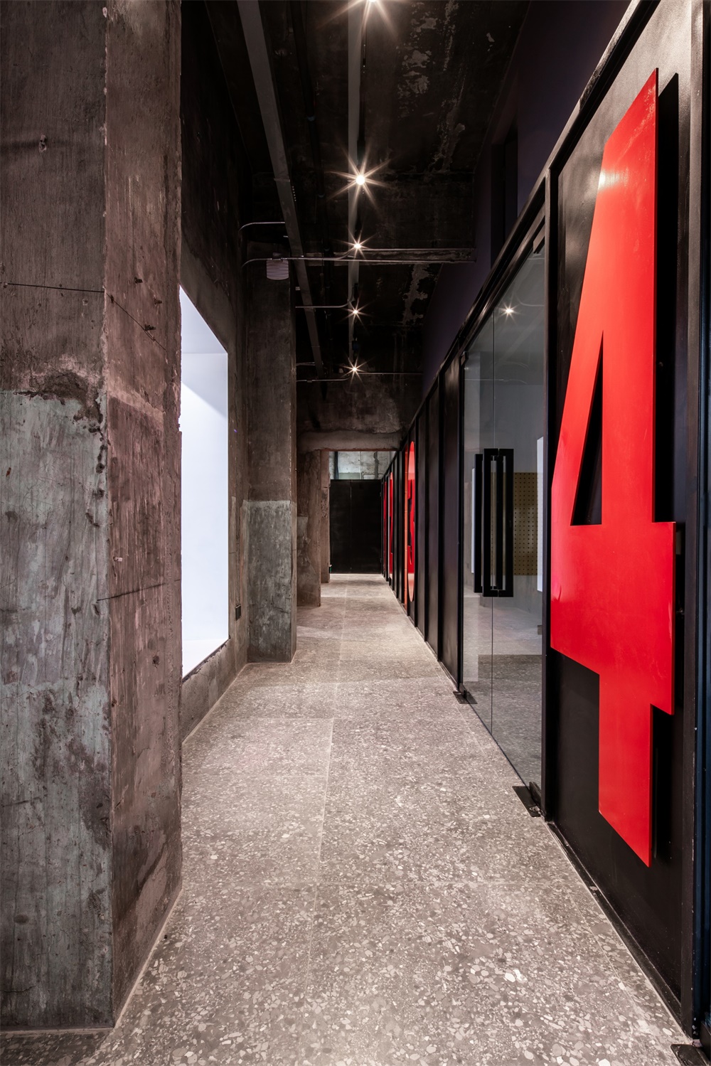
由於牆體的遮擋關係,在大廳的任何一個角度,都看不到全部的數字,隻能看到局部三個數字的組合。這些數字也順利成為了配套空間的房間指示係統,1號對應茶水間,2號對應財務室,3號對應衛生間,4號對應模型室,5號對應會議室。很方便的指引外來的訪客到需要的房間,
Due to the shielding relationship of the wall, at any angle of the hall, we can not see all the numbers, only the combination of local three numbers. These numbers have also successfully become the room indication system of the supporting space. No. 1 corresponds to the tea room, No. 2 corresponds to the finance room, No. 3 corresponds to the rest room, No. 4 corresponds to the model room, and No. 5 corresponds to the conference room. It is very convenient to guide visitors to the rooms they need.
∇ 不能看全的數字 Can not see all the numbers.
外觀:克製的外觀和由內部流線所決定的外部設計 Appearance: restrained appearance and external design determined by internal streamline
老發電機房的造型,是典型的工業建築的風格,追求簡潔明了,滿足功能所需,其高大天窗的設計也是為了滿足快速排煙排熱的需求;在本次改造設計中,設計師克製住自己,沒有對外觀進行過多的改動,隻替換了門窗;
The modeling of the old generator room is a typical industrial building style, which pursues simplicity and clarity to meet the functional requirements. The design of its tall skylight is also to meet the needs of rapid smoke exhaust and heat removal. In this reconstruction design, the designer restrained himself, did not make too many changes to the appearance, only replaced the doors and windows.
∇ 改造基本保持了發電機房外觀的原貌 The transformation basically keeps the original appearance of the generator room
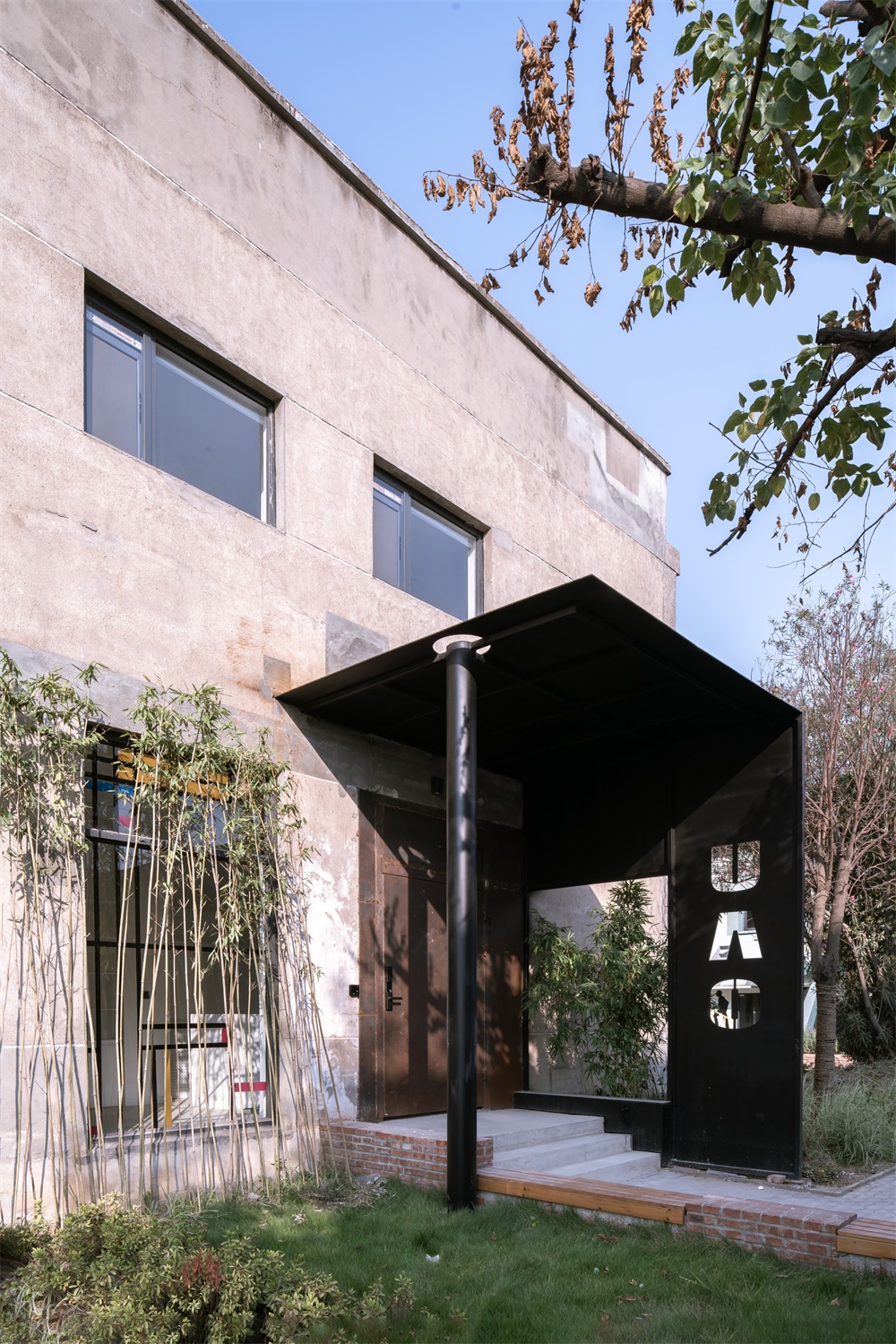
但將原有的北向大門封成落地玻璃窗,將主入口修改在東側的山牆,這樣改動的原因是從平麵布局流線而來:大廳作為主要辦公場所,需要一個相對封閉的環境;而前台設計在東側較低矮的一側;大門的設計也采用鋼結構,黑色柱子是內部夾層結構支撐柱用剩下的半根柱子。
The original north facing gate is sealed as a ground glass window, and the main entrance is modified in the East gable. The reason for the change is from the plane layout streamline: the hall, as the main office space, needs a relatively closed environment; the front desk is designed on the lower side of the East; the gate is also designed with steel structure, and the black column is the rest of the supporting column of the internal sandwich structure.
∇ 門口的鋼柱是室內鋼柱用完剩下的餘料 The steel column at the door is the rest of the indoor steel column.
場景:工作與生活並置的理念 Scene: the idea of juxtaposition of work and life
一個辦公室,絕不僅是單一工作的場景,工作和生活密不可分。這也是這次設計的一大出發點:在低區的屋頂平台,布置成了BBQ的天台,也是專業論壇分享的絕佳場地;在小院內,布置了魚池,從茶水間可以直接出到小院;所有的場景圍繞工作和生活共同展開。
An office is not just a single work scene, work and life are inseparable. This is also a big starting point of this design: the roof platform in the low area is arranged as the roof platform of BBQ area, which is also an excellent place for professional forum to share; in the small courtyard, a fish pond is arranged, which can be directly out of the tea room to the small courtyard; all scenes are unfolded around work and life.
∇ 衛生間熾烈的色彩 The fiery color of the restroom
結語:更新和再生 Conclusion: revolution and regeneration
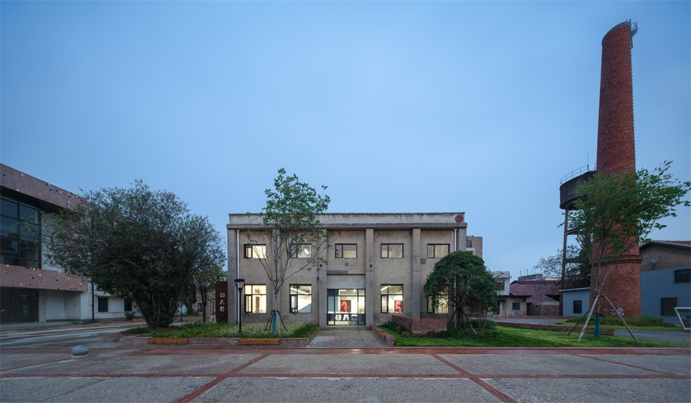
這個老建築的改造,同時又是UAO的自己的辦公室設計,它采取了一種內部植入的更新模式,沒有破壞原有建築的外觀和主體結構,新的植入體又強化了原有建築的空間特質,它將原有破舊的老發電機房,更新改造成UAO的辦公室,是建築的功能再生,也是UAO的一次設計再生。
The renovation of the old building is also the UAO’s own office design. It adopts a renewal mode of internal implantation, which does not damage the appearance and main structure of the original building. The new implant strengthens the spatial characteristics of the original building. It renovates the old old generator room into the UAO’s office, which is the functional regeneration of the building and UAO design.
∇ UAO 新辦公室外觀 煙囪下的老發電機房 攝影:趙奕龍 UAO new office appearance old generator room under chimney Photography: Zhao Yilong
完整項目信息
項目名稱:UAO POWER OFFICE –UAO瑞拓設計新辦公室改造設計
建築師事務所:UAO瑞拓設計
事務所網站:WWW.UAO-DESIGN.COM
聯絡郵箱:542595072@QQ.COM
公司所在地:湖北武漢市 漢口江岸區 良友紅坊藝術社區 A7
–
項目完成年份:2019
建築麵積:474平米
項目地址:湖北武漢市 漢口江岸區 良友紅坊藝術社區 A7
主創建築師:李濤
主創建築師郵箱:542595072@QQ.COM
視覺信息
攝影師:趙奕龍
攝影師郵箱:137664179@qq.com
項目參與者
設計團隊:UAO瑞拓設計
主創設計師:李濤
團隊:張傑銘、孔繁一、龍可成、陸洲、王纖惠、童亭、李莉霞
委托方:UAO瑞拓設計
結構設計:UAO瑞拓設計
景觀設計:UAO瑞拓設計
施工方:UAO瑞拓設計


