LOFT中國感謝來自 門覺建築 的幼兒園空間項目案例分享:
幼兒園是個人教育開始的基礎,進行預備教育的場所空間,是小朋友的快樂天地,可以幫助孩子健康快樂地度過童年時光,不僅學到知識,而且可以從小接觸集體生活。作為孩子學習的第一站,我們希望孩子在這不僅能夠收獲知識,更重要是埋下一顆夢想的種子,激發幻想。
Kindergartens are the basis for individual education. The space for preparatory education is the happy world for children. It is possible for children to spend their childhood in a healthy and happy way in this kind of space so that they can learn knowledge and touch the collective life from childhood. It is hoped by us that children can gain knowledge and even lay a foundation for dreams to inspire fantasy at the first stop of children’s learning.
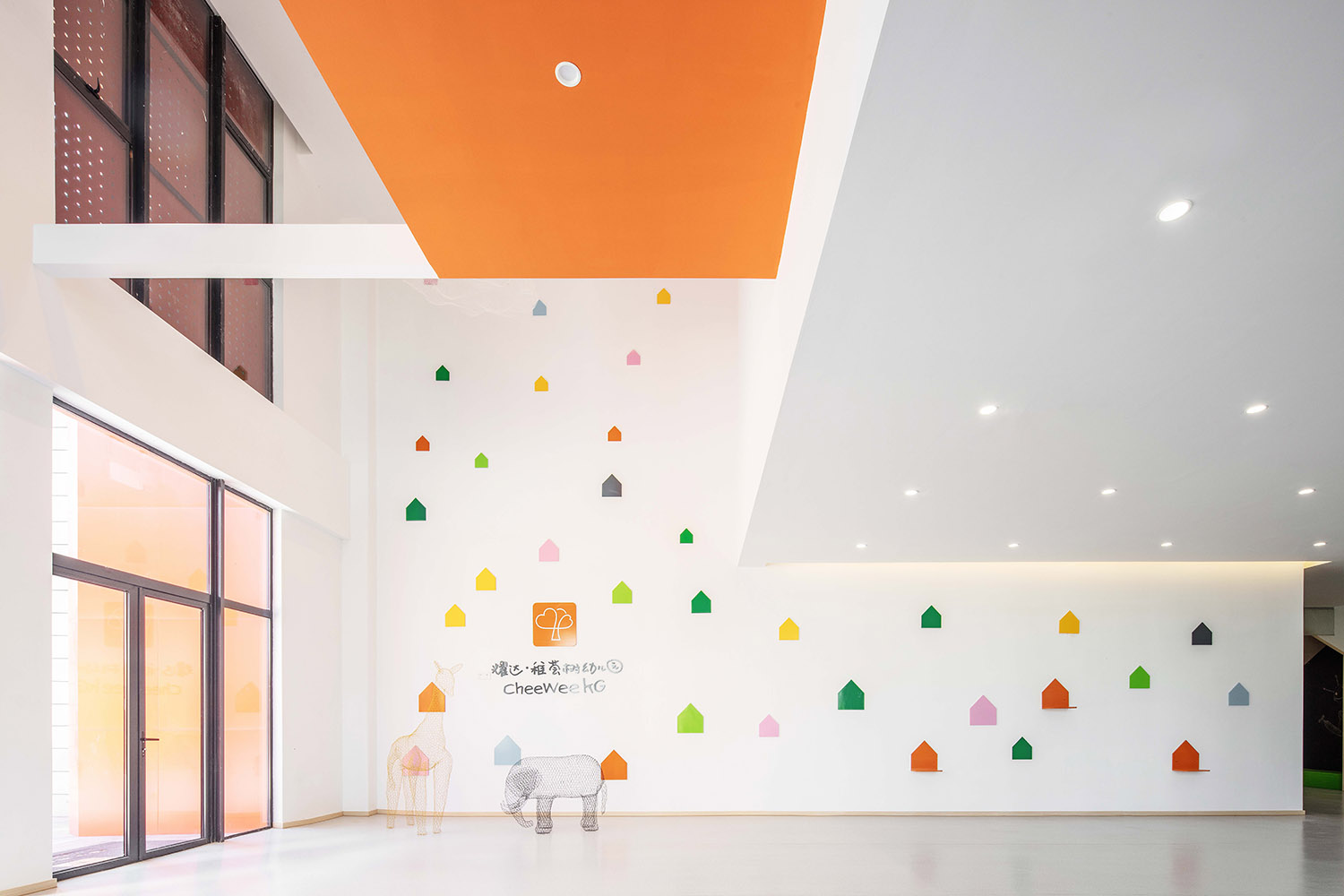
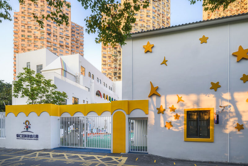
∇ 首層入口(The Entry of the First Floor)
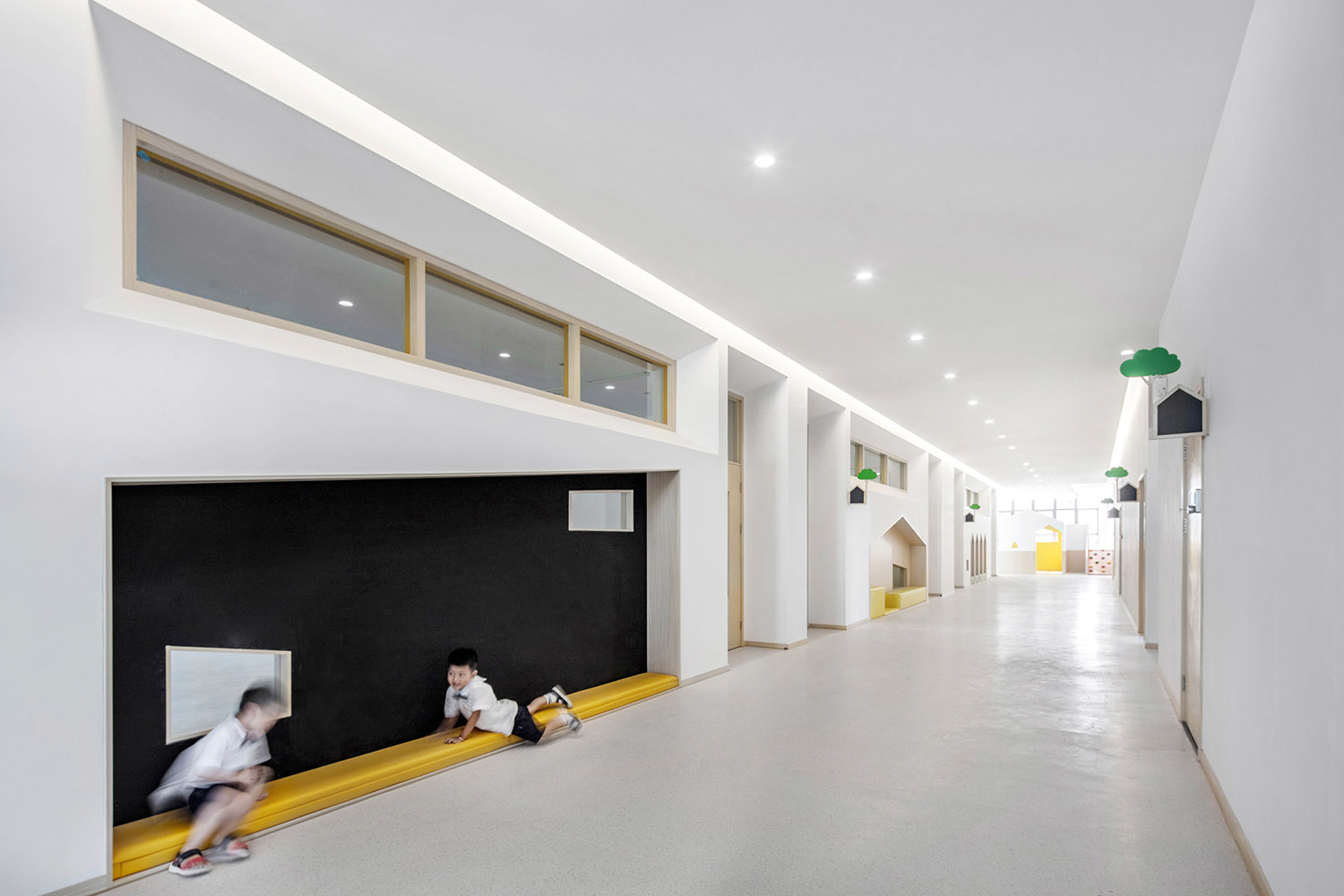
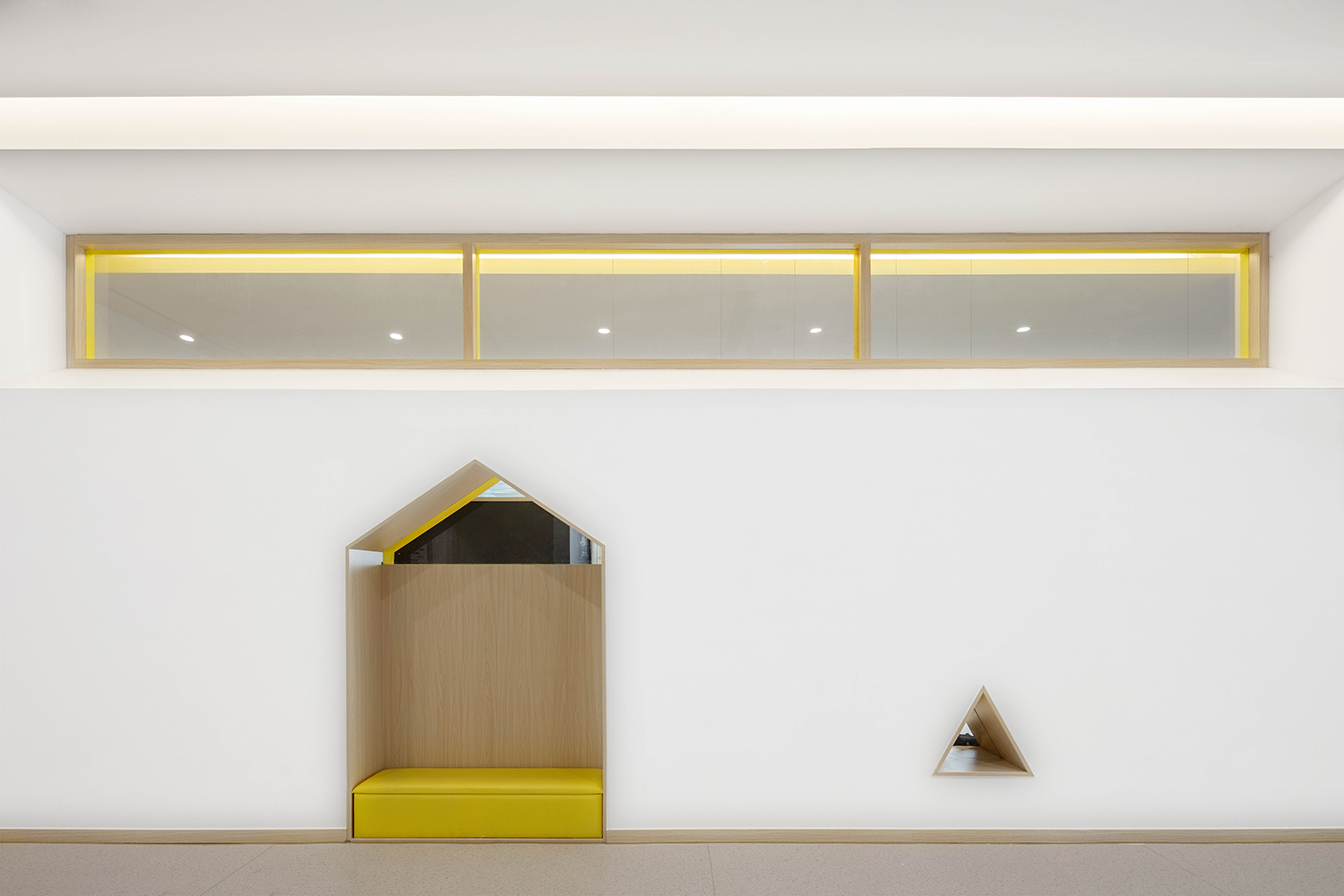
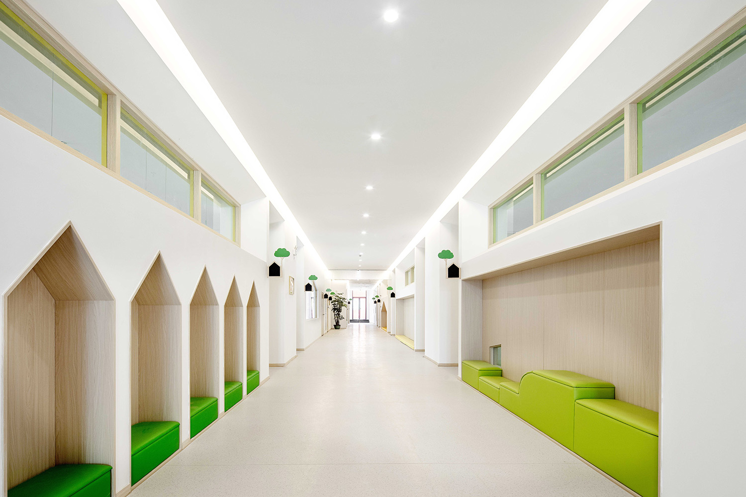
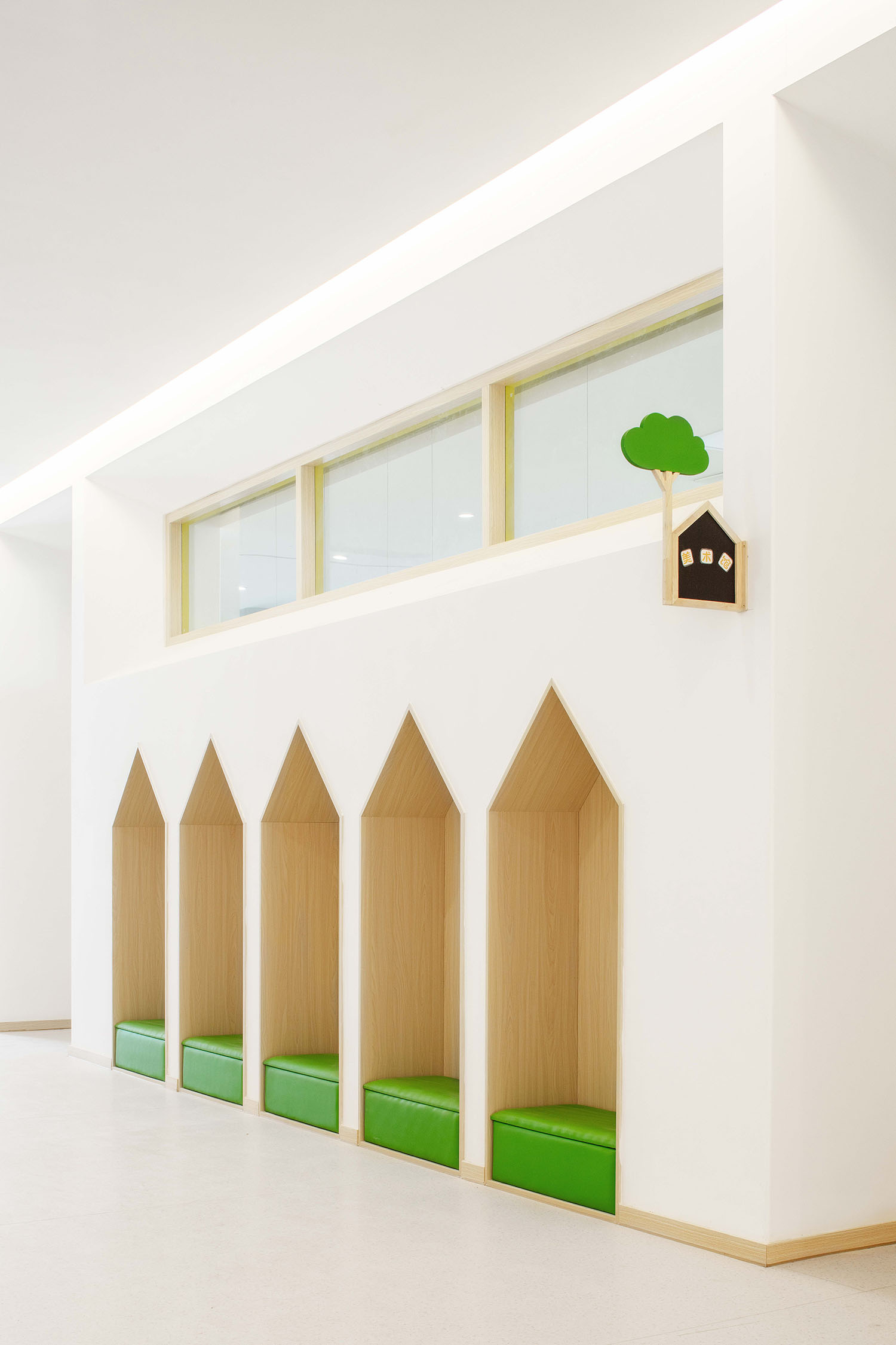
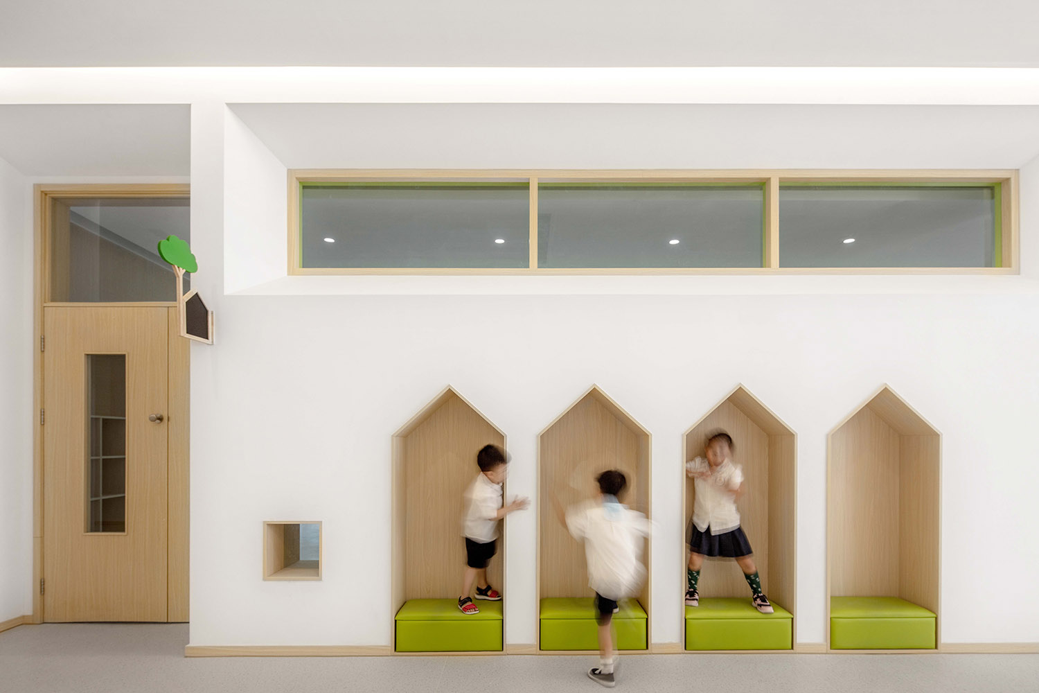
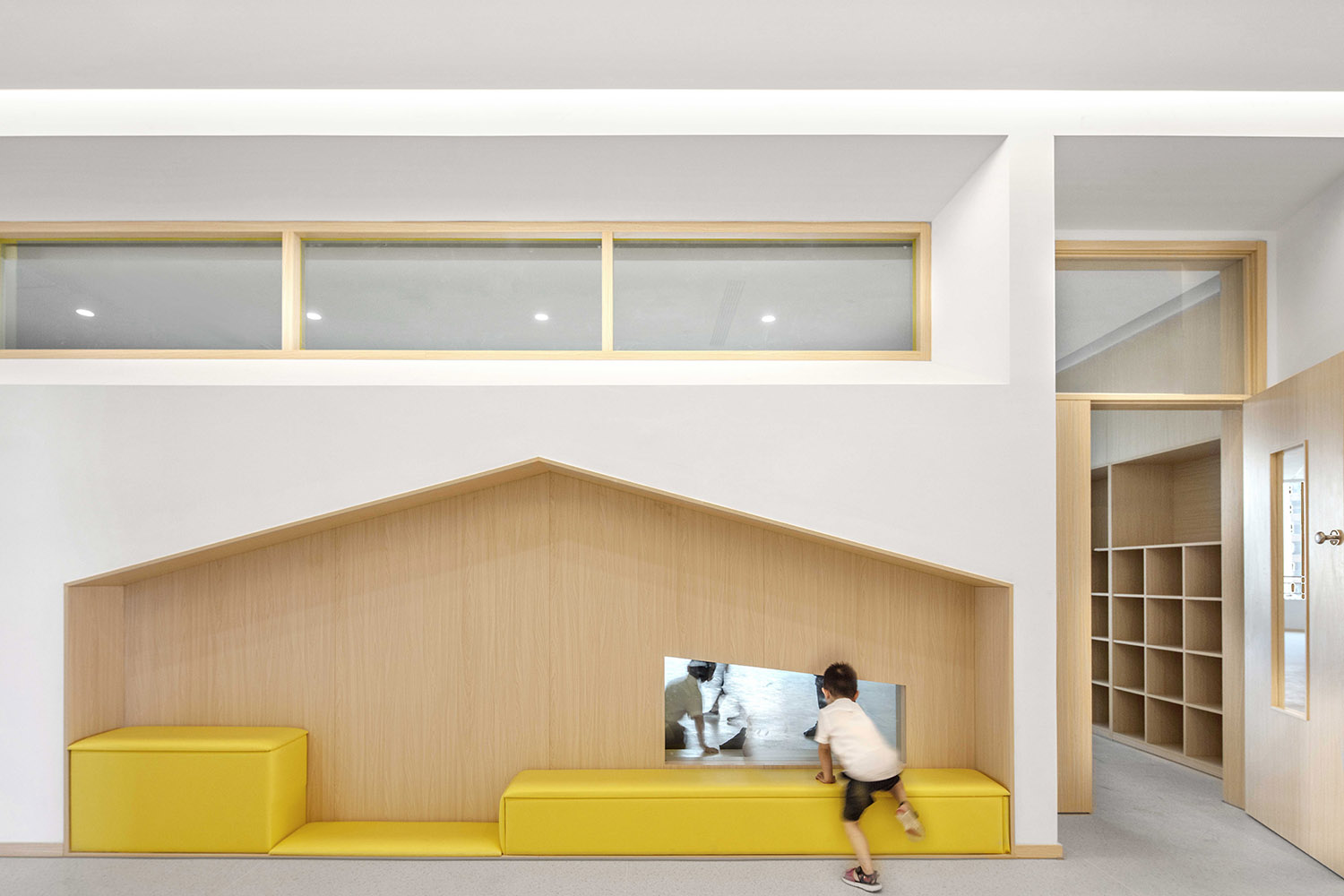
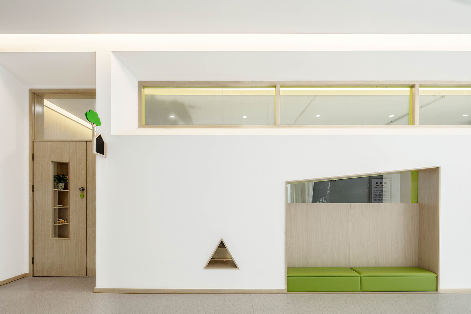
∇ 走廊兒童空間(Corridor Children’s Space)
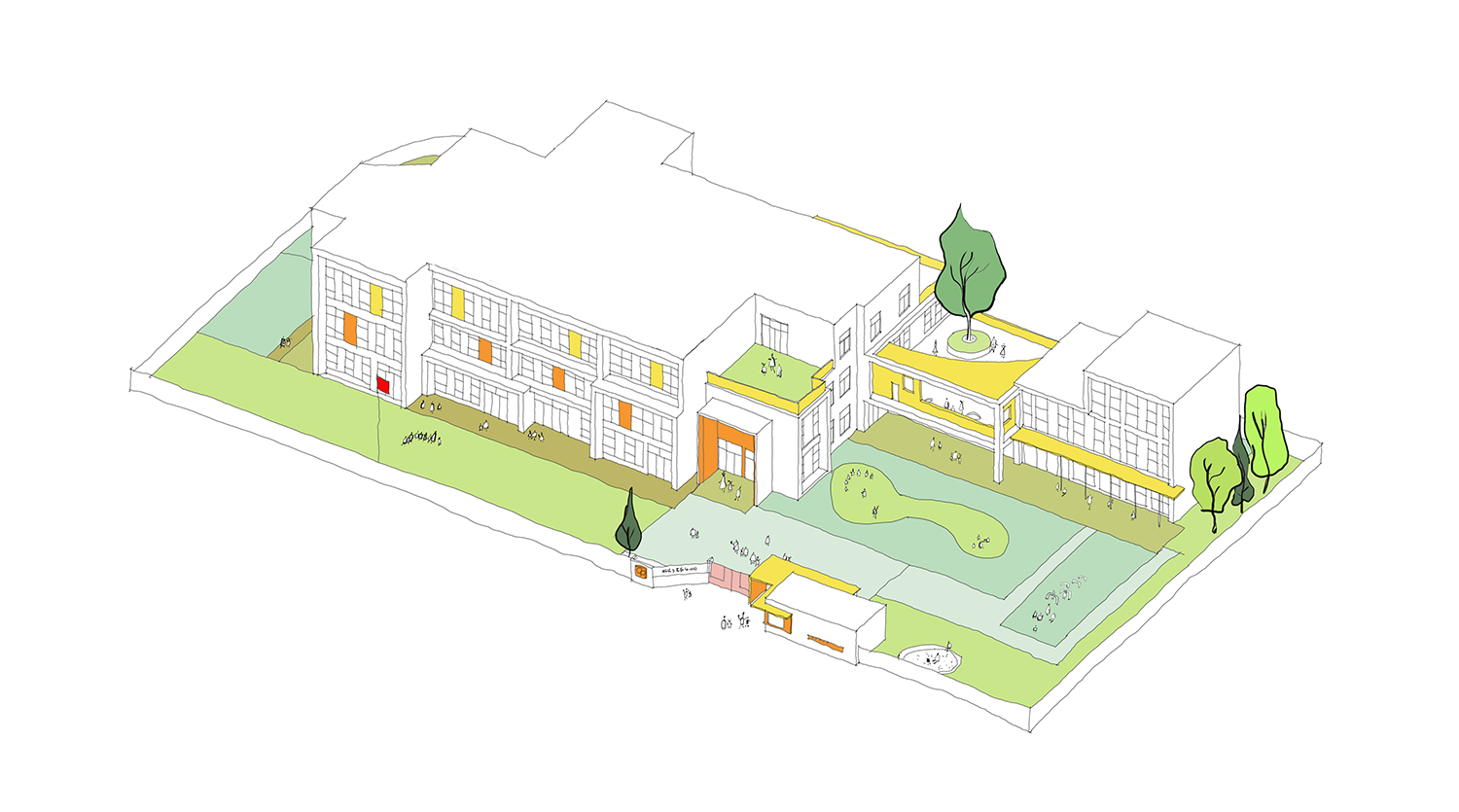
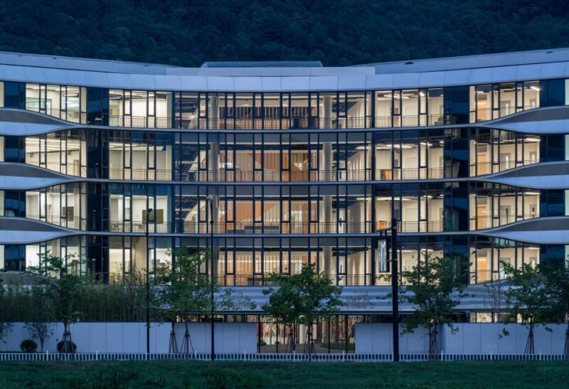
幼兒園位於台州市黃岩區耀達天璽,服務於周邊小區的住戶,建築風貌服從於小區整體設計控製,這類的幼兒園在中國近10年的房地產高速發展中誕生。同時帶來一個問題,普遍性都是滿足功能性的建築,無法激發孩子的幻想。建築大師Ricardo Legorreta曾這樣說:“現代建築總是過分追求理性,這樣會失去神秘感和好奇心帶來的愉悅感受。”
The kindergarten is located in Yao Da Tian Xi, Huangyan District, Taizhou city. It serves the residents of the surrounding community. The architectural style is subject to the overall design control of the community. This kind of kindergarten has appeared in the rapid development of real estate in China in the past ten years. It also brings about a problem that there are full of functional buildings which fail to inspire the fantasy of children. “Modern buildings are always focused on rationality excessively, which can lose the pleasure brought by mystery and curiosity.” said by a master architect called Ricardo Legorreta once.
項目概覽(Project Overview)
建築的暗示Building Implication
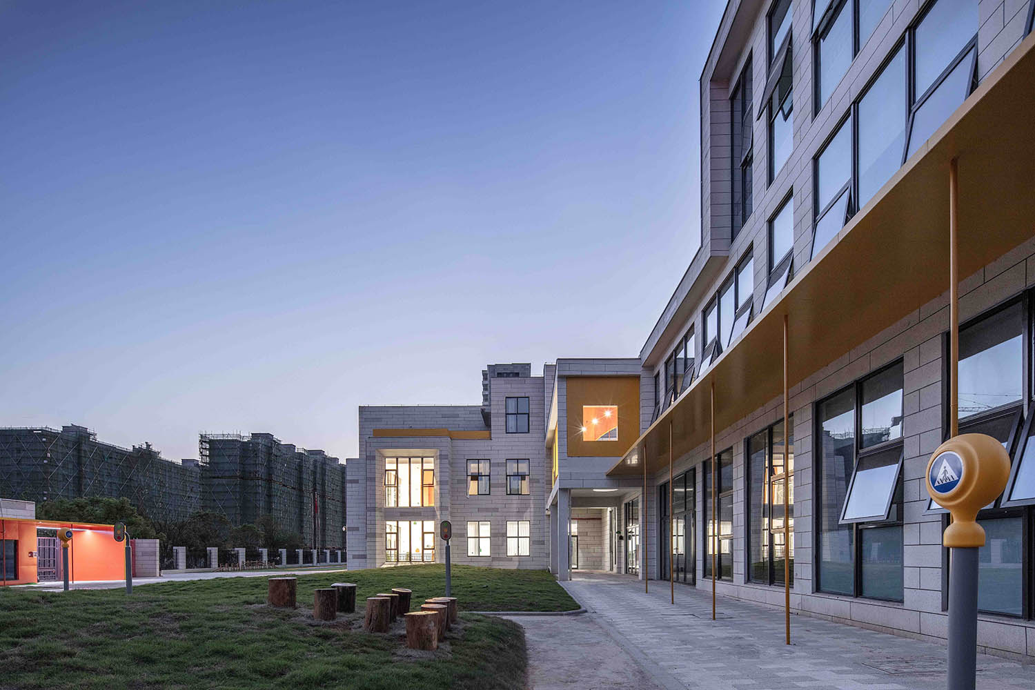
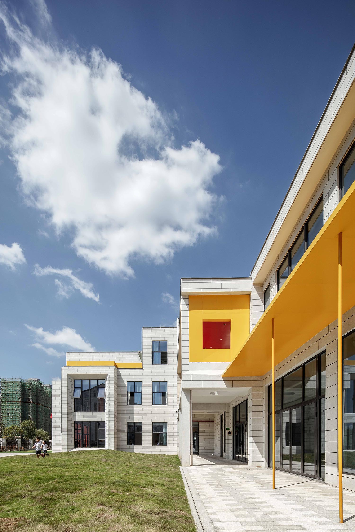
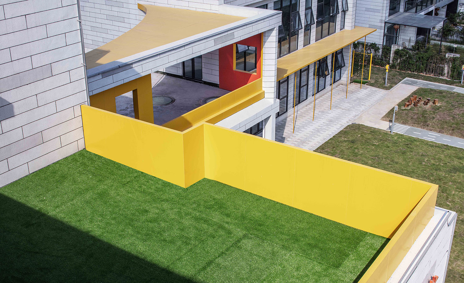
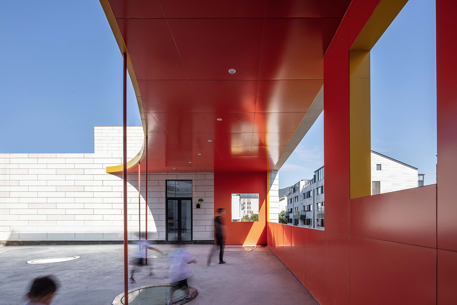
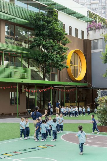
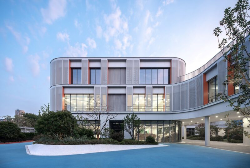
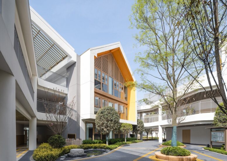
原建築是由一棟主樓和輔樓組成,建築嚴肅與住宅相似,我們希望建築本身可以激發孩子的幻想,和自由意識。因建築整體無法做大動作的調整,通過“插件”的這個設想的動作,來完成整個建築上的情感暗示。新的插件語言通過控製性的顏色模糊了實體屬性,讓孩子可以體驗建築本身,同時提示著幼兒園在街道的位置。
The original building is composed of a main building and an auxiliary building. It is similar with residential buildings in terms of color. It is hoped by us that the building itself can inspire the fantasy and freedom consciousness of children. The building fails to be adjusted greatly on the whole, so the emotional hint of the whole building is completed through the envisaged action of “plug-in”. The entity attribute is blurred by the new plug-in language through the dominant color so as to make children experience the building itself and prompt the location of kindergarten in the street at the same time.
∇ 二層活動空間(Activity Space on the Second Floor)
∇ 首層戶外連廊(Outdoor Corridor on the First Floor)
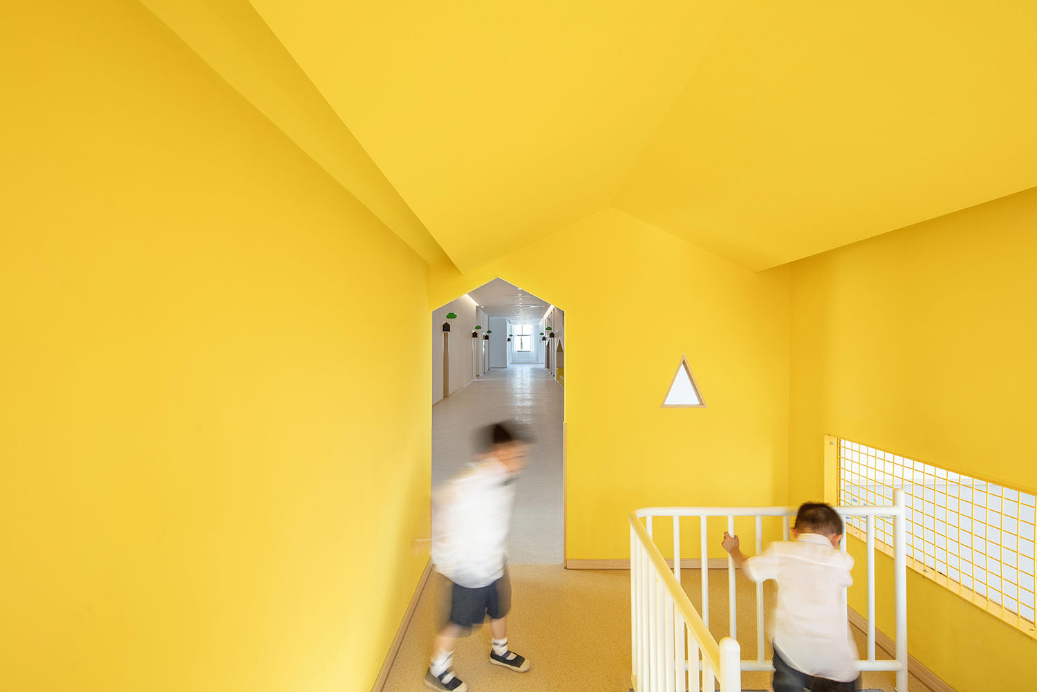
∇ 三層垂直小房子(Small Vertical House on the Third Floor)
空間的氛圍(Atmosphere of Space)
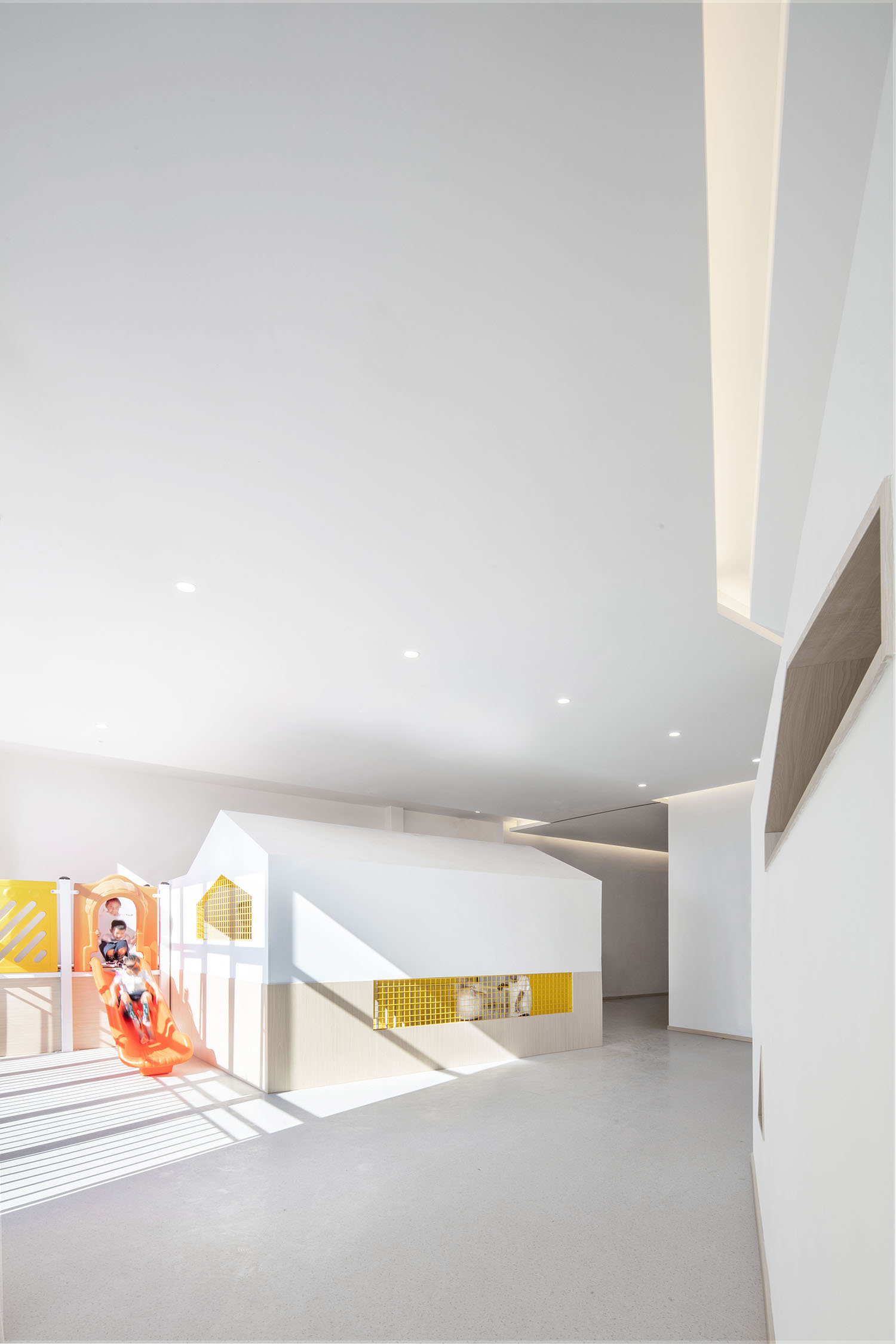
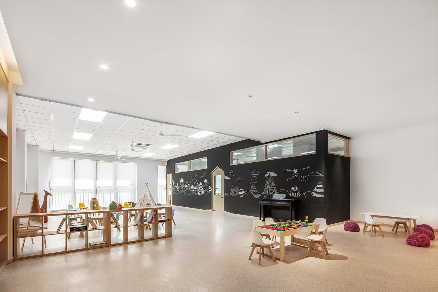
內部空間的重組,給我們帶來新的機會,在內部我們繼續用“插件”這個動作,來完成空間的氛圍表達。兒童空間我們認為最重要的就是激發孩子的幻想,提供屬於一個他們的自由空間。所幸的是,我們發現孩子們喜歡一次又一次的去體驗空間帶來的快樂。
The reorganization of internal space brings some new opportunities to us. We continue using the action of “plug-in” to complete the expression of space atmosphere. In our opinion, the most important thing is to stimulate the imagination of children and provide a free space for them in terms of children’s space. Fortunately, it is found by us that children like experiencing the happiness brought by space again and again.
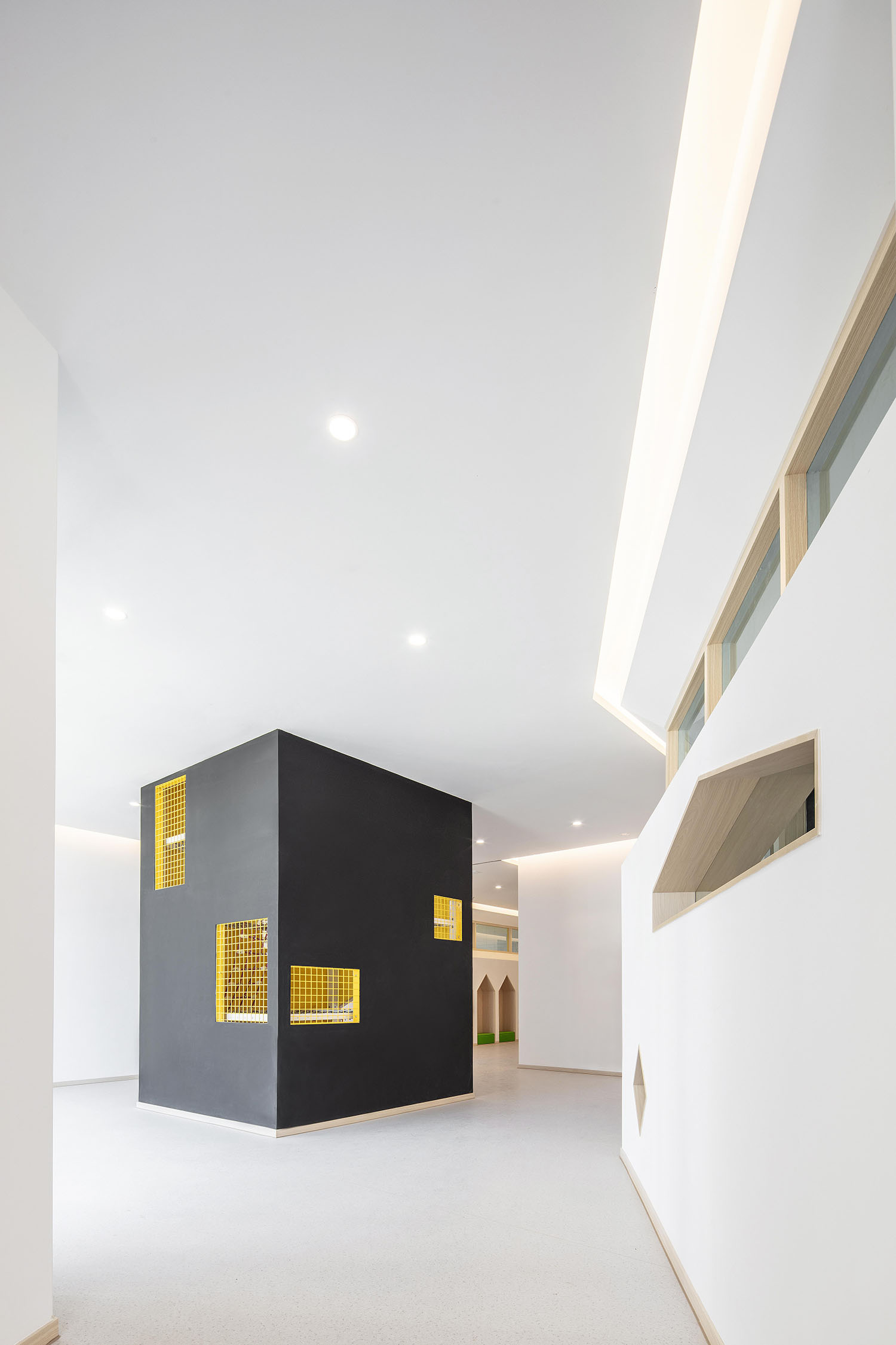
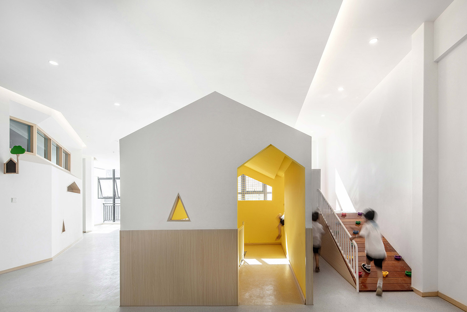
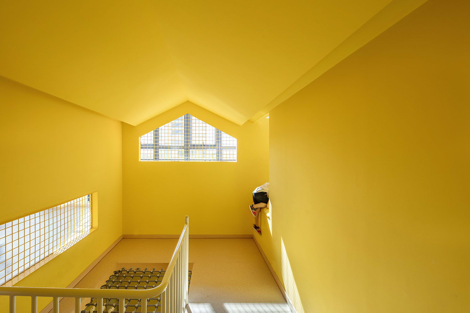
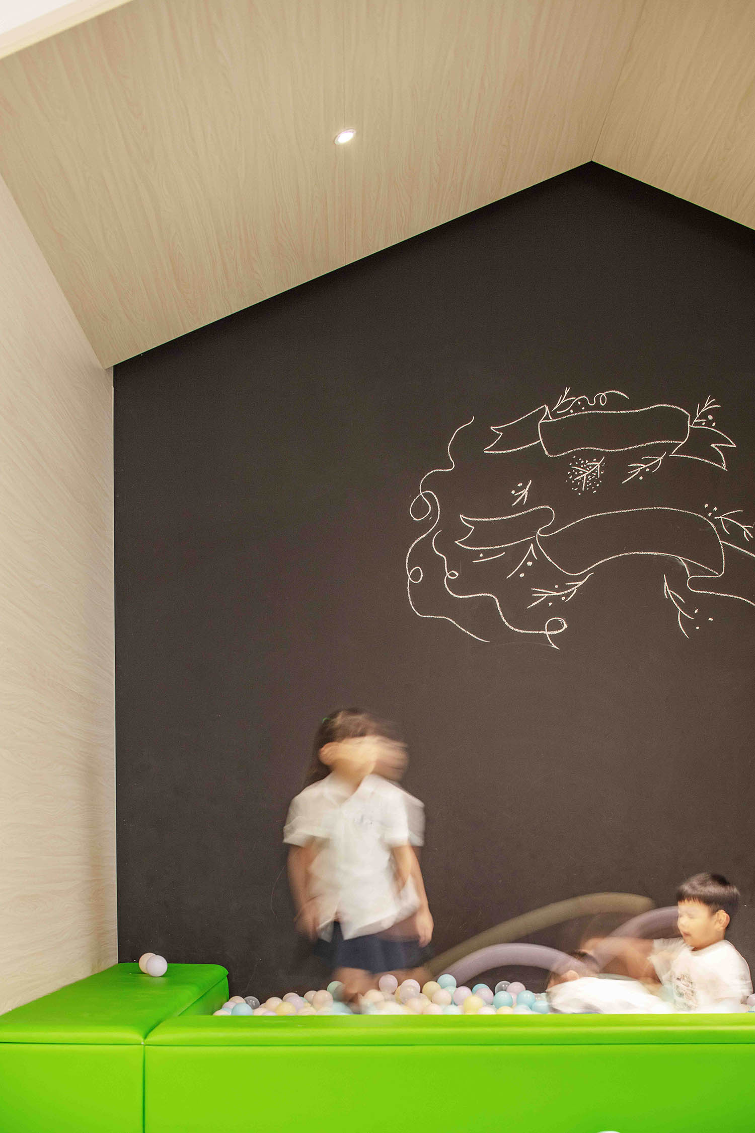
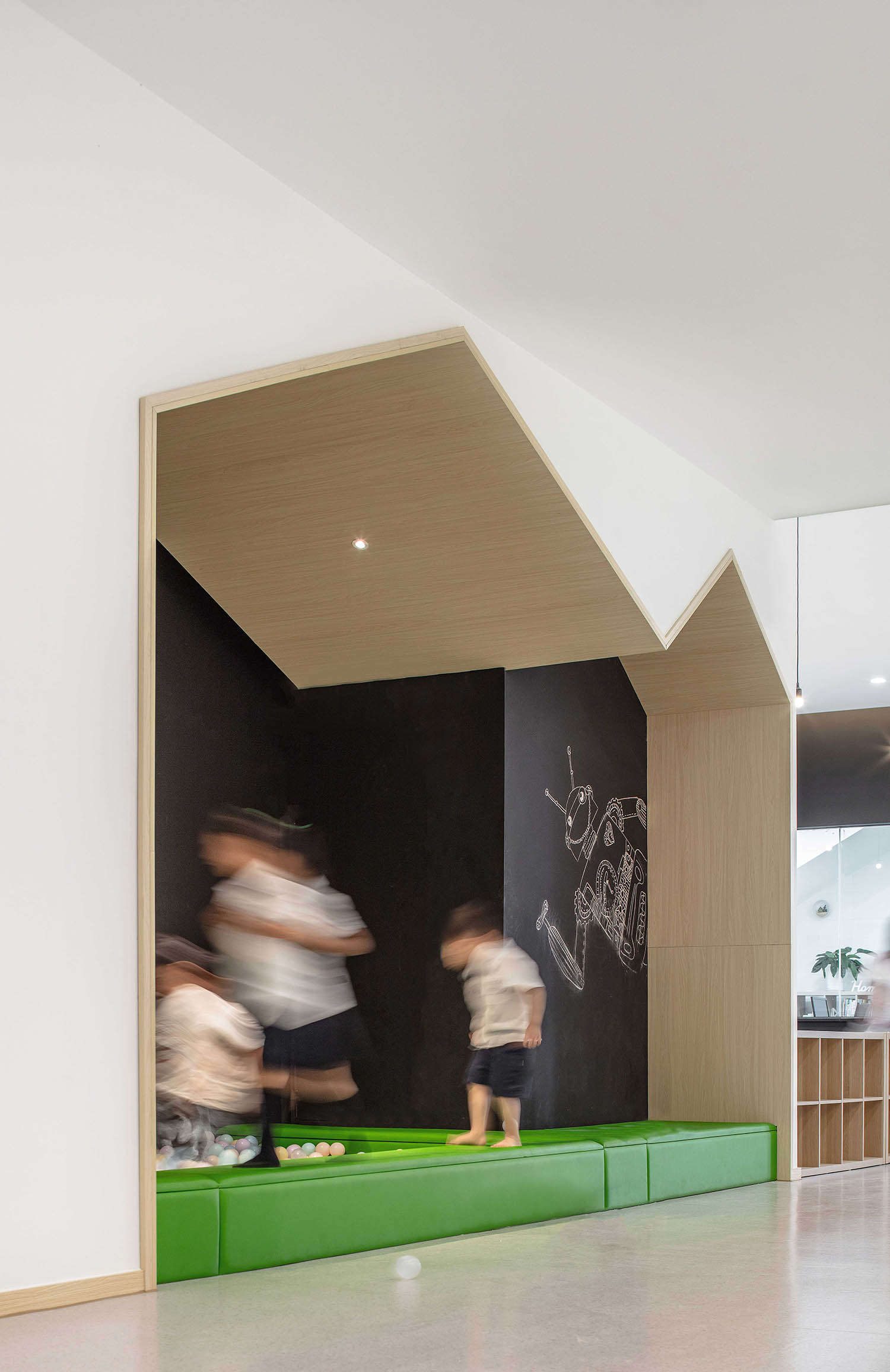
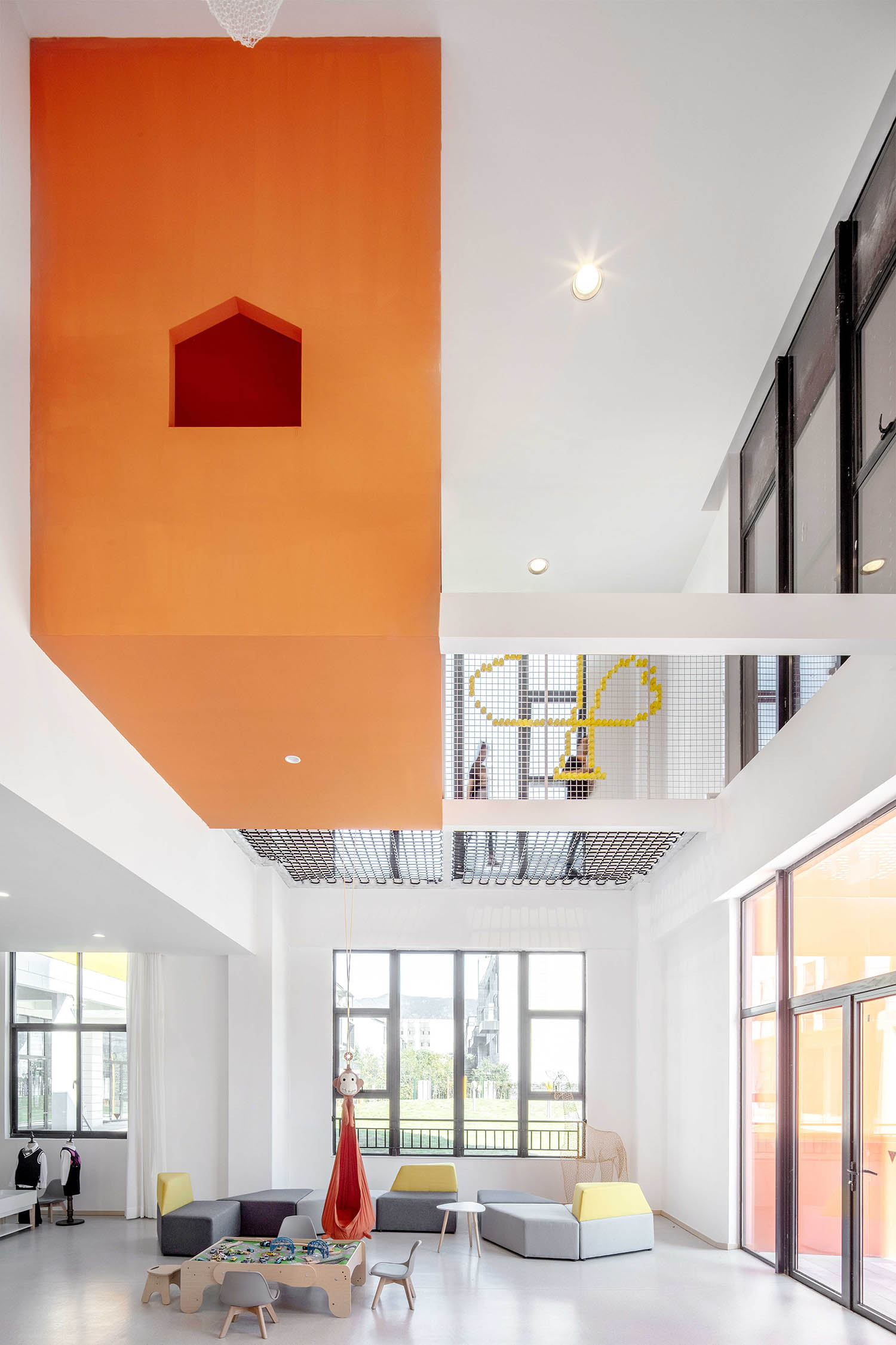
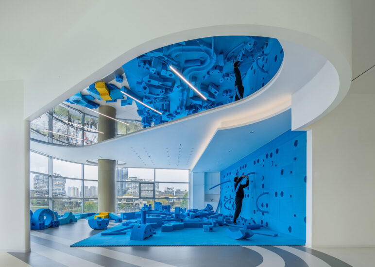
為了達到這個目的,我們還在每個教室做了一個隻適合兒童的空間,而家長是不適合去的。在一層的大廳有一個彈網區域,變為一個充滿挑戰和好奇的空間,同時還插入一個貫通二樓到三樓的垂直房子,孩子們可以在這蹦來蹦去,來回奔跑,自由玩耍。
In order to achieve this goal, we also design a space only suitable for children instead of parents in each classroom. There is a trampoline area in the hall of the first floor, which becomes a space full of challenges and curiosity. In addition, a vertical house throughout the second floor and the third floor is inserted, so that children can jump around, run back and forth and play freely here.
∇ 首層入口(The Entry of the First Floor)
∇ 垂直小房子(Small Vertical House)
∇兒童教室(Children’s Classroom)
∇ 走道兒童空間(Corridor Children’s Space)
∇ 遊戲空間(Game Space)
色彩與光的世界(The World of Color and Light)
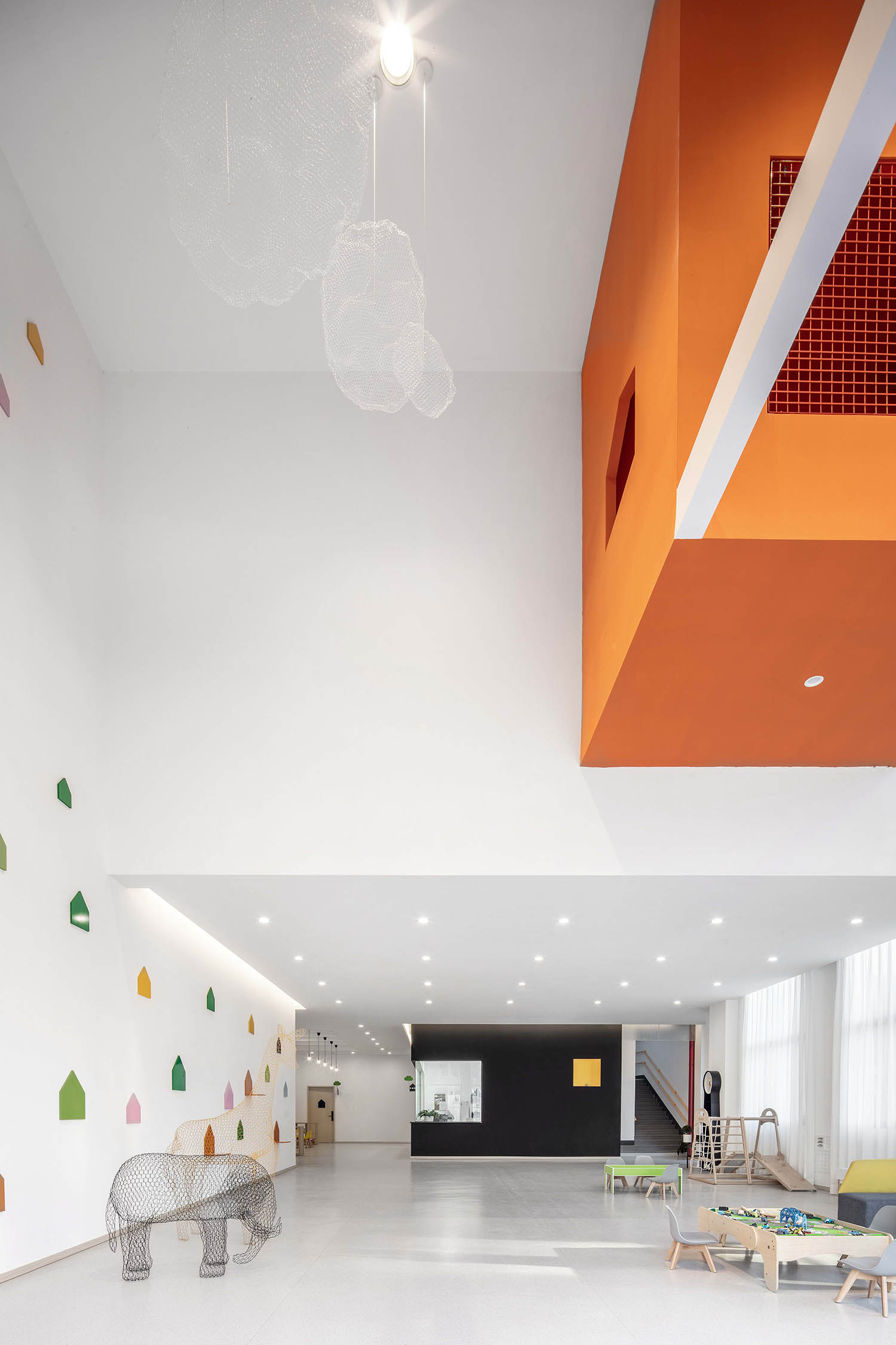
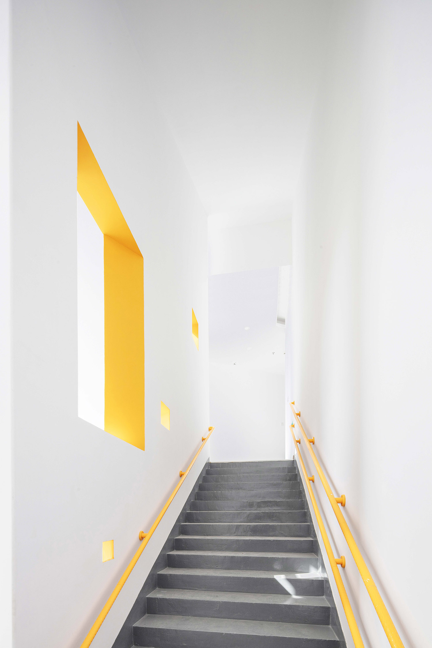
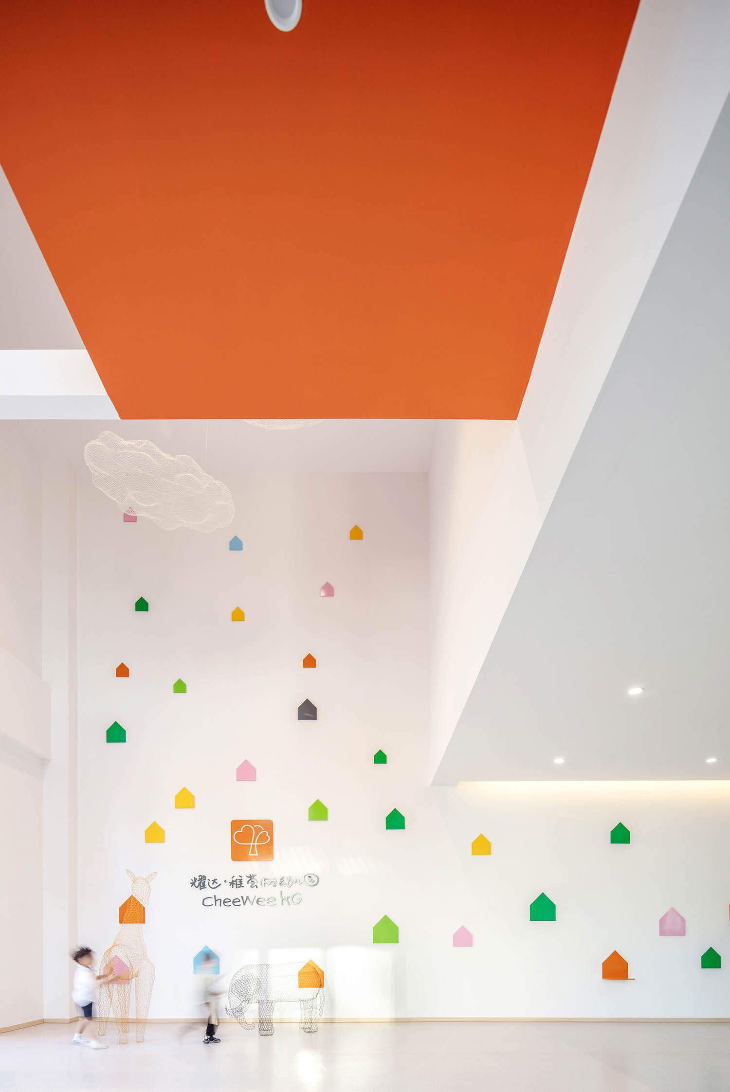
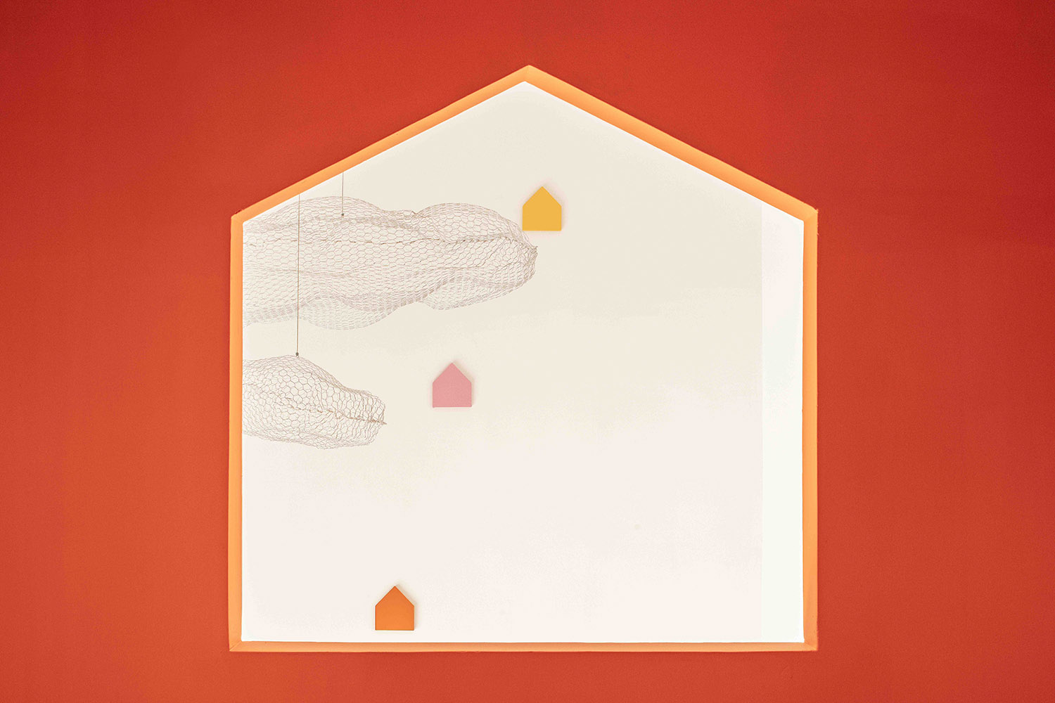
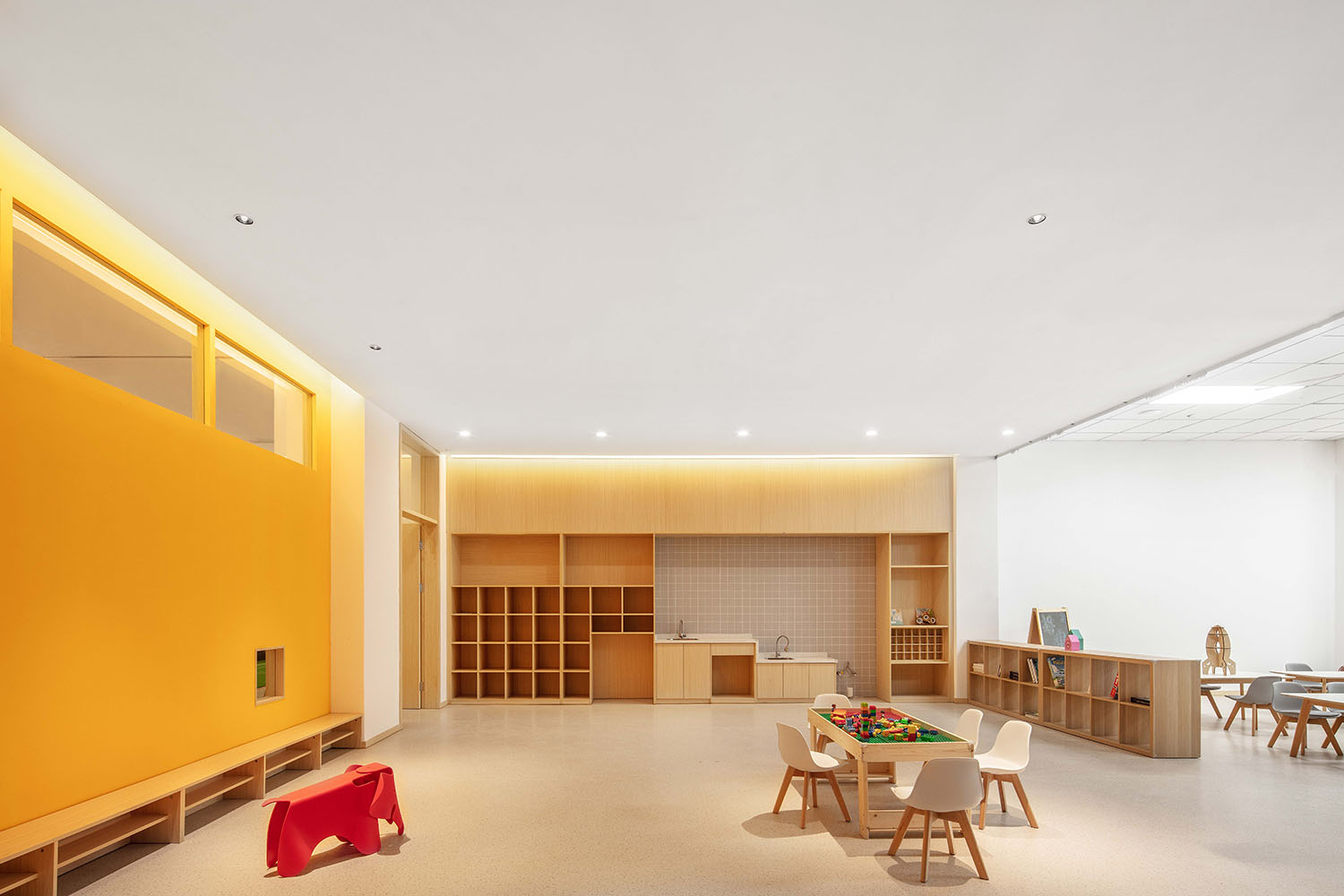
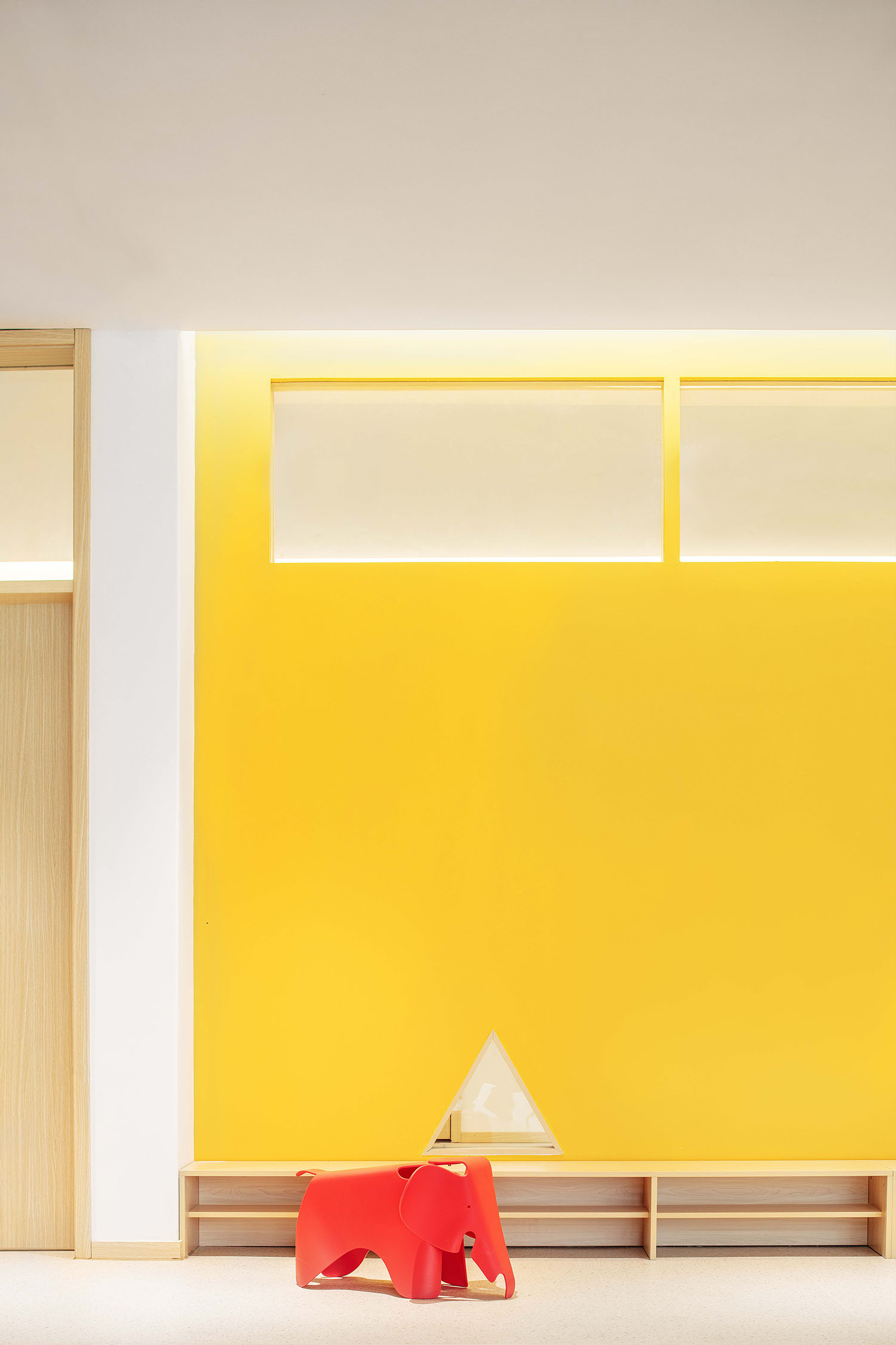
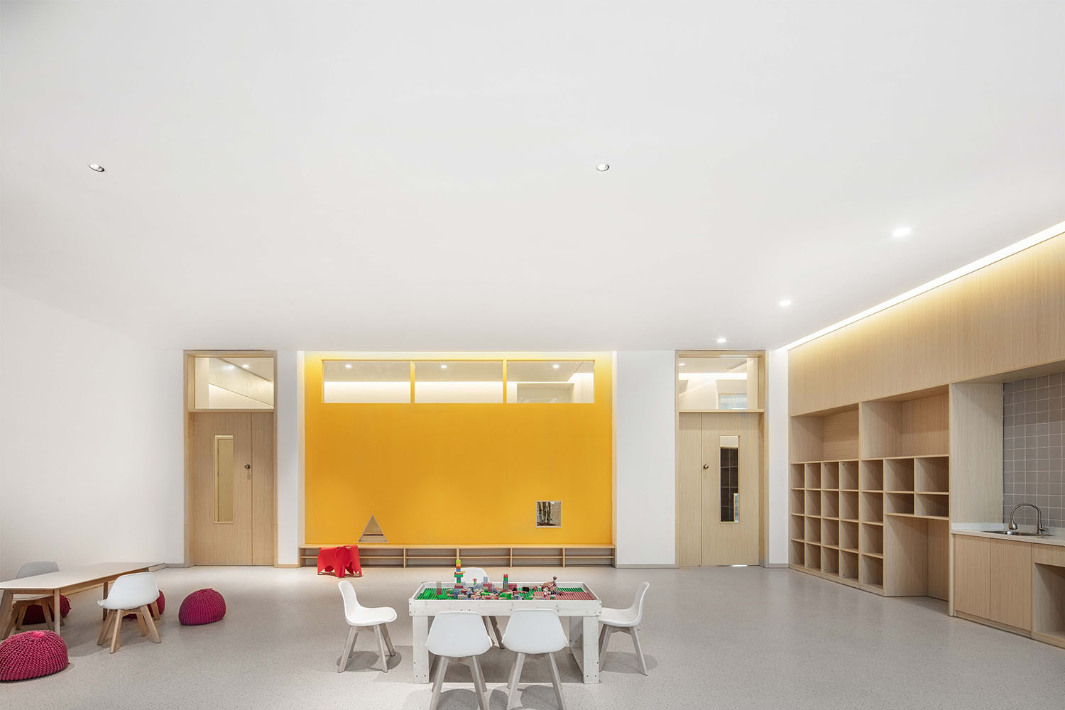
色彩作為一種媒介,調合了建築與外部環境的各種矛盾的因素。在一層挑高的大廳,我們設計一個橘紅色的盒子,這是屬於孩子們自由的空間,同時激發整個空間的幻想力。在外部我們用顏色來剝離解放原建築的形式和材料,在內部空間用極簡的形式和色彩與外部融為一體。
Various contradictory factors between the building and the external environment are harmonized by color as a medium. We design an orange box to stimulate the imagination of the whole space belonging to the free space of children in the high hall of the first floor. Outside, we separate and liberate the form and material of the original building through color. Inside, we integrate it with the outside world through the simplest form and color.
∇ 室內外色彩的交融(Blending of Indoor and Outdoor Color)
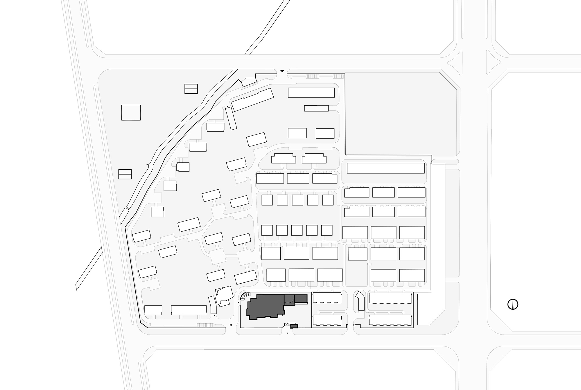
∇ 總平麵圖(General Layout)
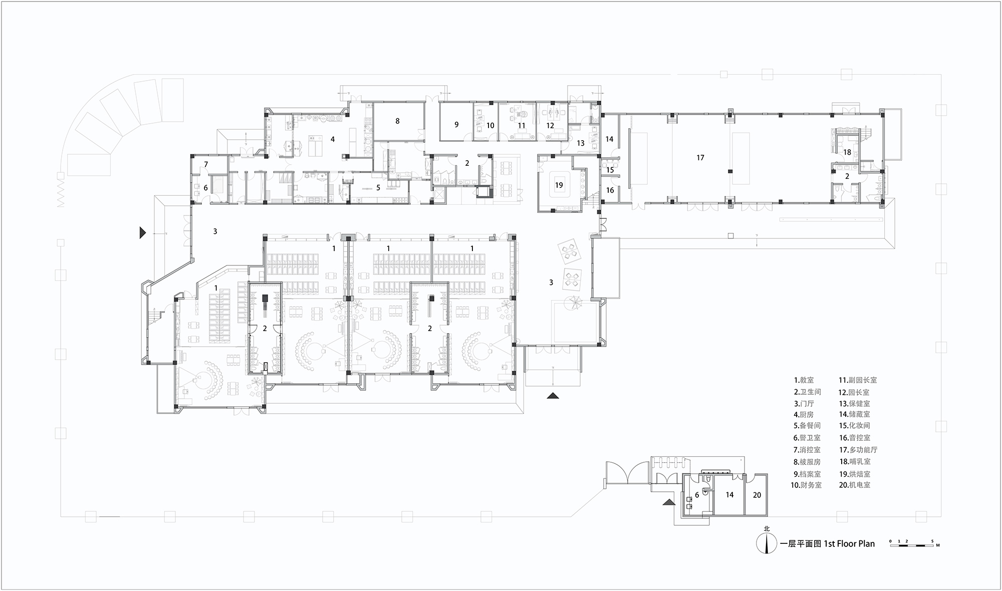
∇ 一層平麵圖(The Plan of the First Floor)
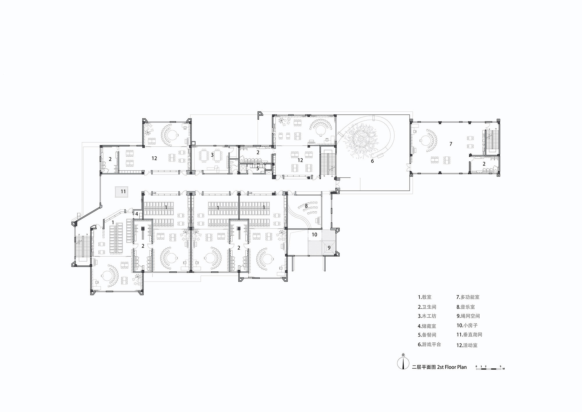
∇ 二層平麵圖(The Plan of the Second Floor)
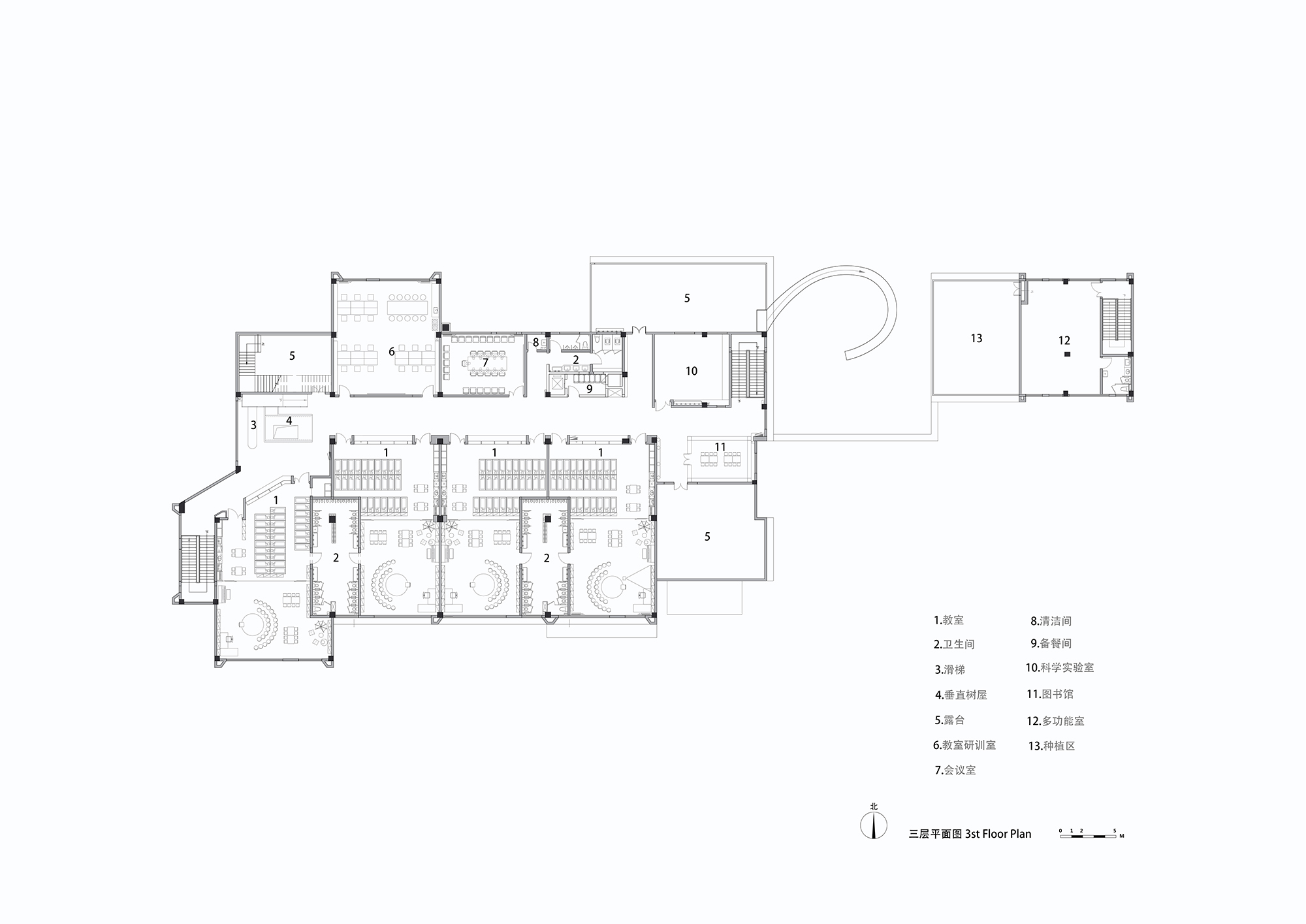
∇ 三層平麵圖(The Plan of the Third Floor)
∇ 大廳剖麵分析圖(The Analysis Chart of the Profile of the Hall)
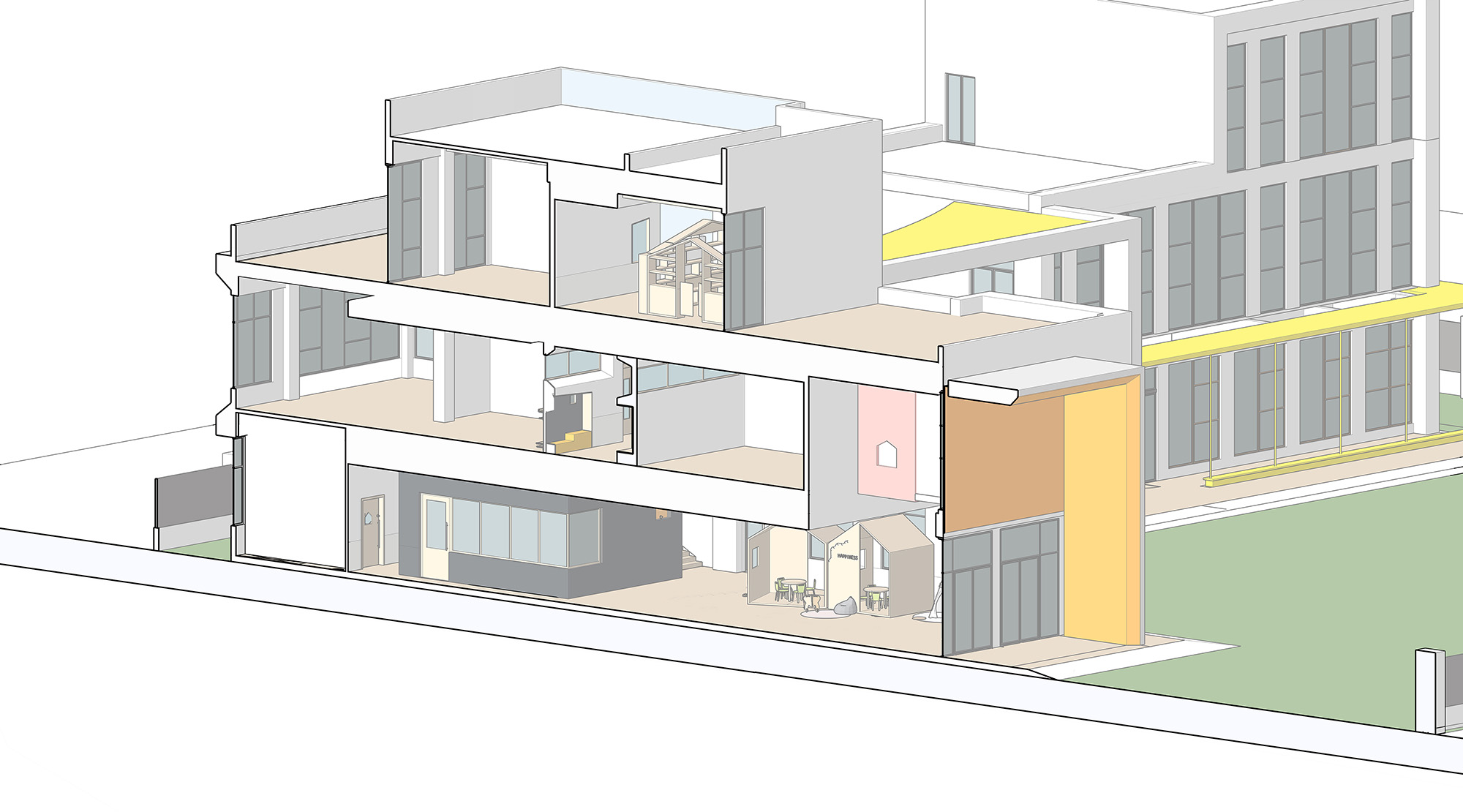
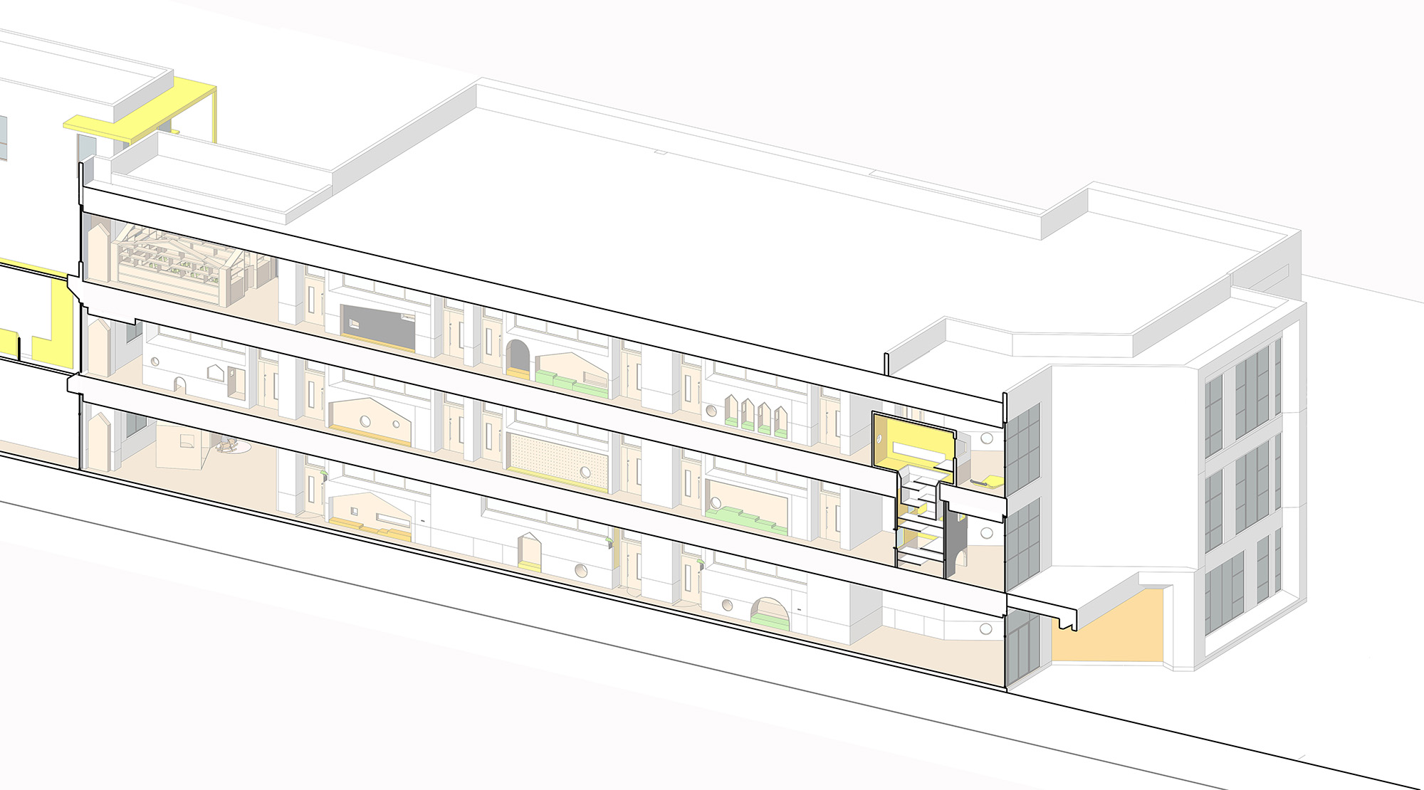
∇ 總體剖麵分析圖(The Analysis Chart of the General Profile)
完整項目信息
地理位置:浙江省台州市黃岩區耀達天璽,中國
業主方:耀達集團
設計方:門覺建築
設計成員:黃滿軍 劉飛 汪娟 丁予然
軟裝設計: 赫婷婷 郭情情
材料:不燃板,塗料,鋁板,pvc地板,黑板漆
建築麵積:5000 ㎡
設計周期:12/2018-04/2019
建設周期:03/2019-09/2019
攝影:陳銘
Address: Yao Da Tian Xi, Huangyan District, Taizhou City, Zhejiang Province, China
Owner: Yaoda Group
Designer: Portal Architecture Co., Ltd
Designers: Huang Manjun, Liu Fei, Wang Juan and Ding Yuran
Soft Outfit Design: He Tingting and Guo Qingqing
Materials: Non combustible boards, paint, aluminum boards, PVC floors and blackboard paint
Building Area: Five thousand square meters
Design Cycle: December, 2018 to April, 2019
Construction Cycle: March, 2019 to September, 2019
Photographer: Chen Ming


