全球設計風向感謝來自 NAN Architects 的商業空間(旗艦店)項目案例分享:
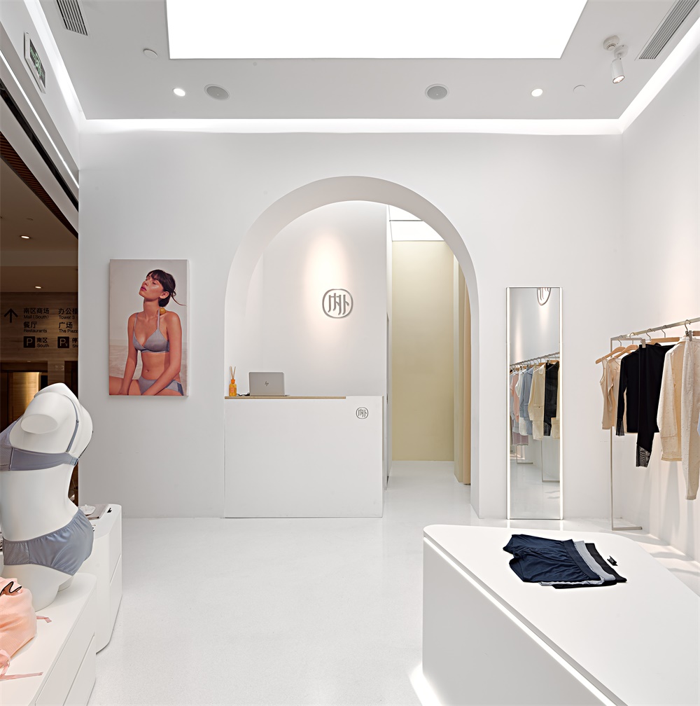
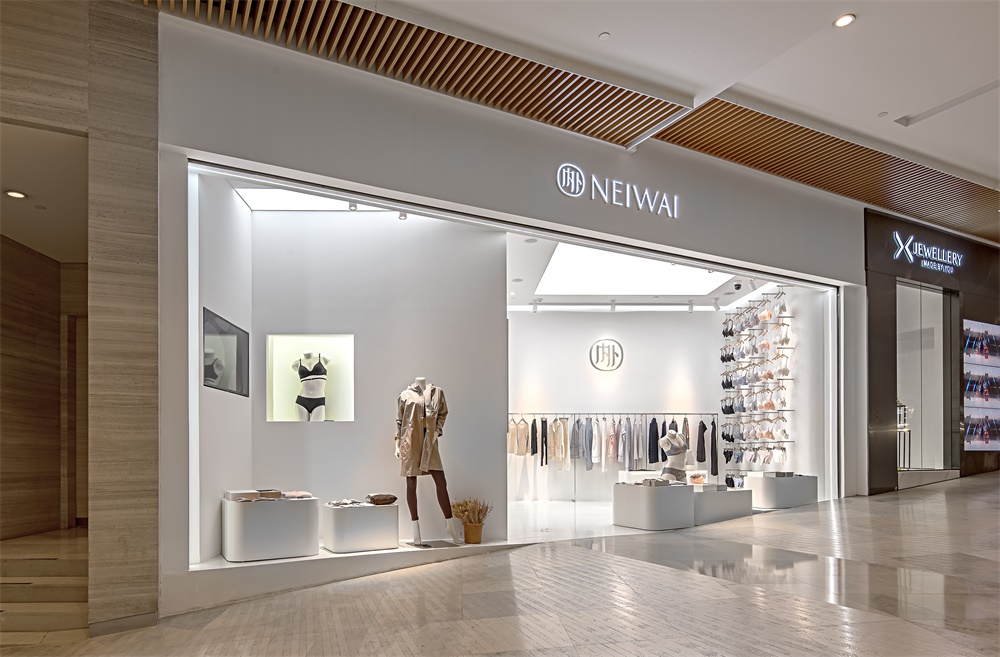
NAN Architects設計了在上海的兩家線下旗艦店。“NEIWAI”是一家來自中國本土、專注於舒適型內衣品牌。“NEIWAI”一詞品牌寓意是“美應該由內而外”,而在建築範疇內,它很容易激發人對空間、材料、圍護這樣詞彙的再認知。
NAN Architects designed two offline flagship stores in Shanghai.“NEIWAI” is a company from China focusing on comfortable underwear design.“Neiwai”, as it presents in Chinese, has a meaning of “Beauty generates from inside to outside”. While thinking in architectural way, it awakes people’s reconsideration about a certain space, materials, and boundaries.
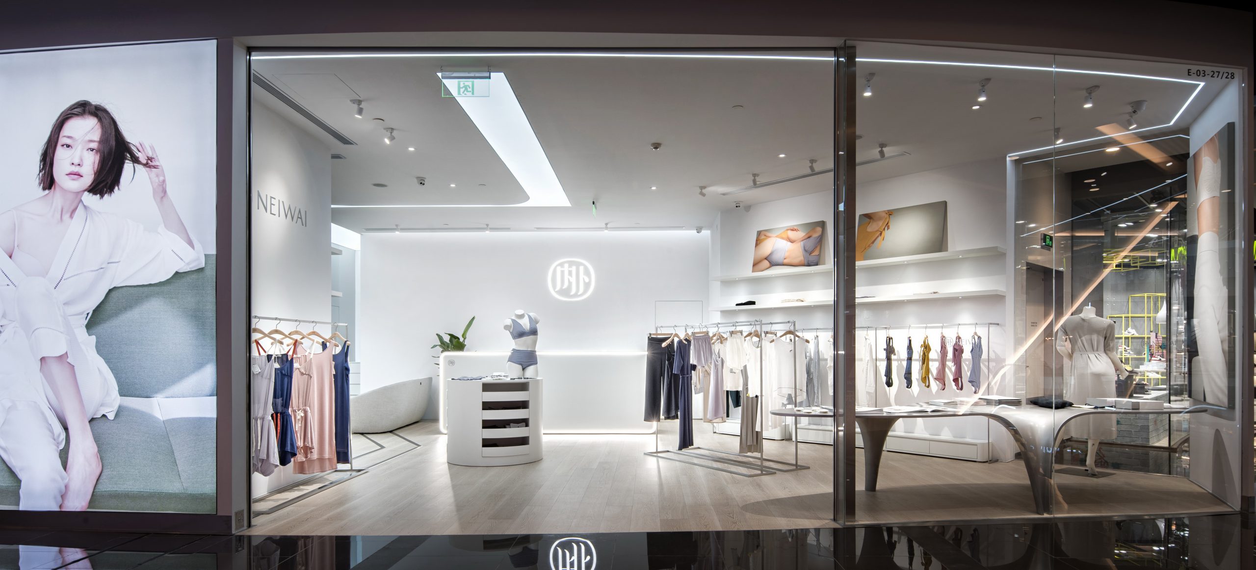
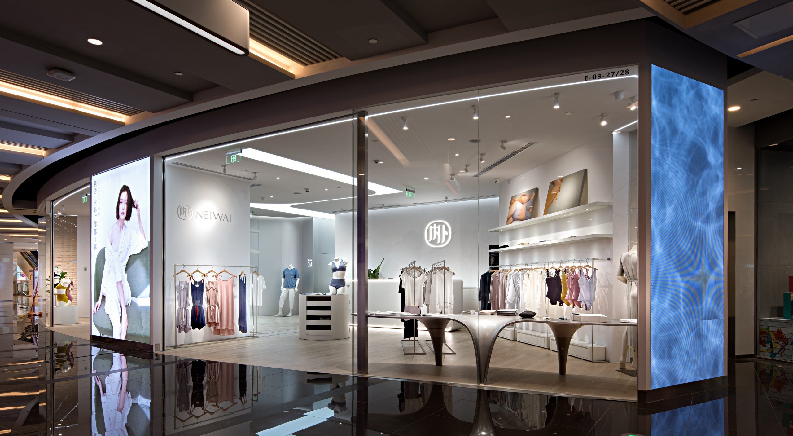
內外上海長寧來福士實體店
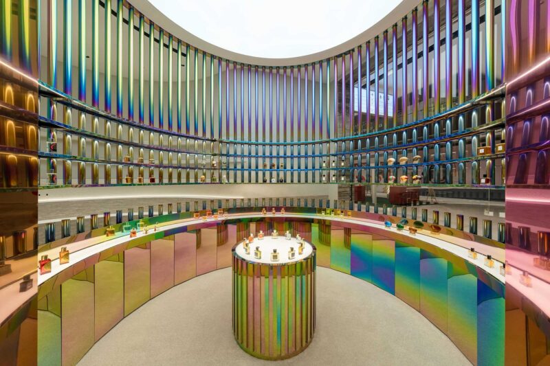
女人是流體。光、金屬、塑料、玻璃和木代表著女人個性的各個片斷。 材料在空間裏流動, 交融在一起。
Woman is fluid. Light, metal, plastic, glass and wood represent the individual pieces of womanhood. Materials flow in space and blend together.
直線、曲線、方、圓、單維曲麵、多維曲麵…形式不再是限定概念的客體,女人的單純和複雜, 沒有一個詞語可以將她概括。
Straight lines, curves, squares, circles, single-dimensional surfaces, multi-dimensional surfaces… The form is no longer the object of the definitional concept. The simplicity and complexity of a woman means that no single word can cover her.
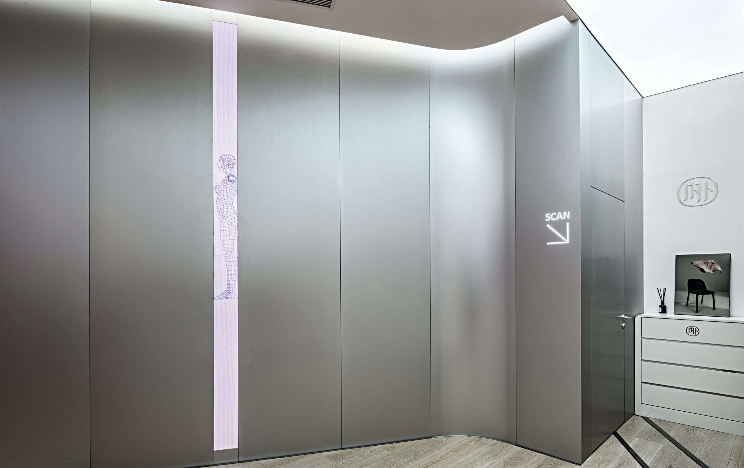
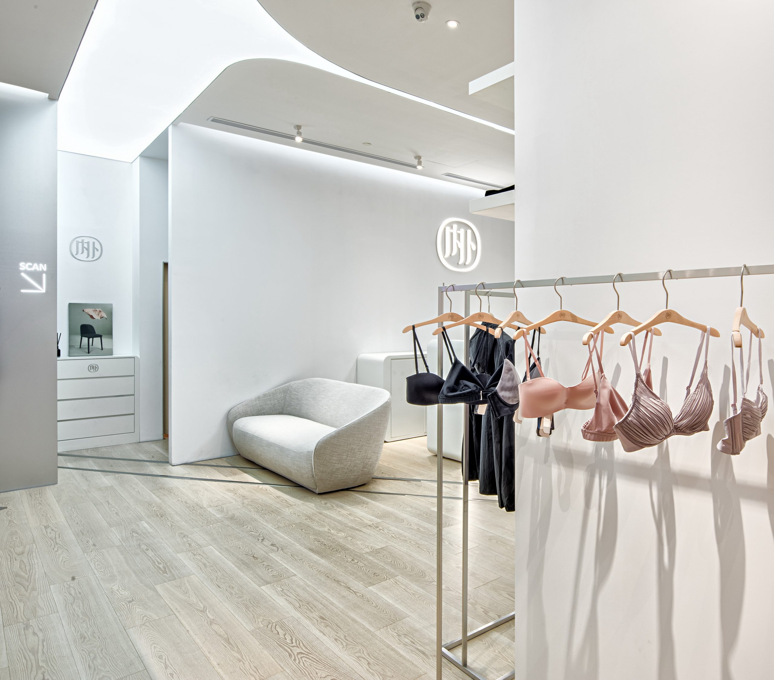
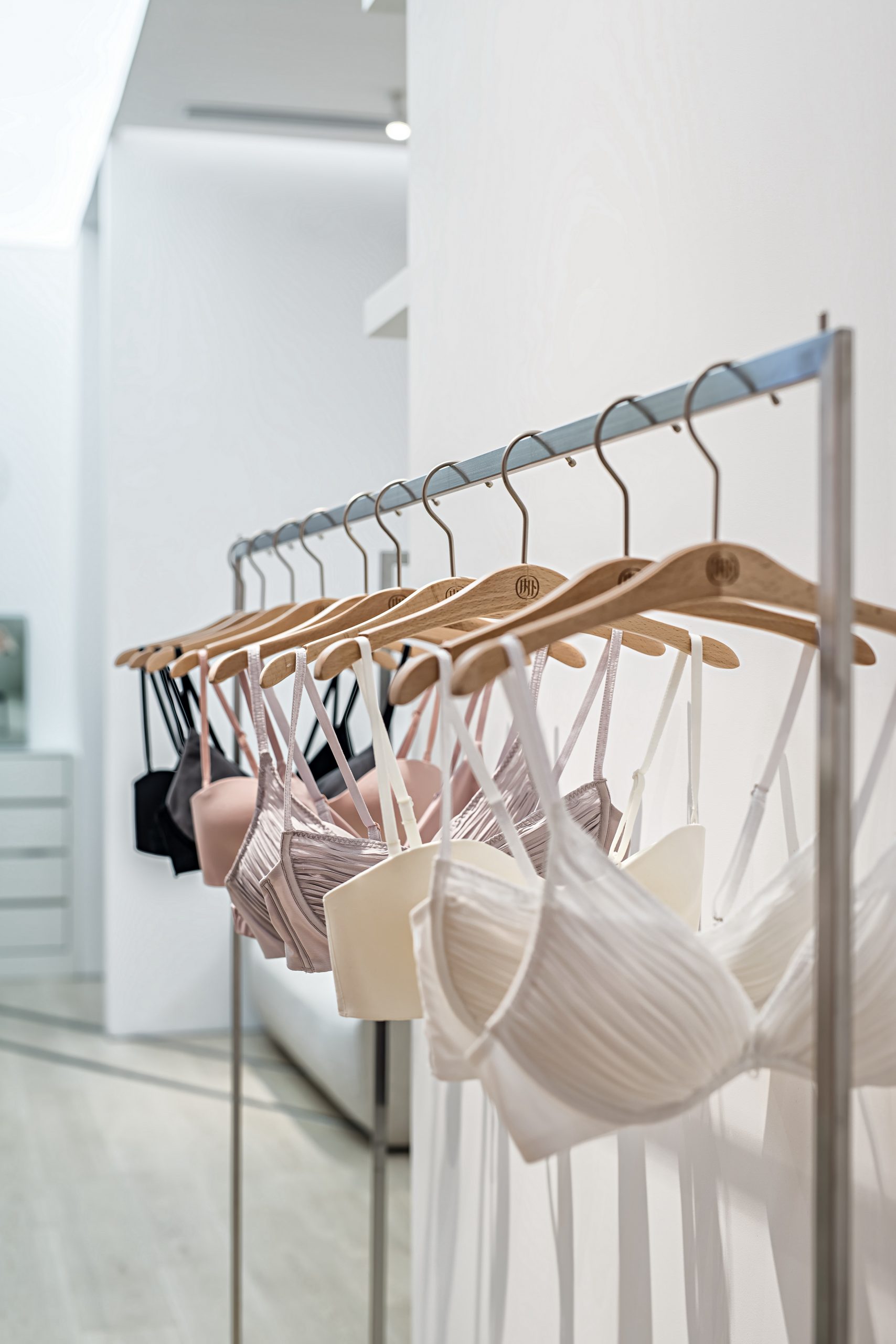
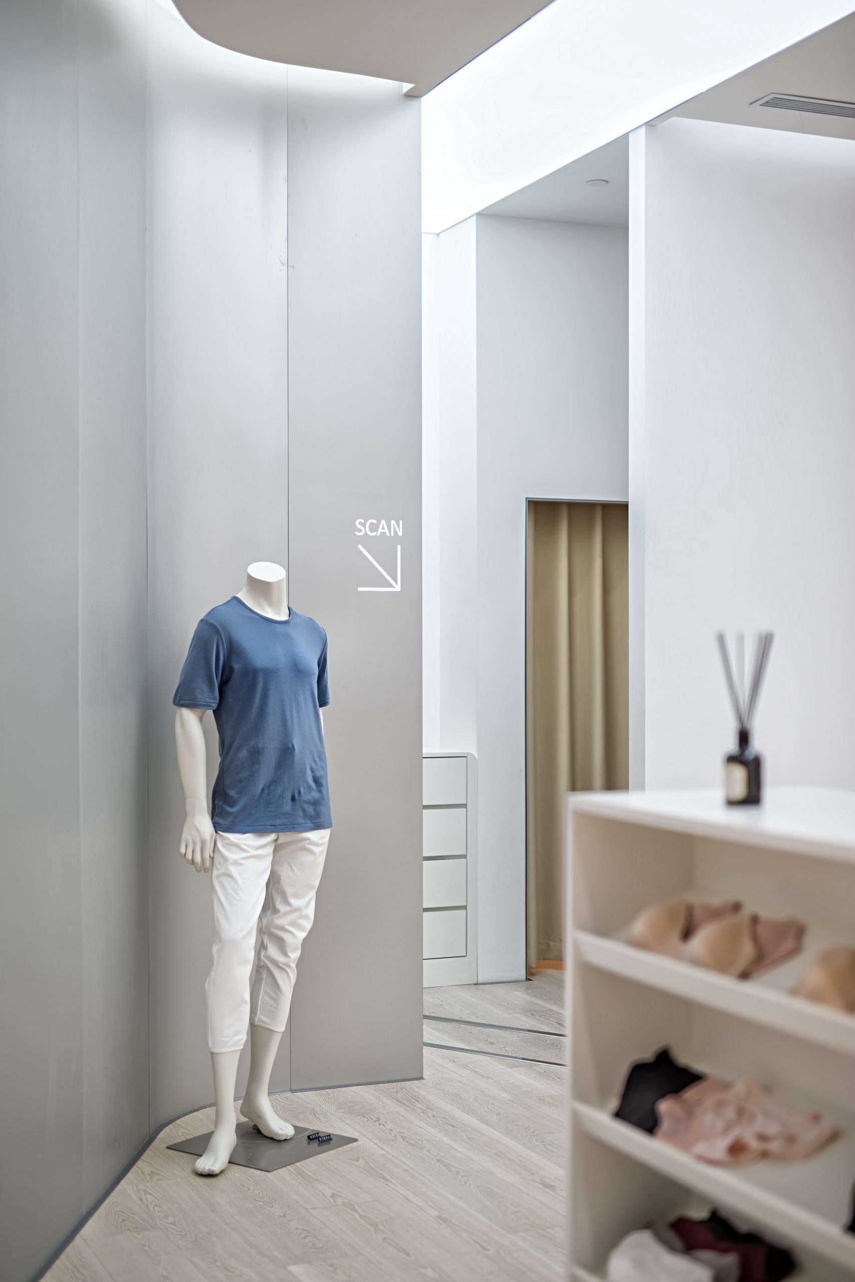
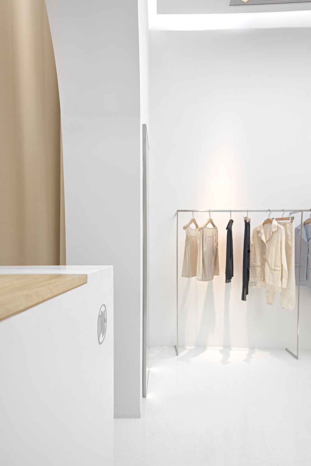
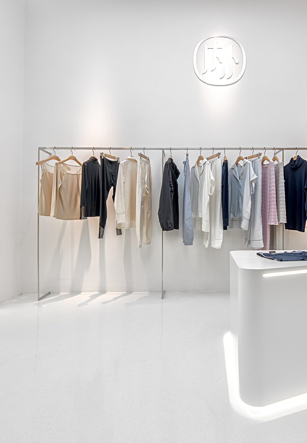
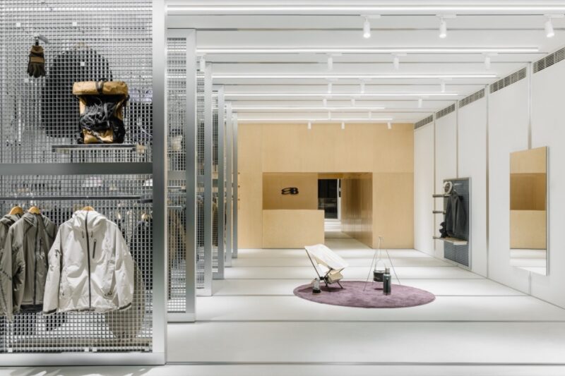
天棚的光帶在方向性上給人暗示,將人引入內部空間。氧化鋁板將高精度的3D掃描儀包裹在裏麵。潔白的桌具,纖細的不鏽鋼架,我們在探求材料特性的同時,回應人們對於女性的各種定義。
The light band of the ceiling gives a hint of directionality and introduces people into the interior space. Alumina plates wrap high-precision 3D scanners inside. With the white table and the delicate stainless steel frame, we responded to various definitions of women while exploring the characteristics of materials.
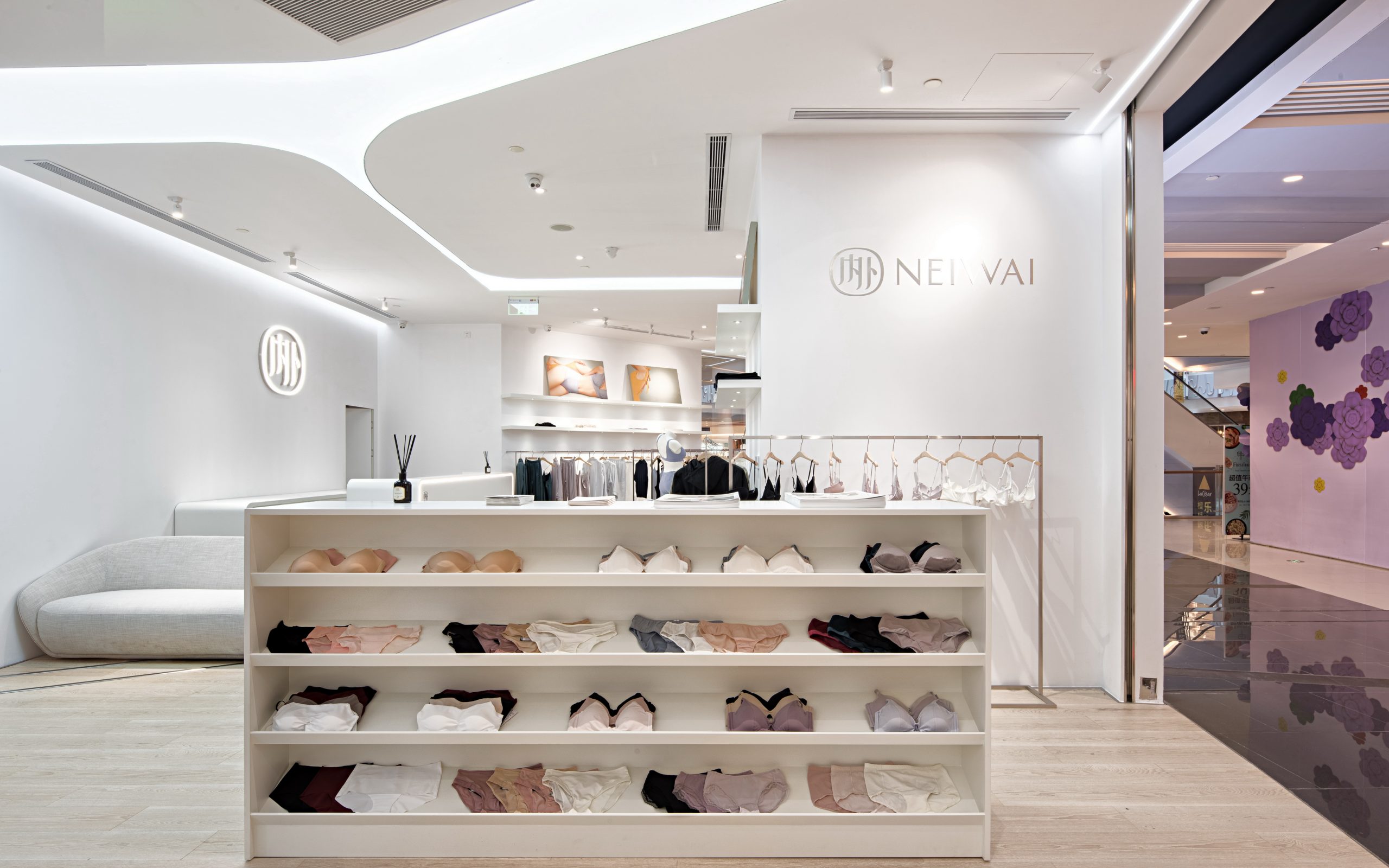
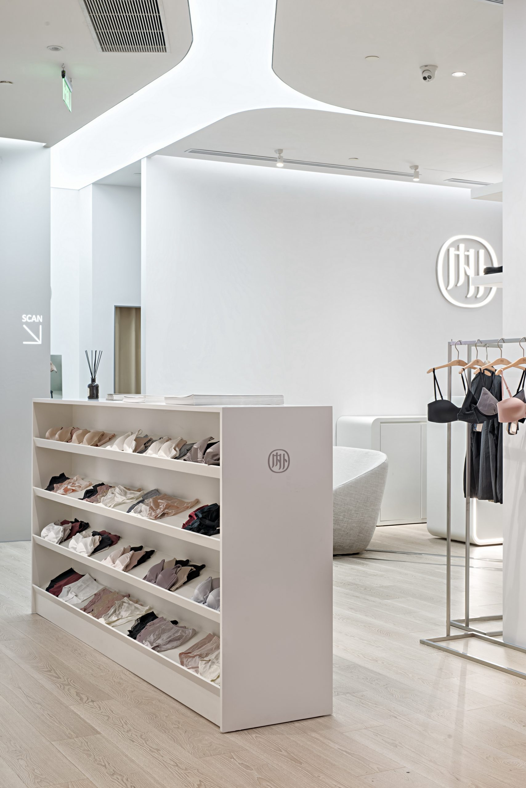
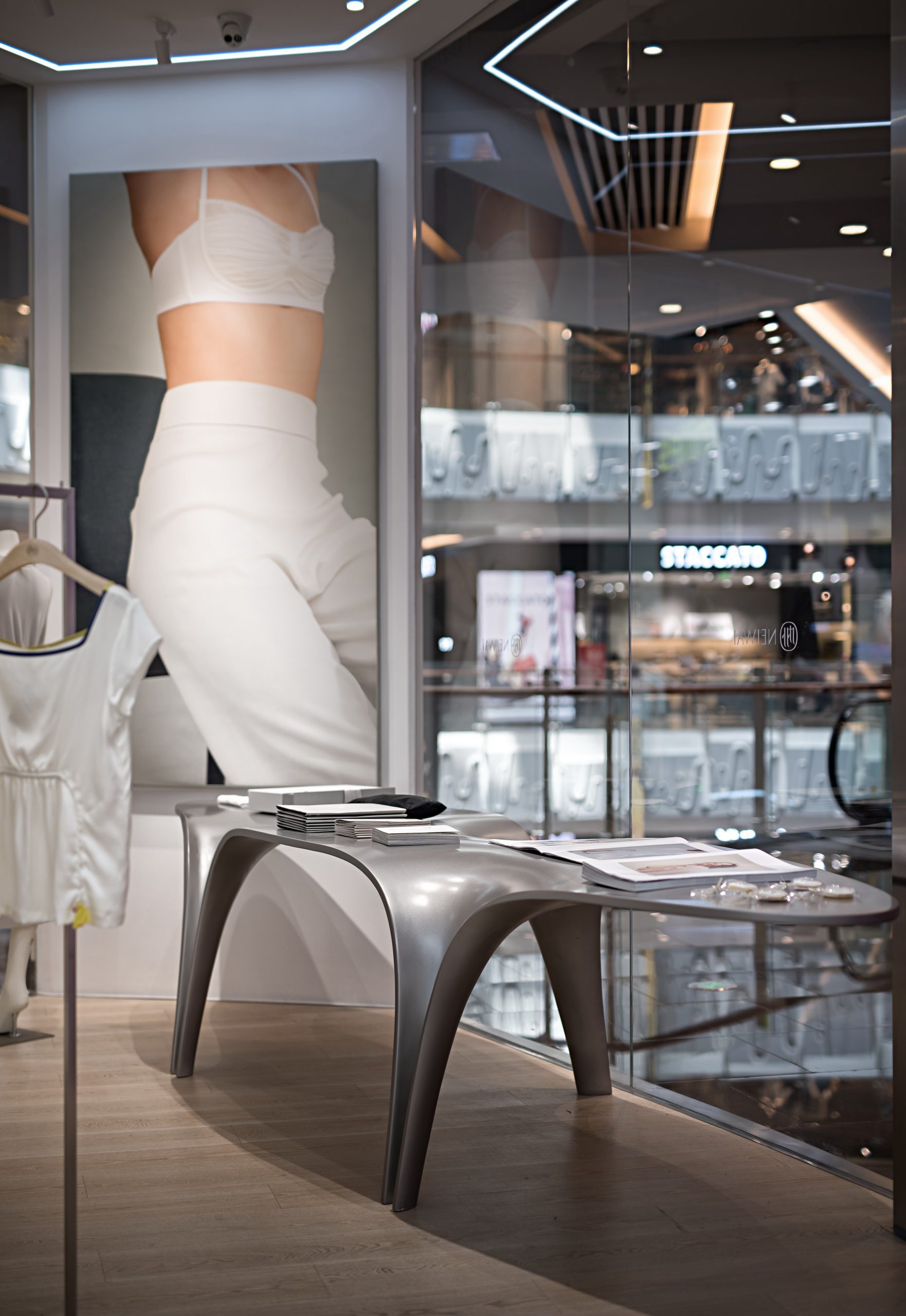
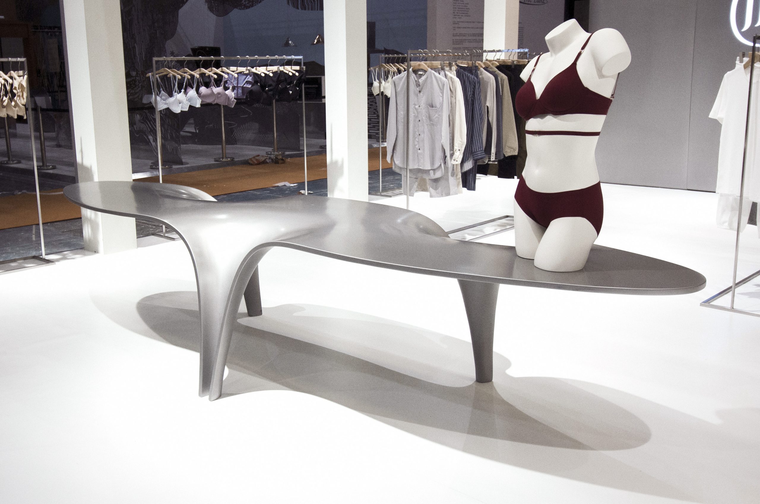
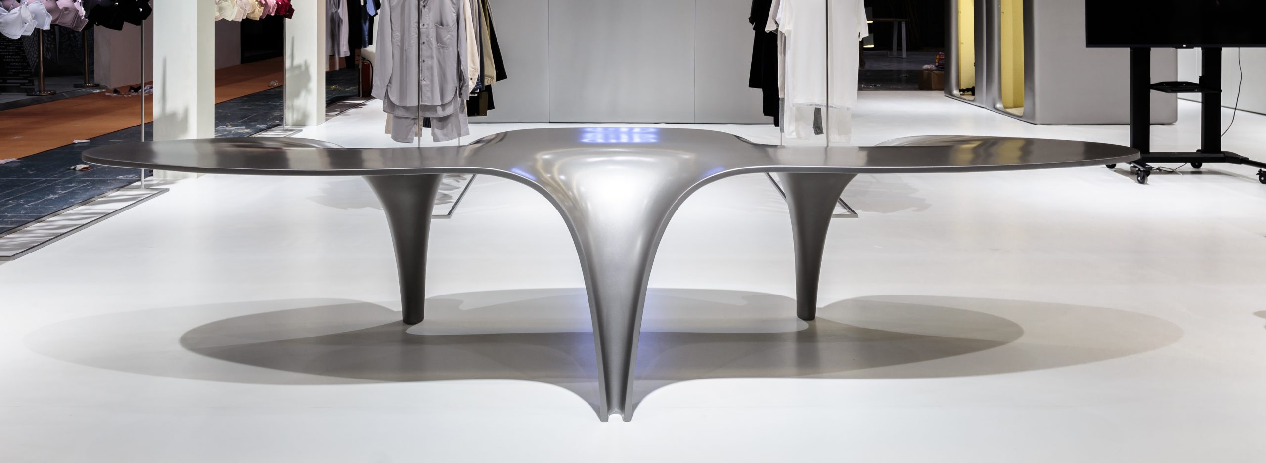
我們還為NEIWAI設計了專用的展示桌子,她的名字叫“AVA”,由FRP製成。她的曲線代表了對女性肢體美感的暗喻。
We also designed a dedicated display table for NEIWAI, her name is “AVA”, made of FRP. Her curves represent the beauty of the female body.
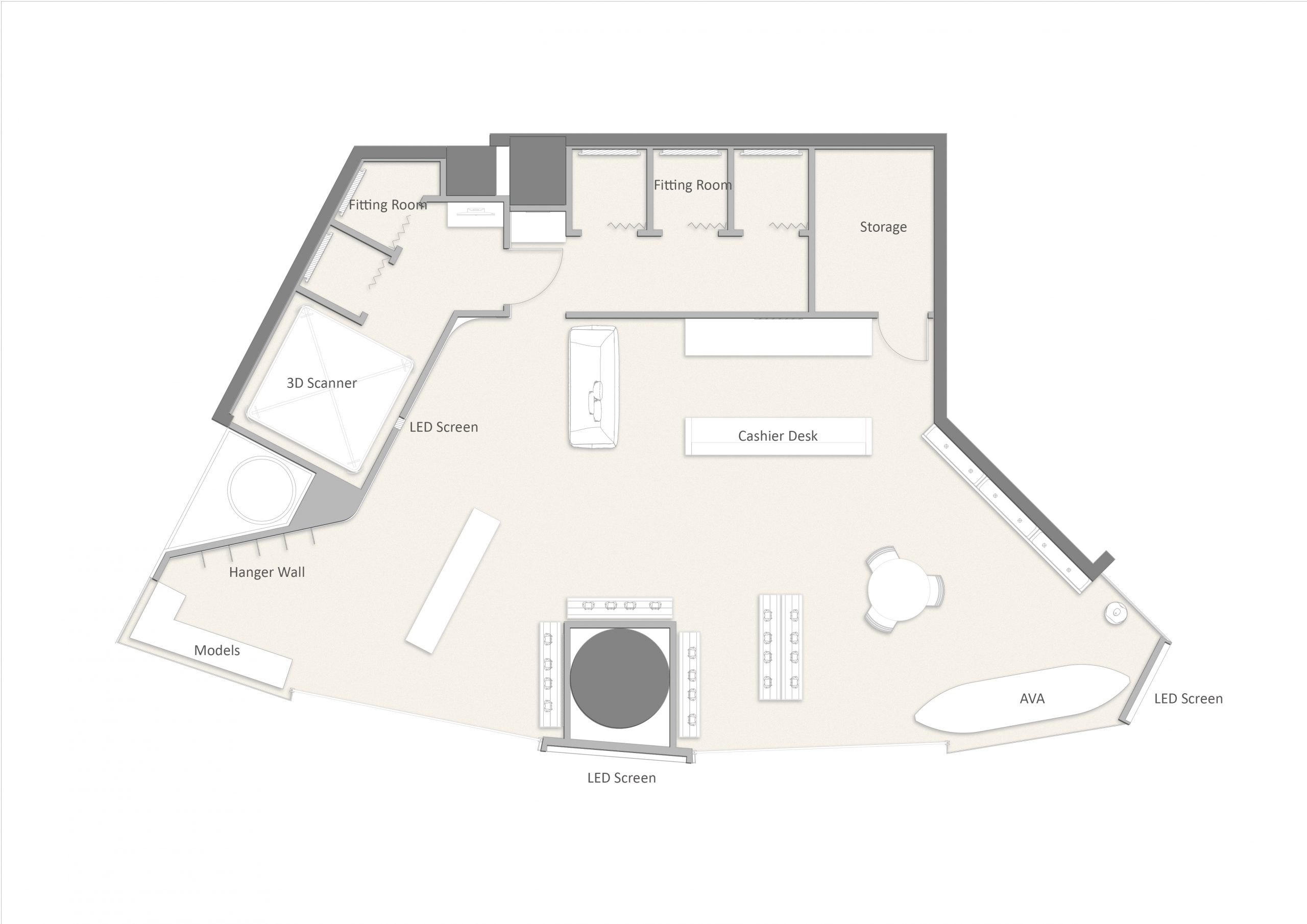
∇ 平麵圖
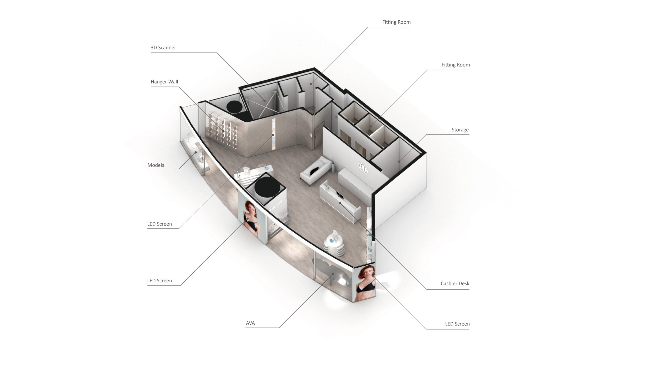
∇ 軸測圖
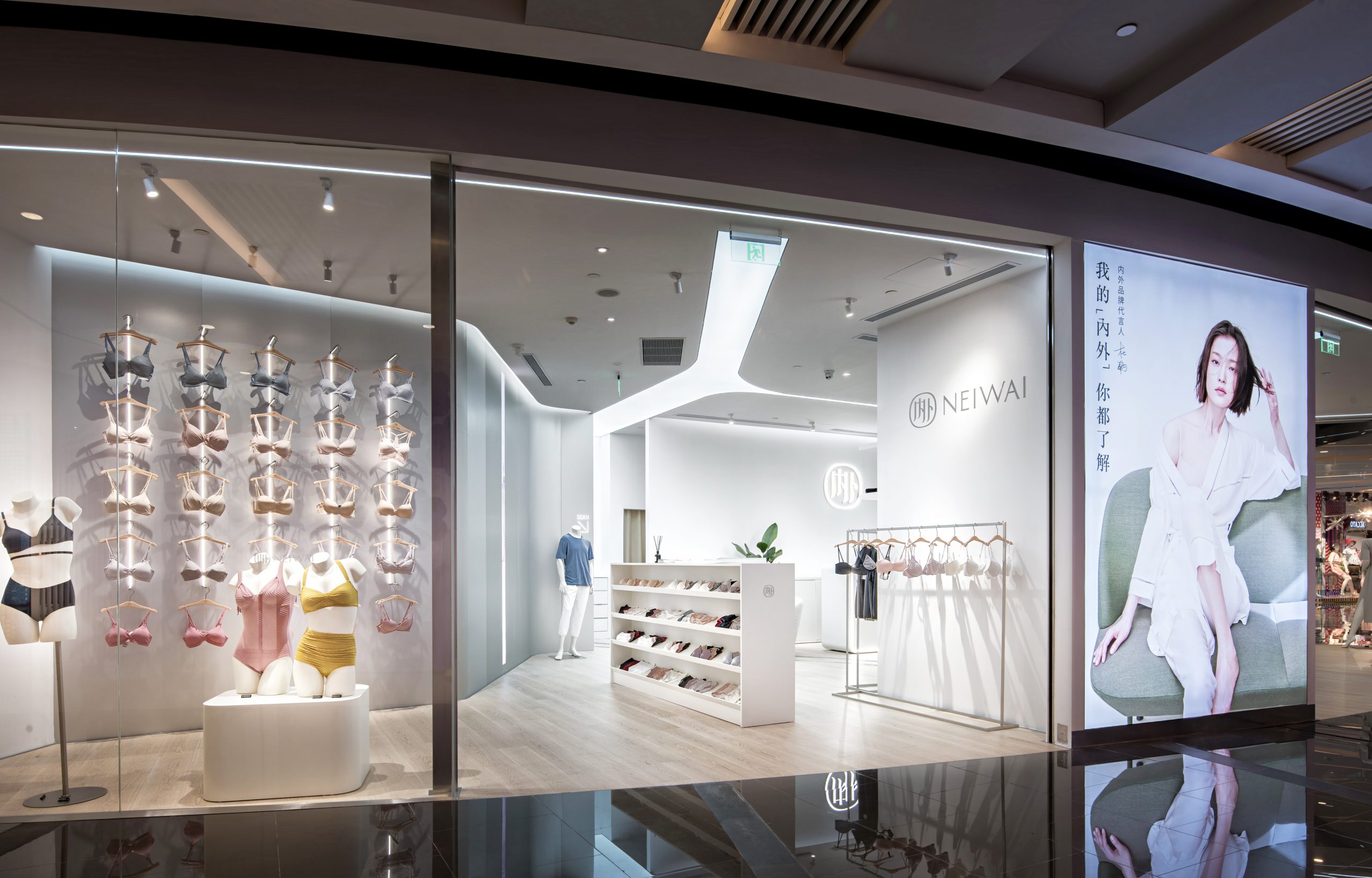
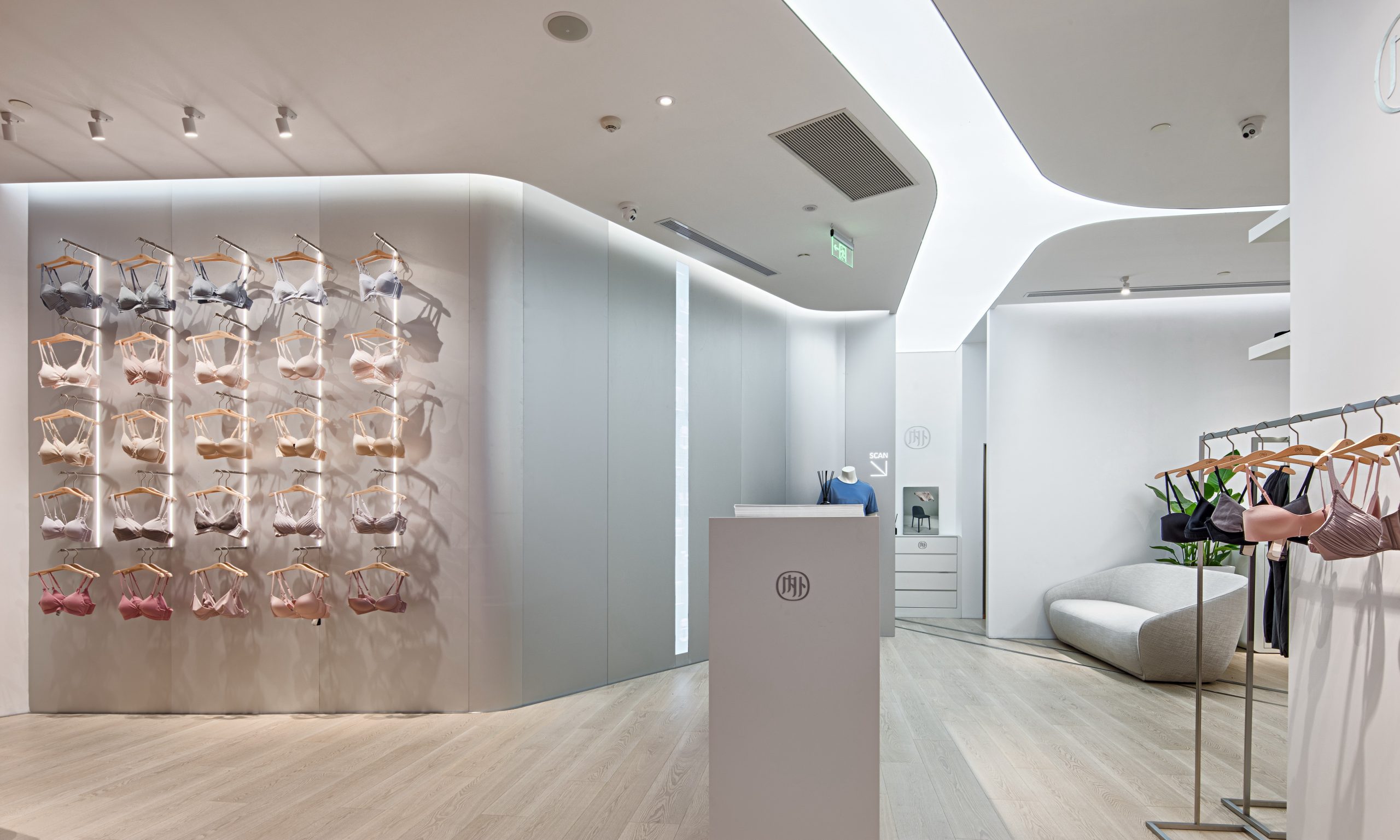
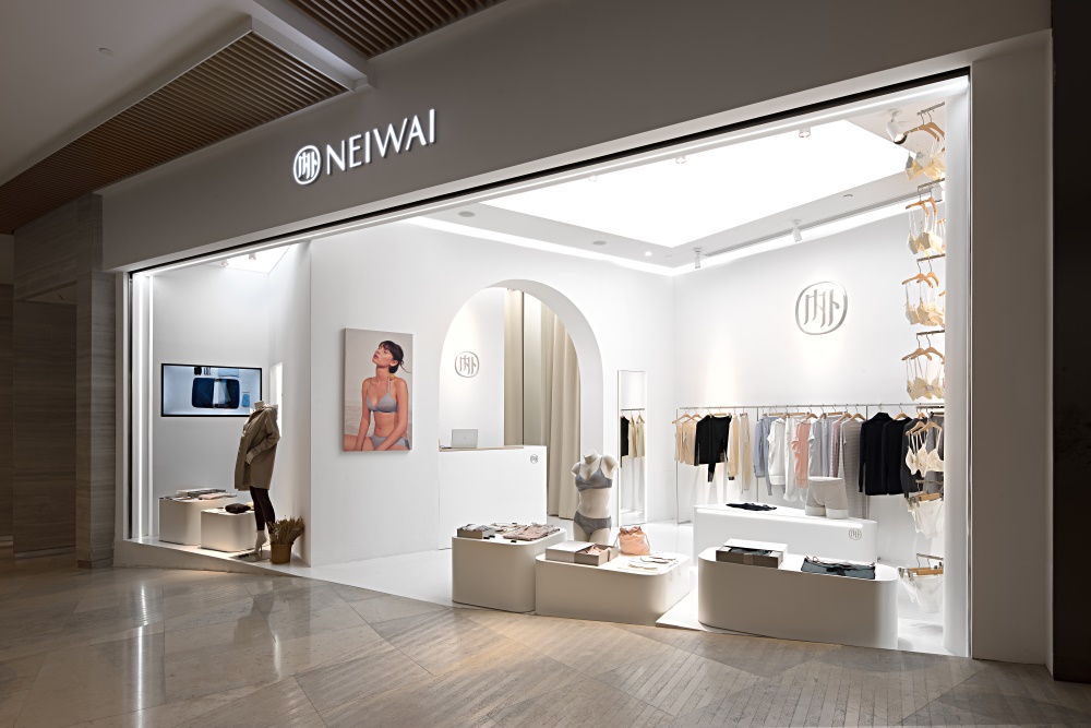
內外上海嘉裏中心實體店
如“NEIWAI”所追求的克製的中性狀態,一部默劇在商業體內悄然上演:
“NEIWAI” is pursuing a neutral attitude toward daily life, identifying themselves as a “purified”, “peace”, and even “serene” design team, working to make life more comfortable. The architectural elements here in our design which set up as a pantomime is brought into stage:
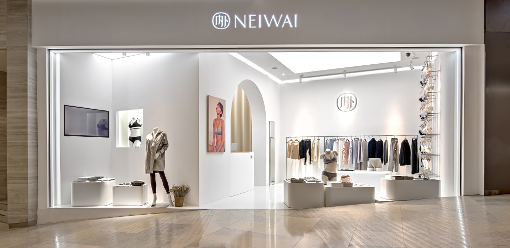
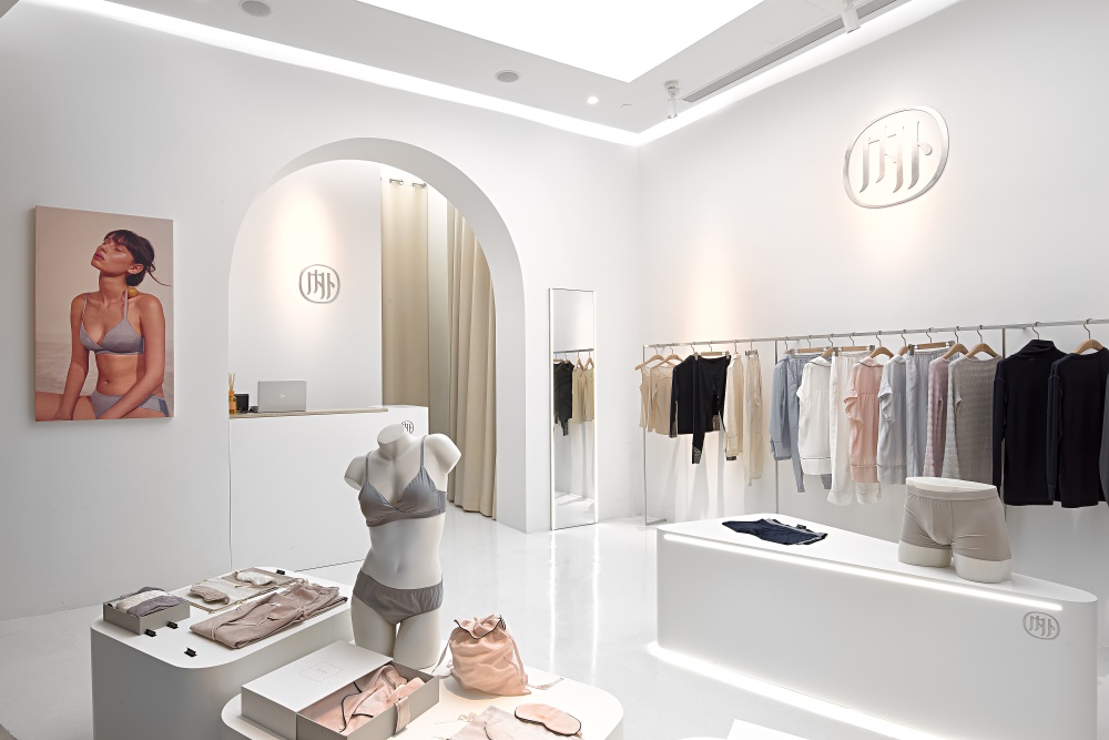
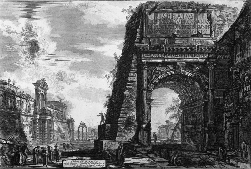
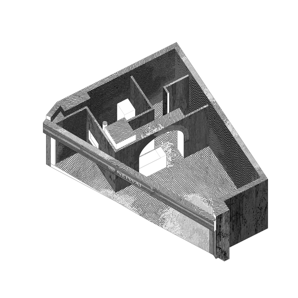
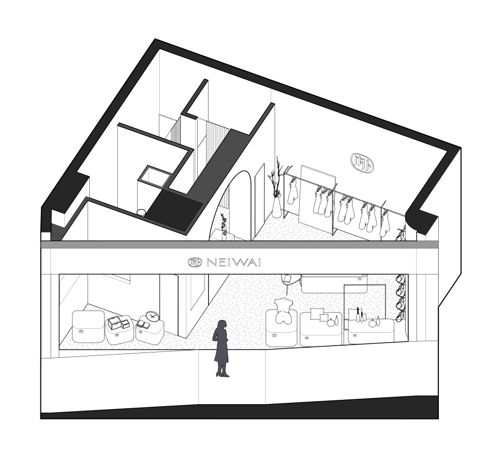
入口處的地麵高差與店招共同塑造了一個外向的、類似劇場的剖麵。走進這個希區柯克式的舞台,發現自己身處看與被看的經典情節中。Piranesi所描繪的羅馬廢墟中殘存的拱門,則會將你引向另一個空間。邊界與隔牆共同構成了內外分明的雕塑感空間,用建築的方式詮釋“NEIWAI”的品牌含義。
The height difference through the entrance and the brand creates a large frame, providing a perspective of a theatre from outside to inside. The frame naturally brings you into a Hitchcock-type experience, you are in the scene from both sides, and the double sided frame sets you as a participants on the stage, not just an observer. As the space shifts, the arch from Piranesi’s Roman remains leads you into another area, the void boundary and the solid walls draws a clear outline of a sculptural and abstract replica of the commercial space, architecturally expressing NEIWAI’s philosophy in life and ideas in design.
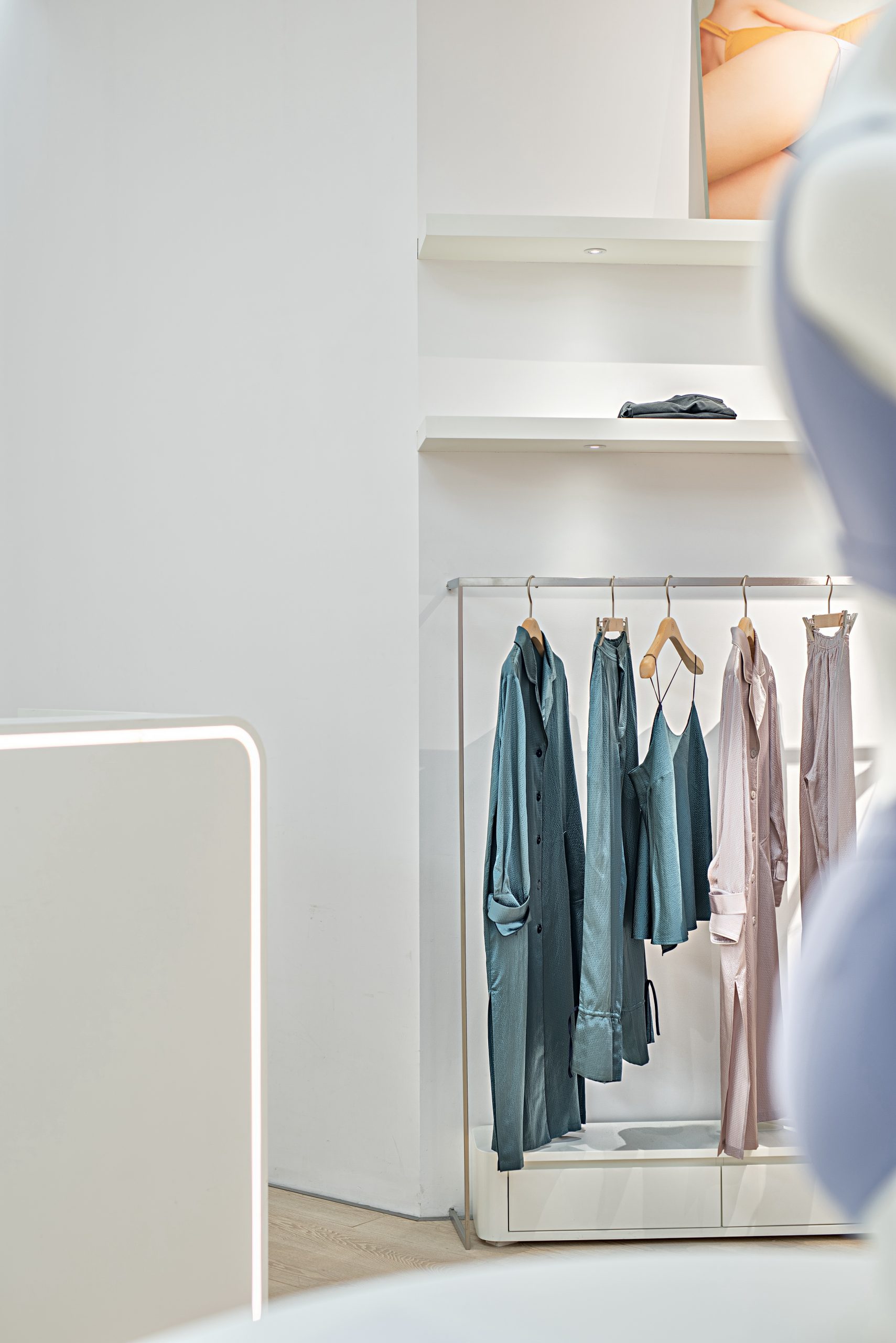
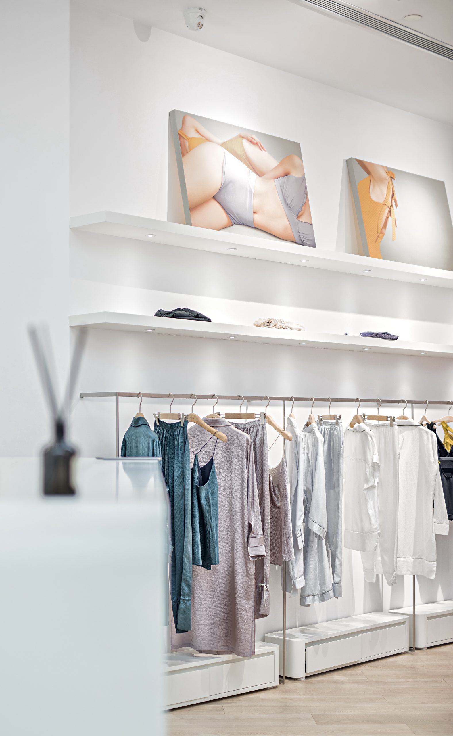
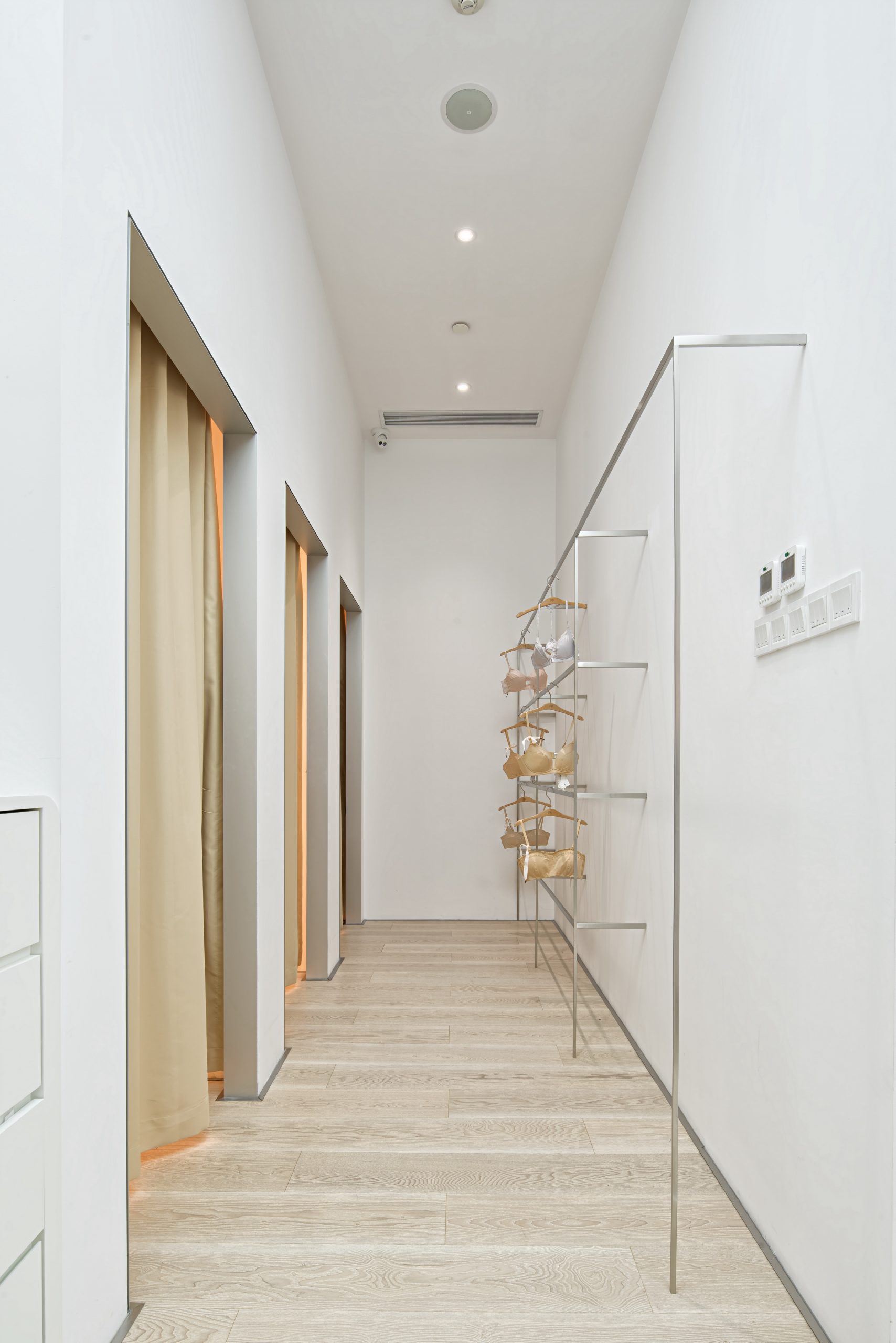
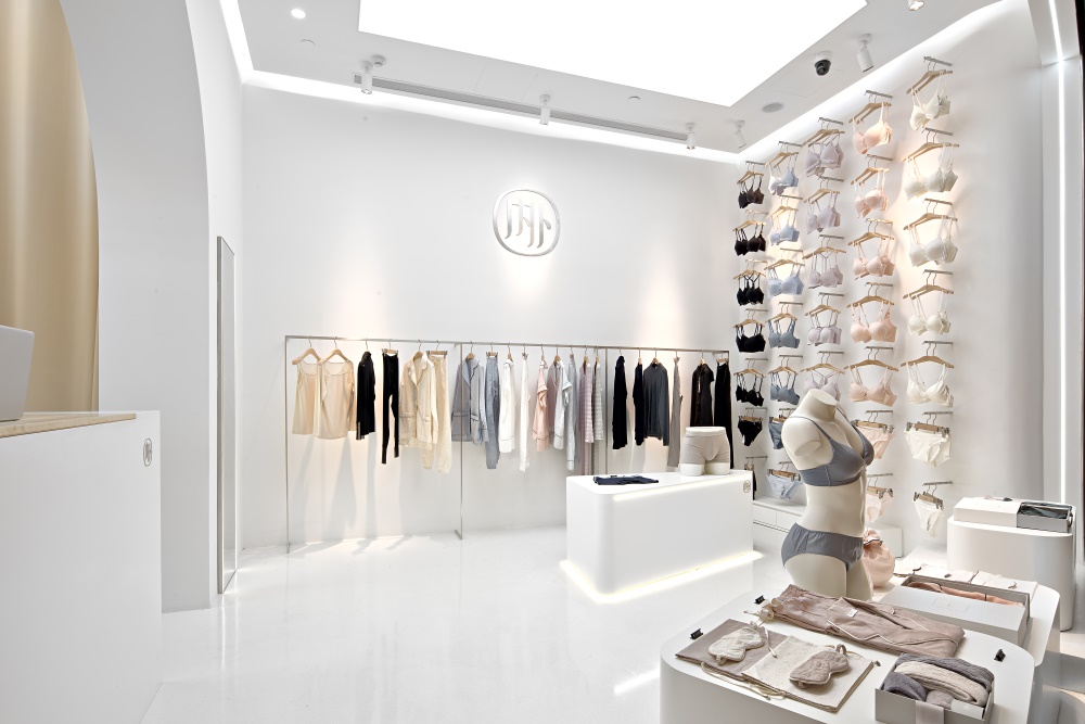
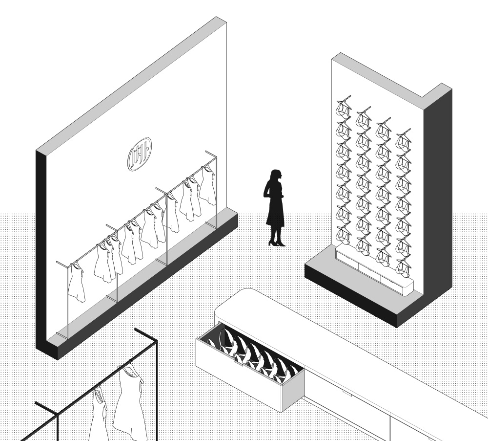
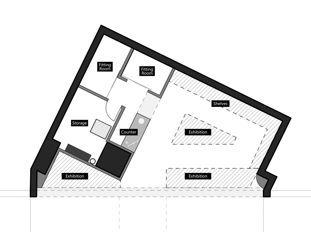
貨架被設計為纖細狹長對女性肢體美感的暗喻。書架的薄元素也創造了優雅的感覺,改善了空間體驗。
The shelves are designed to be long and narrow, which stand as a metaphor for the beauty of women’s figure. The thin elements of the shelves also creates an elegant feeling and improves the spatial experience. During the design, the limits coming from the structural columns and the vertical pipes leads to some inevitable idea shifts, but on the same time it creates unexpected remapping of the arrangement and emotional change of the “NEIWAI” experience.
在這個項目中,店內的燈具和配件也體現了我們簡單的幾何設計語言。該設計從空間的不同位置提供了多個視角。由於牆壁朝向不同的方向,空間被賦予了不同的屬性。與牆壁相交的角落相融合,我們的設計試圖以真實的方式創造一種和平的感覺。
The fixture and fittings in the store also shows our simple and geometric design language in this project. The design provides multiple perspectives from different spots in the space. As the walls facing different directions, the space are identified with various properties. Engaging with the corners intersected by the walls, our design attempts to create a peace feeling in an authentic manner.
∇ 局部效果圖
∇ 建築結構圖
∇ 平麵圖
∇ 軸測圖與門店立麵圖
主要項目信息:
設計公司:NAN Architects (www.nan-xu.com)
主持建築師:南旭
項目地址:上海長寧來福士廣場(120平方米)&上海嘉裏中心(40平方米)
項目類型:商業空間/店鋪設計
攝影師:錢敏


