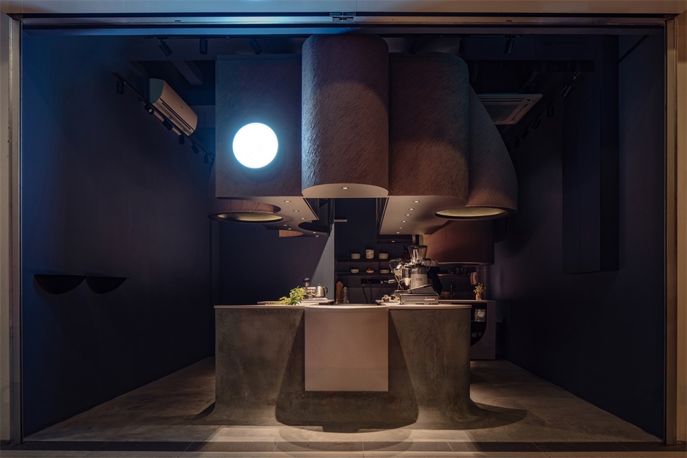
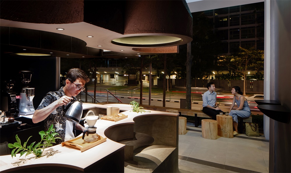
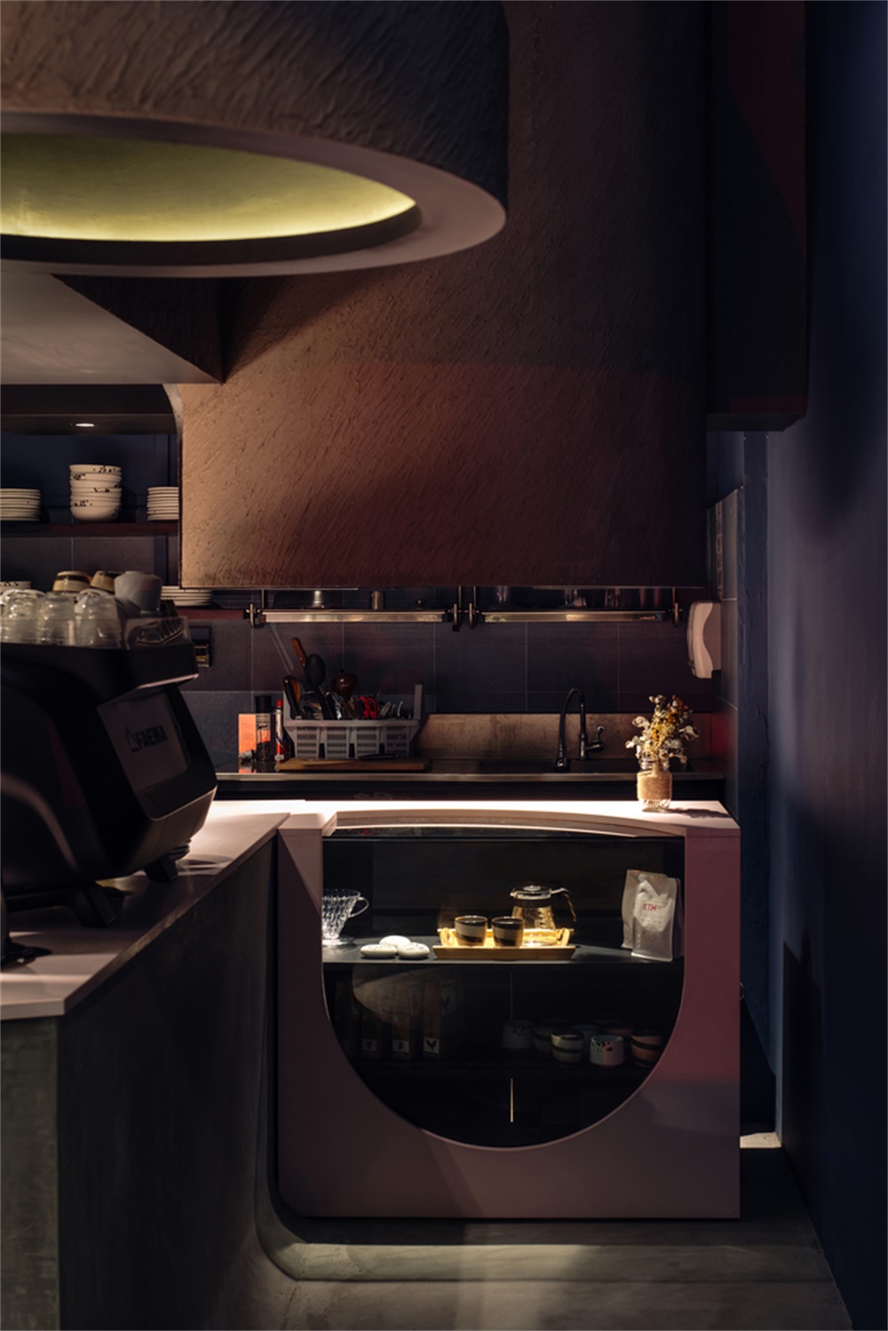
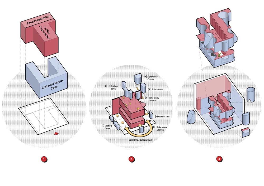
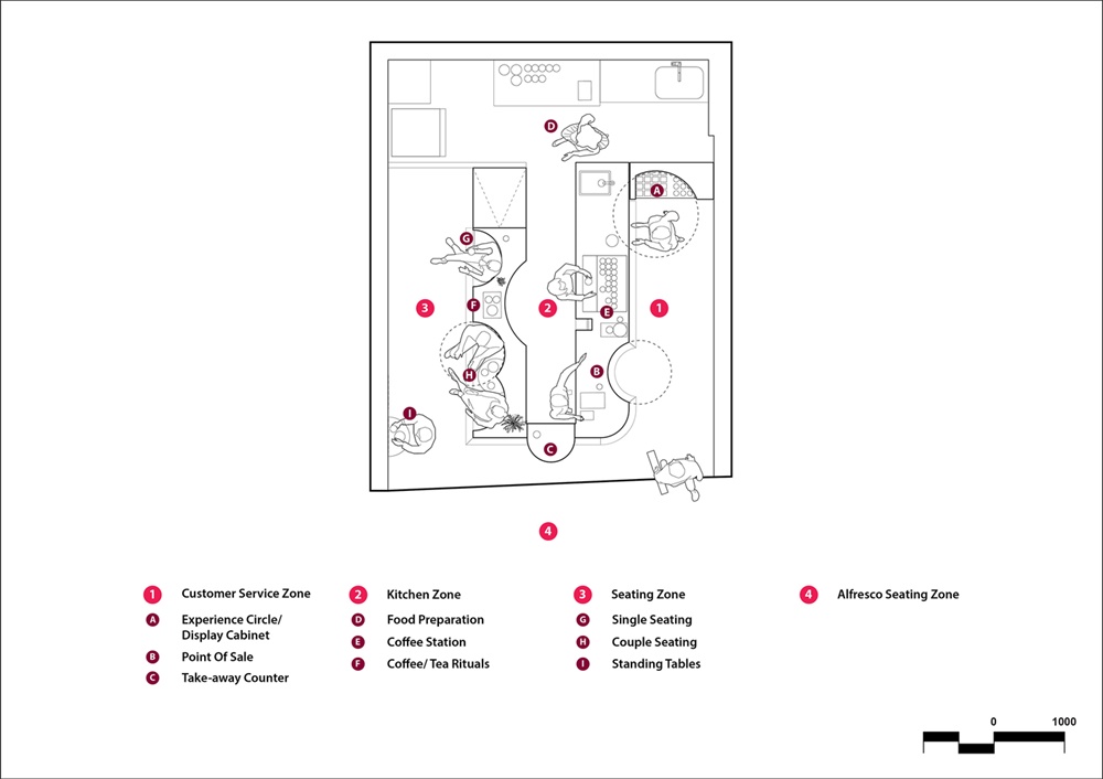
咖啡杯或抹茶碗裏的空間是這個隻有28平方米的微型咖啡館的靈感來源。負空間貫穿整個空間,圓形幾何圖形貫穿其餘的建築形式,雕刻出座位間、台麵、展示架和懸挑的簷篷。這是一個減法和加法的過程,創造了咖啡館的運作和人體測量的需要。在這個濃縮的空間中,我們必須平衡大量的廚房庫存和顧客區域,利用每一個角落來增加這種體驗。我們能夠創建幾個工作區域和顧客區,包括一個體驗區/零售區、一個外賣櫃台、座位區,甚至還有一個小的“儀式櫃台”,用於舉辦開放研討會和製作滴濾咖啡或日本綠茶(抹茶)。
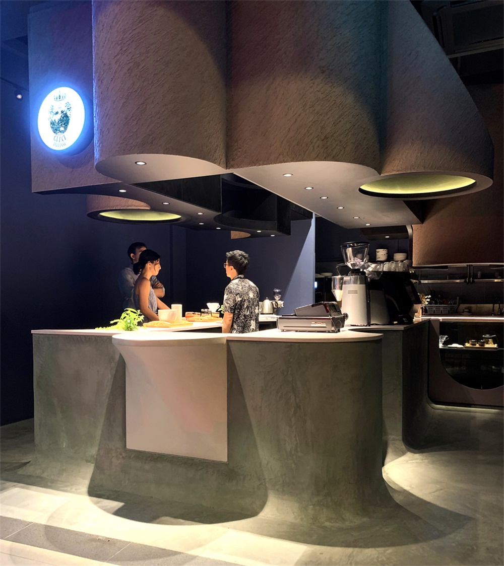
The empty space in a coffee cup or matcha bowl was the form-giving inspiration for this micro cafe spanning only 28 square metres. Negative spaces punctuate the space and circular geometries are consistently carried throughout the rest of the built form carving out seating booths, countertops, display shelves and overhanging canopies. It is a process of subtraction and addition to create the operational and anthropometrical needs of the cafe. In this condensed space, it was essential that we balanced the numerous kitchen inventory with the customer zones, utilising every nook to add to that experience. We were able to create several working and customer zones including an experience/retail corner, a take-away counter, seating booths and even a small ‘Ritual Counter’ for conducting workshops and making drip coffee or bowls of powdered Japanese green tea (Matcha).
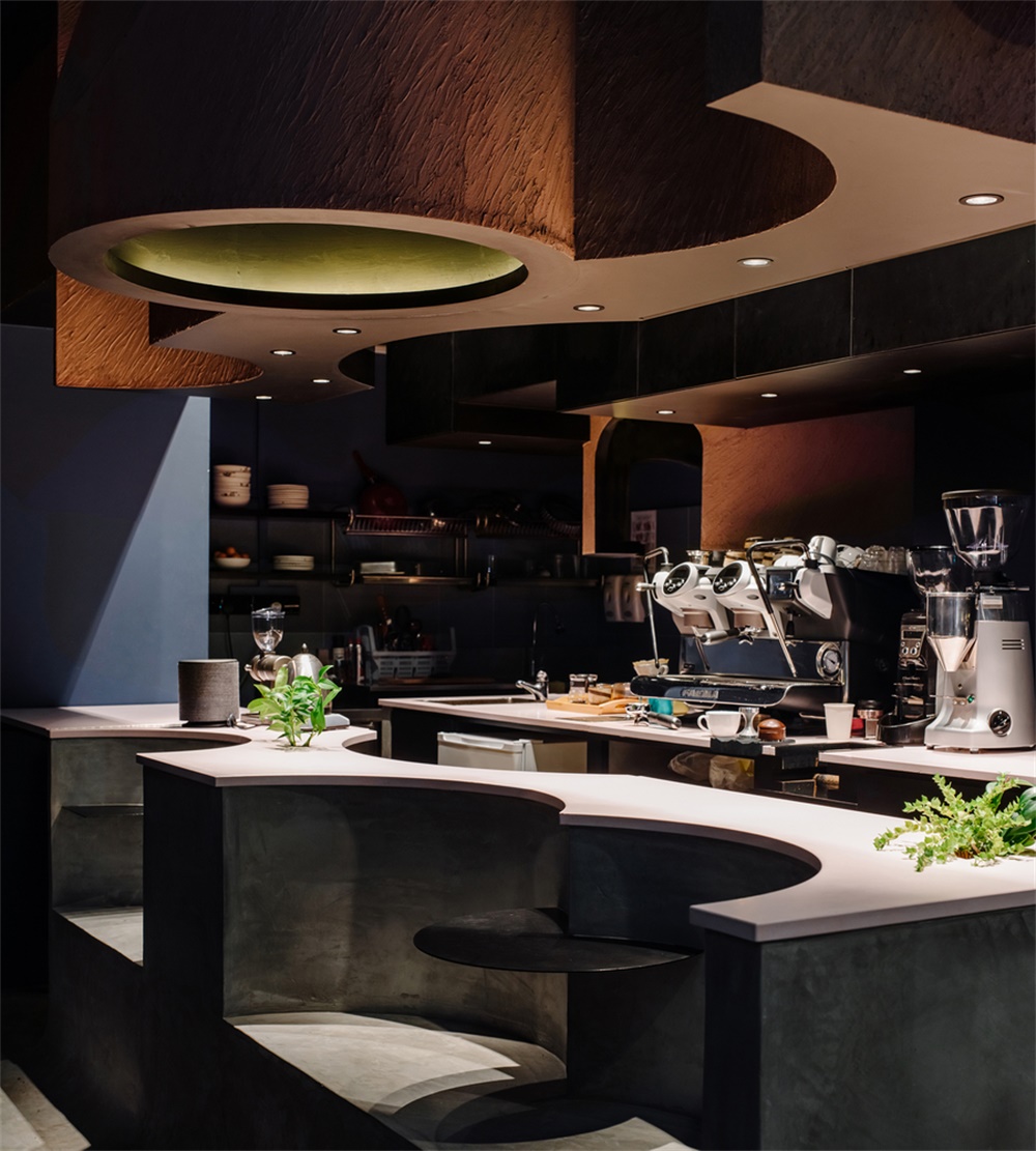
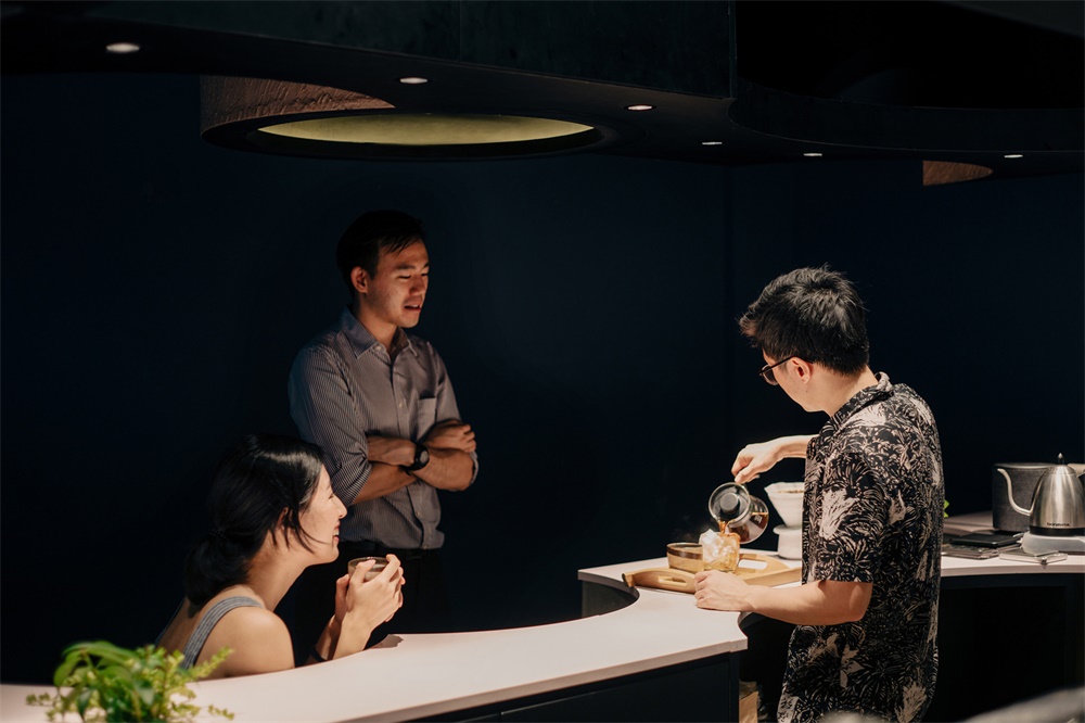
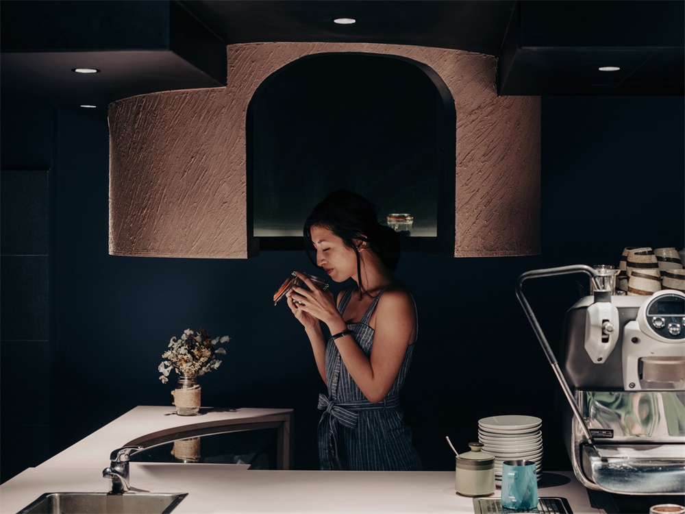
體驗圈被設計成一個懸浮式外殼的封閉空間,顧客可以躲在裏麵體驗不同咖啡和茶產品的味道。櫃台空間的開辟,使顧客和咖啡師之間的互動更加緊密,同時使他們更接近咖啡製作過程的香氣和研磨/敲擊的聲音。
The experience circle was designed as a suspended enclosure where customers can duck under and experience the smell of different coffee grounds and tea products. Counter spaces were carved out to bring together a closer interaction between customer and barista, simultaneously bringing them in closer proximity to the coffee making process with aroma and grinding/tapping sounds.
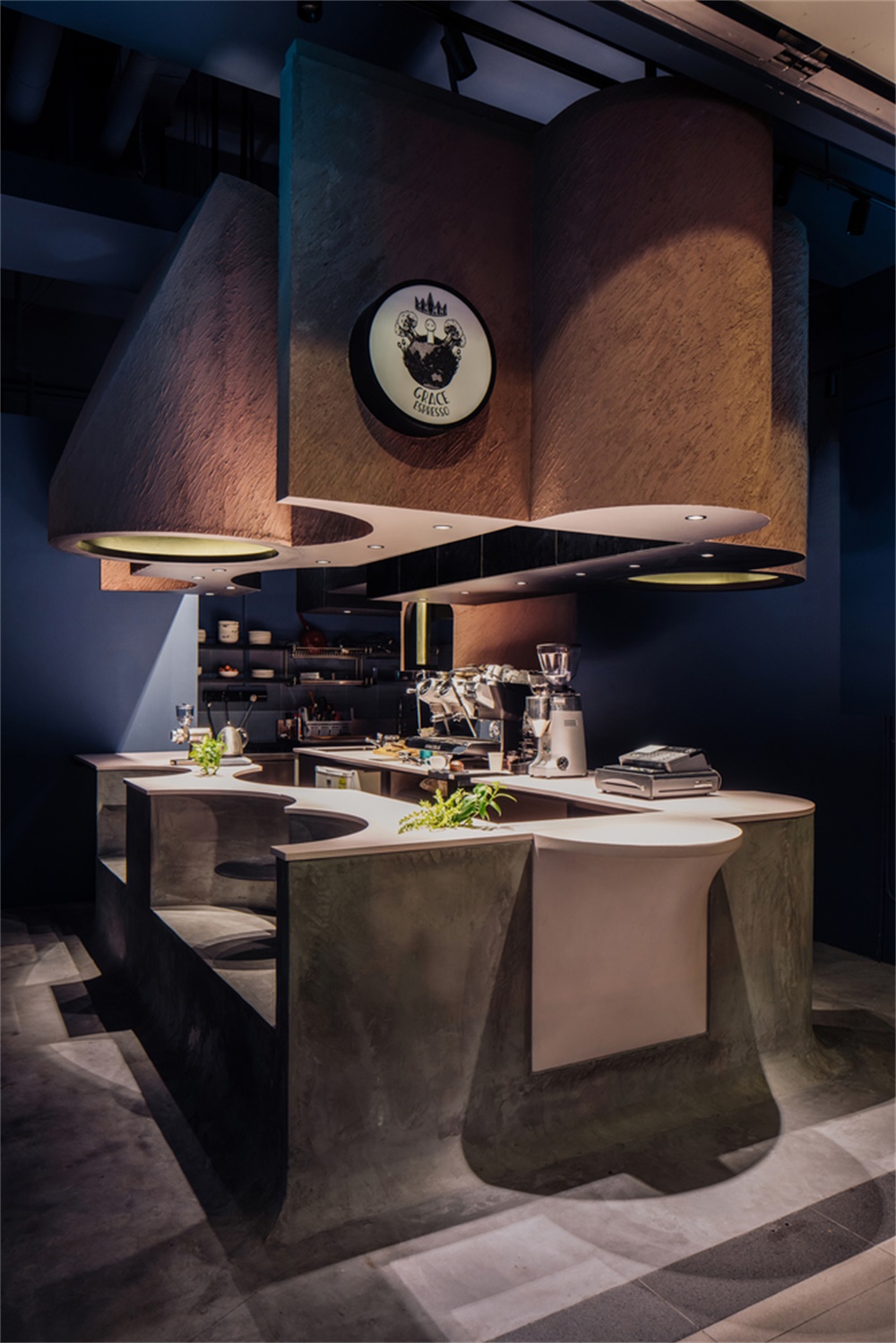
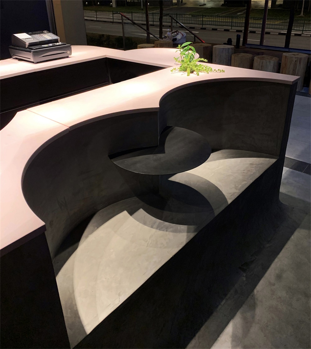
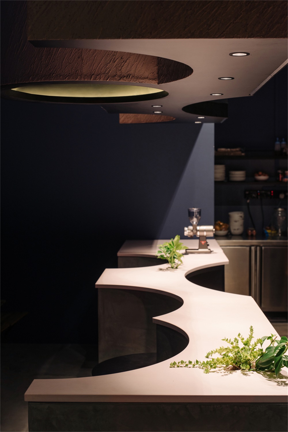
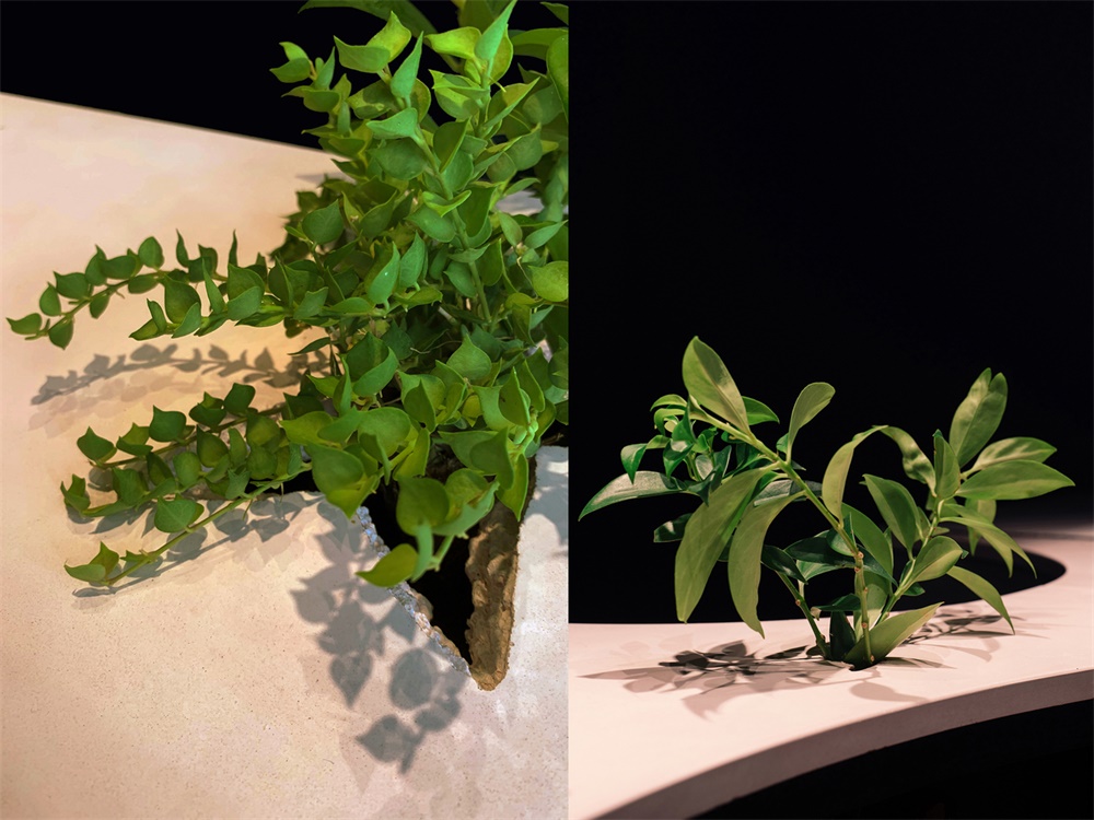
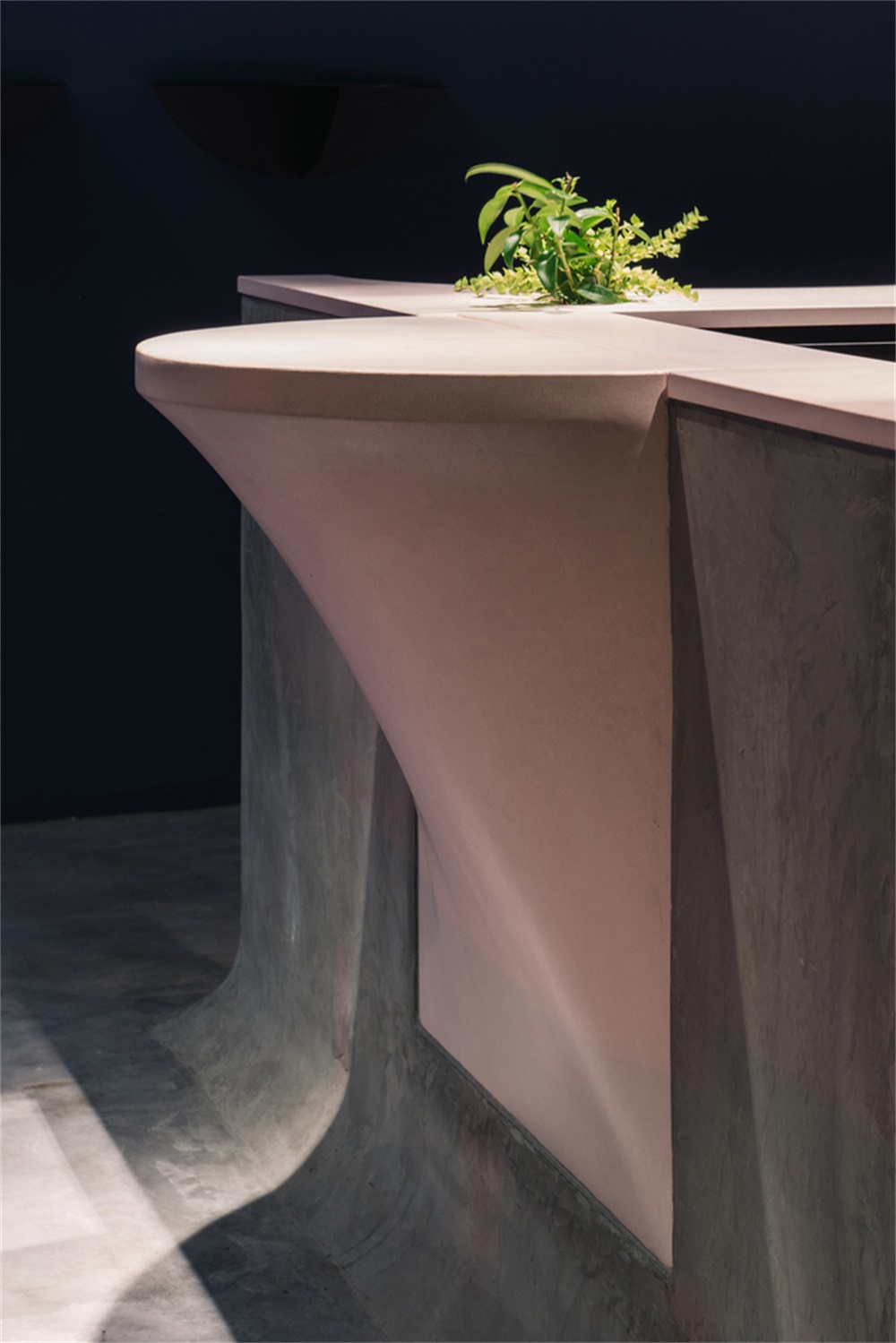
顧客座位是混凝土櫃台上的圓形開口,上麵有與之相配的花瓣狀桌子。粉紅色混凝土台麵是定製澆鑄的,共11塊。其中有一個最小的表麵混凝土台麵,用於使用特殊的織物模板製成的外賣櫃台。還特意在混凝土中開了裂縫,以使植物從下麵露出來,靈感來自於生長在舊建築上的植物。圓形的金屬桌子從牆壁上伸出來,同樣的也從混凝土座位間伸出來。混凝土櫃台塊在視覺上與地板相連,並帶有柔和的弧形弧度。
Customer seating are circular cut-outs in the concrete counters with matching petal-like tables to match. The main powdered pink concrete counter top was custom-casted in 11 separate pieces. Amongst them a minimal surface concrete counter top for takeaways formed by using a special fabric formwork. Cracks were also purposefully cast in the concrete to allow planting to emerge from beneath, an inspiration taken from plants growing on old buildings. Circular metal tables were created to project from the walls and similarly from the concrete seating booths. The concrete counter block was visually made to be contiguous with the floor with adjoining gentle curved radiuses.
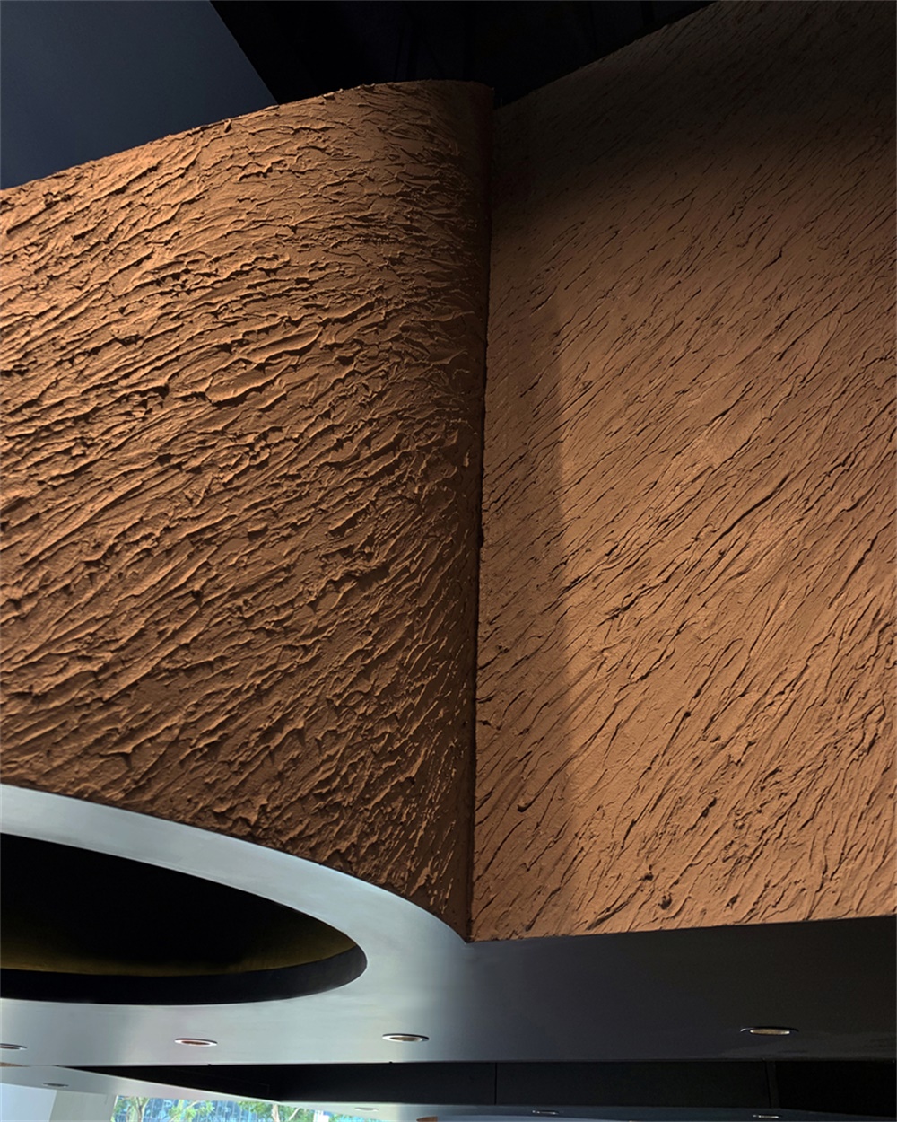
整個體量完全裝在天花板上,沒有支撐連接底部的櫃台頂部,給整個空間結構帶來一種超現實的輕盈感。懸挑的體量也呈現在紋理濃重的灰泥中,灰泥裏有來自磨砂的咖啡渣,創造了反重力的咖啡雲。從減法和加法中產生的美學,創造了一個有著自己模糊邏輯的流動體塊,當然不是基於任何預先設計的形式或咖啡館的象征。
The entire volume was entirely holstered from the ceiling with no supports connecting the bottom counter top mass, giving a surreal lightness about the whole structure. The overhanging volume was also rendered in heavily textured stucco inspired from gritty coffee grounds to create an anti-gravity coffee cloud. The resultant aesthetic from subtractions and additions, creates a massing that appears fluid with its own fuzzy logic, certainly not based on any premeditated form or symbol of what a cafe should be.
∇ 空間結構分析圖
∇ 平麵圖
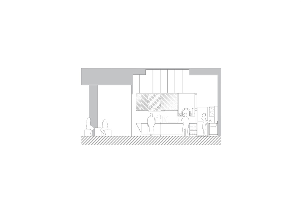
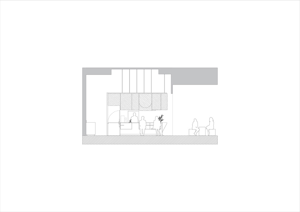
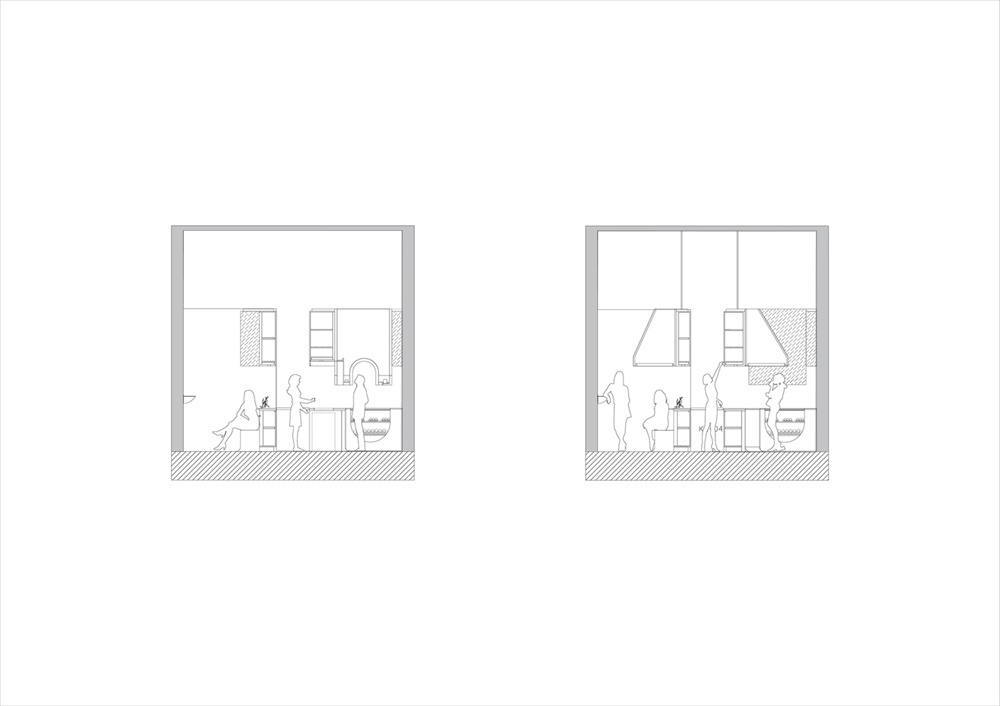
∇ 剖麵圖
主要項目信息
項目名稱:Voids咖啡館
項目位置:新加坡河穀路
項目麵積:28.0 m²
項目類型:餐飲空間/咖啡館設計
完成時間:2019
設計公司:Studio SKLIM
攝 影:Khoo Guo Jie


