全球設計風向感謝來自 集嘉設計 的商業空間項目案例分享:
“空間設計的目的並不是通過強烈的衝擊來短暫的吸引人們的注意,而是將品牌信息通過需求/視覺/行為/心理/感受慢慢滲透到五官六感中去,在人們還沒注意到其存在時,有力的傳達已經悄然完成。”
The purpose of space design is not to attract people’s attention through strong impact, but to gradually penetrate brand information into the five senses and six senses through needs / vision / behavior / Psychology / feelings. When people haven’t noticed its existence, powerful communication has been quietly completed.
需求-功能性/Functionality
“顧客的感受與體驗是我們工作的動力”,這是鹿島品牌的企業理念,「鹿島品牌」創立於2010年,企業定位的精準化,至今在成都、重慶、杭州、蘇州等16個城市設立了門店,此次在重慶來福士設立了「鹿島生活」,這也是集嘉繼成都來福士鹿島生活後為「鹿島品牌」設計的第二個門店。
“Customers’ feelings and experience are the driving force of our work”, which is the corporate philosophy of Ludao brand. Founded in 2010, with precise corporate positioning, Ludao brand has set up stores in 16 cities, including Chengdu, Chongqing, Hangzhou, Suzhou, etc.This time, we have set up “Ludao life” in Chongqing raffles, which is the second store designed by Jijia for “Ludao brand” after Chengdu Raffles Ludao life.
空間設計是品牌展示的舞台,它要與品牌風格與需求契合,營造一個氛圍將品牌需要傳達的展示在消費者麵前。
Space design is the stage of brand display. It should be in line with brand style and demand, and create an atmosphere to show the brand in front of consumers.
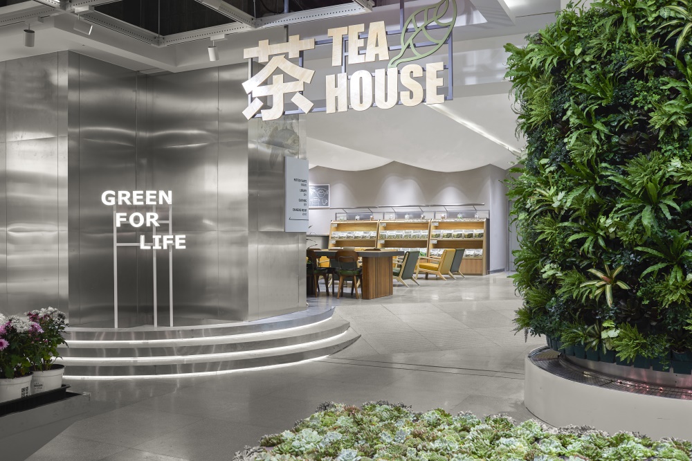
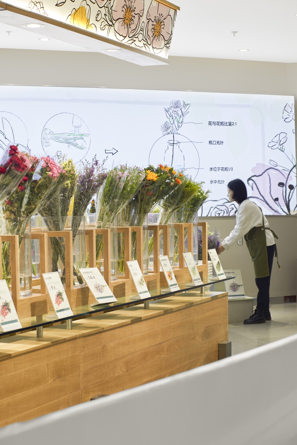
鹿島生活包含了「九大區域」,花藝陳列區、綠植陳列區、周邊工具展示區、創意玻璃房、大型植物展示區、水景植物區、多肉植物DIY、茶藝休閑區以及服飾與生活用品銷售區。
There are nine areas in Ludao life, including flower art exhibition area, green plant exhibition area, surrounding tool exhibition area, creative glass room, large plant exhibition area, waterscape plant area, succulent plant DIY, tea art leisure area and clothing and daily necessities sales area.
視覺-多元性/Pluralism
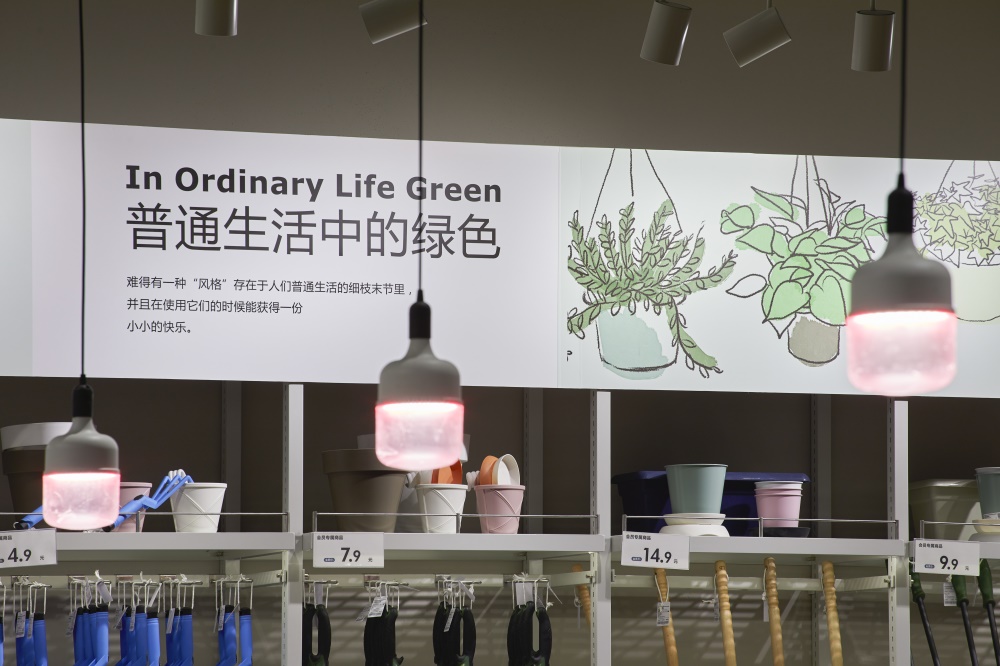
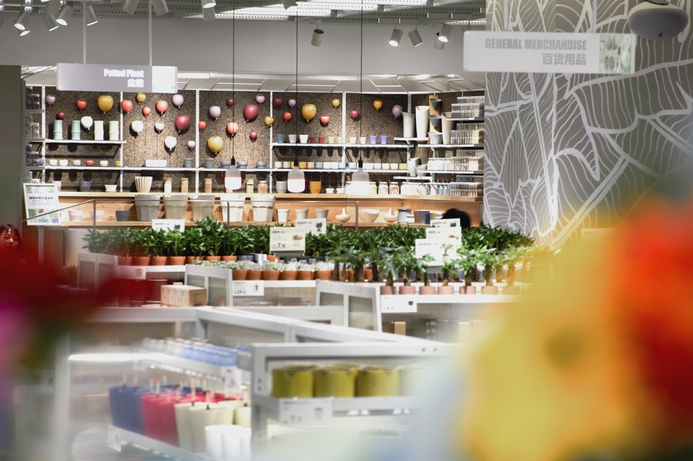
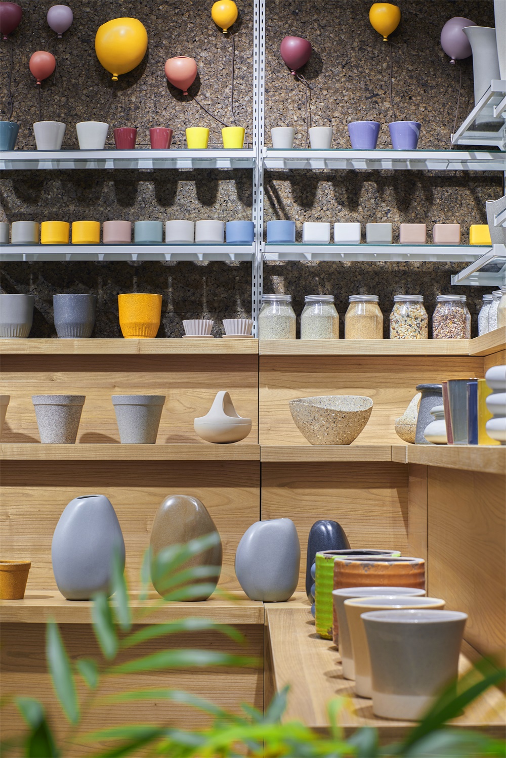
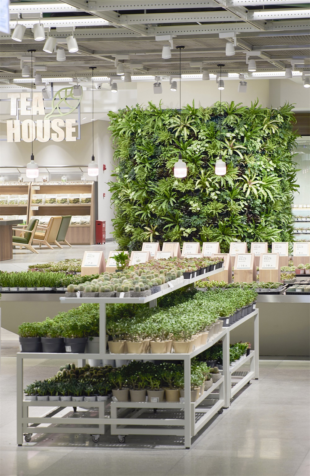
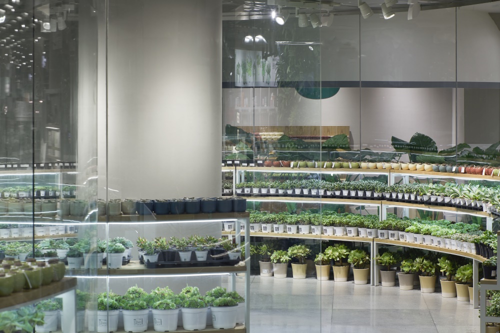
功能分區基本需求建立後,九大區域的合理安排、展示是首要考慮的重點,並且細化每個區域的呈現形式,分析區域產品的種類數量以及存放展示性。鹿島是以簡單實用、質樸自然、選擇性多為特色的快銷品牌,區域內的貨架需最大化的利用空間,盡可能多的放置物品是首要目的,以“綠植盆栽”為例,分為微小型、中型、大型、超大型,種類共計30種,在保證飽滿的前提下有序列化的展示,使視野清晰。
After the establishment of the basic requirements of the functional area, the reasonable arrangement and display of the nine regions are the primary consideration, and the presentation form of each region is detailed, and the type and quantity of regional products and the storage and display are analyzed. Ludao is a fast-selling brand characterized by simple and practical, simple and natural, and multiple choices. The shelves in the area need to maximize the use of space, and the primary purpose is to place as many items as possible. Taking “green potted plants” as an example, it can be divided into micro small, medium, large, and super large, with a total of 30 species. On the premise of ensuring fullness, it has a serialized display to make the vision clear.
陳列分為3大功能、7大方式,氛圍營造:通過櫥窗或者場景陳列;視覺焦點引導:專題陳列、係列陳列;單品重點突出:常規貨架陳列、係統化陳列以及綜合陳列。
Display can be divided into three major functions and seven major ways. Atmosphere creation: through window or scene display; visual focus guidance: thematic display, series display; single focus: regular shelf display, systematic display and comprehensive display.
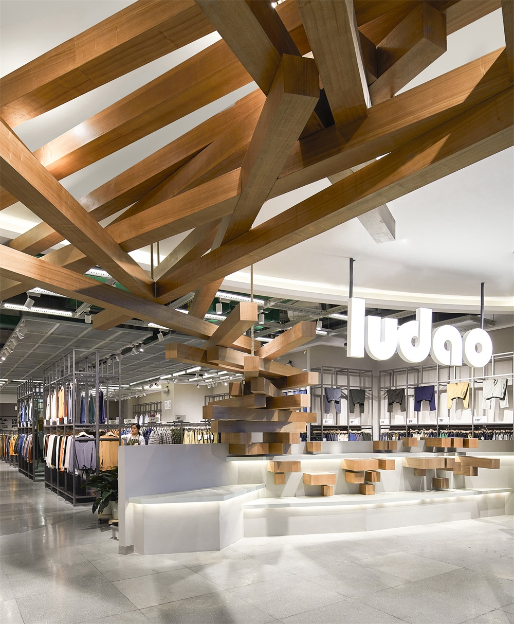
每個貨品有屬於自己的精確位置,從小到大尺寸嚴格規範化,陳列的貨架擺放也按照功能和用途設置為高、中、低三種,中低層主要為銷售區,方便顧客取拿,高層為展示區,營造氛圍和效果。如服裝區域,展台設計符合人體工程學,方便體驗與觸摸。
Each product has its own precise location, and its size is strictly standardized from small to large. The display shelves are also arranged in three types: high, medium and low according to their functions and purposes. The middle and low floors are mainly sales areas, which are convenient for customers to take. The high floors are Exhibition areas, which create atmosphere and effect. For example, in the clothing area, the design of the exhibition stand is ergonomic, convenient to experience and touch.
行為-鏈接性/Linkability
滿足功能分區與物品多元性後,考慮人在空間中的動態走向,如何利用空間設計提高“消費欲望”?
“欲望是創意的起點,設計是為了滿足人們的期望而產生,那麼期望的本質就會作用於設計的本質,“製造欲望”是零售空間設計的核心。”
How to improve “consumption desire” by using space design after meeting the functional partition and the diversity of goods and considering the dynamic trend of people in space?
“Desire is the starting point of creativity. Design is produced to meet people’s expectations. Then the essence of expectation will act on the essence of design.” making desire “is the core of retail space design”
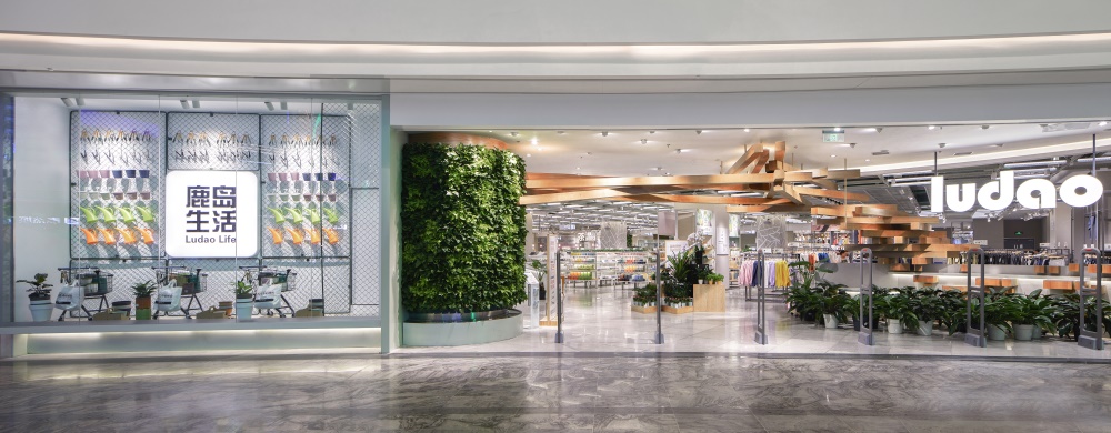
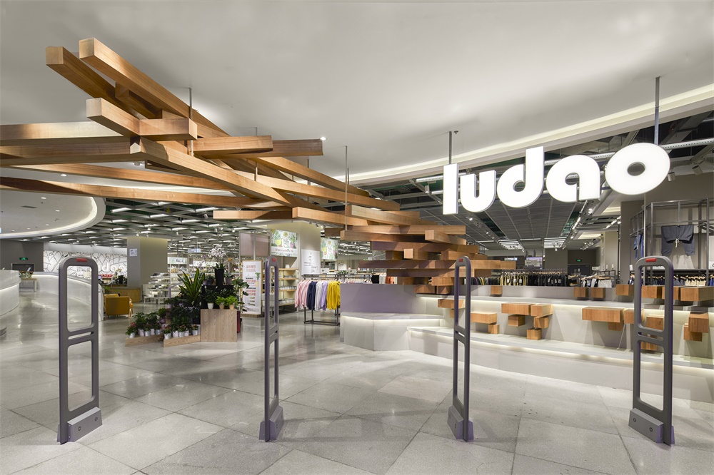
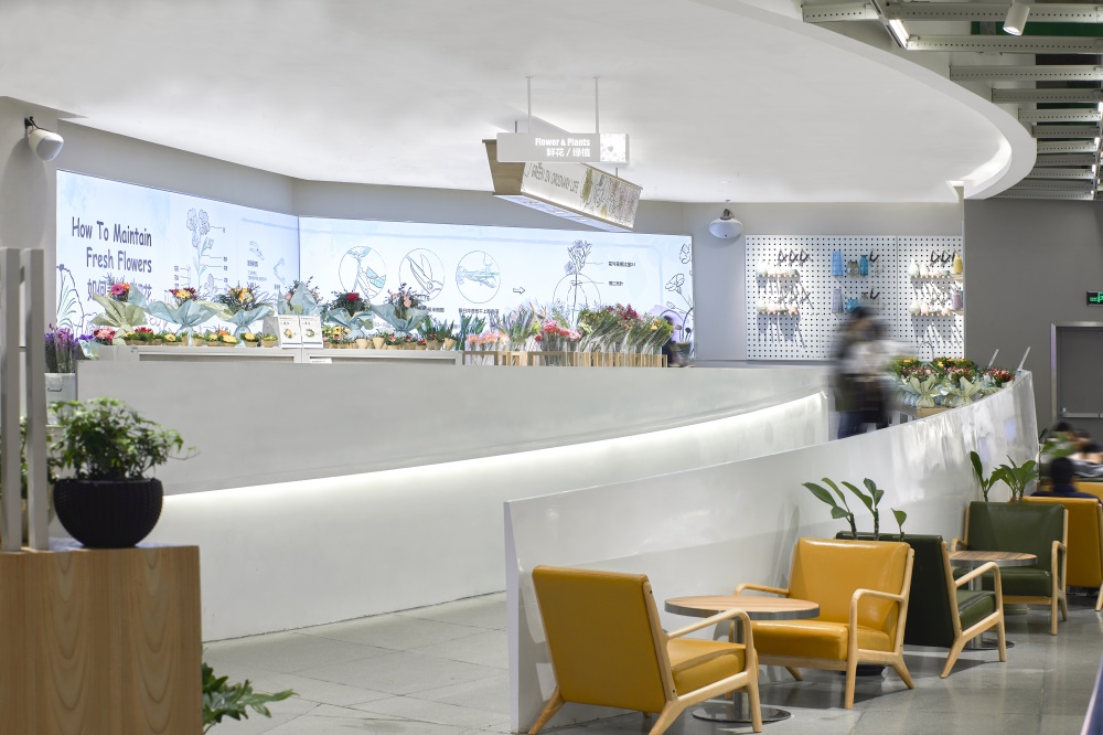
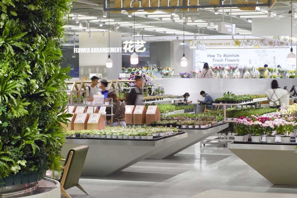
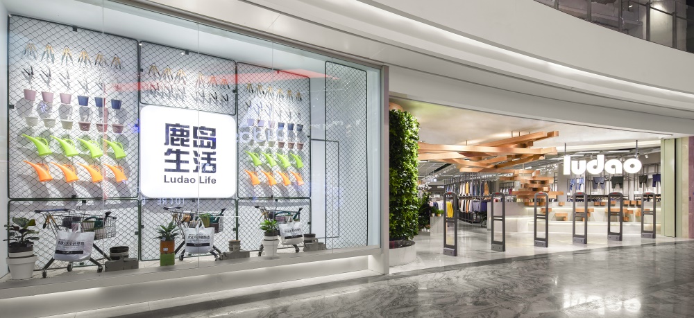
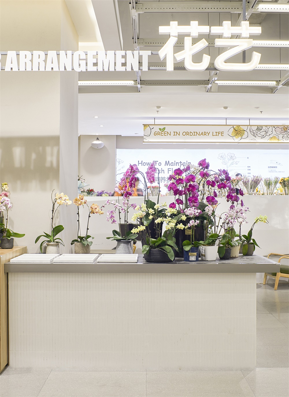
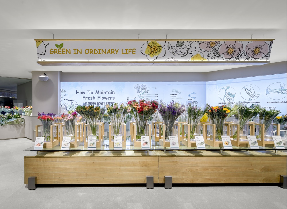
店麵門頭的采用大量的木頭造型而成,木頭與自然的貼合,門頭左邊是鹿島生活的logo和物品展示區,吸引來往顧客眼球。進入店麵,左邊是純白色的抬高扶梯–鮮花擺放區,往下走有配套的鮮花修剪工具區,再往前走是盆栽和多肉植物區,旁邊的展架是配套的盆器以及園藝用品、沙土工具,展架與展架之間有很強的鏈接性,使顧客可以在視野可見的區域範圍內找到配套的物品。
The front door of the store is made of a large number of wood shapes. The wood fits the nature. On the left side of the front door is the logo of life in deer island and the display area of goods, attracting the attention of customers. When entering the store, on the left is the pure white elevated escalator – the flower display area. There is a matching flower trimming tool area down, and then there is a potted plant and succulent plant area forward. The exhibition stand next to it is a matching basin utensil, gardening supplies and sand tools. There is a strong link between the exhibition stand and the exhibition stand, so that customers can find matching items within the visible area of vision.
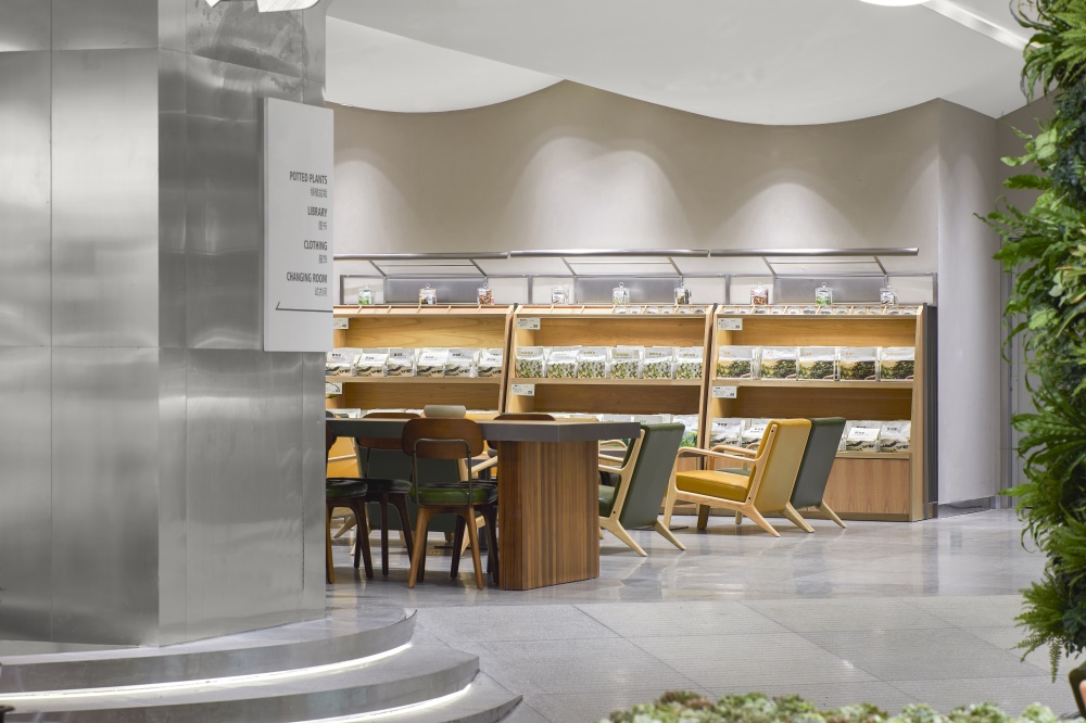
在鹿島生活的空間中我們在四個地方設計了休閑區,放置桌椅,以便顧客在閑逛中累了可以短暫休息後再繼續購物。空間的最裏單獨設置了茶飲休閑區,通過售賣茶飲,提供長時間休息的空間,亦可辦公或朋友三四交流。在營銷售賣的同時更在乎顧客的體驗感受。
In the living space of Ludao, we have designed a leisure area in four places, where tables and chairs are placed, so that customers can continue shopping after a short rest when they are tired from wandering. In the most part of the space, there is a separate tea leisure area. Through the sale of tea, there is a long rest space, which can also be used for office or friends’ three or four exchanges. At the same time, we care more about customers’ experience.
心理-互動性/Interactivity
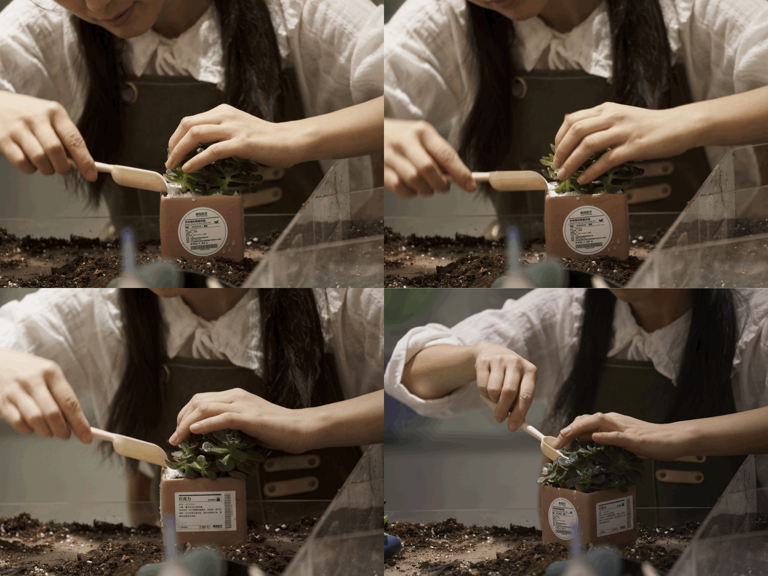
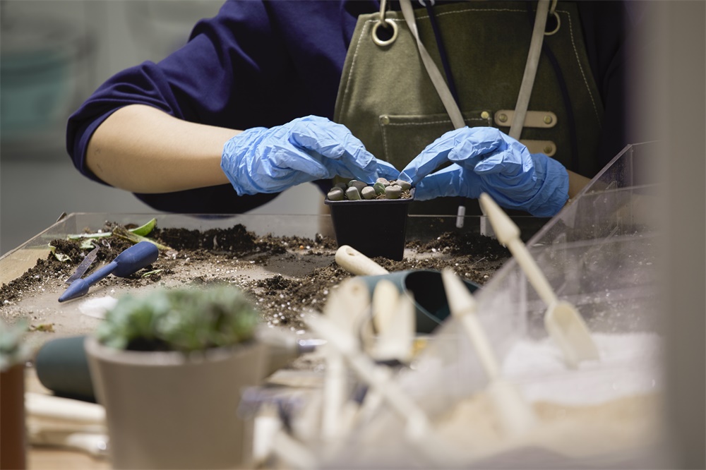
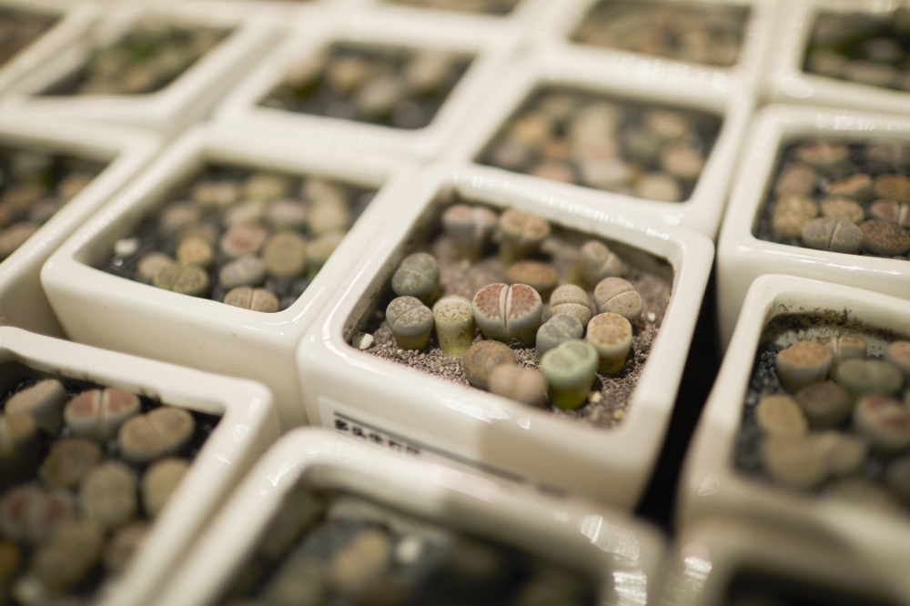
除了視覺和行為體驗,空間中亦存在讓心理“興奮”的互動設計。在多肉植物展區,我們規劃了一個DIY區,顧客可以選擇喜歡的多肉植物,以及盆器、泥土顏色,現場進行換盆;在花藝區,設計了花藝表演台,顧客可以從花束台選擇喜歡的單朵花進行自由搭配,動手剪裁,並選擇包裝後,形成自己喜好的一束花。
In addition to visual and behavioral experience, there are also interactive designs in the space that make the psychology “excited”. In the exhibition area of succulent plants, we have planned a DIY area, where customers can choose the succulent plants they like, pot utensils and soil colors, and change pots on site; in the flower art area, we have designed a flower art performance platform, where customers can choose the single flower they like from the flower bouquet platform for free collocation, hands-on cutting, and selection of packaging to form a bunch of flowers they like.
計算陳列展台間合理距離,以便店員可以隨時用推車補貨加量,或是整理、修剪植物,店員與植物的互動中,傳達給顧客花草植物的新鮮度以及更便於顧客對花草疑問與店員的詢問交流。
Calculate the reasonable distance between the exhibition stands, so that the shop assistant can replenish or trim the plants with the cart at any time. In the interaction between the shop assistant and the plants, convey the freshness of the flowers and plants to the customers and facilitate the inquiry and communication between the customers and the shop assistant about the flowers and plants.
感受-有趣性/Interestingness
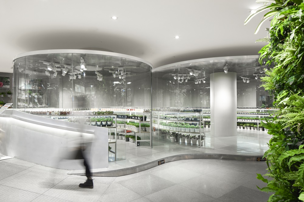
空間中存在很多趣味設置,比如玻璃球恒溫室,它是一個較獨立的空間用於存放需恒溫生存的植物,兩個環繞的玻璃球,步行於其中可體會到不同於其餘展區的感受。再往前行,設計了一個圖書閱覽空間,書籍主要關於植物、花藝與茶飲,周圍放置了桌椅板凳,可隨時在購物之餘停下來閱讀,了解更多知識。
There are many interesting settings in the space, such as the glass bulb constant temperature chamber, which is a relatively independent space for storing plants that need constant temperature to survive. Two surrounding glass balls can experience different feelings from other exhibition areas when walking in it. Further forward, a book reading space is designed. Books are mainly about plants, flower art and tea. Tables, chairs and benches are placed around. You can stop to read at any time after shopping to learn more.
鹿島生活的設計核心更偏重於「人」的體驗,營造整體的氣氛調動人的所有感受,通過視覺、觸感、材質、氣味、行為動態等,體驗和感受空間中人與物的通感,傳達出品牌表達的活力與有趣性,在空間中進行一場舒適的長時間的「感官之旅」。
The design core of Ludao life focuses more on the experience of “people”, creating an overall atmosphere to mobilize all feelings of people. Through vision, touch, material, smell, behavior dynamics, etc., experience and feel the synaesthesia of people and objects in the space, convey the vitality and interest of brand expression, and conduct a comfortable long-term “sensory journey” in the space.
主要項目信息
項目名稱:鹿島生活|LUDAO
項目地址:中國重慶|ChongQi,China
項目麵積:1800㎡
完成時間:2019.10
主要材料:黑色鋼板、拉絲不鏽鋼、木作、水泥肌理塗料
設計公司:集嘉設計
主創設計師:沈嘉偉
主案設計師:馬宏佳
執行設計師:張永川
公司網站:www.jijiaid.com
聯係郵箱:352216073@qq.com
項目撰文:楊拉蔓


