全球設計風向感謝來自 無非設計(深圳) 的商業空間項目案例分享:
女人,從來都帶著感性思維認知這個世界。雖韶華易逝、容顏易改,一切雲煙終是浮華。但積極樂觀的女人,始終擁抱陽光心態,得失無憂,來去隨緣。不管時光在你我容貌間留下多少滄桑,請永遠記住你那無法改變的初時模樣與心境……
Women have always known the world with perceptual thinking. Although youth is fleeting, and appearance is easy to change, all clouds and smoke are ultimately flashy. But positive and optimistic women, always embrace the sunshine mentality, gain and loss without worry, come and go with fate. No matter how many vicissitudes time has left between you and me, please always remember your unchangeable initial appearance and mood……
無非設計首次為Ttsp·X女裝品牌新商場旗艦店操刀設計,Ttsp·X是紮根佛山十數年的女裝品牌。隨著地區型商場的快速升級,原有店麵形象無法滿足現代女性審美要求,無非設計希望在Ttsp·X的新商場店鋪設計上為“她”升級形象,打造成一個低調輕奢的時尚美學生活館,從而占領市場。
It is the first time that the designer has designed for the flagship store of the new store of women’s wear brand of Ttsp·X, which has been rooted in Foshan for more than ten years. With the rapid upgrading of regional shopping malls, the original store image can not meet the aesthetic requirements of modern women, so the design hopes to upgrade the image of “she” in the design of the new store of TTSP · x, to build a low-key and light luxury fashion aesthetic life hall, so as to occupy the market.
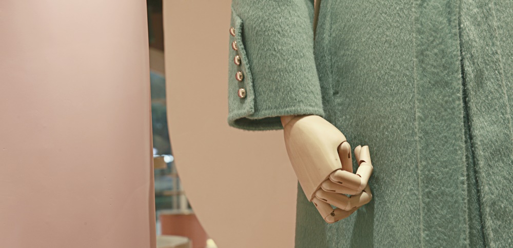
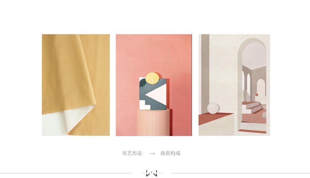
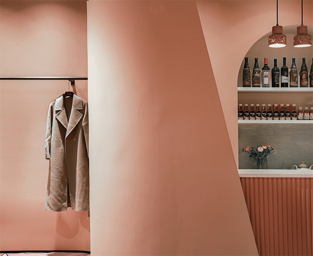
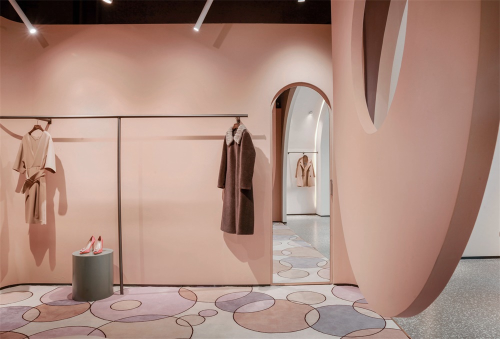
設計靈感來源服裝的布藝麵料本身。我們從中提煉“曲線”符號,構建曲麵空間。步入室內,仿若置身於一個極具動感的空間,搭配的高級空間色彩,使人通過感覺獲得對產品的印象,進而對品牌形成新的識別與認知。
Design inspiration comes from clothing fabric itself. We extract the “curve” symbol from it and build the surface space. Stepping into the room, like being in a very dynamic space, with high-level space color, people can get the impression of products through feeling, and then form a new recognition and cognition of the brand.
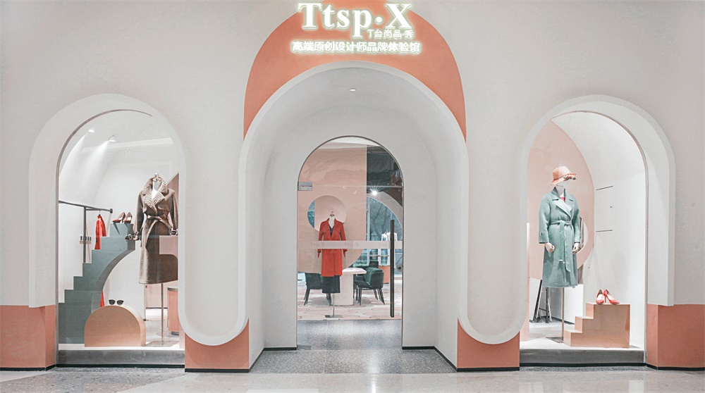
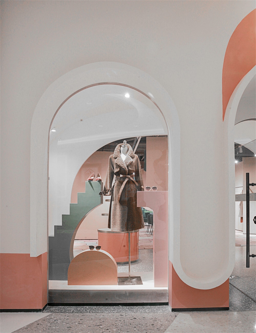
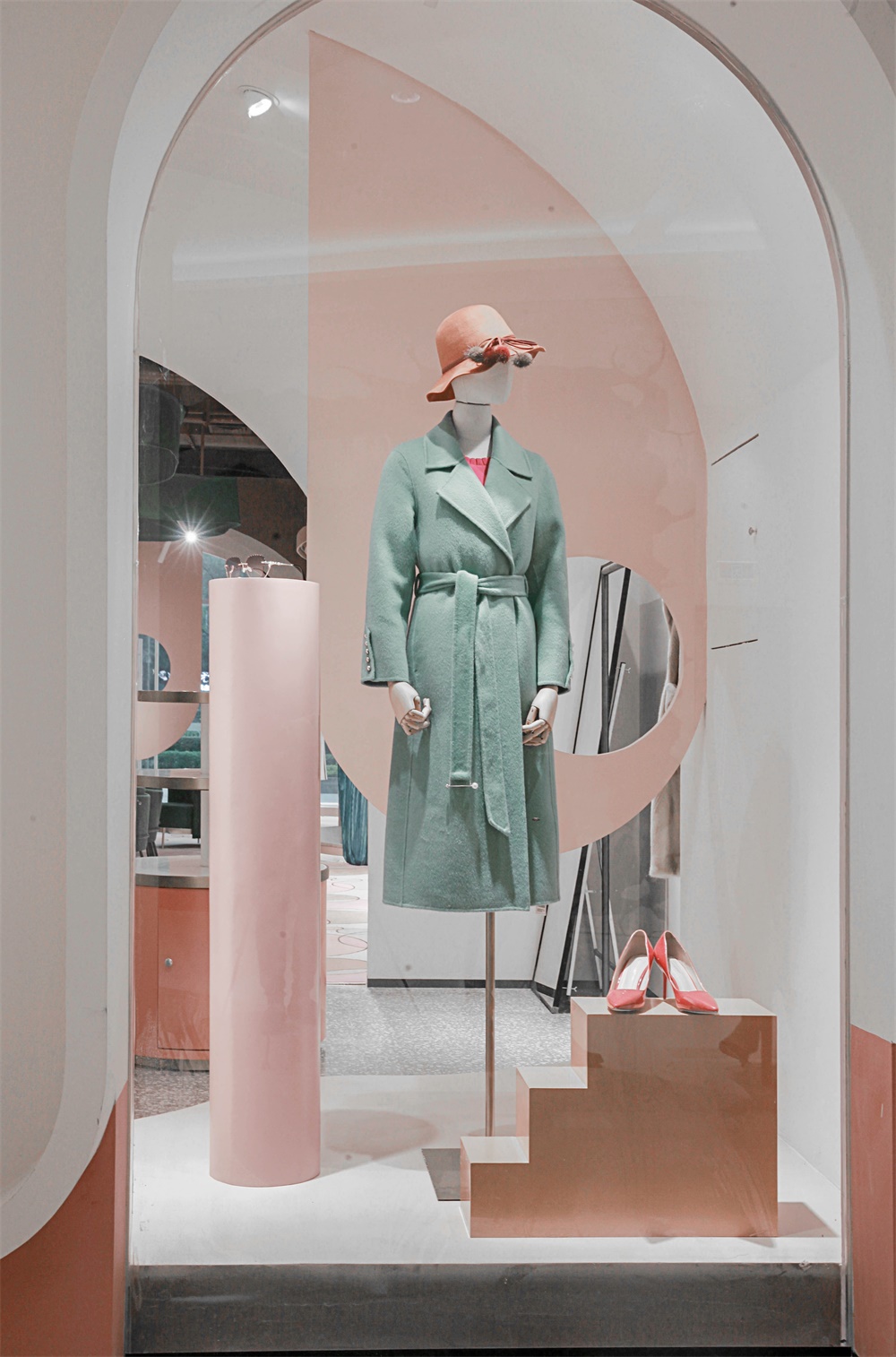
門頭設計,打破千篇一律的大開門形式,而設計成中間對稱的“M”曲麵造型。門口設計在正中並後退1.2米進入,不求誇張的和諧色彩與柔和的燈光表現,不僅營造了舒適寧靜的氣氛,亦在不經意間悄然表達一種低調謙卑而極具儀式感的迎接方式。入口兩邊為曲形櫥窗,強調內部空間與商業街區的間隔式設計。各種材質的質感、色彩、線條、形狀的重複組合,構成富有藝術情調的展示空間。
The door head design breaks the stereotyped form of large door opening, and is designed into a symmetrical “m” surface shape in the middle. The design of the door is in the middle and 1.2m backward. The harmonious color and soft light performance are not exaggerated. It not only creates a comfortable and peaceful atmosphere, but also quietly expresses a low-key, humble and ceremonial way of greeting. Both sides of the entrance are curved windows, which emphasize the interval design between the internal space and the commercial block. The repeated combination of texture, color, line and shape of various materials constitutes an artistic display space.
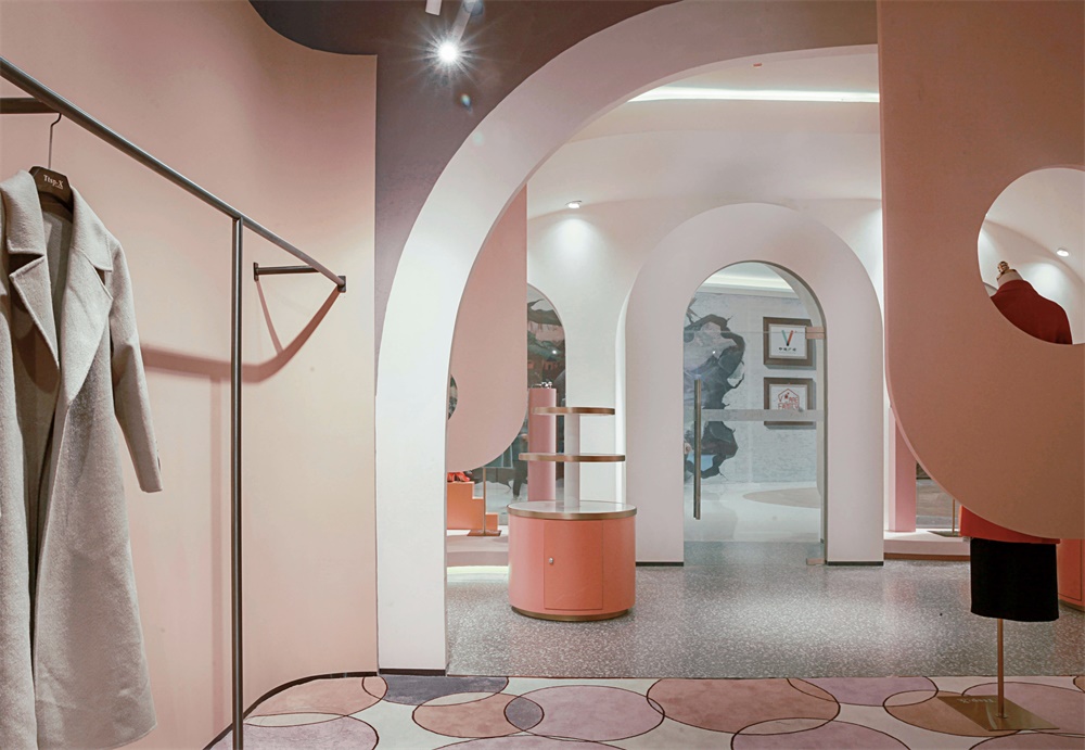
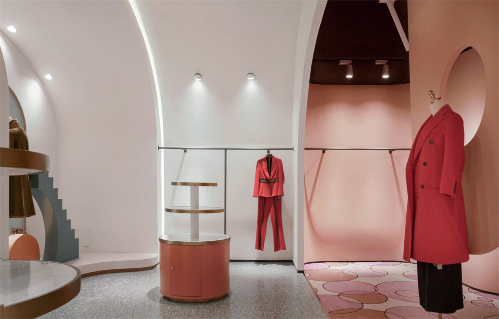
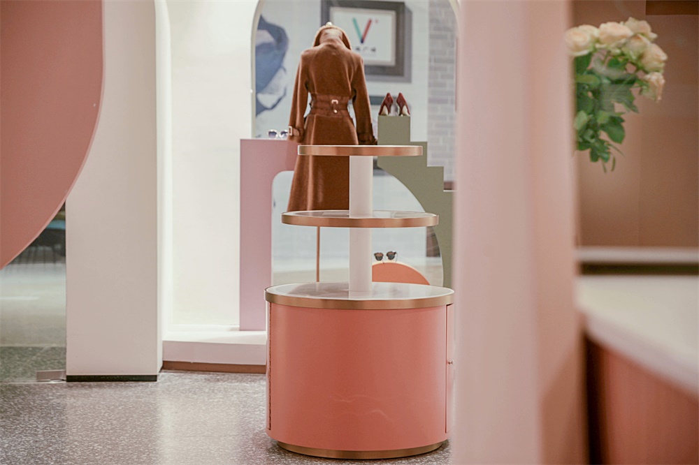
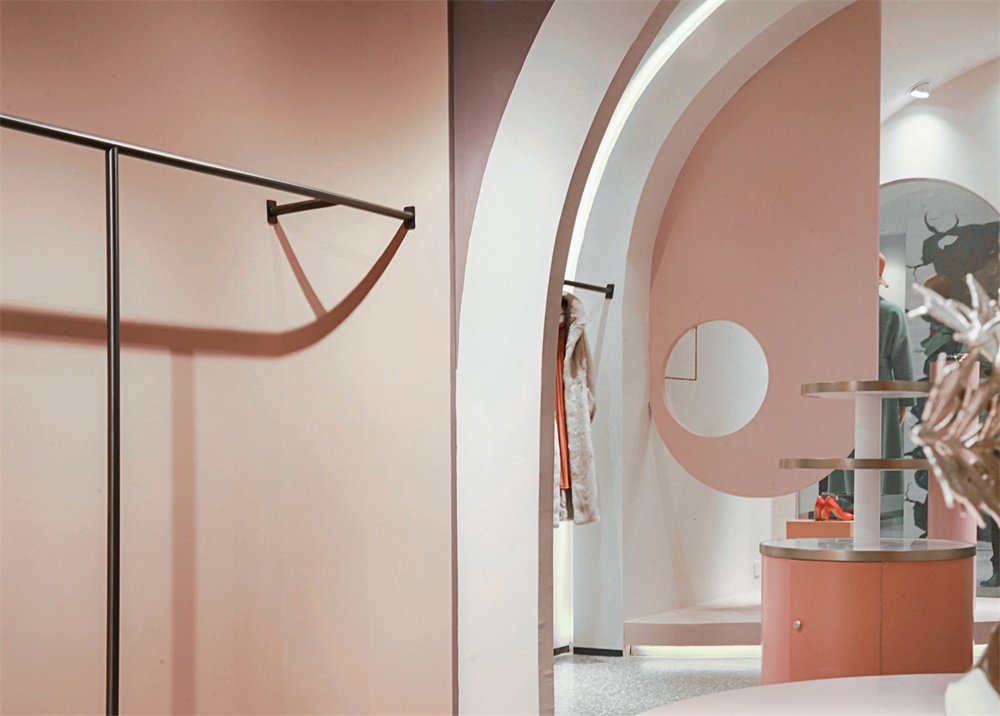
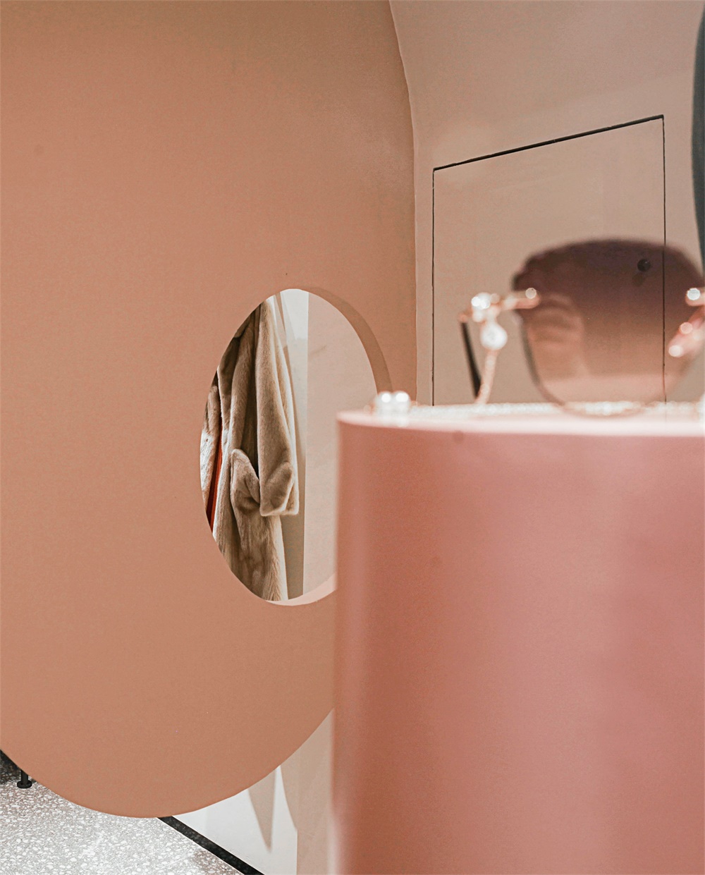
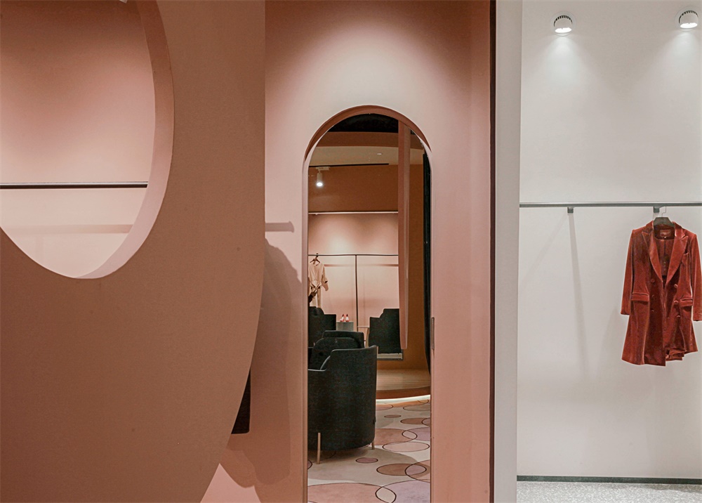
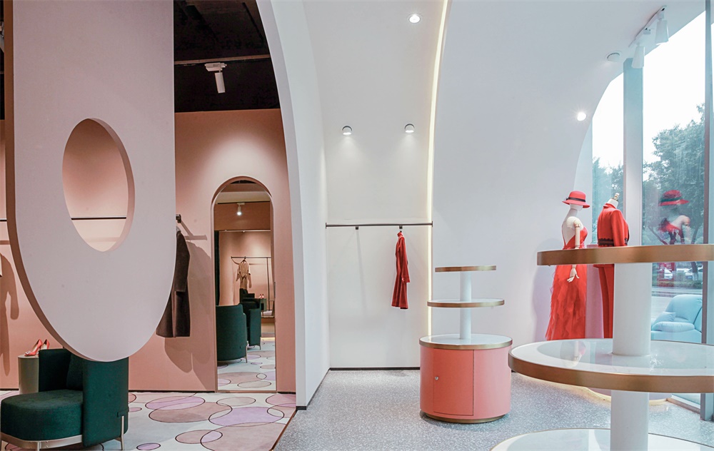
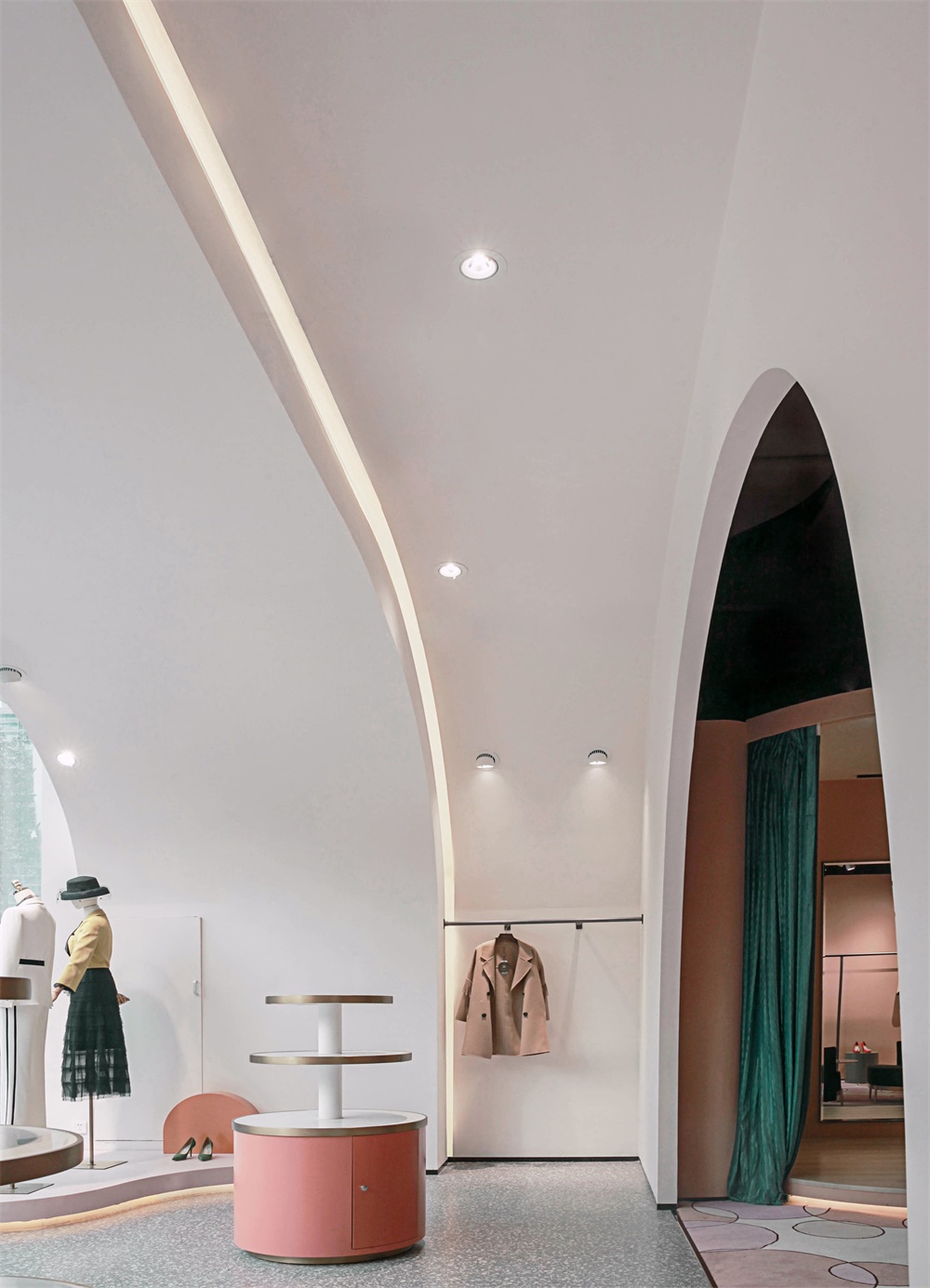
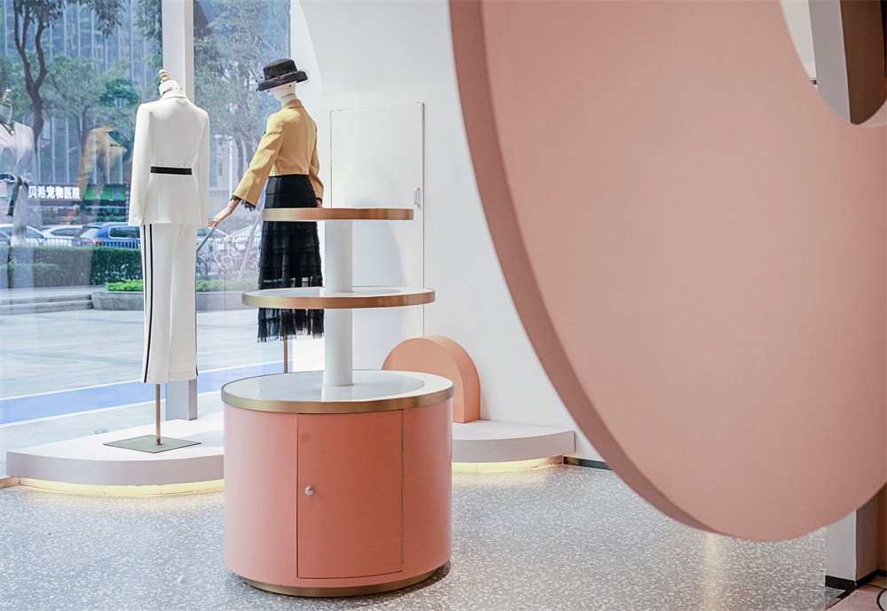
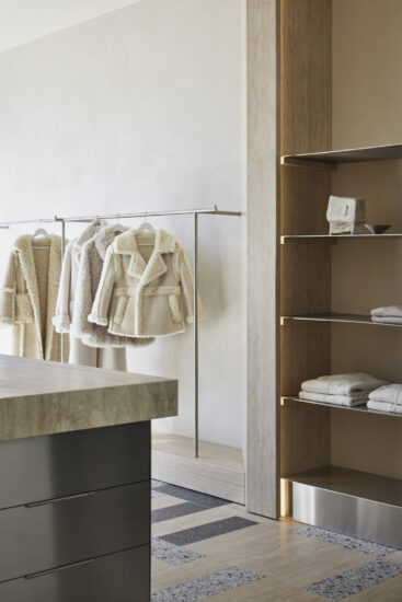
在入門前廳展賣區,為塑造品牌氣質,我們沿用曲麵元素將前廳設計為弧麵穹頂,並通過兩級牆麵和天花的高低前後錯位設計,豐富層次,塑造出獨特氣質的流線之美。衣架陳列、層層疊展、卷曲造型等陳列組合看似隨心所欲、實則獨具匠心。身臨其中,既有共性又充滿個性的體驗感撲麵而來。圓形櫃台的陳列以平麵、立體、抽象、動感等形式存在於空間,無形中成了空間最有趣味的一抹亮色。
In the entrance lobby exhibition area, in order to create the brand temperament, we use the curved surface elements to design the lobby as an arc dome, and through the dislocation design of the two-level wall and ceiling, enrich the levels, and create the streamline beauty of unique temperament. The display combination of hanger display, layer upon layer display, curly modeling, etc. seems to be arbitrary, but in fact, it has originality. In it, there is a sense of experience with both commonness and individuality. The display of circular counter exists in the space in the form of plane, three-dimensional, abstract and dynamic, which has become the most interesting bright color in the space.
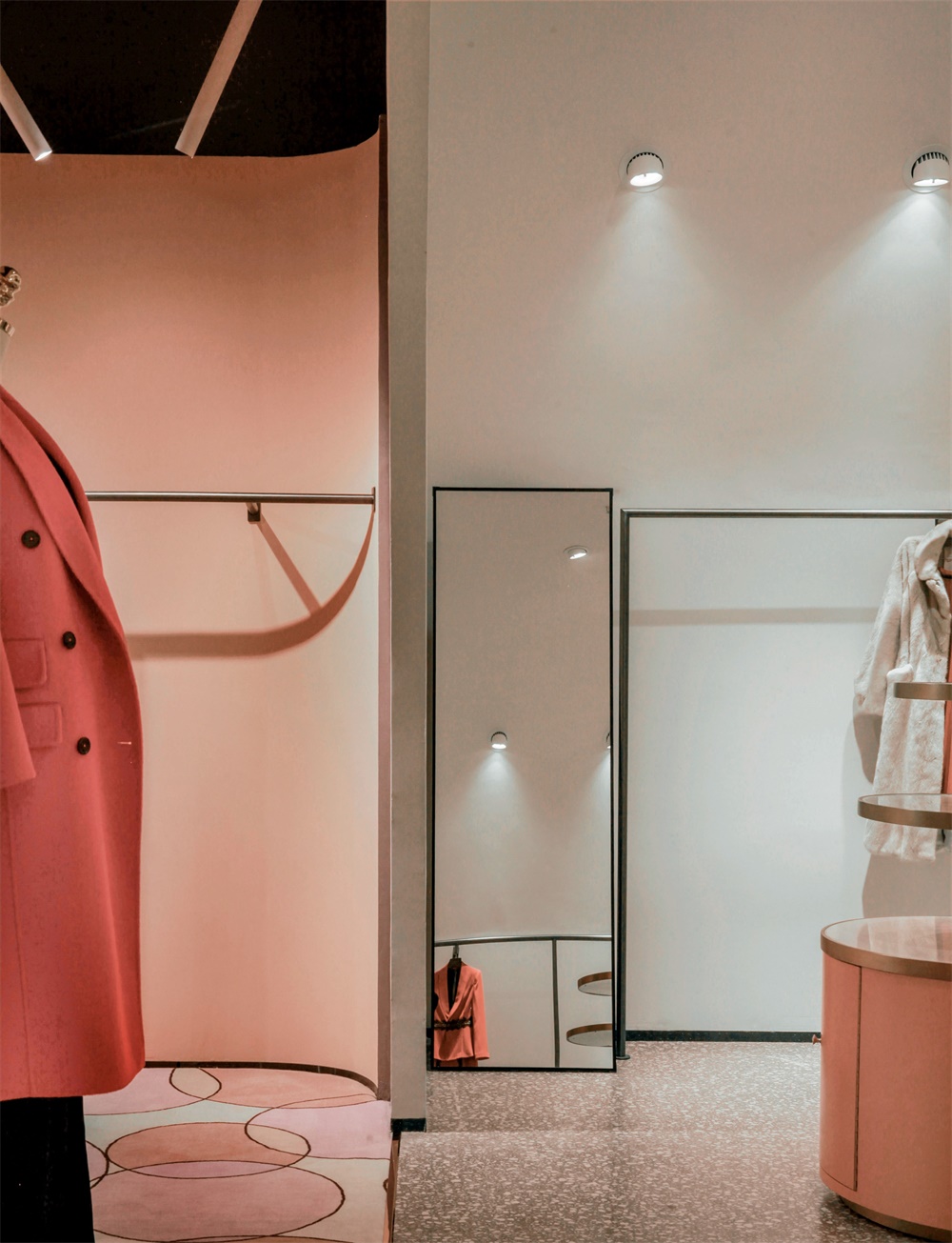
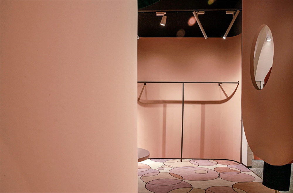
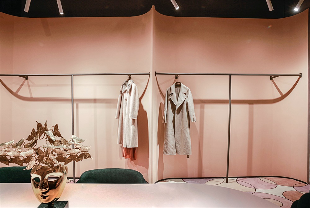
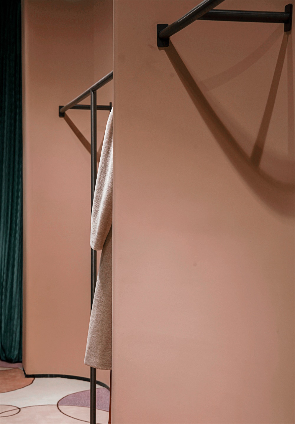
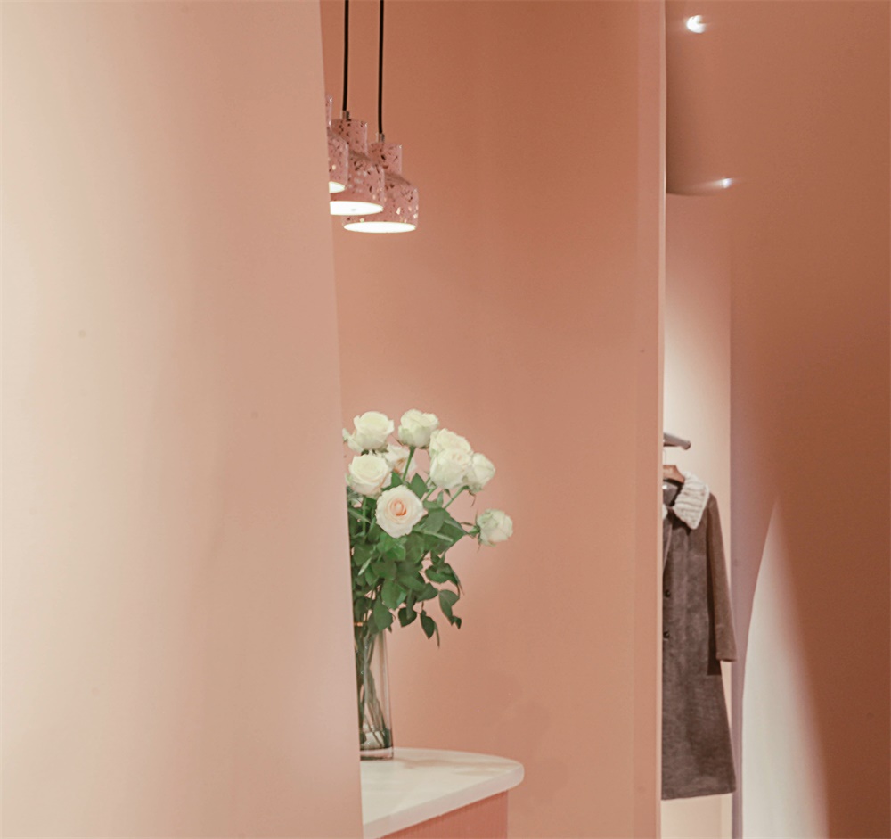
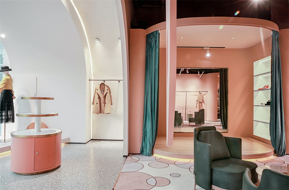
中廳設計,我們大膽將左右兩邊貨架展示牆化為兩條自然彎曲的弧麵布藝造型,所有貨架以穿針引線形式插入牆體。收銀台、倉庫、換衣間燈功能區巧妙設置於轉折處的空間,裝點以高級的粉橘色係。前台設計為半包裹形式,傳達女性“猶抱琵琶半遮麵”的含羞之意,卻又不失大雅。中間為休閑長桌,此處將不定期舉辦各種會員內部沙龍及美學課程,如花藝、手工、攝影等。試衣間設計改變常規做法,設計為試衣大舞台,讓客戶試衣時如登上舞台成為美的視覺焦點。
In the design of the middle hall, we boldly transformed the display walls of the shelves on the left and right into two naturally curved curved fabric shapes, and all the shelves were inserted into the walls in the form of pins and needles. The function areas of cash register, warehouse and dressing room light are cleverly set in the turning space, decorated with advanced pink orange color. The front desk is designed in the form of half package, which conveys the shy meaning of “holding lute and covering face”, but it is elegant. In the middle is a long table for leisure. From time to time, there will be various internal salons and aesthetic courses for members, such as flower art, handicraft, photography, etc. The design of the fitting room changes the conventional practice and is designed as a large stage for fitting, so that when customers try on the stage, they will become the visual focus of beauty.
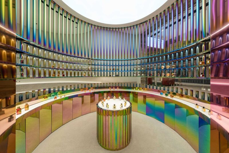
後廳展賣區為近馬路次入口,作為門店形象及街邊引流。西麵與前廳一樣為弧麵穹頂,材質的肌理、色彩的漸變、光影的虛實、空間的層次、展品的精致靈巧、設計的精心與考究,無不使其呈現濃鬱的品牌文化。
The back hall exhibition area is near the road entrance, which serves as the store image and street drainage. The west side, like the front hall, is an arc dome. The texture of the material, the gradual change of the color, the virtual reality of the light and shadow, the level of the space, the delicacy and dexterity of the exhibits, the meticulousness and refinement of the design all make it present a strong brand culture.
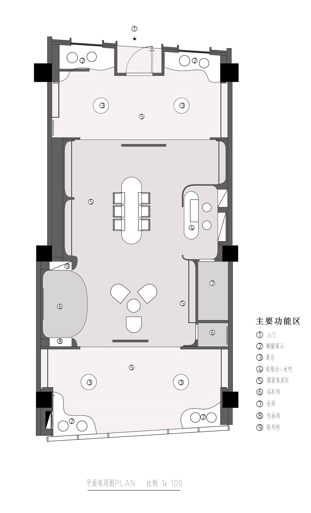
∇ 平麵布局圖
關於無非設計(深圳)
用廣告思維重塑空間美學新高度
成立於2017年,設計師團隊均畢業於中國著名八大美院。W專注於高端商業空間設計及室內軟裝陳設,立足於本土設計的再創造,將現代創意思維融合東方文化,以獨特的審美視覺和跨界顛覆的思維表達商業空間的獨特性,幫助更多品牌獲得全新的空間體驗。其作品已獲得國內外知名大獎,並成為中國頂尖設計機構之一。
Founded in 2017, the designer team has graduated from the famous eight National Academy of Fine Arts in China. W focuses on high-end commercial space design and interior soft furnishings. Based on this The re creation of soil design integrates modern creative thinking with oriental culture. Expressing commercial space with unique aesthetic vision and transversive subversion thinking. Uniqueness helps more brands gain a new space experience. Its work has already been made It has won famous awards both at home and abroad and has become one of the top design institutes in China.
主要項目信息
設計公司:無非設計(深圳)
主創設計師:曹博文
設計團隊:陳小北、薛茵琦,朱武清
設計內容:室內設計、軟裝設計
項目麵積:140.0 平方米
完工時間:2020年1月
主材:水磨石地磚、本傑明塗料、地毯、黑鈦金不鏽鋼、木地板
地址:中建燈湖領袖廣場,佛山,中國
攝影:REDFLAG


