全球設計風向感謝來自 臥野空間設計事務所 的辦公室項目案例分享:
空間設計/展開設計研究所辦公室
一次與材質的對話/將回憶延續的空間之旅
A conversation with the material
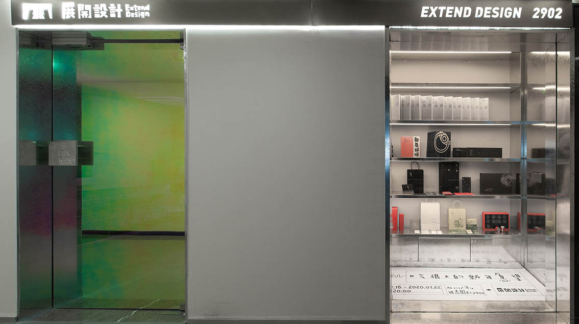
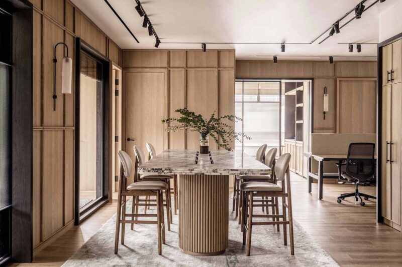
此次項目來自臥野的兄弟公司,展開設計研究所委托。業主希望盡可能保留原有的家居軟裝。因此,我們運用簡潔有力的材質及手法,為其量身打造了空間係統。
The project was commissioned by EXTEND DESIGN. The owner wants to keep the original home furnishings as much as possible. Therefore, we use simple and powerful materials and methods to create a space system tailored for it.
//模糊的邊界
有限空間內的極致區域劃分
//FUZZY BOUNDARY
Area division in a limited space
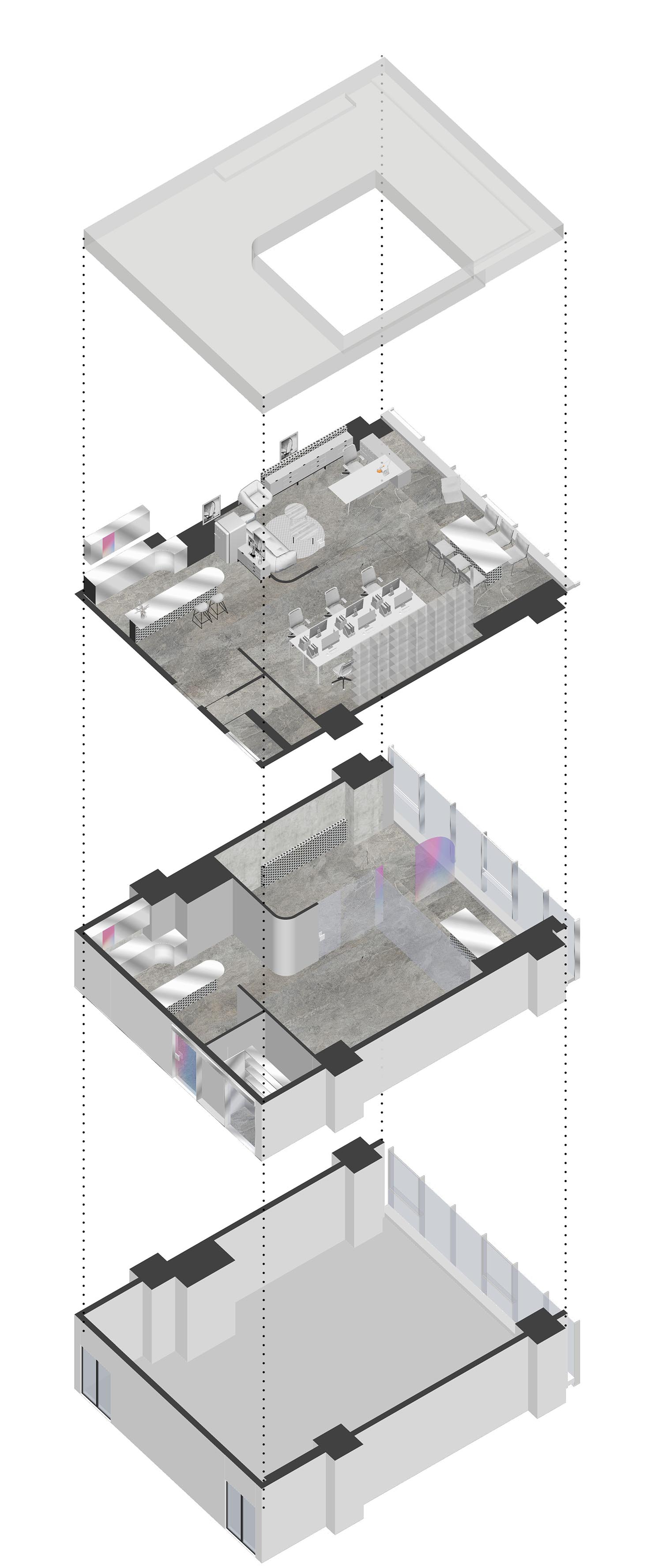
∇ 軸測圖
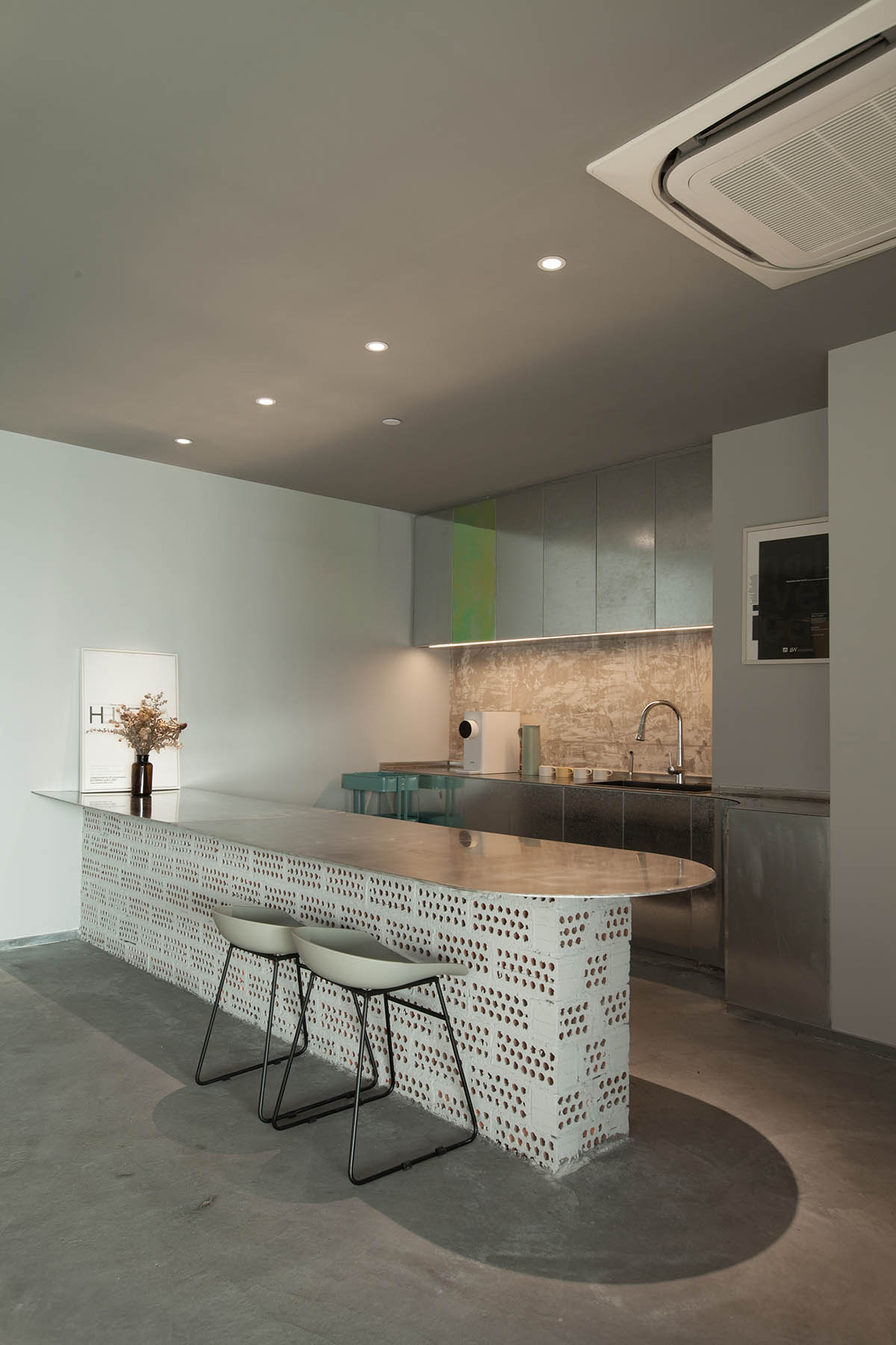
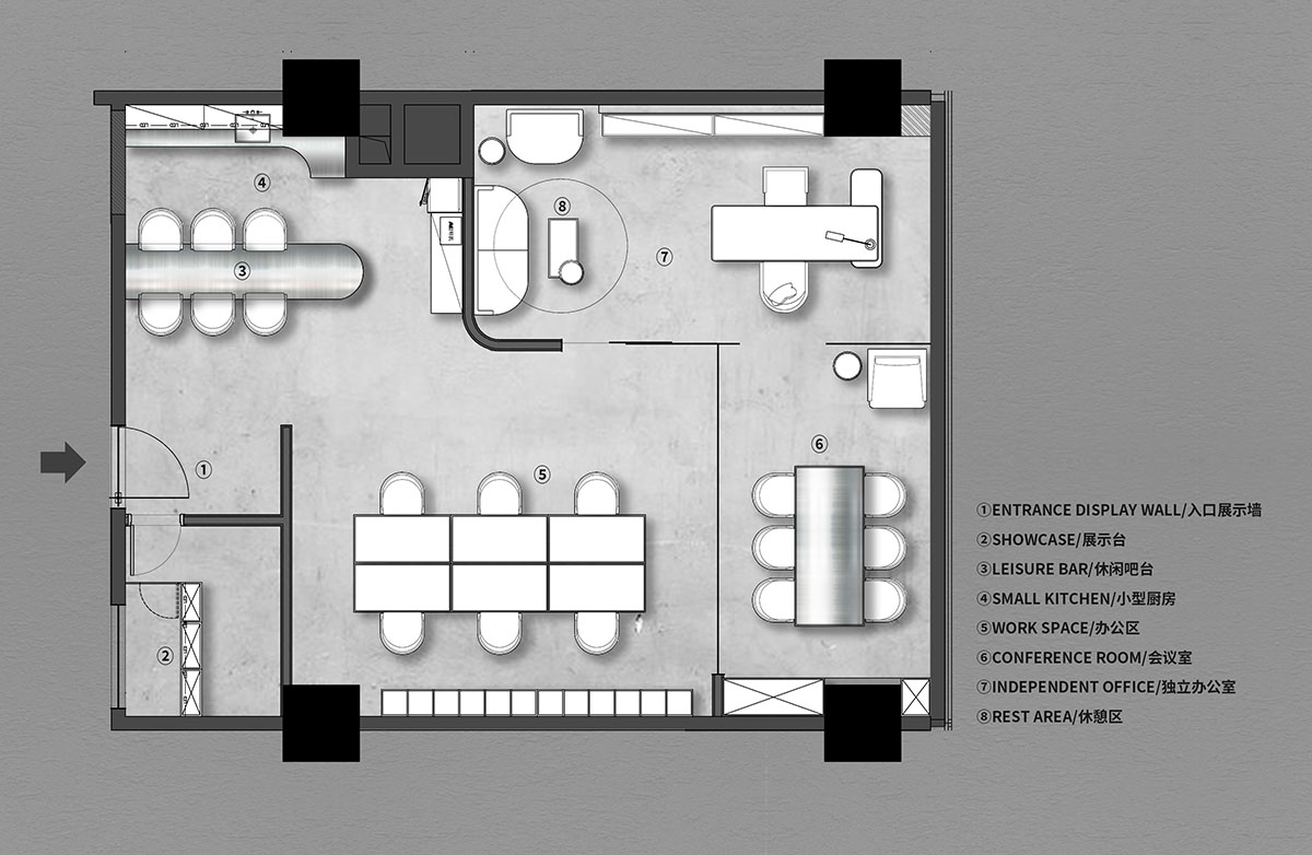
鑒於實際可用麵積的局限,我們模糊了部分功能區域的邊界。
布局的過程中,我們發現這樣劃分不僅將空間利用最大化,同時使得氛圍靈動有趣。
Due to the limitation of the actual usable area, we blurred the boundaries of some functional areas. In the process, we found that this division not only maximizes the use of space, but also makes the atmosphere dynamic and interesting.
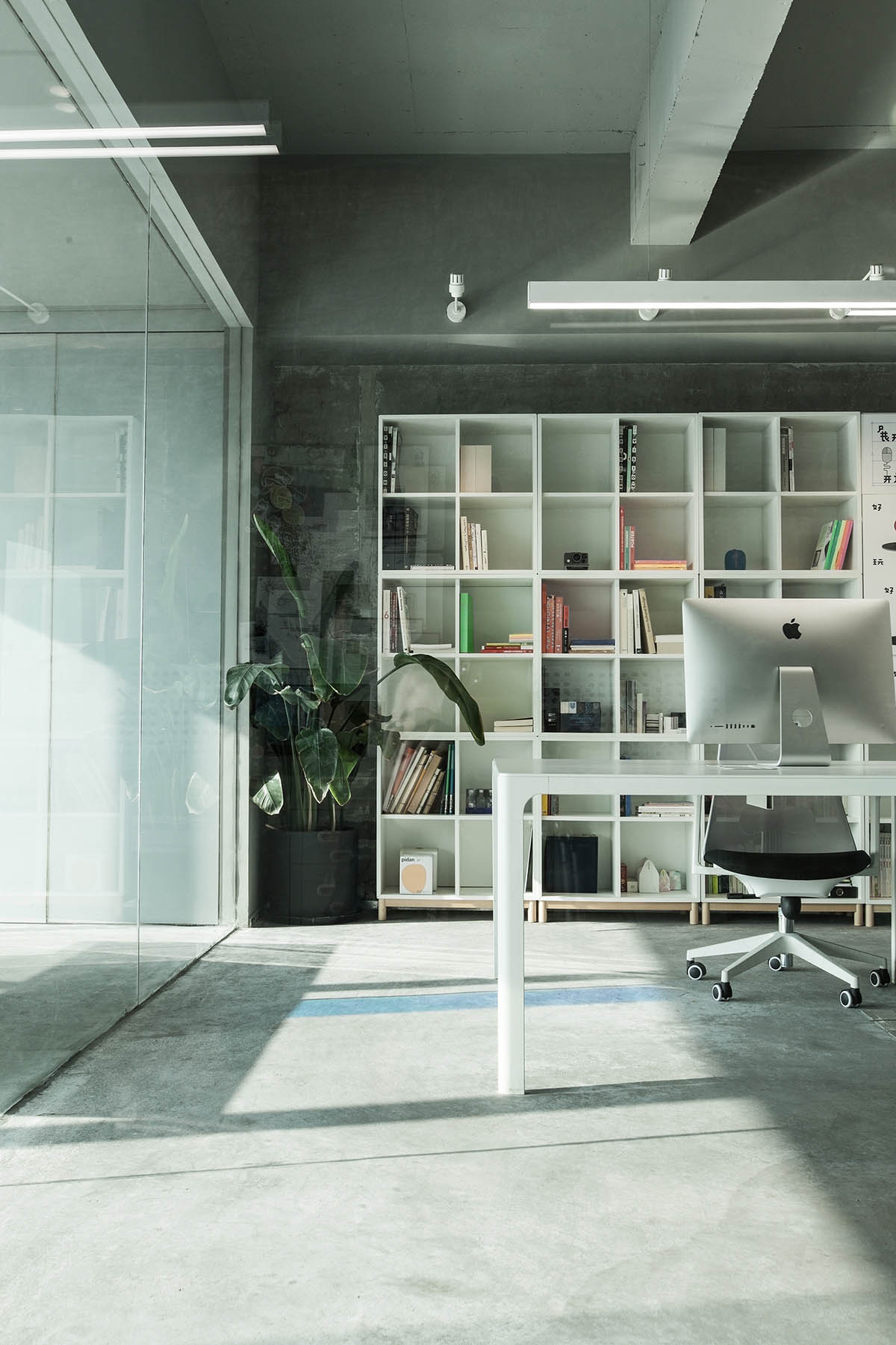
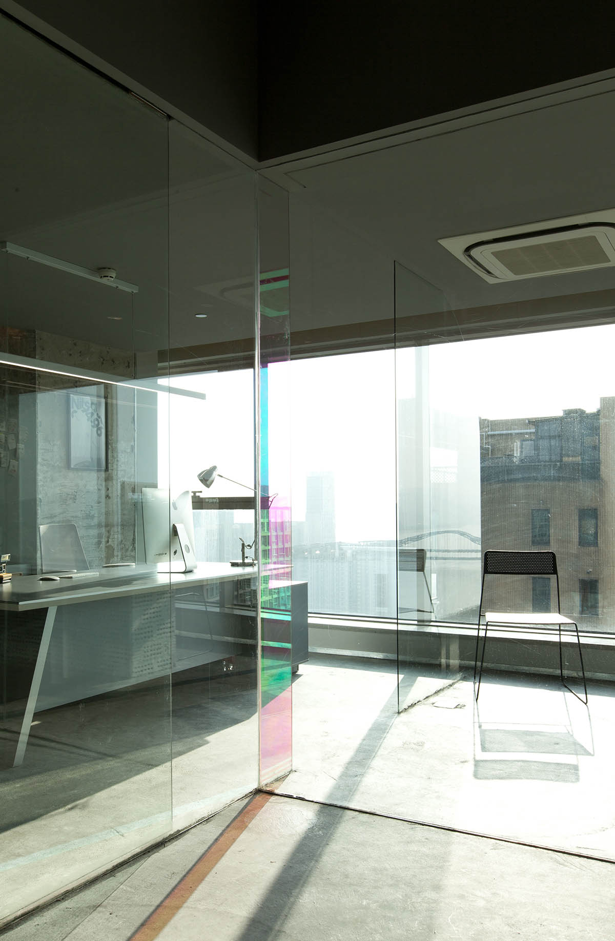
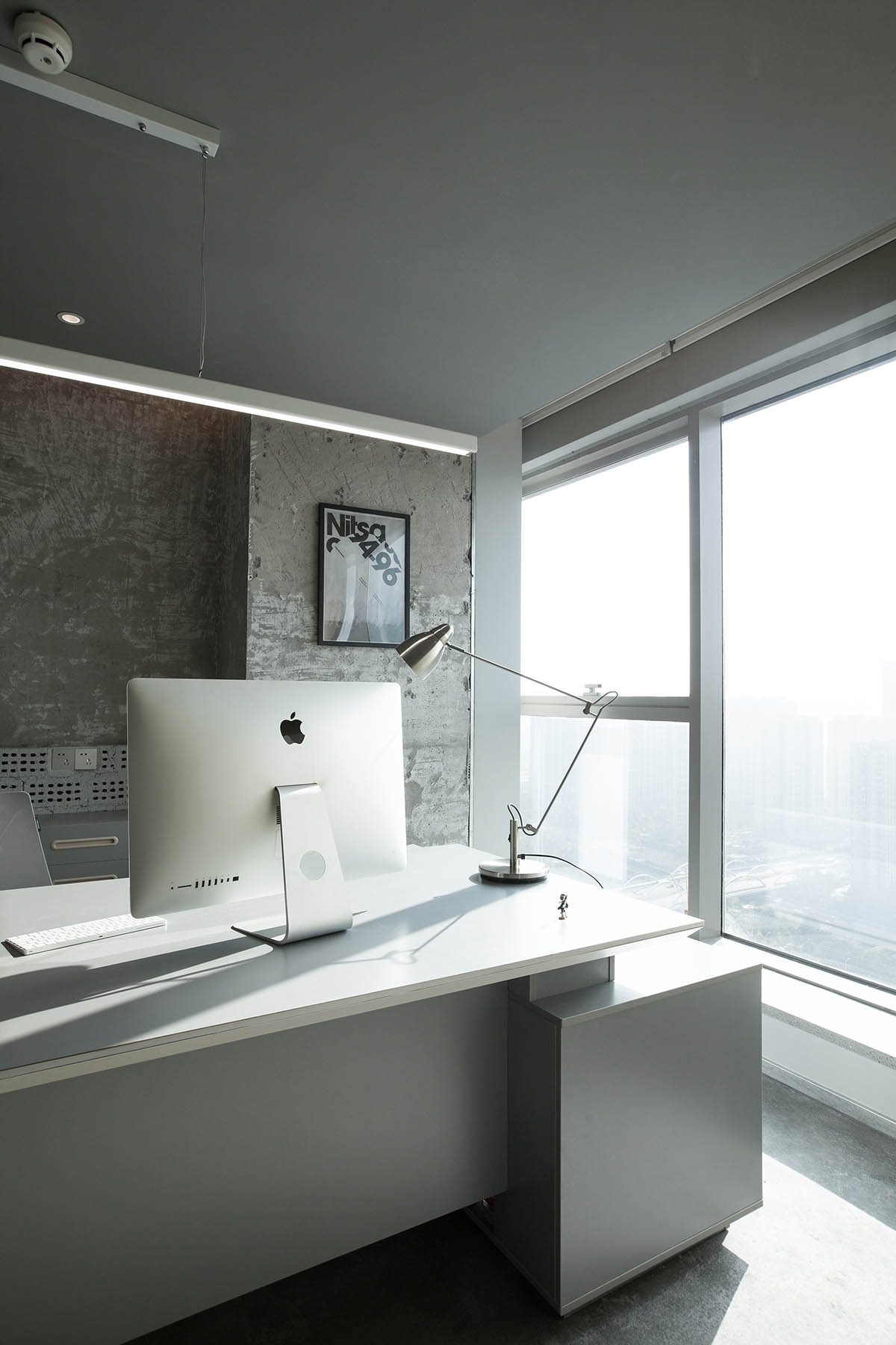
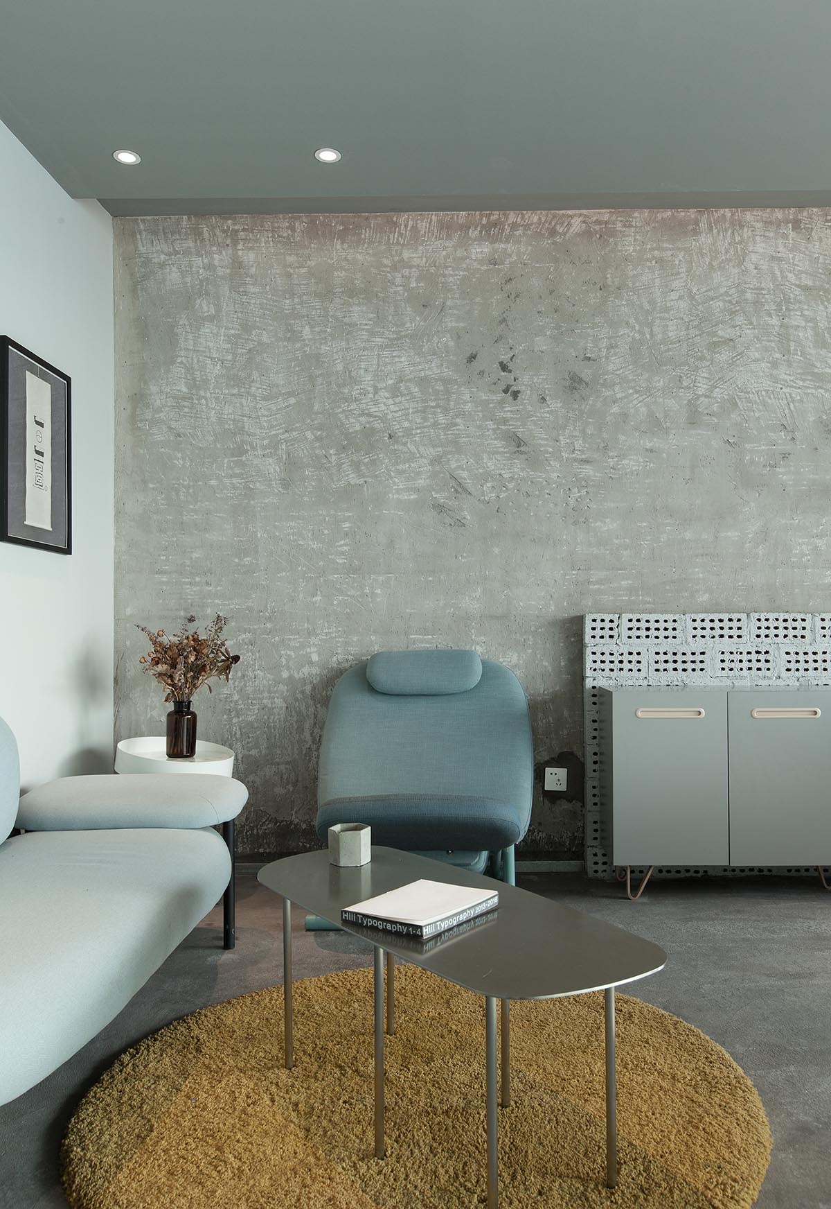
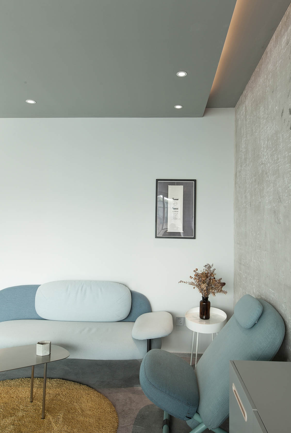
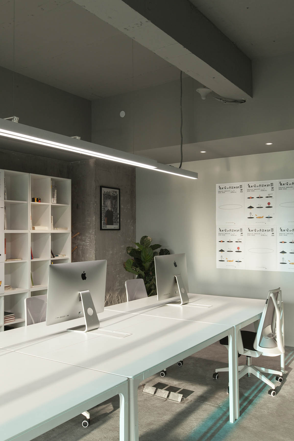
開放式的休閑空間局部吊頂,而沿著巨大的弧形轉角則是開闊的辦公區域,錯落的頂部高差豐富整體空間節奏。
The open-ended leisure space adopts the form of a partial ceiling, while the huge curved corner is an open office area, and the staggered top height difference enriches the overall space rhythm.
//回憶的延續
包含記憶的軟裝置入
// CONTINUATION OF MEMORIES
Furniture full of memories
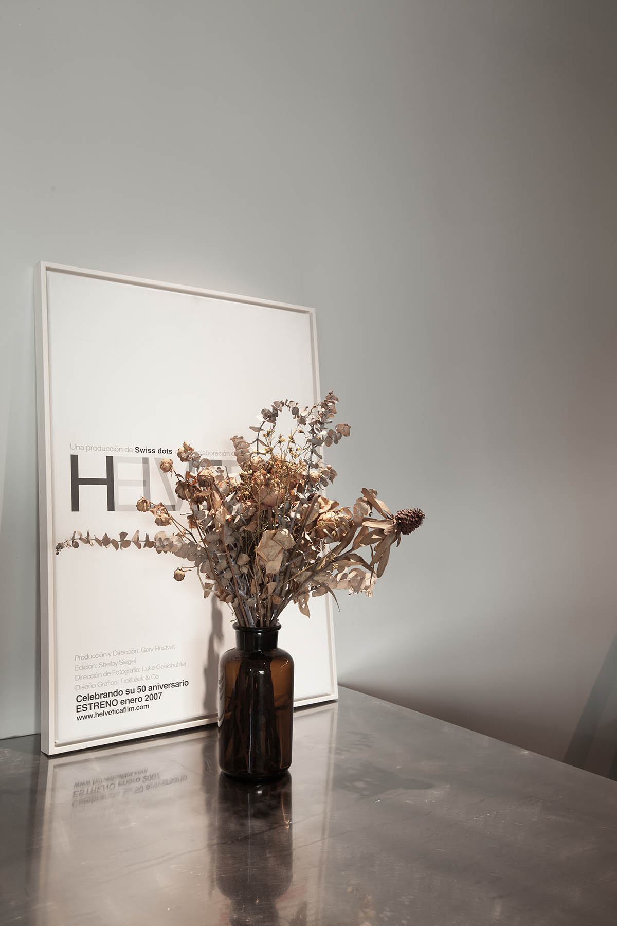
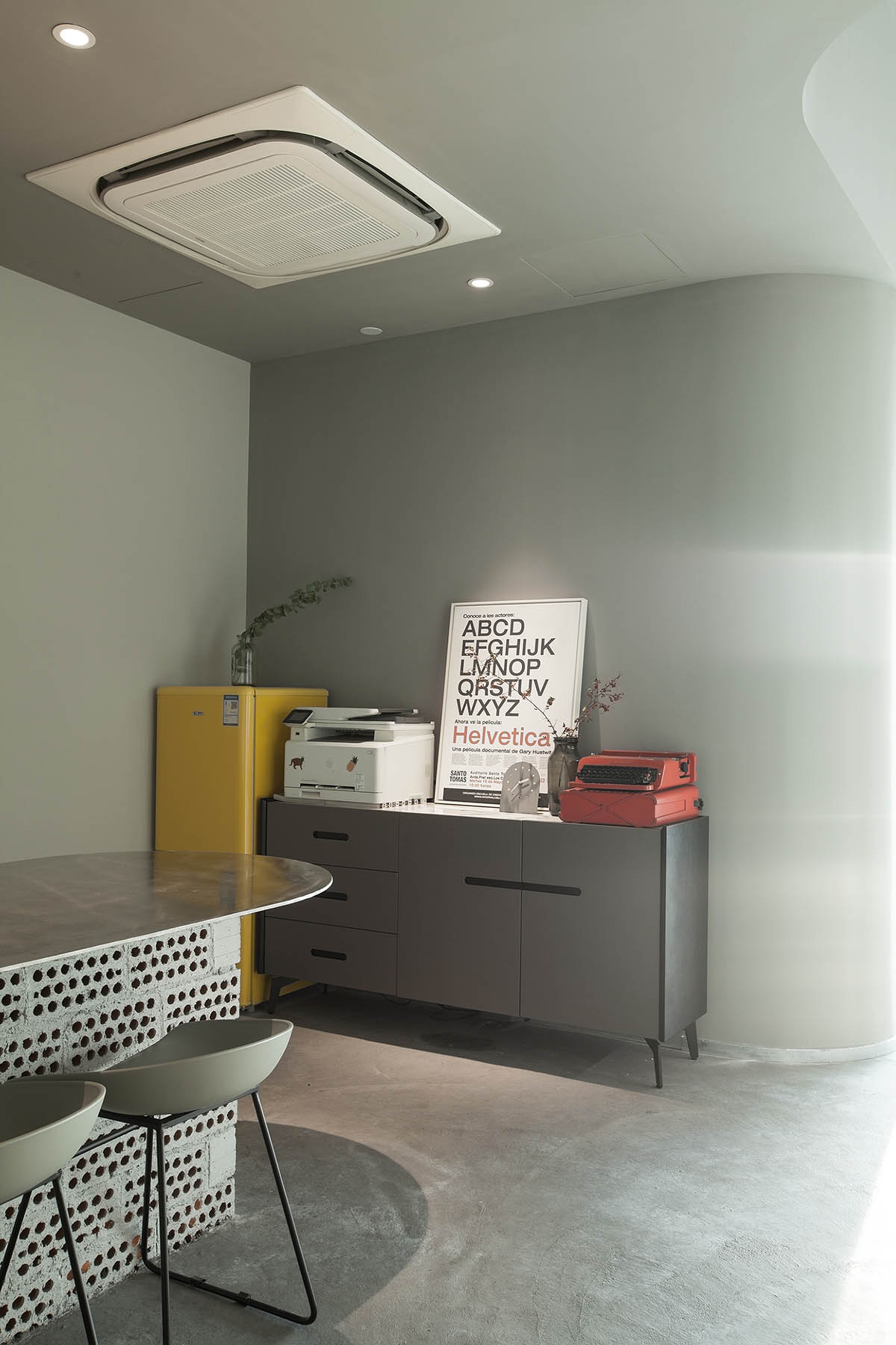
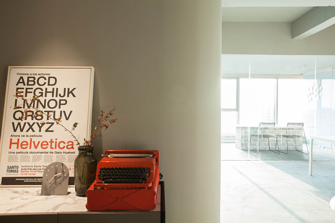
業主本身的意願是想盡可能保留原有家具及軟裝陳設。
因此,設計團隊和施工團隊就材料選擇和布局上進行了詳細討論和嚴謹實施。最終,幾乎所有家具都得以利用並嚴格控製了造價。
The owner’s own desire is to keep the original furniture and furnishings as much as possible.
Therefore, the design team and construction team conducted detailed discussion and rigorous implementation on material selection and layout. In the end, almost all furniture was used and the cost was strictly controlled.
//與材質的對話
原始粗曠的材質散發新活力
// A CONVERSATION WITH THE MATERIAL
Original rough texture exudes new vitality
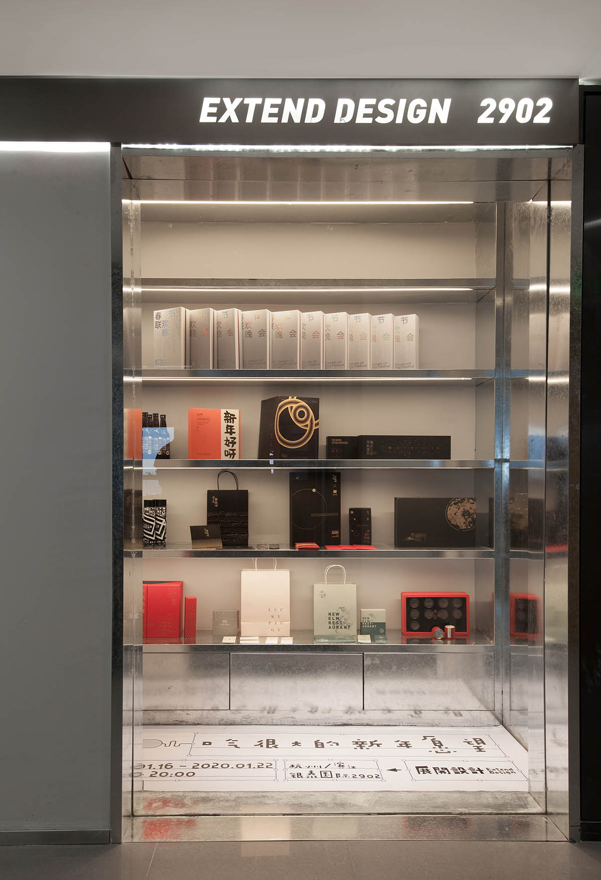
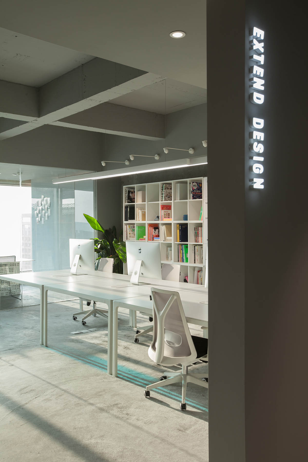
展開設計是一家專注打造品牌視覺的工作室,團隊年輕且有活力。他們希望能打造出幹淨別致,同時能體現出力量感的辦公空間,這與設計團隊的思路不謀而合。
EXTEND DESIGN is a studio focused on creating brand vision, with a young and dynamic team. They hope to create a clean and chic office space that also reflects a sense of strength, which coincides with the thinking of the design team.
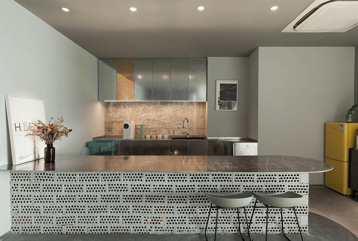
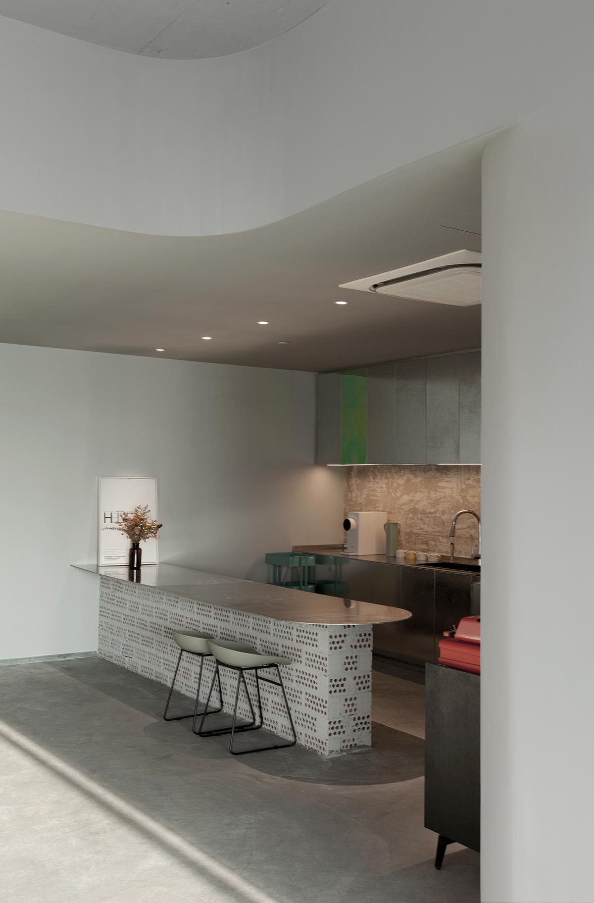
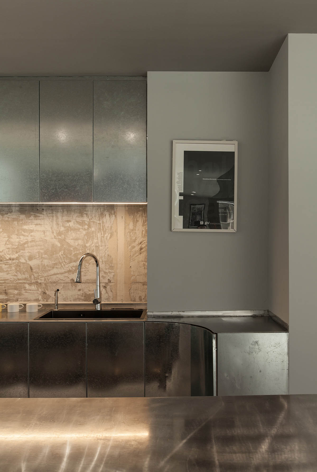
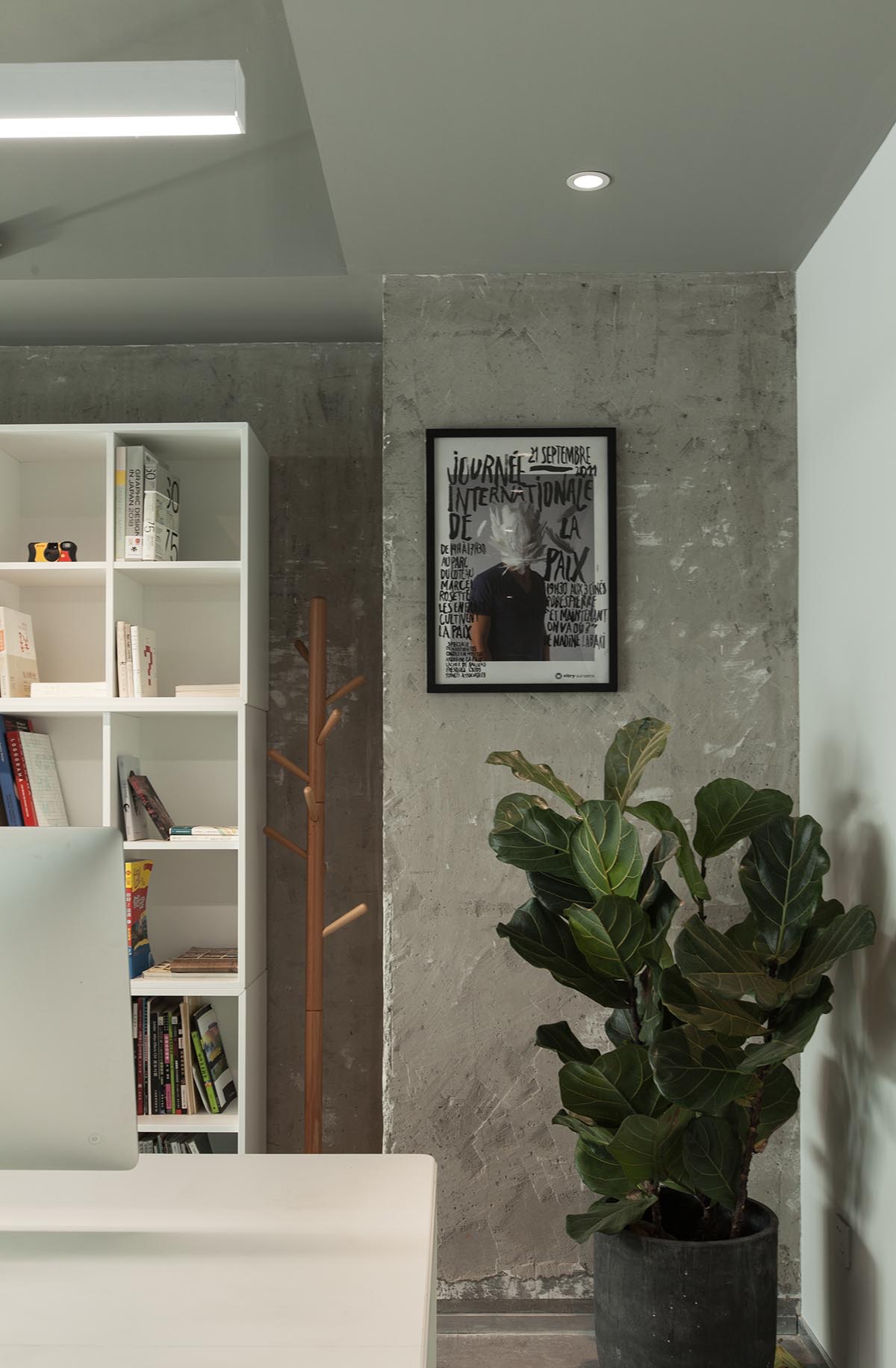
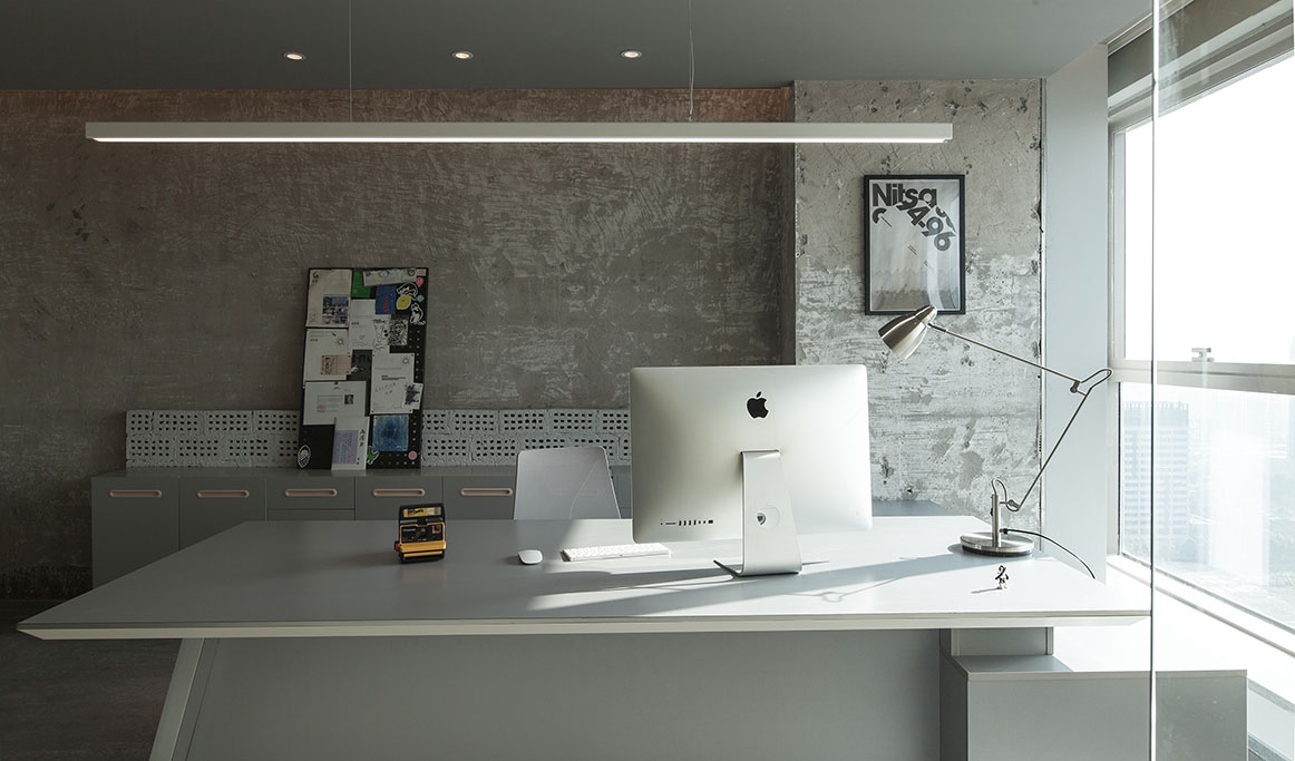
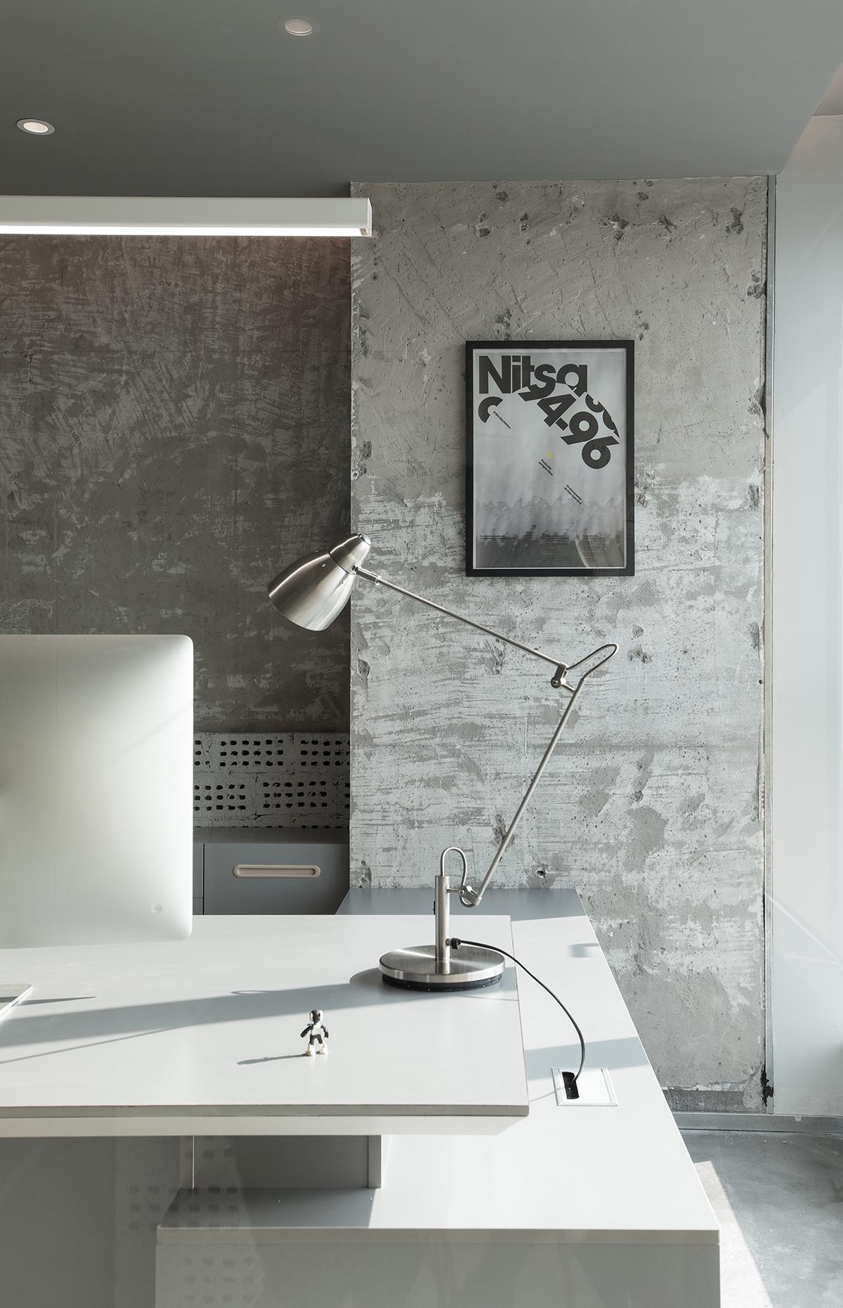
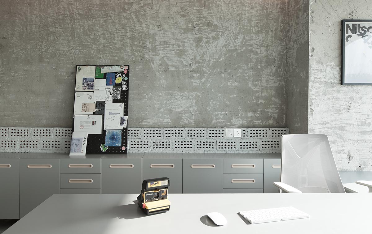
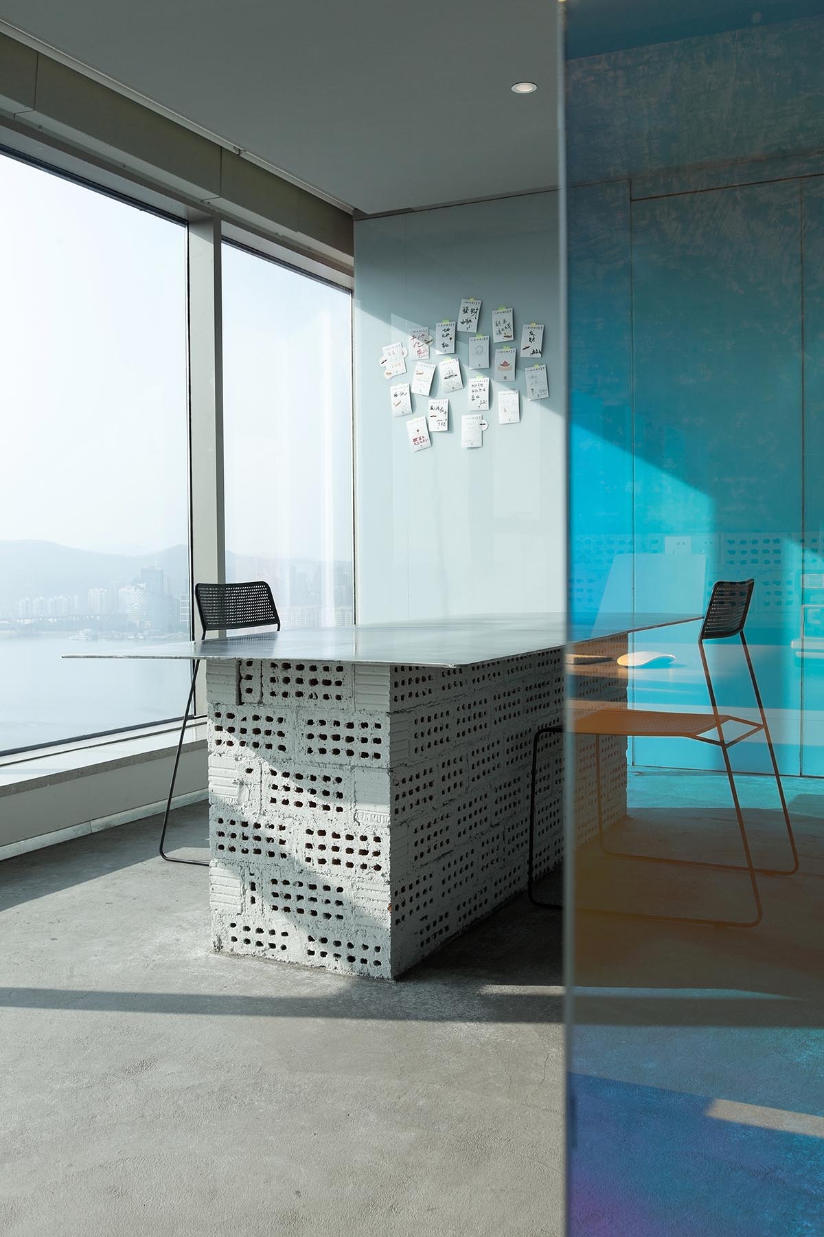
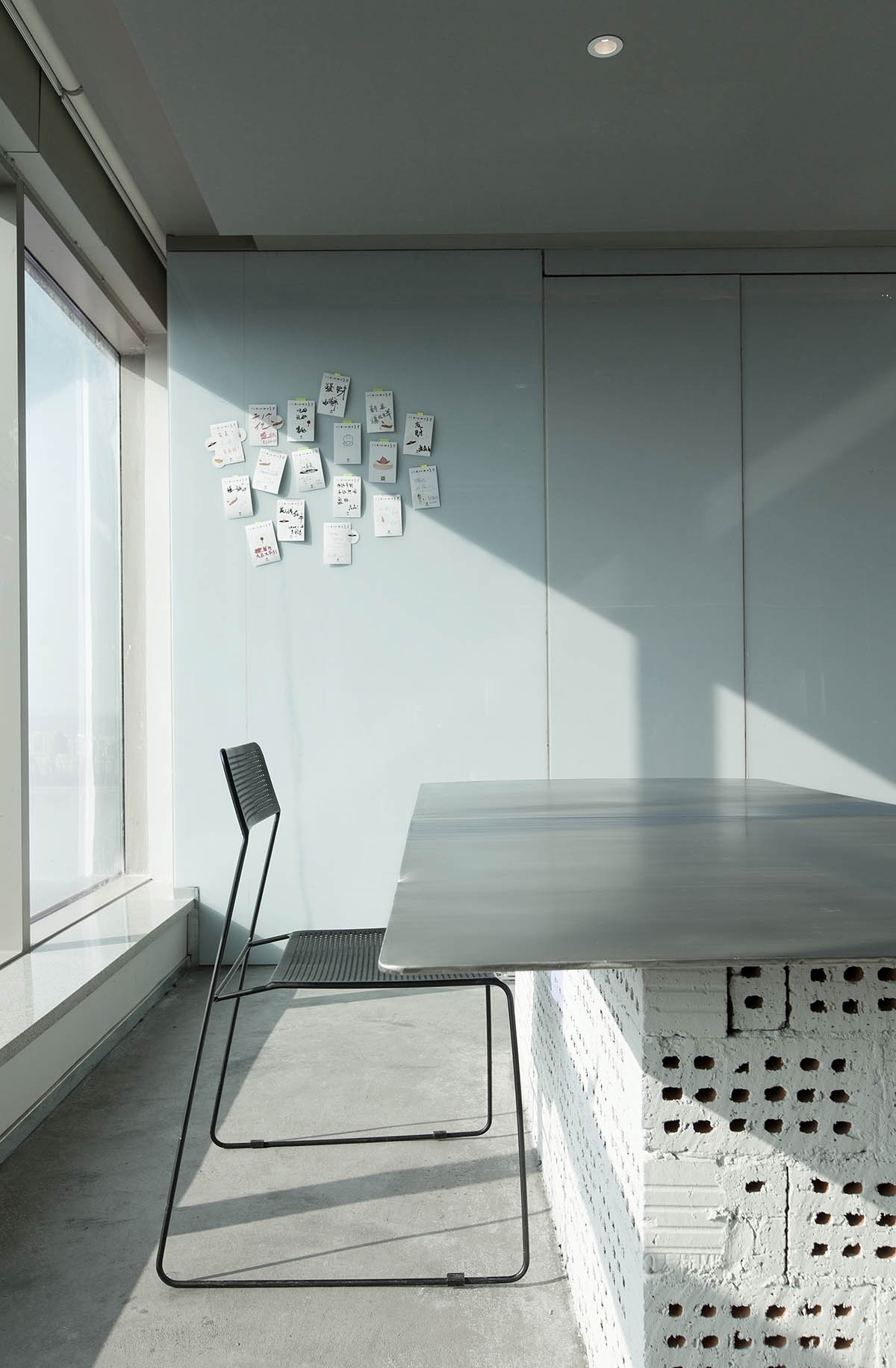
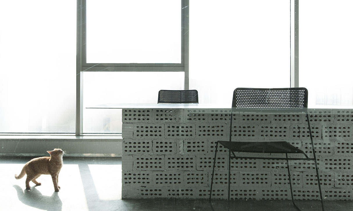
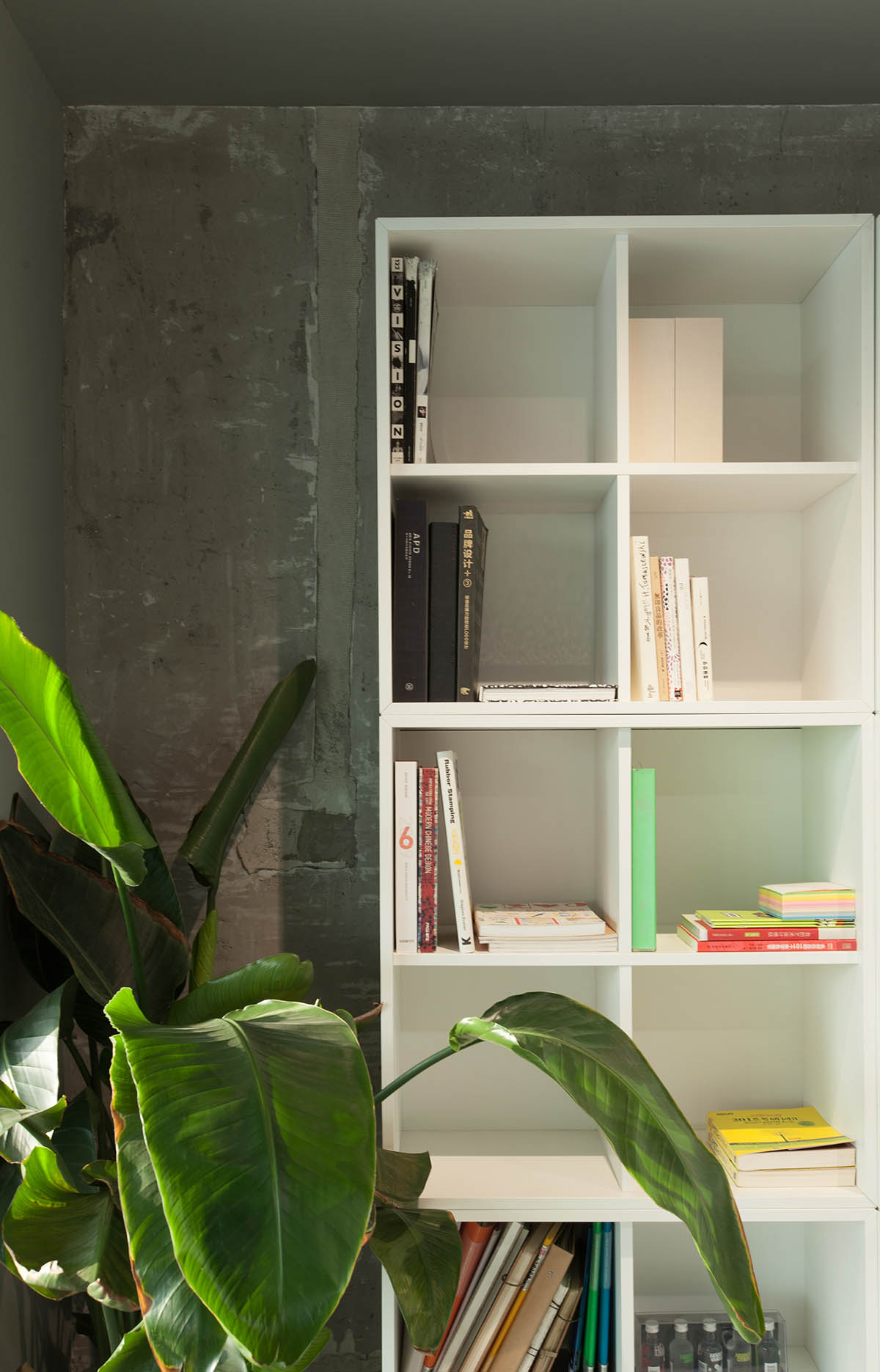
我們采用大量原始粗曠的材料,水泥/超白玻璃/多孔磚等。
同時保留原建築的混凝土牆麵,差異明顯的材質碰撞下形成獨特的美感,也極大節省造價開支。
We use a lot of primitive rough materials, cement / ultra-white glass / porous bricks, etc. At the same time, the concrete wall of the original building is retained, and the distinctive materials form a unique aesthetic sense under the collision, which also greatly saves the cost of construction.
∇ 平麵布置圖
主要項目信息
名稱:展開設計研究所辦公室
地點:浙江杭州
建築麵積:102 ㎡
設計單位:臥野空間設計事務所
主案設計:蘇靜
設計師:奚浩傑
項目深化:奚浩傑
攝影:蘇靜
圖文編輯:33
PROJECT NAME: Office of Design Institute
LOCATION: Hangzhou, Zhejiang
BUILDING AREA: 102 ㎡
DESIGN UNIT:WILD DESIGN STUDIO
MAIN CASE DESIGNER:SU JING
PARTICIPATING DESIGNER:XI HAOJIE
PROJECT DEEPENING DESIGNER:XI HAOJIE
PHOTOGRAPHER:SU JING
GRAPHIC EDITOR:33






![[4K] 2.1G 虛空之美-100個日式庭院](http://www.online4teile.com/wp-content/uploads/2023/09/1_202309111611111-8-414x550.jpg)
