全球設計風向感謝來自 末染設計 的買手店項目案例分享:
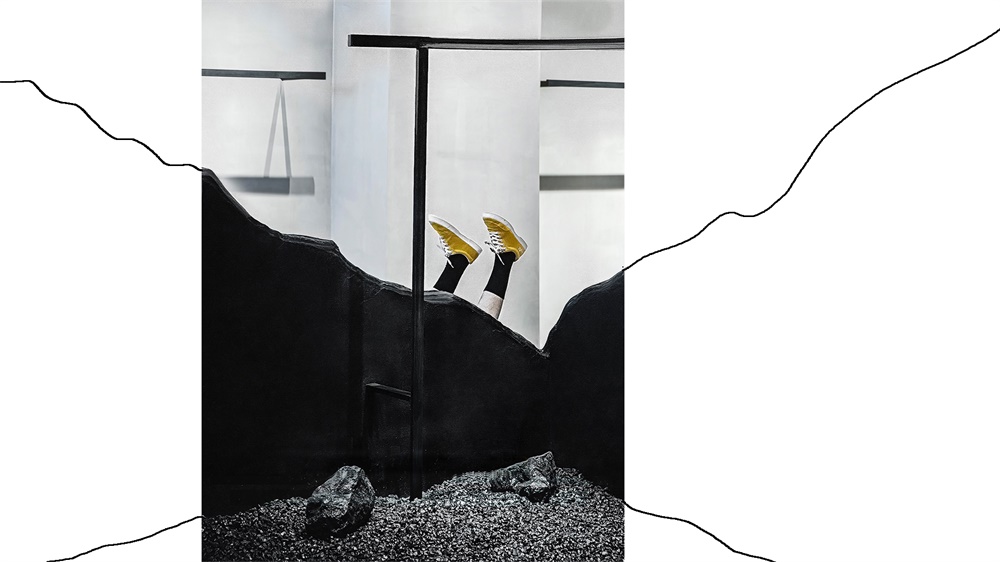
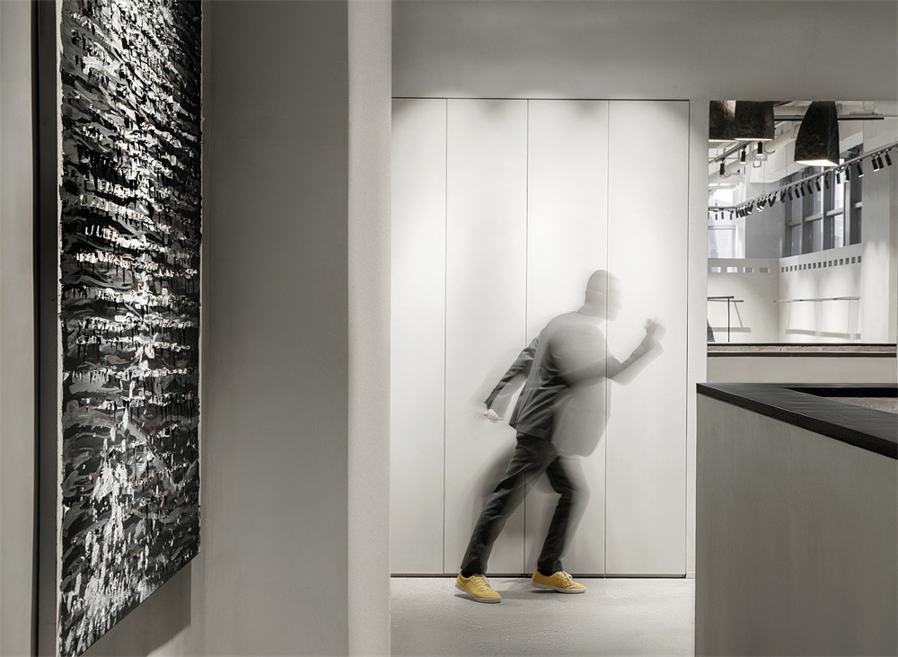
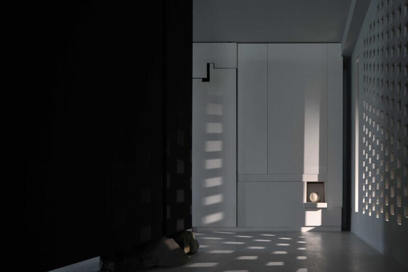
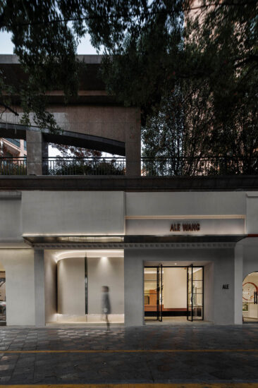
店鋪坐落於太原市陽光環球金融中心二層。店麵與城市主幹道相距較遠,擁有安靜的環境。同時業主也想要一種暗黑空間的感覺,於是在設計時將這裏塑造一種無處不在的寧靜感,在極簡空間中讓品牌的識別性具象化。
The store is located on the second floor of sunshine world financial center, taiyuan. The store is far away from the main street of the city and has a quiet environment. At the same time, the owner also wanted a feeling of dark space, so he created a sense of tranquility everywhere in the design, and made the brand recognition and concretization in the minimalist space.
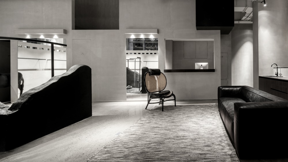
▽展示區全貌/Full view of the exhibition area
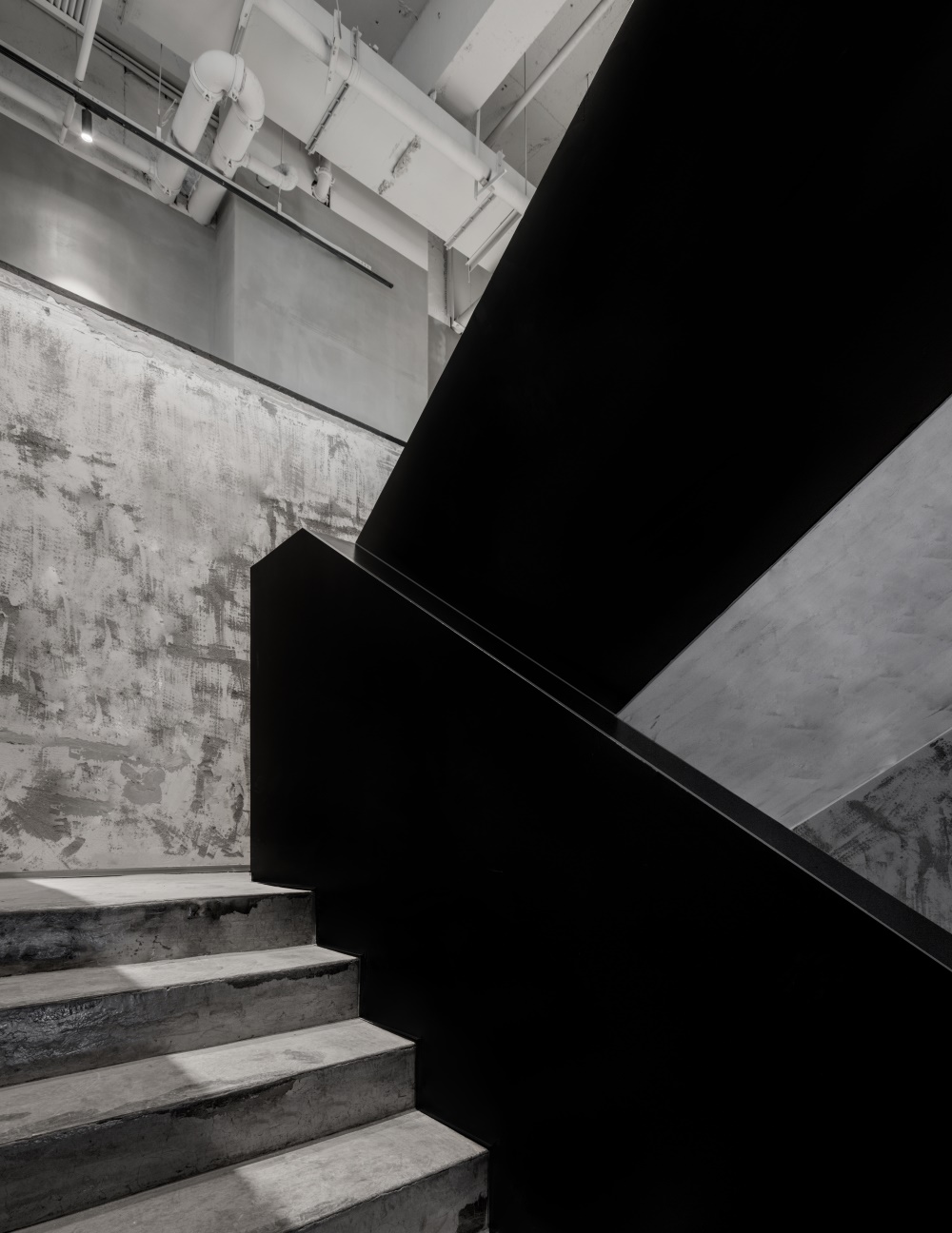
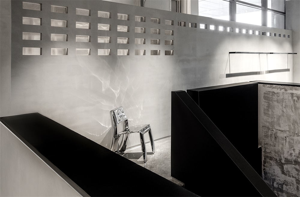
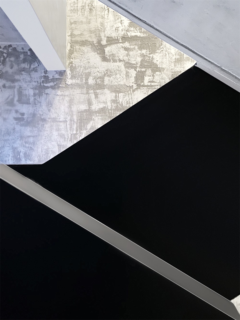
粗糙暗啞的乳膠漆、清利的不鏽鋼、光滑質感的水磨石與特效漆形成這個空間獨有的魅力。
Rough and dull latex paint, clear stainless steel, smooth texture of the terrazzo and special effects paint to form the unique charm of this space.
▽材料/Materials
[特效漆 水磨石 石粒 乳膠漆 木飾麵板 拉絲不鏽鋼]
▽入口空間頂部采用鏡麵不鏽鋼拉高較低的層高
The top of the entrance space is made of mirrored stainless steel with lower storey height
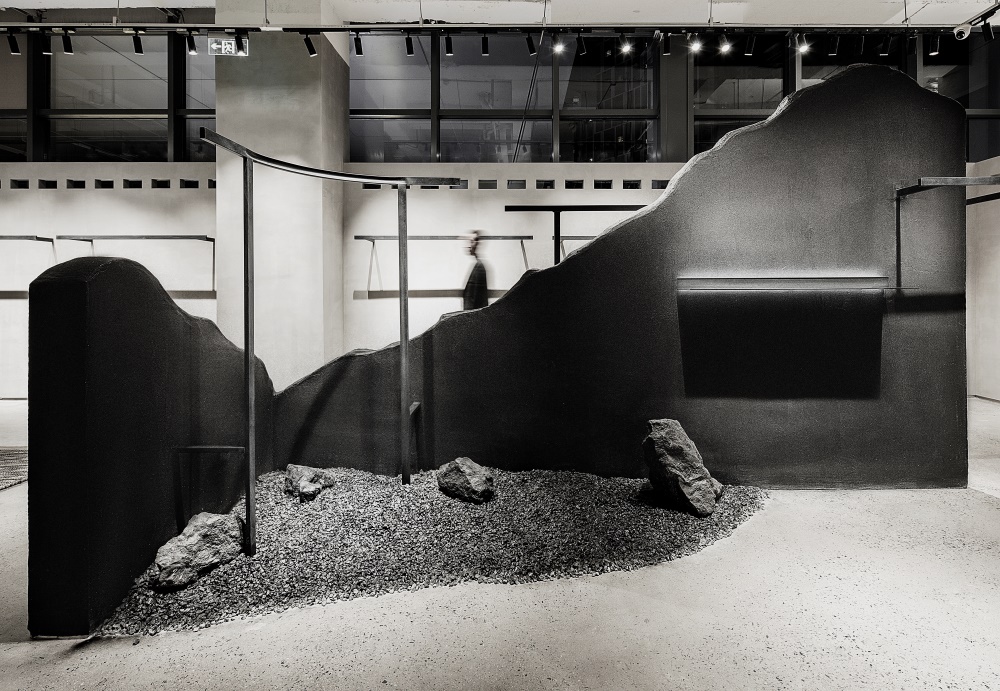
▽展示區/Exhibit
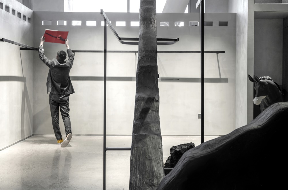
正麵陳列展板和牆體與掛衣杆穿插支撐,纖線條和堅實體塊的對比,形成完善獨立的展示係統。
The front display panel and the wall are interspersed with the cloth-hanging rod for support, and the contrast between the fiber lines and the solid volume forms a perfect and independent display system.
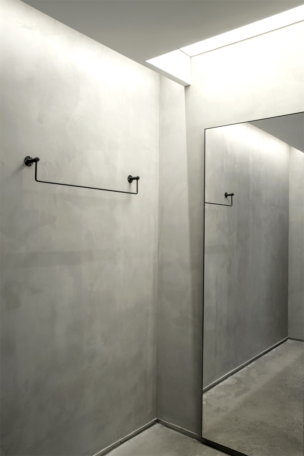
軟膜天光的使用提供功能需求外,滿足了結構上給人帶來的美感。
The use of soft film skylight not only provides the functional requirements, but also satisfies the aesthetic feeling brought by the structure.
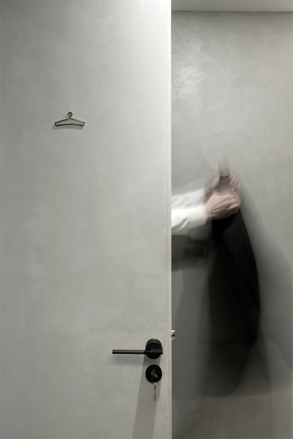
▽試衣間/The fitting room
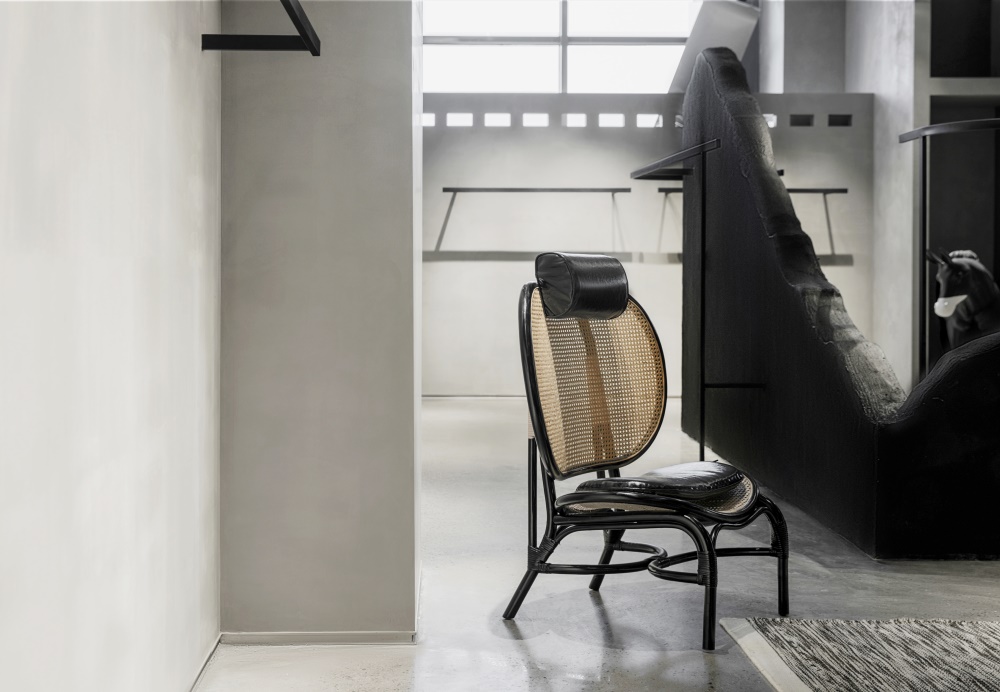
整個以灰色為主的空間中,裝飾材料選用了一些不鏽鋼的結合,給人帶來強烈的視覺衝擊力,但在整個空間中對不鏽鋼材料運用的使用占比卻不會衝突,反而中和出了一種寧靜之美,把一種極簡而又不簡單的設計詮釋的淋漓盡致。
In the whole gray-dominated space, decorative materials choose the combination of stainless steel, which brings a strong visual impact to people. However, the proportion of stainless steel used in the whole space will not conflict. Instead, it neutralizes a kind of beauty of tranquility and thoroughly interprets a simple and not simple design. Yes.
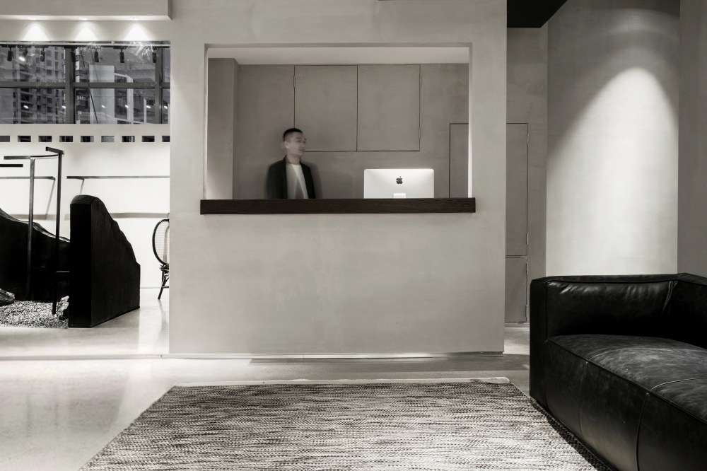
▽收銀台與結構融合/The cash register is integrated with the structure
▽包包的櫃體飾麵同牆麵材質,藏起來的東西總給人高貴的神秘感
The cabinet body of bag is acted the role of with metope material pledges, the thing that hides always gives a person noble mysterious feeling.
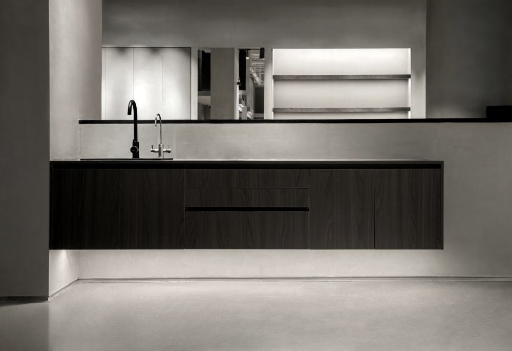
▽水吧區/Water area
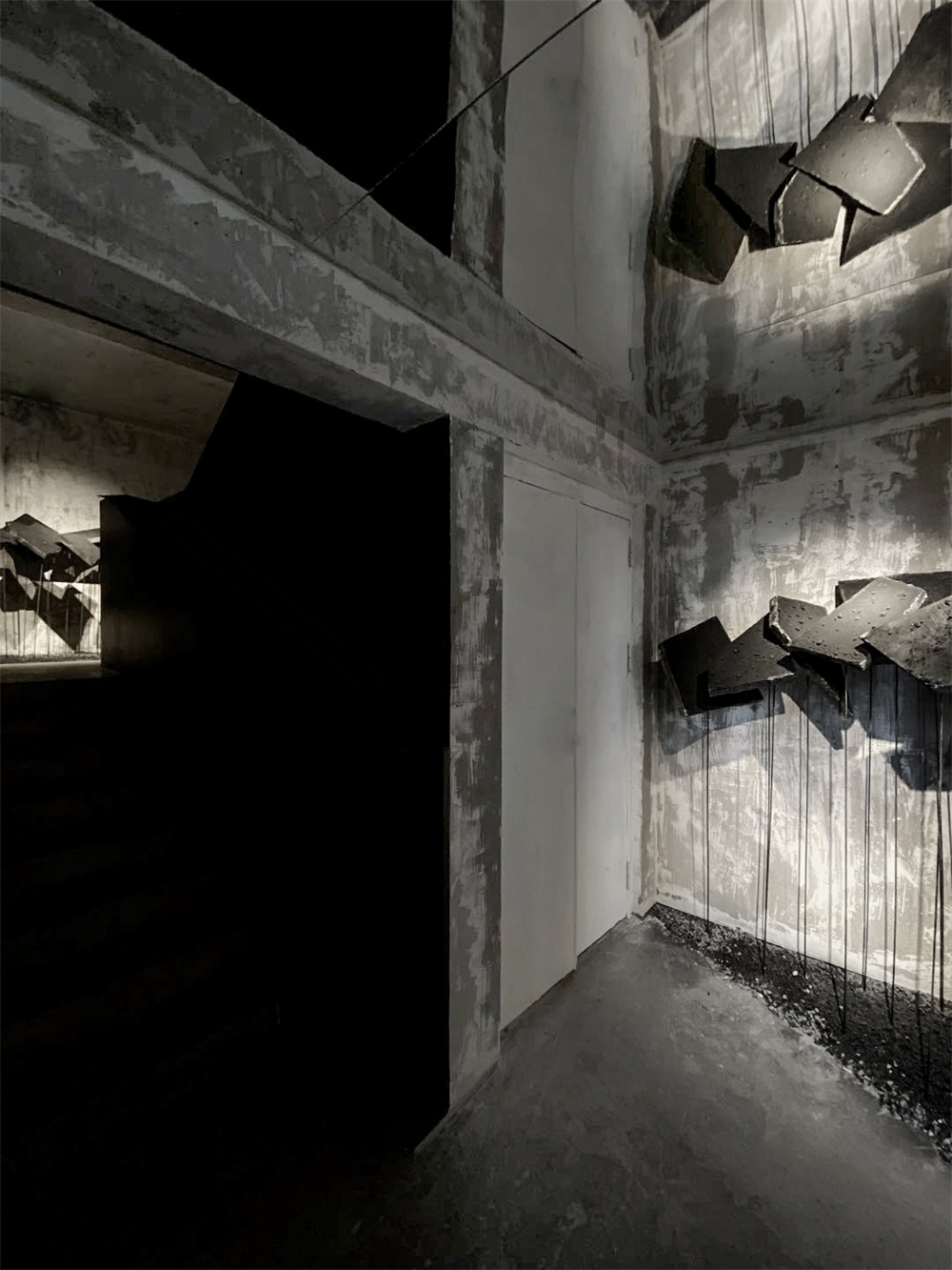
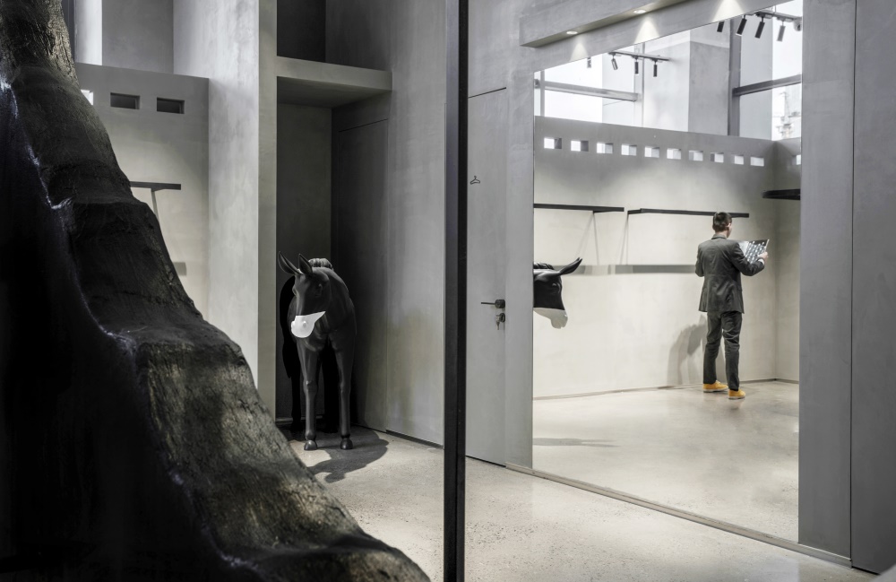
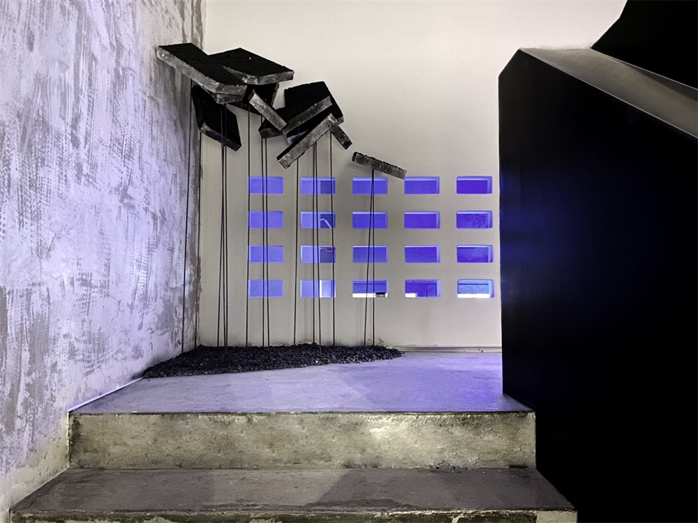
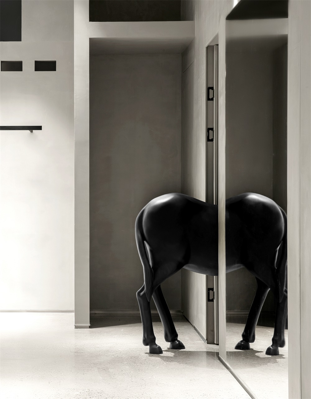
▽進入這個空間人們將會感受到無處不在的神秘感
People who enter this space will feel the mystery that is everywhere.
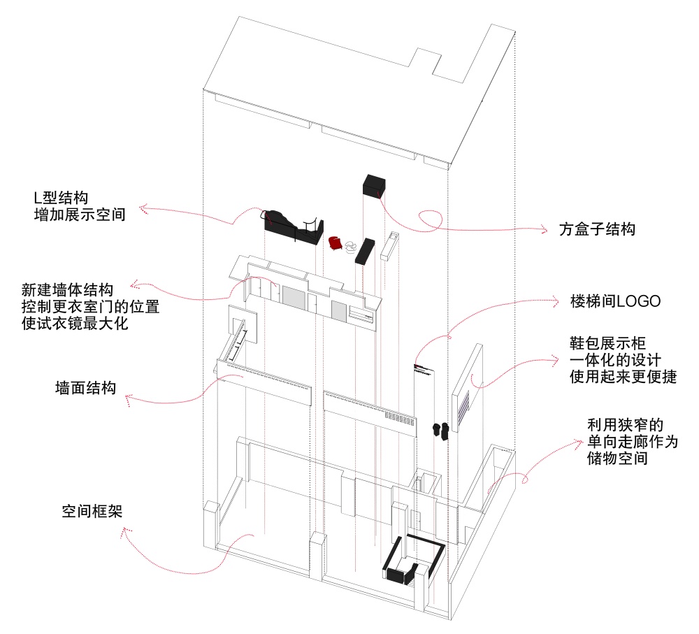
▽軸測圖/Axonometric drawing
主要項目信息
項目名稱:YANYUxIN|買手店
設計公司:末染設計
聯係郵箱:moothan@sina.com
完工時間:2020.01
建築麵積:141㎡
項目類型:服裝店
項目地址:太原市
陳設:黑貓
攝影:小驢
Entry name/YANYUxIN|uyer shop
Design company/moo than.dengsign
E-mail/moothan@sina.com
Makespan/2020.01
Floorage/141㎡
Category/Couture
Location/Taiyuan City
Furnishings/Black Cat
Photograph/Little Donkey


