全球設計風向感謝來自 末染設計 的買手店項目案例分享:
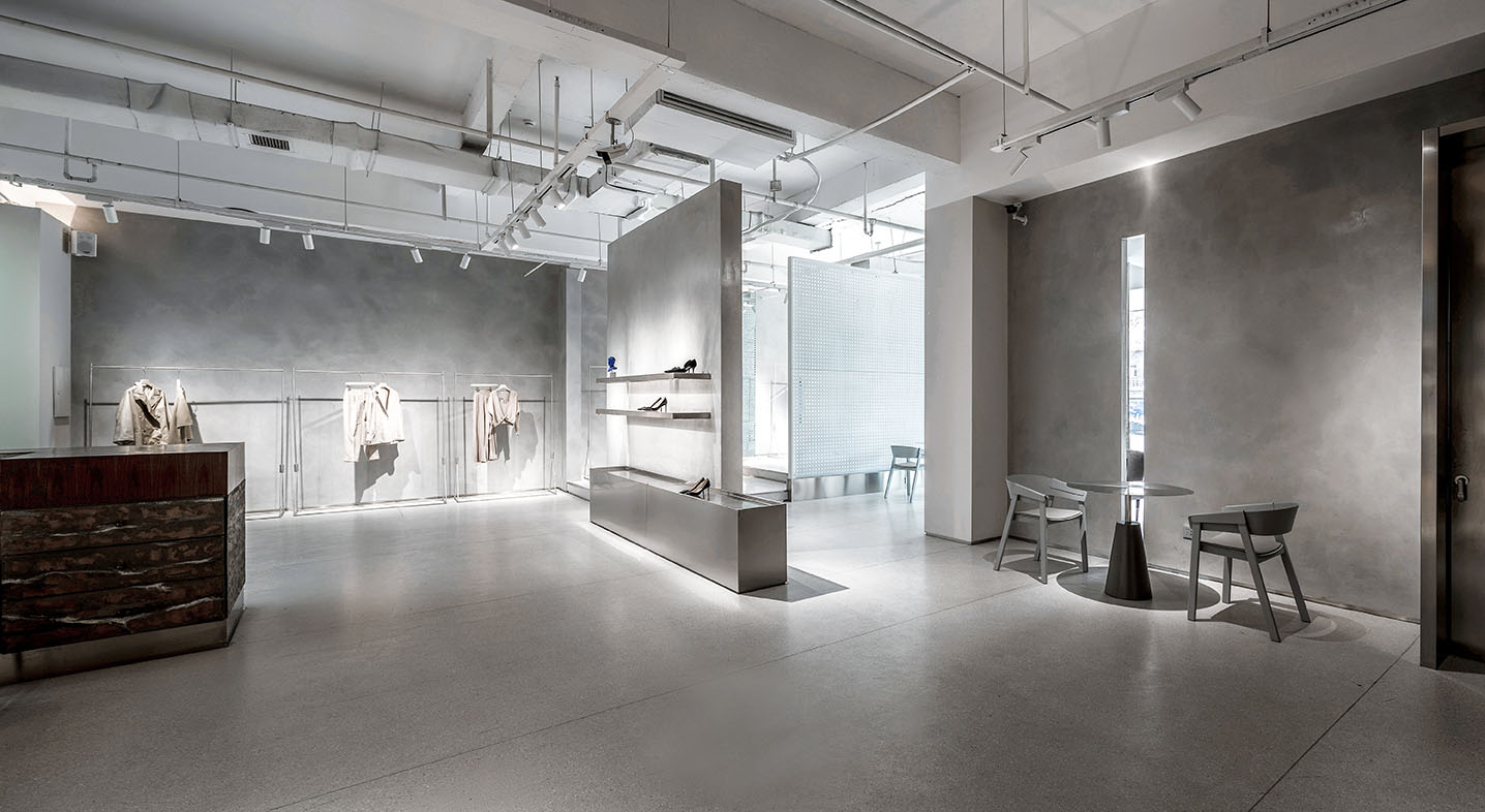
“買手店”已不再是新穎的名詞,這源自與歐洲的商業模式,它在某一程度上迎合了消費者的個性化選擇,位於山西太原的一個繁華的街邊店正以個性、簡潔又安靜的原創設計空間,迎合目標顧客獨特而舒適的購買體驗。業主想做的空間需要配備咖啡吧台、美容服務櫃台、休閑娛樂以及可快速購買的產品展示區。於是在設計時想將這裏打造為這條繁華街道上的庇護所,在配色、家具以及材料的選用上將塑造一種無處不在的寧靜感,在極簡空間中讓品牌的識別性具象化。
“Buyer shop” is no longer a new term, which originates from the European business model. To a certain extent, it caters to the personalized choice of consumers. A busy street store in Taiyuan, Shanxi Province, is catering to the unique and comfortable purchase experience of target customers with its original design space of individuality, conciseness and quietness.The space that the owner wants to do needs to be equipped with coffee bar, beauty service counter, leisure and entertainment, and product exhibition area which can be purchased quickly. So in the design, we want to make it a shelter on this busy street. In the selection of color matching, furniture and materials, we will create a sense of tranquility everywhere. In the minimalist space, we will make the brand’s identity concrete.
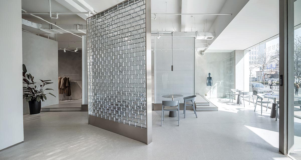
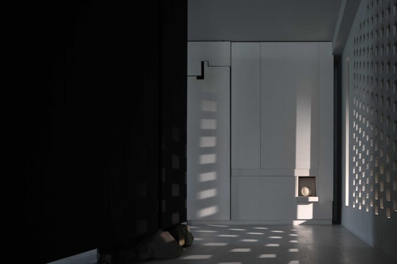
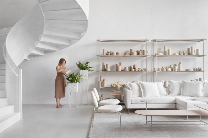
∇ 室內空間概覽,interior overview
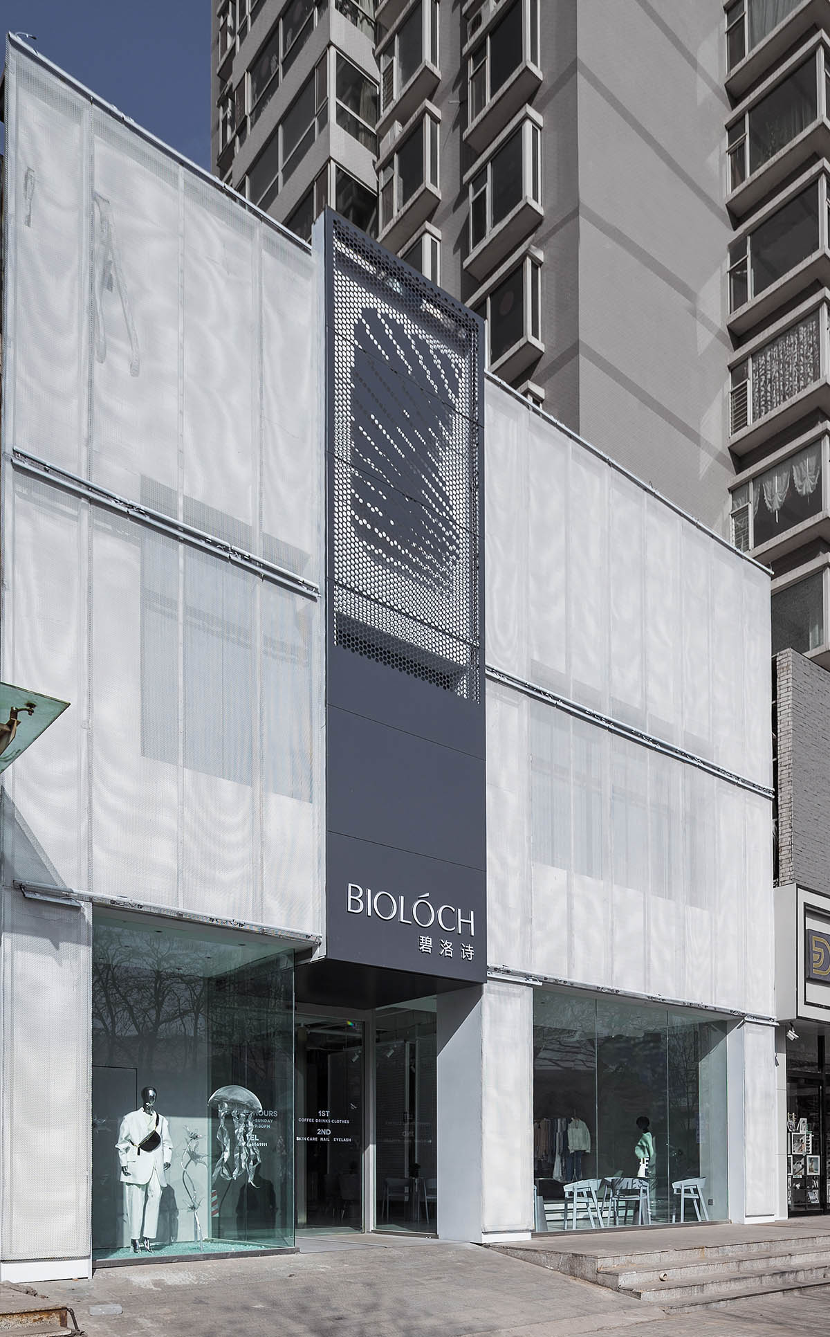
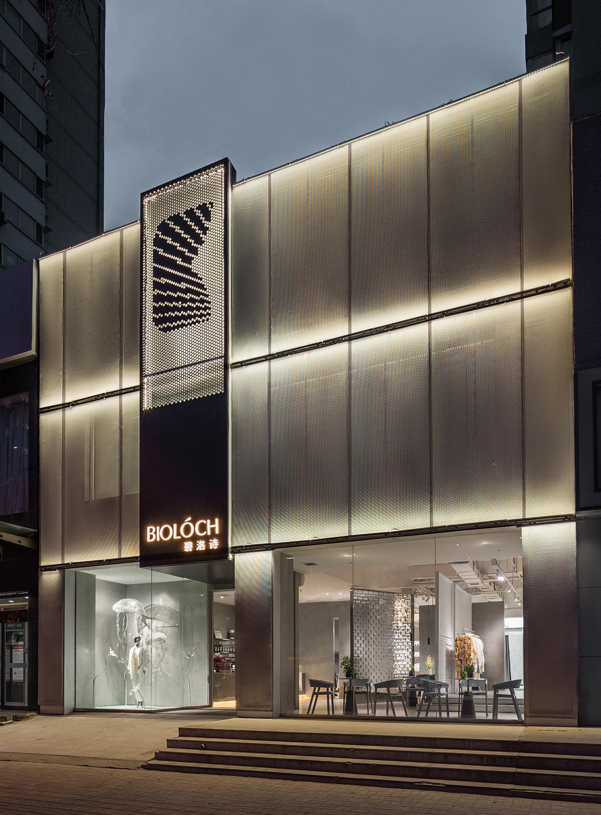
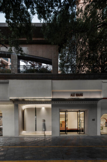
∇ 店鋪外觀,building facade
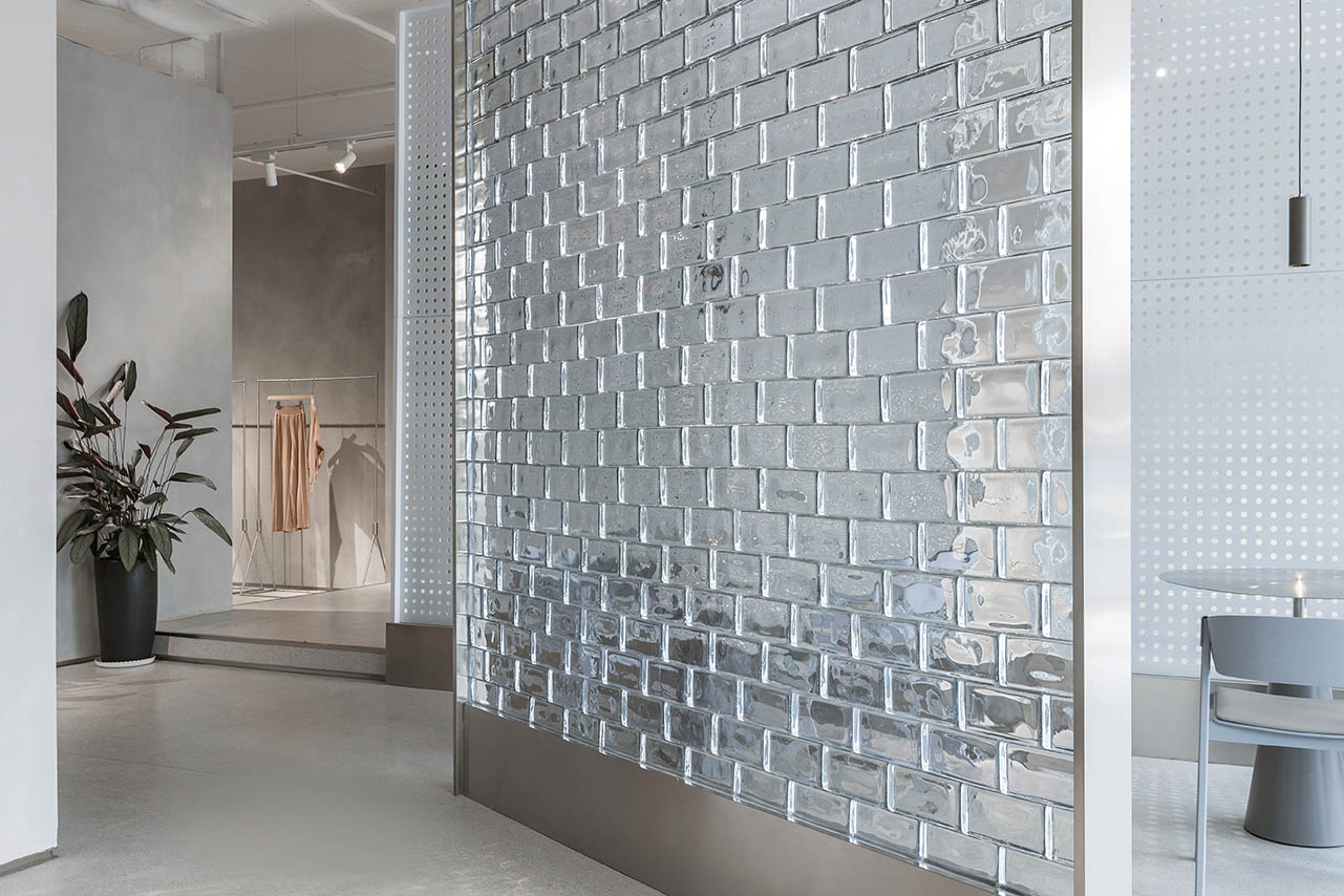
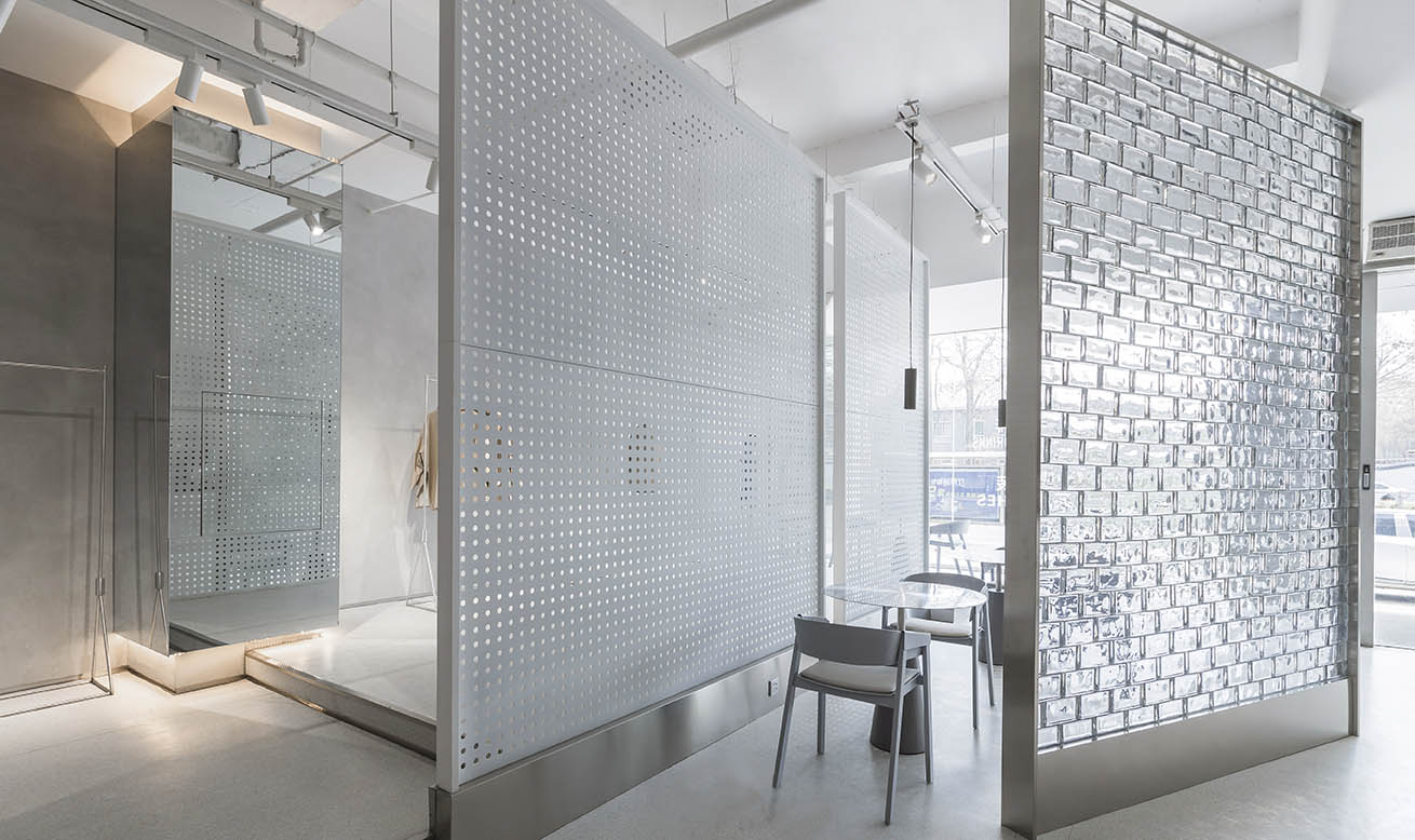
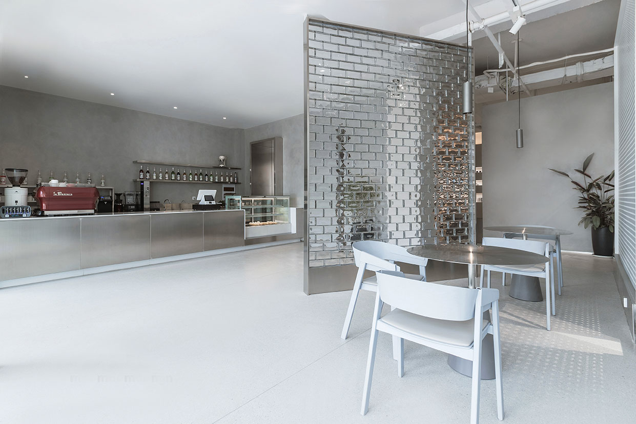
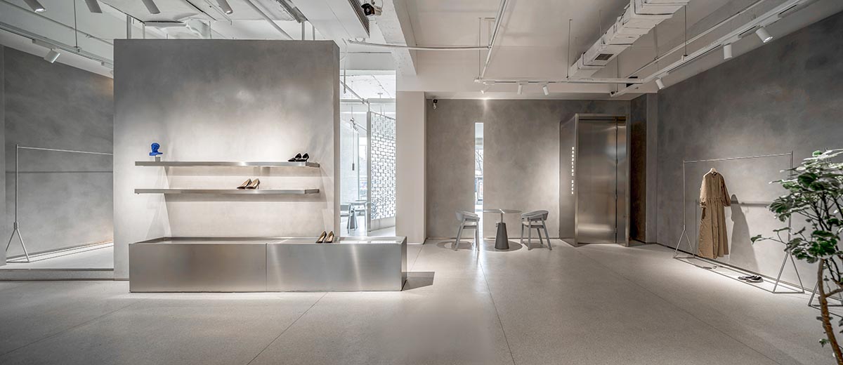
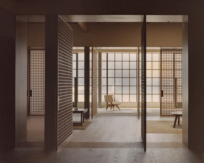
店鋪內所售產品多樣極致,更是營造出“體驗式營銷”空間感受,劃分出一塊休閑區域——咖啡吧,與購物區相連,用優雅舒適的體驗,讓步入其中的顧客在購物之餘可以小憩片刻,有一種“不買也要逛”的愉悅感受。借助半透明的玻璃磚作為隔斷,劃分空間的同時從視覺上將空間聯係起來,而且增加了顧客走向深處的興趣和好奇心,吸引過往行人。
The products sold in the shop are extremely diverse, and create a “experiential marketing” space feeling, dividing a leisure area – coffee bar, connected with the shopping area, with elegant and comfortable experience, so that customers can have a rest after shopping, there is a pleasant feeling of “not buying but also wandering”. With the help of translucent glass brick as a partition, space is divided and connected visually, and customers’interest and curiosity are increased to attract passers-by.
∇入口空間,entrance space
∇半透明的玻璃磚作為隔斷,劃分空間的同時從視覺上將空間聯係起來,translucent glass brick as a partition, space is divided and connected visually
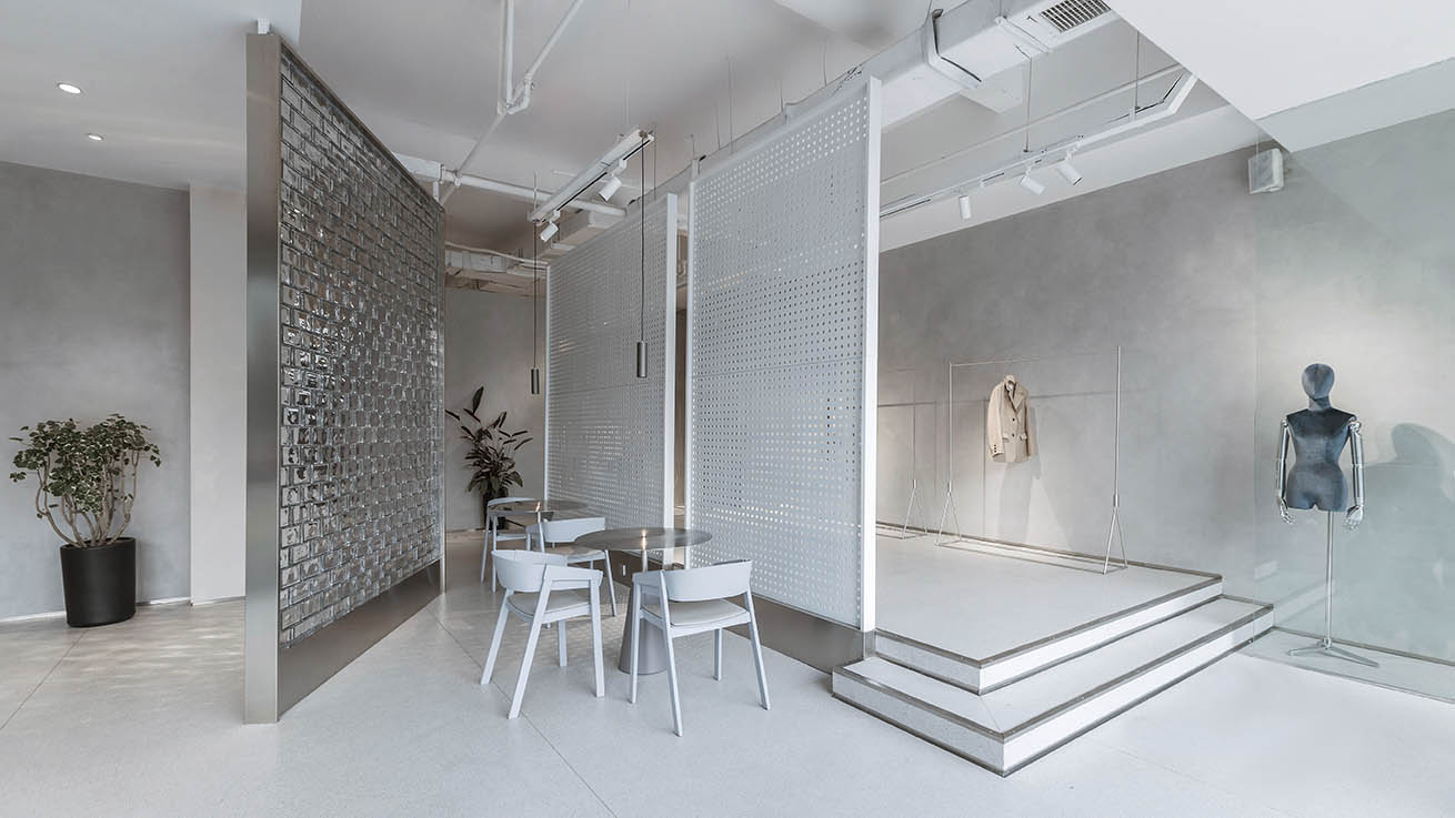
∇ 咖啡吧空間,coffee bar space
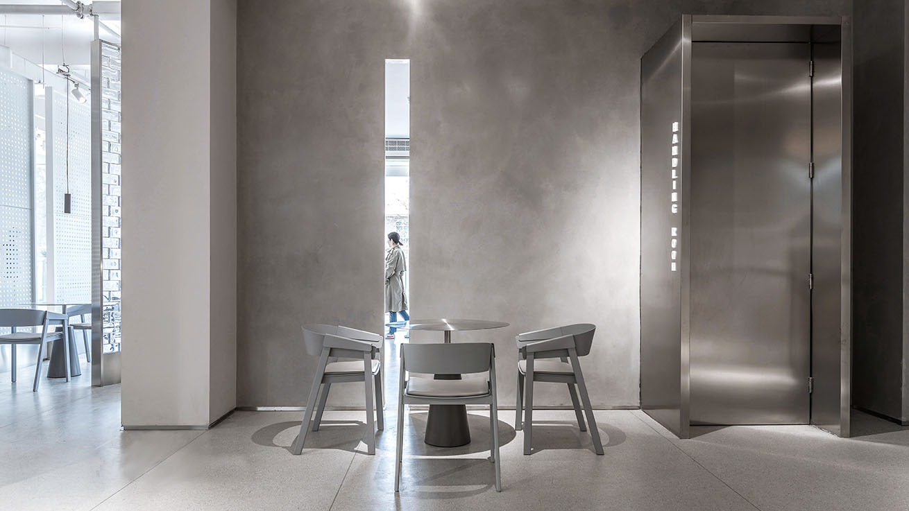
∇ 在購物之餘可以小憩片刻,have a rest after shopping
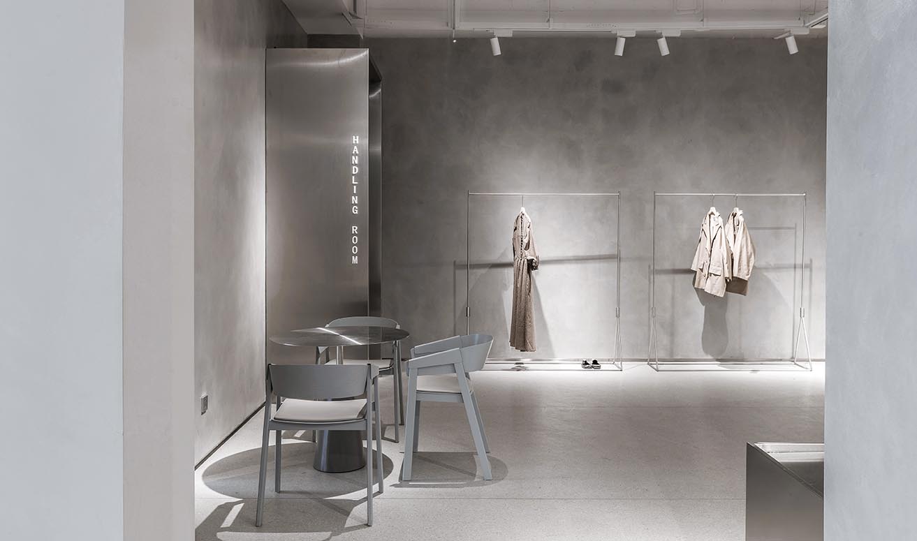
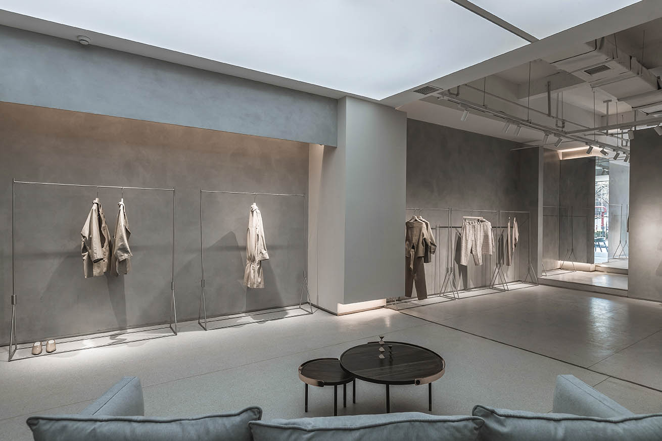
整個以灰色為主的空間中,裝飾材料選用了一些不鏽鋼的結合,給人帶來強烈的視覺衝擊力,但在整個空間中對不鏽鋼材料運用的使用占比卻不會衝突,反而中和出了一種寧靜之美,把一種極簡而又不簡單的設計詮釋的淋漓盡致。
In the whole gray-dominated space, decorative materials choose the combination of stainless steel, which brings a strong visual impact to people. However, the proportion of stainless steel used in the whole space will not conflict. Instead, it neutralizes a kind of beauty of tranquility and thoroughly interprets a simple and not simple design. Yes.
∇ 商品展示售賣區,commodity show and sales area
∇ 整個以灰色空間結合不鏽鋼裝飾材料,gray-dominated space combines with stainless steel material
∇ 服飾展示,clothes display
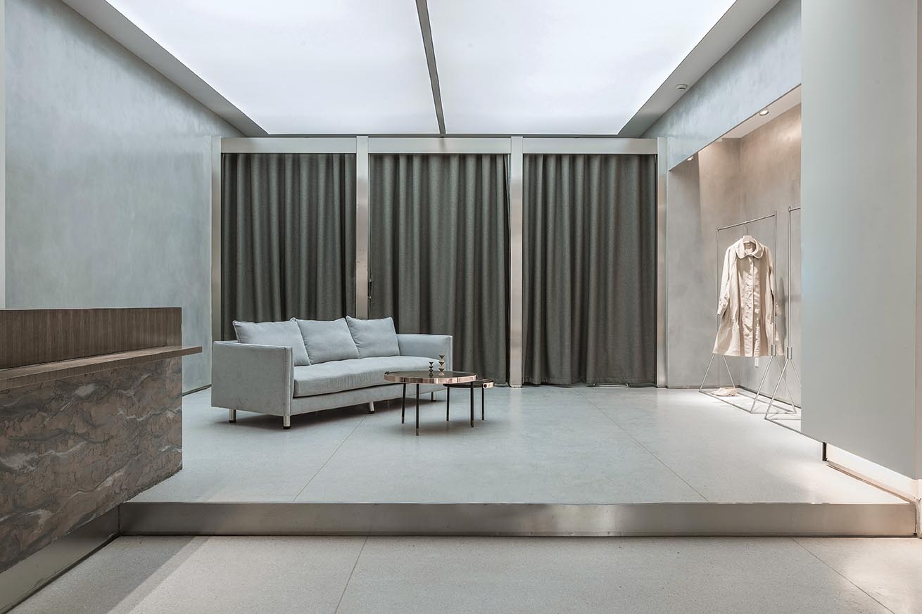
∇ 換衣間及休息等待區,fitting room and waiting area
∇ 夜景,night view
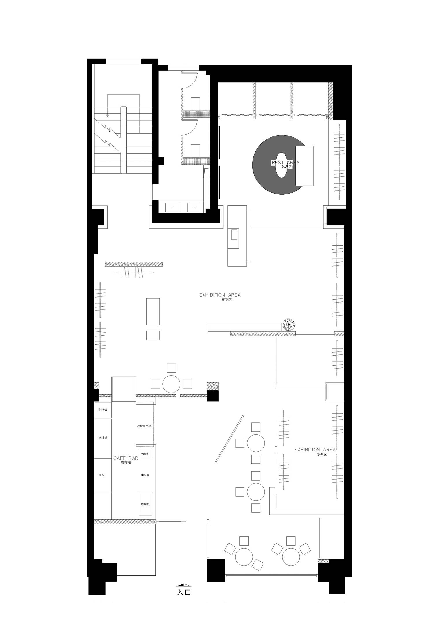
∇ 平麵布置圖,layout plan
主要項目信息
主 案 / 孟 飛
項目類型 / 服裝店
項目地址 / 太原市
項目麵積 / 260㎡
陳 設 / 黑 貓
攝 影 / 小 驢
材料 / 特效漆、不鏽鋼、玻璃
設計方 / 太原市末染裝飾工程有限公司
聯係郵箱 / moothan@sina.com
Design director / Meng Fei
Category / Couture
Location / Taiyuan City
Project area / 260㎡
Furnishings / Nackt
Photography / Little Donkey
Materials / special effect paint, stainless steel, glass
Design / Taiyuan end dye decoration engineering co. LTD
Contact e-mail / moothan@sina.com


