全球設計風向感謝來自 MOC DESIGN OFFICE 的餐飲空間項目案例分享:
台階縱橫的白色空間
A White Space with Superposed Staircases
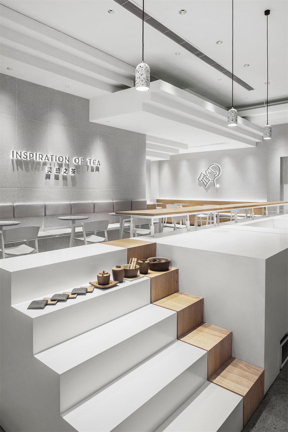
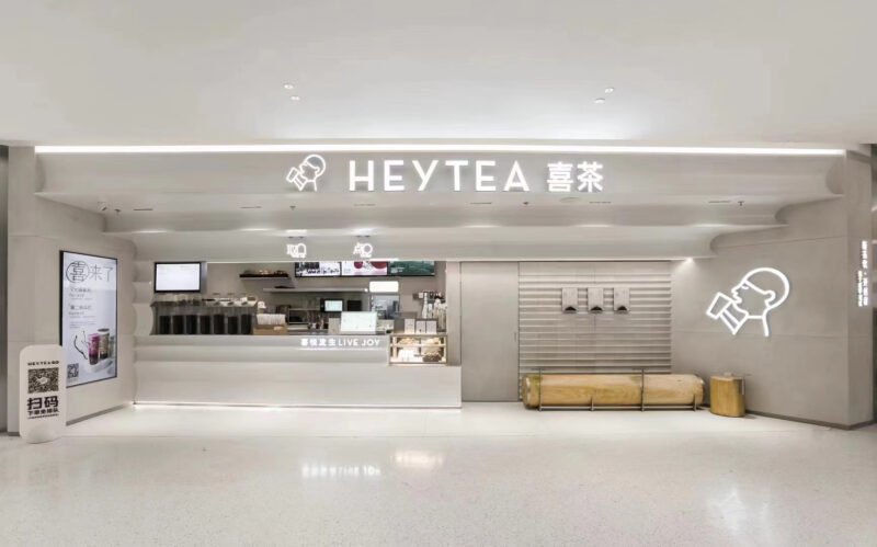
本店位於深圳福田CBD綜合體商圈One Avenue卓悅中心,秉承商場探索,創新,活力的精神, MOC DESIGN以“攀登”為寓指,以台階形態為媒介,將追求進步、勇於攀登的態度融於設計進行延展,通過拆分重組的手法結合空間框架及功能進行設計,用簡潔的體塊、充滿變化的組合貫穿於空間。
This new HEYTEA shop is located in One Avenue, Futian CBD, Shenzhen and it adheres to the spirit of its hosting mall – exploration, innovation and vitality. In the concept of “climbing”, MOC DESIGN OFFICE adopts the staircase as a metaphor and integrates the attitude of pursing progress and climbing with courage in the design. The space and function are carefully dismantled and rebuilt to present simple units, but with changeable combinations.
∇ 以台階形態為媒介來表達空間概念 Using staircases as the media to introduce the space concept
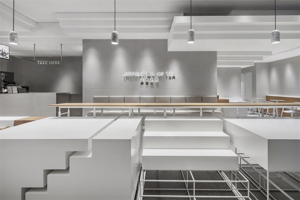
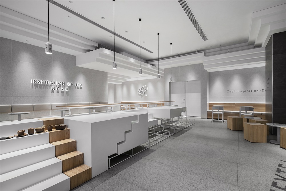
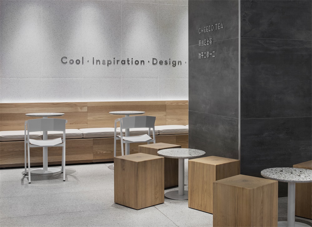
∇ 從吧台看向客座區 Looking over the customer area from the counter
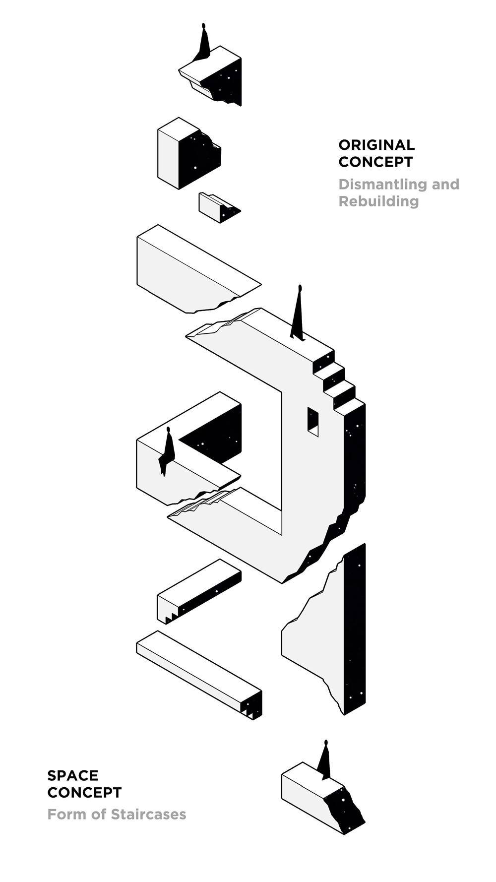
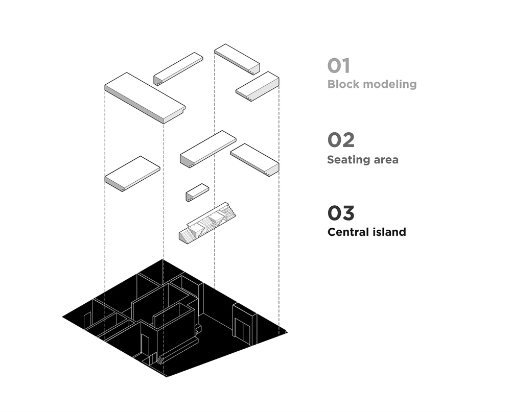
設計構想來源於《紀念碑穀》中縱橫交錯的空間形態,以打散重組在空間中的台階做為概念的表現形式,錯落有致的體塊結合台階形態,自上而下延伸至整個空間。在材質及造型上,為緩解小空間固有的壓迫感,使用白色基調和方正的體塊拓展空間界麵。
The design concept is derived from the crisscross space from the game Monument Valley. It is manifested by dismantling and rebuilding the staircases across the space. Sets of blocks and stairs are superposed to lead up and across the entire shop. In terms of materials and shapes, a white tone and square blocks are employed to amplify the size of the confined space.
∇ 空間形態概念演變 Concept evolution of the space and form
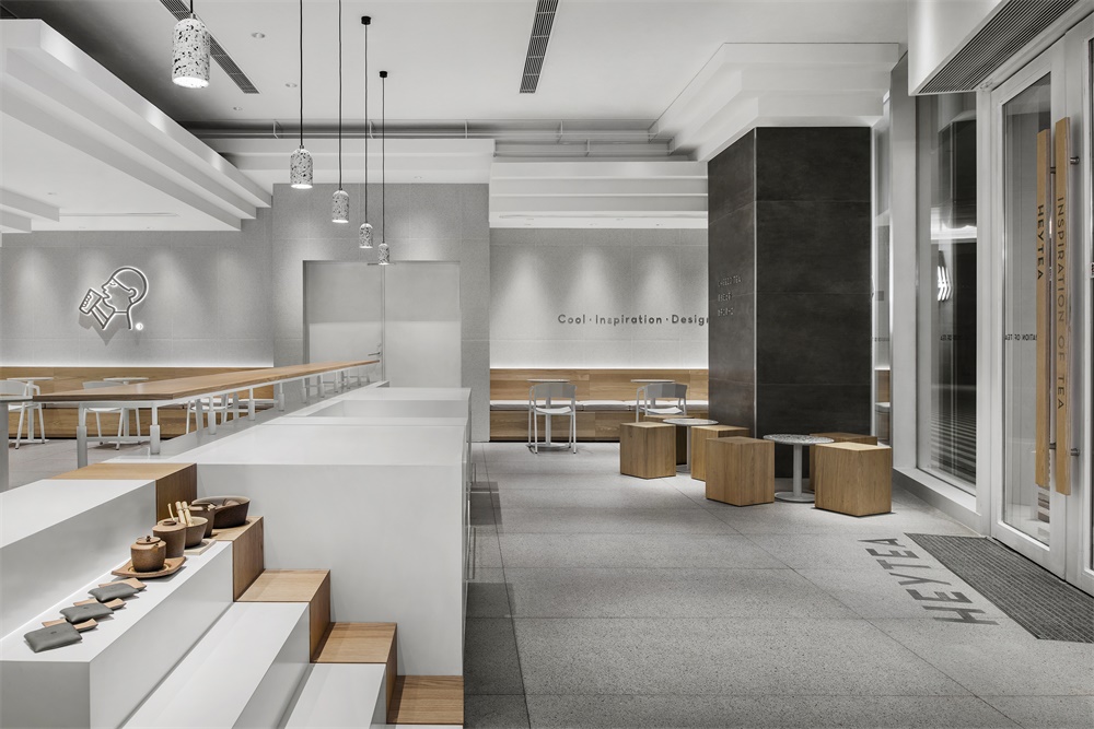
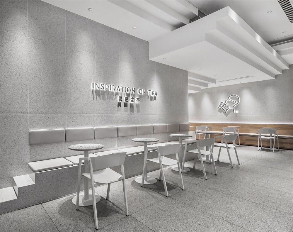
∇ 錯落有致的體塊,自上而下延伸至整個空間 Superposed blocks leading up and cross the whole space
∇ 軸測分析圖 Drawing of Axonometric Analysis
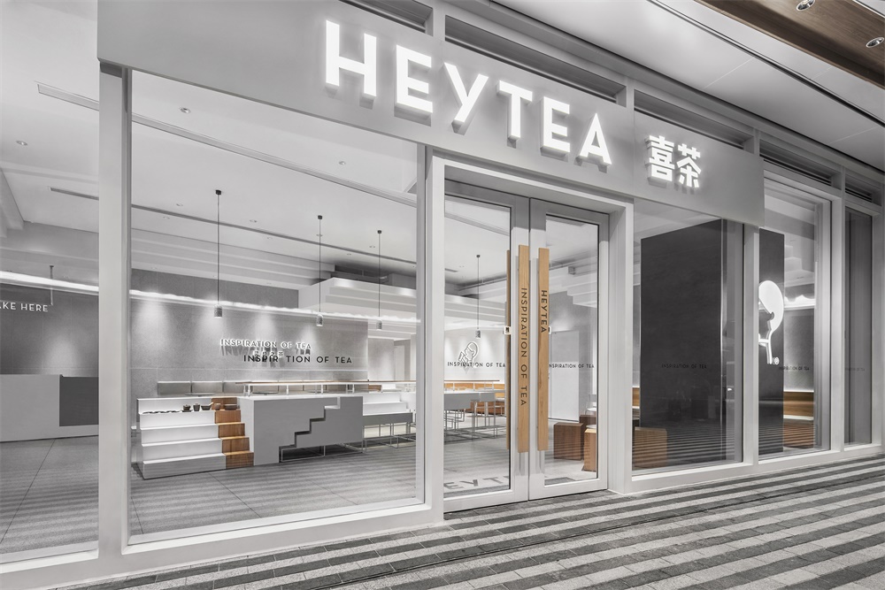
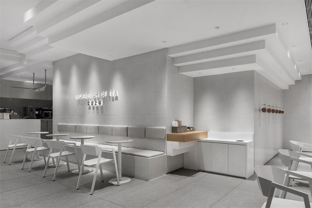
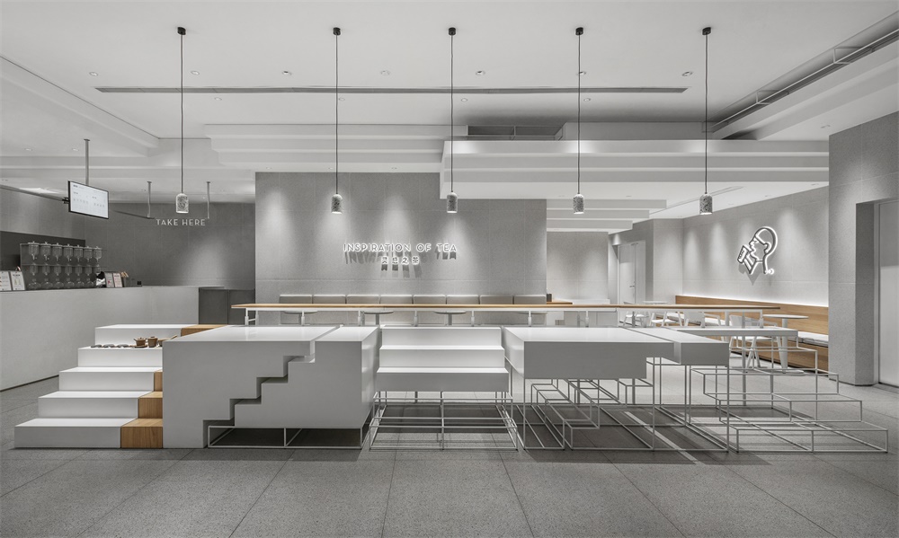
從室外看向室內,虛實交錯的體塊造型鋪滿空間,中島組合成陣列分布,形成了張弛有度的友好姿態。
From outside in, the blocks are piling up and taking shape and the central island becomes a complex functional body, both of which are meant to arouse a cordial feeling.
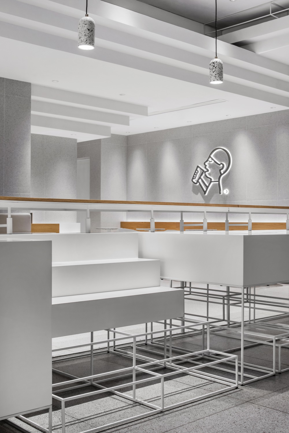
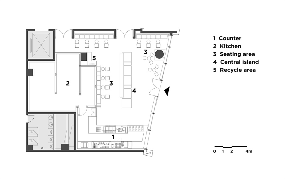
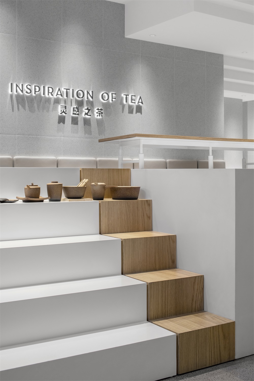
中島區域的高桌組合裝置做為空間的主角,擺列形式仿佛在盡然有序地訴說。實體和線框的台階造型構成虛實結合的姿態,遊走在天花縱橫交錯的台階與整體空間體塊之間,在空間整體純白色調的渲染下,成為空間中的視覺焦點。台階造型的分布,既可陳列品牌周邊文化產品,也滿足動線的劃分,同時達到小憩飲茶的功能需求,人群的交流由此密切展開。
As the main character of the space, a unit of high tables is placed in an orderly manner. The solid stairs and frame stairs are intersected to constitute a stance of actuality and illusion. The ceiling staircases and overall blocks become the visual focus of the space under the rendering of the pure white tone. The staircases spread out as the display of merchandises as well as guiding the traffic flow. Meanwhile, it meets the functional needs of tea breaks and close communication among people.
∇ 從入口處看向中島 From the entrance to the central island
∇中島組合細部 Details of the central island
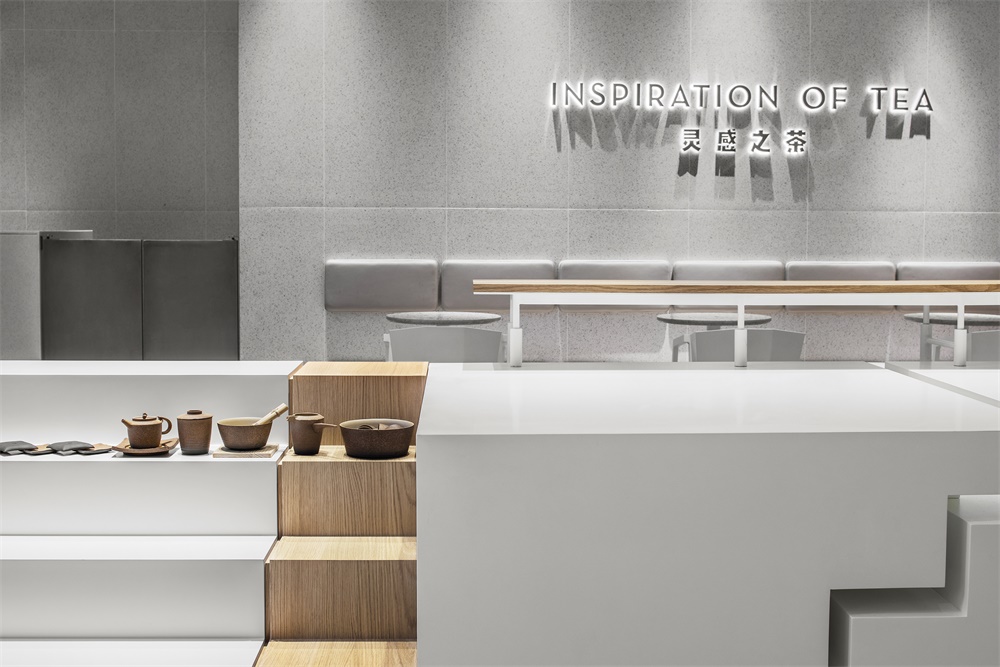
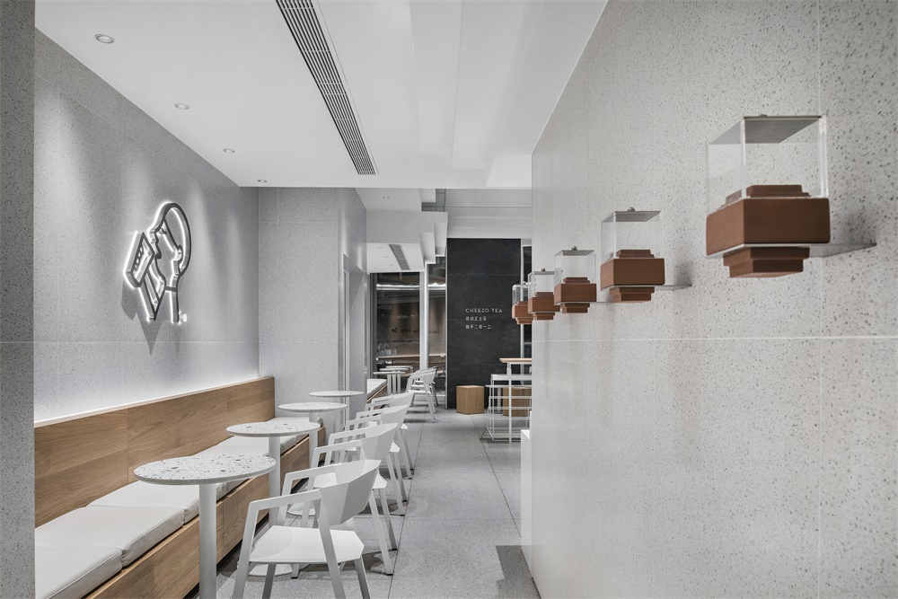
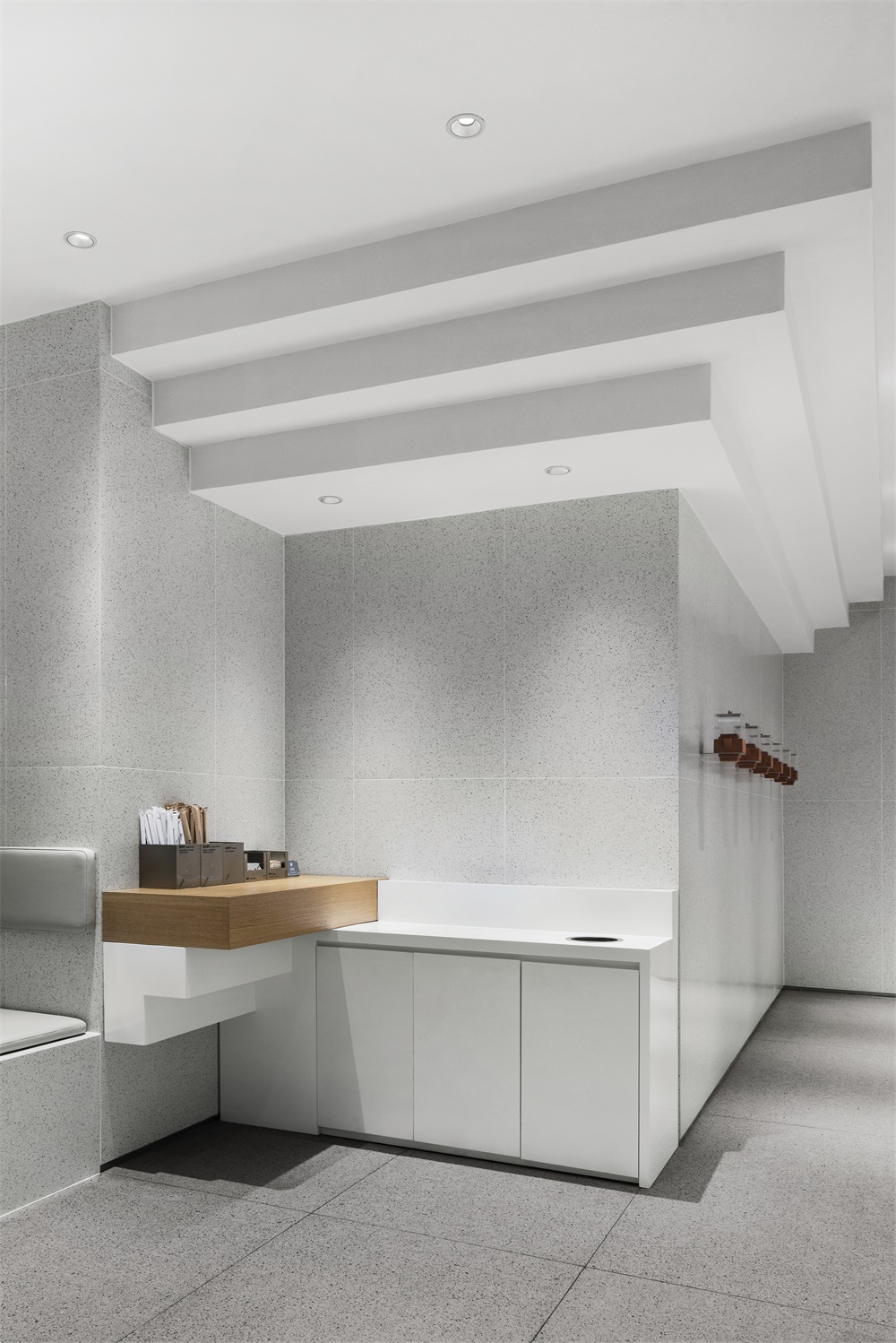
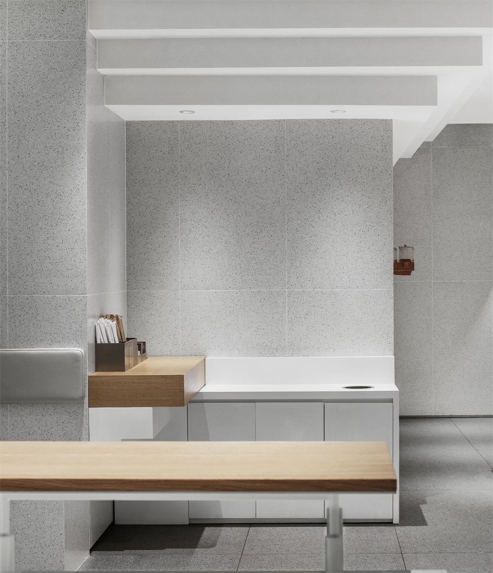
設計師將空間的功能區域如自助台等隱藏於縱橫台階之間,並為品牌方特別設計定製了一款茶具用於向顧客展示其采自不同產地的茶葉。
The designer conceals the functional areas, such as self-service desk, between the vertical and horizontal stairs. A tea set is specially designed and customized for the brand to showcase teas from different origins to customers.
∇ 自助台隱藏與縱橫台階之間 Self-service desk embedded between staircases
∇ 茶具以傳統的陶土為器身,壺蓋則以透明亞克力製成,底部台階狀的形式便於固定於牆麵 Tea pot made from traditional pottery clay and pot lid from transparent acrylic, fixed on the stair-shaped holder along the wall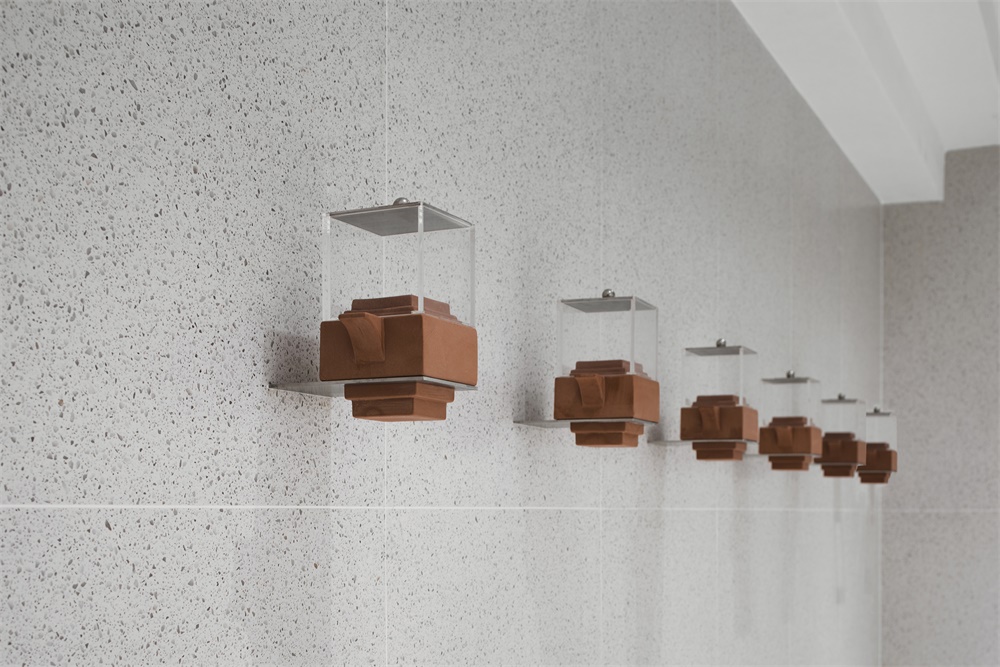
完整項目信息
項目名稱:喜茶深圳卓悅中心店
設計單位:MOC DESIGN OFFICE(www.moc-office.com)
聯係郵箱:info@moc-office.com
主創設計師:吳岫微,梁寧森
設計團隊:莊亦乘,胡僑
設計周期: 2018.11-2018.12
竣工時間:2019.12
項目地址:深圳市福田區卓悅中心1層L140
麵積:178㎡
主要材料:仿水磨石瓷磚,KD木飾麵板,白色烤漆不鏽鋼
客戶:喜茶
攝影:聶曉聰
Project Name: HEYTEA at One Avenue, Shenzhen
Design Company: MOC DESIGN OFFICE(www.moc-office.com)
Contact: info@moc-office.com
Leading Designers: Wu Xiuwei, Liang Ningsen
Design Team: Zhuang Yicheng, Hu Qiao
Design Phase: Nov. 2018 – Dec. 2018
Completion: Dec. 2019
Location: L140 1F One Avenue, Futian District, Shenzhen, China
Area: 178㎡
Materials: Terrazzo Brick, KD Wood Panel, White Painted Stainless Steel
Client: HEYTEA
Photography: Nie Xiaocong


