全球設計風向感謝來自 靳劉高設計 的創意辦公與公共空間項目案例分享:
設計源於生活 Design Comes from Life
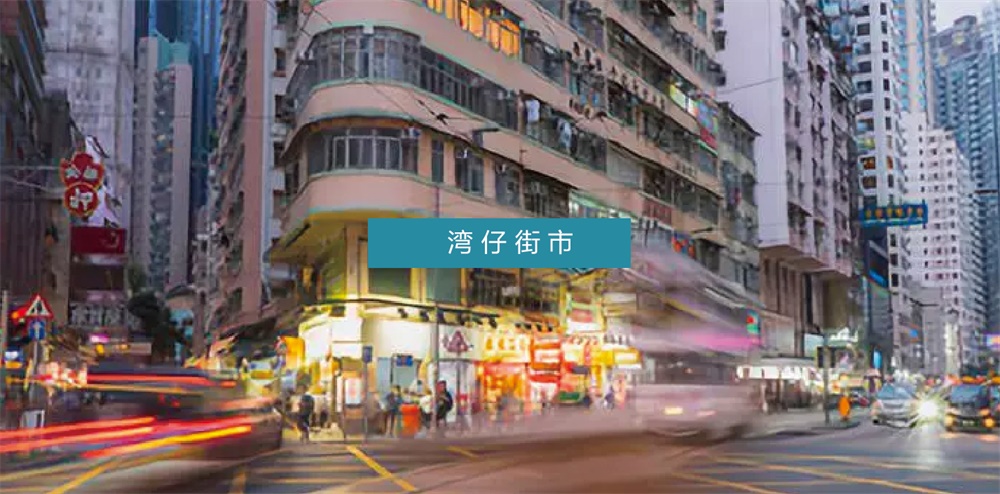
靳劉高設計80年代初的辦公室紮根在香港灣仔,高樓大廈尚未進駐前,這一區域市井氣息濃厚,充斥著小市民拉扯的日常。堅信“設計源於生活”,KL&K DESIGN樂於從最鮮活的日常中汲取設計靈感。
The first office of KL&K Design was rooted in Wanchai, Hong Kong in the 1980s. Before the high-rise buildings entered this area, the location had a strong marketplace presence, filled with everyday-life spirits of ordinary citizens. With the belief of “design comes from life”, KL&K Design always gets design inspirations from what is vividly surrounding us.
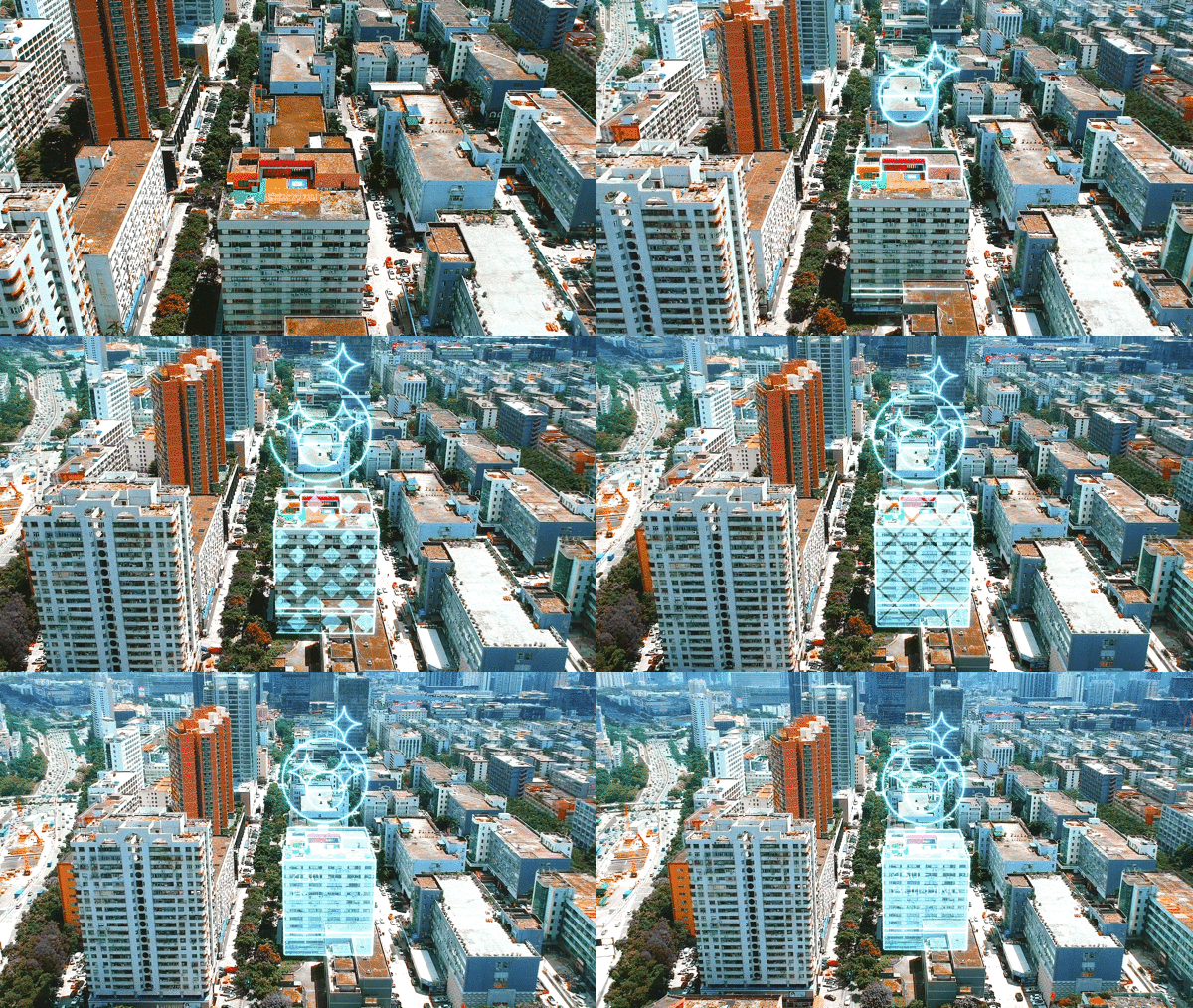
本次搬遷落址於福田八卦嶺。作為深圳最早迎接改革開放的工業園之一,大量設計產業上下遊工廠及供應商坐落在這個園區。隨著舊改的號角響起,周邊殘存的工業感與創意驅動的辦公室碰撞,產生微妙的化學反應。
The company has now moved to Bagualing, Futian. As one of the earliest industrial parks in Shenzhen undergoing reform and opening up, a large number of upstream and downstream factories and suppliers in the design industry are located in this area. The renewal of this old industrial area has just begun, the new creative space has started to form a special chemical reaction with the industrial surroundings.
文化故事起點 The Origin of Culture & Story
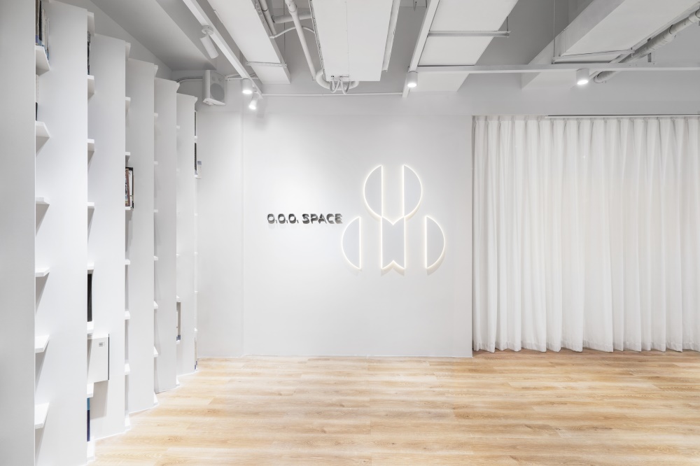
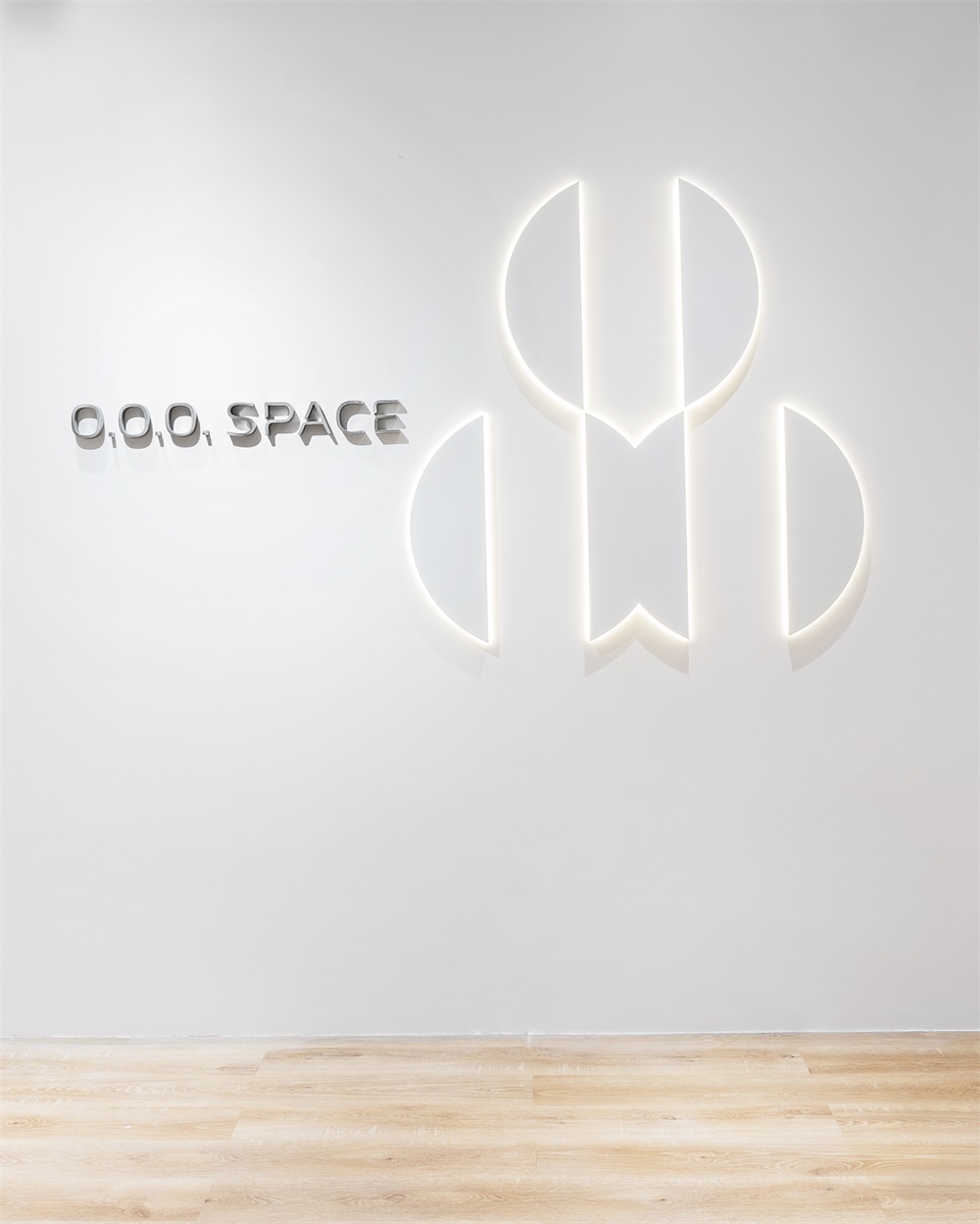
靳劉高設計(KL&K DESIGN)成立四十餘年,一直專注於設計領域發展。公司除了提供顧問服務外,也著力推動設計行業的交流與教育,堅持可傳承、可持續的設計文化理念。搬到現在的辦公新址後,KL&K Design創辦了新的文化交流平台——O.O.O. SPACE。
The company has now moved to Bagualing, Futian. As one of the earliest industrial parks in Shenzhen undergoing reform and opening up, a large number of upstream and downstream factories and suppliers in the design industry are located in this area. The renewal of this old industrial area has just begun, the new creative space has started to form a special chemical reaction with the industrial surroundings.
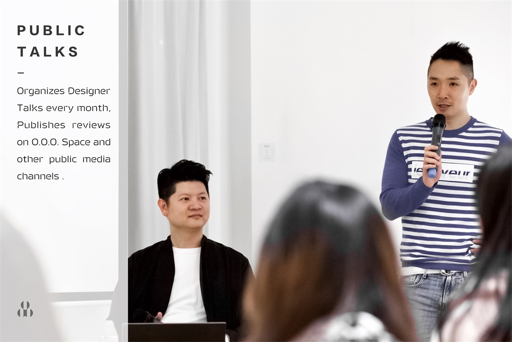
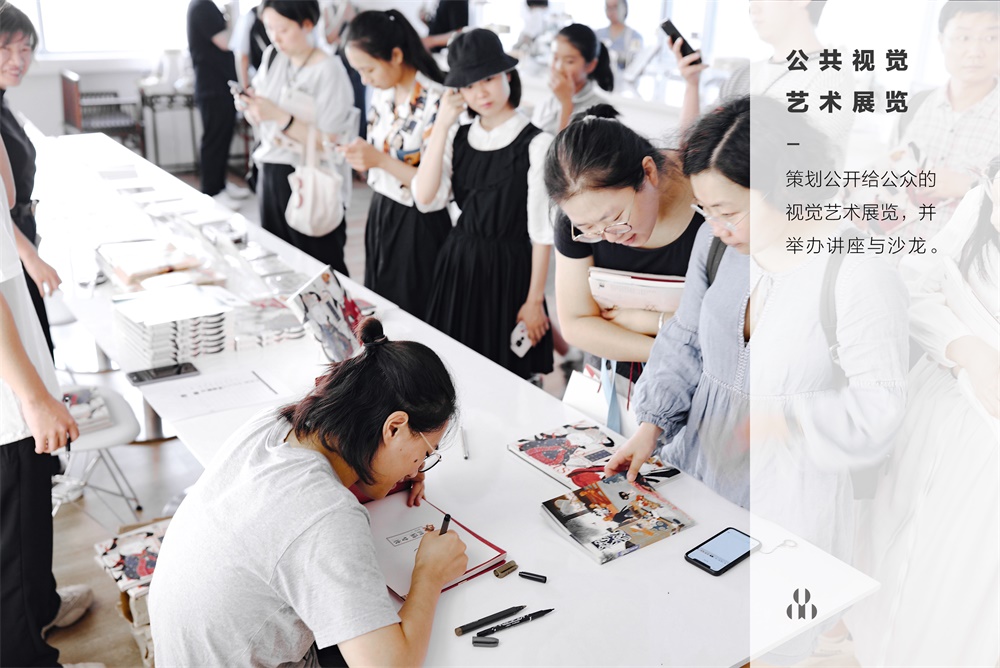
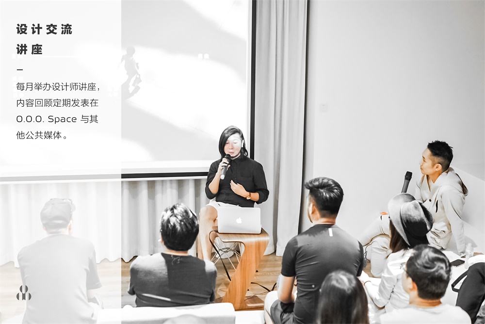
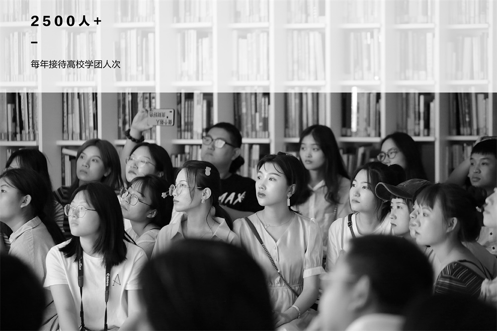
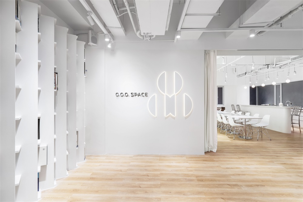
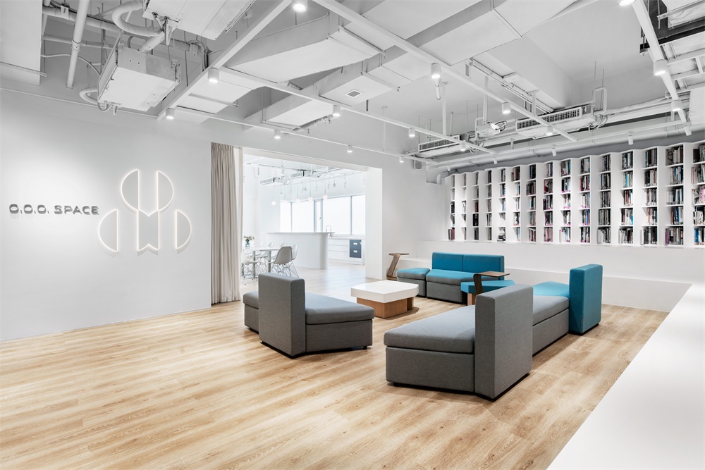
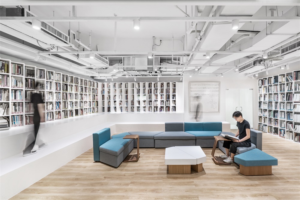
O.O.O. SPACE 是靳劉高設計四十餘年變遷沉澱,精神堡壘般的存在。從整體空間規劃出接近一半的麵積,誌在舉辦公共的視覺藝術展覽、設計沙龍與講座。同時也對院校開放公益接待;與遊學學生團交流,人數每月達到500人次。商學研相長,推動創意行業發展傳承,承擔部分教育公眾的社會責任,探索設計向善的可能性。
KL&K Design has established over 40 years, apart from providing design service, it also has a long history of promoting cultural exchange and education, making contributions back to the industry. Adhering to the inheritable and sustainable design culture, KL&K Design established the social creative platform O.O.O. SPACE.
O.O.O. Space is a visionary social existence of KL&K after four decades of changes and precipitations in the creative industry. The Space covers approximately half of the total area, with the mission to hold public visual art exhibitions, salons and talks. It also gives lectures to visiting academy students (around 500+ people each month). It aims to develop a synthesis between business, education and design research, and the exploration of creativity towards empathy.
空間需求與交互 The Interaction Requirements
從格子間到SOHO一族,再鼓勵員工回到一個共同的物理空間。趨勢要求企業在辦公空間呈現上發起更多維度的思考。適應概念的發展,靳劉高創建了一個新的辦公場景,決定將其打造成傳遞公司核心價值及創意洞見的空間。
From cubicles to SOHO, employees are encouraged to return to a common working space. Under the trend of openness, work space should show multi-dimensional considerations. KL&K determines to set up a sustainable creative space that can combine social explorations and office needs, in a way to transmit the company’s core values and creative insights.
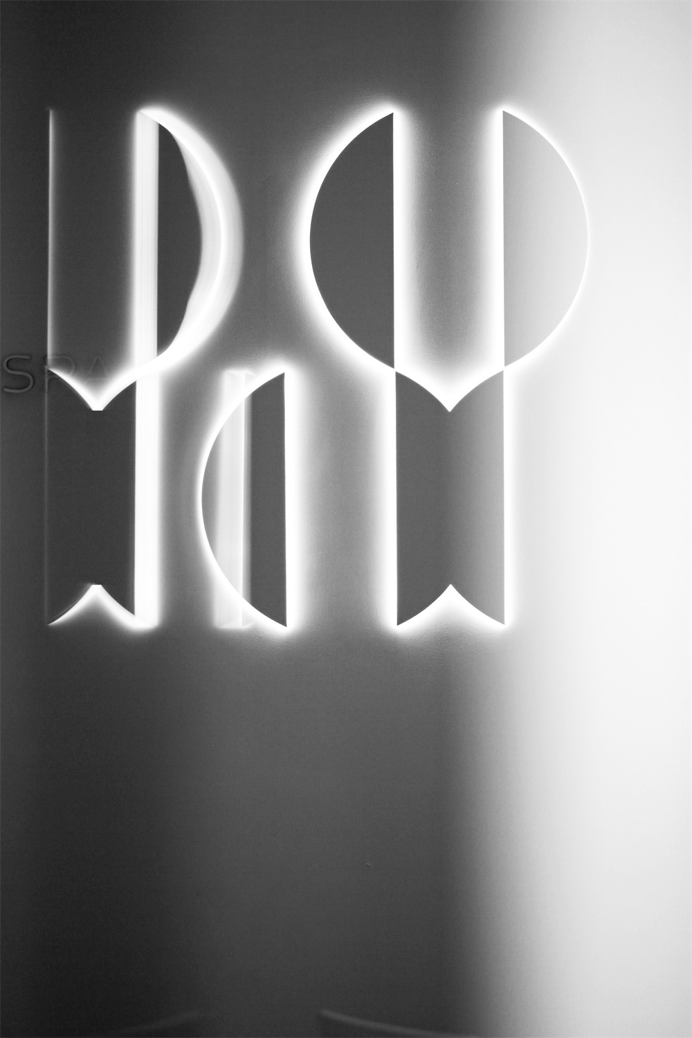
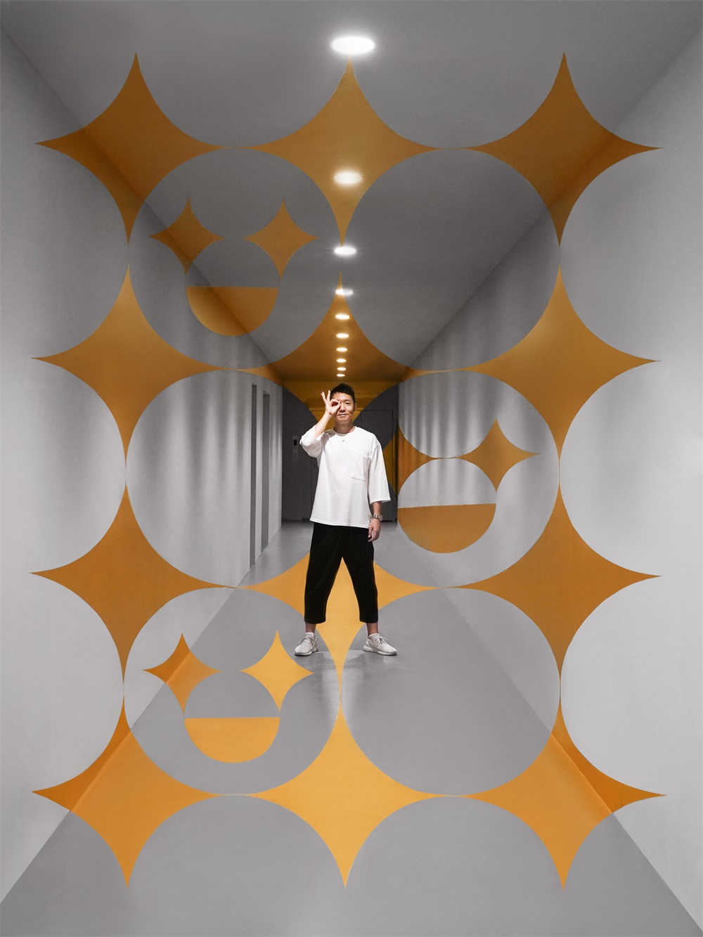
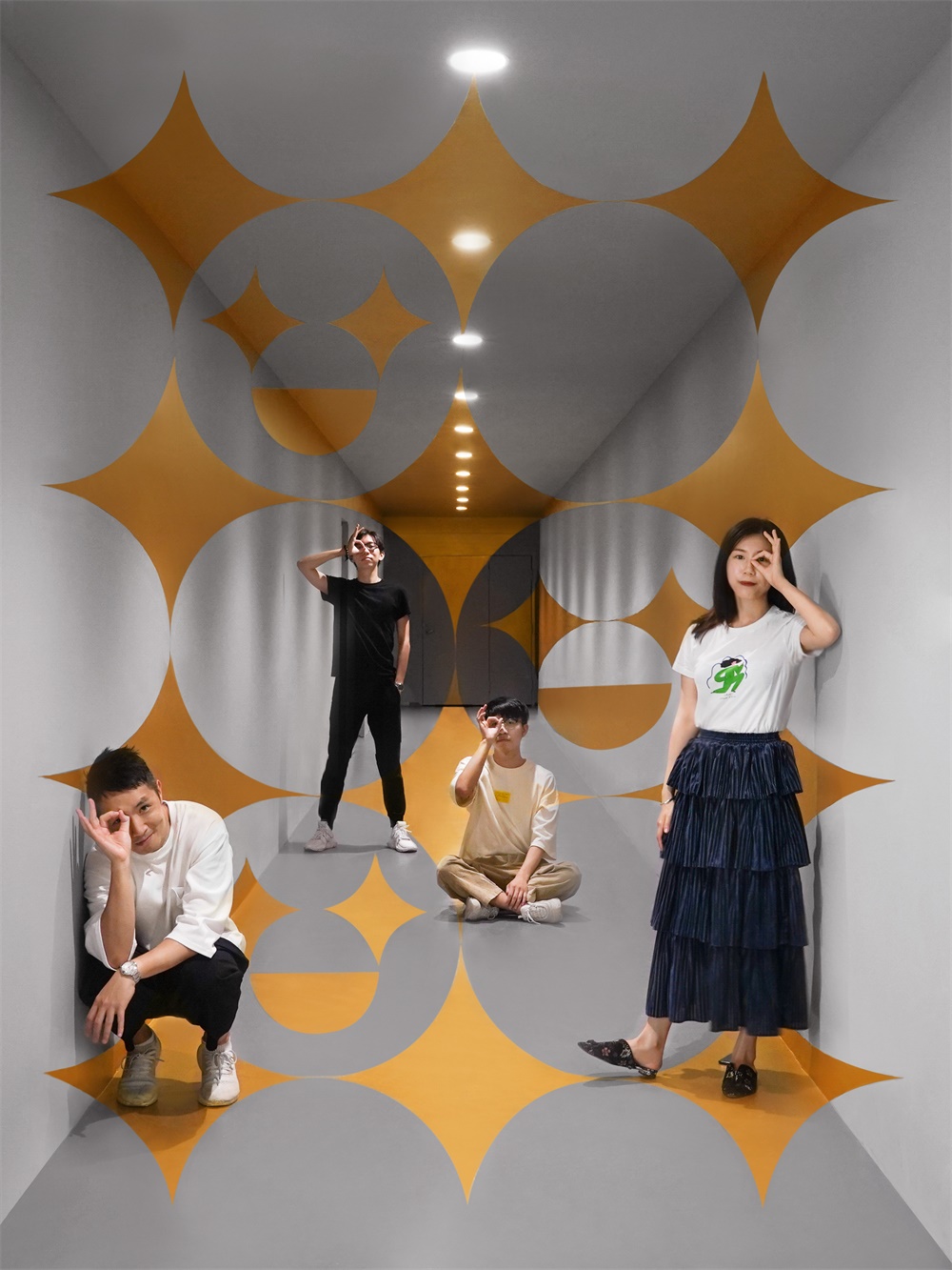
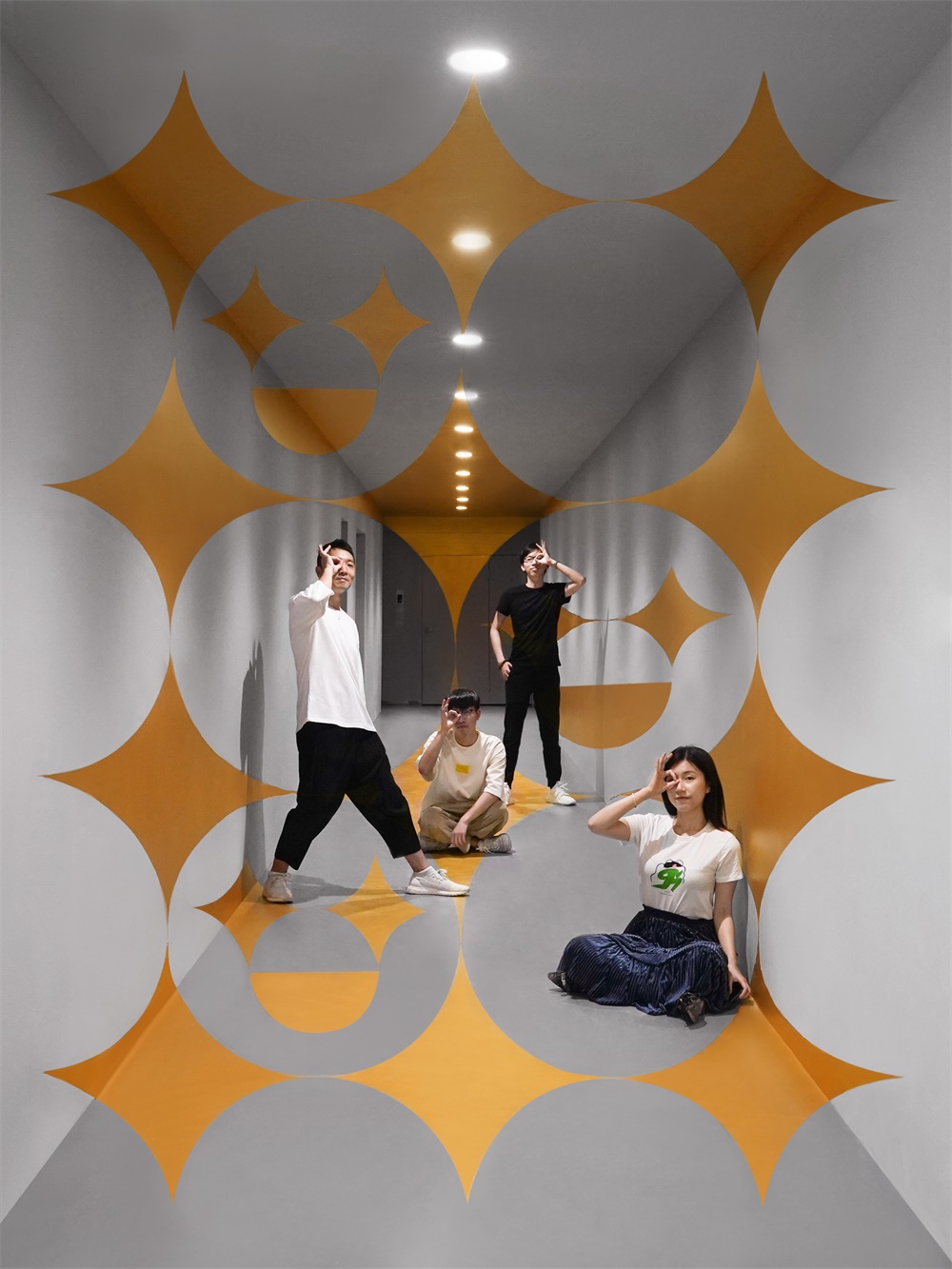
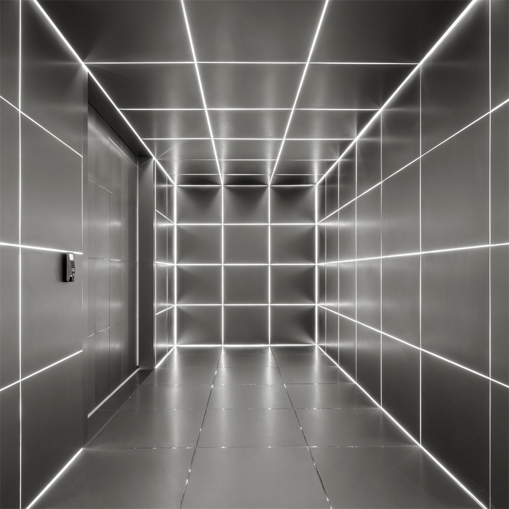
空間入口處的通道是名為“眼前TM一亮”的打卡點。以單點投影繪製的透視空間圖案,必須找到透視的原點才能拍攝出完整的平麵視覺。設計的概念是“創意必須找到焦點,設計才能讓人眼前一亮”。以有趣的方法去回應“設計要亮眼”這個終極要求,代表了機構的文化,也成為訪客的交流話題與打卡地點。
The passageway next to the entrance is named “Bling ™ your eyes”. The concept is “Creation needs to find the right focus to come up with an eye-popping design”. In order to capture a photo of the perfect graphic pattern, you must find the ‘right focal point’. It responds to clients’ ever requests of “eye-popping designs ” in an interesting way, which reflects the company’s culture and has also become a talking point and a photo opportunity for visitors.
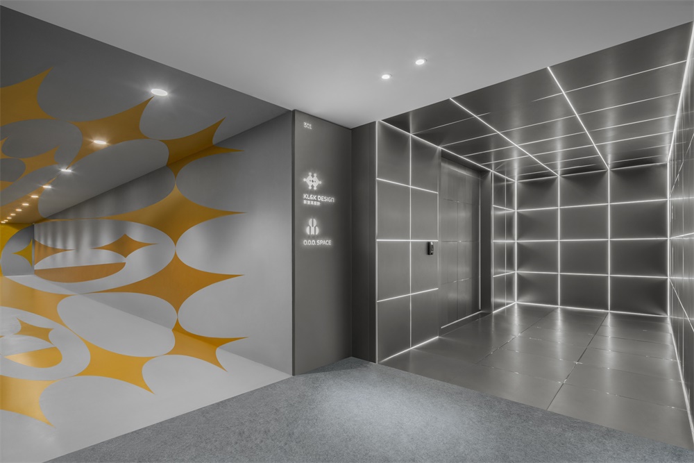
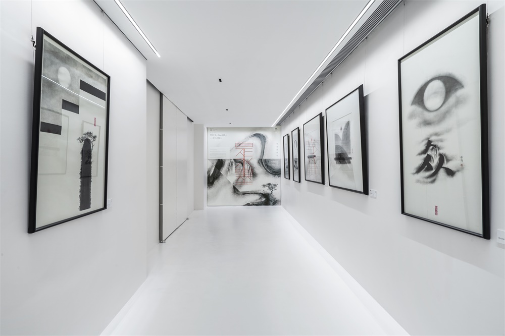
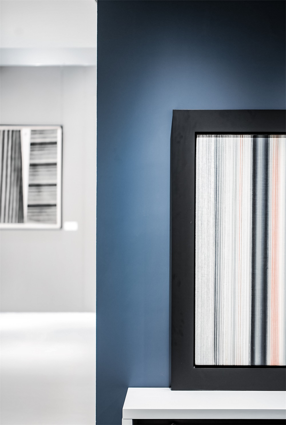
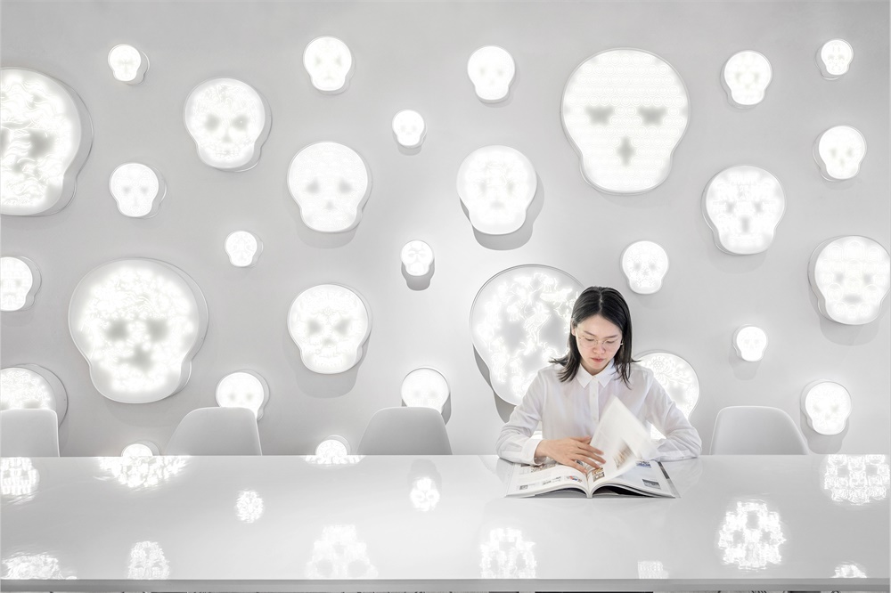
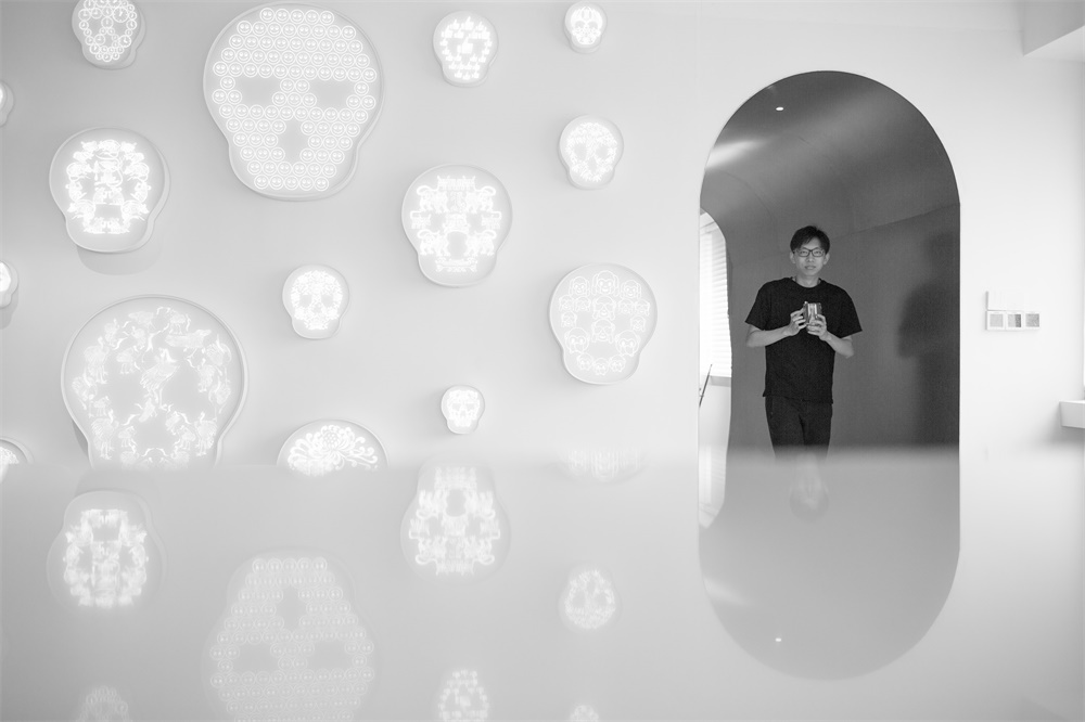
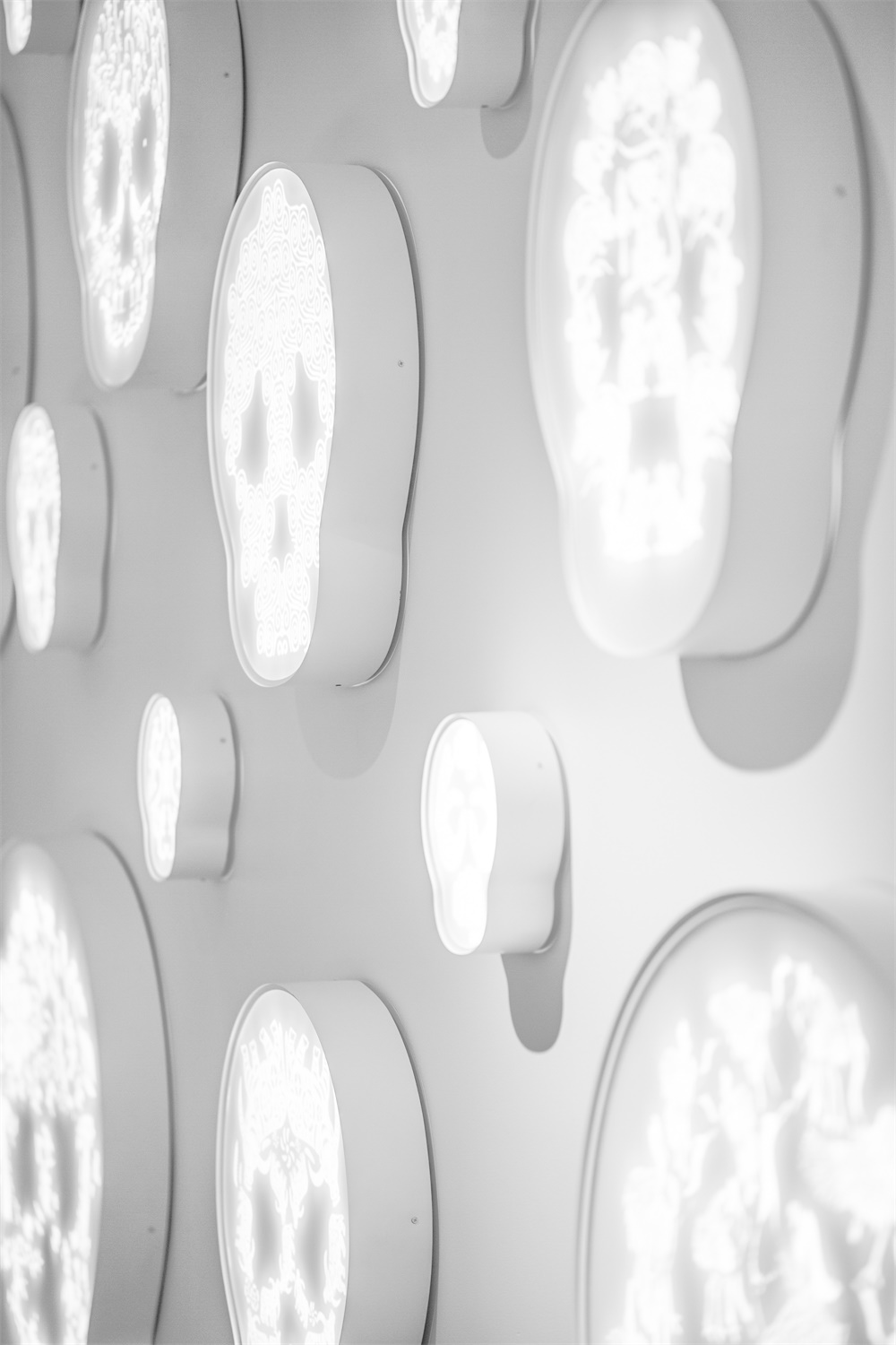
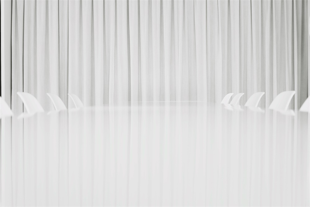
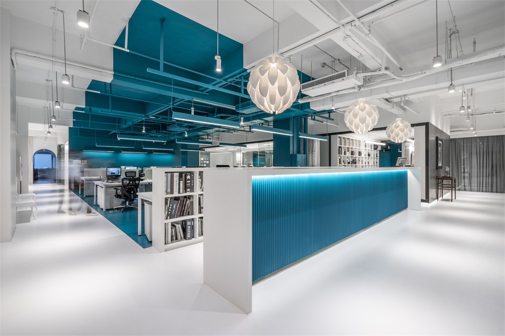
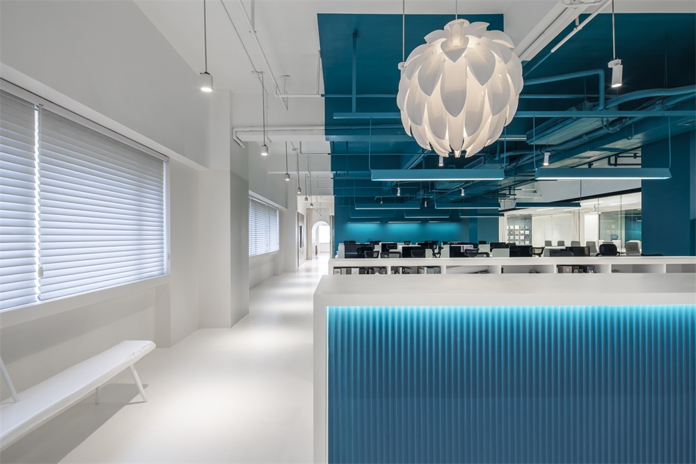
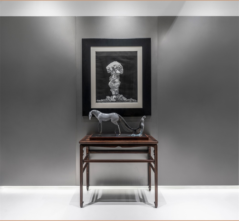
十字網格的入口處是一個強烈反差的過渡空間。有別於一般辦公室入門時的接待前台,打開大門後,迎麵看到的是一個純白色的畫廊空間,目的是以文化的呈現來迎接訪客。
The cross-grid entrance is a transitional space with strong contrast where guests will enter a snow-white art gallery when the door opens, as a cultural approach to present a welcome.
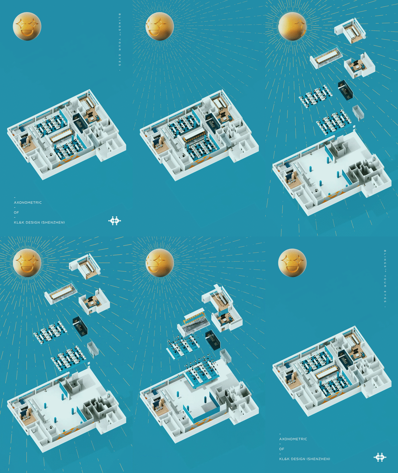
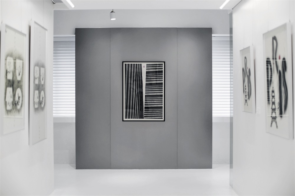
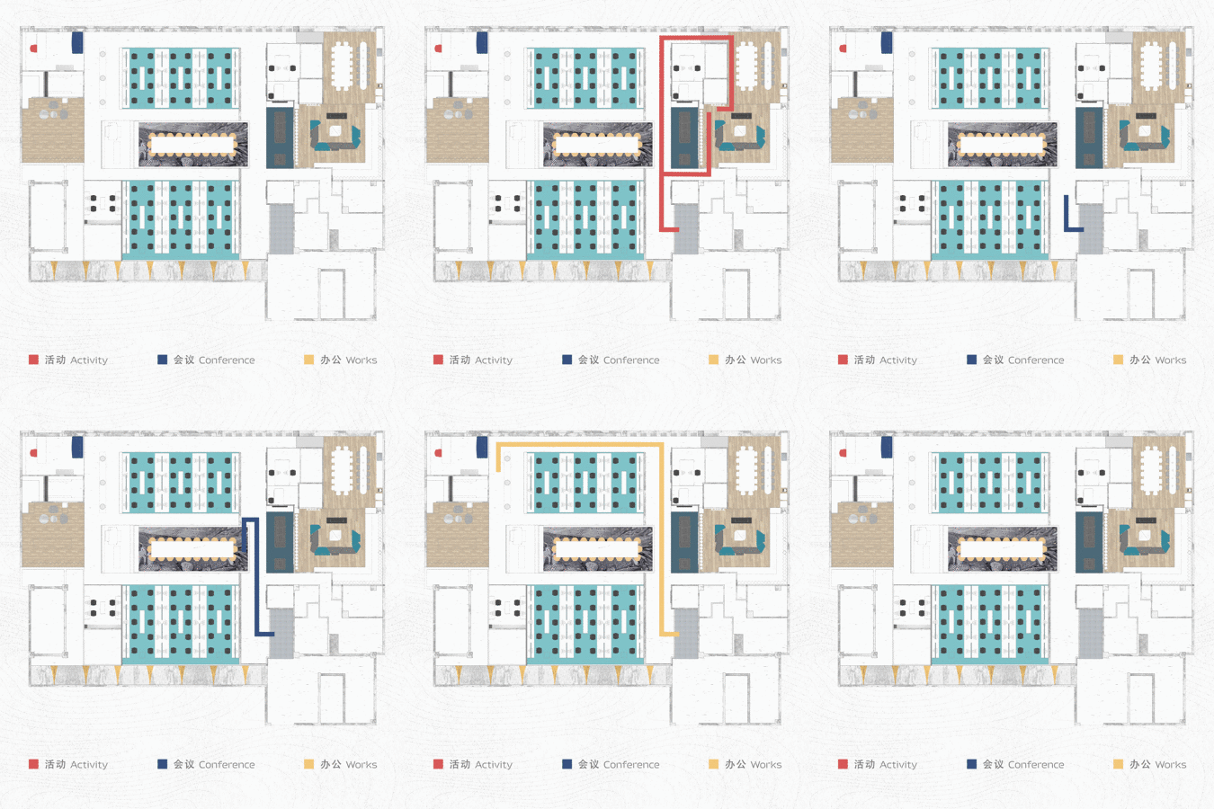
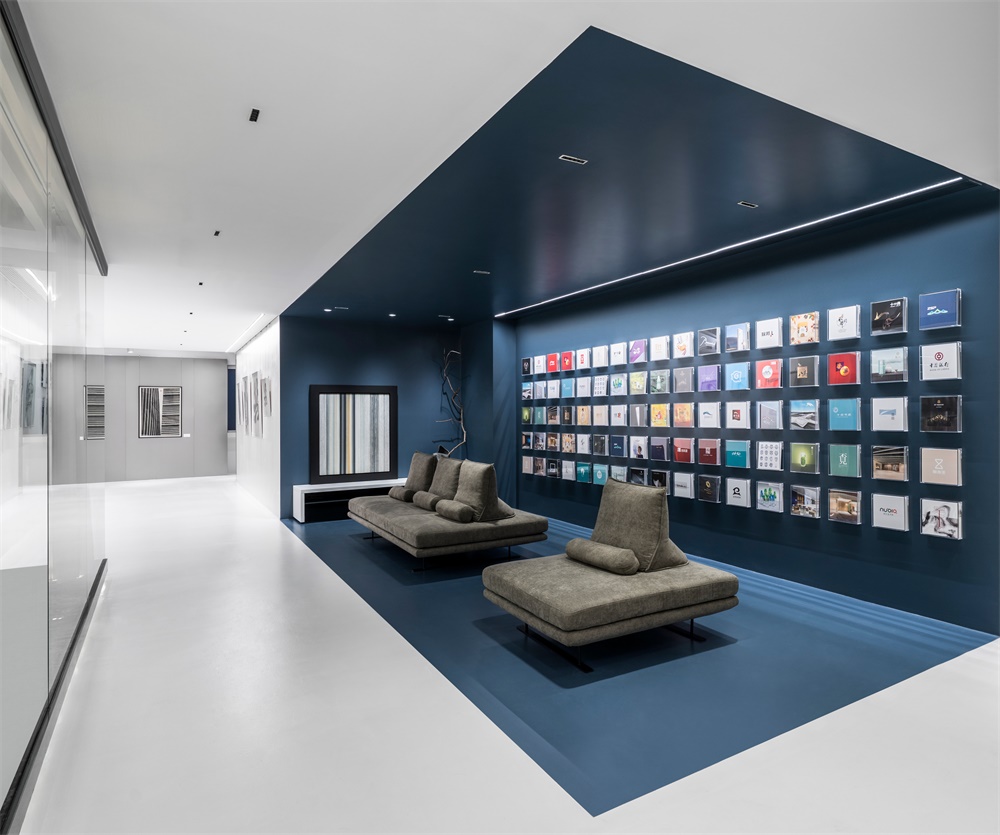
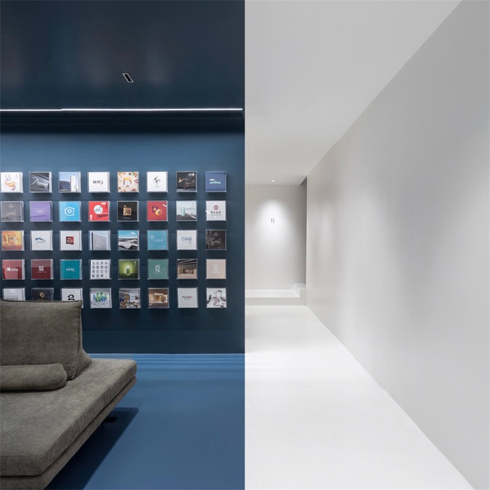
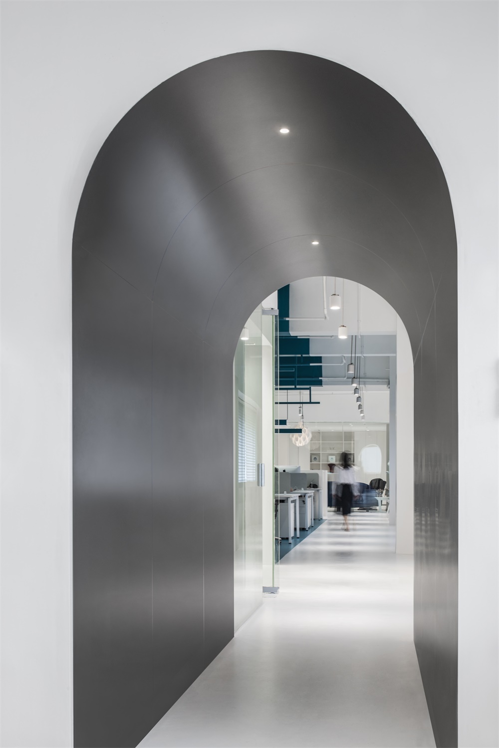
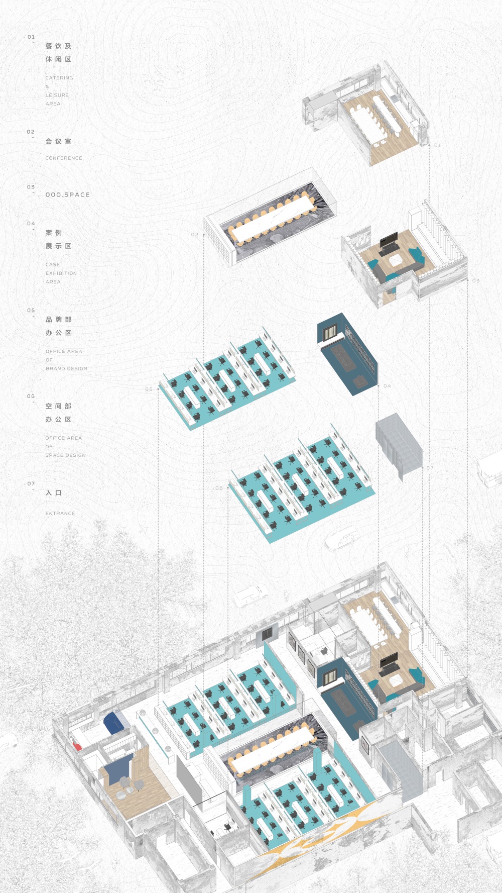
空間要考慮文化活動、日常辦公與客戶會議三種不同的活動需求與空間感知。在空間布局上,需形成三條互不幹擾的人員動線。我們用公共畫廊將公共區與辦工區有效的分割開,純白與深灰大色塊切割使空間變得銳利清晰。
Event activities, office works and conferences require three different space perceptions that need to take into account for the design of feasible moving paths without interfering each other. Therefore, we use the Gallery to divide the public area and the office area. Clear zonings using distinctive colors of pure white, grey and Marrs green from floor to ceiling to make the space looks sharp and clear.
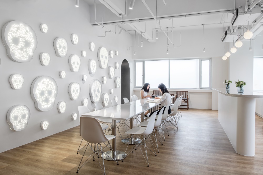
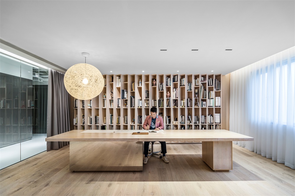
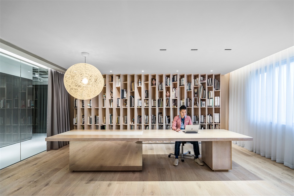
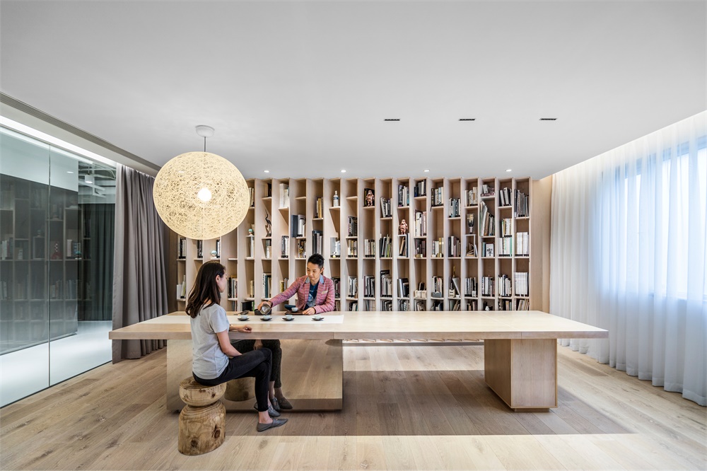
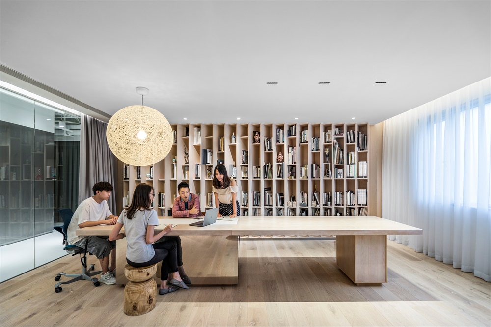
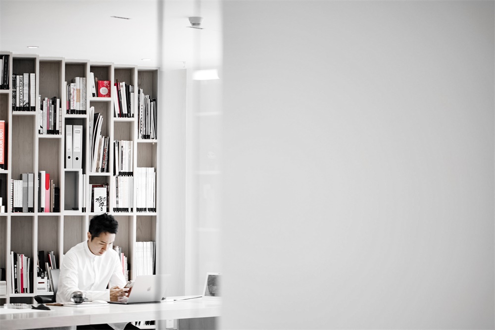
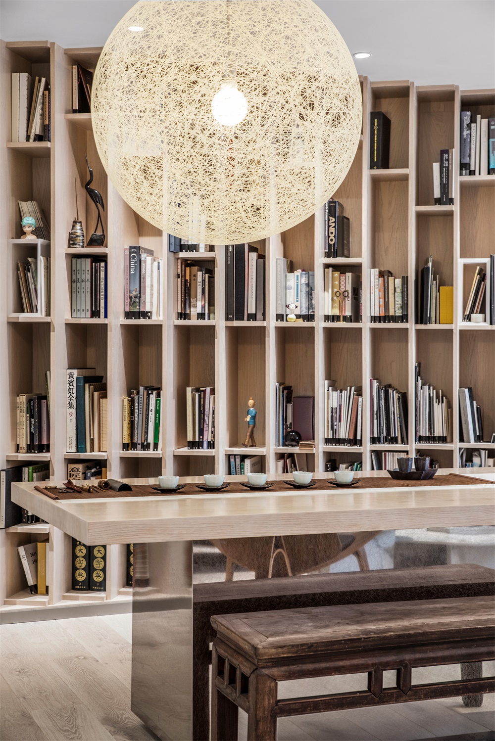
畫廊的一側是OOO SPACE的講座與沙龍區,另一側是客戶的到訪會議室,再深入才是辦公區。三個區域可以同時進行活動功能,但在活動閑置時,講座與沙龍區是作為公司員工的圖書室、CAFE與休閑活動,高效利用。
O.O.O. Space, where public Talks and Salons are held, is on the right-hand side of the Gallery. When the area is not open to public, it is the Library and Cafe of the staff. The Conference Room is on the other side of the Gallery, while walking further down will be the Office area. Different sections can be efficiently used at all time.
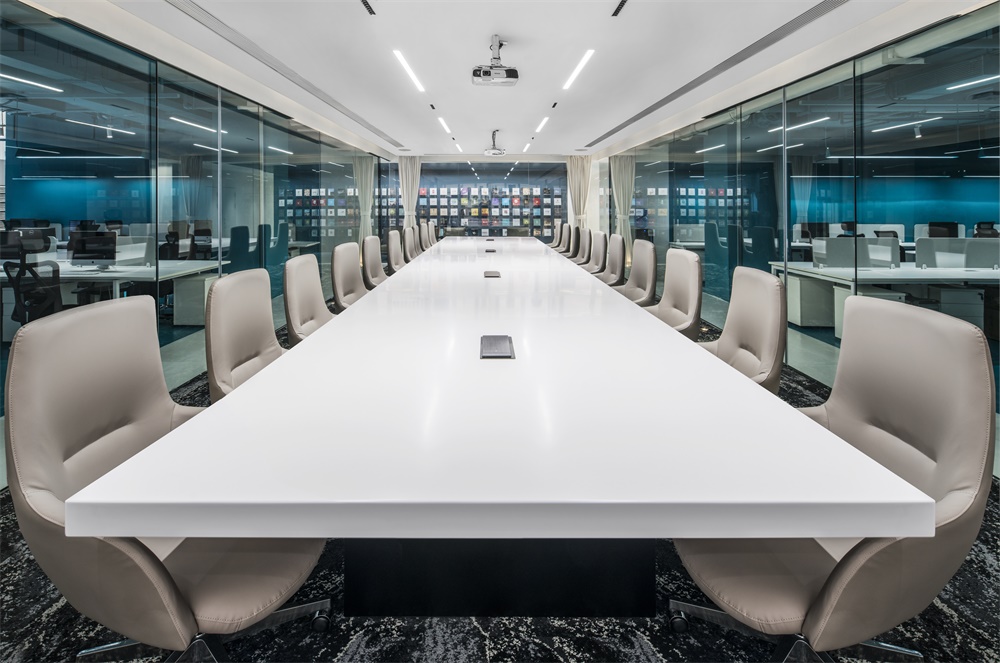
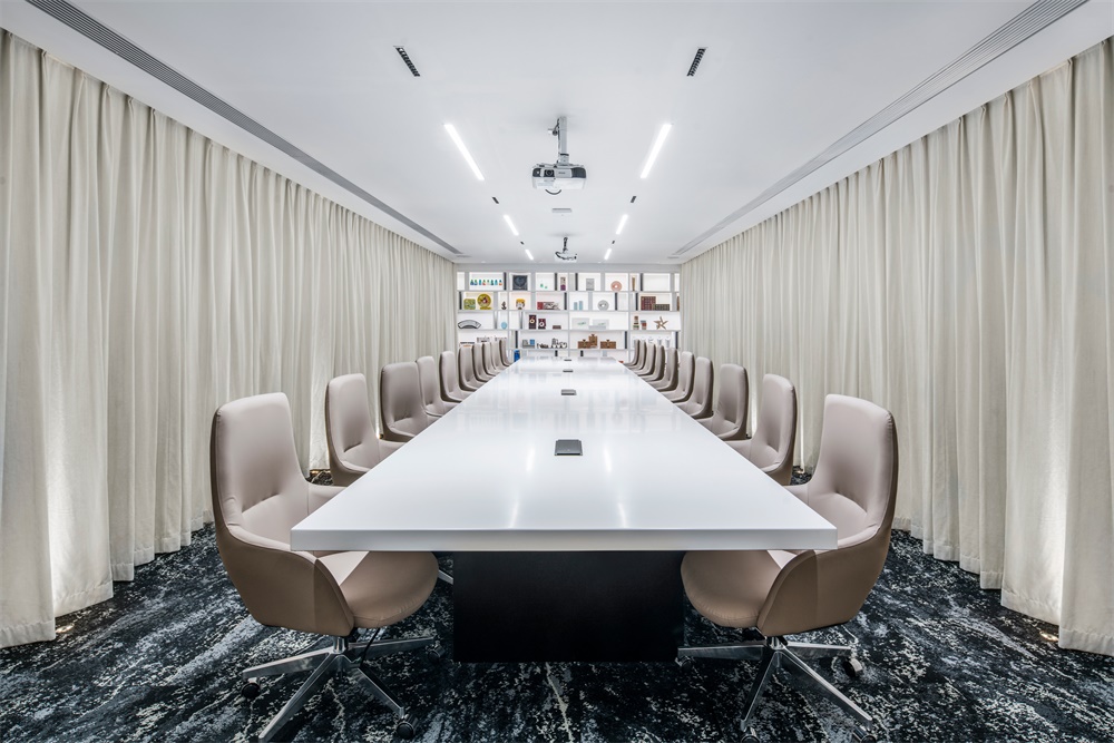
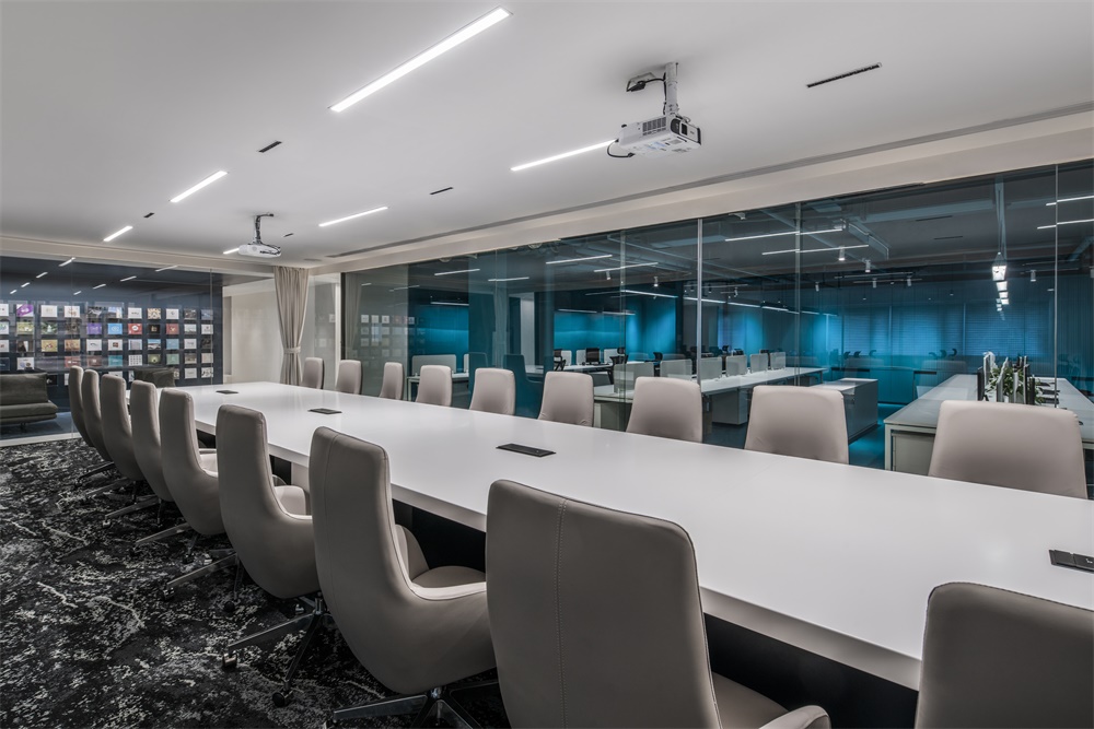
會議室是一個三麵的玻璃盒子。開會模式下,三麵拉上白簾,營造專注的儀式感空間;會議結束後,布簾打開,訪客能看見兩側的工作區域,直觀地感受到工作氛圍。
The Conference room is a three-sided glass box. During the meeting mode, a sense of ceremonial stage is created by closing the full-wall white curtains. When meetings are off, the curtains are opened, visitors can see the work spaces on both sides and feel the work atmosphere intuitively. When the Conference room is not in use, the glass doors on both sides are opened to create a free flow between staff from two departments.
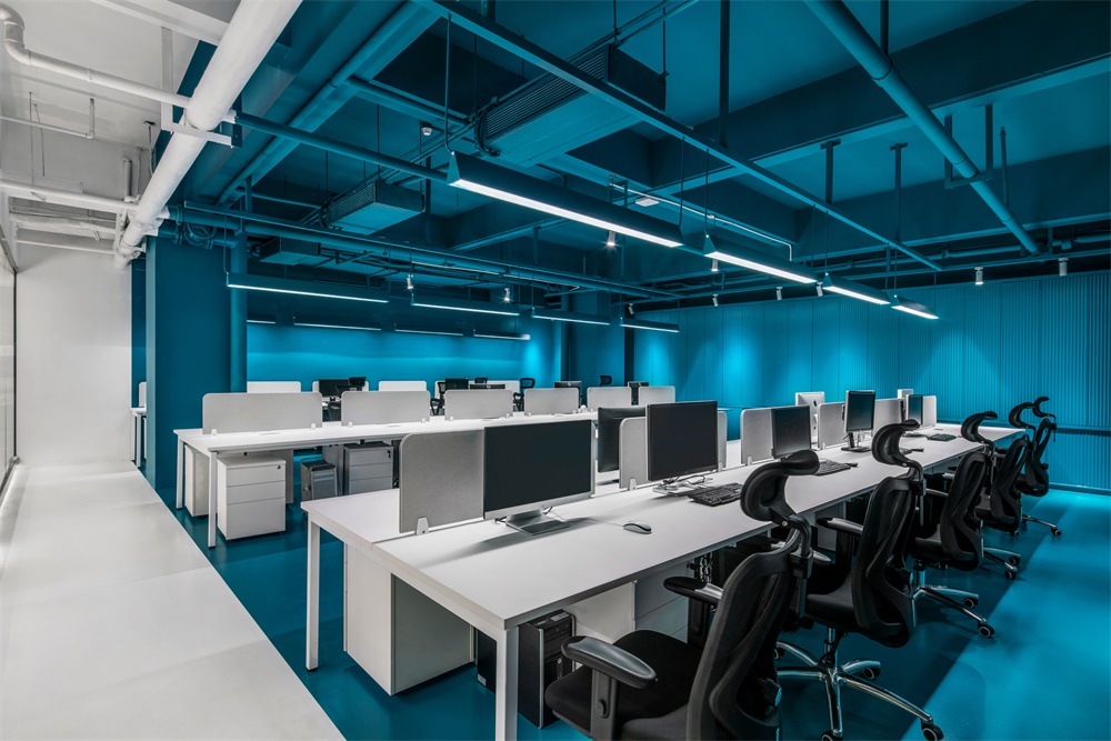
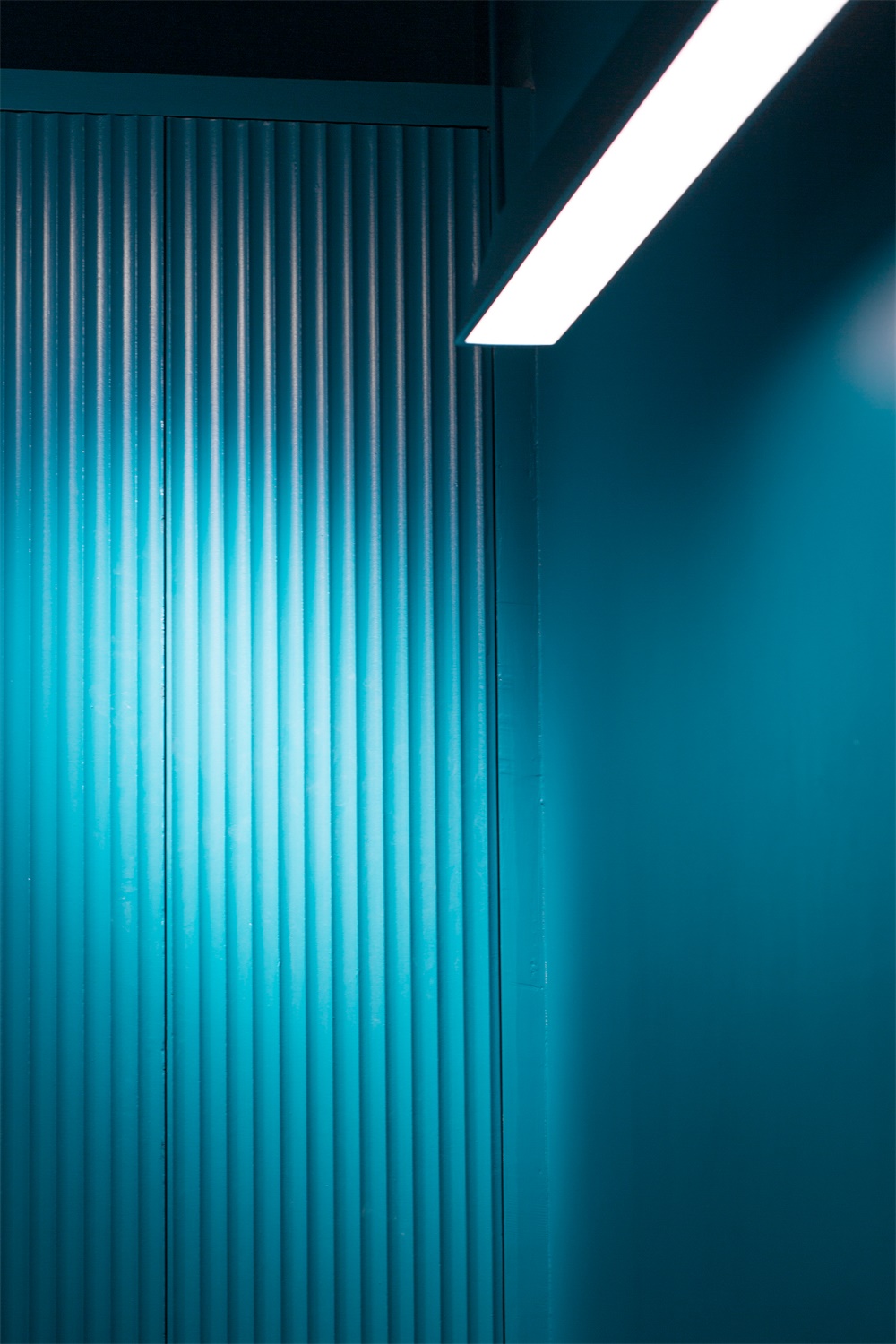
∇ 天地牆使用馬爾斯綠作為主色調,為專注的空間帶出豐富的層次。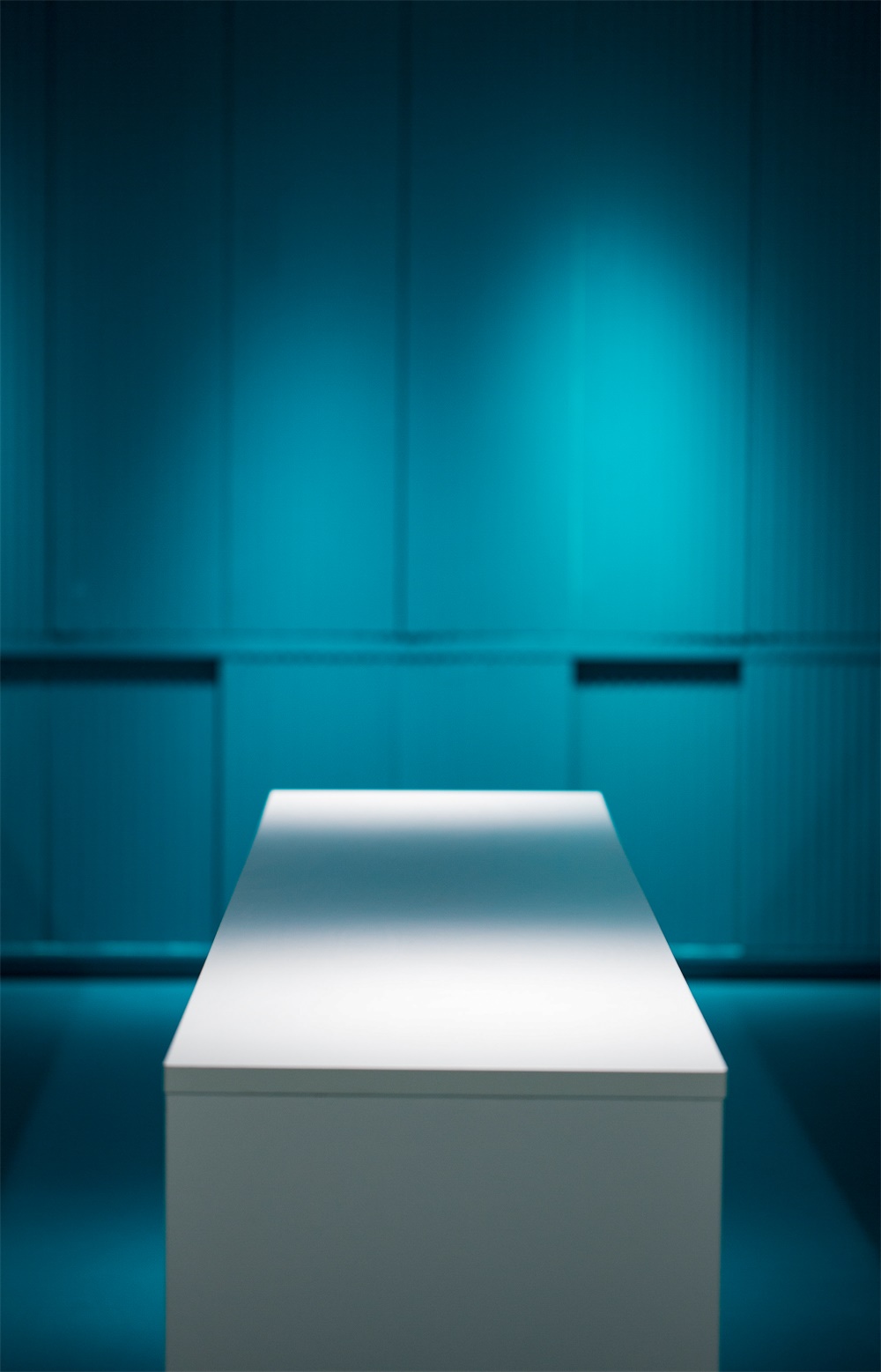
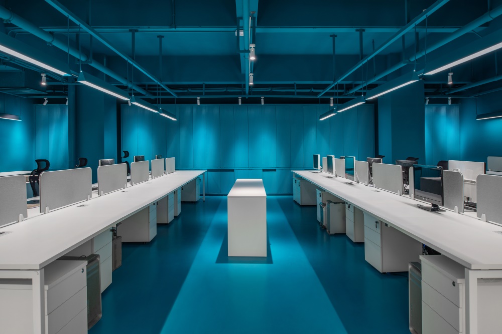
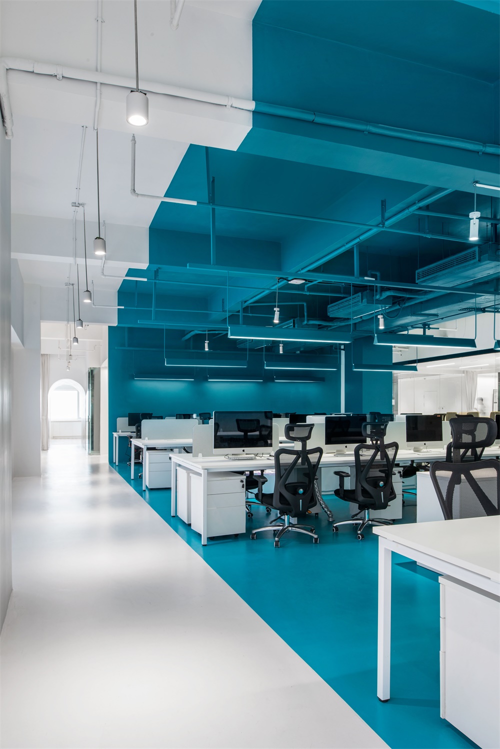
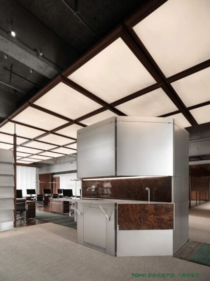
辦公區中,區別於常規的相向而坐、麵對麵交流,KL&K Design的辦公設計更強調快捷的協作模式。小組成員背向而坐,中間設置小長桌供成員快速形成小空間討論;
Marrs green is applied from floor to ceiling in the Office zone, which gives a distinctive look to its attentive work atmosphere. Instead of conventional face-to-face sitting, the design office emphasizes quick response communication and collaboration. Colleagues of individual groups sit back-to-back, with a work table in between two rows, allowing an efficient space for group discussions.
行政與業務管理的獨立房間安排在空間的兩端,布局以大會議室為中心作連結,圍繞打通。房間均以落地玻璃分隔,保持了空間的通透與完整性。整個空間的窗戶做了磨砂處理,隻透進自然光,使空間與外部環境更為獨立,自成一格。
The executive office and business department are arranged at either ends of the space, with the large conference room as the central junction. The individual rooms are separated by floor-to-ceiling glass to maintain transparency and integrity of the space. The windows of the whole space are frosted with natural light, making the space unique and stay independent from the external environment.
KL&K Design認為,辦公空間中,需考慮辦公的物理互動需求,但真正的設計骨架源自於企業文化。以打造全方位的品牌體驗為目標,靳劉高設計新址設計除呈現創意機構的專業性外,希望以文化交流的形式去探索可持續的創意力量。
KL&K Design believes the real framework of a working space lays on its corporate culture, which is the key to construct interactions between different needs. With the vision to foster a total brand experience in its design, the new space of KL&K Design and O.O.O. Space showcase the professionalism of a creative organization, and an effort to explore a sustainable creative power through continuous cultural exchanges.
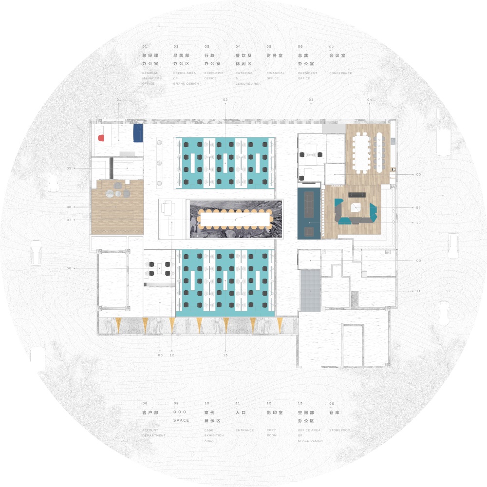
∇ 平麵圖
完整項目信息
項目名稱:KL&K Design + O.O.O. SPACE | 創意辦公與公共空間的互動關係
設計公司:靳劉高設計
官網:http://www.klandk.com/
聯係郵箱:klks@klandk.cn
完成年份:2019年3月
建築麵積(平方米/坪):1000㎡
項目位置:廣東省深圳市福田八卦嶺430大廈
攝影師:高少康、楊振鈺
其他技術信息
主創建築師: 高少康、楊振鈺
設計團隊完整名單:
創意總監:高少康
設計總監:楊振鈺
設計師:歐陽家聲、肖康
素材:胡程熙、鄧佳藝
攝影:聶曉聰、鍾謹燮
撰文:劉沛
業主:靳劉高設計
材料/製造商/產品
室內:靳劉高設計
照明:西頓照明設計
Project name KL&K Design &O.O.O. SPACE | Office and public space design
Design KL&K Design
Website klandk.com
Contact e-mail klks@klandk.cn
Design year & Completion Year January 2019 to June 2019
Leader designer & Team Creative director: Gao Shaokang
Design director: Yang Zhenyu
Designer: Ouyang Jiasheng, Xiao Kang
Material: Hu Chengxi 、Eve
Written by: Liu Pei”
Project location Futian, Shenzhen
Gross Built Area (square meters) 1000m2
Photo credits Nie Xiaocong ,Zhong Jinbian
Clients KL&K DESIGN


