全球設計風向感謝來自 木月建築事務所 的城市更新改造項目案例分享:
總括 Overview
南橫步行街位於貴州省貴陽市南明區的核心地帶,當地政府與企業合作希望創造一個有活力、有影響力、有凝聚力的創新街區, 打造貴陽城市形象的新名片,木月建築事務所(MOON Architects)受邀成為南橫步行街的一體化城市更新改造設計方。木月建築事務所研究城市中的各種問題, 分析使用者的行為需求與問題,通過創新性的研究與設計提供得以推廣和普及的綜合性解決方案, 把一係列的問題和麻煩轉換成空間趣味,通過城市更新喚醒城市記憶與活力。
Nanheng Pedestrian Street is located in the core area of Nanming District, Guiyang City, Guizhou Province. The local government hopes to work together with enterprises to create an influential and cohesive innovative neighborhood, making it a new name card for Guiyang City. MOON Architects was commissioned to be the integrated designer for the urban renewal of the Nanheng Pedestrian Street. MOON Architects studies various problems in the city, analyzes the behavioral needs and problems of users, and provides comprehensive solutions that can be promoted and popularized through innovative research and design, converting a series of problems and troubles into Fun, and awaken city memories and vitality through urban renewal.
∇ 整體鳥瞰,Aerial View of The Site
我們將南橫步行街,這條原本是小吃街的步行街進行全麵改造升級。從宏觀出發,將整片街區看作一個整體,把步行街、建築、室內、景觀、導視的關係整體係統化考慮,相互呼應。在改造中,新的業態引入這個街區,我們追尋原本屬於大眾的積累多年的充滿人文風情的市井空間記憶,創造一個結合文化展示、體驗、生產和經營為一體化的綜合性步行街,一個流動著的貴州文化體驗館。
MOON Architects will make a comprehensive renovation and upgrade of Nanheng Pedestrian Street, which is originally a pedestrian street in Snack Street. Starting from the macroscopic perspective, the whole block is regarded as a whole, and the relationship between the pedestrian street, the building, the interior and the landscape is systematically considered and echoed. In the transformation, a new business model is introduced into this neighborhood. We pursue the memory of the city and the space that has been accumulated for many years and is full of humanities. We create a comprehensive pedestrian street that integrates cultural display, experience, production and management. It is a place where visitors experience Guizhou local culture.
首先,我們的設計從功能需求出發,根據場地裏既有的限製因素,解決現有核心問題:
1:原建築入口標示性不強,導致難以引入人流至內街;
2:原商業內街內部環境較差,通風和采光不好、陰暗潮濕,髒亂現象嚴重,在暴雨天氣倒灌雨水至室內;
3:業態分布不合理,導致商業內街利用率不高,常年處於荒廢狀態;
4:整個街道長約128米,原建築外立麵單一冗長,步行體驗感不好。
First, starting from the functional requirements, solve the existing core problems according to the existing constraints in the site:
1: The original building entrance is not marked, making it difficult to introduce people to the inner street;
2: The internal environment of the original commercial inner street is poor, the ventilation and lighting are not good, and the rainwater is poured into the indoors during heavy rain. Overall speaking, it is dark, humid, dirty and messy;
3: The distribution of the business is unreasonable, resulting in a low utilization rate of commercial interior streets, which is in a state of ruin;
4: The whole street is about 128 meters long. The original building facade is single and long, and the walking experience is not good.
∇ 步行街場地原貌,Site Before Renovation
∇ 改造前室內狀況,Interior Condition Before Renovation
建築設計 Architecture Design
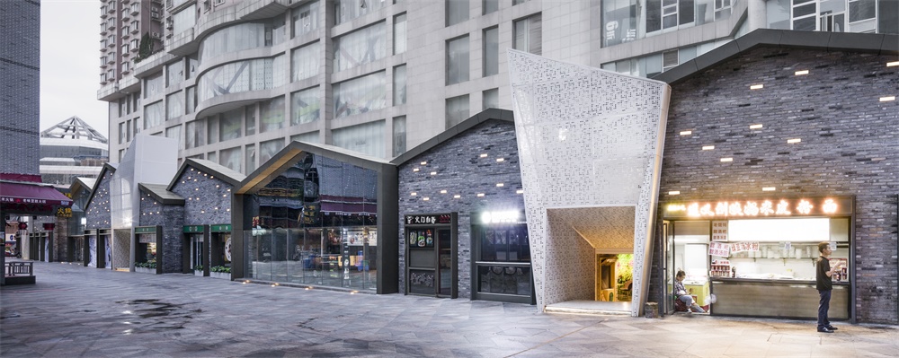
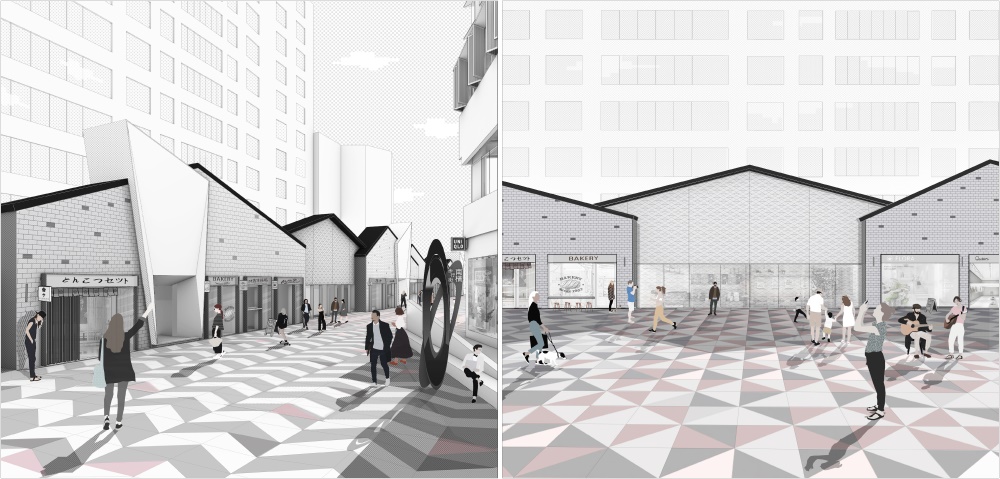
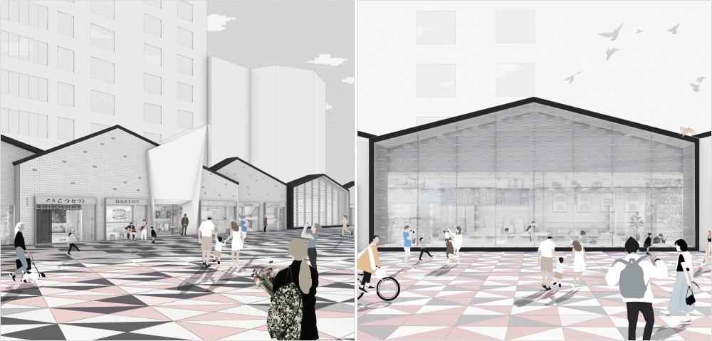
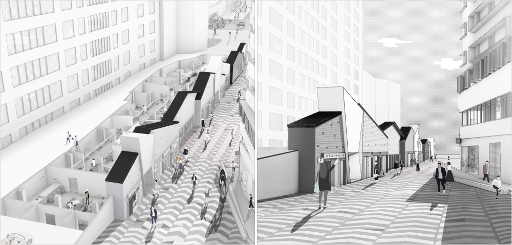
外立麵的設計考慮新秩序商業空間與步行街商業廣場交接和互動的關係,保證外立麵在現有場地中保持獨立,同時建立周邊傳統風貌區有直接或間接的聯係。周邊建築物高度、廣場空間、室內空間、行人步行體驗、天氣、視野是建築外立麵形成的主要影響因素。建築外立麵通過原始的柱間距進行最開始原型的分隔,每個柱間距形成一個獨立的立麵元素,之後,相同功能合並為同一單元,不同的使用功能形成獨立的構成單元。不同的構成單元,依據功能和步行街的影響,形成前後錯落的組合關係。前側步行街廣場較為開闊的位置,外立麵體塊向前較多推進,前側步行街廣場較為狹窄的位置,外立麵體塊較少推進,形成豐富的步行街立麵節奏。外立麵與對麵底層商業及居民樓形成或開闊或狹窄的步行街,影響到外立麵體塊的上升或下降。前部較開闊的廣場位置,適當抬高外立麵體塊,達到醒目,形成廣場中視覺聚集的焦點的目的;前部步行街較窄的位置,外立麵適當下降,避免因步行街兩側都較高帶來的感知壓迫。
The design of the facade considers the relationship between the new order commercial space and the pedestrian street commercial plaza, ensuring that the facade both remains independent in the existing site, and interacts directly or indirectly with the surrounding traditional style area. The height of the surrounding buildings, the space of the square, the indoor space, the walking experience of pedestrians, the weather, and the visual field are the main influencing factors for the formation of the facade of the building. The facade of the building is separated by the original column spacing, and each column spacing forms a separate facade element. After that, the same functions are combined into the same unit, and different functions are used to form separate building blocks. Different constituent units are organized in a logical manner based on the main functions of the pedestrian street. The front side pedestrian street square is relatively open, the facade body block is pushed forward more, the front side pedestrian street square is relatively narrow, and the facade body block is pushed forward less, forming a rich pedestrian street facade rhythm. The facade and the opposite pedestrian commercial and residential buildings form an open or narrow pedestrian street that determines the rise or fall of the facade block. The front part of the open square is appropriately elevated, and the facade body block is raised to achieve an eye-catching effect and the focus of the visual gathering in the square. The narrow position of the front pedestrian street and the facade are appropriately lowered so that people wouldn’t feel uncomfortable.
∇ 步行街全景圖,The Panorama of Nanheng Pedestrian Street
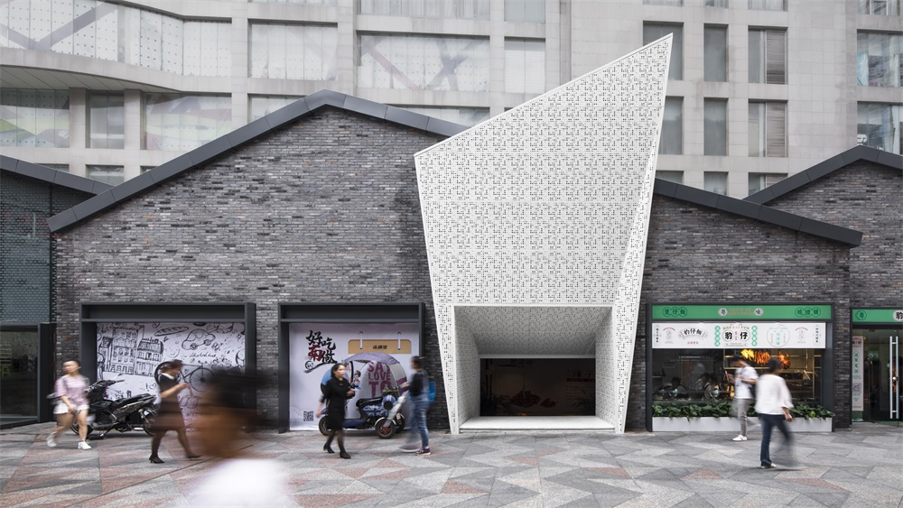
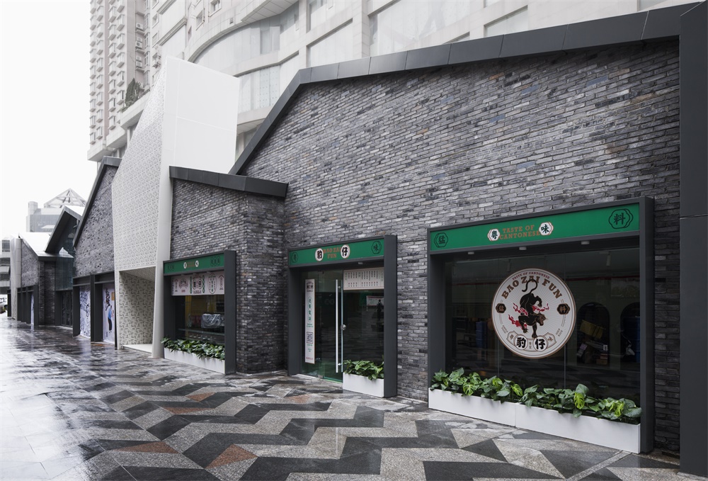
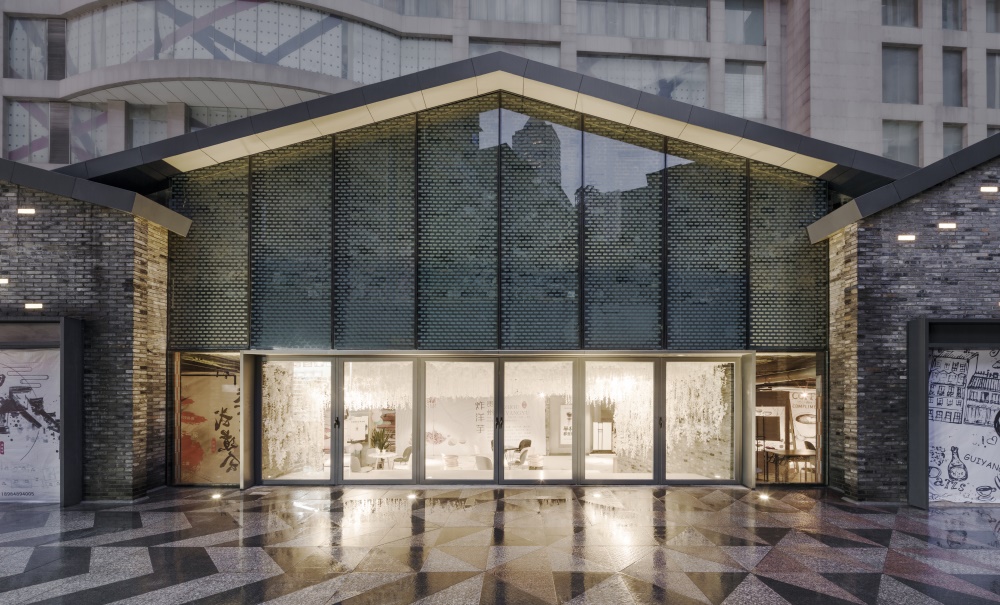
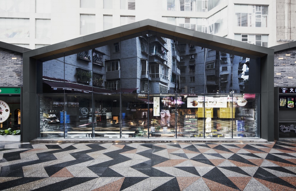
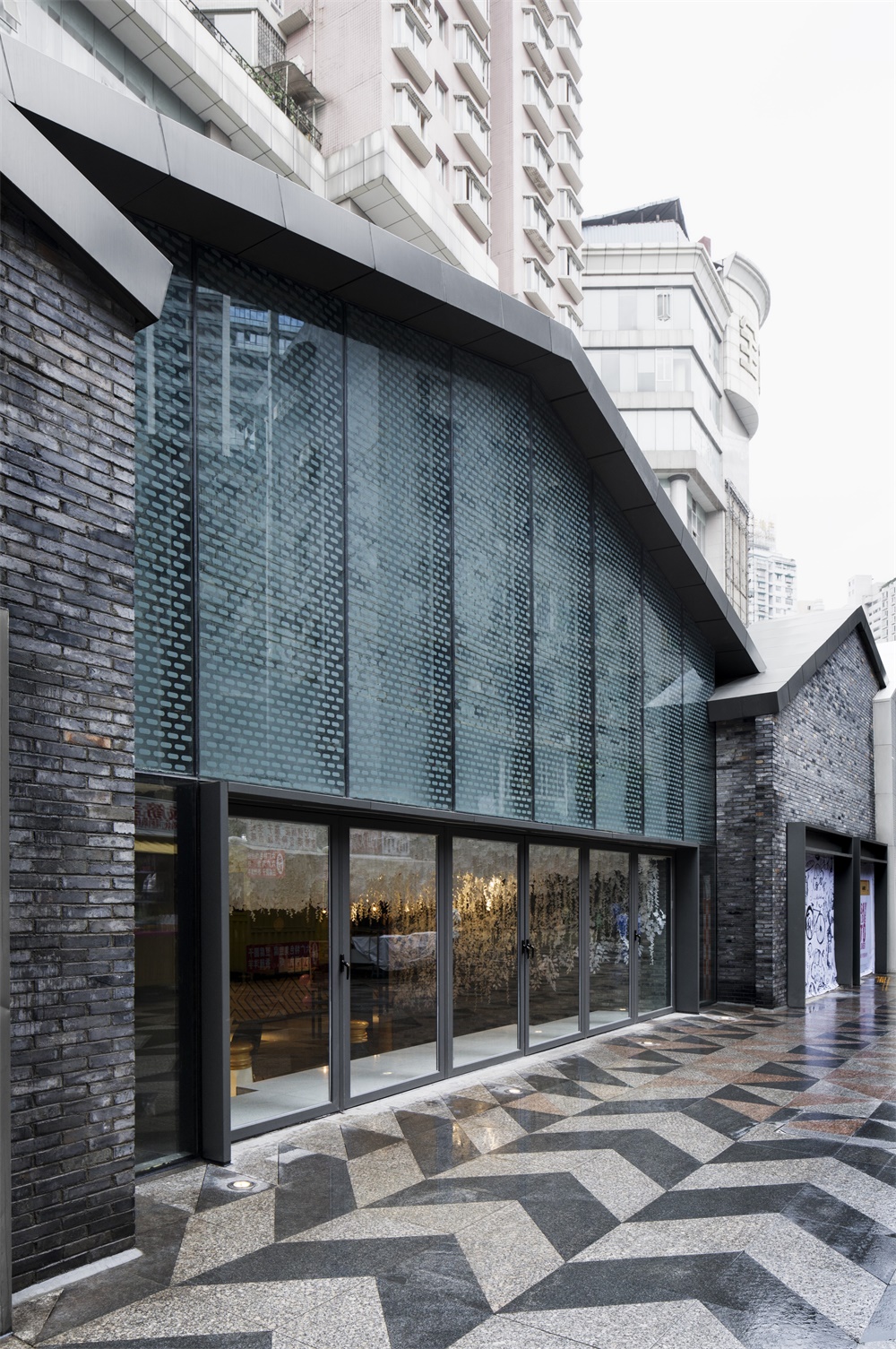
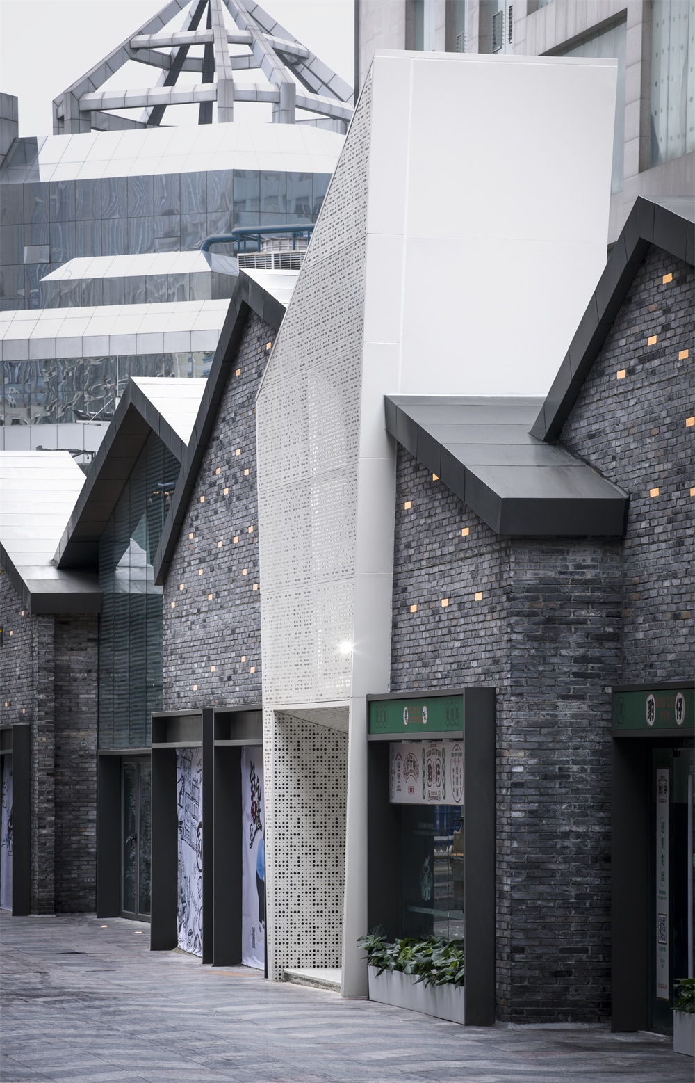
在立麵的形式處理與材料選擇上,屋頂形式采用中國傳統雙坡屋頂,外立麵選用傳統青磚;除傳統材料外,佛碳烤漆金屬邊框,玻璃門窗等現代材料為主。不規則外砌磚牆,豐富建築外立麵的視覺感受。整體外立麵,依托材料變化,形成反應內部空間節奏的虛實外立麵節奏。商業店鋪位置以磚牆為主,形成實體外立麵視覺效果;內部休閑廣場,美食廣場以及入口位置通過幕牆玻璃以及穿孔金屬板的材料使用形成虛體的外立麵節奏。
In terms of form processing and material selection of the facade, a traditional Chinese double-sloping roof style is chosen, and traditional bricks are used in the facade. In addition to traditional materials, Buddha carbon paint metal frame, glass doors and windows and other modern materials are used. Instead of conventional practices, irregularly builds brick walls are constructed to enrich the visual experience of the facade of the building. The overall facade, built by various construction materials, is a vivid display of whatever is going on in the other side of the wall. Most commercial stores have brick walls, enabling visitors to see through. As for leisure plaza, food court and entrance, curtain wall glass and perforated metal sheets are used to create an imaginary facade rhythm.
∇ 建築細部夜景,Building Facade Night View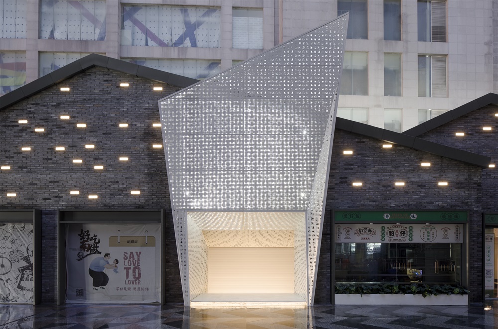
地麵鋪裝設計也通過獨特的地麵鋪裝連接不同的建築物與周邊的社區,在下雨天地麵鋪裝會形成不同的風貌。地鋪秩序采用一種有統一感的主色調鋪裝強化街道景觀的連續性和整體性。而細部色彩設計亮麗、富於變化、生動活潑,以體現商業街生機勃勃的繁華景象;根據流動空間、集散空間和停留空間不同的空間屬性,結合建築外立麵和室內虛實空間進行了五塊區域劃分,以給人方位感與方向感,以及空間性格; 地麵與街道整體環境氣氛相協調,強化街道的個性形象,用不同色彩、質感的材料經過設計、按一定的規則邏輯拚接、組合呈現不同的感受。
The pavement design also connects different buildings and surrounding communities through unique ground pavements, which will create special views on rainy days. The ground floor order uses a unified main tone pavement to enhance the continuity and integrity of the streets-cape. The detailed color design is bright, rich and varied, vivid and lively, to reflect the vibrant and prosperous scene of the commercial street. The space is separated into five areas according to their functions, i.e. walk by, assemble or stay, giving each area a distinct feature and helping visitors to find directions more easily. The ground and the overall atmosphere of the street are coordinated, strengthening the individual image of the street. Different colors and textures of materials are applied and coordinated, making up this unique pedestrian street.
主入口設計 Main Entrance Design
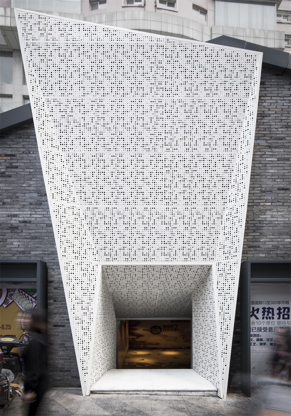
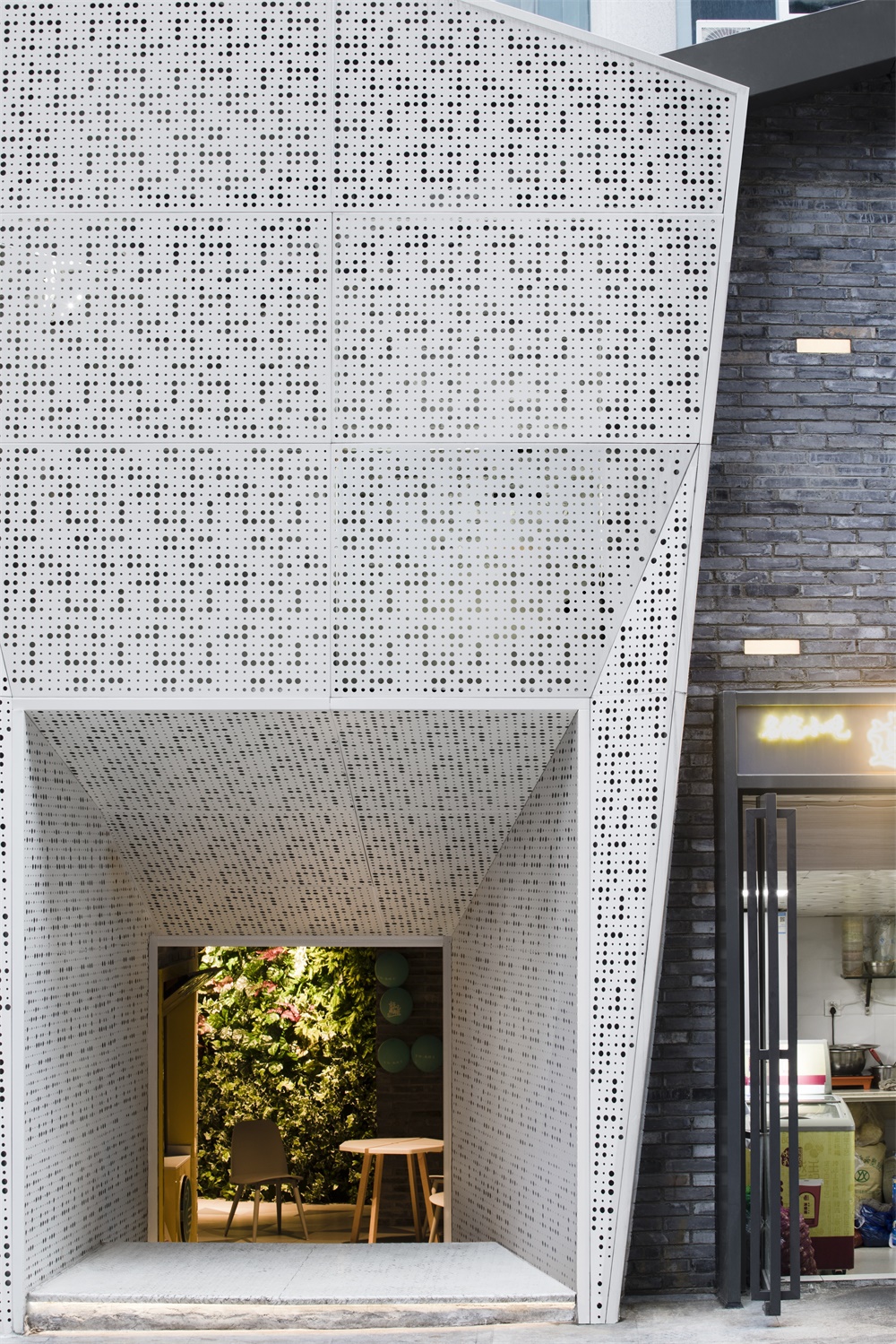
針對原有入口標示性不強,儀式感不足等問題,采取在外立麵置入不規則穿孔金屬板的幾何形體主入口,與外立麵在材料和形體上產生較大的衝突,產生視覺刺激。利用穿孔金屬板後部燈光布置,使不規則穿孔金屬板入口在夜晚形成視覺焦點。創造性的打通南橫街的商業動線,根據場地地形、周邊建築物高度、街道形成的小型廣場空間等分析人流、視野與天際線,確定三個主入口的位置與形式。
In view of the problem that the original entrance is not conspicuous and the sense of ritual is insufficient, a geometrical body with irregular perforated metal plates placed on the facade is used as the main entrance, which creates a large conflict between the material and the form of facade, resulting in visual stimulation. Using the rear light arrangement of the perforated sheet metal, the irregular perforated sheet metal inlet creates a visual focus at night. The new design creatively opens the commercial line of Nanheng Street and analyzes the flow, vision and skyline according to the terrain of the site, the height of the surrounding buildings, and the small square space formed by the street, and determines the location and form of the three main entrances.
室內設計 Interior Design
原有臨街鋪麵44間,室內鋪麵45間。突破傳統商業內街格子間排列情況,通過解構的方法,破除商業空間的分隔,將商業空間靈活,開敞地布置到整體商業空間中,相同商業業態組成無分隔的功能體塊,再通過各個體塊的旋轉,盡可能地形成室內外無差別的連貫空間,建立新的空間秩序。內部商業空間中,無論從哪個入口進入商業內街,經過每個組團商業片區和開放活動空間,都將依次形成虛與實,收與放的空間節奏,通道兩側商業店鋪圍合收的空間節奏,入口和廣場形成放大的空間節奏,為顧客提供較好的遊逛體驗。在虛實節奏中,圍繞開放空間布置形成以咖啡、定製、手工等業態為主的休閑廣場和以開放餐吧等業態為主的美食廣場。兩個廣場空間,借助室外立麵線掛小青瓦材料的使用與綠植的搭配,營造斑斕的光影交替效果。室內商業空間三個入口和兩個廣場位置均布置視覺端景,從室外步行街走過或進入室內都有較好的視覺引導性和美觀性。
Breaking through the arrangement of traditional commercial inner street lattices, through the deconstruction method, breaking the separation of commercial space, the commercial space is flexible and openly arranged into the overall commercial space, and the same commercial business forms a functional block without separation, and then through each. The rotation of individual blocks creates as much as possible a coherent space between the interior and exterior and creates a new spatial order. In the internal commercial space, no matter which entrance enters the commercial inner street, after each group commercial area and open activity space, the virtual and real space will be formed in turn, and the space rhythm of the collection and release will be adopted. The rhythm, entrance and square form an enlarged spatial rhythm to provide customers with a better wandering experience. In the rhythm and rhythm, around the open space, a leisure plaza with coffee, custom, and handicrafts, and a food court with an open bar and other formats are formed. In two square spaces, with the use of the outdoor facade hanging the small blue tile material and the green plant, a gorgeous light and shadow alternate effect is created. There are visual end views in the three entrances and two squares of the indoor commercial space. When visitors enter from the outdoor pedestrian street or enter indoor areas, there is better visual guidance and aesthetics.
∇ 改造後項目外觀,Exterior View of The Project After The Renovation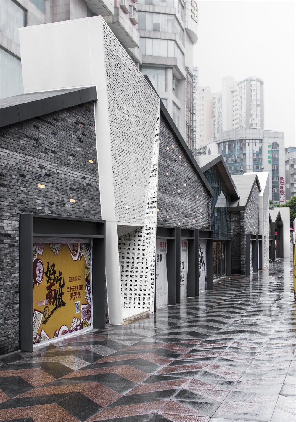
空間形式上吊頂形式延續室外雙坡屋頂,通道兩側商業店鋪共同組成雙坡吊頂形式。吊頂采用格柵與金屬板交替,既可暗示每間店鋪的位置,又能使視線、光線穿透,避免層高造成壓迫感。開放式商業店鋪靈感來源於西方market開放形式,將現狀相對封閉的店鋪化繁為簡,使室內的視覺感受較為開闊。所有店鋪之間無通頂隔牆,保證室內商業空間整體連貫;通道直接與店鋪吧台交接,消費者與店主溝通更接近,且可近距離觀看到商店內食品操作,增強體驗感。朝向室內的店鋪體塊形式與朝向步行街的店鋪體塊關係交錯、咬合,強調兩個體塊整體性,保證整體功能分區邊界清晰。通過外立麵的虛實關係,增加內部空間的公共空間,外立麵的大麵積開窗以引入陽光、空氣,同時步行者可以看到室內公共空間;為解決排水問題,研究場地豎向並在室內外都設置截水溝。
In the form of space, the ceiling form continues the outdoor double-sloping roof, and the commercial shops on both sides of the channel form a double-slope ceiling form. The ceiling is alternated with a metal plate, which not only indicates the location of each store, but also allows the line of sight and light to penetrate, avoiding the pressure caused by the height of the floor. The open commercial store is inspired by the open form of the Western market, which simplifies the relatively closed store, making the indoor visual experience more open. There is no cross-wall between all the shops to ensure the overall commercial space is coherent; the channel directly communicates with the shop bar, the consumers communicate with the owner closer, and the food operation in the store can be closely watched to enhance the experience. The store body block form facing the interior is intertwined with the store body block facing the pedestrian street, and the two body blocks are integrated to ensure the clear boundary of the overall function partition. Through the virtual and real relationship of the facade, the public space of the internal space is increased, and the large area of the facade is opened to introduce sunlight and air, and the pedestrian can see the indoor public space; to solve the drainage problem, the research site is vertical and a water intercepting ditch is provided both indoors and outdoors.
業態調整 Business adjustment
從商業策劃角度考慮,新的業態根據數據分析重新調整,設計者對商業空間的發展、物理和行為空間的理解,對商業空間、店鋪、消費者三者關係的理解;對商業空間、創新業態、可持續運營三者關係的理解;對建築立麵、室內、景觀、燈光、店招、地麵鋪裝、形象標識、指示係統等方麵進行了全方位的改造和重新設計。
From the perspective of business planning, the new format is re-adjusted according to data analysis, presenting the designer’s understanding of the development of commercial space, physical and behavioral space, the relationship between commercial space, shops and consumers, and the relationship between the business space, innovation operation and sustainable operation. All aspects of the building facade, interior, landscape, lighting, shop recruiting, ground paving, image identification, indicating system, etc., are transformed and redesigned completely.
∇ 故事線,Story Diagram
材料 Material
室內商業空間材料與室外步行街鋪裝材料保持聯係。地麵材料從室外延續進室內,保證室內外整體性;室內材料布置與室內空間保持一致。店鋪、通道及廣場在相同色係及拚法的鋪裝材料下,分別增加單個顏色的比例。店鋪內黑白搭配,形成漸變關係,增加室內空間趣味性;通道內以白色為主,配合使用少量灰色和粉紅色;三個入口以灰色為主,配合使用少量白色和粉紅色;休閑廣場和美食廣場以粉紅色為主,配合使用少量灰色和白色地鋪。另外,考慮到店內空間麵積較小,鋪裝與通道和室外相比比例縮小,調整為300*300mm大小鋪裝,適合室內的空間感受。
The indoor commercial space materials are in contact with the outdoor pedestrian street paving materials. The floor material continues into the room from the outside to ensure the integrity of the interior and exterior; the indoor material layout is consistent with the indoor space. Stores, passages, and plazas increase the proportion of individual colors under the same color and spelling paving materials. The store has a black-and-white layout, forming a gradual relationship, increasing the fun of the indoor space; the channel is mainly white, with a small amount of gray and pink; the three entrances are mainly gray, with a small amount of white and pink; leisure square and food areas are mainly pink, with a small amount of gray and white floor tiles. In addition, considering the small space in the store, the pavement is reduced in proportion to the passage and the outdoor, and is adjusted to a size of 300*300mm, which is suitable for indoor space.
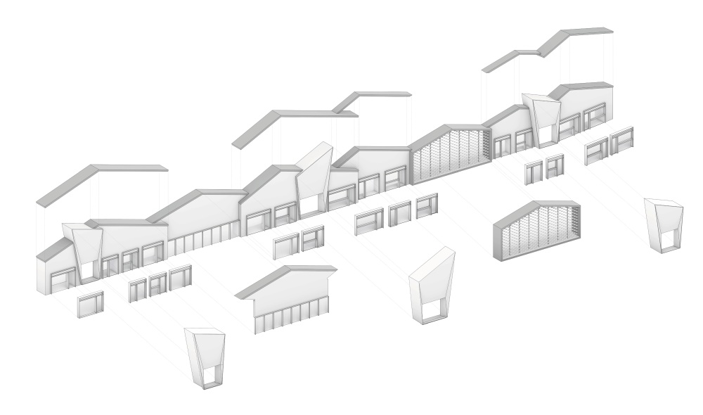
∇ 爆炸軸測圖 The Exploded Axon Drawing
標示係統 Signage System
同時,我們還為場地設計了一整套景觀標識係統,將信息剪切到了場地係統之中: 導向指示的功能屬性,在步行街中起到的引導作用; 步行街環境構成中的一部分,將步行街風格、文化升華; 在南橫街布局的點、線、麵中,它起到的是點和以點代麵的作用。整個基地從地麵鋪裝到建築立麵和屋麵到內街室內, 主要運用了三角幾何元素,所以精神堡壘導視用曲麵與之形成對比,材料采用反光的鏡麵金屬材料,折射反射出每一個經過南橫街的麵孔與身影,體現新貴陽的現代性、多元化和包容性。
At the same time, we also designed a set of landscape Signage system for the site, building a information linkage system within the area: The functional attributes of the guiding instructions play a guiding role in the pedestrian street; part of the composition of the pedestrian street environment, sublimation of the pedestrian street style and culture; in Nanheng Street, each point represents the whole area. The entire base is paved from the ground to the building facade and roof to the inner street interior, mainly using triangular geometric elements, so the spirit fortress guide is contrasted with the curved surface, the material uses reflective mirror metal material, and the reflection reflects each passing. The faces and figures of Nanheng Street reflect the modernity, diversity and inclusiveness of new Guiyang.
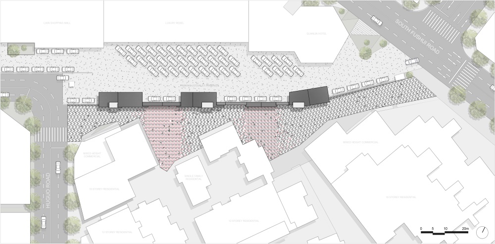
∇ 總平麵圖Masterplan
∇ 平麵圖 Interior Plan
∇ 立麵圖 Facade
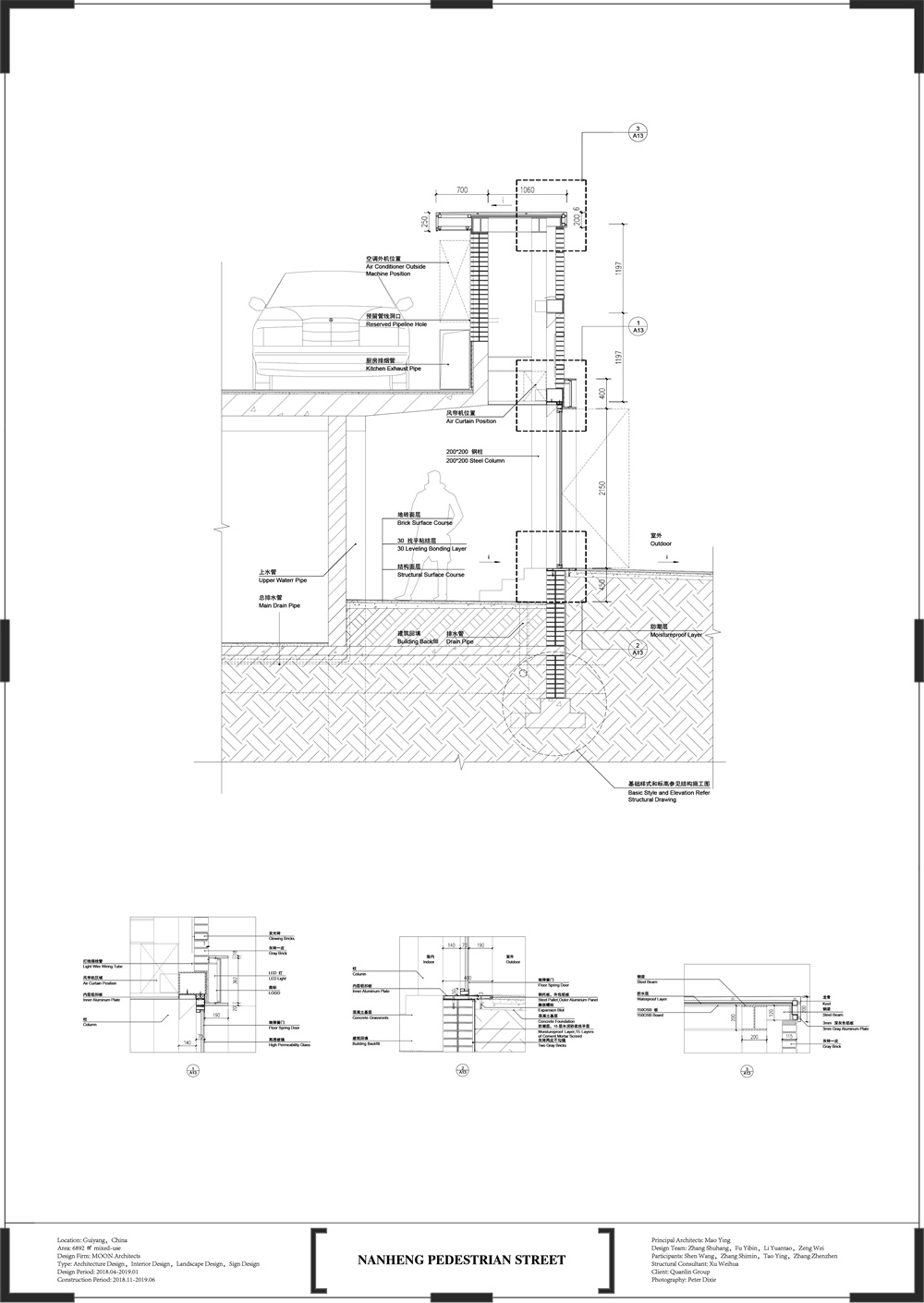
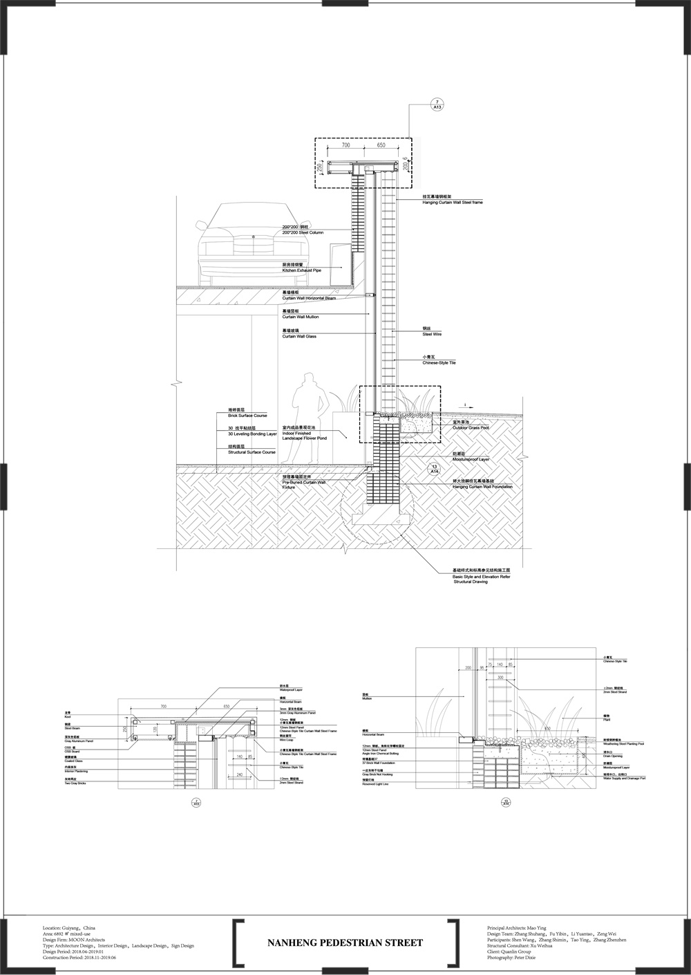
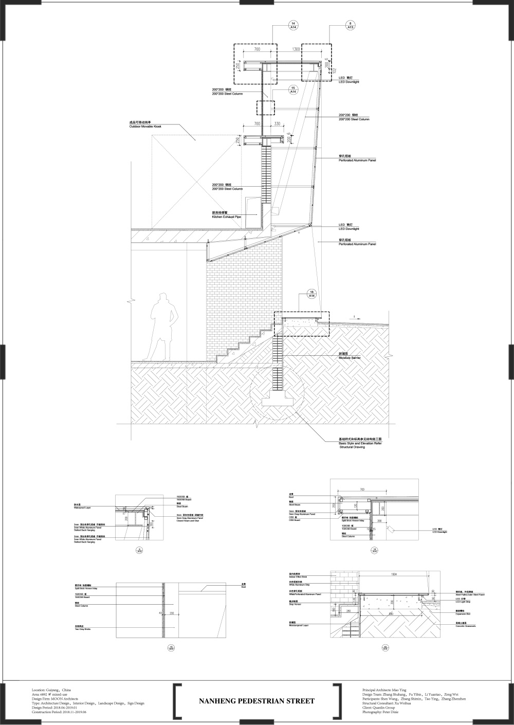
∇ 剖麵圖 Section
主要項目信息
項目名稱:南橫步行街
項目地點:中國貴陽
項目麵積:6892平方米
設計公司:木月建築事務所
主持建築師:毛穎
設計團隊:張書航,付藝彬,李元濤,曾瑋
參與人員:沈王,張詩敏,陶穎,張真珍,王月玫
結構谘詢:許尉華
設計內容:建築設計、室內設計、景觀設計、導視設計
設計周期:2018.04-2019.01
建設周期:2018.11-2019.06
項目業主:貴州全林集團
攝影師:Peter Dixie
Project Name: Nanheng Pedestrian Street
Location: Guiyang,China
Area:6892㎡ mixed-use
Design Firm: MOON Architects
Principal Architects: Mao Ying
Design Team: Zhang Shuhang,Fu Yibin,Li Yuantao,Zeng Wei
Participants: Shen Wang,Zhang Shimin,Tao Ying,Zhang Zhenzhen,Wang Yuemei
Structural Consultant: Xu Weihua
Type: Architecture Design,Interior Design,Landscape Design,Sign Design
Design Period: 2018.04-2019.01
Construction Period: 2018.11-2019.06
Client: Quanlin Group
Photography:Peter Dixie


