全球設計風向感謝來自 拓維設計 的建材展廳空間項目案例分享:
彙亞陶瓷總部地處珠三角製造業中心地帶——佛山,作為一個具有二十多年曆史的建材行業老大品牌,幾乎見證了陶瓷行業的整個發展曆程。麵對市場的激變,行業轉型,傳統製造業品牌何去何從!
我們麵對的是:一棟老建築,一個老品牌……
老,是曆史沉澱,文化傳承,如何保留曆史痕跡和文化軌跡?
老,也是包袱,20年前的建築結構哪裏都顯得不合時宜,哪裏都顯得傳統而過時……
Based in Foshan within the Pearl River Delta known as a manufacturing hub, HUIYA CERAMICS is a leading building material supplier which has witnessed the development of China’s ceramic tile industry. In face of drastic changes of the market and industry transformation, what should traditional manufacturing brands do? Under such circumstance, HUIYA CERAMICS entrusted Foshan Topway Design to conceive its headquarters and exhibition hall via transforming an old building.
The old building constructed 20 years ago is a historical heritage that carries past memories. However, it posed some challenges to the design because of the inappropriate and outdated architectural structures.
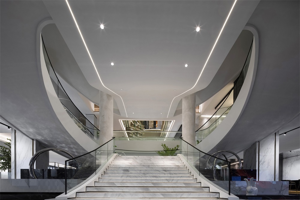
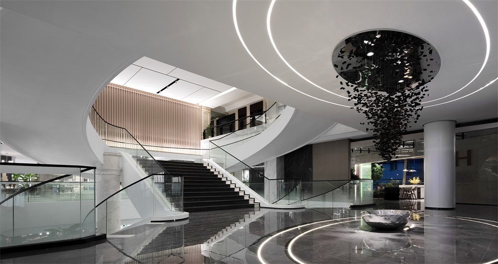
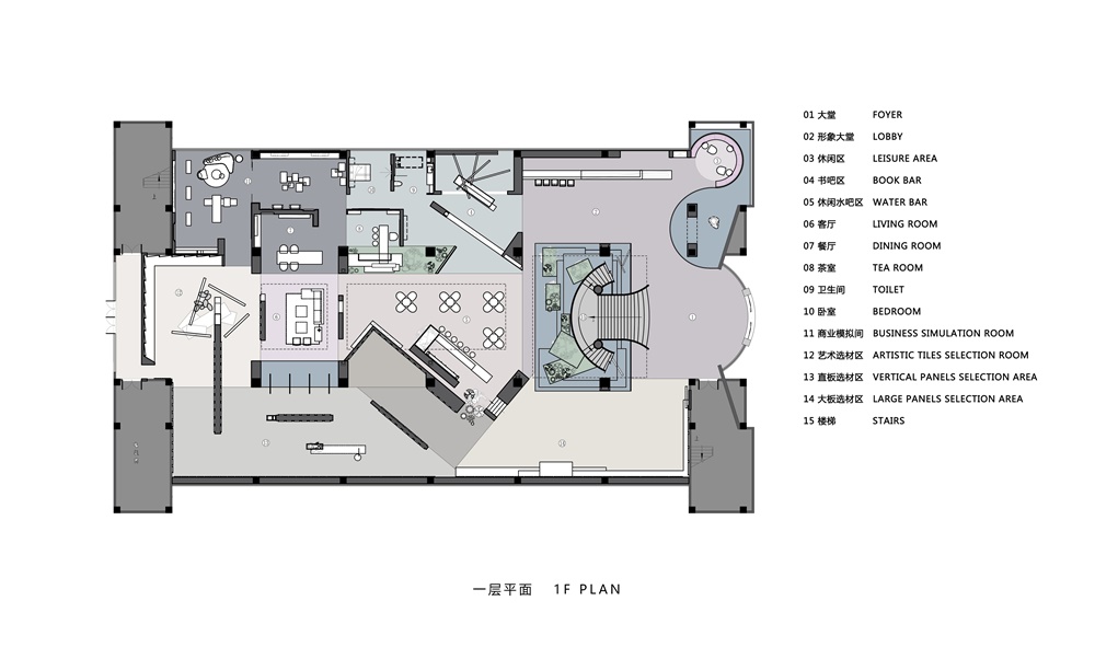
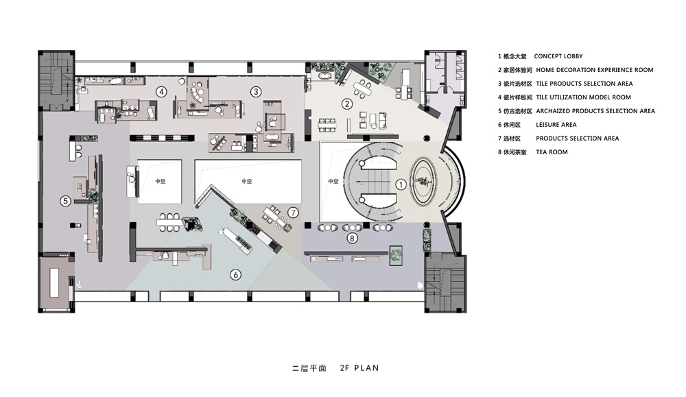
原始建築結構有諸多不合理的地方,比如龐大而笨重的樓梯堵在入口大堂,將整個空間一分為二,中間一個巨大中空占據了最主要空間,在主體建築結構不變的情況下如何通過局部空間改造讓分離的空間串聯起來,流動起來,使得舊的建築煥發新的光彩!
For instance, there is a massive staircase fronting the foyer, which divides the space into two sections and forms a huge hollow space in the middle. The goal was to link up the separated spaces, create fluidity and inject new vigor into the old building, through transforming parts of the space while remaining the main architectural structures unchanged.
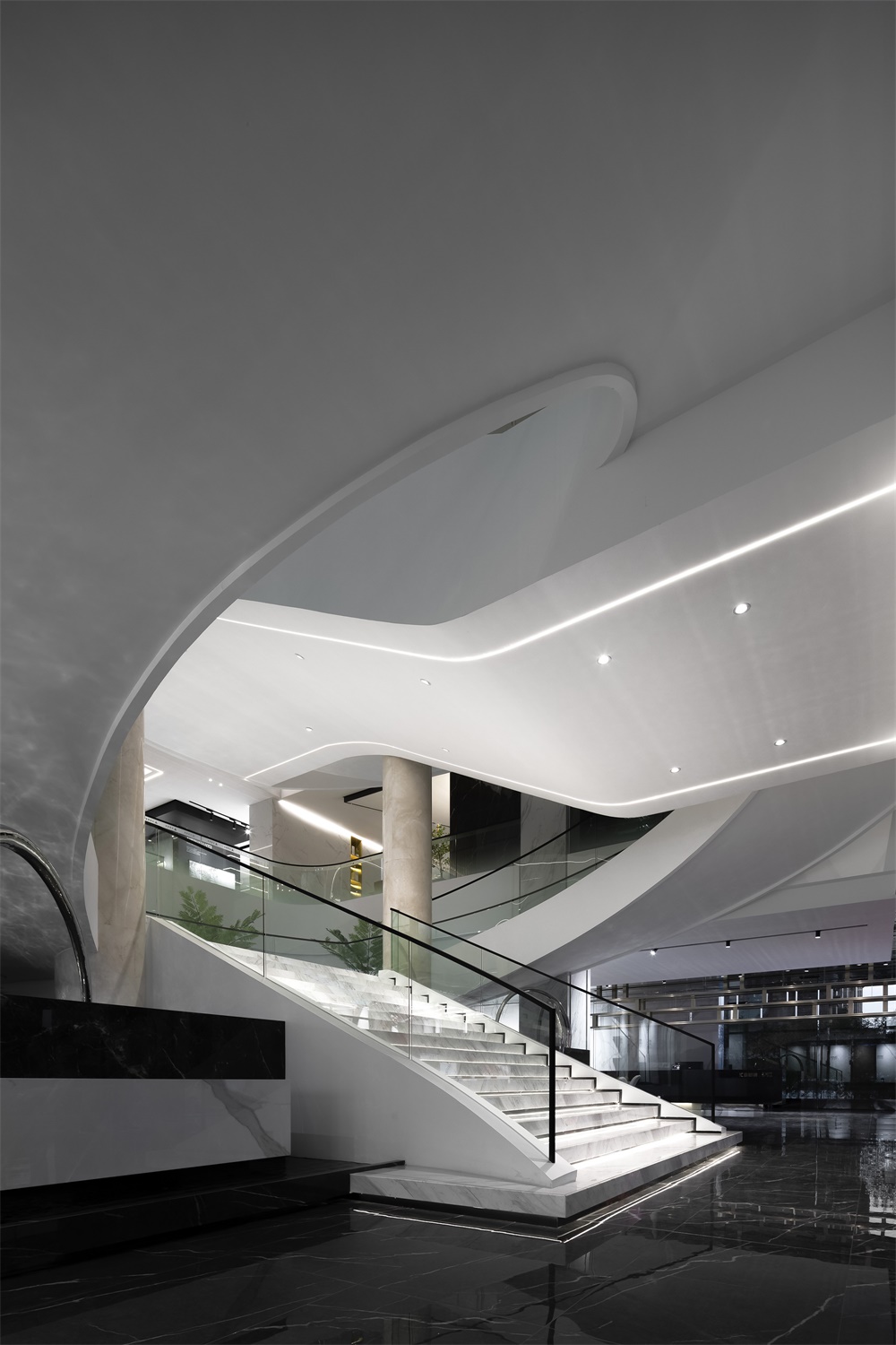
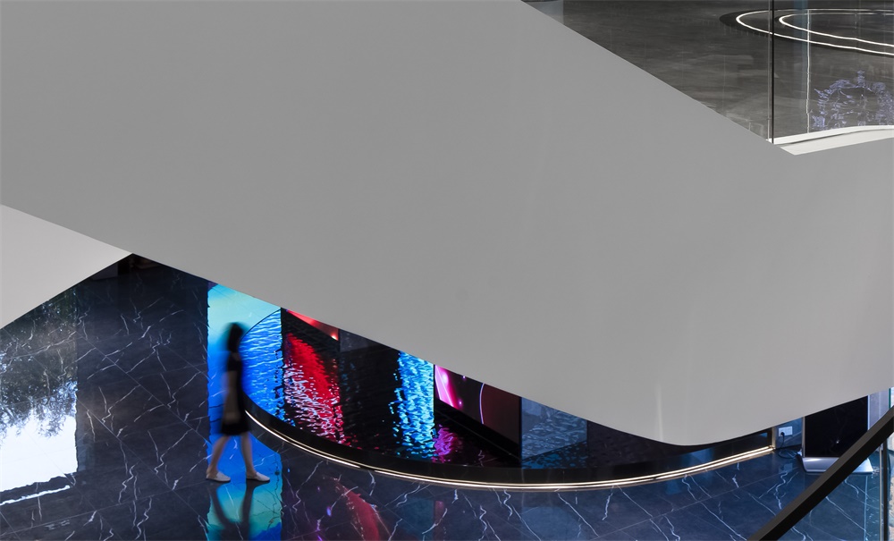
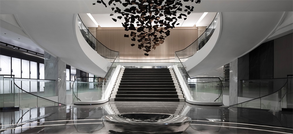
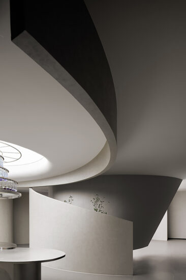
試圖將自由空間理念融入到有序的工業文明之中,將當代美學融入到傳統空間中去,在原結構基礎上加強弧形樓梯的曲麵屬性,使之產生的流動性引導了整個視覺路線,大量使用白色材質使原本笨重的樓梯變得輕盈和活潑,樓梯天花像白色布幔飄向遠方,兩條燈帶強化了這種飄逸感,它更像兩條故事線索在訴說品牌的過去。在整體翻新改造過程中,特意保留了樓梯間的兩根米黃石材柱子,它既象征著品牌的支柱,也是對品牌過去曆史的一種尊敬和傳承!
The designers tried to integrate the concept of free space with industrial civilization, and incorporate modern aesthetics into the traditional space. They intensified the curved shape of the staircase based on its original structure, which produces fluidity and guides the sight line. The white finishes make the originally cumbersome staircase appear lightweight and lively. The white ceiling is like an extending fabric curtain, and the two light strips highlight its flexible and graceful form, just like two clues telling stories of the past. During the renovation, the designers deliberately retained two beige columns on the two sides of stairs, which symbolize pillars of the brand and also pay tribute to the past.
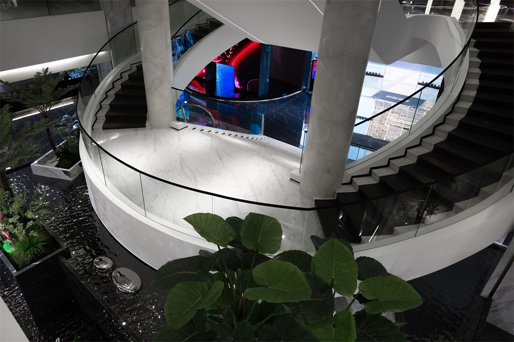
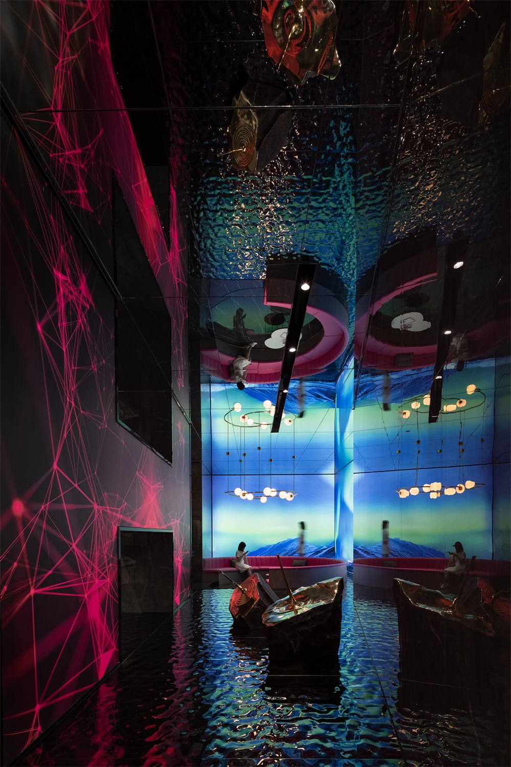
利用樓梯底部空間,用幾個不同形態的盒子進行自然疊加,不鏽鋼圓環穿插其間,水在盒子間流淌,自由理念貫穿其中,讓空間靜中有動,曲中有直!
At the bottom areas of the staircase, several different “boxes” are stacked naturally, with a stainless steel ring inserted in. Water flows between “boxes”, endowing the space with a free, tranquil yet dynamic ambience.
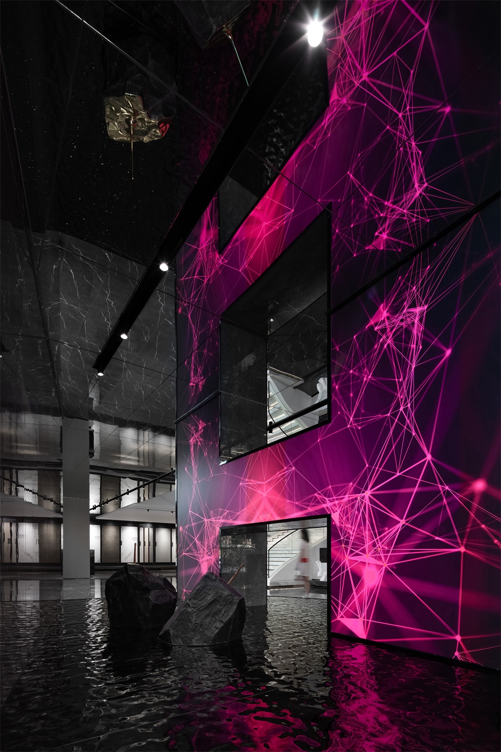
利用兩根結構柱做成的“H”造型源於“彙亞”品牌的第一個字母,它既是品牌的文化符號,也代表著工業文明的結構感,更體現出工業製造的一種品質感,造型采用科幻主題動畫演繹空間的自由變化,以極光,雲彩,宇宙的表達方式強化項目主題,動感畫麵的植入,以創意手法實現來訪者與品牌的自由互動。
Two structural columns help to form an H-shaped structure, which echoes with the first letter of the brand name HUIYA. Apart from being a cultural symbol of the brand, it also presents a sense of structure, and represents quality of industrial manufacturing. In addition, the futuristic animation shown on it brings free visual variations to the space, accentuates the project theme via elements of auroras, clouds and universe, and enables interaction between visitors and the brand.
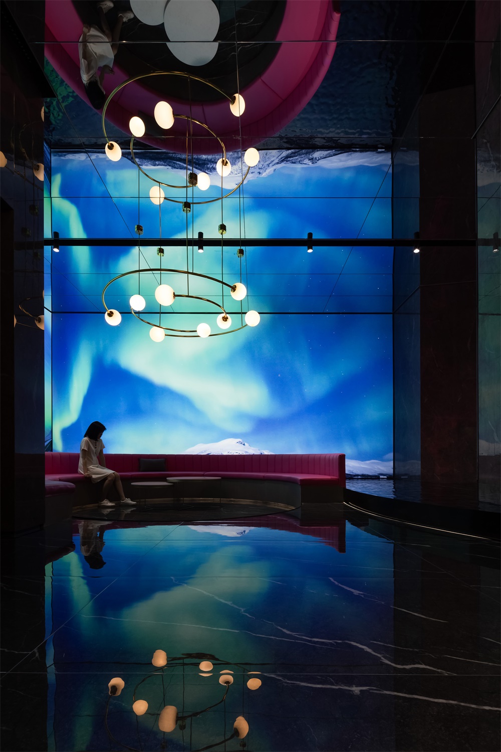
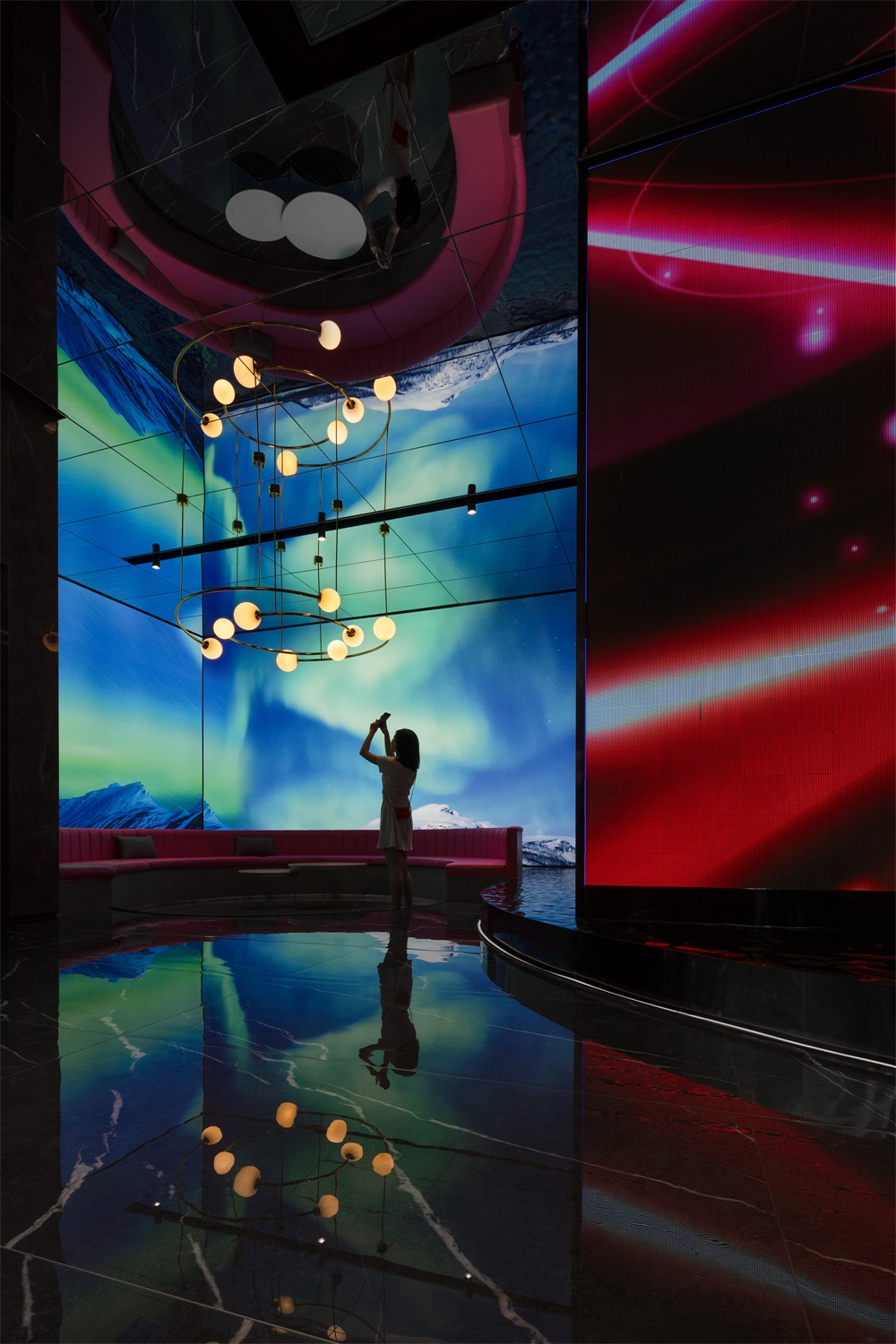
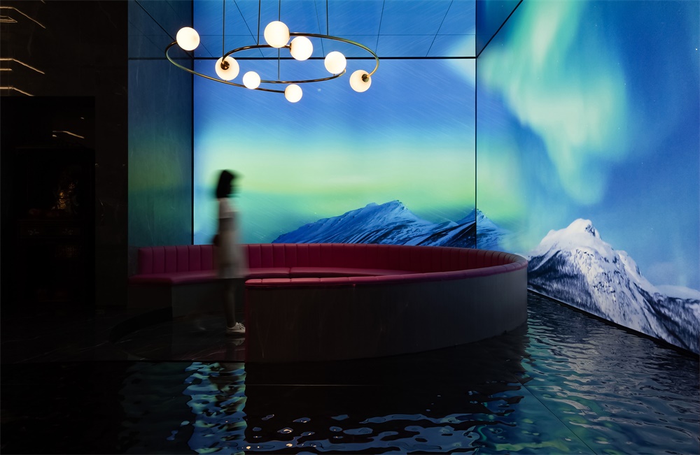
入口休閑區穿插著多媒體的形式以呈現最佳的展示效果,借助這種方式,讓客戶在虛擬場景空間中慢慢享受科技帶來的全新感受。漫步其中,伴隨輕柔音樂律動而產生迷離虛幻的動感畫麵,虛擬的極光映襯在水麵上,在空間中融合科技元素,創造出獨特的沉浸式場景體驗,勾引人們對未知世界的探索欲望。
In the leisure area inside the entrance, multimedia technology is applied to create virtual scenes, which produce perfect visual effects and allow visitors to be immersed in novel futuristic experiences. Along with the rhythm of soft music, various dynamic images are presented on walls, creating immersive scenes and stimulating people to explore. Virtual auroras are reflected on water surface, very charming.
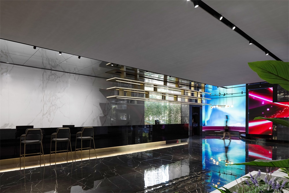
品牌形象區采用長尺度的接待台引導空間動線,拓展空間邊界,通過真實和虛擬場景結合的方式讓空間無限延伸,模糊現實的邊界,整個動線采用自由平麵的方式展開,以一步一景的方式形成客觀動線,實現觀者在空間中自由漫步。
The brand image area has a long reception desk, which guides the circulation route and also extends spatial boundaries. Real and virtual scenes are well combined to endlessly extend the space and blur boundaries. The circulation route is unfolded freely based on the plan, which enables visitors to freely stroll in the space and have varying visual experience at every step.
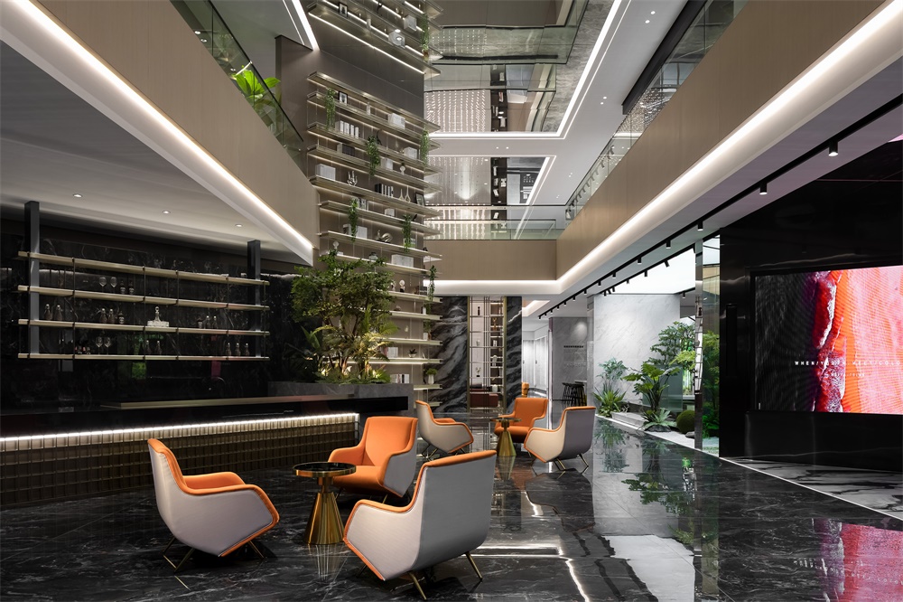
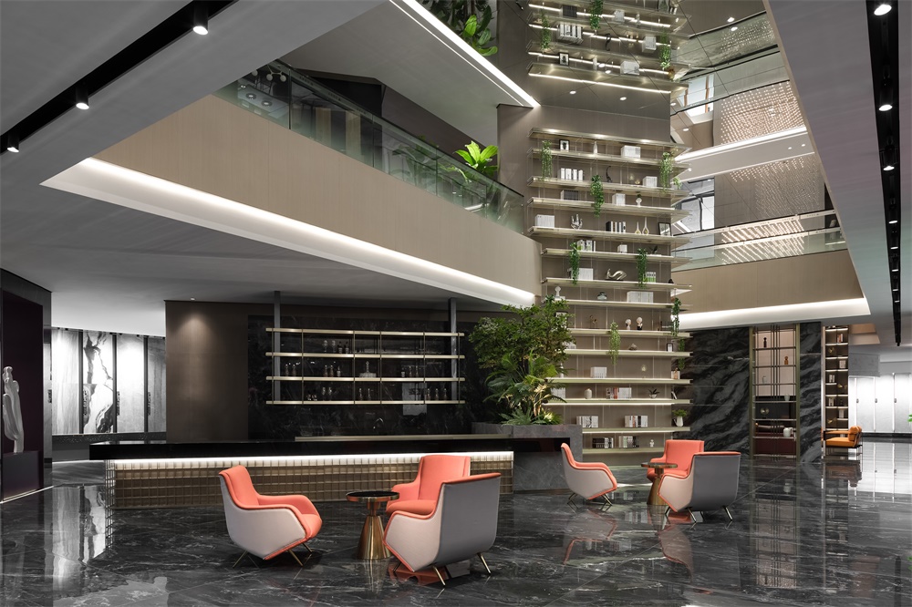
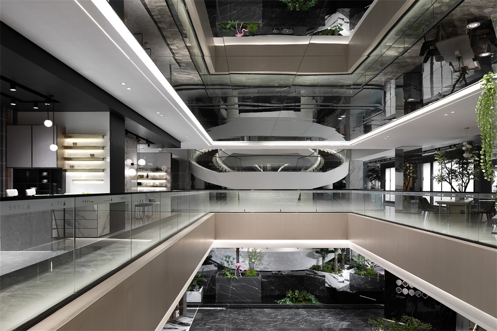
現代人們渴望親近大自然,遠離都市的繁忙和嘈雜。利用展廳的層高優勢,開辟成天井,將自然生態環境引入室內,綠樹成蔭光影變換,陽光揮灑。正是這精心構建的方寸天地,讓大堂吧充滿了鮮活氣息,更具格調,給人以垂直綠洲的奇妙感覺。通過設計手法把戶外景觀引入進來,實現與空間自由的連接,促進人與自然之間持續的互動。
Modern people aspire to escape from the hustle and bustle of urban life, and get close to nature. Taking advantage of the exhibition hall’s storey height, the design team carved out an atrium, where nature is brought in. Featuring green plants, interplay of light and shadows as well as ample daylight, this well-designed hollow space injects vitality into the lobby bar, and creates a “vertical oasis”. Outdoor landscape is introduced into it, which facilitates free connection of spaces while promoting continuous interaction between human and nature.
咖啡吧區以一麵斜形書櫃牆分割空間,並貫穿二樓屋頂,形成強烈的視覺衝撞,這裏既滿足對客戶的服務功能,也成為共享體驗空間,在自然麵前,設計應當是謙卑的,盡量地克製人為的符號與手法,以幹淨的色彩,不同溫度的材質,令空間配合自然,貼近自然,還原自由空間的本真。
The coffee bar area is characterized by a full-height bookcase, which partitions the space and penetrates the ceiling of the second floor, hence generating drastic visual effects. This area not only serves the brand’s clients, but also functions as a sharing experiential space. In face of nature, the design should be humble and restrained. Clear hues and materials of different textures are perfectly combined to coordinate and blend with nature, so as to let the space return to simplicity.
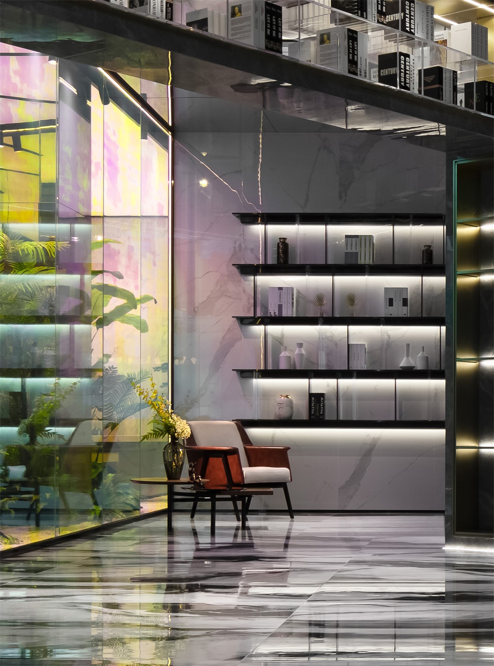
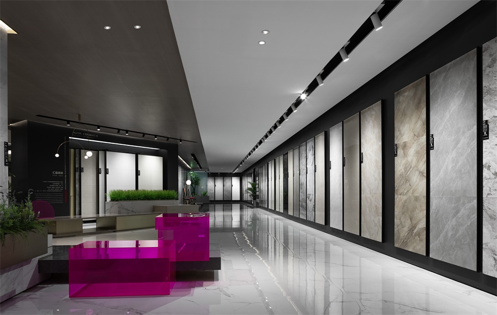
光與色集合成的夢境,帶著令人怦然心動的魔力,迷幻的色彩敲開了一場時空之旅的大門。一直以來,設計師通過去繁就簡的方式,重新構建了空間關係,並植入適當的色彩與光感,用自由空間取代傳統的平鋪直敘,以光色的體驗為導向展開敘事,讓光與影本身形成一組有趣的組合,以神秘的方式打開感官探尋的通道。
Lights and colors are integrated to create an enchanting “dreamland”. The diverse and changing hues open up a mysterious journey. Through cutting out the superfluous, the designers re-organized the spatial relationship, which is awash with freedom. Then, appropriate hues and lights are brought in, which generates fun interplay of light and shadows, produces color-changing effects, enriches visitors’ sensory experiences and guides them to explore the space.
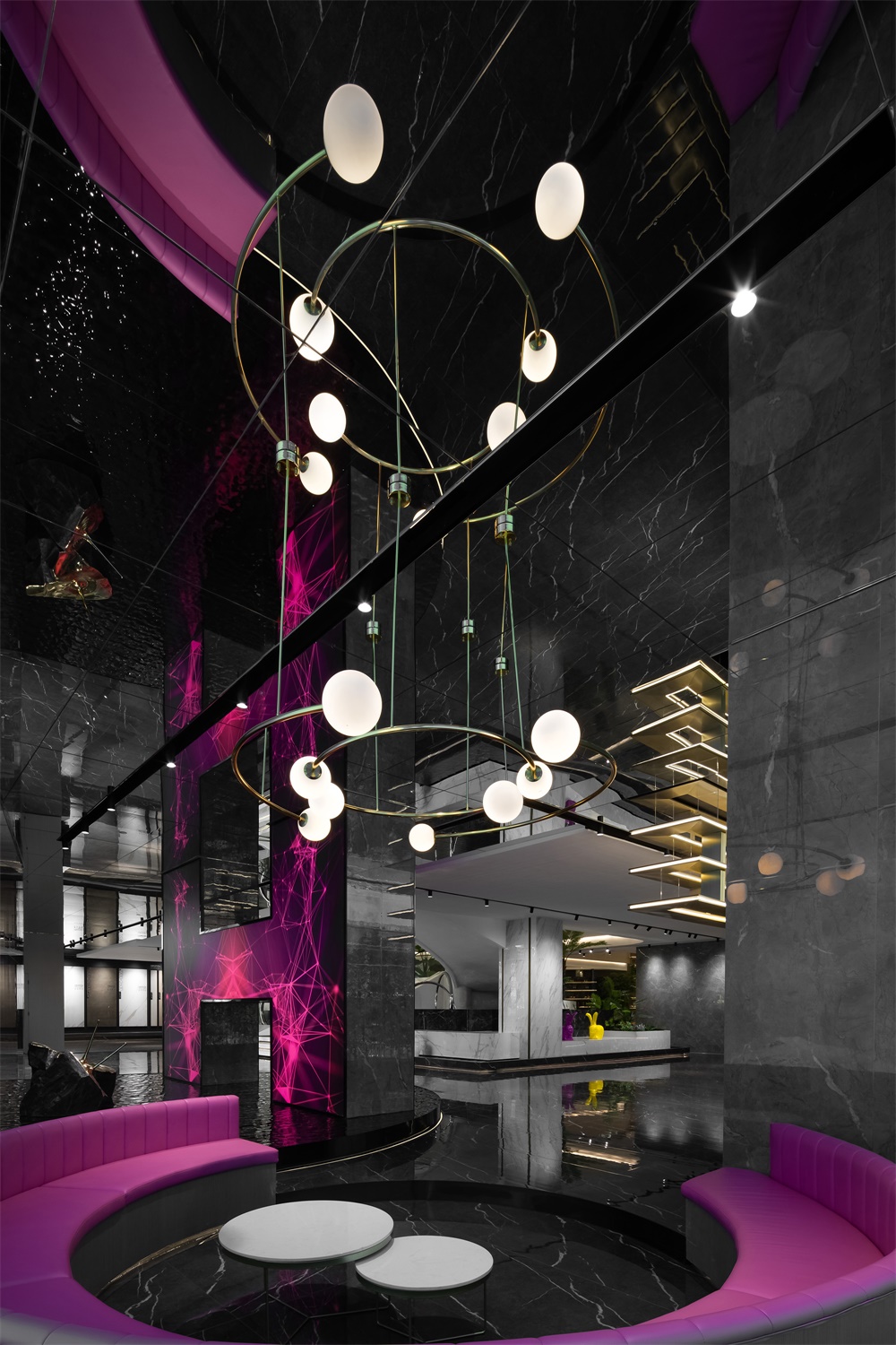
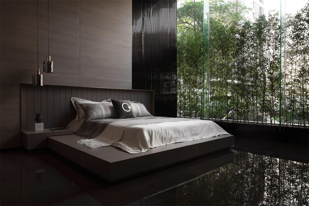
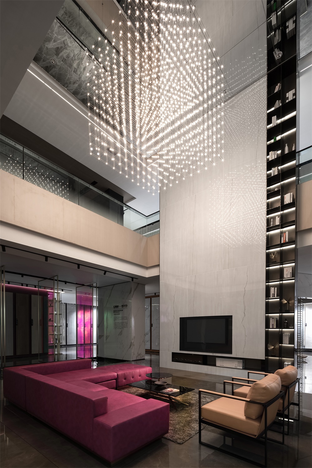
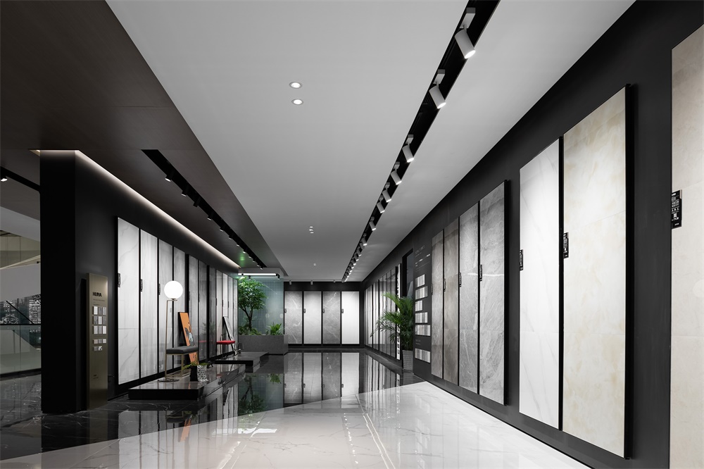
會客廳充分利用空間尺度,采用大規格連紋大理石做背景,鏡麵天花將空間二次反射延伸,紫紅色沙發使空間變得熱烈起來,矩陣星光燈煥發出迷人的光,使空間具有足夠親近的溫度!臥室采用啞光木紋和柔軟的布藝結合,大片落地玻璃將戶外園林引入室內,營造一種寧靜而又雅致的空間體驗。
Based on the spatial scale, the living room utilizes large marbles featuring continuous grain to form the backdrop. The mirror ceiling generates reflections, and helps to visually extend the space. Besides, the red sofa adds a lively atmosphere to the space, and the matrix-like lighting fixture emits charming lights, rendering this area intimate. The bedroom shows perfect match of matte wood-grain tiles and soft fabrics and features a large French window that bring in outdoor landscape, together producing a tranquil and elegant spatial ambience.
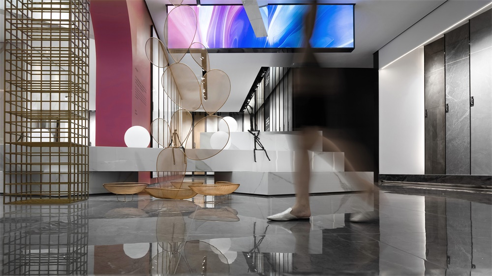
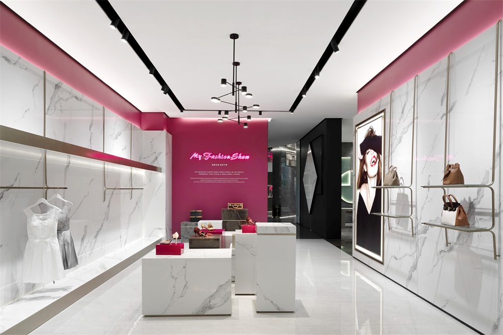
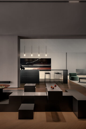
網架元素和建築體塊交織在一起,在視覺上形成一種虛實感和建築結構感。不規則,不拘束的盒子體塊疊加在一起,用金屬網做成的藝術裝置,時尚的燈箱元素,精致的軟裝擺件,讓空間更添層次。
The grid structure and architectural blocks are interwoven, showing a sense of structure and the contrast of solidness and void. The freely-stacked blocks, the art installation formed by metal grid, the stylish light box, and exquisite adornments, all enrich the layering of the space.
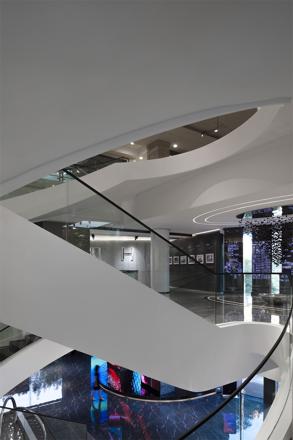
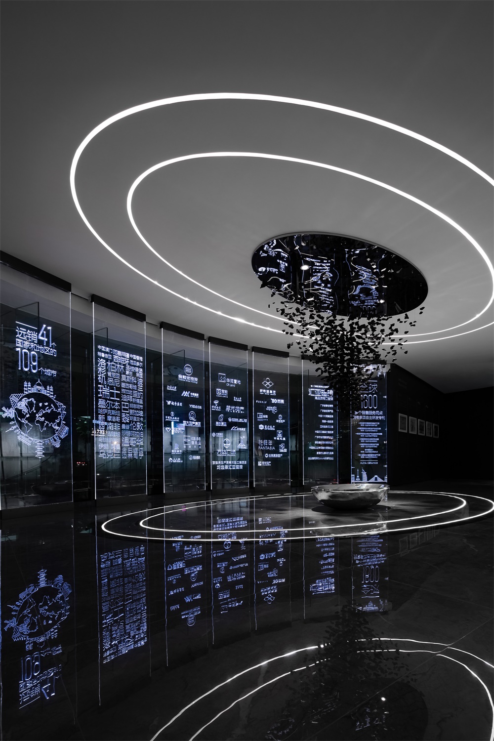
橢圓形線光把天花和地麵相互呼應,倒三角的木炭裝置像懸浮的碎片,形成一個富有文化調性的空間。將品牌故事用文字的方式篆刻在有機玻璃上,通過藏光使它漂浮於空中,有效增強空間的科技感和視覺特效!
Oval lights on the ceiling and the floor echo with each other, and the inverted pyramid art installation is composed of charcoal pieces, which look like floating fragments. All of those elements help to inject a cultural atmosphere into the space. The brand story is carved on glass. The inlaid light makes the carved characters seem to float in the air, and effectively highlights a futuristic feeling.
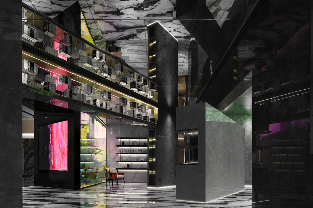
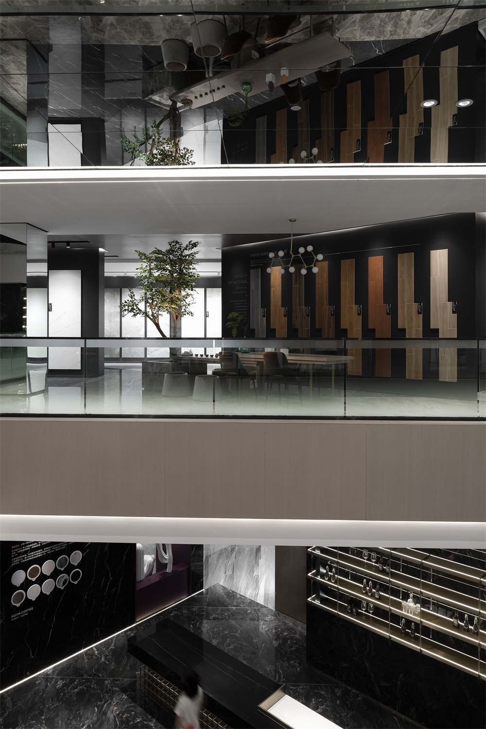
整體三層的空間是開放和流動的,沒有明確的空間邊界相互穿插在一起,但卻有隱藏的精心設定的交錯關係。鏡麵天花把整個空間無限延伸,從而使得整個空間達到了視覺上的最大化。
The overall three-storey space is open and awash with fluidity. There are no apparent spatial boundaries interlacing with each other, which is replaced by carefully-designed hidden intersecting relationships. The reflective ceiling infinitely extends the entire space, and maximizes it visually.
完整項目信息
項目名稱:彙亞陶瓷總部展廳
項目類型:企業總部、展示空間
項目地址:佛山市禪城區南莊陶博大道十六座
設計單位:佛山市拓維室內設計有限公司
設計主創:汪誌科&李小水
設計團隊:拓維設計
項目麵積:4000平方米
設計時間:2019.7
竣工時間:2019.10
主要材料:本傑明塗料、彙亞瓷磚、幻彩玻璃
業主:彙亞陶瓷
攝影師:歐陽雲
Project name: HUIYA CERAMICS Headquarters & Exhibition Hall
Category: headquarters, exhibition space
Location: Bldg.16, Taobo Avenue, Nanzhuang Town Chancheng District, Foshan, China
Design firm: Foshan Topway Design
Chief designers: Wang Zhike & Li Xiaoshui
Design team: Foshan Topway Design
Area: 4,000 m2
Start time: July 2019
Completion time: October 2019
Main materials: paint (BENJAMIN MOORE), tile (HUIYA CERAMICS), color-changing glass
Client: HUIYA CERAMICS
Photography: Ouyang Yun


