全球設計風向感謝來自 NA-DECO那漠含風設計 的商業空間項目案例分享:
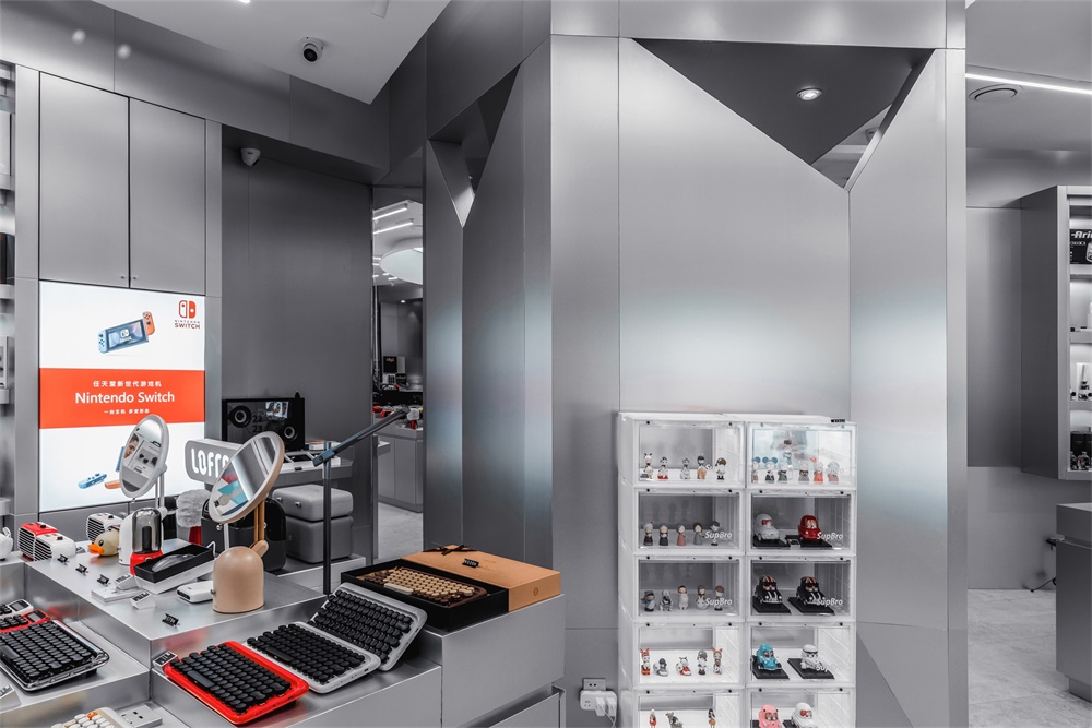
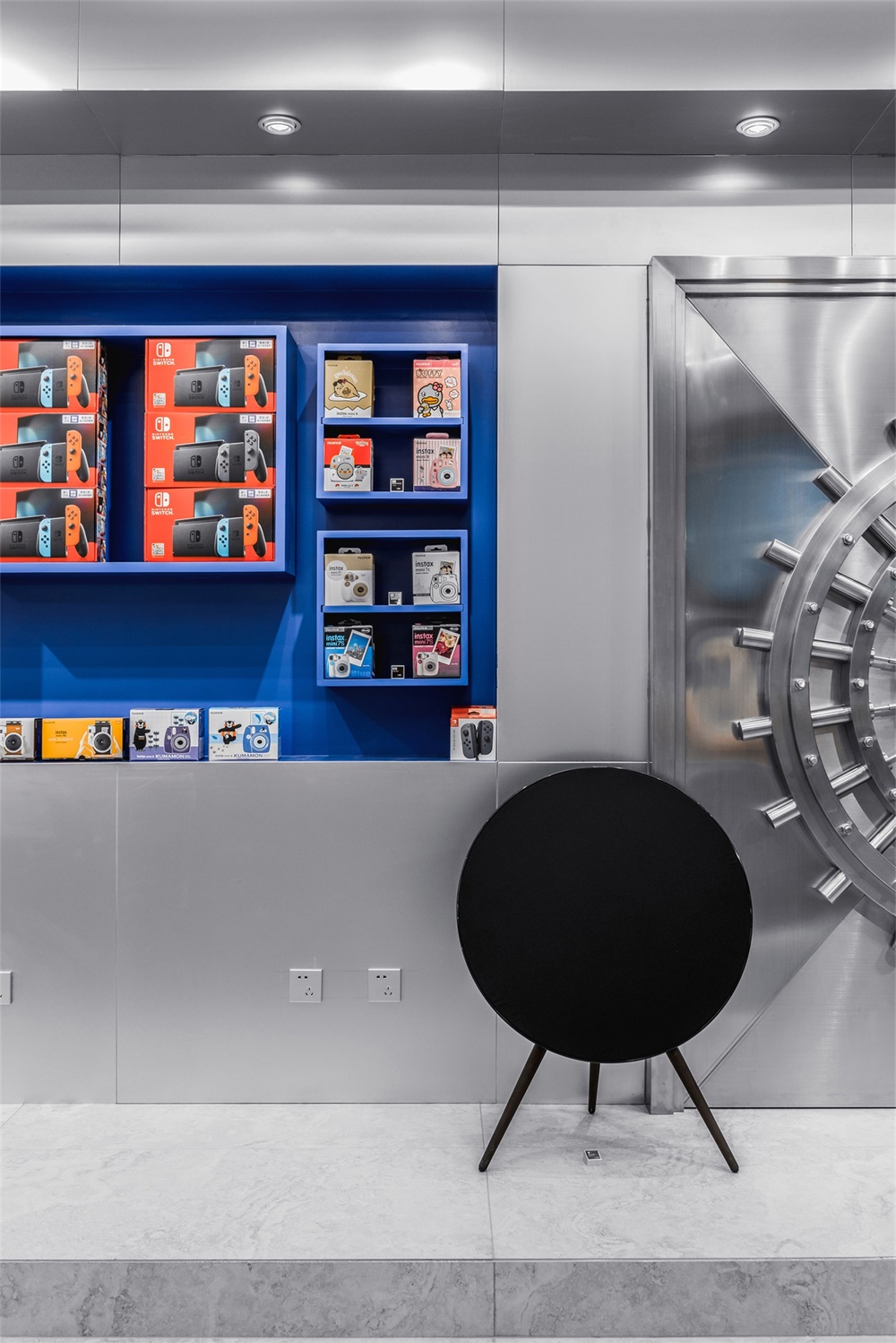
那漠含風設計的最新作品VLAB位於新建成的呼和浩特振華廣場的二樓,這座廣場現已成為該城市最大的商業綜合體。作為內蒙古第一家潮流用品集合店,VLAB專注於提供時下最尖端的設計型產品,涵蓋高端音響、耳機、遊戲機、小家電、玩具、擺件、餐具等。因此,店鋪的設計工作也是圍繞營造“潮流感和未來感”展開。
VLAB , the latest work designed by NA-DECO is situated in the newly built Zhenhua Plaza in Hohhot, which has become the largest commercial complex in the city. As the first multi-brand store featuring cutting-edge technology and design in Inner Mongolia Region of China, VLAB displays various goods ranging from high-end stereo speakers, headphones, game machines, small appliances, to toys and ornaments. To echo the brand positioning, the interior design job is mainly about constructing a “futuristic laboratory”.
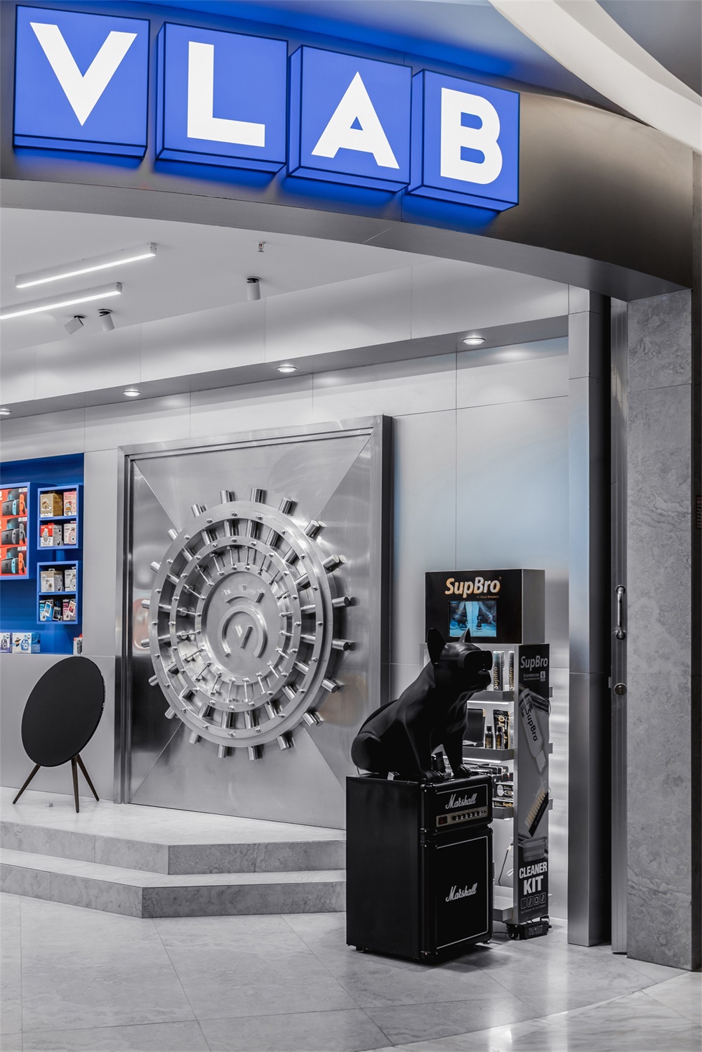
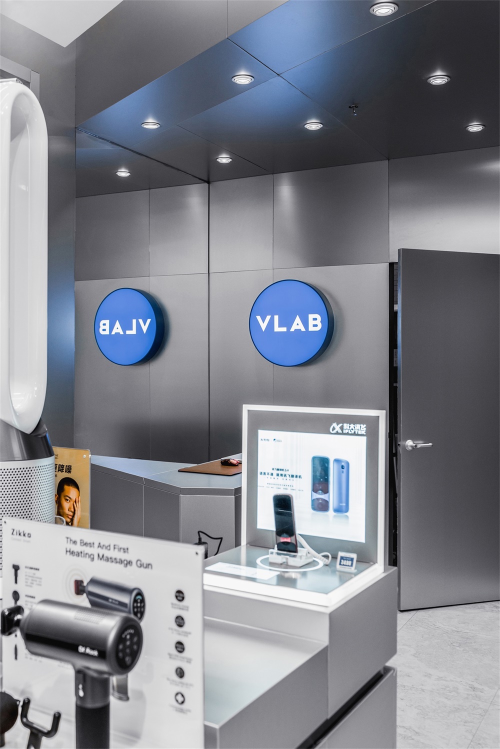
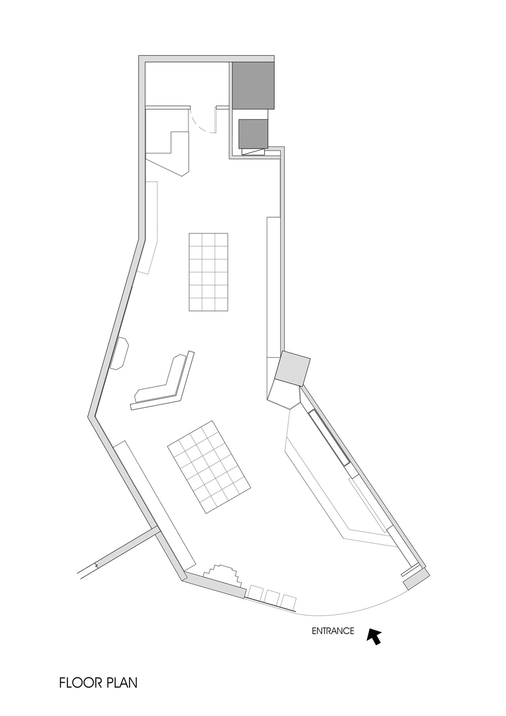
店鋪所在的地塊並不理想,處於逼仄的邊角位置,而且也不是規範的矩形,這對設計提出了很大的挑戰。為了能讓店鋪更加醒目,品牌色選擇了飽和度極高的藍,配合厚重硬朗的字體設計,能讓顧客在二樓的很遠處就能一眼看到店鋪門麵,不僅能精準地塑造品牌形象,更能輕鬆地吸引客人到店體驗,這對商業空間來說至關重要。
Unfortunately, the store is located at corner position on the second floor, and characterized with with an unusual field shape, like a branch broken itself from the middle, which poses a great challenge to the design. In order to make the store more eye-catching, the color blue with high saturation is carefully chosen as the brand color, to provide a perfect backdrop to the bold font design. This strategy can not only effectively enhance the brand image, but can also easily attract customers to walk into the store from the far distance, which is of vital importance for a commercial project.
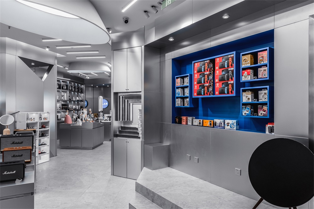
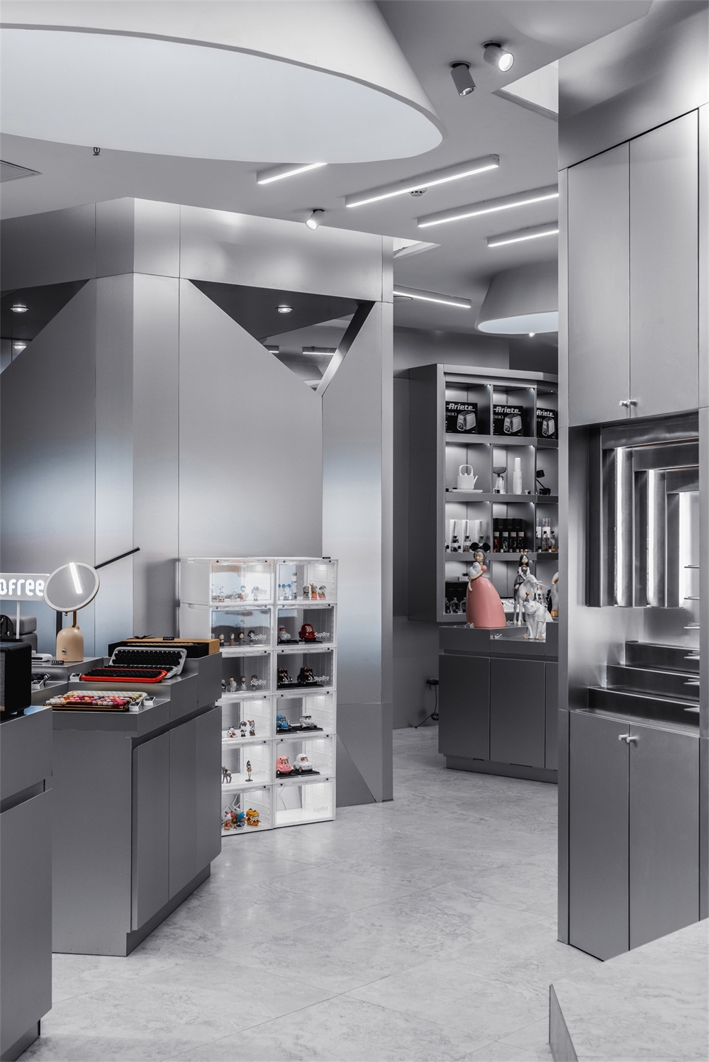
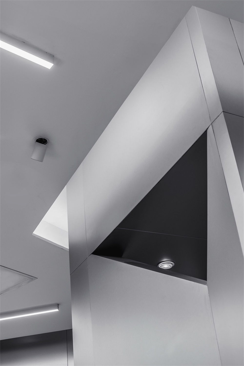
由於地塊形狀怪異,設計師沒有試圖去修正這個“缺陷”,而反之受到該“缺陷”的啟發,聯想到了立體派藝術中交錯疊放的形狀和線條。因此,在店鋪空間中隨處可見三角形、矩形、圓形、六邊形、直線、斜線,通過如此大膽地組合運用,設計師使空間擁有了硬朗和銳利的風格,地形“缺陷”則成為了不可或缺的組成部分。與立體派藝術怪誕的平麵構成不同,設計師運用了更多嚴謹的橫線和垂直線,使空間不會顯得雜亂無章,在未來感的基礎上,給空間增添了一份現代理性主義的色彩。
As far as the odd field shape is concerned, “it should not be reckoned as a ‘defect’, but as an opportunity to evoke imagination,” Ha Da said. Inspired by its irregularity, the space is composed of geometry elements such as triangles, rectangles, circles, hexagons, straight lines. The space turns into a big canvas to paint Cubism arts, most of which appeared in the history are known for overlapped shapes and lines. The vividly sharp style makes the “defect” become an indispensable part. Distinguished from the grotesque composition of Cubism, however, more rigorous horizontal and vertical lines are applied to organize the space, which can shield from visual disorder and add to rationalism in a way.
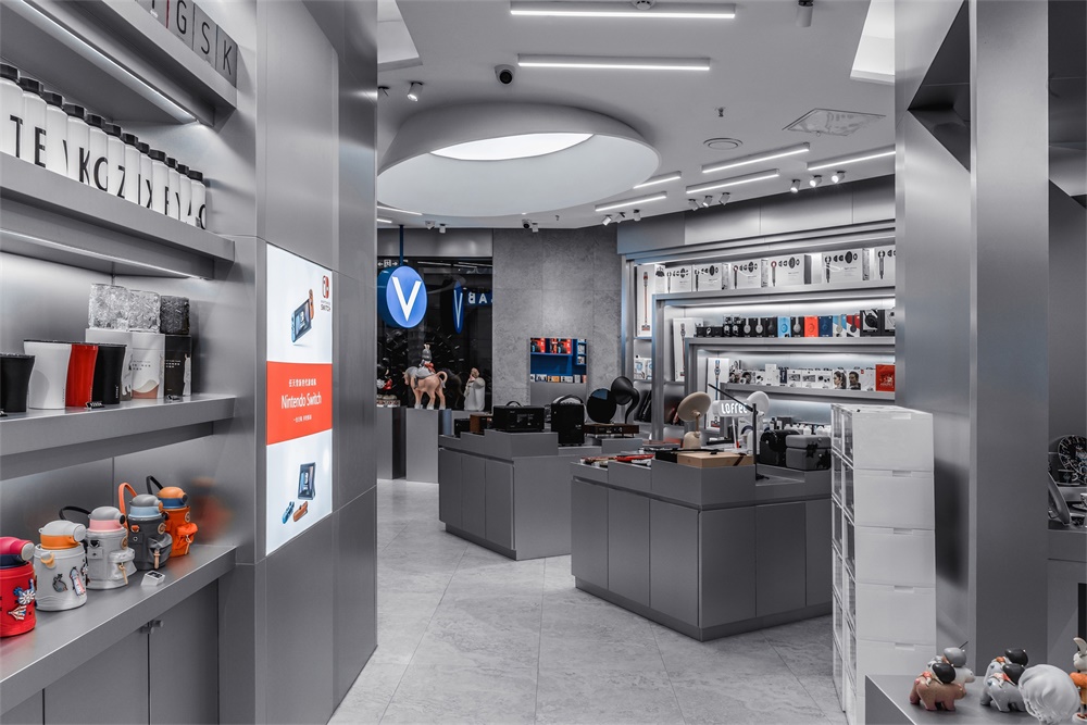
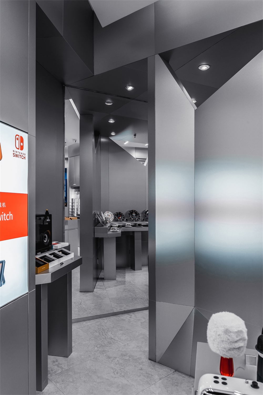
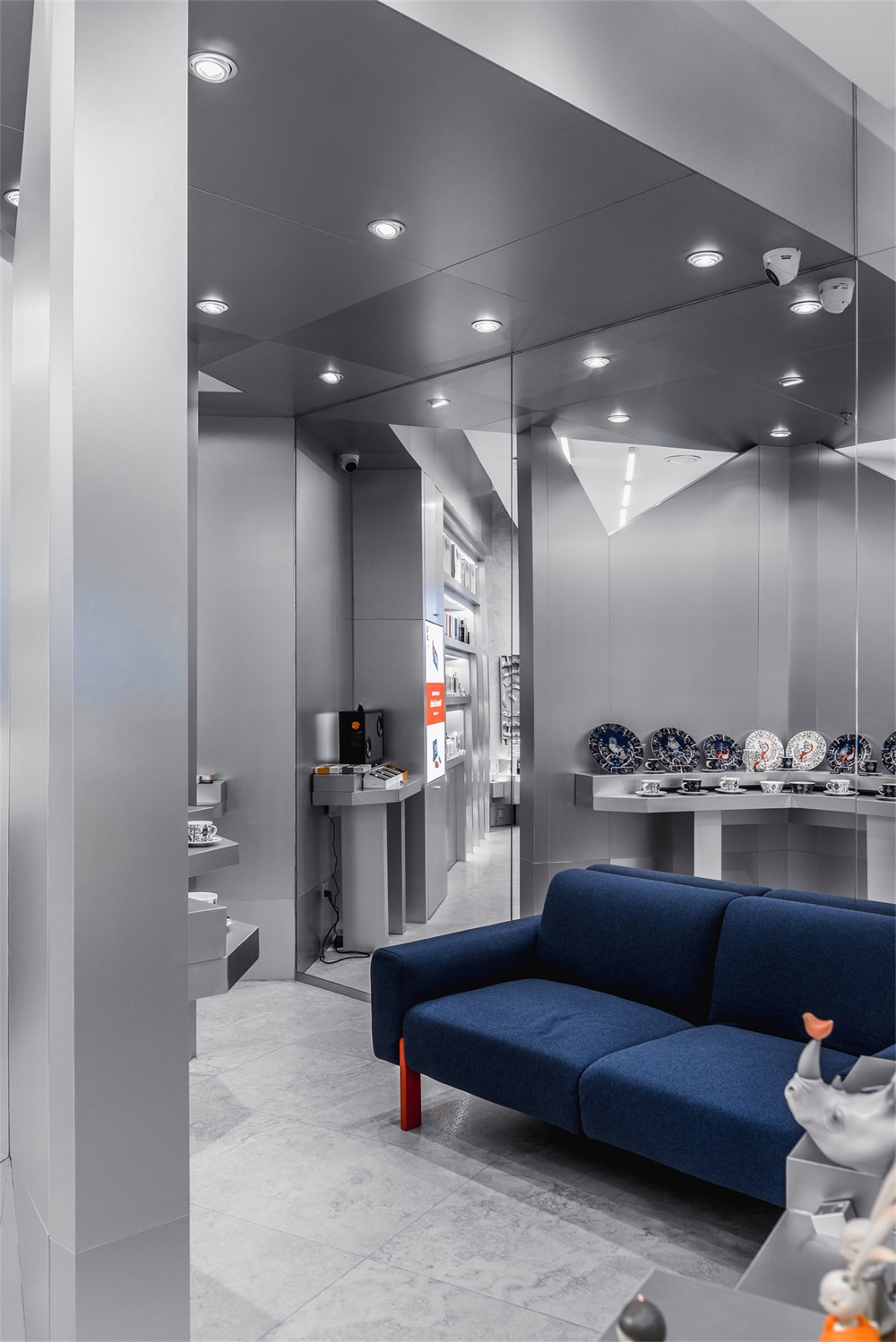
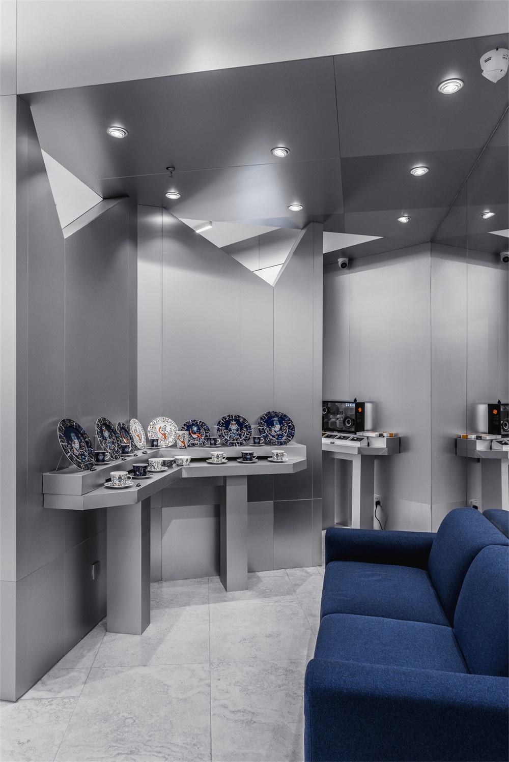
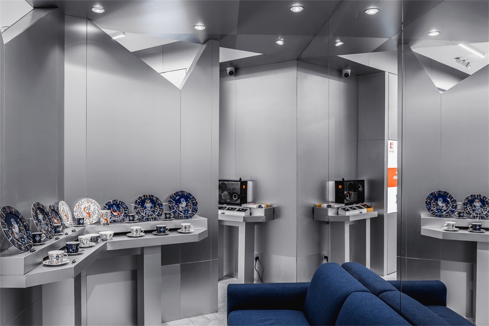
一個巨大的半包圍結構被放置在空間的中心位置,這裏主要用來陳列特殊產品和供顧客休息,同時通過鏡麵的巧妙安排,使這裏成為了交通中心和視覺中心,無論從外側進入還是從內側進入,顧客都能獲得奇妙的的行走體驗,這是對地塊形狀的最重要的解讀和利用。
A huge half-open enclosure with two triangle windows is placed in the center of the space, which is primarily used to display special products and to provide rest. At the same time, through the subtle arrangement of a mirror, it has become a traffic center and visual center. No matter from the outside or from the inside, customers can get marvellous walking experience, which is the most imaginary utilization of the field shape.
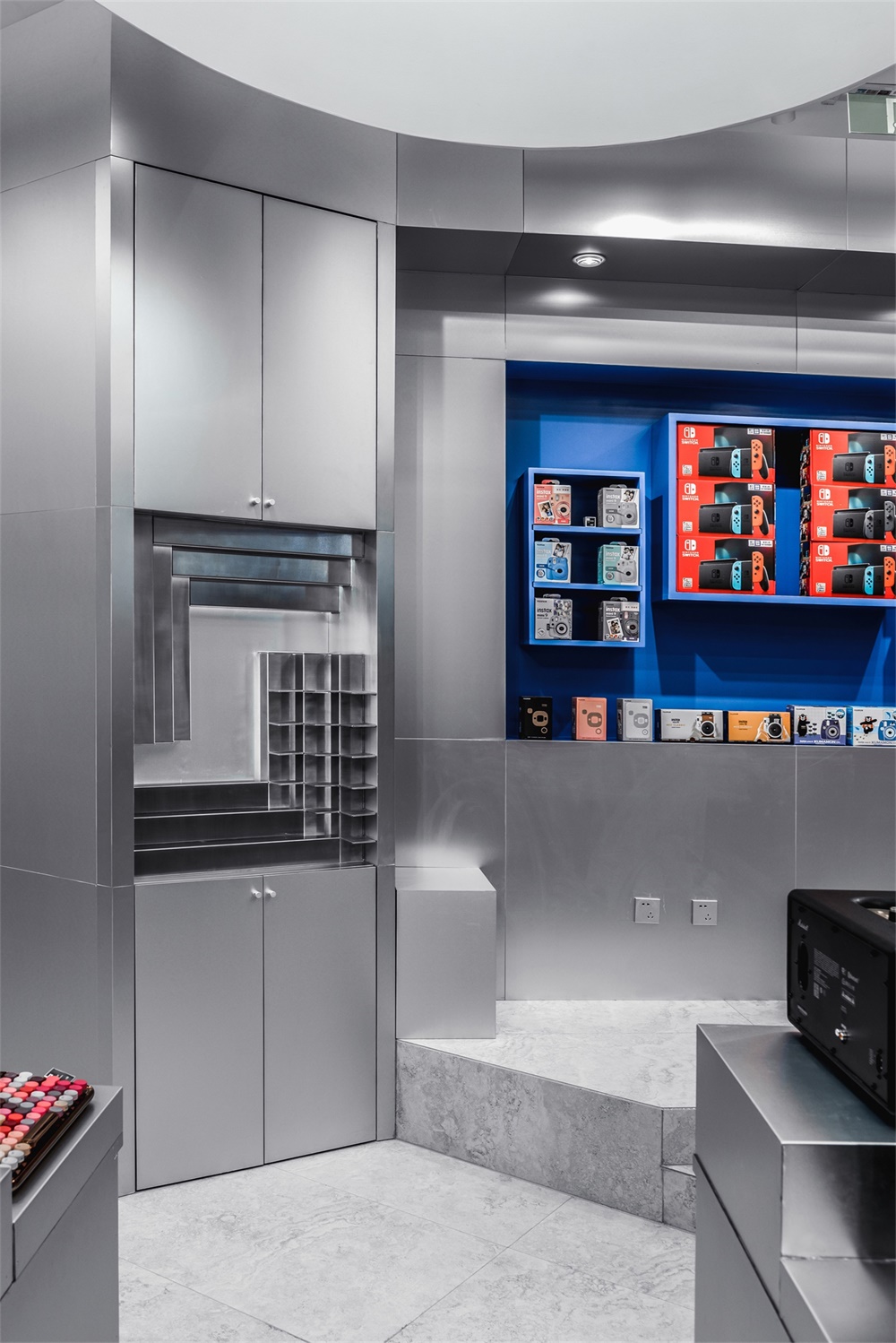
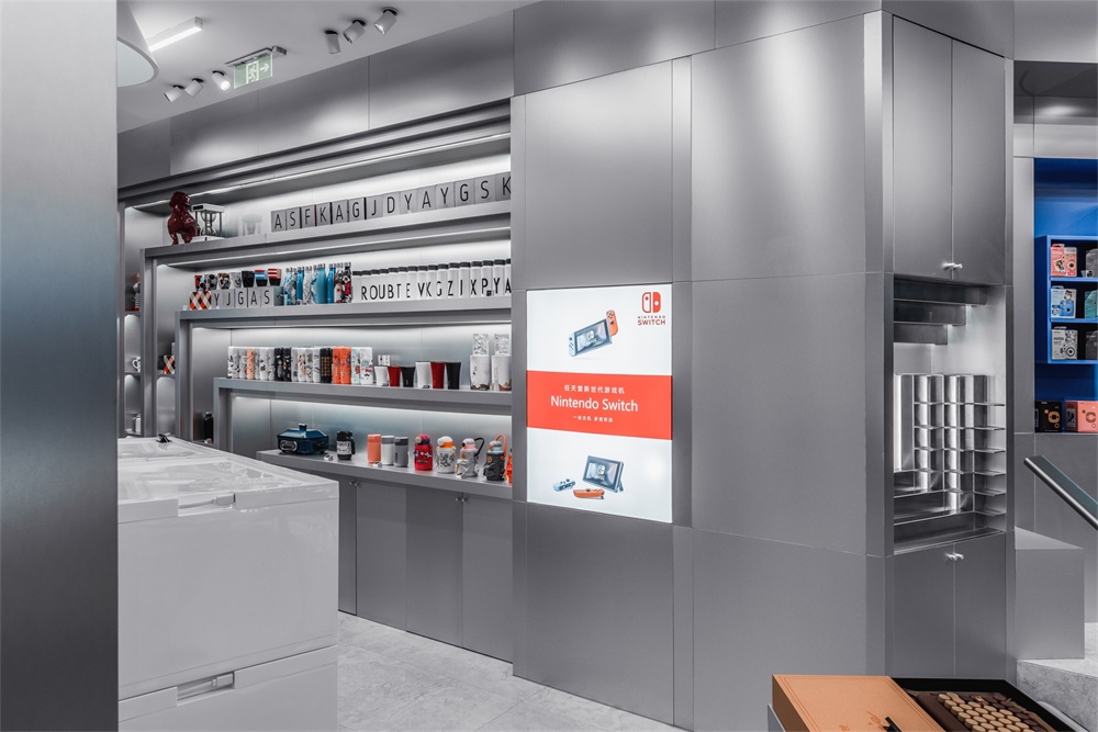
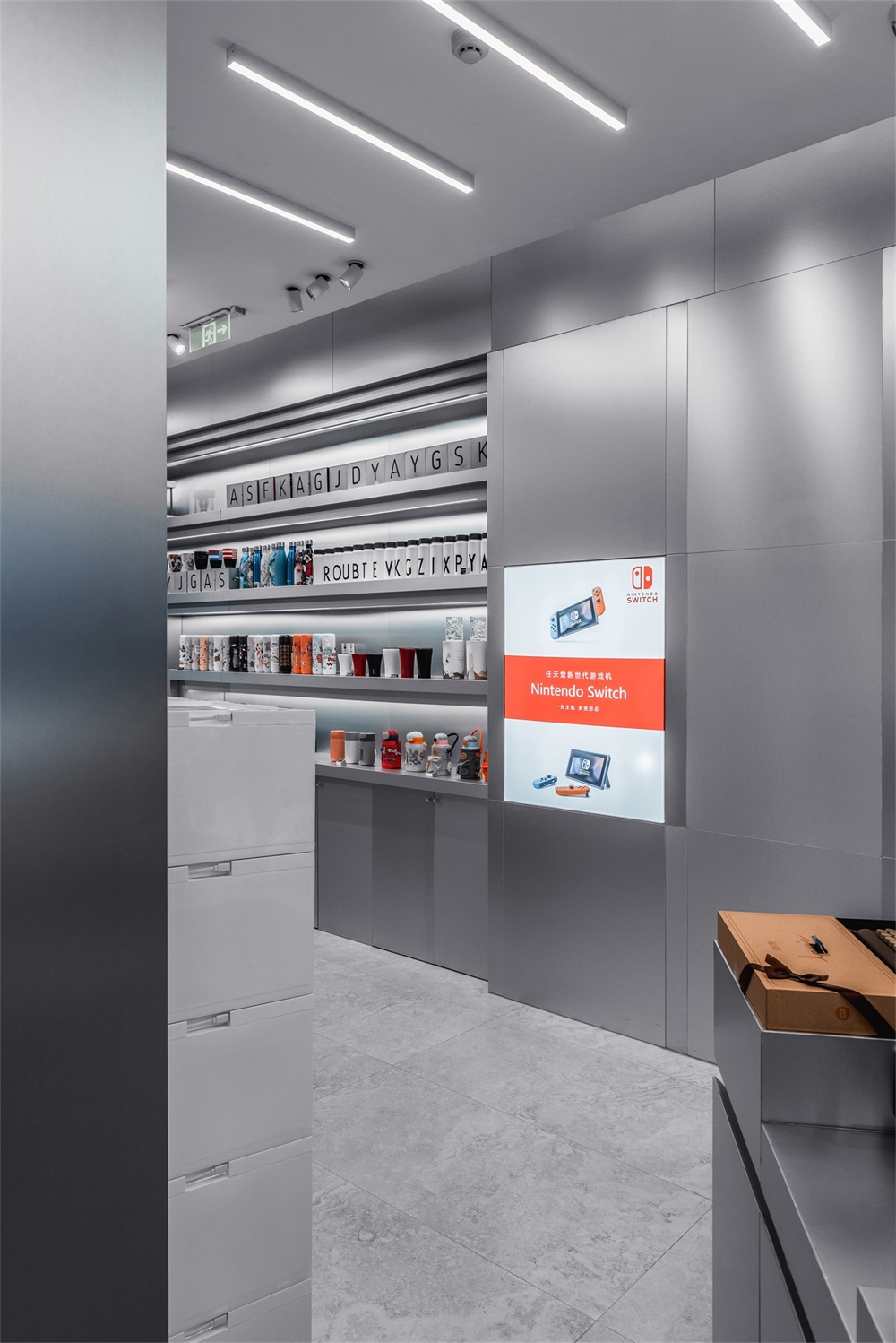
與那漠含風設計以往的折衷主義風格不同,VLAB的空間並沒有豐富的材料和色彩配搭,牆麵是單一的灰色陽極氧化鋁板,地麵是單一的灰色意大利石紋磚,隻有品牌燈箱和局部使用了藍色,這種幹淨洗練的氛圍能很好地襯托豐富的產品陳列,而不會與其產生衝突。設計師更多地是從未來與經典、感性與理性的角度尋求矛盾與統一,VLAB是前所未有的一次嚐試。
Slightly different from the eclectic style of NA-DECO works in the past, the space of VLAB is not rich in textures. The wall is purely covered by gray anodized aluminum panel, and the ground is covered by gray Italian limestone tiles. Only the brand light boxes and few parts of the space are painted with blue brush strokes. With no question, this clean and sharp ambience can well set off the affluent product display. VLAB is an unprecedentedly ambitious attempt, on the whole, where Ha Da practices eclecticism in an understated way, creating balance from the perspectives of future and history, sensibility and rationality, rather than from materials and color palettes.
主要項目信息
項目名稱:VLAB
設計公司:NA-DECO那漠含風設計
官網:www.nadeco.com.cn
聯係郵箱:nadeco.contact@qq.com
完成年份:2020年1月
建築麵積:90㎡
項目地點:內蒙古呼和浩特市
攝影師:哈達
設計團隊:哈達、劉國霞
主要材料:氧化鋁板、意大利石紋磚、烤漆
Project Name: VLAB
Design Firm: NA-DECO
Website: www.nadeco.com.cn
Email: nadeco.contact@qq.com
Completion: January 2020
Area:90㎡
Location:Hohhot City, Inner Mongolia, China
Photographer:Ha Da
Design Team: Ha Da, Liu Guoxia
Material: anodized aluminum, Italian limestone tiles, lacquer


