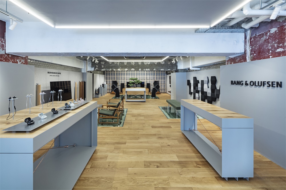
該場地位於東京銀座的並木大街,是一棟於1960年完工的建築,計劃在兩年內拆除。設計要求能夠讓用戶在類似客廳的空間中模擬自己的生活,而不僅僅是體驗產品本身。我們還致力於創造一個融合東京風情與丹麥風情以及B&O優雅工藝的空間。基本布局是B&O品牌設計團隊要求的。這個商店的必要功能是一個像客廳一樣的空間,產品在這裏排列,一個會議室,和一個後院。
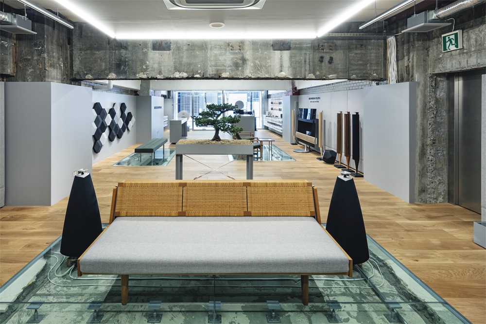
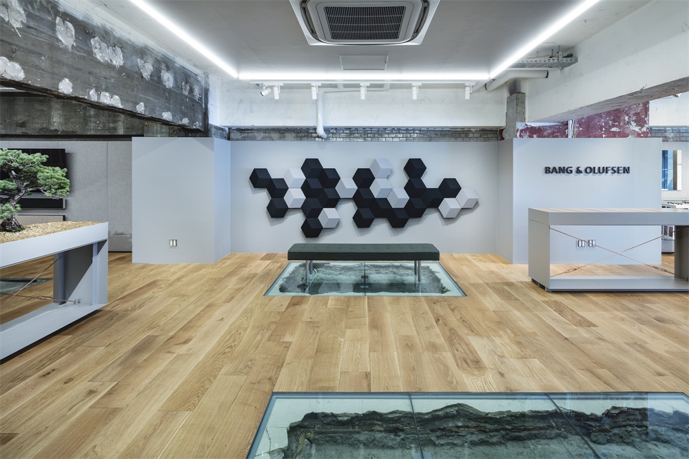
The site, located on Namiki-Dori Street in Ginza, Tokyo, is a building completed in 1960 and scheduled to be demolished in two years. It was required to design that would allow users to simulate their own lives in a living room-like space, rather than just experiencing the products themselves. We also aimed to create a space that fuses Tokyo-ness with Danish-ness and the elegant craftsmanship of B&O. The basic layout plan was requested by the brand design team at B&O. The necessary functions of this store are a living room-like space where products are lined up, a meeting room, and a backyard.
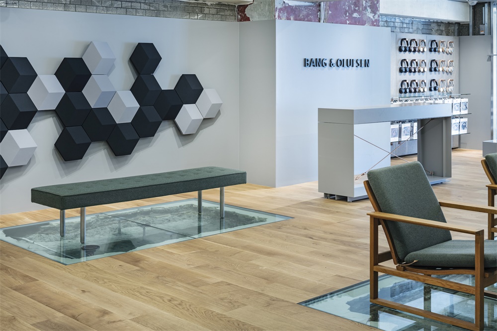
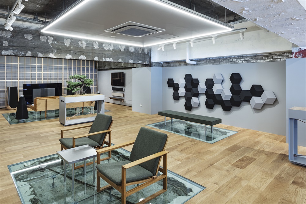
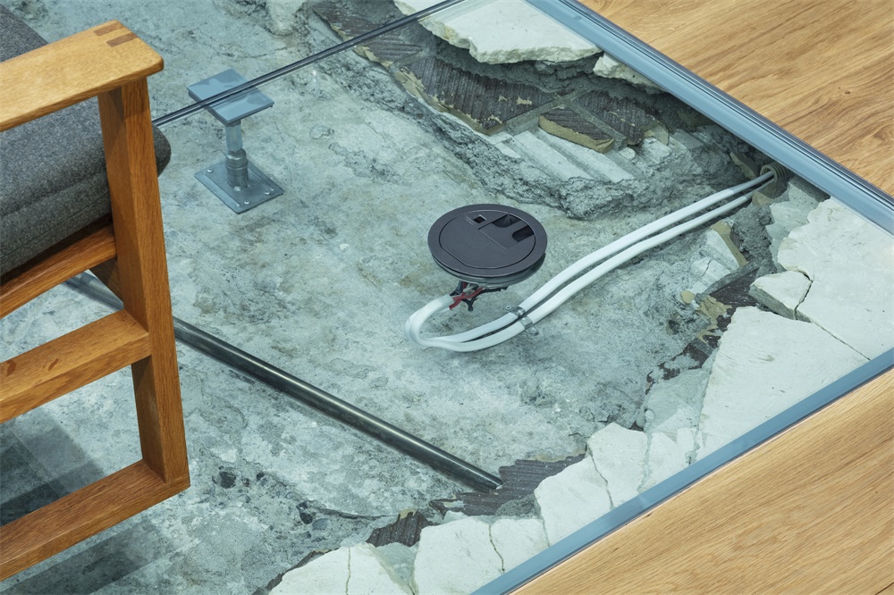
為了響應B&O的品牌宗旨“創造永不過時的獨特產品,挑戰傳統,激發想象力”,DDAA提出在一個空間,丹麥和東京文化之間的共性和對比、最新的產品和工藝、老式家具和當代設計可以共存。我們保留了品牌設計團隊要求的布局,但沒有鋪地毯,而是拆除了地板,放置了揚聲器的電線,並用玻璃覆蓋。建築的改造曆史,自建成以來一直被覆蓋,被視為一個地層。電纜通常隱藏在牆壁或地板內,它們被仔細地布線,就像在玻璃櫃中展示的那樣。玻璃地毯的頂部是與建築完工年份相同時期生產的老式丹麥家具。商店中的老式家具和現代設計形成鮮明對比。
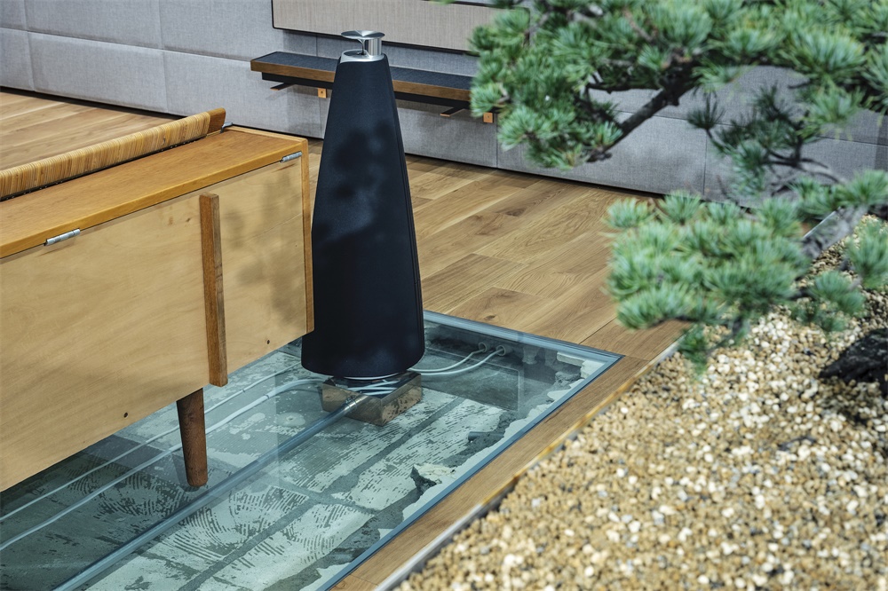
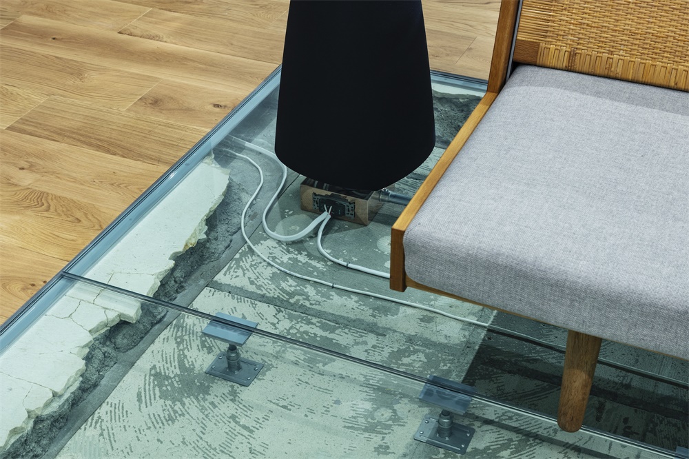
In a nod to B&O’s brand purpose “create timelessly distinctive products that challenge conventions and engage imaginations”, DDAA proposed a space where commonalities and contrasts between the culture of Denmark and Tokyo, the latest products and craftsmanship, and vintage furniture and contemporary design can can live together. We kept the layout requested by the brand’s design team, but instead of laying rugs, we dismantled the floor, placed wirings for the speakers and covered them with glass. The building’s renovation history, which has been overwritten since its completion, is visualized like a stratum. Cables, usually hidden inside walls or floors, are carefully wired as if they were on display in a glass case. This glass rug is topped with vintage Danish furniture produced in the same period as the building’s completion year.Vintage furniture and contemporary design contrast in the store.
丹麥和日本都有根植於其工藝的木工文化。一棵60歲左右的盆景樹被放置在這家店的中心,它進一步象征著老式家具和建築的背景。在這個空間中,視覺化的是曆史背景和基於工藝的“細節”。
Both Denmark and Japan have a culture of woodworking that is rooted in their craftsmanship. A bonsai tree about 60 years old, which further symbolizes the context of the vintage furniture and building, was placed in the center of this store. What is visualized in this space is the historical background and also the “details” based on the craftsmanship.
你可以看到玻璃地毯下麵的揚聲器接線。在支撐大門結構和盆景家具的橫撐上,以及支撐玻璃的五金件上,都使用了鍍銅。會議室裏的桌子是透明的亞克力板,除了連接處外,其他部分都鍍了銅板,使其成為唯一可見的元素。
You can see the speaker wiring under the glass rugs. Copper plating was used on the cross braces supporting the structure of the entrance door and the furniture for the bonsai, and on the hardware holding the glass in place. The table in the meeting room is made of transparent acrylic except for the joints, copper plated in order to be the only element visible.
主要項目信息
項目名稱:BANG & OLUFSEN Ginza Flagship Store
項目位置:日本東京
項目類型:商業空間/零售店
完成時間:2019.9
設計公司:DDAA
攝影:Tomooki Kengaku / Kenta Hasegawa
客戶:BANG & OLUFSEN


