全球設計風向感謝來自 尋長設計(NARMAL) 的甜品店項目案例分享:
LENTOSCANA品牌的藝術實驗 LENTOSCANA Art Lab
LENTOSCANA Art Lab是尋長設計完成的又一個從品牌視覺到品牌空間、再到藝術策劃的”尋長”式品牌案例。
LENTOSCANA is the latest NARMAL branding case that covers brand VI, space and art project planning.
LENTOSCANA的誕生 The Birth of LENTOSCANA
LENTOSCANA誕生於意大利中部大區——托斯卡納,品牌名由意大利語”Lento”(慢慢的),與”Toscana”(托斯卡納)兩個詞彙結合而成。古老的血統,年輕的麵孔。品牌融合文藝複興與古今慢食文化,將甜品、自然、藝術、人文合為一體,以傳遞文化和創造交流為己任。
LENTOSCANA was born in Tuscany, the central region of Italy. The name is a combination of Italian words “Lento” (slowly) and “Toscana” (Tuscany). It is old blood with a young face. The brand integrates the Renaissance slow food culture and the modern slow eating fashion, it integrates the dessert culture and nature, the necessity and humanity. Our clients also take the responsibility for cultural transmission and creative exchange in their business.
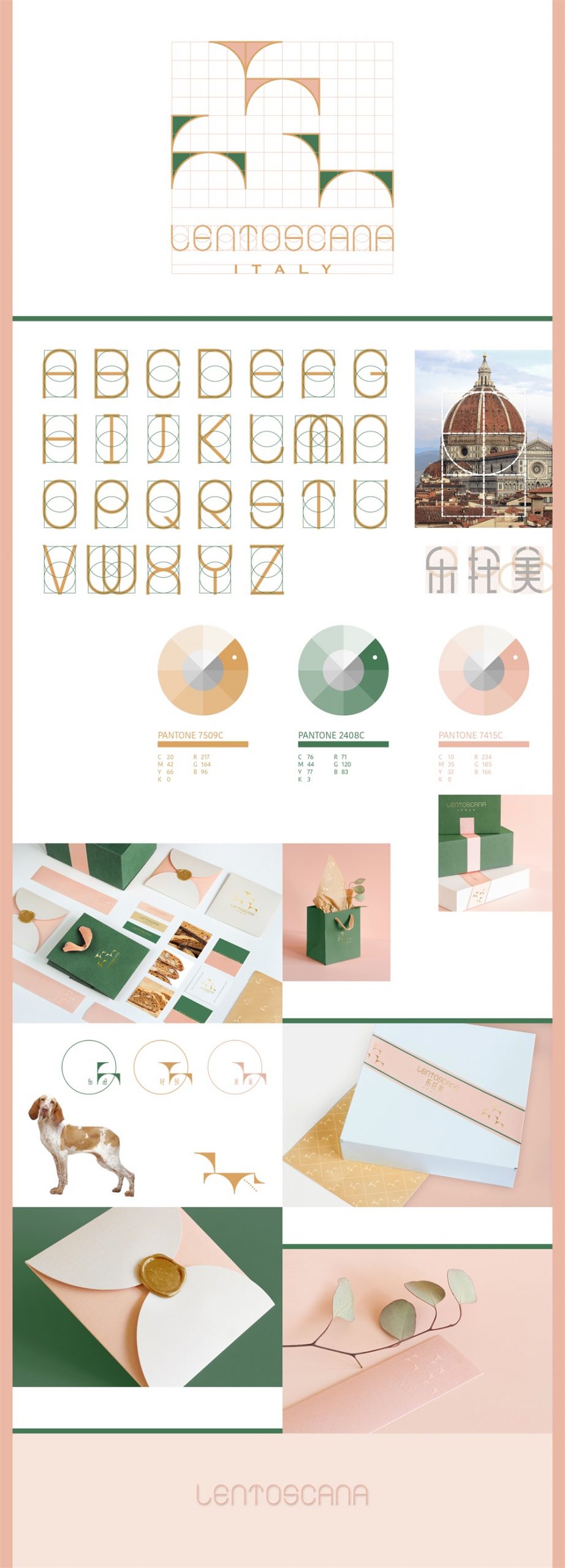
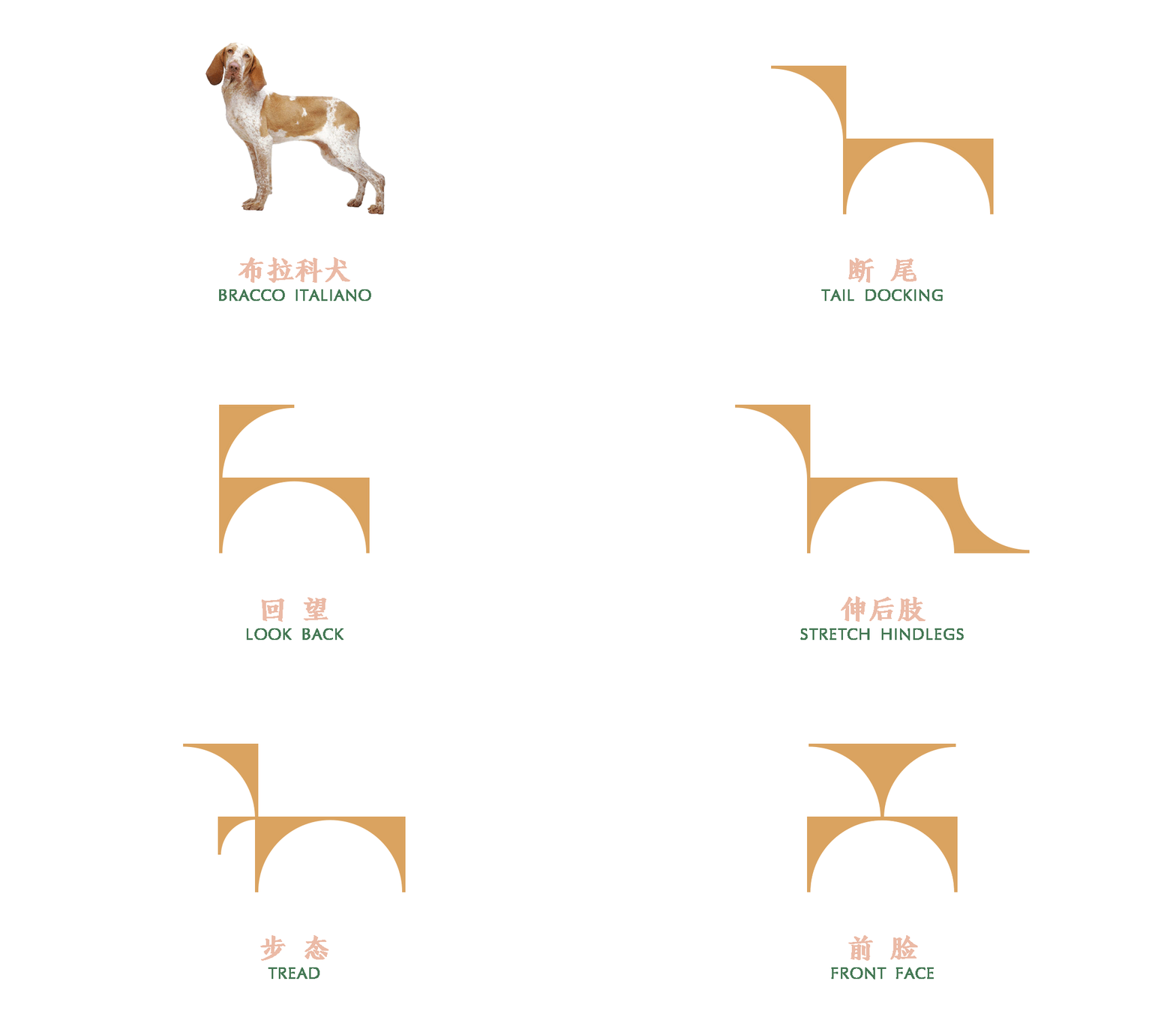
我們用文藝複興的建築比例創造了LENTOSCANA的專用字體,並選取了文藝複興時期極為流行的犬種“布拉科”為品牌代言。配合品牌中文名“樂托美”,創造了“樂樂”“托托”和“美美”三個IP形象。IP形象也是脫胎於文藝複興建築比例的表達。在這個基礎上我們還為三隻小狗創造了一係列的動作和表情。傳達品牌精神的同時,也為未來的產品開發 (玩具/配飾/家具等)和客群互動預留了可能性。
We design the special font of LENTOSCANA from the scales of the Renaissance architectures, and selects the dog breed called“Bracco Italiano”, which was very popular in the Renaissance period, as the brand“spokesperson”. The three dogs “LeLe”, “TuoTuo” and “MeiMei” are also the IP images for the brand in Chinese —— “LeTuoMei”. IP images are also derived from Renaissance architecture. Also, we design a series of actions and expressions for the three puppies. While addressing the brand spirit, it also reserves space for future product developments (toys/accessories/furniture, etc.) and customized activities.
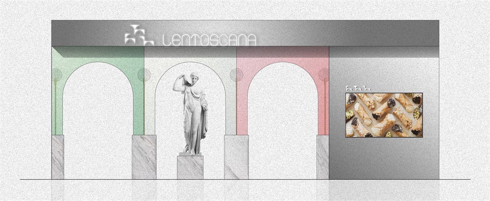
品牌色的設計靈感來自托斯卡納的迷幻風光,以及其首府佛羅倫薩文藝複興早期標誌性建築——聖母百花大教堂外牆使用的三色大理石貼麵的色彩,後者正好似意大利國旗(綠白紅三色縱旗)的灰度化處理。
The brand color inspiration comes from the beautiful scenery of Tuscany and the color of the three-color marble veneer used in the exterior wall of the early Renaissance landmark of Florence, the capital of Tuscany. The latter is also seen in the graying treatment of the Italian flag (green, white, and red vertical flag).
所有的品牌理念、視覺形象都將在空間設計中得到呼應和新的創造,這也是尋長與眾不同的設計手法及思路。
All brand concepts and visual images echo with space and regenerated within it, which is also a unique NARMAL way of thinking.
LENTOSCANA空間 The Space of LENTOSCANA
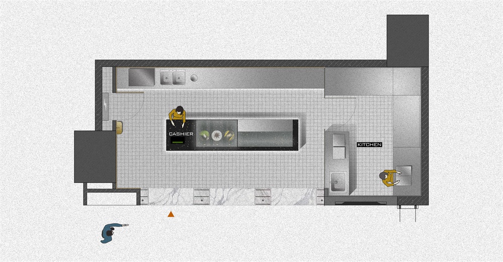
不同於法式甜品精致、甜美的特征,意式甜品有一種樸實、自然的家庭感、親切感。這一氛圍和LENTOSCANA想要傳遞的“陪伴、成長、自然”的精神一脈相承。
Italian dessert has a simple and natural sense generates from the familial and intimacy tradition, which makes it different from the delicate and sweet French dessert. Being simple and natural is also the ingrain spirit of the company, our client wants to convey the energy of accompaniment, growth, nature through their business.
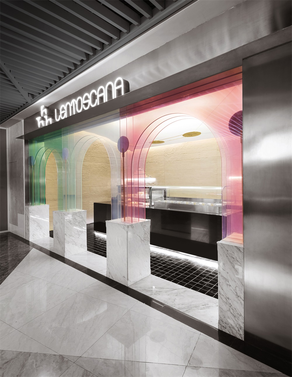
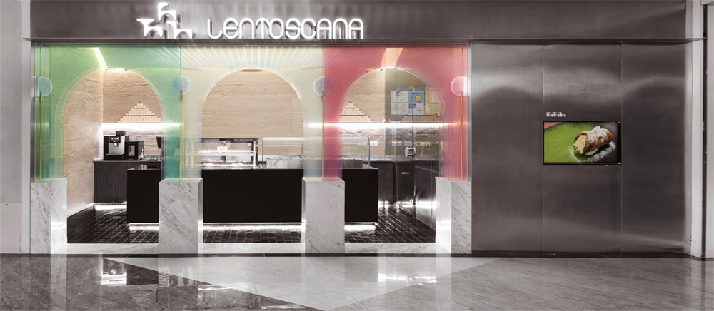
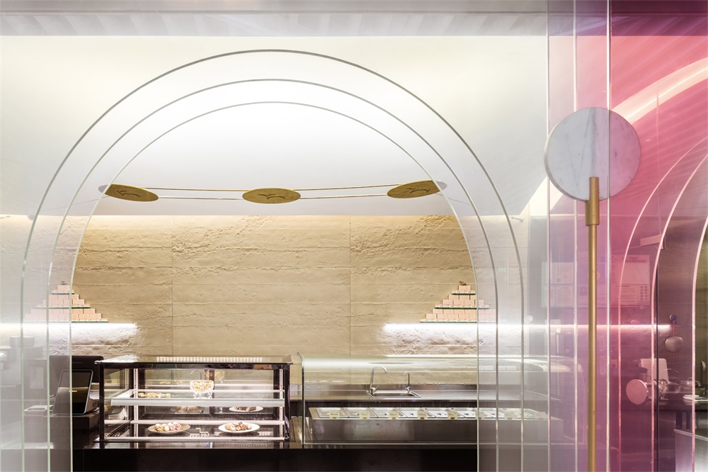
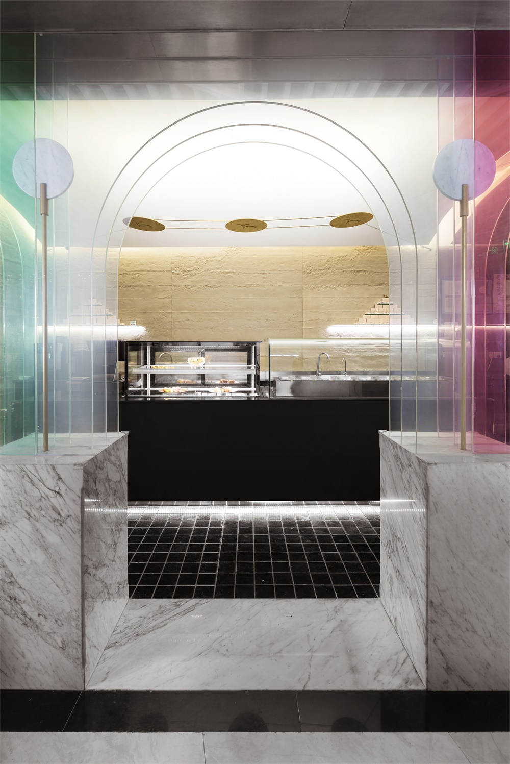
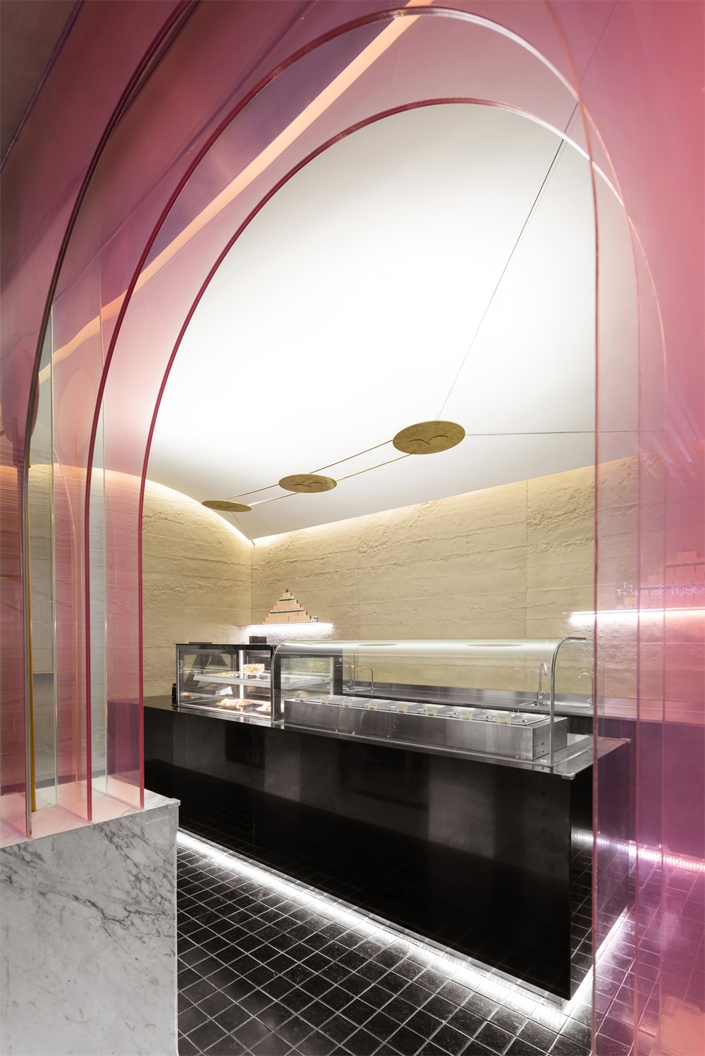
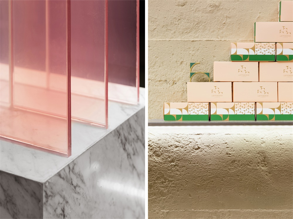
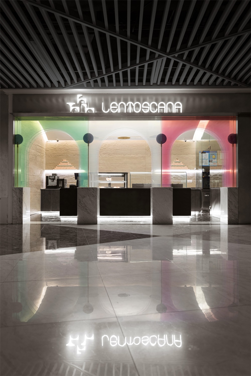
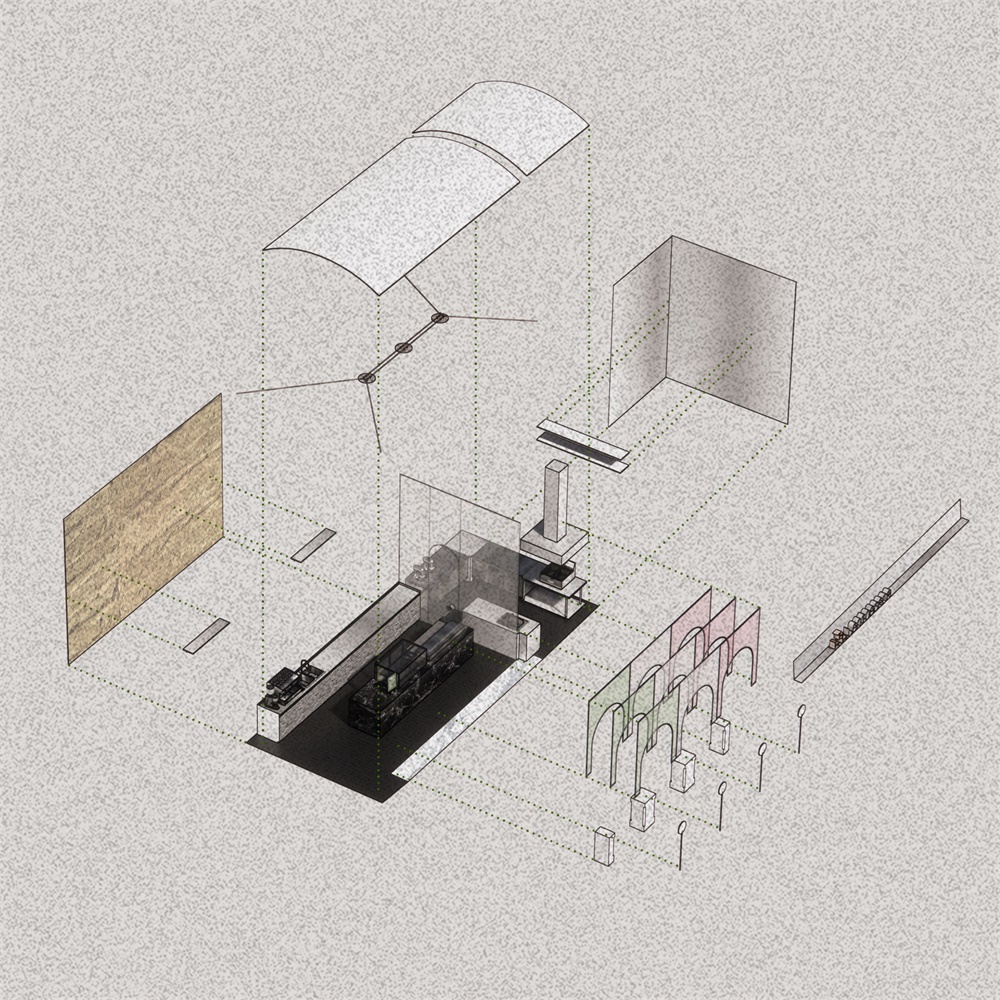
透過門口現代感的透明三色的“九重門”,我們進入到一個傳統的單拱空間。這種“新“與”老”的對比,是我們想要傳達的第一層品牌印象——一個全新而又有曆史積澱的LENTOSCANA。
We enter into a traditional single arch space through the modern transparent three-color “nine doors”. The contrast between “new” and “old” is the first brand impression we want to convey——a modern and historical LENTOSCANA vibe.
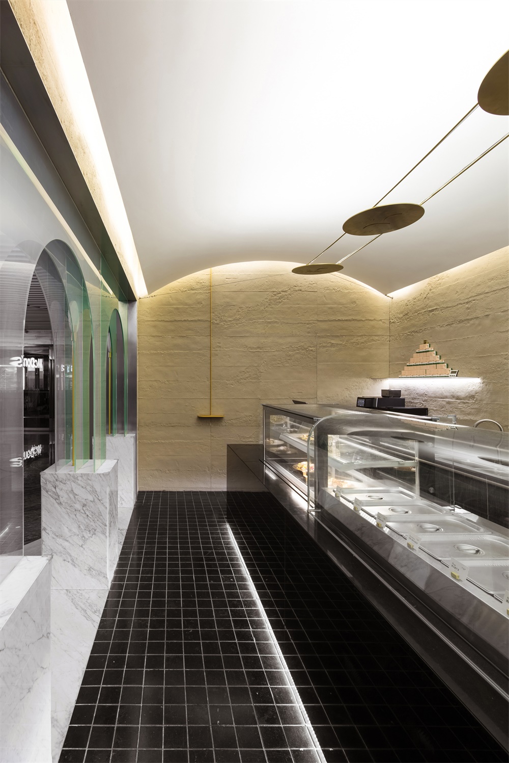
穿過“意大利”色的拱廊,地麵滿鋪10*10切割的山青石,仿佛置身於意大利街道。我們希望這種細膩的觸覺變化會將人帶入“lento”的節奏,進入另一個“世界”。
Through the “Italian” color arcade, the ground is covered with 10 * 10 cut bluestone, which gives the costumers a déjà-vu of an Italian street. We hope that this delicate tactile change will bring costumers into a “Lento” rhythm as soon as they step into the store.
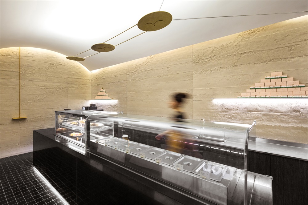
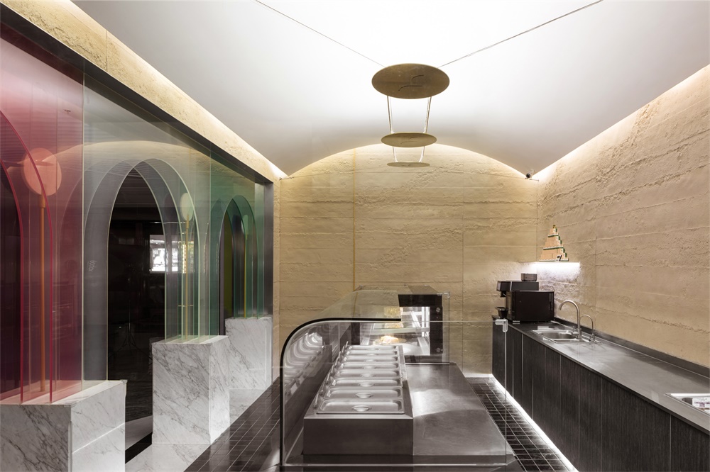
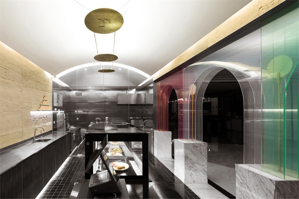
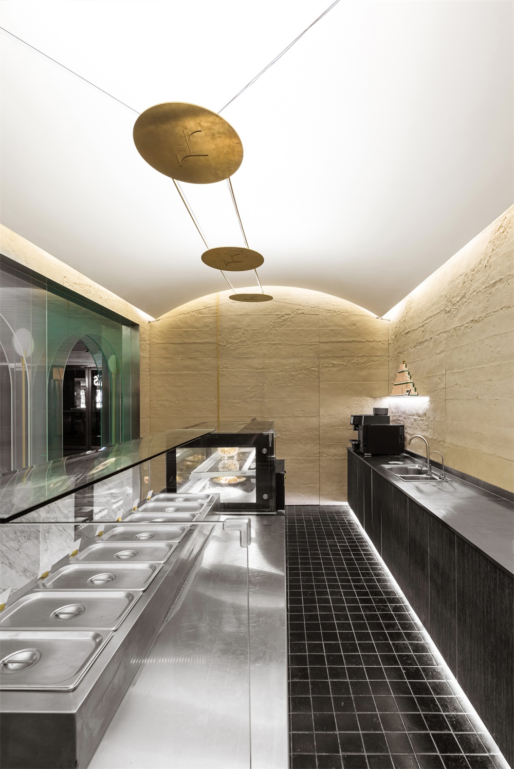
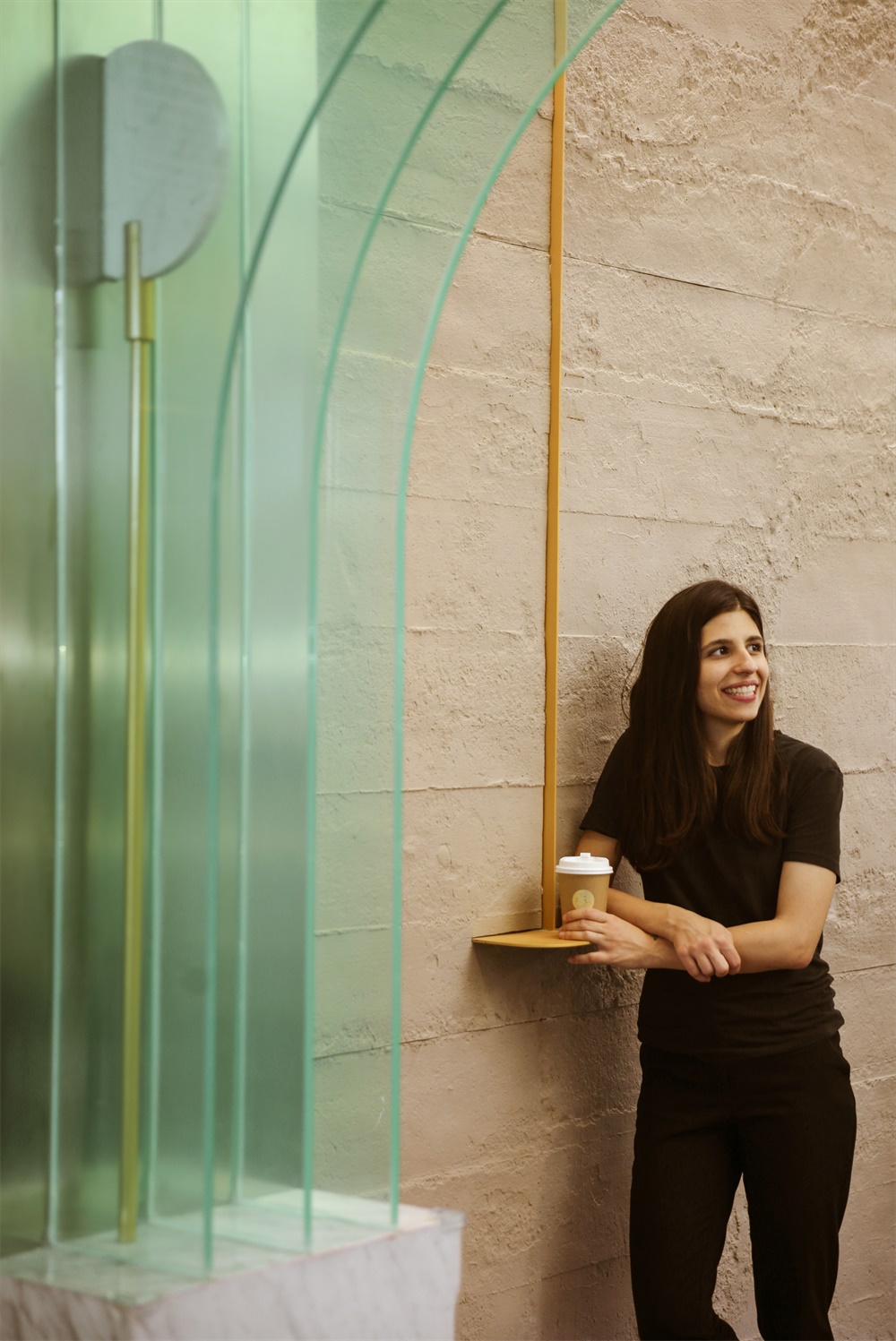
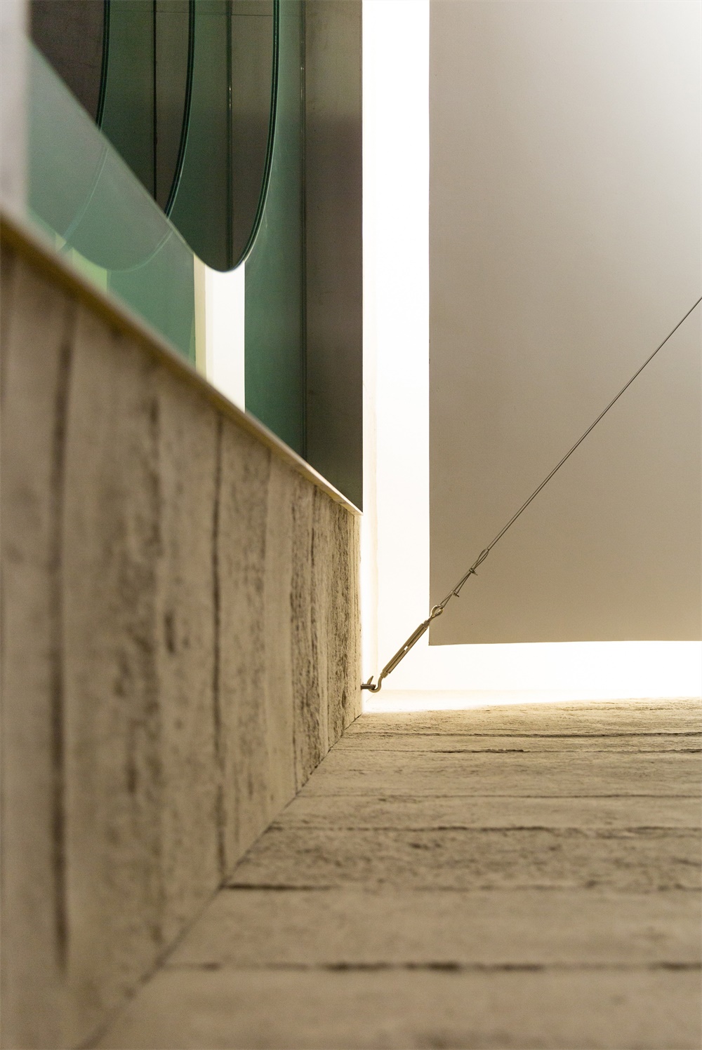
牆體粗糲的表麵和展示台的黑色大理石及不鏽鋼形成質感的衝撞,是對“印象中的甜品店“的一次想象力的解放。這種衝撞與意式甜品“樸實、愜意”的內核相呼應。粗糲牆麵上設有一個非常mini的黃色台麵,是對“親切的消費場景”的一種引導和鼓勵。倚牆而立,正是屬於LENTOSCANA的愜意和隨性。
The rough surface of the wall and the black marble and stainless steel of the exhibition platform form a texture contrast, which is a liberation of “the dessert store in memory”. This contrast corresponds to the essence of “simple and comfortable” Italian dessert. There is a very mini yellow table on the rough wall, which is a kind of guidance and encouragement for “friendly consumption scene”. Customers are encouraged to lean against the wall, to enjoy food in comfort and laid-back LENTOSCANA ambiance.
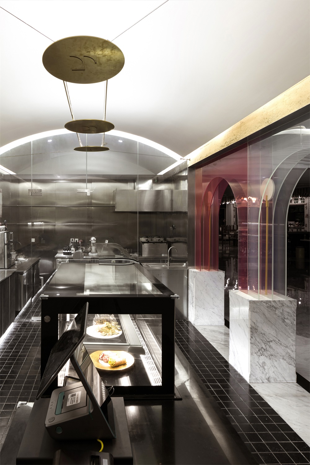
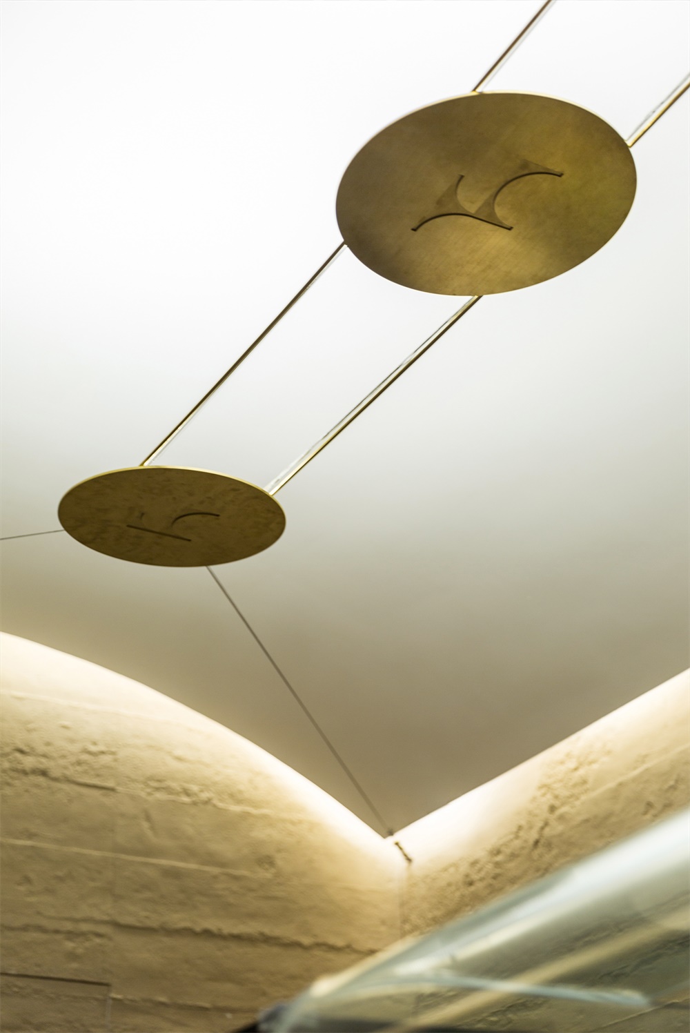
屋頂懸浮三隻陰刻著“代言人”的黃銅燈具,在LENTOSCANA的籠罩下,展示來自“托斯卡納”的別樣氛圍。
Three brass “spokesperson” lamps are hanging in the roof, showing a different atmosphere of “Tuscany” within the space of LENTOSCANA.
藝術策劃 Project Planning for LENTOSCANA
店鋪設計過程中,最叫我們感慨的是交流和傳遞,是世界既無比遙遠又近在咫尺的衝突——一個曾經印象中隻有莫妮卡貝魯奇的西西裏島的一種美味小食cannoli,竟然原汁原味地出現在了上海。未來LENTOSCANA還會陸續帶來更多意大利的美食精品。
In the process of designing the store, there are constant communications and transmissions, which reflects the feeling of the world being remote and close at the same time. Cannoli, a delicacy that is from Monica Bellucci’s remote Sicilian island, appears in Shanghai in its original flavor. We can expect LENTOSCANA to bring more and more Italian delicacies in the future.
我們為店鋪設計選用的“卡拉拉”大理石、“中國黑”大理石在平麵和立麵上呈現,就好像他們本來就來自同一座山脈一樣簡單。
The Karala marble and Chinese black marble we selected for the store interior design are presented on the plane and facade as if they were from the same origin.
這種世界的共通和宇宙的時空扭結,讓我們有了下麵這一段紀錄:
This intertwining of space and time inspired the following art project:
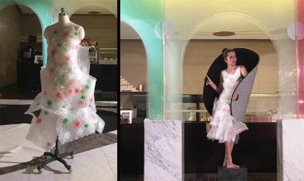
我們為這次表演設計了一件以“意大利”和“隱形”為主題的服裝;
We designed a costume with the theme of “Italy” and “invisibility” for the performance;
我們為這次表演製作了一組“保護”和“運輸”為主題的道具;
We made a set of devices with the theme of “protection” and “transportation” for the performance;
我們邀請好友俄羅斯舞蹈家Olga創作了一段表演《宇宙中的相遇》!
We invited our best friend Olga, a Russian dancer, to create a performance called “encounter in the universe”.
主要信息
項目名稱: LENTOSCANA品牌的藝術實驗
設計公司:尋長設計(NARMAL)
設計團隊完整名單:高傑、李煜瑾、鄒克陽、郭晶
事務所網站: www.narmal.com
事務所公眾號:尋長設計NARMAL
聯係郵箱: info@narmal.com
完成年份:2019
建築麵積:40平方米
項目位置:上海市黃浦區黃陂南路838弄中海環宇薈B132-2
攝影師:謝東叡
其他技術信息
客戶:上海樂托美餐飲管理有限公司
施工:上海颯噶建築裝飾工程有限公司
視頻拍攝:Sophia Liu
視頻製作:折疊視覺設計工作室(FOLDIN DESIGN STUDIO)
藝術家:[俄]Olga Merekina
材料/製造商/產品
品牌:倍砼堡(水泥澆築板)、戈仕玻璃(夾膜玻璃)、鬆耐特(耐火板)


