全球設計風向感謝來自 南築設計 的醫療美容項目案例分享:
情感是最高級、最飽滿的空間溝通與交流語言,生於形式,卻不被形式拘泥。
As the highest level, the most complete spatial communication language, the emotion is born in the form, but not limited by the form.
設計以人為本,設計同時引導人的行動,情感的指引則是其中的主線。
The people-oriented design at the same time guides behaviors of people, while the emotional guidance is one of the main clues.
空間的流動性串聯起實用功能的自然分割,和起承轉合的行走視角。情緒則內涵於每一個空間對材質、對色彩,以及對藝術性的考究。但設計的表達手法,盡量以最簡潔的語言隱藏鋒芒,不爭不搶如水的潤物無聲,自然流淌出最舒適的情緒。
The mobility of the space connects the natural division of the practical functions with the transitional walking angle of view. The mood is blended in the delicacy of each space in terms of materials, colors, and artistry. However, the expression of the design is implicit with the most simplified language as far as possible, no fight and no dispute, exactly as the water nourishes all without a sound, and then the most comfortable mood flows naturally.
而藝術則是感情的表露,使用一種人人都能理解的語言,於外在上助力景語的層次,於內在上去深化空間的情感。
The art, on the other hand, is an expression of emotion, with a language that everyone can understand to enhance the level of description of scenery outside and deepen the emotion of space inside.
溫和而柔軟,簡潔而幹練,優雅的時尚感,是女性氣質的代言,恰恰也是我們想融入空間的情緒表達。
Gentle and soft, concise and smart, and an elegant sense of fashion, it is the representative of feminity, and also exactly the emotional expression that we want to integrate into the space.
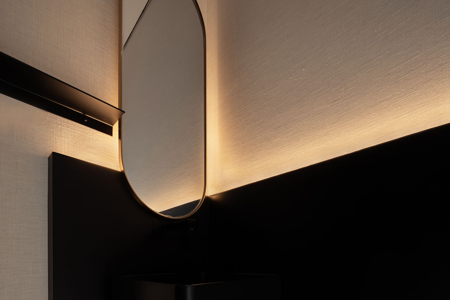
材質與設計符號的對立,對話,恰恰是在藝術感與親和力上尋找一種微妙的平衡點,能夠碰撞出花火,能夠共生出和煦。
The oppositions and dialogues between materials and design symbols are precisely to find a delicate balance point between the sense of art and affinity, which can produce the spark of the collision and generate warmth together.
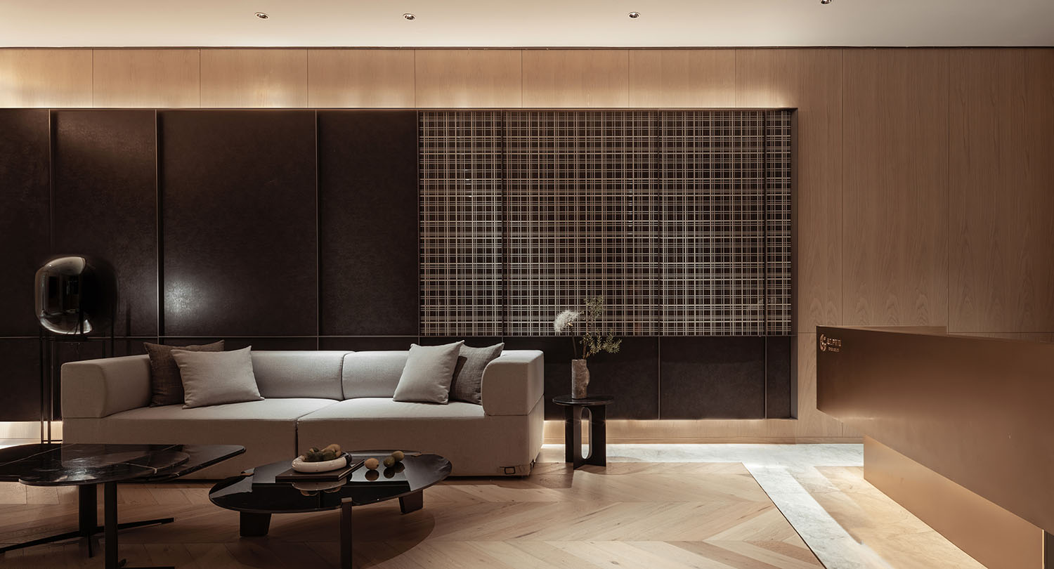
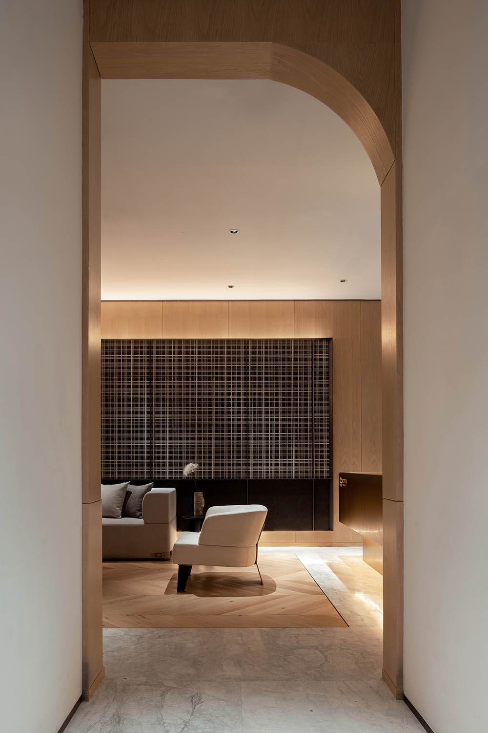
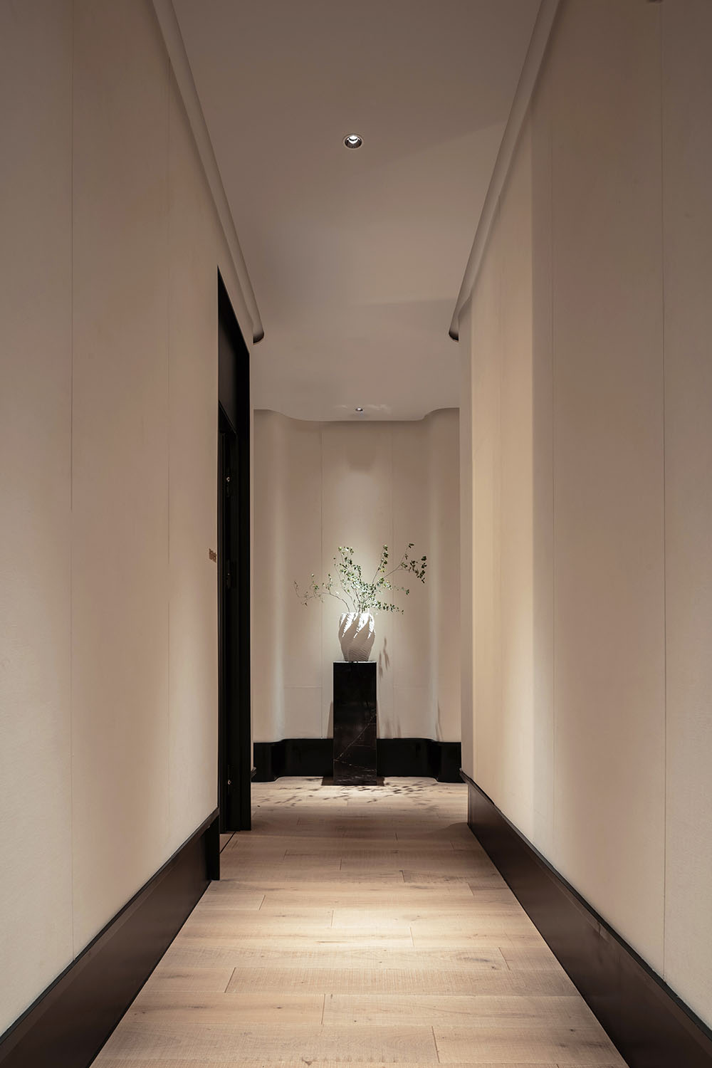
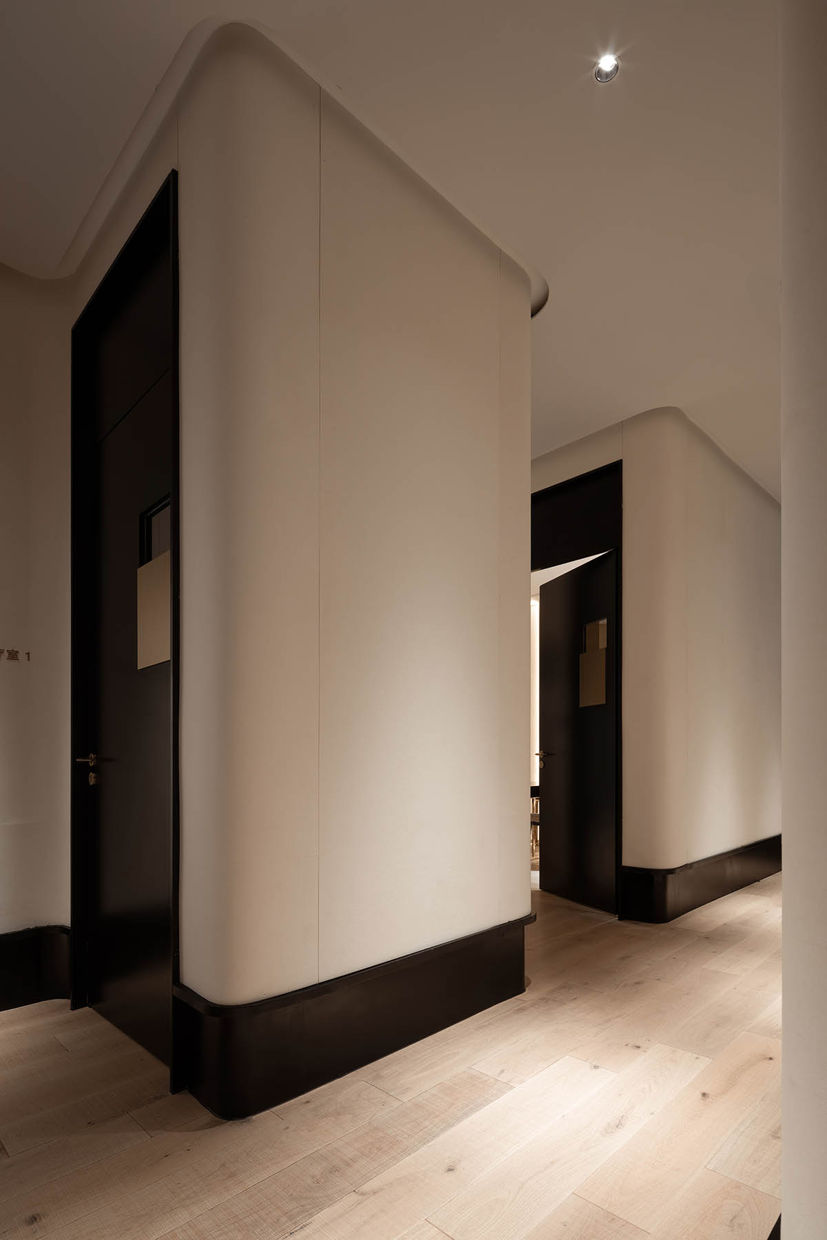
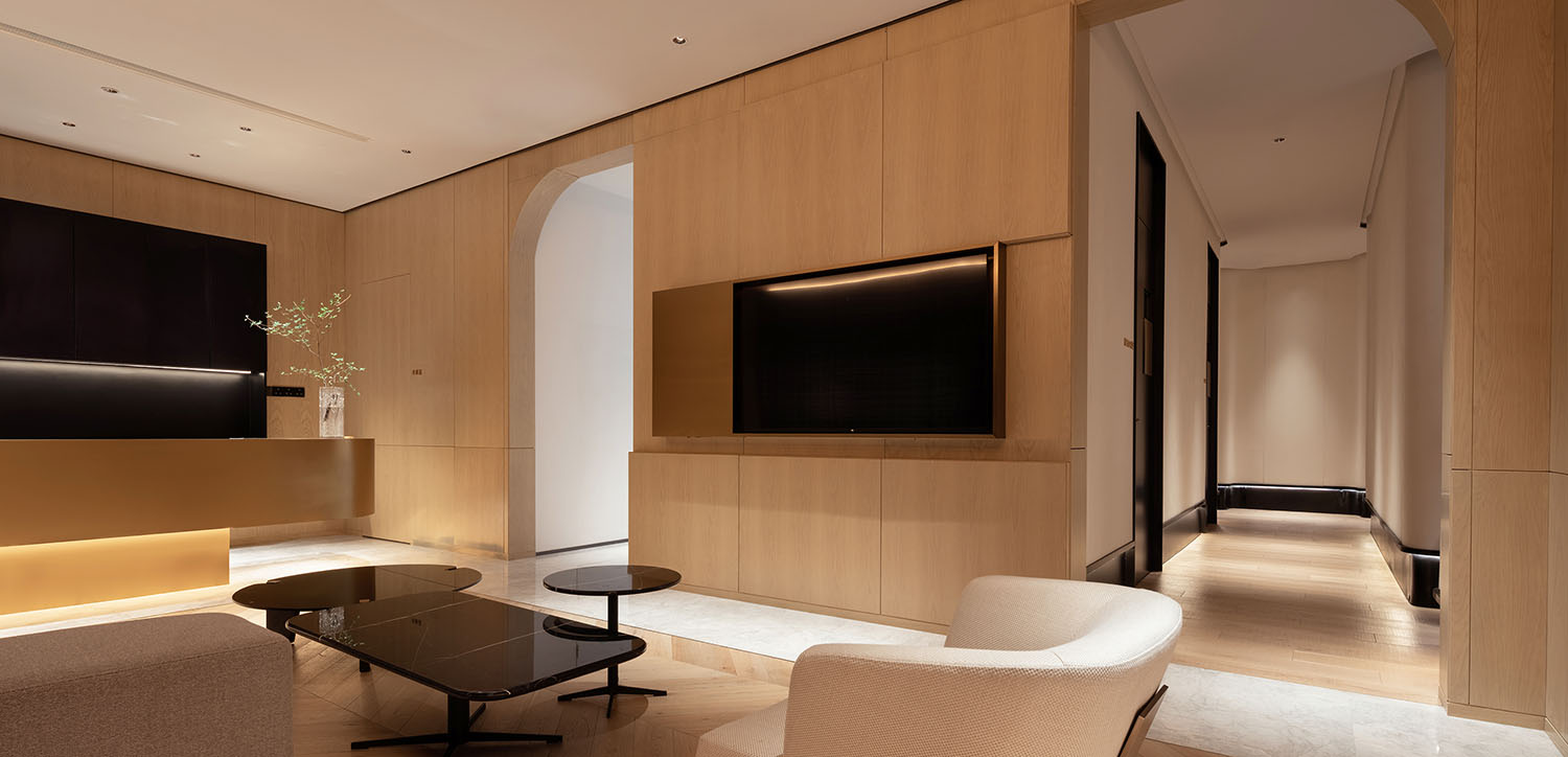
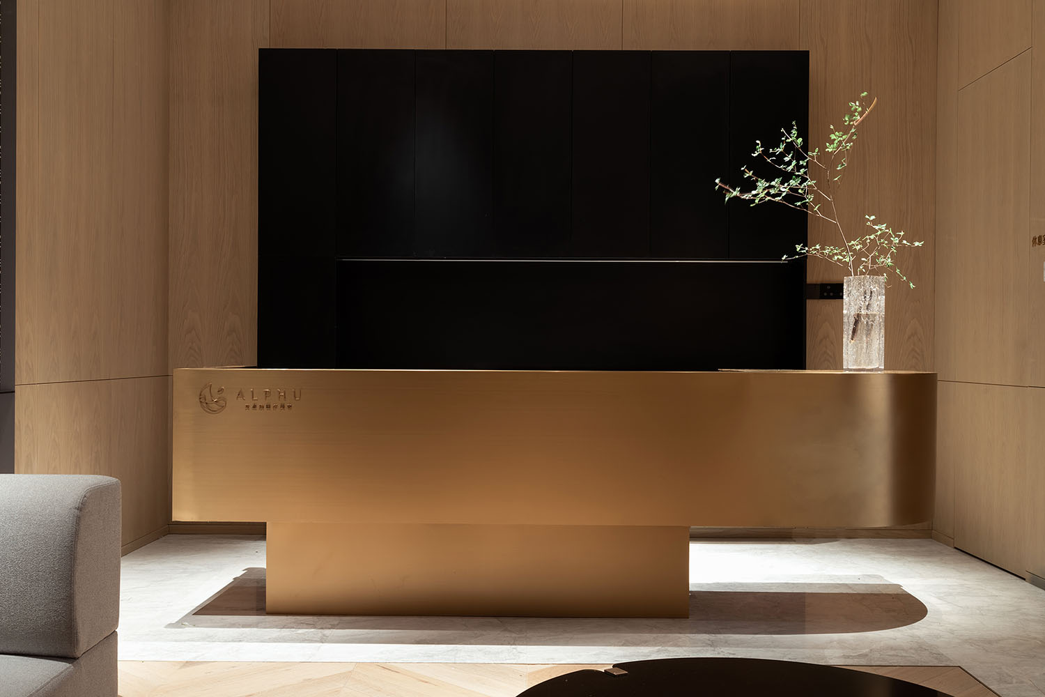
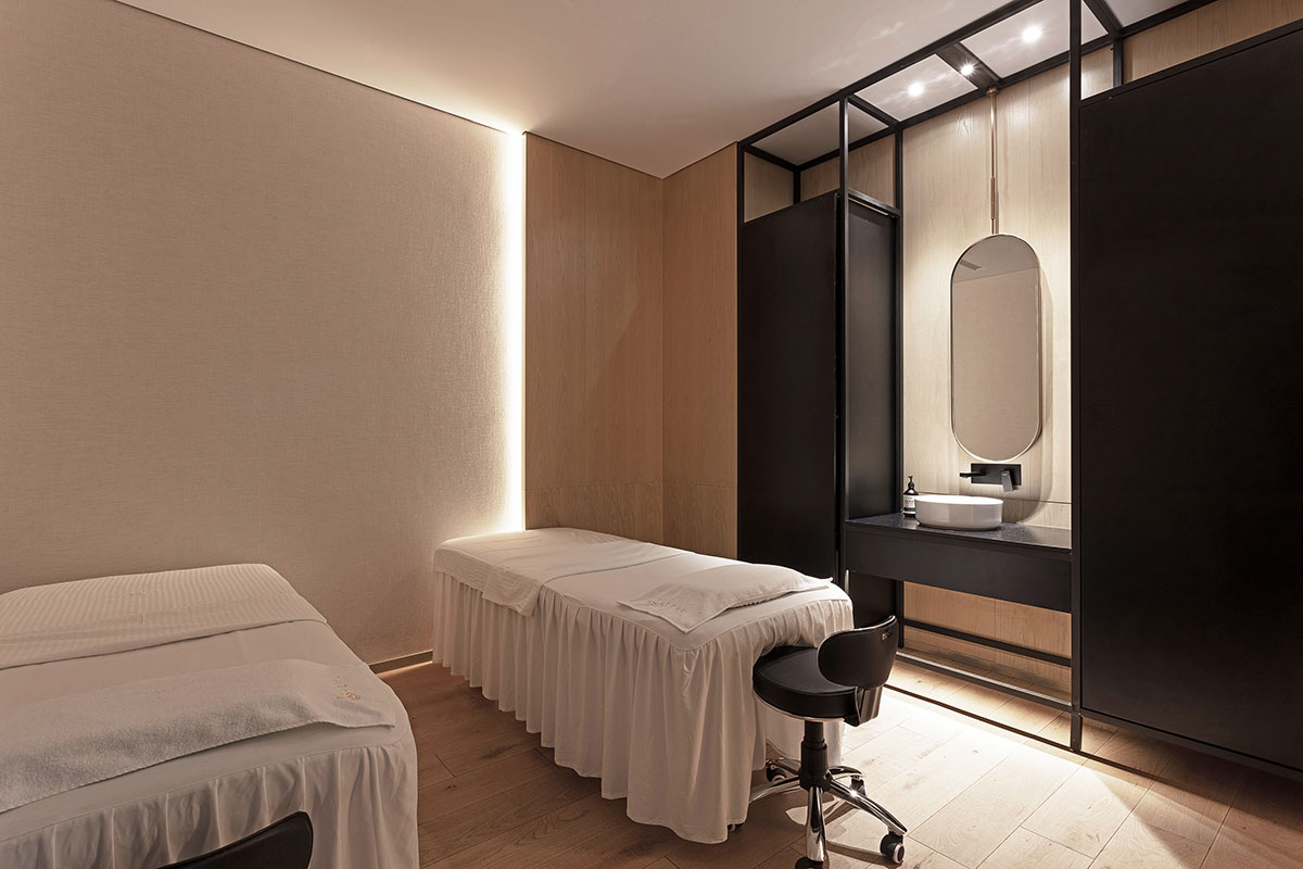
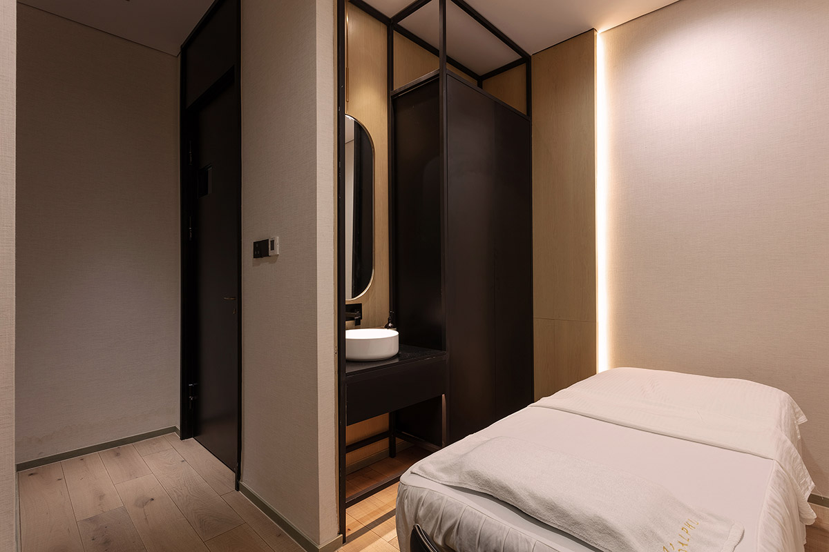
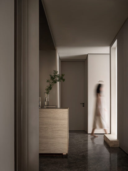
木的原色與天然肌理,與硬核的時尚肌理相遇,起承轉合的柔美弧度,在碰撞中體會美與和諧。
The primary color and natural texture of wood, meet the best fashionable texture, in which the transitional and gently beautiful curve expresses the beauty and harmony in a collision.
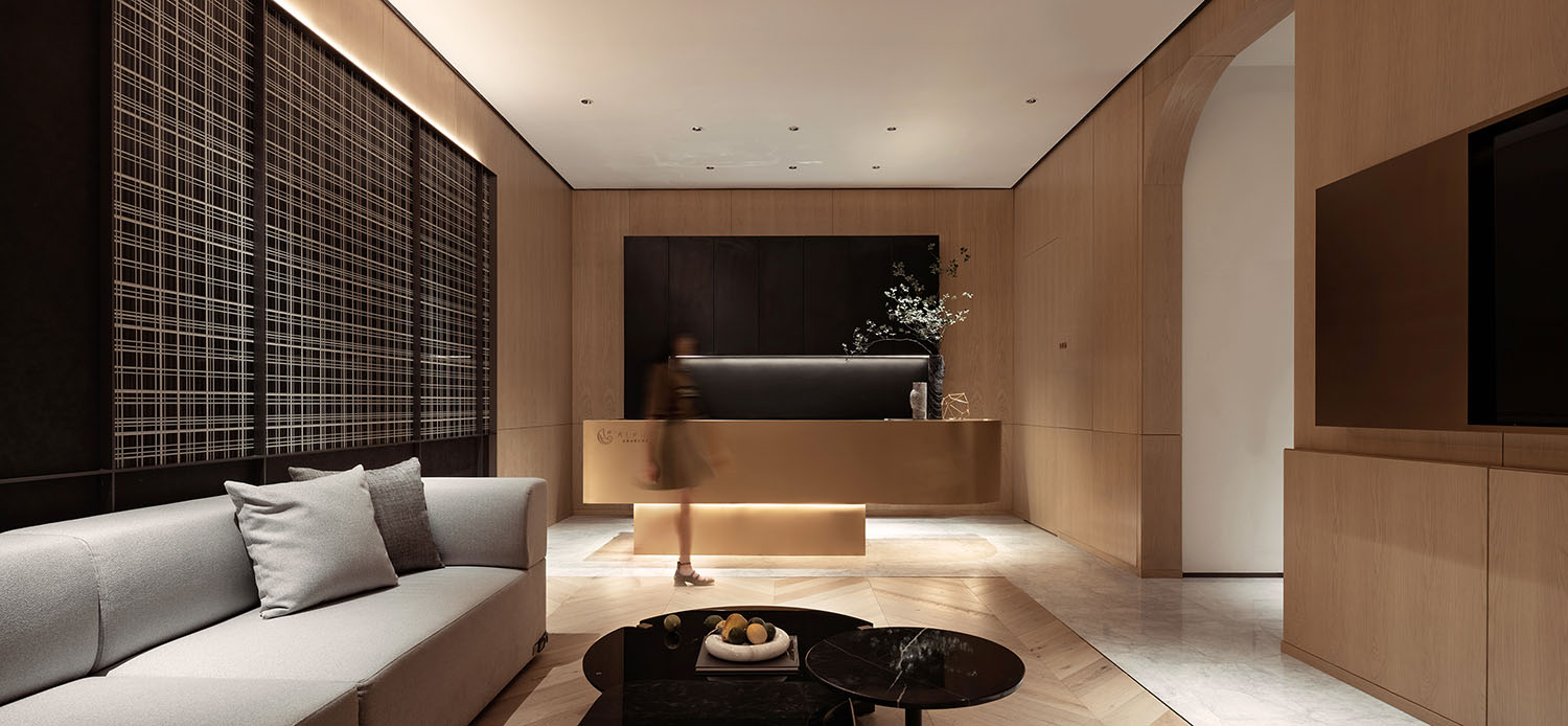
設計應是實用性與藝術性的唱和。以材料的甄選,色塊的隱喻,營造出身體和情緒都得以沉浸其中的靜謐意向,又輕逸出幽芳與清雅的尊貴感。
The design should reflect the perfect harmony of practicability and artistry. With the selection of materials and the metaphor of color blocks, a quiet image is created in which the body and mood can be immersed, and the secluded, fragrant and elegant sense of dignity is also mildly revealed.
每個空間在風格和立意上相互承接,在功能上又呈現出獨立而幽靜的隱秘,形式上的深沉質感,及情緒上的信任感,達成事半功倍的調和。
Each space links each other on the style and conception, and presents the functionally independent and secluded feeling, formally profound quality, and emotional sense of trust, to achieve the far more effective harmony.
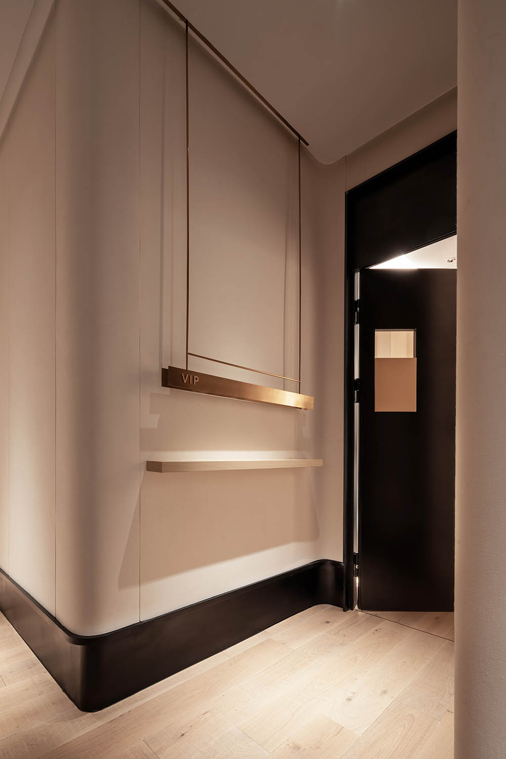
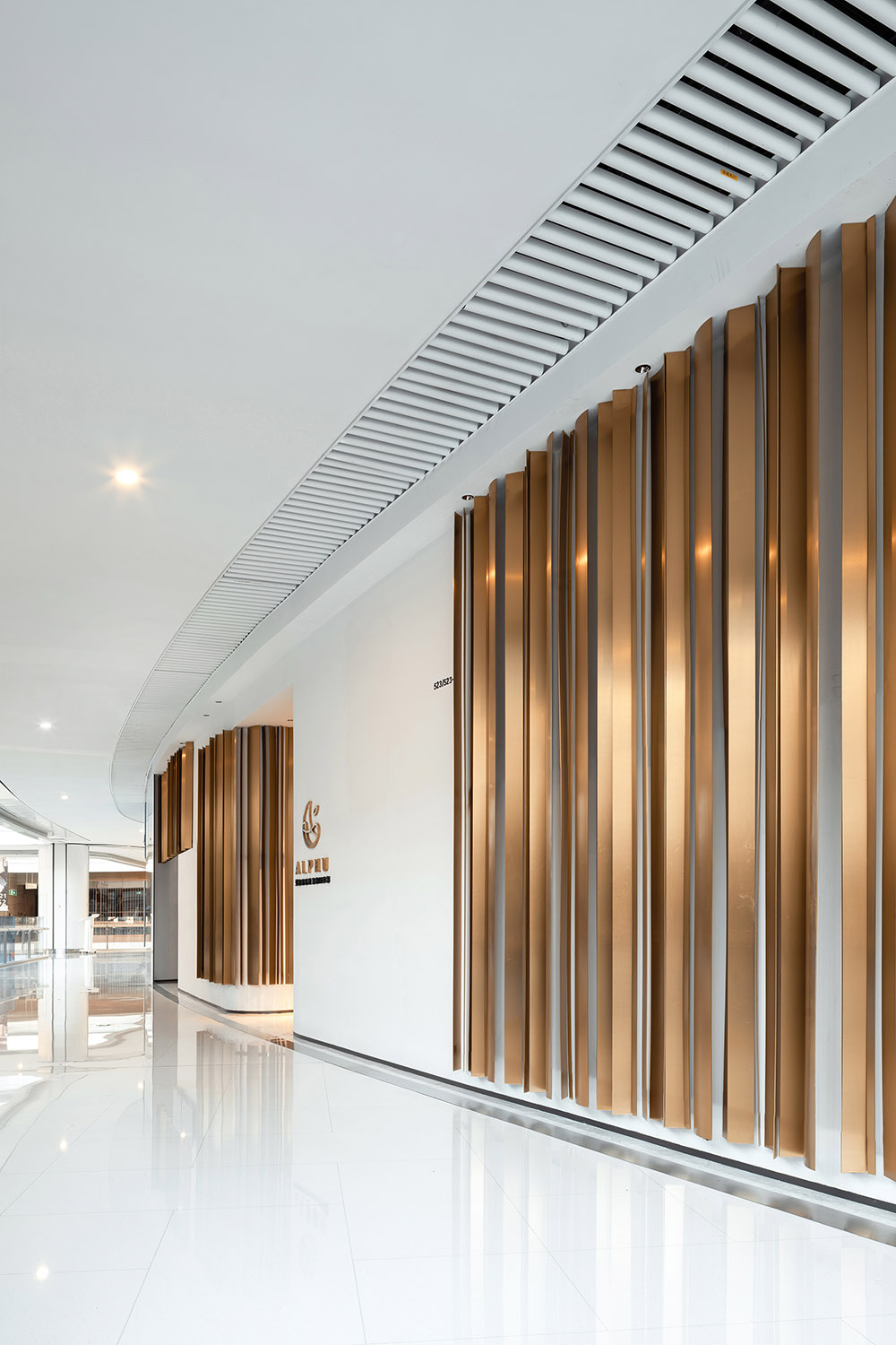
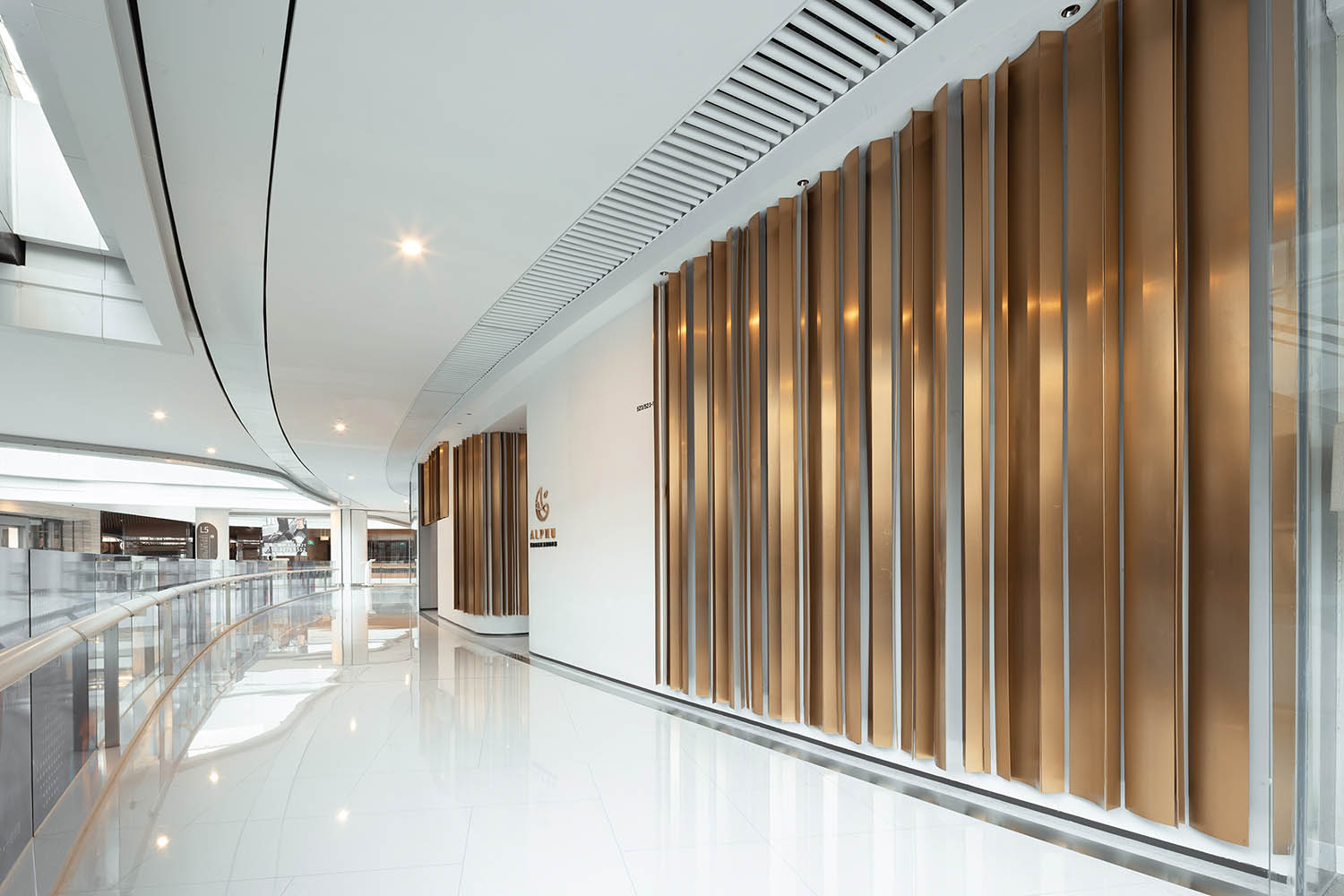
在最簡約的撞色上,金屬是增持,於設計動向的流動上,於觀感和體驗上,都是視能及,而意無窮的精致時尚氣場。
In the most simplified color contrast, the aim of metal is to enhance the design, and no matter from the flow of the design trend, or in terms of the perception and experience, it has a visible and infinitely meaningful, delicate and fashionable gorgeousness.
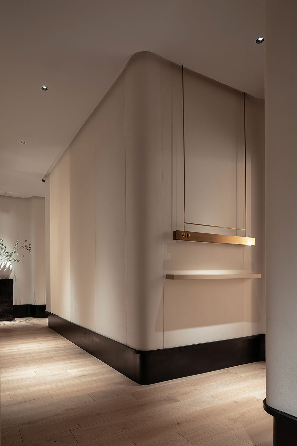
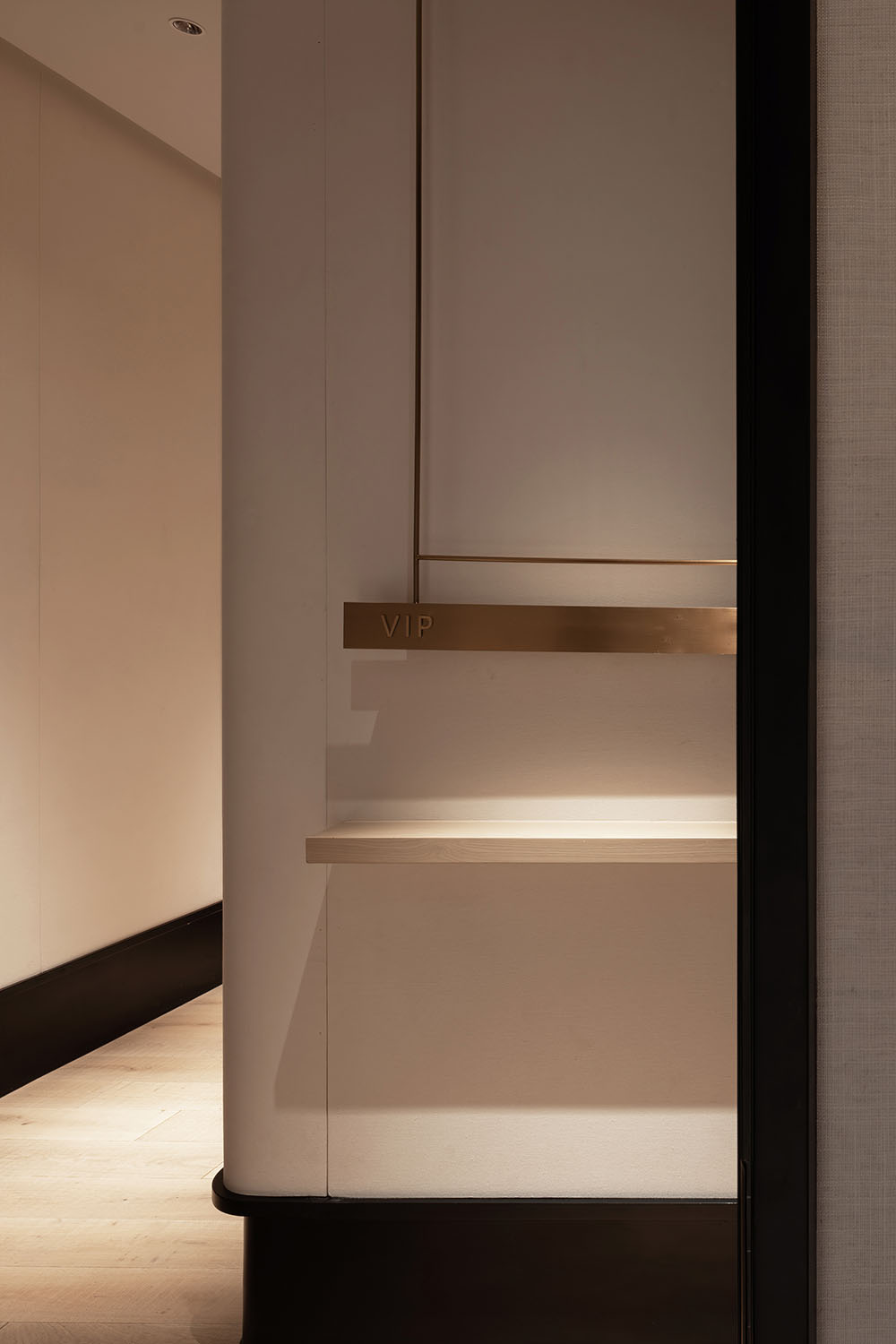
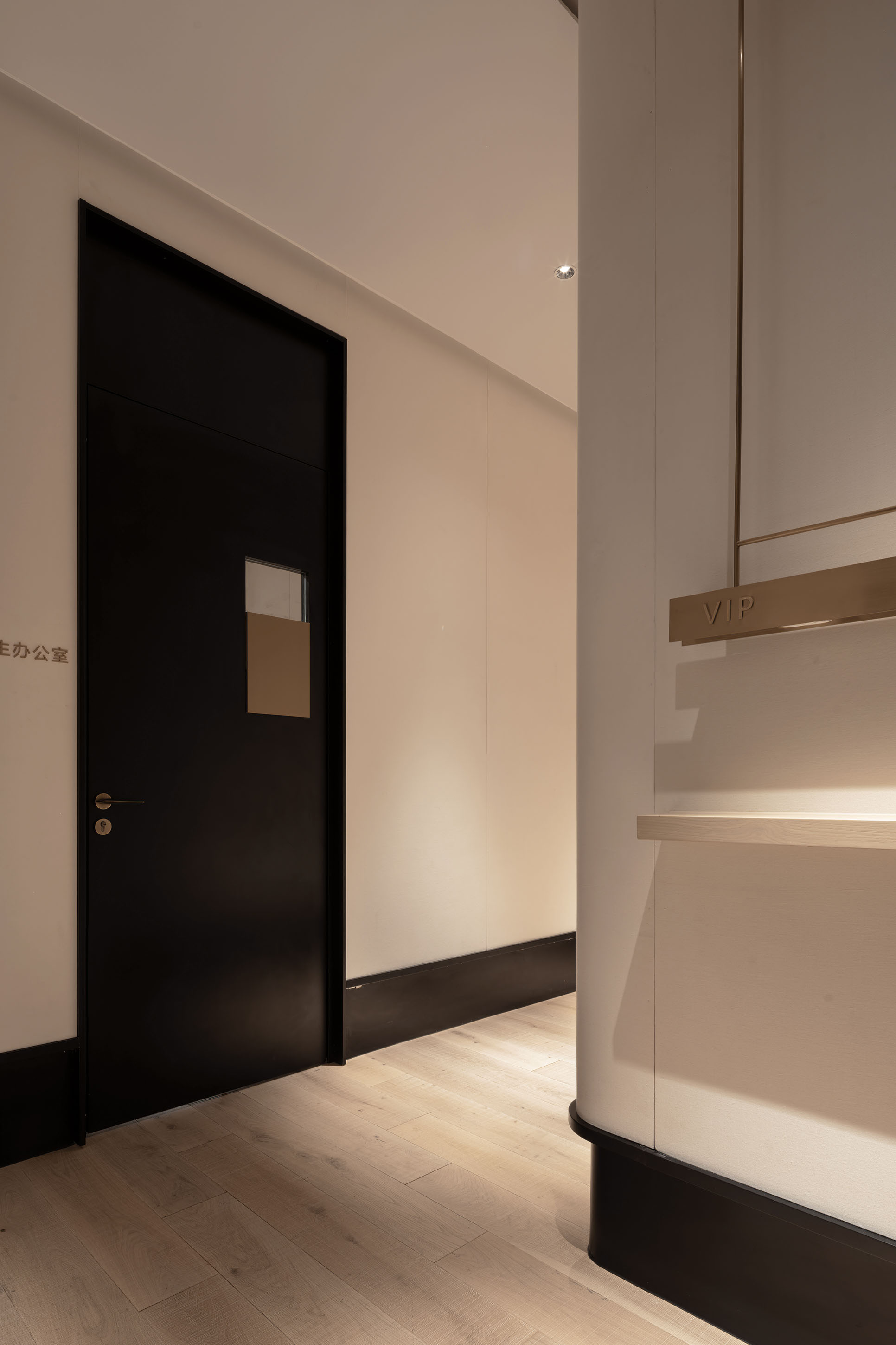
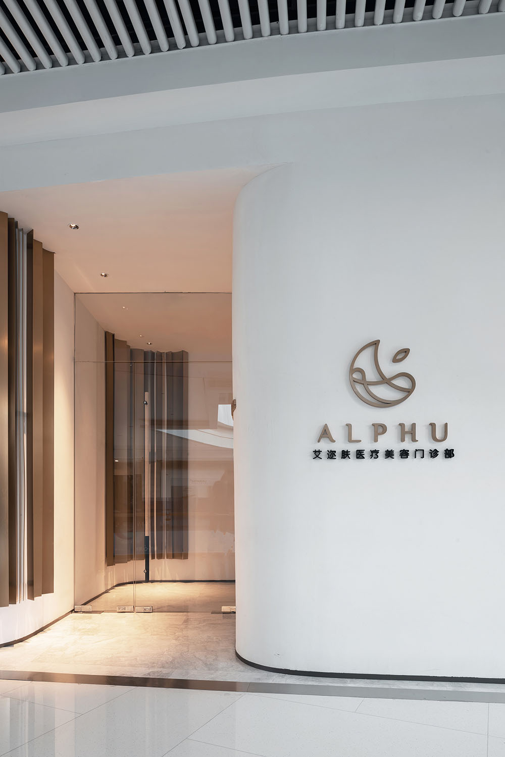
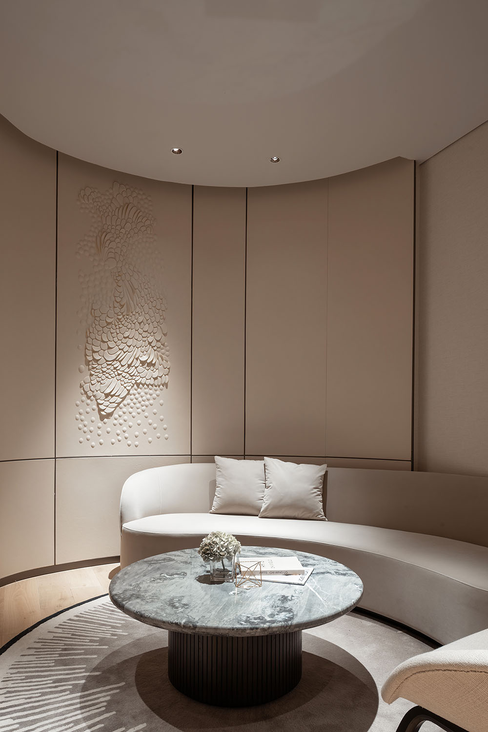
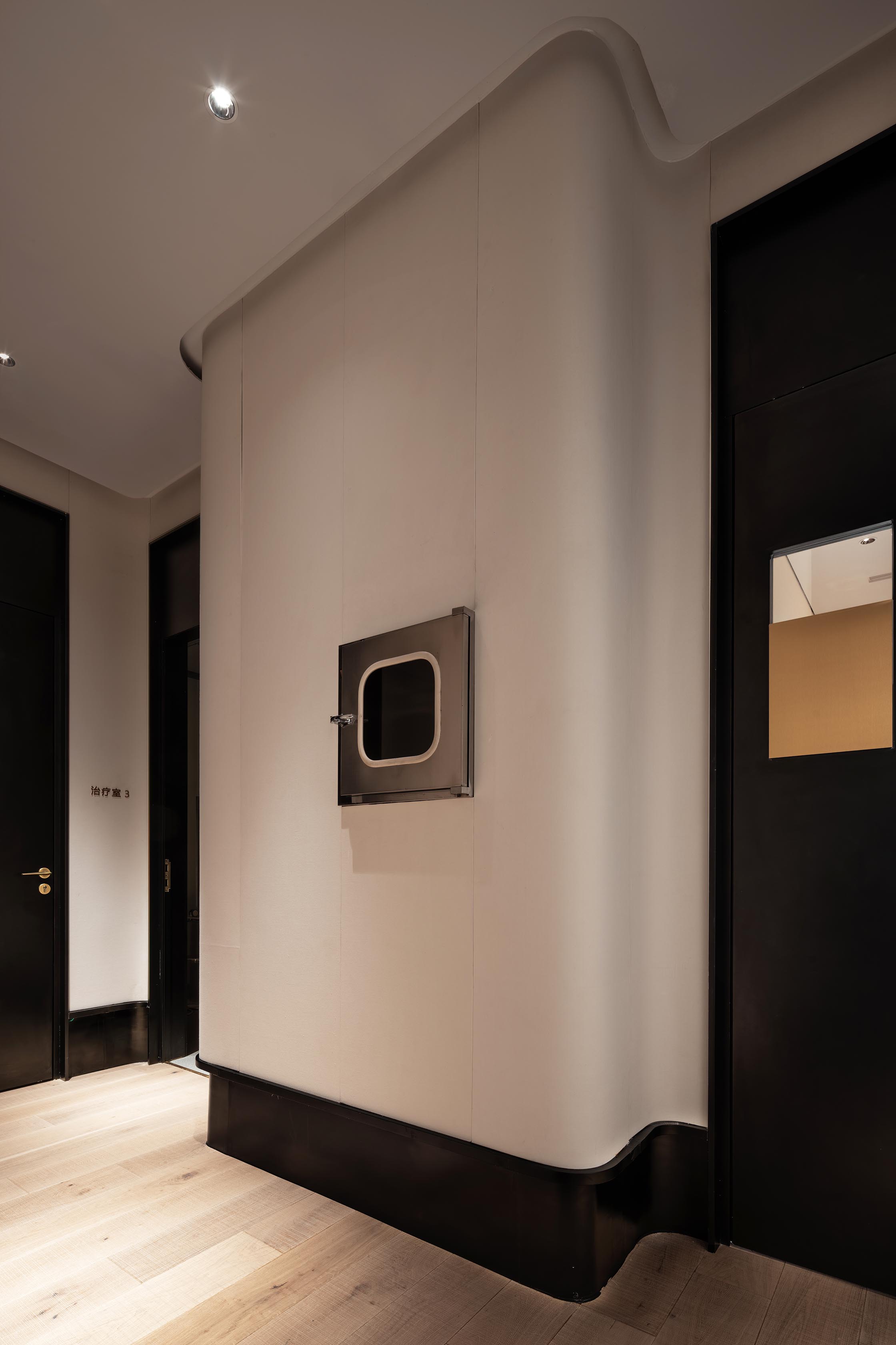
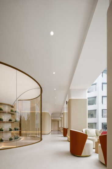
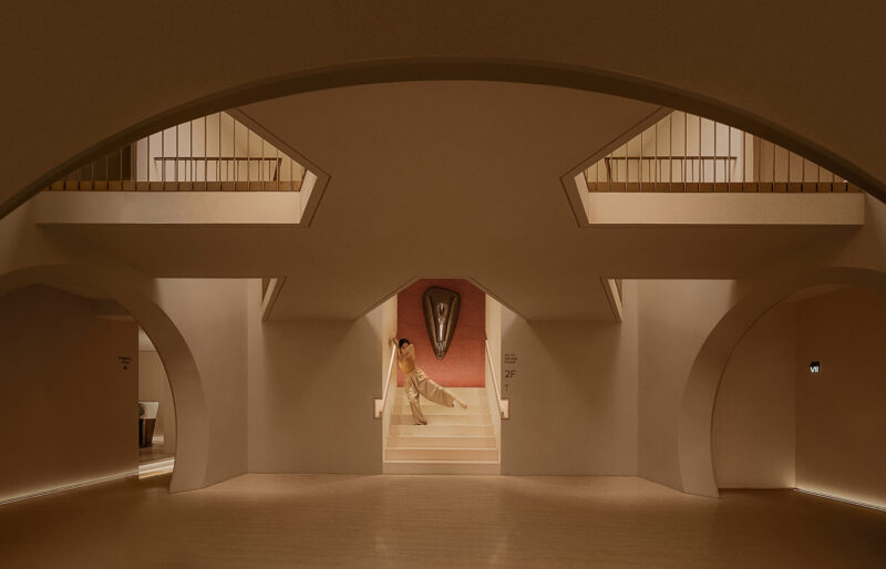
以空間的功用屬性為底層邏輯,以服務思維為設計思維,以人文情緒感悟情緒,便衍生出另一種指引與聚焦形式的表達,轉角的隱秘,及曲線的弧度,定性了第一眼的觀感。
With the functional property of space as the underlying logic, the service-oriented thinking as the design thinking, and the humanistic emotion to comprehend the mood, the design has evolved another expression of guidance and focused form. And the privacy of the corner and the radian of the curve qualitatively define the impression at first glance.
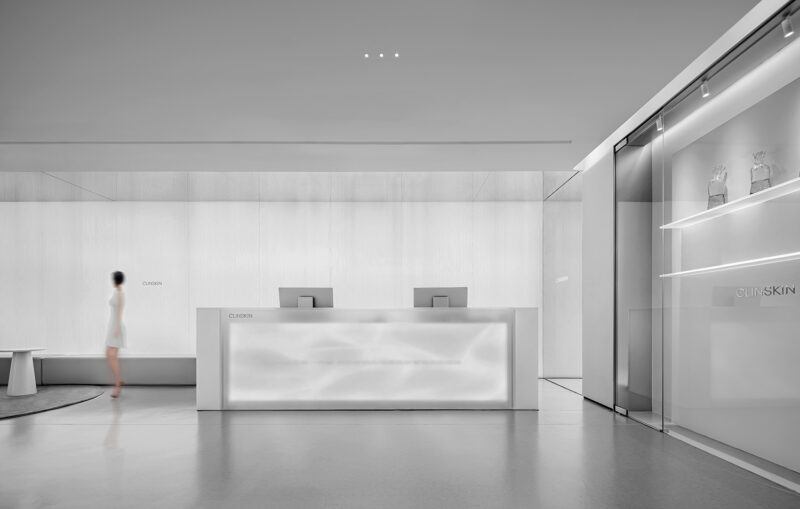
極其簡約的基調和色調一以貫之,營造出充滿張力的氣場。而更富個性的藝術品位,則而交由精致的細節來傳達。
The consistency of extremely simplified keynote and tone, creates a powerful atmosphere full of tension. And the delicate detail will convey the artistic taste with more unique characters.
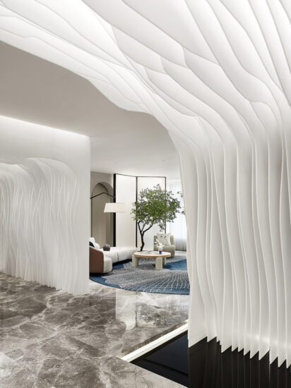
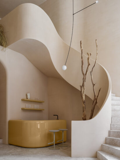
大麵積留白與弧度是柔雅的詠歎詞,與細節處的搭配疏密有致,共同組成了空間的審美和韻律,也賦予空間情緒滿分的張力。
Large area of leaving blank space and curves celebrate the softness and elegance of design, which properly complement the details, thus create the aesthetics and rhythm of the space together, and also ensure the spatial emotion with a maximized tension.
弧線表達以其靈動和富含變化的生命力,成為貫穿空間的流動之美,一切硬朗的材質,皆為其傾倒,高冷的時尚質感,重新被解構出輕鬆和愉悅的旖旎。
With its flexible and consistently changing vitality, the expression of curves becomes the beauty of flow that runs through the space, in which all rigid materials are captivated by the design, and the reserved fashionable quality is deconstructed again to give a relaxed and delighted grace.
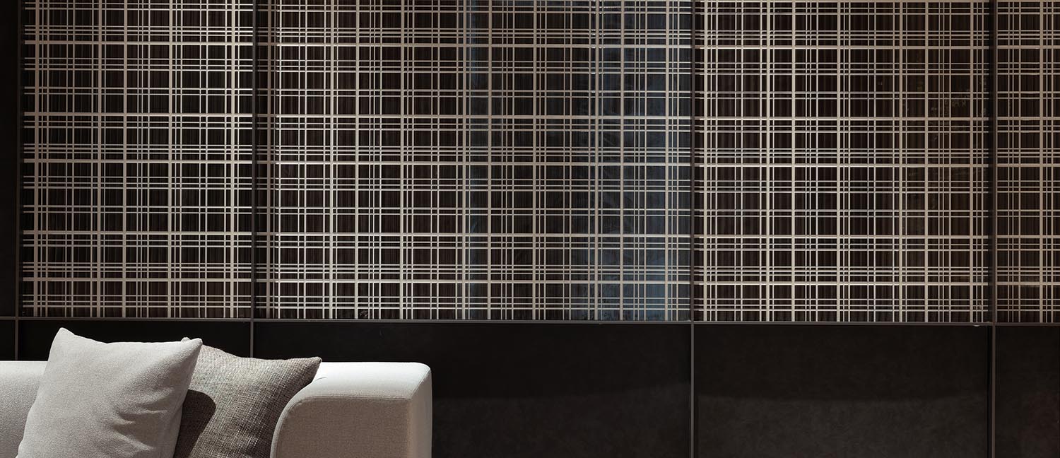
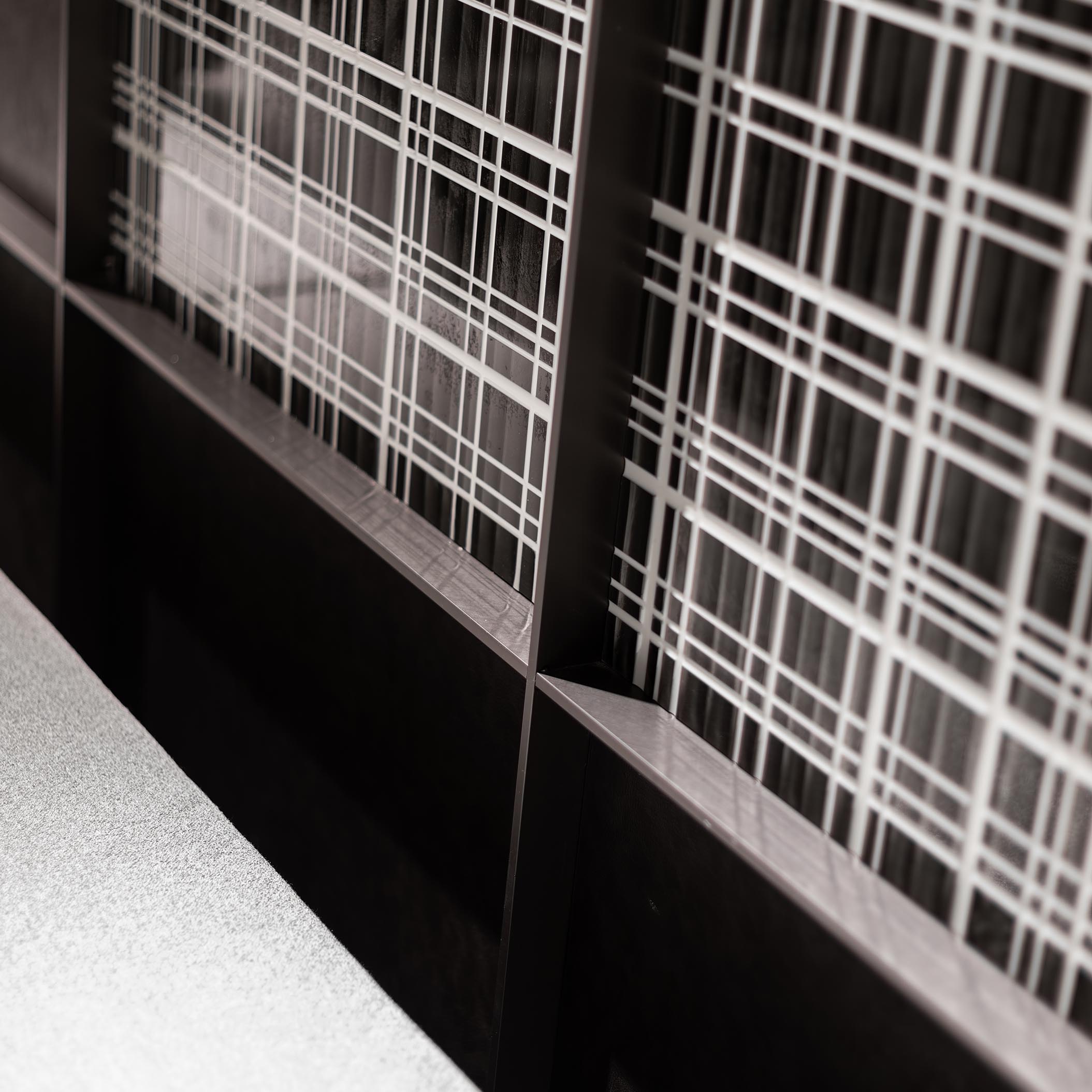
現代感十足的陣列,是時尚的手筆,跳脫出整體空間的秩序感,打破與相融並舉,讓空間更加靈動和富有節奏感。
The very modern arrangement is a kind of fashionable expression, which breaks away from the order sense of integral space, and the coexistence of break and integration enables the space to be more flexible and rhythmic.
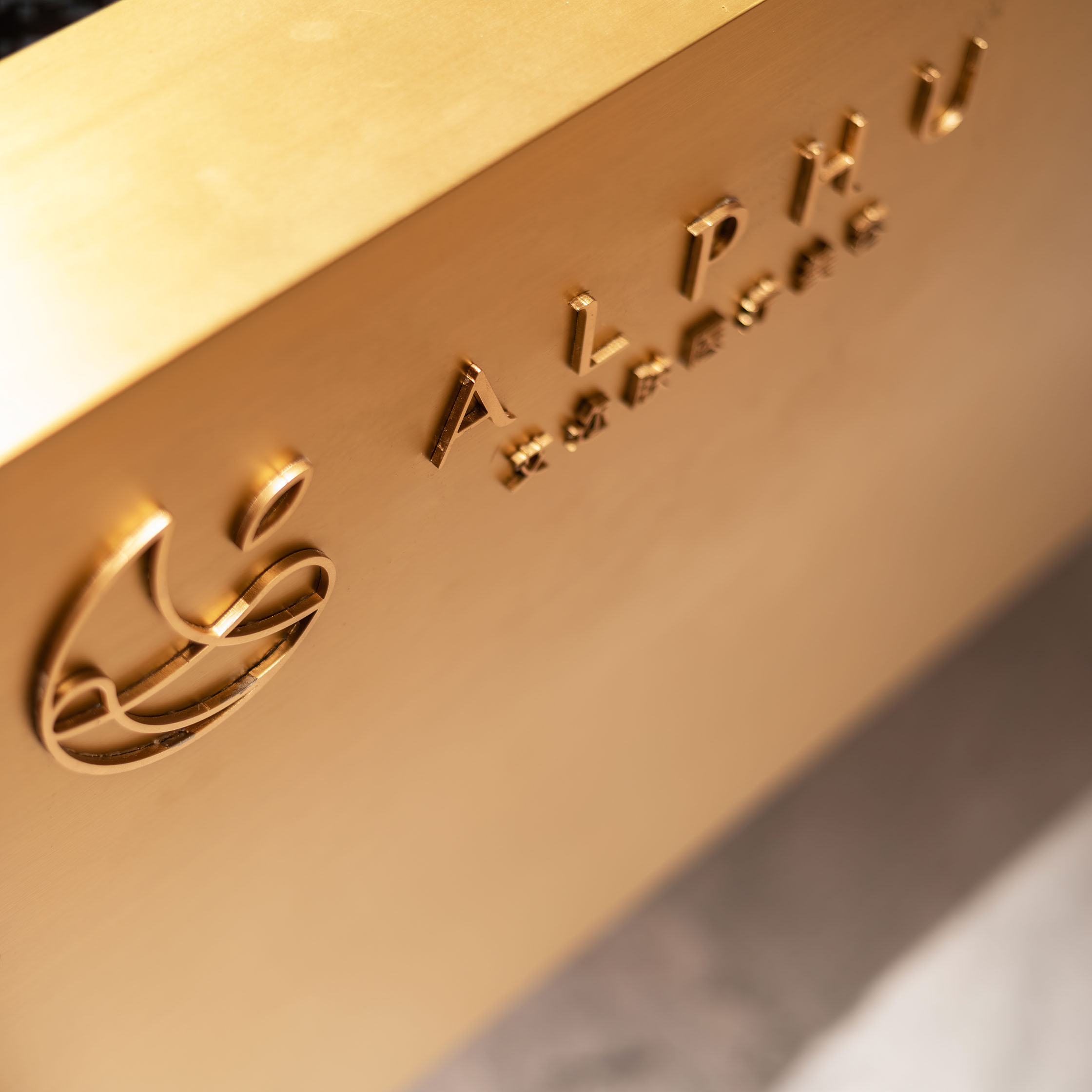
寥寥數筆,一望而知,盡現神韻。元素上的去繁就簡,是設計表達上的加分,正如空間所要傳遞的高端和藝術的核心調性,簡單而率性。
The very modern arrangement is a kind of fashionable expression, which breaks away from the order sense of integral space, and the coexistence of break and integration enables the space to be more flexible and rhythmic.
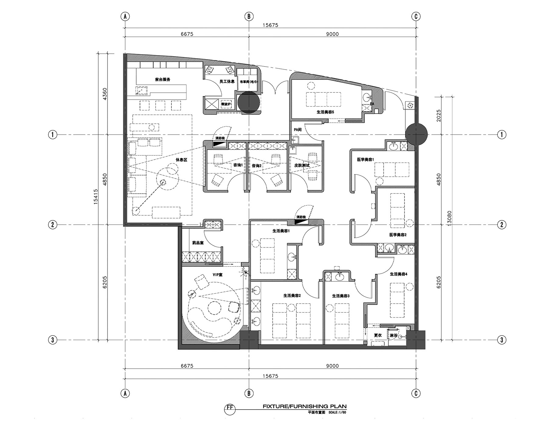
∇ 平麵布置圖
主要項目信息
項目名稱:艾邇膚醫療美容恒隆廣場店
項目地點:江蘇 無錫 恒隆廣場
設計公司:南築空間設計事務所
主創設計:蘇陽、王海
設計團隊:姚育銘 秦梓梁
麵積:220㎡
設計時間:2019.10
完工時間:2020.01
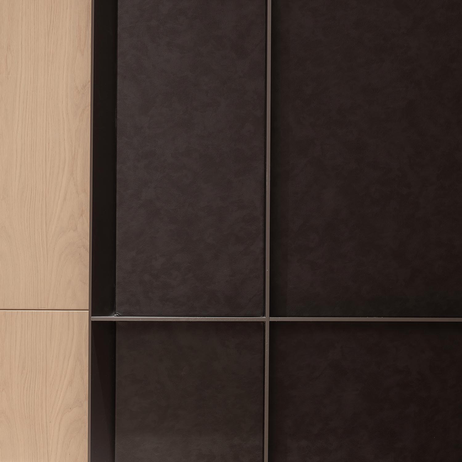
項目主材:雅柏白大理石、樹脂板、金屬定製、皮革軟包、木飾麵
攝影:徐義穩
聯係郵箱:nonezonedesign@163.com


