全球設計風向感謝來自 Sò Studio 的買手店項目案例分享:
CANAL ST.是由紐約downtown引入上海的時尚潮流買手店。我們希望能將紐約downtown的生活方式帶入中國,帶入上海,打造一個彙聚紐約與上海生活方式的潮流零售店麵,兼具本土文化與紐約downtown的氣質。上海與紐約都是包容性極強的超級國際化城市,是潮流文化藝術經濟的彙聚中心。你能在紐約見到百年前建成的基建設施,工業時代飛速發展留下的城市印記與當今最前沿的時尚藝術潮流文化共存,複古與時尚的兼收並取。Downtown的文化是包容多樣自由的,而上海同樣是近百年飛速崛起的超級國際化城市,與紐約一樣兼具包容性,多樣性,國際化,而不同的是上海的發展是建立於中國傳統文化與世界窗口的基礎上和近百年租界文化的融合,我們能在上海看到紐約的氣質,同時上海也具有獨有的氣質,細膩優雅又不失大氣。而作為城市,上海更加年輕,富有活力。我們希望它是有點叛逆的但又是細膩的。有粗糙的部分,但是是精致中的粗糙,是帶有衝突感和矛盾感的,是年輕的,站在潮流最前沿的同時擁有曆史和時間沉澱感的。我們希望顧客和進入店裏的人們能從我們的設計中感受到這些。
CANAL ST. is a select shop introduced from Downtown New York. We hope it will bring the Downtown lifestyle to Shanghai by creating a retail storefront that merged the lifestyle of two cities with both local and Downtown ethos. In New York, you see the coexistence of the mark made hundreds of years ago back to the industrial age with the cutting-edge art, fashion and pop culture in our era. Such kind of inclusion and diversity resonate Shanghai. Differently, Shanghai’s unique ethos is built upon in Chinese traditional culture as well as nearly a century’s concession experience. As a rising international city, Shanghai is younger and more energetic. We perceived Shanghai is a bit of rebel but in the meantime, exquisite. More interestingly, the vulgar part is wrapped in Shanghai’s exquisiteness. The constant tension let everything new here has also been polished and precipitated by time. We hope that people visiting the store can feel and experience it.
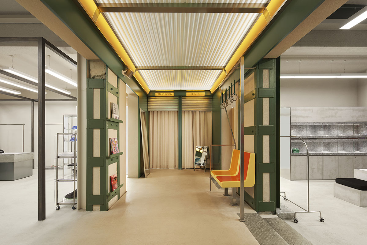
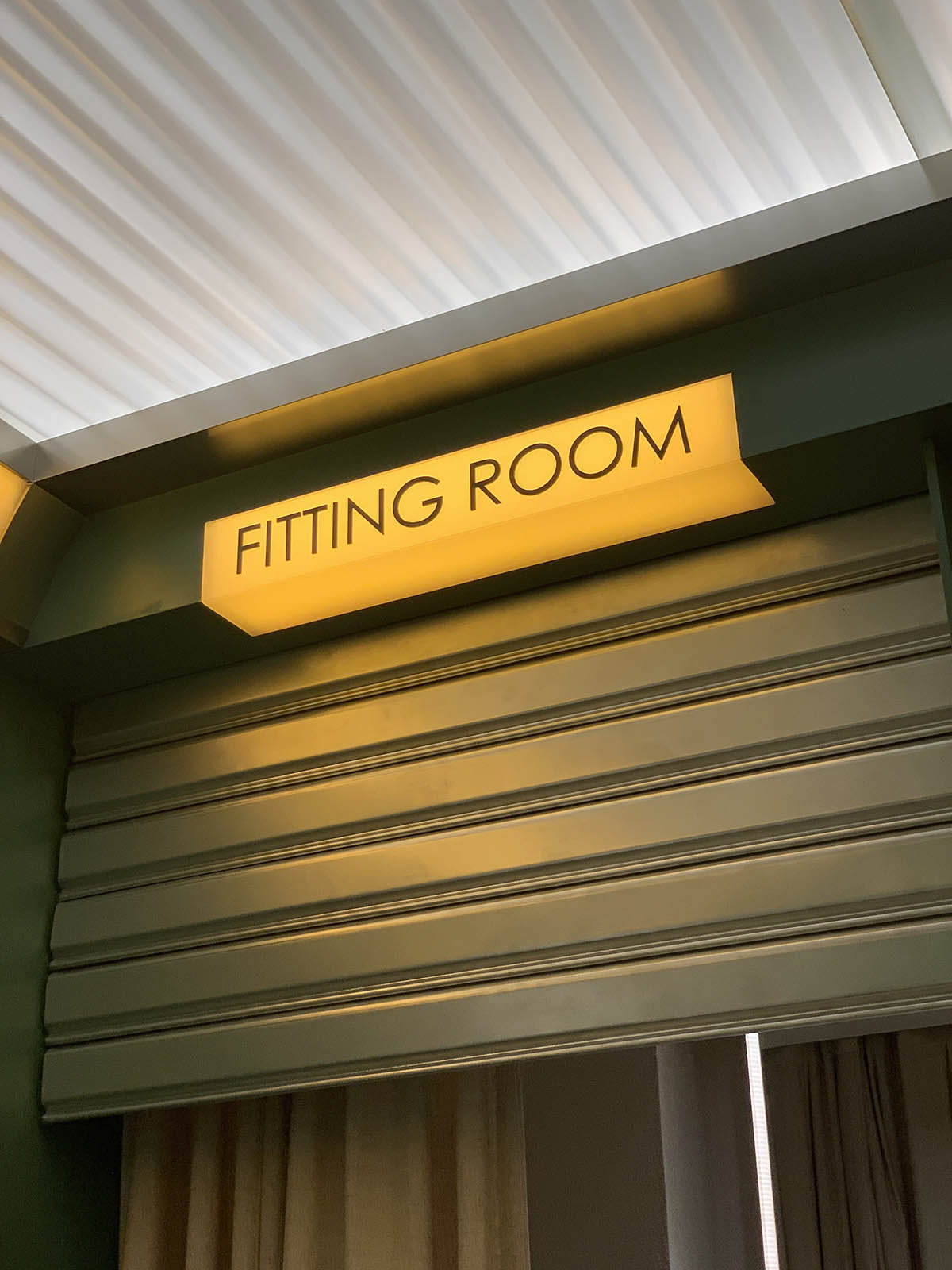
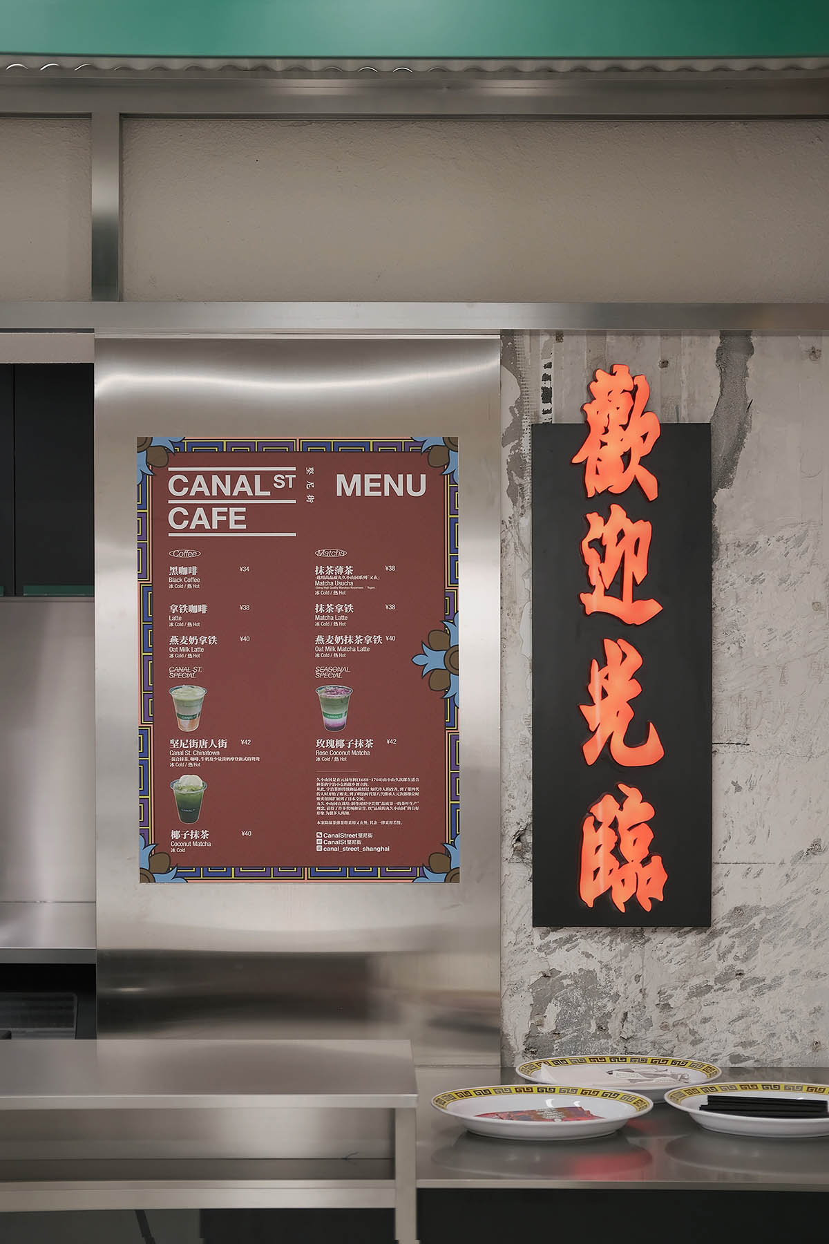
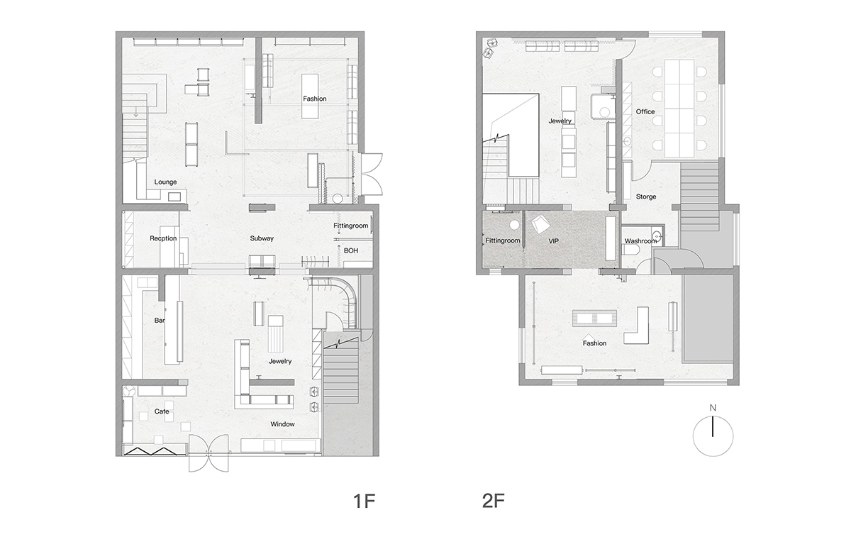
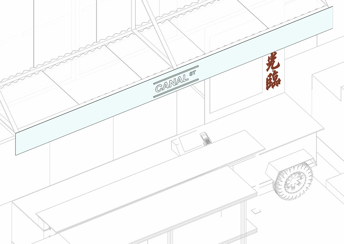
CANAL ST.一樓的地鐵空間,這個區域本來是建築原有樓梯的位置,狹長,又處於整個空間的中部。於是我們利用這個橫向的空間營造了一個紐約地鐵車廂氛圍的過度空間,將縱深過長的一層空間劃分為前後兩個部分,紐約街道上餐車縮影也成了我們café的基因。
The space of subway located on the first floor of CANAL ST. was originally the stairs of the building which was long and narrow, which lies in the middle of the whole space. So, we take advantage of this horizontal space to create a transition space with the atmosphere of New York City subway carriage. The long and deep space is divided into two parts and the miniature of the dining cars on the streets from New York City also becomes the gene of our café.
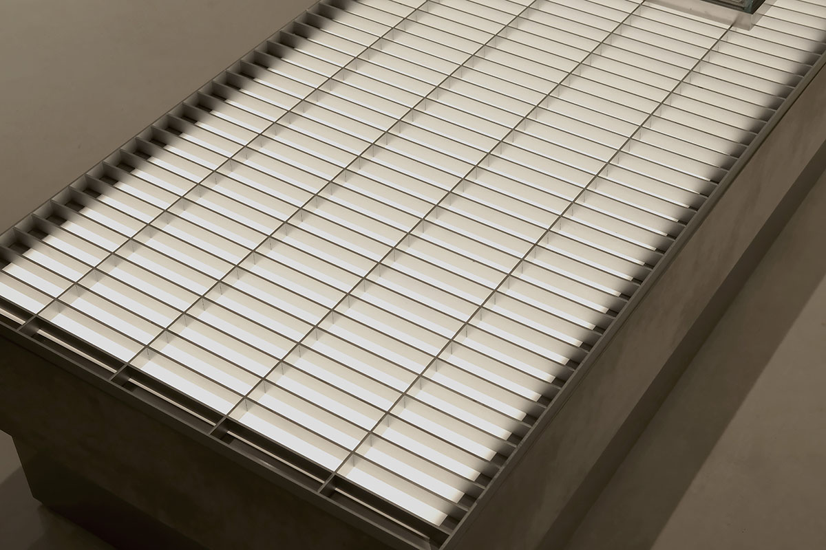
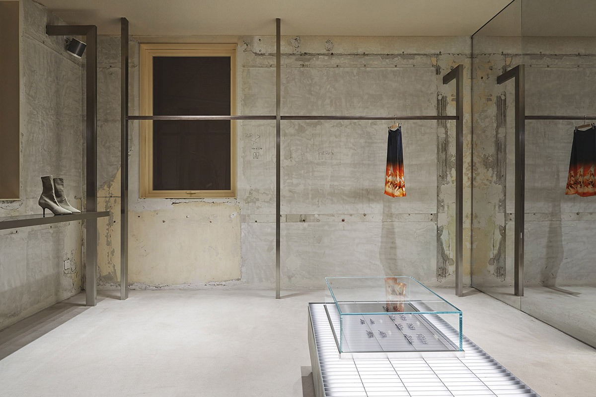
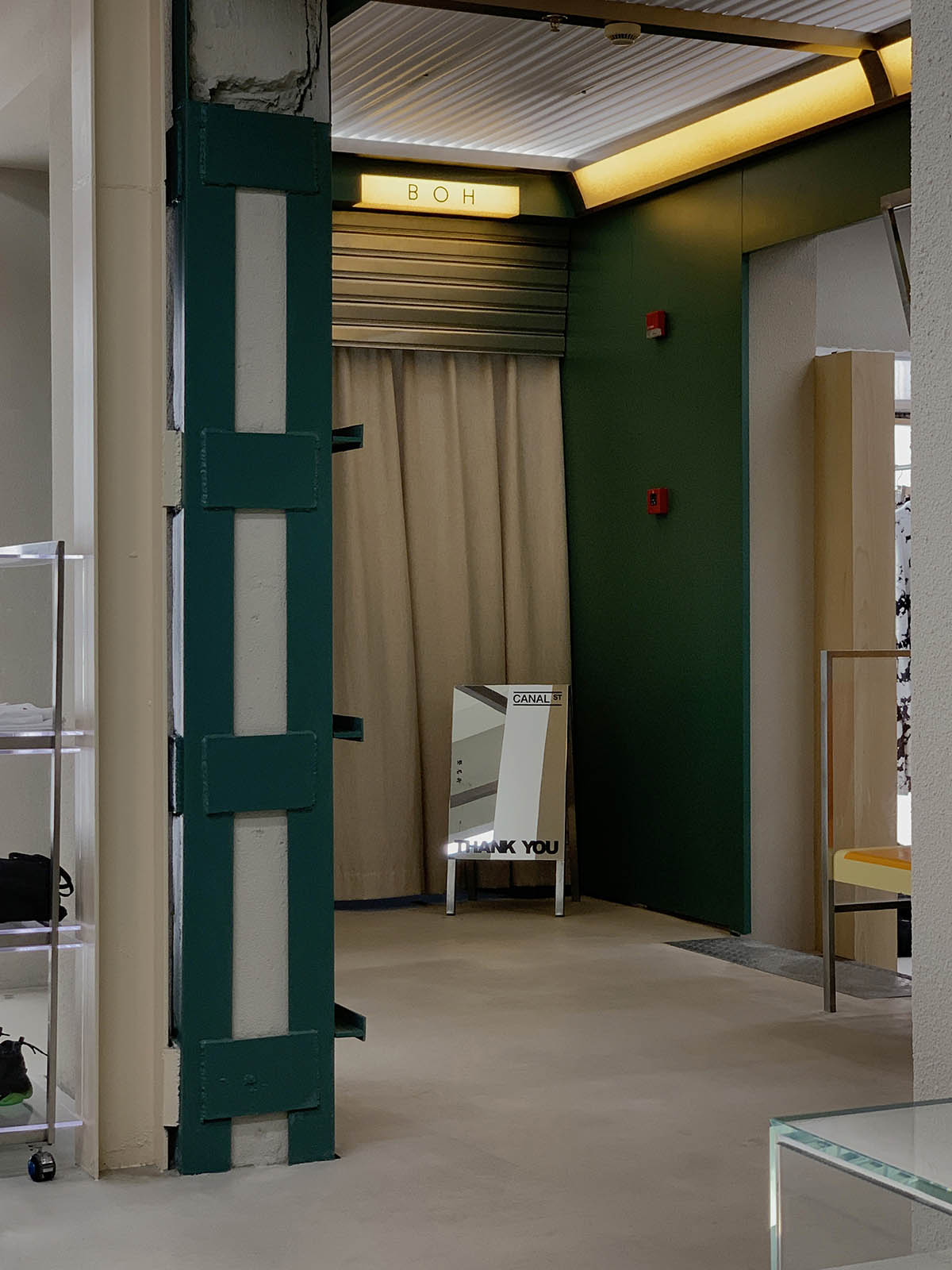
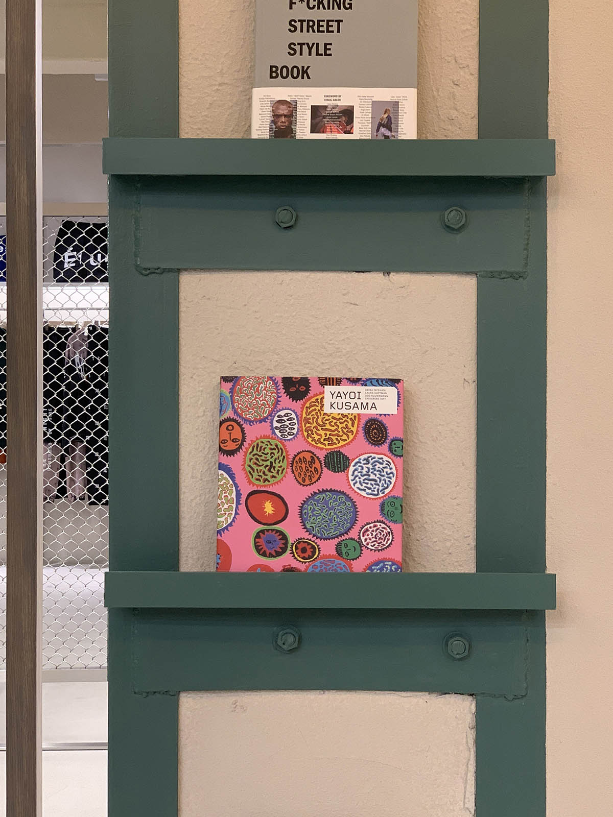
窨井蓋的格柵裝飾,霓虹燈,建築保留的鋼結構,裸露的磚牆等等,都是downtown的細節體現,它或許不同於紐約downtown,卻是傳達出相同的氣質。
The grille decoration of the manhole cover, neon lights, the reserved steel structure of the building, the exposed bricks and etc. all represent the details of downtown. It may be different from the downtown of New York City, but it conveys the same temperament.
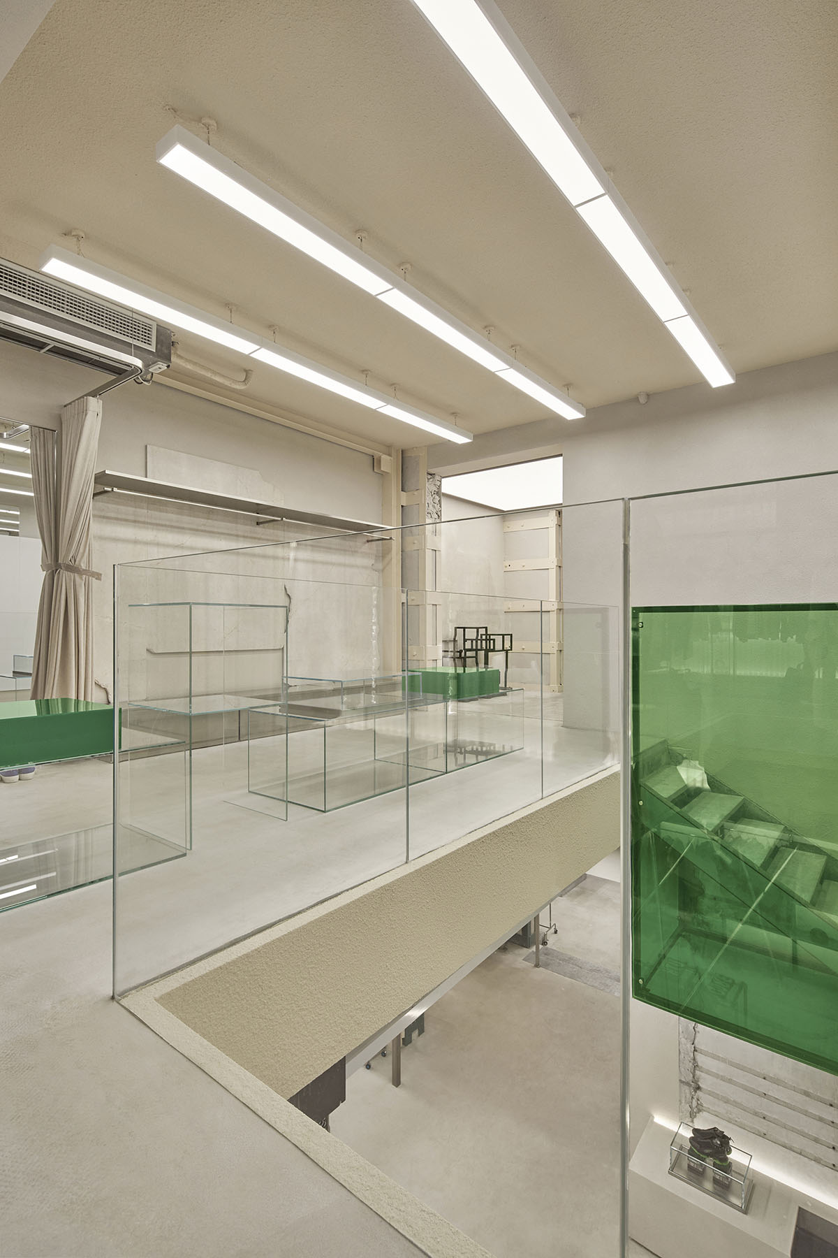
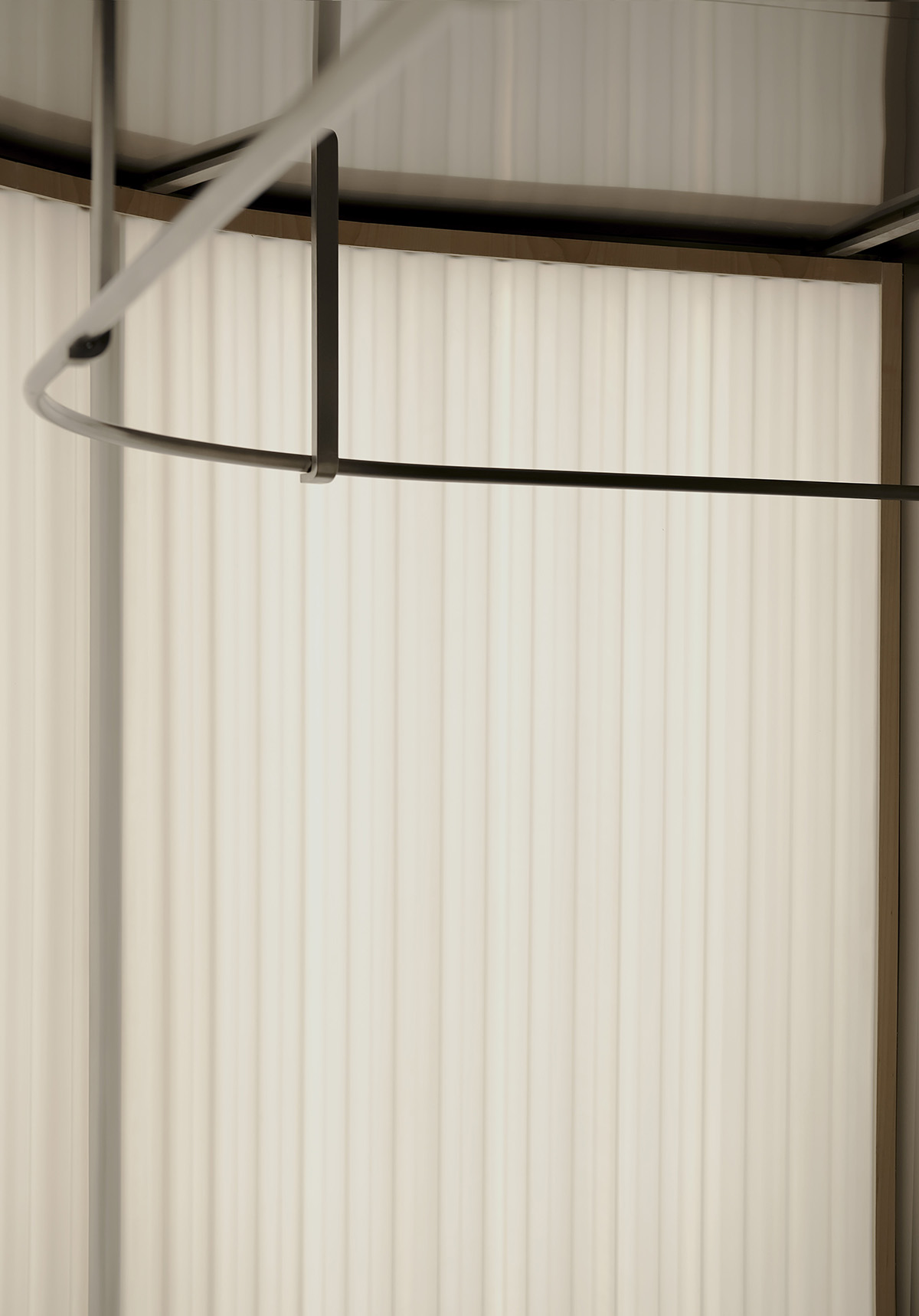
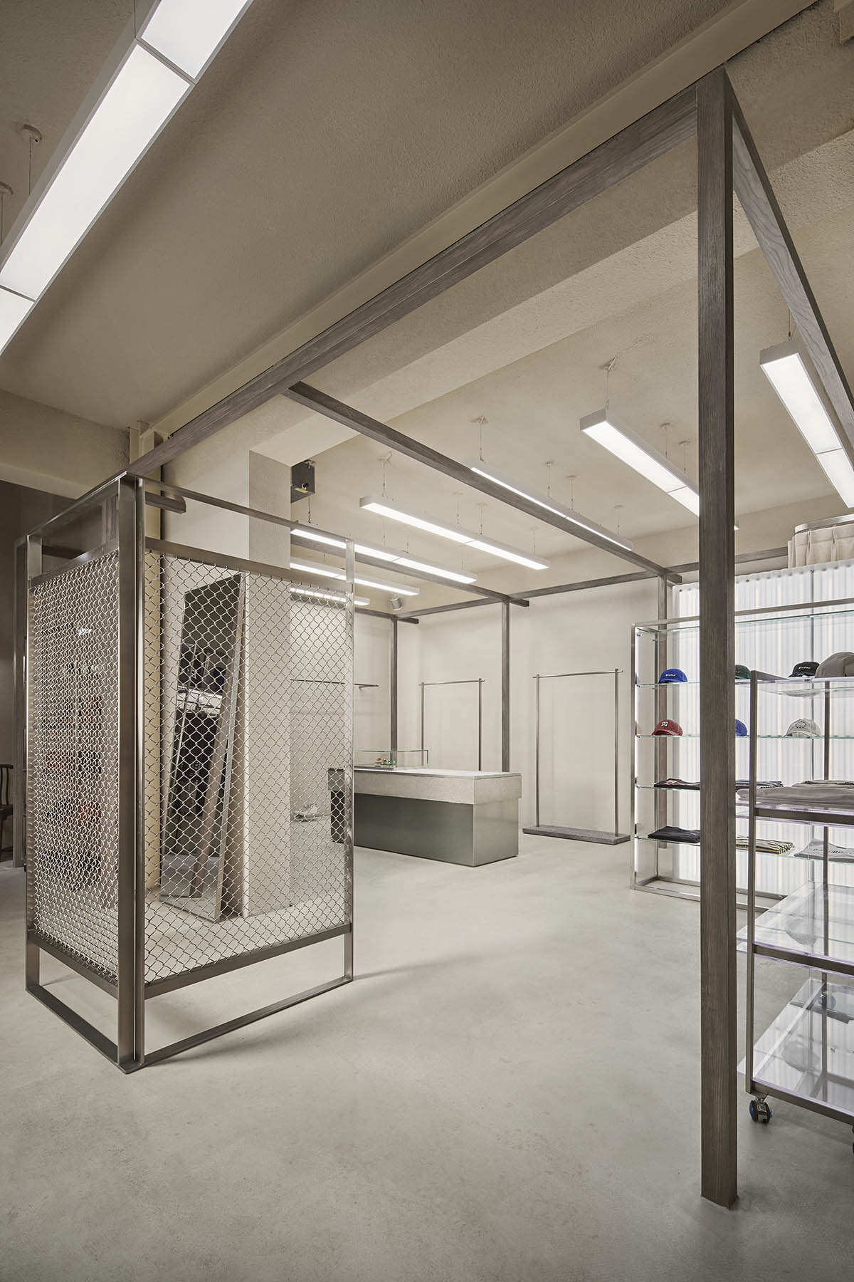
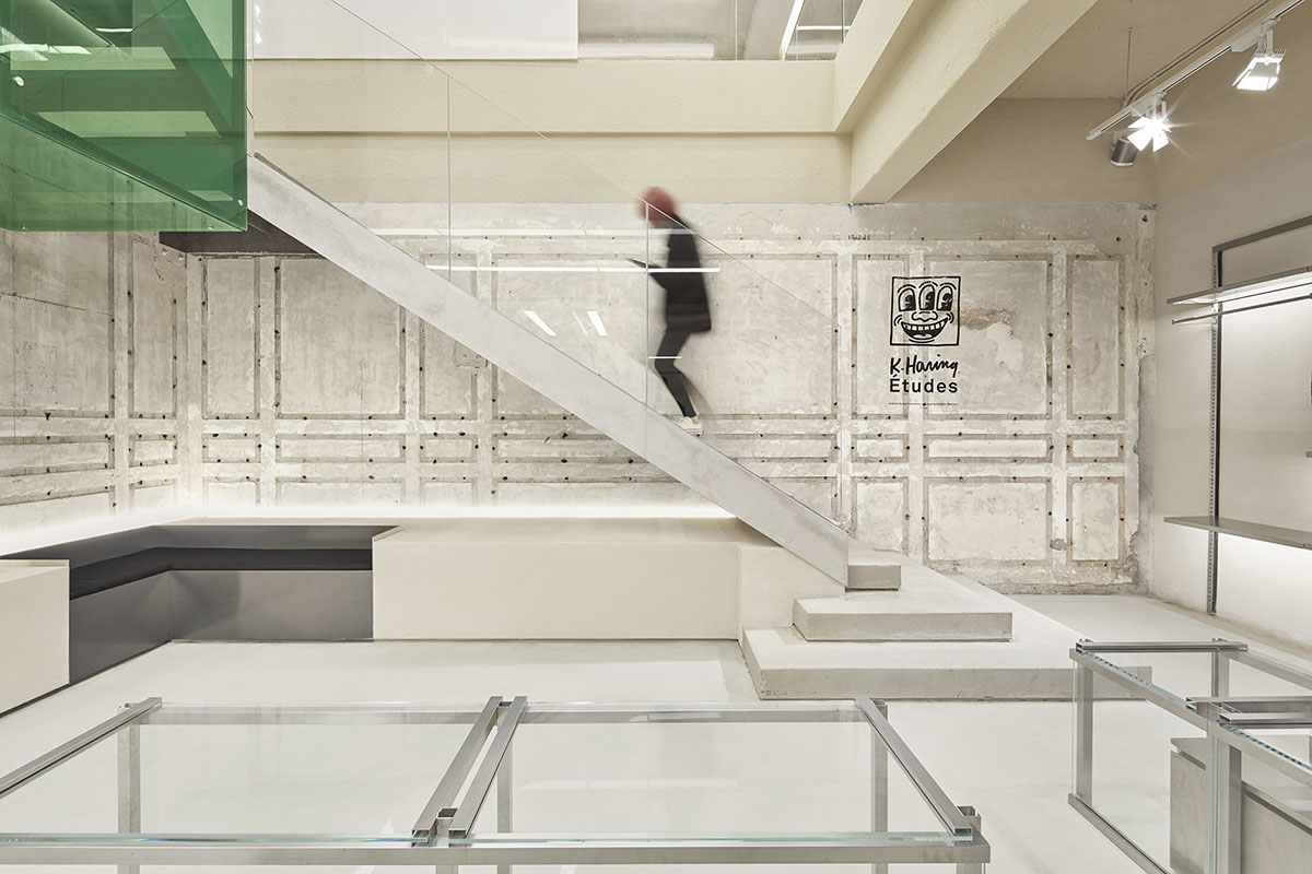
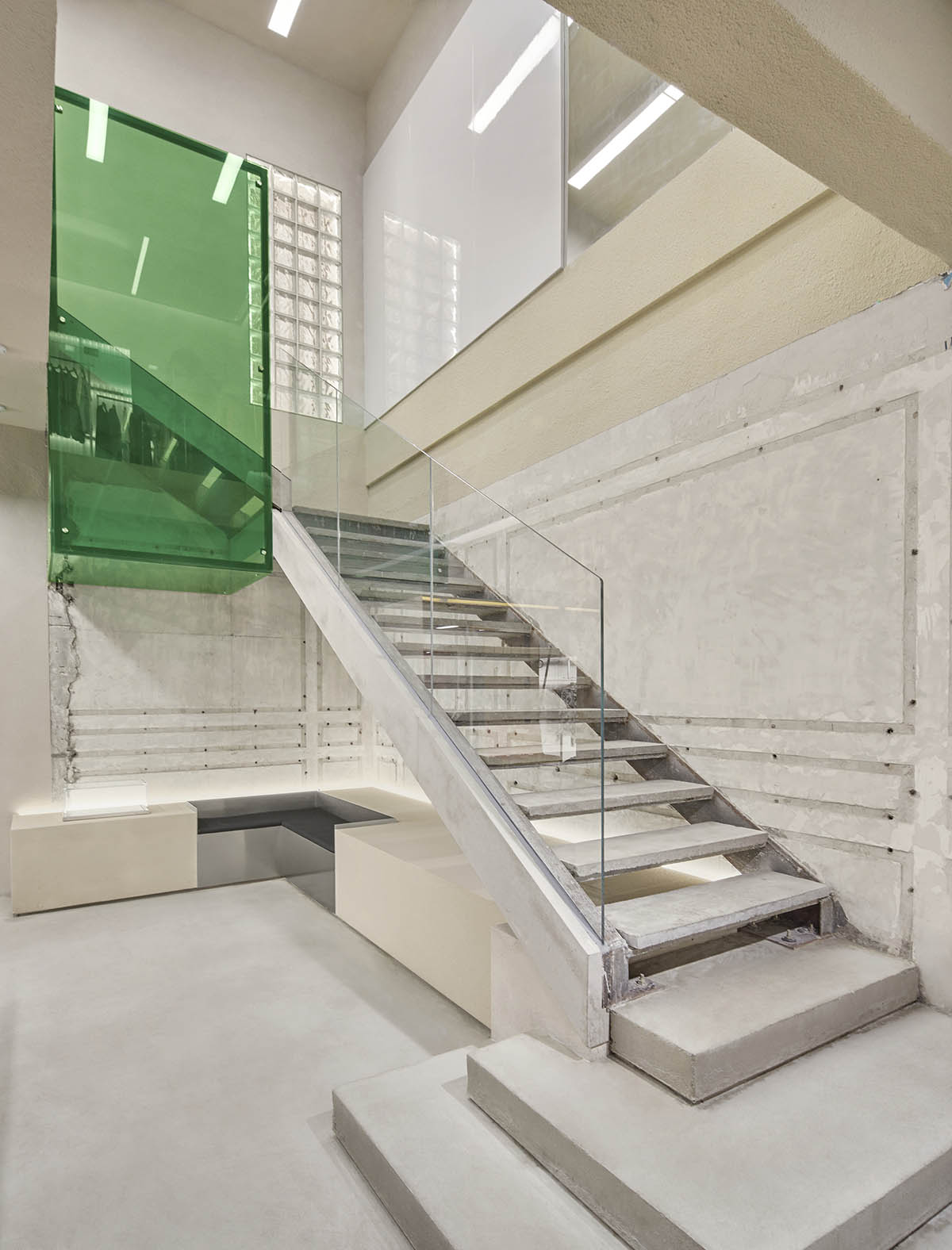
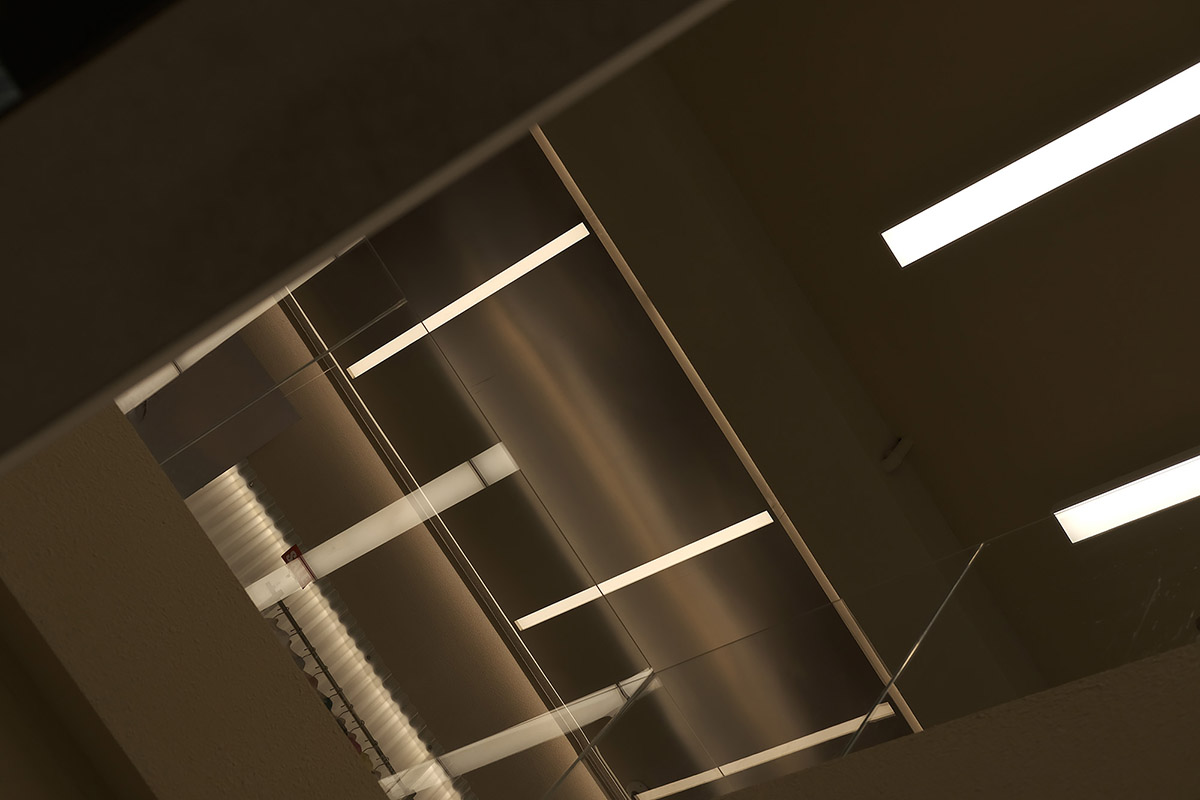
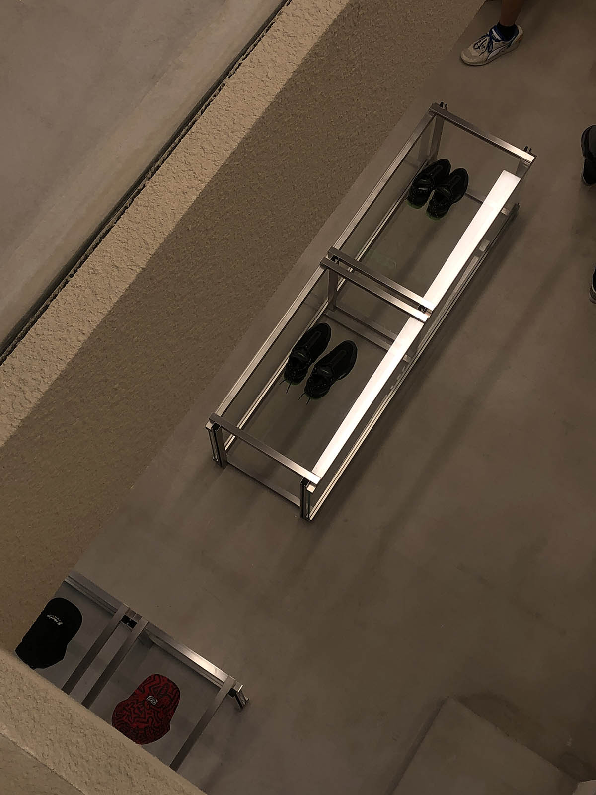
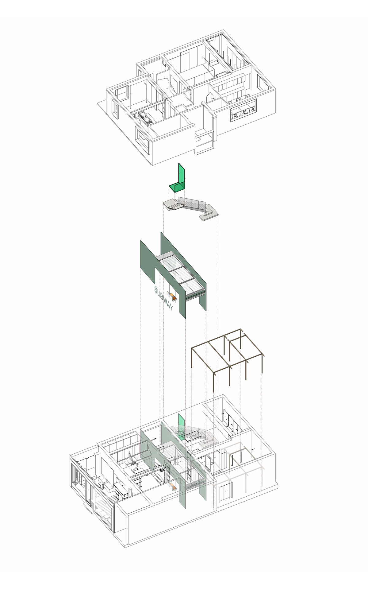
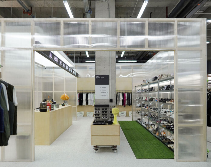
在空間中,我們置入了幾個不同規格的“box”,如懸浮在樓梯上的綠色玻璃box,打破原有空間界限的box木框結構,矩形綠色亞克力地台道具等。我們運用同一種元素但不同的設計手法貫穿整個空間使其連貫,統一。在燈光的選擇方麵,這次我們放棄了通常retail裏的大量筒射燈的點光源主要照明,采用了大麵積平板燈,燈膜,瓦楞板等麵光源照明,使室內光源統一均勻,更加溫柔。舒適的光源能大大增加人在空間中逗留的欲望,同樣選取材料的親和度同樣能使人在空間中感受到舒適。
In this space, we display several ‘box’ in different specifications, for example, the green glass box hung above the stairs, wood framed structure box which breaks the original space boundaries, rectangular green acrylic floor props, etc. We use the same elements but various in design techniques throughout the space to make it coherent and unified. In terms of lighting, instead of the point light source from a large number of tube lighting as the main lighting in the usual retail, we use a large-area of panel lights, light films, corrugated boards and other lights to make the indoor light source uniform and softer. The comfortable light source can significantly increase people’s desire to stay in. Besides, the affinity of the selected materials can also make people feel comfortable.
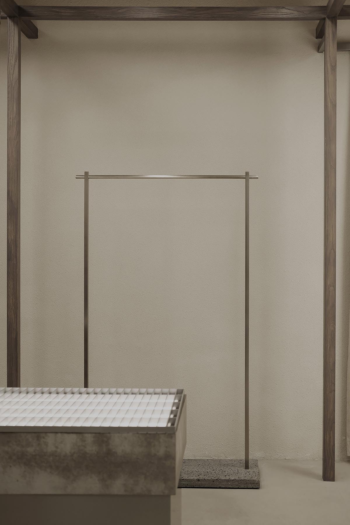
室內空間作為店內陳列的base,怎樣精彩生動而又不搶奪主體也是我們一直思考的,而材料是構成空間的基礎,空間也是材料的容器。於是我們將在城市中常見的材料換了一個容器承載,便有了不一樣的體驗感。CANAL ST.的品牌本身帶有一種street culture,街頭和城市是street culture的承載容器,現在我們希望通過我們的設計將這種文化呈現在我們的室內空間中。
Interior Design, as the basis of shop display, we continuously think about that how to express it extraordinarily and vividly but avoid distracting attentions from products. Moreover, material is the basic element over constructing space while space is the container which contains material.
Then, we changed another container for the regular material in the city to acquire a diverse experience. CANAL ST. itself, with kind of street culture that comes from street and culture. For now, we hope to display street culture in our interior space through our design.
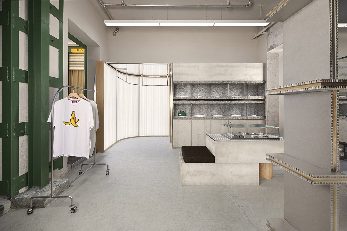
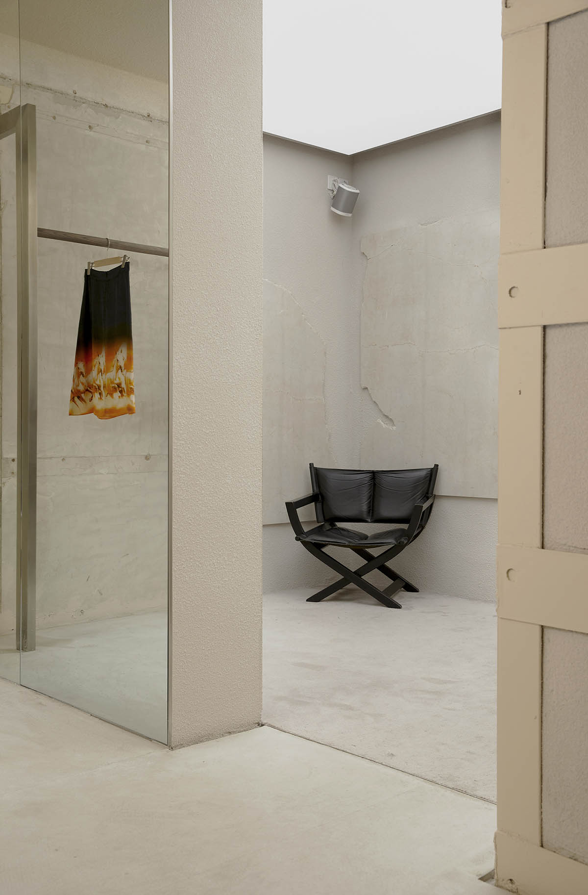
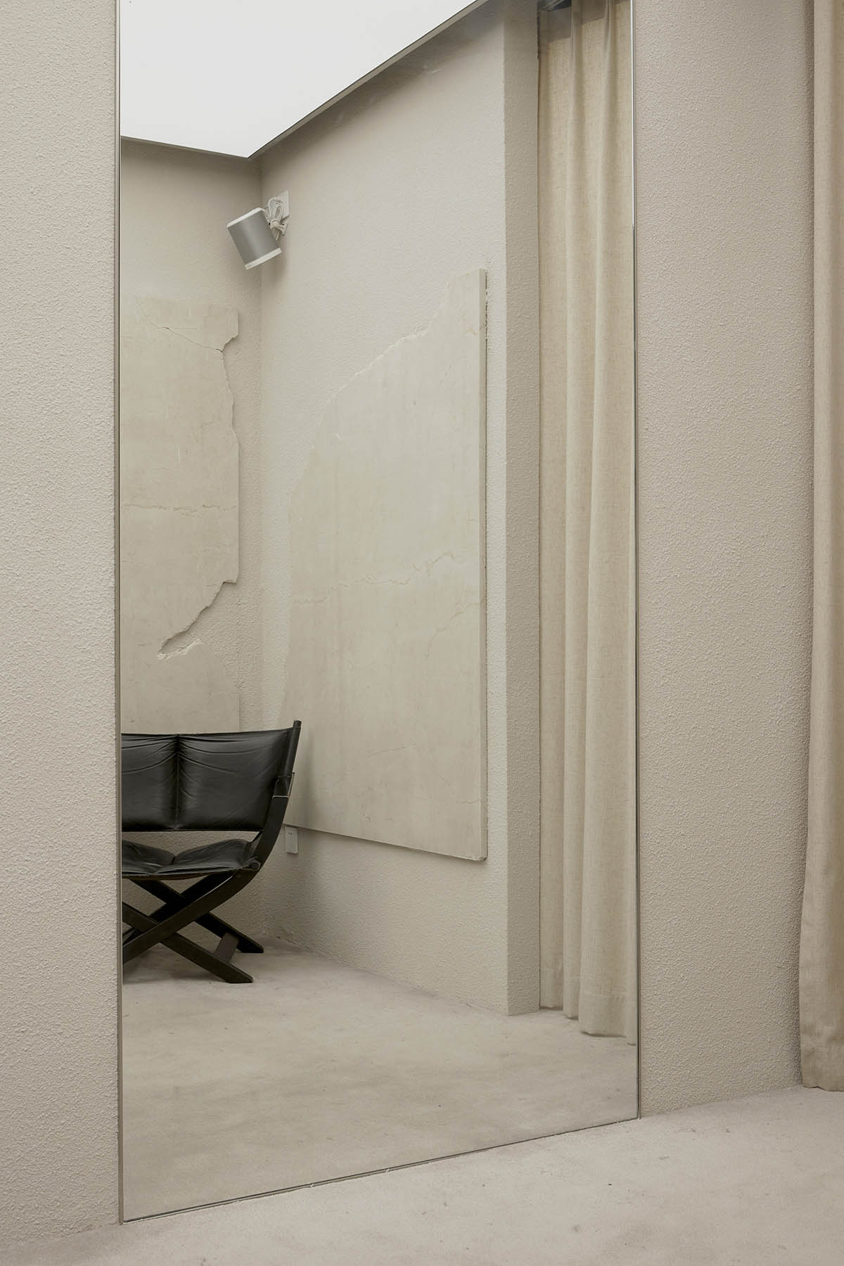
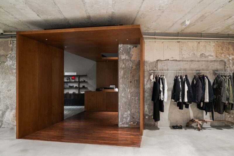
在空間中我們運用了多種材料,不同質感,拚接,重疊,碰撞,重組,但大部分材料的選取是基於空間的敘事性氛圍,也需要控製整體體驗感的節奏變化。這種變化會讓空間氛圍微妙具有細節,同時又不會搶奪主體的吸引程度。而在需要重點表達的空間區域,我們會運用到跳出整體感的材質,增強空間的衝突感層次感。
In the space, we utilized multiple materials with different textures by means of splicing, overlapping, bumping and recombining. Nonetheless, selection over most of the materials is based on the atmosphere that space will tell and also, we need to control rhythm of the overall experience.
And the experience above will promote space atmosphere subtly and carefully but avoid distracting attentions from products. When comes to the space area that need to be emphasized, we used materials that stand out of others to enhance the sense of conflict and hierarchy in the space.
生活在法租界的我們,對於曆史建築會興奮和迷戀,retouch最初時期我們會預設一些空間中的體量留給未知的可能性,想象它的美,然後開始邊清拆邊探索。當原有裝修拆除後我們發現這棟老房子的結構並非想象中簡單,拆除完的現場也極其混亂破敗。由於年歲的關係可以看到有多種不同結構混合存在,像木結構的樓板,紅磚牆和青磚牆,加固的鋼結構鋼梁鋼板,以及混凝土的結構,牆紙的印記層層疊疊,這些都是不同時期對建築休整加固的痕跡。
Living in the city’s former French Concession, it is hard not to feel excited and even obsessed with the historical buildings. During the early retouch period, we reserved some space for the possibility to the unknown to imagine its beauty, so we were exploring as we demolished it. After the removal of all the decorating, the site was entirely dilapidated, and we realized that the structure of this building is not as simple as we thought. Because of its old age, we saw the mixed type of structures, like wooden floors, red and grey brick walls, strengthening steel beam and plate, and concrete structure. The wallpapers, layer upon layer, showed the traces of different period’s reparation and reinforcement.
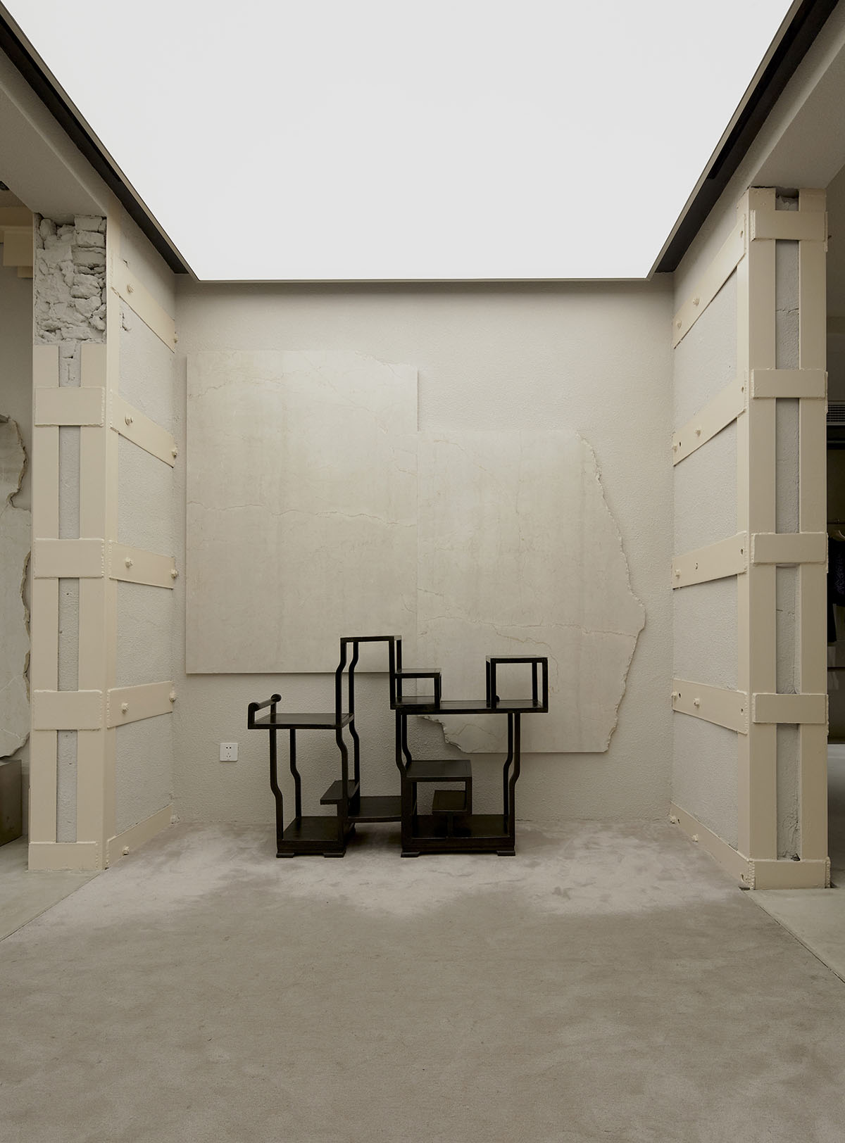
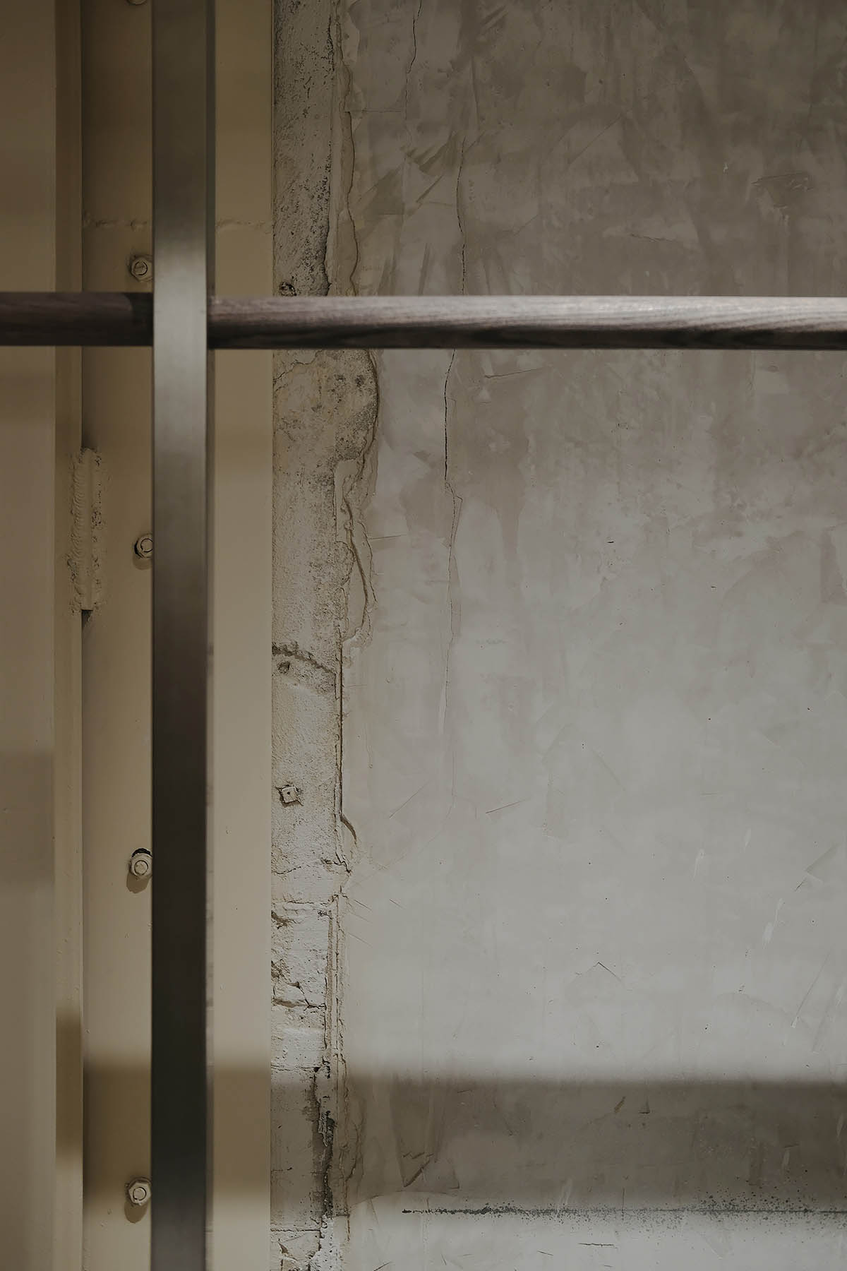
但在這破敗中我們驚喜的發現其本身的舊結構與印記卻是很好的空間敘述者,好像沉默的講述著發生在這個空間中的故事。這份驚喜把我們認知深處的“palimpsest”情結挖掘了出來;palimpsest可以直接解釋為“rewrite”重寫;通過遺留的或者過去痕跡的trace來表達作品。所以我們決定保留部分它原有的結構,牆麵,我們相信這些舊的結構痕跡與新設計的碰撞融合將會呈現給我們完全不一樣的體驗感,以此來製造空間的衝突感與戲劇性。通常我們總是希望創造空間的敘事性,而這個空間本身就可以帶給我們敘事感。
Whereas, we surprisingly figured that such hybrid structure with the mark of time turned out to be a good narrator who attempted to tell us stories in its own way. It reminded us the complex of “palimpsest” – to rewrite, to create through traces of the past. We thus decided to reserve its original structure and walls as we believed that when these old marks met with fresh design, it would produce a stipulating spatial experience to excite people’s conflicting senses. The typical practice is we try hard to create the narrativity of the space, this building can tell itself instead.
在空間結構的處理上我們首先進行了全麵的建築加固,然後拆除了一些原有的牆體,使其變得更加通透有利於retail。重新規劃了樓梯的位置,保證流線的通暢。
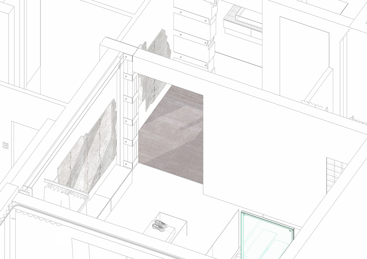
而對於舊牆的保留設計則是與施工同步進行的。有一個空間的牆體按我們原來的設計規劃是準備做塗料的,在施工準備過程中鏟除了原有基層時我們發現,鏟子留下的痕跡與原始牆麵的顏色竟與空間非常和諧又富有美感,當即現場決定不做塗料,保持原始牆麵的狀態。
In the treatment of the space structure, we firstly carried out comprehensive building reinforcement, and then removed some of the original walls to make them more transparent and beneficial to retail. In addition, we reestablish the position of the stairs in order to ensure a smooth streamline.
The preservation design of the old wall synchronizes with construction. For the wall from one space planned to be painted in accordance with our original design. However, after the original grassroots layer was removed during the preparation of construction, we found that the traces left by the shovel and the color on the original wall matching with the space harmoniously and aesthetically pleasing. As a result, we decided to remain the original wall’s condition instead of doing the painting works on the spot.
諸如此類的“by accident process”還有很多,這是舊建築改造難以控製的眾多不確定因素之一。作為設計師在解決這些不確定因素的同時,我們更享受這種設計過程中的“accident”帶給我們的意外與驚喜,這種不確定性也是設計過程中迷人的一部分。
Things like this are too numerous to mention, which is one of many uncertainties that cannot control in reconstruction of old buildings. When dealing with these uncertainties, an interior designer enjoys the surprises brought by the “accident” during the design procedure, which is also a fascinating part of the design procedure.
我們在設計的過程中長期麵對未知,嚐試不同的敘事方式,不穩定的材料,結構的可能性。我們喜歡這些不熟悉的一切,所以我們一直說 there is no plan & beauty by the accidents。
During the design procedure, we will face the unknown over a long period of time, by experiencing different narrative methods, unstable materials, and potential structures. We are obsessed with everything what we are unfamiliar with, so we keep saying there is no plan & beauty by the accidents.
∇ 平麵圖
∇ 分析圖
∇ 空間結構圖
∇ 空間結構圖
主要項目信息
項目名稱:CANAL ST. 堅尼街買手店(新樂路上海旗艦店)
概念:downtown NYC
麵積:300 m2
地址:上海徐彙區新樂路163號
客戶:CANAL ST. 堅尼街
完成年份:2019年11月
設計團隊:Sò Studio(http://sooostudio.com/)
設計總監:吳軼凡、劉夢婕
空間設計:李宇飛、王菲
影像製作承製公司:牧一製作
攝影師:丁宇豪、Elbe、李宇飛、劉夢婕
Project information
Name: CANAL ST. Selected Store
Concept: downtown NYC
Gross Built Area: 300 m2
Address: No. 163, Xinle Road, Shanghai
Client: CANAL ST.
Completion Year: 2019.11
Design team: Sò Studio (http://sooostudio.com/)
Design director: Yifan Wu, Mengjie Liu
Space design: Yufei Li, Fei Wang
Image Production: MUYI Concept + Production
Photographer: Yuhao Ding, Elbe, Yufei Li, Mengjie Liu


