全球設計風向感謝來自 一乘建築 的茶飲店項目案例分享:
機遇與想象
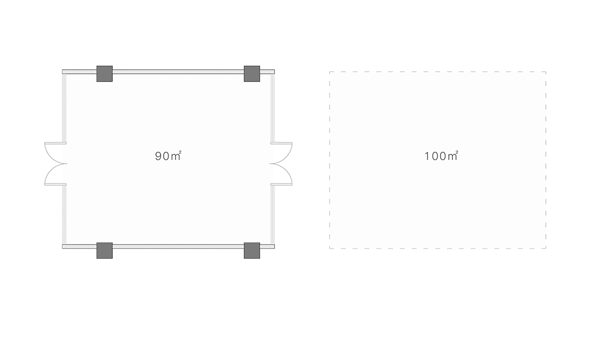
項目位於深圳市寶安區海雅繽紛城,巨大的商業體量和抽屜式的零售邊界,形成了一種相對單一的寄生、對比關係,與甲方的第一次接觸就聆聽到:“希望突破以往複製店的模式,做一間實驗性的飲品空間”,我們被這一段英雄主義式的開場白深深吸引,回到現實的語境中,場地的室內麵積約90平方米,室外約100平方米,戶外場地的實施有著極大難度。不過正是這些難度,促進了整個故事的發生,激發了最終的想象,讓我們將目光鎖定在內與外的整體梳理,而非單一的空間設計。
Opportunity and Imagination
The project is located at Haiya Mage Mall in Bao’an, Shenzhen.
As such a drawer concept retail is built within such large business volumes, the comparison between the beverage store and the mall, somehow forms a relatively unitary parasitic and contrasting relationship.
“We hope to break through the traditional mode of retail chains and create an experimental beverage store.” said our client, which deeply moved us as we first met. Regarding the project, the space includes an approximately 90㎡ indoor area and an approximately 100㎡ outdoor area, it was extremely challenged especially for the outdoor implementation, however, it is the challenge this space brought that inspires and sparks our imagination, which allows us to set sights on a bigger perspective, to see the indoor and the outdoor space as a whole, instead of as separate areas.
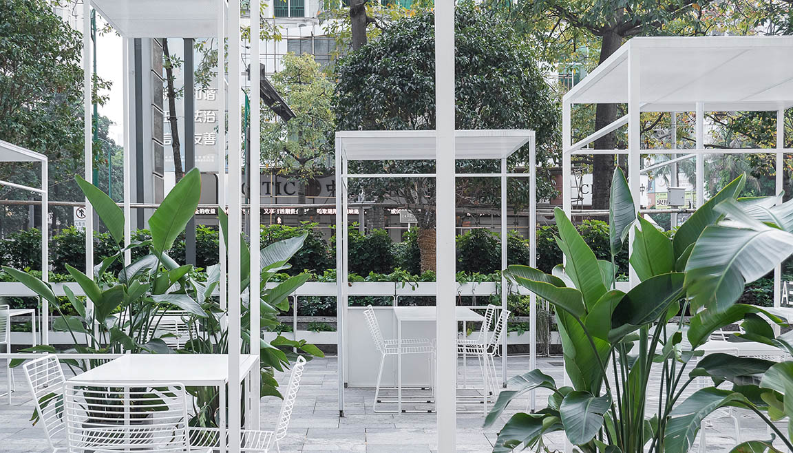
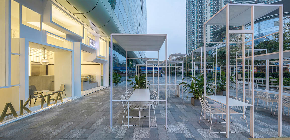
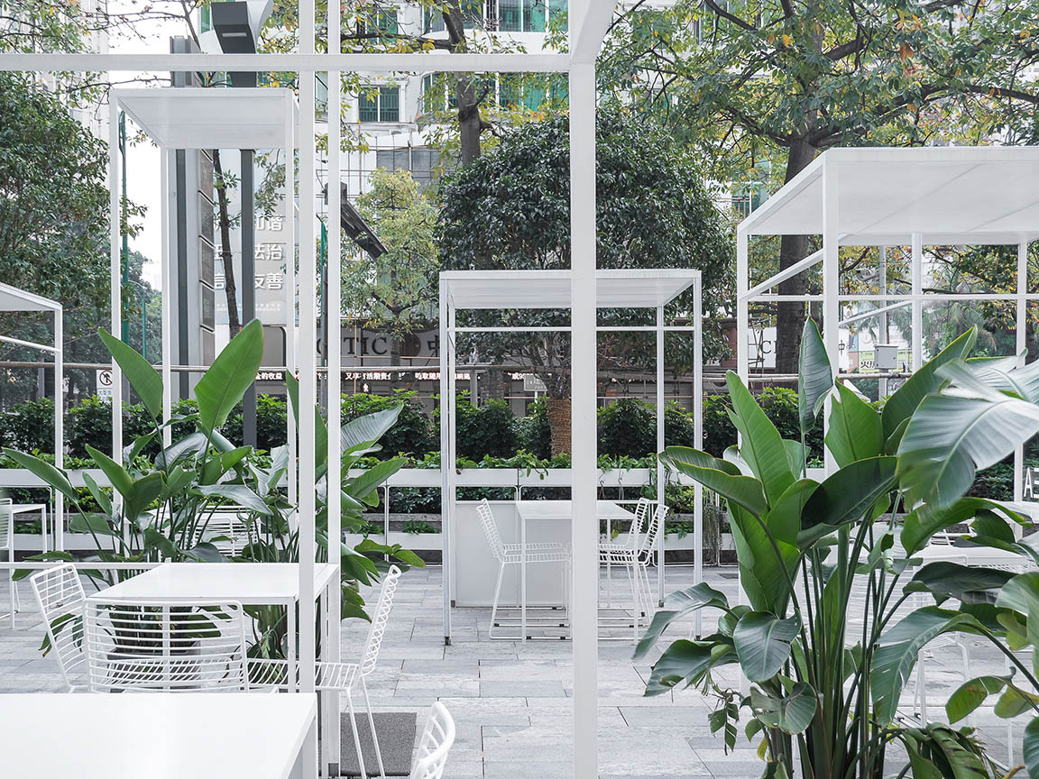
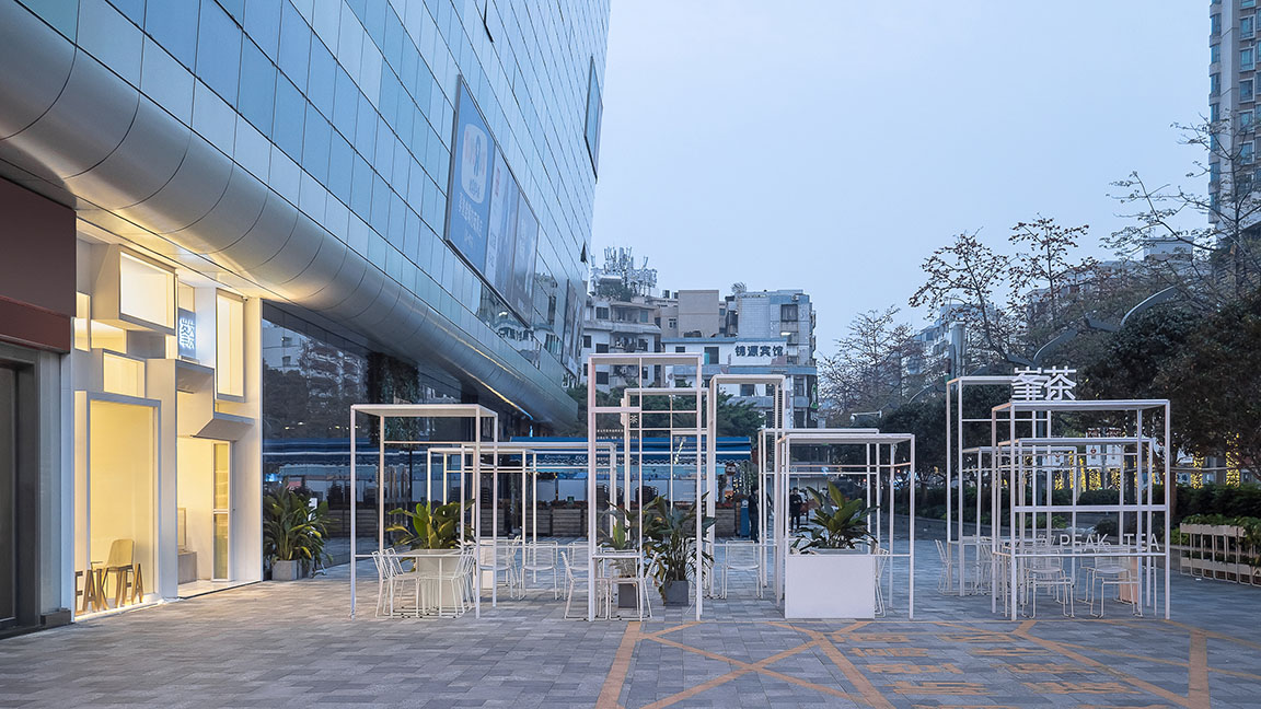
∇ 戶外綠植與都市景觀融為一體 攝影:張超
∇ 改造前內外關係 ©一乘建築
偶遇自然主義式浪漫
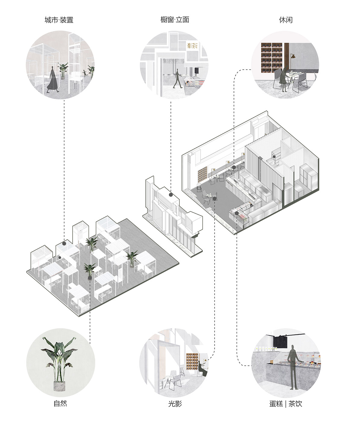
我們希望實現一個內外可以互望偶遇的景觀式空間,“內”作為店鋪功能的支撐點,“外”作為城市的公共舞台兼備景觀性和部分展覽功能。在這樣一個快節奏的城市,思索如何找到“輕和慢”的感覺。
Run into Naturalism Romance
We want to create a landscape space that blends the indoor with the outdoor area. The inside space will work as a support for the function of the shop, while the outside space will serve as a public stage, providing both landscape and exhibition function. We try to find a rhythm of slow and peace in such a fast-paced city.
∇ 設計策略 ©一乘建築
將限製條件轉為積極的理解
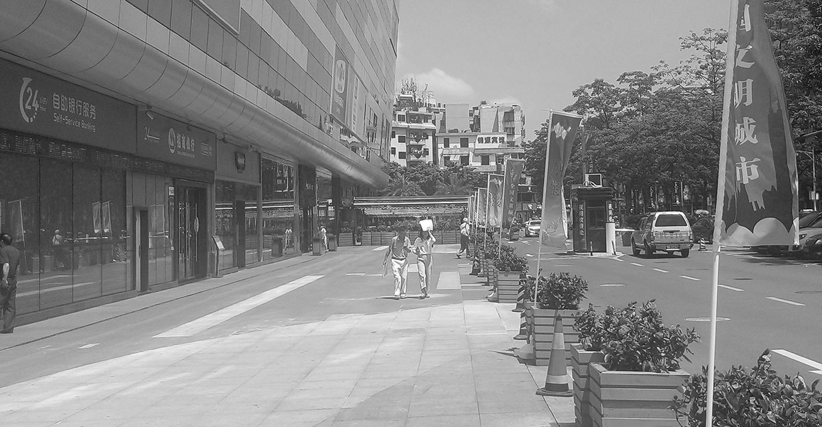
施工前的舊場地,整齊劃一的擺放著花池與旗幟,將人車分流。但公共空間,顯然並未給分流後的人帶來多少停留的意願,這是日常的中國式街道斷麵,安全但缺乏生機。方案一波三折,從甲方通過的舞台版方案,到因消防原因調整的城市家具方案,在規範和使用、造價與工期的諸多因素下,我們希望始終保持這種探索和思考。
Turn Restricted Condition into Positive Thinking
Before our renovation, the original site was placed with potted plants and flags which were designed to separate the pedestrian and vehicles. Unfortunately, such public space does not appeal the pedestrian to stop for a while, this is a typical street section in China, safe but lack of vitality. Our design process was full of complications, from the stage version proposal approved by our client to the revised urban furniture version proposal requested by the fire department, under the restrictions of standard, usage, budget, timeline and various factors, we continued thinking and exploring our way out.
∇ 改造前的街道 ©一乘建築
∇ 舞台版本方案 ©一乘建築
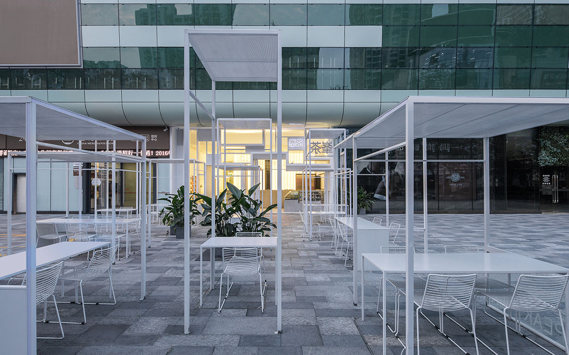
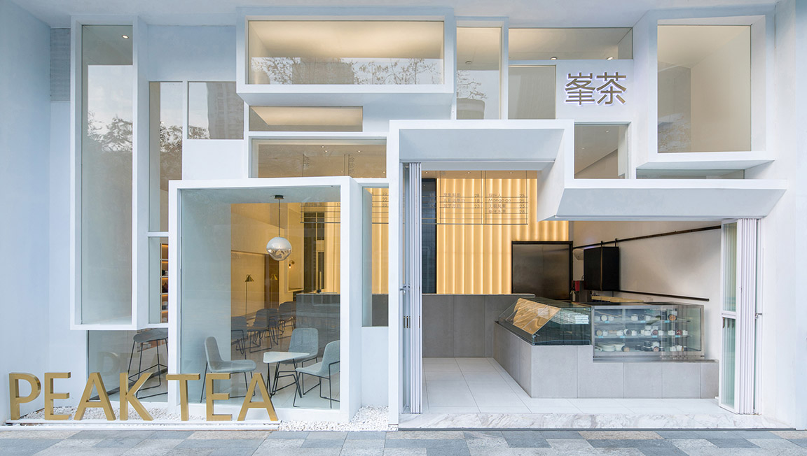
∇ 改造後的街道與立麵 攝影:張超
展示使用者的空間體驗
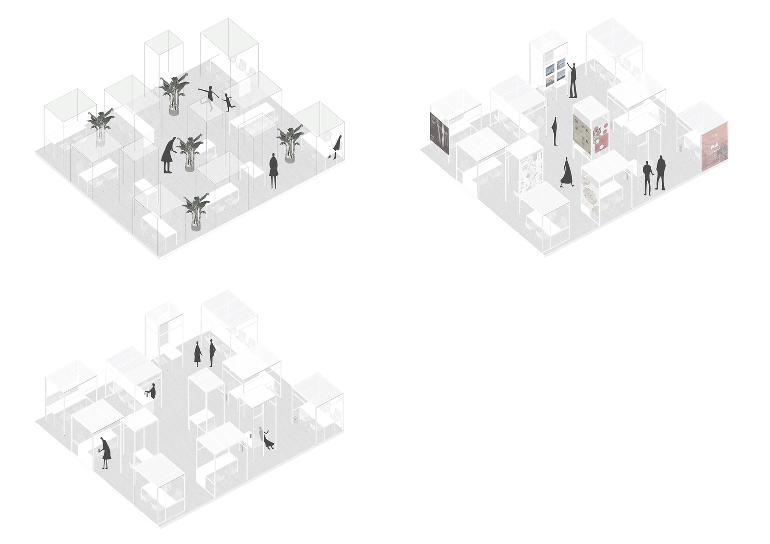
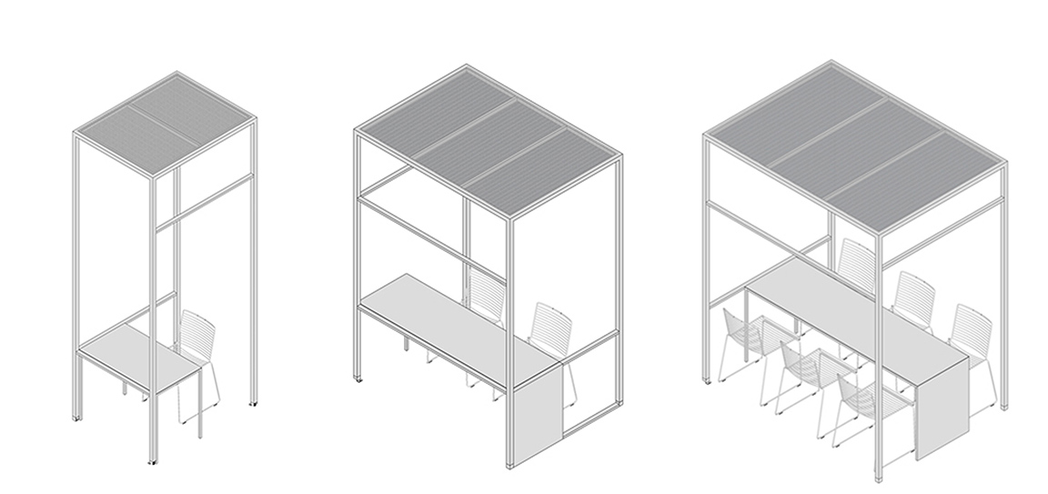
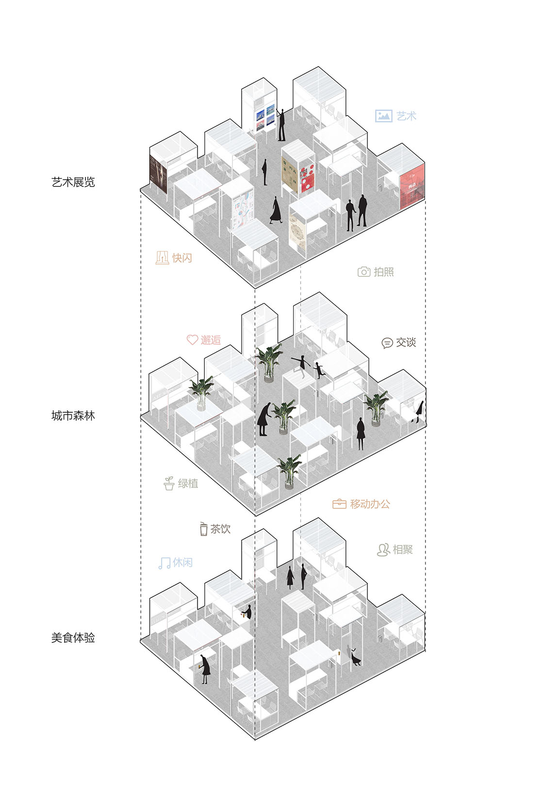
我們希望這組家具設計,可以充當體驗美食、舉辦畫展、城市叢林這幾種功能的背景。裝置由常見的方通構建而成,尺度的高地、大小變化,則是為了讓人感受到自己與空間關係的微妙變化。疊加的線條形成一幅幅框景,我們希望把使用者,理解為這一道風景的主角,展示出使用者空間體驗的畫麵感。
Exhibit Spatial Experience for User
We hope that the design of this group of furniture can be served as the supporting background to different activities and functions such as culinary experience, art exhibition, city jungle and etc. In order to have people experience the subtle changes between the space and themselves, the configuration is simply arranged by several rectangle structures but in different scales. The overlapping lines of the structures enframe a series of scenery, having the users themselves become the main character in the scenery, we hope to create and visualize the spatial experience for them.
∇ 城市家具軸側概念圖 ©一乘建築
∇ 家具類型研究 ©一乘建築
∇ 具備複合功能的城市家具 ©一乘建築
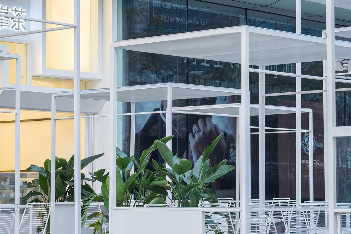
∇ 裝置和植物 攝影:張超
∇ 夜幕降臨 攝影:張超
∇ 透過裝置看城市 攝影:張超
看與被看作為一種立麵的手段
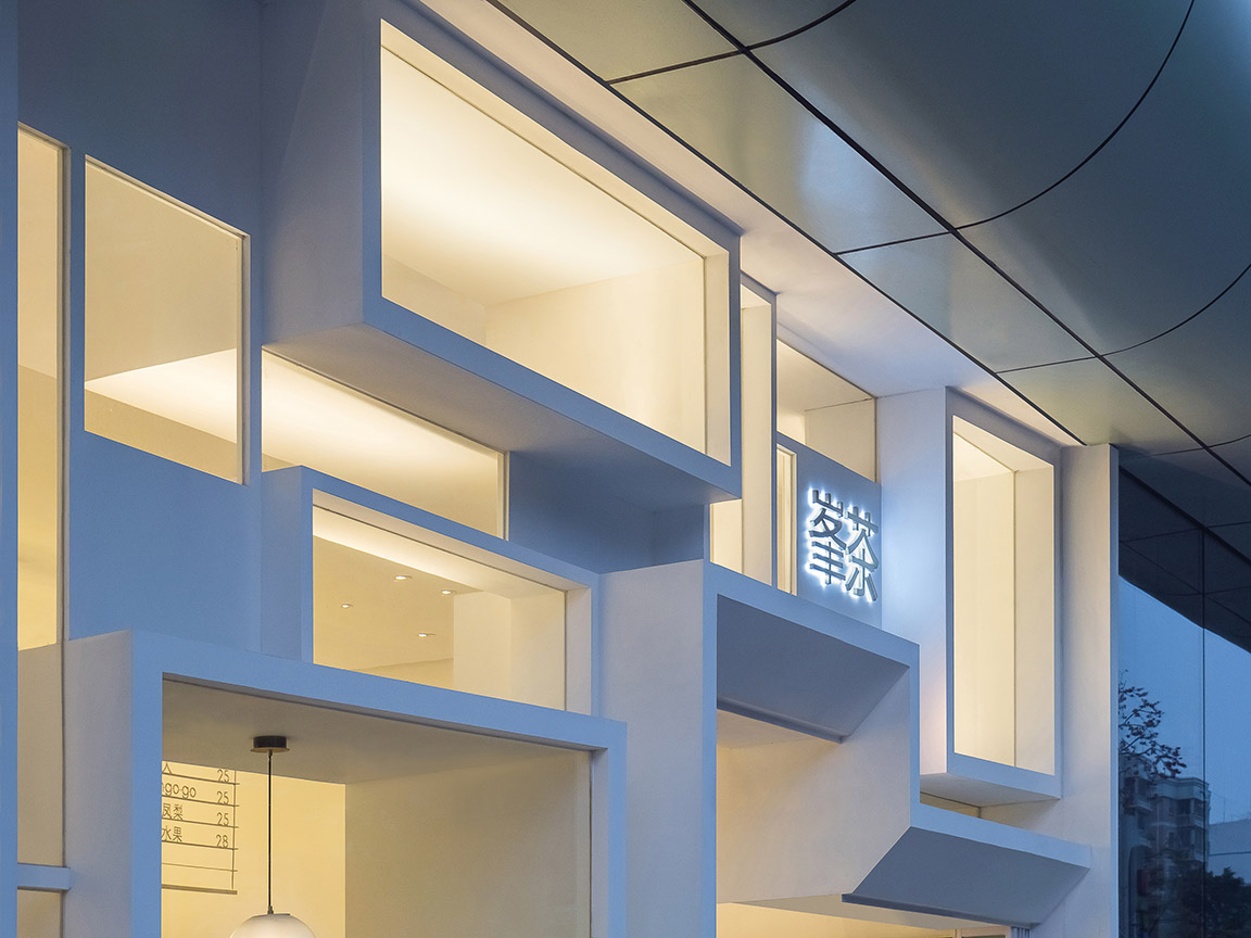
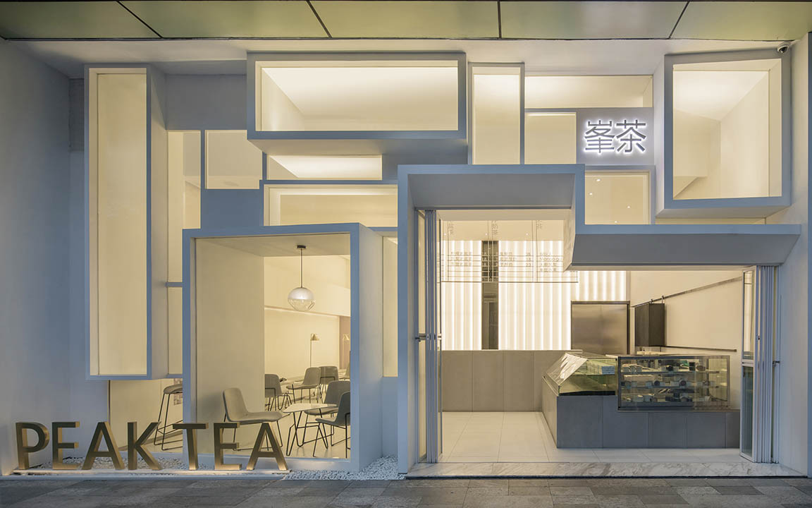
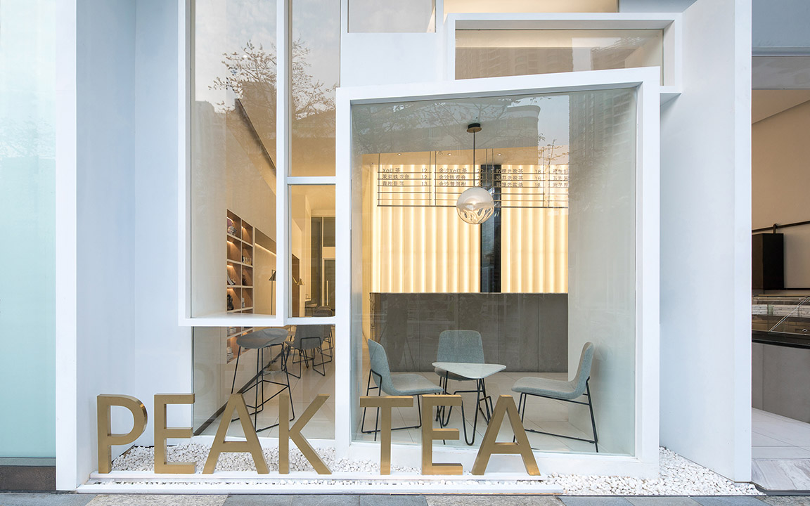
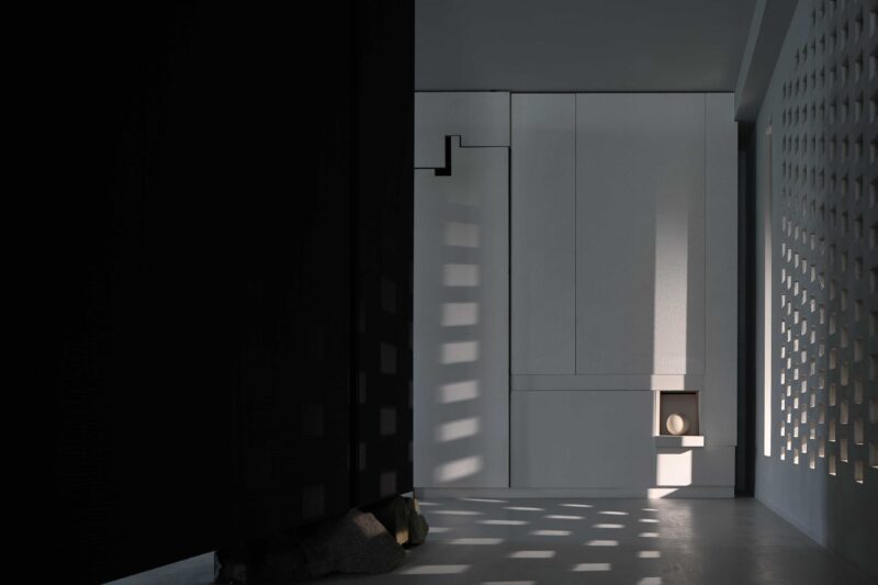
引發立麵設計思考的關鍵,來自於愛德華·霍普的名作《夜鷹》,這幅城市現實主義風格的布麵油彩,描述了一個通宵用餐的場景,三位顧客各自陷入自己的沉思當中,相互之間是緊鄰的但卻是遙遠的,這當中對於人物的刻畫是精準而傳神的。因為產生了對於人的思考,我們於是希望這樣一個店鋪,把人的疏離感重新拉回到合適的尺度上,大玻璃這種潔淨透亮的手法象征著技術的革命,反之我們希望這個立麵碎片化,在進入這個“玄關立麵”的過程,完成一次看與被看的體驗。
Façade Design is the Expression of Seeing and Being Seen
The inspiration of the façade design comes from Edward Hopper’s masterpiece Nighthawks. The realistic painting depicts an all-night diner where three customers, all lost in their own thoughts, are close yet distance from each other. The depiction of the characters is so accurate and vivid that arouses us a philosophic thought on human isolation, we therefore hope to bring the sense of alienation back to an appropriate scale through such a store. A large plate of glass is a symbol of technological revolution, on the contrary, we want to achieve an experience of seeing and being seen through the fragmented façade.
∇《夜鷹》 Edward Hopper 圖片來源於網絡
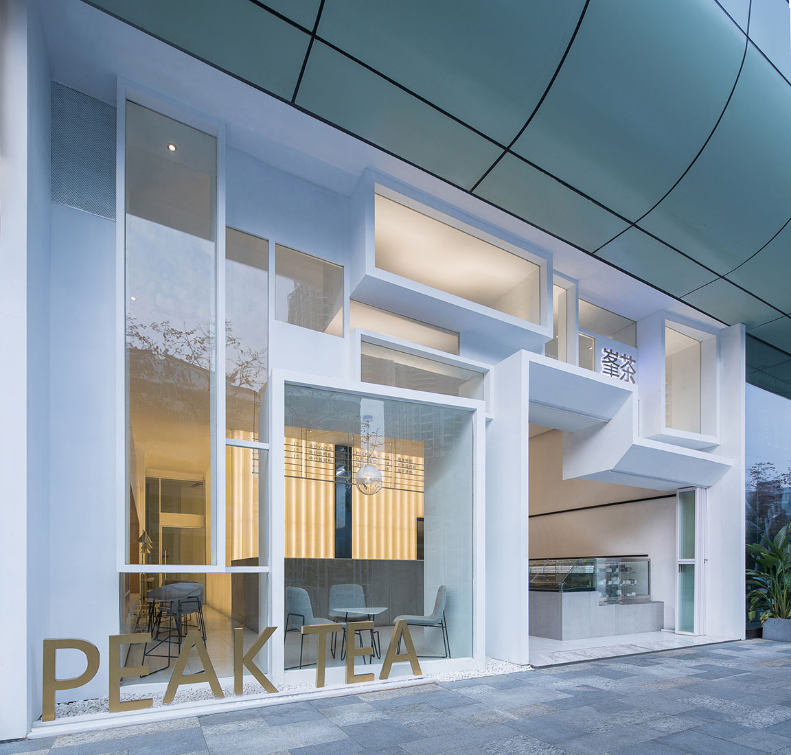
∇ 立麵呈現出立體透視的效果 攝影:張超
∇ 光線緩緩的穿透立麵 攝影:張超
∇ 立麵 攝影:張超
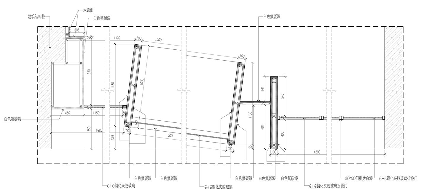
∇ 牆身大樣 ©一乘建築
∇ 牆身大樣 ©一乘建築
∇ 立麵 攝影:張超
∇ 立麵語言創造了新的室內外關係 攝影:張超
∇ 櫥窗 攝影:張超
立麵向內延伸的簡潔感
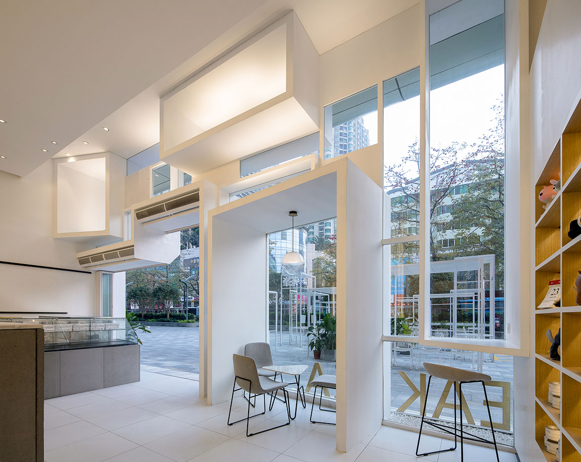
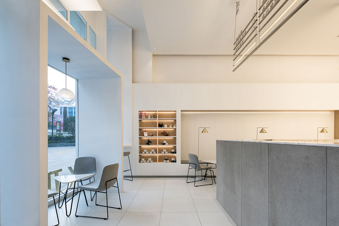
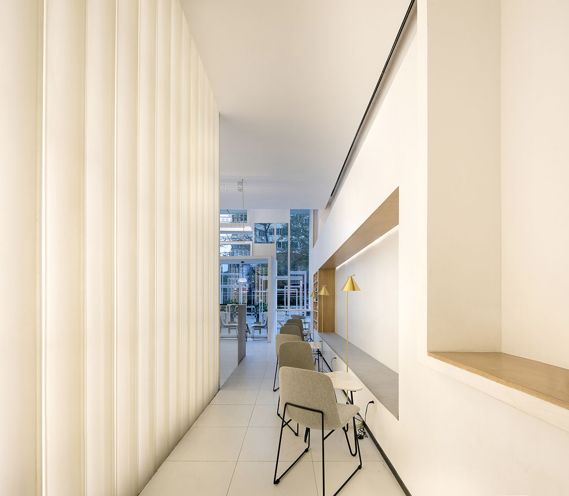
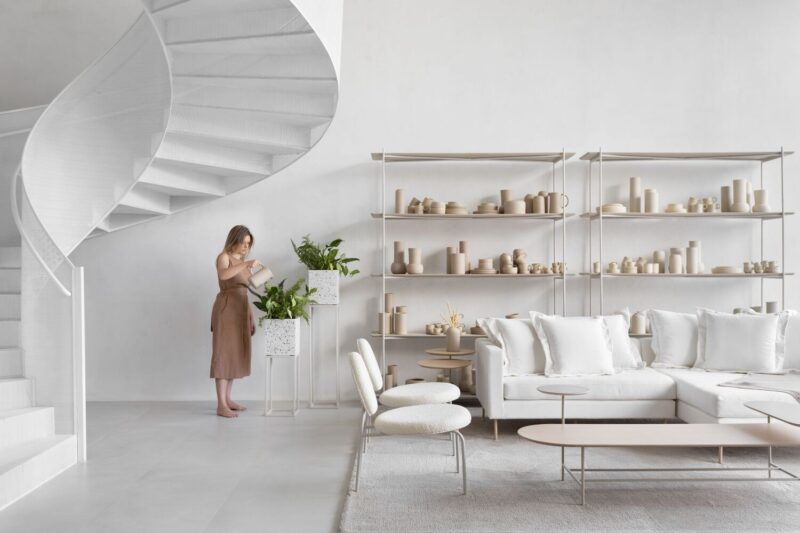
一句話講,室內是由立麵經過簡化和提純向內而生的一個過程,所產生的細部,除了功能作用本身的需求,主要是希望人感覺舒服。白色為主的將空間的結構關係交代清楚,木飾麵點綴在必要的衍生品和座椅空間除,灰度則恰當的點綴在服務功能的前台和座椅空間上。
Concise Feeling from Inward Stretched Façade
The interior design is the process of simplified and purified the façade. Apart from utility function, all the details are created to serve the purpose of making people feel comfortable. As the base color in the space, white is used for constructing the spatial structure, wood veneer is used for decorating the seat area and the color gray, somehow appropriately adorns the front desk and seat area that has the service function.
∇ 戶外場景 攝影:張超
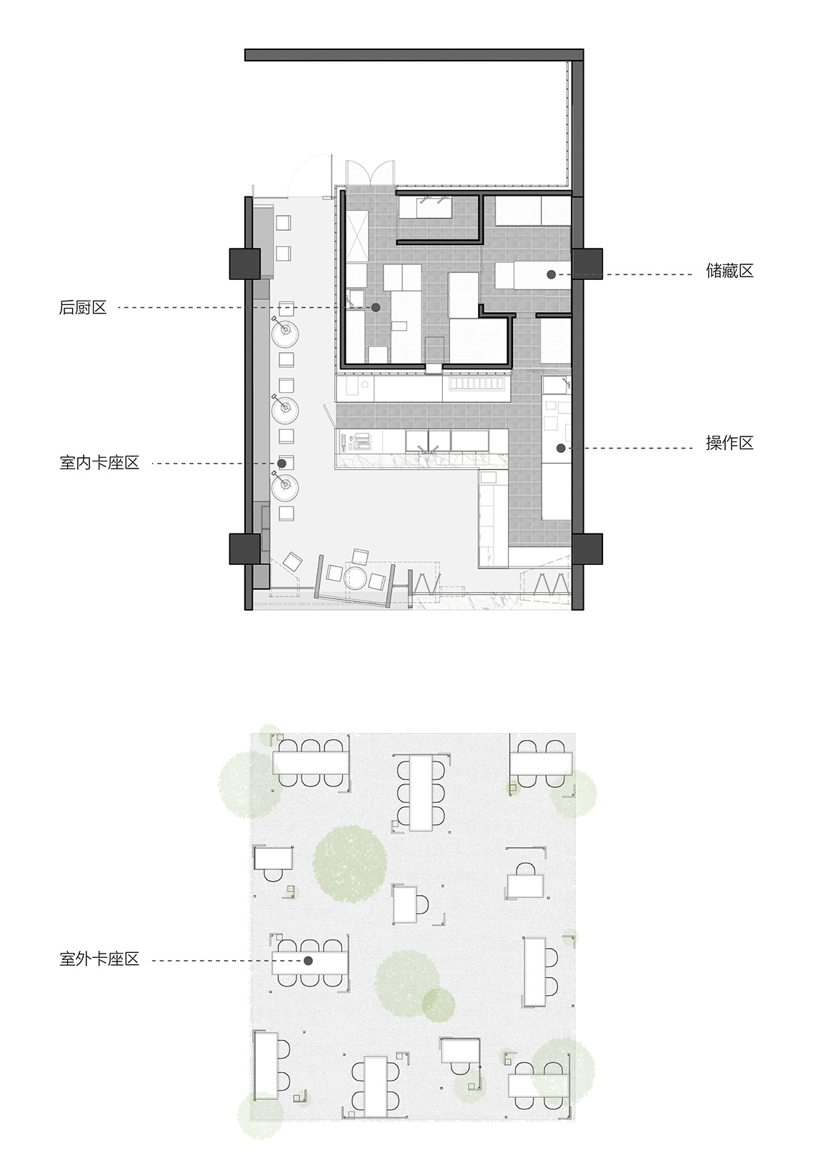
∇ 改造後平麵 ©一乘建築
主要項目信息
項目名稱:峯茶PEAK TEA
項目地點:深圳市寶安區海雅繽紛城
設計團隊:一乘建築(http://www.onexn.com/)
主持建築師:張博、王晶晶
團隊:安炳祥、曾鳴、蔡梓瑩
施工圖:李南芳
施工:李玉林
燈光:譜迪燈光
規模:室內:90平方米、室外:100平方米
攝影師:張超
Project Information
Project Name: Peak Tea
Project Location: HaiYa Mega Mall, Bao’an District, Shenzhen
Design Team: Onexn Architects (http://www.onexn.com/)
Principal Architect: Bo Zhang, Jingjing Wang
Team Member: Bingxiang An, Ming Zeng, Ziying Cai
Construction Drawing: Nanfang Li
Execution of Construction: Yulin Le
Lighting: Pudi Design
Project Scale: 90 m2 Indoor Space, 100 m2 Outdoor Landscape
Photographer: Chao Zhang


